
Emily Henderson's Blog, page 248
September 7, 2019
I Let My 20-Something-Year-Old Staff Dress Me in 2019 Fashion Trends

It’s painfully true that there will come a point in your life where you will not understand what the youth are wearing (or why). To match your lameness, you might say something trite like, “omg, I wore that in junior high!” or maybe get to the point with a “wtf are they actually wearing?” But I don’t take fashion too seriously so I thought it would be VERY fun for my youngest team members to dress me in the trends that they are seeing and loving on their Instagram feeds. Brian thought it was April Fools. I felt like I was ready for Halloween. But I had SO MUCH FUN. So here you go: three trends/outfits my team helped pick out for me and four others on my youngest team members, plus how we all felt about them.
First up, my team really insisted on seeing me in this color we apparently refer to as “millennial purple.” Here’s how the youngins are wearing it:
 from left to right: image source | image source | image source
I think I don’t like millennial purple, yet. Like most things that I think look bad on me, it takes me a while to go through the following internal process:
Step 1: See the trend, hate on it verbally.
Step 2: Let time go by and allow the parasitic zeitgeist trend to burrow into my brain. Out comes an “ooh, well I kinda like this shade of it.”
Step 3: Try trend; realize that it indeed looks bad with my skin tone, as it always has. But maybe that’s also because my skin tone usually is a shade of “spray tan orange” that when resting next to this color looks BRIGHT orange. But I suppose that’s my problem, not millennial purple’s.
But this chick looks good in it:
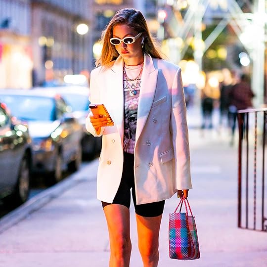 image source
So we tried it out. When my team first bought a version of this look for me, they bought it as a suit (a blazer and short set) and I just couldn’t. It’s likely that if I lived in New York or had a more formal job, I would wear it because I love the idea of it, but it’s just not my lifestyle. It’s neither work wear or party wear or weekend wear.
Instead, I paired it with the obvious choice of a 40-year-old woman: skin-tight, lower thigh length biking shorts. I’m still unsure if I’m supposed to call them “biking” or “biker” shorts (wait…is it just “bike”?). Please advise.
Indeed, I liked it more and sure, and couldn’t wait to take Brian out on that hot date he’s wanted since he wrote my birthday post. I wore a vintage-style rock-and-roll shirt, I’m sorry, BAND SHIRT—that’s what it’s called now, and then we did what I’ve always wanted to do (I’m actually not joking)…put on some sheer socks and white pumps.
I think I nailed it.

Blazer | T-Shirt | Bike Shorts | Shoes | Socks | Sunglasses | Sunglass Chain | Bag
How do I feel about it? I felt ridiculous but Ryann, Mallory, Veronica and Chandler all thought I look LEGIT COOL. I thought it was the definition of “try-hard” but again, that’s because…I WAS.
Here’s how I would “tweak” it for real life: wear the bike shorts with the T-shirt for sure, but likely wear it with Vans. And I love the socks/shoes combo, but likely would feel better about them with a dress that warranted such style. I will never wear the blazer, but my team was into it.
Next, my team dressed me in a look they are calling “festival Emily” based on these very trendy ladies:
 from left to right: image source | image source | image source
I get it. I like ripped jeans, boots, and vintage T-shirts so this isn’t completely off base for me.
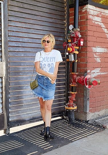
Shirt | Skirt | Necklace (similar) | Sunglasses | Boots | Bag
This is how I dressed in the early 2000s and I like it, but it’s not me anymore and not because I’m too old, but because it doesn’t represent my personality any longer. I don’t think it’s ridiculous, I’m just more “Uptown Prairie” than “Downtown Rock’n Roll.” But honestly now that I think about it, I don’t think that the street-style festival look is too much of a trend that we haven’t seen before…and I guess that’s the case for most of these things. The fashion world simply regurgitates styles from the past by slapping them on fresh new faces and bodies. It’s a cycle.
Now, before we leave my trends, I had to try the biker short in another light, specifically the Hailey Bieber light. If you need more proof to believe this is actually a thing, I give you exhibit A, B, C, D, E and F.
 from top left to right: image source | image source | image source | image source | image source | image source
But the image that got my team’s hearts all AFLUTTER was this one (which is evidently a Princess Di throwback):
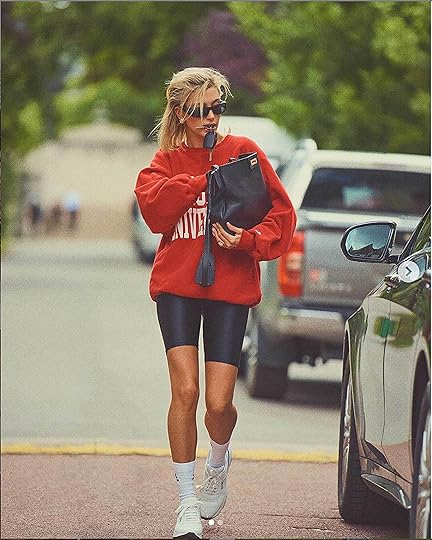 image source
People are FREAKING out about this. Of course, I think that it’s the case of “model-thin-celebrity-wears-anything-ugly-and-gets-people-cast-her-as-fashion-goddess,” but they disagree and truly think it’s awesome. So to prove for (or against) my case, here I go:

Sweatshirt | Bike Shorts | Socks | Shoes | Sunglasses | Purse (similar)
To say I felt uncool wearing this was the understatement of the ’80s. I felt frumpy. Silly. Embarrassed at best. But then I saw the photo and I was like, wait, is she kinda cool?
Let’s side by side it again, we need more analysis:

I think there is a clear winner, and it is not the one who slobbered on keys to “get the shot.” But I had hope for the bike shorts in my future. To convince my team of how I could see myself actually wearing them, I brought a sweatshirt and shoes from home.

Sweater (similar) | Shorts | Shoes | Sunglasses
I actually liked it! When I sought approval they said, it’s a “cute drop-off-the-kid-mom” clothes, but it’s no longer the look or trend that impressed them. I get that.
But I also think that the influence of “influencers” that are just “skinny models” is a miss and not who anyone should set their sights on or admire artistically. I challenged them to find other, weirder, more creative (and NEW) actual trends and I’d be game. I mean, I had fun but it’s literally just a sweatshirt and biker shorts from the ’80s, HOW did that break the internet? I suppose it was the idea of an influencer recreating iconic Princess Diana looks, but it still felt a little stale to me.
Despite the embarrassment of this shoot, experimenting and hanging out with my girls was fun. I will say that buying this stuff vintage makes far more sense for me (and creates less waste) because most of this isn’t even being reinvented or modernized, which is actually my biggest beef with it. That champion sweatshirt has proportions that no person would look good in—why not create a better silhouette? So that’s the good news, just head to Goodwill and you can surely find yourself some 35-year-old biker shorts…(but we’ve linked up where they got all of them, too).
Now for my crew to take a pass at this because we all wanted to have some fun. Being 25 and under, they can surely convince us all that these trends (i.e. reboots from the ’80s and ’90s because that is exactly what it is) are cool, RIGHT????
Ryann’s Trend: The Bike Shorts

Blazer | Shirt | Bike Shorts | Shoes | Sunglasses | Earrings
Her take: Yes, the bike shorts trend got to me, too (see Emily’s inspo photos earlier). As I began pulling my outfit together, more trends came into play i.e. the asymmetrical neckline, and the strappy heels and I won’t lie: I felt silly wearing this walking down Hyperion Ave posing for photos FOR SURE. When I saw the pictures, I wasn’t a complete hater because this outfit IS flattering and cute, it is just not “me.” That said, I would absolutely wear every one of these pieces again but likely not altogether like this. I am really into this blazer. The way it falls, the color, the length, everything about it. It’s really special and reasonable priced. The bike shorts are actually my favorite to wear around the house with an oversized T-shirt or sweatshirt (although I am not one to wear athleisure outside the house unless I am extremely tired or hungover lol). The sandals are very fun and I love a leopard print (plus I have nothing like them atm) and I can see myself wearing them with vintage Levi’s and a white ribbed tank top for summer or with black bell-bottoms and a tube top for a “going out” look.
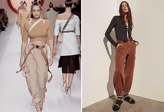
Veronica’s Trend: The Utility Pant + Tie Dye
 from left to right: image source | image source | image source
Her take: I’m a huge advocate for the “mom jean” trend that circled back around, and I feel like this is a comfier version of that. I felt very relaxed and cool in this, ready to skate along the beach! I would wear the shirt and shoes again and the pants only for winter because they were pretty heavy and warm. It’s all so comfortable and simple, and any of the pieces could be transferable to pair with other items of clothing. You could wear the tye-dye shirt with a pair of shorts and sandals for a summery look, the pants could be paired with a cropped shirt for a more comfy, loungey look, and the shoes can be worn with literally anything. Add a beanie on top of this outfit and a black long sleeve under for colder weather, and you’re ready to go.
Chandler’s Trend: The Jogger Pant
 from left to right: image source | image source
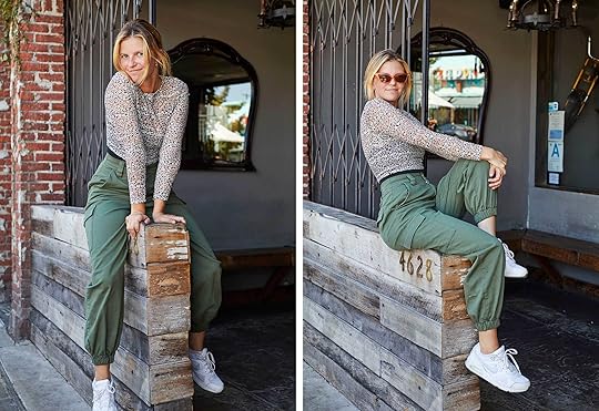
Shirt | Pants | Shoes | Sunglasses
Her take: I wanted to try this trend because there are so many ways to dress the outfit up or down, so I wanted to see how to get a good in-between that was still fun. I am a huge advocate of buying clothes that can function as something I can wear to the office, and then alter slightly for a Friday night dinner. These pants are comfortable and functional and I would for sure wear them again and again. They work with sneakers, but are pretty heavy and would also work with boots and a cropped sweater in colder weather, which I think would be a more comfortable way to wear them. I felt like this was a great everyday outfit with some spunk and style. It was a little edgier than my normal everyday outfit choice and I was into that. I don’t think I would wear the shirt again with these pants just because the see-through trend isn’t really my thing, but I LOVED the bra/tank I wore under the shirt. Overall, this trend is a yes for me.
Mallory’s Trend: The Midi Leopard Skirt + Dad Shoes
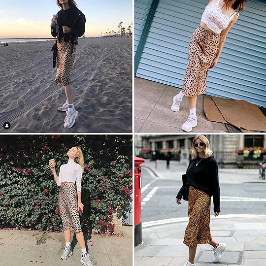 from top left to right: image source | image source | image source | image source
Shirt | Skirt | Shoes | Bag | Hair Clips
Her take: I’ve been into this leopard midi skirt trend for quite some time, so when it was time to pick a trend to try out for this post, I instantly knew it would be this. The strategy for the exact outfit inspo was this: go to the Urban Outfitters Instagram and search for the perfect leopard midi. It must have been a good strategy because I found one in 3 seconds. While wearing this, I felt like an influencer, honestly. It seemed weird that I wasn’t on Melrose with a latte in hand and my Instagram boyfriend taking photos of me in front of the pink wall. The dad shoes (which made me feel like I was Godzilla stomping through LA) PLUS the midi skirt PLUS the hair clips were a little too aggressively trendy for my taste. The top and the skirt together make a great go-to look that I know I’d wear all the time. I’d pair them with a dainty Madewell sandal over the dad sneaks (since I don’t consider myself edgy or sporty enough to pull off the FILA look).
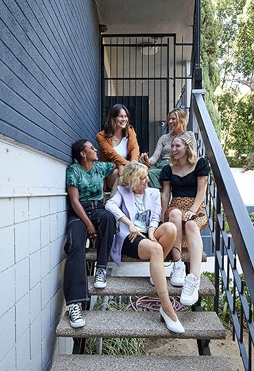
Look at us. So happy with ourselves and our youth (ha!).
WHEW. That was a lot of trendiness for one day. What do you all think (I know to some of you, it might all seem silly, but playing “trendy” dress-up was honestly SO MUCH FUN)? We would love to hear your thoughts. xx
***photography by Veronica Crawford (group shots by Brian Henderson)
The post I Let My 20-Something-Year-Old Staff Dress Me in 2019 Fashion Trends appeared first on Emily Henderson.


September 6, 2019
Make Your Home Fall Ready With 7 Simple Tricks (Using All Target)
Well. There has been a plot twist in the Emily Henderson bio-pic: I might be getting into orange and chickens (?). I’m more of a cream, mustard, maroon and gold fall decor fan. But this year, Target challenged my anti-orange ethos with their rather beautiful and welcoming new fall collections. Hope you are excited because it’s good and making me ready. Plus, I’m a mountain gal now with a soft spot for rustic coziness. So today, I am going to show you step by step how you can make your home have that welcoming rustic but modern cozy look we are actually craving this time of year. Grab a hot tea and let’s see how I used and fell hard for what Target is serving up this fall…
Start With Your Front Door
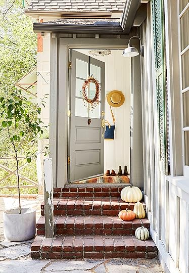
|| shop all front door products here ||
I like to think that any good seasonal or holiday decor starts outside. This way your neighbors know you mean celebratory business and you get to feel the festive spirit embrace you every time you get to your front door (also, EVERYONE has a front door, whether you live in a smaller apartment or a stand-alone home). So let’s get into my tips for creating a happy but simple seasonal front door moment.
1. Use a variety of faux gourds. Real gourds are, of course, great, but if you want to start early, you’ll want to avoid the inevitable great pumpkin melt/rot. You can use these from September until the Christmas lights go up. No need to wait for Halloween season to roll around. Plus, you can use them year after year because a classic gourd will never go out of style. So mix them up with different colors, shapes and sizes to create a lovely front door styled moment. You can also always mix in some real pumpkins and squashes for a super authentic feel (though these are actually great and convincing).
2. Go for a delicate wreath. Using a delicate wreath instead of a huge and overpowering one is A. a bit more modern (even if it’s more on the traditional side…it’ll feel more updated) and B. you can “go for it” with the color without feeling like it’s too much. This one is a bright orange and yet it’s not too orange because it’s visually delicate. I would avoid using orange on a red door or a brown door, but on white or gray, it’s a lot chicer. Plus, that awesome matte black wreath hook is super pretty and won’t force you to make a hole in your door. Great option for renters, too.
3. Use a festive (but not too holiday) doormat. Probably the easiest way to add in color and texture to your entry is a doormat. So why not go for it by adding in a very cute, autumn toned doormat like the one we used in the below photo? I love how it says fall without screaming fall.
|| shop all above products here ||
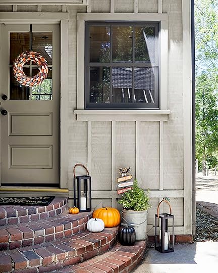
You have seen my all-out Halloween kid-friendly decor in the past but for something a little more “cool” rather than “kid,” we decorated this doorway for you to get your spooky on in a welcoming, modern way.
1. Halloween calls for orange (just not too much). It’s undeniable that orange is just a part of Halloween decor, even if I’ve been resistant myself, so I say lean into it. If I can, you can. And these faux orange pumpkins are pretty cute. The fact that they are purposefully simple avoids the over the top look. I love how they’re more squat and chunky. Then to visually balance the look, sprinkle the orange love around. We used that colorful wreath (which can stay out through Thanksgiving because it’s more general “fall”) and the fun Halloween sign. Just the right amount of orange so everyone is happy.
2. Keep it playful. This is a fun holiday so don’t take yourself or decor too seriously. We used that colorful wreath to add pattern and some other colors, the very welcoming doormat to tie in the black color and lastly the Halloween sign for some straight-up Halloween goodness. Another unexpected way to bring up the mood is a live plant. The texture of the potted plant adds depth and lightens what would otherwise be a more serious Halloween look.
3. Use black accents to keep it modern. Black and modern are basically synonymous. Black is also synonymous with Halloween, so having the right amount of black accents will not only keep things cool and grounded but will also feel festive. The black pumpkin is simple and perfect. But those lanterns are probably my favorite. Can you even handle that leather handle?? It’s so good. Plus, they will last you all year long. Bonus. 
September 5, 2019
Throwback Trend Thursday: Accent Walls Might Be “Cool” Again (& Here’s How to Do It Right)
 image via house beautiful | design by molly britt
I totally understand why the “accent wall” was a thing back in the earlier 2000s: it’s a “pop” of color without taking too much of a risk in a room. I mean, if you end up hating that one random purple wall, you can just quickly paint it back…in a quarter of the time as a four-walled room. But here’s the thing about doing just that: well, it looks like you did JUST THAT. It’s like the coward’s approach to bold paint (and I can say that because I’ve been there, painted that in the past). This type of tippy-toeing tends to not look very purposeful and gives off “I didn’t really get around to finishing up the paint job in here” vibes, I’m sorry to say it. HOWEVER, I’ve found myself bookmarking and pinning lots of images lately of rooms with…ACCENT WALLS. That being said, they aren’t your ’00s accent walls. Instead, what I’m seeing done really well is accent walls with a purpose. These babies have a new grasp on life. Read on because I’m going to walk you through what the keys to nailing the accent wall of today are with lots of very pretty examples (so get your Pin finger ready).
To Draw Attention to an Architectural Feature
 image and design via brio interior design
First and foremost, using paint to highlight an architectural feature like a fireplace, a special room shape, molding, etc. will always get a thumbs up from me. Here, in a room by Brio Interior Design, the white brick fireplace gets the contrast it needs against a charcoal wall to feel special. When you aren’t working with a flashier tile or surround material, this is a genius way to create a moment out of a pretty basic set up.
 image via zillow | design by ryan white
Painting built-ins as your “accent wall” helps to pull all the attention something like this (vintage or newly installed) deserves. Whether cabinets or bookcases, make sure to paint any wall bits that show up (for instance, if it’s more like a hutch with bottom cabinetry but shelving up top) the same color so it’s seamless. This works particularly well in a room that might be a little more monotone, like the above shot from a house designed by Ryan White. Yes, the floors are pretty stellar (and um, give me that chair, thanks), but really this appears to be a pass-through space made to be felt important with built-ins in that perfect sage-y hue.
 image via apartment therapy | design by ligia baleeiro
Had the wall behind that sofa (in an Argentinian home via Apartment Therapy) been painted the same white as the rest of the room, your eye might have missed that unique slope of the wall, but in a bright cerulean, it’s basically the first thing you notice (followed by the beautiful light pouring through the door, the molding and those stunning floors). If you have a room with a different roofline or shape, consider finding a way to accent either it or the space around it to make it shine.
To Bring Interest to An Overlooked Transition Space
 image via cote maison
“Wow, this is such an inspiring hallway,” said ALMOST no one ever, until now, because I just said it. This might be my absolute favorite version of an accent “wall” on this whole list, except it’s more an accent door/ceiling. The ceilings here appear to be quite tall, so to bring even more attention to them, painting the door up into the overhead space is like a magnet for the eyes. And here’s the thing: had they decided to paint the whole hallway that dark inky blue (which I’m sure would have looked killer, too), would have laid out a totally different mood in here. This way, it still feels bright and airy with just enough visual interest.
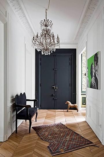 image via domino
Here’s a similar take on the “paint a door at the end of a hallway” thing from the prior photo just without the whole painted ceiling commitment. I love that they went all in on that sliver of wall, and didn’t just paint the door but rather all the moldings and hardware involved.
To “Distinguish” a Space for a Purpose
 image and design via marion alberge
Another very smart application of the accent wall is to carve out a “purpose” for a portion of a room without having to put up any walls or get too creative with furniture. In the above room by Marion Alberge, a dining room is distinguished from a much larger living space (that you can’t see in this photo). The slight alcove was the perfect opportunity to do this, so if you have awkward little spaces like that, you might want to consider going the accent wall route.
 image and design via plank + pillow
I love the architecture of this space, but I could see how being all white, it might be a little one-note. The creative minds behind Plank + Pillow smartly too a little niche, clad it in shiplap and painted it a chalky navy to let it act as a workspace. To save money and labor, you can always skip the paneling and just go the route of paint for a similar effect. Note, also, that they painted the baseboard in that section, since that would be a question I myself might have if I were embarking on a similar painting journey: to paint or not to paint the baseboard.
 image via architectural digest
Here’s something a little different: painting the majority of the wall to draw attention to a corner. I found this shot on Architectural Digest, and at first, I thought it was a little funny not to commit fully to the paint job (in terms of taking it fully to the corners, ceiling or baseboards) but then I realized that it was the most purposeful way of going about it being that there is more wall beyond the corner, and otherwise they would have had to take the paint all the way across. Leaving the border says “yes, I meant to do this and I’m confident about my choice” which I’m all for.
 image via house beautiful | design by molly britt
Goodness this breakfast nook is dreamy, ain’t it? (insert my 3rd-grade teacher’s “ain’t ain’t a word” lesson here). I believe this is Farrow & Ball’s Inchyra Blue (PLUG! this also happens to be the color I went with in and with lots of bright light, it looks quite different here), and against the white painted brick and the rest of the room, it sings.
 image via home adore | design by stamp architecture
I pulled this photo because I think it’s a nice way to use up and feature a sliver of a wall that, in this layout, would likely go to waste. Gallery walls for the win, people. (Also note their use of black frames on the black wall to just let the art itself be the star.)
 image via cote maison
 I know this is a bit “niche” in that most people do not have a full wall of cabinetry in their bedroom (at least, now in the US) with a bed built in, but IN CASE YOU DO, or are thinking up some storage solutions for an upcoming project, painting (and wallpapering??) an inset to place your bed is a great way to make a “headboard” without actually having a headboard.
To Add Contrast to a Basic Room
 image via adore magazine | design by kate cooper
Okay, this one is SMART. It’s no secret that designers and design-aficionados are TV-averse but look, let’s get real…most of us have a television that we need to have displayed openly. However, if you want some ideas as to how to “camoflauge” it, take a cue from Kate Cooper who worked on the above room. The majority of the house this room is in is white, bright and airy, but in the TV-viewing space, she went the route of painting the wall the flatscreen sits on a similar dark hue. This accomplishes two things: 1. the TV is less HUGE BLACK BOX ON BRIGHT WHITE WALL, and 2. it gives this relatively boxy room some contrast.
 image and design via alternative indigo
Accent walls don’t just have to be paint, either. I myself am a little on the fence about the “headboard wall” accent treatment because frankly, I think most rooms don’t need it (I say go all-in in terms of paint in a bedroom, or let the bed and art tell the aesthetic story) but this is where you’re likely to spot it most often on the webs. However, I am pretty into this wood paneling situation. Alexis from Alternative Indigo opted for Stikwood, which is like removable wallpaper but wood veneers! You just peel and stick those bad boys up on the wall. Genius.
 image and design via design loves detail
 Design Loves Detail shows another example of the “headboard wall” treatment, just in a nursery. The addition of molding kicks it up like 10 notches.
To Make the Most of Awkward Architecture
 image and design via marion alberge
And finally, one that won’t apply to most of you, but I wanted to include it because I think it’s so fun. Particularly if you live in an old home with quirky architectural, using an accent wall approach to highlight anything that’s funky or awkward makes the most of your home’s uniqueness. The powder blue wall portion here really plays into the mid-century vibes of this room by Marion Alberge.
Alright, there you have it…the accent wall glow-up. I’m into it…are you?
Also, is there anything “passé” you’ve been seeing lately that you’re like “wait, that’s cool again!”? Let us know in the comments. We love diving in, researching and finding great new ways to approach an old design idea and then sharing with you all here. Can’t wait to hear what you’ve been seeing. Thanks for reading, friends.
The post Throwback Trend Thursday: Accent Walls Might Be “Cool” Again (& Here’s How to Do It Right) appeared first on Emily Henderson.
September 4, 2019
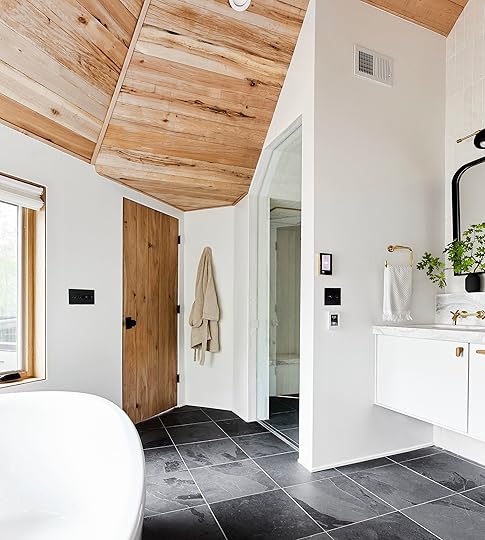
The Final Mountain House Reveal (for Now): All the Details of My Master Bathroom
Here we are, the reveal of the master bath of the mountain house (check out the bedroom if you missed yesterday’s reveal!). This bathroom is an actual fantasy and the fact that it’s ours is still insane to me. When people walk in, their reaction is “omg. stop it.” It’s been six months since it was finished and three months since we shot so at the end, I’ll let you know how things are wearing and any extra “learnings” because guys, THERE ARE ALWAYS LEARNINGS.
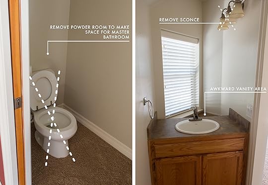
But first, this lady wasn’t always so pretty.

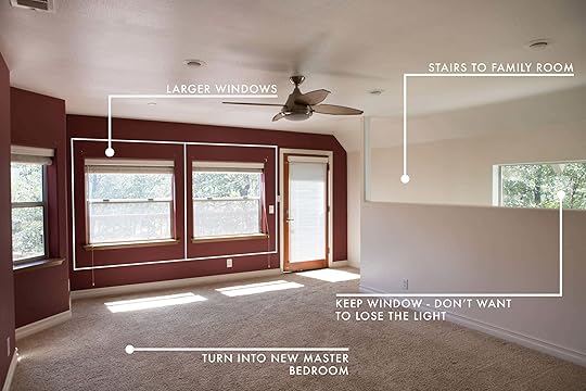
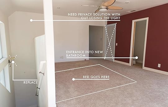
As you can see from the floorplan below, there was also a powder bathroom (that was attached to the then-upstairs-common-room now-master-bedroom), which was demoed out:
The Goal:
To create a luxury and smart bathroom, for ultimate relaxation. Our bathroom in LA is cute, but there wasn’t room for a tub and I forgot that I actually love a bath. So since we had the space here, I really promised myself to try to make it one that I would enjoy, of course not knowing that it doesn’t matter who you design a room for, unless you have strict rules YOUR YOUNG KIDS WILL BE OBSESSED WITH THE MICRO BUBBLE BATH, and then yes, take it over (and that’s okay).
The Challenges:
Ironically, when you completely demo/change all walls, fixtures, windows and finishes, you can really start new and in a way it reduces a lot of the original “challenges” of the dated bathroom. But here is a list of the awkwardness:
The jacuzzi tub took up all of the bathroom and there was no shower, but we loved that the tub was in the window.
The windows were low, the ceilings were low, the vanity was small, not to mention it opened to the old “master” that is now the kids’ room.
There was a small CARPETED powder room with a strangely placed vanity that left lots of awkward space behind it on the other side of this space for a common area upstairs (now that master bedroom like I mentioned).
Here is a zoomed in original floorplan (though I actually think the toilet is wrong here…it was against the window parallel to the tub):
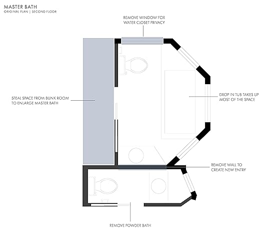
And what we proposed as the final plan where we sole from the powder bath as well as the kid’s room (which used to be the master):

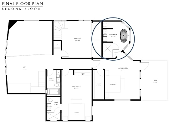
For placement, here’s the final floor plan of the upstairs so you can see where we are in the house:
The original moodboard (shared here in the original I Design, You Decide) has changed, as all design does from the beginning, which I think is crucial to understand—don’t stick to a plan simply because it is “the plan” if you find it no longer works or pleases you.
Here’s where it all landed:
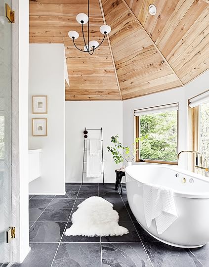
Oh man. I want to GO BACK RIGHT NOW—not in time, literally go back to the house and get in that tub.
First, let’s talk layout:
The shower is at the front (just across from the entry door), then because we wanted to work with the symmetry of the windows, we put the 60″ Kohler vanity on the opposite side of the tub that sat in the middle, with the toilet/water closet on the other side of that wall. Yes, we thought about putting a door on the toilet room, but for code, it would have needed to bump the wall out and have more room between the toilet and door, and that would mess up the symmetry and make it look a lot smaller so we decided against it.
The Wood Ceiling:
Ross Alan Reclaimed Lumber clad the ceiling with the same beech that’s in the whole house and I can NOT believe how good of a job they did with all those crazy angles. I can’t stress this enough: if you are doing a big renovation, consider grabbing any ceiling height from attic space. Look at your roofline to see if you have enough to make it worth it. It can be a substantial cost, with demo, redoing any electrical and ducting, then cladding, but that obviously makes a huge difference.
Lighting:
Mixing lighting in a room can be hard, but I LOVE the combo of the vanity sconce (by Katy Skelton) with the Allied Maker chandelier (and the toilet sconce—from The Urban Electric Co.—which you can’t see here). We wanted something that lit the ceiling, while still casting nice light down. It’s streamlined and yet still a round shape that we needed. We also have cans in there because since it’s a bathroom, it needs the option for bright lighting.
The Floor:
We ended up not doing the pebble tile (yes, even though you voted yes) because Brian actually stayed in a bathroom that had it and he didn’t like it at all underfoot. But we wanted to stay dark as that was the original plan so we chose this classic slate tile from Clé (that has a total mountain vibe) to ground it. We chose a dark grout that STILL lightens up too much, and I wish we had gone with something even blacker so you don’t see the seams. It actually shows up way more in photos than in real life.
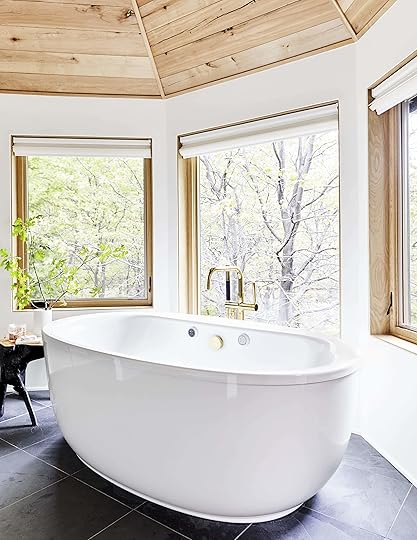
The Windows:
We made all the windows bigger and prettier (using the same Marvin white oak frames), and our architect had the smart idea to make the middle window oversized, even though it goes lower than the tub. We love how it looks. It’s a picture window, while the other two use a crank to open. We put motorized shades by Hunter Douglas from Decorview on them for privacy and they are so lovely.
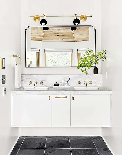
The Vanity:
The 60″ floating vanity gives it a custom and high-end look that I love (yet it was readymade from Kohler so it cost less than something custom would). I wanted to give it some architectural interest so I designed it with the Volaskas marble slab (sourced from Bedrosians Tile & Stone) extended from the countertop up into a backsplash with a 3-inch ledge that bumps out from the wall. At first, I was SUPER into the idea, then after it was done (but before all the materials went in) I was like “why did I do that?” but now that it’s totally done, I really like the subtle detail that looks more custom and adds depth. Plus yes, it does provide a place to put everyday product if I wanted.
We used the Purist wall-mount faucets from Kohler in vibrant polished brass from their Finish to Order program. They are extremely gorgeous, with the undermount sink making it feel really clean. Big fan of that “wall mount/undermount sink” combo in general and will continue to use if it works for a modern house.
Our plumber did, however, put the faucet plumbing too low, i.e. not centered vertically on the backsplash, and at this point, due to the fact that the sink plumbing and vanity were already installed, we couldn’t really move the vanity down (plus the holes were already drilled in the marble). My team caught this on a site visit and called me, so nervous that I was going to be bummed because I think we realized it was somehow our fault with our dimensions, but it’s SO not a big deal. Would I rather them be 2″ higher? Sure, but that might splash more anyway. They were worried that Brian wouldn’t have the space to put his head under the faucet, which I think is quite possibly the sweetest (and totally weirdest) concern from a designer.
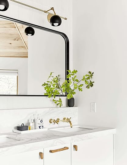
The sconce by Katy Skelton is FANTASTIC, and while the brass doesn’t match the faucets (which we had ordered months prior) we don’t totally care, but yes ideally they would. The mirror was custom made by a local fabricator, which I believe cost around $800, but we wanted a very specific size and shape that was proving difficult to find.
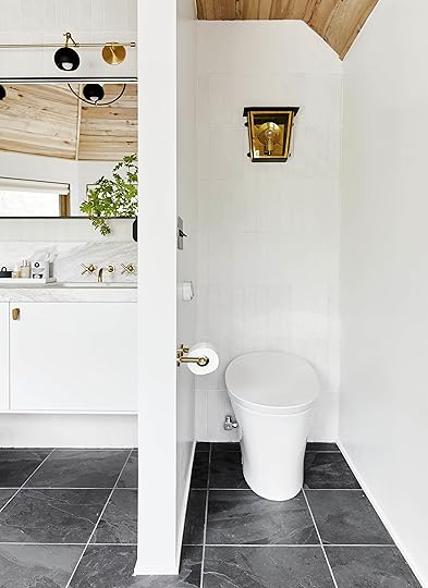
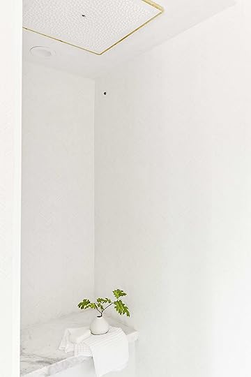
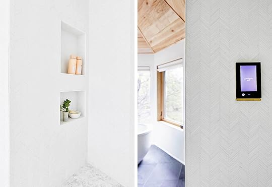
The Tile:
The toilet room was kept really simple with the same tile as on the backsplash of the vanity, which is SO simple and pretty (from Clé—it’s their new terra-cotta line). We stacked it vertically, after much debate. Remember this “to stack or stagger” post?
HOT TIP: it’s more modern to have the smallest grout line as possible so we asked for the spacing of the tile to be the closest possible. Tile installers don’t generally love doing this because they have to be more accurate and can’t use the spacers they typically like, but I think it looks less busy which is prettier.
The Toilet:
I partnered with Kohler on this bathroom, with the intent that it would be a smart bathroom and this toilet is one of the most fun parts. I wrote all about the product here in our intro post, but trust me it’s fun. A fancy toilet is certainly a luxury and not necessary, but when you walk up, it opens, it’s warm and it flushes without you doing anything. So if that is a luxury that you are into and works with your budget then know that I love this one.
I’m also a huge fan of that Urban Electric Co. lantern sconce—pulling the black and gold throughout but giving it a slight cabin feel.
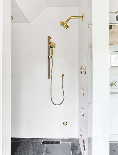
There is the other side of the room which shows you more of how it’s laid out (and where our shower is). The black DTV+ digital interface panel (which controls the shower temperature and features like the steam, rain bath, and tile body sprays) sits above the Forbes & Lomax light switches, which is above the nVent Nuheat radiant heating underneath. I wish those remotes stacked for sure, but it’s not a huge deal.
When people see the shower, they freak out, and it is awesome, but there is where I would have done some things differently (not necessarily stylistically but functionally).
Shower Lessons:
I didn’t know the CA water regulations when I ordered those beautiful body sprays. You can’t turn on more than two legally due to water restrictions, and you can’t have any fixtures (overhead, real rain, steam OR body spray) on at the same time. They are so pretty and if you could have all six on at the same time, you’d get a pretty incredible hydro-massage, but definitely check your state regulations before you order them. Just having one on does not keep you warm enough.
Stylistically there was no need to switch up the tile here, and I could have done the same as the vanity backsplash and toilet room. Again, I LOVE this tile—it’s from Artistic Tile and is a herringbone Carerra marble that has so much movement and reflects the light in such a beautiful quiet way, but it was incredibly labor-intensive (i.e. expensive) to install in THIS bathroom due to all the angles of the ceiling and the nooks and all the plumbing fixtures. My contractor thinks it took about a month to install because of all the cuts of the tiny tiny mosaic tiles. It such a beautiful tile for a backsplash or a contained area without a ton of angles, but as you can see the ceiling angles a lot, which just cost way more in labor.
We didn’t put in a curb because, well, it looks more clean and modern to forego it, but yes it can leak out, which isn’t a big deal, but just something to link about.
The Good News:
I can sit in there for hours and hours. I love the steam feature (except I have lash extensions so I SHOULD wear goggles which feels, well, totally odd) and the square overhead panel—Kohler’s “Real Rain” feature—really does feel like soft warm rain. I sit in the back, on that slab bench, like a sauna, and put on the steam and the real rain overhead and it feels like I’m in my own spa. I’m looking forward to winter for this exact reason.
And yes, you can control everything on the inside of the shower as well, don’t worry.
It’s truly, truly, truly the best bathroom I’ve ever been in, quite possibly because it’s mine and it was designed with so much love, with so many pretty materials that I love individually and together it feels like a simple, bright, clean and fresh home spa.
Any questions??? I need to get a proper bathmat (I think a dark gray as it is more seamless with the floor, and don’t worry I have since bought a reclaimed tub-tray from Ross Alan for me to rest my wine, I mean soup, on as well as my copy of House Beautiful, of course.
Here are all my lovely resources and partners we used to pull this together.
Finishes, Windows & Doors:
Pure White by Sherwin-Williams | White Oak Contemporary Windows by Marvin | Beechwood Tongue and Groove Ceiling Cladding by Ross Alan Reclaimed Lumber | Reclaimed Beechwood Door by Ross Alan Reclaimed Lumber | Vanity Backsplash Tile by Clé Tile | Shower Herringbone Tile by Artistic Tile | Volakas Marble Slab Countertops from Bedrosians Tile & Stone
Lighting:
Vanity Sconce by Katy Skelton | Water Closet Sconce by The Urban Electric Co. | Chandelier by Allied Maker
Bath Fixtures by Kohler:
Wall-Mount Faucet | Sink | Freestanding Tub | Floor Mount Bath Filler | DTV+ Digital Interface | DTV+ Steam Adapter Kit | DTV+ Eco System Controller Module | Shower SoundTile | Real Rain Overhead Panel | Real Rain Trim | Showerhead | WaterTile Round Bodyspray | Handshower | Toilet Paper Holder | Robe Hook | 24″ Towel Bar | Towel Ring | Toilet
Hardware:
Door Hardware by Rejuvenation | Cabinet Knobs by Waredesignworks | Drawer Pulls by Waredesignworks | Antique Bronze Light Switches by Forbes & Lomax | Slate Flooring by Clé Tile | nVent NUHEAT radiant heating
Furniture & Decor:
Mirror | 60″ Vanity by Kohler | Vanity Roll-Out Storage by Kohler | Vanity Makeup Storage by Kohler | Window Treatments by Hunter Douglas through Decorview | Leaning Ladder by Katy Skelton | Sheepskin Rug by Article | Vintage Black Wood Side Table (not available) | Art by Addie Juell | Towels from Target | Robe by Parachute | Marble Vanity Tray by CB2 | Black Ceramic Lidded Jar by Ferm Living
Thanks again to my design team Julie Rose and Velinda Hellen for all your lovely help and talent, and to Emily Bowser who helped pull together the styling for the shoot.
***Photos by Sara Ligorria-Tramp
Check out the rest of The Mountain House reveals here: The Kitchen | The Kitchen Organization | The Kitchen Appliances | The Powder Bath | The Living Room | The Downstairs Guest Suite | The Loft | The Kids’ Room | The Upstairs Guest Bath | The Dining Room | The Family Room | The Master Bedroom
The post The Final Mountain House Reveal (for Now): All the Details of My Master Bathroom appeared first on Emily Henderson.
September 3, 2019
Mountain House Reveal: Our Calm Scandinavian Master Bedroom
Here we are in the master bedroom, quite literally my favorite place to wake up in. This house didn’t really have a master bedroom. There were four different common areas, this being one of them, but only three bedrooms, so we turned this former family room into the suite. So today, you’ll see the reveal of it as well as hear how we live in it and what has changed since the shoot 2 months ago.
Let’s revisit this space’s original glory with the text of what we THOUGHT we were going to do:
As you can see, there was a stairway up from the downstairs family room and you guys gave me the genius idea to simply get rid of it. We don’t need it and haven’t ever missed it. Getting rid of the stairs made this room so much more usable, not to mention bigger.
I BARELY remember this space and can’t believe what we turned it into. We changed everything: all new windows, flooring, and the most important thing we did was pop through the ceiling to vault it and then obviously clad it.
This room (along with the family room beneath it) are the two that changed THE MOST. It’s basically unrecognizable.
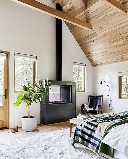
First things first: the wood ceiling/floor. Vaulting the ceiling made the room feel HUGE and by putting in four Velux skylights, it’s flooded with light (they have blackout shades on remotes, don’t worry). We got the wood from Ross Alan Reclaimed Lumber and Ross and his team did the most BEAUTIFUL job cladding the ceiling and trimming it out.
We used the same fireplace from Montigo that we did in the because we loved the indoor/outdoor nature of it, but this time had our GC figure out a custom steel cladding to fit into my Scandi cabin dreams. We LOVE the look of it, and in the winter we used it a decent amount, mostly during the day while I was hanging out in there.
There are a couple of caveats to it, though. The blower is pretty loud outside if you have it up high, so we have it low which doesn’t create THAT much heat if it’s freezing outside. I guess I thought I’d be able to sit with a cup of hot tea in the evening in the snow, but in order to feel that kind of heat, you have to turn the blower up so loud that you can’t really talk.
Oh and the flue is faux and just for looks; you don’t really need it but we loved the drama of it.
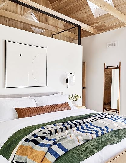
You are likely wondering what is behind that headboard wall—it’s the walk-in closet (which just got installed last week so we are shooting it soon). Why did we do this? Because we needed a closet and didn’t want to carve out a big one that would break up the squareness of the room. We could have taken the wall to the ceiling like normal people but it would have made the room feel smaller and we were used to seeing the expanse of the ceiling all the way back.
So Velinda designed this black steel and glass enclosure that made it look intentional and architecturally spectacular (just having it be empty up top could have looked unfinished). I almost scrapped the whole thing because of budget but ultimately decided for a variety of reasons that it was worth ponying up the $15k to build and install the panel and door (more to come). We worked with Bananas and Hammocks on it (they were GREAT if you are in the market for custom steel/glass doors). If you look into the closet (through the mirror reflection), you can see it unfinished with just a dresser…again, we’ll reveal that soon!
That chair was a gift from the by the local Oregonian maker, Justin Nelson of Fernweh Woodworking.
He said that after we featured it in Portland, his business bumped up and the press flocked. I love nothing more than hearing that we are helping the businesses of small makers. It’s quite possibly the most beautiful chair in the world and I accepted it with absolute honor.
We paired it with a Target table and that awesome Katy Skelton sconce. My apologies that we wrapped up the cord for another shot but you get to see that unedited blip.
September 1, 2019
The Link Up: EHD’s Favorite Table Lamp, Arlyn’s Chickpea “Cookie Dough” Recipe, Julie’s Perfect Travel Skort
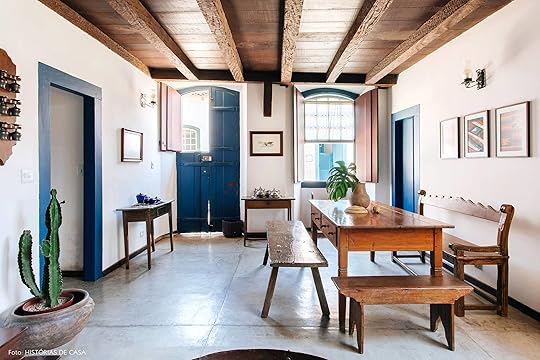 photo by Luiza Florenzano | via historias de casa
First things first…HAPPY BIRTHDAY, Emily Henderson. Yes, it’s our fearless leader’s big day and we hope it’s perfect. We will have to save the singing, hugs and inevitable treats until we are all reunited on Tuesday. But since today is also a Sunday (of a holiday weekend, no less), we have a GREAT Link Up for you this week so let’s get to it.
New international design site alert! Historias de Casa is full of beautiful Brazilian design…like the photo above.
Emily has a deep love for Vince platform slip-on sneakers and these new woven natural/black kicks that she wore to the mountain house reader event are her new favorite. The style ups the “cool” factor to seriously any outfit and they are super comfy and on-the-go friendly.
Sara’s homemade old fashioned daiquiris are her go-to summer (and almost fall) drink this year, and it’s not the frozen monstrosity that most people are used to (we’re talking just good rum, homemade simple syrup, and fresh lime juice on the rocks). She uses this recipe.
The orange eye shadow or more fondly named the “Aperol Spritz” eyeshadow trend is here and honestly, looks good on almost every skin tone. Jess was here for it and found this super affordable jewel-tone eye palette from Sephora. “I’m mostly obsessed with lighter tangerine color. It makes my green eyes pop and makes me feel very cool without looking like I’m trying too hard.
Ryann, a chronic snacker, found out that cauliflower pretzels are so tasty and she will likely never be the same. They are her ideal office snack and are great to eat alone or dipped in hummus.
Caitlin’s new favorite Instagram is House Hunters Screens, which is EXACTLY what you think it is. These screencaps run the gamut from silly (“Nobody wants to watch themselves that closely”) to a little existential (“You know, you can have fun if you want to.”) “This appeals to the part of me that like, loves watching Nathan for You while scrolling through memes—it’s the best.”
For anyone who lives for eating raw cookie dough but realizes they’re an adult trying to be remotely healthy, Arlyn has a chickpea-based recipe for you: “I know this sounds weird, but I promise it’s ridiculously delicious and just as good as Nestle. Stash it in the fridge before eating for ultimate deliciousness.”
Velinda and Bowser used this lamp from CB2 in two recent designs recently (Sixpenny and Velux), so obviously we’re fans…as are some of you asking about it. So, here, you’re welcome.
Chandler recently got the Beis makeup bag and she loves it. It’s big enough to hold all of her makeup plus moisturizers face washes etc. Also, it has a spot for your brushes so that they don’t get dirty as well as a mirror for when you’re doing your makeup on the go. She loves that it’s just a very practical design and also nice quality.
This is the perfect summer/fall skirt because it feels like you’re not wearing anything but it is so chic and has shorts! Julie just bought it for her European excursion and plans to wear it 17/18 days of the trip.
For those days Carolina wants to have a “no-makeup look,” she always goes for her NARS Liquid Blush in Orgasm. It’s super buildable without getting too heavy, and gives a natural-looking, second-skin finish.
This illustration artist is MEGA talented! Veronica says she personally has the drawing skills of a kindergartener— “tbh, most 4-year olds could probably show me up,”—so she is uber jealous of this lady’s beautiful talent. Her colors and detail are incredible, making her images jump off the page.
Mallory has been having an internal struggle trying to decide how she feels about all these trendy hair accessories coming in HOT this fall. She’s already on the scrunchie train (these are the softest of them all, Chandler can attest), but is now considering this hair clip situation. Thoughts?
Short-ish and very sweet. Have a wonderful holiday weekend and see you Tuesday for the reveal of the mountain house master bedroom (if you aren’t caught up, check out everything we’ve revealed so far ). xx
The post The Link Up: EHD’s Favorite Table Lamp, Arlyn’s Chickpea “Cookie Dough” Recipe, Julie’s Perfect Travel Skort appeared first on Emily Henderson.
Brian Henderson Interrupts Our Regularly Scheduled Post…

Hi there. You probably came to the blog today for a nice relaxing Labor Day post about “style,” or “design,” or “pillows,” or something (editor’s note from Arlyn: actually, we do The Link Up on Sundays…that’s still on the schedule, just for a little later this morning). Well, I’m sorry to say that I have officially hijacked Emily’s site today and am holding you all hostage to read the longest birthday card anyone has ever written. I hope you don’t mind.
Emily turns 40 years old today. That’s a big one. A lot of people wouldn’t like their age posted on social media, let alone a website for millions to see, but we all know that Emily is much too cool to care about stuff that. That’s a big part of why I love her. I think when someone is as open and transparent as Emily is on this blog, it inspires us to try to be more honest in our own lives. So that’s what I’m going to try to do here, for better or worse. I wasn’t quite sure if I should write this directly to Emily, like: “Hey, Emily, you thought your post about pillows was going up today, but here’s what I think about you…” But I know she doesn’t like being put on the spot, so I’m gonna talk about her like she’s not here. I was also thinking I’d do my own version of a “Round Up” post since people like those, but like an “Emily Round Up” about things I love about her, but it sounded too cutesy and to be honest kind of exhausting, I don’t know how she and her staff do it. Instead, I’m just going to take a lesson from Em and try to write as openly and honestly as I can about my beautiful birthday girl. Oh, and warning—I’m going to straight up brag about her here, sorry Em, you’re gonna have to deal with it. Okay, here goes:
As of today, I’ve been in love with Emily Henderson for pretty much half of her life (half of mine, too—I turned 40 last year), which is a rare thing I think. We met when were barely 21, up in the patchouli-soaked rain of Eugene, Oregon. Our mutual friend Ryan got hit by both sides from us asking “Who is that?” when we spotted each other at a cast party for a play I was in. He introduced us, and had to scramble to get out of our way. It was like we had waited our whole young lives to meet each other and had a lot of catching up to do. We shut the party down, stayed there all night into the dawn, and didn’t stop talking the whole time. Everything seemed to be moving in stop motion around us and we were too busy devouring each other’s discourse to notice that the sun had come up. And we didn’t even kiss! Barely even touched! As I dropped her off the next morning in my ‘93 Civic, I whispered to myself, “…sh*t.” Not because I didn’t attempt to kiss her that night, or because iPhones hadn’t been invented yet to get her number, but because I knew I was totally, and royally screwed.


See, I had spent the previous year and a half working to get out of the friend-zone with a girl I had a huge crush on, and a week or so before that fateful party, I had finally bridged the unbridgeable gap and started dating said other girl. Let me repeat, A YEAR AND A HALF. But it was all moot because I knew that I had fallen instantly and irreversibly in love with Emily that night. I knew it. More than that, I knew I was meant to be with her, like in a way that I have trouble putting into words. I have never in my life felt such a pure certainty of connection with another person and never have since, except for when my kids were born. It was cosmic, if you believe in that. Or predetermined, if you believe in that. Or divine, or primordial, or historic. I’m a skeptic through and through, but I still marvel at the feeling I had the night I met Emily.
“…sh*t.”

I’ll save you the details, or you can go read Emily’s version, which is much funnier and better written, but suffice it to say within a couple weeks, Emily and I were together. And we’ve been together since. Well, except for that time I got all actor-y and dramatic and broke up with her because I wanted to be “free,” or that other time I got all actor-y and dramatic and we broke up to explore our youth in New York. But each time I came crawling back. One time, I came running back. Literally. I’m embarrassed to say it, but I once ran with scissors around her house until she took me back. I told you: actor-y and dramatic. But aside from those minor breaks, I think I can safely say that I’m the leading expert on the adult life of Emily Henderson, and that’s a pretty sweet field to be an expert in.
So, as the expert, here are a few things I’d like to share about Emily on her 40th birthday.

She’s been this way since I’ve known her.
For a lot of people, to say that they haven’t changed as they’ve grown up could be seen as a negative thing. It implies that they haven’t learned or matured in a way. Not Emily. That girl has not only been more mature than me our whole lives, but she has had the same un-extinguishable brightness in her since day one. It’s like the Olympic torch. In the almost 20 years that I’ve known Emily, she’s been the same optimistic, fun-loving, thoughtful, caring person that she is today. All those posts that make you feel hopeful or optimistic? She’s been talking like that since she was wearing cowboy pants and cheesy vintage tees. Not that she doesn’t have lows, we all do, but I’m in constant shock at her ability to pivot to positivity, no matter how much pressure she’s under or how many people are depending on her. And it’s not fake, or put on, or done for a selfish self-help kind of thing. It’s genuine and it changes the energy of every room she’s in. She’s been called a “cosmic bunny” by spiritual guides and a “dolphin” by her staff, both of which have tons of bright energy and are always playful and positive (editor’s note: we went with dolphin also because they’re crazy smart, Brian!!). I think that’s apt. I’m not sure what my spirit animal is, or if I have one, but I’m so grateful to have that this dolphin-bunny in my life to pull me out of my dark moods, or to remind me how lucky I am in life. Which brings me to my second share:

She saved my life.
I know, it’s a big statement, but it’s true, she did. She didn’t physically pull me off a cliff with her bulging biceps or anything, but she kinda did metaphorically. A few years after we moved to LA, I got very depressed. I wasn’t working, I wasn’t being creative, I wasn’t contributing, I felt stuck. More than stuck, I felt like the world owed me something and that it had reneged on a deal it wasn’t aware of. In New York, I had been riding high—great MFA program, great acting jobs, Broadway! But in LA, the big fish wasn’t so big and when things didn’t work out, I went dark. I was hard to be around; bitter, closed off, petty, and, worst of all, jealous. That’s what broke me. I was jealous of everyone else’s success, from my friends to strangers, and I hate to write this, but I was jealous of Emily.
Our professional tracts had taken polar opposite arcs in LA. Where mine was in a downward spiral, she had won Design Star, shot her own show, and was on a meteoric rise in her field. I should have been thrilled! I mean, what kind of a spouse isn’t over the moon for their partner in that scenario??? Ugh, I hate even thinking about that time in my life, the thick shadowy muck that kept me from being there for my wife. And even more gut-wrenching is to think of all the missed opportunities I had back then to say “Congratulations!” or “I’m so proud of you!” Instead, I would find little ways to be petty and pessimistic. I was the worst. I knew it, and Emily knew it.

So one day she pretty much threw it down. She told me that I wasn’t the man that she had married and that I had to make a change. She didn’t put it as an ultimatum, but I felt like I was about to lose my marriage, which shook me. And she didn’t mean it in a holier-than-thou way, she just wanted so badly for me to be happy. Because she knew that that was the only way we could be happy together. So, she suggested I see a therapist, which was such a foreign idea for me that I think I might have laughed at first. But it wasn’t a joke. And long story short (I may write a therapy post here soon) I saw someone who helped pull me out of the dark and showed me how to re-engage with my life in a better way, but more importantly re-engage with Emily in the way that she deserved. The therapy she suggested changed everything. I’m still working on it, and I still screw up by not appreciating her enough, but having Emily shake me out of my dark time reshaped me forever. I’m so, so grateful to Emily for that.
Whew, sorry to bring it down on a birthday post, so let’s get to something lighter:

Her roots are starting to show.
As many of you know, Emily was raised Mormon, in a small coastal town with open forest to roam in and family activities to come home to. A large family of 8, who would craft all day, cook family meals, and would even can their own tuna! I’ve never actually gotten the details of that, and now that I’m writing it, it sounds crazy. How does a family can tuna? Did they catch it themselves? They didn’t own a boat or a tuna farm as far as I know. Where did all the tuna come from?!? I’ll have to ask at the next Starke family dinner.
Anyway, in her 20s and 30s, I don’t think Emily could have told you what a spatula did. Which is totally fine! We lived in New York and ate out every meal, then in LA, we still ate out every meal. And I certainly didn’t care nor expected her to cook or be “domestic” in any way. Not my thing. Not her thing. Which is why the shift in the last year has been so fun to watch. It’s like the Mormon frontier woman got activated in her and started taking over her body. I’ve watched her go from almost slicing off her thumb every time she chopped veggies, to expertly concocting a delicious soup from scratch! With homemade bone broth! Like, she dissects a whole chicken and makes broth from its bones! Or she roasts a chicken with a bunch of delicious other stuff and we all sit down as a family for Sunday supper like we’re on the prairie! Who is this woman??
Don’t get me wrong, it’s amazing, but I keep expecting to come home to a 6-foot tuna on our counter, a house full of jars, and Emily with a hatchet and a grin. She still almost cuts her thumb off while chopping, but it’s amazing how she can still find new things to become obsessed with. Oh, and did I mention she also fancies herself a vegetable farmer now, as well? Despite the fact that the only viable veggies to come out of our raised bed so far have been micro-carrots that resembled micro-something-elses, she will be the first to tell you that gardening is one of the more important things to her right now. Between that, the renewed interest in drying flowers, church, and nature hikes up in the mountains, I feel like the next chapter of Emily’s life may include a lot of prairie dresses and braids. And I’m not mad at that. Because:
She’s super hot.
Y’all, my wife does an excellent job at trying to hide it, or be super self-deprecating about it, but I am the luckiest husband on Earth, and I finally have a big ol’ megaphone to brag about it. She’s a straight up hottty! And no, you grammar freaks, that’s not a typo, I put an extra “t” on purpose! Screw it, I’ll put in four just to make the grammar police upset: She’s a hotttty! Sorry, I know it’s not great to objectify a woman, even your wife, so let me skip to the next one:

No one moms harder.
My kids are OBSESSED with Emily. To watch her with them brings that cosmic thing into my stomach again. To know your spouse is the best parent in the world, that’s what true safety feels like. She is so patient, kind, and fun that I sometimes just watch my kids watching her. Their smiles crush me and they never smile more than when they’re with her. I dare you to try to come between Birdie and a hug with her mama, she’ll scratch your eyes out. And Em is a natural at it. It could be that she came from a big family with kids all around, or her parents taught her well, or maybe it’s those 29 parenting books that she’s read, but I think she’s just naturally talented as a mom.

It’s like she’s able to slow down time when one of our kids is having a tantrum, or screaming at us like a dictator when one single fleck of pepper gets into their scrambled eggs— “I. SAID. NO. PEPPER!!!!”—and she somehow knows how to talk to them the way you’re supposed to. She’s constantly thinking about how we parent, not just how to get through the day. It’s super inspiring and makes me up my game on that front as well. Not that we don’t both have our breaking points or bad moments, we do. I’ve seen her get real scary. But after the kids are down and we’re having that post-bad-moment glass of wine, we talk about parenting and she is so thoughtful in trying to figure out what we can do better. I often wonder, how is there enough space up there in that brain of hers? She spends all day and late nights working on this blog, thinking of design, and style, and her business, and she has the space to be a good mom? I have a fraction of her workload, and I still have the urge to check out sometimes. I think she’s just one of those people who can appreciate things in real time and there’s nothing she appreciates more than our family, and we are ridiculously lucky to have that.
I warned you I was going to brag about her. Sorry. But here’s my last one, and kind of the thesis of this whole thing:

My wife is the most extraordinary person I’ve ever met.
That one is not me being actor-y dramatic, it’s not hyperbole, it’s the honest truth. As honest as I know how to be. I truly have never encountered anyone else who has as much capacity for life as Emily Henderson. Through this blog, you guys get a glimpse of who she is, a pretty large glimpse actually, because she’s so transparent about her life and work on here. And maybe the thought has crossed your mind a few times that it’s BS. Fake Instagram smiles. That no one could possibly do all that she does and still find time, like actual meaningful time to be with her family. No one is that positive. No one is that generous. But the thing is, she kind of is. And those smiles? They’re the most genuine smiles on Earth, because as her family, we know what it’s like to have her around.
She is never down. Or as close to never as I’ve ever seen a human being get. I mean of course she gets down, she’s not a robot, and she’s also not like overly positive, like those people you want to slap and say, “Come on. Really?” But she always tries her hardest to focus on the positive, and that inspires us to do the same. She cherishes her time with her family, even though she should be falling into bed or demanding some quiet time after work. She busts her ass all day running an empire, no joke, she’s someone who never wanted to be an entrepreneur or a boss or business owner, and she is managing 12 employees and a global company. Last month, I got to see her with dozens of fans up at the mountain house, not just engaging with everyone and answering questions, but leading a full-on style diagnostic and teaching people about design. And she never trained for any of this!
She didn’t go to business school or design school, she learned on her feet, working, fighting her way up through the styling world for years. She was just a girl who started a blog called The Brass Petal because she loved design, and now she’s the one everyone looks up to. It’s amazing. She scrambles and struggles and frets over her work, constantly feeling out of her comfort zone, but never giving up, and when five o’clock hits, she somehow changes all those gears and is the most engaged wife and mom you’ve ever seen. She wants to know how our days were, she snuggles and dances and draws and sings goofy songs and then bathes and reads and puts down, and then talks and laughs and smiles and loves. It’s easy to forget that she woke up at 6am to write next week’s post and was a super engaged boss for 12 employees all day. I honestly don’t know how she does it. And I don’t acknowledge it enough. I’m not hardwired to verbalize my inner life and sometimes I assume that what I’m feeling is being understood, or just a “given,” and the moment slips by. I need to be better at that. Which is part of the reason I’m putting it down here today. Just so she hears it:
Emily, I’m not talking directly to you. I am so unbelievably proud of you, and am so grateful for everything that you do for me and our family. I don’t know what force intervened and brought you to see me do a shirtless, feminist version of Hamlet in that professor’s backyard almost 20 years ago, but I am so thankful that you didn’t walk out at intermission. You work so hard, and love so tirelessly, you inspire everyone around you, you blow my mind. Happy 40th birthday my love. No one deserves it more than you. I love you.
p.s. You may want to go look in the kids’ attic, up the ladder…
The post Brian Henderson Interrupts Our Regularly Scheduled Post… appeared first on Emily Henderson.
August 31, 2019
On Turning 40…


I turn 40 tomorrow, so to celebrate, I spent about 26 hours writing a post that was titled “The 40 Things You Don’t Know About Me,” mostly because I love a good self-reflection marathon and treat self-indulgence like a sport. I thought it would be “fun” and “easy” but it was probably the most daunting, and then eye-opening thing I’ve written in a long while, where I realized some real patterns that I hadn’t seen before, and could trace where they came from. It was like watching the Emily Henderson bio-pic as an outsider and as the 40 years went by, I found it, well, first, rather entertaining, with plot twists that I can now see were unexpected, at the same time I can now see how it all makes sense. Your patterns don’t just come from nowhere; your triggers aren’t random. Your childhood and teenage years really affect who you are in a way that is kinda terrifying as a parent myself to confront.
I’m not ready to publish it in its current form. I think it’s more of a series of essays—it was already 22 pages which no one wants to read. Also, not having the gene for embarrassment and rarely shame makes it hard for me to remember that there are many others in my life who value their privacy. BORING.
I will say this: I knew this would happen, you hear about it all the time, but turning 40 does mean giving less f*cks. It means that I make more choices for me and my family. There is so much more ownership of your experiences and you start being like “thank god that terrible thing happened, because I am now ______ because of it.” I feel the need to prove nothing to anybody and I have become so clear with my limitations, boundaries and expectations from everyone. Almost in a cold way which I would like to improve on.
Going forward, I want to focus on my relationships with those in my life who I’m so strongly connected to, on putting even more inspiration and positivity into the world, on working on all my vulnerabilities and exposing them even more. I’ve hustled so hard, all through my 20s and 30s, I’m honestly exhausted, so guess what? IT’S TIME TO ENJOY IT.
There might be some big moves this year, some pivots and shifts that will be shocking but not necessarily surprising. It’s all REALLY GOOD STUFF, I promise.
I’ve got to go. I’m up at the with my family and some friends, playing a mean game of Uno with a 3 and 5 year old, sipping a glass of champagne.
Have a lovely weekend. xx
The post On Turning 40… appeared first on Emily Henderson.
August 30, 2019
Roundup: All The Best Labor Day Sales for Home and Fashion
 photo by sara ligorria-tramp | from: Our Soft Yet Secretly Sultry Downstairs Guest Bed + Bath
Welcome back to another sales post. Most of you are probably familiar with this trend by now, but if you are just joining us, basically it goes like this: American holidays = retail sales, so here at EHD we scour the internet (and our emails) for the best ones and then share that info with all of you lovely people. Of course, we implore you to celebrate the fruits of your labor by doing whatever it is you want to do. If it’s simply enjoying an extra day off, we are here for it. If it involves just peeking at the sales (because, you don’t want to lose money on this stuff) consider me your travel guide through the internet sale zeitgeist. This is a great time to refresh your room with that bedding you have been eyeing, or finally getting that perfect side table your living room desperately needs. Oh, and we snuck in some fashion sales, too, because a new outfit can certainly be considered self-care (and yes, you deserve it). Let’s get to it:
Home:
Allswell
Dates: Through Sept 8
Deal: 15% off mattresses and bedding
Code: LD15
Our Picks: The Supreme | Year Round Down Alt Duvet Insert
Annie Selke
Dates: Through Sept 3
Deal: Save up to 50% off select bedding, rugs, pillows and throws
Plus, save an extra 20% off already reduced prices at Annie Selke Outlet
Code: None
Our Picks: Seychelles Indigo Quilt | Masinissa Hand Knotted Rug
Apt2B
Dates: Through Sept 3
Deal: 15% OFF Sitewide
20% OFF $1999 or more with code 5MORE
25% OFF $3499 or more with code 10MORE
30% OFF $4999 or more with code 15MORE
Plus up to 50% off the Outlet
FREE DELIVERY
Code: None
Our Picks: San Pedro Coffee Table | Pasadena Bookshelf
Article
Dates: Through Sept 9
Deal: Up to 35% off select items
Code: None
Our Picks: Seno Media Unit | Cirrus Sofa
Brooklinen
Dates: Through Sept 3
Deal: 10% off orders under $200 and 15% off orders over $200
Code: None
Our Picks: Linen Duvet Cover | Linen Pillowcases
The Container Store
Dates: Through Sept 13*
Deal: From 8/5 – 9/8 up to 25% off office essentials
From 8/19 – 10/13, up to 25% off their custom closet portfolio:
25% off Elfa Classic and Elfa Décor + Elfa Installation
20% off Avera
10% off Laren
All other shelving 25% off
Code: None
Our Picks: White Multi-Purpose 3-Tier Shelf | 2-Tier Bamboo Stackable Shoe Shelf
Coral & Tusk
Dates: Through Sept 2
Deal: 25% off site-wide including pillows and table linens, stationery, fabric and sale items
Code: LONGWEEKEND25
Our Picks: Navy Quill Lumbar | Tumbleweed Natural Pillow
Framebridge
Dates: Through Sept 2
Deal: 15% all orders over $50.00
Code: LABORDAY
Our Picks: Mercer Slim | Irvine Slim
 photo by sara ligorria-tramp | from: Makeover Takeover: Jess’ Long Awaited Living Room Reveal
Home Depot
Dates: Through Sept 2
Deal: 20% off select bedding and bath
25% off kitchenware
35% off small kitchen appliances
40% off select furniture and home decor
Code: None
Our Picks: OXO Good Grips 10-Pc Everyday Kitchen Tool Set | Stella Brass Finish Bar Cart With Leather-Wrapped Handles
Interior Define
Dates: Through Sept 23
Deal: 15% off everything in-store and online
Code: None
Our Picks: Ms. Chesterfield Sofa | Sloan Sofa
Jayson Home
Dates: Through Sept 2
Deal: Take an additional 20% off all Closeout items
Code: EXTRA20
Our Picks: Slip Chair | Sarma Pouf
Lamps Plus
Dates: Through Sept 2
Deal: 1/2 price days and sales up to 50% off all categories of lighting and most accessories categories
Code: None
Our Picks: Epilogue White LED Ceiling Fan | Wide Brass 6-Light Sputnik Pendant
Lulu & Georgia
Dates: Through Sept 3
Deal: 15% off $400+, with code TAKE15
20% off $800+, with code TAKE20
25% off $1200+, with code TAKE25
Code: TAKE15, TAKE20, TAKE25
Our Picks: Moroccan Flatweave Lumbar | Leila Moroccan Shag Rug
Minna
Dates: Through Sept 2
Deal: 20% off site-wide
Code: No code
Our Picks: Shadow Pillow Cream | Speckled Prong Fruit Bowl
Modsy
Dates: Through Sept 2
Deal: 25% off all design packages
10% off select rugs available through Modsy
Code: LABORDAY25
Overstock
Dates: Through Sept 2nd
Deal: extra 20% off select items
Code: None
Our Picks: Safavieh Rug | Oxford Leather Tan Sofa
Pier 1
Dates: Through Sept 2
Deal: Extra 25% off entire purchase
students save an additional 15% purchase with valid student ID
Code: None
Our Picks: Rattan Headboard | Magnolia Home Trinity Multi Rug
Serena & Lily
Dates: Through Sept 2
Deal: Up to 30% off rugs
Code: None
Our Picks: Seaview Rug | Selby Hand-Knotted Rug
Target
Dates: Through Sept 2
Deal: Up to 25% off home
30% off select indoor rugs
30% off fan shop
Up to 25% off patio sale and clearance
Up to 20% off Chicco gear
Up to 40% off clearance
Code: None
Our Picks: Buckland Live Edge Coffee Table | Abstract Loomed Area Rug
Tempaper
Dates: Through Sept 3
Deal: 10% off Chinoiserie, Fresh Pressed, and Zoe Bios collections as well as the Last Call section with code
Code: LABORDAY10
West Elm
Dates: Through Sept 2
Deal: Up to 40% off sofas, sectionals, chairs and more
Up to 30% off bedding, rugs, and more
Up to 40% off coffee and side tables
70% off warehouse sale
Up to 50% off outdoor furniture
Code: None
Our Picks: Anton Solid Wood Coffee Table | Hamilton Leather Sofa
Fashion:
 photo by veronica crawford | from: 5 Fun & Unexpected Summer Office Outfits
Express
Dates: Through Sept 2
Deal: 50% off summer essentials
Code: None
Our Picks: One Eleven Slub V-Neck Tee | High Waisted Striped Sash Tie Pull-On Ankle Pant
Madewell
Dates: Through Sept 2
Deal: Summer sendoff: up to 75% off sale styles with code
Code: SEEYA
Our Picks: Denim Wrap Dress | Floral Embroidered Denim Ruffle Top
Modcloth
Dates: Through Sept 2
Deal: 30% off dresses & jumpsuits
Code: None
Our Picks: Quite Clearly Charismatic Midi Dress | Chance Encounter Faux-Wrap Dress
Urban Outfitters
Dates: Through Sept 2
Deal: 25% off back to school bags w/ code BAGS25
25% off books with code BOOKS25
Code: BAGS25, BOOKS25
Our Picks: Matt & Nat Vignelli Backpack | My Small Space: Starting Out in Style By Anna Ottum
Well, folks, if you made it this far we hope you scored some great deals, so make sure to pop in the comments and tell us what you found. And with that, happy labor day weekend and happy shopping! xx
The post Roundup: All The Best Labor Day Sales for Home and Fashion appeared first on Emily Henderson.
August 29, 2019
A Countdown Of Our Top Pinned Images From the Year…So Far (Did Your Favorite Make the List?)

 photo by sara ligorria-tramp
If last year was the year of the bathroom, this year is the year of the kitchen. And I am not just saying this because the Mountain House kitchen was a real hot commodity this year (put it this way: the kitchen would have been #2 #4, #5 and #6 in this roundup) but because a number of other kitchens are up there in this list, too. This isn’t huge news to us, since you guys have been validating this fact via comments and blog traffic, but it is always fun to see the data match up. And you know what else? Trend posts yield a LOT of re-pins from our site. This actually makes perfect sense to me despite the general aversion to the word “trend.” I understand why those posts do so well because seeing designers do new things and experiment with what’s “in” or (more likely) “what’s coming back” at the moment is exciting to look at, because it is different. We don’t all run out and redesign our homes based on them, but they are visually interesting so to the Pinterest inspiration boards they go.
Seeing what our most pinned images are is of course very important research, but also, a reason to revisit beautiful photos that were inspiring enough to be scroll stoppers is always a yes in our book. So without further ado, let the countdown begin…
Coming in at #10: This shot from Velinda’s Tiny Kitchen Makeover Takeover (With Tons of Smart Storage Hacks)
photo by sara ligorria-trampWe are off to a good start with Velinda’s 49-square-foot kitchen full of those always necessary and sought-after small space storage hacks. Sign us up. Not only is this space a sight for sore eyes, (the tile! the countertop! the shelves! the cabinets!) the post is really informative and transparent about what it costs to do a mid-level renovation, which I imagine was part of the desire to hit that “pin” button. Before moving on, if you haven’t seen the before of this kitchen (or need a refresher), I suggest you head here to see it. The transformation is pretty wild, and the wise musings by Velinda are always worth the read.
Coming in at #9: This bathroom from Why You Should Be Using Armoires In Every Room
 image source via elle decor | design by patrick printy
You all were very into this post, as was I (and the rest of EHD). It was when I realized my love for armoires and wardrobes was deep and only growing stronger by the minute. They instantly add visual interest to a room, and they are essentially giant, gorgeous junk drawers (or you know, linen cabinets for “tidy” people). So, this one is a no brainer in our book.
Coming in at #8: This dining and living room combo from A High Impact & Actually Doable Lighting Trend We’re Seeing Everywhere
 image source via architectural digest | design by jack ceglic and manuel fernandez-casteleiro
We pulled this photo of composer Jonathan Sheffer’s home to prove that pendants are in and possibly plotting world domination. According to our data, you guys loved this post and the inspiration photos from it. I mean, I can only imagine why. The pin-ability of this photo is unreal. I also have it pinned in my “Makeover Takeover” inspiration board, though “aspirational” board may be more accurate because there is a lot to aspire to here. But pairing that giant globe pendant with two micro pendants is something special and totally doable. Not to mention this room is making a solid case for the brown trend.
Coming in at #7: The gallery wall of our dreams from Makeover Takeover: Jess’ (Long Awaited) Small Space Living Room Reveal
 photo by sara ligorria-tramp
Okay, who wouldn’t want to stare at this wall 24/7? There are so many beautiful things to soak in, and every single thing here looks so good together. Hot tip: if you have a gallery wall conundrum, get yourself a Jess to help out (or just head to her living room MOTO for the tricks of the trade).
Coming in at #6: This moody kitchen from 9 Kitchen Trends We’re Betting Will Be Huge In 2019
 image source via remodelista | design by quatrefoil
Here comes another kitchen from a very early 2019 trend post we did (see what I mean? Y’all love trends and kitchens). This particular shot was used to suggest that dark countertops and cabinets are going to give us all a run for our money this year. A lot of you agreed at the time but the question is: What do you think now? Were we right? Have you weighed in here yet?
Coming in at #5: This magical patio from Mountain House Monday: The Exterior Update And Plan
 image and design via railica design
This one felt like a wild card amongst the rest of the list, but that is not to say it is undeserving. It is one of the inspiration photos for the Mountain House exterior and has the whimsical mountain getaway feel I think we all crave. I would gladly throw a summer soiree out here, thank you very much.
Coming in at #4: This minimalist dining room from A High Impact & Actually Doable Lighting Trend We’re Seeing Everywhere
 image source via behance | design by viktor korchinskyi
See? Pendants are taking over and we (and apparently you, too) are on board. But really, there is so much to ooh and ahh over here. Those chairs for one are enough to stop anyone’s thumb from scrolling but also, every time I look at this photo there is something new to love. It is definitely the eye candy we all deserve. (Side note: how are we feeling about “matching” dining sets? These probably aren’t a “set” as much as the wood tones just coordinate very well, but if done well…could it be a thing again?)
Coming in at #3: Every kids’ dream room from Mountain House: The Kids Room Reveal
 photo by sara ligorria-tramp
This room has the most DIYs of the mountain house, which could be part of its popularity among the Pinterest sphere but I will venture to guess it is also because this room is just plain cool. I desperately want this room for past me, aka 5-10 year old Ryann who would literally climb up and on top of everything like a monkey. Plus, this room screams adventure and fun while still being incredibly stylish.
Coming in at #2: The rustic-Scandi-minimalist kitchen from It’s Finally Here: The Mountain House Kitchen Reveal
 photo by sara ligorria-tramp
Ahh there she is. An EHD pride and joy. No matter what, I will always stop scrolling for the mountain house kitchen. It deserves all the love IMO, and it is so exciting to see our love for it reciprocated by all of you. And like I said, this kitchen would have been all over this list, so if you feel deprived from seeing all the shots that would have made the list, get your fix here.
And finally…
.
.
.
.
.
.
.
.
.
.
.
Coming in at #1: This mudroom inspiration from Why You Should Be Using Armoires In Every Room
 image source | design by suzanne kasler interiors
Another wild card!! I wouldn’t have guessed this one, but I am not mad about it. I mean, talk about a rustic, country dreamboat. Can you just imagine coming home from work to this? Or more likely, coming home from tending to your luscious vegetable garden? So. Rustic. Chic.
Alright friends, that is all I have for you today, Are you surprised by any on the list, and which is your favorite? Do you want more of these posts? Should we do them quarterly or is once a year enough? Tell us everything.
The post A Countdown Of Our Top Pinned Images From the Year…So Far (Did Your Favorite Make the List?) appeared first on Emily Henderson.
Emily Henderson's Blog

- Emily Henderson's profile
- 10 followers

