
Witold Rybczynski's Blog, page 28
March 11, 2015
THE TENT MAN
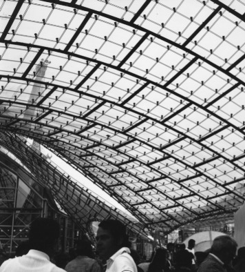
Olympic Stadium, Munich
Frei Otto (1925-2015) is an inspired choice for the Pritzker Prize. When I was a young architect, he was the man of the moment. I thought that his German pavilion at Montreal’s Expo ’67 was the best building of the exhibition. The sense of fluid, uncompartmented space created by the tent structure was something entirely new. That was just a warm-up for his breathtaking Olympic Stadium in Munich. I saw that building in 1972 and wrote about it—my second ever published article. Otto was later overshadowed by postmodernism, and by celebrity-driven architecture, but his lightweight architecture prepared the way for architects such as Piano, Foster, and Grimshaw. Otto—an engineer as well as an architect—never used structure as a fashion statement; his solutions were always rooted in iron-clad logic.


March 5, 2015
WORTH EVERY PENNY
All built in last dozen years.
All designed by David M. Schwarz Architects.
Downtown Fort Worth is a lively urban place that includes a central plaza, shops and restaurants, movie houses, theaters, a concert hall, and a public library. At the head of Main Street is the 1895 Tarrant County Courthouse, which resembles the state capitol in Austin, but with a clock tower instead of a dome. The downtown architecture is a mixture of styles: the Renaissance Revival courthouse, Sullivanesque office blocks from the early 1900s, Art Deco buildings from the 1930s, and modern towers from the 1980s (notably two glass hulks by Paul Rudolph). Most of the commercial construction tracked recurring oil booms. “When we get some money we like to build,” Edward Bass tells me. Bass is the motive force behind Sundance Square, the development company that is responsible for the revival of Fort Worth. There are different models for successful downtown renewal: an activist civic leader (Mayor Joe Reilly in Charleston), a take-charge business improvement district (Center City District in Philadelphia), a thriving real-estate market (Washington, D.C.). In Fort Worth, it’s a benevolent developer. Sundance Square owns about 30 city blocks in downtown (currently about half built-up), and has been developing them since the mid 1980s. This sort of long-term stewardship is unusual. Bass had read Jane Jacobs and William H. Whyte, and he took their teaching to heart. The result is commercial development that is pedestrian-oriented, lively at sidewalk level, and—most unusual—small in size. “We wanted lots of buildings, not a few big buildings,” say Bass. The tallest new office building is 16 stories, and most are much lower than that. Unlike most American cities, which have “exciting” skylines, Fort Worth is more like a downtown of the 1940s—human scale. The architecture is like that, too. David M. Schwarz Architects is responsible for all Sundance Square’s commercial buildings, as well as the expanded central library, the new concert hall, and some of the county buildings. Normally that would produce mind-numbing uniformity, but Schwarz is a cheerful eclectic with a scenographic bent, so the result is a pragmatic mix of historic buildings, restored landmarks, invented landmarks, repurposed old buildings, and new buildings in a variety of styles: Beaux-Arts classical, Art Deco, Art Moderne, Viennese Secession. Schwarz has described his firm’s goal: “to make places for people, created out of a fabric that was familiar and easy to understand.” In Fort Worth, he succeeded.
February 15, 2015
THROWAWAY ARCHITECTURE
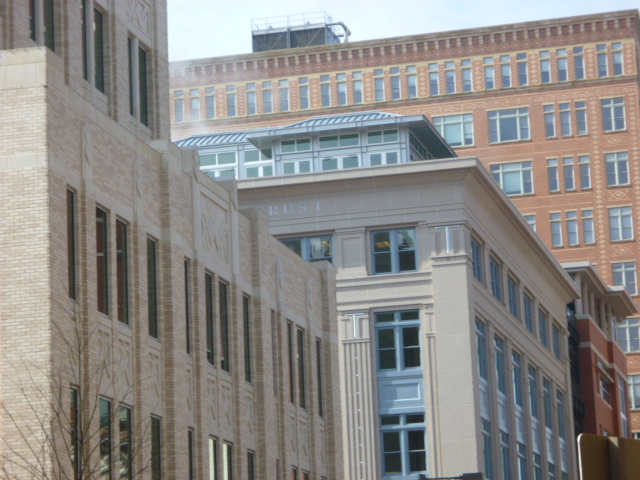
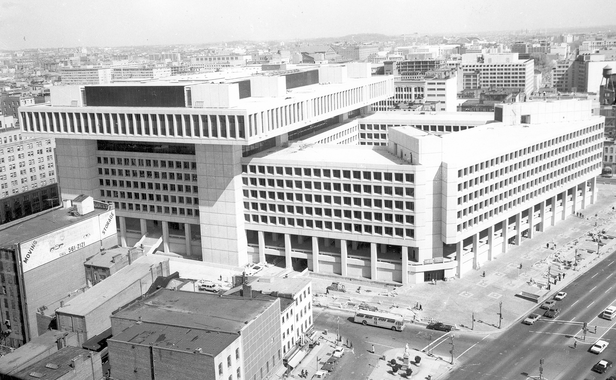 The federal government is looking for a developer to build a new suburban home for the FBI. The old FBI headquarters on Pennsylvania Avenue in Washington, DC is offered in exchange. A 41-year-old public building is going on the block. Admittedly the FBI headquarters (designed in 1975 by Charles F. Murphy & Associates) is an eyesore and won’t be missed (assuming it’s torn down, which seems to be its likely fate). But only 41 years! Washington is full of buildings that are two and three times as old. The first federal office building, the venerable Patent Office, designed by John Mills, opened in 1867 and still serves, albeit as an art gallery. I think that there are several reasons why so many public buildings from the 1970s have short lives. Architectural modernism promotes invention. An earlier generation would have built a generic loft building. Modernism required something more original, although the FBI building was inspired by Le Corbusier’s La Tourette Dominican priory—an odd model for a government office building. “Form follows function” is another reason for short life. Tailoring buildings for one use guarantees problems when they come to be repurposed in the future—as virtually all buildings are at some point. Concrete construction also doesn’t help, since it tends to create structures that are difficult to alter. And, not least, the ugly Brutalist style of the 1970s ensures that there will be no constituency militating for a building’s preservation (except for a few earnest architecture critics). What a waste.
February 8, 2015
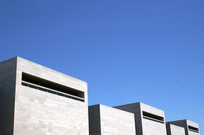
MIAMI NICE
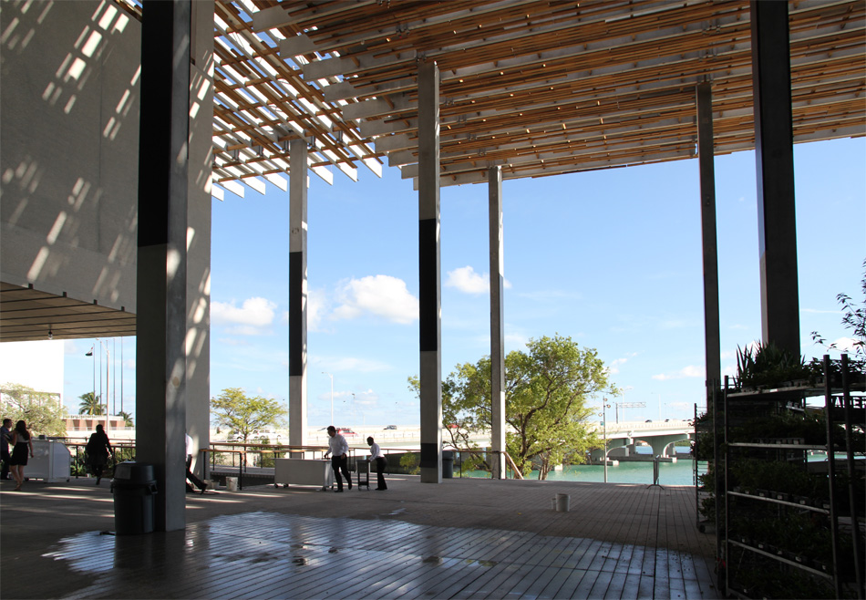 The Pérez Art Museum in Miami suits the city and it suits modern art. Can’t ask for more than that. My first glimpse of the museum, which opened in 2013, was from the MacArthur Causeway, which swoops across the water next to the museum. My impression was of a hovering shade roof over a boxy building gave the impression of a Renzo Piano museum. But something was different, and the difference became clear when later that day we visited the building. As in a Piano building, the architecture is derived from the construction, but unlike Piano, Herzog and de Meuron don’t sweat the details. Instead of preciousness there is an appealing rough-and-ready quality. The concrete is smooth, but not silky smooth like the Kimbell; the roof shade, a slapped-up assembly of wood and concrete, is not delicate like that of the Chicago Institute of Art. All this suits Miami, a booming city of construction cranes (recession, what recession?) that is rebuilding itself decade by decade in an improvised and not particularly coherent way. The site of the museum is on the water (good), but it is also next to the MacArthur Causeway (bad). How do you build a cultural facility next to a reasonable approximation of the Indianapolis Speedway? The New York Times has described the Pérez Museum as “spectacular,” but that is not the right word. It is assertive and self-confident, but not theatrical. The planted columns that hang from the roof outside are photogenic but they strike me as weird rather than interesting. Their logic becomes apparent when you are inside looking out—they make an interesting green screen. And the discrete white galleries do not overwhelm the art, as far as I could tell (I am not a fan of modern art). A final word—about the parking garage. The museum is raised on a platform beneath which sits the garage. With a few deft strokes, the architects have transformed this arrival space (this is Miami so everyone drives). Natural light penetrates from the sides; tropical planting is mixed in among the parked cars; and the floor is not concrete but gravel. That feels rough-and-ready, too..
THE VIEW FROM ABOVE
I’m staying in a Miami hotel, looking down on Brickell Avenue. Since I’m on the 29th floor, I can see the roofs of several lower buildings. Looking down on a building gives a different perspective of its architecture. From this vantage point, buildings that appear solid from the ground become insubstantial, theatrical, flimsy—the facade revealed as merely a wrapper. The wrapper stops at roof level, and the roof itself, invisible from below, is a utilitarian collection of cooling towers and other mechanical equipment. The building across the avenue is a recently completed office tower with ten-story annex whose roof is covered with a garden. Seen from above, a garden is still a garden, the swaying palms are still palms, the pavement pattern is still a pattern. This reminds me that much of architecture is a manufactured illusion—the magically hovering cantilever, the effortlessly sweeping roof, the glass handrail that almost isn’t there. Whereas landscape is always landscape.
January 25, 2015
TRIED AND TRUE
National Air & Space Museum
“Experimentation can sometimes look weird at first, but it is a necessary part of figuring out how to make our human-built world better,” writes Aaron Betsky in his December 2014 Architect column. The implicit suggestion is that architectural experimentation is a good and necessary thing. But buildings that “look weird” are one thing, buildings that act weird are another. Buildings, unlike most artifacts, must last a long time—hundreds of years—so in terms of construction, weirdness should be avoided. In the sixteenth century, the great Palladio built revolutionary buildings, but he did so using tried and true technology, which is why so many of his works have survived. On the other hand, the National Air and Space Museum in Washington, D.C., which is barely 40 years old, just announced that its facade will be “revitalized” as part of a $30 million renovation. When Gyo Obata of HOK designed the museum in 1976, he matched the Tennessee marble skin to the National Gallery across the Mall. But he didn’t match the way it was used. John Russell Pope, used marble that is 4-8 inches thick; the marble on the Air and Space Museum is only 1 1/4 inches thick. Over the years, the thin slabs have begun to bow and crack, and now have to be entirely replaced. The marble skin of I.M. Pei’s nearby East Building of the National Gallery (1978) also failed, although for a different reason: the stainless steel anchors of the marble skin had to be replaced and the entire marble wall rebuilt. There is nothing novel about architectural veneer; the ancient Romans covered the brick structure of the Pantheon with marble slabs, and a thousand years later Charles McKim used basically the same technology in the Morgan Library. The Romans, McKim, and Pope, used marble to build thick self-supporting walls that wrapped around the structure, while Pei and Obata hung the marble from the structure. No one would describe the East Building or the Air and Space Museum as weird, but their architects were experimenting in adopting untried construction methods. Of course, if you believe that today’s architects and engineers are simply smarter that those of forty years ago, you can be cavalier about innovation. But the unintended consequences that accompany new materials and novel techniques are difficult to predict precisely because they are unintended. Better to go slow.
December 24, 2014
A NEW TOOLKIT
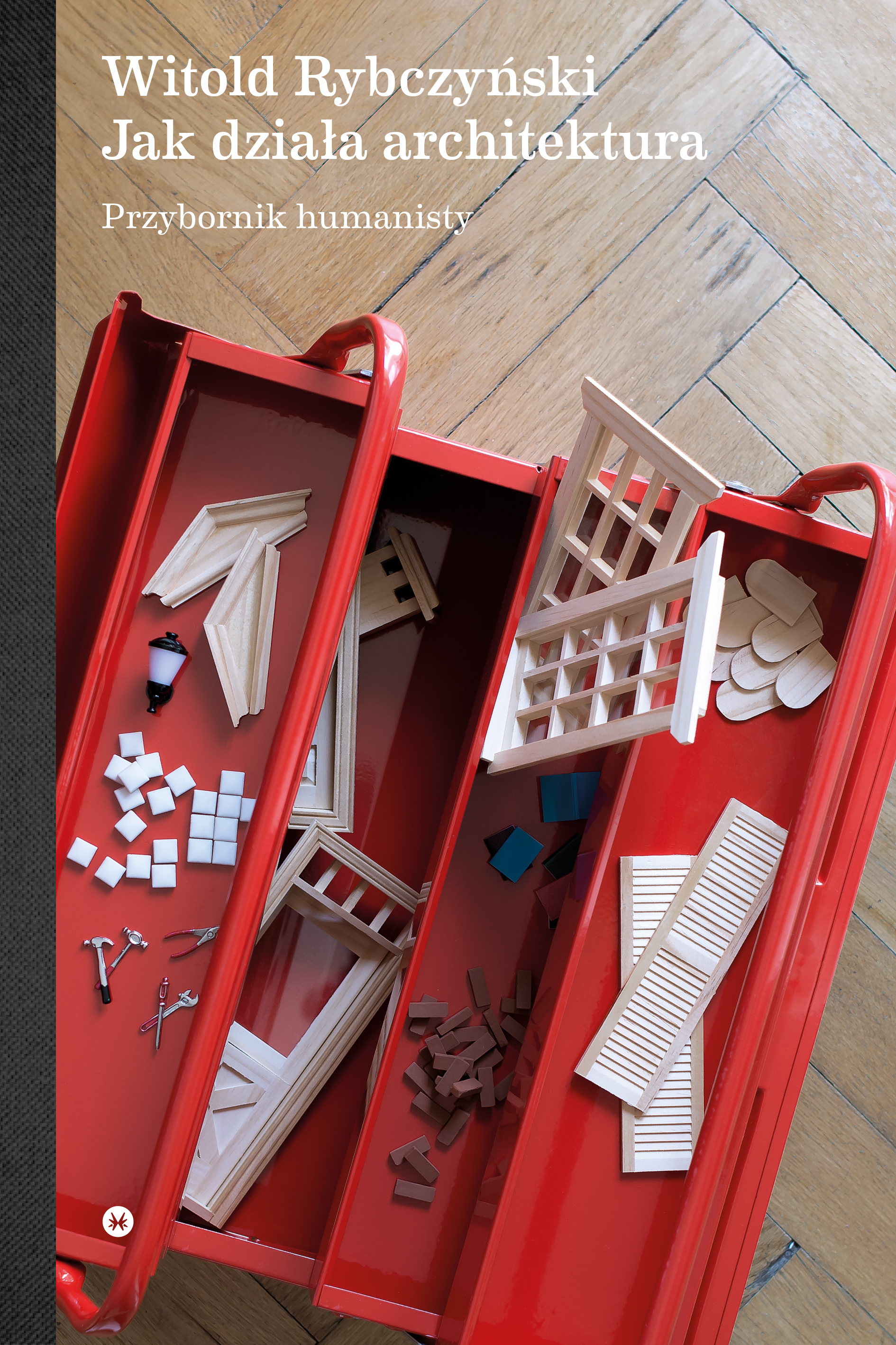 A Polish translation of How Architecture Works: A Humanist’s Toolkit will be appearing soon from Wydawnictwo Karakter in Krakow. Translations are also in the works from Owl Publishing House in Taipei, Cheers Media in Beijing, and CIR Co. in Seoul.
December 21, 2014
ARCHITECTURAL JUDGMENT
 This year’s Best American Magazine Writing, published by Columbia University Press, includes three of my essays that were finalists for the 2014 National Magazine Awards. This might be a good place to express my appreciation to Architect, which published them, and to my supportive editor Eric Wills. My subjects were untypical for an architecture magazine: these three essays were not about the next new thing, which is what most architectural writing these days is concerned with. I wrote about two buildings in Seattle built ten years ago, about a planned community in England that is now two decades old, and about a public housing project in Boston that was built twenty-five years ago. This reflects my conviction that the time to judge a project is not when it is brand new but when it has been used for a decade or two—which in the life of a building makes it barely a teenager. I don’t mean only judging how it has performed functionally, but also how it has aged aesthetically. Ideas that seem wonderful when first unveiled, often sour after an interval of time—think Brutalism, megastructures, postmodernism, deconstructivism. Architecture is not about fashion or, at least, it shouldn’t be. Unlike clothes and consumer products, buildings last for centuries and they should be assessed only in the fullness of time.
December 5, 2014
THE CHAIR
Executive Chair–Charles Pollock
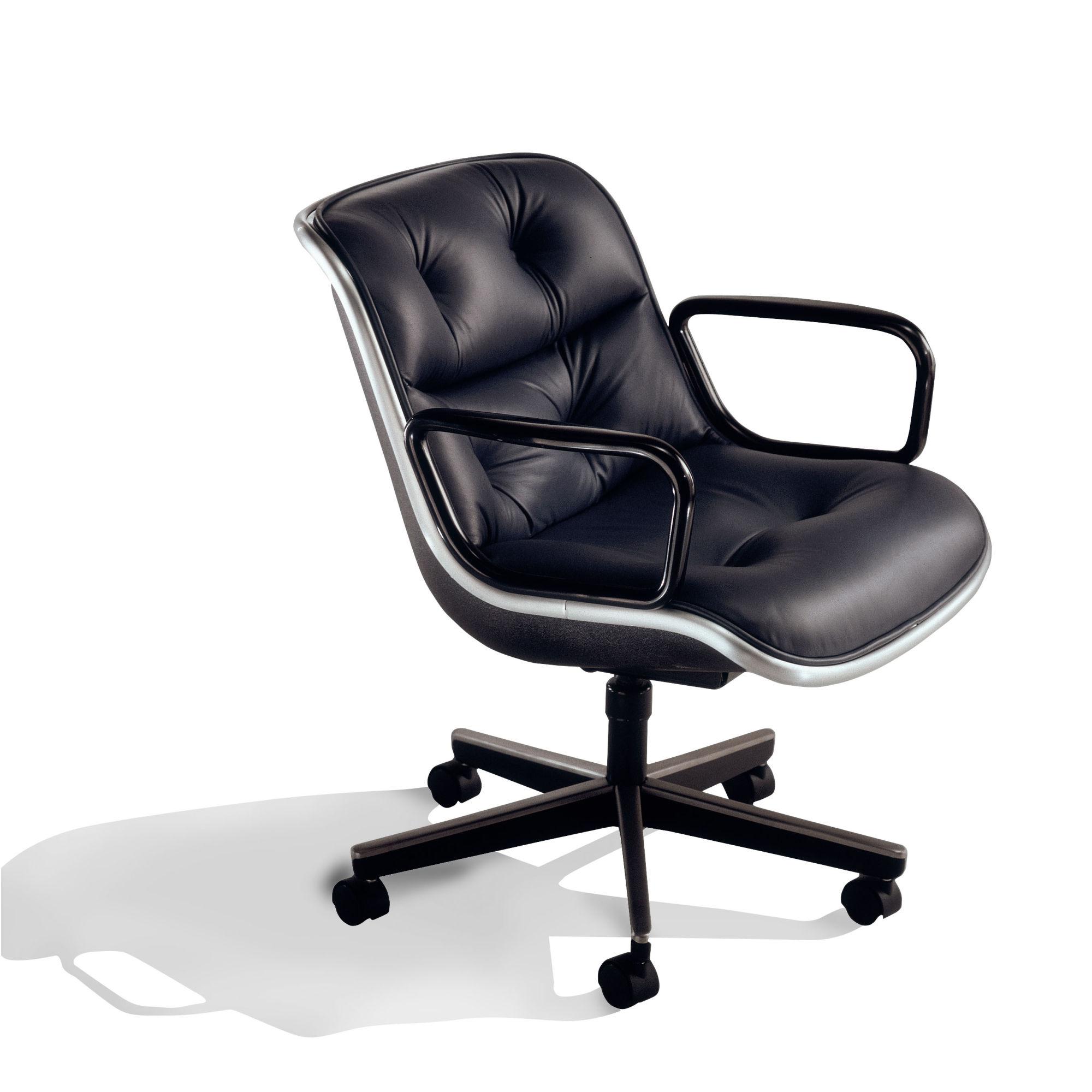
I recently visited the Knoll Museum, which is in Knoll’s headquarters in East Greenville, Pa. “Museum” makes it sound grander than it is; it’s more like a showroom with 70-odd chairs on the floor. What makes it better than any design museum I’ve ever visited is that you can sit in the chairs. Simply looking at a chair is kind of pointless; about as useful as being shown photographs of food. So I sat. Mies’s Barcelona Chair was pretty comfortable, although hard to get up out of. Breuer’s B35 lounge chair, which I’ve always admired but never sat in, was disappointing—the top bar cut into my back. Saarinen’s Grasshopper Chair was OK, but I’ve never been a fan of contoured chaises longues—not enough freedom. There were several of Venturi’s PoMo chairs from the 1980s—embarrassingly unsittable. Ditto for a Meier-design barrel chair. While all the chairs in the Knoll museum were Knoll chairs, there was one exception: the Eames-Saarinen shell chair, designed in 1940 and recently manufactured (for the first time) by Vitra. Beautiful to look at and beautiful to sit in; a masterpiece. Before I left, I tried out an unprepossessing executive chair; the tufted leather looked so inviting. The moment I sat down I knew this was a chair I wanted. It was designed by Charles Pollock in 1963, and the ingenious design consists of an extruded aluminum rim that acts as the main structure. The arms are phenolic plastic. Unlike today’s ergonomic chair it has few adjustable features. It doesn’t need them.
November 23, 2014
SPLENDID LOCATECTURE
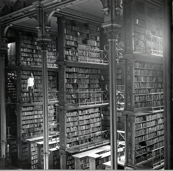 MessyNessyChic, a blog about libraries and books, recently featured the old Cincinnati Main Library, built in 1874 and demolished in 1955, less than a century later. The period photographs show a building of subtlety and sophistication. The four-story facade on downtown’s Vine Street is pragmatically built up to the sidewalk (like Chicago’s Harold T. Washington Library), and gives nothing away about the extraordinary space within. It is a “room full of books” what better image for a library than that? The architect was James W. McLaughlin (1834-1923). Born in the city, he apprenticed with a prominent local architect, James Keys Wilson (1828-1894). In addition to the library, McLaughlin also designed the city’s art museum and zoo. The most prolific Cincinnati architect of that period was probably the British-born Samuel Hannaford (1835-1911), who designed the city hall and the Music Hall. By the second decade of the twentieth century, there seems to have been a sense that outside architectural expertise was required, especially for the new building type: the skyscraper. Cass Gilbert was brought in to build what was then the tallest office building outside New York City, Delano & Aldrich designed a soaring moderne slab that anticipated Rockefeller Center, and Paul Cret was consulting architect on the beautiful Art Deco railroad terminal. Since then, this trend has continued as many civic buildings have been designed by imported stars: Michael Graves, Cesar Pelli, and Zaha Hadid. This sometimes makes for good buildings, but one can still look back fondly to a time when local architects produced splendid designs like the old Main Library.
Witold Rybczynski's Blog

- Witold Rybczynski's profile
- 178 followers

