
Becca Hillburn's Blog, page 36
November 17, 2016
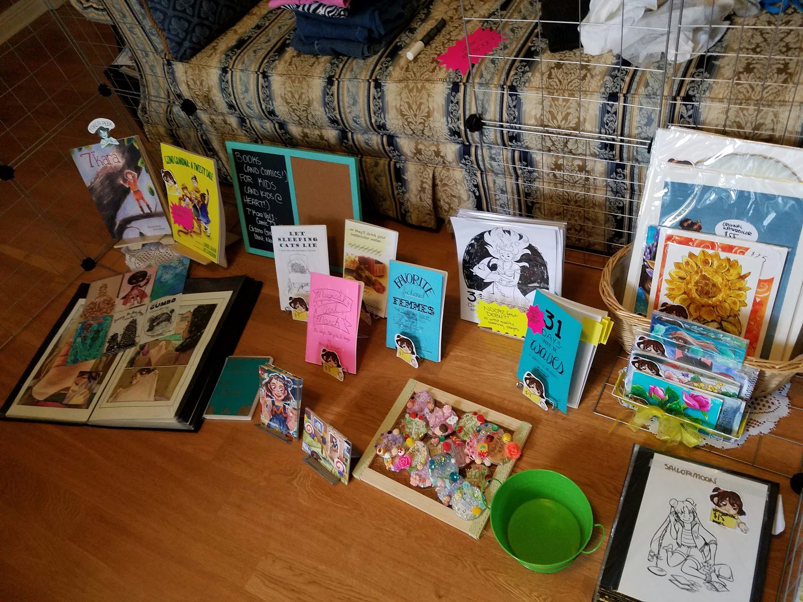
NOCAZfest 2016 Announcement

Hey guys! I'll be returning to NOCAZfest for my third year running, and I have lots of great stuff for this year! NOCAZfest is a small indie comic and zine show in downtown New Orleans with a great all ages atmosphere, and a very inclusive environment. The organizers and volunteers are all friendly people eager to help you get into indie comics.
The first two years I have tabled at NOCAZfest, it was a one day show, but this year, NOCAZfest is turning into a two day show, which gives you plenty of time to get your booty down to the New Orleans Main Library on Loyola and buy some comics and zines. If you're in the area, you have no excuse, as admission is free to the public.
New to NOCAZfest!
Gizmo Grandma: A Twisty Tale- an illustrated children's novel by Lenore Salazar and Becca Hillburn (book debut- limited copies available!)
31 Days Under the Waves: A Mermaid Zine (book debut, first 5 copies sold are numbered special editions)
31 Days Under the Waves: Coloring Sheets (item debut, only 5 sets available, printed on artist quality marker paper)
2016 Black and White and Color Sketchbook Ashcans (new this year)
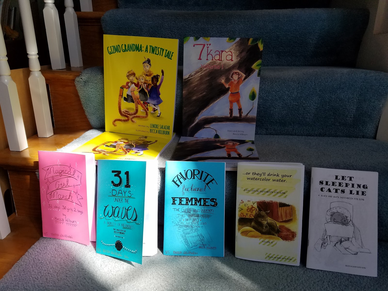
I will also have:
Original art for sale
Pages from Volume 2 of 7" Kara
copies of 7" Kara Volume 1
Favorite Fictional Femmes
Magical Girl March
Assorted cute merchandise like pins and stickers
Inking Workshop
Learn to ink with me this weekend!
On Sunday, at 1PM, I will present a workshop/panel on Inking that will cover everything from technical pens to inking with a brush. I plan on bringing lots of materials for participants to experiment with, and participants may bring their own materials if they wish. Admission to the panel is free.
Please consider donating to this blog or purchasing from Natto-shop (http://nattosoup.com/shop) if you want me to continue publishing quality content. All materials tested were purchased from my own pocket. Keep on Truckin' Nattosoup is not under any sponsorship.


November 16, 2016
Art Soundoff 2016 Announcement
This November, I'm participating in Art SoundOff, an artist journaling challenge created by Rob Steinzinger and Jerzy Drozd. Youcan find more information, including official prompts, here on the Art SoundOff site.
Every day in November, I am journaling some aspect of my artistic life, from inspiration to creation, to dealing with deadlines, and more. These are handled vlog style, and are generally me addressing the camera directly, so if you wanted more face time, this is definitely the playlist for you. You can check out my ArtSound Off Playlist here, and if you have suggestions for prompts, or topics you'd like to see covered, please let me know via Youtube or Patreon comments.
These videos are recorded using my Samsung S 7, and have been edited either using YouTube's editing software or Samsung's editing software- meaning minimal editing.
Due to a sensitive nature, some of these vlogs will be only available to Patreon backers, but my intention is not make Art SoundOff a Backer Exclusive.
At the end of the month, I plan on recapping my month of art journaling/vlogging, and sharing my thoughts.
Please consider donating to this blog or purchasing from Natto-shop (http://nattosoup.com/shop) if you want me to continue publishing quality content. All materials tested were purchased from my own pocket. Keep on Truckin' Nattosoup is not under any sponsorship.

November 13, 2016
Favorite Fictional Femmes Coloring Sets Now In Stock
Everything Pack
Loading...
Animated Pack
Loading...
Ladies of Literature Pack
Loading...
Please consider donating to this blog or purchasing from Natto-shop (http://nattosoup.com/shop) if you want me to continue publishing quality content. All materials tested were purchased from my own pocket. Keep on Truckin' Nattosoup is not under any sponsorship.
Loading...
Animated Pack
Loading...
Ladies of Literature Pack
Loading...
Please consider donating to this blog or purchasing from Natto-shop (http://nattosoup.com/shop) if you want me to continue publishing quality content. All materials tested were purchased from my own pocket. Keep on Truckin' Nattosoup is not under any sponsorship.
November 11, 2016
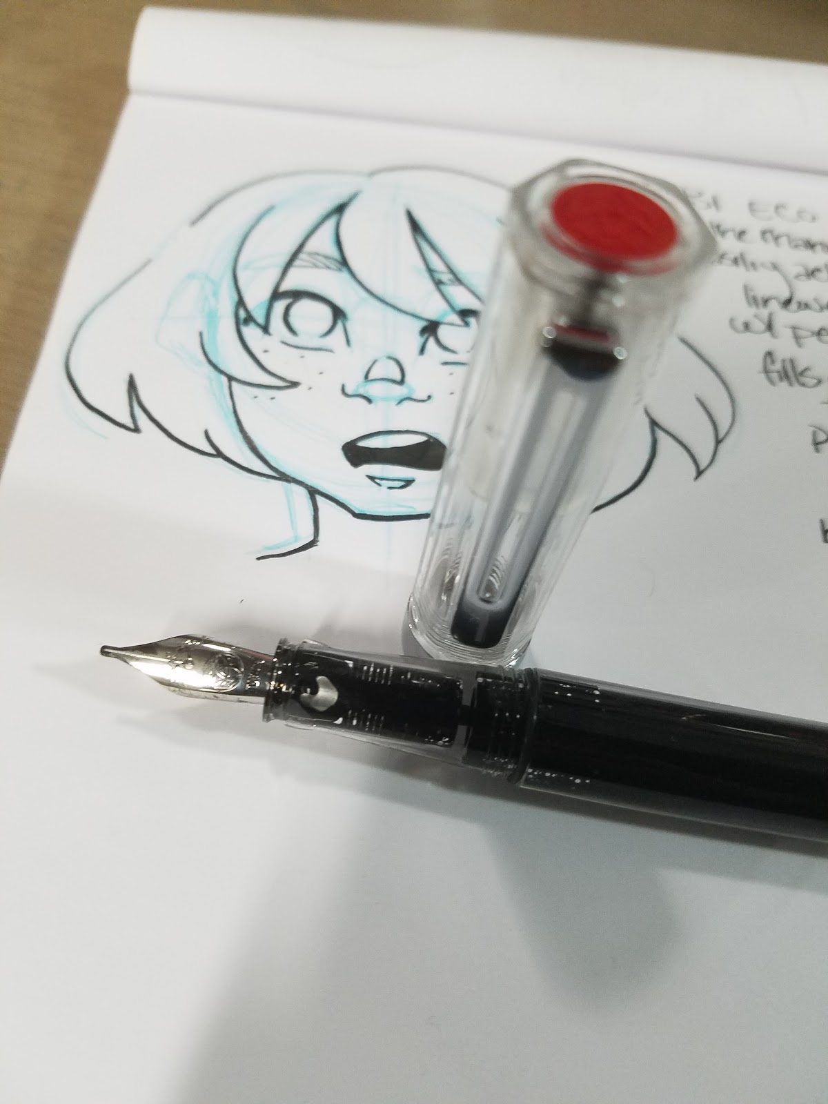
Inking and Lettering with Fountain Pens
I assure you guys, I have no intention of this blog becoming a fountain pen blog. There are plenty enough of those. I don't even intend to do full reviews of the pens I've purchased, unless one is particularly standout, or one just outright fails.
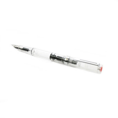
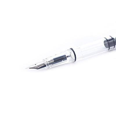
I did, however, buy a few after visiting with Heidi and recording a video on the best fountain pens for sketching. I was weak- playing around with dip nibs for Inktober made me fall in love with nib inking again- and I wanted to find the Pentel Pocket Brush equivilent of a fountain pen. Something inexpensive, with expressive lines, that I could take anywhere. Heidi's reccs started me off on a strong foot- the TWSBI Eco and a JetPens Chibi for fun, but I quickly added a Noodlers Flex, a Pilot Varsity, and a Sailor Fude De Mannen.
You can check out our guide video AND the shownotes by clicking here.
Pens Purchased:
TWSBI Eco (piston type reservoir)
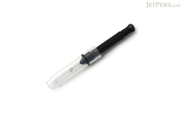
JetPens Chibi (and converter)
Noodler's Flex (piston type reservoir)
Pilot Varsity (disposable, for general writing and maybe doodling)
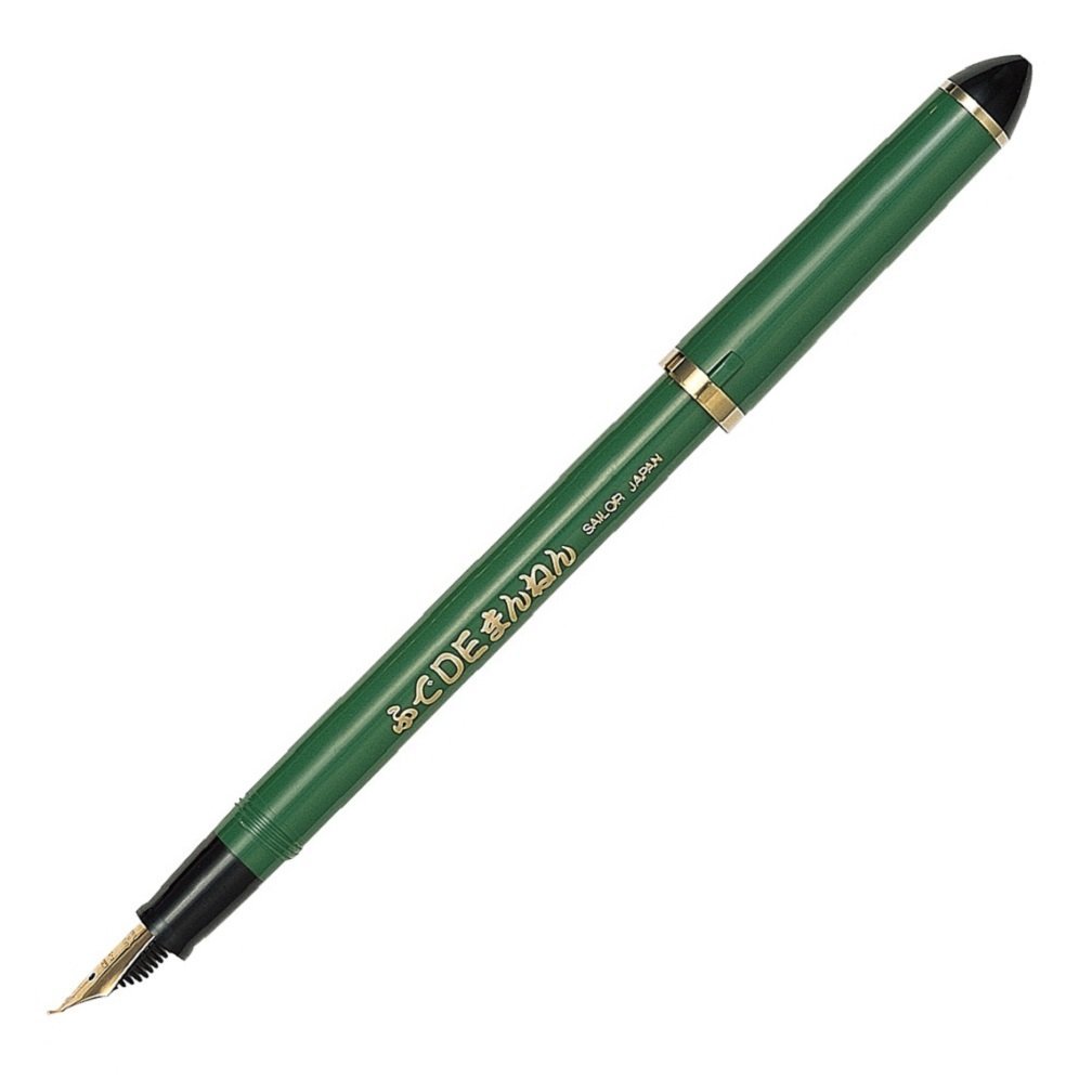
Sailor Fude De Mannen (and converter)
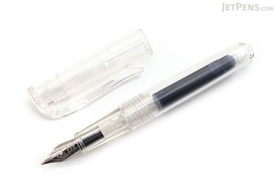
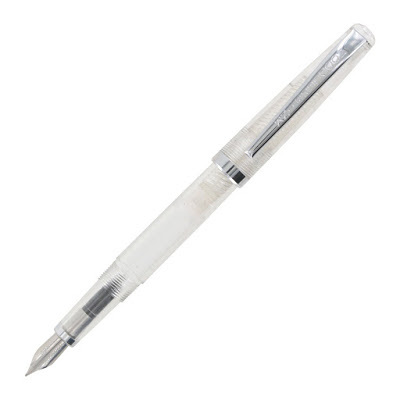
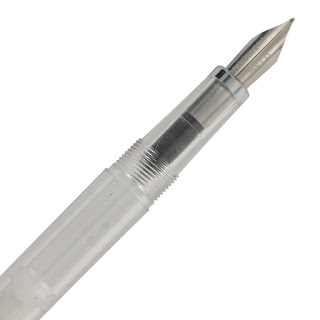
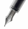
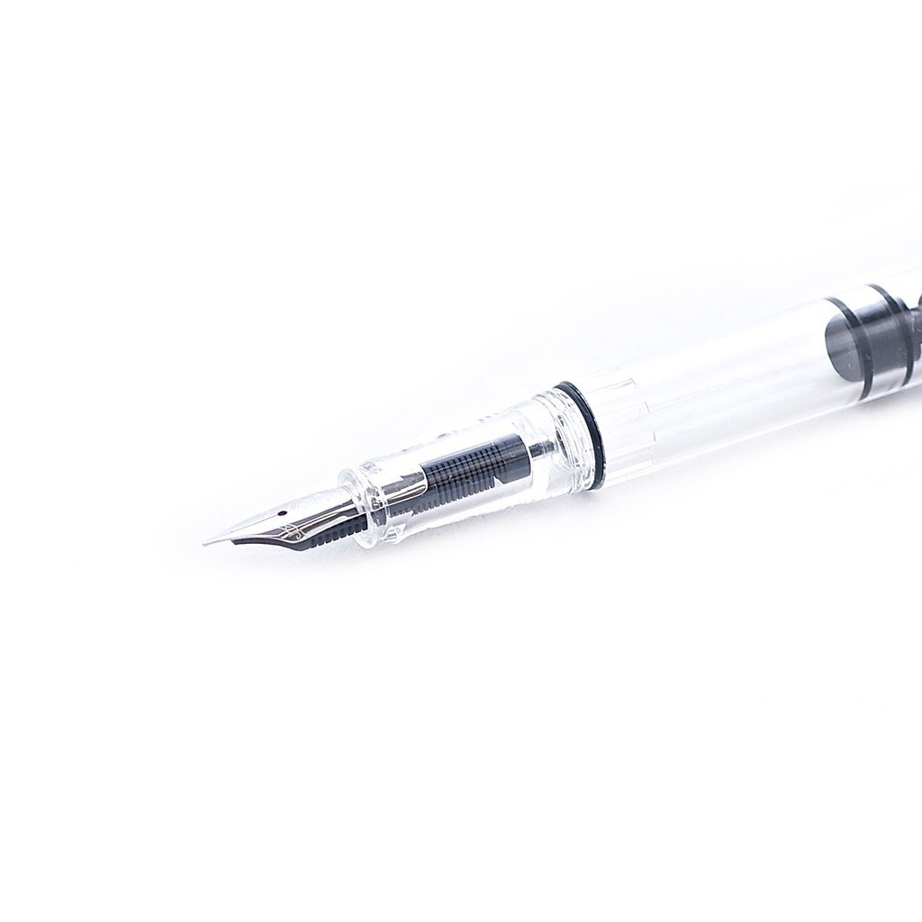
TWSBI Eco
 TWSBI Eco. Image Source
 TWSBI Eco Image Source
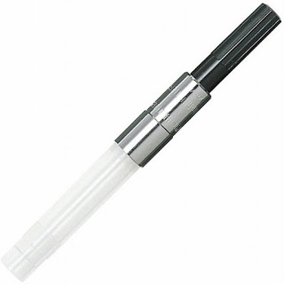
Jetpens Chibi
 Jetpens Chibi Image Source
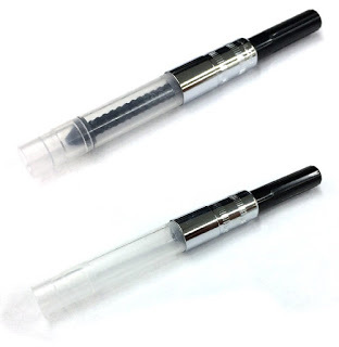
 Monteverde Mini Fountain Pen Converter Image SourceNoodler's Flex
 Noodler's Flex Image Source
 Noodler's Flex Image Source
Pilot Varsity
 Pilot Varsity Image Source
 Pilot Varsity Image Source
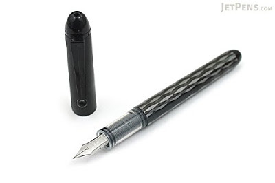
Sailor Fude De Mannen
 Sailor Fude De Mannen Image Source
Sailor's Fude De Mannen have nibs with varying degrees. The above pen (as well as mine) has a 55 degree angle. I would be interested in trying the 40 degree Fude de Mannen as well.
 Sailor Piston Converter Image Source
 Sailor Piston Converter Image Source
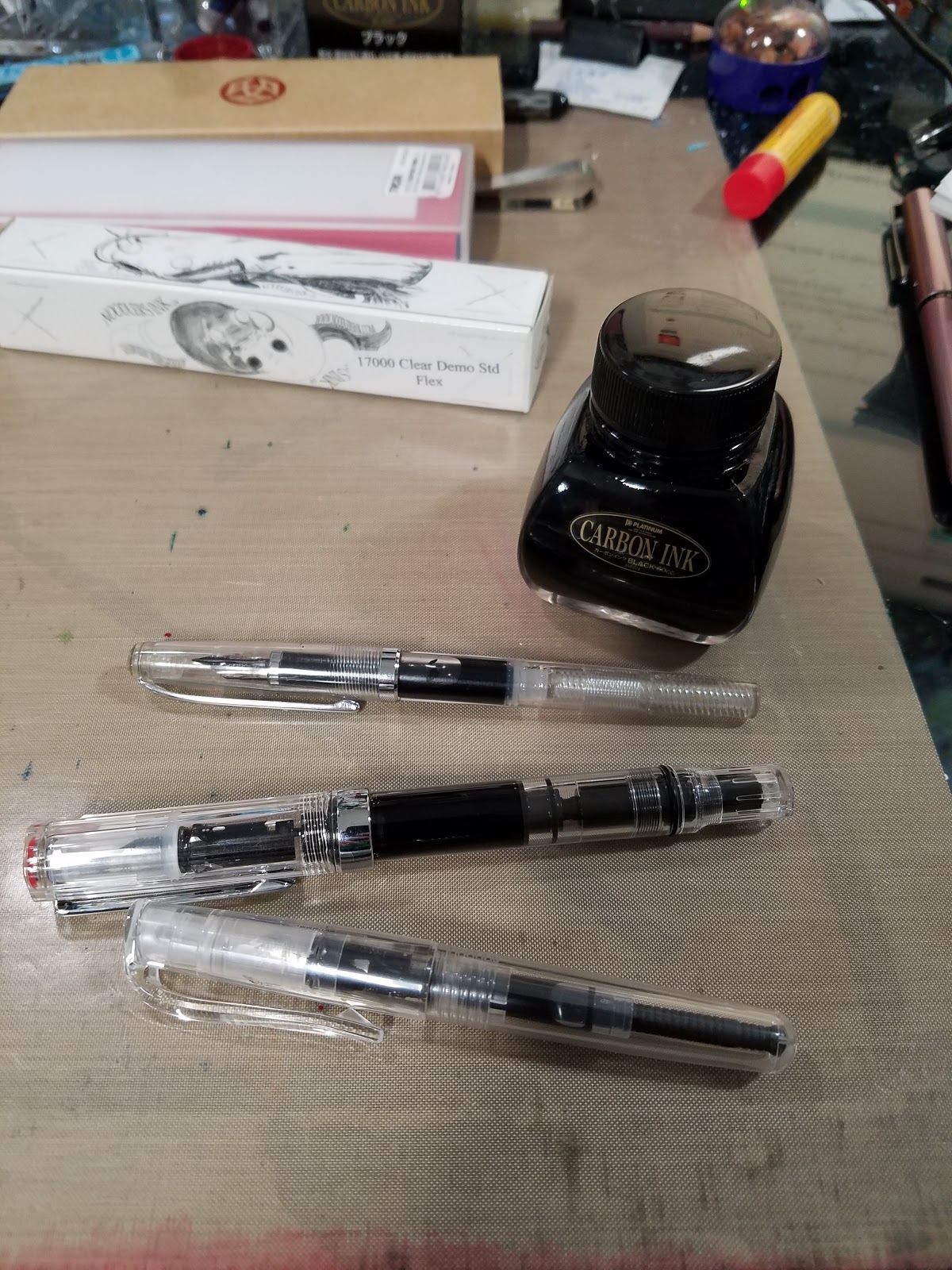
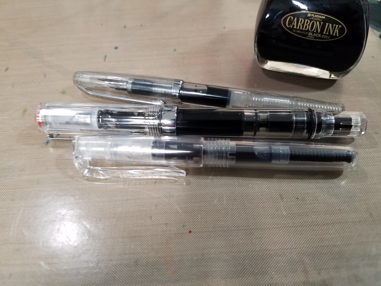
I couldn't play with my new toys until an appropriate ink was found and I quickly ordered Platinum's Carbon Ink, also by Heidi's recommendation.
Ink Purchased
Platinum Carbon Ink
Cleaning My New Toys:
Used the method demonstrated on Withoutink


Setting Up My Pens


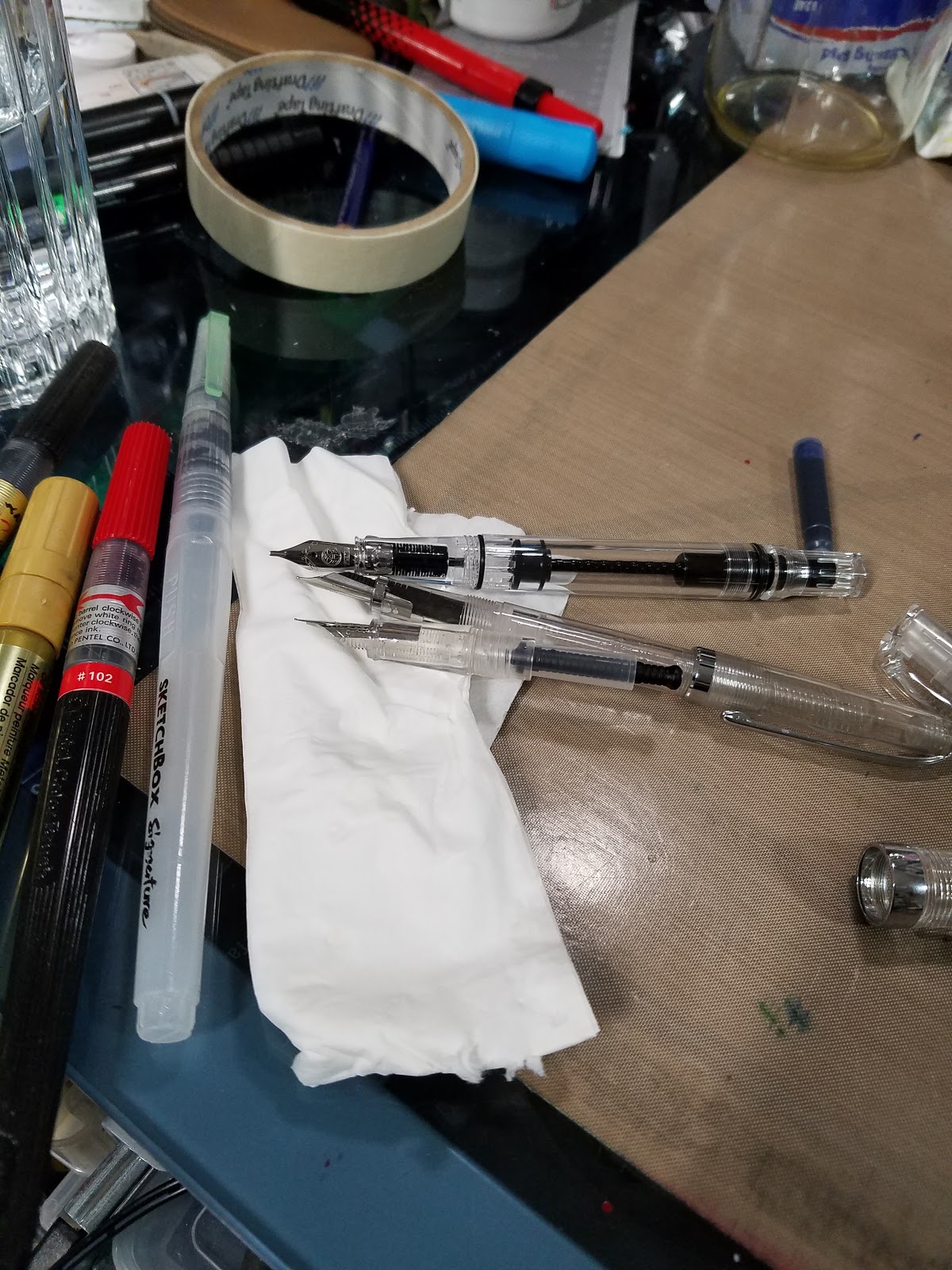
After cleaning, all three pens were easy to use on the Rhodia blank pad I picked up at Paper and Ink Arts. Instant ink startup, no skips, no catching on the paper. I found that the Noodler's Flex, although a bit stinky, handled the best for what I wanted, and was able to sketch and doodle without nipping the paper. The Pentel Chibi also handled quite well, almost as well as the Flex, and the TWSBI offers a broader nib with a little less flex. All three are great so far, and have been inked up with my Carbon Ink.
The TWSBI and Flex both have their own pistons for easy filling, but I purchased a little converter for my Pentel Chibi.
I think I'm going to add my Flex to my everyday art carry, but the Chibi and TWSBI ECO will probably live on my desk, at least until I ink the Chibi with something exciting (or order another).
Sailor Fude De Mannen
After I'd already cleaned out my Flex, TWSBI, and Chibi, my anticipated Fude de Mannen arrived from Amazon.
A fude style fountain pen is designed to facilitate Eastern style characters and replicate the stroke of a brush. Instead of being more flexible than Western nibs, a fude style nib is bent at an angle (45 or 55) to facilitate this.
Drawing with Fountain Pens
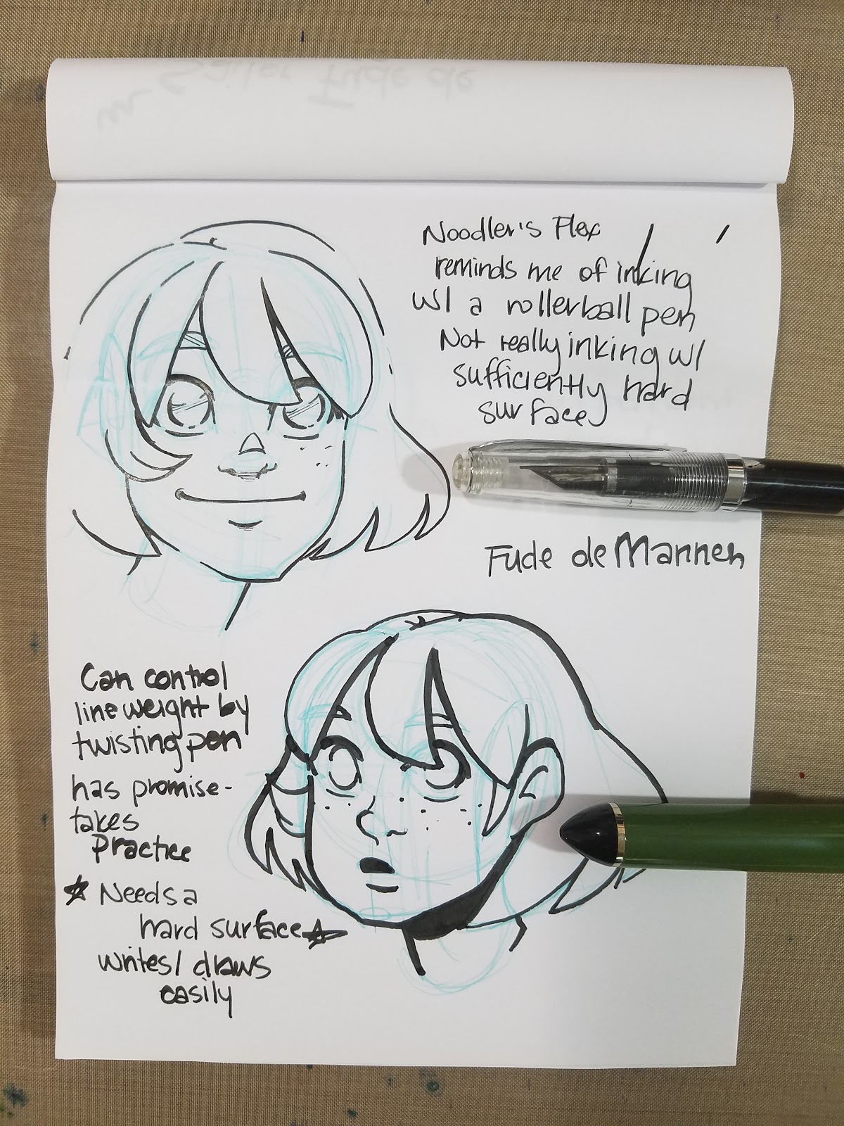
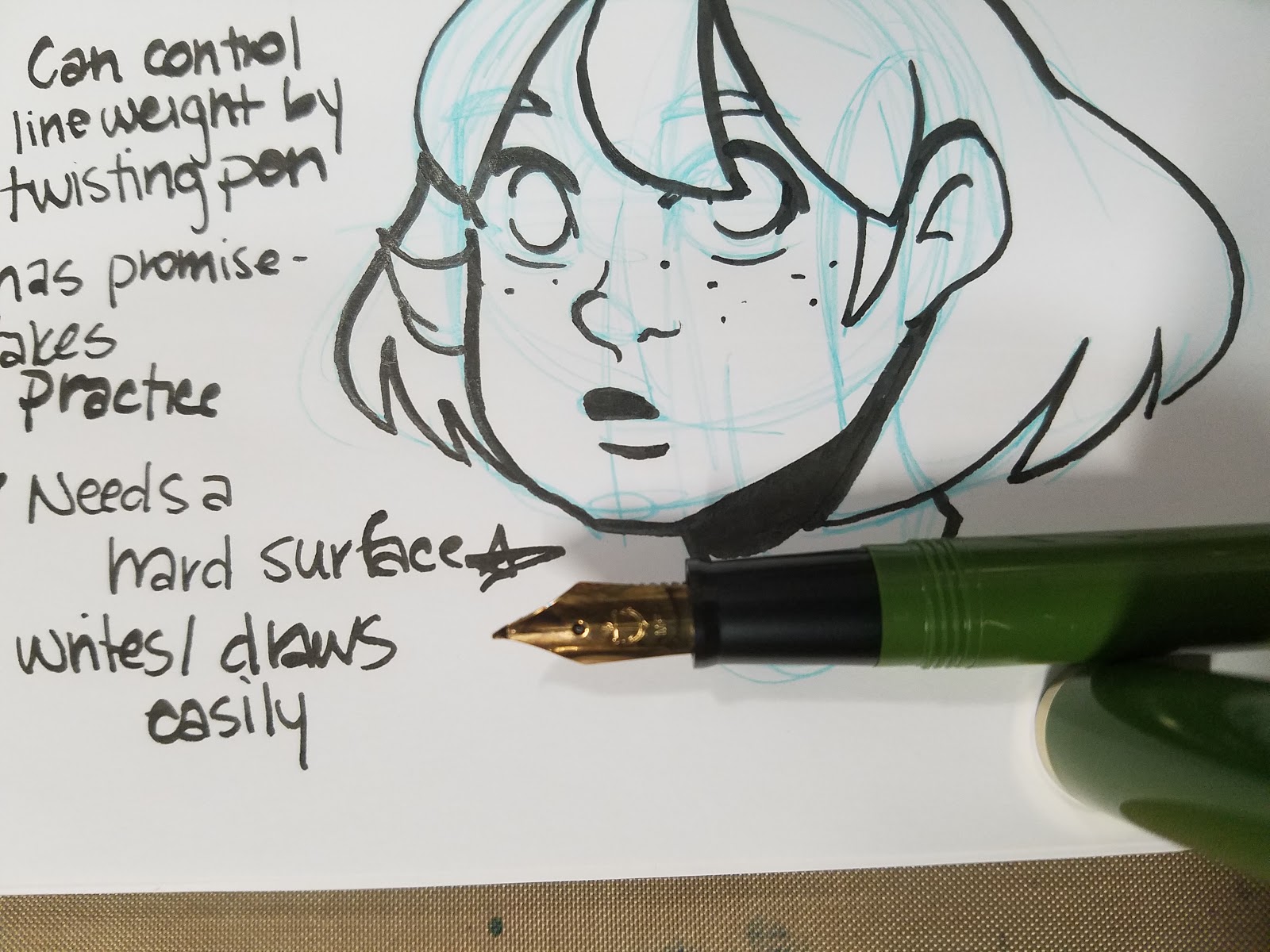
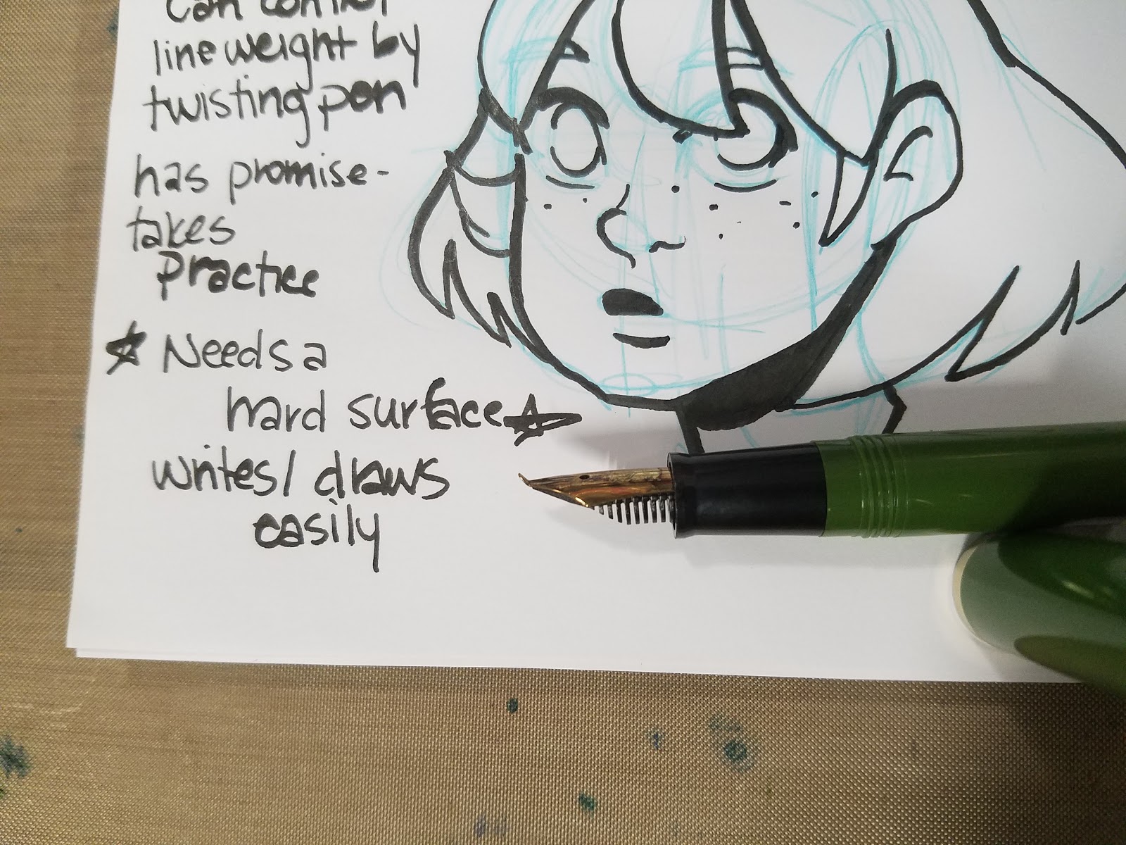
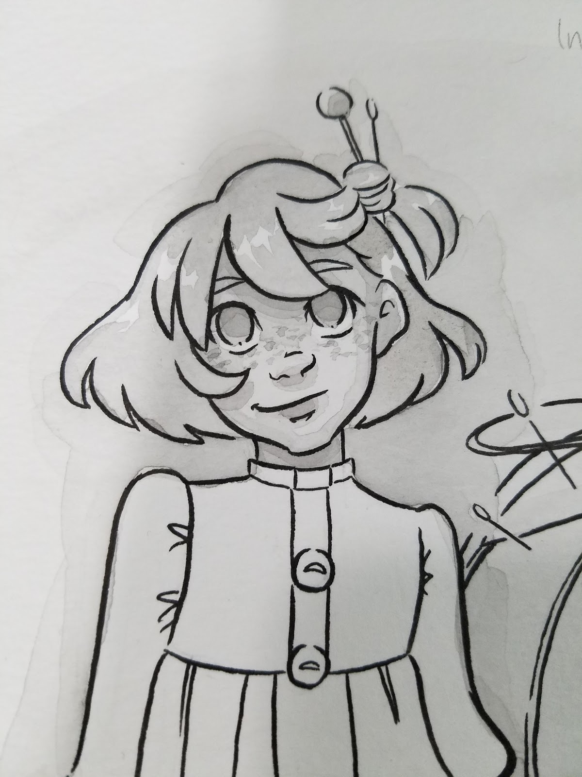
Noodler's Flex and Fude De Mannen
Drawn in a Rhodia Blank notebook.

Noodler's Flex

Fude de Mannen


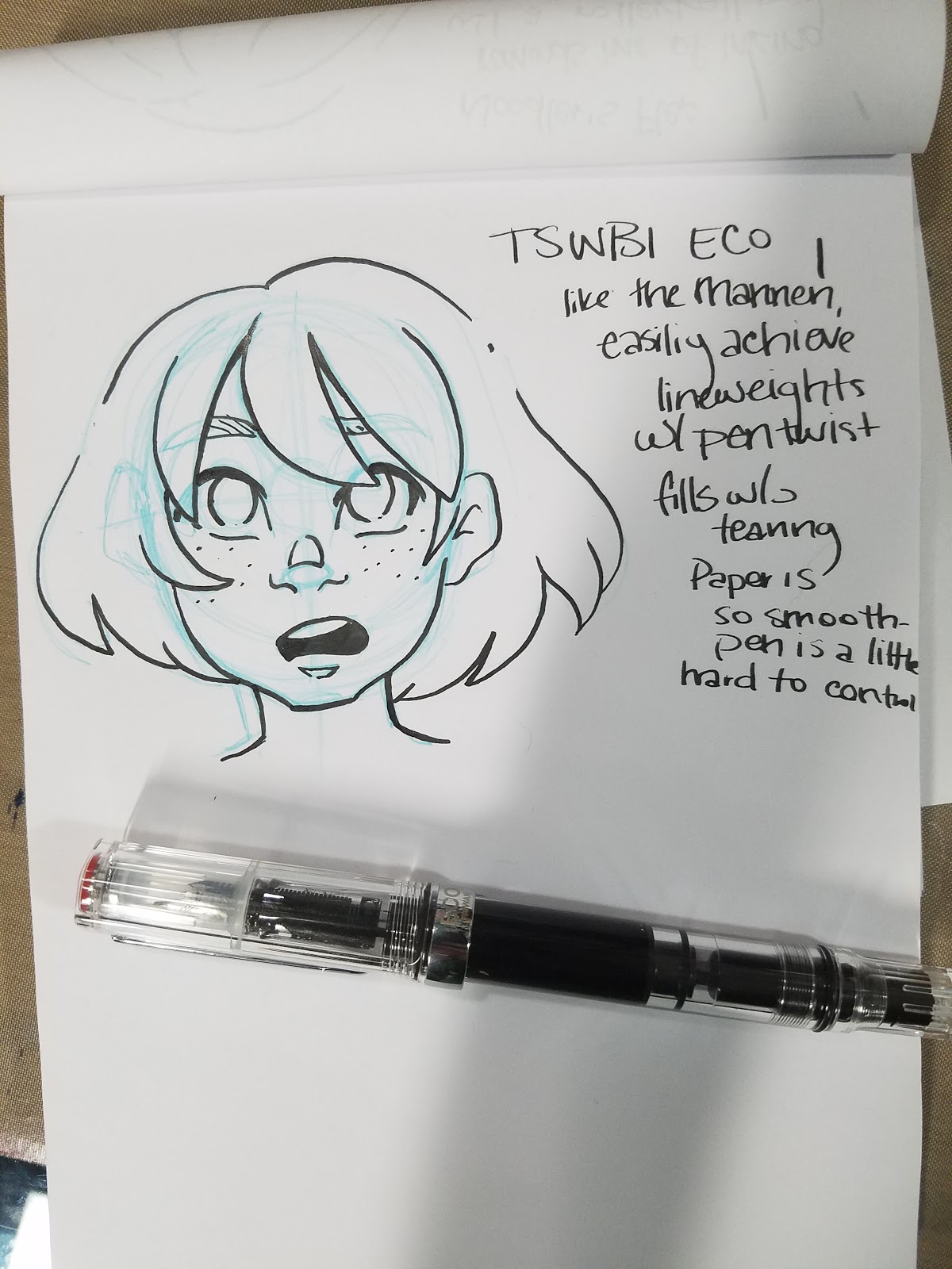
TWSBI Eco and Jetpens Chibi
Sketched on Rhodia blank paper.
Jetpens Chibi

TWSBI Eco


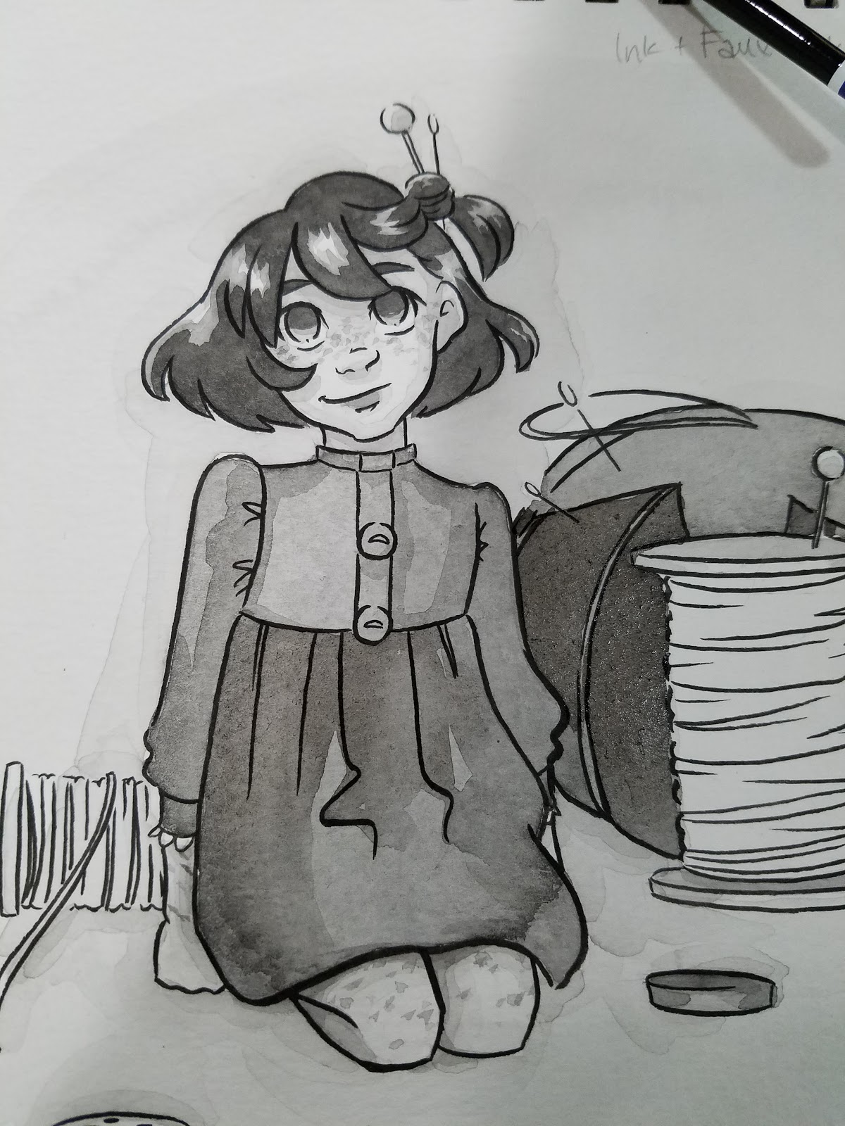
Inked with the TWSBI Eco and the Noodler's Flex
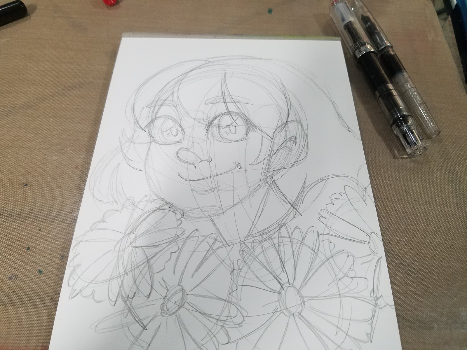
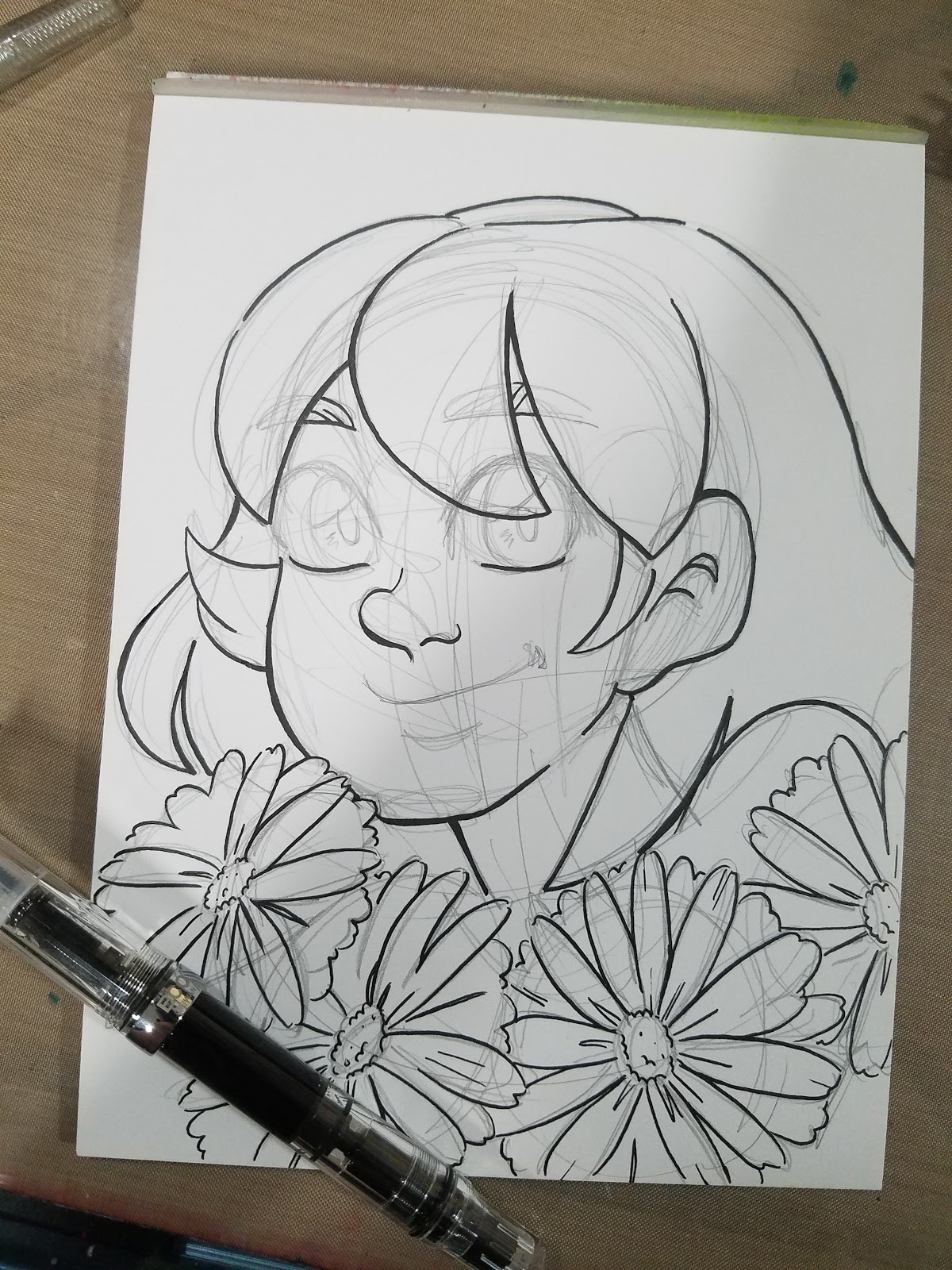
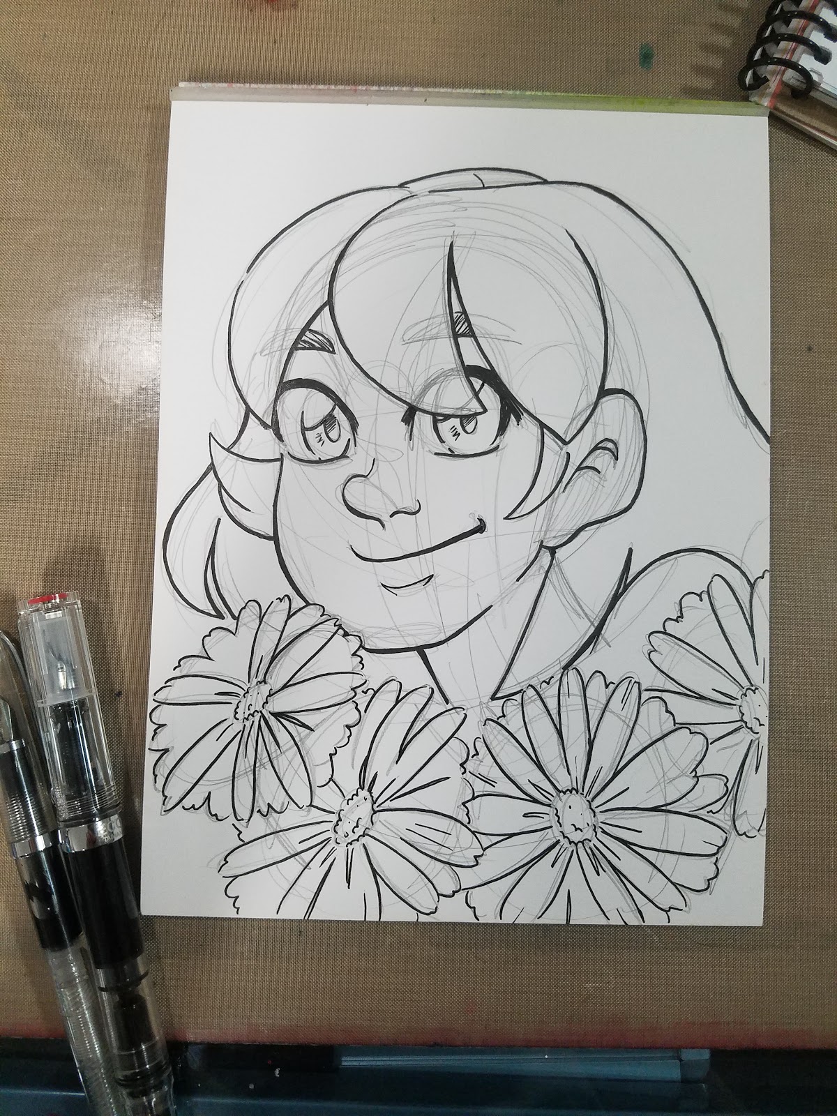
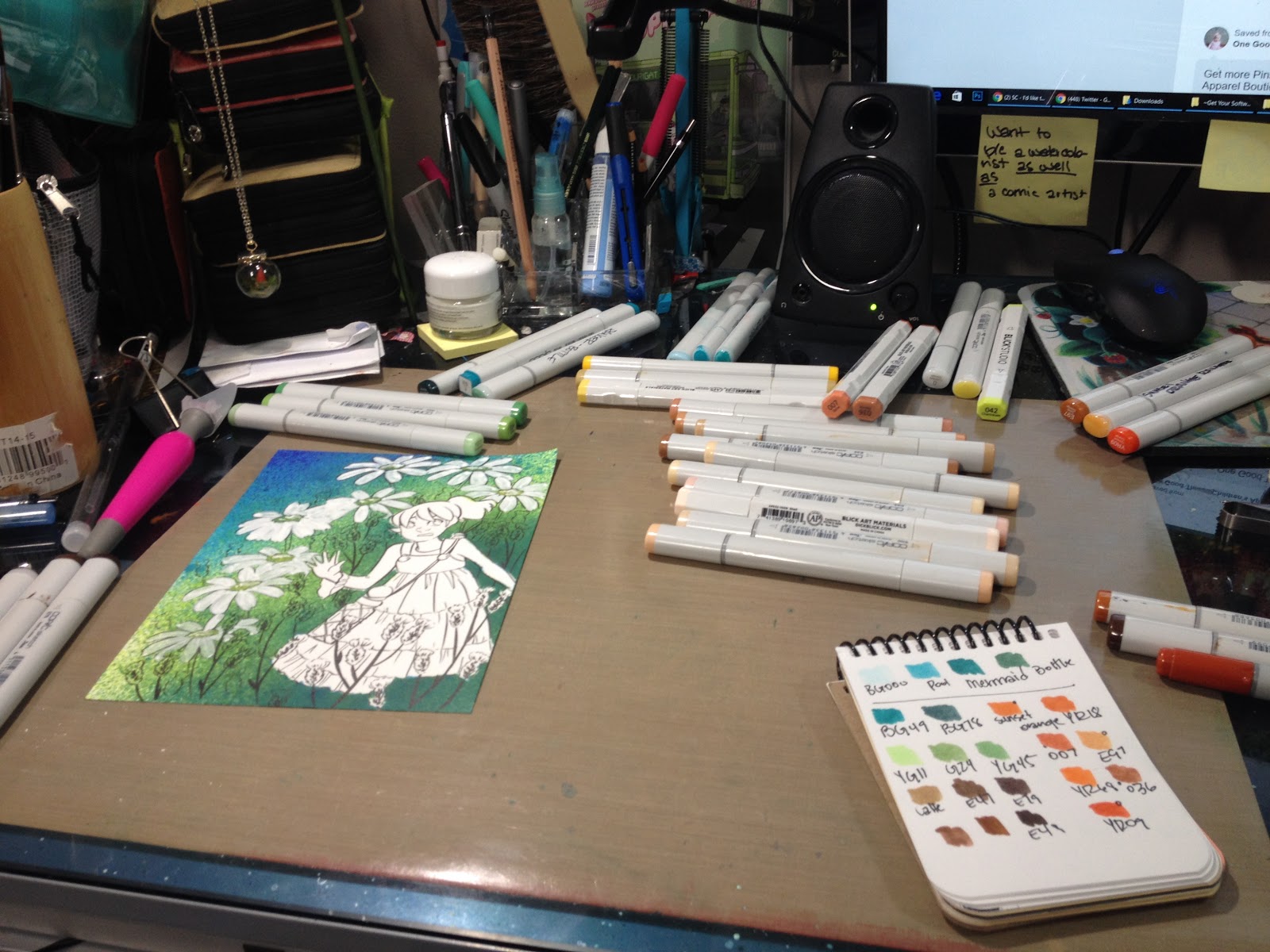
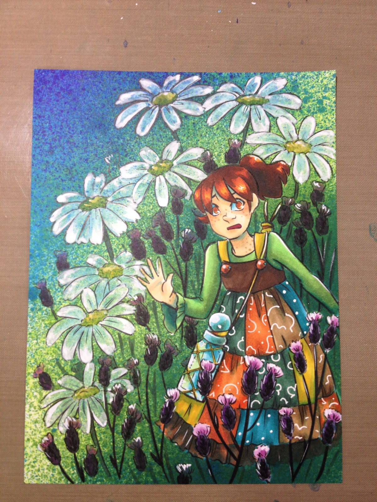
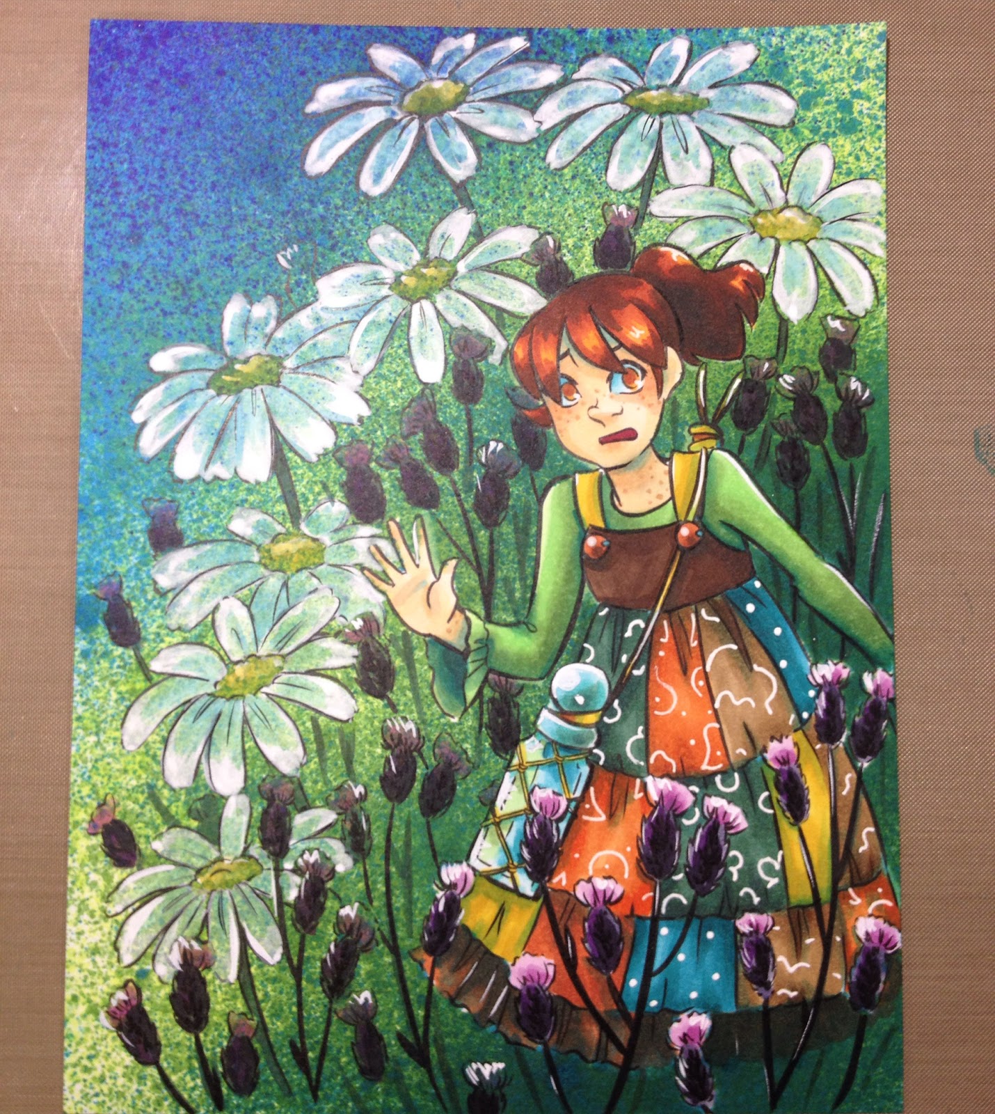
Sketched and inked on Strathmore 400 series Mixed Media paper with Platinum Carbon Ink using a TWSBI Eco and a Noodler's Flex.


Daisies were inked with the Noodler's flex, as it can deliver a fine line. I noticed no paper tearing.

Outlines and major details were inked with a TWSBI Eco broad nib.

Finer details were inked with a combination of the TWSBI and the Noodler's Flex.
 Ink was allowed to dry for 24 hours, then erased, with no noticeable ghosting.
When sketching and inking, I find myself reaching for the Noodler's Flex, especially after listening to Goulet Pens interview with Nathan Tardif. It's such an easy little pen to ink with- a good amount of flex, doesn't nip up quality watercolor paper, easy to get started, doesn't require much pressure to with. Right now, if you're interested in a fountain pen for inking your art, I definitely recommend it.
Pros of using a Fountain Pen to Ink
Can use a wide variety of inks and ink colors- from very watersoluble to waterfast, to inks with dichromatic propertiesInexpensive options like the Jetpens Chibi, Pilot Preppy, and the Pilot Petit1 can be purchased in quality and filled with a rainbow of colors, if you enjoy colored lineworkEven without flex, with an italic nib, you can achieve a lot of lineweight by rotating the pen slightly.Cons of Using a Fountain Pen
The most flexible nibs on an unmodded, stock pen will be on vintage pens, which tend to be expensiveIf you want to carry a lot of ink, you may need to buy a converter or try an eyedropper conversionNeed to be careful about the papers you ink on- sketchbook paper is generally a no go, but tightly woven papers and coated papers should work decentlyUnless you mod or buy a modded pen, no nib will deliver the flex of a flexible dip pen nibCan't use just any inks- need to use exclusively fountain pen inks, otherwise ink may clog/ruin pen
Comic Lettering with a Fountain Pen
 Uppercase alphabet lettered with the Sailor Fude de Mannen, lettered on Strathmore Writing paper (prelined)
Although I lettered alphabets with all four of my fountain pens, only the Fude De Mannen had a distinctive stroke. This makes sense as it's a pen designed to replicate stroke calligraphy.
This said, the TWSBI Eco is enjoyable for general writing, and I find myself reaching for it when I want to make notes.
Outside Resources:
Fountain Pen Network: Painting With Watercolors over a Fountain Pen
Jetpens Blog: Fountain Pens (section)
Parts of a Fountain Pen
Fountain Pen Terminology
Pen Maintenance
Filling Mechanisms
Fast Pen Flushing
How to Write with a Flex Nib
Fast Pen Flushing
How to Write with a Flex Nib
If you enjoyed this post, there are loads of ways you can let me know! You can shoot me an email using the form in the lefthand sidebar, you can share this post to your social networks using the sharing buttons below, you can link this post on your favorite forums and sites. These are all great ways to show me that you enjoy my content, as you're helping me increase my audience, spread the goodness of art education to the masses, and helping me establish legitimacy. If you'd like to show more support, contacting companies on my behalf is a great way to really help me in a meaningful way- you can find company info in the righthand sidebar. If you'd like to help fund future posts, you can purchase something from my online shop or my Gumroad shop. Finally, if you'd like to join my community of art nerds, gain early access to content, AND help support future posts, head on over to my Patreon for information on how to join the community.
Please consider donating to this blog or purchasing from Natto-shop (http://nattosoup.com/shop) if you want me to continue publishing quality content. All materials tested were purchased from my own pocket. Keep on Truckin' Nattosoup is not under any sponsorship.
I did, however, buy a few after visiting with Heidi and recording a video on the best fountain pens for sketching. I was weak- playing around with dip nibs for Inktober made me fall in love with nib inking again- and I wanted to find the Pentel Pocket Brush equivilent of a fountain pen. Something inexpensive, with expressive lines, that I could take anywhere. Heidi's reccs started me off on a strong foot- the TWSBI Eco and a JetPens Chibi for fun, but I quickly added a Noodlers Flex, a Pilot Varsity, and a Sailor Fude De Mannen.
You can check out our guide video AND the shownotes by clicking here.
Pens Purchased:
TWSBI Eco (piston type reservoir)
JetPens Chibi (and converter)
Noodler's Flex (piston type reservoir)
Pilot Varsity (disposable, for general writing and maybe doodling)
Sailor Fude De Mannen (and converter)
TWSBI Eco
 TWSBI Eco. Image Source
 TWSBI Eco Image Source
Jetpens Chibi
 Jetpens Chibi Image Source
 Monteverde Mini Fountain Pen Converter Image SourceNoodler's Flex
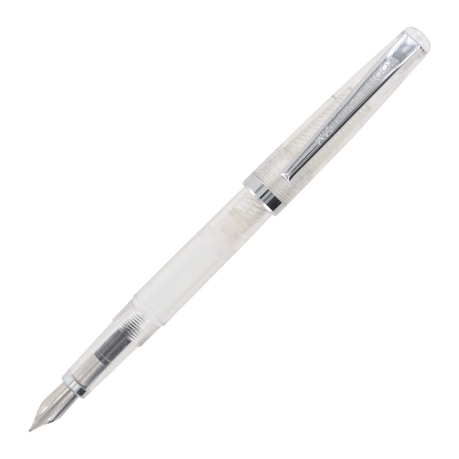 Noodler's Flex Image Source
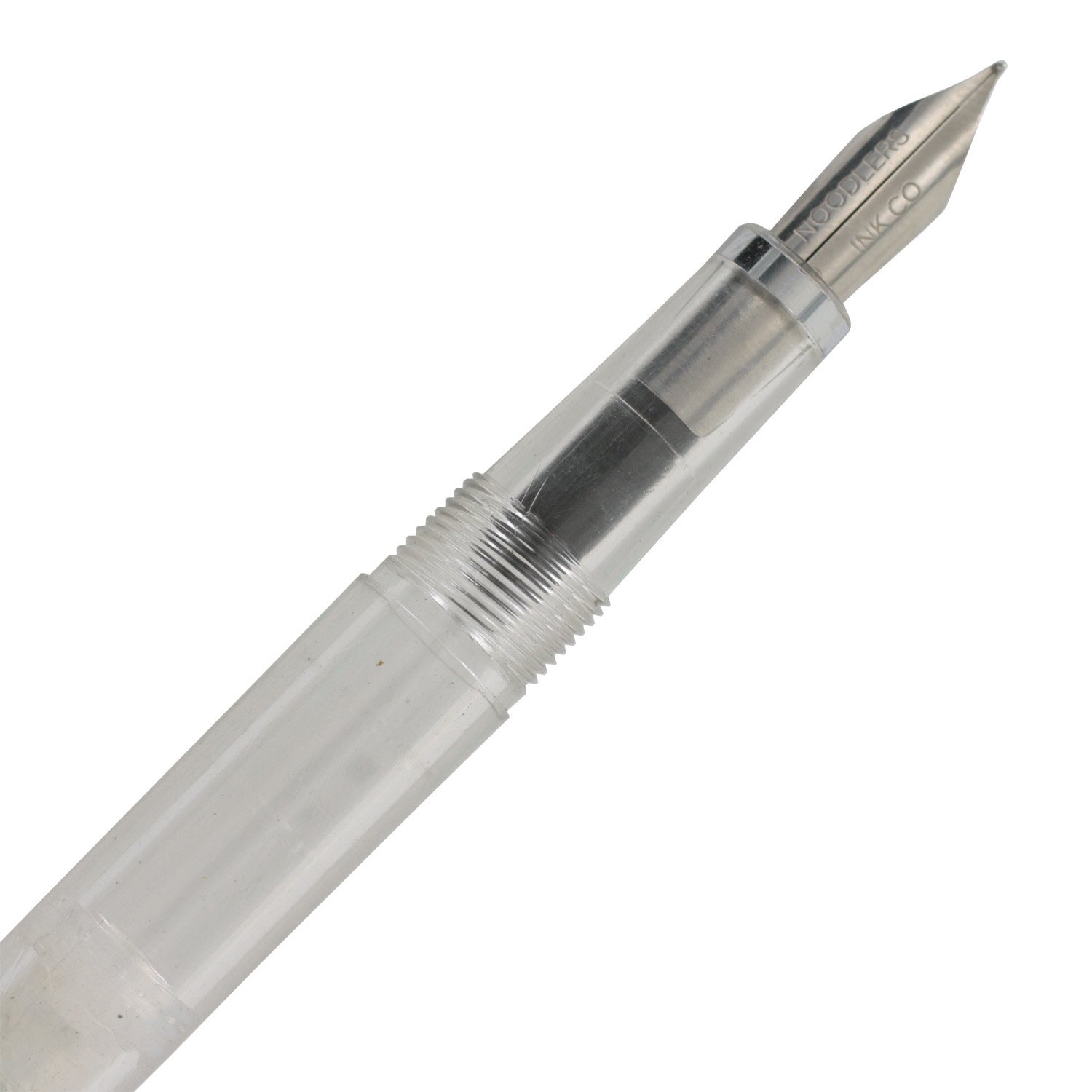 Noodler's Flex Image Source
Pilot Varsity
 Pilot Varsity Image Source
 Pilot Varsity Image Source
Sailor Fude De Mannen
 Sailor Fude De Mannen Image Source
Sailor's Fude De Mannen have nibs with varying degrees. The above pen (as well as mine) has a 55 degree angle. I would be interested in trying the 40 degree Fude de Mannen as well.
 Sailor Piston Converter Image Source
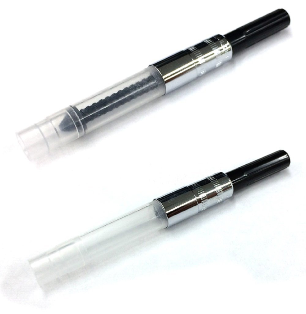 Sailor Piston Converter Image Source
I couldn't play with my new toys until an appropriate ink was found and I quickly ordered Platinum's Carbon Ink, also by Heidi's recommendation.
Ink Purchased
Platinum Carbon Ink
Cleaning My New Toys:
Used the method demonstrated on Withoutink

Setting Up My Pens

After cleaning, all three pens were easy to use on the Rhodia blank pad I picked up at Paper and Ink Arts. Instant ink startup, no skips, no catching on the paper. I found that the Noodler's Flex, although a bit stinky, handled the best for what I wanted, and was able to sketch and doodle without nipping the paper. The Pentel Chibi also handled quite well, almost as well as the Flex, and the TWSBI offers a broader nib with a little less flex. All three are great so far, and have been inked up with my Carbon Ink.
The TWSBI and Flex both have their own pistons for easy filling, but I purchased a little converter for my Pentel Chibi.
I think I'm going to add my Flex to my everyday art carry, but the Chibi and TWSBI ECO will probably live on my desk, at least until I ink the Chibi with something exciting (or order another).
Sailor Fude De Mannen
After I'd already cleaned out my Flex, TWSBI, and Chibi, my anticipated Fude de Mannen arrived from Amazon.
A fude style fountain pen is designed to facilitate Eastern style characters and replicate the stroke of a brush. Instead of being more flexible than Western nibs, a fude style nib is bent at an angle (45 or 55) to facilitate this.
Drawing with Fountain Pens
Noodler's Flex and Fude De Mannen
Drawn in a Rhodia Blank notebook.
Noodler's Flex

Fude de Mannen
TWSBI Eco and Jetpens Chibi
Sketched on Rhodia blank paper.
Jetpens Chibi

TWSBI Eco
Inked with the TWSBI Eco and the Noodler's Flex
Sketched and inked on Strathmore 400 series Mixed Media paper with Platinum Carbon Ink using a TWSBI Eco and a Noodler's Flex.

Daisies were inked with the Noodler's flex, as it can deliver a fine line. I noticed no paper tearing.
Outlines and major details were inked with a TWSBI Eco broad nib.
Finer details were inked with a combination of the TWSBI and the Noodler's Flex.
 Ink was allowed to dry for 24 hours, then erased, with no noticeable ghosting.
When sketching and inking, I find myself reaching for the Noodler's Flex, especially after listening to Goulet Pens interview with Nathan Tardif. It's such an easy little pen to ink with- a good amount of flex, doesn't nip up quality watercolor paper, easy to get started, doesn't require much pressure to with. Right now, if you're interested in a fountain pen for inking your art, I definitely recommend it.
Pros of using a Fountain Pen to Ink
Can use a wide variety of inks and ink colors- from very watersoluble to waterfast, to inks with dichromatic propertiesInexpensive options like the Jetpens Chibi, Pilot Preppy, and the Pilot Petit1 can be purchased in quality and filled with a rainbow of colors, if you enjoy colored lineworkEven without flex, with an italic nib, you can achieve a lot of lineweight by rotating the pen slightly.Cons of Using a Fountain Pen
The most flexible nibs on an unmodded, stock pen will be on vintage pens, which tend to be expensiveIf you want to carry a lot of ink, you may need to buy a converter or try an eyedropper conversionNeed to be careful about the papers you ink on- sketchbook paper is generally a no go, but tightly woven papers and coated papers should work decentlyUnless you mod or buy a modded pen, no nib will deliver the flex of a flexible dip pen nibCan't use just any inks- need to use exclusively fountain pen inks, otherwise ink may clog/ruin pen
Comic Lettering with a Fountain Pen
 Uppercase alphabet lettered with the Sailor Fude de Mannen, lettered on Strathmore Writing paper (prelined)
Although I lettered alphabets with all four of my fountain pens, only the Fude De Mannen had a distinctive stroke. This makes sense as it's a pen designed to replicate stroke calligraphy.
This said, the TWSBI Eco is enjoyable for general writing, and I find myself reaching for it when I want to make notes.
Outside Resources:
Fountain Pen Network: Painting With Watercolors over a Fountain Pen
Jetpens Blog: Fountain Pens (section)
Parts of a Fountain Pen
Fountain Pen Terminology
Pen Maintenance
Filling Mechanisms
Fast Pen Flushing
How to Write with a Flex Nib
Fast Pen Flushing
How to Write with a Flex Nib
If you enjoyed this post, there are loads of ways you can let me know! You can shoot me an email using the form in the lefthand sidebar, you can share this post to your social networks using the sharing buttons below, you can link this post on your favorite forums and sites. These are all great ways to show me that you enjoy my content, as you're helping me increase my audience, spread the goodness of art education to the masses, and helping me establish legitimacy. If you'd like to show more support, contacting companies on my behalf is a great way to really help me in a meaningful way- you can find company info in the righthand sidebar. If you'd like to help fund future posts, you can purchase something from my online shop or my Gumroad shop. Finally, if you'd like to join my community of art nerds, gain early access to content, AND help support future posts, head on over to my Patreon for information on how to join the community.
Please consider donating to this blog or purchasing from Natto-shop (http://nattosoup.com/shop) if you want me to continue publishing quality content. All materials tested were purchased from my own pocket. Keep on Truckin' Nattosoup is not under any sponsorship.
November 9, 2016
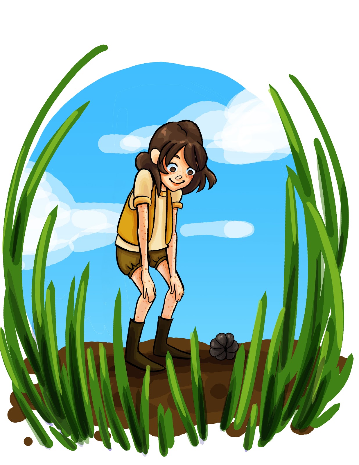
One Illustration, Multiple Renditions
As a children's comic artist, I feel like I've hit the wall with self publishing. Comics, as an industry, isn't really geared towards producing work intended for children, and isn't really interested in exploring untapped avenues. Although I love comics, and want to continue to make comics for a younger audience, I feel like it's time for me to think more laterally and explore other options.
Currently, I'm working on bridging my work from comics to include kidlit and children's book illustration. This requires a fair amount of work creating new pieces for my online portfolio, as much of that market currently focuses on digital art. While I prepare my portfolio to submit to agencies, agents, and art directors
I thought it would be interesting to handle the same basic illustration- Kara watching a curled up doodle bug- a variety of ways. While completing these illustrations, I learned a lot and improved my digital rendering methods, so I definitely think this is time well spent.
If you are an agent, art director, or in a position to help me pursue my goals, and you like what you see here or on any other post, please do not hesitate to get in contact with me. You can check out my kidlit portfolio for more examples of kid specific work, or you can check out my Behance for a much broader selection. I am always interested in new longterm, paying, job opportunities, and am not currently under contract.
All illustrations were originally inked in a sketchbook, scanned, and rendered in Photoshop on my Surface Pro 3. Character depicted is Kara from my ongoing watercolor comic, 7" Kara. Volume 1 is available in book and pdf formats.
Digital Flats

Digital Pastel
 Digital Watercolor (no textures)
 Textured Digital Watercolor

Digital Crayon

Digital Illustration

Faux Papercut Simple
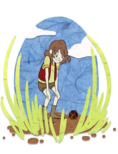 Layered Cut Paper

Faux Colored Lineart

Digital Lineless
 I also take private commissions for art both digital and traditional. If you're interested in purchasing a commission, check out my options on my online shop, or send me an email describing what you want, and I can make a recommendation and provide quotes.
Please consider donating to this blog or purchasing from Natto-shop (http://nattosoup.com/shop) if you want me to continue publishing quality content. All materials tested were purchased from my own pocket. Keep on Truckin' Nattosoup is not under any sponsorship.
Currently, I'm working on bridging my work from comics to include kidlit and children's book illustration. This requires a fair amount of work creating new pieces for my online portfolio, as much of that market currently focuses on digital art. While I prepare my portfolio to submit to agencies, agents, and art directors
I thought it would be interesting to handle the same basic illustration- Kara watching a curled up doodle bug- a variety of ways. While completing these illustrations, I learned a lot and improved my digital rendering methods, so I definitely think this is time well spent.
If you are an agent, art director, or in a position to help me pursue my goals, and you like what you see here or on any other post, please do not hesitate to get in contact with me. You can check out my kidlit portfolio for more examples of kid specific work, or you can check out my Behance for a much broader selection. I am always interested in new longterm, paying, job opportunities, and am not currently under contract.
All illustrations were originally inked in a sketchbook, scanned, and rendered in Photoshop on my Surface Pro 3. Character depicted is Kara from my ongoing watercolor comic, 7" Kara. Volume 1 is available in book and pdf formats.
Digital Flats

Digital Pastel
 Digital Watercolor (no textures)
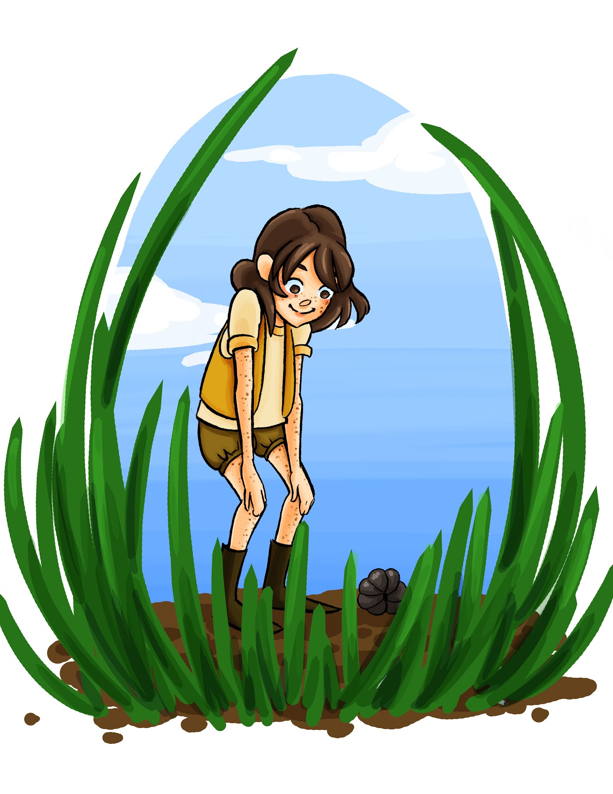 Textured Digital Watercolor
Digital Crayon

Digital Illustration
Faux Papercut Simple
 Layered Cut Paper
Faux Colored Lineart

Digital Lineless
 I also take private commissions for art both digital and traditional. If you're interested in purchasing a commission, check out my options on my online shop, or send me an email describing what you want, and I can make a recommendation and provide quotes.
Please consider donating to this blog or purchasing from Natto-shop (http://nattosoup.com/shop) if you want me to continue publishing quality content. All materials tested were purchased from my own pocket. Keep on Truckin' Nattosoup is not under any sponsorship.
November 7, 2016
2017 Backer and Potential Backer Interest Survey
Even if you aren't a backer on my Patreon, please take a moment to fill out this survey- it includes questions about the YouTube channel and this blog. Your answers will help me improve all three platforms in 2017, and will give me valuable insight.
Loading...
Please consider donating to this blog or purchasing from Natto-shop (http://nattosoup.com/shop) if you want me to continue publishing quality content. All materials tested were purchased from my own pocket. Keep on Truckin' Nattosoup is not under any sponsorship.
Loading...
Please consider donating to this blog or purchasing from Natto-shop (http://nattosoup.com/shop) if you want me to continue publishing quality content. All materials tested were purchased from my own pocket. Keep on Truckin' Nattosoup is not under any sponsorship.
November 6, 2016
Should I apply to SCAD?
Should I apply to SCAD?
I can really only answer this question for the SEQA department, and only for graduate school. Please keep in mind that a lot has changed since I graduated. I've attempted to answer this question in the past, but it's always worth revisiting as things change and time progresses.
Why I Chose SCAD
Why SCAD
SCAD Advice for Matriculating Undergrads
A Year at the Savannah College of Art and Design Part 1
Our Visit to SCAD Atlanta
Things I've Learned from Art School
Since I'll hit my fourth year since graduation next March, I thought it'd be nice to distill everything down to the most essential questions.
What it really depends on is "What do you want out of SCAD"
If you want to improve your artistic abilities quickly, and use what you've learned to propel your growth into the future: Yes. Although I was a self motivated student, I needed guidance and peers who were interested in my field. UNO did not provide sufficient guidance in my field of study, and self education, while quite useful, was not enough to bridge the gap.
If you want to learn how to work in your industry: From my experience, the answer was no.
If you want to make contacts that can help you find work: The answer definitely varies with who you have classes with. If you get along well with your classmates and have a good bunch, you'll definitely have a great network. Although I'm still friends with a few people I met while I attended SCAD, I've definitely made better industry contacts outside of SCAD by participating in comic discussions on Twitter.
Can I rely on SCAD as a continuing resource: Officially, they claim you can, but your mileage may vary. As a comics person, they had very little directly in my field, but a lot of opportunities for advertising.
Gradschool is a huge investment, but it is a huge investment in YOU. If you believe you have what it takes- be it determination, motivation, willpower, drawing ability, or drive, it may be worth the gamble.
If you do decide that pursuing higher art education is important to you, owning your investment is important. In an industry that idealizes the myth of the 'self taught artist', art school is seen as an unnecessary luxury- you had to pay for your skills. Over the years, I've minimalized the value of having an MFA in an attempt to be polite to other artists- I've downplayed the virtues of attending a dedicated, accredited art institution, putting my time in, and earning a terminal degree in order to not appear conceited. This has been a mistake on my part. Although I do not believe art school is mandatory for a career in comics, I do believe it was something worthwhile, money fairly well spent, and something I needed to do for me. The education I received was not only valid, it was exceptional, and many of my professors had worked in the industry I wished to enter. I learned solid skills while at SCAD, from perspective to human anatomy, to handlettering to digital coloring. I learned how to give and receive critique, how to use that to propel my work to another level, how to construct an engaging story, and perhaps the most important thing of all, I learned how to take what I needed and how to throw the rest away.
Please consider donating to this blog or purchasing from Natto-shop (http://nattosoup.com/shop) if you want me to continue publishing quality content. All materials tested were purchased from my own pocket. Keep on Truckin' Nattosoup is not under any sponsorship.
November 5, 2016
Mermaid Coloring Pages Now Available on Gumroad!
Loading...
Please consider donating to this blog or purchasing from Natto-shop (http://nattosoup.com/shop) if you want me to continue publishing quality content. All materials tested were purchased from my own pocket. Keep on Truckin' Nattosoup is not under any sponsorship.
Please consider donating to this blog or purchasing from Natto-shop (http://nattosoup.com/shop) if you want me to continue publishing quality content. All materials tested were purchased from my own pocket. Keep on Truckin' Nattosoup is not under any sponsorship.
November 2, 2016
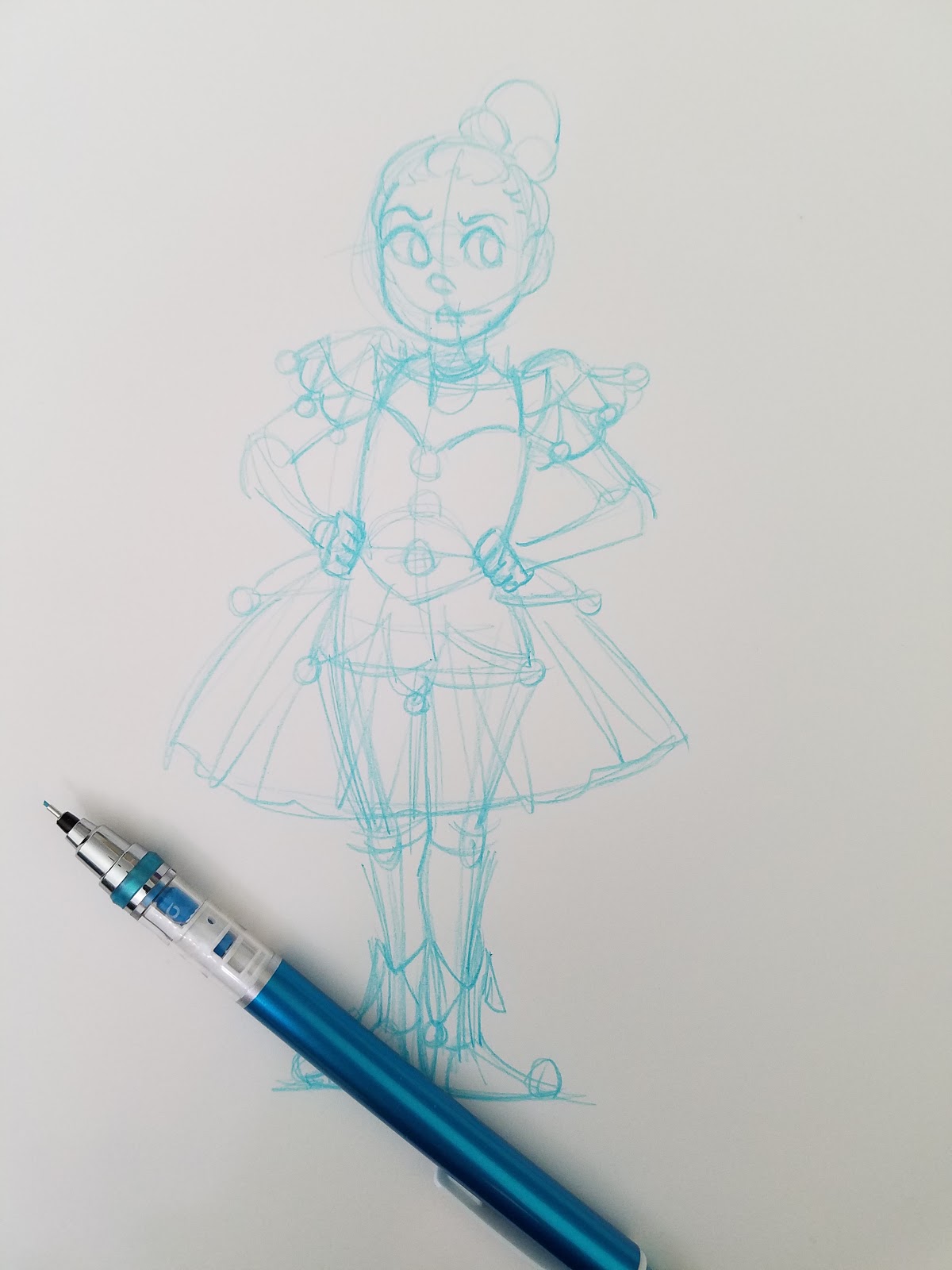
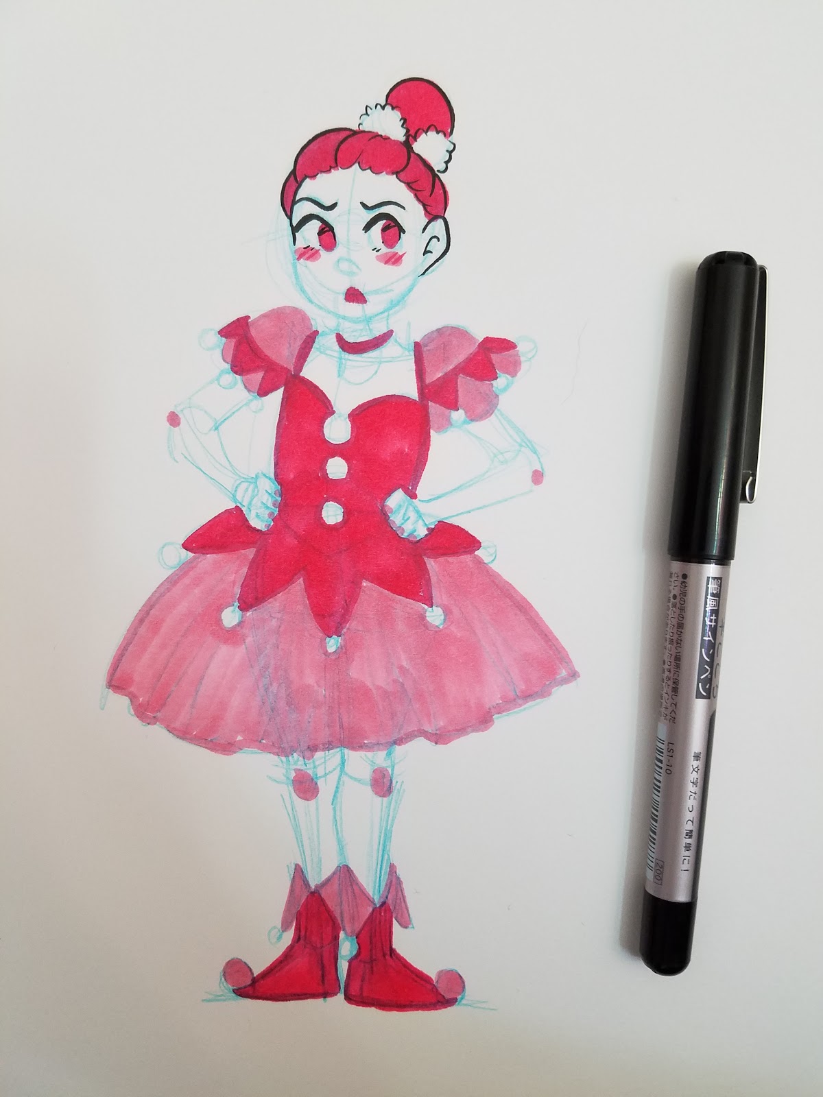
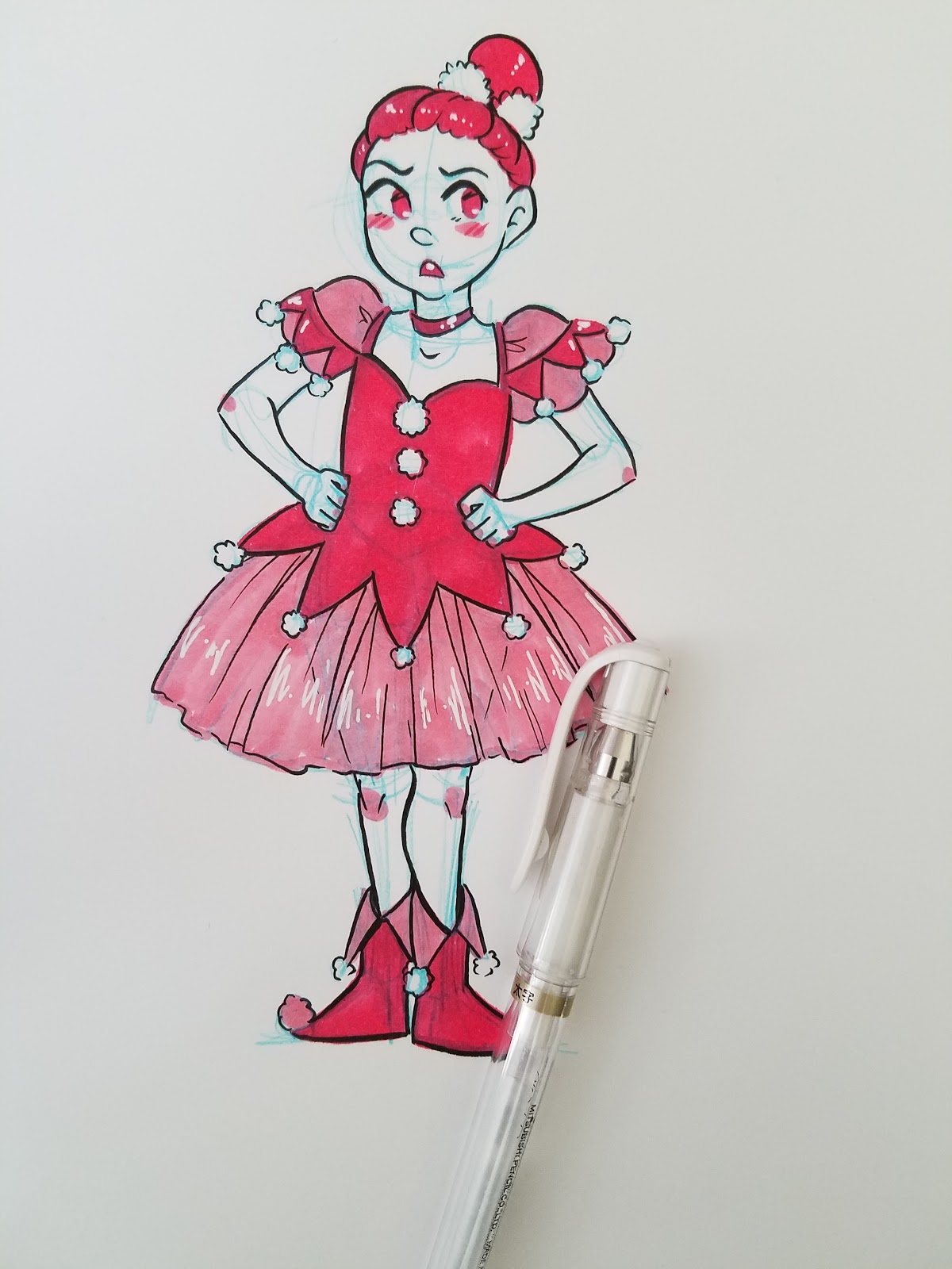
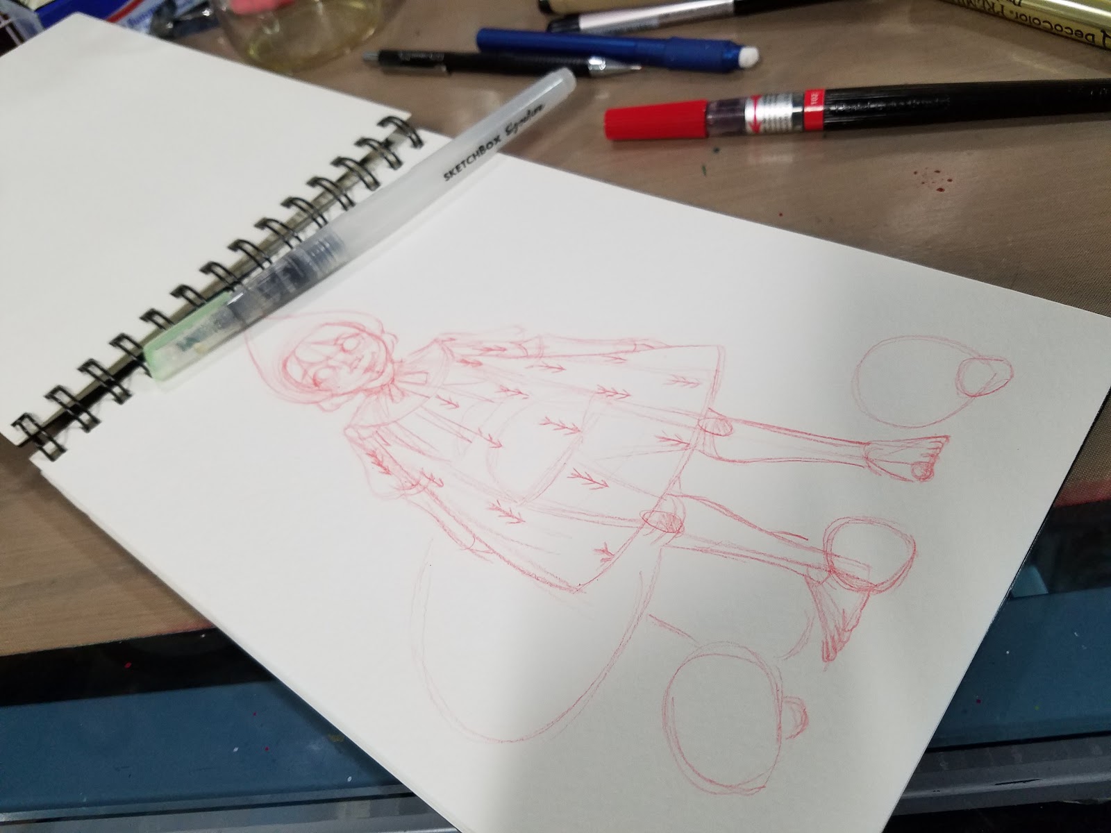
Taking Sketchbook Inks to the Next Level
Although Inktober is over, that's no reason to stop inking! I know many of you are tired out from the daily grind of drawing and inking a piece every day for October, but hopefully these easy inking hacks will inspire you to pick up the brush/pen/nib once more. Now that you've put in some practice inking, these playful additions should not only be easy, but loads of fun. And all of them look like so much more than the sum of their parts.
If you need to pick up any supplies for these tutorials, please use the included links. These affiliate links pay me a small bounty when products are purchased, and are at no additional cost to you. Using my affiliate links, or beginning your Amazon shopping trips with my affiliate links (even if you don't directly purchase the item linked) is a great way to help support this blog at no cost to you.
If you enjoy these sort of posts, and would like to help me make more of them, please head on over to my Patreon for information on how to join my merry band of artnerds, and how to support future content. Even a small monthly contribution goes a long way towards future tutorials and reviews!
Blue Lead+Alcohol Marker+Black Inks
Materials Needed:
C6 Copic Marker or other cool gray alcohol marker
Signo White Gel Pen
Non photo blue lead (I use Color Eno Soft Blue)
Fude pen (I use Kuretake's Fudegokochi)
Step 1: Sketch

Step 2: Outline with Alcohol Marker


Step 3: Fill in with Alcohol Marker


Step 4: Ink with Pen


 Step 4: Fill in Spot Black

Step 5: Add Highlights with Signo

Further Examples:


Blue Lead+Multiple Alcohol Inks+Black Ink
Materials Needed:
Complimentary marker colors (at least 2)
Signo White Gel Pen
Non photo blue lead (I use Color Eno Soft Blue)
Fude pen (I use Kuretake's Fudegokochi)
Step 1: Sketch
 Step 2: Outline areas you want to fill with color

Step 3: Begin Coloring


Step 4: Ink with Black Pen


Step 5: Add Highlights


Using a colored lead+colored ink+black ink
Materials Needed:
Colored Lead (I used Pentel's red lead)
Matching Colored Brushpen (I used Pentel's Brushpen in Red)
Signo White Gel Pen
Fude pen (I use Kuretake's Fudegokochi)
Black brushpen (I used a Pentel Pocketbrush and a Pentel Brushpen)
Step 1: Sketch in Colored Lead

Step 2: Outline and Fill with colored ink
Step 3: Ink
Step 4: Fill in Spot Blacks

Further Examples:

Colored Lead+Colored Ink+Inkwash Techniques+Black Ink
Materials Needed:
Colored Lead (I used Pentel's red lead)
Matching Colored Brushpen (I used Pentel's Brushpen in Red)
Signo White Gel Pen
Fude pen (I use Kuretake's Fudegokochi)
Black brushpen (I used a Pentel Pocketbrush and a Pentel Brushpen)
Waterbrush with Clean Water
Surface to use as palette (I'm using an Inkssentials Craft Mat by Ranger)
Step 1: Sketch image in colored lead
 Step 2: Apply colored ink to palette. Add a drop of water. Begin painting delicate washes. Allow to dry.
 Step 3: Apply red ink. Allow to dry thoroughly (takes awhile on watercolor paper).
Step 4: Ink with black ink.
 Further Examples

Colored Leads+Colored Ink+Metallic Ink+Black Ink
Materials Needed:
Colored Lead (I used Pentel's red lead)
Matching Colored Brushpen (I used Pentel's Brushpen in Red)
Metallic pen (I used Uchida's DecoColor Premium)
Fude pen (I use Kuretake's Fudegokochi)

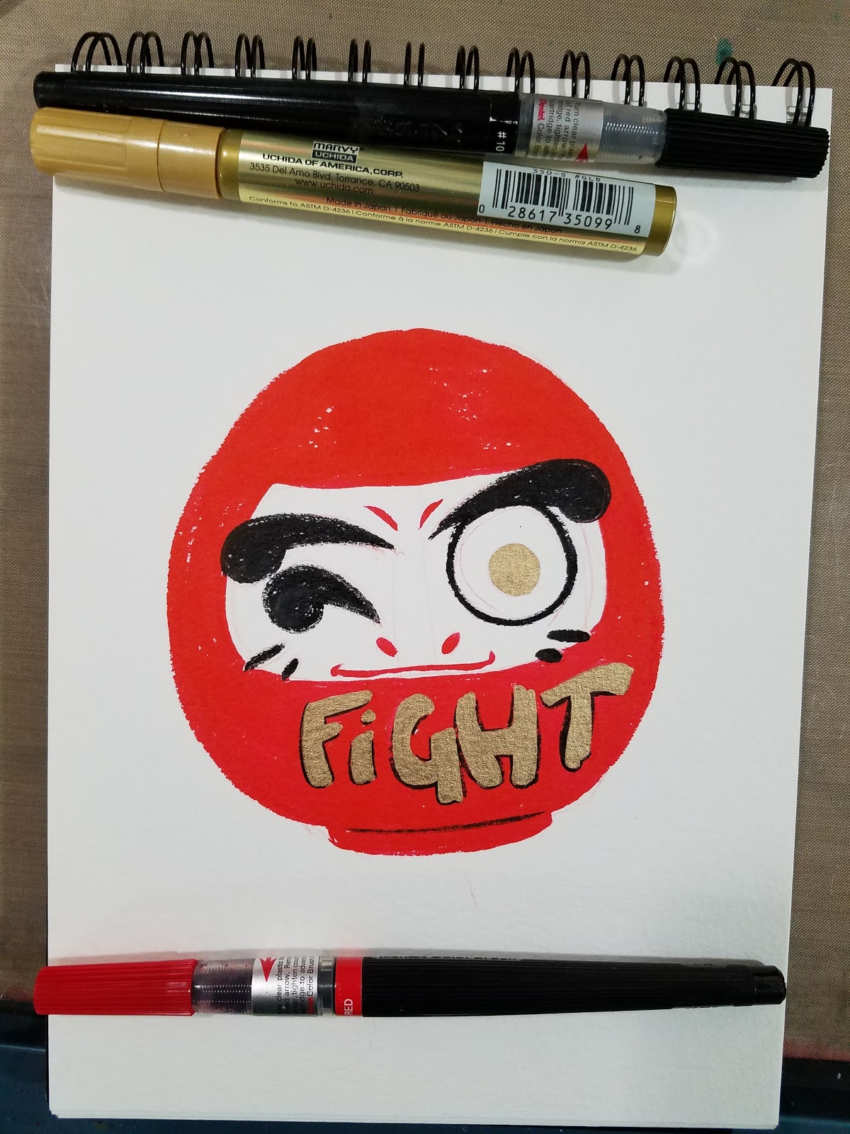
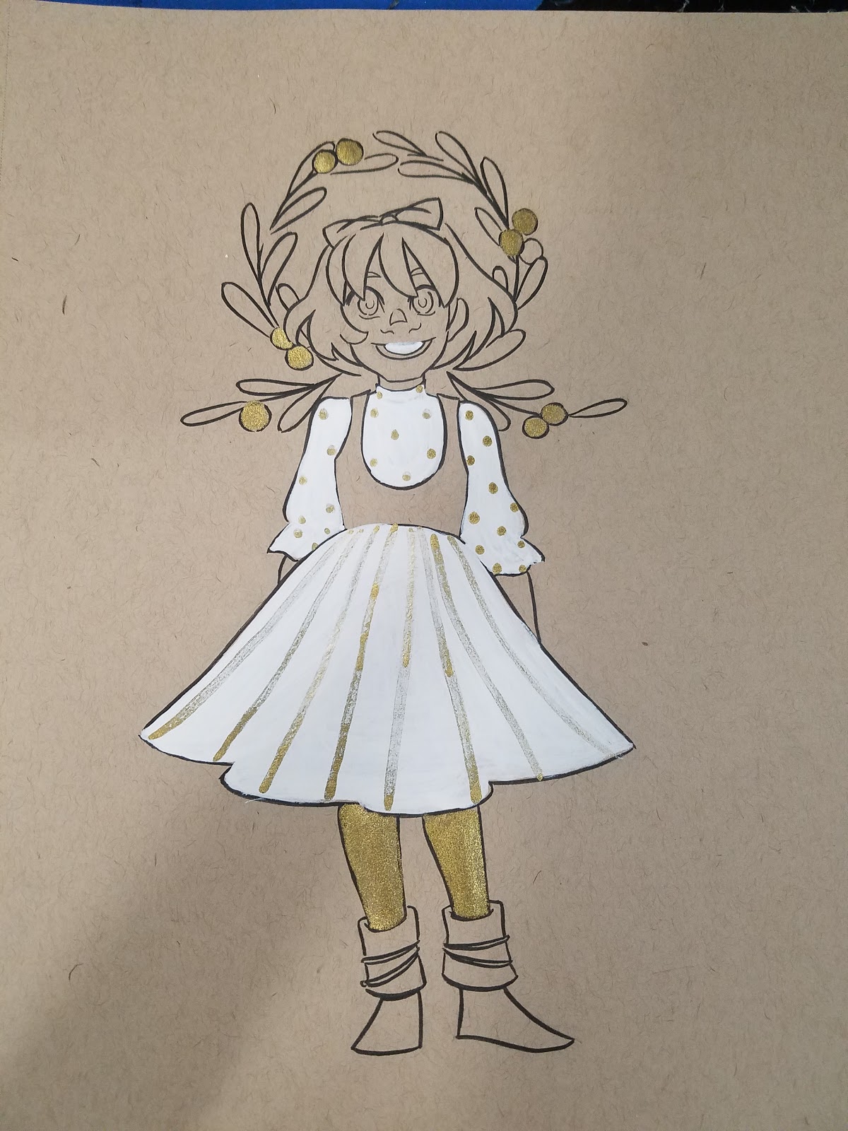
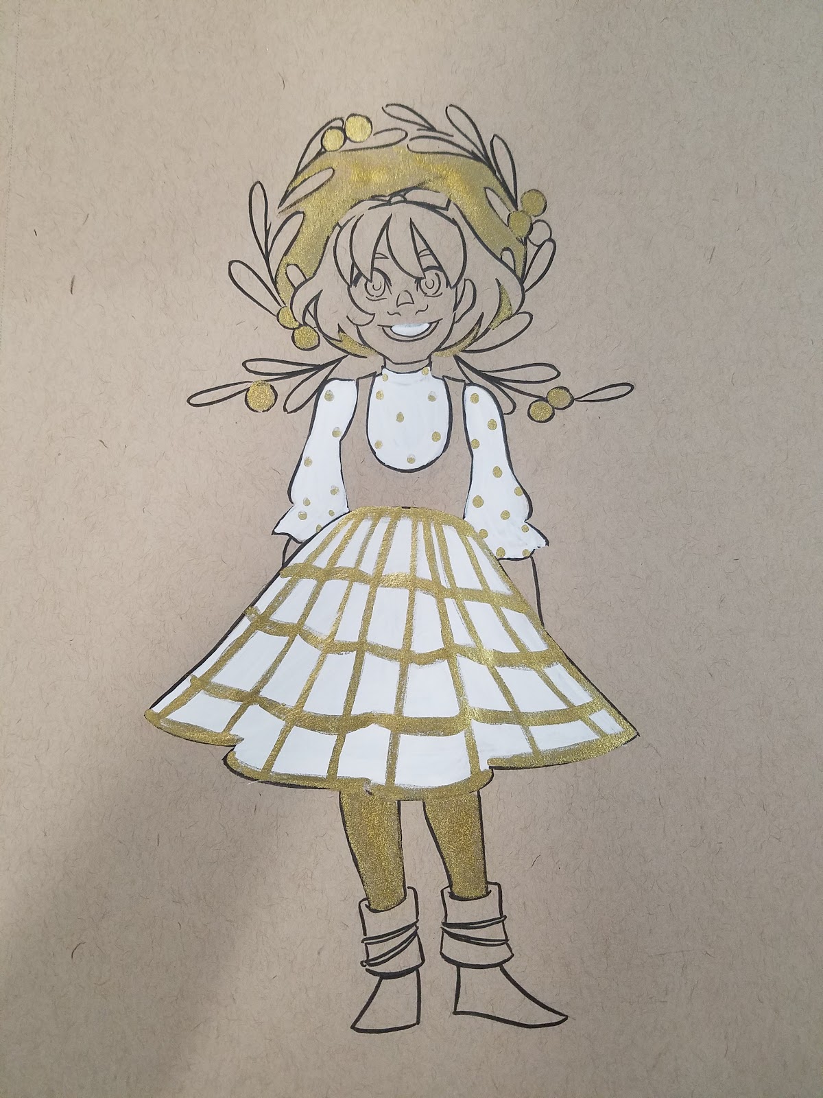
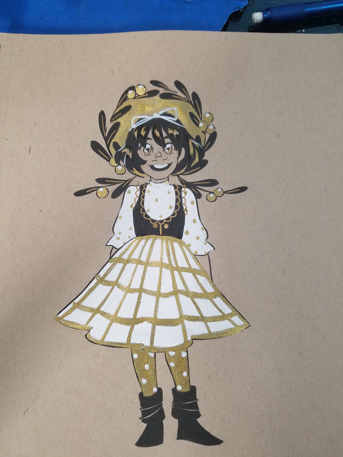
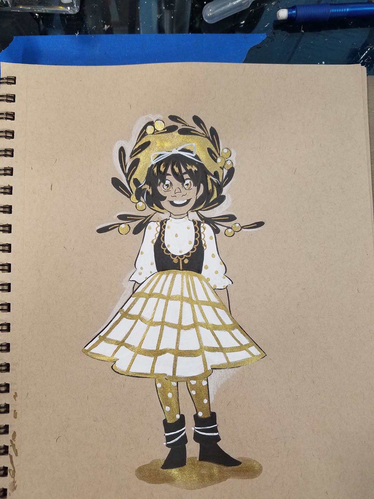
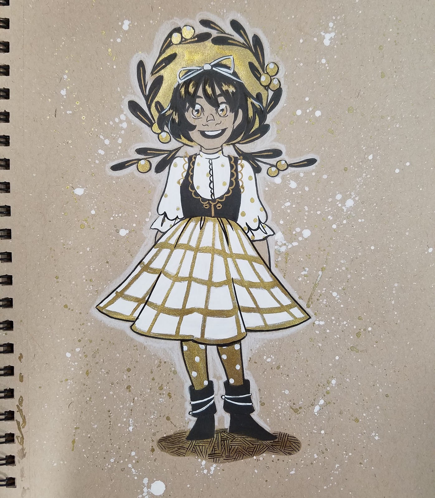
Toned Tan Paper+Graphite+Black Ink+Copic Opaque White (or Gouache)+ Gold Ink
Materials Needed:
Colored Paper (I used Strathmore's Toned Tan paper)
Black Ink (I used a Sailor Mitsuo Aida brushpen, as it's waterproof)
Graphite lead
White Gouache, White Signo, or Copic Opaque White
Gold Ink (I used Winsor and Newton's Gold Ink)
Optional: Tracing Paper (for mask)
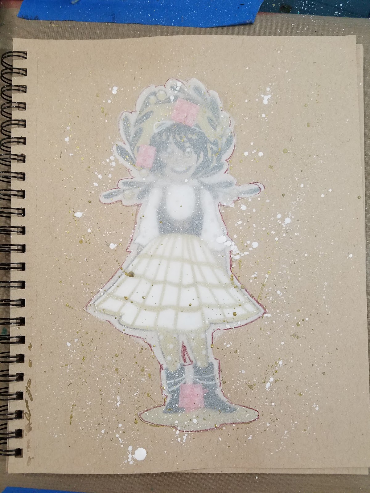
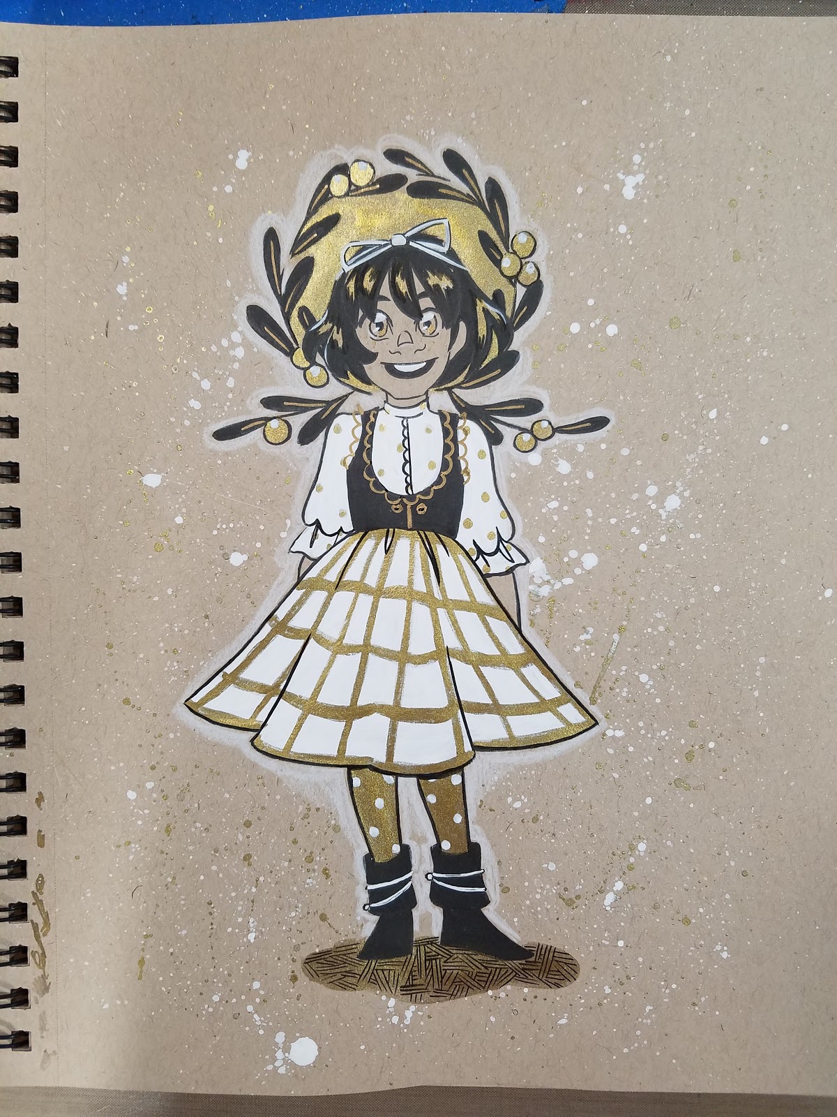
Step 1: Pencil Image
Step 2: Ink Image
Step 3: Erase Inks
Step 4: Fill in major areas of white, allow to dry

Step 2: After white gouache/Copic Opaque white is dry, you may begin applying gold ink

Step 3: Some areas may need repeat coverage for opacity

Step 4: Begin filling in areas of spot black

Step 5: Add white details and refine areas of black ink, reinking when necessary


Step 6: For Splatter Effect: With tracing paper, cut a mask for the area you'd like to protect

Step 7: Tape it down

Step 8: Splatter with ink of choice (in this instance, gold and white)

Step 9: Remove mask


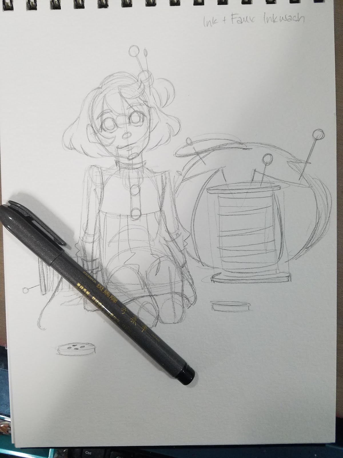
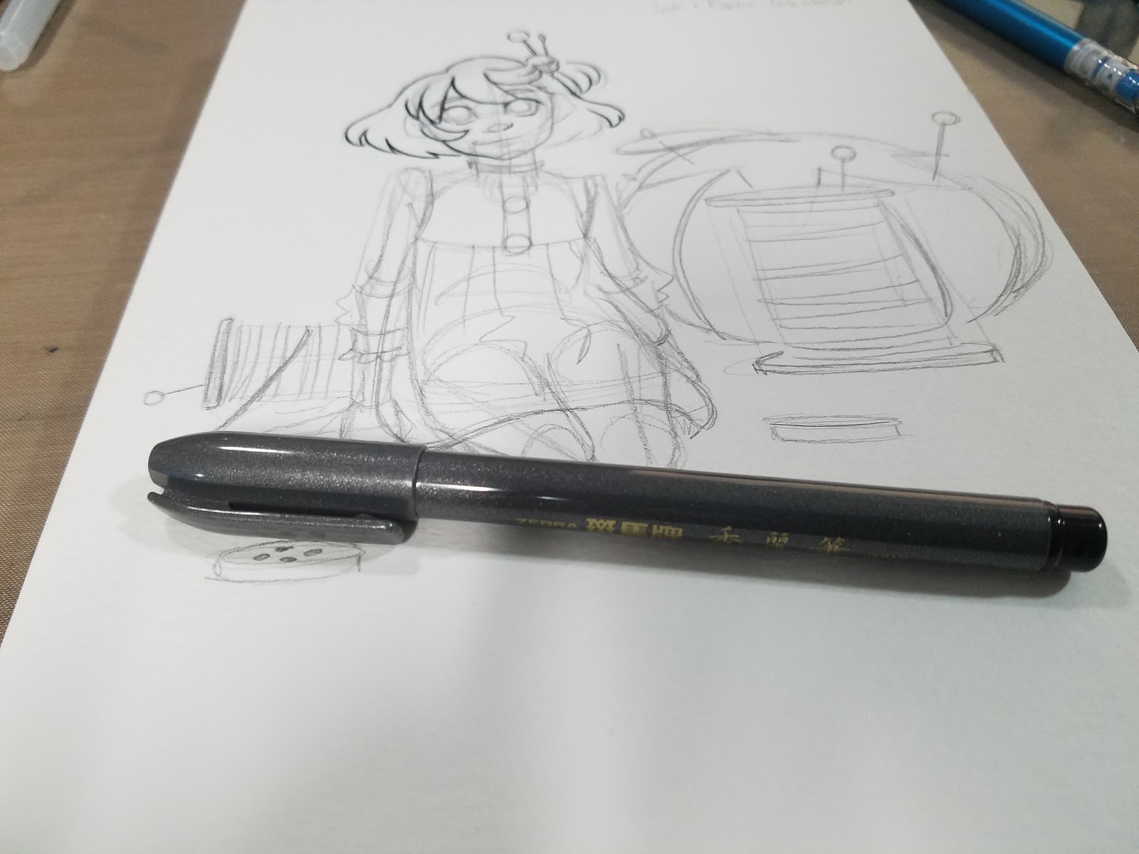
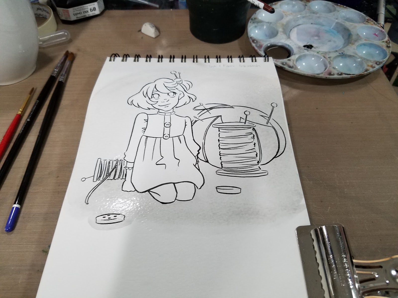
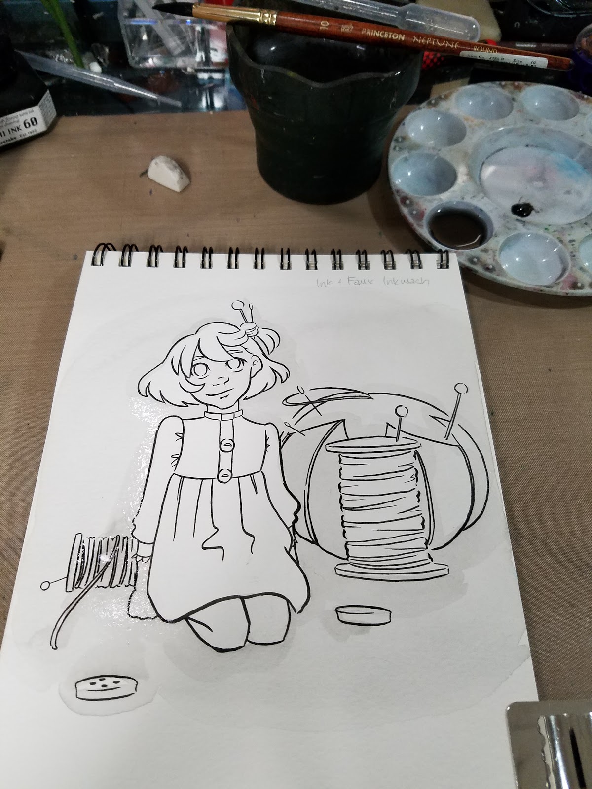
Ink+Watercolor Faux Inkwash
Materials needed:
Sturdy Paper (I recommend watercolor, inexpensive is fine)
Ink (I used a waterproof India Ink or a waterproof brushpen like the Sailor Mitsuo Aida)
Matching Watercolor color (I used Holbein's Carbon Black)
Step 1: Pencils

Step 2: Ink with waterproof ink


Step 3: Erase Pencils

Step 4: Select your paint

Step 5: Apply pea sized portion to palette

Step 6: Fill well with water, begin mixing paint, starting from lightest to darkest.


Step 7: For much darker objects, you may work directly from watercolor paint knob.


Step 8: Keep layering, allowing paint to dry between layers.


Step 9: Add highlights with White Signo, Copic Opaque White, or White Gouache


Further Examples:


 These sample are from Pretty Paladin Critical Missy, my Chainmail Bikini story.
So those are some of my favorite easy ways to bring my sketchbook inks to the next level! Only require a few additional supplies (that most of you already have lying around), and can really make a big impact on your work, and help break up inking monotony.
Questions? Comments? Let me know via email (left sidebar) or Twitter! Let's talk about YOUR favorite easy inking hacks! Liked this blogpost? Found it helpful? Share it with your friends and fans using the handy social media links below this post! Your share and signal boost really helps me out, and is much appreciated.
Please consider donating to this blog or purchasing from Natto-shop (http://nattosoup.com/shop) if you want me to continue publishing quality content. All materials tested were purchased from my own pocket. Keep on Truckin' Nattosoup is not under any sponsorship.
If you need to pick up any supplies for these tutorials, please use the included links. These affiliate links pay me a small bounty when products are purchased, and are at no additional cost to you. Using my affiliate links, or beginning your Amazon shopping trips with my affiliate links (even if you don't directly purchase the item linked) is a great way to help support this blog at no cost to you.
If you enjoy these sort of posts, and would like to help me make more of them, please head on over to my Patreon for information on how to join my merry band of artnerds, and how to support future content. Even a small monthly contribution goes a long way towards future tutorials and reviews!
Blue Lead+Alcohol Marker+Black Inks
Materials Needed:
C6 Copic Marker or other cool gray alcohol marker
Signo White Gel Pen
Non photo blue lead (I use Color Eno Soft Blue)
Fude pen (I use Kuretake's Fudegokochi)
Step 1: Sketch

Step 2: Outline with Alcohol Marker
Step 3: Fill in with Alcohol Marker


Step 4: Ink with Pen
 Step 4: Fill in Spot Black
Step 5: Add Highlights with Signo
Further Examples:


Blue Lead+Multiple Alcohol Inks+Black Ink
Materials Needed:
Complimentary marker colors (at least 2)
Signo White Gel Pen
Non photo blue lead (I use Color Eno Soft Blue)
Fude pen (I use Kuretake's Fudegokochi)
Step 1: Sketch
 Step 2: Outline areas you want to fill with color
Step 3: Begin Coloring


Step 4: Ink with Black Pen

Step 5: Add Highlights

Using a colored lead+colored ink+black ink
Materials Needed:
Colored Lead (I used Pentel's red lead)
Matching Colored Brushpen (I used Pentel's Brushpen in Red)
Signo White Gel Pen
Fude pen (I use Kuretake's Fudegokochi)
Black brushpen (I used a Pentel Pocketbrush and a Pentel Brushpen)
Step 1: Sketch in Colored Lead

Step 2: Outline and Fill with colored ink
Step 3: Ink
Step 4: Fill in Spot Blacks

Further Examples:

Colored Lead+Colored Ink+Inkwash Techniques+Black Ink
Materials Needed:
Colored Lead (I used Pentel's red lead)
Matching Colored Brushpen (I used Pentel's Brushpen in Red)
Signo White Gel Pen
Fude pen (I use Kuretake's Fudegokochi)
Black brushpen (I used a Pentel Pocketbrush and a Pentel Brushpen)
Waterbrush with Clean Water
Surface to use as palette (I'm using an Inkssentials Craft Mat by Ranger)
Step 1: Sketch image in colored lead
 Step 2: Apply colored ink to palette. Add a drop of water. Begin painting delicate washes. Allow to dry.
 Step 3: Apply red ink. Allow to dry thoroughly (takes awhile on watercolor paper).
Step 4: Ink with black ink.
 Further Examples
Colored Leads+Colored Ink+Metallic Ink+Black Ink
Materials Needed:
Colored Lead (I used Pentel's red lead)
Matching Colored Brushpen (I used Pentel's Brushpen in Red)
Metallic pen (I used Uchida's DecoColor Premium)
Fude pen (I use Kuretake's Fudegokochi)
Toned Tan Paper+Graphite+Black Ink+Copic Opaque White (or Gouache)+ Gold Ink
Materials Needed:
Colored Paper (I used Strathmore's Toned Tan paper)
Black Ink (I used a Sailor Mitsuo Aida brushpen, as it's waterproof)
Graphite lead
White Gouache, White Signo, or Copic Opaque White
Gold Ink (I used Winsor and Newton's Gold Ink)
Optional: Tracing Paper (for mask)
Step 1: Pencil Image
Step 2: Ink Image
Step 3: Erase Inks
Step 4: Fill in major areas of white, allow to dry

Step 2: After white gouache/Copic Opaque white is dry, you may begin applying gold ink
Step 3: Some areas may need repeat coverage for opacity
Step 4: Begin filling in areas of spot black

Step 5: Add white details and refine areas of black ink, reinking when necessary
Step 6: For Splatter Effect: With tracing paper, cut a mask for the area you'd like to protect

Step 7: Tape it down

Step 8: Splatter with ink of choice (in this instance, gold and white)
Step 9: Remove mask
Ink+Watercolor Faux Inkwash
Materials needed:
Sturdy Paper (I recommend watercolor, inexpensive is fine)
Ink (I used a waterproof India Ink or a waterproof brushpen like the Sailor Mitsuo Aida)
Matching Watercolor color (I used Holbein's Carbon Black)
Step 1: Pencils
Step 2: Ink with waterproof ink

Step 3: Erase Pencils

Step 4: Select your paint

Step 5: Apply pea sized portion to palette

Step 6: Fill well with water, begin mixing paint, starting from lightest to darkest.

Step 7: For much darker objects, you may work directly from watercolor paint knob.


Step 8: Keep layering, allowing paint to dry between layers.

Step 9: Add highlights with White Signo, Copic Opaque White, or White Gouache


Further Examples:

 These sample are from Pretty Paladin Critical Missy, my Chainmail Bikini story.
So those are some of my favorite easy ways to bring my sketchbook inks to the next level! Only require a few additional supplies (that most of you already have lying around), and can really make a big impact on your work, and help break up inking monotony.
Questions? Comments? Let me know via email (left sidebar) or Twitter! Let's talk about YOUR favorite easy inking hacks! Liked this blogpost? Found it helpful? Share it with your friends and fans using the handy social media links below this post! Your share and signal boost really helps me out, and is much appreciated.
Please consider donating to this blog or purchasing from Natto-shop (http://nattosoup.com/shop) if you want me to continue publishing quality content. All materials tested were purchased from my own pocket. Keep on Truckin' Nattosoup is not under any sponsorship.
October 30, 2016
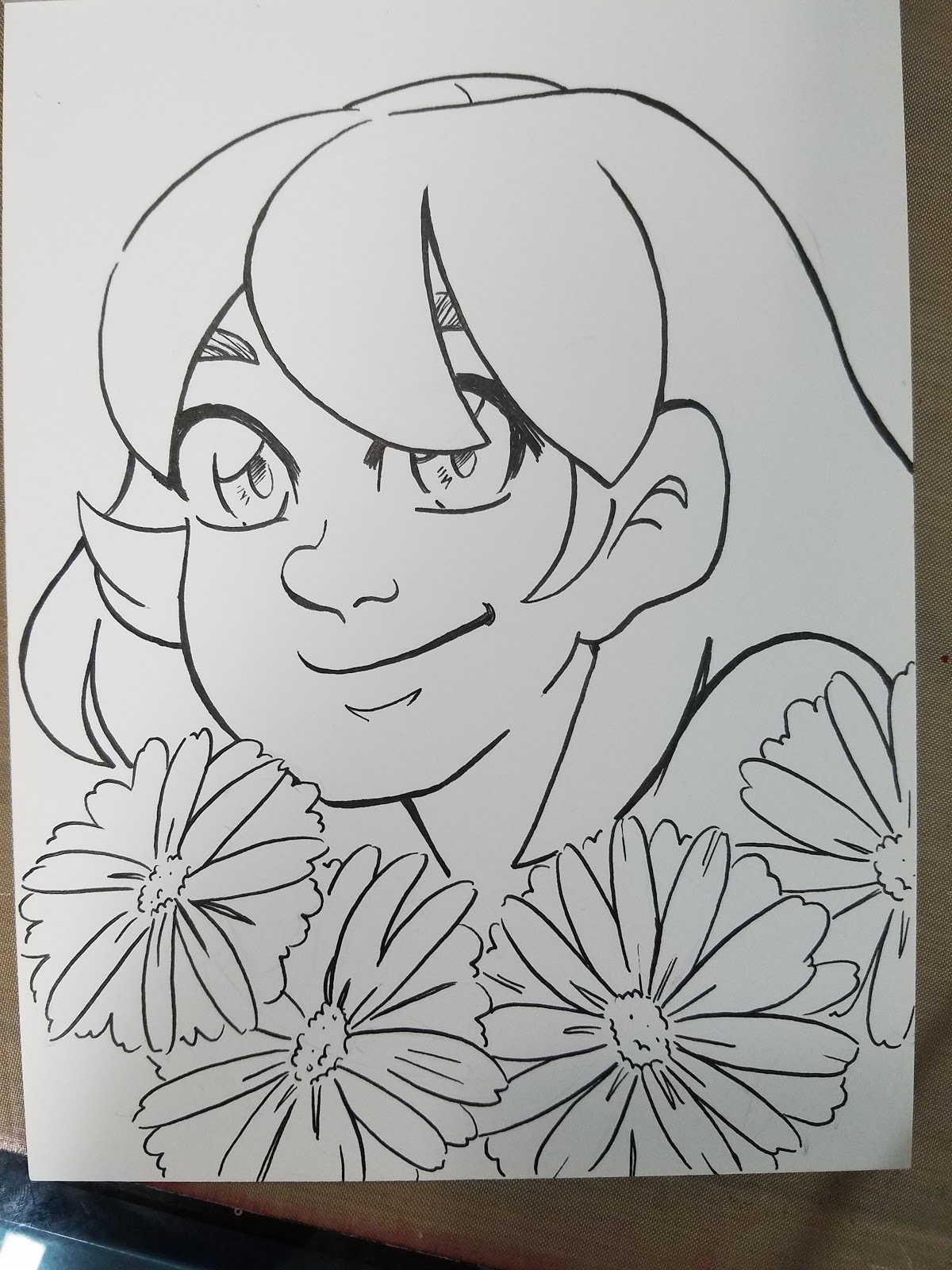
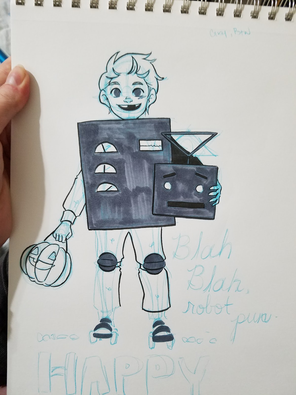
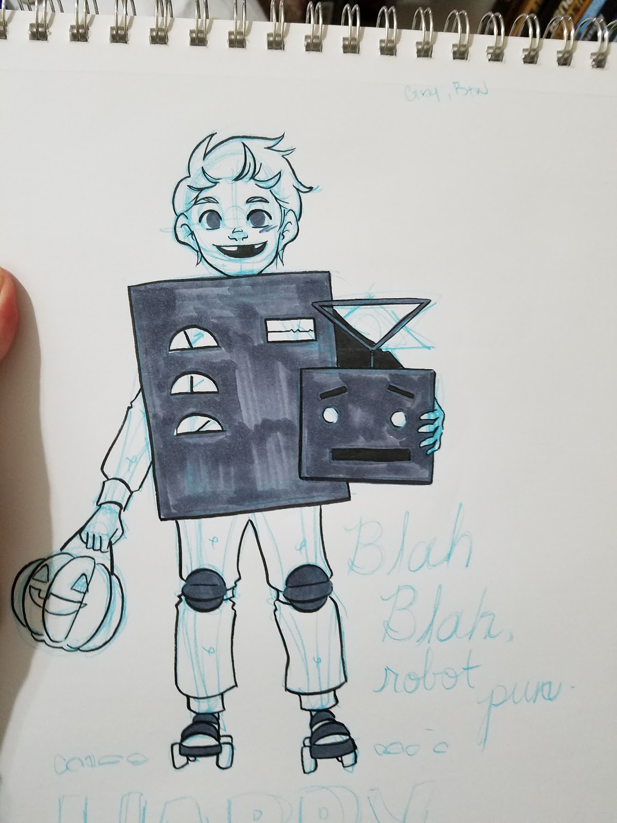
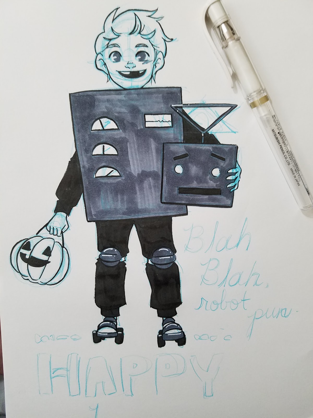
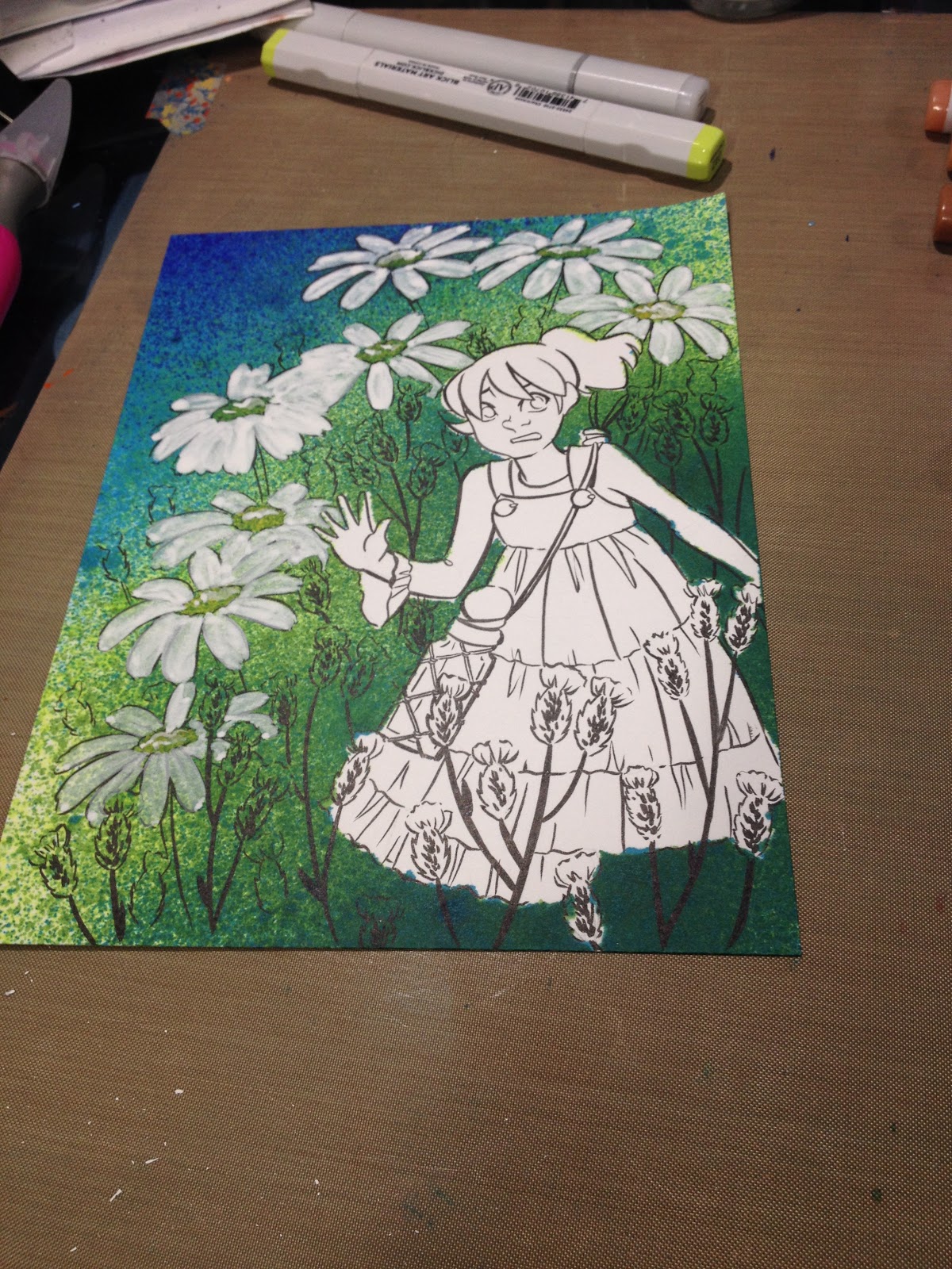
Breaking Complex Inks into Manageable Parts
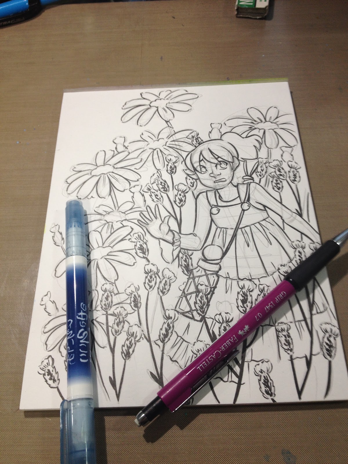
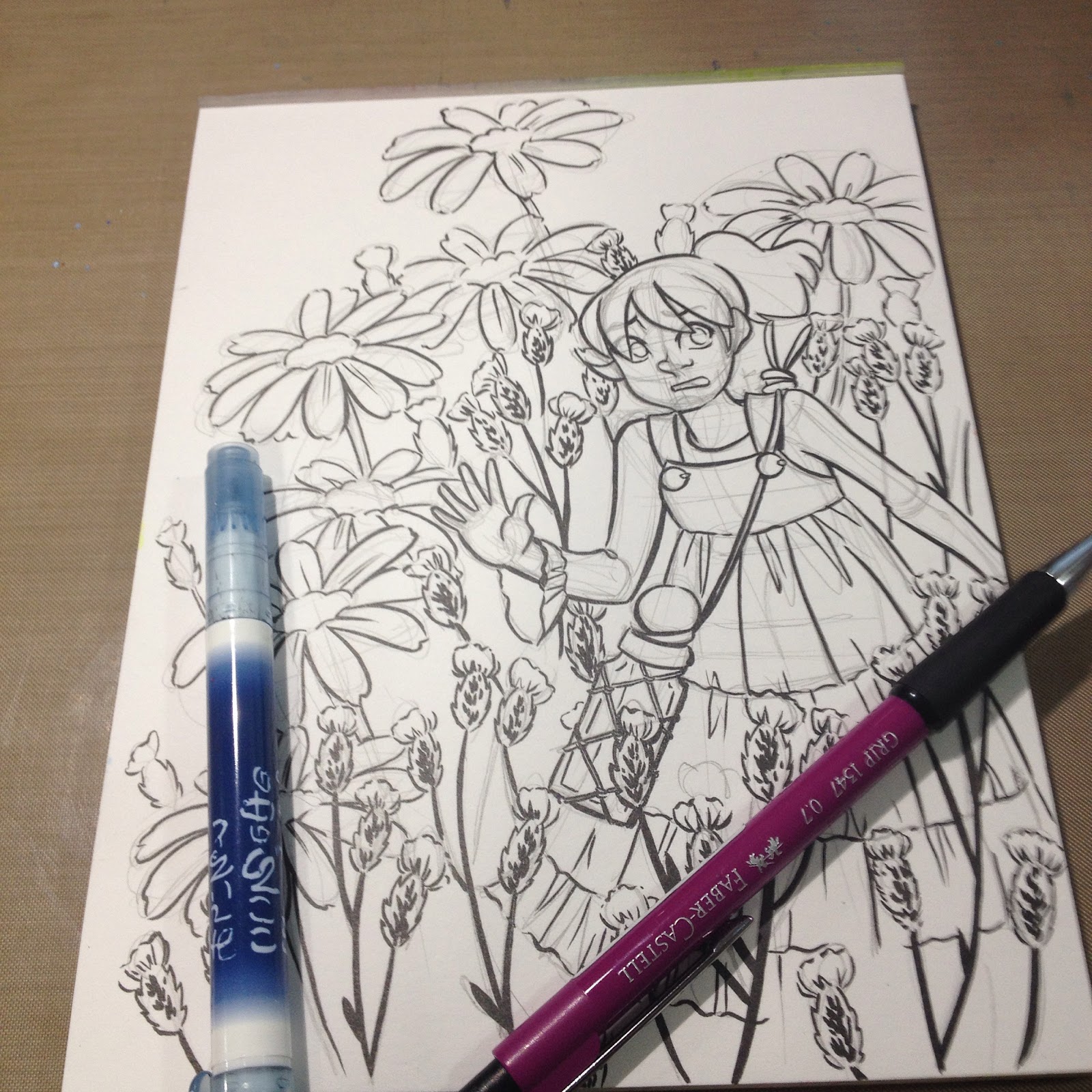
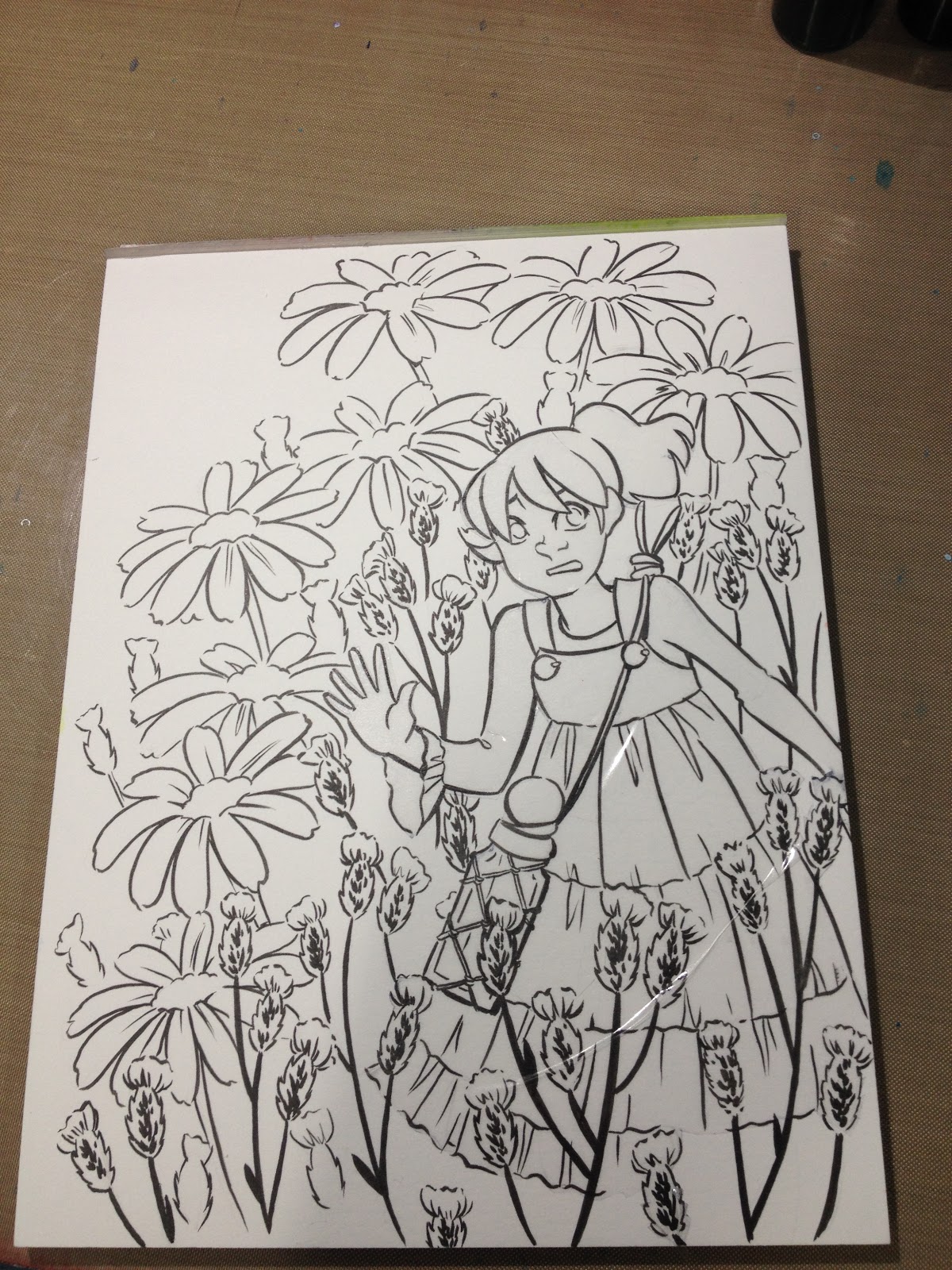
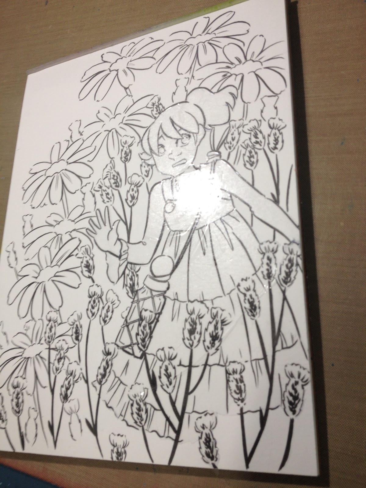
Complicated images are not only difficult to design, but difficult to ink as well. I've found that it helps to work on difficult or complicated designs in sections. I tend to ink from front to back, inking overlapping shapes before the shapes they overlap. In this tutorial, I'm going to break down a complex pencilled lineart into three distinct sections- foreground, middle/character, and background. There's also a bonus tutorial at the end on applying masking frisket.

The image used in this blog tutorial goes on to live another life on the YouTube channel as the basis for an alcohol sprays/alcohol marker tutorial, so keep an eye out for that. If you enjoy tutorials like this, please do me a favor and share a link to this post on your favorite social networks (sharing buttons are conveniently located below every post), and if you would like to help fund future tutorials (as well as gain access to Patreon exclusives) please visit my Patreon for information on how you can join the community.
To begin, you're going to need the lineart you wish to ink, as well as your inking tools and an eraser.
Breaking Complex Inks into Manageable Parts
 Step 1: Ink the Foreground
Begin by inking everything closest to the viewer with your heaviest lineweight and largest concentration of spot blacks and detail.
 Step 2: Ink the Characters
Before your hand gets too tired to handle fine detail properly (or after a break to refresh your hand and stretch), begin inking your characters. When inking characters, I tend to start with the head and work my way down, inking any bangs that overlap the face first. Next I ink the eyes, then nose and mouth, then the outside of the face. The face is the most recognizable part of the human body, and the most important to get right, so I put the most effort into inking the face properly. Small mistakes may slide in the hair or on clothing, but a small mistake on the face can change a character completely.
Once the character has been inked, I move on to inking other mid-ground objects.
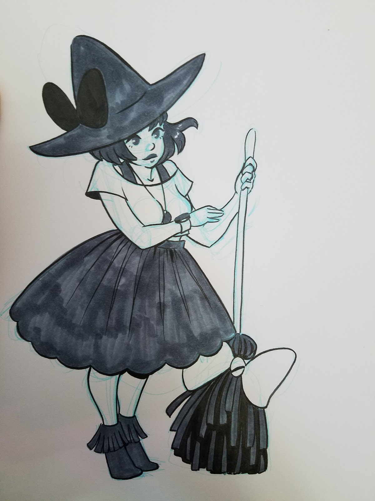
 Step 3: Begin Inking Background
Finally, I begin inking the background, using the lightest linework and the least amount of detail. The intention is to draw the audience through the picture plane, and varying the amount of included detail can help give the appearance of distance.
Once everything has been inked, I allow my piece to cure for 24 hours before erasing. This helps prevent smearing and ghosting.
Bonus: Using Frisket and Spray Inks to Create a Background
Masking frisket can be a helpful tool for masking areas of your marker illustrations. I use Grafix low tack masking frisket. For a live demonstration, check out this tutorial.
Before cutting my frisket, I use an alcohol based marker (like a Sharpie) to trace the outline of the object I want to mask (in this case, Kara, from my comic, 7" Kara). Once I have traced my outline, I use a small, sharp knife to carefully cut out my shape. Once the shape has been removed from the rest of the frisket, I use an alcohol wipe to remove the Sharpie, as leaving it on will cause smearing once I start applying alcohol inks. Depending on how large the masked area is, I may cut the backing paper to aid in application (see video tutorial linked), and carefully apply my mask over the area.


The masking film protected Kara from multiple heavy applications of alcohol sprays.


I hope you guys enjoyed this short tutorial, and found it helpful. If you have any questions,please send me an email via the sidebar form, or contact me on Twitter. For more of my art on a daily basis, please make sure to check out my Instagram, and for more tutorials, please stop by the Youtube channel.
Please consider donating to this blog or purchasing from Natto-shop (http://nattosoup.com/shop) if you want me to continue publishing quality content. All materials tested were purchased from my own pocket. Keep on Truckin' Nattosoup is not under any sponsorship.

The image used in this blog tutorial goes on to live another life on the YouTube channel as the basis for an alcohol sprays/alcohol marker tutorial, so keep an eye out for that. If you enjoy tutorials like this, please do me a favor and share a link to this post on your favorite social networks (sharing buttons are conveniently located below every post), and if you would like to help fund future tutorials (as well as gain access to Patreon exclusives) please visit my Patreon for information on how you can join the community.
To begin, you're going to need the lineart you wish to ink, as well as your inking tools and an eraser.
Breaking Complex Inks into Manageable Parts
 Step 1: Ink the Foreground
Begin by inking everything closest to the viewer with your heaviest lineweight and largest concentration of spot blacks and detail.
 Step 2: Ink the Characters
Before your hand gets too tired to handle fine detail properly (or after a break to refresh your hand and stretch), begin inking your characters. When inking characters, I tend to start with the head and work my way down, inking any bangs that overlap the face first. Next I ink the eyes, then nose and mouth, then the outside of the face. The face is the most recognizable part of the human body, and the most important to get right, so I put the most effort into inking the face properly. Small mistakes may slide in the hair or on clothing, but a small mistake on the face can change a character completely.
Once the character has been inked, I move on to inking other mid-ground objects.
 Step 3: Begin Inking Background
Finally, I begin inking the background, using the lightest linework and the least amount of detail. The intention is to draw the audience through the picture plane, and varying the amount of included detail can help give the appearance of distance.
Once everything has been inked, I allow my piece to cure for 24 hours before erasing. This helps prevent smearing and ghosting.
Bonus: Using Frisket and Spray Inks to Create a Background
Masking frisket can be a helpful tool for masking areas of your marker illustrations. I use Grafix low tack masking frisket. For a live demonstration, check out this tutorial.
Before cutting my frisket, I use an alcohol based marker (like a Sharpie) to trace the outline of the object I want to mask (in this case, Kara, from my comic, 7" Kara). Once I have traced my outline, I use a small, sharp knife to carefully cut out my shape. Once the shape has been removed from the rest of the frisket, I use an alcohol wipe to remove the Sharpie, as leaving it on will cause smearing once I start applying alcohol inks. Depending on how large the masked area is, I may cut the backing paper to aid in application (see video tutorial linked), and carefully apply my mask over the area.
The masking film protected Kara from multiple heavy applications of alcohol sprays.
I hope you guys enjoyed this short tutorial, and found it helpful. If you have any questions,please send me an email via the sidebar form, or contact me on Twitter. For more of my art on a daily basis, please make sure to check out my Instagram, and for more tutorials, please stop by the Youtube channel.
Please consider donating to this blog or purchasing from Natto-shop (http://nattosoup.com/shop) if you want me to continue publishing quality content. All materials tested were purchased from my own pocket. Keep on Truckin' Nattosoup is not under any sponsorship.


