
Marcu Taylor's Blog, page 21
June 20, 2017
Does Live Chat Actually Increase Conversions?
Last year, all we seemed to hear about was the chatbot takeover but the technology hasn’t lived up to the hype so far. I’ve said before that chatbots have all the potential to change how brands and consumers interact, but this won’t happen until developers stop worrying about the latest marketing gimmick and get back to solving user problems.
With the chatbot revolution on pause – at least for now – brands are getting their fix from one of its closest relatives: live chat. This typically involves adding a widget to your pages, prompting users to engage in conversation. The aim is to generate leads, of course, and these things are cropping up all over the web – but do they actually increase conversions?
When did live chat become a lead generation strategy?
Live chat has been around for years but now it’s come back with a facelift and renewed excitement, thanks to the chatbot hype. Which means you’ll see something like this on a lot of sites out there:

Source: Elegant Themes
In this case, Elegant Themes’ live chat widget pops up, asking users if it has any questions about its popular Divi theme. These popup-style widgets have become popular over the last year or so and you’ll often find them on homepages and landing pages.
This implementation is designed to generate leads – unlike the kind of live chat you get on contact or support pages, where the goal is customer service. The question is: does it really boost conversions?
You’ll find plenty of articles answering this question with a resounding yes. Live chat is a big trend right now and a lot of people are keen to hype it up. Before we answer this question for ourselves, though, let’s look at what live chat brings to the table.
Why is live chat so popular at the moment?
There are a few key UX points with live chat that make it an interesting conversion tool:
Live chat reaches out to people: It actually prompts users to engage by starting the conversation.
It provides an instant response: Users don’t (always) need to wait for brands to get in touch.
They can make it easier to find information: If users can’t find the information they need, many live chat widgets can help them out.
They offer an engaging alternative to web forms: We know users don’t like filling out forms and live chat creates an alternative.
And, of course, you have to credit some of the live chat popularity to the stuttering chatbot trend. Last year, everyone was going nuts about bots and then live chat – which has been around for years – suddenly starts trending.

Source: BI Intelligence
Last year, it was highly publicised that people now use messaging apps more than social media – a large argument for the chatbot revolution. It seems marketers are determined to turn the rise of messaging apps into conversions, whether it’s through chatbots or not.
Is live chat up to the hype?
In some cases, I think live chat can have a place in lead generation for certain brands. However, like most new trends in marketing, it’s being overhyped and overused in most of the situations I come across. Here are some common problems I’m constantly seeing with live chat on websites.
Live chat interrupts the user experience
The use of live chat widgets on homepages and landing pages interrupts the user experience, much in the same way popups do. It’s certainly not as intrusive as full-screen popups, but they’re blocking the view of content and they can take up a large amount of screen space on mobile.
It distracts attention from page content
Your pages have content for a reason: because you have a message to get across and you’ve invested good time and money into designing each page. So it’s a bit counterintuitive to slap a widget over the top of them which steals user attention a matter of seconds after they’ve landed on the page.
Again, this isn’t so different to popups that trigger upon page load and those things hardly have a good UX reputation.
If users can’t find the info they’re after, your design has failed
This is my main concern with how live chat is being implemented on sites at the moment. The reason we have things like information architecture, web design and UX design is because it’s our responsibility to deliver information in a discoverable and engaging way.
If users can’t find what they need, without the help of a live chat widget, then there’s something wrong with your design approach – and you need to fix it, not chuck another design trend on top of it.
Live chat can look untrustworthy
As I say, live chat has been around for years. Remember those horrendous widgets on insurance websites and sketchy IT firms? I certainly do and I also remember hitting the back button at the slightest hint of live chat. It reminds of cold calling, unsolicited emails, popups and other tricks used by brands that don’t have enough confidence in their own products or services to let users make their own decision.
Admittedly, the fresh design of live chat widgets looks a lot more trustworthy and the fact we’re so used to messaging apps now could change all this.
Too many brands use live chat because their forms suck
This is another big concern. One of the most common arguments I hear for using live chat is that it’s “better” than web forms. Again, if this is true, then there’s something seriously wrong with your form designs and you’ll be better off fixing this before adding anything else to your site.
Live chat vs web forms
Considering how poorly the average web form performs, it’s no surprise brands are screaming out for a better lead generation alternative. But most of the live chat implementations I come across try to cover up a crappy web form experience with an equally crappy chat experience.
Here’s an idea: why not try sorting out your forms before adding further barriers to the conversion process? I’m not saying live chat doesn’t have its merits, but using it to replace forms because your form designs are sub-par doesn’t make much sense.
It’s crazy how many forms I see that still don’t get the basics right:
Use form elements correctly
Remove unnecessary fields
Remove unnecessary clicks
Improve mobile performance
Stop using CAPTCHAs
Take it easy on validation
Stick to single columns
I could keep going, but the point is there are probably plenty of ways to improve your forms. Check out this article from Marcus for 58 ideas on how to improve your forms.
One not-so-generic piece of advice is to use multi-step forms if you need a lot of info from users. Despite popular belief, various studies show that shorter forms don’t always result in higher conversion rates. However, the more you demand from users, the more friction you’re adding – there’s no getting away from this.

Leadformly‘s multi-step forms make longer forms more engaging
Multi-step forms look considerably less demanding because users don’t really know how much info you’re asking for. Better yet, you can design your multistep forms reduce the number of interactions that require typing – the best way you can improve the experience for mobile, among other things.
These are the kinds of improvements you should be looking to make before you slap a live chat widget over the top of your website, hoping to increase conversion rates. Live chat is great for customer service but interrupting the user experience in the way so many live chat widgets are starting to do is crazy.
The post Does Live Chat Actually Increase Conversions? appeared first on Venture Harbour.


June 19, 2017
5 Studies on How Form Length Impacts Conversion Rates
The golden rule of web form optimisation is simple: shorter forms mean higher conversions. But is this really the case? Yes, shorter forms generally require less work from users and logic suggest fewer form fields reduce friction. Generally speaking, this is a good design principle to start from.
However, like many best practices, this theory doesn’t always pan out. In many cases, we see reducing the number of fields in tests can actually reduce conversion rates – so what’s going on here?
Form length is important – nobody is disputing that – but it’s not always a simple question of fewer fields leading to more conversions. To help illustrate this, I’ve got five case studies for you today that illustrate form length really impacts conversion rates.
Examples of longer forms
Before we get into the case studies, let’s take a look at some form designs that go for the longer approach. First up is Salesforce, which goes for six custom fields, three dropdown lists and three tick boxes:

Next up we have WhatIsMyComfortZone.com, which asks 30+ questions from users over different sections:

That’s basically wiping your backside with the UX rulebook on form design, yet this site brags an incredible 50%+ conversion rate. Wipe away my friends.
Case study #1: The expected result
Lead Generation: Testing form field length reduces cost-per-lead by $10.66
Our first case study comes from MarketingExperiements and it offers up the kind of test we would normally expect in this scenario. Marketo reduced the number of fields on its signup form and progressively increased conversions.

This was all the way back in 2011 and it was studies like this one that led to the best practices we accept today. Design guidelines tell us to stick to five fields or fewer in order to reduce friction and, in theory, increase conversions.
However, nothing is ever quite so straightforward in marketing.
Case study #2: The unpopular result
This one comes courtesy of ConversionXL, which brings up recent research from Unbounce conversion optimiser Michael Aagaard. Testing field length with one of his clients revealed the exact opposite result to our first case study.

Reducing the number of fields resulted in a 14% drop in conversions. This wasn’t the result Michael was expecting, of course, and he was determined to figure out what happened. He stumbled across a simple, easy-to-make but important mistake:
“I removed all the fields that people actually want to interact with and only left the crappy ones they don’t want to interact with. Kinda stupid.” – Michael Aagaard, speaking at CTA Conference
By putting these fields back in and testing variations of field labels instead, Michael was able to reach a 19.21% increase in conversions.

The key takeaway is that sometimes users want and expect more fields. Consider someone looking for an estimate on the value of their house, for example. They understand it’s going to take more than a name and an email address to get their answer.
Context is very important here.
Case study #3: Conversion rates and lead quality
This video case study from MarketingExperiments isn’t the most enjoyable watch, but its findings are interesting and detailed. In this case, a form with 11 fields was tested with two variations: one with 15 fields and one with 10 (plus some other variations).

The form with 15 fields resulted in a 109% uplift in conversions and the form with 10 saw an 87% increase. By applying the insights from this test to a membership form, conversions were then increased by 226% from asking more questions.
Except the goal isn’t purely increasing conversions in this case study. The goal is to also increase the quality of leads coming in by collecting enough data to validate each lead. This data tells you how to engage with the people who fill out your forms in the future – you need to decide when and how to get that information.
Case study #4: Moving beyond form length
Nonprofit Testing: How one small change led to 190% increase in clickthrough
The reason I want to point out this case study is to show that form length is by no means the only factor you have to consider when designing forms for conversions. This test from non-profit organisation DTS aimed to find out whether copy on its donation page would encourage more people to donate.

In terms of form length, nothing was changed at all. However, the addition of copy above the form reduced conversions by 28%. It turned out placing copy above DTS’ donation form got in the way of people who were already motivated to convert.
The point is, form length isn’t necessarily the biggest factor in form conversion rates. Imagine this test in reverse, if the original version had copy at the top of the page. Placing too much attention on the number of fields would make you blind to one simple change that results in a significant conversion increase.
Case study #5: The multi-step alternative
Finally, one of our own case studies brings us back to the WhatIsMyComfortZone.com example from before. In this case, formatting 30+ questions in a four-step form resulted in an incredible 53% conversion rate. In this case study, Venture Harbour CEO Marcus Taylor takes us through other examples where multi-step forms increased conversions by 35% for BrokerNotes, 59% for Vendio and 214% for an astroturf company.
Multi-step forms allowed these brands to significantly increase the number of fields without negatively impacting user experience. In fact, many designs psychologically reduce friction because users don’t know exactly how many questions they’ll be asked. The sight of multistep forms is less intimidating, despite the fact they require more from users.
You can also start with less-demanding questions and finish with things like email addresses, once users have already invested time and feel more reluctant to quit the session.
So longer forms convert better than shorter forms?
No, not necessarily. There are too many factors involved in form design to simply turn around and say shorter or longer forms are more effective. Certainly, you want to ask the least number of questions possible to reach your targets, but there are various things to consider:
The type of conversion: Email signups and account creations demand very different forms.
User expectations: If users see value in filling out a field, they’ll be happy to do so.
Incentive: With this in mind, can you create incentive to reduce friction?
How much info you need: Sometimes adding friction is the price you pay for quality leads over quantity.
Formatting: Multi-step forms create space for much longer forms, formatted in a design that reduces friction.
Best practices: These are guidelines, not rules. Accepted design trends don’t always work out.
The fact remains that the harder you make it for people to fill out your forms, the less likely they are to do so. In most cases, longer forms only add to the difficulty of completion but there’s one other key factor to consider, which we touched on above.
Applying BJ Fogg’s behaviour model to form design
BJ Fogg’s behaviour model illustrates the key elements behind users taking action: Motivators, Ability and Triggers. In simple terms, the more motivation you give people and the easier you make it for them to take action, the more likely they are to do so.

Credit: Kristen Sunde, Slideshare
As for triggers, these are the interactions you place between users and the desired action: copy, form fields, CTAs, etc. And the sweeter you hit that balance between high motivation and ease-to-do, the better your chances of getting the action you want.

Credit: Kristen Sunde, Slideshare
This helps explain why longer forms can actually increase conversions. If you create enough motivation to complete your forms, the relative ease (eg: number of fields) becomes less important. Not unimportant, but less important. So, in the case of promising a faster response via phone if people enter their number, for example, adding this field could potentially encourage people to complete your form.
Make no assumptions
The biggest thing you learn from conversion optimisation is that you can’t afford to make assumptions. All logic suggests shorter forms should perform and there are plenty of case studies to back this theory up. The fact remains that short forms often beat their longer counterparts.
However, this isn’t always the case and we’re seeing more studies reveal cases where longer forms increase conversion rates. More importantly, form length isn’t the only factor you need to think about. How you format these forms to reduce friction and create user incentive to reach the finish line are absolutely paramount. The number of form fields you choose to go with is simply one of many factors to consider in this process.
The post 5 Studies on How Form Length Impacts Conversion Rates appeared first on Venture Harbour.
June 11, 2017
10 Landing Page Copywriting Best Practices That Are Borderline Magic
With landing page builders like Unbounce and Instapage so readily available – not to mention years worth of best practices to fall back on – the visual side of landing page design isn’t the challenge it once was.
Unfortunately, none of this helps you when it comes to crafting landing page copy that convinces people to convert. Behind all the design tricks, this is the core ingredient that really inspires action and there are no templates or formulas for guaranteed success.
Creating landing page copy that captivates people is a real art form – so here are ten examples that get it spot on.
#1: CrazyEgg
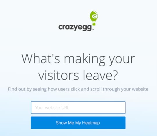
CrazyEgg jumps right in with the burning question people have in mind when they land on the page. It then backs this up with a demo where users can type in their URL to get their first heatmap. That’s a pretty difficult proposition to turn down for any website owner.
#2: Unbounce
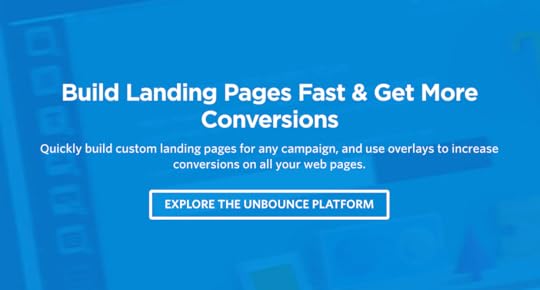
Unbounce takes a different approach by telling users what they’ll be doing by using its product. It’s literally telling users to “build landing pages fast and get more conversions” by signing up to the Unbounce platform. Essentially, this implies they’re wasting their time and not getting the conversions they could by not using Unbounce.
This use of imperative sentence structure is the most common approach to CTA copy you’ll find.
#3: ActiveCampaign
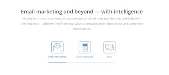
If you’ve got a lot of information to get across, it can be hard to organise everything into a visually compelling format. ActiveCampaign‘s landing page uses clickable icons to break up its content into email marketing, site messaging and SMS categories. This gives users an overview of what information is available and all they need to do is click an icon to get more information.
Here’s what users get when they click the email marketing icon:
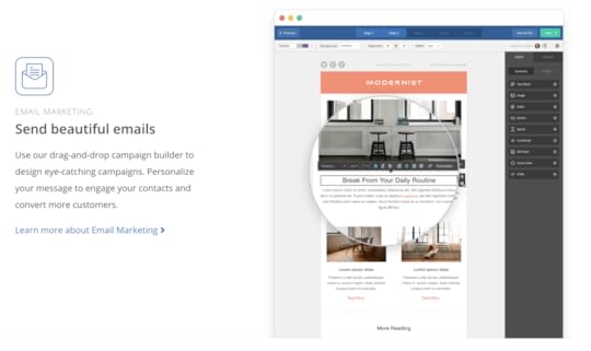
Information overload is something you want to avoid with landing page design but, like many enterprise software platforms, ActiveCampaign has a lot of stuff to get across. I personally prefer a more minimal approach but check out the ActiveCampaign page if you’re going for a content-heavy design.
#4: Asana
The landing page for Asana’s free trial campaign shows how minimal SaaS landing pages can be. The copy is stripped down to the bare minimum of key benefits and calls to action:
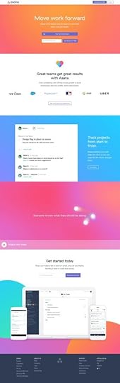
This is no accident either. One of Asana’s key selling points is “from chaos to clarity” and the tech company stays true to its brand image across all of its landing pages. Of course, this wouldn’t work if Asana didn’t have such a strong grasp of writing great copy.

It’s easy to say “less is more” when it comes to landing page copy, this only applies when you make the most of every word you write.
#5: IFTTT
IFTTT is another SaaS platform but this fits into a very different category than ActiveCampaign and Asana. IFTTT is a lightweight app that links other platforms together, meaning it doesn’t have a tonne of features to plug, unlike our previous two examples. So, while Asana has a real decision to make regarding how much copy it fills its landing pages with, it only makes sense for IFTTT to take the minimal approach – and this is precisely what it does.
 Once again, there’s short, punchy copy that tells users what they’re missing out on by not using IFTTT and what they have to gain by signing up.
 And, of course, it wouldn’t be right to get through a landing page copy article without mentioning the classic benefits vs features best practice:
 IFTTT doesn’t have the largest collection of landing pages but it certainly knows how to pen some good copy.
#6: Hootsuite

While I’m not the biggest fan of Hootsuite page designs, this established name in social media management has been writing great copy for years. When it comes to any automation tool, there is one key selling point: convenience. Hootsuite sets itself us as the most convenient of automation tools by billing itself as “the easiest way to schedule posts on social media.

This point is reinforced throughout Hootsuite’s free trial landing page, with a full section dedicated to explaining the various ways its platform saves you time.
#7: Shopify
Shopify gives us another example of minimal copy, despite being a platform with a lot to say. I’ve seen a lot of Shopify landing pages over the years and they get lighter on the copy front as time goes by. Once again, though, it’s long descriptions replaced by punchy, compelling language that highlights the key benefits of using the platform.

The point is, you don’t need to say everything on your landing page. The goal is to capture people’s interest and encourage them to convert – or, failing that, lead them to another part of your site where you can capture them as a different kind of lead.
#8: Leadformly
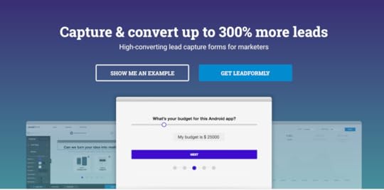
Leadformly hits users with the big promise as soon as they land on the page. Let’s face it, who wouldn’t want to capture and convert up to 300% more leads? This theme continues nicely as users scroll down the page when they come across the key question:

Of course they’re not getting enough qualified leads – this is precisely why users landed on this page in the first place. By echoing user concerns in its copy, Leadformly tells them it can deliver precisely what they’re looking for and, once again, this is backed up by another promise: capturing 2-3X more leads.
It’s powerful, confident copy that leaves little doubt in visitors’ minds. And, before we move on, there’s one more snippet I want to talk about:

Finally, Leadformly sets itself apart from other form builders by explaining the science behind its product and the years of experience that went into creating it. For a tool that makes big promises, it’s important that Leadformly is able to convince visitors that it has a history of getting proven results.
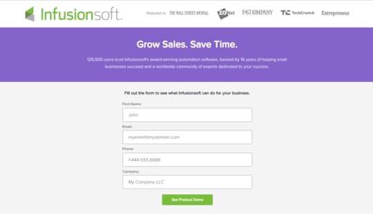
#9: Infusionsoft

Infusionsoft is another big name in the automation game, this time providing a sales and lead nurturing platform for brands that need to streamline customer interactions. Much like Hootsuite earlier, Infusionsoft knows what its selling point is and the core benefit its product provides.
Automation, simplicity and speed are how Infusionsoft helps you maximise revenue and not a single word is wasted on saying anything else.

The tone implies businesses that aren’t using Infusionsoft are unorganised, underperforming in the sales department and wasting time while they’re at it.
#10: Pocket

Much like IFTTT, Pocket is a relatively simple productivity app that serves a single, but powerful function. It starts by highlighting a common user problem: discovering interesting content you’re not ready to read right now. Is this enough to get people signing up, though?

Pocket takes users through the actions they can take using the app, recreating the experience of browsing the web with Pocket on their devices.

Pocket has the exact opposite problem most SaaS companies experience when it comes to landing page copy. Instead of having a tonne of information to condense down, it had to come up with a way to turn a basic function into something exciting – and it does a great job.
Give landing page copy the attention it deserves
Most brands are slowly coming round to the idea that design and visual elements are incredibly important with landing pages. When it comes to crafting powerful landing page copy, though, there’s a lot of work still to be done. All of the examples we’ve looked at today showcase concise copy that packs a punch with careful wording and short snippets of text.
Not only that but they highlight the key benefits of each product and hint at what users are missing out on by not taking action. And, of course, they all point towards a nearby call to action that makes it difficult for users to resist clicking the all-important button.
The post 10 Landing Page Copywriting Best Practices That Are Borderline Magic appeared first on Venture Harbour.
10 Examples of Remarkable Landing Page Copy
With landing page builders like Unbounce and Instapage so readily available – not to mention years worth of best practices to fall back on – the visual side of landing page design isn’t the challenge it once was.
Unfortunately, none of this helps you when it comes to crafting landing page copy that convinces people to convert. Behind all the design tricks, this is the core ingredient that really inspires action and there are no templates or formulas for guaranteed success.
Creating landing page copy that captivates people is a real art form – so here are ten examples that get it spot on.
#1: CrazyEgg
CrazyEgg jumps right in with the burning question people have in mind when they land on the page. It then backs this up with a demo where users can type in their URL to get their first heatmap. That’s a pretty difficult proposition to turn down for any website owner.
#2: Unbounce
Unbounce takes a different approach by telling users what they’ll be doing by using its product. It’s literally telling users to “build landing pages fast and get more conversions” by signing up to the Unbounce platform. Essentially, this implies they’re wasting their time and not getting the conversions they could by not using Unbounce.
This use of imperative sentence structure is the most common approach to CTA copy you’ll find.
#3: ActiveCampaign
If you’ve got a lot of information to get across, it can be hard to organise everything into a visually compelling format. ActiveCampaign‘s landing page uses clickable icons to break up its content into email marketing, site messaging and SMS categories. This gives users an overview of what information is available and all they need to do is click an icon to get more information.
Here’s what users get when they click the email marketing icon:
Information overload is something you want to avoid with landing page design but, like many enterprise software platforms, ActiveCampaign has a lot of stuff to get across. I personally prefer a more minimal approach but check out the ActiveCampaign page if you’re going for a content-heavy design.
#4: Asana
The landing page for Asana’s free trial campaign shows how minimal SaaS landing pages can be. The copy is stripped down to the bare minimum of key benefits and calls to action:
This is no accident either. One of Asana’s key selling points is “from chaos to clarity” and the tech company stays true to its brand image across all of its landing pages. Of course, this wouldn’t work if Asana didn’t have such a strong grasp of writing great copy.
It’s easy to say “less is more” when it comes to landing page copy, this only applies when you make the most of every word you write.
#5: IFTTT
IFTTT is another SaaS platform but this fits into a very different category than ActiveCampaign and Asana. IFTTT is a lightweight app that links other platforms together, meaning it doesn’t have a tonne of features to plug, unlike our previous two examples. So, while Asana has a real decision to make regarding how much copy it fills its landing pages with, it only makes sense for IFTTT to take the minimal approach – and this is precisely what it does.
Once again, there’s short, punchy copy that tells users what they’re missing out on by not using IFTTT and what they have to gain by signing up.
And, of course, it wouldn’t be right to get through a landing page copy article without mentioning the classic benefits vs features best practice:
IFTTT doesn’t have the largest collection of landing pages but it certainly knows how to pen some good copy.
#6: Hootsuite
While I’m not the biggest fan of Hootsuite page designs, this established name in social media management has been writing great copy for years. When it comes to any automation tool, there is one key selling point: convenience. Hootsuite sets itself us as the most convenient of automation tools by billing itself as “the easiest way to schedule posts on social media.
This point is reinforced throughout Hootsuite’s free trial landing page, with a full section dedicated to explaining the various ways its platform saves you time.
#7: Shopify
Shopify gives us another example of minimal copy, despite being a platform with a lot to say. I’ve seen a lot of Shopify landing pages over the years and they get lighter on the copy front as time goes by. Once again, though, it’s long descriptions replaced by punchy, compelling language that highlights the key benefits of using the platform.
The point is, you don’t need to say everything on your landing page. The goal is to capture people’s interest and encourage them to convert – or, failing that, lead them to another part of your site where you can capture them as a different kind of lead.
#8: Leadformly
Leadformly hits users with the big promise as soon as they land on the page. Let’s face it, who wouldn’t want to capture and convert up to 300% more leads? This theme continues nicely as users scroll down the page when they come across the key question:
Of course they’re not getting enough qualified leads – this is precisely why users landed on this page in the first place. By echoing user concerns in its copy, Leadformly tells them it can deliver precisely what they’re looking for and, once again, this is backed up by another promise: capturing 2-3X more leads.
It’s powerful, confident copy that leaves little doubt in visitors’ minds. And, before we move on, there’s one more snippet I want to talk about:
Finally, Leadformly sets itself apart from other form builders by explaining the science behind its product and the years of experience that went into creating it. For a tool that makes big promises, it’s important that Leadformly is able to convince visitors that it has a history of getting proven results.
#9: Infusionsoft
Infusionsoft is another big name in the automation game, this time providing a sales and lead nurturing platform for brands that need to streamline customer interactions. Much like Hootsuite earlier, Infusionsoft knows what its selling point is and the core benefit its product provides.
Automation, simplicity and speed are how Infusionsoft helps you maximise revenue and not a single word is wasted on saying anything else.
The tone implies businesses that aren’t using Infusionsoft are unorganised, underperforming in the sales department and wasting time while they’re at it.
#10: Pocket
Much like IFTTT, Pocket is a relatively simple productivity app that serves a single, but powerful function. It starts by highlighting a common user problem: discovering interesting content you’re not ready to read right now. Is this enough to get people signing up, though?
Pocket takes users through the actions they can take using the app, recreating the experience of browsing the web with Pocket on their devices.
Pocket has the exact opposite problem most SaaS companies experience when it comes to landing page copy. Instead of having a tonne of information to condense down, it had to come up with a way to turn a basic function into something exciting – and it does a great job.
Give landing page copy the attention it deserves
Most brands are slowly coming round to the idea that design and visual elements are incredibly important with landing pages. When it comes to crafting powerful landing page copy, though, there’s a lot of work still to be done. All of the examples we’ve looked at today showcase concise copy that packs a punch with careful wording and short snippets of text.
Not only that but they highlight the key benefits of each product and hint at what users are missing out on by not taking action. And, of course, they all point towards a nearby call to action that makes it difficult for users to resist clicking the all-important button.
The post 10 Examples of Remarkable Landing Page Copy appeared first on Venture Harbour.
June 6, 2017
9 Biggest Landing Page Mistakes & How to Avoid Them
Landing pages are one of your most important lead generation tools, but the majority of examples you’ll come across are uninspiring, to say the least. Despite all the design guidelines and best practices available these days, I see far too many brands make the same mistakes time and again wth their landing pages.
Today I’m going to lay it out straight: don’t make these mistakes with your own landing page designs because you’ll only be wasting time and money on getting poor results.
#1: Not having enough landing pages
All the way back in 2011, studies were showing that the more landing pages businesses had, the better results they were getting. Why? Because these businesses are creating landing pages to highly specific buyer needs rather than trying to appeal to everyone with the same few pages. Trying to do too much with any one landing page sets you up for failure before you’ve even started.
How to avoid this landing page mistake

Destinology.co.uk targets honeymooners specifically with this landing page
Create separate landing pages for different conversion goals, buyer personas, each stage of the consumer journey – not just your products/services. For example, if on of your conversion goals is to generate signups to a free trial for your SaaS product, create specific landing pages to target IT pros, marketing managers, sales teams or whatever your target audiences may be.
#2: Beating around the bush
With a specific goal and message in mind, you now have to get this across in a compelling way – and you’ve got a matter of seconds to do this. All the way back in 2006, studies found users make up their minds about a website “in the blink of an eye” – or 50 milliseconds to be precise.
Which means, if your message doesn’t get right to the point and convince visitors you have something valuable to offer, you’ve got a problem.
How to avoid this landing page mistake
Strip down your marketing message to the core value proposition you’re offering. Tell people what problem you’re solving, how you’re improving their daily lives or whatever benefit is key to your offer. For PPC landing pages try to match the headline in your page with the headline of your ad. None of this should be difficult if you’re creating enough landing pages, each with their own relevant message.
#3: Creating distractions
When your aim is a concise message, the last thing you want to do is create unnecessary distractions. This is an important part of getting your message across quickly (as mentioned above), but it applies to every other part of your landing page, too.
Distractions take user attention away from the core benefit your offer provides. They can also confuse visitors about which action to take and choice fatigue is always a danger if you provided too many options – none of which is good for conversions.
How to avoid this landing page mistake
Infusionsoft ditches the header and all other distraction on this landing page for its free demo
Remove any element from your landing pages that doesn’t reinforce the main message of your offer. Ditch the header navigation to remove choice fatigue and keep users focused on the task at hand, making it absolutely clear what action they should be taking. If you have a secondary conversion (and it’s fine if you do), make sure it’s 100% obvious that it’s not the main action you expect users to take.
#4: Adding friction
With distraction-free landing page designs, there’s nothing getting in the way of your message and its intended audience. As for conversions, though, there’s still the matter of minimising friction to think about. Any unnecessary barrier you place between users and taking action is one extra reason for them to quit the session without converting.
How to avoid this landing page mistake
Put yourself in the shoes of your target audience and look for excuses they might find to avoid converting. Stay away from obvious UX mistakes like popups and scroll hijacking, paying special attention to your CTAs and the steps users actually have to take to convert – eg: which form fields they have to fill out and whether they add any friction.
#5: Not optimising your forms for conversions
One of the biggest friction points on any landing page is web forms. There’s no easy way to approach this topic but the best place to start is designing forms with conversions in mind from the beginning. From here you have the task of optimising your forms over time to remove problematic fields and other design issues preventing conversions.
How to avoid this landing page mistake

Leadformly: Conversion optimised multi-step forms that don’t look anything like forms
First, get yourself a good form optimisation tool that helps you track performance and easily edit your forms to make improvements. Best practices used to tell us that shorter forms outperform their longer cousins, but recent studies have shown this isn’t always the case. Multi-step forms are a relatively new trend that’s generating some incredible conversion rates – especially those designed so they don’t actually look like forms at all.
#6: Neglecting buyer concerns
No matter how good your offer is – or how good your landing page sells it – people will still have doubts about buying into your brand. It’s difficult for people to trust a faceless brand – especially when they’re seeing your landing page/brand for the first time – and neglecting these buyer concerns is a big mistake.
How to avoid this landing page mistake
The most obvious way to tackle this problem is using trust factors like testimonials, customer reviews, industry awards and other forms of third-party feedback that give users their seal of approval. Another tactic is to provide guarantees over common concerns – for example:
Money-back guarantee
No credit card details required
Privacy policy
Identify what concerns each of your target audiences will have with your conversion goals and try to reassure them.
#7: Slow loading times
All your hard work to create landing pages that convert count for nothing if people leave before they finish loading. As the web matures, user expectations on loading times become more demanding and many brands are falling behind. Pages that take longer than 2-3 seconds to load lose more than 50% of visitors, which counts for the vast majority of landing pages. Don’t let yourself fall into this category
How to avoid this landing page mistake
Keeping on top of loading times needs to be one of your priorities and this involves a number of key factors:
Use a fast hosting provider
Keep your web code clean
Minify your website files (HTML, CSS, JS, etc.)
Sign up to a content delivery network (CDN)
Use web caching
Regular speed tests
Minimise server requests
Image optimisation
Minimise page redirects
Loading times are one of those things you have to work at regularly and it’s not only users who demand speedy landing pages. Page speed is a ranking factor in Google’s search algorithm and it also plays a role in Ad Rank, which determines whether your PPC ads show and where they appear on the page.
#8: Poor mobile experience
It almost pains me to talk about mobile optimisation in 2017 (I know, old news) but the majority of landing pages fail miserably at providing a decent experience across devices. Loading times are a big part of this, of course, but there are basic design mistakes that crop up constantly. When the majority of searches take place on mobile, failing to provide a consistent experience across devices is crazy.
How to avoid this landing page mistake
If you’re using landing page builders, make sure the code is lightweight and optimised for mobile performance. Stick to single column layouts with plenty of whitespace and full-width sections; these are easy to make responsive across while maintaining a consistent experience. Take a look at this example from Asana that couldn’t be more mobile friendly (this is from my desktop, btw):

Also, avoid using any unnecessary JavaScript that’ll add bloat to your code and loading times (including popups). Optimise your visuals for size and performance and use responsive form designs that adapt to different screen sizes.
#9: Weak calls to action
The whole point of your landing pages is to generate leads and convert people, which means your calls to action are the defining factor in that crucial moment. Weak CTAs kill your conversion opportunity cold dead. You need to grab people’s attention and make your offer hard to refuse – anythings less and your landing pages are underperforming.
How to avoid this landing page landing page mistake:
First of all your CTAs need to stand out, so use good colour contrast and bold elements to make them visually striking. Next, they need to convince people to take action. Reaffirm the core benefit of your offer and spell out the action users should take with your button text (eg: “Create my free account”, “Build your first landing page”, etc.).
Another example from Infusionsoft – simple yet powerful CTA copy
Placement is always important, too, but don’t get caught up in moving your CTA buttons a few pixels in A/B tests, hoping for miraculous results. These kinds of tests are misleading and time-consuming. The same thing goes for button colours, font styles and other minute details. Focus on the things that matter: contrast, copy and a layout that makes for a powerful, convincing CTA.
Landing pages are serious business
All of the mistakes we’ve looked at today can be avoided by taking three things seriously: audience research, relevancy and user experience. Once you know what each of your target users wants, you’re able to create highly specific marketing messages that strike a cord with their desires. Suddenly, your copy sounds more convincing, the benefits of your offer become clear and your calls to action are more difficult to resist.
All that’s left is to package this in a user experience that removes all conversion barriers and your fleet of landing pages is getting serious business results.
The post 9 Biggest Landing Page Mistakes & How to Avoid Them appeared first on Venture Harbour.
May 31, 2017
5 B2B Chatbot Case Studies: Do Chatbots Increase Conversions?
Chatbots were the biggest talking point in marketing last year, hyped up to be the next big thing about to shake up the entire industry. Except things haven’t really panned out that way in 2017 so far and people are starting to question whether the technology is ready to claim its place as a vital marketing channel.
Sadly, this was always going to happen. When there’s so much hype surrounding a new technology, it always falls short of early expectations. It’s not because the technology itself is lacking, though. Instead, it’s got more to do with people jumping on the bandwagon and making a half-hearted or misguided effort to implement it.
However, there are plenty of success stories from brand who develop bots with the right intentions. And, to prove the case, here are five B2B chatbots that are are generating new leads and increasing conversions.
#1: Winnie

Winnie is a chatbot designed to help website owners make better choices about which hosting provider to go with. Getting the most suitable hosting provider and package for your needs can be one of the most frustrating things about getting a website up and running.
Winne helps users narrow down their choices, based on the kind of website they’re setting, up and points them in the direction of suitable providers hosting packages. Since the bot first opened on Facebook Messenger, it has achieved an incredible 72% CTR of users clicking through to an affiliate hosting provider.
Not bad at all.
#2: RapidMiner

RapidMiner elected Leadbot – a “sales assistant” developed by Drift – to cater for their chatbot needs. Visitors are greeted by the very friendly MarlaBot, who gets the conversation rolling a matter of moments after you land on the company’s website. However, MarlaBot isn’t alone. RapidMiner sales staff are brought into the loop as soon as Marla gets an answer, at which point they start monitoring the conversation to see where they should to jump in.
“The bot isn’t about replacing a human. The bot for us is about augmenting and taking a user down a journey so then we can jump in at the right moment.” – Tom Wentworth, Chief Marketing Officer at RapidMiner
Meanwhile, Marla is collecting all the data she needs from her interactions to build a more relevant experience for each user. Mr Wentworth says the bot, in many cases, is capable handling the entire conversation by itself and people regularly thank the Marla when they’re done.
“One of the most common responses we get at the end is ‘thank you’.”
There’s a lot of talk about the ability of chatbots to hold meaningful conversations with users, but RapidMiner and Leadbot show its a question of how you implement the technology into the buying journey.
#3: Instant Translator
Instant Translator was originally built as a demo to show corporate folk what chatbots are capable of. Despite its modest intentions, it soon became the biggest translation bot on Facebook with more than a million users. Why? Because the team behind it focused on creating the best platform they possibly could for the people using Instant Translator.
Back then, it was only capable of translating from English to Arabic and Arabic to English. However, Instant Translator now supports 19 languages and it’s not done yet.

The bot is available on Facebook Messenger and Viber with more than 600k active monthly users. It now translates around 300k sentences every day, which isn’t bad for a bot that started out as a demo.

After promoting the demo with a $20 boosted post in some Arabic-speaking countries, Instant Translate quickly went viral and the rest is history. An incredibly simple platform that makes a constant effort to expand and improve for its users now has enough momentum to grow sustainably.
Here are some tips from the team behind the bot (published on Chatbotmagazine.com):
We believe our growth was due to the following:
Extreme easiness: The bot didn’t have a flow. It only does translating and it doesn’t fail at that job because all of the code is written to handle a lot of failures which ensures it always replies to the user.
Listening to your users: We always hear our users. We add more languages when they ask, we improve the speed if they say the translation is slow, and most importantly, the bot has extreme alerts to detect any major failures, which gives the bot a 99% up-time.
Answer all users: We answer every user question, we help every user and we check Facebook reviews. The users feel important and very thankful when you answer their questions within the page.
Videos: Show your users how to use their bot. Make their lives easier. Not a lot of users understand everything. Even when you tell them “Send a message to the page,” you have to explain to them how to do it.
As you can see, users are the driving force behind every change made to Instant Translation and the bot has completely transformed itself, one improvement at a time.
#4: RewardStream

RewardStream also took the Leadbot approach and it accounted for 30% of their converted leads in the first 45 days. Yikes. Now RewardStream builds platforms that help companies encourage their existing customers to refer friends – mostly for enterprise businesses.
The software company was doing everything right on the digital marketing front: generating traffic, engaging content, effective paid advertising and a solid email marketing strategy. Great stuff. Except there was a problem: RewardStream wasn’t converting enough of those leads into customers.
We were bringing a lot of people to our site who were reading our content but not converting, and we felt that we should engage people in the moment. – Neil Parker, VP of Marketing at RewardStream
So the company decided to invest in a chatbot that would engage with those visitors at the opportune moment. And the company found its new Leadbot steadily converted a higher number of leads as the days rolled by – reaching an impressive 30% of all conversions with the first month and a half.
#5: MyWorkout

In fairness, this bot doesn’t really fit into the B2B or B2C backets, but it’s a perfect example of how to design a simple bot that captures attention. MyWorkout aims to make working out easier and more accessible to everyone by taking users through each step with instructions and custom illustrations. It’s a simple enough idea but the conversation design and visual content really turn this basic concept into something truly engaging. The team behind MyWorkout don’t waste time trying to impress people with intelligent or witty comebacks. Instead, they focus on giving users what they want within a couple of clicks.

By focusing on the experience rather than their own egos in the design and development of MyWorkout, Günther Matzinger and the other guys behind the bot saw “overnight success” after releasing it on Facebook Messenger.
Why are most B2B chatbots underperforming?
It’s true that chatbots aren’t living up to the hype they generated last year but this has more to do with how designers and developers are creating them than the technology itself. Chatbots have all the potential to change the way people interact with brands and buy products online but this won’t happen until more bots are created with the goal of solving user problems.
The majority of bots being developed right now try to be too clever or impress users. Except nobody really cares how “smart” your chatbot is; they just want to enjoy a better buying experience. So forget the flashy features and get back to basics with UX design, becasue this is where the best B2B chatbots excel.
The only bots that fail are the ones that add nothing valuable to the consumer exprience – and this sadly counts for the majority of them at the moment.
This tends to happen with new technologies: brands get all bright-eyed by the promise of new marketing trends and approach them from the wrong angle. Yes, chatbots can drastically improve conversion rates – if you build a bot that removes conversion barriers. On the other hand, building one for the sake of it, or without knowing what experience you’re trying to improve, will only waste valuable time and money.
The post 5 B2B Chatbot Case Studies: Do Chatbots Increase Conversions? appeared first on Venture Harbour.
May 29, 2017
9 Lead Capture Quiz & Survey Strategies That Work in 2017
One lead generation strategy many businesses overlook is using quizzes and surveys to get people involved with brands for the first time. I don’t particularly mind this because most implementations of quizzes and surveys I come across leave a lot to be desired. They tend to expect too much from users while offering little incentive to take part, merely adding unwanted barriers to converting.
You don’t need to worry about this, though, because today I’ve got nine lead capture quiz and survey strategies that’ll get you converting users. By creating quizzes and surveys people actually want to complete (yes, it is possible), all that friction disappears and you’ve got yourself a highly effective lead generation strategy that asks very little from people interacting with your brand.
#1: The attractive offer strategy

Pulse offers people the chance to win John Lewis vouchers in return for filling out a survey.
The challenge with quizzes and surveys is they ask a lot from users. This isn’t like they’re filling out one of your web forms because they want to buy into your services; they’re giving up their valuable time for nothing in return, which means you really have to earn their interest.
The most obvious way to do this is by offering users something in return for taking part. It could be entering into a competition, a free voucher or whatever kind of incentive you think it will take to get people participating.
If you hit people with the offer before they start your quiz or survey then it’ll have to be something pretty special. And there’s nothing wrong with this approach, if you’re confident people will be tempted enough by your offer to take part. However, I tend to see better results from designing quizzes and surveys that are more tempting by their own merit and then hitting users with the offer – after they’ve completed them.
You’ll get a better idea of how this works throughout the article.
#2: The ‘fun’ quiz strategy
The rise of social media and BuzzFeed quizzes has warmed people to the prospect of quizzes as entertainment. The trick here is to really nail your audience research and understand what’s going to peak their interest. For example, if you’re targeting IT professionals with a project management platform, you can play on the typical personality/communication clash that often exists between IT technicians and IT managers. Every industry has these kinds of inside jokes and the more specific to each audience you can be, the better.
At some point, you’ll want to tie this into what you’re selling (eg: your project management tool breaking down the language barrier between IT techies and managers). But all you need to do at this stage is get each audience engaging with your lead capture quiz.
#3: Play on industry developments to generate interest

Painfully dull topics suddenly become interesting when there’s money on the line. (Source: Zanebenefits.com)
Nothing stays the same for long in business these days and there are constant industry developments we all have to keep up with. You can use this to make your quizzes and surveys more appealing by promising to help your prospects prepare for upcoming changes.
This can be especially effective when there are changes to government regulations that affect business operation. For example, last year’s changes to workplace pensions in the UK or the ACA Employer Mandate in 2015 for businesses in the US. If you can make these changes relevant to your brand and help your target audiences deal with them, you’ve got a strong incentive to work with.
Likewise, for those of us in digital industries, any major change to Google’s search algorithm does the trick – especially when they’re announced ahead of rollout. In 2015, we had the “mobile-friendly” update and this year we have mobile-first indexing to think about – both of which were announced before the changes came into effect.
So in this case, a quiz that starts out by asking: “Are you ready for Google’s big ‘mobile-friendly’ update?” raises doubt in people’s minds and makes it difficult not to fill out your quiz.
#4: Ask target prospects to take part in industry reports
It’s always difficult to make a survey sound exciting. Even the word “survey” itself sounds unappealing, but I find there’s one guaranteed way to get people excited about filling these things out – especially for B2B leads.
Approach your target prospects, asking them to take place in an industry report you’re putting together. Make it clear their opinions not only matter to you but other people in the industry and you want them to be a part of the report you’re publishing. Human ego will take care of the rest for you.
The best part about this strategy is you can capture leads while creating your study and then use the published report to capture yet more leads as a downloadable resource.
#5: Target different users with personalised quizzes/surveys

VWO is one of the leading names in personalisation and testing software
To get the maximum number of leads from your quizzes and surveys, you need to pinpoint the specific interests of your different target audiences. Once again, this starts with knowing your audiences and creating personalised quizzes/surveys for each of them, based on their unique interests.
Next, you need a way to target each of your audiences with your personalised content. Thankfully, this part is quite straightforward with the tools we have available today. Your first option is to use personalisation software to segment your visitors and display the relevant lead capture quiz or survey. Tools like Optimizely and VWO make this approach more time and cost-effective than ever.
Then you have social media, which you can use to target highly focused audiences with your quizzes – and I’ll cover this approach in more detail shortly.
#6: Use quizzes to score and qualify your leads
This one comes from Ben Snedeker who’s part of the Infusionsoft team. The magic of a good lead capture quiz or survey is you get the opportunity to get more information from users than you might otherwise be able to. This allows you to score and qualify each lead to gain a better understanding of how to follow-up and move them along the sales process – something Infusionsoft will help you automate.
The thing is, you have to know what information to ask and how to attribute this to sales intent. Then you need to create your lead capture quiz or survey in a way that gets the necessary info without adding too many steps. This can be particularly challenging when you’re taking the “fun” quiz approach where dull questions might kill the experience.
Don’t forget you can reach out to users at a later date for more info and you can also use your targeting options to narrow down prospect information before they’ve even participated. You need to find the right balance between acquiring the info you need from users without preventing conversions.
#7: Promote your quizzes on social media

Promoting your quizzes on social media brings two key benefits to your lead generation strategy. First of all, your quizzes are getting seen by a much wider audience but the real magic is in the targeting options you have to work with.
This is especially true with Facebook and Instagram, which both allow you to narrow down on highly specific audiences. I mentioned targeting different users with personalised quizzes earlier and this is your best alternative (better yet, do both).
You can create quizzes on Facebook in no time but you’ll want to set them up as advertising campaigns to get the best out of the network’s incredible targeting options. It’s kind of scary how specific you can be with targeting people on Facebook and Instagram but it gives you the power to get your content seen by the right people when it matters most.
#8: Disguise your quizzes so they don’t look like quizzes
 We have so many best practices and guidelines knocking around these days that things tend to all look the same. Homepages all look like homepages, web forms all look like web forms – and breaking these conventions is generally seen as bad UX design.
However, this doesn’t always translate to better results. When I first started testing out multi-step forms on websites I found the designs that didn’t look like forms got the best results. People don’t like filling out forms so why make it painfully obvious that they’re filling one out?
The same thing goes with quizzes and I’ve found using Leadformly‘s multi-step forms as a way to create “quizzes” works incredibly well. They don’t look like forms; they don’t look like quizzes – they just work.
#9: The follow-up offer

This quiz on Entrepreneur.com hits users with an offer in exchange for email addresses but allows them to scroll down for the results.
Once users complete your quiz or survey you have the all-important task of asking them to provide their email address in exchange for the results. However, this presents a real UX barrier by essentially blocking users from the content they’re after at the last stage – pretty frustrating for them.
You might want to work on alternative approaches.
Let’s say the results from your quiz aren’t particularly good (eg: “You scored 6/10 for your lead generation techniques”). Why not give them the results right there and ask them to hand over their email address for more info on how to get their score up to 10/10?
Don’t overlook the power of lead capture quizzes and surveys
Don’t let the fact many brands fail to make the most of lead capture quizzes and surveys put you off. By asking the right questions you can make it hard for users to resist taking part and capture low-intent leads that might otherwise leave without converting at all.
The post 9 Lead Capture Quiz & Survey Strategies That Work in 2017 appeared first on Venture Harbour.
May 22, 2017
5 Salesforce Web-to-Lead Form Hacks & Tips to Get More Leads
Salesforce is one of the best CRM platforms you’ll find on the market, enabling you to automate all kinds of lead nurturing and customer management processes. It’s a powerful piece of software, there’s no doubt about that, and while it’s not designed to be a lead generation tool per se, it does a fine job if you implement it with the right third-party tools.
To give you an idea of how good Salesforce can be at lead generation, I’ve got five hacks & tips for using Salesforce Web-to-Lead Forms, which will get you generating more leads and converting more of them with the platform.
#1: First, get yourself a form builder
Although you can create forms using Salesforce, they’re notorious for being difficult to set up and, well, let’s just say they won’t be winning any beauty awards. Worse still, they’re a chore to optimise/customise and none of these characteristics are great from a lead generation point of view.
Luckily, Salesforce Web-to-Lead Forms play nicely with a number of third-party lead generations tools, including Leadformly – which allows you to embed conversion optimised, easily customisable and easy-on-the-eye forms on any page. Aside from that, you get detailed analytics on how your forms are performing so you can improve results as time goes by.
This is particularly important when you have to manage multiple forms on your site. Speaking of which.
#2: Create a Salesforce campaign for every form on your site
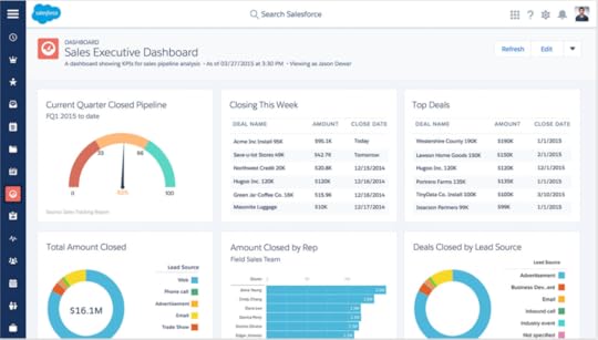
Source: Salesforce
Salesforce really starts to shine once you start mapping out customer journeys. I’m not talking about the sales funnels you’ve created as a path to guide users along; I’m talking about the path they actually take – which tells you how successful your marketing strategy is at guiding users across the sales funnels you create.
To map these journeys out on Salesforce you first need to how you first generated each lead. By default, Salesforce Web-to-Lead forms only capture only capture the name and basic demographics of people who sign up. This isn’t a bad start but it doesn’t tell you anything about why these leads got involved with your brand.
Thankfully, there’s a simple hack to fix this.
All you need to do is create a separate campaign for each form on your site. To do this, you’ll have to create your campaigns first and then “associate” each form to the relevant campaigns. You can do this by including the Campaign ID and Campaign Member Status on your forms. If you need more info on how to do this, there’s a Salesforce Knowledge Article that explains the entire process.
Salesforce automatically gathers data for every campaign you create and because these are associated with specific forms, you’re getting data specific to each of them. So now you can see how many leads each form is generating, how many are converting and a range of other key metrics.
More importantly, you can see which form individual leads come from. So now you know why they signed up in the first place and what kind of follow-up message it will take to get them further along the buying process.
#3: See the path to conversion users take by capturing URL parameters
Our last hack was pretty good and incredibly simple, but we take this a giant step further by capturing URL parameters with hidden fields on your forms.
This tells you which page leads are on when they convert (particularly important when you have the same form on multiple pages) but you can also use this technique to map our the journey they took before converting.
Before you can do this you’ll need to add these parameters to your URLs. For example, you’ll add something like mail_camp=# to the URLs for traffic that comes from your email campaigns. So the URL for a visitor who lands on your product page from one of your email campaigns might look like this:
https://yoursite.com/product/?mail_ca...
Whereas the URL from an organic visit would simply look like:
Once you’ve added these parameters to your URLs, you can place a hidden field on your forms that automatically grabs them and pairs them with your users’ information. So you know exactly which path to conversion every user took and you can use this information to map customer journeys in Salesforce and send users tailored messages, based on the path they’re taking.
Again, this is particularly valuable if you have the same form on multiple pages. There are some downsides to this approach, though. First, there are some SEO issues to consider and you can also get lost in a sea of cluttered reports if you’re not careful.
This is one powerful hack, but use it with care.
#4: Put a stop to spam
Stopping spam from web forms is a real challenge for every website owner but this is especially frustrating when it comes to customer and lead management. Spam plays all kinds of havoc with your data and putting a stop to it is vital.

With Salesforce Web-to-Lead Forms you can add a CAPTCHA to prevent spam but this is a terrible way to approach the issue. First of all, you’re adding an incredibly frustrating step to filling out your forms for human visitors. While, at the same time, you’re telling them you don’t have a good enough system in place to stop web spam yourself and you’re passing the responsibility over to them.
CAPTCHAs suck. Don’t use them.
Instead, there’s a simple but highly effective way to stop form spam from getting through, known as the honeypot technique. Essentially, it involves creating another hidden field on your forms, except this one is designed to catch out spam bots. When bots come across a web form they fill out every field, which includes your hidden honeypot field. So you can set a rule that blocks form submissions when this field has been modified while genuine leads (from humans who can’t access this field) get through with no problems.
To set up a honeypot field on your forms you’ll need to use display: none; in your CSS for the field you want to hide. Then you’ll set a JavaScript rule that blocks submission when your honeypot field has been modified.
If code isn’t your thing, then you’ll be glad to know Leadformly, which I mentioned earlier, comes with honeypot fields on all of its forms as standard.
#5: Put a stop to duplications
A common problem with analytics and CRM platforms is duplication. For example, when a user signs up to your newsletter during one session then downloads your eBook in another, you don’t want them to be treated as two separate leads. Unfortunately, Salesforce doesn’t have a built-in system for dealing with this kind of duplication so you’ll need to call on some more third-party integration for this.
You’ll find plenty of options available via the Salesforce AppExchange page, including CRMfusion, RingLead and plenty of others. Of course, this means signing up to these third-party tools as well, so you’ll need to consider what else each of these tools has to offer and whether they have a place in your marketing toolkit.
There are also some dedicated tools to prevent duplication in the AppExchange, ranging from freebies like DupeCatcher to the $5,000-per-year DupeBlocker 3. You can, of course, develop your own system for preventing duplications but that’s a little outside of the scope of this article.
Whichever approach you take to this, you’ll want to have a system in place before you start using Salesforce or your chosen CRM. You can take it from me that deduplicating your account data after it has been collected is just about one of the most painful tasks you can do with Salesforce Web-to-Lead.
Salesforce can be a lead generation tool
As I say, Salesforce is more of a CRM than a lead generation tool but you can but a few hacks and third-party integrations Salesforce Web-to-Lead Forms can change all that. While Salesforce can be a difficult platform to integrate, the benefit of this complexity is how flexible the platform is, once you get your head around it. Hopefully, the hacks in this article have given you an idea of the lead generation potential Salesforce has and a few ideas on how to improve results for yourself.
The post 5 Salesforce Web-to-Lead Form Hacks & Tips to Get More Leads appeared first on Venture Harbour.
May 20, 2017
The Ultimate Guide to LinkedIn Lead Gen Forms
Last month, LinkedIn rolled out an exciting new feature for lead generation ads. Lead Gen Forms are designed to increase mobile conversion rates by placing CTAs on your ads, making it easier for users to take action.
LinkedIn says 80% of engagement with sponsored content happens on mobile and the network realises web forms are a common obstacle to conversions. So it’s decided to take action by creating user-friendly forms on your behalf and prompting users to convert inside the LinkedIn app.
Sounds good, right? Well, let’s take a close look.
What are LinkedIn Lead Gen Forms?

LinkedIn Lead Gen Forms are available for sponsored content campaigns. You can choose whether to use them or not and they won’t cost you anything, so it’s certainly worth trying them out to see what impact they have on lead generation.
Essentially, Lead Gen Forms add a call-to-action to your sponsored content ads, asking users to sign-up, download your eBook, or whatever action you’re targeting. When users click the CTA they’ll be greeted by a signup form inside the app, but instead of filling out fields LinkedIn will automatically pull in the details from their account – so all users have to do is confirm their email address and hit the submit button.
Next, they’ll be greeted by a thank you page and a link to your content or website, depending on where you want to send them. This does involve a bit of setting up on your part, though, so let’s look at how you can create LinkedIn Lead Gen Forms.
How do I set up LinkedIn Lead Gen Forms?
To get started with Lead Gen Forms you’ll want to create a promoted content ad – this is the only format that supports the feature. Next, you’ll be asked whether you want to increase traffic with your ad or generate leads using Lead Gen Forms. Naturally, you’ll need to select the second option to use this feature.

Once you’ve named your campaign and selected Lead Gen Forms you’ll be asked to choose which post you want to sponsor – or create new sponsored content from scratch. You can also go to Campaign manager and create Lead Gen Forms for existing campaigns.
Once you’ve chosen (or created) the content you want to promote, you’ll be asked to create your form template. You can either choose the default format or create your own:

Nothing complex here. You simply have to name your form (users won’t see this), choose your headline and provide any additional information you want about your offer. There’s also the option to add custom privacy policy details if you want to reassure users about their data.
One thing worth mentioning is you need a valid URL for your privacy policy page.
Next, you can choose which details LinkedIn collects from user accounts (a maximum of seven fields). First name, last name and email address are selected by default but you can also request additional contact, location and professional details that your Lead Gen Form will automatically collect.

Users will be able to see what information you’re collecting from them on your Lead Gen Forms, so be considerate of how much info you think they’ll be willing to hand over. These forms remove the need to type anything out but they don’t necessarily remove the reluctance to hand over personal details. Bare this in mind and understand you might need to experiment a bit to maximise conversions from these forms.
The final step is to choose the thank-you message you want users to see after they submit.

Once you’re done, click Save and that’s it. Now you can set your ad targeting options as normal and your new Lead Gen Form is good to go.
Why Should I use LinkedIn Lead Gen Forms?
As I say, the whole point of LinkedIn Lead Gen Forms is to boost conversion rates from your lead generation campaigns. It’s a pretty good implementation, too, and there are a number benefits to using the new feature.
Remove friction
The aim of the game with Lead Gen Forms is to make it easier for users to convert by removing friction. All it takes is two clicks for users to convert – an impressively low commitment required on the part of users. This adds up to a serious improvement for mobile users compared to the standard promoted content format.
Fewer steps, more info
Lead Gen Forms prove you can ask for more information from people without killing conversion rates. It all comes down to how you design the experience of completing forms and LinkedIn is doing a pretty good job here. This gives you the chance to collect more data without hurting conversions but also choose which kind of information to collect and create advertising campaigns accordingly.
Want to sign up CEOs? Then create your campaigns with them in mind and select “Job title” as one of your fields to confirm you’re getting the right sign-ups.
Potential for double conversions?
Something I’ll be keeping an eye on over the coming months is the potential for double conversions with LinkedIn Lead Gen Forms. After users hit the submit button, they’ll be greeted with your thank you message and prompted to visit your site, which gives you the option of targeting them with another offer.
Of course, you’ll already have their email address by this point so the aim is to bag yourself a more valuable conversion – eg: free trial signups, product purchases, social shares or whatever else you think could add value to this lead.
Integration with third-party tools
By using Driftrock, Zapier or Oracle Eloqua, you can integrate LinkedIn Lead Gen Forms with a wide range of third-party marketing tools. This means you can collect your data from LinkedIn and automate the process of nurturing your leads from the new feature.
Are there any downsides to using Lead Gen Forms?
While I’m excited about working with LinkedIn Lead Gen Forms there are a few potential downsides I can already see. None of these are confirmed (just like the potential benefits) but I’ll be keeping an eye on a few things over the coming months.
They don’t solve the web form problem
Actually, this one doesn’t need to be confirmed. Lead Gen Forms have a lot to offer LinkedIn advertising campaigns but let’s be clear: they don’t solve the form design problem most brands are suffering from.
If your web forms are designed and optimised the way they should be, then LinkedIn Lead Gen Forms won’t make much of a difference because your forms will already be converting across all devices, for all of your ad campaigns, on every network.

Leadformly doesn’t make users type out nasty fields either
The reason LinkedIn has come up with this feature isn’t because promoted content ads were failing; it’s because brands are failing to create an intuitive experience once users land on their site.
Instead of waiting for Google, Facebook and everyone else to design a bunch of web forms for you, take control of your own lead generation by creating and optimising forms that convert.
The right form optimisation tool will also help you improve performance and increase conversion rates – something you won’t get from LinkedIn Lead Gen Forms.
They could add friction
Let’s say you have an intuitive signup process on your site, designed to capture leads from LinkedIn and your other lead generation channels. If this is the case, then Lead Gen Forms could actually add friction to the conversion process.
Instead of clicking right through to your site and instantly accessing your content, the CTA on promoted content ads will take users through a multistep signup process – before they’ve accessed your content.
This is where I see a potential problem.
Goodbye traffic?
There’s always a downside to in-app conversions: the risk that traffic will never reach your site. If you’ve already got their email address, you might consider this a small price to pay but missing out on traffic can rob you of other conversions, useful analytics data, potential ad revenue and other branding opportunities.
All of the advertising giants are creating their own “walled garden” systems, making it more difficult for users to leave their platform. It would be a shame to see LinkedIn take the same route and Google and Facebook.
Test them out for yourself
Don’t let me or anyone else tell you how good LinkedIn Lead Gen forms will/won’t be for your business. If you’re advertising on the network, try them out for yourself and see what kind of difference they make to your lead generation results. Just bare in mind your results will vary depending on the kind of content, ads and campaigns you create. Lead Gen Forms won’t do everything for you.
Also, consider what I said earlier about creating the best form and lead generation experience you can on your own site. Your time and effort might be better spent on improving this process to get better results from all of your advertising/marketing channels.
The post The Ultimate Guide to LinkedIn Lead Gen Forms appeared first on Venture Harbour.
May 18, 2017
15 PPC Landing Page Examples & Best Practices to Boost Conversions
Sloppy landing pages are great at losing leads, but great landing pages are a selling powertool for online brands. Sure, designing these things can be a tricky business but the worst mistake you can make is not putting in the time and effort to create landing pages that convert.
So today I’ve got fifteen no-nonsense landing page best practices that will boost your conversion rates.
#1: Create multiple, highly-specific landing pages
Relevance is the key to high-converting landing pages. Users click your ad because they’re searching for something specific and they think you might have what they need. So there’s no space for generic marketing messages here. Every advertising campaign should have its own landing page with a highly focused message appealing to the needs of each search you’re targeting.
Here you can see ActiveCampaign has one message on its landing page for marketing automation and another for email marketing.

This is the kind of approach you should be taking with your own landing pages and tools like Unbounce mean this is pretty manageable these days.
#2: Match the search intent
Something else ActiveCampaign is doing with these messages is matching the original search intent for each campaign. This tells users in an instant that your landing page does, in fact, offer what they’re looking for and the easiest/fastest way to do this is by matching the keywords you bid on.
Here’s what I searched for before clicking through to ActiveCampaign’s marketing automation landing page:

And here’s what I typed in before clicking through to its email marketing landing page:

This tells me ActiveCampaign can provide exactly what I’m looking for in both cases, as soon as I land on the page, giving me every reason to stick around – rather than hit the back button.
#3: Stick to single column layouts
When you’re trying to get your message across as quickly as possible, don’t confuse things with complex layouts. Stick to a single column with your landing pages and don’t try to squeeze too much into any one section of the page.
Asana goes for this super-simple layout, highlighting a single benefit in each section of the page. The end result is a clear, concise message that leaves no doubt in users’ minds about what the SaaS firm has to offer – and how they can get their hands on it.
#4: Keep it minimal; use white space, contrast
Something else Asana gets spot on is its use of minimal design with plenty of white space and contrast. The key elements jump out of the page, meaning nothing goes unnoticed as users scroll down the page. Asana makes this approach look deceptively easy with its landing page but this is one of the best landing page designs you’ll come across right now.
#5: Invest in quality visuals

There’s one more takeaway from Asana that I want to highlight and then I’ll shut up about it, I promise. The final point is to invest in quality visuals – none of that stock image nonsense. Most best practice advice will tell you to use images featuring people – and that’s fine – but make sure they don’t look like some royalty-free garbage you picked up from Shutterstock (like most of the ones I see).
#6: Hit them with your value proposition

Always remember: it’s not a product you’re selling, it’s a better life. Sure, RescueTime could big itself up as a productivity tool that allows you to get more work done, but is that what you really want – to do more work? Or would you rather “find your ideal work-life balance” and enjoy a happier, healthier life?
#8: Then back it up with trust factors

Once you’ve made your big promise you need to earn people’s trust and RescueTime chooses to do this buy listing its impressive collection of big-name clients. If the BBC, The NewYork Times and TechCrunch trust them, then who are we to doubt how amazing their product is?
Other trust factors you can use to install confidence are:
Testimonials
Social feedback
Online reviews
Case studies
Awards, certifications, etc.
Positive mentions in publications
These are all great trust factors you can add to your landing page to boost conversion rates but your entire landing page design needs to earn users’ trust. Loading times, professional design, quality visuals, error-free content and everything else about your landing page has an impact on how trustworthy people perceive your brand to be.
#9: Remove fear factors
The other side of earning trust is removing people fears and hesitations about buying online. What these fears may be will depend on the kind of brand you are, what you’re selling and the previous experiences of your visitors (this last point should be part of your audience research).
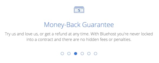
Bluehost uses the classic money-back guarantee technique to reassure people they’ve got nothing to lose by trying out their product. If your goal is more along the lines of a free trial (rather than a product sale), then telling users they don’t need to hand over their credit card details could be the best way to ease hesitation. Likewise, if you’re simply asking for an email signup, promising that you won’t pass on their details might remove their concerns about handing over their email address (just make sure you’re not lying).
#10: Create a subtle sense of urgency
There are plenty of ways to create a sense urgency on your landing pages and, once again, the best approach will vary greatly on what you’re selling. Most landing pages nowadays use something called implied urgency, which is where phrases like “Buy now” or “Sign up today” feature so heavily in CTAs. By using time-sensitive words you’re implying that the longer people hesitate, the longer they’ll be missing out on your fantastic offer.
Time limited offers are another classic technique and you can also take the limited stock approach. This plays more heavily on our fear of missing out on something, which studies show is actually stronger than our desire to gain something – also known as loss aversion.
Much like trust factors, you can create a subtle sense of urgency throughout your landing page copy – and I find this more convincing than overly obvious attempts.
For example, a good approach is to use imperative (commands) to highlight the benefits of your product. Earlier, we saw RescueTime tell users: “Find your ideal work-life balance”. And, here you can see Infusionsoft telling users to “simplify your sales cycle and maximize revenue”.

These imperative commands make it explicitly clear what users gain from taking action. While, in the case of Infusionsoft, this hero section creates a subtle but powerful sense of urgency by implying users aren’t going to maximise their revenue until they sign up. Also, notice how the secondary benefit, “close more deals faster” hints that visitors are losing out on deals right now by not using Infusionsoft’s platform.
So you don’t need to plaster “offer ends soon!” labels all over your landing pages to create a sense of urgency. People don’t like to realise they’re being influenced by marketing messages, so the more subtle your use of consumer psychology is, the more effective it’ll be.
#11: Use multi-step forms

Designing effective forms can be particularly tricky for landing pages. Most best practice suggestions tell you to go for short forms, using no more than 3-4 fields, but it turns out this isn’t the format that converts most.
Despite popular belief, multi-step forms outperform their shorter cousins – by as much as 300%. Instapage also recently published its own findings on multi-step forms performing better on landing pages and I’ve found similar results, despite wanting to believe otherwise.
This is one of the reasons I recommend Leadformly, because it comes with conversion optimised multi-step forms you can embed on any landing page. It also provides form analytics to highlight anywhere your forms might be preventing conversions so you can remove any barriers.
#12: Secondary call to action (repeated)
Another landing page “best practice” that needs debunking is that should only have one call-to-action. I’d like to tweak that slightly to say you should always have one main call to action, backed up by a secondary CTA for those who aren’t ready to take the desired action right now.
The aim with this second CTA is to get a point of contact you can work with, normally an email address. So free trials, free downloads, newsletter and other soft conversion are always good approaches to take.

Leadformly does something entirely different by using one of its multi-step forms to encourage to generate email enquiries from users who don’t sign up. The amazing thing is it feels more like a product demo than an actual form and, before you know it, your enquiry has already been sent.
#13: Disable popups for mobile
If you decide to use popups on your landing pages, I highly recommend disabling them for mobile. Not only do they slow down loading times, but they can be a real pain to exit on smaller screens. You might also get a search penalty from Google after the tech giant started cracking down on mobile popups last year.
#14: Remove distractions
I’ve already talked about minimal design and focused messages but I think there’s still more to be said for removing distractions from your landing pages. For example, you might want to drop the header navigation from your landing pages because it only encourages users to click out of your sales funnel – not to mention adding choice fatigue when you’re trying to maintain a focused message.
The same could be said for your footer, especially if it’s filled with links to parts of your site you don’t want people visiting right now. Or that blog feed you have dynamically inserted at the bottom of every page – now probably isn’t the best time to give users that option.
#15: Don’t get bogged down in testing
I guess this one goes against another established “best practice” but the idea that you should test every detail on your landing pages is ridiculous. It’s amazing how many marketers I see move from one element to the next on their landing pages, testing variations for everything, and believing their data is still relevant in the next test.
“This CTA beat that one and now this headline beat that one, so put the two together and we have a better CTA and headline combination”. Sadly, it doesn’t work like this because you’re testing elements in the context of your wider design and once you make another change the context also changes, making your previous data irrelevant.
You’re better off testing completely different designs of landing pages to see which ones perform better. the rest of your time will be better spent on other things.
Don’t let leads slip away with sloppy landing pages
I can’t tell you how hard it is to find great examples of landing page designs, despite all the best practices floating around. The good news is this means the bar is way lower than it should be and you have a good shot at beating the competition with a little more effort put into your landing page designs.
The post 15 PPC Landing Page Examples & Best Practices to Boost Conversions appeared first on Venture Harbour.


