Marcu Taylor's Blog, page 24
January 18, 2017
12 Landing Page Best Practices & Examples to Steal in 2017
If you’re looking for the usual landing page advice like ‘change your buttons from blue to orange’ or ‘reduce your form fields’, you’re in the wrong place.
In this BS-free article, you’ll learn the most effective techniques and processes that I’ve come across in 9 years of optimising landing pages. Many of the insights below have generated 700-800% increases in conversions for our sites.
First, though, I want to share with you an important philosophy that, when understood and applied, will transform your approach to landing page optimization.
If you want big results, stop tweaking
We’ve all been there – someone in the office says “Do you think this thing should be X or Y?” and another person enthusiastically responds with the stock phrase “Why don’t we A/B test it!”
There’s a big problem with this.
First of all, it’s driven by silver bullet thinking. We read about how Amazon made a few million extra dollars by changing their buttons from rounded edges to square edges, and assume that the same applies to us.
But the bigger problem is that making small tweaks keeps you in your local maximum (the highest conversion rate that you could get with your current landing page design).

I’ve focused the majority of this guide on the strategies, processes and techniques to use to upgrade your landing page, rather than specific changes to make. My intention is that you take away these techniques and use them to do your own research to identify new ways to take your landing pages to the next level.
With that caveat out the way, we can move onto the 12 landing page best practices and examples – enjoy!
1. Reduce your attention ratio
A few years ago, I attended a CRO event in Estonia called Digital Elite Camp.
One of the concepts that stuck with me from the event is an idea shared by Unbounce’s Oli Gardner called ‘Attention Ratio’. Attention Ratio is the ratio between the number of things you can do on a given page to the number of things you want people to do.
Your landing page should, ideally, have an attention ratio of 1:1.
In other words, the only thing that people should be able to do on your landing page is the thing that you want them to do. Every other link, button, or offer is merely a distraction.
In reality, most landing pages have 50-100 different things competing for a visitor’s attention.

When VWO removed the navigation from one of their landing pages (reducing their attention ratio from 13:1 down to 3:1) their conversions increased by 100%.

Is there anything on your landing page that might be distracting people away from the action you want them to take?
2. Use interactive, intelligent, intuitive forms
Forms are surprisingly hard to get right, and are often one of the main causes of lost conversions on a landing page. As such, they deserve a lot of attention.
I won’t go into form UX & design principles here (if you want to learn about that I’d recommend reading my post on ‘58 Form Design Best Practices & Form UX Examples’). Instead, I’d recommend considering whether your form could be more intelligent or interactive (e.g. by using a multi-step or quiz-like form).

Alternatively, if you don’t want to spend weeks fiddling around with your forms, you could use a tool like Leadformly which incorporates most form design best practices into a lead capture form that you can embed on your website.
3. Optimise for motivation, then for ability
According to Stanford professor BJ Fogg, there are two ways to influence the likelihood of someone taking action. You can either increase someone’s motivation to do that action, or you can increase the ability, make it easier for them to do.
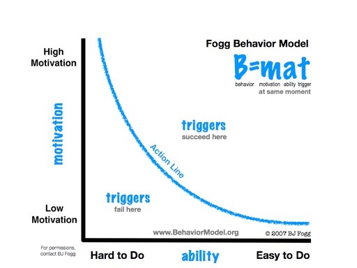
Most landing page optimisation advice focuses improving the page’s design to make it easier for visitors to take action. While important, optimising for ability pales in comparison to optimising for motivation.
Ultimately, every person visiting your website is trying to achieve some kind of outcome. This is driven by a cocktail of emotions that stem from either a desire for pleasure or a desire to avoid pain.
Take a look at Booking.com. Their landing pages are definitely not easy to use, so why are Booking.com one of the fastest growing online travel sites?
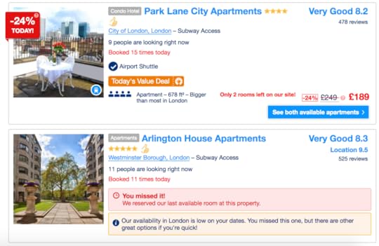
As you can see, Booking.com have clearly spent a lot of time optimising their pages for a strong emotional response. By leveraging many cognitive biases, scarcity, and urgency, they’ve driven up the motivation to book a hotel on their site.
4. Increase urgency & scarcity
According to WiderFunnel’s LIFT model (one of my favourite conversion optimization frameworks) there are six things you can change to increase the conversion rate of a landing page:
Increase the relevance of the page to the visitor
Increase the clarity of your offer
Reduce anxiety
Reduce distractions)
Improve the value proposition
Increase the urgency of the offer

We’ve already covered one of these (reducing distractions), so let’s now look at one of the most potent, yet underused, tactics: Increasing urgency.
In 2012, I A/B tested adding urgency to a landing page by adding a countdown timer and the number of products remaining near to the page’s call to action.

While subtle, this change increased our conversion rate increased from 3.5% to 10%. In other words, we generated almost three times as many sales just by adding some urgency.

Now, there are a lot of ethics and considerations to take into account when adding urgency and scarcity to your landing page. Fake or implied urgency (e.g. saying ‘hurry! Sale ending soon’ when it’s not) is not nearly as effective as genuine urgency and scarcity.
5. Write call to values, not call to actions
Common wisdom is that every landing page should have a call to action (a button telling the user to do something e.g. ‘Get started’).
While clear, most call to actions lack any clear value proposition. Why should I ‘get started’?
A better approach is to write a call to value – an action that has a value proposition attached to it. For example, if you run a financial advice firm a good call to value might be ‘Start saving money’ or ‘See my recommended portfolio’. These are not only more specific, but they give the user a reason why they should take this action.
One of my favourite examples of this is TimothySykes.com. While he arguably takes this concept too far, you won’t find any generic CTAs on any of Timothy’s landing pages.

6. Create multiple versions of your page to boost relevancy
If 500 people visit your landing page it’s likely that they represent different cohorts of your audience.
Your UK visitors may behave differently to your US visitors.
Your high budget visitors may behave differently to your low budget visitors.
Instead of offering the same experience to all visitors you can tailor your landing page to different people to make it more relevant. If you want to do location / geo-based personalisation, you can do this either with browser redirection or with content swapping based on IP address (there are free WordPress plugins like custom content by country that do this).
If you want to personalise the landing page experience based on other factors e.g. industry, budget, or what a person’s looking for, you could do this using an interactive form that redirects visitors to a different landing page based on a person’s answer to a question in the form.

7. What’s in it for me?
People don’t care about your company or product. They care about how it can help them achieve something they want or need.
In their brilliant book ‘Neuromarketing’, author Patrick Venoise outlines a range of tips for selling to the lizard brain, the part of our brain that makes the majority of our buying decisions.
One of the simplest, yet most potent, tips that I took away from this book is using the word ‘You’ more often in your marketing copy. We’re hard-wired to pay attention to things that are about us – which is focusing on your visitors rather than your company is a powerful technique.
8. Avoid video backgrounds at all costs
When I tell people to ditch video and slider backgrounds, I often get responses like “But AirBnB do it”.
True, but AirBnB are most likely losing conversions due to this. They may not care, as the reduction in conversions may be justified by achieving some arbitrary goal like ‘telling the brand story’ or increasing ‘brand value’.
While video backgrounds and fancy hover effects may look cool, I’ve yet to see them convert better than a simple static alternative.
Movement is an extremely effective way to capture someone’s attention – we’re hard-wired as animals to pay attention to movement, as thousands of years ago this was the difference between staying alive or being killed by a saber-tooth tiger.
So, why on Earth would you want to attract people’s attention towards the background of your page when they’re supposed to be reading your copy or clicking on your call to actions?
As Coco Chanel put it, simplicity is elegance.
9. Combine two types of social proof
There are two types of social proof: ‘Authority’ and ‘People like me’.
Authority social proof communicates that your offer has garnered the support of experts and authorities. A good example of this is featuring logos of press publications you’ve been featured on, or a testimonial from a respected expert in your industry.
‘People like me’ social proof answers the question ‘Is this suitable for people like me?’ – this is where a ‘wall of client logos’ and testimonials from customers is important.
Social proof is one of the most effective ways to improve the credibility and trustworthiness of your offer.
10. Grammar & spelling matter
A study by Global Lingo found that poor spelling and grammar was the #1 factor that people claimed made them not trust a web page.
This point doesn’t need much embellishing – just check and then double check that your spelling and grammar is immaculate. It costs $10 to hire an English graduate to proof-read your landing page on Freelancer.com, so there’s no excuse. A final recommendation is to install Grammarly, a free plugin that will highlight spelling or grammatical errors in your work.

11. Tackle every objection before the user thinks of them
Like great salespeople, a great landing page tackles objections before the visitor thinks of them.
Before designing a landing page, I like to spend 30-45 minutes somewhere out of the office to write down every possible objection I would have if I were a visitor learning about the offer. While there are some common objections like those listed below, your offer will probably have some unique objections to tackle.
Common objections:
What if I don’t like the product? (is there a refund policy?)
What payment methods are accepted?
Is this product trustworthy? Who else uses it?
When will I receive this product?
How much does it cost?
A good practice when launching a new landing page is to install a free live chat plugin like Olark on the page for the first 1-2 weeks to monitor what questions people are asking through live chat. Then, add your responses to these questions in an FAQ section on your landing page.
12. The right picture is worth 1,000 words
The old adage of ‘A picture tells 1,000 words’ is only half right. For an image to have a potent impact, it must convey a complex or hard to explain concept in simple terms.
For example, the image below is taken from Hotjar’s homepage. This is probably one of the most copied images of 2016 in the B2B SaaS community, and for good reason. It’s so simple, yet the story it tells is so powerful that it needs no further explanation.

Boiling your value proposition down to a single image is hard, but worth the effort. Whether it takes you a day, a week or a month to identify what that image is, getting this right has the potential to transform your landing page conversion results.
What next?
If there’s one point in this article worth re-reading and arranging a discussion with your team about its #3. Optimising for motivation rather than ability is perhaps the best secret weapon available to anyone in charge of optimising a landing page.
Why? Because optimising for motivation forces you to ask the right questions – what emotions are you provoking? How intensely? Should you be using fear or pleasure to drive engagement with your offer? What images would provoke a stronger emotional response?
These are the questions that few digital marketers ask, but the ones that do are killing it.
The post 12 Landing Page Best Practices & Examples to Steal in 2017 appeared first on Venture Harbour.


December 19, 2016
7 Email Marketing Tips to Amp Up Your Digital Marketing Efforts
So you’re on the lookout for tactics to draw in more customers through an effective digital marketing campaign. Maybe you’ve been focusing your efforts on digital marketing and website optimisation, which have yielded good results. But have you tried optimising your email marketing tactics? With email being one of the most effective online customer acquisition methods, you could achieve even better results with an improved email marketing strategy.
Take a look at some of these email marketing tips that can help you make serious improvements to your digital marketing:
1. Welcome Your New Subscribers
When someone decides to subscribe to your marketing emails, make sure you engage them from the start. It’s common knowledge that you should send a welcome email to your new subscribers. But don’t wait too long to send yours. You may want to send it a few seconds, minutes, or hours after they hit the subscribe button. Either way, the ideal timing for welcome emails is on the same day as the initial subscription.
Smytten sends out welcome emails on the same day a user signs up for their app. The email contains a quick guide to the app, and reminds the user what they can do using Smytten. This is an excellent way to start engaging your new subscribers as you’re helping them get to know more about your service/business/products.

2. Avoid Being Too Spammy
Are you sending your marketing emails and newsletters too often? You may want to keep updating subscribers about the latest products in your store or you may want to inform them about daily deals and offers. But that doesn’t mean you keep spamming their inboxes with marketing emails.
Limit yourself to one email a day at the max. And even if you do send out daily emails by default, make it easy for recipients to customise their email preferences. Instead of limiting the options to only an “unsubscribe” button, give them the freedom to choose how often they receive emails from you.
Inbound.org gives their subscribers an option to update their email preferences. As you can see in the screenshot below, subscribers can opt in for certain types of emails that are relevant to them. Through this, Inbound can avoid spamming their subscribers’ inboxes with irrelevant updates.

3. Optimize Your Subject Lines
Your subject lines are one of the first things people will notice about your marketing emails and newsletters. It’s where you make the first impression, which could determine whether the email gets opened or ignored. So you need to write email subject lines with a few goals in mind:
1. Grab the recipient’s attention
2. Make it relevant for the recipient
3. Get straight to the point
4. Keep it short
Think about yourself as the recipient when you’re trying to come up with an effective subject line. Come up with a few drafts, and ask yourself if each of those subject lines is relevant to you and stirs your interest. And instead of beating around the bush, make sure the subject clearly conveys the content and purpose of the email.
For newsletters, you could try using blog post titles or ebook titles to draw inspiration for your subject line. Klear did this recently by using the titles of one of the blogs included in their newsletter – “5 Instagram Tools to Try in 2017.”

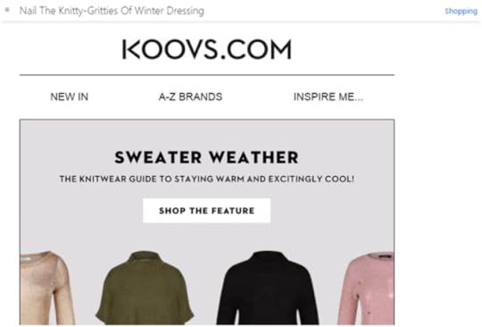
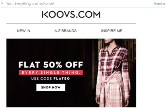
For normal marketing emails, you could try stirring their curiosity or adding some humour to your subject line. You could even try creating some urgency to compel recipients to open the email. Indian eCommerce website, Koovs does a great job with their marketing email subject lines.
As you can see in the screenshot below, the subject line is casual and it gets straight to the point telling the recipient about a 40% off deal for shoes. The way the sentence has been framed is as if it’s a conversation between friends.

Here’s one more example, where they’ve used a pun to add some humour to their email subject line. The subject line invites recipients to nail the nitty-gritty of winter dressing, but they’ve replaced “nitty” with “knitty.” The wordplay is perfect as the mail is intended to promote winter clothing such as sweaters.
But even without witty puns and humour, you can still grab the attention of your audience through your subject line. For example, something as simple as, “Yes… Everything is at half-price!” could stir the curiosity of the recipients and compel them to open the email.
Whichever subject line you choose, consider A/B testing your subject lines to ensure that your ideas are increasing your open rates.
4. Optimize The Sender Name
Along with the subject line, the sender name of an email plays a crucial role in making a first impression. Emails coming from a “No Reply” email address may seem impersonal, and may not do much to help you with marketing. Instead, keep it personalised by including the name of an actual person. Using an individual name as a sender name can add a human touch to your marketing emails.
But some businesses and brands opt to send marketing emails using their company name to maintain reliability. They may feel that subscribers will be more likely to open those branded emails than emails coming from some person they’ve never heard of before.
However, you can add a human touch while still ensuring credibility by combining an individual name and a company name. For example, BuzzSumo sends their newsletters from, “Steve from BuzzSumo.”

And NinjaOutreach newsletters and updates come from, “Mark at NinjaOutreach.” Using an individual name can add a human touch to your interactions. Including your company name reassures recipients that the email is coming from a reliable source. So you get the best of both worlds by combining the two.

5. Optimize For Mobile Users
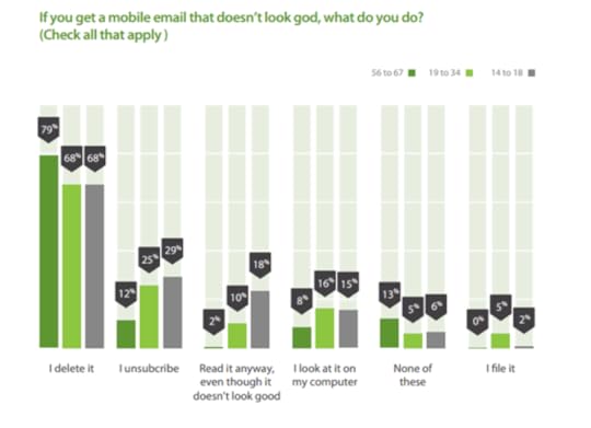
Are you creating marketing emails with mobile users in mind? Litmus conducted a study of 13 billion emails around the world and found that 55% of emails are opened on mobile devices. This can only mean that businesses need to optimise their marketing emails so that mobile users can easily open and view them.
Just put yourself in the shoes of the email recipient. You’re going through your inbox, using your phone, and you find an email that intrigues you. But when you open it, you realise that the design does not look good at all. Some of the images won’t load, the buttons don’t work, and you have to zoom in to read some of the text.
What would you do in such cases? Would you delete the email? You may even be frustrated enough to unsubscribe from the mailing list altogether. A 2016 study by Adestra found that a majority of people across all age groups would delete an email that doesn’t look good on mobile.
6. Choose The Right Timing
Maybe you’ve constructed the perfect body and subject line for your marketing email. But if you’re sending the mail out when a majority of your recipients are inactive, you might be unable to get optimal opens. To ensure that you get more email opens, try to choose the right timing to send out your emails.
There are conflicting opinions about the best day and time to send marketing emails. But an analysis of 10 studies by Coschedule has concluded that Tuesday is the best day of the week for sending out your emails. This is followed by Thursday and Wednesday. And the best time of day to send emails is 10 AM, followed by 8 PM to midnight, and then 2 PM.
While this is the case, it would be best to experiment with different days and times when sending out your emails. This can help you determine the best timing to reach your audience and generate high-quality leads.
7. Don’t Forget A Killer CTA
You may be regularly updating your subscribers with the latest products and deals. But are they taking the desired action? It’s not enough that you send out your updates. You need to make sure that your audience takes the next step – whether it’s to read your latest blog post or to buy your latest product. This means you’ll need to come up with a killer CTA (call-to-action) that compels readers to take action.
Instead of putting your call-to-action as just a link, create a CTA button to include in your emails. It could say anything from, “Start Shopping,” to, “Grab Your Deal” The rule is to keep it short, and straight to the point. When eBay sends out exclusive coupon codes for discounts, the CTA button includes the special code people can use for an extra discount, and invites recipients to use the code.

Conclusion
Now you have a clear understanding about some of the best ways in which you can pull off a better email marketing campaign. The tips given in this post will help you create more effective marketing emails, and engage your audience better. Got any of your own ideas to add to the list? Feel free to share your thoughts in the comments. And if you have any questions about how to rock your digital marketing campaign, you can always get in touch with me.
This guest post is written by Shane Barker, a digital marketing consultant that specialises in influencer marketing, product launches, sales funnels, targeted traffic and website conversions. He has consulted with Fortune 500 companies, influencers with digital products, and a number of A-List celebrities. Interested in writing a guest post on VentureHarbour.com?
The post 7 Email Marketing Tips to Amp Up Your Digital Marketing Efforts appeared first on Venture Harbour.
December 13, 2016
How to Create High-Performing Landing Pages
Landing pages are a fundamental part of any website because they form your website’s first impression.
They are used to perform a lot of important responsibilities, including an increase of brand awareness, promotion of a new product or service, collection of feedback, conversion of followers into leads and conversion of leads into sales.

The importance of high-performing landing pages is perfectly illustrated in the Marketing Benchmark Report that gathered the data from 7,000 different online businesses. This report found that businesses that had more than 100 pages on their websites (and therefore more landing pages) generated 250 percent more leads than businesses with websites of less than 50 pages.
These findings suggested that landing pages are enormously important for inbound marketing because they are the centre of all leads generation efforts. But what can we do to design high-performing landing pages?
5 Fundamental Rules of Landing Page Design
1. Get straight to the Point
No one likes when the seller brags about their products, agree? The same rule also applies to the Internet business. People surfing the net generally have little time to read everything you wrote on the website, so if they see a large text waiting for them, you would be very lucky if they read it to the end. In reality, they never do it because they have limited time (does anyone read terms and conditions pages these days?).
To make sure that the viewer will indeed read the textual content on your landing page, it should get straight to the main point. They will scan the information for several seconds and if they like what they see there, they might click the button you want them to click.
Remember, people have come to your site for some reason and they would not appreciate it if you think that wasting their time is the right thing to do, like bragging.
2. Branding
Marketing experts recommend to brand and personalise everything these days to make the experience of the customer unique and the brand memorable. The logo is the most important distinct design element that should stand out on the landing page to be memorable and create a positive perception. Remember, that the logo should be placed strategically, which means that you should place it a non-promotional way but it still needs to be visible at all times.
If your landing page is connected to social media, ensure that your logo is consistent with the one have there. Otherwise, the visitors might get a little bit confused.
3. Social Proof
Social proof is the evidence provided by social media users about the effectiveness of your product or service, so it can be considered as testimonials. By using the social proof that describes the correct behaviour, you will ease the minds of the unsure potential customers and therefore increase conversions.
This strategy can be very effective. According to Consumerist, almost 70 percent of customers rely on online reviews to make the decision whether to purchase a product, so placing positive reviews by real people on the landing page is a great move.
There are many types of social proof that you can use, including customer testimonials, celebrity endorsements, case studies, media mentions, customer base, trust seals, and others.
4. Use of colors
The main purpose of a landing page is to persuade visitors to click one button that will take them straight to the conversion page. This button should stand out in order to be visibly distinct, marketing experts say. In fact, they have an entire theory called the Color Theory to explain how the impact of colors on the impact on potential customers.
Contrasting color combination is the best way to go, marketers suggested. This strategy is explained like this: let’s assume that the background of the landing page has a white color and the information submission form has a shade of pink to differ from it. In order to be noticeable right away, the conversion button should have a contrasting color to white and pink, which could be red. A red dot on the white screen is easily noticeable and distinct, which is exactly what you need on the landing page.
Need more examples of the colors that convert? Check out this Instapage article.
5. Appropriate Formatting
To craft a really good landing page, you need to give a special consideration for formatting as well. All elements, including lead capture forms, images, headlines, and text, should emphasise the value of your product or service in order to be effective. The best way to organise the format is to use a visual user-friendly experience and a clear meaning.
To be easily digestible, your page needs to have a clear headline formatted in a larger font that the rest of the text. The headline itself should have three essential ingredients,” says Michael Popovski, a web design specialist from Proessaywriting, “such as focus, relevance, and benefits.” Focus is important because the headline should not be vague, so special formatting emphasis might be put on calls to actions. Next, the headline also needs to be relevant because it should be related to the offer on the landing page. Finally, you need to show what problems the product or service will help the visitor to solve by showing benefits. The benefits, by the way, should be as specific as possible.
There are many formulas for headlines that you can use but all of them aim to ensure these three ingredients. The amount of the text of the page should be kept to a minimum, plus it should highlight as many advantages of working with you as possible. Some subheaders also may be used to improve the understanding of the content.
Examples of Great Landing Pages
Now that we have enough knowledge about effective landing pages, let’s review some to see how these strategies are used in practice by different businesses.
1. Munchery

This landing page is beautifully made not just in terms of design but layout of the elements. The first thing that the visitors see is two boxes: the one with the submission form and the other with the benefits they will get after using the product. The design of the submission form was selected to illustrate the example of a white background and a red call-to-action button that we discussed before. The submission form itself has the white colour but the button is red, which totally shows the effectiveness of using contrast colors for making it distinct.
If the visitor decides to scroll down, they will see some statistics that the company provides to ensure its professionalism. Munchery uses the number of cooked meals and the volume of carbon emissions to show their popularity and environmental consciousness.
At the bottom of the page, the viewer is presented with the submission form once again. Good move, considering that the company is beautifully represented on the page, which means that the second time the visitor may be reassured in the righteousness of the decision to convert.
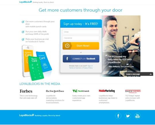
2. Loyal Blocks

The next example of landing page puts a special emphasis on the social proof because it cites Forbes, the New York Times, TechCrunch, MobileMarketing, and Daily News to support the effectiveness of the product. Moreover, it uses a customer testimonial: an owner of a café says that he has been able to increase the daily sales by 41 percent by using Loyal Blocks. Also, the page has a list of advantages associated with the product and a headline that encourages the visitor to take an action. Once again, the call-to-action button is made using a contrasting colour.
3. Ballpark
Another great example of a good landing page that uses a lot of elements described in the first section of this article, including the use of contrasting colours, social proof, and formatting. The headlines and the text clearly explain why the product should be used while a smiling customer tells the story of how Ballpark helped him to run his business. Also, a list of informational resources is presented to show how the company was portrayed there plus the site contains the submission box and a call to action both at the top and at the bottom.
The Final Thoughts
The landing page is the result of your effort to get more leads through the website. This is the ultimate place for conversion from visitors to leads and from leads to sales because it contains the information that persuades to make the decision you want the visitors to make.
Do it right.
You will craft beautiful and high-performing landing pages by using the tips described in this article. As soon as you create one, make sure that you have everything right and continue to improve it as needed. Remember, the process of crafting a great landing page can never be completed because trends and methods of attracting customers change very quickly.
This guest post is written by Tom Jager. Tom Jager is a professional blogger. He works at A-writer. He has a degree in Law and English literature. Tom has written numerous articles/online journals. You can reach him on Facebook. Interested in writing a guest post on VentureHarbour.com?
The post How to Create High-Performing Landing Pages appeared first on Venture Harbour.
December 4, 2016
How to Segment Your Traffic into Buckets to Increase Leads & Conversions
Whether you’re marketing an eCommerce site, a SaaS company, a blog, or a Fortune500 company, traffic segmentation has the potential to transform your lead generation results, by enabling you to deliver the right experience, to the right person, at the right time.
Before I explain how to create personalised web journeys and marketing funnels for your audience buckets, let’s first establish why segmentation matters.

Why segmentation matters for marketers
Imagine you’re looking at the Google Analytics report for your website’s homepage. You probably see a number of page views.
Imagine your page views as real people standing in a large room. You can probably see a mixture of people; Good clients, bad clients, high-paying clients, low-paying clients, people in various industries, with different roles and interests.
People on your website have varying needs. Despite this, most websites send all visitors through the same one-size-fits-all path.
Segmentation by the numbers: 89% sales uplift & 58% increase in average order value
If you’re anything like me, you might be thinking “This sounds great – but where’s the evidence to suggest it’ll actually grow our company?”
In 2015, my team added traffic segmentation to MusicLawContracts.com – an eCommerce site that provides music contract templates.
We added a form on the homepage that required visitors to fill out “I’m a BLANK, looking to BLANK” e.g. ‘I’m a record label looking to sign an artist’. When they hit ‘find my contract’ they were redirected to a personalised landing page recommending the most relevant product based on their responses.

The results from this simple segmentation form were staggering.
Instead of taking an average of ~20 minutes to buy a product on this site, it now took under 6 minutes. The site’s conversion rate increased from 1.31% to 2.47% (an 89% increase in sales), and people were now spending $110.50 on average instead of $70.89.

In other words, segmentation improved the site’s conversion rate, average order value, AND the time it took for someone to find and purchase a product. How? By making it easier and faster to get different visitors to the right product for them.
By knowing two pieces of information (who they were and what they wanted) we could also personalise all of our email marketing campaigns to be more relevant to their specific situation. We could now show the right message to the right person.
So, how can you apply this to your website to improve your marketing metrics?
5 ways to start segmenting & converting your traffic
There are several methods you can use to segment your visitors into different ‘buckets’. We’ve already seen how you can use a form/tool to segment people into different buckets.
This is my preferred approach, as it provides an engaging experience for visitors, while enabling you to capture leads in your CRM and create valuable reports to better understand your audience.
There are other methods like using cookies to dynamically track and ‘swap out’ content on your site, but as this approach typically requires compIex software to manage, I’d recommend starting off by segmenting visitors using a basic form.
1. Segment leads as soon as they land on your site
One technique that has become quite popular is having a tool/form on your homepage that sends visitors down a personalised path when submitted.
This is the approach that we use for Leadformly’s homepage. As you can see below, we have a form that asks visitors to describe their company. Based on their answer, they’re directed to a personalised ‘thank-you page’ with a demo video that’s personalised to their type of business.
In addition to providing a more relevant experience to visitors, this means we’re also able to see what percentage of our visitors are enterprise companies, agencies, SMBs and startups each month.
We can even break this down by traffic source to see precisely where high-value enterprise leads are coming from so that we can take the guesswork out of our which channels we should focus on for lead generation.
2. Give your visitors a personalised recommendation
Another popular technique used by companies like Hubspot, Wealthfront, and Crew is using an interactive form to give visitors a personalised report / recommendation based on their responses to a series of questions.
While the visitor benefits from the free advice, these companies are able to cleverly segment their audience into different buckets – enabling hyper-targeted marketing later on via email marketing, retargeting, and direct marketing.

We tested this approach on a site we run called BrokerNotes. To ‘match’ traders with a suitable broker, we built an interactive form that asked a series of questions that would produce a personalised report on which brokers would be suitable to use.
This interactive form increased BrokerNotes’ conversion rate of landing page visitors into leads from 11% to 46%. It also provided extremely valuable data on what traders on this site wanted to trade, how experienced they were, and much more.
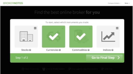
Most importantly, though, the visitors on this site were receiving their desired outcome (learning which broker to use) much faster, as a result of better segmentation.
3. Refine your content & messaging using segmentation data
Sometimes the audience insights that you get from segmenting your audience into buckets is more valuable that the immediate uplift in results from providing a better user experience.
A few years ago, we published a guide on finding the best web hosting. At first, the article was written for experienced webmasters who might be considering a mid-high range VPS or dedicated server.
After segmenting readers of this article with an interactive form, we discovered that we were totally wrong about our audience (whoops!). Over 70% of the people reading the article were beginners looking to spend less than $10/month on web hosting.

After learning this, we scrapped the entire article and re-wrote it with a focus on helping beginners get started with their first web host. As a result, all of our engagement metrics improved – from time on site, to bounce rate and number of shares.
So, if you’re running a content website or want to better understand the audience on certain pages of your site – segmentation might provide answers that would otherwise be tricky to identify. As an aside, these visual web forms are also very effective for engaging your audience.
4. Personalise your nurturing emails for each segment
If you can segment your audience on your website while capturing a visitor’s email address, you can obviously use the segmentation information to send hyper-targeted email campaigns that are going to the lead.
One of my favourite examples of this is from a company called Paper Style, who increased their revenue per email by 330% using the following approach.
Paper Style, who sell wedding-related products, realised that their audience fell into two distinct buckets – brides, and friends/family of brides. By identifying whether someone was a bride or someone helping a bride, Paper Style could personalise their email nurturing campaigns to promote products that a lead was most likely to be looking for at the time.
By increasing the relevancy of these emails, Paper Style’s open rates increased by 244%, email click-through rates increased by 161%, and their revenue per mailing increased by 330%.
5. Remarket to your segments that don’t buy or enquire
Imagine someone goes to your site and fills out an interactive form/tool that tells you who they are and what their challenge is. Perhaps you’re a web design agency and someone has just said they’re a medium-sized business and are looking to get a new website built.
If that lead doesn’t convert, you could remarket to them with hyper-targeted ads that specifically mention something along the lines of “We specialise in helping medium-sized businesses build a new website affordably and on time”.
This kind of hyper-relevance may be a bit scary – but it’s extremely likely to drive people back to your site or follow-through with their enquiry.
Summary: Now it’s your turn
Segmentation is a fundamental in marketing. Unlike the shiny tactics and channels that phase in and out, segmentation is ultimately a means to delivering a more relevant message to the relevant person.
In marketing, there’s nothing better than reaching the right person with the right message at the right time – and this allows us to get closer to that, in a way that is both scalable and well-adapted for the online world.
Understanding the value of segmentation is the easy bit. The hard part is taking action and applying it to your business. My challenge to you now is to take an idea from this post and start the ball rolling today. After all, Henry Ford’s advice rings very true here – if you always do what you’ve always done, you will always get what you’ve always got.
If you want to learn more about segmentation and building interactive forms, feel free to join this free webinar I’m running on ‘How to acquire 300% more leads without increasing your traffic’.
Image sources: Freepik & MadebyOliver
The post How to Segment Your Traffic into Buckets to Increase Leads & Conversions appeared first on Venture Harbour.
November 20, 2016
21 Beautiful Responsive Drupal Themes
Despite the overwhelming popularity of WordPress, Drupal is still one of the internet’s most popular open-source content management systems. Because it’s not the most popular CMS, finding a decent theme to use for your website can be difficult.
The best themes should be clean, professional, and responsive on both desktop and mobile devices. Below is a list of 21 of the best Drupal themes currently available for purchase.
1. Bank Drupal Theme (Demo)
This theme for banking and financial websites has clean professional design. Green elements placed over the fair layout are pleasant for the users’ eyes. Round banners impart the theme a modern look. Customers’ testimonials as well as Google Maps, where you can indicate your company physical location, impart even more reliable image to this corporate website.
2. Logistics Agency Drupal Template (Demo)
This theme for logistics and transportation websites has an appealing, dynamic layout. Slider captures visitors’ eyes and encourages them to explore the website further. Main menu has lowered position on the page. Progress bars help the author illustrate the complicated information, making it simpler to comprehend. Parallax effect adds depth and perspective to the layout.
3. Simplicity – $40 (Demo)
The third entry on this list is, in many respects, the quintessential minimalist Drupal theme. Its simple tabbed layout allows for a website that is both clear and efficiently structured, and its sleek icons fit perfectly with the overall theme that the designer was aiming for.
4. Webstudio – $45 (Demo)
By far one of the most highly -rated themes currently for sale on ThemeForest, Webstudio is, for all intents and purposes, pretty much everything that you could ask for from a Drupal design. With an interface that combines the more contemporary tabbed layout with the traditional navigation bar coupled with full responsiveness across desktop, mobile, and tablet, it isn’t hard to see why.
5. SpecialOne – $45 (Demo)
The most aesthetically -appealing aspect of leaftree’s SpecialOne theme is the clean -cut chunky icons that are almost reminiscent of a smartphone interface. When these are presented alongside a clean and professional blue -on -white interface, the whole package really starts to look rather nice.

6. Other – $45 (Demo)
Featuring a visually stunning full -page grid gallery, Refaktor’s Other theme is an ideal choice for those looking to set up an attractive and engaging online photography portfolio. The simple and non -intrusive side navigation bar makes traversing pages easy and allows the user to focus on the most important aspect: the photos.
7. Realia – $45 (Demo)
If you’re a real estate company looking to definitively announce your web presence with a sleek and professional site design, you can do a lot worse than aviators’ Realia theme. Featuring an extensively customisable main page made up of an interactive map for listing your properties overlaid with adjustable sliders on either side, this layout is clean -cut and mindblowingly simple to use.
8. Finesse – $45 (Demo)
A professional appearance and a minimalist appearance are often two concepts that go hand in hand, and tabvn’s Finesse theme is a hugely effective marriage of the two. The orange -on -white colour scheme is incredibly easy on the eyes and the ensures that your important content will not go unnoticed.
9. Consilium – $45 (Demo)
Teal is a colour that really doesn’t get enough love nowadays, but fortunately CMSSuperHeroes’ Consilium is here to remedy that. The almost -aqua shade of gorgeous bluey -green contrasts excellently with the white background, and with so much space to fill with content running out of room is never a worry.
10. MY FOLIO – $45 (Demo)
Another one for all of the aspiring photographers out there, responsivecoil’s MY FOLIO eschews the traditional full -page grid approach in favour of an incredibly effective tiered system that intersperses your content boxes amongst the featured images. It’s retina -ready, too, so your treasured snaps will look glorious on a smartphone screen.
11. Magnetto – $45 (Demo)
An awful lot of themes boast the sliding image tabs, but tabvn’s second entry on this list, Magnetto, takes it to a whole new level. With clever animations that pop in when you scroll to them, you can be sure that users are going to notice what you want them to notice – they’re even touch-enabled for full smartphone responsiveness, too.
12. Kalypso – $45 (Demo)
When it comes to effective web design, colour is quite often something that is best used sparingly, and with the Kalypso theme, refaktor has thoroughly embraced this idea. A calm greyscale theme lightly dashed with smatterings of blue stays well away from gaudy territory, and the stickied traditional navigation bar on the left is a nice touch that will increase usability tenfold.
13. Designmd 01 – $45 (Demo)
Whether you’re a fan or lighter themes or darker themes, DDamir has you covered. Designmd 01 comes with two interchangeable designs to suit the mood of your website, each one fully-featured with all of the CMS essentials including the designer’s own take on a pretty snazzy navigation bar that blends the traditional with the more contemporary drop-down list alternative.
14. Blocks – $45 (Demo)
Windows 8 really revolutionised the world of operating system interfaces with its new “Metro” desktop, and this Drupal theme by refaktor brilliantly captures the effectiveness and ease-of-use of the Windows 8 desktop. With brightly coloured content boxes arranged in the signature grid style followed by boxes with novel sliding images, this is a brilliantly usable representation of Microsoft’s style.
15. Smooth – $45 (Demo)
Remember when Web 2.0 was first dawning on the internet and the in -thing was themes with sheen on everything? Well, with Smooth, themebiotic harks back to those halcyon days but this time there’s no risk of over -saturation. Sparing gloss mixed with subtle blacks and greys equals an effective, professional -looking theme.
16. Danat – $45 (Demo)
It’s amazing how much something as simple as a single colour can impact on the way that a theme is perceived, and tabvn’s Danat is no different. The unobtrusive blocks of lime green are beautifully bright and refreshing on the eyes, ensuring that your end users will want to come back again and again. Simplicity in its purest form.
17. Style Vintage – $45 (Demo)
Keeping the whole “refreshing” theme going, StyleMultimedia’s Style Vintage takes the concept and elevates it to stunning new heights. The ice cream theme makes use of gorgeous pastel colours that are almost capable of making you salivate following even the slightest glances. Clean -cut and full -featured, this is definitely the one for you if you want to keep it bright and breezy.
18. Expressa – $55 (Demo)
If you’re looking for a surefire way to help your business rise above the competition, you need look no further than refaktor’s excellent Expressa theme should be your first port of call. A simple, no -frills approach to this e -commerce layout’s design ensures that your customers are going to be focused almost entirely on the most important aspect – the products for sale.
19. Visia – $40 (Demo)
We’ve already covered a couple of beautiful portfolio layouts, but neither of them are quite like tabvn’s Visia. A tiered layout makes it easy to distribute all of the important information that you need, and each tier is distinctly coloured to minimise confusion. Throw in some very sleek scrolling animations, clever mouseover effects, and an all -round feeling of professionalism and you have a very effective portfolio template indeed.
20. Astrum – $45 (Demo)
In this age of smartphones that we currently live in, retina optimisation is a significant plus point when it comes to Drupal themes – rest assured, then, that tabvn has ensured that the wonderfully minimalistic and concise layout of Astrum is ready to be viewed at maximum quality on a handheld screen. Throw in some seriously smart video embedding support in the main content slider, and you’ve got a theme that packs a serious punch.
21. Evolve – $45 (Demo)
Last – but by no means least – on our list is an entry from drupalexp, coming in the form of the seriously smart -looking Evolve. It’s main innovation comes in the form of a small loading bar travelling across the bottom of the ever -changing content slider, so your visitors will know just when they can expect to see something new. The template is full of classy, professional animations that will give your company that little bit of je ne sais quois necessary to really claim its place in the busy online market.

The post 21 Beautiful Responsive Drupal Themes appeared first on Venture Harbour.
November 13, 2016
WP Engine Review: My Experience Moving 12 Sites to WP Engine
Over the past decade, we’ve used countless web hosting companies at Venture Harbour to host our portfolio of sites; From Bluehost to Media Temple and AWS. In 2016, we decided to migrate 12 of our websites to WP Engine.
In this post, I’ll share why – and our experience so far, including the ups and downs.

TLDR: WP Engine is an impressive web host. While they do have a few quirks that take getting used to, I’d recommend them if you run a WordPress site that gets a decent amount of traffic.
Why we left Media Temple & moved to WP Engine
In 2013, I wrote about migrating VentureHarbour.com to Media Temple after we outgrew the bandwidth limits on our Bluehost server.
While Media Temple weren’t bad, they had a few drawbacks that made us decide to move:
Annoying auto-updates – Media Temple regularly updated our WordPress files without telling us. While this sounds like a good thing, these updates occasionally broke our site. Their auto-updates also included useless plugins and themes that they were trying to promote/sell, causing our server to get bloated.
Declining performance – When we started using Media Temple, our sites were lightening fast. Over time (and particularly following them being acquired by GoDaddy), our server performance went downhill. I’m not sure if we were moved to lower-quality hardware post-acquisition or whether their servers just didn’t scale up properly, but we saw a significant drop in performance.
Slow and buggy auto-migration – Media Temple claim to have a one-click migration service. Unfortunately, it took us over 4 weeks to migrate one site from Bluehost to Media Temple. It turned out that Media Temple’s auto-migration plugin would often skip files, causing incomplete migrations.
So why WP Engine?
In our guide to the best web hosting, we evaluated over 53 different web hosting companies. Out of this list, WP Engine scored exceptionally in a range of areas. Everything from uptime and server hardware quality, to the average time it took their customer support to answer the phone was impressive.
Uptime (%) of different web hosting companies
WP Engine
99.99%
As we use WordPress for the majority of our sites, I decided to migrate VentureHarbour.com to WP Engine as an experiment. If after two weeks we were happy – we would gradually migrate all of our WordPress sites over to WP Engine.
While you know how this story ends – it wasn’t all singing and dancing. Next, I’ll share my first impressions and the pros and cons of WP Engine.
First impressions logging into WP Engine (Video)
When I opened our WP Engine account, I decided to record a short video talking through my first impressions of their platform out loud.
To see a quick walkthrough of WP Engine’s interface, as well as what it’s like when you first open your account with them, watch the video below.
Since recording the video above, we’ve migrated 12 of our sites to WP Engine, and monitored the performance of them for two months.
What I like about WP Engine (Pros)
1. They’re actually good at WordPress hosting
Every web hosting company says that they offer WordPress hosting these days. But no one does it quite like WP Engine.
WP Engine don’t let you install certain WordPress plugins. Why? Because they constantly monitoring the WordPress plugin marketplace to identify plugins that have security loopholes or that put a lot of strain on your database (causing slow loading).

This is how WP Engine are able to guarantee that if your site ever gets hacked, they’ll fix it free of charge. They prevent the likelihood of it happening in the first place.
In addition to this, WP Engine have built-in caching, a built-in CDN (content delivery network), automated daily backups, and much more – to prevent you having to run lots of WordPress plugins that would cause bloat.
They do this in addition to using server hardware and software that is specifically optimised to run WordPress sites. The result? You can rest assured that your site will run fast, with good uptime, and without the risk of it being hacked.
2. WP Engine have the best customer support I’ve ever used
When we used Media Temple, I always thought their customer support was quite good. It was a bit annoying having to remember a PIN to call them, and not having decent live chat, but problems were generally solved quite swiftly.
But WP Engine have since raised my expectations for support sky-high.
When one of our sites was running a bit slower than expected, WP Engine’s support team moved our website to a brand-new higher-spec server free of charge. No downtime, no selling, and no effort on our part. They just got on with it.
When a migration didn’t work out and I clumsily set up the DNS records incorrectly, they told me the exact changes to make, which solved the issue in minutes.
I’ve never had to call up WP Engine’s phone support, as their live chat is so good. We’ve always got a response within less than 2 minutes from a skilled tech support person.
This is what’s going to make it extremely hard to use any other web hosting company.
3. Effortless automated migration (that actually works)
After my experience with Media Temple’s “automated” migration tool, I was extremely skeptical about WP Engine’s automated migration plugin. But I gave it a shot.
I was blown away; It was so easy I migrated four of our sites to WP Engine in about an hour and a half. When I told our CTO about the migrations, he didn’t believe me – so we migrated another site to WP Engine together. It took under 15 minutes.
The first time does take a bit of getting used to, but their plugins just works. Even if you have files outside of the WordPress installation, it seems to (almost magically) copy them across.
Nice touches:
You can choose the location of your server – We decided to host our sites on WP Engine’s UK data centre to be closer to our audience.
Staging sites – While other web hosting companies we’ve used have enabled staging sites (cloned versions of the website to test/build on), they can be time-consuming to set-up. WP Engine have a one-click clone button that creates a staging site. You can then deploy from staging to production in one click from your WordPress dashboard.

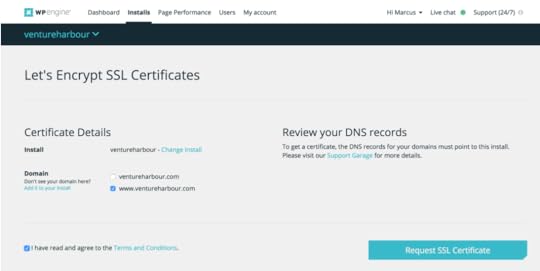
Free SSL certificates – With WP Engine you can convert your site to https:// in seconds with a free SSL certificate. For a few of our sites, we actually decided to cancel our paid SSL certificates, as it was easier to just install a free WP Engine one.
Automatic backups (done well) – Most web hosting companies offer daily backups, but there’s usually a catch. Either you can only restore the backups (but not download them to your computer), or the backup happens daily instead of after major updates. With WP Engine, you can download or restore backups. Backups are also taken daily AND before and after all major updates (e.g. updating your WordPress version).
Scheduled pagespeed tests – Another unexpected nice touch is that WP Engine can run weekly or monthly page speed tests on any page you specify. This means you can diagnose when changes to your site cause it to run slower.

Clever user & FTP management – One challenge we’ve had with other web hosting companies is having multiple developers sharing SFTP logins, or ending up with lots of unused FTP accounts. WP Engine allow you to set permissions for control panel access to prevent contractors being able to access sensitive areas like billing. They also allow you to create disposable SFTP logins, making it easy to give different logins to different developers that will expire.
What I don’t like about WP Engine (Cons)
While WP Engine are by far the best overall web hosting company we’ve ever used, they’re not perfect. Below are some of the drawbacks and ‘doh!’ moments we’ve come across using their service.
1. Their biggest strength is also their weakness
What makes WP Engine great is that they just do WordPress hosting.
This can be frustrating. For example, WP Engine don’t offer email hosting. If you want to have an email address for your website, you’ll have to use a separate email host like Google Apps or Zoho Email. Want multiple (non-WordPress) databases? Nope.
If you run a site that has a non-WordPress component (e.g. a software application), you probably won’t be able to run the software part of it on WP Engine (which means you’ll need a separate hosting service like AWS to run it).
For me, this is the biggest drawback with WP Engine. That said, it’s a necessary compromise that (for us) was worth it – as it’s what allows WP Engine to offer such a high-quality WordPress hosting service.
2. The built-in CDN is average
At first, I was really impressed that WP Engine had a built-in content delivery network. As we have a paid account with Cloudflare, I was looking forward to moving our CDN under the same roof as our hosting with WP Engine.
But it didn’t happen. We still use Cloudflare on all of our sites.
WP Engine use NetDNA as their built-in CDN. It’s not as fast as Cloudflare, it doesn’t provide the same level of DDoS protection, and it seems a bit buggy.
When we turned on the CDN the first time, it was ‘on’ in our control panel but seemed to make no difference to our page speed. After contacting support it turned out that it was not actually on. Thankfully, their support team rectified this straight away by turning it on manually.
What happened next was that all of our site’s resources were loaded from a .netdna.com subdomain. This was a bit annoying, as we’d worked hard to reduce the number of DNS lookups our site was making – so we had to manually change all of our resources to be loaded from .ventureharbour.com instead.
In the end we just used Cloudflare.
3. Plans are limited by the number of visits you receive
Our account allows us to run 25 WordPress sites with a total allowance of 400,000 visits per month. While this seems like a lot, that’s an average of 16,000 visits per site per month.
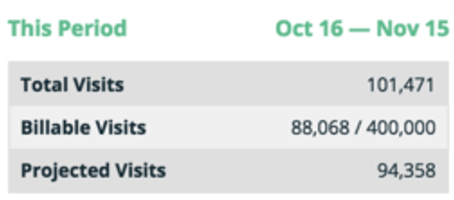
Currently, our sites use about a quarter of this allowance. While understandable, it does make me a little bit nervous that we might be charged overage fees if we suddenly received a spike in traffic.
One positive aspect of this is that WP Engine do not bill you for any bots or non-human visits. As you can see from the screenshot above, this is quite a significant chunk of traffic (over 10% of our visits were non-billable).
Head-to-Head: Media Temple vs. WP Engine
Before we migrated VentureHarbour.com from Media Temple to WP Engine, I recorded our page speed performance, so that we could benchmark whether the migration had improved our performance or not.
Before (Media Temple):
Prior to moving to WP Engine, our web hosting guide took 1.32s to load and had a page performance grade of 90, which is pretty decent.

After (WPEngine):
Immediately after the migration, the same page was now taking 1.22s to load. While not a staggering improvement, it is still a 7.5% improvement on an already very good page speed.
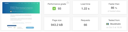
If you’re wondering about the variation in page size, this was due to the hiccup with WP Engine’s content delivery network that I mentioned earlier. In other words, the Media Temple score benefited from a Cloudflare CDN, while the bottom score did not have a working CDN.
Summary: If we went back two months, would we still migrate our sites to WP Engine?
Unsurprisingly, yes.
In the past, I’ve often had buyer’s remorse when choosing a web hosting company. Usually, I come across another web hosting company that offers something better for the same or a lower cost, or a friend tells me an amazing story about a certain web host.
I haven’t had any remorse with WP Engine. In fact, I’m *that* friend that’s been shouting about WP Engine from the proverbial treetops.
While WP Engine is certainly not the cheapest option out there, they’re definitely one of the most cost-effective when you take into account the value of the security and performance features that they offer as standard.
So who would I recommend WP Engine to – and more importantly, who wouldn’t I recommend it to?
I would recommend WP Engine if: You have a WordPress site (or collection of sites) that receive decent traffic (more than 10,000 visits / month) and that you critically need to keep online and not get hacked.
I would not recommend WP Engine if: You’re a beginner looking to host a low-traffic / side-project website (it’s probably overkill for that – save your money and use Bluehost instead). Obviously, if you’re not using WordPress this isn’t going to be right for you.
I hope this evaluation has been useful to you. If you have experience with WP Engine, I’d love to hear your thoughts in the comments below – otherwise, if you want to get started with them you can do so by going to https://wpengine.com.
Update: WP Engine have kindly offered a 20% discount to Venture Harbour readers on their first month if you go through this link. You can also get two months free by choosing an annual plan. For full disclosure, we do get paid a commission – but this comes out of WP Engine’s pocket and not yours.
The post WP Engine Review: My Experience Moving 12 Sites to WP Engine appeared first on Venture Harbour.
September 26, 2016
10 Ways to Scale Your Agency or Consultancy’s Lead Generation
Last year we had to turn away 300+ qualified leads.
After four years of trial and error, Venture Harbour reached full-capacity, with 100’s of leads on a waiting list. I say this not to brag, but to provide some credibility before I share any advice.
In this article, I’ll outline five of the most effective strategies I’m aware of for generating a steady stream of ‘bread and butter’ leads for your agency, followed by five tactics to attract big accounts.
Whether you’re an established creative agency, a leading management consultancy firm, or a startup SEO consultant, I encourage you take action on this information to build a scalable lead generation machine that takes your business to the next level.
#1 Scrap your generic enquiry forms
Most agencies and consultancies use dull, out-dated forms on their websites.
These cost agencies a lot of leads (we were no exception). Your form is the final step in the lead generation marathon – it literally separates your leads from your non-leads, and therefore has significant influence over how many leads you receive. Simply put, the better your lead capture forms, the more leads you receive.
At Venture Harbour, I continually optimised our form using Leadformly, ultimately increasing the conversion rate of the site from 0.96% to 8.1%. Not only did this skyrocket our leads, but our cost of acquiring a lead was now much lower, opening doors to new acquisition channels.

So, how do you improve your form?
Give people what they want
Your leads want to know four things:
1. What will you do for them?
2. How much will it cost?
3. How are you different from everyone else?
4. Do you know what you’re talking about?
So give it to them.
Instead of using a dull contact form like every other agency, offer your visitors a free proposal, a 60-minute introductory consultation, or a personalised audit. You could even use a tool like Leadformly to build an interactive form that gives each lead a personalised response, like what Hubspot do with their marketing grader form:

#2 Speak at small, industry-specific events
Between 2012 and 2015 I spoke at almost any conference, meetup, or event that would let me step on a stage. Anything from a 20-person meetup in London, to a TED conference in Australia.
Here’s what I learned about generating leads from public speaking:

Speaking at big marketing conferences is mostly ineffective
While speaking at established marketing events is great for credibility, they’re often ineffective for generating leads.
First of all, there are too many competitors pitching for the prospect’s attention. It’s like trying to promote your book in a book store: Unless you have something truly exceptional to say, you’re soon forgotten.
The bigger problem, though, is that most of the audience assumes that you’ll be busy after your talk – so relatively few people come up to speak to you.
In contrast, at a small event with 50-100 people you’re seen as more accessible. As a result you have more (and deeper) conversations that turn into better leads, and more clients.
Industry-specific events are a goldmine
Last year, I spoke at a forex conference in Cyprus. We had just started working with a client in the forex niche, so I flew to this event to meet them and learn about their industry. To make the most of my time there, I offered to give a keynote on marketing automation.
I came away with more leads than I’ve ever received from any event I’ve spoken at.

How? I was one of the only digital marketers at the event. The audience was full of CMOs and marketing directors from banks and other financial institutions, but no other agencies or marketing consultants were competing for their attention.
People quickly assumed that I was an expert in forex digital marketing, which led to more financial speaking events and opportunities to write for financial publications.
I observed a similar phenomenon speaking at conferences in the music industry. When you attend or speak at industry-specific verticals, you’re seen as the expert in that field.
My advice? If you want to get leads from speaking, zig where everyone else is zagging.
#3 Use webinars to out-teach the competition
No company wants to hire an agency or consultant that isn’t an expert in their field. Our BS radars have become so good that as an agency you must show, not tell, that you’re the authority.
The most scalable way of doing this online is through webinars, which have a few bonuses:
Reciprocity – according to Dr. Robert Cialdini, people are hard-wired to want to repay favours, even when it’s totally irrational. It was found, for example, that people are more like to buy a car at a dealership if the sales person gave them a free coffee. By giving a free webinar, your leads are more likely to reciprocate by signing the contract.
Authority – your webinar positions you as the authority on your topic.
Likability – we’re more likely to buy from people we like. A webinar is an opportunity to spend an hour with a prospect where they’re listening to your voice, developing a relationship, and building rapport.
Scarcity – Many webinars end with an offer such as ‘The first X companies get started with our agency from this webinar will get a free Y’. This scarcity increases the likelihood of your leads taking action.

At Venture Harbour, we use WebinarJam to run webinars. This tool allows you to run polls, display timed offers, and even pre-record your webinar and have it play once a week, and much more.
If you’re interested in watching one of my webinars, I host a free weekly webinar for Leadformly on ‘How to acquire 300% more leads without increasing your traffic’, which you can secure your spot for here. In it, I share even more techniques that can be used by agencies and consultants to capture more leads.
#4 Low-frequency content marketing
If we apply the 80/20 principle to content marketing, 80% of your leads will come from 20% of your content. If you can identify what 20% of content would be most effective, you can get 80% of the rewards for only 20% of the effort.
This is where low-frequency content marketing comes in.
Instead of creating content on a daily or weekly basis, slow down. Spend at least 40 hours on every piece of content you product, and make it exceptional.
If your dream clients are film companies, create the ultimate guide to digital marketing for film companies. Continually refine this piece of content to make it 10X better than the next best piece of content on the topic.
From my experience, this approach to content marketing and blogging yields significantly higher quantity and quality of leads.
#5 Automate prospecting & outbound sales
Lets be clear, outbound sales does not mean cold-calling.
I’m talking about building an automated system that:
Builds a qualified prospect list for you – by pulling in public data on company financials, technology used on their website, and other public data that can be found online. If your clients typically have over £10m in annual revenue, are based within 100 miles of London, and use a premium CRM like Pardot or Marketo, you can automatically build a list of all of the companies that meet this criteria (I’ll explain how in a moment).
Automatically reach out to these companies – You can then automatically trigger a personalised introductory email to all of the prospects that meet your ‘typical client profile’. The ones that respond are then handed over to your sales team.
This means that your team no longer needs to spend time prospecting, and can focus 100% of their time and effort on the leads that have the highest likelihood of closing.
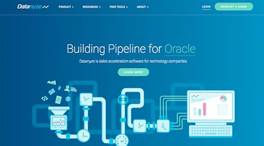
The best tools for this are Datanyze and Growbots. They’re not cheap – but if you’re spending a lot of time finding prospects for outbound sales, this will save you a lot of time.
#6 Build your referral network
If you want to attract clients with big budgets, you either need a referral network, or to create word of mouth. Ideally both. As word of mouth is slightly more elusive, I’ll focus on how to build a referral network.
There are three kinds of partners that I recommend developing partnerships with:
Upstream services – If you’re an SEO agency, an upstream service might be a web design agency, a PR agency, a venture capital firm, or a marketing training company. These companies will typically have influence into which SEO agency their clients choose.
Other agencies – While it may seem counter-intuitive, other agencies are a great source of leads. First of all, another agency’s bad-fit client may be a dream client for you. Also, when an agency (like ours) is at full-capacity, they need other agencies to recommend.
Niche partners – If your agency specialises in consulting to hotels, it makes sense to partner with organisations and associations that are well-connected within the hotel industry.
#7 Build complimentary tools and software
The majority of Venture Harbour’s best leads come from our ventures, such as MarketingAutomationInsider.com (a site we built to help marketers find the right marketing software).
I’ve noticed that more and more agencies are combining the agency model with either SaaS or information products. By building complementary tools or products, you can not only cross-sell and create new revenue streams, but you can also market your agency services to the people who’re signing up for these products.
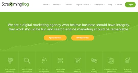
Screaming Frog is a fantastic example of this. With their software widely loved by the SEO community, many people don’t even realise that Screaming Frog is actually an agency.
#8 Run your own shows
While conferences and events (including meetups, dinners, and award ceremonies) may not be the best standalone business model, they are a great way to boost your influence in your industry or niche.
When you run the events in your niche you become a de-facto authority. This attracts publicity opportunities, enables high-potential networking opportunities, while insulating your agency from the competition as you’re able to somewhat control who can access your event’s audience.
Above all else, though, it gets you out of the office and into a room full of potential clients. Combined with a steady flow of beers, and valuable insights on who’s attending, it’s a clever and underused strategy for topping up the top of your sales funnel.
#9 Write the book in your niche
For similar reasons as above, authors are widely perceived as authorities. Sending a copy of your book to leads is a great way to differentiate your agency, while putting your agency’s brand front and center in your leads’ day-to-day lives for a few weeks.
If you’re able to secure a publisher it can also be an effective way to reach an even larger audience of potential leads. Just remember that most (reputable) publishers require you to put in a lot of public speaking work to more or less guarantee at least 10k-20k book sales within the first year.
A great example of this is Blue Ocean Strategy, which has sold 3.5 million copies promoting The Boston Consulting Group’s infamous strategic principles.

#10 Ask
One of the best ways to get more business is to simply ask for it.
Try this: Create a list of no less than ten companies that would be your ideal leads. These must be companies that you can genuinely offer transformational results to. Once you have your list, use email hunter to find relevant contacts at each of these companies, and then reach out.
Your email needs to sincerely explain why you want to help them and what you believe you can do for them. Be specific, and don’t copy and paste the same email.
I guarantee that you’ll receive at least one very high quality lead from this, and most likely a new client.
Summary: Take action
As I mentioned in the introduction, this information is only valuable when acted on. Whether you decide to improve your lead capture forms, test webinars, or start a referral network, or all of the above, the key is to make changes. Because…
If you always do what you’ve always done, you will always get what you’ve always got – Henry Ford
The post 10 Ways to Scale Your Agency or Consultancy’s Lead Generation appeared first on Venture Harbour.
August 9, 2016
Why Multi-Step Lead Forms Get up to 300% More Conversions
Five years ago, I accidentally discovered that multi-steps convert really well.
I had just launched an online calculator for measuring ‘comfort zones’ called (unoriginally) WhatIsMyComfortZone.com. The tool had a multi-step form that converted 53% of site visitors into ‘leads’, despite asking a lot of questions (including email, name, phone number and salary).
When we tested asking all of the questions on one page (like most lead generation and contact forms do) the conversion rate plummeted. It made no sense as, after all, we were still asking the same questions.
When should you use multi-step forms?
You might be wondering “I can see how it’d work for that site, but what about X?”
Over the past five years, I’ve tested multi-step forms across a lot of industries and site types. For lead generation specifically, I’ve yet to see a traditional single step form that converts better than a multi-step version with the same questions.
When we changed the consulting enquiry form on this site from a traditional contact form to a multi-step form that I built in Leadformly, our conversion rate went from 1.3% to 8.2%.

When we started using a multi-step ‘tool-like’ form on BrokerNotes, a B2C financial lead gen site, our conversion rate increased from 16% to 41.6%.
An astro-turf company A/B tested a one step form vs a multi-step form and saw a 214% uplift in leads.
Vendio, a website building tool, ran a similar test that resulted in a 59% increase in leads. Tinkoff bank also saw an increase in credit card applications using a multi-step form.
So, why do multi-step forms convert so well?
Want to capture up to 300% more leads without increasing your traffic?
Join me on this free webinar where I’ll share the secrets behind the lead generation strategies of companies from Expedia and HP to startups like Crew – and how they’re generating 1,000’s of extra leads every month.
Why multi-step forms convert so well
It may seem counter-intuitive that adding more steps to a form would increase results. The common wisdom in conversion optimisation is that less is more, particularly when it comes to forms.
So why isn’t this the case with multi-step forms? Here are a few possible reasons:
Multi-step forms reduce psychological friction
The first impression appears less overwhelming
The progress bars encourage users to complete the form
You can ask ‘sensitive’ questions (e.g. email address) on the final step when users have more ‘skin in the game’ from filling out previous steps.
7 tips to make sure your multi-step form converts
1. Ask low friction questions on the first step
The beauty of multi-step forms is that you can start your form with a low-friction question that engages potential leads.
Typically, I recommend starting a multi-step form with a question like ‘what’s your goal?’. Not only is it a low friction question, it also puts your potential leads in the frame of mind where they’re thinking about the benefit of your product / service.
2. Show users that they’ve already made progress
According to the ‘endowed progress effect’, which is a proven bias around how the human brain makes decisions, we’re more likely to complete an action if there’s an illusion of progress.
Put plainly, telling someone that they’re 20% complete (when they start an activity) increases the likelihood of them completing that activity. This was proven in a study that gave people buying coffee one of two loyalty card stamps:
One had eight spots to stamp
One had ten spots to stamp, but two had already been stamped
In both situations, people had to buy eight coffees to claim a free coffee. However, the one that had two spots already stamped increased the likelihood of people becoming loyal to that coffee shop and buying more coffee.
When applied to multi-step forms, if you start your form with a progress bar that subtly implies that they’re already made some progress, you will increase your completion rate.
This is why all multi-step forms built in Leadformly start with the progress bar already showing that progress has been made.

3. Ask one or two questions per step – but don’t have too many steps
I’ve found that it works best when you ask one or two questions per step. This way the form appears less overwhelming and feels faster to progress through.
The caveat, however, is that this is true if your form contains 2-10 questions. If you’re asking more than 10 questions, you may want to group more questions per step to prevent having a form that appears to have an endless number of steps.
4. Use conditional logic to personalise the questions on later steps
Conditional logic enables you to only display a question if a previous question was answered in a certain way.
For example, in the form below the question ‘what are you looking for in a broker?’ is only displayed if someone answers ‘experienced’ or ‘expert’ to a previous question asking how experienced they are at trading.
This is because a beginner trader might be confused by this question, causing them to abandon the form.

The great thing about multi-step forms is that you can make them feel very conversational by personalising the steps based on their previous answers.
For example, in the form below you can see that the question on step 2 asks “Which company are you the CEO of?”. The form ‘knows’ that they’re the CEO as they previously answered that they’re the CEO in a previous question.
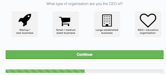
If you want to get really hyper-targeted, you can even make the thank you pages personalised based on how people answered questions in your form.
Leadformly does this with the form on its homepage. If you answer that you’re an agency, for example, it takes you to a page with a video talking about how agencies use Leadformly, FAQs aimed at agencies etc. Similarly if you say you’re a startup, or enterprise, you’re also taken to a hyper-targeted page.

5. Make it clear which step users are on and how many steps are left
When creating a multi-step forms, progress bars are absolutely essential. Without them, there is no indication as to how much time or effort users have to invest to complete your form.
There are various ways you can show progress. You can use traditional progress bars (my favourite), you could say ‘X% complete’, or you could even say ‘you’re on step 2/4’. The important things is that you communicate two essential pieces of information:
1. Where are you right now.
2. How long until you’re done.
6. Offer immediate value upon submitting the form
When it comes to increasing form conversion rates, the most effective yet least talked about tactic is improving the ‘outcome’.
To illustrate the point, imagine that you built an awful form with 50 questions. Perhaps 0.5% of your visitors would fill it out.
Now imagine you offered everyone that used it a free Ferrari. The conversion rate would shoot up to 100% – despite nothing in the form itself changing. This illustrates how important the outcome of using your form is.
As a general rule, I’ve found that the highest form conversion rates come from offering a tangible instant outcome.
Crazyegg (a heatmap tool) offer their visitors a personalised heatmap instantly.
ComparetheMarket offer their visitors an instant quote.
BrokerNotes gives its visitors an instant recommendation.
When giving instant value doesn’t make sense, offer your leads something tangible in return for submitting your lead form like a proposal, a 30-minute consultation call, or a free information pack.
7. Ask questions that benefit both you and your leads
I’m regularly asked which questions should be included on a form. The simple answer is that you shouldn’t ask anything your potential leads won’t want to give you.
Phone numbers, for example.
Asking for phone numbers is common practice, but is one of the most significant causes of form abandonment. Most people don’t want sales people distracting them by calling them up. There are exceptions, of course.
The questions in your form should at minimum be questions your leads are happy to answer. Ideally they should actually benefit them.
For example, I know that entering my travel dates into a travel site’s form will benefit me by helping me get accurate availability and pricing information. I wouldn’t, however, be happy giving a phone number at this stage.
What’s next?
If you want to learn more about how you can use multi-step forms to capture more leads, check out this free webinar I’m hosting where I go into them in much more detail.
Alternatively, If you want to get stuck into build one you can use a tool like Leadformly to do so, which enables you to build multi-step forms in a drag and drop editor (instead of having to get a developer to build one manually).
The post Why Multi-Step Lead Forms Get up to 300% More Conversions appeared first on Venture Harbour.
June 28, 2016
5 Ways to Get More Product Demos for Your B2B / Enterprise Software Service
Last year, I spent a lot of time experimenting with and implementing lead generation strategies for a B2B financial software company. It had its challenges, but I learnt some invaluable techniques on how to drive more product demos.
Below are five tips that I found useful, and that I hope will enable you to generate more leads for your software service.
#1 Reduce time from visit-to-demo
When someone decides your software might be right for them, they want to see it – now.
Instead of playing email ping pong to schedule a demo, only to find that timezones and busy schedules mean that the demo has to be scheduled two weeks from now, use automation to reduce your ‘time to demo’.
GoCardless ran an A/B test where they replaced ‘request a demo’ with ‘watch a demo now’. Instead of taken leads to a page where they scheduled a demo, GoCardless tested taking leads to a 10-minute video demo of the software.

Now, I get that this is a ballsy experiment. A pre-recorded demo makes it harder to address specific objections and it may not feel as tailored. However, the data speaks for itself. For GoCardless, the pre-recorded demo resulted in a 114% improvement in their conversion rate.
One piece of advice I would add is that you should always start off by doing manual demos. That way you will understand the common objections your leads have, and will be better prepared to put a good pre-recorded demo together.
Of course, if your clients are fortune 500 companies you may need to alter this approach, perhaps by allowing them to schedule a ‘one-to-one call’ after they’ve watched the pre-recorded demo.
#2 Upgrade your lead capture form
Most B2B software companies use the generic web forms provided by Salesforce, Marketo, or whichever CRM/automation service they’re using.
While convenient, these forms are designed to be generic. They’re not designed to drive conversions, and are likely costing you leads. As such, it’s better to use something like Leadformly which allows you to quickly build lead generation forms that have been optimised for specific purposes – like driving product demos.
Your form is the last step in your lead generation process, and it has a significant amount of leverage. If you increased your form’s conversion rate from 2% to 4%, you’ve doubled the effectiveness of EVERY marketing and lead generation campaign that is driving leads to your website.
Forms may seem like a simple piece in your marketing machine – but they’re arguably one of the most important parts of your funnel to get right.
They’re also very easy to get wrong. In fact, Expedia lost $12 million per year by adding ONE field (company name). A study by Clicktale also found that asking for phone numbers can make up to 10x as many people abandon your form. The moral of the story is don’t gamble with forms – either pay a good UX design / conversion optimisation agency to design them, or use a tool like Leadformly.
#3 Get your product demo process right
Some software companies lose as many 50% of their leads due to the challenges of arranging and conducting online demos. Inevitably, you’ll have come across potential leads that…
Due to company policy had to use their own Webex or GoToMeeting account.
Had a poor Internet or audio connection.
Forgot to add a calendar notification.
Had a previous meeting that overran.
Lost the meeting login link / pin code.
Due to company policy couldn’t install any required browser plugins.
Etc.
The reality is that some of these problems are unsolvable from your end. The best that you can do is ensure that you are never the problem, and then if there is a problem that you have backup plans.
Here are a few ideas that I’ve found useful:
Always ensure you are using the fastest and most stable broadband you can find. If you’re in the field a lot, get a high-speed portable WIFI device.
Use marketing automation (or your web conferencing software) to automatically send meeting reminders via email and SMS one hour and ten minutes before every meeting. Include all of the necessary meeting links in these notifications, and remind them to go somewhere quiet and with a good Internet connection.
Identify company policy issues when the demo is scheduled (not five minutes before the call). On your demo confirmation page mention something like “The scheduled demo will take place on Webex. If you’d prefer to use different software, please let us know here”.
Ultimately, you should be aiming for 100% of your scheduled demos to show up and be successful in the first-attempt.
#4 Use whitepapers and ebooks to drive top of the funnel leads
Almost every B2B software client / project I’ve worked on, the best way to increase demo leads at the top of the funnel was through whitepapers, ebooks, and other free information products.
If you’re receiving a reasonable amount of traffic to your website, but are only converting a handful of visitors into leads, experiment with offering something valuable to leads to capture their email address.
You can then create a nurturing ‘drip campaign’ to gradually educate them on your service and bring them to a point where they’re ready to arrange a product demo.
#5 Experiment with one-to-many demos
I recently demo’d Intercom as a service to use for one of our ventures. To see whether it was a good fit for our company, I attended one of their weekly webinar demos. At first I thought this was a clever way of scaling demos without losing the personal touch.
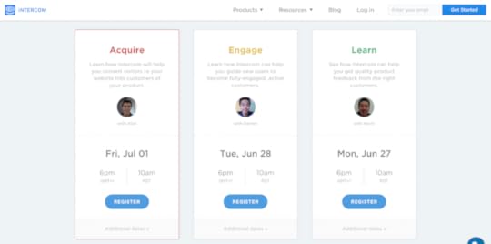
The webinar went like this: Someone from Intercom did a personal introduction for a few minutes and then played a pre-recorded product demo that I believe lasted around 20 minutes. Afterwards, the host did live Q&A with a hundred or so people who were all watching the demo.
What I liked about this is that the live Q&A created a lot of social proof. I could clearly see that lots of other marketers were interested in this product, and I could see their objections being addressed. It was both operationally and psychologically impressive.
Over to you
Generating more product demos doesn’t require any radical thinking. It often just requires that you take down the barriers that are causing friction in your existing funnel.
While I hope the tips above provide some useful inspiration, the real lesson is to take a good hard look at your funnel and identify where the friction is for you. Then, experiment with different approaches to try and break down that friction.
The post 5 Ways to Get More Product Demos for Your B2B / Enterprise Software Service appeared first on Venture Harbour.
June 24, 2016
58 Form Design Best Practices & Form UX Examples
One of my favourite things about running Leadformly is that we’re constantly learning from form optimisation and design experiments.
Below are 58 of the best insights I’ve come across on form design from seeing countless form design A/B tests, and studying the work of companies that have invested heavily into form optimisation.
This post turned into a bit of a monster so I’ve broken it into eight sections. I also made a full checklist that you can download for free to evaluate your own forms.
General form design & structure
Questions & field types
Accessibility & ease of use
Validation & error handling
Trust & social proof
Multi-step forms & progress indicators
Buttons & call to actions
Mobile form best practices
Before we jump in, I should caveat that while most of the tips are based on statistically valid experiments ran across numerous sites and industries, they shouldn’t be taken as gospel. Forms are highly-contextual and depend on more than just the design of the form itself to convert well. With that said, let’s jump in.
General Form Design & Structure
1. Multi-step forms out-perform single-step forms
Splitting your forms into two or three steps will almost always increase form completion. We’ve tested this across all kinds of lead generation forms, from webinar registration forms to B2B enquiry forms, and consistently we’ve found multi-step forms out-perform generic single-step forms.
There are three reasons why multi-step forms work so well:
The first impression is less intimidating than a long form with lots of question fields.
By asking for sensitive information (email, phone) on the final step of a multi-step form, users are more likely to fill out these fields – otherwise they lose the progress made by filling out the previous steps (this is a proven cognitive bias known as the ‘sunk cost fallacy’).
By seeing a progress bar, users are more motivated to complete the form. This is, again, based on numerous proven cognitive biases such as the endowed progress effect.
2. Remove all non-essential fields.
Expedia lost $12 million per year by asking one additional question (company name) in their booking form. Marketo also found that a few non-essential fields were inflating their cost per lead by ~25%.

Every additional field in your form is losing you leads – so consider whether each question justifies the incremental loss in leads or opt-ins.
3. Use conditional logic to shorten your forms
Conditional logic (sometimes called ‘branch logic’) is where you only display a question if a user has answered a previous question in a certain way.
This technique reduces the average length of your form, while also reducing form abandonment by not displaying questions that might be irrelevant to certain users.
One of our clients at Leadformly used this feature to create a unique enquiry form for their web agency. Using conditional logic, their visitors could tell them precisely what service they were looking for just by clicking a series of icons.

4. Top-left aligned labels are best for readability & completion
Google’s UX researchers found that aligning labels above fields on the left-hand side increased form completion time. This is because it requires fewer ‘visual fixations’, as illustrated in the diagram below.

There is one acceptable alternative to top-aligned labels, which I’ll discuss in point #16.
5. Avoid placing questions side-by-side.
Eye-tracking studies have shown that simple one-column layouts are better than multi-column layouts with questions positioned side-by-side.
The only exception to this rule is when asking for dates (day, month, year) or time (hours and minutes), where multiple fields are expected to be on one line.
6. Give people a reason to use your form
Imagine you had a long form that took an hour to complete. Nobody would use it, right?
Well, not if you gave everyone a free Ferrari for completing it. The promise of a Ferrari would give people the motivation to push through, despite the long and poor user experience. While extreme, this example illustrates the role that motivation plays in form optimisation.
In one simple example, BettingExpert received 31.54% more signups by changing their form title and call to action to emphasise why people should sign up.

7. Group related fields together into sections or steps
If your form has more than six fields, it’s considered good practice to group questions into logical sections or steps.
Questions & Field Types
8. Choose field types that reduce the number of clicks required to complete
When Microsoft changed their shutdown prompt from a clickable shutdown icon to a dropdown box, they found that fewer people were shutting their computers down – just because of an additional two clicks.

When choosing which question field type to use, try to optimise for as fewer clicks as possible.
9. Use smart defaults
If you’re asking questions like phone number or country, you should suggest a default phone extension or country based on the user’s IP address.
Exclusive Bonus: Download this post as a checklist for a guide on how to boost your conversions with high-converting lead gen forms.
10. Know when to use radio buttons, checkboxes, and dropdowns
As a general rule of thumb, radio buttons should be used when there’s a range of options and only one option can be chosen.
Checkboxes are should be used when more than one option can be selected.
Where possible, checkboxes and radio buttons should be used instead of dropdowns, as they less cognitive load to process. Typically, I use dropdowns when there are more than six options to choose from.
11. Radio buttons should be vertically-stacked
Vertically-stacking radio buttons (and checkboxes) makes them faster to process compared to a horizontal layout.

12. Do not slice fields when asking for phone numbers or date of birth.
Sliced fields force the user to unnecessarily make additional clicks to move to the next field. Instead, it’s better to have one single field with clear formatting guidelines in the placeholder.
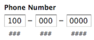
Even if you auto-advance users onto the next field, field slicing imposes stricter validation that has the potential to backfire. In the diagram above, for example, this field slicing would be confusing for anyone entering a phone number outside of the United States.
13. Clearly explain why you’re asking for sensitive information
People are increasingly concerned over privacy and information security. If you must ask for sensitive information, make sure you explain why it is needed using support text below the field.
14. When asking for addresses, use a post code / zip code lookup to reduce field entry
When asking users to fill out their address, it’s best practice to just ask for a house number and post code/zip code, and then use a lookup service to suggest the full address.

15. Use placeholders correctly
A placeholder is the light text that appears within a form field. In the example above, you can see a placeholder that says ‘E.g. ‘CR0 3RL…’.
Placeholders should be used to guide users on how to fill out the field if there’s any ambiguity. In other words, you probably don’t need to have a placeholder for fields like ‘First name’ as most people know how to answer their first name.
16. Always display a field label
A field label is the question text that sits above the field. These should always be present and should not be replaced with placeholders. Why? Because when you start entering text into a field the placeholder text disappears which forces people to use their memory to recall them.
The only instance where it may be acceptable to not have a field label is if you’re using inline labels. Inline labels are a hybrid solution that are always in view, but do not take up as much vertical space as top-aligned labels. Below is an example of inline labels being used by BounceExchange‘s form.

17. Use predictive search for fields with lots of pre-defined options
When asking users to choose their country, occupation, or something else with a large number of predefined options, it’s best to provide a predictive search function to reduce the amount of typing and cognitive load required.
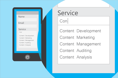
18. If you must ask an optional question, make it clear that it’s optional
While I’d advise removing optional fields or using milestone submissions to ask them after users have already submitted their data, sometimes internal politics require them to be asked.
If you must ask optional questions, make it clear that they’re optional using placeholders.
19. Selectable images are among the most engaging question type
Where it makes sense, use clickable images as a question type. From the data we’ve seen at Leadformly, they’re among the most engaging question types and provide a great form user experience.

20. Be careful when asking for phone numbers
People are increasingly less happy handing out their phone numbers. In fact, one study by Clicktale found that marking the phone number field as optional decreased the form abandonment rate from 39% to 4%.
21. Input fields should be sized accordingly
The size of a field should reflect how much text the user is expected to enter. Therefore, fields like zip code or house number should be shorter in width than fields like the address line.
Accessibility & Ease of Use
22. Avoid using Captchas.
A study by Stanford University found that Captchas will cost you a drop in subscribers / leads of up to 30%. When Animoto removed captchas from their sign-up form, they received 33.3% more signups.
Captchas force the problem of spam management onto the user, causing friction, and ultimately deterring leads. A better alternative would be to use an automated spam detection service like Akismet, or create a ‘honeypot’ using hidden fields. Using a Captcha should be your absolute last resort.
23. Do not rely on colour to communicate
While less common in women, 1 in 12 men have some degree of colour blindness.
When displaying validation errors or success messages, be sure to not rely on making the field green or red. Wherever colour is used, try to also display text and/or icons to communicate a message to the user.
24. Ensure that your entire form can be navigated using the tab key
While many people use the tab key to navigate through forms, this is particularly important for disabled users who may be relying on software that uses the tab function to move from one question to the next.
25. When asking a question that users may not understand, provide clear explanations to guide them to the correct answer.
Insurance lead generation forms are not easy. Unfortunately, there’s a lot of mandatory information that must be asked that can confuse users.
Fortunately, there’s a lot that we can all learn from insurance companies on how to tackle this challenge. ComparetheMarket.com do a great job of providing detailed visual explanations when you hover over a question.

26. Does your form work on all major browsers and devices?
It may sound like common sense, but it’s good to check that your forms work and are easy to use across all major browsers and devices. When in doubt, use a service like BrowserStack.
27. Is your form easy to use in bright or low-light situations?
If people are likely to use your forms outdoors on their mobile devices, it’s best to ensure that your question fields contrast against the form background. Otherwise, users may not be able to see where to tap.
28. Ensure that nothing flashes more than twice per second
If you plan on using blinking cursors, animated progress bars, gifs, or anything else that flashes, ensure that they do not flash more than twice per second. Otherwise this may trigger seizures for some people.
29. Enables browser auto-fill
Browsers like Google Chrome & Firefox now have an auto-fill function that lets users fill out standard form fields in one click.
For this to work, Google Chrome / Firefox look for contextual clues in the ‘name’, ‘label’, and placeholder text. Therefore, it’s good practice to ensure your fields are properly tagged with terms that a browser would recognise e.g. ‘email’, ‘first name’, or ‘city’.
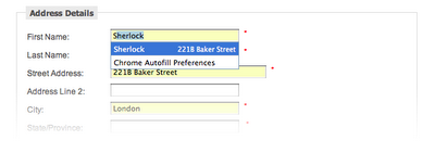
30. Use milestone submissions
How do you keep your forms short enough not to deter users, while still capturing more information if a user is willing to provide more information? Milestone submissions is one option.
Milestone submissions is a technique that allows you to submit the form when a user has reached a certain step in the form, and then continue providing more information if they want to. Toptal.com use this feature to fast-track people who are willing to answer a few additional questions.

Exclusive Bonus: Download this post as a checklist for a guide on how to boost your conversions with high-converting lead gen forms.
31. Optimise the speed of your forms
Users expect websites and forms to load fast. In fact, for every 100 milliseconds Amazon speed up their website, they see a 1% increase in revenue. If you want to increase your conversions, ensure your form is as fast as it can be.
32. Avoid auto-advancing (automatically jumping to the next question)
It’s not expected and generally confusing.
33. Use visual cues and icons to make form fields more intuitive
Our brains process visual images significantly faster than text. As illustrated by the Compare the Market form below, visual prompts can be used to signal how a field should be filled out.

Input Validation & error handling
34. Don’t make your validation too strict
Strict validation is a symptom of lazy programming. It’s bad for users, and your business will pay a price for it.
If there’s a lot of variation in how users answer a field (for example, responding to phone number with +12345678912, +44 12345678912, 012345678912), your programmers should use a rule that converts these to a consistent format on your end.
Alternatively, use field placeholders to clearly show the suggested format.
35. Do not ask people to confirm their email or password twice
If you must use an email / password confirmation system, it’s better to have an icon or checkbox that unmasks the password when clicked.
36. If you must use validation, ensure that it’s inline (to the right of the field) and reports errors early on.
Don’t wait until a user hits submit to report validation errors. At the same time, inline validation should not be real-time, as this is likely to report errors before a user has completed the field.

Ideally, inline validation messages should appear around 500ms after a user has stopped typing.
Trust & Social proof
37. Make your form design beautiful
It has been proven that people trust beautifully designed forms / websites more than forms that don’t look as impressive.
38. Address likely concerns near your form
There are likely a number of reasons why people might feel uncomfortable using your forms. For example, how long will it take? Will I need to enter my credit card details? Will I receive annoying phone calls from a sales person?
By addressing these up front, you can break down the barriers and make using your form more of a no-brainer. Freshbooks address their users’ concerns by displaying “No credit card required. No Contracts. Cancel anytime” beneath their form’s call to action.

39. Display strong social proof in close proximity to your form
Statements like ‘used by 100,000 people’ and testimonials by other people in a similar situation are powerful persuasion techniques that make users more likely to trust you and use your form.
40. Be careful using security seals, unless you’re asking for payment
People associate privacy and security seals with making a payment. In the A/B test below, adding a payment seal actually decreased conversions because people thought they would be taking to a page to pay for something.

41. Display live chat or contact information within view of your form
Despite their registration form being very simple, Intercom display a live chat window in clear view to answer any questions or objections you might have prior to registering for an account.

For more complex forms where users might have questions about the form itself this is an extremely powerful technique. Not only does it build social proof, but it also helps potential leads answer any questions stopping them from using your form.
Multi-step forms & progress indicators
42. When using multi-step forms, always display a progress bar
Progress bars encourage completion and reduce your user’s anxiety by clearly communicating how far they are from finishing.
As an interesting side note, we’ve found from our experiments at Leadformly that animated progress bars (like the one on Leadformly.com) typically outperform static progress bars.
Also, starting your progress bar with some progress already made increases the number of people that use the form.
43. Be mindful of your transition speeds
A good friend of mine was capturing leads for his dating company’s website using a 5-step lead generation form. But he couldn’t figure out why people were clicking the next buttons and then abandoning the form.
It turned out that their transition speed was too fast. Users were clicking the next button and not noticing that the content on the step had changed, because it changed so fast. After slowing down their transition speed their conversion increased.
This is one of the most counterintuitive lessons I’ve come across on multi-step form design. After all, we’re often told that faster is better. Not when it comes to transition speeds, it seems.
44. Use clear signposting
A progress bar by itself is not enough. You should also display the the total number of steps and which step the user is currently on to remove any ambiguity. In the example below you can see how BrokerNotes clearly tells users that they’re on step one of two.

Buttons & Call to actions
45. Call to actions should finish the sentence ‘I want to…’
By default, many forms use dull call-to-action buttons like ‘submit’ or ‘send’. These should be avoided and replaced with call to actions that match what the user is hoping to achieve when they complete your form.
A good rule of thumb is to answer the question “I want to…” from the user’s perspective. For example, if it’s an enquiry form for a free consultation, the call to action could be ‘Request My Free Consultation’.
In this study, Unbounce found that even just changing ‘start your free trial’ to ‘start my free trial’ increased clicks of the call to action by 90%.

46. Make sure call to actions are highly contrasted
We’ve all heard about those infamous studies where changing the colour of a button increased conversions. These studies can be dangerous when interpreted literally, as it’s usually not the specific colour that matters – it’s the contrast.
Notice how the orange call to action stands out from the blue/white in the Unbounce example above? That’s what you’re aiming for.
47. Call to actions should be the same width as fields
Uber’s forms use large full-width call to actions that are highly contrasted against the form backgrounds. By making call to actions the same width as fields you remove any doubt over where the button is located.
For an example of how not to do this, see UPS’s form in the tip below.
48. Avoid using ‘clear’ or ‘reset’ buttons
Below is a screenshot of UPS’s registration form. Not only are the call to actions small, but the next button is also right next to a ‘cancel’ button that is styled and located in a similar position to the ‘next’ button.

The risk of accidentally deleting all of the information you’ve entered outweighs the small convenience of having to start again. Most users are aware that refreshing the page or just re-entering information will enable them to start over again. As such, cancel or reset buttons should be avoided.
49. Sequence your questions logically
When asking for credit card details, for example, ask for information in the same order that it typically appears on the physical card (credit card number, expiry date, security code).
50. Do not place overly complicated legal messages near your buttons.
If you must have your users agree to lots of complex disclaimers, try to combine these into as few files as possible and keep legal messages as concise as possible.
51. Do not trick users by auto-enrolling them into your mailing list.
This comes across as manipulative and forces most users to make an additional click to opt-out of your list.
52. Clearly explain what’s next upon clicking the submit button
When someone uses your form they might be wondering how long they’ll have to wait, whether they need to prepare anything, or what is going to happen.
Ideally, your form should redirect users to a page that clearly communicates what will happen next and what they can expect.
53. Upon submit, disable the submit button from being pressed again
This is to prevent duplicate submissions, and to also provide an extra signal to the user that their submission has been been successful.
54. Make it clear what the user can expect to happen next
Your call to action (and landing page in general) should clearly communicate what the user can expect to happen as soon as they complete your form.
Mobile form optimisation
55. Use the mobile device’s native features (camera, geolocation, date picker) to simplify tasks
Last year, I spent a lot of time with a forex broker trying to help them optimise their onboarding forms. For regulation reasons, this company had to ask users to submit ‘KYC’ (Know Your Customer) documents, such as their driving license and a recent bill.
On desktop this is a clunky process at the best of time, as users would typically have to abandon the form to scan a document and then upload it.
For mobile users, it was even more difficult. Ultimately, we found that tapping into the mobile device’s camera was the best user experience, as it enabled users to take a photo of their driving license without leaving the form.
I have even seen this same approach used to let users ‘scan’ their credit card, instead of having to fill out their credit card information manually.
56. Question fields and buttons should be at least 48 pixels high.
The average adult finger pad size is about 10mm wide. In web terms, this is approximately 48 pixels. Therefore, when designing forms that are to be used on mobile devices, ensure that your fields are at least 48 pixels high.
57. All form labels & placeholder fonts should be above 16px
After redesigning an entire user interface for a client last year, I received an email from their CEO saying “It looks great Marcus, but I can’t read a thing!”.
The font was 14px, which is a fairly standard font size… for web. But my client was viewing this interface on a mobile device. When designing for mobile or an older audience, your text should be at least 16px in size.
As a side note, iOS devices will zoom in when any text below 16px is tapped, but not if the text is 16px or above, as it’s deemed unnecessary.
58. Use specific HTML input types to show the correct keypad
Ever noticed how, when using a mobile device, the phone displays different keyboards depending on which question you’re asking? Sometimes the ‘.com’ button displays, while other times a date selector comes up?
That’s all thanks to HTML input types. For mobile form design, they’re awesome and you should use them. There are eight input types that are relevant to form design:
input type=”text” displays the normal mobile device keyboard
input type=”email” displays the normal keyboard plus ‘@’ and ‘.com’
input type=”tel” displays the numeric 0-9 keypad
input type=”number” displays a keyboard with numbers and symbols
input type=”password” this hides characters as they’re typed in the field
input type=”date” this displays the mobile’s date selector
input type=”datetime” this displays the mobile’s date and time selector
input type=”month” this displays the mobile’s month/year selector
Now, over to you.
Form optimisation is not an event, it’s a never-ending process. This is why we built Leadformly, as we believe that constantly testing assumptions and design changes can lead to big increases in your bottom line over time.
Even if you were to action all of the advice in this article, you’d be far from complete as there would still be countless variations and assumptions to test.
My hope is that this article has provided you with the inspiration and insight needed to take your forms to the next level and convert leads at a rate that’s higher than if you hadn’t come across this guide.
And on that note, remember to get your free checklist version of the post. If the article has been useful, please do consider sharing it, as it does help more than you’d imagine.
The post 58 Form Design Best Practices & Form UX Examples appeared first on Venture Harbour.