Marcu Taylor's Blog, page 20
August 29, 2017
7 Free UX & Usability Tools to Improve Your Landing Pages
In our last article, we looked at 101 landing page optimisation tips to help you build better pages from the start and improve performance over time. That second part is where a lot of brands run into problems. Not only is landing page optimisation a time-consuming hobby, you have to pay good money for a bunch of tools to collect data and run your tests.
Well, today I’m going to try and put one of those things right with seven free UX and usability tools to improve your landing pages. With these tools you’ll have all the core features of an enterprise optimisation platform without the usual price tag.
So, if you’re a small or new business, this is the list for you. Even if you’ve got the budget for high-end software, these free UX tools will help you get to grips with landing page optimisation – so you’re ready to make the most of paid platforms when the time comes.
#1: The UX Checklist by Github

The first thing you need for any kind of optimisation strategy is a clear plan. Knowing what to do is half the battle and The UX Checklist by GitHub acts as a working guide through the entire UX design and testing process.
Each item on the list leads to further information, giving you a primer on what you need to do and the kind of tools you’ll want on board. It’s not specifically a landing page resource but even as general reading this will help you optimise your existing landing pages and design better pages in the future.
#2: ClickHeat

When you think of landing page optimisation, one of the first tools that’ll come to mind is heatmapping. And while I suggest paying up for a pro tool like Hotjar, sooner or later, ClickHeat provides a free heatmapping option for you to use in the meantime.
Sure, it’s not the prettiest tool you’ll ever come across and it doesn’t come with the same extensive features as the likes Hotjar and Crazy Egg, but it does the job as a basic heatmapping tool.
#3: The AdWords Landing Pages tool

Earlier this week, Google rolled out the new AdWords Landing Pages tool, which is perfect timing for an article of this nature. The only thing I will say is you’ll have to wait until you get the new AdWords interface (which is still rolling out) before you can access the Landing Pages tool.
If you haven’t got the new interface yet, you should have it within the next few months.
Once you’re set up with “the new AdWords Experience”, you’ll find the Landing Pages tool int he left-hand menu. Click on the tab and you’ll the URLs for all of your landing pages listed with a number of metrics in columns to the right.
As with many of Google’s newest tools, there’s a heavy emphasis on mobile performance here. The first metric you’ll see is labelled Mobile-friendly Click Rate. Which measures the number of clicks from your landing page that lead to another mobile-friendly page. The aim is to help you provide a stronger mobile experience beyond the first click on your landing pages.
#4: Peek

Peek is a cracking free UX tool from the guys over at UserTesting. Essentially, it’s a free peek at UserTesting’s full UX tool, providing you with a 5-minute video of someone using your website or mobile app. You simply type in the URL of the landing page you want to test and you normally get your results within the hour.
Aside from getting insights into the UserTesting platform, Peek also gives you a taste of qualitative research – ie: testing with real users.
#5: The Five Second Test

The Five Second Test is one of five user research tests you can run with UsabilityHub. The free UsabilityHub plan includes the five second test, which helps you gauge how effectively your landing page message comes across.
Essentially, you show your landing page to users for five seconds only and then ask them questions about what they remember.

The answers are collected and ranked, giving you the most common responses in order. The idea is to refine the messaging on your page, remove distracting elements and make sure they key parts of your page stand out. Remember people only get five seconds to view the page so don’t ask questions about footer design or silly stuff like that. Keep it on point.
#6: Google Analytics and AdWords

No matter what kind of budget you’re working with, Google Analytics and AdWords are the two most important landing page optimisation tools you have. The reason I’m mentioning both of these tools together is because they work best together.
To get this magic partnership working you’ll need to link your Google Analytics and AdWords accounts. This allows you to import goals and transactions from Google Analytics, see GA data in your AdWords and import Analytics remarketing lists. So you’re getting considerably more data from your landing pages than you would with AdWords alone and you can set up custom goals for better insights into what users are actually doing once they land on your site.
You can also enhance your AdWords efforts with Analytics Remarketing and Dynamic Remarketing. For more information on this, you can head over to Analytics Help.
#7: Google Optimize

Google Optimize is the free, stripped down version of Google Optimize 360 and it’s an impressive tool in its own right. To sum up, you get:
A/B testing
Integration with Google Analytics
Advanced targeting options (geographic, user attributes, etc.)
Multivariate testing (limited)
There are various other stripped down features included in the free version of Google Optimize and you can compare the two platforms here.
The main thing is, you get a free A/B testing that integrates fully with Google Analytics – and that alone is a pretty sweet deal. Combine Google Optimize with the other platforms in this list and you’ll have a good selection of tools to help you design, test and optimise your landing pages. You won’t get the full suite of tools available on platforms like Optimizely or VWO but all the main essentials are covered.
Don’t rule out the paid tools
The list of tools we’ve covered in today’s article is ideal for smaller businesses that don’t have the budget for enterprise software. That said, I wouldn’t rule out enhancing your toolkit with paid platforms somewhere down the line. I’m not aware of any free form optimisation tools, for one thing, and you’ll have to pay up for any kind of decent user testing platform. You’ll also probably want to upgrade to a paid heatmapping tool at some point and they tend to come packed with additional optimisation features.
Once you’ve gotten to grips with optimising your landing pages, I recommend trying out some free trials for enterprise tools like Optimizely and VWO. You’ll be in a better position to put all those features to good use and get an idea of what they’re capable of.
There is one final option if the price of tools (or time it takes to optimise your landing pages) doesn’t suit. Marketing agencies will have these tools bought and paid for, which means you might get more for your money by tapping into their resources – including their expert marketers who can optimise those landing pages on your behalf.
The post 7 Free UX & Usability Tools to Improve Your Landing Pages appeared first on Venture Harbour.


August 21, 2017
101 Landing Page Optimisation Tips
Landing pages should be where the bulk and best of your leads are coming from. If they’re not, there’s something wrong. If they are, you can probably And, if they are, it’s probably because you spend a good amount of time optimising your landing pages for the best performance.
Landing page optimisation is an ongoing process. There are few shortcuts but plenty of potential wrong turns you can take, wasting both time and resources on weak performance. No need to panic though. Because we’ve crammed 101 landing page optimisation tips into this article, which will help you stay on track with getting the best results from every page you build.
We’ve broken up these tip into a few sections and you can click on the following links for quick reference:
General principles
Landing page design
Landing page copy
Landing page calls-to-action
Landing page form optimisation
Building trust and credibility
Landing page UX tips
Landing page SEO tips
Speed optimisation
Analytics and testing
Lead nurturing tips
As you can see, that’s quite a lot to get through – so let’s get cracking!
General principles
First, let’s run through some general principles to consider before you create your next landing page. It’s worth keeping these in mind with every page you create.
#1: Have a landing page for every campaign

The key to high-converting landing pages is relevant, targeted messaging that resonates with specific audiences. This is why you create multiple PPC campaigns and precisely why each one needs a dedicated landing page.
#2: Short landing pages: more leads, lower quality
Generally speaking, shorter landing pages are better geared towards converting high volumes of leads. The downside is, they tend to generate a lower quality of lead than longer pages.
#3: Longer pages: fewer leads, higher quality
Likewise, longer pages typically generate a lower volume of leads, but they come with higher quality. Both approaches have their uses; it’s a case of knowing when to choose them.
#4: Keep the message focused, avoid distractions
When you have a landing page for every campaign, it should be easy to keep your messages focused and avoid distractions. Keep it that way.
#5: Best practices are only guidelines
This might just be the most important tip in this article. Best practices are guidelines, nothing more. They’re not written rules and they don’t work in every case.
Landing page design tips
The best landing page optimisation strategy is to design pages that convert from day one.
#6: Create a branded template
Certain parts of your landing pages will be the same: logos, fonts, colour schemes and other branded elements. Even some layout choices will be repeated (eg: logo centred in the header, hero section with text and CTA button, etc.).So create a branded template to cut down on your work – one you can
So create a branded template to maintain consistency but also cut down on repetitive work.
#7: Ditch the navigation

You won’t find any navigation on this Salesforce landing page.
Navigation menus on landing pages do two things: they distract users from the main message of your page and they allow them to venture off your sale funnel. Neither of those does much good for your conversion rates.
#8: Keep it simple with layouts
Stick to single-column websites wherever you can. Aside from being better suited to responsive design, they reduce distractions as users scroll and make your content more digestible.
#9: Use plenty of white space
White space makes designs and content easier to read/digest. Use plenty of it and use it well. Take a look at this article from WordStream for more details on using white space for landing page design. I’ve borrowed a few example images from the article to quickly illustrate the point:

The ad on the left looks like the kind of cluttered mess you’d see in the back of a paper during the ’90s while the version on the right isn’t just easier to read, it looks more like something you would expect from a premium brand.

The same thing goes for landing pages.

#10: Make elements stand out with contrast
Contrast is one of the most important design principles and fundamental to making the key parts of your landing stage stand out. CTA buttons, important text and other important elements should jump out of the page.
It’s not only colour contrast I’m talking about, either. There are various types of contrast you can (and should) use:
Colour contrast
Size contrast
Shape contrast (circles vs squares)
Positional contrast
Use these forms of contrast to make key elements stand out and guide users through the most important parts of your page.
#11: Invest in quality visuals for every page
Stay away from stock images and free graphics packs. Invest in quality visual content for every landing page.
#12: Point to your CTAs with visual cues
Visual cues are another tool you can use to steer users towards the key parts of your landing pages – particularly CTAs. There are many types of visual cues you can use – some more subtle than others – but don’t get carried away with testing too many cues against each other.
#13: Reduce attention ratio
Here’s the definition of attention ratio from Unbounce:
The ratio of links on a landing page to the number of campaign conversion goals. In an optimized campaign, your attention ratio should be 1:1. Because every campaign has one goal, every corresponding landing page should have only one call to action – one place to click.
Sound advice from one of the leading names in landing page optimisation.
#14: Gifs might be better than video
Generally speaking, video is great if you’re after an emotional response but gifs tend to be better for demonstrating things like software features.

In this case, a product video would kill the flow of the page and force users to click for some fairly dull footage.
#15: Forget background and autoplay videos
I’m not hating on video content here; just pointing out a couple of common mistakes when using it. Don’t fall for the gimmick of video backgrounds on your landing pages because all they do is distract attention away from the message on your page.
Autoplay videos are also a no-no. Aside from a number of UX issues, you want people to read the content on your page and that’s pretty difficult when a video is blaring int he background. If you’re going for video on any of your landing pages, create CTAs that compel users to click the play button. Don’t force it on them.
#16: Remember the 5-second rule
The 5-second rule is a classic design principle, based on studies that show the average user forms an opinion about a page in 3-5 seconds. Previous studies suggested users form a first opinion about pages somewhere between 50 milliseconds and half a second of first seeing a page.
This doesn’t really give users a chance to scan your landing page copy and its offer, though. So the 5-second rule has become something of a rough industry standard for pages that need to get a message across – and a common UX test we’ll come back to later.
Landing page copy tips
Speaking of landing page copy, here are some more tips to help you optimise those pages of yours.
#17: Keep your messaging consistent
If you’re creating separate landing pages for each campaign, then the core message of each page should already be written in your ad copy. Keep this message consistent throughout, stick to your key selling point and don’t wander off track.
#18: Capture attention with your heading
 This starts by matching the offer in your ad with the heading on your landing pages. Your ad convinced them to click through and now your heading needs to confirm your page provides what they’re looking for. It’s not only your wording that can capture attention, either.Choose your fonts, styles, colours, contrast and background elements wisely.
Choose your fonts, styles, colours, contrast, background and other design elements wisely (more on those later, too).
#19: First person vs second person
Your landing page copy should be in the second person (you, your) tense. The only potential exception to this is with your CTAs, where you might find first person (me, my) tense is more effective.
There isn’t a great deal of research into first vs second person tenses and CTAs, but the small amount there is gives a slight edge to the first person. This doesn’t necessarily mean the same will apply to your own CTAs, but it’s something to keep in mind.
#20: Think motivation first, then ability
Dr BJ Fogg, the man who founded the Persuasive Technology Lab at Stanford University, also created one of the most widely used concepts in design and copywriting. The Fogg Behaviour Model maps out a formula for influencing behaviour.
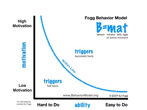
Most UX discussions revolve around making it easier for users to take action. And, while this is important, without installing enough motivation in users, it doesn’t really matter how much you optimise for performance.
Keep this in mind with your landing page copy because this is where motivation needs to come from.
#21: Make it emotional
No matter how rational we like to think we are as consumers, we’re emotional beings. The key to motivation is capturing an emotional response from your visitors. You’re not saving people time; you’re making their lives less stressful. You’re not saving people money; you’re making them richer. You’re not selling holidays; you’re giving people priceless life experiences.
To motivate people, move them emotionally.
#22: Benefits vs features
This copywriting classic also stems from the need to create an emotional response. People don’t really care that your software platform automatically saves everything to cloud storage or what security features it has. But they’ll feel a sense of relief knowing they’ll never lose another document before another important meeting.
#23: Go easy on the adjectives
Okay, this is where I have to play the hypocrite card. I use my fair share of adjectives in blog posts to keep a conversational tone, but I don’t recommend doing the same with your landing page copy.
In fact, a lot of copywriters will tell you to ditch the adjectives altogether. Personally, I don’t think you can set black and white rules in this game and the odd adjective can make all the difference. That said, keep them to an absolute minimum.
#24: Master power words
While adjectives can kill copy dead, power words are a copywriter’s best weapon. These are the words that really capture attention and work to create that all-important emotional response.
Bookmark this article from Optinmonster and give it a read before you work on your next landing page copy.
#25: Create a sense of urgency
This is another copywriting classic. People don’t like the idea of missing out on something valuable and hinting at the possibility encourages them to take action now. There are various ways to instill a sense of urgency in users:
Scarcity: Supplies are running out
Time: Clocks, timers and countdowns showing that time is running out
Loss aversion: Plays on the fear of loss – for example, a discount that only lasts for 24hrs (click now or miss out on something you never really had)
Competition: Brings out the competitive nature of people
Negativity: Highlight the negatives of not taking action, allowing users to improve their situation
I suggest taking a subtle approach with using any of the above tactics. You don’t need red clicks and alarm bells to create a sense of urgency; choose your words wisely.
#26: Hire a professional copywriter
This is the best tip in this section. If you’re struggling to get the best out of your landing page copy, hire a professional copywriter with experience in writing for conversions. You’ll make more than you spend and save a whole bunch of time in the process.
#27: Run a congruence check
Congurance is a pretty ugly word but it’s damn important for landing page copy and design. Cue another definition from Unbounce:
Congruence refers to the concept of ensuring that every element on your landing page refers to, or supports, your core value proposition. Look over your design and copy, if itʼs not directly supporting your goals ditch it or re-write/re-design it.
If it’s not congruent, ditch it.
Landing page call-to-action tips
We’ve mentioned calls-to-action a few times in the landing page copy tips but they deserve a section of their own.
#28: Make it 100% clear what the offer is

Above all, make it 100% clear what the offer is. Tell users what they’re getting in return for clicking your CTA button and keep in mind the copywriting tips from before (benefits vs features, power words, etc.).
#29: Lead with your ‘macro CTA’
A macro conversion is the main reason for creating any given landing page: buying the product, signing up for the free demo, booking a ticket to your event, etc. This is your primary conversion goal and there should only be one of these per page.
So let’s call these your “macro CTAs” and, in most cases, these will go above the fold – or very close to it. Either way, lead with your macro CTA and don’t let anything distract from it.
#30: Repeat CTAs on long landing pages
If users have plenty of copy to get through, repeat your CTA as they scroll down your page. As they learn more about your offer, they should be more inclined to take action and you want to provide every opportunity for them to do so.
You don’t have to repeat your CTAs word-for-word (in fact, I suggest you mix things up a little) but remember to make your offer clear throughout and stay consistent.
#31: Have a backup CTA
Some marketers will tell you a page should only have one conversion goal but I don’t buy into that for a moment. Your macro CTAs aren’t going to convert every time around and having a backup, “micro” CTA will get you leads that’ll otherwise disappear.
Just make sure your micro CTAs never take the attention away from your primary conversion goal. You want these to tempt people who aren’t ready/convinced by your main offer, not steal conversions away from it.
#32: Make your micro conversions super-easy to complete
Your main conversion will generally be the most demanding action users can take on your landing page. So, make sure your micro conversions are incredibly easy to complete. Aim to create a soft conversion (free demo vs purchase) that requires less commitment and leaves no friction between users and taking action.
#33: Always prioritise your macro CTA
Once again, your main CTA should always take priority – no exceptions. This doesn’t mean you can’t have two CTAs in the same view (despite what some might say).

PayPal puts two CTAs in the same view but makes sure the main conversion goal always stands out. You’ll often see this on SaaS landing pages where free demos are offered alongside paid versions.
#34: Focus on contrast, bold fonts, punchy text
To make your primary CTAs stand out, focus on using contrast, bold fonts and punchy text. In the example above, PayPal uses colour and background contrast to make its blue CTA button stand out. This is always more difficult when you have multiple CTAs in the same view but subtle changes can go a long way.
#35: Don’t get caught up in button colours
One of the most overhyped talking points in CTA design is button colour. Yes, different colours have a psychological impact on us but switching button colours isn’t going to revolutionise your business. Don’t pay attention to those articles claiming to have increased conversions by 500% from changing one button on their website.
Focus on more important things.
#36: CTAs are only as good as your copy
Instead, get caught up in copywriting because your CTAs are only as good as the copy surrounding them. Remember the Fogg Behaviour Model; motivate with your copy and enable action with your CTA buttons, forms, etc.
#37: Use imperatives (because I told you too!)
Imperatives are essentially commands, turning verbs like “to book” into imperatives like “book now!”. This is the fundamental language of calls to action; explicitly tell users what they need to do.
#38: Make your CTAs the most attention-grabbing thing on your page
If your CTAs are being outshined by fancy scrolling effects and animations, you’ve got a serious problem on your hands. Know your priorities with landing page design and which elements need to shine.
#39: Try sticky CTAs

The Zumo Smart Bar puts a sticky CTA at the top of your page (it’s easy enough to build your own though)
Sticky CTAs stay in a fixed position of the browser window, no matter how much users scroll. A common approach is to have a sticky header design with a CTA button in the top right corner. This brings the obvious advantage of always having a call to action in view. It’s not a guaranteed conversion winner, but it’s something to think about.
Landing page form optimisation tips
Pretty much every conversion on your landing pages will need some kind of form to seal the deal.
#40: Optimise your forms
Too many brands settle for default forms and leave them to it – especially on sites running WordPress. This is one of the worst things you can do for conversion rates. All of your marketing efforts are wasted if your forms prevent people from taking that final step at the last hurdle.
#41: Use a form analytics tool

Google Analytics doesn’t really cut it when it comes to form optimisation You can kind of pinpoint when your form stops someone from converting but you can determine why. To answer that all-important question you need a form analytics tool that tells you which fields users have problems with.
#42: Use interactive, intuitive forms
One of the biggest barriers to form completion is the fact users hate the sight of them. They’ve got a long history of dealing with these things and they know how much of a chore they can be.

Try interactive, intuitive forms that don’t scare users as soon as they lay eyes on them.
#43: A/B test your forms
With a decent form analytics tool on your side, you should be in a good position to A/B test your forms for better performance. Don’t go nuts with the minor details; check out our article on where to focus your form A/B test efforts.
#44: Fewer fields doesn’t guarantee conversions
The popular assumption with form design is that shorter forms convert more. We know this is isn’t always the case, though – especially for purchases, quotes and the more profitable conversions you’ll be targeting.
We’ve seen this is our own research and we’re not the only ones. Likewise, longer forms don’t always guarantee
#45: Try rewording fields before removing them
As you collect data from your forms, you’ll find certain fields prove particularly troublesome. When this happens, it’s tempting to remove them and cut out the root of the problem.

Don’t get ahead of yourself, though. As with the Conversion XL example above, rewording problematic fields increased conversions while removing them actually reduced them.
#46: Remove unnecessary fields
The fields you want to remove are the unnecessary ones. In other words, the fields that don’t collect information you need for your marketing campaigns and add friction. If you do need that information, go back to tip #45.
#47: It’s not only about conversions
One of the worst form optimisation mistakes marketers make is optimising for conversions only. The problem is, as you reduce friction and remove fields to increase conversions, the quality of those leads will drop. You end up with more leads but less power to nurture them along the buying process.
Sometimes you’re better off with fewer, more qualified leads.
#48: Get the data you need
Leading on from our last tip, get the data you need from your forms. If you really need it, ask for it and accept the fact you’ll lose some conversions in the process. This is especially true for micro conversions where you need enough data to place where users are along the consumer journey.
#49: Consider getting more info after they convert
If you really struggle to get the info you need from users before they complete your form, try asking users for it after they convert. Send a follow-up email requesting the additional info you need. You can’t guarantee they’ll provide it, of course, but you’ll to weigh up which approach works best for you.
#50: Hide forms behind CTA buttons

This one is particularly useful for CTA in the hero sections of landing pages. You don’t want forms interrupting the flow of your page but you do want a quick way for high-intent users to convert right away.
#51: Reduce typing and clicks
I mentioned this one in our recent form A/B testing article. Rather than reducing the number of fields per say, focus on reducing the amount of typing and clicks required to complete your forms. After all, this is what makes forms suck in the first place.
This is another design principle behind Leadformly, which replaces typing with clickable buttons and other interactive elements.
#52: Show a progress indicator on multi-step forms

When you’re using multi-step forms, show a progress indicator to give users feedback on how far they’ve made it. This applies to short multi-step forms as much as longer ones, as it tells users they haven’t got much further to go.
Progress indicators also build up a sense of achievement and make it harder for users to give up once they’re close to the finishing line.
#53: Use conditional logic for complex forms

With complex forms, conditional logic can help you filter out questions that aren’t relevant to individual users.
Tips for building trust and credibility
When you promise the world it’s only natural that consumers are sceptical that you’ll deliver on our word. Everyone’s been disappointed with previous purchases and you need to do what you can to ease concerns by building trust.
#54: Design is the most important trust factor
Remember the 5-second rule we mentioned earlier? Users form an opinion about your page as quickly as 50 milliseconds but you might get a full five seconds if you’re lucky. Which means they’ve largely decided how trustworthy they think you are in a matter of seconds – long before they’ll see any of the trust factors we’re about to mention.
#55: Start with testimonials for B2B landing pages

Business owners tend to want to hear accounts from other business minds. This is why you’ll see testimonials rather than product reviews on software landing pages and other B2B products/services.
This isn’t a set rule; it’s just how things tend to pan out. Feel free to try/test out other approaches.
#56: Reviews are golden for consumer products
consumers tend to respond to product reviews more than testimonials. There’s something about five golden stars in a row that brings out the buyer in them.
#57: Client logos show you’re working with the big guns
Going back to B2B landing pages, showing the logos of your biggest clients tells visitors you must be doing something right. Essentially, you need brand names that are bigger than your visitor. The aim is to make them think “if they’re good enough for [brand name], they must be good enough for us”.
#58: Provide access to case studies
For business owners who want more details about what you can do for them and how you operate, case studies are the way to go. I would place these under a call-to-action as a potential next step for users who don’t bite.
#59: Show off your awards and certifications
If you’ve won any awards, proudly show them on relevant pages and the same thing goes for industry certifications – the latter being especially true for B2B brands.
#60: Provide links to your privacy policy, terms and conditions
Serious brands have privacy policies and terms and conditions. Provide links where appropriate to show users you mean business. Privacy policies reassure them you’re compliant with legal requirements and you’re also obliged to point users towards terms and conditions.
#61: Money back guarantees
The main concern consumers have is paying up for something that fails to deliver. A money-back guarantee tells them they’ve got nothing to lose by trying your product out and the rest of your page tells them how much they’ve got to gain.
#62: Ease consumer fears
At this point, we’re easing consumer concerns and it pays to know what worries your target audiences. It could be hidden delivery costs, needing to create an account before they can buy, handing over credit card details for demos or any number of things.
#63: Add legit business information
Business information like phone numbers and addresses prove you’re a legit business, aside from providing important contact information. This also helps with your local SEO efforts, as Google likes to see consistency with business names, addresses and phone numbers across your pages (a little more complex if you have multiple locations).
Landing page UX tips
Your landing pages will be the first introduction to your brand for many users. Their experience starts here and you want to get things off to a good start.
#64: Avoid interruptions

I see far too many landing pages interrupted by popups, live chat widgets and other distractions. Even if these things have a place in your marketing strategy, your landing pages aren’t one of them. Aside from the UX issues, you’re just putting additional barriers between users and the message on your page.
#65: If you must use popups, go for exit-intent popups
If you’re going to take the popups route, go for exit-intent popups. They’re not exactly UX-friendly but you won’t find a less intrusive option. Besides that, exit-intent popups don’t get in the way of your message and they give you another chance to convert users with a unique offer (don’t repeat the same offer on your page – it clearly didn’t work).
#66: Optimise for speed
Aside from being a ranking factor, page speed is a big deal for users. If you’ve got a maximum of five seconds to make a good first impression, you don’t want to waste three of them with slow loading times. Google recommends your pages take no longer than 2-3 seconds to load but I would aim for less than that.
#67: Take mobile optimisation seriously (most don’t)
Most landing pages are poorly optimised for mobile. They’re slow, cumbersome and key elements like forms are a horror show on mobile. This has probably got a lot to do with the fact Google’s requirements for a “mobile-friendly” page are so low. User requirements, on the other hand, are more demanding.
#68: Stay away from AMP landing pages
I’m not a fan of Accelerated Mobile Pages, to say the least. The Google-backed initiative is entirely unnecessary and a blatant attempt from the search provider to hijack pages on its own servers and make it more difficult for users to leave the Google ecosystem.
This comes with a number of other nasty side-effects, including lost traffic, reduced page visits, unbranded content and all kinds of other nonsense. And now Google is trying to convince businesses to convert their landing pages over to AMP.
Nice try.
#69: Avoid design gimmicks
AMP isn’t the only gimmick you want to stay away from in landing page design. I’ve already mentioned popups and live chat widgets but landing pages have been dogged by design gimmicks for years. Scrolling effects, those distracting background videos, scroll hijacking – the list goes on.
Landing page SEO tips
For short-term campaigns (eg: Christmas), landing page SEO doesn’t really come into things. However, for longer term campaigns, it’s important you remember to optimise your landing pages for search.
#70: Identify your search terms

For users to discover your landing pages via search, you need to know what they’re looking for at different stages of the buying process. For example, rather than a specific product purchase, they might be looking for info on the best products within your category (eg: “best entry-level DSLRs in 2017”).
#71: Create landing pages for resources
Now you know what your target audience is looking for, create resources that provide the answer they’re looking for and promote them on your landing page. A guide to buying your first DSLR in 2017, for example.
It could be a video tutorial, webinar, coupons or anything else that generates a soft lead. Depending on your keywords, you might even be able to get direct sales (normally for queries that don’t trigger ads). Rare these days, but it can happen.
#72: Optimise your page titles
Page titles are still one of the most important on-page SEO elements and you’ll want to make sure your keyword is included. Your title doesn’t actually appear on your landing page but it does show in results and browser tabs – not to be confused with headings.
#73: Optimise your URLs
The URLs of your landing pages should match the title – something like www.yoursite.com/title-of-your-landin.... This way your keywords are already included and your titles are descriptive for users.
#74: Know your headings
Headings are important for a number of reasons and you’ll want to work your keywords into these naturally. Don’t force them in. Above all, make sure your nest your headings correctly
If you’re not sure how to use headings correctly, check out this quick guide from Yoast.
#75: Put keywords in your image alt descriptions
Also, put your keywords in the alt descriptions for any images on your landing page. This will help your images display in Google Images and also tell the search giant your images are relevant to the content on your landing pages.
#76: Target inbound links
Inbound links are still the most important ranking factor in Google search results. Link building is pretty tough as it is, but it can be even more challenging for landing pages that essentially act as a gateway to content or products. You’ll have to make sure the resource your offering (buying guide, tutorial series, industry study) is impressive enough for high authority sites in your industry to link to.
#77: Don’t forget about internal linking
Internal linking is also important for your landing pages. This involves linking to your landing page from other pages on your site. Blog posts are the easiest place to create regular internal linking but you can also place links elsewhere on your site. Just keep it relevant.
#78: Promote your pages/content on social media
Google still denies that social activity has any impact on search ranking, despite plenty of evidence that suggests otherwise. Either way, promoting your landing pages and its content on social media will only help your search ranking and bring additional traffic in (which is kind of the whole point in search optimisation anyway).
Landing page speed optimisation tips
I’ve mentioned speed once already in this article, but it’s easy to talk about the importance of loading times. Actually optimising your pages for speed is much trickier. Here are some tips to get you off to a good start.
#79: Aim for under 2 seconds
In 2017, there aren’t many excuses for pages that take longer than two seconds to load. And you don’t need AMP to do it, either. Just follow keep reading and apply these tips to your landing page designs.
#80: Choose quality hosting

Fast websites start with fast hosting and it’s worth getting to know a bit about this topic. Quality hosting isn’t exactly expensive these days anyway. However, going with the cheapest options will limit how fast your pages load, how much traffic your site can accept, how many tasks it can handle (eg: multiple users downloading the same resource at the same time) and a range of security issues.
For high-traffic WordPress sites, I recommend WP Engine and Bluehost is always a good option for startups and new businesses.
#81: Reduce server calls
Speaking of WP Engine, check out this guide from them on how to reduce server requests. Every page, image, font and resource on your page means another server request sitting in the queue – all of which takes time.
#82: Compress your core files (HTML, CSS, JS, etc.)
This also includes the core files of your site: HTML, CSS, JS files and anything else the browser needs to call in before it can render your site. These files all come with a certain bulk to them but you can reduce the file sizes by compressing them.
This is also known as “minifying” and there are plenty of WordPress plugins that can do this for you.
#83: Keep plugins and widgets to a minimum
That said, you might want to compress your own files because every plugin you add to your site can impact speed and security. This doesn’t only apply to WordPress, either, but also libraries like jQuery that can add functionality to your site with plugins.
#84: Also, compress your images
In most cases, images will be the heaviest resources on your landing page and compressing them is a must. You have to decide what level of picture quality you need is and compress them accordingly. Sadly, smaller file sizes mean lower quality images; it’s a question of compromise.
#85: Use a Content Delivery Network (CDN)
The further a user is away from your server, the longer it will take for your site to load and operate. So users in Asia will have to wait longer than users in Europe if your servers are located in Holland, for example.
Content Delivery Networks (CDNs) allow you to tap into servers closer to user locations, taking distance out of the equation.
#86: Enable Caching
Caching doesn’t make your site faster per se. Instead, it stores data on users’ devices so they don’t need to redownload the same resources for every visit. Essentially, future visits will be faster (until that data is deleted or lost).
#87: Stick to minimal design
Landing pages don’t need to be complex. They don’t need heavy video backgrounds or JavaScript animations clogging up the browser. They don’t need busy layouts that make it hard users to know where they should look. They just need to get to the point and let your offer do the talking.
#88: Choose a landing page builder with fast templates
When you’re building and optimising dozens or hundreds of landing pages, you need a good landing page builder to manage everything. So be sure you try a few out and run their templates through a couple of page speed tests to get an idea of what to expect out of the box.
The better optimised their templates are as standard, the less work you’ll have to do yourself.
Landing page analytics and testing tips
Of course, you can’t optimise your landing pages without a good set of analytics tools and some testing know-how.
#89: Link Analytics and AdWords
The first thing you want to do is link AdWords and Google Analytics together. AdWords alone gives you plenty of good info about your landing page performance but linking it to GA combines all your data into one place.Not only that, but it opens a new world of analytics functionality.
Not only that, but it opens a new world of analytics functionality.
#90: Set up goals and events tracking
Once you’ve got AdWords and Google Analytics linked up, you’ll then want to set up goals and events tracking. This allows you to measure the actions users take on your landing pages (eg: click play on a video, start filling out a form, bookmarking your page, etc.).
With goals and events tracking you can build a more accurate picture of what users get up to on your page. Most importantly, you get insights into how and why they do/don’t convert.
#91: Get a decent heatmapping tool
There are plenty of heatmapping tools about these days and it’s worth signing up to one right away. Essentially, they show you where users click the most, telling you how closely they follow your intended conversion path. You can also pinpoint any elements on your page users accidentally click, thinking they’re buttons or some kind of interactive element.
#92: Run the 5-second test
Yes, we’re coming back to the 5-second rule once again (I told you to remember it!). This is one of the most common UX tests, where you show your landing pages to users for five seconds only and get them to jot down what they can remember.
This should tell you what kind of impression they’ve got from your site and also highlight which elements and messages stand out to them the most.
#93: Don’t test every minute detail
One of the worst A/B testing mistakes you can make is testing every minute detail (button colours, font styles, single words). Stick to testing meaningful variations like two different landing pages or one with multi-step forms and one without. These are factors that genuinely impact the consumer experience and whether people do business with you.
#94: Make sure your tests are statistically significant
Unless your A/B tests reach statistical significance, they’re useless. Sadly, even if they do reach statistical significance, this doesn’t guarantee your results will be reliable. The industry benchmark is 95% statistical significance but even the best tests will fluctuate above and below that level before they reach sustainable statistical significance.

This is why ending your tests as soon as they become significant is a mistake. Give them time to level out.
#95: High bounce rates aren’t always a bad thing
The classic rule with landing pages is that high bounce rates are BAD. But this might not always be the case. What if you have a highly focused landing pages that converts really well? Users land, convert and leave – no messing around.
In this instance, your bounce rate is going to be through the roof but you don’t need people to visit a second page if they convert right away.
#96: Segment your audiences
I started this article by saying the first thing I always tell people about landing pages: create a separate page for each of your campaigns. I stand by this comment but we could be on the verge of this changing.
With audience segmentation and personalisation, you can deliver a different message to people based on their audience profile. For example, you show one message to a first-time visitor and then present them with something different when they return.
Landing page lead nurturing tips
The whole point of building landing pages is to generate targeted leads. Some of your most qualified leads will convert there and then, but most of them won’t. Which means you need to think about lead nurturing to get the most from your suite of landing pages.
#97: Provide additional info for those who don’t convert
Many of your visitors simply won’t be ready to convert now, no matter how good your copy is. Providing access to further information gives these users a path to follow and extra touch points for you to improve the quality of your leads and attribute them (that last point is important).
#98: Use a good sales management platform
There’s a big difference between someone who signs up to your newsletter and an existing customer who might be ready to buy again. This is where attribution is so important. You need to know when, where and why users interact with your brand in order to deliver the right follow-up message.
So get yourself a good sales management platform like ActiveCampaign (my recommendation of choice) to attribute and nurture your leads through the consumer journey.
Check out our in-depth look at ActiveCampaign to get a better idea of why we recommend it.
#99: Build email lists
I still see many brands pumping all kinds of money into paid advertising and not backing it up with email marketing. Email is by far the most powerful way to nurture leads and your PPC traffic is a great source. If they don’t buy up, get them on your email list.
#100: Use AdWords RLSAs and Customer Match
AdWords comes with a number of lead nurturing features you can use to get more from your advertising spend. The first one I want to talk about is remarketing lists for search ads (RLSAs). These allow you to target previous visitors with different search campaigns, using a more specific message.
You can go as far as creating RLSA lists for all the major stages of your sales funnels and create campaigns to guide users along the buying process.
Another great feature is Customer Match, which allows you to target users who show similar online behaviours to your existing email marketing list. Another reason to make the most of PPC and email marketing together.
#101: Move beyond the initial sale
Customers are great but repeat buyers are where it’s really at. You invest a lot to turn leads into customers but the journey doesn’t end with the first purchase. Consumers update smartphones, business owners upgrade software platforms and every sale opens to door to related products/services.
Establish yourself as the go-to brand for customers in your niche.
Become a landing page expert
As I said at the beginning of this article, the bulk and best of your leads should be coming from your landing pages. To get that kind of performance takes some work but once you’ve found a formula that works for your brand, things will get a lot easier. Take it upon yourself to become landing page expert – you’ll thank yourself later for putting in the work.
The post 101 Landing Page Optimisation Tips appeared first on Venture Harbour.
August 11, 2017
15 Form A/B Test Ideas Backed by UX Research
Web forms rarely get the attention they deserve when it comes to conversion optimisation. Most brands settle for the same old designs, which are typically built on design principles from half a decade ago – or more. Times have changed.
Modern web forms (or at least the high-converting ones) look very different these days. Brands that take the time to A/B them effectively realise that some classic assumptions about form design don’t hold up.
Today, we’re running through the fifteen form A/B test ideas – all of which are backed up by research from the last few years.
#1: Form placement
The first thing you need to think about is form placement. Until a few years ago, we were told to put everything important above the fold, but things have changed. Mobile pretty much forced scrolling upon users and now people expect to venture below the fold in search of more information, even on desktop.
A study from Clicktale shows that 76% of users and 22% reach the bottom of the page.
The trick to form placement is actually the content that surrounds it. Completing your form is the action you want users to take and it’s your content’s job to inspire that action. So, as Instapage research finds, landing pages with short, concise messages should aim to inspire action above the fold.
While more complex messages and secondary goals (email signups, quote requests, etc.) are better suited to having forms placed further down the page – or perhaps on different pages entirely.
#2: Form layout
Next up, we should talk about form layout and this is where form design has really evolved in the last few years. After years of awful layouts, the general consensus is that single-column layouts are the way to go. Mobile had a big influence in this, of course, but it’s also a question of making forms easier to read and more actionable.
In this case study from Aquireconvert.com, switching from a horizontal layout to a vertical design boosted conversion by 52% for Arenaturist.com.

Don’t assume vertical column layouts are the best approach for all forms, though. Test out your own variations and bare in keep in mind that different layouts could work better for some forms more than others.
#3: Number of fields
This is one of the most debated talking points with form design. The obvious answer is that fewer fields mean more conversions, but this isn’t always the case. As Jared Coad points out on LinkedIn, longer forms tend to convert more for mortgage leads and other conversions where users expect to provide more info. Let’s face it, you’re not going to take a loan of someone who simply asks for your email address and leaves it at that, are you?
In fact, there are plenty of case studies where longer forms have turned out to perform better than shorter variations.

Start by pinpointing the information you absolutely need – these are your minimum requirements. Next, draw up a list of info that would be helpful for lead nurturing and marketing purposes. Finally, if the form you’re designing involves any legal, financial or otherwise official purpose, consider any info users might expect a reputable source to request.
Create your form variations based on these three lists and narrow down the best performer. Remember, it’s not only a case of maximising conversions but also getting the information you need to generate leads you can work with. With some conversions, quality is more important than quantity.
#4: Ask fewer questions per page
Sometimes, you don’t have room to compromise with the number of fields on your forms. It’s not only banks and government agencies that need a lot of information either. Imagine hosts on Airbnb, retailers on Amazon or people signing up to an account with any brand. Some forms need to be long and this One Thing Per Page case study offers a potential solution to lengthy forms.
The concept of one thing per page is to group fields and actions into tight themes (eg: personal info, account details, delivery info, payment details, etc.). Essentially, users are completing one task per “page” and this reduces the load of each stage.

So, instead of single-page forms or filling screens from top to bottom (as above), try splitting longer forms across multiple pages with one action/category on each.

Again, this approach won’t always necessarily result in better performance but it’s a damn good option to test out for longer forms.
#5: Multi-step forms
Multi-step forms are the next step in the one-thing-per-page evolution, but it’s not only longer forms that benefit. As you can see from our own case studies, we’ve seen multi-step forms increase conversion by up to 300%. The thing is we’re also getting great results with multi-step forms when we’re only asking the equivalent of 5-10 questions – as well as increased conversions for much longer forms.

It’s not only form length that multi-step designs are addressing though. They also create more intuitive, engaging forms that often remove the need for typing. Not to mention the fact that, depending on how you design them, they don’t look anything like forms in the traditional sense. So users have none of the resistance to multi-step forms they tend to feel when they see traditional designs.
Combine all of these factors and you’ve removed a lot of the friction that web forms usually come with. This is the purpose of Leadformly; to remove unnecessary friction in form designs and get back to generating leads.
#5: Visual questions
Key to the experience of Leadformly forms is the visual question format. Humans can process visual information 60,000 times faster than text, which instantly makes your forms faster to navigate. They also remove the need to type for many queries, solving one of the biggest UX grips with forms – particularly on mobile.With the multiple choice format, you also remove the
With the multiple choice format, you also greatly reduce the chance of users making mistakes. Finally, you’re reducing clicks with a more sophisticated alternative to dropdown boxes – all of which adds up to far more engaging kind of form.
#6: Conditional logic
When some questions on your form aren’t applicable to everyone, you have a design problem on your hands. Including optional questions or instructions like “If you answered ‘yes’ to question B, answer questions…” leaves too much room for errors. You need another solution.

BrokerNotes uses conditional logic to solve this problem. The answers users give to questions determine the questions they fill out in the remainder of the form, leaving no room for confusion.
#7: Reduce typing, clicks
So we know fewer forms fields aren’t always better, but what is all that research suggesting otherwise really telling us? When it comes down to it, users don’t really care how many fields your form has – it’s the amount of typing and clicks that present a conversion barrier.
This is why multi-step forms work. They remove a lot of the workload and gradually guide users through what’s left. Aside from visual questions, though, there are other steps you can take to reduce the amount of typing and clicks on your forms.
 Source:
HTML5rocks.com
Source:
HTML5rocks.com
First of all, use mobile form markup and allow auto-complete and pre-fills to help reduce typing. You could also test providing instructions for any forms that prove to be tricky. Also, instead of asking users to select their location from a dropdown menu, you can detect their location via IP address and set their location as default. You can also do the same for any language preference, if that’s applicable to your form.
#8: Validation
Form validation aims to solve three problems: user errors, spam and hacker attacks. Above all, you don’t want hackers sending rogue code to your servers and this is the main purpose for using validation. But you can also use it to stop spam and prevent users skipping important fields or submitting incorrect info.
Form validation can be a relatively secure method of solving all three problems, but it’s not without some compromises. Applying too much validation can lead to failed form completions that would otherwise be successful. You don’t want to be overly fussy with your requirements at the expense of valuable conversions. Of course, security should never suffer, but defaulting to validation when it’s not necessary could be costing you.
#9: Spam systems
There are multiple ways to go about preventing spam but they all come with compromises. If you’re using WordPress, one of the easiest options is to use the Askimet plugin, which comes preinstalled with the WordPress package. It’s not perfect but it is impressively capable of detecting and deleting spam.
Better yet, you can back this up with the “honeypot” technique, which places a field users can’t see and uses validation to check that it’s left empty. While users will leave this input blank, bots will fill it out and you can use this to detect and block spam.
As for CAPTCHAs or “human-friendly bot-unfriendly” questions (eg: what’s 7+13), just forget about them.
#10: Copy and CTA around your forms
Nobody fills out forms for the fun of it. You need to give people good reason to take action and this comes down to the copy and call-to-action surrounding your forms. Sadly, there’s no formula for the perfect copy and CTA combo; you’ll have to experiment with these.
The visitor will be making judgments on whether or not the offer is right for them, the words are persuasive and the design is there to help build strong interest. – Neil Patel
Your aim is to do two things here. First, your copy needs to create incentive, a kind of tension that won’t be satisfied until users do something about it. And this is where your CTA jumps in, telling users relief is just one form away. The more demanding your forms is to fill out, the stronger the incentive your copy creates will have to be.

Source: Neil Patel
#11: Visual cues
Visual cues are one of those things that are great in theory, but don’t always result in higher conversion rates. You’ll find plenty of studies praising their power and the science behind them is solid but you can’t just slap an arrow on your existing design and expect magic to happen.
This study from Conversion XL tests a number of different visual cues and the findings are pretty underwhelming. There’s no mention of increasing conversion rates and the only interesting result is that including a “hand-drawn” arrow had users looking at the form for longer.

Feel free to go ahead and test visual cues, but don’t assume they’ll have a positive impact.
#12: Form behind CTA button
I’ll just let the GIF do the talking here.
#13: Forms in blog posts
Marketers have a bad habit of interrupting blog readers with popups before they’ve even made it through the first paragraph. Preventing people form reading the same content you’re asking them to sign up to isn’t the most logical way to go about things – so try a few alternatives.
First, you can try embedding signup boxes between paragraphs of your blog posts. Yes, you’re still interrupting readers to some extent but it’s far less intrusive than popups and you can be more strategic about where they appear.

Another option is to place your CTAs at the bottom of each blog post. Of course, this relies on the idea that people will read as far as the end of your articles. But, if you’re expecting them to sign up to anything, you better be confident about your content being good enough.
#14: Trust factors and reassurance
The most obvious examples are things like customer reviews, testimonials, awards badges and other elements that tell people you’re a trustworthy brand. There are more subtle trust factors at play, though. Even the visual design of your site and things like loading times impact the level of trust people will have in you.
Trust factors alone aren’t enough either. You also need reassure those niggling buyer concerns people have. For example, telling people you won’t share their email address or providing a 30-day money back guarantee – whatever it takes to reassure users they’ve got nothing to lose.
#15: Checkout process
If you’ve got any kind of checkout system on your site, cart abandonment will be one of your main CRO battles. There are no quick fixes to this and optimising your checkout is something you’ll have to experiment with.
One option we recently suggested was using exit-intent popups for users who place an item in their basket. If they go to leave before paying, you can offer a discount or something else that entices them to complete the purchase now. Other things you can explore are one-click payments, guest checkout options, reducing the number of steps, trust factors, etc.
 How much control you have over your checkout process depends on which payment methods and gateways you have running on your site (much of this is covered by third-party software). So keep this in mind when you choose the platforms to power your eCommerce side of your brand.
Wrapping up
All of the points we’ve looked at today are based on real-world research, but you’ll need to rely on your own data to get the best from your web forms. So make sure you’ve got a quality form analytics tool on your side that helps you pick out conversion barriers that your users are experiencing on with your web forms.
If you haven’t already, check out our list of form analytics tools to help you increase conversion rates. Once you start optimising your forms for better performance, your only regret will be that you didn’t start doing it sooner.
The post 15 Form A/B Test Ideas Backed by UX Research appeared first on Venture Harbour.
August 9, 2017
8 Awesome Landing Page Builders to Try Out in 2017
Marketing today is all about generating targeted leads with a proven potential to buy. Generic homepages don’t really cut it anymore and it takes a suite of landing pages to pinpoint specific consumer needs.
Unfortunately, landing pages don’t build themselves but the good news is there are plenty of tools to make the process easier for you. Managing and optimising multiple landing pages for better performance can be a full-time job in itself – until you find a platform that helps you maintain everything efficiently from a single dashboard.
As things stand in 2017, there are eight landing page builders I would recommend trying out for every business. Each one has its own strengths and weakness, which I’ll be making clear today – so you can choose the ultimate landing page builder for your needs.
#1: Unbounce
Pros:
Fully featured
Great templates
Powerful, flexible editor
Best A/B testing options among these tools
Unbounce Convertibles (popups)
Cons:
Not the cheapest option
Slight learning curve
Not a tool for beginners
Unbounce is probably the first name that comes to mind with landing page builders. Featuring one of the best drag-and-drop builders in the game, Unbounce may not be a beginner’s tool but it is one of the most advanced builders you’ll find.
Unbounce is about more than simply building pretty landing pages. It puts all the emphasis on landing pages that convert – the whole point of creating them in the first place. With support for A/B testing, AdWords integration and visitor stats, Unbounce is probably the best all-round builder around.

As for pricing, Unbounce is one of the more expensive options. You can see the main differences between the packages above: the number of landing pages you can have live at anyone time, number of Convertables (popups) you can have running and the ability to create sub accounts for clients. Aside from that, the main difference is the range of integration with platforms like Salesforce and Marketo.
Essentially, you’re paying more to get more with Unbounce and there’s nothing wrong with that.
#2: Instapage

Pros:
Super-fast landing page creation
Great analytics reports
Powerful drag-and-drop editor
Good choice for beginners and experts
Cons:
Not quite as powerful/flexible as Unbounce
No popup options
A/B testing not available with cheapest package
As the name suggests, Instapage is all about speed. You can have landing pages live in a matter of munites by choosing from more than 100 templates. The builder is more basic than Unbounce which makes for faster customisation and barely any learning curve at all.
At the same time, Instapage doesn’t quite match Unbounce for customisability but does come with A/B testing functionality and real-time analytics.
 Instapage is generally cheaper than Unbouce but you have to pay up for the Optimization package (or higher) to get its A/B testing features, heatmaps and basic personalisation tools. If you’re already paying for these features with another platform, the Core package might be enough for you.
#3: Wishpond

Pros:
Unlimited landing pages, social contests and popups
Basic marketing automation features
Lower starting prices
Pricing based on number of leads, not features
Cons:
Not a dedicated landing page tool
Limited customisation
Editor is pretty good, but nothing like Unbounce or Instapage
Wishpond is more than a landing page builder. You can also create social contents, popups and run basic automation tasks with ease. Even with the most basic package, there’s no limit on the number of landing pages, social contests or popups you can create. Instead, you’re limited to the number of leads you can generate from your Wishpond toolkit each month.
For $49 per month, you can get up to 1,000 leads; $99 per month, you can get up to 1,500 leads and $199 per month gets you up to 10,000 leads.

You can go much further than that, though. You can select up to 1 million Wispond leads for roughly $3,000 per month or call them for a custom package, if you need more.
#4: Leadpages

Pros:
Low starting price (see cons)
Another great editor
Quality A/B testing and analytics feature
Cons:
Not all templates are free
Limited customisation
A/B testing not available with cheapest package
Leadpages is the cheapest platform we’ve looked at so far and it offers more in terms of features at every price point. There are 160+ free templates to work with and the Leadpage drag-and-drop builder is probably my favourite of the bunch. A/B testing isn’t available with the Standard package but the $25 monthly asking price makes this great value if you’ve already got testing through another tool.

The Pro package gets you all the Leadpages A/B testing features and the Advanced option brings advanced integration with Hubspot, Marketo and Salesforce – plus the ability to create five sub-accounts for clients.
#5: Lander

Pros:
Rock-bottom starting prices
A/B testing on all packages
Facebook landing pages
Custom code editing
Cons:
Not the best editor
Not the most customisable option
Integration can be hit-and-miss
Lander is designed for smaller businesses and this is certainly reflected in the prices – but not so much in the features. The main difference between packages is the amount of traffic you expect your landing pages to generate.
The Basic package ($16/mo) is only good for five thousand visitors, but remember this is traffic to your landing pages only. So you need to calculate how much traffic your PPC and organic SEO strategies will generate. If you anticipate more than 100k visitors, there are custom packages available, too.
The thing I like about Lander is you can fully customise the code of its landing page templates. This won’t appeal to all teams but code-level customisation gives you full control over your pages and faster loading times. A/B testing also comes as standard with every Lander package and you also get dedicated landing pages for Facebook.
#6: Landigi

Pros:
Unique design features
Unlimited landing pages, traffic, leads, domains and users
Solid editor
Basic automation features
Analytics
Cons:
A/B testing not available with cheapest package
Limited integration with cheapest package
Landigi also sets itself apart from other landing page builders. You can choose from templates or create your own from scratch, but you can also call on the Landigi team to build landing pages for you – an interesting selling point.
You’re not limited by the number of landing pages, traffic, domains or anything else. The differentiation between Landigi’s two packages are A/B testing, automation and integration options – all of which come with the $49/mo Automate plan.
#7: Launchrock

Pros:
It’s free
Super-fast builder
Promotion features
Analytics
Cons:
No A/B testing
Limited customisation
Only suitable for smaller businesses
Launchrock is actually a basic website builder but you can use it to create landing pages for free. This platform gears itself towards entrepreneurs and new startups more than enterprise businesses. Once your page is created you can share them on social and get them discovered by the existing Launchrock audience to boost exposure.
You don’t get A/B testing with Lanuchrock but there is a healthy selection of analytics tools to keep track of performance. We’re not talking about rich features with Launchrock; instead, you’re looking at a simple, free and versatile alternative to paid platforms.
#8: KickoffLabs
Pros:
Unlimited Landing pages, popups contests and referrals
A/B testing with all packages
Analytics
Promotion features
Cons:
Limited campaigns and visitors
Limited customisation
Limited integrations
Once again, KickoffLabs offers a lot more than landing pages. More specifically, it’s designed to help you launch and promote new products/services with a number of features. Aside from landing pages, you can give awards to customers for referrals and run contests.
You also get analytics, A/B testing and fraud protection to prevent fake contest entries and referrals.

Pricing is in the same ball park as the rest of the tools we’re looking at today but there’s a pretty heavy restriction on the number of visitors and campaigns. Each campaign is essentially a list of leads that can come from multiple landing pages. However, a unique visitor counts as someone who views a KickoffLabs form or triggers an API request.I tend to find you’ll reach the visitor limit before you’ll max out your campaigns
I tend to find you’ll reach the visitor limit before you max out your campaigns but the limitations quickly become apparent either way.
Conclusion
To sum up, if you want the best features and most customisation, Unbounce is still the tool to go for. There is a bit of a learning curve but you can simply do more with it. It also comes with the best A/B testing features offered by any of these tools and quality analytics feedback. And then you have Unbounce Convertibles, which brings popups to Unbounce landing pages (if that’s your thing).
If you want less power and more speed, then take a look at Instapage. It’s crazy how quickly you can get optimised landing pages up and running with Instapage, even if it doesn’t match Unbounce for flexibility. It also doesn’t come with native popup features – something to consider (you don’t have to use them!).
Wishpond and Leadpages both have their pros and cons, depending on which price point you’re looking. Either way, these top four options are all great tools and certainly worth checking out.
As for the other options on this list, they don;t compete with the top four as dedicated landing pages tools. But they do bring their own unique strengths and features that might appeal to more specific needs.
The post 8 Awesome Landing Page Builders to Try Out in 2017 appeared first on Venture Harbour.
July 19, 2017
53 Tools That Help Us Grow Online Businesses by 330% Per Year
Since 2012, our team have built eight online businesses that have collectively grown by 330% or more per year. We’re extremely proud of this growth, but we wouldn’t have been able to achieve it without the tools that have enabled us to scale and systemise our websites.
Below is a full list of the tools we love and use daily at Venture Harbour to systemise, automate, and scale online businesses. While there are many popular tools in the list, we’ve also included a few less-known hidden gems for you.
Virtually all of the tools below offer free trials, so if you see one you like – give it a try to see whether it might be a good addition to your toolkit.
As we’ve featured quite a lot of tools, we’ve broken up the list into eight sections:
Marketing tools
Design and DevOps tools
Customer success & productivity tools
Hosting and performance tools
Content creation tools
General & admin tools
Without further ado, let’s dive into the Venture Harbour team’s marketing tech stack.
Our Marketing Tech Stack
As a marketing-driven comp
#1: ActiveCampaign

When we were first looking for a CRM platform, nothing seemed to fit the bill. Everything seemed to create as much extra work as it saved us from. Then we tried ActiveCampaign.
ActiveCampaign is our go to tool for all marketing automation and CRM needs across all of our ventures. From managing Leadformly’s sales pipeline, to drip-feeding the Venture Harbour newsletter, ActiveCampaign sits at the heart of most of our marketing activity.
But the real magic with ActiveCampagin is the ability to automate pretty much anything. Of all the CRM platforms we tried, this is the only one that really saved us time and enhanced our marketing efforts.
If you’re in need of a CRM, try out the free demo and see for yourself. And, if you want any tips on how to get the most out of ActiveCampaign, check out this guide Marcus published earlier this year.
#2: SendinBlue
SendinBlue is a transactional email marketing tool that also offers email marketing and marketing automation. As we use ActiveCampaign for most of our email marketing needs, we primarily just use SendinBlue to trigger transactional emails for Leadformly (e.g. password reset emails, invoices etc).

Why did we choose SendinBlue over the alternative transactional email services? Very strong deliverability rates, an intuitive API, and beautiful reporting.
#3: WebinarJam

WebinarJam helps you manage and automate your webinar marketing efforts and we’ve seen great results with a number of its tools. Using one of its products, Everwebinar, we managed to lift the attendance rate for one of our webinars from 20% to an incredible 76%.
If you want to turn webinars into valuable leads, this is the tool for you.
#4: Leadformly
Our team built Leadformly to scratch our own itch. We were fed up of using forms that didn’t convert very well and needed a better alternative, but all of the options felt like they were lacking.
Leadformly has been our secret weapon for several years, and has enabled us to 3-4X our landing page conversion rates, effectively tripling our leads and cutting our cost per conversion by two-thirds.

Leadformly works by providing you with a suite of lead capture form templates that have been tried, tested, and optimised to perfection. Rather than you having to spend the next few years A/B testing your forms to find out what works, we’ve done the hard work for you.
It still takes a few hours to get a really powerful form put together, but the end result certainly pays off in our experience.
#5: Optinmonster
Popups are always a contentious issue in online marketing and design, but they can make a positive impact when done well. We sometimes implement exit-intent popups that only trigger when a user shows signs of leaving the page. The idea is that they’re less intrusive than regular popups and they give you one last shot at converting a visitor into a lead.

When we decide popups are the way to go, Optinmonster is the tool we use. It makes them easy to implement on any page and you can create A/B tests to improve performance.
#6: Zapier

Zapier lets you connect different apps that wouldn’t otherwise be compatible, opening up a new world of automation potential. Amazing stuff.
#7: AHrefs

While AHrefs is a general purpose SEO tool, there’s one function we use it for in particular. The backlink checker tool in AHrefs is unrivalled, making this an indispensable tool for link building. Also, its website reports are more detailed than any of the other tools we tested, providing a wealth of technical SEO information about your site. This helps you pinpoint problems faster and get them fixed before they hurt your search ranking.
#8: SEMrush
In combination with Screaming Frog, SEMrush is our team’s favourite SEO tool for on-site auditing and running a health check on our websites’ technical SEO. While SEMrush is better-known for its keyword research capabilities, we actually prefer the Site Audit functionality, which provides us with a thorough checklist of all of our site’s technical SEO opportunities.

SEMrush is also particularly great at enabling junior staff members or those who are less experienced in technical SEO to reach the same conclusions as our more senior SEO staff members, which is pretty brilliant for less than $100/month.

#9: Unbounce
Unbounce is our go-to tool when we have multiple landing pages to design, optimise and manage. If you’re serious about PPC (either on AdWords or social) you’re going to have a lot of landing pages to keep on top of. Unboucne makes all of this easier to handle from a single dashboard.
#10: VWO
VWO (or Visual Website Optimizer, as it used to be known) is our go-to tool for split-testing. We use it across all of our active ventures to ensure that all key pages in our user journeys are continually improving their conversion rates.

Thanks to VWO, we’ve been able to get more leads and conversions out of every marketing dollar we spend and scientifically optimise our marketing funnels.
PS – And if you’re wondering from the screenshot above, yes Marcus was rather upset that his face converted 5% worse than a screenshot :-)
#11: Hootsuite

Hootsuite is the ultimate social media management tool. You can manage all of your accounts from the one place, schedule posts and get insights into your performance – all from the same place. We don’t recommend automating all of your social media posts but tasks like automatically posting your blog articles, once they go live, is an obvious choice.
When it comes to networks like Twitter and Instagram, where content is more disposable, reposting multiple times is the best way to maximise exposure. This is precisely what Hootsuite is there for.
Design & DevOps tools
Next up is our collection of design and DevOps tools which help our designers and developers to build better products.
#12: Retrace by Stackify
Retrace helps developers write their best code on every project by quickly finding bugs and identify opportunities for better performance. It’s the only tool of this kind that combines APM, errors, logs, metrics, and monitoring into one platform – great for any development team.
#13: Ghost Inspector

We run about 150 automated tests every day using Ghost Inspector to prevent regression bugs in Leadformly. That’s a lot of testing power you can have working in the background to catch bugs before they start costing you. Ghost Inspector is great keeping tabs on complex sites or applications – especially when you have a dashboard filled with features.
#14: InVision
InVision is a project management tool for designers that makes it easy for your entire team to collaborate and provide feedback on design mockups.

When our design team creates a new mockup for one of our ventures, they usually share an InVision link with the rest of our team. This makes it easy for everyone to comment on the designs and make annotations without needing to have any design software.
One particularly great feature in Invision is the interactive build mode. This allows you to turn your static mockups into interactive demos so that your team can click on sections of the mockup and see what happens.
We also love the Inspect feature in InVision, which allows our development team to click on any element in InVision and immediately see all of the CSS and dimensions for that element, which reduces any style changes occurring between the design and development phase.

Bonus: If you get started via this special link, InVision will give you $25 off and they’ll send our designers a free t-shirt :)
#15: Sketch

Sketch is the Photoshop killer for web and application designers. While Photoshop is still more versatile than Sketch, it was never really built with design projects in mind. Sketch creates a faster workflow for designers to create realistic mockups of web and application designs.
#16: Stripe

Stripe is a payment platform designed specifically for online businesses. If you’re running an eCommerce store, check this out for sure. Likewise, if you’re selling subscription services or software then Stripe is a great platform for managing payments, subscriptions and accounts.
#17: Sentry

Sentry is another tool we use to detect bugs and other errors in real-time (it’s always a good idea to have more than one). However, Sentry goes a few steps further by providing users feedback and assuring them help is on the way. It also helps you narrow down the cause of errors so you can get them fixed faster.
#18: Codacy

With Codacy you can get feedback on your code before it goes live. If you build anything custom, this is a great platform for pinpointing errors before they become an issue and guaranteeing you have the cleanest code powering your products.
#19: Beanstalk

Beanstalk is a complete platform for writing, reviewing and deploying code. It allows your team to add files, edit them and deploy code – all from within the browser. You can also request code reviews on Beanstalk (although we use Codacy for this) if you want to reduce your list of tools.
#20: BitBucket

BitBucket is kind of Invision for development projects, calling itself the Git solution for software teams. Again, the emphasis is on project management and collaboration to help you get from the first line of code to deployment faster.
#21: Teamwork

Teamwork is another project management platform and we use this one specifically for our Leadformly development team. Teamwork Projects keeps all of your team’s tasks in one place, allowing for better collaboration. It’s available for iOS, Android and most desktop browsers, meaning your team is always connected – no matter where they are or what device they’re using.
Customer success & productivity tools
Lead and customer management is a large part of what we do here at Venture Harbour, for ourselves as well as our clients. Keeping track of leads and customers as their needs change is vital, but it’s a real challenge without a system in place to handle them in large volume.
This is where our next set of tools comes in.
#22: Helpscout

Helpscout is a customer service platform that helps you handle inquiries and technical support. You can assign tickets to members of your support team, automate basic responses, set reminders and create custom folders to organise enquiries.
When you have a collection of support tickets to keep on top of, you need a tool like Helpscout to put the smile back on your customers’ faces.
#23: Promoter.io

You can’t rely on customers reporting problems for feedback about your products/services. Reaching out to people proves you’re a brand that listens to people’s concerns and wants to improve. Promoter helps you reach out to these people with surveys to see what they love about your brand and what they don’t.
#24: Hotjar

Hotjar reveals user behaviour on your website with heatmaps, conversion funnel reports and you can even record user sessions to see what they’re up to. These insights help you improve the user experience and remove conversion barriers that stop visitors moving along your sales funnels.
#25: Calendly

Calendly is a productivity tool that makes it easy to schedule demos and calls with customers, without the hassle of back and forth scheduling emails. This is huge if you’re selling software-based products or bespoke services based on quotation.
#26: Chargebee

Another essential tool for SaaS companies (among others) is subscription billing. We integrate Chargebee with Stripe so we can easily apply refunds, upgrade accounts, generate invoices, and do other administrative and billing related tasks for customers.
#27: IFTTT

While Zapier (mentioned earlier) is the more advanced tool, IFTTT is a decent free alternative. It’s not designed for teams in the same way Zapier is (individual accounts only) but it can help individual team members speed up their workflow.
Hosting tools and performance
We have a number of websites and applications that need quality hosting – and the same thing goes for our clients. Which means our choice of hosting providers and performance tools is incredibly important for everyone we work with.
#28: Amazon Web Services (AWS)

Amazon Web Services (AWS) is pretty much the name in cloud-based web services and we use this to host our Leadformly software. It’s as secure as any system you’ll come across and we use a number of its tools for better performance.
#29: WP Engine

WP Engine is our choice of hosting provider for high traffic WordPress sites that expect thousands of visitors per day. WP Engine is built to get the best performance from WordPress sites and there’s a big emphasis on speed and security – both incredibly important for sites using the world’s most popular CMS.
#30: Bluehost

We generally go with Bluehost as our hosting provider for new or small sites that don’t need to handle large amounts of traffic. It’s a less specialist but cheaper package overall, which makes it a good option in those early days, when budgets are smaller and traffic levels are lower.
#31: Amazon CloudFront

Most hosting providers come with a Content Delivery Network (CDN) option but we use Amazon’s AWS option for clients who need the absolute best performance. A CDN makes your site load faster for users, regardless of their location – vital if you have a global audience to attract.
#32: Amazon ElastiCache

Again, most hosting providers have caching solutions and there are plenty of WordPress plugins for sites. However, Amazon ElastiCache is a premium hosted caching tool that comes as part of your overall subscription to Amazon Web Services.
#33: AWS Cloud Security

Ok, this is our last plug for Amazon Web Services. If you’re signed up, you may as well make the most of it. Otherwise, you’ll want to look elsewhere for CDNs, caching and security.
General admin tools
Our list of admin tools is relatively short, thanks to platforms like ActiveCampaign and Hubspot automating so much for us. However, there are a few additional tools we still need to keep on top of those daily business essentials.
#34: Xero

Xero calls itself “Britain’s leading online accounting software” and it certainly does the trick for us. It doesn’t reinvent the wheel with accounting platforms but its mobile integration is by far the best we came across. This is a key selling point if you’re constantly on the move and need access to accounts as you go.
#35: Dapulse
[image error]
We use Dapulse for our quarterly task planning. Everyone on the team has a 90-day plan, showing the tasks and goals they’re working towards each quarter. You can also use it to prioritise tasks and manage short-term targets, see who’s working on what and keep ahead of deadlines.
While it wasn’t a major factor in our decision, the mobile experience with Dapulse also proved to be a real bonus. Quarterly goals aren’t always at the front of your mind when you’re working on a project and the ability to step back and get a distanced overview outside of the office is great.
#36: Breezy.hr

Breezy is a recruiting tool that lets you post jobs on more than 25 of the most popular job boards and manage applications across all of them. You can create pipelines to filter out applications, set interviews, score candidates and narrow down the perfect person for the job.
#37: Zoom

Zoom is a professional video conferencing platform that goes beyond your typical Skype call. You can use it to host online meetings, stream live webinars and set up group messaging for team sessions.
Content creation tools
Content is the substance of any marketing campaign, but we need to produce so much of it to have an impact these days. Thankfully, there are plenty of tools you can use to create quality content in large volumes.
#38: WordPress

After all these years, WordPress is still the world’s most popular CMS. The ability to type out content and publish it at the click of a button (instead of coding every single letter) is something we take for granted these days.
#39: Feedly

Keeping your blog and social accounts filled with fresh content is no easy task. Rule one in content marketing is to have something unique to say and this starts by knowing what everyone else is already talking about. Feedly pulls all the content from your industry into one place so you’re always up-to-date with the latest goings on.
#40: Pocket

When you’re busy working on something and you see an interesting site, page or article crop up, Pocket is the perfect place to save it. This free app saves everything so you can access it from any device when you’ve got some time to spare. Best of all, it caches pages so you can access them offline and there are add-ons for all the major browsers.
#41: Buzzsumo

Buzzsumo helps you discover the most shared content across social media and get detailed reports on the best-performing content from around the web. You can also use it to find top influencers for any topic and get alerts for new content that includes your target keywords.
#42: CoSchedule

With CoSchedule you can kiss goodbye to messy spreadsheets and coordinate your content strategy with its drag-and-drop editor. You can tag content for different search engines, different formats (blog post, infographic, video, etc.) and priority. You can even use CoSchedule to schedule and publish your content on your chosen platform.
#43: Grammarly

Yes, spell checkers and grammar tools suck – at least until you try Grammarly. I’m not saying you can rely on this thing 100% but it’s impressively good at picking out spelling mistakes, typos, confused words and basic grammar issues. It won’t make your writing 100% error-free but it does make it a whole lot easier to spot your mistakes as you type.
#44: Quora

Quora gives you a unique perspective to see what questions are on people’s mind about your industry. You’ll see plenty of brands jump in to promote their own products but you can be a bit more subtle than that. Create content that answers these questions, post a link to your “impartial” piece and then promote your content further on social. If nothing else, Quora is a good place to get content idas from.
#45: Canva

With Canva you can quickly create simple graphics and visuals for blog posts and social media. It’s not a replacement for Adobe Illustrator or pro software but it’s a great platform for creating unique images, fast. It’s also free, unless you actually want to pay for any of the awful stock images (you really don’t need to).
#46: Animoto
Finally, we have Animoto, which makes it easy and affordable to create video content. You can record, upload and edit your own video clips via its simple interface and be ready to publish in no time. That’s not all either. Animoto’s real selling point is you can upload images and use basic animation techniques (zoom, blur, fade, etc.) and text overlays to create the illusion of video without recording a thing.
#47: Visme

Visme allows you to quickly create graphs and other data visualisations to present your findings to the world. You simply type your numbers in and Visme takes care of the rest. This is perfect for whitepapers, case studies, reports and other formal pieces of content – most of which can be repurposed into blogs and social media posts.
Pack your free downloads with Visme graphs, add a short preview to your landing pages and watch those email lists grow.
The Google collection
Of course, no marketing toolkit would be complete without a selection from tech giant, Google. Aside from pretty much owning half of the internet, Google also provides us with a fair chunk of the tools we need to get any business value from it.
#48: Google Analytics

The first analytics tool that should be on your list. Google Analytics is a (mostly) free, powerful tool that’s hard to beat – even with paid analytics tools. Especially when you combine it with some of the other Google tools in this list.
#49: AdWords

One tool you want to integrate with Google Analytics is AdWords. Paid advertising on Google is the fastest way to bring high-quality traffic to your site and combining these tools gives brings another level of landing page analytics to your lead generation strategy.
Also, Google’s Keyword Planner tool is part of the AdWords platform.
#50: Google Search Console

Once you integrate Search Console into Google Analytics, you have access to a much wider range of data on the performance of your website and the traffic landing on it. For example, Search Console allows you to see the search terms users type before they click through to your site, giving you insights into how well your keyword strategy is working.
#51: Google Drive

Considering Google Drive is free (depending on your storage needs), it’s a cracking collaboration toolkit. In fact, that’s doing it a disservice. Google Drive and Google Docs are a great combination in their own right and the free price tag only makes them more impressive.
#52: Google Keep

Google Keep isn’t going to transform your business or anything, but it’s a wonderfully simple app for creating, sharing and editing notes on the go. For informal to-do lists between team members and personal reminders, it’s a lightweight digital notepad everyone in your team can use.
#53: Google Trends

Finally, we have Google Trends, the place to see what the world is searching for right now. You can narrow data down by location, topic, dates and other parameters. Not only does this provide you with valuable keyword information, it also provides another tool for content inspiration.
No-compromise tool selection
The key to building your own business toolkit is creating the most productive workflow you can. As we found out along the way, a lot of tools will create as much work as they save you – sometimes more. You also have to think about integration with other tools and how they fit into your working process. Be sure the tools you choose really do save you time, money, stress and whatever else.
As we found with choosing a CRM platform, none of the tools we looked at really made us more productive. Sure, they made certain things easier, but they also made other things more complex. Luckily, we found ActiveCampaign and everything clicked into place. We had similar experiences with WebinarJam, HelpScout and many of the other tools in this list. Sometimes you have to keep looking until you find the right tool for you.
Occasionally, you might find there really is no tool out there that cuts it for you. This is what we came across with form optimisation and we decided to take the initiative ourselves. This is how Leadformly was born. If there’s a lesson to learn from this, it’s not to accept compromises when it comes to choosing your tools. If it doesn’t improve your business, it’s not worth paying for – and that’s all it comes down to at the end of the day.
The post 53 Tools That Help Us Grow Online Businesses by 330% Per Year appeared first on Venture Harbour.
July 1, 2017
How We Got a 75.62% Webinar Attendance Rate
According to the latest Webinar Benchmarks Report from ON24, the average webinar attendance rate is 46%. This is pretty consistent with the results from previous and the 40-50% target is generally accepted across the board.
So we were a little disappointed by the fact that only 20% of people who signed up to our The 4-Step Formula That Will Increase Your Leads by 300% webinar were attending it this time 18 months ago.
In our defence, marketing webinars tend to perform below the wider average – at 36%, according to the latest study from ON24. However, this still left us considerably below the industry average and we’re used to targeting results well above the average expectations.

ON24 2017 Webinar Benchmarks Report
So we decided it was time to change our approach to managing webinar leads – and the results were pretty spectacular. In less than 12 months we managed to boost our webinar attendance rate from 20.56% to an incredible 75.62%. And here’s how we did it.
First, the tool we used

A lot of the credit for our success has to go to Everwebinar, an automation tool that completely transformed the way we deliver webinars to our audiences. This wasn’t the only secret to our impressive results but everything started with one key automation feature Everwebinar brings to the table.
Prior to using Everwebinar we were scheduling our webinar to screen three times a week. Looking back at things now, we were doing pretty well considering the lack of flexibility we offered users – at least compared to what we’re able to do now.
Check this out.
Just-In-Time Webinars boosted attendance by 100%

The magic for us happened when we switched from three weekly plays to something called Just-In-Time Webinars. This feature allows people who sign up to your webinar to watch it almost instantly, creating an on-demand environment for attending your webinars.
Previously, people were signing up to our webinar but then had to wait until the next screening, which gives them all kinds of opportunities to lose interest, forget or find something more important to do.
Just-In-Time Webinars mean users get to watch your webinar when they’re most hungry for them: the moment they actually sign up to watch it. And the results speak for themselves. This one feature boosted our attendance rate by more than 100%, from 20.56% to 42.46%.
Then we incentivised people to attend
Okay, so Just-In-Time Webinars allow you to provide on-demand viewing for your users, so they can watch the moment they sign up. However, we decided to take a slightly different route and scheduled ours to play every 30 minutes, meaning there’s always a webinar about to start when people visit our sign up page.
Why did we do this?
The short answer is that we wanted to incentivise people to “get instant access”.
By placing a timer below our CTA button we found more users clicked – a classic case of incentivising users with the fear of missing out. However, this wasn’t the only reason we scheduled out webinars this way.

We also found people like a small amount of time to prepare webinars. When you sign up to watch a webinar, you expect to have to pay attention and take notes – at least if there’s anything worth taking away from it. So, aside from incentivising people to sign up, our 30-minute scheduling gave people time to their head in gear, make a brew and grab some paper and a pen – all of which increased attendance rates.
We didn’t end it here, though. We also optimised our pre-webinar email sequence by giving people a free workbook to use during the webinar. Not only did this further increase our attendance rates but we also saw more viewers watching the entire webinar as a result. And that’s not all.
Just-In-Time Webinars also boosted replay watches
By switching to Just-In-Time Webinars and optimising our signup process to increase incentive, we saw a massive increase in engagement. People weren’t just attending our webinar in larger numbers, they were watching it in full and even coming back to watch it again.
Another 33% of people watched a replay bringing our overall attendance to over 70%. So we decided to add an exit-intent popup prompting users to watch again, for those who might otherwise leave without considering it. This led to another 4% increase in attendance for us, bringing us to a final total of 75.62%.
Amazing results in less than a year
In just under 12 months our overall webinar attendance went from 39.46% to 75.62%. That’s an impressive climb by anyone’s standards and way above the industry average, which we should all be aiming for really. Of course, Everwebinar’s Just-In-Time Webinars feature played a huge role in our success, which only goes to show the power of automation when it comes to using webinars as a lead generation tool.
We didn’t simply rely on Everwebinar, though. Many brands fall into the trap of setting their tools and leaving them to take care of the rest for them. This is fine, if saving the most amount of time possible is your goal, but we managed to secure another 35% of attendees by increasing incentive and refining our process for handling leads after they clicked to view.
The big lesson in all of this is that underperforming campaigns can be turned around, if you find the right way to deliver them. We already knew the content in our webinar and the lead generation strategy around it were more than good enough. People were signing up and those who attended were moving closer to doing business with us. The underperformance was somewhere in between signing up and physically attending the next webinar. This is where we focused our optimisation campaign, removing every potential barrier we could identify – and the turnaround was a huge success.
The post How We Got a 75.62% Webinar Attendance Rate appeared first on Venture Harbour.
June 30, 2017
10 Digital Marketing Conferences in 2017/18 (That Aren’t a Waste of Cash)
Marketing conferences are big business these days but the truth is most of them are pretty naff. You cough up a wedge of cash on tickets and travel expenses for a bunch of company owners trying to shove their product down your throat. They’re not interested in networking and they’re certainly not in the business of handing out free advice that’ll help you improve your marketing efforts.
Sadly, this is the state of marketing conferences in 2017.
On the bright side, there are still marketing conferences worth going to, but you have to attend so many duds to filter them out and get a list of events worth attending. You end up wasting a lot of time and money before you start walking away from conferences feeling like they were worth attending.
I’m not saying these are the best marketing conferences out there (I can’t attend them all) or that you even need to go every year. But, if you’re looking to network with pros and get valuable insights into the latest marketing strategies, you won’t be disappointed by these.
#1: Digital Elite Camp

Digital Elite Camp 2017 has just been and gone but it’ll be back in Estonia again next summer. I first attended in 2014 when highlights included Brian Massey’s insights from 500 conversion optimisation tests and Bart Schutz on the brain science behind selling.
Okay, the real highlights were the parties, where you get a chance to quench your thirst and network.
Three years later and Elite Camp is still a relatively small conference in terms of speakers and participants. There are no sales pitches either; only actionable insights and a focus on networking with three parties across the two-day event.
Another one to consider for 2018.
#2: Conversion XL Live

If it’s conversion optimisation insights you’re after and a trip to Austin Texas isn’t too far for you, Conversion XL Live is the conference for you. It’s too late to attend this year’s conference but you can register now for the 2018 edition on March 28-30.
I didn’t go this year but CXL Live 2016 was a great conference, focusing on consumer psychology, the testing/optimisation process and the rise of personalisation. The thing with CXL Live is it addresses the many problems we have with conversion optimisation (accuracy, technological restrictions, data overload, etc.) and creating a better optimisation process.
#3: Search Love

Search Love London 2017 takes place on October 16-17 and you can book tickets starting from £699. As the name suggests, the focus in on search marketing with a heavy emphasis on SEO, more than PPC. In 2015, speakers included Rand Fishkin, Larry Kim and a number of CEOs from international agencies.
The talks are a little more generic than the other events I’m recommending but you’ll certainly learn a thing or two about selling SEO services to potential clients, if you’re in the industry yourself. As always, it’s all about the networking and making the most of your time in a room full of experts and peers.
#4: MozCon

MozCon is one conference you have to attend at least one. Aside from being the most fun you’ll probably have at one of these things, the networking side of MozCon is worth every penny alone (roughly $1,500). I’m happy to see a former colleague of mine billed as a speaker for this year’s MozCon so I might have to make the trip myself to show her some support – not that she’ll need it.
#5: BrightonSEO

BrightonSEO is unique for a number of reasons. First of all, you can attend the events (two per year) for free, if you’re fast enough to get a ticket. Considering this conference started out as a few SEOs meeting up in a Brighton pub, it’s amazing to see how popular these conferences are now.
For me, the thing is it’s still an approachable environment where people gather to share insights and opinions for the sake of improving the industry – no hidden agendas. There’ a strong sense of community here and you really walk away feeling like every conversation had something to offer.
#6: Affiliate World

Marketing conferences are really kicking off in Germany right now and you definitely want to get yourself out to one of these things. Affiliate World holds events in Europe (Berlin) and Asia (Bangkok) every year – an absolute must for affiliate marketers. The Meet Market is definitely the highlight, where you get to network with people – many of whom attend the conference every year.
#7: Online Marketing Rockstars

Online Marketing Rockstars dubs itself as a “festival” rather than a conference, mixing talks from some of the biggest online names with music and its OMR Expo. OMR really does have a festival feel about it, too, where online influencers, entrepreneurs and rock stars focus more on creating a buzz about brands than filling spreadsheets with data.
#8: ad:tech

Not enough marketing conferences highlight the importance of advertising but you don’t get this problem at ad:tech events. With conferences held around the world every year, ad:tech brings industry leaders together to talk about the state of digital advertising and where technology is taking us.
You can book tickets for this year’s London event or take a look at some of the exotic locations it’ll be visiting later this year.
#9: SXSW

SXSW is way more than a marketing conference – way more than a conference, in fact. Key players from the marketing, tech, interactive, music and film scenes congregate in Austin, Texas, for one of the calendar’s biggest events for creatives across each industry.
This event is huge, though, so don’t expect to see it all. Conference tracks include: Brands & Marketing, Design, Code & Programming, Health & Wellness, Intelligence Future, Style, Workplace, Startup & Tech Stories, VR/AR and so much more. Aside from the travel and hospitality expenses, SXSW is very reasonably priced. The most you’ll pay for a ticket to the nine-day event is around $1,250. Pretty incredible, considering how much goes on at this thing.
Admittedly, it’s not much of an educational experience as some might like but it’s a major networking opportunity and insightful across a wide range of industries.
#10: B2B Marketing Expo

B2B conferences don’t get the rockstar treatment some of their peers enjoy but B2B Marketing Expo has earnt the reputation as the best of its kind in the UK. You can also get your hands on tickets for free, making this a darn sight cheaper than some of the high-profile international events.
You don’t get the same kind of festival experience you get from the likes of SXSW, but that’s fine. Instead, you get a more serious networking event focused specifically on B2B marketing for the year ahead. We’re pretty much talking about the biggest B2B specialist conference in the UK, too, which means you’re getting some of the highest quality connections available in the country.
Too many conferences to count
So that’s it for my recommendation of 10 marketing conferences worth attending, in no particular order whatsoever. There are plenty of conferences I haven’t attended – and some I’m probably not even aware of – so I’m not going to pretend this is the absolute best pick of conferences around the world. What I can say, though, is you won’t be disappointed by any of the recommendations I’ve made today.
The post 10 Digital Marketing Conferences in 2017/18 (That Aren’t a Waste of Cash) appeared first on Venture Harbour.
10 Marketing Conferences (Actually Worth Attending)
Marketing conferences are big business these days but the truth is most of them are pretty naff. You cough up a wedge of cash on tickets and travel expenses for a bunch of company owners trying to shove their product down your throat. They’re not interested in networking and they’re certainly not in the business of handing out free advice that’ll help you improve your marketing efforts.
Sadly, this is the state of marketing conferences in 2017.
On the bright side, there are still marketing conferences worth going to, but you have to attend so many duds to filter them out and get a list of events worth attending. You end up wasting a lot of time and money before you start walking away from conferences feeling like they were worth attending.
I’m not saying these are the best marketing conferences out there (I can’t attend them all) or that you even need to go every year. But, if you’re looking to network with pros and get valuable insights into the latest marketing strategies, you won’t be disappointed by these.
#1: Digital Elite Camp
Digital Elite Camp 2017 has just been and gone but it’ll be back in Estonia again next summer. I first attended in 2014 when highlights included Brian Massey’s insights from 500 conversion optimisation tests and Bart Schutz on the brain science behind selling.
Okay, the real highlights were the parties, where you get a chance to quench your thirst and network.
Three years later and Elite Camp is still a relatively small conference in terms of speakers and participants. There are no sales pitches either; only actionable insights and a focus on networking with three parties across the two-day event.
Another one to consider for 2018.
#2: Conversion XL Live
If it’s conversion optimisation insights you’re after and a trip to Austin Texas isn’t too far for you, Conversion XL Live is the conference for you. It’s too late to attend this year’s conference but you can register now for the 2018 edition on March 28-30.
I didn’t go this year but CXL Live 2016 was a great conference, focusing on consumer psychology, the testing/optimisation process and the rise of personalisation. The thing with CXL Live is it addresses the many problems we have with conversion optimisation (accuracy, technological restrictions, data overload, etc.) and creating a better optimisation process.
#3: Search Love
Search Love London 2017 takes place on October 16-17 and you can book tickets starting from £699. As the name suggests, the focus in on search marketing with a heavy emphasis on SEO, more than PPC. In 2015, speakers included Rand Fishkin, Larry Kim and a number of CEOs from international agencies.
The talks are a little more generic than the other events I’m recommending but you’ll certainly learn a thing or two about selling SEO services to potential clients, if you’re in the industry yourself. As always, it’s all about the networking and making the most of your time in a room full of experts and peers.
#4: MozCon
MozCon is one conference you have to attend at least one. Aside from being the most fun you’ll probably have at one of these things, the networking side of MozCon is worth every penny alone (roughly $1,500). I’m happy to see a former colleague of mine billed as a speaker for this year’s MozCon so I might have to make the trip myself to show her some support – not that she’ll need it.
#5: BrightonSEO
BrightonSEO is unique for a number of reasons. First of all, you can attend the events (two per year) for free, if you’re fast enough to get a ticket. Considering this conference started out as a few SEOs meeting up in a Brighton pub, it’s amazing to see how popular these conferences are now.
For me, the thing is it’s still an approachable environment where people gather to share insights and opinions for the sake of improving the industry – no hidden agendas. There’ a strong sense of community here and you really walk away feeling like every conversation had something to offer.
#6: Affiliate World
Marketing conferences are really kicking off in Germany right now and you definitely want to get yourself out to one of these things. Affiliate World holds events in Europe (Berlin) and Asia (Bangkok) every year – an absolute must for affiliate marketers. The Meet Market is definitely the highlight, where you get to network with people – many of whom attend the conference every year.
#7: Online Marketing Rockstars
Online Marketing Rockstars dubs itself as a “festival” rather than a conference, mixing talks from some of the biggest online names with music and its OMR Expo. OMR really does have a festival feel about it, too, where online influencers, entrepreneurs and rock stars focus more on creating a buzz about brands than filling spreadsheets with data.
#8: ad:tech
Not enough marketing conferences highlight the importance of advertising but you don’t get this problem at ad:tech events. With conferences held around the world every year, ad:tech brings industry leaders together to talk about the state of digital advertising and where technology is taking us.
You can book tickets for this year’s London event or take a look at some of the exotic locations it’ll be visiting later this year.
#9: SXSW
SXSW is way more than a marketing conference – way more than a conference, in fact. Key players from the marketing, tech, interactive, music and film scenes congregate in Austin, Texas, for one of the calendar’s biggest events for creatives across each industry.
This event is huge, though, so don’t expect to see it all. Conference tracks include: Brands & Marketing, Design, Code & Programming, Health & Wellness, Intelligence Future, Style, Workplace, Startup & Tech Stories, VR/AR and so much more. Aside from the travel and hospitality expenses, SXSW is very reasonably priced. The most you’ll pay for a ticket to the nine-day event is around $1,250. Pretty incredible, considering how much goes on at this thing.
Admittedly, it’s not much of an educational experience as some might like but it’s a major networking opportunity and insightful across a wide range of industries.
#10: B2B Marketing Expo
B2B conferences don’t get the rockstar treatment some of their peers enjoy but B2B Marketing Expo has earnt the reputation as the best of its kind in the UK. You can also get your hands on tickets for free, making this a darn sight cheaper than some of the high-profile international events.
You don’t get the same kind of festival experience you get from the likes of SXSW, but that’s fine. Instead, you get a more serious networking event focused specifically on B2B marketing for the year ahead. We’re pretty much talking about the biggest B2B specialist conference in the UK, too, which means you’re getting some of the highest quality connections available in the country.
Too many conferences to count
So that’s it for my recommendation of 10 marketing conferences worth attending, in no particular order whatsoever. There are plenty of conferences I haven’t attended – and some I’m probably not even aware of – so I’m not going to pretend this is the absolute best pick of conferences around the world. What I can say, though, is you won’t be disappointed by any of the recommendations I’ve made today.
The post 10 Marketing Conferences (Actually Worth Attending) appeared first on Venture Harbour.
June 28, 2017
Do Exit-Intent Popups Actually Increase Conversions in 2017?
Love them or hate them, exit-intent popups are a favourite lead generation strategy. They’re not without controversy though. We’re talking about one of the most divisive topics in the industry: a clash between conversion optimisation and the impact on user experience.
On the side of exit popups, there are plenty of case studies promising big conversion rate increases. However, the other camp will tell you these studies exaggerate the positive impact they have and overlook the implications they come with.
As with most things in this business, there is no single correct answer. So, today we’re going to address these issues to help understand what they mean for your marketing efforts. We’ll be looking at the following points in this article:
Implementing exit-intent popups
How they impact conversion rates
Why you shouldn’t rely on them too much
The declining performance of exit popups
Some alternatives you can use, in place or alongside them
By the end of this article, you’ll have a much better understanding of the pros and cons of exit-intent popups as a conversion tool.
Implementation is crucial
Let’s be realistic: slapping a bunch of popups over your site and hoping for the best doesn’t count as a conversion strategy. There’s a little more to it than that. Above all, it depends on the offer you present and whether it justifies stopping users on their way out of your website.

The exit popups used on VentureHarbour hits users with an offer no marketer or businesses owner can ignore.
Let’s imagine a user who’s found nothing interesting on your homepage and decided to leave. If you expect them to suddenly sign up to your newsletter because you make it unnecessarily difficult for them to leave, prepare to be disappointed.
Now, let’s imagine a different user. This one clicked through to a blog post of yours via social media, meaning they’ve shown a specific interest in a topic. And, once they’re done reading, there’s a good chance their next action will be leaving – unless you provide them with a reason to stick around. In this case, a targeted exit popup that offers a free download or promotion related to your article makes sense.
These are the kind of strategies you need to come up with.
Exit-intent strategy examples
Here are some other strategy examples to give you a few ideas:
On product pages: Stop users leaving after viewing a product by sweetening the deal somehow (eg: coupon code).
Cart abandonment: Reduce cart abandonment with a last minute offer or ask people to save their shopping list.
Landing pages: When your landing page message doesn’t quite work, exit popups provide one last chance to make an offer.
Running discounts: People might be more willing to hand over their email address for a special offer that lasts a week, rather than forcing them to buy now.
Price/availability alerts: When prices or availability often change (flights, properties, job positions, etc.), offering alerts is a great way to get people involved with your brand.
Each of these exit popup strategies has two things common. First, they target the interest users have already shown by landing on your page. And then they turn this interest into a relevant offer that might prevent this person from leaving if something else doesn’t keep them on your site. The challenge is coming up with an offer that’s unique from everything on your page and more convincing – because those offers clearly haven’t worked once a user decides to leave.
What about the conversion rates?
We’ve all seen blog posts boasting 300% conversion increases from using exit popups, but how truthful are these? Well, in most cases, you’ll actually be looking at an average of 5-10% increase in conversions with a targeted popup strategy – a far cry from the big figures you might be used to.

Don’t get me wrong, it is possible to get figures like this but it suggests something is wrong with the test. First of all, this result doesn’t tell us what kind of conversions suddenly skyrocketed. More worrying, though, is why this page/website is leaking enough traffic to see a 300% hike in any kind of conversion from exit-intent popups.
‘Conversions’ can be a misleading word
Conversions is a blanket term that can mean anything from signing up for a newsletter to buying a product and anything in between. Go back to the short list of popup strategies we ran through above and you’ll see clear goals for each of them: decrease cart abandonment, increase product sales, target email subscribers, etc. These specific conversion goals are the kind of things you need to be targeting – not blanket terms.
Yes, this drastically reduces the percentage of your conversion increase, but it’s a targeted increase and a higher quality of lead. It’s better to work with 100,000 high-quality leads than a million duds.
Exit popups are the last resort
You also need to remember that exit popups are a backup to your web pages. As soon as a user sees these things, your page – and the sales funnel surrounding it – has failed. You want the vast majority of visitors to never even see your exit-intent popup because your site is so well optimised for conversions that most people never make it that far.
Note: You should also disable exit popups for users who have already completed your conversion goal.
It’s not unusual to slap an exit popup over a site that’s leaking traffic and see a spike in conversion rates – especially for generic conversion goals. But this says more about the failings of the site itself than the popups that prevented people from leaving it.
The decline of exit-intent popups?
Something we’re also starting to see is signs of an overall decrease in the average increase of conversions by using exit popups. It’s not a major drop but one that’s worth keeping an eye on over the next couple of years.
There are a lot of potential reasons for this:
As we optimise sites, the need for exit popups decreases
Users could be getting too used to them
Increased use lowering the overall quality of strategy and offers
Google penalising popups on mobile
New alternatives to exit popups
Now, it would be great to believe that, as we continue to optimise our sites for better performance, the need for exit popups reduces. However, there are too many other variables for us to know for sure.
Exit-intent popup alternatives
One of these variables includes a number of exit-popup alternatives that have cropped up in recent years. Each one comes with their own pros and cons, of course, but we’ve got more options than ever when it comes to maximising leads – and this can only be a good thing.
Notifications

Yes, these notification requests seem to be everywhere right now, prompting users to opt in for push notifications even after they’ve left a site. The technology works on mobile and desktop alike and you can use this to update users about new content, offers, shopping cart reminders and all kinds of other notifications as they continue to browse the web.
In theory, these things are incredible. In practice, though, they can be annoying as hell because legally you have to ask users to opt-in and this brings us back to intrusive popups.
Live chat

Live chat is finally in the big leagues of design/marketing trends, offering up a kind of alternative to popups and web forms in one solution. Again, the theory sounds compelling, but the widespread use of live chat on homepages, landing pages and other key parts of your website brings up a number of implications, which I covered in a recent article on the VH blog.
As always, it’s a question of how you implement the technology and whether it actually improves the experience, rather than complicating it further.
Multi-step forms
Thankfully, there are some non-intrusive alternatives out there and multi-step forms are leading the way. Multi-step forms reduce friction in a number of ways, starting with the fact they don’t look anything much like forms at all. This instantly removes the psychological resistance people have when it comes to filling out forms. Crucially, they also slot into your web pages, making them a part of the experience, rather than interrupting it (a novel concept these days).
Calls-to-action (remember those?)

Here’s a crazy idea for you. If users are getting to the bottom of your blog posts and leaving (or giving up halfway through) why not give them a reason to stick around before they lose interest. The same thing goes for homepages, landing pages and your other key lead generation tools. Break them up with strategic, relevant CTAs that tap into the interest they’ve already shown by landing on your page.
Back in the old days, this was known as call-to-action design and you didn’t need any fancy javascript popups to make it work.
Should I use exit-intent popups?
The worst thing you can do as a marketer is get caught up in chasing new solutions, instead of actually fixing problems. After all, it’s easier to chuck popups all over your site than try to get to the bottom of an issue yourself – especially when companies selling popups software promise it’s going to transform your business.
If you’re strategic about using exit-intent popups as a safety net to reduce the number of leads slipping away, then you’re approaching things from the right angle. If you’re using them to make up for the failings of your website, then you’re doing yourself an injustice. Your priority should always be getting the best from your page designs, web forms and CTAs first, because these are the non-intrusive elements that build the online experience for your users.
Once you have these things in order, you’ll get an accurate idea of what additional technologies like exit popups and live chat can bring to your brand. Otherwise, you’re simply painting over cracks.
The post Do Exit-Intent Popups Actually Increase Conversions in 2017? appeared first on Venture Harbour.
June 22, 2017
5 Strategies to Build a Marketing Funnel That Converts
I’ve heard a lot of talk over the last couple of years about the sales funnel being dead. What a load of nonsense. It’s not that long ago these sorts were telling us SEO is dead or – more recently – that web design is dead. Jackie Chan has also died multiple times over the last couple of years but I have my doubts about this, too, unless he has at least one identical twin who also happens to be versed in multiple forms of martial arts.

Jackie Chan or a lookalike, alive on Facebook
Okay, so death rumours aside, the sales funnel is in good health and every argument I’ve heard suggest otherwise comes from someone trying to create a selling point for one of their products. What has changed in recent years is how marketers use the sales funnel because the number of interactions between brands and consumers along the buying cycle has multiplied.
More importantly, though, we can use these interactions to capture prospects at various different stages of the consumer journey, prioritise which of those are most important and guide them closer to conversions.
Here are five strategies to do just that.
Your basic sales funnel
The basic sales funnel principle still applies as much now as it did five years ago. Don’t let people try to make it sound more complex than it is. Yes, there are considerably more interaction points – both online and offline – between brands and consumers, but the stages buyers go through are essentially the same.
For the sake of explanation, simplicity rules – and this funnel diagram published on Liz Willits’ AWeber blog is a great visualisation:

These are the key stages that matter most. You can call them what you like, but every successful consumer journey goes through the first three of these stages. As for the other two, you want every possible customer to reach these stages of the buying cycle.
Awareness: The moment a user first discovers your brand, product, offer, ect.
Consideration: They’re interested but not ready to buy now – perhaps comparing you against the competition or waiting for a special offer.
Conversion: When a user finally makes the choice to buy (hopefully with you).
Loyalty: Users who regularly buy from you and find it difficult to go elsewhere.
Advocacy: Users who actively recommend you to potential buyers.
The key thing here is that your marketing funnel doesn’t end with the purchase. There is plenty more work to be done at this stage. You can add as many stages into this funnel as you deem necessary to your brand but, again, it’s up to you how complex your marketing funnel should be. You can also expand it with time as your strategy becomes more efficient and new opportunities arise.
First, though, you want to map out all the potential interactions users can have with your brand and assign them to the most relevant stage of our marketing funnel. For example, a first-time visitor on your site will fit into the “awareness” category while someone who has repeatedly visited the same product page probably fits in the “consideration” stage.
By mapping out these interactions and assigning them to each stage of your marketing funnel, you can then target each user – based on their previous actions – with marketing messages designed to move them closer to the purchase.
For now, though, let’s crack on with our strategies.
Strategy #1: Go straight for the likeliest buyers
This is basic marketing logic. The best lead you can have (at least, in theory) is the one closest to buying right now. Aside from them being the most likely kind of lead to convert, it’ll take much less work on your part to make it happen. When you’re talking about high-quality leads, these are the gold standard: highest potential; minimal input.
You want as many of these as possible.

You know this person is going to buy
So the obvious approach to funnel marketing is to focus on high-intent users who show all the behaviour of someone ready to buy. And your best weapon for this is AdWords – the only platform that allows you to target people itching to buy. People turn to Google when they’re about to jump from consideration to conversion and AdWords is the only channel that allows you to target high-intent search queries that have “next customer” written all over them.
#2: Target the consideration stage
Going straight for the likeliest buyers is a great way to start your marketing funnel strategy, but you’ll never maximise conversions if that’s your only approach. High-intent leads may be the most valuable but they’re also the least common and competition for them can be fierce.
Going back to the AWeber funnel graphic, you’ll see each stage of the buying process contains a smaller number of potential leads. But what happens if you turn your attention to all those consideration leads and convincing them to convert?
This is precisely what you’re going to do. And because you’ve already assigned user actions to each stage of your marketing funnel, you know what kind of behaviour people in the consideration stage will demonstrate.
Here are a number of actions you can target to reach these prospects:
Searches for product, service, company reviews.
Best of searches: best product type, best businesses in an industry, etc.
Pages visited on your website
Subscriptions to your email list
Content downloads
Interests that guarantee purchases – like lenses for pro photographers
Related product purchases (targeting option in Facebook, Instagram)
Life events that require purchases (eg: weddings mean dresses, honeymoons and all kinds of purchases)
Like I say, there will be an entire list of interactions for each stage you create in your marketing funnel. The point is, you can use these interactions to target leads at each stage and then create marketing messages to bring them closer to the sale.
#3: Start from the top (and guide them all the way)
The largest pool of leads is always the least qualified, but every one of them is still a potential customer – one that might shop with one of your competitors if you don’t get them first. So, to maximise your marketing funnel conversions and keep your rivals in check, you also want to guide as many of these potential buyers towards the finishing line as possible.
To capture these leads, you’ll be using a mix of organic search, social advertising and AdWords to target prospects who have reason to be interested in your brand. These leads won’t necessarily have any intention of buying right now but they hold good potential for the future.
Facebook is particularly good at capturing these leads, thanks to its targeting options. You can narrow down on users based on their demographic info, interests, online behaviour and previous purchases. AdWords also has a role to play here, letting you target lower-intent searches like “how often should I audit my website?” and getting these users involved with your brand.

Targeting these leads is the easy part; guiding them along the buying process is more challenging. For this, you’ll need an effective content strategy that provides them with the information they need and keeps them coming back for more. You’ll want to get these people signing up to your newsletter – or some other kind of email interaction – as soon as possible. This gives you a channel to segregate audiences and target them with more relevant messages that move them along the sales funnel.
This also touches on other important factors, like website optimisation, maximising web form conversions and call to action design – things you’ll need to work on as you refine your marketing funnel strategy.
#4: Create repeat buyers, loyal customers and brand advocates
I mentioned earlier that the sales funnel goes beyond the first purchase. You don’t want customers to buy once and then forget about you. You want them to buy again and become long-term customers who are loyal to your brand. You want them to recommend you to other people – both online and offline – who might also be interested in what you have to offer.
This is where your loyalty and advocacy strategies come into play.
The most important part of this comes down to the quality of your product/service and your customer care system. Essentially, the entire experience of dealing with your brand matters when you want people to continue opening their wallets and recommend others start doing this same.
Of course, there are other key elements:
Quality products/services
Premium customer service
Refund offers
Return policies
Loyalty programmes
Rewards for recommendations
Personalised offers for your existing customers
Time-limited promotions
Content that helps users after the purchase
By this stage, you already have your customers’ details and every reason to reach out to them. All you need now is to think beyond the purchase and create the best possible experience while building a gradual incentive to buy again, making them know it’ll be hard to get a better deal elsewhere.
#5: Automate your marketing funnel
Now we’ve covered the key stages of the marketing funnel, it’s time to bring it all together. You don’t want to be manually picking up leads at each stage of the buying process and then craft marketing campaigns for each of them. To maximise your marketing funnel conversions, you’ll need to automate as much of this process as possible.
To do this, go back to your list of interactions, which are all assigned to the most relevant stage of the buying process. What you need now is a system capable of detecting these interactions and then assigning them to segmentation lists. This will allow you to target users on each list with campaigns relevant to their place along the buying journey.
The good news is you can do this in Google Analytics for the majority of actions that take place on your website. With a combination of events tracking and segments, there aren’t many actions that can’t be assigned to a segmented list in Analytics and then imported to any other marketing platform you use.
Export these lists to your sales automation software and you’ve got a free reign to target users with personalised marketing messages as they work their way along the consumer journey.

You can also link up AdWords to Google Analytics to create RSLA lists, allowing you to target users with different display ads as their needs change. Once again, you create lists based on your interactions and they’ll be updated automatically as soon as a user takes any action to suggest they’ve moved onto another stage of your marketing funnel.
Your other key weapon in funnel automation is email marketing. By automating with ActiveCampaign, SendinBlue or whatever email software you’re already using, you can reach consumers at every stage of the buying process and make your messages as personal as you feel necessary.
The sales funnel lives on
The sales funnel we looked at from AWeber before may be a simplified version of what most brands are looking at these days, but the same principles apply. The only thing that’s really changed over the years is that we now need to pick up leads at every stage of the funnel in order to maximise conversions. We now put more focus on lead nurturing and optimising each stage of the consumer experience to prevent leads slipping away and buying elsewhere.
The post 5 Strategies to Build a Marketing Funnel That Converts appeared first on Venture Harbour.