Marcu Taylor's Blog, page 18
January 22, 2018
Anchoring Bias: 7 Ways to Use It to Boost Your Conversions (With Examples)
Throughout 2017 we looked at a number of psychological devices marketers use to influence buyer decisions – and we’re not done yet. This week we’re looking at something called anchoring bias, which is one of the most fundamental principles in marketing today.
You’ll see this as you walk around the supermarket, compare different software platforms online and feel the temptation of discount promotions. And, as of today, you’ll be using it to boost conversion rates in your own marketing efforts.
What is anchoring bias?
Anchoring bias is the human tendency to put more weight on the first piece of information offered than everything that follows. During decision making, anchoring happens when the initial information influences the way people interpret following pieces of info and then form a conclusion.
For example, if you tell someone a product normally costs £9.99 they’ll instinctively think they’ve found a bargain when they see it advertised somewhere for £7.99. Likewise, they’ll assume the item is overpriced if they see it on sale somewhere else for £12.50. The first price acts as an anchor, influencing people’s interpretation of the prices they come across in the future.
Anchoring bias was first theorised by Amos Tversky and Daniel Kahneman in the 1960s. Various studies have shown how difficult it is to avoid anchoring since the pair theorised the phenomenon and this helps explain why it’s so effective in marketing.
So let’s look at how marketers use anchoring bias to influence buyer decisions.
#1: Original price vs discount

Next time you see promotion sales, pay attention to how retailers present their savings. In many cases, they’ll simply put the new discounted price and tell people they’re getting a bargain – but this doesn’t really illustrate the saving.
If you put the original price first, though, this acts as an anchor representing the true value of the item. Any discount price that follows instantly gains weighing because you’ve already anchored that initial price into people’s minds.
#2: Monthly vs Annual plans

This is a classic tactic used by software firms that exploits anchoring bias. Obviously, it’s far better for Zoom to get an annual payment of $149.90 from users upfront than a single $14.99 payment each month. But when it displays the annual price at $12.49 after the monthly price, it seems like people are saving money by signing up for a year even though they’re paying $134.51 more and tying themselves into a year-long contract.
#3: Manipulating price perception
Ever wondered why car dealerships put their most expensive models at the front of the display room when they’re typically the slowest selling models? When you walk past that £120,000 BMW i8 that £65,000 M5 suddenly doesn’t seem so expensive.
The same thing applies to every kind of luxury purchase. Start by showcasing your £16,000 honeymoons and £8,000 starts to sound more reasonable.
If you need proof this actually works, look no further than the hilarious $69 hotdog marketing ploy by Serendipity 3. The pricey food chain made headlines and even landed itself in the Guinness Book of World Records for the most expensive wiener in history – all of which resulted in masses of exposure for the New York eatery.
That wasn’t the victory though. Sales of the ludicrous $69 hotdog weren’t particularly impressive, despite all the press. But the sales of their $17.95 cheeseburgers – a price no-one in their right mind would normally pay – soared. People were drawn to the place because of the hype and opened their wallets because an almost $20 burger seems reasonable at a place that charged $69 for a hotdog.
They also sell a $1,000 sundae.
#4: Multiple unit pricing

Supermarkets have been milking this one for decades and people still queue up to hand over their cash for this classic trick. Multiple unit pricing is when you simply add a discount for buying in bulk – for example, three packs of beer for £21 instead of £9.00 each.
Again, the idea is to make people think they’re saving money when they’re actually buying something they don’t even need. Even if you only plan to buy one crate of beer, it’s hard not to buy three when it seems like you’re almost getting one for free. In fact, it’s hard to resist buying beer at all when you know it’ll keep and you’ve already “saved” your money.
#5: Price increases
Consumer tech brands do a great job of increasing the price of their products over the years – far more than inflation and their technology innovations often justify. Apple has been the champion of this, releasing a more expensive breed of devices with HD displays over the last half-decade.

The latest iPhone will cost you at least £999 in the UK after steady price increases put the iPhone 8 Plus at a starting price of £699.
Anchoring bias is working in two ways here. First, each progressive price hike seems less significant because the previous model acts as a new anchor. And then you have to iPhone X on the other side making a £699 starting price for the iPhone 8 seem less unreasonable – for a phone that’s pretty much the same as the iPhone 7 Plus, let’s not forget.
Unsurprisingly, sales of the iPhone 8 Plus and iPhone 8 have overtaken the iPhone X and can you guess what the three best-selling handsets in the US were at the end of 2017? Well done, Apple.
#6: Lead with your core selling point

Anchoring bias isn’t only something you can use to influence the perception of price. By leading with your core selling point, you also define how people interpret the information you then tell them about your product or service. If you convince them your product is innovative in your core selling point, everything on your spec sheet will appear innovative – even if it’s not industry leading.
#7: Gear Acquisition Syndrome
Gear Acquisition Syndrome (GAS) is the constant desire to add new equipment to your collection. It tells photographers that their £6,000 camera is no longer good enough, musicians that their 400kw amp is no longer loud enough and drivers that last year’s M5 isn’t impressive enough anymore.
Essentially, it’s the irrepressible habit of buying new things we don’t need.
This works a treat with consumer electronics because power users are obsessed with features and specifications. This is why people ditch their 4K TVs in favour of 8K displays even though there aren’t any 8K broadcasts available to get the benefit from the jumbo 8K resolution. It’s the same reason people buy computers based on processing power that many never use.
So what’s going on here? Essentially, previous specs are acting as an anchor for consumers and any significant improvement suggests there’s a better product out there. Except, the number of megapixels has a very small impact on the quality of pictures a photographer takes. Likewise, the power of an app does nothing to improve the talent of a musician or the quality of the sound being produced.
Anchor bias does wonders for conversion rates
Anchor bias is one of the most common and effective devices used by marketers. The truth is we’re suckers for this psychological ploy and we all convince ourselves that we make logical, calculated buying choices.
Which means people fall for this trick time and again while still convincing themselves that they don’t. So be sure to make the most of anchoring bias in your pricing strategies, web copy and advertising campaigns – it does wonders for conversion rates.
The post Anchoring Bias: 7 Ways to Use It to Boost Your Conversions (With Examples) appeared first on Venture Harbour.


Anchoring Bias: 7 Ways to Use It to Boost Your Conversions w/ Examples
Throughout 2017 we looked at a number of psychological devices marketers use to influence buyer decisions – and we’re not done yet. This week we’re looking at something called anchoring bias, which is one of the most fundamental principles in marketing today.
You’ll see this as you walk around the supermarket, compare different software platforms online and feel the temptation of discount promotions. And, as of today, you’ll be using it to boost conversion rates in your own marketing efforts.
What is anchoring bias?
Anchoring bias is the human tendency to put more weight on the first piece of information offered than everything that follows. During decision making, anchoring happens when the initial information influences the way people interpret following pieces of info and then form a conclusion.
For example, if you tell someone a product normally costs £9.99 they’ll instinctively think they’ve found a bargain when they see it advertised somewhere for £7.99. Likewise, they’ll assume the item is overpriced if they see it on sale somewhere else for £12.50. The first price acts as an anchor, influencing people’s interpretation of the prices they come across in the future.
Anchoring bias was first theorised by Amos Tversky and Daniel Kahneman in the 1960s. Various studies have shown how difficult it is to avoid anchoring since the pair theorised the phenomenon and this helps explain why it’s so effective in marketing.
So let’s look at how marketers use anchoring bias to influence buyer decisions.
#1: Original price vs discount
Next time you see promotion sales, pay attention to how retailers present their savings. In many cases, they’ll simply put the new discounted price and tell people they’re getting a bargain – but this doesn’t really illustrate the saving.
If you put the original price first, though, this acts as an anchor representing the true value of the item. Any discount price that follows instantly gains weighing because you’ve already anchored that initial price into people’s minds.
#2: Monthly vs Annual plans
This is a classic tactic used by software firms that exploits anchoring bias. Obviously, it’s far better for Zoom to get an annual payment of $149.90 from users upfront than a single $14.99 payment each month. But when it displays the annual price at $12.49 after the monthly price, it seems like people are saving money by signing up for a year even though they’re paying $134.51 more and tying themselves into a year-long contract.
#3: Manipulating price perception
Ever wondered why car dealerships put their most expensive models at the front of the display room when they’re typically the slowest selling models? When you walk past that £120,000 BMW i8 that £65,000 M5 suddenly doesn’t seem so expensive.
The same thing applies to every kind of luxury purchase. Start by showcasing your £16,000 honeymoons and £8,000 starts to sound more reasonable.
If you need proof this actually works, look no further than the hilarious $69 hotdog marketing ploy by Serendipity 3. The pricey food chain made headlines and even landed itself in the Guinness Book of World Records for the most expensive wiener in history – all of which resulted in masses of exposure for the New York eatery.
That wasn’t the victory though. Sales of the ludicrous $69 hotdog weren’t particularly impressive, despite all the press. But the sales of their $17.95 cheeseburgers – a price no-one in their right mind would normally pay – soared. People were drawn to the place because of the hype and opened their wallets because an almost $20 burger seems reasonable at a place that charged $69 for a hotdog.
They also sell a $1,000 sundae.
#4: Multiple unit pricing
Supermarkets have been milking this one for decades and people still queue up to hand over their cash for this classic trick. Multiple unit pricing is when you simply add a discount for buying in bulk – for example, three packs of beer for £21 instead of £9.00 each.
Again, the idea is to make people think they’re saving money when they’re actually buying something they don’t even need. Even if you only plan to buy one crate of beer, it’s hard not to buy three when it seems like you’re almost getting one for free. In fact, it’s hard to resist buying beer at all when you know it’ll keep and you’ve already “saved” your money.
#5: Price increases
Consumer tech brands do a great job of increasing the price of their products over the years – far more than inflation and their technology innovations often justify. Apple has been the champion of this, releasing a more expensive breed of devices with HD displays over the last half-decade.
The latest iPhone will cost you at least £999 in the UK after steady price increases put the iPhone 8 Plus at a starting price of £699.
Anchoring bias is working in two ways here. First, each progressive price hike seems less significant because the previous model acts as a new anchor. And then you have to iPhone X on the other side making a £699 starting price for the iPhone 8 seem less unreasonable – for a phone that’s pretty much the same as the iPhone 7 Plus, let’s not forget.
Unsurprisingly, sales of the iPhone 8 Plus and iPhone 8 have overtaken the iPhone X and can you guess what the three best-selling handsets in the US were at the end of 2017? Well done, Apple.
#6: Lead with your core selling point
Anchoring bias isn’t only something you can use to influence the perception of price. By leading with your core selling point, you also define how people interpret the information you then tell them about your product or service. If you convince them your product is innovative in your core selling point, everything on your spec sheet will appear innovative – even if it’s not industry leading.
#7: Gear Acquisition Syndrome
Gear Acquisition Syndrome (GAS) is the constant desire to add new equipment to your collection. It tells photographers that their £6,000 camera is no longer good enough, musicians that their 400kw amp is no longer loud enough and drivers that last year’s M5 isn’t impressive enough anymore.
Essentially, it’s the irrepressible habit of buying new things we don’t need.
This works a treat with consumer electronics because power users are obsessed with features and specifications. This is why people ditch their 4K TVs in favour of 8K displays even though there aren’t any 8K broadcasts available to get the benefit from the jumbo 8K resolution. It’s the same reason people buy computers based on processing power that many never use.
So what’s going on here? Essentially, previous specs are acting as an anchor for consumers and any significant improvement suggests there’s a better product out there. Except, the number of megapixels has a very small impact on the quality of pictures a photographer takes. Likewise, the power of an app does nothing to improve the talent of a musician or the quality of the sound being produced.
Anchor bias does wonders for conversion rates
Anchor bias is one of the most common and effective devices used by marketers. The truth is we’re suckers for this psychological ploy and we all convince ourselves that we make logical, calculated buying choices.
Which means people fall for this trick time and again while still convincing themselves that they don’t. So be sure to make the most of anchoring bias in your pricing strategies, web copy and advertising campaigns – it does wonders for conversion rates.
The post Anchoring Bias: 7 Ways to Use It to Boost Your Conversions w/ Examples appeared first on Venture Harbour.
January 16, 2018
Top 10 Digital Marketing Strategies for 2018
With 2017 officially behind us, it’s time to turn our attention to creating better businesses in 2018. Big things will happen this year, too, thanks to new technology innovations that bring fresh opportunities and challenges to the table.
The usual marketing strategies like SEO, social media and conversion rate optimisation will continue to be important, of course. But, for the first time since mobile rocked the web – all the way back in 2007 – marketers will have to come to terms with an entirely different landscape in 2018.
Here are the marketing strategies that will matter most this year.
#1: Big data finally takes off
We’ve been talking about big data for years but the truth is it’s done nothing for your typical business. Sure, the likes of Google and IBM are killing it with big data. But who wouldn’t with all the server, processing and financial power those tech giants are rocking?
Well, this year big data finally becomes a viable marketing strategy for businesses and marketing teams of all size. Thanks to machine learning and automation, you’re no longer limited by the amount of data you can process or the insights you can extract.
In fact, the challenge for smaller businesses in 2018 (aside from getting to grips with machine learning) will be getting their hands on enough data.
#2: Artificial intelligence and machine learning
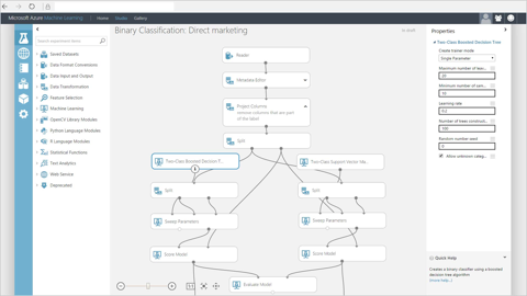
Microsoft’s Azure makes machine learning accessible to everyone
Machine learning is the first practical gift artificial intelligence has given – and it’s going to change the way you do everything in marketing. Machine learning process large volumes of data, spots patterns in different datasets and then makes predictions based on its findings.
That last part is extremely important. These are algorithms capable of predicting consumer behaviour based on almost limitless amounts of data.
The key difference in 2018 is that machine learning is now accessible to everyone. With drag-and-drop tools like Microsoft’s Azure, anyone can build machine learning algorithms without writing a single line of code.
#3: Personalisation
Personalisation is something else we’ve been talking about for a while now, but it’s never really taken off. The reason is we haven’t really had the technology available to make personalisation work effectively.
This is no longer the case.
All the technology you need to create fully personalised experiences for users is there. The only problem now is that we have the General Data Protection Regulation (GDPR) coming into effect on May 25 and this could make it harder to collect the personal information you need to personalise the consumer journey across different devices/sessions.
The key word in that last paragraph is “could”. We don’t yet know how internet users are going to react to GDPR and the changes they force businesses to make. And, even if the most pessimistic predictions come true, brands will still want to personalise individual user sessions as much as possible – as we’re already seeing with chatbots.
#4: Data transparency, protection
GDPR is all about protecting user data and making the process of using it more transparent. Personally, I’ve got no problem with this whatsoever and think we’ll adapt perfectly well to whatever impact we see after May 25.

At the very least, every business will need to get more serious about data transparency and protection.
You’ll have to get permission from people before collecting any personal info, make it absolutely clear what you plan to do with it and delete everything at their request. Not to mention a bunch of other regulations you’ll need to follow if you want to use data from people in the EU and UK.
From your email signups to your cross-device lead nurturing, everything you do with data will be different in 2018.
#5: Contextual targeting
With GDPR potentially making personal data more difficult to obtain, marketers will need to explore alternative targeting options. And top of the list right now is contextual targeting, which doesn’t rely on user data at all. Instead, contextual targeting focuses on individual user sessions and the content people engage with.
A simple example of contextual targeting is putting display ads on sites that your target audience uses. For example, insurance companies know that anyone who buys a new car needs to rethink their insurance situation and placing ads on car retailer websites makes a lot of sense.
With the industry focusing on personal data for the last decade, contextual targeting hasn’t really developed too much. If advertisers find GDPR too restricting, though, this could put more emphasis back on contextual targeting.
Machine learning will certainly help us get more sophisticated insights and predictive modelling from individual user sessions as well. Brands will still try to get consent from users to use their personal data, of course, but contextual targeting seems like the obvious choice to fill any void left by GDPR after May 25.
#6: Targeting ‘Generation Z’
There’s been a lot of emphasis on targeting Millennials over the last decade but Generation z is now coming of age. Born between 1998 and 2016, the oldest Post-Millennials are now graduating university and gearing up to make adult (and some not-so-adult) buying decisions.
Which makes 2018 the year to start putting more focus on the next generation of consumers.
it’s not a simple case of targeting a younger age bracket either. This is the first generation to be born into a connected world where the internet has been an ever-present part of their lives. They’re more tech-savvy, less brand-conscious and even more cynical than their Millennial predecessors.
Brands need to adapt their marketing strategies to cater for the rising Generation Z and the Millennials who approach middle age.
#7: Content marketing
I kind of want to kick myself for putting something so obvious in this article but, according to research from SmartInsights, marketers still place content marketing as the single most important strategy for 2018 – above big data, machine learning and everything else.

Of course, you can’t really have marketing without content so this doesn’t come as a massive surprise. It might be an obvious choice but I pretty much had to include it. It’s done now; let’s move on.
#8: Live video marketing gets serious

Everwebinar simulates the live streaming experience by automating your webinar marketing strategy.
Social media has propelled the phenomenon of live video marketing in recent years. Facebook, Instagram, YouTube and Twitter all support live video streaming and Periscope has become a vital platform for journalists, gamers and a range of different audience types.
According to Cisco’s Visual Networking Index report for 2016, Streaming video accounts for over two-thirds of all internet traffic, and this share is expected to jump to 82% by 2020.
Consumer brands are leading the innovations in live streaming right now but B2B brands can achieve more with live webinars or automated webinar marketing strategies in 2018.
#9: Conversational UIs
With devices like Google Home and Amazon Echo in houses across the country, the age of conversation UI is already here. This trend will continue to develop throughout 2018 as the technology improves and people become more comfortable with talking to the devices in their lives.
This changes the way we need to design every interface – from the on-site search functions on your site to the way you mark up your page content to make them accessible for voice-orientated platforms.
#10: Dynamic funnel marketing
With the risk of GDPR making personal data more difficult to get, marketers will need to do more with the data they do have in 2018. Forcing users along predefined sales funnels is already starting to look dated and machine learning makes bigger things possible at the perfect moment.
Once people give you consent to use their data, you can create dynamic sales funnels that adapt to their previous actions. So, rather than users who hit a roadblock along one of your sales paths dropping off, your funnel can adapt to deliver the content most likely to keep users moving in the right direction.
For some users, this might be a series of product reviews while others might be more tempted by a special offer. With a more dynamic approach to funnel marketing, machine learning will help you deliver the most convincing content at each stage of the sales process.
Make it bigger in 2018
The key marketing innovations in 2018 are all going to revolve around data. Machine learning means we’re able to do insanely complex things with the data we have on board while GDPR could make that data more difficult to collect. The marketers that make it big this year will be the ones that convince users to hand over their personal details and know how to turn it into machine learning magic.
The post Top 10 Digital Marketing Strategies for 2018 appeared first on Venture Harbour.
December 27, 2017
10 Web Design Trends That’ll Boost Conversions in 2018
With 2018 fast approaching, marketers are busy getting their strategies in place for the year ahead – and it’s a year that promises plenty of change.
We’ve got the rise of machine learning and artificial intelligence to think about, technologies like voice search coming of age and the challenge of creating more personalised web experience.
All of this is going to have a major impact on how we design websites for conversions. In this article, we’re going to look at ten web design trends for 2018 that will determine your online performance for years to come.
#1: Content-first design
The days of designing for specific devices are coming to an end. Roughly ten years ago, the mobile web matured as a technology and wreaked havoc on the entire web design industry. We simply weren’t prepared for a future where people would access the web on anything other than desktop computers.
Every business that had invested in an online presence had invested in a format that was about to become outdated and essentially unusable on the most important device in people’s lives. Sadly, even now, the average mobile experience leaves a lot to be desired and we’re miles away from designing content that works across smartwatches, phones, desktops and 4K TVs hooked up to the web.

Credit: “Samsung Gear S smartwatch with Galaxy Note 4” flickr photo by Janitors https://flickr.com/photos/janitors/15... shared under a Creative Commons (BY) license
The problem is we’re still designing for devices and, in most cases, only two of them. But what about voice platforms and personal assistant apps that don’t even direct people to websites? What about devices connected by the Internet of Things and technologies we haven’t even created yet?
The reality is we need to forget about dated models like mobile-first design and concentrate on a content-first approach. This means formatting content in a way that users can access on your site, Google Home can reproduce in voice search and upscales from mobile displays all the way to the next wave of 8K screens that are hitting the market.
Device agnostic design isn’t a new concept but as the range of devices people use to access the web increases, 2018 is the year we need to start taking it seriously.
#2: Personalisation
Another design concept that’s about to kick off is personalisation. Again, the idea has been around for some time but the technology to implement genuine personalisation has only really caught up with the concept over the last year or two.
Effective personalisation isn’t about calling people out by name or getting creepy with personal details. It’s about pinpointing consumer interests, where people are along the buying process and delivering a tailored message to nudge them on another step.

Source: Optimizely
With tools like Optimizely, you can already create variations of your homepage for different audiences, based on criteria like their geographic location, the device they’re using and where they came from (search, social, etc.) and what kind of content they’ve previously engaged with.
As personalisation becomes more advanced, we’ll be tailoring experiences based on the keywords people in Google, the
#3: Micro interactions
Micro interactions are finally getting the attention they deserve in the wider design community. Speak to any UX designer and they’ll tell you this is long overdue but 2018 is shaping up as the year when micro interactions will make their presence on the mainstream web.
So what are micro interactions and why are they important? Well, as Sneha Munot puts it on UX Planet, they’re “the little animation or visual responses users see when they perform certain actions.”

Source: UX Planet
In other words, micro interactions are visual responses that provide feedback from user actions, enhancing the experiencing of interacting with an interface. Some micro interactions might appear trivial but they confirm that a user action has had the desired effect – eg: confirming that a user successfully liked a social media post.
Moving back to consumer websites, micro interactions tell users when they’ve successfully submitted a payment, favourited a product or submitted a review.

Source: UX Planet
They can also enhance the navigation of your site, the way users interact with content (eg: content they’ve read vs content they haven’t) and a wide range of actions that bring them closer to converting.
#4: Multistep forms
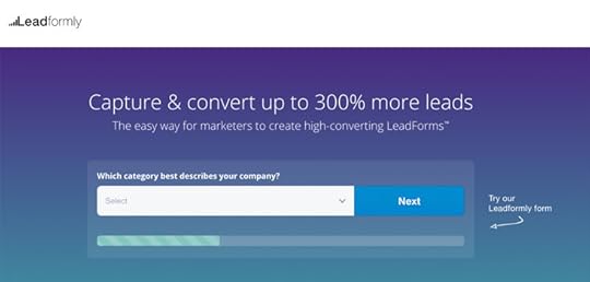
By far the biggest breakthrough we’ve made with form optimisation was converting to multi-step form designs – and we expect to see more brands make the jump in 2018. With multi-step form designs and analytics from Leadformly, we’ve been able to increase form conversions by up to 300% for our clients.
Multi-step forms the intimidation factor of lengthy forms and increase engagement with touch gestures and other micro interactions that reduce typing and create a more immersive experience. And with Leadformly’s form analytics you can pinpoint which fields and other elements on your forms are preventing conversions.
This is how brands should be designing and optimising their forms in 2018.
#5: Machine learning and AI
Machine learning is starting to transform the way people work in just about every industry. In terms of web design and conversion optimisation, we’re on the brink of machine learning tools that can make design choices on your behalf, based on how people interact with your site. Pretty soon, these tools will be able to crunch more data in a day than you could handle in a decade (assuming that much is available) and extract insights.
It’s not about taking the design process away from designers, but rather empowering them to make better decisions, backed up by larger volumes of data than ever possible before.
#6: Predictive analytics
Something else we can thank machine learning for is making predictive analytics possible for brands of any size. Soon, predictive analytics tools will be as common as landing page builders and email marketing platforms, turning your existing data into qualified predictions and better conversion rates.

IBM’s predictive analytics tools might not be pretty but they’re powerful
Imagine an advertising campaign that adjusts based on the weather, new search trends, important sports results or anything else that might affect your conversion rates. MAchine learning and predictive analytics make all of this possible by mapping out a data history, spotting patterns and identifying situations where adjustments should be made.
For example, a predictive analytics tool might notice that
#7: Constant design improvements
The tradition of redesigning websites every few years has been fading out for some time, thanks to conversion rate optimisation. And with machine learning promising to automate much of the testing, data and predictive analytics side of things for us, website redesigns will be replaced with a constant state of design improvements.
Unless you’re completely rebranding, drastic redesigns are an inefficient approach to optimisation. You render most of your previous data useless and have to start from scratch. Not to mention the fact you instantly go back to making design choices based on intuition rather than user data – aka: shooting in the dark.
By automating the conversion process, you’ll be able to make systematic design changes as they’re needed, knowing that they’re backed up by data collected from your users, not some design best practises guide. You know that all of your design tweaks are made with the goal of improving business results rather than aesthetic reasons alone. And you don’t have to spend thousands on expensive redesigns anymore when you can make small, incremental improvements that have a proven impact on ROI.
#8: Integrating with conversational UIs
One of the biggest disruptions in web design over the next few years will be integrating with conversational UIs. This means creating content that integrates with platforms like Amazon Echo, Google Assistant, voice search, chatbots and voice technology on all devices – from TVs to the cars we drive and the ovens on our homes.

Google Assistant
Google and Amazon already have their conversational platforms on the market. Facebook, Apple and Microsoft are among the other tech giants working on their own platforms designed to cater for everything people need to do online. If you’re not integrated with these platforms, you won’t be discoverable on the platforms people use for most of their online activities.
#9: Looking beyond Google Search
With a wider range of conversational UIs acting as search platforms for users, we can’t keep optimising for Google alone. Aside from having more platforms to optimise for, the nature of search is changing.
Google itself is turning into more of a recommendation engine than a search engine as users become more passive in the way they discover content. Social media has had a lot to do with this, where users simply scroll down feeds without actively searching for anything.
As user habits change and these platforms continue to evolve, the user intents we target, the kind of content we create and the process of nurturing leads along the consumer journey will drastically change. Competition breeds innovation and we can expect things to develop at an even faster pace as Google’s rivals get stronger.
#10: Designing the offline experience
With mobile came the first real opportunity to bridge the online and offline consumer experience. Sadly, progress has been slow but we have people using searching Google Maps to find shops as they make their way about town and using mobile in stores to check product reviews, compare prices and make buying decisions.
In 2018, we need to step up our game in terms of how we design for a streamlined experience.
There are a number of challenges to address with this, though. One of the biggest issues in 2018 will be GDPR which completely changes the way you’re legally required to collect and process data. So far, the best offline digital experiences have relied on mobile location data – and this could be more difficult once GDPR comes into effect in May.
Another key challenge with bridging the online-offline gap is the lack of any blueprint. What works for some brands (or more to the point, their users) can dismally fail for others.
For example, people in the market for technical gear like video recording equipment might benefit from being able to book in-store trial sessions with the specific items they’re interested in. The same thing could apply to people in the market for a new car or anything else you’d prefer to try before buying.
Another strategy for general retail stores could be barcodes on shelves or in catalogues that users can scan to get details product information. Better yet, let users scan multiple barcodes to compare products and make better buying decisions in-store, without turning to Google and potentially finding one of your rivals online.
You could also include notifications for out-of-stock items that tell people when their desired product in back in stock. You might want to offer some kind of incentive to bring them back to your store instead of looking elsewhere in the meantime. And it would also be a good idea to give them the option of ordering online once the item is back in stock and reserve items for collection. Not only does this allow them to buy in the way that suits them most but it also guarantees they don’t miss out.
These might sound like minor interactions but bridging the online-offline gap is all about building a better experience with these kinds of interactions. Pinpoint the areas where you can improve the consumer journey across devices, as well as in-store – this is where you need to design for the offline experience.
Few excuses left in 2018
In 2018, we really can’t be talking about poor mobile experiences or dated design trends anymore. People have little reason to tolerate crappy experiences and brands need to step up their game – especially as technologies like machine learning offer so much potential in terms of enriching the consumer journey.
In the year ahead, we need to start designing with a more sophisticated mindset by aiming for experiences that keep people engaged through every step. This means designing for every device they use as well as their consumer actions, both online and offline, to stop them dropping out of the buying process and doing business elsewhere.
The post 10 Web Design Trends That’ll Boost Conversions in 2018 appeared first on Venture Harbour.
December 15, 2017
7 Landing Page Design Mistakes to Avoid
With a host of landing page builders available these days, it’s easy to think the design process is pretty much taken care of. But even with the best landing page builder on your side, you have to make dozens of design choices that will determine the performance of your pages.
It doesn’t matter whether you create your own landing pages from scratch or start with templates. You’re still susceptible to the same design mistakes I see all over the web – and here are seven of the most common to avoid.
#1: Not having enough landing pages

By far the most common mistake I see in landing page design is simply not having enough of them. Every service you offer should have its own dedicated landing page and every major product you sell should have one of its own, too.
The same thing goes for every sale of promotion you hold.
Better yet, create multiple landing pages for each product/service, targeting a different audience or selling point. A small business is going to have different requirements from accounting services compared to a larger enterprise, for example.
Likewise, some gaming fans are going to resonate with titles and genres that others won’t. Rather than promoting a console with generic messaging, you might have better luck by targeting specific gamer interests.
The problem with not having enough landing pages is your messages will be too vague to pinpoint specific audience interests, which is crucial to maximising conversions.
#2: Vague messaging
As mentioned in the previous point, not having enough landing pages tends to result in vague messages – and this is a serious problem. Great landing page design starts with defining a list of target audiences and creating messages tailored to each of their specific needs.
Let’s say you’re selling enterprise software, for example. You can identify two key audiences for almost every business type: the business owner themselves and high-level staff with purchasing authority. The business owner is more likely to be interested in how much money your product can save them while staff might be more convinced by how much time your product can save.
#3: Cluttered layouts
In terms of visual design, the first mistake you’ll probably fall into is a cluttered layout. Don’t try to be innovative with the fundamentals; stick to a simple layout that helps users navigate through your message and see the most important elements on your page.

There’s no one layout that works for every scenario but the single-column layout is a solid choice for just about every occasion. It reduces the workload on user vision, presents one key piece of information at a time and pretty much optimises itself for mobile.
Above all, it’s hard to clutter up a single column layout.
#4: Distracting design elements
This one is painfully common, too. There are parts of your landing page that should grab user attention as soon as they see them and others that shouldn’t. Do you really want that pop-up distracting attention away from your call-to-action or an explainer video that interrupts the user journey through your page?
I’m not saying you shouldn’t use popups or explainer videos, but you don’t want to use them at the expense of more important elements.
Also be mindful of how you style design elements. Dodgy font choices, a touch of bold colour in the wrong place or a distracting image can take attention away from parts of your page that should stand out the most.
#5: Missable CTAs
One design element that should stand out on every page is the call-to-action. These things need to be unmissable as users scroll down the page but there are plenty of reasons they may go unnoticed:
Distracting design elements: As mentioned in the previous point, avoid other design elements taking user attention away from your CTAs.
Poor CTA placement: Putting your CTAs too far down the page means people might never see them. While placing them too far away from the core benefits of your message can reduce their incentive to take action, whether users see them or not.
Lack of incentive: A CTA that compels people to take action will always stand out ahead one that’s less inspiring. This depends on the message surrounding your call-to-action as much as the text in your CTA button.
Lack of contrast: The easiest way to make your CTA visually stand out on the page is to use high contrast. Bold colours are the obvious choice but you can also use size, shape and style are among the other types of contrast you can use to make your CTAs stand out.
Creating CTAs that inspire action is essential to every landing page you design. Before they can do this, though, they need to capture user attention and point them in the direction of taking the desired action.
#6: Not optimising your forms for conversions
Landing page forms often get overlooked when it comes to optimising for conversions. This is pretty crazy when your forms are the final hurdle users have to jump before converting – which is the whole point of landing page design.
Google Analytics isn’t a bad tool for optimising forms but you might get better results from a dedicated form optimisation tool. Leadformly comes with a selection of already-optimised forms that you can embed directly onto your landing pages.
You also get analytics reports for specific form fields to see where users are running into problems and customisation options to make design improvement without writing any code.
#7: A/B testing the wrong things
There’s been a lot of talk about A/B testing over the last five years or so. In principle, it’s a great idea, but the notion that you have to test every minute detail on your landing pages is ridiculous.
Forget about boosting conversions by 600% from changing a button colour and anyone who makes claims these kind of results are realistic.
People don’t buy from you because of the colour of your CTA buttons. They buy from you because your products are worth buying, your web copy is compelling and you effectively nurture them across the buying process.
I’m not saying button colour isn’t something to think about, but don’t waste time testing minute details for months on end. Focus on the design elements that actually have an impact on buying decisions.
Want more tips on landing page design
In today’s article, we’ve covered some landing page design mistakes you really want to avoid. But if you want some examples of what you should be doing with your landing pages, check out our 15 Landing Page Form Best Practices & Examples and 101 Landing Page Optimisation Tips articles for a whole bunch of pointers.
The post 7 Landing Page Design Mistakes to Avoid appeared first on Venture Harbour.
December 3, 2017
101 Webinar Marketing Tips to Drive More Signups, Attendees & Sales
Webinar marketing is a favourite strategy for B2B brands looking to build a stronger relationship with their audience. Aside from capturing new leads, webinar marketing can help you gauge how qualified your prospects are and nurture them along the buying process – even if they don’t convert directly after watching.
In this extended guide, we’ve got just about every tips you could ever need to build a webinar marketing strategy that drives more signups, gets people attending your webinars in larger numbers and increases sales as a result.
We’ve broken up these tip into a few sections and you can click on the following links for quick reference:
Webinar content tips
Running your webinars
Marketing your webinar
How to maximise attendance rates
Optimising your webinar
Nurturing webinar leads
Choosing your webinar marketing metrics and KPIs
Choosing your webinar tools
That’s quite a lot of tips for us to get through – so let’s get started!
Webinar content tips
As with any marketing strategy, content is the first thing you need to think about. So let’s begin by looking at how you can create webinar content that gets results.
#1: Be strategic from the start
The webinar itself is only one part of a much larger strategy. It’s important you know what role your webinars are going to play in this – especially if you’re going to publish multiple webinars with different marketing objectives.
One of your webinars might be designed to raise awareness about a new product, for example. While a later event could be designed to push sales more directly. Be strategic, plan well in advance and have clear goals for every webinar you publish.
#2: Create evergreen webinar content

Our prerecorded webinar on How to Capture 4X More Leads & Sales From Your Website gets results every month.
Most webinars are live events streamed online and then later recorded for attendees to download afterwards. However, this isn’t the only way you can go about things. You can prerecord your webinars and upload them for viewers to watch anytime, anywhere.
This allows you to create evergreen webinar content that continues to generate new leads on a monthly basis. We’ll be talking more about prerecorded webinars throughout this guide.
#3: Create a series of webinars
One way to keep your webinar audience engaged is to create a series of webinars for them to follow. This can work well for a SaaS companies, for example, that need to keep people signed up to their software platforms. Your webinar marketing goal, in this case, could be to retain customers and potentially upsell them to a more expensive payment plan.
#4: Address audience concerns
The most important thing in terms of webinar content is that you address your audience’s concerns. Whether it’s creating a more productive workplace, cutting business expenses or getting more from their advertising budget, your webinars need to address these issues. Otherwise, people have got no reason to sign up, let alone watch.
#5: Promise something special
Your target audience is already bombarded with ads and invitations to sign up for webinars. We’re approaching a point of webinar fatigue where people only pay attention to the most promising webinars.
You already know what your audience concerns are so now you need to promise something special. Tell them you’re going to transform their business into a more productive place, slash their expenses and reveal the advertising secrets they’ve been waiting for.
#6: Include numbers and power words in your title
When it comes to communicating this grand promise in your webinar title, use numbers and power words to grab people’s attention. You’re not just going to increase productivity, you’re going to boost it by up to 300%.
#7: Provide actionable tips
Throughout your webinar, provide actionable tips that attendees can put into action as soon as they’ve finished watching. This will confirm your webinar has value and keep them watching until the end.
#8: Define a consistent brand voice
Throughout your webinar marketing strategy you want a consistent brand voice to shine through. Define this before you get started because this is part of what keeps people coming back to view more webinars.
#9: Get professional scriptwriters
Each of your webinars is a short story of the brand experience for your target audience. You need to engage viewers with a compelling story and it takes professional storytellers to pull this off.
#10: Choose your hosts wisely
I see too many CEOs take to the stage at live events, only to prove they’re not really cut out for public speaking. Not everyone needs to be a great public speaker, there’s nothing wrong with that. But whoever you choose to host your webinars does need to capture your message and brand voice in a compelling way.
#11: Include expert speakers
Expert speakers add authority to your webinar and encourage more people to sign up and attend. Authority is important because it makes your webinar and the points you make more credible – especially when you’re just starting out.
#12: Make it interactive
Engagement is always important when you expect people to keep watching for 30 minutes or an hour. Allow viewers to ask questions, make sure you answer them, ask questions in return and conduct polls or surveys in your webinar to keep people involved and engaged.
#13: Use multimedia content
Multimedia content is another key tool for keeping people engaged. Include video clips, slides, images, on-screen text and other visuals to create a more engaging experience.
#14: Don’t show too much visual content at once
There’s a limit to how much visual content people can read at once. Keep in mind the fact that people need to understand what you’re saying and take in any visual content that pops up throughout your webinar.
#15: Be better than your rivals
Remember that your audience is being bombarded with webinar invitations and plenty of these are going to be coming from your competitors. Sign up and watch your rivals’ webinars, carefully examine how they market them and aim to beat them across the board.
#16: Don’t push your products too aggressively
There’s nothing wrong with promoting your products or services in a webinar but don’t be too aggressive. Remember the point here is to address user concerns and get them involved with your brand.
#17: Don’t make compromises
Running webinars can be incredibly cheap or surprisingly expensive. Decide what your audience needs in advance and don’t make compromises. There’s no point doing this if you’re going to scrimp on the necessary tech gear or content quality it takes to get results.
It’s better to create fewer high-quality webinars than a catalogue of sub-par content.
Running your webinars
How you run your webinars depends on what kind of production you want to host. In some cases, a live video chat allowing people to speak to your technical staff might be all it takes. Other times, a full studio session with a production team and a live audience might be the way to go.
Whichever approach you take, there are some things you’ll want to do for every kind of webinar.
#18: Record your webinars
Whether you’re hosting a live event or not, record your webinars. Allow users to download them after they’ve finished watching, send links to people who didn’t attend and use clips to attract new viewers on social media.
#19: Automate your webinar strategy

Once you start recording your webinars, you’re able to plan out an automated strategy where you can promote them all year round. We use a tool called Everwebinar to automate our own webinar strategy and our results have dramatically improved since automating things.
#20: Get the right tech gear
Whether you’re doing the webcam thing or hiring a full production team, make sure you get the right tech gear on board. At the very least you’ll need a platform for streaming/recording your webinar and the right sound gear to make sure everyone can hear you. For more ambitious productions, you could need a full suite of professional tech and software.
#21: Test your gear before any live events
For live events, make sure you test all of your gear before hitting the play button. You need to reduce the risk of technical issues as much as possible. So, even if you’ve been using the same gear for years, test your setup before every live event.
#22: Run rehearsals before going live
This is especially true you’re using multiple cameras, live editing, sound gear and technical staff. Your speakers will certainly want to rehearse before going live. But, if you’ve got any kind of production team involved, do full rehearsals so everyone can get any mistakes out of their system.
#23: Have a good technical team on board
Even if you’re taking the webcam approach, have a people on board to address any technical issues that might crop up. You don’t want to be fiddling with mics or presentation gear in front of your audience. Have people on standby to handle any mishaps so you can keep your audience engaged, should anything go wrong.
#24: Expect things to go wrong
No matter how much you rehearse or how large your technical team is, something out of your control can still go wrong. You need to expect this, have contingency plans in place and be prepared to deal with any issues. From backup mics to prerecorded footage you can cut to in times of need, make sure you’re prepared.
#25: Avoid or edit out time references
If you’re going to automate your webinars, you need to avoid making certain time references – or at least edit them out in the post-production stage. You don’t want to reference the 2018 World Cup when people are watching your webinar in March 2019, for example.
#26: Invite viewers to ask questions

I mentioned Q&As as a way to engage your viewers earlier but you might be wondering how on Earth you’re supposed to do this with prerecorded webinars. Well, luckily, Everwebinar comes with a live chat simulator that allows viewers to ask questions and get genuine responses, no matter when they watch.
#27: Be prepared to answer questions
When you invite people to ask questions, be prepared to answer them. Don’t deflect questions like a politician or crumble under the pressure of being asked something you didn’t expect.
#28: Assign moderators to handle live chat
Live or not, you’ll need someone to handle the Q&A process with your webinars. However, for live events, you’ll want moderators who are able to approve and manage the conversation.
#29: End with a CTA or next step for viewers
You’re not limited to one CTA in your webinars but make sure you at least end with one. This doesn’t necessarily have to be the main CTA for your webinar but it should prompt them with the desired next step to take after watching your webinar.
#30: Create a sense of urgency with your CTA
Try to end your webinar with a sense of urgency that encourages your attendees to take action now, rather than later on. The chances of people taking action later reduce significantly so try to create that sense of urgency while you can.
#31: Replicate the live experience with your automated replays
One of the key aspects that made us choose EverWebinar to automate our webinar strategy is that it comes with a number of features to recreate the live experience with recorded webinars. Aside from the live chat simulator, users joining your recording after it starts playing to simulate the live streaming. There’s no play or pause button involved here.
Marketing your webinar
With your webinar recorded or ready to stream live, it’s time to think about how you’re going to promote it. So let’s turn out attention to drumming up interest in your webinar.
#32: Have a dedicated landing page for each webinar

The first thing you’ll need is a dedicated landing page for every webinar. Essentially, this is your registration page and also the place you’ll point to with your ads and CTAs elsewhere on your site.
#33: Reach out to people who watched your previous webinars
Hopefully, this one’s obvious but it would be a crime to leave it out. Unless, this is your first webinar reach out to people who have attended your previous events and get them signed up to the next one.
#34: Promote your webinar with AdWords
AdWords is a great place to promote your webinar. Target long-tail keywords related to the audience concerns you’re addressing in your webinar – eg: “How to improve productivity in the workplace”.
#35: Don’t forget about social advertising
Facebook is another great place to promote your webinar and you might want to think about LinkedIn, Twitter and other platforms too. The great thing about Facebook is you’re able to target people with incredible detail. Use this to your advantage.
#36: Invite people on your email list to attend
Your email list should be one of the first places you think to promote your webinar. But consider how you’re going to segment your audiences, personalise your messaging and how regularly you’re going to remind people.
#37: Place CTAs on relevant blog posts
Another place to promote your webinar is on blog posts related to the topic you’ll be covering. What you can start to do is create blog posts specifically related to the same topics and leave readers wanting more. Point them in the direction of your webinar as the place to get the conclusion they’re looking for.
#38: Consider exit-intent popups
Exit-intent popups are always a contentious issue so this is something you’ll have to weigh up yourself. It’s a method worth considering, though, as they’re less intrusive than traditional popups.
#39: Create partnerships to expand your audience
A great way to expand your webinar reach is to create partnerships with brands that have a valuable audience. You don’t want to team up with direct competitors, of course, but you can link up with brands that have a similar target audience. Ask yourself, which other brands are these kinds of people engaging with.
#40: Guest blog on relevant sites
To expand the reach of your webinar audience, source out relevant third-party sites and publish guest posts there. The larger their audience is, the greater your chances of attracting new registrants for your webinar.
#41: Promote your webinar on LinkedIn
Publish articles on LinkedIn to promote your webinar. Don’t make it too obvious that you’re goal is to get people signed up; create a solid article in its own right and lead to your webinar as a follow-up piece.
#42: Promote your webinar on SlideShare
LinkedIn owns SlideShare these days so this isn’t the most creative continuation on from our previous tip, admittedly. However, SlideShare users are already visually engaged in a topic and receptive to the idea of a webinar that has something to offer. Tap into this interest.
#43: Tell people spaces are running out
When you tell people things are running out, their desire to grab what they can while it lasts increases. This is the principle of using scarcity to create a sense of urgency in people and you can use this with your webinars. Tell people there are limited seats which are rapidly getting booked to give them more incentive.
#44: Announce new speakers, topics in the build-up to going live
This one works particularly well if you’ve got expert speakers lined up for a live event. Announce them gradually in the build-up to hosting your webinar and send out the necessary updates on social, email and your other key channels.
#45: Ask people who sign up to invite others
Don’t be afraid to ask people who sign up to attend your webinar to invite other people who might be interested. Better yet, you can find a way to incentivise the process by entering them into a competition or offering some kind of bonus.
How to maximise attendance rates
Getting people to sign up for your webinar is only half of the battle. Now you have to turn those signups into people who actually watch your webinar, which is another challenge entirely.
#46: Start by targeting the right audience
By carefully segmenting and targeting your webinar audiences, you’ll attract signups from people who are more likely to actually watch your webinar. Use targeting options on platforms like AdWords and Facebook to reach the right audience.
Just remember that you can still nurture signups who don’t attend your webinar as a different kind of lead.
#47: Optimise your webinar landing pages
Your webinar landing pages are the gateway to getting people signed up, so take the time to optimise them for performance. You can find out how to do this by reading our 101 landing page optimisation tips article.
#48: Optimise your signup forms

A fundamental part of any webinar landing/registration page is the signup form – something else you’ll want to carefully optimise. Check out Leadformly‘s already-optimised web forms and analytics tools to help you optimise for better results.
#49: Send ‘thank you’ emails
The first thing a thank you email does is confirm that users have successfully signed up to watch your webinar. But it also gives you the chance to get in there and push them for further action.
#50: Send email reminders
For live webinars, you want to start sending reminders roughly two weeks before the main event. For prerecorded and automated webinars, sending reminders depends on whether people watch right away or schedule a viewing for another time. For anyone who misses their scheduled viewing, remind them that they can book another spot or watch right now.
#51: Just-In-Time Webinars

If you’re automating your strategy with EverWebinar this is another must-use feature. Just-In-Time Webinars allows people to watch your webinar almost on-demand. Set your webinar to play every hour and visitors are always just in time to catch the next show.
The countdown clock creates a sense of urgency, encouraging people to sign up and watch right way. This is a huge feature.
#52: Be strategic with times and dates
For live webinars, you’ll need to be strategic with your times and dates, considering where your audience is located and catering for any time differences. Automating your webinar strategy removes this problem, of course – and this is the best approach we have found so far.
#53: Use remarketing to remind people
Email isn’t your only tool for reminding people about your webinar. Create AdWords remarketing ads to remind people as they browse the web and use Google platforms like YouTube.
#54: Don’t advertise your replays
If people know they can watch your webinar whenever they want, the incentive decreases. So don’t advertise the fact that people can watch replays or attend your webinar on-demand. Maintain a sense of urgency and save the replays for those who don’t attend first time around.
#55: Provide an add-to-calendar function

Another way to prevent people forgetting about your webinar is to provide an add-to-calendar button on your signup pages or in your confirmation emails. You can either code these yourself or embed something like Add to Calendar on your page. Simple but effective.
Optimising your webinar
As with any kind of video content, it’s important you also think about how to optimise your webinars for the best possible experience.
#56: Make it mobile friendly
People should be able to access your webinar from whichever device they choose. So make sure your webinars are optimised for mobile. If you use a third-party tool to host or market your webinars, make sure it supports mobile devices.
#57: Compress your video files
Make sure you also compress your recorded webinar videos to reduce file sizes. This isn’t only important for mobile but also for loading times and moments where people are using weak internet connections.
#58: Use HTML5 video
For embedding videos on web pages, use HTM5 video. Once again, this is important for mobile users (particularly cross-browser compatibility) but it also plays nicely with video formats and different encoding types (eg: subtitles).
#59: Allow users to download webinars for offline viewing
If you’re running a one-time live webinar, allow users to download the event in full for offline viewing. If you’re taking the automated approach, give users access to a page where your webinar is embedded, rather than allowing them to download it. You don’t want people uploading your webinar to YouTube while it’s still part of your lead generation strategy.
#60: Think about webinar length
Webinar length is important. You know your audience wants detailed information but you don’t want to go on for so long that they lose interest. Research generally suggests that webinars should be no longer than 60 minutes and somewhere between the 30-60min mark is a good place to aim for.
#61: Get feedback from viewers and implement it in future webinars
Of course, you can ask your attendees whether they thought your webinar was too short, long enough or too long by getting feedback from them after the event. In fact, there are plenty of questions you can choose to ask and implement in your future webinars.
#62: Use a CDN
This one is particularly important if you’re streaming live webinars. The further people are away from the server your video is hosted on, the longer it takes for your content to be delivered to them. A Content Delivery Network (CDN) speeds up this process by hosting your content on virtual servers in locations closer to your users.
#63: Define the width and height of your media player
If you’re embedding a video player into any of your pages, be sure to define the height and width of your player. This saves the browser having to calculate the dimensions every time the page loads – a process that takes up valuable time.
#64: Provide a text transcript
Sometimes it’s easier to revise text than skip through video, trying to find the key moments of your webinar. Transcripts also serve as good notes to send users after your webinar has finished, as part of your email marketing strategy.
#65: Provide subtitles/captions for multilingual audiences
If you expect non-native English speakers to be attending your webinar, providing subtitles or captions can drastically improve the experience for them. Reading text another language at your own pace is one thing but listening to people speak at full pace is something else entirely.
Providing subtitles/captions is obviously much easier once webinars are recorded but live subtitles are doable if you’re serious about targeting other language speakers.
Nurturing webinar leads
The whole point of your webinar marketing strategy is to generate leads, engage your audience and bring them closer to the sale. So let’s start looking at how you can nurture your webinar leads and turn them into customers.
#66: Create webinars as a stepping stone
You’re not creating webinars for the sake of attracting viewers; you’re doing this to capture qualified leads and nurture existing ones. Pick your audience based on where they are along the buying journey and create a webinar designed to move them along to the next step. The more webinars you create, the more targeted you’ll need to be with your audiences, topics and CTAs.
#67: Know what you expect users to do next
An important part of this is knowing what you expect users to do after watching your webinar. Not everyone’s going buy as soon as the screen dims and you’ll need to have a list of desired actions mapped out. These are the basis of your CTAs and your email marketing efforts that follow.
#68: Use exit-intent popups to prevent people leaving your webinar

Optinmonster‘s exit-intent popups only trigger when a user looks like they’re about to leave.
Another use for exit-intent popups is to have them trigger when users look like they’re about to exit your webinar. Again, there are always UX concerns with using popups but this is something you might want to test and see if it reduces your exit rates.
#69: Attribute your webinar leads
This one is crucially important. You want to know where users first discover your webinar (search, Facebook, guest blog, etc.) and track their actions as they continue to interact with your brand. Do they sign up right away, leave and eventually sign up through one of your remarketing campaigns or take more persuading?
You need to know the answer to these questions to understand how effective your webinar marketing channels are performing.
#70: Send follow-up emails to users
Once people are done with your webinar, it’s time to push them for further action. Some may have converted while watching, others might have resisted your CTAs and some probably didn’t even make it all the way through your webinar. Which means you’ll want to target these different user types with appropriate follow-up messages.
Segment your email marketing lists and tailor messages for each audience type.
#71: Send notes/summaries to attendees
We talked about providing users with a transcript of your webinar earlier, which you can send to them as notes after they finish watching. You can do a lot more than this, though. Try creating infographic summaries or something a little more visual and work your CTAs into something people can use after they’ve finished with your webinar.
#72: Ask for feedback
Aside from giving you another conversion opportunity, asking for feedback helps you gauge the quality of your webinar leads. This also brings us back to a previous point about implementing feedback as a means to optimise your webinars for better performance. If people keep telling you your webinars are too long or poorly optimised for mobile, you know what to fix next.
#73: Send links to related content
Your webinar won’t be the only piece of content you’ve published on the same topic. Reach out to attendees with links to related content that might interest them and bring them closer to one of your desired conversions.
#74: Create content that answers the questions from your Q&A
Publish blog posts or create emails that answer the questions raised in your Q&A. These are obviously topics that interest the people who attended your webinar so reach out to them with more information about their concerns.
#75: Give attendees a reward
A great way to strengthen the bond between your brand and attendees is to offer them some kind of reward. Give them “free” access to some of your premium content, a discount of some kind (not a bad conversion incentive) or something that signifies VIP status.
#76: Don’t forget about those who didn’t attend
No matter how well you promote your webinar, there will be some people who sign up but don’t attend. In fact, the majority of people who sign up probably won’t attend but these no-showers are still leads that you can work with. Create a segmented email audience for these people and get working on your follow-up messages.
#77: Give no-showers another chance
The first message you’ll want to send people who didn’t attend your webinar is another chance to watch it. Make this sound like a bit of a gift – not something you would do for just anyone. Include highlights from the webinar, feedback quotes and other incentives to make it seem like they really missed out by not watching the first time.
#78: Send a ‘last chance’ message to those who don’t bite
Sending a “last chance” message to no-showers might give the more reluctant ones the incentive they need to finally watch your webinar. Don’t be too pushy. Simply tell them their seat will expire soon and they’ll miss out on the benefits of your webinar if they don’t watch now.
#79: Take a different approach for those who don’t watch
Some people won’t watch your webinar, no matter what you say to them. This is fine – it’s all part of the webinar marketing process. Your next step is to come up with an alternative strategy that will keep these leads involved with your brand and moving closer towards doing business with you.
#80: Create targeted content for each segment of your webinar audience
At this stage, you have a number of webinar audience segments: attendees, non-attendees, converters, non-converters and any other segments you consider valuable. You’ll want a follow-up content strategy in place for each of these with targeted messages that address their current place along the consumer journey.
#81: Adjust your remarketing efforts
Promoting your webinar isn’t your only remarketing goal in this strategy. You can adjust your remarketing messages to promote your conversion goals, follow-up content and other offers so people continue to see them as they browse the web.
Choosing your webinar marketing metrics and KPIs
You can’t nurture webinar leads without tracking the right metrics and KPIs. You’ll have to devise a specific list of these to suit your own webinar objectives – something that could change from one campaign to the next – but here’s a rundown of some essentials to get you started.
#82: Registrations
The number of people who register for your webinar. This is a specific number, not a ratio or percentage.
#83: CTR
The percentage of people who register for your webinar vs the number of users who visit your landing/registration page.
#84: Attendance ratio
The ratio of people who actually attend your webinar against the number who sign up to attend.
#85: Completed viewings
The percentage of attendees who watch your webinar in full. Don’t be too strict on how you measure this as some people might exit once they can tell your webinar is wrapping up. Does it really matter if people stick around to hear you say goodbye? If not, set your cut off point at the last important thing people really need to see in your webinar – eg: your final CTA.
#86: Exit ratio
This tells you how many people stopped watching your webinar before reaching the end. Again, don’t be too strict on measuring this, for the same reason mentioned in the previous point.
#87: CTA impressions
This tells you how many attendees view the CTA(s) in your webinar, even if they don’t end up watching it in full.
#88: Conversion rate
This measures the percentage of attendees who convert during or after viewing your webinar (attribution and tracking actions are important for the latter).
#89: Engagement rate
The percentage of attendees who ask questions, answer polls or interact with your webinar in any way
#90: Survey participants
The percentage of attendees who complete the feedback surveys you send out after they watch your webinar.
#91: Download rate
The percentage of registrants who download your webinar once it becomes available.
#92: Audience retention
The number of attendees who continue to watch your webinars or engage with your follow-up content.
Choosing your webinar tools
Managing an effective webinar marketing strategy requires a certain set of tools. Again, the specific tools you’ll need to get the job done will depend on what you’re trying to achieve – but here are some key considerations for you.
#93: Choose the right webinar marketing tool
The first choice you need to make is which kind of webinar marketing tool you’re going to use. If you’re planning to automate your webinar strategy in any way, you’ll want a specialist tool like EverWebinar but there are plenty of other options for less demanding needs.
Check out our comparison of the 10 best webinar marketing platforms available right now for more help on choosing the right tool for your needs.
#94: Make sure you have a good landing page builder

Your webinar marketing efforts will come to nothing without a good landing page builder. Some webinar platforms come with customisable registration pages but not all of them. Besides, the quality of them can vary quite a lot so you might be better off with a dedicated language page builder, depending on your other tool choices.
#95: Choose the right advertising platforms
Advertising your webinars will be important and choosing the right platforms is an essential part of the planning stage. AdWords is the obvious choice for search ads and Facebook is hard to ignore for social advertising – if not for its targeting options alone. But you also have LinkedIn, Twitter and a host of other platforms that can help you reach a different kind of audience.
#96: Get a form optimisation tool
Convincing people to sign up for your webinar is no easy task and the last thing you want is your web forms preventing them from registering. get yourself a good form optimisation tool like Leadformly to stop your registration forms being a barrier to attending your webinars.
#97: Use heatmapping to find out why people don’t sign up

With a heatmapping tool like Hotjar at your disposal, you can track user behaviour on your landing/registration pages to see why people aren’t signing up. Is your CTA in the wrong place? Is there something preventing users from scrolling down to your signup form? Or is something distracting user attention away from the most important parts of your page?
Heatmapping can help you answer these questions and increase the number of people signing up.
#98: Use professional presentation software
When you’re including presentations slides in your webinar, you want to make sure they look the part. Use professional presentation software and create individual slides using design software like Adobe Illustrator. Likewise, use professional data visualisation tools for tables, graphs and other visuals.
#99: Know what you need in terms of cameras, lights and sound gear
If all you need is a laptop and a mic to make things happen with your webinar strategy, that’s great. If you’re trying to create a more ambitious production, though, make sure you know what you need in terms of cameras, lights, sound gear and production software – and be willing to pay the price.
#100: Build your editing team
As soon as you start recording webinars, using multiple cameras or mixing with sound equipment, you’re going to need an editing team. For live webinars with multiple cameras, mics and multimedia content, this is more demanding. For recorded webinars, you may only need a team of one or two.
#101: Get the right editing software
Regardless of how big your editing team is, you don’t want to scrimp on editing software. Stay away from budget tools and those cheesy fade cuts. You need to consider video and audio quality as well as compatibility with the rest of your hardware/software tools.
Create your webinar strategy
With these tips in mind, you should be ready to put together your own webinar marketing strategy. You don’t need to follow every tip religiously; identify your own goals, KPIs and use the best tools to get the job done your way. If you’ve already got your own webinar strategy up and running, hopefully there were still some useful pointers in here for you.
Good luck!
The post 101 Webinar Marketing Tips to Drive More Signups, Attendees & Sales appeared first on Venture Harbour.
November 21, 2017
Webinar Software: 10 Best Webinar Platforms Compared
Webinar marketing is a vital strategy for B2B businesses and a lot of consumer brands are also turning to it for their own B2C marketing efforts. Webinars give you the chance to build a more personal relationship with your audience, delve deeper into the topics that concern them and build your brand as a place people can come to for important info.
We’re not here to talk about what makes a great webinar here today, though. Instead, we’re going to run through some of the best webinar marketing platforms available right now to get your own webinar strategy up and running.
We’ll be running through the features, pros and cons of each platform, plus a brief explanation on what purpose each platform is best suited to – everything you need to choose the best webinar platform for your needs.
#1: EverWebinar
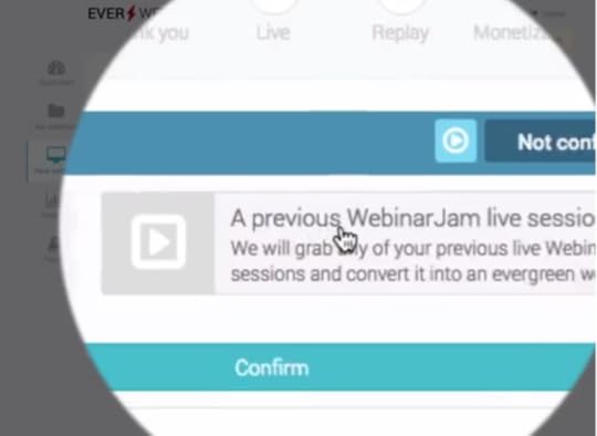
The first platform we’re looking at is EverWebinar, a powerful webinar automation tool that aims to help you build email marketing lists with a purpose. With EverWebinar, you can schedule and automate your webinar footage to play at set intervals and the software aims to recreate the live experience for users.
The goal is to increase engagement and attendance by telling users the next webinar is about to begin, even if you choose to replay it a dozen times per day.

We use EverWebinar to automate our own webinar strategy and we’ve seen great results from the platform’s features.
EverWebinar features:
Automate webinars: Schedule webinar to replay at set times throughout the day – eg: every hour.
Just-In-Time Webinars: Tells users there’s a webinar just about to start, encouraging them to sign up on the spot.
Block night-time viewing: Stops playing your webinar through the night to keep the illusion of live webinars realistic.
Block dates: Stop your webinar from playing on any desired date or holiday.
Time zone auto-detection: Automatically sets your webinar plays to different time zones so you only have to schedule things once.
Free training: In-depth resources on creating webinars and using EverWebinar.
Integration: EverWebinar is designed to build email leads and integrates with email ActiveCampaign, GetResponse, MailChimp and other email marketing platforms.
Analytics: Insights on the performance of your webinar strategy.
Just-In-Time Webinars is a great feature that really gives people the nudge to sign up and attend your next screening.
Who is EverWebinar for?
EverWebinar is the platform for you if you want to automate screenings of your prerecorded webinars and turn them into a highly effective lead generation strategy. This is a truly unique platform.
#2: WebinarJam

WebinarJam is developed by the same team as EverWebinar but the focus is on screening live webinars this time. WebinarJam is more like a traditional webinar platform designed for live events so there’s no automation or scheduling with this tool. However, it syncs perfectly with EverWebinar to provide a platform combination that caters to all of your webinar needs – more capable and cheaper than most of the competition.
WebinarJam features:
Streaming: Stream to Facebook Live, YouTube Live or WebinarJam’s private JamCast broadcaster.
Recording: Automatically record every webinar for use with EverWebinar.
Branded pages: Customise your pages for brand consistency.
Interaction: Engage viewers with live chat, polls and a virtual whiteboard.
Presentations: Insert pre-recorded video into your webinars for presentation purposes.
Security: Webinar rooms protected by password.
Analytics: Reporting on your live webinar performance.
Aside from the live streaming itself, the auto-record feature is an absolute winner with WebinarJam. This means every webinar you hold provides evergreen material for your webinar strategy that you can replay with EverWebinar.
Who is WebinarJam for?
Marketers who want to stream webinars live and record them for use with EverWebinar.
#3: GoToWebinar

GoToWebinar is a popular alternative to WebinarJam that allows you to stream live webinars and send recordings to attendees once it’s finished. It’s a solid platform but it comes with fewer features than WebinarJam and you don’t get any of the automation or scheduling features of EverWebinar. The main frustration with GoToWebinar is the restrictions you get on its packages. For example, on the Starter plan, you’re limited to 100 participants per webinar and prices drastically increase if you want to increase your limits.
GoToWebinar features:
Live webinars: Host live webinars and share recordings with participants later on.
Custom landing page forms: To encourage people to sign up for your webinars.
Email notifications: To remind people about your webinar event.
Engage: You can use live chat, polls and send files to audience members during your webinar.
Analytics: Reporting and analytics on our webinar performance.
As a platform, GoToWebinar is easy to use and a solid all-round tool for webinar marketing. It was a genuine contender for us until we discovered the WebinarJam/EverWebinar combination.
Who is GoToWebinar for?
Marketers with smaller audiences who only need live webinar hosting.
#4: WebEx

WebEx is more than a webinar platform, combing a wider range of features for holding online meetings, events, training sessions, interactive presentations and team collaboration. This sets it apart from the tools we’ve looked at so far, although the pricing is very similar. So you get a lot of features for your money compared to GoToWebinar and a completely different set of features to EverWebinar.
WebEx features:
Webinars and video conferencing: So you can host a wide range of live events, meetings and training sessions.
Chat and brainstorming tools: Interactive whiteboard and other tools for collaboration.
File sharing: The ability to share files and apps for a better workflow.
Call back: Automated calls inviting people to attend your webinar.
What you don’t get with WebEx is a dedicated webinar marketing tool. This is primarily a video conferencing suite that also caters for webinars and other live events. It’s far more than a webinar tool but perhaps not the best webinar marketing tool.
Who is WebEx for?
Businesses that want a single, powerful video communication system without the marketing features.
#5: GetResponse

GetResponse is an email marketing platform by trade but it also comes with decent webinar features on most of its plans. So if you’re after a single platform that provides email marketing, webinar marketing and basic automation, this could be a good choice for you.
Get Response webinar features:
Quick scheduling: Select your dates, times and create custom URLs for your webinars in moments.
YouTube integration: Boost your audience with YouTube integration.
Recordings: Record your webinars, download and share with whoever you want.
Engagement: Engage viewers with dynamic presentations, interactive whiteboard, videos and live chat.
Security: SSL-encrypted URLs and you can choose whether your webinar is open to everyone or password-protected.
Analytics: Reports and analytics on your webinar attendance rates and other metrics.
GetResponse offers up some impressive webinar features – particularly for a platform that’s primarily an email and marketing automation tool. It’s not up there with some of the specialist webinar marketing tools but it was never designed to. Either way, it’s a good option if you’re after a general purpose marketing automation tools with some decent webinar features.
Who GetResponse for?
Marketers who want email, marketing automation and webinar features from a single platform, but don’t demand industry-leading tools.
#6: Demio

Demio brings us back to the serious webinar platforms and this is the first real contender that competes with WebinarJam and EverWebinar. First of all, you can automate webinar replays with Demio, which the platform calls “Like Live Replays”. You also get the multimedia and interactive features, plus a range of customisation options for your registration page and thank you messages.
It’s a really slick platform, too. In fact, I would say it’s the most pleasing tool on this list. it’s just a shame it lacks that crucial Just-In-Time webinar feature that sets EverWebinar apart.
Demio features:
“Stay registered” series: Allow people to signup once for an ongoing series of webinars.
Private chat: Users have the option to send private messages to event coordinators or public messaging visible to everyone.
Branded registration page: To keep things consistent with your brand.
Like Live Replays: Automate replays of your webinars to build email lists.
Analytics: Insights into your webinar performance.
I’m a big fan of Demio and any marketer who takes webinars seriously will be too. It does some things better than EverWebinar, other things not so much. It also offers some features you won’t find elsewhere but falls short on some of the webinar automation features that make EverWebinar so appealing.
Who is Demio for?
Marketers who want a dedicated webinar tool with automated replays but put more emphasis on the live events.
#7: ClickMeeting

ClickMeeting is another dedicated webinar tool and it pretty much offers all the features you would expect at this stage. The only major thing lacking is the automated relay feature, once again – but you can record webinars and download them for sharing.
ClickMeeting features:
Subaccounts: Assign webinar duties to different individuals in your team.
Customisation: Customised invitations, branded webinars and “waiting rooms”.
Recordings: Record your webinars, download and share with whoever you want.
Engagement: Engage viewers with dynamic presentations, interactive whiteboard, videos and live chat.
Analytics: Reports and analytics on your webinar attendance rates and other metrics.
ClickMeeting gives the best webinar tools a run for their money, offering some unique features you won’t get elsewhere. How useful they’ll be to you really depends on what you’re looking for but I wouldn’t say any of these additional features are essential. That’s for you to decide, though.
Who is ClickMeeting for?
Serious webinar marketers should definitely take a look at this one.
#8: Livestream

Livestream is by no means webinar platform but rather a system designed to create studio-like live streaming. The idea is to use multiple cameras, professional audio equipment and lighting for high-end productions, including corporate webinars. So Livestream doesn’t come with any of the webinar marketing features we’ve focused on so far in this article. Instead, it provides a platform for streaming live productions of the highest quality and how you use that is up to you.
Livestream features:
High-end production: Livestream a professional production suite for film crews and production exports.
Advanced editing: Including autofades, graphics overlays, pictures within pictures and green screen.
Social media integration: Reach your audience across Facebook Live, YouTube, Twitch and Twitter.
Engage audiences: With a moderated chat feed.
Analytics: Insights into viewership and other key metrics from your Livestream productions.
Once again, this isn’t a webinar platform and you don’t get any of the marketing features we’ve looked at so far. But you do get a level live event production software that none of the other options in this list come close to.
Who is Livestream for?
Brands that produce professional grade live video content for streaming across online platforms – webinars optionally included.
#9: Webinars OnAir
Webinars OnAir positions itself as a tool that provides “all the webinar features you need” from a platform of this kind. It’s a bold claim for sure, but it’s backed up by a lot of the key features we’ve been looking for in this selection of tools – plus a few unique ones to brag about.
Webinars OnAir features:
Tracking pixels: A new feature that sets you up for remarketing via AdWords.
Automated webinars: So you can replay your webinar footage as evergreen content.
Monetisation options: Prompt viewers to convert with popup-style product offers.
Engagement: Polls, surveys and chat functions to engage with your audience.
All in all, Webinars OnAir offers up an impressive list of features against any of the other tools in this list. Yet it still manages to lack a few vital marketing features and never really feels like a professional grade platform.
Who is Webinars OnAir for?
Brands who need to do webinar marketing on a budget.
#10: Zoom

Zoom is a general purpose video conferencing tool that caters for business meetings, collaboration and dedicated webinar solutions. There’s no webinar automation available with Zoom but you get a reliable system for an incredibly modest price tag if all you need is live webinar hosting. Low prices come at a cost, though, and there’s very little in the way of webinar marketing features with Zoom.
Zoom features:
Interactive: Up to 100 interactive video participants for webinars with large panels of speakers.
Integration: Broadcast your webinars to Facebook Live and YouTube.
Controls: Mute/unmute speakers for full control over participants.
Interactive: Polls, Q&As and live chat for engaging viewers.
Closed captioning: Provide text captions for hard-of-hearing audiences or people using devices on mute.
As a video conferencing platform, Zoom is a feature-rich platform that’ll meet the needs of most corporate businesses. As a webinar tool it caters well to live broadcasts, especially if you have a large panel of speakers waiting for their turn to speak.
Who is Zoom for?
Businesses that need an all-in-one video conferencing tool that includes live webinar broadcasting.
Which is the right webinar tool for you?
There are some great webinar platforms on this list and a few outside bets that cater to more specialist needs. For us, the EverWebinar and WebinarJam combination came out on top as we were looking for a webinar marketing platform specifically. Few platforms can match this combo in terms of marketing features and Just-In-Time Webinars – a feature unique to EverWebinar – sealed the deal for us.
The right webinar platform for you, depends on your specific needs, of course. However, I can fully recommend taking a closer look at the options we’ve covered today by trying out a few free trials.
The post Webinar Software: 10 Best Webinar Platforms Compared appeared first on Venture Harbour.
November 16, 2017
The Mere Exposure Effect: 7 Ways to Use It to Boost Your Conversions (with Examples)
Over the last few months, we’ve been looking at a range of psychological devices marketers use to influence buyer decisions and increase conversions. Today it’s all about the mere exposure effect, one of the most widely used techniques in advertising and marketing over the last fifty years.
Otherwise known as the familiarity principle, the mere exposure effect explains the human tendency to favour things that we’re familiar with.
Right away you can how this is a fundamental principle behind advertising campaigns designed to increase brand awareness. In theory, the more familiar people are with your brand, services or offer, the more favourably they’ll view it.
In practice, things are a little more complex than that. We can’t simply bombard people with the same marketing message and expect them to bite, sooner or later. We have to be a little more strategic with our approach to using the mere exposure effect.
So here are seven ways you can use this principle effectively to boost conversion rates.
#1: Capture leads early
To make the most of the mere exposure effect you need to capture leads early. Introduce your brand at the last stage of the buying process and you’re at a disadvantage over your competitors who have been building familiarity with users along the buying process.
Help consumers choose which products are for them and business owners what kind of software options they should consider. Even if you’re not promoting your own brand at this stage, you’re establishing that initial connection and capturing a lead early on in the buying process. Using the mere exposure effect, you can nurture this lead to build familiarity and boost your chances of people choosing you when it comes to making the final purchase.
#2: Make the most of Facebook targeting

Facebook is a great platform for making the most of mere exposure. The network is better suited to building brand awareness than directly converting leads and its targeting options mean you can pinpoint audiences that are most likely to do business with your brand later on.
One tactic that works really well with Facebook is to target people based on life events or previous purchases that mean people will be in the market for what you’re selling in the near future.
For example, you know that newly engaged couples will be thinking about honeymoons. Likewise, pregnant women will soon be in the market for prams and a wide range of baby products. And people who are looking at buying a new car will need to review their insurance policy in the near future.
Targeting these people with ads for your own products before they even realise they need them gets the mere exposure effect in motion at the earliest moment.
#3: Make the most of AdWords Display Ads
While you can use regular search ads to leverage the mere exposure effect, it tends to be an expensive approach. If you’ve got the budget for it, don’t let that stop you. Dominating page one with AdWords text ads and a top spot in the organic listings for popular searches is a great way to trigger the exposure effect.
You can also bid on your competitors’ brand names to sneak your brand into the mix and get things started.
If those approaches are too much for your AdWords budget, then try this one on for size. Using the Display Network you can target users with visual ads based on the websites they visit. So people searching for a new phone can be targeted with gadget insurance ads, for example. Business owners looking for WordPress themes can be targeted with ads for specialist hosting.
#4: Use AdWords remarketing to nurture leads
Once you get users on your site, AdWords remarketing allows you to target users with ads on the Display Network after they leave. So leads that don’t convert right away will see your ads as they continue to browse the web and the mere exposure effect works its magic.
The key with AdWords remarketing is not taking things too far – and this is important with the mere exposure effect in general. You don’t want to show people the same too frequently or for too long a period, otherwise you’ll end up frustrating them.
Be strategic with your ad choices, use ad variations and set a time limit on your remarketing campaigns.
#5: Marketing automation

Salesforce‘s marketing automation makes it easier to target consumers at every stage of the buying journey.
As marketing automation technology matures, it’s getting easier to target users over an extended period of time while changing your message to meet their developing needs. As I said in the previous point, targeting users with the same ad for too long causes more harm than good. It also dilutes the impact of your message which doesn’t adapt as their demands change.
For example, a consumer in the comparing-products stage of the buying journey will respond differently to someone looking for reviews of a specific product.
Marketing automation means we’re now able to target these same users as they progress through the different stages of the buying journey and adapt our ads to meet their changing needs. The mere exposure effect kicks in when your brand is repeatedly in view, but in a way that doesn’t frustrate users because you’re constantly addressing their needs.
#6: Blend in
As marketers, we tend to obsess over differentiating brands as a means of standing out from the competition. This is a fundamental marketing principle that’s hard to argue against but there are times where you might actually want to blend in.
For example, a life sciences company doesn’t want a website design that makes them look like an online casino. Likewise, a technology startup doesn’t want to follow the typical design convention of a non-profit organisation. This is because brands want to feel familiar to new and regular users despite needing to communicate some kind of unique selling point (USP).
#7: Atack your rivals
You can also use the mere exposure effect against your competitors by targeting their USP and turning it against them. Or, better yet, turn their biggest weaknesses against them. Samsung has a great history of doing this against Apple and the Korean tech giant has just launched a new ad campaign attacking the iPhone X release.
In its latest anti-iPhone ad, Samsung picks at some of the faults, lacking features and missing headphone jacks that iPhone users have had to put up with over the years – prompting the central character to switch from iPhone to Samsung.
This ad works on so many levels and the iPhone criticisms aren’t the most important thing going on here. Samsung has hijacked the release of Apple’s most anticipated release in years used it to promote its own brand at a time when everyone’s attention is focused on Apple.
And it works, too – because the press coverage for this ad has been pretty big. Not to mention the predictable backlash from iPhone loyalists who only end up promoting the video even more.
Make your presence felt
The mere exposure effect helps explain why building brand awareness is such an important marketing strategy. You have to be strategic with your efforts, though, because nobody wants to see the same brand name everywhere they turn.
So let your brand take the back seat sometimes and allow your marketing message to shine through. Adapt your messages for consumers as they work their way along the buying process and make the most of today’s automation and targeting technologies to reach them with the right message, at the right time.
The post The Mere Exposure Effect: 7 Ways to Use It to Boost Your Conversions (with Examples) appeared first on Venture Harbour.
November 7, 2017
The Endowment Effect: 7 Ways to Use It to Boost Your Conversions (with Examples)
Over the past few months, we’ve been looking at a series of psychological and behavioural economic factors marketers use to drive conversions. This week we’re looking at the endowment effect, which explains the human habit attributing greater value to things we own than those we don’t.
First, I’ll start by explaining what the endowment effect is and then we’ll look at seven different ways you can use it to drive conversions – each one with a working example.
Let’s get started.
What is the endowment effect?
Here’s the Wikipedia definition for you:
In psychology and behavioral economics, the endowment effect (also known as divestiture aversion and related to the mere ownership effect in social psychology[1]) is the hypothesis that people ascribe more value to things merely because they own them. – Wikipedia
From a marketing perspective, this can manifest in a number of ways. For example, people are often willing to pay more to keep something they already own while new customers will be less inclined to pay the same asking price.
Likewise, it’s difficult for people to let go of things they already own because the sense of value becomes inflated.
The endowment effect in action
In 1991, a trio of economists – Richard Thaler, Daniel Kahneman and Jack Knetsch – at Cornell University conducted an experiment. They gave one group of students a coffee mug and another group nothing at all, splitting the students into owners and non-owners.
They then asked the two groups to set a price on the coffee mugs. The owners placed a selling price on the mugs they had received and the non-owners set a buying price for the same mugs after only viewing them. The owners refused to sell their mugs for anything less than $2.25 while the non-owners refused to pay any more than $2.75.
This is the endowment effect in action. Now let’s look at how you can use this psychological phenomenon to boost your conversion rates.
Method #1: The giveaway
This is one of the most common examples you’ll see of marketers using the endowment effect. The idea is to give users something they can own right away; something that requires them to convert in order to use.

Whether you give users a free coupon, a product or some free balance to start using your services, you’re creating a sense of ownership right from the start. Once the endowment effect kicks in, people will start assigning additional value to your giveaway – more than the actual value it deserves. And the best part is you’re not giving them anything they can use without converting.
It’s a simple and widely used strategy, but an effective one.
To take things even further, you can compliment your giveaway with a takeaway. Stick a time limit on those coupons or an expiry date on the availability of your freebies. This will also trigger loss aversion and create a sense of urgency for added potency.

Google offers people who buy a range of computers and mobiles 100GB free storage on Google Drive for two years. After six months you’ve forgotten all about the time-limited offer and already exceeded the regular 15GB limit on free accounts. Which means you’ve got little choice but to sign up to a paid data plan after two years or lose all your files.
It’s a bit of a stitch-up, to be honest, but it sure works.
Method #2: Free trials
 Letting people use your products or services is a good way to kick-start the endowment effect. This is the principle behind test driving cars and the policy in Apple stores to let people play around with devices for as long as they like.
The longer people spend interacting with these products, the greater the sense of ownership becomes. The same thing goes for free trials with software products and online services, too. The more time people spend using and customising them, the greater the sense of ownership becomes and the harder it is to give up.
Method #3: Accounts and personalisation
As soon as a user creates an account with your product or services, they’ve got a private space of ownership with your brand. So encourage users to sign up for an account before they convert and make these spaces as personalised as possible.
Avoid forcing people to sign up before they can convert, if possible – because doing so adds friction. But you can encourage them with incentives or rewards for creating an account on the spot.

In the case of Envato Elements, you can browse design elements and get a flavour of the platform. Essentially, it’s like a free trial without needing to sign up. Then users are prompted to create a free account to access all items, even if they don’t sign up to the paid version of the tool – all the while, users are getting more ownership of the platform. Finally, users are asked to sign up for a monthly subscription to get unlimited downloads and access to other Envato services.
Once people sign up, encourage them to save custom settings and create resources like favourites lists, archives and plugins. Each of these personalisations is another element users feel they own and won’t want to give up.
Method #4: Freemium versions

Free trials are one thing but offering a freemium version of your products is a great way to give people ownership and trigger the endowment effect. The key is offering the right features in the free version of your product. You want to offer enough that users experience the best of what it has to offer but hold back enough to make serious users want to upgrade their package.
Hotjar offers a free basic version that gives users access to most of the features its premium packages offer. However, it limits the number of page views users can collect data from, making it pretty useless for serious enterprises.
Hotjar is fine with students and bloggers using its platform for free because they aren’t its target audience. However, enterprise businesses and marketers can get an all-access trial for an unlimited period of time by using the free package. The longer this goes on, the more ownership these users have and the incentive to upgrade increases.
Method #5: Add new features for premium customers

Earlier this year, Pandora added a new Autoplay feature for Premium account holders. The aim with features like these is to encourage people using the free version of the app to upgrade to premium.
This on its own can be enough to turn casual users into primary conversion goals, but you can use the endowment effect to take things further. Instead of simply introducing new features for your top-paying customers allow all users to try out the new feature for a set period of time. Let them get used to enjoying the platform with this new feature, develop that key sense of ownership and a resistance to giving it up.
Method #6: Brand ownership

Amazon Prime has had great success of its pilot season marketing campaign, which gets users involved in the viewing and rating process for potential new shows. Viewers can give Amazon Studios direct feedback on its original content, which helps the company decide which shows to fully release.
Not only that, but it gives Amazon Prime users a sense of belonging and ownership to the service – plus the shows they critique. Crucially, people signed up for the 30-day free trial can also get involved, giving them more reason to pay up for a full subscription.
Method #7: Make the most touch screens
Back in 2013, a study looking into consumer psychology and the rise of mobile technology. It found that users who interact with products via touch screens develop a perception of ownership, setting them up for the endowment effect.
The study went on to recommend stores allow people to use their mobile devices in-store to enhance the browsing experience. It suggested providing users with engaging product images they can zoom, rotate and interact with. All of which is designed to build that early sense of ownership.
Just a few years later, 90 percent of shoppers were using smartphones in stores to help them make buying decisions. In-store deals, loyalty programs and product recommendations are just a few of the techniques retailers are using to create a more interactive shopping experience in stores.
The power of ownership
The endowment effect is a powerful tool for keeping people onside with your brand but you can also use it to boost those initial conversions. It all comes down to creating that sense of ownership when it doesn’t really exist. Non-tangible assets like coupons, freebies, user profiles and personalised experiences all contribute to the perception of ownership.
As soon as this happens, people assign value to these perceived ownerships and the endowment effect gives you leverage to move them along the conversion process.
The post The Endowment Effect: 7 Ways to Use It to Boost Your Conversions (with Examples) appeared first on Venture Harbour.
November 2, 2017
The Ultimate Guide to Creating a Value Proposition w/ 30+ Examples
Value propositions are one of the most important elements on web pages and ads. Capturing people’s interest and getting them to find out more about what you’re offering all comes down to how successful your value propositions are.
Fail with your value propositions and people probably won’t even notice your ads. They’ll hit the back button before making it beyond the fold of your most important pages. And they’ll have zero incentive to read through copy explaining a concept you failed to excite them about the first time around.
In short, creating killer value propositions is top of your priorities for every ad and most pages on your website.
What is a value proposition?
A value proposition is a concise and compelling description of the core benefit people get from doing business with you. In the case of your brand, it’s the unique value you have to offer that people won’t get from elsewhere. In the case of your products or services, it’s the problem they solve or the positive impact they have on people lives.

ActiveCampaign positions itself as the first marketing automation platform that’s both powerful and easy-to-use. There are plenty of powerful, complex automation tools out there. There are plenty of tools that fall short of marketers’ needs.
AutoCampaign sets itself up as the perfect compromise and, by using the word “finally”, implies that markers have been screaming out for a tool like this until now.

Airbnb’s value proposition is so strong it hasn’t really changed in its decade-long lifetime. The entire premise is unique travel experiences and getting beyond the typical tourist attractions.

Google doesn’t waste time talking about how much storage space users get with Google Drive or even which apps the suite comes with. It pinpoints the value proposition of providing a single, safe place for all of your files.

Uber uses a trio of value propositions to get new drivers signing up, including the “set your own schedule” plug. The idea of having no office, no boss and the freedom to choose when you work is a pretty compelling reason to become an Uber driver.
Now, from the examples we’ve looked at so far, you can see the best value propositions connect with people on an emotional level. The promise of unique travel experiences, occupational freedom and online security aren’t brand images or features. These the ways using a product or service will transform your life, career or something else important.
A value proposition isn’t a slogan

A slogan is designed to encapsulate your entire brand image in no more than a few words. Whereas a value proposition isn’t really about your brand at all. It’s about what your product, service or other offer can do for your target audience.
It isn’t a positioning statement either

A positioning statement defines what your brand does, who for and why you do it better than your competitors. Positioning statements are specific, tailored to your target audience – and, once again, more about your brand than the end user.
Value propositions are broader concepts and 100% about what your customers.
Features and specs aren’t value propositions

The main selling point of Sony’s full-frame mirrorless cameras is a whopping 42.4MP 35″ sensor crammed into a small, light body. However, these are features and specs, not value propositions. The value proposition of Sony’s mirrorless range is having the latest technology on your side so you never miss out of a shot.
What makes a great value proposition?
Okay, so we’ve looked at what a value proposition is and what one isn’t. However, the art of crafting an effective proposition that grabs people’s attention and primes them to take action is something else altogether. So let’s run through the key attributes of a great value proposition.
It must be… valuable
There’s a clue in the name with this first one. Skip on the value part with your value propositions and you’re going to misfire. Assume every visitor who lands on your page is asking themselves “what’s in it for me?”

Tell people what they get out of doing business with you and make it sound exciting. The guys at InVision know how frustrating it can be for design teams to collaborate on projects. More specifically, they know collaboration can be slow, cumbersome and difficult to manage. Its value proposition revolves solving these issues for design teams and managers.
Capture the main benefit
This one can tricky if you have a complex product or service. The challenge is to capture a single core benefit that makes your offer stand out from the way people currently do things.

DataDog makes this perfectly clear in the value proposition on its homepage. In an industry where marketers are surrounded by data from various sources, DataDog allows them to “see inside any stack, any app, at any scale anywhere.”
It’s a value proposition that perfectly describes the main reason people use DataDog in a single sentence.
Make it clear
When your value proposition is trying to capture a broad concept it can be hard to keep things clear and concise. If you fail to do this, though, you’ll lose all the potency you need to capture people’s attention.

If you’re struggling to do this, create a value proposition in the style of a call-to-action. Literally tell users what they’ll be doing by as soon as they take action on your offer, in the same way you would with a good CTA.
Make your product stand out
As with all marketing messages, your value proposition needs to make your product, service or brand stand out among the competition. Doing this convincingly is no easy task but Stripe takes the classic approach of making its platform sound innovative.

This is a solid tactic for tech firms, digital agency and any product or service that aims to innovate. The only thing is you need to back up your ambitious statement by living up to the promise.
Solve an ongoing problem
Nothing is more valuable than solving a problem that’s been burning away at your target audience for a long period of time. No matter what you’re selling, if you can make people confident your product or service will change their lives, you’ve got yourself a killer value proposition.
If customer training is difficult, make it easy – as Skilljar promises. If your target audience is wasting money, put an end to it. Hopefully, they’ll be well aware of their ongoing problem and promising a solution will be enough to capture their attention. If it isn’t, make the problem clear to them and then position yourself as the brand to solve it for them.
How to create a killer value proposition
After looking at what makes a great value proposition, we know what we should be aiming for. But how do you actually go about creating a killer value proposition in practical terms? Here’s a quick rundown of the key stages that’ll help you put together compelling value propositions every time around.
Step 1: Know what you’re promoting
A value proposition for your homepage will very different to one on a product page. Likewise, the launch of a new sales promotion is a world away from the value proposition you’ll aim for in an advertisement.

This is important because trying to capture your entire brand in a single value proposition is a completely different challenge to doing the same thing for a single product. Throughout the process of creating a value proposition, constantly remind yourself what it is you’re actually promoting. As soon as you deviate away from this, you’re in trouble.
Step 2: List the key benefits of your offer
Once you’ve clarified precisely what you’re promoting with your value proposition, it’s time to list the key benefits of your offer. As I told you earlier, a value proposition needs to capture the broadest, most important benefit of your offer. What we’re doing here is working in reverse by listing all of the benefits and refining the list until we arrive at a single, core benefit.
Step 3: List user problems associated with your offer
In the same way you’ve just listed the key benefits of your offer, it’s now time to lists the problems your target audience experiences, related to your offer. Once again, it’s important you keep your offer in mind (eg: homepage vs product pages) because the problems you’re addressing will vary.
Once you have your list of user problems, put them in order of importance. Then go back to your key benefits and circle every benefit that’s relevant to the most important user problem on your list.
Finally, mark the benefits related to your second and third most pressing user problem as well, because you might need them later on.
Step 4: Condense your list of benefits into value propositions
Now that you’ve got a short list of benefits related to your audience’s most pressing problem, it’s time to condense them into value propositions. You may find all of your benefits combine nicely into a single value proposition.

Or you may have to come up with a number of value propositions highlighting each benefit and see which one makes the most compelling offer. Either way, you should end up with a range of value propositions and variations to work with.
Step 5: Test your value propositions
One of the biggest mistakes marketers make with value propositions is not testing variations. As a minimum, test your propositions with small user groups to choose which one you set as your sample and A/B test the other variations.
The key is to test value propositions that are significantly different from each other, not simple variations that change a single word. Test propositions that focus on different user problems or key benefits to make sure you’re on the right track.
How to design a killer value proposition
Much like creating a great call to action, you don’t simply write a killer value proposition. You design one. So, in this next section, we’re going to look at the visual elements that make a great value proposition.
Above the fold is pretty important
It’s generally accepted that calls to action don’t always need to be above the fold these days. However, I would argue value propositions almost always want to be in the first view user has of any given page or advertisement. If you value proposition isn’t the first thing grabbing user attention, then what is?
Probably something that shouldn’t be.
Think about placement above the fold
Let me be clear: I’m not saying you should always put your value propositions above the fold (there are no rules) but it will be the best place for it in 99% of situations.
Either way, you also want to think about placement within the hero section (above the fold) or wherever else you put your value proposition.

For some interesting insights into value proposition placement, you can take a look at this study from ConversionXL. However, the key thing is to put plenty of whitespace around your proposition and make it the standout feature of your content above the fold.
Make it stand out visually
Aside from using whitespace to your advantage, you’ll want to make the most of font choices and styles. Find the right balance between bold and regular text, especially if you have a heading and subheading design (always a good place to start).

Colour contrast is also important. In the FusionCharts example above there’s strong contrast between the white text and the purple background. There’s also contrast between the bold and regular weighted text and colour contrast between the white and the purple shade of the subheading. There’s also a good touch of size contrast, which is important here.
The only criticism here is that the light purple text of the subheading against a purple background could be difficult to read in bright light situations. This can be a common problem for mobile users browsing in daylight.
Avoid visual clutter

The example above is an old design and a little extreme by modern standards, but it illustrates the point well. Avoid visual clutter when it comes to value proposition design. This starts with an uncluttered design surrounding your proposition but also pay attention to any images you use to reinforce your message.

While the overall page design in the example above is cluttered, notice how the value proposition itself it snuggly tucked away in the white background of a duvet. The image couldn’t be more relevant to the core message of this proposition and the text is wisely placed.
Make the message your priority

Evernote ditches the images altogether on its homepage, choosing to let the text say everything it needs to. To keep things concise, it uses a simple animation effect to slide four different pieces of headline text into a placeholder. This gives space for a longer proposition message without taking up any physical room on the page.

A longer value proposition might be ok
In general, I always recommend to aim for the most concise value proposition you can. The headline and subheading format is a great approach to this because it really forces you to condense your proposition into something short and punchy.
That said, don’t feel you can’t go for a longer value proposition when necessary. The best value propositions are no longer than they need to be. But, sometimes you simply have to go for more to get the right message across.
Going back to the ConversionXL study we looked at earlier, some value propositions work more effectively when more information is given.

The problem is your design project becomes more challenging with longer value propositions. Bullet points can be a good way to visually break up your key points and some brands even go for a slider design.
Just be careful your value proposition doesn’t turn into a list of benefits on the wrong part of your page.
Additional value proposition examples
By this stage, you should be in a good position to create value propositions that grab people’s attention and inspire them to take action. To put the points we’ve covered in greater context, though, let’s look at some more great examples of value propositions that make things happen.
Leadformly

Leadformly integrates a value proposition into the first call-to-action you’ll see on its homepage – a good approach to creating powerful CTAs in the hero section of your pages.
Infusionsoft

Infusionsoft doesn’t claim to be doing anything revolutionary. Instead, it focuses on making everyday life easier for businesses and sales team, promising to make customers happier by improving efficiency.
It’s a concise value proposition and it sticks to all the design fundamentals we’ve covered in this article. Simple. Effective.
Iterable

Iterable has made a conscious decision to use industry jargon in the value proposition for its homepage. This can be a risky move unless your target audience is highly focused on people who understand the language you’re using.
In this case, it works and it works well. Jargon can be okay if your aim is to solve technical issues for tech people, but use it with care.
Algolia

Algolia nails the visual value proposition approach. The platform allows online businesses to easily integrate search into their sites and a search bar dominates the hero section of its homepage. Algolia uses animation to type out its value proposition out in front of users’ eyes. It’s no design gimmick either, as it perfectly illustrates the purpose of signing up to the platform.
GoCompare

GoCompare allows users to compare prices on all kinds of purchases, from insurance to broadband and energy plans. However, the brand chooses to focus on the service of comparing car insurance in its main value proposition, consistent with the majority of its advertising campaigns.
Don’t be afraid to focus on your most attractive offer for your homepage and other places where multiple products or services are being promoted.
Ancestry.com

Ancestry.com‘s entire marketing strategy revolves around the notion of making people feel special about themselves. In a world full of Instagram pics and Facebook statuses, we’ve never been more narcissistic and Ancestry.com plays on this desire to feel special perfectly.
Episode Time

Another side-effect of modern times is the fear of missing out on something others are enjoying. On-demand and streaming services use this to full effect and you can even see this compulsion used in the value proposition for Episode Time – an app that simply tells users when their favourite shows are on.

When time is precious, we’re not always in a position to read all of the content that catches our eye. Pocket offers the simple ability to save any page for later, view it from any device and even convert it for offline viewing so you’ve got something to read when internet access lets you down.
Hopper

Hopper lets you type in your travel plans and get alerts when the best flights crop up. Essentially, it’s an ongoing automated price comparison tool but the value proposition is getting the cheapest fares without constantly having to search yourself.
Everything starts with your value proposition
Crafting a killer value proposition is about much more than writing a bit of sales copy. This is the entire premise of why people should buy into your offer and making this clear from the moment visitors land on your page is essential.
If this is the value proposition of your entire brand then hopefully you know what it is that sets you apart. For new product releases, service, events and sales promotions, aim to capture what makes this launch so exciting to the end user.
Tell users what they get out of this and make your value propositions so compelling people can’t help themselves scrolling further down the page.
The post The Ultimate Guide to Creating a Value Proposition w/ 30+ Examples appeared first on Venture Harbour.