Marcu Taylor's Blog, page 19
October 25, 2017
Sunk Cost Bias: 7 Ways to Use It to Boost Your Conversions (with Examples)
.Sunk cost bias (otherwise known as sunk cost fallacy) is a psychological trap we fall into when making decisions. It’s the reason we overeat expensive meals, hoping to get our money’s worth. The reason we continue watching a bad film, purely because we’ve already wasted an hour of our lives on it. And it even keeps us in failing relationships because we’ve already invested time and effort into them.
Simply put, we’re suckers for sunk coast bias. As soon as we invest time, money or energy into something, we persevere with it because we don’t want to lose our investment. Despite the fact we’ll never get it back, regardless of what happens.
From a marketing perspective, sunk bias cost also impacts a lot of people’s buying decisions. And you can use this to boost your conversion rates. Here are seven ways you can use sunk cost bias to influence consumer behaviour.
#1: Ease buyer remorse

“Hootsuite helps you do more with social media”
We’ve all bought into things and been disappointed by the reality that comes after the sales pitch. Whether your new car doesn’t live up to the reviews you read or your social advertising strategy isn’t justifying the money you’ve invested so far. Buyer remorse is a painful thing.
Hootsuite knows that disappointed social media marketers find it hard to resist its product. They’ve invested time into social marketing and fallen short of expectations. Sunk cost bias is hitting hard and they’ll jump at the chance to turn things around.
#2: Use progress indicators to increase conversions
Two of the worst places to leak conversions are web forms and online checkouts. At this point, users are committed to converting but something gets in the way of completing the process. Which is why form and checkout optimisation are so important.
One powerful tactic you can apply is a progress indicator on your multi-step forms and online checkouts. Showing users they’re two-thirds through your form makes it difficult to give up after investing the time to make it this far. If they quit now, they’ve wasted their time for nothing.
#3: Use a balance payment system
Allowing users to pay by card is a great feature but you might get better results by encouraging people to top up a balance. Once that money is there, it feels like users have already spent the cash and they’re less resistant to buy more.

Instead of forcing users to buy this way consider some kind of reward for topping up. For example, a coffee shop might give users a free coffee with their first order every time they top up their balance by £20 or more.
#4: Leverage sunk costs to boost upselling
As Greg Wise says on the HubSpot blog, once users are invested in a subscription-based service they’re more likely to upgrade or make an additional purchase.
Once buyers have paid a hefty sum for your products, they can often be persuaded to kick in a little more for a truly stellar experience – Greg Wise
This is how consumer electronics brands sell insurance for phones and other pricey gear. It’s the same approach airlines take with selling priority boarding and seat reservations. Why does this work, though?
Well, essentially buyers tell themselves “I’ve already spent this much so I may as well pay a little extra for a better experience”. This is particularly effective when the additional cost is significantly smaller than the initial expense.
#5: Set users up for sunk cost bias
Products that require users to invest time and money make it difficult for buyers to switch brands. Think of a DSLR user with tens of thousands invested in Nikon lenses. It’s very difficult for these people to suddenly switch to Canon or Fuji.
Likewise, software platforms that are highly customisable or difficult to set up are hard to give up on. One platform that does this really well is Spotify. On the face of things, Spotify doesn’t look all that customisable. You don’t get much in the way of a user profile and the experience is essentially the same for all users (aside from the free and paid versions).

However, once you’ve used Spotify for six months or more you realise you’ve got a whole catalogue of custom playlists and artists you’re following. This is what you’re really giving up by jumping over to another service.
#6: Use sunk rewards to keep customers buying
Sunk costs don’t always have to be a financial loss. If you reward buyers for doing business with you, it becomes more tempting to buy again. Mor to the point, it becomes difficult to go elsewhere.
A classic example is the coffee stamp card where customers get their tenth coffee for free. Studies show people are significantly more likely to complete a ten-stamp once two spots are stamped. More so than an eight-stamp card without any spots stamped.
In both cases, customers only need eight stamps but it’s the previous investment that drives them. With two spots stamped, people feel compelled to complete the card and get their reward. They’ll order coffee when they’d rather have tea and won’t waste their time buying coffee from anywhere else.
#7: Recommend a friend
You can also use rewards to get entirely new customers with a recommend-a-friend policy. Your existing customers are already invested and have nothing to lose by getting some of their friends on board. In fact, they could have a lot to gain if they’ve got a long list of friends.

Nationwide allows customers to share a reward with friends they recommend.
Nationwide offers £200 when customers introduce their friends to open a current account with the bank. The cash prize is shared between the customer and the friend, giving them both an incentive to sign up. Both parties get a reward for the recommendation and Nationwide gets a new customer out of the deal – everybody wins.
If you take this approach, it’s worth allowing customers to recommend multiple friends. You probably don’t want to limit the number of new customers you can get from the policy. The more your existing customers get out of the process, the greater the incentive to recommend multiple people.
The pros and cons of sunk cost bias
While sunk cost bias can be a powerful tool, there are some pros and cons to consider. First of all, you want to make sure you don’t fall into the trap yourself – eg: continuing with marketing strategies purely because you’ve already invested time and money into them. Sometimes it’s better to understand you’ll never get that time or money back whatever you do and pull the plug.
You also don’t want to become overly reliant on sunk cost bias with your customers. For example, it can be easy to get complacent with software updates because you know users have already invested themselves in your platform. This might work out for you initially but as soon as a rival comes out with a better system, you could be in trouble.
Likewise, encouraging users to buy accessories or add-ons to increase their investment in your product/brand is fine. But if you force them too much or make the add-on free experience too limited, you could earn a reputation for holding your customers to ransom.
As with all things in marketing, getting the best results from sunk cost bias is a balancing act. You’ll have to consider your brand image and business ethics, marketing goals and the opportunities your products or services provide for exploiting the sunk cost bias phenomenon.
The post Sunk Cost Bias: 7 Ways to Use It to Boost Your Conversions (with Examples) appeared first on Venture Harbour.


October 20, 2017
Which Marketing Metrics & KPIs Should You be Tracking – and Why?
One of the biggest challenges for marketers today is measuring the success and profitability of their campaigns. In an increasingly data-driven industry, marketing strategies need to prove their worth and this only happens when you can attribute their success to the key metrics and KPIs that matter.
But which metrics and KPIs really matter most – and what’s the difference between the two anyway?
If these are the kind of questions you’re constantly asking then this is the article for you. Today we’re looking at some of the most important metrics and KPIs for businesses in all industries. And, before we do that, we’re going to clear up the confusion between metrics and KPIs once and for all.
Metrics vs KPIs: What’s the difference?

There’s a lot of confusion between these two terms and many confusing explanations to go with them. So let’s clear this up, shall we? Metrics are simply measurements; they give you an indication of user behaviour that you can use to interpret the performance of your marketing strategies.
Metrics are cold hard data. What you do with them is up to you.
KPIs, on the other hand, are directly aligned with your marketing goals. These are the metrics or calculations that tell you how successful your marketing strategies are at achieving specific goals.
When you say your aim is to increase traffic from X to Y then the number of unique visitors becomes your KPI. When you aim to reduce the number of customers walking away from your business, customer retention rate and customer churn rate will probably be your KPIs.
Any time you set out a marketing goal, you need to establish which KPIs will allow you to measure success.
Metrics and KPIs for profit and cost

The first thing you need to know about any marketing campaign is how much you’re making and how much you’re spending. When it comes down to it, this is all that matters and everything else simply helps you improve these numbers.
Profit
I’m not talking about profit margin or return on investment here – both of which are measured in percentages. Your profit is a cold hard figure; the amount of money you make on top of all expenses. You want to be able to tell execs that your latest marketing campaign has made £255,000 profit in the final quarter, for example.
Note: Profit margin is the percentage of total revenue that is profit. So, if 48% of your total revenue was spent on marketing, your profit margin would be 52%.
Return on investment
Return on investment (ROI) is a measure of your profit over costs. It’s also measured in a percentage but – unlike profit margin – ROI can be more than 100%. Your return on investment is calculated like this:
ROI = Revenue – cost / cost
So, if you spend £1 and make £1 back, your ROI is 0%. If you spend £1 and make £2, then your ROI is 100% and £3 revenue would make your ROI 200%.
ROI is a good way to quickly gauge and compare the profitability of marketing campaigns. Just keep time frames vs investment amounts in mind, as these can obscure results.
Cost per acquisition
Cost per acquisition calculates how much you pay to convert each customer. Essentially, it’s your total marketing spend divided by the number of customers you campaign generates. This is an important metric for setting budgets and refining your marketing spend over time.
Revenue growth
This tells you (or, more importantly, the guys upstairs) how much your marketing strategies have increased revenue. In other words, this proves how much value your efforts have added to the business and this is one metric you really want to see in the black.
In most cases, a healthy revenue boost is the one metric that will really impress the board. Hitting these KPI targets should be a priority.
Metrics and KPIs for customer value and success

Knowing the overall profitability of your marketing strategies tells you how effectively they’re working but they don’t really give you any clues about how to improve performance. For that, you want to dig a little bit deeper and find out where your
Customer retention rate
Customer retention rate is simply the percentage of customers who continue to buy from you after the first purchase. However, the way you measure customer retention rate depends on the nature of your products and what you’re selling.
For example, a SaaS firm based on monthly subscriptions will need to measure their retention rate on an ongoing monthly basis for each customer. While a bike repair shop will probably want to measure retention rate on an annual basis – both for online and offline customers.
Customer churn rate
At the opposite end of the spectrum we have customer churn rate, which is the number of customers you lose over a certain time frame. Again, this is a vital metric for SaaS or subscription-based service (eg: Sky TV) but every business should be tracking customer churn rate on an annual basis to make sure customer numbers are moving in the right direction.
Lifetime value per customer
When customers keep coming back for more, it’s important you’re able to attribute a calculated lifetime value to each of them. This gives you a better idea of how valuable each closed lead will be for your business and also helps you set budgets for your customer retention efforts (eg: customer service, coupons, etc.).
Calculating a lifetime value per customer isn’t exactly straightforward but many analytics tools will be able to calculate an average figure for you over time. For now, this Kissmetrics infographic gives you an idea of the maths involved (click to enlarge):

Cost per lead
Cost per lead is often associated with paid advertising (or cost per click) but it’s important to understand the cost of leads from all of your marketing strategies. This is more difficult with strategies like SEO and content marketing but it’s vital you know how much you’re spending on these strategies if you want to prove their worth.
Once you have a figure for the cost of leads from each of your marketing strategies, you next need to calculate an ROI for each of them. This will highlight their effectiveness and pinpoint areas for improvement.
Lead to customer ratio
Your lead to customer ratio tells you how many leads you need to generate to meet your customer and revenue targets. It also gives you an idea of how effective your marketing strategies are at generating quality leads and how well your sales team is doing at turning them into deals.
A low lead to customer ratio suggests you need to improve the quality of your leads and/or the sale process that follows them.
Conversion rate
Conversion rate should be a familiar term by now. Strictly speaking, your conversion rate will be the percentage of users who convert after landing on any page with a conversion goal.
This is a favourite metric with marketers.
As with all metrics, though, conversion rate can be problematic if you focus on it too heavily. For example, it can’t differentiate between a user who sees your CTA and one that doesn’t. Which means using conversion rate at a page level to gauge the effectiveness of your CTA can be misleading.
Metrics and KPIs for engagement

Before you can generate leads you need to engage users and get your message across. This is what makes engagement metrics important. Because, if users never get to see your message, then your lead generation efforts are off to a false start.
Abandonment rate
This one is generally associated with eCommerce brands and shopping cart abandonment. However, abandonment can refer to any kind of conversion goal that users quit before finishing. You can have form abandonment rates, video abandonment rates, chatbot session abandonment rates and many more.
Click through rate
When you want users to click from one location to another, measuring click through rates is imperative. This helps you understand how effective your messages are at encouraging users to click through to the next stage, whether it be organic traffic, PPC traffic or users moving from one page on your site to another.
Bounce rate
Bounce rate is the number of users who only visit one page on your website before leaving. This isn’t always a bad thing (eg: if users convert right away and leave) but it often suggests visitors can’t find what they’re looking for or don’t like what they’ve found.
Time on site
Time on site measures the entire duration of a user session. Again, you don’t always want a lengthy user session but more time generally suggests more engagement.
Pages per visit
Pages per visit simply tells you how many pages a user visits during a session. This is an interesting metric because too few pages could suggest your messaging isn’t getting the right response from users. But too many pages could suggest your messaging or navigation is too confusing.
Start with the right KPIs and metrics
These days, most marketers are swimming in more data than they can handle. The problem is data without context means nothing and prioritising the right KPIs and metrics is a vital start to measuring your marketing efforts with accuracy.
First, define your goals and then assign the right KPIs that enable you to measure success. Next, identify the metrics that provide the data your KPIs need and filter out anything else. Don’t get bogged down in data that’s irrelevant to the core goals of your campaigns. Everything but the essential data is a distraction.
The post Which Marketing Metrics & KPIs Should You be Tracking – and Why? appeared first on Venture Harbour.
October 10, 2017
Loss Aversion: 7 Ways to Use It to Boost Your Conversions (with Examples)
Loss aversion is the theory that we fear loss considerably more than we desire gaining something. More specifically, it says the psychological pain of losing something is roughly twice as intense as the pleasure of gaining something of the same value.
In other words, losing £20 hurts us a lot more than gaining £20 will please us.
Which means we’re psychologically geared to react in situations where we have something to lose than we are when there’s something to gain. And this is one of the most powerful logical fallacies marketers use to sell products.
Here are seven ways you can use loss aversion to boost your own conversion rates.
#1: Free trials and samples
Offering a free trial or samples of your product may seem like a trivial matter but there’s a lot of psychology going on here. First of all, research shows us that we assign a higher value to items that we own than items we don’t. Once users are signed up to your free trial, they feel like an owner and they start attributing value to it.
More importantly, once users get used to the full version of your product and its premium features, it’s difficult to let them go. Loss aversion literally leaves them itching to sign up to the full paid version of your platform rather than lose out on the features they’ve already enjoyed for the last 30 days.
#2: Coupons

Source: Invespcro.com
As Khalid Saleh points out in this article for Invespcro.com, coupons are a classic loss aversion tactic that still works in the digital age.
Coupons trigger loss aversion far more aggressively than a regular sales promotion. Why? Because a coupon is something consumers easily gain; it’s something they can comprehend owning – and it’s something they can image losing.
Once you put a time limit on that thing, it’s not a saving they’ve gained. It’s a saving they’re about to lose unless they act quickly.
#3: Scarcity and urgency

Last week, we ran an article looking at 19 ways you can add urgency to your landing pages. One of the tactics we covered was scarcity, which prompts users to take action rather than risk missing out altogether.
Essentially, scarcity and urgency tactics play on the fear of losing the opportunity to buy. When there are thousands of products left in stock, we know we can buy when we want. When an item is sold out, we kick ourselves for not taking action sooner.
#4: Buy now, get it tomorrow

Glasses Now makes a big deal out of its “Buy Today Wear Tomorrow” service. It features a countdown on the home page and one in a sticky header that’s always in view as users scroll down the page and navigate its site.
This countdown timer is telling users that these glasses are as good as theirs, as long as they click the buy button before the counter reaches zero.
#5: “Buy now and get…”

If you promise consumers they’ll get something extra if they buy today, then they’ll instantly feel like they’re missing out on something if they buy at a later date. This is particularly effective for users who are close to buying but need that extra push over the finishing line.
For example, people who don’t automatically sign up for the paid version of your software, once the free trial has ended, might take the final step with an added incentive.
#6: Protect people from loss

Most loss aversion tactics give users some kind of discount on the product you want to sell them. It’s the fear of missing out on that offer that triggers loss aversion in these cases. However, some products are designed to protect consumers from losing something else they already own.
People want to protect their data, health, consumer tech gear, homes, loved ones and all kinds of things they consider to be important in their lives. If your product or service can protect people from losing these important aspects of their lives, you don’t need coupons or special offers to trigger loss aversion.
This approach has certainly worked for insurance firms over the last few centuries.
#7: Use loss aversion to encourage form completions

The reason progress bars work so effectively on multi-step forms is because they trigger loss aversion. By creating the illusion of progress as users complete more of your form, the more resistant users become to the idea of not fully completing it.
The notion of losing that perceived progress makes it difficult to give up when they might otherwise be tempted to. This happens because of something called the endowed progress effect.
Researchers Joseph C. Nunes and Xavier Dreze put this theory to the test with loyalty cards for car washes. Much like those cards you get from coffee shops, participants got a free carwash after collecting eight stamps. Except they handed out two different types of card to participants. One had eight blank spaces requiring stamps while the other had ten spaces with two already stamped.
After nine months, 34% of the people with 2 free stamps had redeemed their cards versus 19% percent who had cards without stamps
The illusion of loss
In marketing, loss aversion tactics create the illusion of giving potential buyers something of value – something they can comprehend losing. Of course, you’re not really giving them anything at all. You’re giving them the concept of a coupon or a discount for a limited period of time and threatening to take it away. As soon as you create that sense of missing out on something, loss aversion is triggered.
The biggest brands all make good use of loss aversion to boost conversions and most users will be none the wiser.
So instead of offering users £20 credit for signing up to a VIP account, give them the £20 VIP credit to begin with. And then ask them to sign up to a VIP account in order to keep hold of their free credit.
The post Loss Aversion: 7 Ways to Use It to Boost Your Conversions (with Examples) appeared first on Venture Harbour.
October 9, 2017
18 Mobile Landing Page Optimisation Ideas & Best Practices
With mobile dominating search, more of your landing page traffic comes from the portable devices in people’s lives. Research by Wolfgang Digital reveals that 59% of all eCommerce sessions in 2016 were on mobile.
Which confirms what we already know: it’s vital that you optimise your pages for the best possible experience on mobile. But the standard approach of building a responsive website doesn’t always cut it when you’ve got specific marketing goals for each ladning page. So here are 18 mobile landing page optimisation ideas and best practices to help you get better results.
#1: Rethink your mobile goals

Source: Wolfgang Digital
While most searches are conducted on mobile, 63% of eCommerce revenue comes from desktop sessions – and it’s important we keep this in mind. Users clicking through to your landing page on mobile often come with different intentions, which means you might need to rethink your goals for these visitors.
Don’t assume one responsive landing page is the best option for all devices. A separate landing page with specific goals, content and CTAs might be the way to go for mobile campaigns.
#2: Go easy on the copy
Mobile screens are considerably smaller than desktop. Squeezing all that same content onto a smaller screen can kill the flow, layout and impact of your landing page copy. Shorter, punchier copy created with mobile screens and scrolling in mind is another good reason to consider separate mobile optimised landing pages.
#3: Go easy on the visuals
Visuals are important with landing pages but they’re also demanding on browsers, internet connection and device harder – all things that can be in short supply for mobile users.
So consider trimming back the visual content for mobile users and make sure you compress your files for mobile-friendly sizes.
#4: Ditch the videos
I’m not saying mobile landing pages should never have videos but be careful with these things. First of all, forget about any video backgrounds in the hero section. They distract from the main message of your page and ask too much of mobile connections and data.
As for embedding videos into the main body of the page, there’s also another issue. Autoplay videos are a no-no and getting users to click the play button can be problematic. Is that really the action you want users to take? Probably not. And getting them to hit play takes away the emphasis from the action you do want them to take.
#5: Speed matters
Speed is always important for any landing page but mobiles come with limited resources. In terms of hardware, the top smartphones are powerful machines these days but not everyone has the latest iPhone. Likewise, not everyone has access to endless WiFi or unlimited data. Ignore these restrictions at your peril.
#6: Nail the mobile optimisation essentials
Whether you go for a single responsive landing page or dedicated mobile designs, getting the optimisation essentials wrong is unforgivable. This means using font sizes that are scalable (em, %, etc.) and full-width, adaptive or responsive layouts. Keep server requests to a minimum and compress everything you can to reduce file sizes. And optimise your designs for touch, not keywords and mouse clicks.
#7: Don’t fall for the AMP sales pitch
You’ll hear a lot of press about Accelerated Mobile Pages (AMP) and the wonders it can do for loading times. Google is now pushing business owners to sign up for AMP landing pages but I recommend you research the downsides to AMP before signing up – there are plenty of them.
#8: Lose the hamburger navigation
In fact, you should probably ditch the navigation altogether when it comes to landing pages. But the “hamburger” menu solution (which has a number of UX issues at the best of times) has no place on mobile landing pages.
Take it out and focus on steering users toward the action they’re supposed to be taking on your page.
#9: Make sure all text, elements are large enough
One of the most common mistakes you’ll see when visiting landing page son mobile is that certain pieces of text or other elements aren’t large enough. This is particularly common with responsive designs and especially so with responsive themes on CMS platforms like WordPress.
Keep an eye out for this and make sure every element on your page is large enough on smaller screen sizes.
#10: Stick to default scrolling behaviour
Scroll hijacking became something of a trend in 2014 and it’s probably one of the worst we’ve seen in the mobile age. Overriding the default scroll behaviour of web browsers takes users out of the experience they know and trust. It distracts their attention away from your content and there’s a good chance they’ll get frustrated and leave before you get a chance to make your point.
#11: Mobile optimise your forms
The vast majority of brands fail miserably when it comes to optimising forms for mobile. At the most basic, you should use the latest HTML5 form elements to make the typing experience better for mobile users.
In terms of layout, stick to single columns and large input fields to make using forms easier. Better yet, forget the bog-standard form design and try out something that genuinely caters for mobile users.
#12: Reduce clicks and typing

Multi-step forms are one design approach you should definitely check out. We’re seeing much better results than previously achieved with standard web forms and they’re just about the best mobile form experience we’ve seen.
With touch buttons, conditional logic and responsive designs, users don’t need to go through the usual pain of clicking and typing their way through your forms. Which means you can ask for considerably more information without killing conversion rates.
#13: Use click-to-call CTAs
Back in the old days, phones were used to make phone calls and little else. Believe it or not, modern smartphones still come with this capability and allowing users to call you directly from your landing page should be a standard feature.
Make sure your number is present and clickable so users can call you with one tap. Better yet, create click-to-call CTAs that entice users to get in touch. Finally, use call tracking to make sure the leads that come via phone calls don’t slip through your analytics and lead nurturing efforts.
#14: Use high-contrast
People tend to use their phones everywhere. Natural outdoor light makes it hard to see what’s on a screen and low-contrast designs will be almost impossible for users to see in harsh light. So go for high contrast designs on your mobile landing pages – and really make those CTAs stand out.
#15: Stick to single column layouts
Single column layouts are easier for users to navigate visually and much easier for you to design as well. Phone screens are essentially a single vertical column and breaking away from this can be awkward and distracting. That said, there are times when you want to jar people’s attention so the occasional section of columns or misaligned content can be powerful amongst an otherwise single-column design.
#16: Ditch the popups
Landing pages aren’t the best place for popups at the best of times but mobile users really don’t want to be seeing these things. If you find using exit popups makes a significant difference in tests the fair enough. Otherwise, ditch the popups altogether for mobile users on your landing pages.
#17: Know what to test
No matter how good your initial landing page designs are, sooner or later you’ll need to run tests to improve performance. The key is knowing what to tests (and what not to test). Pitch two different landing pages against each other or two separate CTA designs to see how your users respond. Don’t waste time testing different background colours that have no real impact on the user experience.
#18: Don’t lose sight of your brand

Source: Burstsms.com.au
One danger with testing and refining your design is you might end up losing sight of your brand image. Take the Freelancer example above. This is a site primarily aimed at web designers and people looking to hire them. Yet the mobile version of its site does nothing to reassure them that quality design gigs or designers are associated with the brand.
Design for mobile users
With responsive design so widely adopted, most brands take the easy option of creating one landing page for all devices. The problem is mobile users search and visit sites with a different mentality than desktop users. People move from one device to another as they make their way along the buying process and the mobile/desktop sessions play different roles.
Which means your mobile landing pages need to provide the experience and encourage the right kind of actions along these different stages. Luckily, you can easily create advertising campaigns to target mobile users and create dedicated landing pages for them. So don’t settle for the same landing page for all devices. Map out the journey you want users to take, which devices they use along the way and optimise your landing pages accordingly.
The post 18 Mobile Landing Page Optimisation Ideas & Best Practices appeared first on Venture Harbour.
October 3, 2017
19 Ways to Add Urgency to Your Landing Pages (with Examples)
As the online consumer journey continues to get longer for most purchases, it’s increasingly difficult to get quick conversions. People do a lot of research before buying these days and the list of competitors fighting for their attention only grows.
Which means we have to work harder to instil that sense of urgency in people; something that gives them the itch to convert now, rather than walk away and reconsider things.
So today we’re looking at 19 examples of how you can add urgency to your landing pages and make it difficult for users to put the purchase off any longer.
#1: The countdown

Instapage comes with a countdown timer feature
The countdown is a classic urgency tactic – one that’s not always used to the best effect on landing pages. Essentially, there are two approaches to using a countdown timer. The first tells users they only have a certain amount of time to take action. Eg: Telling users they only have x-amount of time to sign up for your webinar.
The other approach is to countdown the start of something desirable, like an event or product launch. More on that second approach later.
#2: Scarcity
People don’t like missing out and this anxiety intensifies the desire to buy before it’s too late. So, if time itself isn’t running out, then limited stock can be the ideal way to push interested buyers over the edge.
 Whether it’s limited stock, limited tickets or whatever else, the fear of missing out drives people to buy now rather than risk waiting. This works particularly well for events or seasonal promotions where there’s a fixed date coming up (essentially a time limit) and scarcity to double up on the dose of urgency.
#3: Temporary deals
 If consumers hate missing out, there’s nothing that bugs them more than missing out on a good deal. Supermarkets make an absolute mockery of us by selling us things we don’t need – and all it takes is a special offer deal.
This tactic is great for purchases that involve a lot of thinking – eg: consumer electronics. The hesitation of buying the wrong phone, laptop or TV quickly disappears when a temporary deal comes along.
The same thing goes for things we buy regularly, like clothes, wine and accessories for other products (eg: camera lenses, car parts, etc.).
#4: Timing words
A more subtle way to create a sense of urgency is to use timing words in your CTA copy.

The obvious format is CTA + now/today but there are plenty of other approaches. In fact, our last example also uses timing words to reinforce the notion of a temporary deal: “Offers Ending Soon“.
#5: Temporary free access
I’m not talking about free trials that users can sign up to at any time here. I’m talking about a set window where people get free access to your product/service. Like the free weekends Sky TV occasionally offers or this free week from Findmypast.co.uk.

The urgency comes from knowing this might be the only chance for users to try something out before potentially buying it. This is ideal for brands who don’t generally offer a free trial.
#6: Promise quick results
Another subtle way to add urgency to your landing pages is to promise quick results. By making it clear things will quickly improve by using your product, you’re making it equally clear that the sooner they sign up the sooner things will change.

This is particularly effective for platforms designed to improve business performance – like the Crazy Egg example above. Just make sure you can live up to your promise, or you’ll have a bunch of unhappy customers and negative feedback on your hands.
#7: Coming soon

Every major game release, new iPhone, relentless Marvel sequel and countless other products hit the market to huge demand. The coming soon phenomenon one that leaves consumers more agitated than anything, literally counting down the days until they can click that buy button.
If you can command that kind of anticipation before releasing a new product, use it to your full advantage.
#8: Reservations, pre-orders
When you’ve got a product that drives people crazy with anticipation, offering reservations and pre-orders can keep everyone happy. You get a bunch of conversions piling up before your product even hits the shelves (so to speak) and consumers feel reassured there’ll be one with their name on it when it finally does get released.

There’s nothing worse than waiting for that all-important release date, only to find out the stocks run dry in minutes or the website crashes. Consumers won’t want to take this risk and pre-orders will be hard to resist in the build-up. This is especially true if you’re the retailer of a product rather than the manufacturer.
#9: Booking phases
When you’re selling tickets for a major event, putting all your tickets up for grabs at the same time seems like the obvious choice. But Glastonbury used to sell tickets in phases and FIFA still does the same for the World Cup and other global football events.
Splitting sales into different windows does two things. First, it means there are fewer tickets on sale for each window, which means buyers feel the urge to secure one as quickly as possible. And then you have multiple rounds of that anticipation working in your favour as well.
#10: Use the calendar

It’s amazing how much the calendar influences our buying decisions. We buy new clothes as the seasons change, pay double for chocolates and roses on Valentine’s Day and lose all sense completely at Christmas.
Calendar events are one of your best weapons when it comes to creating a sense of urgency with consumers. We see this in summer sales, back-to-school promotions, Black Friday and all manner of calendar events encouraging us to buy before it’s too late.
#11: Show delivery estimates
The worst thing about buying products online is having to wait for them to arrive in the post. Showing users you’re working hard to reduce the waiting time as much as possible is a big deal when it comes to choosing who to buy from.

Be as specific as you possibly can with your delivery time estimates – and make sure you live up to them. GiffGaff tells customers ordering a new phone from its website that they’ll be holding their new handset the very next day, as long as they place their order before 10pm Mon-Sat and 7pm on Sundays.
Not only is that about as good as you can expect from a delivery service (it’s also free) but it tells users they only need to click that button NOW to get that new phone in their hands the following day.
#12: Loss aversion
Loss aversion is a psychological phenomenon where the fear of losing something is greater than the sense of gaining something of the same value. Essentially, loss aversion is why we’ll act desperately to avoid losing £10 but act with far less intent to gain £10.

Which means, by giving something to users for nothing, the prospect of losing it makes them more likely to convert. It could be a free bet, a discount coupon or a free product if they place their order now. That “if” creates the sense of urgency by making it clear that not converting now means they’ll lose their freebie, even though they never really had it.
#13: Offer protection

Everything we value in life and business is constantly under threat. Our health is at risk from the latest cancer-causing foods, our jobs are under threat from artificial intelligence and our businesses are never far from being outdone by our closest rivals.

In a similar vein to loss aversion, we naturally want to protect the things we already value. We hate the idea of Google algorithm updates hurting our current rate of traffic or the notion of losing customers to a rival business. And we’ll take action to protect the things we hold dear from the things we fear most.
#14: Stop what you’re doing
Human nature is a funny thing. No matter good or bad things are going for us we always crave for more. Even the most successful business owners want their empires to grow bigger and dominate their respective market. Even the most strict dieters kick themselves when they discover their favourite fruit is packed with the wrong kind of sugar.

There’s nothing worse than finding out we’ve been doing something wrong all these years without even knowing it. Worse still, can be knowing we’re doing something wrong and having no clue how to put it right.
This is where the Stop what you’re doing approach works so well. Essentially, you tell users to get their act together, stop hurting their own interests and provide the solution in one powerful CTA. Where’s the urgency? Well, the sooner they “stop” and convert, the sooner they’ll put an end to the harm they’re causing themselves or their business.
#15: The bandwagon effect

Not long ago we ran an article looking at how you can use the bandwagon effect to boost conversion rates. The bandwagon effect is where we make decisions based on the actions of others. For example, when you hear about the leading brands in your industry all making success of a new technology trend, it’s hard to resist following in their footsteps.
Last year’s chatbot rush was a perfect example of this in action.
The same thing happens when a new investment opportunity arises. Investors want to get in quick and see the best return on their investment before everyone else jumps on the bandwagon.
For more info on how to use the bandwagon effect to boost conversions, check out these 7 ways to use the technique (with examples).
#16: Exclusivity

Exclusivity is a powerful thing when status counts or special benefits are up for grabs. You’ll often find business owners want the enterprise version of your software, even if a cheaper package is enough for them -purely because they think their business should be using top of the line software.
As for VIP accounts, don’t just reward members with benefits; reward them with prestige. Put a VIP icon on thier profile pictures for everyone to see. Those who don’t have one will feel the constant itch to upgrade their accounts – not only for the better features but also the status.
It might be superficial but it works.
#17: Visual urgency
Using visual elements to create a sense of urgency brings us deep into the psychological side of web design. I don’t want to go too far into this because obsessing over the psychological impact of colours and font choices will be counterproductive.

Your visuals should at least reinforce the urgency your copy is trying to create, though. Now TV promises to give users access to all of the TV shows they want and nothing else, so they never miss out on their favourite shows again. The visual content reinforces this by assigning bold colours to different types of TV and piling up the free passes that are only a click away.
Do you want to keep missing out or click for instant access right now?
#18: Personalisation
Personalisation uses everything we know about a user to help us deliver a message that resonates with their needs/wants. For example, Airbnb features homes, experiences and recommended destinations based on your previous activity.

When it comes to landing pages, we aim to deliver a message that’s as relevant as possible to the ad a user clicks – which is why every campaign should have its own unique landing page.
However, the latest suite of personalisation tools allows us to deliver different messages to audience segments. For example, you can offer repeat visitors a one-off discount to make the final commitment. Or, you can create a custom message for users based on the query they typed into search. So, let’s say someone types in, “most reliable web hosting provider”, you can make reliability and customer care the focus on your message.
For this kind of personalisation, check out VWO, Adobe Target, Optimizely and similar tools.
#19: Be problematic
One of the most fundamental techniques in landing page messaging is to focus on the problem rather than your product. Much like the Stop what you’re doing approach, this plants the seed in people’s minds that something isn’t right.
And when there’s a problem, we tend to want to fix it.

If I tell you Leadformly builds intelligent and interactive forms, you’re not really going to care. If I tell you this will generate more leads then maybe you might start paying attention. But if I ask whether you’re “Not getting enough qualified leads from your website?” then you’re automatically questioning the issue yourself.
Chances are you’re not getting enough qualified needs and you certainly wouldn’t turn down the chance of getting more. Suddenly the notion of intelligent and interactive forms that generate more leads is much harder to resist.
Walk away now and you’re missing out
This is the message you want to leave in people’s minds when you use the techniques we’ve looked at in this article. You already know these users are interested in what you’ve got to offer but the aim is to get them converting now, rather than walking away and potentially choosing one of your competitors.
Most landing pages and calls to action will use a combination of these techniques to tell users now is the time to act. Try not to be too aggressive with your approach but feel free to make it clear to people that they’ll be missing out on a one-off discount or some other kind of incentive if they don’t commit right now.
You’ll be amazed by the results this can have.
The post 19 Ways to Add Urgency to Your Landing Pages (with Examples) appeared first on Venture Harbour.
September 26, 2017
12 Homepage A/B Test Ideas Backed by UX Research
In many cases, the homepage will be the first thing users see of your brand. The big challenge with homepage design is you’ve got represent your entire business and offer an overview of everything you have to offer.
Talk about mixed messages.
With so much going on, it takes time to refine the perfect homepage design. It’s no wonder major brands change theirs so often – but the key is to make changes based on data, not intuition. Which starts with knowing what to test on your homepage.
So here are twelve killer homepage A/B test ideas – all back by research
#1: Sticky vs non-sticky Navigation
UX research: Sticky menus are 22% faster to navigate
With your navigation design finished, there one test I always recommend running on your homepage. A sticky navigation sits at the top (or side) of the browser window, remaining in view as users scroll.

A regular navigation simply sits at the top of the page or wherever else you decide to put it. Sticky navs can be particularly useful for modern homepages where users scroll through one message after the other.
Don’t simply go for the sticky nav, though, test it.
#2: Hero section copy and visuals
UX research: It takes users 50 milliseconds to form an opinion about your site
Hero sections often look simple (and arguably should be, visually), but there’s nothing easy about designing them. This is where you need to sum up your business and everything it has to offer in a handful of words and a limited set of visual elements.

That’s a lot to squeeze into one browser window.
Don’t expect to get it right first time. Test variations of your hero design with different messages, selling points and visual content. If you’ve got a CTA in your hero section, conversions are obviously one thing to think about – but there’s more. You can’t expect everyone to convert
You can’t expect everyone to convert but you want those who don’t to scroll down, not hit the back button.
#3: Primary CTA copy and position
UX research: Use multiple CTAs on a long page to chunk it up into mini sections

Whether it’s in your hero section, just below it or somewhere further down the page, your primary CTA is one of the most important sections of your homepage. By primary CTA I mean the first call to action that prompts users to complete the most important conversion/action on your homepage.
Once again, you’ll want to test different variations of your CTA copy but it’s also important to consider position. Where on your homepage is that CTA going to be most effective and where should it fit into the wider story?

In many cases, you’ll also want put additional CTAs for your primary conversion/action and place them at other positions on your homepage. Placement can make all the difference with conversion rates so test them out in different places.
#4: The order of your products, services or benefits
UX research: Appreciate that like any great sales pitch, there is an optimized order to the information presented
Should you lead with your most profitable product/service or your most popular? Which benefit do users really care about most as they’re scrolling down the page? Or could it be you’ll get better results by ditching the product/service section altogether and focusing on the core benefits with your homepage?
These are the kind of questions you can only answer with A/B testing.
Also, consider layouts and how they adapt for mobile. A three column div quickly turns into one long vertical div, which changes the order of content as users scroll.
#5: Form length and position

UX research: Shorter forms don’t always mean more conversions
There’s a common misconception that shorter forms increase conversion rates. While this may be true in some cases, there are plenty of occasions where longer forms perform better than shorter variations. Once again, this highlights the importance of testing.
Position is also important with forms as well. As with CTAs, you’re not restricted to a single form design or location – just be aware that every addition/variation is another variable to test.
#6: Single vs multi-step form
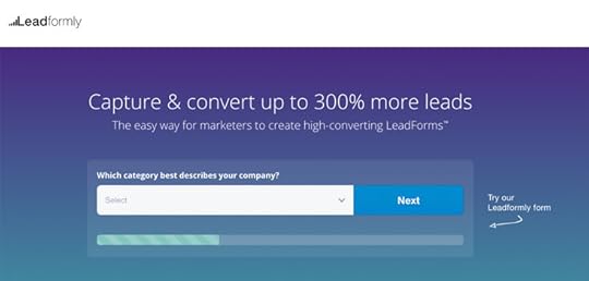
UX research: Multi-step forms can increase conversion by up to 300%
We’ve been testing multi-step forms for the last five years and the results have been pretty conclusive. There’s still something of a science to designing multi-step forms that convert (which is why we came up with Leadformly) but there are two key lessons we’ve learned over the last half decade.
First, longer forms tend to perform better for the conversions that matter most. And, secondly, multi-step forms convert better still by solving the typical UX issues longer web forms can bring.
#7: Test your additional lead gen tactics

UX research: Interruptions are bad for UX, not necessarily conversions
Whether you’re using popups, live chat widgets or any other kind of additional lead generation tactics on your homepage, always test them out. Sure, you might be increasing subscriptions but are you kissing goodbye to potential customers in the process?
Popups (and your other lead gen strategies) might work on parts of your site, but the homepage won’t necessarily be one of them.
#8: Social proof options

UX research: 63% of consumers indicate they are more likely to purchase from a site if it has product ratings and reviews
Social proof is a tried and tested method of installing trust in users. You have customer reviews, testimonials, customer badges, case studies, awards and many other kinds of social proof to choose from.
You probably don’t want to use them all. But you do want to test out different options to see which combination has the biggest impact.
#9: Final call-to-action

UX research: This CTA at the bottom of the page got 3x more conversions
Don’t let users reach the bottom of your homepage without a final call-to-action. If they make it this far, they clearly haven’t found what they’re looking for. Which means, unless you come up with one final offer that peaks their interest, the exit door is likely their next destination.
Once again, test the message and the copy rather than button colours and font styles. Try to pinpoint what offer will keep these users involved with your brand.
#10: Footer content

UX research: “The footer of your page is important! Users do pay quite a bit of attention to that area of your page.“
Aside from web forms, footers have got to be one of the most overlooked elements on a website. Again, this isn’t specific to your homepage only but it does bring an end to the user experience on your homepage for many users.
Don’t simply chuck a bunch of links and contact details in your footer. Be more strategic about things and test different variations.
Ask yourself what you expect users to do when they make it as far as the footer on your homepage.
#11: Light-weight vs fully-featured

UX research: “No matter what, faster is better and less is more“
Google tells us pages should load in no more than 2-3 seconds – and even that’s pushing it from a bounce rate and conversion point of view.
The problem is, every image, animation, third-party plugin, embedded code and other resource adds bulk to your loading times. So test a version of your site without these against one with them. If those animations are losing more leads than they’re generating, lose them.
#12: Identify distractions and conversion killers

UX research: In the ResearchXL model, distraction falls under the heuristic analysis category
Distraction is a conversion killer and you want to remove every instance of it possible. The problem with distractions is you can’t measure them; they’re heuristic. Which means you’ll need to interpret your analytics data effectively to identify potential distractions and then test them, before removing anything.
The last thing you want to do is remove something you assume is distracting that actually contributes to conversions.
Test the things that really matter
A/B testing is no joke. It takes time and effort to get conclusive results from your tests, which only makes it more important that you choose the right elements to test. Changing a font style probably isn’t going to drastically improve the UX of your homepage or increase conversions. So focus on the areas that really make an impact on the experience visitors have and the actions they take.
The post 12 Homepage A/B Test Ideas Backed by UX Research appeared first on Venture Harbour.
September 14, 2017
The Bandwagon Effect: 7 Ways to Use It to Boost Your Conversions (with Examples)
Consumers like to think they buy thing through free will. In reality, the vast majority of our buying decisions are influenced by people and things around us. The bandwagon effect is a phenomenon where people subconsciously (or even consciously) mimic the buying choices of other people.
This is one of the many psychological attributes marketers use to influence consumer behaviour – and you can do the same. Here are seven ways to use the bandwagon effect to boost your conversion rates.
#1: Show people using your product/service
The easiest way to trigger the bandwagon effect in potential customers is to literally show them people using your products. From the images on your website to the promotion videos you share on social media, show people enjoying the best of what your brand has to offer.

You could simply use regular models in your content but the big brands can’t resist a good celebrity in their marketing campaigns. While a more modern approach in the digital age is influencer marketing, which may or may not involve celebrities.

Jennifer Tuffen has turned travel into a lifestyle with brands keen to tap into her audience of 2.7 million people who dream of following in her footsteps.
Essentially, you get your product used by an online influencer with a crowd of followers (typically on Instagram) and bask in the mass exposure, knowing your followers will jump on the bandwagon to be like your influencer.
#2: Create your own gold rush
This one works particularly well for B2B and service-orientated brands. Position yourself as an opportunity for people to get their slice of a newly lucrative pie. The perfect example right now is cryptocurrency: literally a digital gold rush for the 21st century.
Now we have investors and cryptocurrency “experts” promising to let us all get in on the action.
An article from Return of Kings apparently revealing how to make money trading cryptocurrency.
Not all gold rushes fit the metaphor so blatantly, though. We’ve seen social media gold rushes in the marketing industry, PPI gold rushes in the legal sector and various property gold rushes over the last century.
#3: Jump on the bandwagon yourself

The new iPhone X sports a dual camera – not because they’re better; because people love a good bandwagon.
We see this one from tech brands all the time. Dual cameras on phones perform worse than single cameras, yet people demand the feature now. 4K TVs are essentially a waste of money because the majority of broadcasts and hardware don’t support resolutions four times bigger than Full HD. Yet people can’t resist buying a TV with those expensive 4K (or even 8K!) stickers.
Sometimes the best way to get people on the bandwagon is to jump on it yourself first.
#4: Use fear to usher people onto the bandwagon
This is a classic tactic used by insurance companies, moneylenders and all kinds of financial firms. Chances are you’ll never be burgled, your house won’t burn down, you’ll get through every holiday without injury and you’ll never be sued. Yet fear makes us pay up for all kinds of insurance policies we’ll probably never need.
Few things burn a hole in our wallets like those terrifying what if? questions.

Even the fear of being a burden on our loved ones has us paying up for funeral plans when we could just as easily put our own money aside to pay for the costs after death.
#5: Use calendar events to your advantage

Black Friday: An event where retailers manage to convince consumers they’re getting a good deal by offering them old stock they can’t sell at discount prices.
Ever wonder why barbeque food sales rocket during the summer (when we actually have one)? Probably not, because you were too busy queuing up in the supermarket and fighting over the last packet of sesame seed buns like everyone else who couldn’t think of a more creative way to spend August Bank Holiday Weekend.
Bandwagon alert!
The same thing goes for that itch to buy new clothes when the fashion seasons switch. Or why people spent more than they’ve got in the buildup to Christmas. It’s the same reason we all by roses and chocolates on Valentine’s Day instead of actually putting some thought into something original for our loved ones.
#6: Showcase your happy customers

This is probably the most obvious (and common) bandwagon effect technique in marketing today. This is where your customer reviews, testimonials, case studies, social shares and every other example of a happy customer will help you boost those conversion rates.That’s probably
bandwagon effect tells users that what made your previous customers happy should make them equally as chuffed with your brand.
#7: Position yourself as an anti-bandwagon brand

Airbnb: Book “unique” travel experiences by doing the same things as everyone else.
This last one is perhaps my favourite use of the bandwagon effect. Not only does it bring out the sheep in consumers, it combines some classic reverse psychology to capture people who hate the idea of jumping on any kind of bandwagon.
In the days of social media turning us into narcissistic maniacs, we like to think we’re unique. Special, even. We have people like hipsters who pride themselves on being different when they do exactly the same thing as every other hipster. These are the bandwagon haters who queue up more eagerly than anyone jump on a bandwagon – as long as it’s made out of recycled material.
Build your own bandwagons
No matter how unique consumers like to think they are, we all fall for the bandwagon effect – more often than we’d probably like to admit. Each example in this article is widely used by brands across a range of industries and it’s one of the most influential marketing strategies still used today.
So get out there and build your own bandwagons!
The post The Bandwagon Effect: 7 Ways to Use It to Boost Your Conversions (with Examples) appeared first on Venture Harbour.
September 13, 2017
15 Landing Page Form Best Practices & Examples
A good landing page has two jobs. First, it should inspire visitors to convert on the spot. And, failing that, it needs to generate some kind of secondary lead you can nurture further along the buying process.
When a landing page does none of the above, it has failed to do its job.
Sadly, one of the biggest barriers to conversions on landing pages is those pesky forms. Master the art of landing page form design and you’ll see an instant uplift in conversions. And, to help you make this happen, we’ve got 15 landinage page form best practices and examples to learn from today.
#1: Multi-step forms outperform single-step forms
We see multi-step forms outperform single-step versions time and again. We’ve tested this across various industries and forms for different conversion types. The numbers tell us that people find multi-step forms less intimidation, which increases the number of users who start filling them out and the number of those who complete them.
We’re not the only ones who have seen this kind of results. The UK Government’s Digital Service (among others) has also found multi-step forms provide the best experience and highest conversion rates. And, after seeing similar results in the vast majority of our own tests, we figured it was time to build a platform that makes multi-step form design straightforward.
This is where the concept for Leadformly came from.
#2: Short forms for secondary conversions
As a general rule, you should stick to short forms for secondary conversions. Basic actions like email signups, general enquiries and searches want to be as quick and easy as possible for users.

In the example above, you can see ActiveCampaign sticks to a two-field form design for its free trial CTA. Users are then taken straight to the dashboard to get started with their free trial – no messing around.

#3: Longer forms for primary conversions
Once users are more committed to your offer, they’ll be willing to work harder for conversions. In fact, they’ll often expect and want to provide more information on your forms.
Bluehost goes for a familiar form design for users who have decided to sign up with a domain name they already own.
For example, ActiveCampaign users understand they’ll have to provide payment details to start using the full version of the tool. Likewise, Holiday goers expect to fill out all the essential info when they reserve something. They want it in their name, fully reserved without any mistakes.
Once again, use multi-step forms to make the process more intuitive and implement a progress bar to show users how they’re getting on.
#4: Hide hero forms behind CTA buttons

Don’t bombard users with a form as soon as they land on your page. Let your primary call-t0-action work its magic uninterrupted and hide your hero forms behind that CTA button.
#5: Use a form analytics tool

The only way to know your landing page forms are performing is with data. With Google Analytics you can see how many people fail to complete your forms but you can’t find out why. So get yourself a dedicated form analytics tool that shows you which fields people are having problems with and what needs fixing.
Leadformly comes with a built-in form analytics tool and you can check out our other favourite form analytics tools for more recommendations.
#6: Redesign before removing important fields
One of the most important principles in form design is to remove every unnecessary field. But what happens when users have problems with a field that provides important data for your lead nurturing process?

In these cases, try to redesign your form before you start pulling out important fields. You may find simply rewording your labels or switching to a multi-step format solves the problem. In the example above, the shorter form actually performed worse than the original version, but tweaking the field labels improved conversions by almost 20%.
#7: Create incentive

The longer your forms are, the more incentive it’ll take for users to complete them. This is where your landing page copy needs to shine and inspire users to take action. No matter how good your form designs may be, zero incentive means users have little reason to start filling them out – let alone complete them.
With landing page forms, the calls to action surrounding them are probably the most important part of this. However, the rest of your landing page copy becomes increasingly important as users scroll further down the page.
For tips on how to create landing page copy, head over to our 101 Landing Page Optimisation Tips article. First, though, it’s time to talk about those calls to action.
#8: CTAs – ‘I want to…’
Our next tip was originally posted in this article by Marcus, but it’s well worth repeating. If you want an easy template to creating CTAs that convert, ask yourself what your audience really wants and finish the sentence “I want to…”.

In the example above, Unbounce has decided its target customers want to build landing pages quickly and increase conversions. From there the landing page copy pretty much writes itself and Unbounce has only tweaked the same message over recent years.
#9: Stick to single column layouts

Single column layouts are important for a number of reasons. Above all, they’re easier for users to quickly interpret and they look less intimidating. Even though neither form design looks appealing, you can see how the first example above is far more user-friendly than the second.
Aside from visual layout, single column designs are much easier to make mobile-friendly. Which brings us on to our next point.
#10: Design for mobile first
There’s far more to designing forms for mobile than making them responsive (although this is a good place to start).
First, use the correct HTML5 markup so user keyboards popup in the correct format for typing phone numbers, email addresses and other input types. Also, make the most of mobile features like cameras, geolocation and touch screens.

For example, asking users to take a photo of their card rather than type their details out can drastically reduce friction.
#11: Use contrast to full effect
Something most form designs fail to do is make the most of contrast. Aside from helping users to navigate their way through a form, good use of contrast can reduce potential distractions from other elements on the page.

The bold blue and white design of Salesforce’s free trial signup isn’t the prettiest form you’ll ever see, but it doesn’t let anything else hog the limelight.
Contrast is also another important factor in optimising forms for mobile. Remember people could be outside or in brightly lit places that make low-contrast designs almost impossible to use.
#12: Reduce typing

One of the most important factors in form optimisation is reducing the need for users to type. Image buttons, sliders and other touch elements make the form filling out process much easier for users – especially for those on mobile, once again.
Avoid asking people to retype their passwords, email addresses or other information. Also, enable browser auto-fill so users don;t need to retype the same old information out every time they use a form.
#13: Go easy on the validation
Form validation is a tricky thing. It’s great to have it if it helps users fill out your forms correctly the first time; not so great if it makes it harder to submit than necessary.
First of all, you will need to use validation to prevent server attacks and malicious code. You can do all that in the background, though, far out of users’ sight.

If you use validation to help users submit forms successfully, make sure it’s inline and provides feedback as they type. Also, don’t make it too strict so that typing +44 instead of 0 for phone numbers causes problems.
Remember, the aim isn’t to prevent form submissions; it’s to help users complete them successfully the first time around.
#14: Forget CAPTCHAs, there are better approaches
One thing I hate to see still being used as spam prevention is CAPTCHAs. It’s not your users’ fault if you can’t come up with a better system for preventing spam – so don’t punish them with these horrible things.

Like I say, you can use validation behind the scenes to rule out spam. A common trick is the use hidden fields that spam bots will fill out (but users won’t) and then block submission with your hidden field completed.
Not a CAPTCHA in sight.
#15: Know where to send users next

One of the most common form design mistakes I see is a lack of thought regarding where to send users next. It’s fine if your form uses AJAX to popup and disappear after submission but do you really want users to stay on the same page?
If you do, that’s great – job done.
Otherwise, you’ll want to be a bit more strategic about where you send them next. Do you need users to confirm their account signup, get started with their free demo or try to move them on to the next conversion as soon as possible?
Choose wisely and maintain a good user experience.
Build better forms today
If you want to increase conversions from your own landing pages forms, check out some Leadformly templates. They’re built from the ground up using form best practices and user testing results. Otherwise, you can check out another article of ours offering even more form design best practices and UX tips.
The post 15 Landing Page Form Best Practices & Examples appeared first on Venture Harbour.
September 8, 2017
The Confirmation Bias: 7 Ways to Use It to Boost Your Conversions (with Examples)
Confirmation bias is a psychological habit where we interpret and remember information in a way that confirms our existing ideas and beliefs. Essentially, we’re geared to favour information that tells us we’re correct and shun information to the contrary.
The term was first coined by English psychologist Peter Wason in 1960, but marketers are still using this phenomenon to drive sales today.
To help illustrate how confirmation bias can boost your conversion rates, we’ve got seven working examples for you.
#1: Reinforce your brand image

The entire notion of confirmation bias is that people already have ideas in their head – and they’re difficult to change. Which means, if you have a strong brand image that people associate with, you simply need to “confirm” this with them when they land on your page.
In the case of Apple, consumers associate it with the highest premium tech gear. By maintaining this idea that “Anything you can do, you can do better” with Apple products is an incredibly simple, yet powerful use of confirmation bias.
#2: Use stereotypes and cliches to your advantage

We all know German cars are reliable, Japanese cameras are the finest and Columbian coffee is the stuff of kings. Except none of those stereotypes or cliches are any more true than the other lies we tell ourselves on a daily basis.
The good news is you can use these preconceived ideas to your advantage, thanks to cognitive bias. When a German car manufacturer tells people their cars are reliable, few of them will question it. And people looking for the most reliable car on the market will be drawn to German automobiles regardless of how many reliable manufacturers there are out there.
#3: Show customers their money is safe

When consumers pay for something, they want to know their money is in good hands. So they’re looking out for reinforcements that tell them they can trust you as a brand. This is why customer reviews, testimonials, money-back guarantees and lists of your best clients can have such a drastic impact on conversions.
With confirmation bias at work, consumers think “if it works for them, then it’ll work for me” and they’re less protective over their money.
#4: Become your target audience
Ever wonder why some people identify so strongly with some brands more than others? It’s because they associate a part of themselves or the person they aspire to be with said brand. If you’ve ever felt yourself saying “This is the company for me!”, there’s every chance your own cognitive bias has been triggered.
Images are incredibly powerful here, literally showing users the kind of person they’ll be with your brand.
Notice the different approaches of Ultra Light Outdoor Gear and Cotswold – two of the UK’s leading outdoor clothing and equipment retailers.

ULOG goes for images that show people making porridge in the wilderness, sleeping outside and mountain climbers in mid-swing. These are real adventure seekers (or people who see themselves/aspire to be) that the brand is targeting.

Meanwhile, Costwold goes for images that look more like a rugged fashion brand. there’s far more emphasis on look and style than pitched tents and outdoor stoves, even though it sells many of the same product categories as ULOG.
By mirroring your target audience and the person they consider themselves or aspire to be, you’ll confirm that you’re the brand for them.
#5: Know your audience’s pain points

When people have a problem they want to believe there’s a solution out there for them. This is where the concept of pain points comes from in marketing. Know what bugs your target audience the most and position yourself as the solution.
This works in two stages. First confirmation bias tells users that, yes, they do in fact have the problem you’re talking about. And, more importantly, it confirms the news they’re hoping for: that there is a solution and you can provide it.
#6: Retain your existing customers
One of the most important uses of confirmation bias is retaining customers and turning them into repeat buyers. When someone buys a product, the first thing they want to do is rationalise their purchase. They want to justify their buying choice and this is especially true for the more expensive or significant purchases.
Which means you need to eradicate the risk of buyer remorse that could result in cancelled orders or unhappy customers. The good news is confirmation bias makes it pretty easy to convince your customers that they made the right choice.
Product/service quality is the first thing you need to establish, which includes a solid customer service system to help ease any issues they might have. You can sweeten the deal further with freebies, add-ons, vouchers and other rewards for their initial purchase. Help them get the best out of your product/service with free guides and tools – eg: free Photoshop plugins for creatives.

Once your customers are fully happy with their initial buying choice, it’s time to turn them into repeat buyers and brand advocates. Call them loyal customers, set milestones and rewards for using your product or service. MailChimp’s famous high five micro-interaction gives users a subtle sense of satisfaction for sending a campaign live. These small touches make a blog difference across the entire platform.
#7: Avoid the confirmation bias trap yourself
A challenge we all face as marketers is keeping ourselves free of confirmation bias. This is particularly true with conversion optimisation where we make changes and run tests with preconceived ideas. Data can quickly start telling us what we want it to tell us and minor test results are easily exaggerated.
The danger is we could end up choosing a test result that isn’t as positive as we like to think or potentially ignore a variation that actually increases conversions.
Remember, we’re all geared towards confirmation bias influencing our choices. Learn how to use it to your advantage with your marketing messages, but also how to stop yourself from getting suckered into it as well.
The power of confirmation bias
The truth is we’re suckers for believing what we want to believe. As marketers, it’s much easier for us to roll with people’s preconceived ideas than try to change them and this is the entire premise of using confirmation bias in marketing.
It’s an incredibly powerful psychological characteristic we all share. But we have to remember we’re just as susceptible as our target clients – especially when it comes to data and conversion optimisation.
The post The Confirmation Bias: 7 Ways to Use It to Boost Your Conversions (with Examples) appeared first on Venture Harbour.
September 1, 2017
The Halo Effect: 7 Ways to Use It to Boost Your Conversions (with Examples)
The halo effect is a classic psychological phenomenon that’s been used by marketers for almost a century. It’s the reason a young, handsome person is convicted of a violent crime or a casually-dressed lady turns out to be a millionaire.
It’s the same reason first impressions are so important in job interviews.
The halo effect is a cognitive bias where our mind takes one point (or a select few) and bases an opinion about an entire person, brand or organisation. From a marketing perspective, this can be a very good or bad thing, depending on the opinion people form about your brand.
#1: Page design & loading times
First impressions count for a lot and the first two things people notice about your website are design and loading times – even if they don’t realise it. In fact, if your design and loading times are good enough, they shouldn’t consciously notice them.
Ask yourself what kind of impression you want users to have when they land on your site. Are you supposed to be a professional brand, a luxury retailer or something a little more tongue in cheek? Your design needs to reflect your brand image and the expectations your target audience have of you.
Also aim for pages that load within two seconds or you could be making a bad, lasting impression.
#2: Audience research
I’m going to go with travel brands for this example because the best of them absolutely nail audience research. The best travel brands know they’re not selling a service, they’re selling an experience. And they also know they need to match the kind of experience their target audience is looking for.

Traveloregan.com pushes a more active kind of travel experience
You can see how the branding of Traveloregan.com and Hmbalanguera.com defines everything in their design – from copy to images, font choices and colours. Both focus on the experience they’re trying to promote but they’re worlds apart – and both appeal to completely different audiences.

Hmbalanguera.com appeals to holiday makers after a taste of luxury.
People expect very different things from a luxury travel brand and one providing adventure activities.
#3: Play to your brand strengths
In 2014, M&S brought together its food and general merchandise ranges into a unified marketing campaign. The goal was to create a halo effect for the brand’s entire range of products that customers associate with the highest standard of quality.
The British retailer makes no apologies for being pricier than the average high street store. Instead, it focuses on its core brand strength: quality. And, by unifying the two sides of its product lines, it created a single halo effect for the entire brand. Not only did this help M&S create a more consistent message for both sides of the business, it increased the number of customers already invested in one side buying into the other.
The halo effect can be a powerful way to justify something undesirable (high prices) with something more important (premium quality) to your target audience.
#4: Lead with your star product
Another premium brand that nailed the halo effect is Apple. Not only do we associate its high price tags with premium products, we’re happy to cough up the extra dough to get our hands on its devices.
So how did Apple get from a specialist computer manufacturer to the most desirable consumer electronics brand on the planet?
Well, it all started with the iPod – a tiny device that cost a fraction of the price iMacs and MacBooks were going for. Yet Apple marketed the iPod as its leading product, despite the comparatively tame markup on each sale. With the iPod, Apple created a new halo effect that would drive its popularity and innovation into the iPhone manufacturer we know today. Not to mention it increased annual profits by 384 percent in 2005.
#5: Social proof

Active Campaign shows customer stories to highlight the best of its services.
One of the most common halo effect strategies you’ll see on websites is social proof. By including testimonials, users get the impression your services are always to the highest standard. By showing brand logos of your biggest clients, users assume this is the calibre of business you are on a daily basis. And customer reviews set the bar of expectations for prospective leads.
#6: User experience
One of the most important factors in creating a halo effect for any online brand is user experience. Beyond the first impression we talked about in point #1, it’s the user experience you create that builds a lasting impression of your brand. But you need to move beyond the notion of simply designing a good experience and designing the right kind experience.
Booking.com could certainly simplify its user experience, but convenience isn’t the selling point it’s going for. People go to Booking.com for cheap rates on hotel rooms and they’re happy to take extra steps in the process. In fact, these extra steps contribute to the satisfaction element of securing rooms at a discount rate.
Meanwhile, Airbnb has nothing to do with discount rates, instead focusing on the experience of staying with locals. Which is reflected in the community experience it creates, complete with hosts’ user profiles and messaging system.
#7: Build an online presence
People assume brands sitting at the top of Google are bigger and better than the rest. Simple as that. The same thing goes for brands to pay to be seen on Facebook and other social networks. Building a strong online presence not only make you more visible, it makes you perceptively more trustworthy and authoritative.
So be strategic about your approach to search engine optimisation and paid advertising. Aim for the top spots wherever possible and supplement your lower rankings with AdWords ads.
You can boost your efforts further by using seller ratings in AdWords to show customer reviews on your ads. To do this you’ll want to collect as many positive reviews on Google and third-party sites like Trustpilot – all of which spreads your online presence further.

The same thing goes for Facebook and your other networks. Show reviews and rating where you can and be responsive. Show people you’re quick to engage and the halo effect will suggest you’re equally as responsive when it comes to customer services and other important areas.
The power of influence
When designers talk about the importance of loading times and professional design, it’s not a sales pitch. Psychological principles like the halo effect have been used by marketers for decades to make the right kind of impression on consumers. Or, perhaps more importantly, avoid making the wrong kind of impression – because they tend to last longer.
The post The Halo Effect: 7 Ways to Use It to Boost Your Conversions (with Examples) appeared first on Venture Harbour.