
Marcu Taylor's Blog, page 17
May 1, 2018
The Ultimate Guide to Automated Evergreen Webinars
When 73% of B2B marketers say webinars are the most effective way to generate high-quality leads, you know there must be something to it. That stat comes from InsideSales’ Optimal Lead Generation methods report from last year, which provides insights from the world’s top sales and marketing leaders.
Here at Venture Harbour, we’ve enjoyed great success with webinar marketing, too. And, in this guide, we’re going to show you how to do the same with an automated, evergreen webinar strategy that generates high-quality leads around the clock.
Best of all, you only need to set up this strategy once and it’ll keep working in the background while you and your team focus on closing leads.
What is automated evergreen webinar marketing?
First of all, let’s clarify what we mean when we say “automated evergreen webinar marketing”. If you’re not 100% sure what a webinar is, it’s simply a seminar broadcast over the internet which people can sign up to attend (watch) before they begin.
With a webinar marketing strategy, you’re aiming to do a number of things:
Get the highest number signups from people interested in attending your webinar.
Maximise the percentage of signups who actually attend/watch your webinar.
Maximise the percentage of attendees who convert during or after your webinar
Send follow-up messages to signups who don’t attend your webinar
Now, evergreen webinar content should be as fresh and useful for attendees this time next year as it is now, meaning you can record your webinar and keep using it to generate new, highly-qualified leads. Better yet, you can automate the lead generation process so your webinars are picking up attendees, engaging them and converting them without you having to do any additional work.
In other words, an automated evergreen webinar strategy is a one-time investment that keeps generating leads and increasing its own ROI over time.
What are the benefits of automated webinars?
Webinars are a proven lead generation strategy but creating and hosting events on a regular basis isn’t practical for most brands. In fact, even holding a single live webinar can be tricky – not to mention expensive – unless you have all the right resources in place (venue, camera equipment, lighting, etc.).
The more webinars you hold, the more expensive and challenging your strategy becomes.
Unless you record a single webinar, schedule replays that people can watch any time and automate the signup process. This way you turn a single webinar into a lead generation strategy that works 365 days of the year.
As always, there are some downsides to automated webinar strategies, too, so here’s a quick look at the pros and cons.
Pros:
You only pay for/produce each webinar once
A single webinar can be used indefinitely
No need to hold a live event
Fully automated so it keeps generating leads while you concentrate on closing them
All the benefits of webinar marketing at a fraction of the cost
Cons:
Creating truly evergreen content is difficult
You can’t include time-sensitive references
Interactivity is more challenging
The reality is, no piece of content is truly evergreen because things always change. What’s relevant in your industry today might not be in ten years’ time. More importantly, the demands of your target audience are going to change and you could even be targeting an entirely different audience five years from now.
For the purposes of an automated evergreen webinar strategy, though, you need to create content that’s still going to excite your target audience and provide value for as long as possible – be it a year, five years or a decade.
One thing you need to avoid is time-sensitive references that could hurt the relevance of your webinar. For example, talking about the World Cup in Russia this summer is going to be irrelevant as soon as the competition finishes in July 2018. Likewise, referencing something that happened “last year” is going to cause the same problem when someone watches your webinar in a years’ time. Mentioning historical events like WWII won’t be an issue but be mindful of references that become less relevant as time passes.
Finally, there’s the challenge of making recorded webinars interactive and this is something we’ll address later in this guide.
An example of automated webinar marketing in action
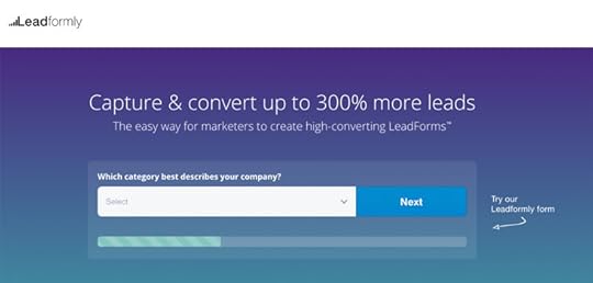
If you want to see an automated evergreen webinar strategy in action, all you need to do is look at this lead capture page by Leadformly. When users visit the Leadformly website, here’s one of the calls to action they’ll see:

Once they click on on the CTA button, they’ll be taken to the signup page, which looks like this:

As you can see, there’s a headline with a compelling proposition, a CTA button and logos of some of the world’s leading brands to whose marketers have attended this webinar. Then you have that countdown at the top, creating a sense of urgency and compelling people to sign up now so they don’t miss out.
Here’s the thing, though: this webinar is prerecorded and playing on loop every 60 minutes, meaning there’s nothing to miss. People can watch this webinar any time they want and if they miss the scheduled viewing they sign up for, lEadformly simply reaches out to them, asking them to watch another screening.
All of this is automated, meaning leads are coming in from highly-qualified visitors without Leadformly’s marketing or sales teams needing to do anything.
How we achieved a 75.62% webinar attendance rate with automation
Last year, we published an article looking at how we achieved to get a 75.62% webinar attendance rate, more than double the average for marketing webinars.

ON24 2017 Webinar Benchmarks Report
So how did we pull this off? You guessed it: with an automated evergreen webinar strategy that continues to generate and close leads all by itself. If you want to read the full case study, you can do so by clicking this link but I’m going to summarise the main points now.
#1: We chose the right webinar automation tool

To run an automated webinar strategy you’re going to need the right tool and we chose Everwebinar, which allowed us to go from manually scheduling three webinars per week to running them constantly, automatically.
#2: We used Just-In-Time Webinars to boost attendance by more than 100%
One of the best features Everwebinar has to offer – and a key reason we decided to use it – is Just-In-Time Webinars. This means you can let users watch your webinar on-demand, at a time that suits them. They can literally click- through and attend your webinar almost instantly instead of having to wait days or weeks, by which time most of your signups won’t attend.
Using this feature alone, we boosted attendance rate by more than 100%, from 20.56% to 42.46% – already above the industry average for marketing webinars.
#3: We created a sense of urgency

You’ll year this phrase used in all sorts of marketing blogs and here’s proof it actually works. By adding a countdown timer to the signup page, users are encouraged to reserve that seat now, rather than miss the webinar or have to wait for the next one to start.
#4: We chased up lost leads
Finally, we created an audience segment of people who signed up to watch our webinar but didn’t attend. By reaching out to these people, we’re able to remind them why they signed up in the first place and give them the chance to watch another screening.
The results: 75.62% attendance rate in less than a year
By automating our evergreen webinar strategy, we were able to increase attendance rates to 75.62% in less than a year. It was an incredible turnaround, considering we were only achieving 20.56% twelve months previously – more than a 300% increase in highly-qualified leads from a single webinar.
Not only were people watching our webinars in greater numbers, they were watching it in full, thanks to the on-demand environment we created. Better yet, 33% of attendees are now coming back to watch our webinar a second time and they can do so whenever they want.
Create your own automated evergreen webinar strategy
Don’t take our word for what automated evergreen webinar marketing can do for your brand. Create your own strategy that generates qualified leads for your business and cut out 90% of the workload normally involved with running live webinars.
The post The Ultimate Guide to Automated Evergreen Webinars appeared first on Venture Harbour.


April 10, 2018
5 Top Tools To Systemise Your Sales & Marketing
In many ways, marketing automation is the only trend that matters in the industry this year. After years of talking about big data, personalisation and cross-channel marketing, automation is finally making all of these things possible and the best part is it makes them accessible to businesses of all sizes.
Thanks to automation, big data doesn’t require the programming experts or data scientists it once did and even the smallest brands can now turn large amounts data into more effective business decisions.
If you’re not already automating as much of your sales and marketing workflows as possible, you’re probably not maximising results. And, with this in mind, here are five top tools that to systemise your sales and marketing strategies.
#1: ActiveCampaign

ActiveCampaign is a leading email marketing and automation platform that streamlines your sales and lead nurturing processes. Here’s a quick look at some of the features on offer to give you an idea of what ActiveCampaign can do:
Email marketing
Email templates
Drag-and-drop builder
Email segmentation
Subscription forms
Dynamic content
Split testing
Marketing automation
Site and Event Tracking
Lead & Contact Scoring
Automation Goals
Attribution
SMS Marketing
Site Messaging
Split Action
Sales and CRM
Sales Automation
Contact Management
Contact and Lead Scoring
Gmail Extension
How ApproveMe generates 1,600% more profit by using ActiveCampaign
Features are one thing but actually using them to transform your marketing results is something else entirely – so let’s look at how ApproveMe.com uses ActiveCampaign to boost its profits by 1,600%.
That may sound like a made-up number but it comes from ApproveMe itself and you can read the company’s case study on the ActiveCampaign website.
Before launching, ApproveMe built and optimised a website asking people to sign up and test a pre-release version of its product. This gave the company a chance to tests and improve its product before fully releasing it but it also helped build the company’s first email list which it could use to convert testers into buyers.

Source: ActiveCampaign
Using ActiveCampaign, ApproveMe was able to build a list of more than 1,000 testers and potential customers before it had even launched (not to mention getting invaluable feedback on how to improve its product). As soon as someone signs up to test the demo, ApproveMe’s automated workflow begins and guides users through the sales process, ultimately asking them to buy in to the product for real.
Using ActiveCampaign’s site tracking feature, ApproveMe can see what users are getting up to on its website and send custom messages based on their actions.

Each user action identified by ApproveMe triggers one of four different email responses, calling on them to take the next step. All of this happens in the background without ApproveMe’s marketing or sales teams doing anything. For example, when ActiveCampaign detects that a contact has visited ApproveMe’s website twice within a short time frame, it sends out a message asking them if they have any questions about the product.
Instead of starting out with zero leads on launch day, ApproveMe was proactive in building an audience with purchase potential before its product even went live. With ActiveCampaign powering its marketing smarts, the company says it was able to boost profits by 1,600% and gain invaluable customer insights at the same time.
#2: HubSpot

HubSpot is one of the leading names in marketing and sales automation. It offers three separates software packages: a free CRM as well as its Marketing Hub and Sales Hub. You can use each product independently or combine them to create a full suite of marketing, sales and CRM tools.
How I-Vitae increased leads by 43x in four months with HubSpot
I-Vitae provides diagnostic testing for women with unexplained infertility, hoping to find out potential causes and give them a chance to conceive naturally. When the company changed its business model from B2B to B2C, it needed to reach an entirely different target audience quickly and it turned to HubSpot to help make it happen.
In four months, I-Vitae was able to increase leads by 43x, email open rates to 62% and boost blog engagement by 300%. More importantly, 9% of all visitors to I-Vitae’s website now convert into fully qualified leads.
You can read the full case study over at HubSpot but let’s summarise how the Italian startup pulled it off.
First, the company put its entire site on the Hubspot CMS and set up a complete conversion funnel for its new B2C target audience. Next, it ran A/B tests on the call to action on its homepage and different sales funnels to choose the most effective conversion process for its customers.
“We use Smart Calls-to-Action and Smart Forms to customise the user experience throughout the site, and we A/B test to see what is working best. We then organise prospects into Smart Lists and nurture them through the marketing pipeline with Workflows.” – Alessandro Scozzesi, Co-Founder and CEO of I-Vitae
With HubSpot CRM, I-Vitae builds a contact profile for each lead, allowing its sales team to reach out via Sales Hub with targeted messages and interactions, encouraging prospects to take the next step along the sales funnel.
#3: Leadformly & Bidsketch

Leadformly is a multi-step form design and optimisation tool that helps you increase leads and conversion rates on your website. Meanwhile, Bidsketch allows you to automate proposals and bids for new prospective clients. Both of these are great platforms in their own right but they become an automation powertool when you implement them both together.

As we mentioned in a recent article looking at how to automate quotes and proposals, you can use webhooks to sync your Leadformly leads with Bidsketch and send out customised proposals to different types of customer, based on how they interact with your forms.

Using Leadformly’s conditional logic features, you can segment leads while they’re completing your form and build an accurate picture of what they need from you. From here you can create targeted proposals for each type of lead your forms are going to generate and Bidsketch will automatically send them out to the relevant lead without you needing to do anything.
This saves you manually drafting proposals for every lead, segmenting your contact lists from scratch and wasting time with leads that don’t materialise. You can also integrate this system with CMR platforms like Salesforce and Infusionsoft to automate follow-up interactions and the rest of your lead nurturing strategy.
#4: Infusionsoft

Infusionsoft is a complete sales and marketing automation system for businesses of all size. Platforms like this tend to be associated with digital and online brands but Infusionsoft has helped thousands of “offline” businesses grow in an age where every company need to take control of their digital presence.
When Cleancorp first started out in Australia in 1995, digital marketing as we know barely even existed but the company adapted and capitalised on the web revolution. It wasn’t easy, though. In fact, after initial success, Cleancorp ran into problems with the sales and admin side of the business. In terms of the service it was providing, there were no complaints but scaling the business in a manageable way was proving incredibly difficult.
How Cleancorp boosted revenue by 275% with Infusionsoft
In 2007, Cleancorp turned to Infusionsoft and within 18 months the company had expanded nationally. Dramatic growth boosted revenue by 275% and increased the company’s customer lifetime value by 145% turning Cleancrop into a multimillion-dollar brand.
So how did it do this?
Today, Cleancorp uses Infusionsoft to implement a personalized, automated sales and marketing strategy. They segment prospects by the type of cleaning they want and number of services needed per week, and create highly targeted, location-specific messaging to speak to their needs. – Infusionsoft
With Infusionsoft, Cleancorp has been able to create a personal experience that starts online and works its way through to the offline experience of enjoying its services. Customers are greeted with personalised greeting emails introducing them to the leaning professional who will serve their business and the company’s support team has all the info they need to hand when a customer calls with a query.
Founders Lisa and Hamish Macqueen say Infusionsoft has reduced their working week from 50 hours to 32 hours while boosting their revenue by275% at the same time.
#5: Blueshift

Blueshift is a cross-channel marketing platform that uses artificial intelligence to help you understand leads more effectively and convert the into customers. Blueshift builds consumer journeys across each of your marketing channels, based on data collected from your existing leads and customers, allowing you to apply these insights to new leads.
It also automates audience segmentation based on their real-time behaviour, allowing you to send tailored messages to people as their position along the consumer journey changes via email, push notifications and SMS.
How Vouchercloud increase revenue by 81% in 6 months with Blueshift
Vouchercloud is the UK’s biggest money-saving app and the company was able to boost its revenue by another 81% within six months of using Blueshift. Vouchercloud used Blueshift to deliver more than 1 billion personalised messages, triggered by user behaviour across multiple channels.
The online brand focused its efforts on five key areas:
Segment and target customers: Segmenting and targeting users based on user actions – eg: favouriting a retailer or redeeming an app offer at a specific location.
Personalisation: Personalising messages based on user behaviour to address their needs as they change.
Unify data from multiple platforms: Create single user profiles as users move between the Vouchercloud website, mobile app and other channels.
Manage leads in one place: Blueshift allows Voucherclouds small marketing team to manage all leads from a single platform.
Manage large campaigns: Events like Black Friday and Christmas can be demanding but Blueshift makes it possible for Vouchercloud’s team to manage campaigns for the biggest calendar events.
This strategy boosted open rates for Vouchercloud’s messages to 40% – more than 3x the previous rate for batch communications and boosted revenue by 81% in six months. All of which happened with a relatively simple automation strategy that works in the background while Vouchercloud concentrates on building a bigger brand.
Go forth and automate
The biggest differentiator between brands over the next few years is going to be their ability to automate as many tasks as possible to free up resources for those that can’t be handled by algorithms. As for the losers, these will be the companies, marketing divisions and sales teams that are slow to adopt automation and waste time on inefficient workflows.
Make sure you’re not the latter.
The post 5 Top Tools To Systemise Your Sales & Marketing appeared first on Venture Harbour.
March 24, 2018
Growth on Autopilot: A Healthier Alternative to the Old Way of Business
Can you leave your business alone for a year and come back to find it bigger and more successful than when you left it?
I was sat in a cafe on St Kilda beach in Melbourne, where I lived at the time, when I read this question. It immediately prompted an uncomfortable truth – my consulting ‘business’ would collapse if I left it alone for one month let alone a year.

After returning back to the UK, I re-designed Venture Harbour to not just run on autopilot but grow on autopilot (more on that later). I stopped consulting and instead built SaaS tools & products that would generate passive revenue.
Why put business on autopilot?
When you automate something, it generates consistent results.
When you automate something, you trade a one-off time investment for infinitely recurring results, creating less work in the long-run and leveraging your time.
This combination of predictability and leveraged time ultimately means less stress, more calm, better results, more free time, faster growth, more profit, and… well, just a deeper sense of bliss knowing that your business can support you doing all the things you want.
For me, I always dreamt of off-grid travel, like husky sledding, while having a business running in the background. Everyone has their different motivations, but ultimately I think we all share one thing in common – we want freedom and flexibility. Putting your business on autopilot is the means to that end.
The Goal is Growth on Autopilot
Before you can grow on autopilot, you must first build a business that can survive (i.e. generate a profit and positive cash flow) and then thrive.
I like to think of the evolution of a well-systemised business in four stages:

The goal here is Growth on Autopilot, which I define as being the point at which you can leave your business alone for a year and come back to find it bigger and better than when you left it.
Run on Autopilot, on the other hand, is the point at which you can leave your business alone for a year and find it more or less where you left it. In other words, your sales engine has consistently generated X sales per month and the product/service is being delivered without your involvement.
The gap between these two steps is not small. Growth on Autopilot requires you to have automated or delegated virtually all aspects of business operations (finance, HR, sales, admin, product delivery, customer support) in addition to having built a marketing engine that is constantly identifying, prioritising and executing marketing strategies to grow the business without you.
That said, getting your business to run on autopilot shouldn’t even be attempted if you haven’t yet built a business that can survive and thrive.
The dangers of automating early
Automation is a force multiplier. Automating a lousy unprofitable business often just magnifies the lousiness. Automating a highly efficient business magnifies the efficiency.
When we launch a new venture at Venture Harbour, we deliberately spend the first year or so in a scrappy/agile state with very few systems. I recommend this approach as it’s important to have as little rigidity early on while you’re still figuring out what works.
Achieving Growth on Autopilot
Below are three of the most helpful strategies I’ve come across in getting Venture Harbour and its ventures to reach Growth on Autopilot.
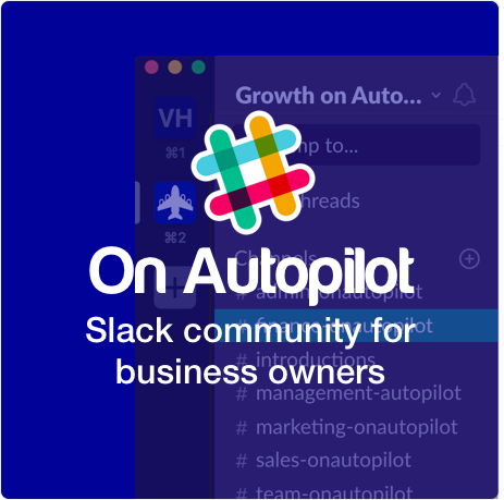
If you’d like more practical ideas, I run an invite-only Slack community called On Autopilot, which is full of high-functioning business owners sharing their processes for putting their business (and life) on autopilot. If you run a business and would like to join, you can apply here. You can put my name (Marcus Taylor) as your introducer.
1. Eliminate, automate, delegate
Before you search for ways to automate your business, eliminate the unnecessary.
Do you really need an office, or could you work remotely? Do you really need a company Whatsapp, landline phone, Skype, GoToMeeting, and Slack – or could you just have all your communication in one place?
Elimination should be the first step in improving your business’ efficiency as, frankly, most things we do as businesses are just not that effective in the first place.
Before delegating tasks to staff or a VA, automate as much as possible. Automation is more cost-effective and consistent than delegation over the long-run. It does, however, lack creativity. Some tasks, such as creating design briefs or defining your marketing strategy, are often best delegated rather than automated.
Eliminate. Automate. Delegate. In that order.
2. How much is your time worth?
All business owners spend some time working on tasks worth less than £10/hour. We also spend some time working on tasks likely worth upwards of £5,000/hour.
Here’s an exercise I recommend doing:
Take a page in your journal or fire up Evernote/Google Docs
Draw four columns and label them £10/hr, £50/hr, £500/hr, and £5,000+/hr
List every tasks you did in the past two weeks in the column that it would cost to delegate / or the amount of value it has on your business
Here’s an example of one I did last summer (I finally delegated picking up milk for the office after doing this exercise!)

Everything in the first two columns should go on your to-delegate list (explained in a moment). The more time you’re spending on tasks on the right, the more value you’re adding to your company and the faster you’ll grow.
3. Have a to-delegate list
To-do lists are great, but I prefer my to-delegate list.
Rome wasn’t built in a day and neither are great businesses. There are probably many aspects of your business that you have no idea how to automate. That’s fine – it was (and still is) the case for me in many aspects of my business.
So what’s a to-delegate list? It’s a one-page document listing all of the tasks and responsibilities you do as a business owner. Next to each task is a date by which you’ll delegate that responsibility to someone else.
Your to-delegate list takes the pressure off having to automate/delegate everything now. It helps you acknowledge what you need to systemise, and then gives you the time to explore ideas, while making a commitment that you will have found the answer by a given date.

Finally, you’re not alone
When I pivoted Venture Harbour to a more automated business model, I really struggled to find a network of business owners tackling similar challenges.
Putting a business on autopilot is hard. There are technological hurdles, strategic hurdles, and enormous psychological hurdles to overcome. But the stakes are massive – if you can untether yourself from the growth of the business you can achieve so many incredible things.
If you’re facing similar challenges in your business and want to learn and be inspired by a group of like-minded business owners who’re going through or have been through the same thing, the On Autopilot community is a great place to start.
I look forward to seeing you in there :)
PS – A few months ago, I finally went off-grid to mush huskies through the arctic wilderness. Coincidentally, Venture Harbour had its best month while I was away (or maybe not a coincidence…)!

.wp-caption-text {
font-size: 11px;
color: #999;
margin: 10px 0px 0px 0px;
}
The post Growth on Autopilot: A Healthier Alternative to the Old Way of Business appeared first on Venture Harbour.
March 13, 2018
How to Automate Quotes & Proposals to Capture More Leads
For many B2B businesses, quotes and proposals are an integral part of generating leads. The problem is they can be incredibly time-consuming to create for each prospective client, especially if you’re dealing with a large number of leads on a regular basis.
You want to provide the most detailed quotes and proposals as possible, tailored to the specific requirements of each potential client. But the more you customise, the time you have to invest in each quote/proposal and your workload multiplies.
So what’s the answer?
As with many things in today’s marketing landscape, the sweet spot between efficiency and quality lies in automation – and, in this article, we’re going to show you how to automate quotes and proposals.
Why automate quotes and proposals?
The goal of any automated marketing strategy is to cut out repetitive tasks. With the technology we have available today, repetition means you’re wasting time on tasks that could be automated – time that could be better spent elsewhere. The most basic way to automate quotes and proposals is to use templates, for example, so you’re not creating documents from scratch every time you pitch to a client.
You can take automation much further, though.
With the right tools at your disposal, you can instantly generate quotes and proposals so that you don’t have to do anything at all. You can programmatically set parameters, based on information your prospective clients hand over, to tailor your proposals to their specific needs and automate this entire process. Which means you can have a single automated quote/proposal strategy that generates leads from a dozen different target clients.
Aside from saving time on each proposal, automation makes it easier to filter out the leads that are worth pursuing from those that aren’t – all without wasting any time on creating proposals for projects that aren’t a good fit with your company.
How to automate quotes and proposals
Automation is transforming the marketing industry, cutting out repetitive tasks like proposal drafting, and the range of tools available is getting better every year. There are plenty of software options that can help you automate the proposal/bidding process and two of the most popular choices right now are Bidsketch and Quoteroller.

Bidsketch promises to cut your proposal time in half with a range of templates and reusable content features to help you speed things up. You can also include optional add-on fees in your proposals to boost your profits, automate the next-step process for your prospects and electronic signatures mean you can close the deal instantly.
Quoteroller by PandaDoc is a more comprehensive automation tool that helps businesses close 28% more deals. By combining templates and reusable content blocks, you can create proposals in a matter of minutes with minimal customisation. You can also see how effective your proposals are using PandaDoc analytics to see how long prospective clients spend on each section of your proposal and tweak your templates to improve results.
Both of these tools are great options and they’ll speed up proposal creation to no end. But you can take things even further and automate the entire proposal/bidding process so you don’t have to do anything at all. You simply concentrate on generating those initial leads and let your automated proposal system take care of the rest.
How?
Use Leadformly to create a multi-step for that uses conditional logic to ask users questions about the nature of their project. This allows you to determine what kind of proposal each user needs (eg: web design with a budget of £10,000 vs marketing with an annual budget of £250,000 per year) and what their requirements are.
Next, you use webhooks (code that sends Leadformly data to your proposal software) to send the relevant proposal with all the parameters defined on your multi-step form. Which allows you to create your proposal templates for each type of lead you’re targeting with your form and they’ll automatically be sent out to the relevant user every time.
There’s some development work involved in setting up these webhooks but the end result is an automated proposal/bidding system that closes the deal with clients while you focus on tasks that can’t be automated.
Pretty incredible.
Automated proposals in action
Venture Harbour isn’t the only agency automating proposals and bids. Neil Patel, who also happens to be a big proponent of automation in marketing, uses a similar tactic – both on his personal website and QuickSprout, which he co-founded.
In this case, Neil integrates with Google Analytics to analyse your website and provide feedback on areas where it could be improved. This system promises to improve the performance of business websites and all it does is automate a report based on standard Google Analytics data.

That’s a powerful way to generate leads without actually doing anything, once the initial automation system is up and running. This is the whole point: invest a little time into automating your proposal/bids and let it work its magic while you work on other things.
Another great example is Klientboost, which has a really nice integration of multi-step forms and automated proposals. It all starts with a strong call to action in the hero section on the homepage for its website. There’s also a CTA in the site’s sticky header, which means it’s always in view and Klientboost also uses exit-intent popups to generate as many proposal leads as possible.

Once a user clicks to get their free proposal, they’re taken through a multistep form process which refines the content of the proposal they’ll receive.

It’s an engaging process that tells users their individual needs are being taken into consideration and, crucially, gets all the information Klientboost needs to auto-generate proposals that are relevant and compelling to every prospect.

When it comes to PPC strategies, there are a lot of variables to consider in terms of client needs and this is about as complex as automating bidding will get. However, Kilentboost proves it can be done effectively and it’s clearly working as the brand’s primary lead generation strategy.
So, if Klientboost can automate its PPC proposals, there aren’t many proposals or bids you won’t be able to automate.
Make an impact with automation
The more time you can save with your automated quote/proposal strategy, the more time and effort you have to invest in crucial parts of your business where things can’t be automated. This kind of efficiency is what’s going to drive the best brands forward over the next few decades, where automation changes the resource management game forever. Don’t sit back wait for this to happen. Take automation by the horns and turn your business into a venture that grows by its own momentum while you concentrate on steering it in the right direction.
The post How to Automate Quotes & Proposals to Capture More Leads appeared first on Venture Harbour.
February 18, 2018
7 Best Practices That Can Kill Your Conversion Rate
Best practices can be a wonderful thing, guiding you towards better website designs, marketing strategies and everything you could possibly need to build a better business.
What’s not to love?
The problem is best practices can also kill your conversion rates. A lot of brands, designers and marketers put too much faith in best practices, which is a dangerous path to follow. Here are seven best practices that can kill your conversion rate.
#1: Mobile users are more important
The narrative behind most mobile optimisation best practices is that mobile users are more important. It’s not a sophisticated deduction by means. Most user sessions now happen on mobile, therefore they must be more important.
This is what we call an assumption.

Yes, mobile traffic has boomed since smartphones hit the scene and, yes, it’s important to optimise for mobile users. But it’s a mistake to assume these are the people who are most likely to convert.
There are various reasons conversion rates are higher on desktop and we’re not going to get into this today. Just remember: mobile users aren’t the be-all and end-all of conversion optimisation.
#2: Create content for people, not search engines
I’m a big fan of this best practice and this is the first thing I would tell any new content publisher. Google makes a point of telling this to publishers, marketers and everyone else in the content game as well.
Optimize content for your users, not search engines – Google
Sooner or later, though, our friend the new content publisher is going to realise something doesn’t quite fit. After investing heavily in content production and creating the best stuff in his industry, why isn’t the magic happening?
Every time they type their keywords into Google all they see is naff content from Forbes and all the other usual names.

And, when they click through to see how good this content must be in order to rank #1 in Google, they get this blocking their access:

Clearly, Forbes isn’t creating content with its users in mind or the kind of user experience Google constantly tells us is so important.
Sorry folks, quality content isn’t enough to get you to the top of Google and the highest-ranking publishers constantly prove it’s not even much of a requirement.
#3: More conversions are better – always
This one’s pretty obvious, isn’t it? The whole reason we have marketing strategies like conversion rate optimisation is because more conversions are better – always. Every A/B test you read about is geared towards boosting conversions and their success or failure relies on that single metric increasing.
What about campaigns where you want to decrease conversion, though?
Yes, that’s right. I said decrease conversions. Because sometimes you might want to reduce the percentage of users signing up for your newsletter, for example, because too few of them are turning into paying customers. You might decide it’s more profitable and more manageable to convert a smaller percentage of users – the ones that are most likely to turn into paying customers and forget about the rest.
Sometimes quality is better than quantity.
Want your business to run on autopilot?
Discuss automation strategies with like-minded founders
Join our Slack community
#4: Reduce friction, increase conversions
The worst assumption you can make in conversion rate optimisation is that reducing friction will always have a positive result. Friction isn’t always a bad thing. In fact, you can use it in a number of ways improve user experiences, increase the quality of leads and even boost conversion rates.
A good example would be confirmation emails. Despite adding a number of extra steps in the signup process they serve two important purposes: they tell users their account was successfully set up and they give you the chance to confirm they’re a real person, not a bot.
Likewise, showing users a bunch of related items before they a pay for the items in their basket could result in more sales. Or asking users if they want to save the items in their shopping basket when they try to quit the session could save you a valuable lead.
#5: Short forms are better than longer forms
Closely related to the less friction = more conversions idea, shot forms are widely considered to be better for conversion rates than longer ones. This isn’t always the case, though, as we’ve found in various tests over the years.
We’re not the only ones either.
Former Unbounce conversion optimiser Michael Aagaard came across similar test results during his time with the company.

There are various reasons this can happen. Longer forms can appear more trustworthy for certain types of conversion, for example. While users expect something like an account application for to be longer than a simple login form.

With Leadformly, we use conditional logic to add fields to our interactive forms, creating a more immersive experience for users. This also allows us to segment the leads we generate forms and follow them up with more targeted messages.
#6: Security badges increase buyer confidence
If you’re in the eCommerce business you’ll have heard about the importance of adding security badges to your website. There’s a good chance you’ll have tried them on your homepage and it’s widely recommended you put them on payment pages to help buyers feel more confident when they complete the purchase.

As this study from Get Elastic shows, adding security badges doesn’t always have a positive impact on conversion rates. It turns out reminding people about the potential risks of buying online can actually become more of a deterrent than trying to ease their concerns.
The lesson is to test out different trust factors on your site to check they have the result you’re hoping for. However, this brings us to our last best practice that can kill your conversion rate.
#7: You need to test everything
This is one of the most dangerous best practices in conversion rate optimisation, mostly pushed by CRO experts and companies selling CRO software. Running successful A/B or multivariate tests isn’t only tricky, it’s also time-consuming.
There are only so many tests you can expect to conduct and you want to make sure they have the most significant impact. For example, you want to know which landing page design converts more effectively or which ad generates the most clickthroughs.
Focus your CRO efforts on the things that really impact conversion rates – like page designs, content, CTAs, forms and other crucial deciding factors.
Best practices only get you so far
Best practices are perfectly useful as long as you don’t become over-reliant on them. Sure, treat them as general guidelines but always question how they apply to what you’re designing and how you’re crafting your marketing strategy. If best practices always worked nobody would be using popups on their website or paying for guest post opportunities.
In the real world, best practices don’t always pan out. They may have worked for any number of brands in specific use cases in the past but this doesn’t mean anything when it comes to dealing with your own users.
The post 7 Best Practices That Can Kill Your Conversion Rate appeared first on Venture Harbour.
7 ‘Best Practices’ That Can Kill Your Conversion Rate
Best practices can be a wonderful thing, guiding you towards better website designs, marketing strategies and everything you could possibly need to build a better business.
What’s not to love?
The problem is best practices can also kill your conversion rates. A lot of brands, designers and marketers put too much faith in best practices, which is a dangerous path to follow. Here are seven best practices that can kill your conversion rate.
#1: Mobile users are more important
The narrative behind most mobile optimisation best practices is that mobile users are more important. It’s not a sophisticated deduction by means. Most user sessions now happen on mobile, therefore they must be more important.
This is what we call an assumption.
Yes, mobile traffic has boomed since smartphones hit the scene and, yes, it’s important to optimise for mobile users. But it’s a mistake to assume these are the people who are most likely to convert.
There are various reasons conversion rates are higher on desktop and we’re not going to get into this today. Just remember: mobile users aren’t the be-all and end-all of conversion optimisation.
#2: Create content for people, not search engines
I’m a big fan of this best practice and this is the first thing I would tell any new content publisher. Google makes a point of telling this to publishers, marketers and everyone else in the content game as well.
Optimize content for your users, not search engines – Google
Sooner or later, though, our friend the new content publisher is going to realise something doesn’t quite fit. After investing heavily in content production and creating the best stuff in his industry, why isn’t the magic happening?
Every time they type their keywords into Google all they see is naff content from Forbes and all the other usual names.
And, when they click through to see how good this content must be in order to rank #1 in Google, they get this blocking their access:
Clearly, Forbes isn’t creating content with its users in mind or the kind of user experience Google constantly tells us is so important.
Sorry folks, quality content isn’t enough to get you to the top of Google and the highest-ranking publishers constantly prove it’s not even much of a requirement.
#3: More conversions are better – always
This one’s pretty obvious, isn’t it? The whole reason we have marketing strategies like conversion rate optimisation is because more conversions are better – always. Every A/B test you read about is geared towards boosting conversions and their success or failure relies on that single metric increasing.
What about campaigns where you want to decrease conversion, though?
Yes, that’s right. I said decrease conversions. Because sometimes you might want to reduce the percentage of users signing up for your newsletter, for example, because too few of them are turning into paying customers. You might decide it’s more profitable and more manageable to convert a smaller percentage of users – the ones that are most likely to turn into paying customers and forget about the rest.
Sometimes quality is better than quantity.
#4: Reduce friction, increase conversions
The worst assumption you can make in conversion rate optimisation is that reducing friction will always have a positive result. Friction isn’t always a bad thing. In fact, you can use it in a number of ways improve user experiences, increase the quality of leads and even boost conversion rates.
A good example would be confirmation emails. Despite adding a number of extra steps in the signup process they serve two important purposes: they tell users their account was successfully set up and they give you the chance to confirm they’re a real person, not a bot.
Likewise, showing users a bunch of related items before they a pay for the items in their basket could result in more sales. Or asking users if they want to save the items in their shopping basket when they try to quit the session could save you a valuable lead.
#5: Short forms are better than longer forms
Closely related to the less friction = more conversions idea, shot forms are widely considered to be better for conversion rates than longer ones. This isn’t always the case, though, as we’ve found in various tests over the years.
We’re not the only ones either.
Former Unbounce conversion optimiser Michael Aagaard came across similar test results during his time with the company.
There are various reasons this can happen. Longer forms can appear more trustworthy for certain types of conversion, for example. While users expect something like an account application for to be longer than a simple login form.
With Leadformly, we use conditional logic to add fields to our interactive forms, creating a more immersive experience for users. This also allows us to segment the leads we generate forms and follow them up with more targeted messages.
#6: Security badges increase buyer confidence
If you’re in the eCommerce business you’ll have heard about the importance of adding security badges to your website. There’s a good chance you’ll have tried them on your homepage and it’s widely recommended you put them on payment pages to help buyers feel more confident when they complete the purchase.
As this study from Get Elastic shows, adding security badges doesn’t always have a positive impact on conversion rates. It turns out reminding people about the potential risks of buying online can actually become more of a deterrent than trying to ease their concerns.
The lesson is to test out different trust factors on your site to check they have the result you’re hoping for. However, this brings us to our last best practice that can kill your conversion rate.
#7: You need to test everything
This is one of the most dangerous best practices in conversion rate optimisation, mostly pushed by CRO experts and companies selling CRO software. Running successful A/B or multivariate tests isn’t only tricky, it’s also time-consuming.
There are only so many tests you can expect to conduct and you want to make sure they have the most significant impact. For example, you want to know which landing page design converts more effectively or which ad generates the most clickthroughs.
Focus your CRO efforts on the things that really impact conversion rates – like page designs, content, CTAs, forms and other crucial deciding factors.
Best practices only get you so far
Best practices are perfectly useful as long as you don’t become over-reliant on them. Sure, treat them as general guidelines but always question how they apply to what you’re designing and how you’re crafting your marketing strategy. If best practices always worked nobody would be using popups on their website or paying for guest post opportunities.
In the real world, best practices don’t always pan out. They may have worked for any number of brands in specific use cases in the past but this doesn’t mean anything when it comes to dealing with your own users.
The post 7 ‘Best Practices’ That Can Kill Your Conversion Rate appeared first on Venture Harbour.
February 9, 2018
19+ Examples of Killer CTAs You Should Learn From
Designing calls to action that convert is one of the most important and difficult tasks for marketers and online businesses. There are tonnes of best practices you can follow and guidelines to help you create more compelling CTAs yet the vast majority of brands fall short when it comes to putting these into practice.
Today I’ve got 19 examples of killer CTAs you should learn from. Each example comes with at least one image and an explanation of what makes it such a good call to action. So read on, take notes and get ready to start designing calls to action that convert from the day they go live.
#1: Looker

Analytics is something every department needs in a modern business but it can be daunting for people with no experience of handling data. Looker aims to solve this problem by creating a visual analytics platform that turns data into graphs and sharts anyone can take insights from.
The call to action on its homepage is the first thing you see when the page loads. Small, punchy and convincing, it gets the platform’s value proposition across instantly.
Visually speaking, it’s bold and attention-grabbing with good use of colour, contrast and font size/styles. Also, notice how it presents two CTA buttons with its primary conversion goal highlighted in orange to make it stand out.
#2: Evernote

Evernote takes all of the design cues we mentioned in our first example: bold text, different font styles and a brightly coloured CTA button. Once again, it captures the core value proposition of using Evernote in a punchy headline and a subline.
Pay attention to the CTA button text, which uses the second-person “your” (first vs second term tense is a big CTA button talking point) and one of the most important the power words in copywriting: “free”.

Further down the page, you’ll find another CTA taking most of the same design principles, except it drops the headline-subline format in favour of a single line of bold text and slightly different CTA button text. That power word “free” is there, though.
#3: Kissmetrics

You would hope Kissmetrics would know how to put a decent call to action together but it’s surprising how many players in the marketing industry come up with underwhelming CTAs.
Kissmetrics gets it spot on with this example, though. What business doesn’t want to “get, keep and grow” their customer base?

Kissmetrics seems to like this CTA (hopefully from highly successful testing) so much that it repeats it further down the page, only dropping the subline and throwing in an extra CTA button to give users another option.
#4: Plated

This call to action from Plated is one of my favourite examples of what I call an all-inclusive CTA. I’m talking about a call to action that speaks out to everyone who reads it. I mean, who on this planet doesn’t like food? And, in this busy lifestyle we’re all compelled to live, who on Earth wouldn’t like the time or resources to eat better meals at the end of the day.
#5: Shakr

I’m not normally a fan of animated CTAs because the animation tends to distract attention away from the message itself. In this case, I think Shakr justifies the animated CTA by targeting specific audiences and use cases where it’s the “best video maker”.
#6: Lush

Aside from creating a visually compelling CTA that jumps out from the page, Lush has adapted the man call to action on its homepage for Valentine’s Day. It’s highlighted a crucial time of the year for its brand tailored its cire message to suit.
Christmas isn’t the only calendar event that matters to businesses.

Scroll down the page and you can see Lush has also adapted its content strategy for Valentine’s Day and used it to capture leads at the top of the sales funnel.
#7: Tableau

Tableau is another analytics provider with a difference and it needs to find a way to communicate this difference in a CTA. The brand has identified one of the biggest problems businesses face when it comes to data: turning all those numbers into something that actually has a positive impact on their profit margins.
For anyone who’s tried to unleash the full power of data and failed, this CTA will speak out to them.
#8: Hotjar

Hotjar provides a more niche kind of analytics platform in the shape of heatmapping to help you understand what users are doing on your site. Once again, it can be difficult to know exactly which elements of the page users have/haven’t seen and where they’ve clicked from numbers alone.
Hotjar promises to show you how your visitors are really using your website.
#9: Campaign Monitor

Campaign Monitor does something else I don’t often like to see with a CTA in the hero section of a homepage: the overly-used video background. Aside from being a gimmick, you risk taking attention away from the message in your call to action by taking this approach – so use with caution.
There are always exceptions, though, and I think Campaign Monitor qualifies with this call to action design. With an overlay darkening the video background, there’s just enough contrast for the white text to stand out (only just, mind you) and those double CTA buttons both capture attention as the brightest elements on the page.
#10: Dropbox

Dropbox is one of the earliest and biggest successes of the cloud computing startup boom. This CTA captures the Silicon Valley tone perfectly with talk of creative energy, modern workspaces and focusing on the things that matter.
That magic power word makes another appearance in the Dropbox CTA button as well. Above all, Dropbox gets across its value proposition quickly in language its target audiences resonate with.
#11: Pocket

Pocket is a tool designed for a very specific use case: allowing people to save content and web pages for later. This makes it much easier to create a concise call to action that explains why people should use Pocket. Unlike Dropbox, Pocket decides to spell this out in plain language rather than dress it up in startup lingo.
A different approach but an effective one.
#12: CXL Institute

This CTA from Conversion XL’s CXL Institute isn’t much to look at. In fact, it’s safe to say it’s the ugliest call to action we’ll be looking at in this article but I want you to pay attention to the copy:
“Learn from the top performers to become one”
“Online courses on growth, digital marketing, optimization, analytics, persuasion. Perfect for teams.”
“World’s leading practitioners teaching you their best stuff.”
Almost every word on those three lines promotes CXL Institute as the best place to learn core values Conversion XL’s target audience crave the most. It seems there isn’t a course for attractive web design but I imagine the section in creating a compelling CTA is pretty good.
#13: Bulletproof

Bulletproof opts for a slider of three different CTAs for the hero section of its homepage. I’m not the biggest fan of sliders normally but this one is visually sleek, well balanced and perfectly optimised for mobile.
Again, CTAs are bold and full of contrast while the “Save 10%” button text in the first slide is a great example of compelling copy.
#14: Netflix

Netflix has a habit of creating great CTAs and this one is no exception. “See what’s next” hints at the binge watching tendencies people are so vulnerable to when watching series on Netflix, reinforcing its brand image as something people can’t get enough of, something everyone should try.
Then we have “watch anywhere” in the subline which promotes the mobile aspect of the platform for people who want to watch their favourite shows as soon as a new episode is out, regardless of where they are. While the “cancel anytime” benefit tells people they’ve got nothing to lose by signing up for that incredibly tempting free trial.
#15: Spotify

Spotify is for music listeners what Netflix is for film/TV fans and it also knows how to nail a call to action. It doesn’t even ask desktop users to create an account, allowing them to open up the web player and start listening with one click.

Then we have the mobile CTA which also highlights the free version of Spotify ahead of the paid premium version. Of course, Spotify gets ad revenue from people who use its free version so there’s incentive to keep enough people using the free version of its app.
#16: Codecademy
Codecademy keeps it simple with the CTA in the hero section of its homepage. After all, this is what the brand is all about: making the complex art of programming simple to learn for everyone.
It’s the interactive element of Codecademy that set it apart from the other online resources for learning code when it first hit the scene – and there aren’t many that make interactivity a priority, even now.

Oh yeah, and Codecademy is also free.

At least it was until it launched Codecademy Pro, a paid version of the platform that helps users take their coding skills to the next level – or “the next step for your career” as it puts it in the CTA.
#17: Unbounce

As an industry leading landing page builder, Unbounce can’t really afford to come up with subpar CTAs. And the company has refined its CTAs over the years, mostly focusing on the same selling points: creating high-converting landing pages quickly.
This is still true today and its latest CTA is one of the best examples I’ve seen from Unbounce.
#18: TaxJar

TaxJar absolutely nails its value proposition in this CTA and there’s not much more to say about it. Automating tax calculations, reporting and filings may not be the most glamorous of services but it sounds like a dream come true for just about every business owner.
#19: Usabilla

Usabilla is a platform that makes user testing easier and more insightful for marketers and businesses alike. In other words, it makes optimisation easy and what CTA to wrap up our list of examples. Clean, concise and right to the point, this call to action perfectly sums up the Usabilla selling point just three words (or ten if you include the subline).
What’s the main takeaway from these examples?
The key takeaway from the examples we’ve looked at today is it’s the copywriting in your CTAs that really matters. I’m not saying design isn’t important but the role of design here is to take a back seat and let the message in your CTA copy speak loudest.
Bold colours, font choices, contrast and placement are all vital CTA design choices but they serve to make your call to action jump out of the page and give your copy the best chance of getting its message across.
The real challenge in creating CTAs that convert is coming up with punchy, compelling copy that makes hard for users to scroll past without clicking.
The post 19+ Examples of Killer CTAs You Should Learn From appeared first on Venture Harbour.
February 7, 2018
9 Cognitive Biases That Influence Buyer Decisions
For a number of months now, we’ve been looking at various psychological devices used by marketers to influence buyer decisions – aka cognitive biases. If you’ve been following the entire series, you’ve now got a powerful set of strategies you can apply across your website and other resources to boost conversions and increase sales.
If you haven’t kept up with our entire series, don’t worry – we’ve got you covered. I this article, we’re going to quickly run through all nine of the of cognitive biases we’ve covered in this series and link you to each post offering more detail and examples on how to use them.
You’re welcome.
First, what are cognitive biases?

To answer this question, we’re going to borrow a nicely rounded definition from Chegg Study, suitably filed under its psychology definitions section:
“A cognitive bias is a mistake in reasoning, evaluating, remembering, or other cognitive process, often occurring as a result of holding onto one’s preferences and beliefs regardless of contrary information. Psychologists study cognitive biases as they relate to memory, reasoning, and decision-making.”
Psychologists and experts from various other fields have identified a wide range of cognitive biases and each of them influences our decision making in a different way. By using the psychological tools we’re looking at in this article, you can create more influential marketing messages and have a stronger impact on the buying choices your target audiences make.
#1: Confirmation bias
Confirmation bias is where people seek, interpret and remember information in a way that confirms their existing ideas. Essentially, people hear what they want to hear and no matter how impartial someone thinks they are, they’re going to favour information that supports what they already believe or want to be true.
Let’s say someone has just bought one of your products. They’ve decided to buy from you, handed over their precious cash and they want feel like it was money well spent. This is the post-sale period where customers want to justify their purchase – not only to get their money’s worth but also protect their ego from admitting they make a bad choice.

In other words, they want to confirm they made the right decision and MailChimp uses micro-interaction – like the famous chimp high five – to tell users they’re making things happen by using the platform. Which is precisely what users want to believe and MailChimp needs them to believe if they’re going to keep paying subscription fees.
To learn more about how you can use confirmation bias to enhance your marketing strategy, check out this article.
#2: Loss aversion
Loss aversion describes how we fear loss considerably more than we value gaining something of the same worth. For example, we’re more frustrated by losing £10 than we would be happy to find £10 in a jeans back pocket.

Source: Invespcro.com
The classic loss aversion tactic used by marketers is to give shoppers free coupons. Once you give people a $5-off voucher, they feel like they own that perceived saving. And, if you threaten to take that away, people automatically feel as if they’re losing something that’s rightfully theirs – even though there’s nothing to own.
The same thing happens when a free trial comes to an end. Users feel like they’re about to lose out on something they’ve spent the last month using, which makes it harder to give up. Thanks to loss aversion, you’re far more likely to turn free trials into paid subscriptions than converting users who’ve never used your software before.
Check out these seven examples of how to use loss aversion to boost conversion rates.
#3: Anchoring bias
Anchoring bias is where people place more significance no the first piece of information they receive. For example, the first review someone reads about a product will have more impact upon them than the second or third.
Likewise, the first price people see for a product will set the bar of expectation and you can use this to affect the way people respond to product pricing.

Show the RRP of a product that’s discounted in a sale and people automatically think they’re getting a bargain. Or show off your most expensive products first and the prices of your other products will instantly seem more reasonable than they would have by their own merit.
There are a bunch of other ways you can use anchoring bias to manipulate the way people respond to your pricing – and you can find them right here.
#4: The bandwagon effect
The bandwagon effect helps explain why people queue up for days to buy an iPhone they don’t need. Or why people sign up for pension plans when they could just as easily (and more securely) save that money for themselves. It also explains why the price of Bitcoin has soared and crashed in the space of one year.

It’s all because of the bandwagon effect and this is the same reason brands spend huge amounts of money on celebrity faces to advertise their products.
When a consumer product becomes as fashionable as the iPhone, people buy it purely for the logo. When finance companies tell you every sensible person is paying into their futures, people sign on the dotted line. And when a few people get rich with a new investment opportunity, everyone wants a piece of the action.
As consumers, we’re all sheep and you can find out more about how to capitalise on this by using the bandwagon effect here.
#5: The mere exposure effect
Otherwise known as the familiarity principle, the mere exposure effect explains why people are more likely to buy from brands they know well. This is why it’s much easier for Adidas to sell running shoes than a new manufacturer, regardless of product quality. And this is why brands like Adidas pay big money to sponsor sporting events and manufacture kits for the most popular teams.

The mere exposure effect is a fundamental principle in advertising and you can learn how to use it by reading this article.
#6: The endowment effect
In 1991, a bunch of students were divided into two groups: the first group was given coffee mugs and the second group was given nothing. When the first group of students were asked what they would charge to sell their mugs, they gave a higher price than the second group who were asked how much they would pay to buy the same mug.
This is due to the endowment effect, where people place additional value on items they own.

A great example of this in action is Google giving away free cloud storage to people who buy certain devices. People get their free storage for two years but, once that time has passed, they have to give it up – or pay the usual rate. By this time, users have already assigned two years’ worth of ownership value to the storage, which is hard to give up.
Meanwhile, people who have never used Google Drive storage will value it much lower and be significantly less likely to convert.
For more examples of how to use the endowment effect, check out this blog post.
#7: Sunk cost bias
Sunk cost bias (or sunk cost fallacy) occurs when people invest time or effort into something. In most cases, people don’t want this time and effort to be wasted, which encourages them to persevere with something until their investment is justified.
For example, studies have shown people are more likely to complete a web form if a progress indicator shows they’ve already made it so far. If they give up now, they’ve wasted their time for nothing. Likewise, if users have invested time in setting something up – like playlists on Spotify that can’t be transferred easily – they’re far less likely to stop using a platform.
Check out this article for more examples of how to use sunk cost bias to boost your marketing efforts.
#8: The halo effect
The halo effect is a cognitive bias where our first impressions influence the way we interpret further information about things or people. This is why a great company with a shoddy website will struggle to sell more online than a shoddy company with a great website.
As soon as people land on the page, they make a quick decision about each brand which defines everything else they learn about them.

Traveloregan.com crafts it opening message to a very niche kind of visitor
This is also why it’s so important to nail the first marketing message users see when they discover your brand for the first time. Because this has a huge influence on how they’ll see your brand in every interaction that follows – and don’t be afraid to target specific niches.
Want to know more about the halo effect? Here you go.
#9: The serial position effect
The serial position effect explains how people interpret the first and last pieces of info in a list as being more important and remember them more clearly. This is a hugely important cognitive bias that can help you decide how to order information on your web pages, design more effective navigation menus and create entire sales funnels.

In any scenario where you have multiple pieces of information to get across, you want to think about the serial position effect and how to apply it to your content/designs. Once again, you can find out more about how to do this by checking out this blog post.
Be influential
Great marketing campaigns don’t convert people by accident; they guide users through a decision-making process with decisive messaging. It’s not about deceiving people or tricking them into buying something. It’s about understanding how people’s minds work and presenting your brand in the most effective way – something that’s increasingly difficult in a competitive online market.
The cognitive biases we’ve looked at today aren’t only techniques you can use to boost conversion rates and increase sales. You can also use them to create better user experiences, retain more of your customers and ensure they’re happy to keep doing business with your brand.
The post 9 Cognitive Biases That Influence Buyer Decisions appeared first on Venture Harbour.
February 5, 2018
The Serial Position Effect: 7 Ways to Use It to Boost Your Conversions w/ Examples
In this article, we’re looking at another psychological device used by marketers to influence buyer decisions. This time we’ll be talking about the serial position effect, which helps explain why the order you reveal information to users has such a big impact on conversion rates.
Once you’ve got your head around the serial position effect, you’ll be creating landing pages, ordering product listings and drafting ad copy in an entirely different way. So let’s look at what the serial position effect is and how you can use it to boost your conversion rates.
What is the serial position effect?
The serial position effect explains why humans tend to remember the first and last item on a list while easily forgetting the points in between. Hermann Ebbinghaus first coined the phrase in the late 19th century and his findings were backed by Murdock and Bennet in a series of tests during the 1960s.
The serial position effect is essentially the combination of two other effects:
The primacy effect
The recency effect
The primacy effect simply says we tend to remember the first few piece of information in a list than those in the middle. We also assume these first bits of information are more important than the ones that follow, making the primacy effect very similar to anchoring bias, which we looked at earlier this year.
Then we have the recency effect, which says we tend to remember the last few pieces of information in a list more than those in the middle. Once again, we have a habit of assuming these last bits of info are more important than those in the middle.

Source: Wikipedia
Combine these two psychological tendencies and you have the serial position effect, which says we tend to remember the first and last piece of information we’re told and put greater emphasis on their importance.
This probably gives you a good idea of how the serial position effect can be used in marketing but let’s look at some examples and use cases.
#1: Priciest item first

Crazy Egg isn’t the only software company to lead with the most expensive option on its pricing page. Logic may suggest you want to start with the cheapest option to suggest your prices are lower but those $79/mo plans are going to seem expensive if the first thing users see is your $29/mo basic plan. Lead with your $189/mo option and $79/mo suddenly seems like a reasonable price for a premium package.
#2: Targeting bottom ad placement

When you’re paying for ads on a platform like AdWords, you know that sitting in the first ad position is a lucrative place to be. However, it’s also the most expensive ad position for any given search query. Which means you could save a lot of ad spend by aiming to sit in the final position of the top pack in search results – particularly if you can make your ad stand out.
In the example above, Jetcouncil.com uses review extensions and sitelink extensions to make its ad stand out while targeting the third position in this pack. Not only does this leave it in a good place to generate clicks but they’ll also come cheaper than they would from targeting the top spot.
Let’s not forget Google puts ads at the top and bottom of search results, essentially making them the first and last listing users see on each page.
#3: Ordering page content
The serial position effect is incredibly useful when it comes to ordering content on important pages – particularly homepages and landing pages. As you might expect, it’s important to lead with your most important message and end on a high, reserving those middle positions for less important information.

As you can see in the example above, Asana starts strong with its core value proposition and a call to action compelling people to sign up right away. Then Asana invites people to learn more about the key features of its platform and earn trust by showing existing clients, before ending with another call to action.
#4: Lead with your deal clincher
If you identify free delivery as a key deal clincher for your online store (and it often is), don’t wait to tell users about it. Shout it out to new users and remind return visitors that free delivery comes as standard – something they’ll come to associate with your brand.

H&M leads with this message at the top of its homepage, before it even shows users any products. And one of the last thing it shows visitors is another set of potential deal-clinchers at towards the bottom of its homepage.

By leading and ending with these key selling points, H&M emphasises these deal clinchers and makes them more memorable as users continue to browse its site.
#5: Lead with your best performers
Whether it’s your best selling product or most engaging blog post from the previous month, leading with your best performer only increases the chance of boosting results further.

This is why publications feature their most popular content at the top of the page, why online stores place their best selling products at the top of the page and why Udemy leads with its most popular courses first.
#6: Lists of three
The downside of the serial position effect is we’re pretty useless at remembering long lists of information. So, if you reel off 18 benefits of using your product, the vast majority of them are going to be lost on people.

This is why you’ll see lists of three so commonly on homepages, landing pages and product pages. Check out the Leadformly website and you’ll see lists of threes all over the place. We know people are likely to remember the first point on any of our lists. We know they’re likely to remember the last point as well and limiting the number of middle points to one makes all three points easier to remember.
#7: Serial position emails
One of the most important places to utilise the serial position effect is in your email marketing campaigns. As this article from Campaign Monitor explains, the subject line is the first thing people will see in your emails – and this is what needs to convince them your mail is worth reading.
It’s a good idea to echo your subject line in the first point of your email, much in the same way you do with ad headlines and landing pages. This reaffirms your main points, adds emphasis to it and makes it significantly more memorable for users who click through to read your emails.
Once again, there’s room for the less important pieces of information in the middle of your emails and placing a secondary CTA at the bottom of your templates is a tried and tested approach.
For emails with a lot of information, remember to start with the first few most important points and end with the remaining key bits of info at the end. The same thing also applies to any lists you include on your designs. When you have a lot of info to get across, use the serial position effect to enhance the most important points.
Get your info in order
Users consume a lot of content as they work their way through the buying process and the way you order your information is a crucial factor in how far they progress. It’s not only a case of getting your most important points across, but also knowing which pages to guide users to and how to craft your next message – all part of nurturing leads towards the final purchase.
Anytime you have multiple messages to get across or lots of information to provide, the first thing to do is see if you can condense your points. A more concise set of info will always be easier to digest and remember; whether it will also convert more effectively is something you’ll have to find out in testing.
Either way, the serial position effect is always there to help you order your information. Which you can use in everything from landing page design, ordering links in a navigation menu, creating UI interface layouts and modest bullet point lists on your web pages.
The post The Serial Position Effect: 7 Ways to Use It to Boost Your Conversions w/ Examples appeared first on Venture Harbour.
January 31, 2018
9 Value Propositions That Work Every Time
Value propositions are one of the most important elements of every advertising campaign, product page on your website and interaction you have with your target audience. This is where you forget about the features and specs of what you’re selling and focus on the emotional connection you want people to have with your product or services.
This is where you tell people how you’re going to change their lives for the better, regardless of how much impact you’re really going to have. This is how fast food retailers dress up their brands as an exciting treat when their products have nothing beneficial to offer people whatsoever.
Value propositions are that powerful and here are nine that work every time.
#1: You won’t find a better price anywhere else
Price matters when it comes to consumer choices and there’s no getting away from this. Sites like GoCompare, MoneySupermarket and Skyscanner exist precisely because people want to get the best price on their purchases and this is their entire selling point.

You don’t even need to click through to the Skyscanner website to see the brand’s value proposition. It’s all about getting the best price for flights to your next holiday destination.
#2: You won’t find a better product anywhere else
Price is always important with any buying decision but assuming it’s always the priority is one of the biggest mistakes you can make in marketing. There’s a large chunk of consumers who want to pay for the best cars, best smartphones, most luxurious hotel and the finest wine.

Apple’s iPhone X raised the bar – at least in terms of smartphone price (Source: Apple)
In some cases, consumers want the best product; in others, they want to be seen with the best product. In some cases, the most expensive product in any particular category is automatically seen as the best product. It’s up to you how you choose to build your message around this.
#3: We’re going to save you money
It doesn’t matter whether you’re targeting consumers or business owners, everyone loves to save money. Groupon has become a multi-billion company playing off this human desire, despite the fact people don’t actually save money at all – a wonderful exploit of consumer logical fallacy.

Of course, some products have a genuine argument that they’ll save buyers money in the long run. Productivity tools save businesses money on wages, recruitment agencies save them money in the hiring and firing process and energy efficient boilers save homeowners money on their heating bills.
The truth is it doesn’t matter how genuine your value proposition is, as long as people buy into it. And Groupon is the perfect example of how this can work.
#4: We’re going to save you time
In business, saving time is as good as saving money and you shouldn’t underestimate the value in saving consumers time either. After all, with today’s busy lifestyle, freeing up an extra hour in someone’s day is a big deal.

According to Global Data, the majority of people who buy time-saving products do so because they want to reduce stress and simplify their lives (36%). Which is closely followed by those who want more time to themselves for bobbies and relaxing (25%).
This is becoming increasingly important as people struggle to find the work-life balance in modern life.
#5: We’re going to make your life easier
Life is hard, right? Well, compared to those living in conflict, famine or contagious disease, we haven’t got anything to complain about. Yet the repetitive, day-to-day grind still manages to wear us down and we love anything that makes our first-world problems that little bit easier.
The RAVPower Ace 6700mAh Power Bank packs all kinds of phone charging power into a teeny package.
What’s that? Portable charger so I never have to face the horror of my phone battery dying while I’m trying to grab a selfie with my hipster latte?

#6: We’re going to make you sexier
This has got to be one of the most successful value propositions over the last half-century, not to mention pretty cringe-worthy at times. Not all use cases are as unsophisticated as the Lynx Effect campaigns that ran until 2014. The promise of making people sexier sells everything from lingerie to beauty products, sports cars and luxury watches.
Just about anything on the consumer market will push this value proposition at some point – and it works every time.
7: We’re going to make you more successful
This is the premise behind every B2B product, article posted on sites like Entrepreneur.com and a bunch of consumer products, too. Everybody wants to be more successful, enjoy a more lucrative life and work their way up the corporate/social ladder. It doesn’t matter whether you’re the director of a company, contracted staff or a freelancer – everyone wants 2018 to be a more successful year than the previous one.
#8: We’re going to make you happier
Few value propositions are used as extensively as the promise of delivering happiness. We see this in every ad for soft drinks, new smartphone release and those bizarre ads where people are partying like crazy over a packet of crisps.
It’s a far cry from the reality of eating a “for sharing” bag of Doritos to yourself while you binge-watch your latest fix on Netflix. Yet the lure of good times, fun and things we can post about on social media keeps us buying into the pursuit of happiness.
Funnily enough, Coca-Cola’s creative boss says happiness is overused in advertising. I’m not going to disagree with that but you have to chuckle when Coca-Cola has been one of the biggest contributors of bombarding people with the happiness value proposition.
Once again, if it’s overused, it’s overused because it works.
#9: This is an experience you’ll never forget
The final value proposition in our list is one that’s become more prominent in recent years. One of the best industries to take example from is the travel industry where people are progressively shunning the convenience of all-inclusive holiday packages in favour of unique travel experiences.
More now than ever people are craving those once-in-a-lifetime experiences they’ll never forget.

This is the entire selling point of Airbnb: to book unique homes and experiences all over the world. This fits in perfectly with the narcissistic rise of social media consumers who want to be seen as unique, free-thinking individuals.
This value proposition isn’t limited to the travel industry either. First kisses, graduations, wedding days, children being born and priceless moments with those closest to you are all experiences that will never be forgotten.
Mastercard’s Priceless advertising campaigns captured this perfectly during the ’90s and we’re starting to see products like Google Home take a similar approach with devices that aim to become a part of the family experience.
The power of value propositions
The important thing with value propositions is to capture the desire of your target audience. This is how brands successfully turn a product as useless as a fizzy drink into something people struggle to walk past as they go to pay for their petrol. It’s how an airline turns the prospect of a 12-hour long haul flight into an exotic escape from the daily grind.
No matter what you’re selling, one of the value propositions we’ve looked at in this article will work, as long as you can craft a convincing message around it. Focus on the emotional response you’re trying to generate from people and the image you want them to have in mind when they think about your brand.
The post 9 Value Propositions That Work Every Time appeared first on Venture Harbour.


