
Marcu Taylor's Blog, page 23
April 19, 2017
15 Best B2B Marketing Conferences & Expos You Should Attend
B2B marketing conferences and expos are an opportunity to build your network of contacts and find potential partners. Whether you intend to give a presentation or attend as a visitor, the events below should be a fixture in every digital marketer’s annual calendar.
The best B2B marketing conferences and expos offer valuable insights and cover a wide variety of disciplines in the digital marketing sphere. These events offer something for everyone, but places are limited and tickets go pretty quickly.
Best advice: plan ahead. You could contact your nearest Trade Association or local Chamber of Commerce to ask for advice, information and notifications. But to save you the hassle, we have listed a strong line-up for you to investigate.
B2B Marketing Expo – London, UK
The B2B Marketing Expo is self-proclaimed as the “UK’s leading marketing event” – and who are we to disagree. This is a high-quality conference and showcases some of the most influential firms in digital marketing. You can even sign up for free interactive masterclasses.
Keynote speakers include representatives from recognisable global brands including Google, IBM, Twitter, Hubspot, SalesForce and Smart Insights.

The B2B marketing events are typically held in March so keep an eye out for the next event. Tickets are snapped up quickly. Awards are also handed out for the most innovative suppliers and contributors to the digital marketing industry.
DMWF Expo – Global
DMWF Expo is a must-attend for B2B marketers. These inspirational events cover multi-digi-disciplines and even delve into the future of online marketing. With exciting topics such as virtual reality, AI, wearables and 360 video there’s plenty of insights on offer.
Now in its 8th year, DMWF Expo is one of the grandest digital marketing conferences in the world. Annual events take place in North America, UK and Europe. Expect topics such on social media marketing, influencers and content strategies. Guest speakers stem from leading global brands such as Coca-Cola, Hootesuite, IBM, BBC, Lego and HSBC.
SMX Conference – US, UK, Europe and Israel
Search marketers – this is one for you. The SMX Conference is the premium search marketing expo on the planet with events in at least seven cities throughout the year.
The focus of SMX is to educate digital marketing professionals about the cross-grid of online marketing tools. Advice offered by leading industry experts has helped “thousands of marketing practitioners succeed with actionable tactics.”
And the event attracts critical acclaim from high-profile attendees. Purna Virji, the Senior Manager and PPC Training Officer at Microsoft said: “I’ve been attending the SMX shows since 2010 and each one just gets better and better.”
Ignite (B2B Marketing Summit) – London, UK

This is a digital marketing event that promises to be explosive. Even the name has been updated from the simple, ‘B2B Marketing Summit’ to – Ignite!
And with good reason. Ignite is among the biggest B2B marketing conferences in the world and features a string of creative keynote speakers the digital marketing arena has to offer.
On the Ignite agenda is a programmed design to inspire. And if you miss any of the speakers you can stream it online. If that’s not enough to score a ticket, the organisers provide you with reasons to convince your boss why you should attend.
Ad:Tech – US, India, China, Australia
Social media is an integral part of digital marketing. And if you want to know all about the latest tips, trends and technologies in the world of social networking, make Ad:Tech your expo of choice. You have the choice of six conferences so there is no shortage of options.
With 20 years of successful marketing events to its name, Ad:Tech is an established digital marketing conference. And with structured formats that focus on game-changing technologies, this is your chance to stay ahead of the curve.
The immersive event is a playground for technology and media communities to assemble and share new ideas. Subsequently the Ad:Tech expo is a great opportunity to make contacts, build relationships and define innovative strategies.
Cyber Science – London, UK
If you don’t have the budget to go globe-trotting, head to London for the Cyber Science International Conference. This is one of the best social media marketing expos in Europe.
Compared with many other digital marketing events, Cyber Science is barely out of nappies. But even in its fledging years this is an event that is creating a stir. The event covers the latest on social media, wearables and web analytics.
In 2017, there is a focus on web security and protecting social media users – a subject that should be at the heart of all digital marketers. As web engineers and digital marketing practitioners seek solutions, the Cyber-Science Conference presents a great opportunity for specialists to get involved in exciting new projects.
Content Marketing Masters – Berlin, Germany
Content marketing plays a pivotal role in digital strategies. It is used to drive traffic, increase your online visibility and turns browsers into buyers.
And now mobile technologies are changing the rules, marketers need to stay on top of the content game. The Content Marketing Masters conference shows you how with top tips and insights from experienced and knowledgeable practitioners.
MarTech – San Francisco, USA
The MarTech Conference is making waves. The expo boasts over 100 leading marketing technology solutions, 60 “state-of-the-art” educational session and the opportunity to connect with more than 2500 marketing executives. This is a marketing event senior-level marketers, data scientists and growth hackers do not want to pass up.

Attendees discover how corporate brands are transforming their teams, leveraging marketing analytics and implementing Account-Based Marketing (ABM) strategies. There is even an award up for grabs in a competition to boast about your marketing stack.
With a focus on online behaviour, customer experience, design and data analytics, attendees can expect insightful solutions to engage customers. If you need to up your online game, MarTech provides the answers.
Adobe Summit Marketing Conference – Las Vegas, USA
When you hear Adobe are holding a marketing conference, you sit up and take notice. When you discover the “bash” features guest bands Death Cab For Cutie and One Republic, you develop a twitch in your click finger.
Alongside the star-studded line-up are marketing pros tackling cutting-edge subjects including data-driven marketing, integrated marketing cloud and mobile marketing. Over 150 sessions. And you have the opportunity to join pre-conference training labs. Perhaps this really could be “the best party in Vegas” for digital marketers.
Hero Conf – LA, USA, London, UK
The Hero Conf qualifies as one of the largest digital marketing conferences in the world. If your focus in paid advertising, this is a trans-Atlantic event for you. Speakers discuss innovative methods of integrating marketing tactics with Adwords, Bing Ads and other Pay-Per-Click advertising tools.
Needless to say, search giants Bing and Google are in attendance to offer insights. In the past, they have been joined by other big-hitting creative digital brands like Adobe. If you’re looking for actionable takeaways to step up your paid ad campaigns, Hero Conf is a must.
MozCon – Seattle, USA
Moz fans should head off to Seattle this summer to join Rand Fishkin and friends for a day of trailblazing digital insights. The main course is of course a plateful of inbound marketing. But guest speakers reveal industry secrets on multiple topics such as consumer research, data-driven design, SEO and email marketing.
But the MozCon expos are for all-rounders. A wide variety of topics are covered including social media, mobile, brand development, CRO and web analytics together with an excellent opportunity to extend your online community. Jump in early and you get the best discount deals on tickets.
Search Love | Distilled – USA and UK
Distilled in another of the leading lights in the digital marketing sphere hosting their own event. Titled ‘Search Love’ the event ads will be disappointing for hopeful daters, but a delight for digital marketers.

The Search Love events continue the theme of intimacy into the arena. Close-knit groups are encouraged to share their thoughts and “help us all get better every day.” With two days of talks covering a wide variety of topics you will need to take your notepad for this one.
Dmexco – Cologne, Germany
To stay ahead of your competitors in the online space, you need to get on top of trends. If you can spot trends before they even become trends, you’re on to a winner and have a longer run-in than your rivals.
That’s why Dmexco in Germany is the conference choice of champions. The number one goal is to inspire. And with a program that runs for more than 250 hours, you can expect to pick up some great ideas.
Dmexco have impressive stats too. Since 2009, the attendance rate has increased by 343%. Last year saw around 50,700 visitors, 1,013 exhibitors and 570+ speakers. Dialogue is at the heart of the Dmexco expo and one of the reasons for it bulging popularity.
Web Summit – Lisbon, Portugal
The Web Summit is a three-day digital marketing conference that is receiving rave reviews from the mainstreaming media. Touted as “the best tech conference on the planet” and labelled as the “Glastonbury for geeks”, Web Summit brings a wide range of tech industries into a global community.
Keynote speakers are very high-profile. Past presenters have included Elon Musk, Jack Dorsey, Travis Kalanick and Mike Krieger. Even Bono has got in on the act. This is a marketing event for big game fisherman – so take a big hook.
DigiMarcon – Online
Marketers that are unable to escape the office still have the opportunity to gain insights into the latest digital marketing strategies’. DigiMarcon is steamed online, live and On Demand. By default, this is the biggest digital marketing event in the world.
DigiMarcon hosts some of the industries thought leaders who share their ideas about building traffic, expanding brand awareness, using digital technologies to improve online customer service and showcasing the latest digital tools.
Which digital marketing events will you be attending this year? Give us a shout, we may see you there!
The post 15 Best B2B Marketing Conferences & Expos You Should Attend appeared first on Venture Harbour.


April 18, 2017
7 Must-Have Landing Page Optimisation Tools in 2017
Every year, more landing page optimisation tools hit the scene. In one sense this is a good thing because it means you have more options to choose from and it also forces software companies to up their game in terms of what they offer for their asking price.
The downside is this makes it harder to choose your suite of optimisation tools. So today I’m going to run through the short list of landing page optimisation tools I consider must-haves for getting the best performance from your landing pages.
Each of these tools does a different task and I’ll throw in some alternative suggestions where I can – or explain why I think my choice is the best tool for the job. So here goes…
#1: Unbounce – The landing page builder

Before you can optimise your landing pages you need to actually build them. Unbounce is still the biggest name when it comes to building custom landing pages without writing any code. It’s a great tool for building multiple landing pages (and you do need multiple landing pages) in a time and cost-effective manner.
Having been around for quite some time now, Unbounce plays very nicely with other marketing tools – including WordPress, Google Analytics and just about most of the major email marketing tools available today. This kind of integration is important because it allows you to get third-party insights on your landing page performance and automate as much of the email marketing side of things as possible.
Alternative options: There are some great alternatives to Unbounce so be sure to take a look at Instapage and Leadpages as well – all solid options.
#2: Leadformly – Landing page forms that convert

Landing page forms are a tricky thing. You need them to convert users but you know most people hate the idea of filling these things out, which presents a real barrier to maximising conversions (the whole point of a landing page).
The best brands spend months and even years fine-tuning their forms to get the best performance and I whole-heartedly recommend doing the same. The only problem with this is you’ll be missing out on any number of leads while you slowly improve your design. Wouldn’t it be nice if you could start with forms that are already 90% of the way to optimal performance?
Leadformly provides you with a library of web forms that are just that; designed to convert from the moment you embed them into your site. It also provides analytics and customisation so you can make improvements over time, but you’ll be getting great results from day one instead of starting from zero.
Alternative options: There are plenty of alternative form optimisation tools out there, but Leadformly is the only one I know of right now that provides you with forms that get results right away.
#3: Crazy Egg – See what works, what doesn’t

Much like Unbounce, Crazy Egg is probably the most popular tool of its kind. It combines heatmapping reports for clicks, mouse movements and scrolling to show you what users are getting up to on your landing pages.
A good landing page should have a highly focused message and conversion goal, which means user actions will be very linear – at least if you get things right. This makes heatmaps a great tool for seeing how effectively your landing pages convey their message and steer users to your CTAs, forms and other important elements.
Alternatives: Clicktale and Hotjar are just two of the many Crazy Egg alternatives you’ll come across. Try a few of them out and see which one works best for you.
#4: Pingdom – See how fast/slow your landing pages are

Landing pages are often the first interaction people have with your brand and you want to make sure they’re not the last – so don’t let slow loading times kill your chance to convert before it’s even begun.
Pingdom is a free tool that tests the loading time of any URL you type into the search bar. This is especially useful if you’re using tools like WordPress or Unbouce to create your landing pages. You want to know their templates are fast enough right out of the box and be sure your customisations aren’t slowing them down.
Seriously, go ahead and try it on your existing pages to see how close to the 2-second loading time target you are. The Venture Harbour homepage came in at 1.69 seconds and this is the kind of result you should be aiming for on your own pages.

#4: Google Analytics – The most powerful analytics tool

Google Analytics isn’t perfect (more on that point in a moment) but it’s still the most powerful tool of its kind. Sync GA with AdWords and you’ve got yourself one hell of a system for tracking landing page performance and setting up remarketing lists to bring leads back to your site after they leave.
To get the best out of Google Analytics you’ll probably need a developer to set up things like events tracking and custom metrics but it’s a worthy investment. With detailed insights into where your visitors are coming from and what they do on your site, you’re not only in a position to optimise your landing pages but also your advertising strategy and other parts of your site for better performance.
#6: Mixpanel – For what Google Analytics isn’t so great at

Like I say, Google Analytics isn’t perfect and while I’m not saying Mixpanel is the better tool it does beat GA at a few important things. It trumps Google in terms of events reporting, real-time data collection, funnel analysis, retention analysis and segmentation/reporting – one a hell of a combination.
Most of those things can be done with Google Analytics but setting things up on GA takes more time that could be better spent elsewhere. To get the same kind of events tracking on Google Analytics, for example, you have to implement all kinds of hacks, whereas Mixpanel comes with these ready to use. That said, there are countless things Mixpanel can’t do that Google Analytics is capable of – so this isn’t a replacement for Google’s analytics platform, but rather a tool to enhance it.
Alternatives: Google Analytics and KISSmetrics are the obvious alternatives but I always suggest using more than one analytics platform (GA is free don’t forget).
#7: Optimizely X – A new kind of optimisation tool

Instead of the usual analytics reporting and A/B testing features, Optimizely X allows you to create personalised content for different users based on their actions. So, for example, your landing page message can be different for first-time mobile users and return visitors who abandoned their cart last time around.
You also dedicated tool for optimising mobile experiences, in addition, the analytics and A/B testing features you would expect from a tool of this kind. But the emphasis is on creating targeted landing pages that meet the specific needs of your visitors and that’s a very good thing for maximising conversion – especially for return visitors who might be more tempted by a slightly different message.
Alternatives: Visual Website Optimizer is the closest alternative to Optimizely X I’m aware of, including a dedicated system for delivering personalised content. I’m always on the lookout for new alternatvies though.
So there you have it: the seven must-have landing page optimisation tools for 2017, plus a few alternatives thrown in for good measure. From building multiple landing pages, monitoring their performance and improving results over time, the tools I’ve recommended today should give you everything you need to make your landing pages the lead generators they should be.
The post 7 Must-Have Landing Page Optimisation Tools in 2017 appeared first on Venture Harbour.
April 12, 2017
20 Digital Marketing Statistics & Charts for 2017
Digital marketing is changing at a meteoric rate, making it more difficult for businesses to keep up with the latest industry standards. In fact, 76% of people think marketing has changed more in the past two years than it did over the previous fifty, which sums of the pace of change right now.
So to help put things into context for 2017, here are 20 digital marketing stats and charts to quickly summarise the state of content marketing, as it stands now.
Mobile marketing in 2017
Mobile is no longer the new kid in town; it’s the most common way people access the web. So there are no excuses for failing to meet user expectations across multiple devices in 2017. Sadly, the stats suggests most businesses are still coming up short.
#1: Mobile loading times are way behind the 2-second target. (Marketing Charts, Google)
#2: 85% of mobile advertisers think they’re providing a positive experience; only 47% of users agree. (Unlockd)
#3: Mobile will account for 72% of digital ad spend by 2019. (eMarketer)
Takeaway
It’s ten years since the first iPhone was released and the majority of brands are still failing their mobile users. Worse still, most of them don’t even realise they’re doing it but you can guarantee their visitors do. Bloated sites, sloppy code and aggressive advertising are just a few of the bad habits many sites are still guilty of – and we should all know better by now.
Search marketing in 2017
When you talk about change in digital marketing, search has got to be the most chaotic aspect of it all. Google algorithm updates alone have kept so many marketers awake at night we should be considering a lawsuit but user habits are just as decisive in how we approach search marketing.
#4: 60% of people have started using voice search within the last year. (MindMeld)

#5: The average number of organic results on Google searches has dropped from 10 to 8.5. (Searchmetrics)
#6: The average world length of content that ranks on the first page of Google results is 1,890 words. (Backlinko)
Takeaway
The age of voice search is very much here but don’t expect it replace displays entirely. Google continues to prioritise its own ads and products over organic listings but text ads don’t exactly fit into voice-only searches. There’s also a lot of demand for visual content while it turns out search engines and users alike have developed a love for long-form written content.
Email marketing in 2017
Despite newer strategies like content and social media marketing getting most of the attention, email remains as one of the most effective ways to generate new leads and get customers back for another purchase. Email is the marketing strategy that refuses to go away – not we’d want it to.
#7: The best time of day to send emails is between 4pm and 8pm. (Experian, Marketing Charts)

#8: Segmented email campaigns have an open rate that is 14.32% higher than non-segmented campaigns. (Mailchimp)
#9: eCommerce customers who receive multiple abandoned shopping cart emails are 2.4 times more likely to complete the purchase than those who receive only one follow up email. (Experian)
Takeaway
Email lists continue to be one of the most valuable owned marketing commodities for brands but relevancy is key to maximising open and conversion rates. Use a form optimisation tool like Leadformly to get people signing up and then something like ActiveCammpaign to send targeted messages to people based on what they signed up to.
Conversion optimisation in 2017
Conversion optimisation has become an integral part of marketing since mobile and UX design went mainstream but are we really creating a better web in 2017?
#10: Mobile conversion rates are on the up but still in third place. (Monetate, Smart Insights)
 #11: The average ROI on CRO tools is 223%. (Venture Beat)
#12: 4.8% is the average conversion rate for websites using video, compared to 2.9% for those who don’t. (Adélie Studios)
Takeaway
Thanks to brands taking conversion optimisation seriously, mobile conversion rates are now comparable to other devices. There’s still a long way to go for online businesses to remove friction and maximise sales but the return on investment brands are seeing from conversion optimisation suggests we’re heading in the right direction.
Content marketing in 2017
Producing great content is difficult for every brand and users are getting more demanding about the kind of stuff they want to engage with. So what our digital marketing stats say about the role of content in 2017?
#13: 46% of marketers say photography is critical to their current marketing and storytelling strategies. (CMO Council)

#14: 72% of marketers worldwide said relevant content creation was the most effective SEO tactic (Marketing Profs)
#15: Brands spend 25%-43% of their marketing budget on content, yet only 23% of CMOs feel they are producing the right information for the right audience, and delivering it at the right time and correct format (Marketing Profs, eMarketer)
#16: Content marketing costs 62% less than traditional marketing and generates about 3 times as many leads. (Demand Metric)
Takeaway
Brands who invest in content marketing are seeing the benefits but few believe they are really getting the most out of it. The strategic planning and execution of content marketing is still a challenge and the majority marketers feel they could be producing more effective content.
Social media marketing in 2017
Social media hit the scene as this kind of promised land for instant marketing success – and some brands really did get overnight results – or so it seemed – in the early days. With so many voices fighting to be heard on social in 2017 the challenge for brands is finding a way to cut through the noise.
#17: 94% of B2B marketers use LinkedIn as part of their content strategy. Other popular platforms include Twitter (87%), Facebook (84%), YouTube (74%) and Google+ (62%). (Content Marketing Institute)

#18: Infographics are Liked and Shared on social media 3X more than other any other type of content. (Mass Planner)
#19: Social media has become the most popular content marketing tactic reported by 90% of B2C businesses.The next most used content marketing tactics are illustrations and photos (87%), eNewsletters (83%), videos (82%) and website articles (81%). (Content Marketing Institute)
Takeaway
Brands realise now that social media is essentially a content publication tool, not a quick fix to instant marketing results. The key is knowing which networks to use, what kind of content to publish and how to get your brand seen by the right people – which generally means adding social advertising into the mix.
And finally…
#20: Marketers who use automation tools say time is the biggest barrier to advanced marketing while those who don’t automate say that budget is their biggest barrier. (Openprise)
Takeaway
Choosing the right automation tools is an art that pays for itself and frees up more time to focus on increasing your marketing ROI. Automation will be one of this year’s industry buzzwords as marketers realise it’s not so much a question of how much you spend, but how much you make in return.
Today’s offering of digital marketing stats says a lot about the state of the industry today. Despite the rapidly changing nature of marketing, most of the areas for improvement come from brands making the same old mistakes. The fact we’re still talking about mobile loading times in 2017 shows how little progress most businesses have made. The good news is this also shows how easy it could be to get the edge on your competitors by getting a few essentials in order with your own online brand.
The post 20 Digital Marketing Statistics & Charts for 2017 appeared first on Venture Harbour.
April 9, 2017
8 Uncommon Ways to Increase PPC Conversions
Conversions are the cornerstone of any successful PPC strategy. Every visitor who clicks your ad is traffic you pay good money for, meaning each one that doesn’t convert is hitting you in the pocket. Maximising conversions after ad clicks is vital to getting the best return on your investment and you’ll find plenty of online articles offering advice on how to do that.
You’ll find plenty of articles online offering advice on how to boost conversion rates, but they tend to offer up the same basic advice. So today we want to go deeper than the basics with eight uncommon ways to increase your PPC conversions.
#1: Make your site as fast as possible
It’s kind of ridiculous that we can call this an “uncommon” way to increase PPC conversions, but the internet has a serious problem with speed. This has prompted Google and other tech firms to get behind initiatives like Accelerated Mobile Page (AMP) and Instant Articles – all for the sake of creating a faster web, especially on mobile.
The simple truth is this: page loading times are the number one conversion killer for most brands. People expect your pages to load in two seconds or less but Google data shows the average loading times for sites on mobile is 14 seconds on a 4G connection with things getting even worse for people on 3G and slower connections.
So, seriously, get your page loading times in order if you want to maximise your PPC conversions. You’ll be beating the vast majority of your competitors hands down if you can reach that two-second target.
#2: Create ad campaigns for ‘micro-moments’
Micro-moments is a term coined by Google to describe the small actions people take online that eventually result in a sale. The idea is to catch leads at a very early stage of the buying process and guide them along the path to purchase, allowing you to turn low-quality leads into paying customers, instead of letting them buy elsewhere at a later stage.

Source: Google
Different micro-moments prompt people to conduct different kinds of actions, some of which have a much higher purchase intent than others. Google users, for example, tend to have a higher purchase intent than Facebook users because they’re actively looking for something. Facebook users, on the other hand, are casually scrolling through their News Feed until your ad catches their eye.
As a result, AdWords and Facebook typically generate different kinds of leads and your ad campaigns need to reflect this. Mapping out the journey of micro-moments your target customers experience along the buying process tells you what their needs are at each stage, the kind of ad messages you should create and what kind of conversion to target with each campaign. Get this right and you’ll be able to guide people from the very first stage of the consumer journey, all the way to the buy button.
#3: Create remarketing lists for your ‘micro-moment’ traffic
Once you get micro-moment visitors onto your site you can create remarketing lists based on the actions they take there (AdWords). This allows you to create lists for every stage of the buying process and choose which actions qualify users for each stage. Google will then automatically add users to the relevant list when they perform one of your chosen actions.
Now here’s where the magic happens. You create remarketing campaigns for each list, using ads designed to move them on to the next one. And you keep this going until people find themselves at the final stage of the consumer journey, confirming their payment details.
With your remarketing lists set up like this, all that’s left is to create remarketing ads that encourage users to take the next action. But you should have a good idea of what ad message and conversion goal will make this happen because you did such a good job of mapping out your target audience’s micro-moments earlier.
#4: Build your email list (target in AdWords, Facebook)
Make no mistake about it, email marketing is important to every online brand and you can also use those lists of yours to increase PPC conversions. AdWords, Facebook, Twitter and (soon) LinkedIn all allow you to upload email lists and target these users based on a wide range of actions.
For example, with AdWords Customer Match you could target every previous customer, people who bought a specific product last Christmas or users who downloaded one of your eBooks. Next, you create ads tailored to each these audiences and then Google matches your email list with other Google account holders that show similar online behaviours. So Google is essentially finding new potential customers for you, based on actions your existing customers have already taken.
Facebook also allows you to target beyond your existing customers and email lists with Custom Audiences. So build those email lists of yours, because they’re not only good for email marketing; they can increase your PPC conversion rates and generate new leads you would never encounter otherwise.
#5: Optimise your forms to maximise conversions
To build those all-important email lists you need web forms that encourage people to sign up for your offers. The problem is most forms don’t convert too well and there’s something of a science to creating forms that inspire people to take action.

Building great forms takes a bit of time and fine-tuning but the good news is there are tools like Leadformly to help you maximise conversion rates as soon possible. We recently published an article recommending our favourite form analytics tools, if you want to take a look.
#6: Have a call-to-action on every page
No matter how good you are at guiding PPC traffic along the buying process, there will be some that wander off track. There will also be visitors who fail to reach pages that trigger your remarketing strategy and those who simply aren’t convinced by what you’re offering – at least not the first time around.
These are lost leads you might never see again if you let them slip away now.
So don’t sit there and let them walk away. Make sure every page has a call-to-action, giving them a good reason to stay involved with your brand. Ask yourself what will inspire people who are looking at this page right now and craft a call to action that stops them leaving.
In terms of delivering these CTAs, you can insert them into pages or use tools like Wishpond and OptinMonster to integrate exit popups on your site. There’s a relatively new tool from Unbounce called Convertables, promising to help you “get more conversions from every page on your website”.
As we’ve mentioned before, exit popups may raise a few UX eyebrows but they seriously get the job done and you’re about to lose these visitors anyway – so why not give it one last try?
#7: Place call buttons on your mobile landing pages
No, I’m not talking about call-to-action buttons here, but rather a button mobile users can click to call your business with a single tap (assuming you’re geared up to take customer calls). All this takes is one line of HTML on each page you want to place a call button:
That’s it. Although you’ll want to jazz up your buttons a little with some CSS so users can easily understand the click-to-call function. You can also use CSS to hide these buttons for desktop users or replace them with buttons that automatically call via Skype. If in doubt, test different options.
Finally, there are WordPress plugins that will take care of all of this for you, if you’re keen on scribbling your own code.
#8: Create campaigns for your existing customers
I’ve touched on this a couple of times today but let me make one thing clear: the best kind of customer is a repeat customer. People who buy once are more likely to buy again – as long as you keep them excited about your brand and what you have to offer.
You already know how to target existing customers with PPC ads because we looked at remarketing and uploading email lists earlier in this article. What you need to do now is build a profile on your existing customers so you can create ad messages that whet their appetite for future purchases.
Here are a few things to consider:
What’s your product/service lifecycle?
What related products/services will interest each customer (based on their purchase history)?
What do your customers need/want in between purchases?
The first question is important because many people buy phones on an annual basis but software customers will ideally be yours for many years. You need to know when your customers are likely to get the itch to buy again and this depends entirely on what you’re selling.
Repeat customers don’t necessarily buy the same product every time, of course. Phones are better with accessories, software can be upgraded to premium packages or combined with other platforms and just about every purchase opens the door to buying related products.
Finally, it’s important to keep customers sweet between purchases by addressing their needs after the initial sale. This starts with exceptional customer service but ask yourself what else you can do to meet people’s needs because this is how you build brand loyalty.
By knowing when your customers are likely to buy again and keeping them happy in the meantime you’re in a good position to target them with ads that make them hungry for the next purchase and ensure it’s your brand they come back to when the time comes.
Wrapping up
So there you have it – eight uncommon ways to increase PPC conversions that you won’t find in your average blog post. As with any modern marketing strategy, the key to maximising your PPC profits is nurturing every lead and ensuring the absolute minimum number of people slip through your net. Each of the tactics we’ve looked at today will help prevent leads you’ve paid good money for from leaving your site before converting in some way – whether it be a purchase or a conversion that brings them one stage closer.
The post 8 Uncommon Ways to Increase PPC Conversions appeared first on Venture Harbour.
April 3, 2017
15 Contact Form Examples to Help You Design The Ultimate Contact Page
The average contact page converts a measly 1% of visitors – by far the worst-performing type of web form online businesses use. That’s a pretty uninspiring statistic that tells us one of two things: either contact forms suck or the majority brands are failing miserably to design contact forms that get results.
As an agency that’s drastically increased the conversion rates of contact forms for a collection of brands, we can safely say the latter is true. Contact forms don’t get the attention they deserve and this puts a serious dent in a brand’s ability to generate qualified leads.
#1: The multi-step approach
General best practices say you should keep your contact forms as short as possible and you’ll find countless test results saying contact forms with four fields or less perform most effectively. But what happens when you really do need more than four fields on your forms?
Well, in these cases, you might be better off going with a multi-step form:

The animation above is purely an example of a multi-step contact form design (courtesy of Mary Lou over at Codrops) to show how they can work. Instead of presenting users with six fields, multi-step forms create the illusion of only needing to fill in one, making that initial effort seem less demanding.
We can tell you from experience that multi-step forms really do work – and not just for contact forms either. In fact, we’ve seen as much as 300% conversion rate increases from implementing multi-step contact forms in place of traditional designs.
#2: The classic-but-minimal approach
In contrast to the multi-step design in our first example, the classic-but-minimal approach is generally the way to go when you only need a name, email address and a message from users.

The example above is the contact form at Leadformly – a tool that helps you create forms designed to convert. The rest of Leadformly’s website has forms optimised to generate leads (including multi-step forms), but when it comes to the contact page they go for the absolute minimal.
#3: Hootsuite
Like many brands in the SaaS game, Hootsuite has a problem on its hands when it comes to contact page design. Hootsuite provides a wide range of marketing solutions for companies, which means customers could be getting in touch for any number technical issues with various products – in addition to the general inquiries you would expect from any contact form.
The question is, how do you create a single contact page to handle all of this? Well, Hootsuite starts by dividing it into two distinct sections:

So there’s no single contact form that does it all here – and there’s no rule saying there should be. Hootsuite chooses to start by guiding users to the relevant department/area of the site. First of all, this tells people what kind of tasks they can expect help with and it also reassures them that they’ll be speaking to the right people, rather than asking technical questions to sales staff, for example.
Once users choose which team they want to speak to they’re auto-scrolled down to the relevant part of the page with more options.

So still no contact form in sight but, once you click on the Contact Sales button, the suspense is finaly over. And the contact form itself? Well, here it is:

Okay, so not the most inviting of contact forms perhaps, but users are already invested in the idea of getting in touch by this point, meaning form length becomes less of an issue. Does this mean the form couldn’t be improved? Well, no, but the point we want to make with this example is that one form on your contact page might not be enough to handle everything.
#4: Scribd
Proof that Hootsuite’s approach can be made a little prettier is easy to find over at Scribd. The online publishing company calls out to six different types of inquiry, allowing it to send users to the relevant contact form or page of the site.

Click I need help! and this handy box pops up, providing access to general support information and a contact button.

Click on one of the other boxes and you might be taken to a different contact form or your email client might boot up for you to send an email directly. Scribd has built multiple functionalities into a single contact page that doesn’t look overcrowded with options – a great achievement all-round.
#5: Zendesk
Zendesk goes for conventions ahead of creativity with its own contact page, opting for the classic contact form with a drop-down list of options. This is the easy HTML solution to creating a single contact form for all types of inquiry and – guess what – Zendesk proves it can work rather nicely.

This allows Zendesk to maintain a simple, sleek contact page that also provides a dedicated section for product support, without any of the clutter you find on some pages that try to cram too much in.

So remember, sometimes the simplest solutions are the best when it comes to conversion optimisation. Don’t make things unnecessarily complicated.
#6: WP Engine
As one of our top recommendations for WordPress hosting we’re glad to see WP Engine provide a contact form worthy of this list.

Once again, it’s a case of simplicity coming out on top in this design. The real standout feature on this contact page, though, is that bold 24/7 support panel, which is so important to any hosting provider. WP Engine has got its priorities in perfect order here, giving its customers the quickest possible access to technical support for any issues they might experience. The lesson here is to know what’s most important to the people landing on your contact page.
#7: Infusionsoft
Infusionsoft takes the WP Engine concept even further by dropping its form below the fold for the contact page. Instead, the emphasis is all on live chat although there are various other contact options accessible further down the page, including the usual form.

As we’re seeing in a lot of our examples today, contact forms aren’t always in the first view of the page anymore. However, Infusionsoft is the first example to push its form down the page in favour of a different messaging format.
#8: Toptal
If people really hate filling out your forms, why not give them another option? Toptal puts a column of important contact details alongside its form and they’re all clickable. So users can click to call from their smartphone or tap to open up a new email draft.

It may not be anything groundbreaking visually but, in terms of functionality, it’s offering users a lot. This is a solid approach that could easily be given a makeover to give it more visual punch and make a contact page designed to convert.
#9: Pixpa
Pixpa goes for the unintimidating three-field contact form and, aside from using the default Submit button, there’s not much wrong with that. What really sets this contact page apart, though, is the use of calls-to-action above and below the form itself.

Before users can fill out a single field they’re reminded about why they should be signing up for a free trial instead. That’s not just any call-to-action sitting above the contact there either, it’s a damn good one – and the one waiting just below it is arguably even better.

After all, who wants emails when you could be getting sales instead?
#10: Yummygum
Dutch design studio Yummygum opts for a two-step process to its contact form, which pops up as soon as users click the Contact button located in the site’s header.

Notice how the copy is very friendly, quite literally inviting people to get in touch with its team. You might not be comfortable with such a casual tone for your own brand (birds and bees anyone?) but you can see the benefit of choosing welcoming language on your contact page.

Hitting the Meeting for a coffee option brings up a nice and short general enquiry form while the Your great project selection returns a more in-depth form.

We won’t tell you what the Birds and bees option comes up with.
#11: Mary Lou’s fullscreen design
Our first example today was a multi-step concept by designer Mary Lou and we’re back with another piece of work by the talented woman. This time we’re looking at a fullscreen, multi-step offering that would make a fine alternative to the traditional contact page.
This concept would be perfect for the kind of no-contact-page approach used by Yummygum, where the form pops up as soon as users click on your contact button.

By guiding users through each stage of your form, you’re able to get more information from them without those lengthily forms that put so many people off.
#12: Active Campaign
Active Campaign brings us back to design concepts for contact pages that need to offer multiple options for users. We’re not talking about the most exciting design either, but it really gets the job done in a simple, effective way.

Each option is made perfectly clear to users and Active Campaign is able to provide the relevant form (or another resource) depending on their answer. Few of the examples we’ve looked at today provide visitors with six distinct options in such a concise way.
#13: Envato
Envato runs a full suite of online services across multiple sites, making its customer service demands pretty epic. So the company’s contact page first needs to direct users to the most relevant site for their needs.

The contact page itself looks more like a homepage/landing page design than anything else, but it helps users narrow down on what they’re looking for. People can then click the Envato site/service they need and they’ll be directed to the relevant panel.
It’s an interesting design approach and one we think could be useful if you also have multiple services spread across different sites. That said, Envato could have done a lot more with this implementation to create a better contact page.
Clicking any of the links provided simply takes users to one of Envato’s other sites. There are no options for contacting the relevant teams – in fact, there’s no way to contact anyone from Envato’s “contact” page. So, while we like the filter system the company has gone for, we recommend you don’t forget the actual purpose of a contact page if you take inspiration from it.
#14: The footer form
One approach we don’t see too often is footer form designs, but they can be highly effective. In addition to having a contact page, this approach puts a contact form in your website’s footer, essentially turning every page into a contact page.
In the case of Creative Design Architects, they’ve gone for footer forms instead of a dedicated contact page. However, we always recommend having a contact page as users tend to expect them and they’re also important for local SEO.
Getting back to the footer form, these can be a great way to get people involved with your brand once they reach the bottom of your page. Which is why you’ll see a lot of calls-to-action towards the bottom of important pages – and there’s no reason you can’t have both.
#15: The no-form approach

This may sound odd coming from an article looking at contact forms but Pagelanes comes up with an interesting no-form alternative for its contact page. Here the emphasis is on connecting via social media and users can also click to start an instant chat with the company’s support team – two modern alternatives to the classic contact form.
We still think it would be a good idea to have a form of some kind on the page, even if it was secondary to the social and chat integrations. That said, we always appreciate some alternative thinking and if this works for Pagelanes, we’re all for it.
Wrapping up
All of the examples we’ve looked at today have their own merits but none of them are perfect. Creating the ultimate contact page is an ongoing process that takes time, experimentation and plenty of testing. But each of the forms and contact pages in this list will provide you with some useful inspiration for tackling some of the biggest challenges in designing a contact page that converts.
The post 15 Contact Form Examples to Help You Design The Ultimate Contact Page appeared first on Venture Harbour.
March 27, 2017
7 Form Analytics Tools to Help You Increase Form Submissions
Web forms are one of the biggest friction points between users and conversions. Let’s face it, nobody likes filling these things out and shoddy form design is one of the quickest ways to stop people doing business with your brand.
The problem is web forms are a necessary evil. They’re the gateway to just about every conversion you need from a marketing perspective. Without them you can’t accept payments, build your email list, sign up new account holders or do much of anything. So it’s vital you’re able to design web forms that convert and today we have seven tools that can help you turn those forms into the kind of money-makers they should be.
#1: Formisimo

Formisimo is a comprehensive analytics tool that reveals why people aren’t completing your forms. It provides eight detailed reports to give you powerful insights into your forms’ performance:
Form Overview: Shows the number of visitors, how many started filling out your form and how many successfully converted.
Field Drop Off Report: See which fields cause users to abandon your forms.
Most Corrected Fields: Explore the fields that cause users most frustration.
Real Time Report: See how users are interacting with your forms right now.
Completion Time: Shows how long it takes people to complete your forms.
Problem Fields Report: See which fields are the most problematic.
Fields Before Submission: Reveals which fields people complete before submitting and which options cold be removed.
Field Times Report: Shows how long it takes users to fill out specific fields.
There are four different plans available: Startup, Small Business, Large Business and Enterprise – all of which come with the eight reports as standard, plus various additional features depending on which plan you go for.

Either way, you’re getting extensive insights on your web forms, allowing you to test variations and drastically improve your conversion rates. If it’s pure form analytics you’re after, Formisimo is one of the most in-depth reporting tools you’ve got. That said, our other recommendations all offer up more than form analytics reporting – so let’s move on.
#2: Hotjar
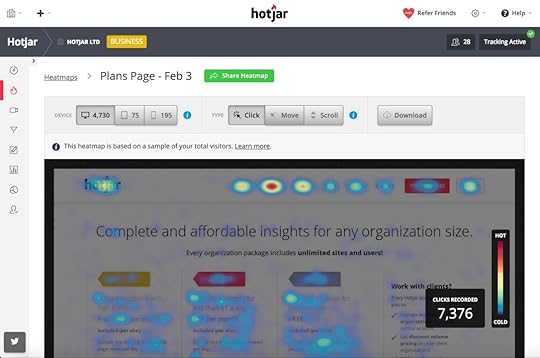
Hotjar aims to be a single analytics toolkit, providing detailed reports on user behaviour. This includes form analysis but also provides heatmap reports, visitor recording (see what your users see), conversion funnel reports and various other data sets.

On the form analysis side of things, you can see how many people start your forms, how long it takes them to fill each field and the time it takes to complete the whole thing. You can also see which fields cause users to abandon and how many failed submissions you get.
The reports aren’t as detailed as Formisimo but they’re very well put together visually. A quick glance is all it takes to get a solid overview of how your forms are doing and you get a lot more than form analytics as part of the package.
Think of this as a Jack of all trades analytics platform – one that includes a competent tool for gaining insights into form performance – rather than a form specialist like Formisimo.

As for pricing, packages are based on the number of visitors you want to collect data from, as opposed to features. So you’ll be paying more for Hotjar than Formisimo for large volumes of traffic but you’re getting more reports for your money.
#3: Leadformly

Leadformly is a completely different kind of tool for creating better web forms. Instead of simply providing analytics, Leadformly gets you started with a range of form templates designed by conversion experts to get results from day one. So, instead of sitting there and watching your web forms underperform, you can get off to a better start from the get-go.

Form analytics is still very much a part of Leadformly, providing detailed insights into how your forms are doing. You’ll also soon be able to run A/B tests on the platform, once the feature rolls out (coming soon), which is really exciting. And, perhaps best of all, you don’t need any coding skills to embed or edit your forms – so you can make improvements on the fly, as and when your analytics/tests reveal opportunities to improve.

There are three main packages at different price points and you can get three months free by paying annually, rather than quarterly – so keep that in mind. Of course, you can always sign up to a free trial first, to see how you get on with the platform.
#4: Clicktale

Clicktale offers a full suite of analytics tools and its Conversion analytics platform is where you’ll find web forms come into the equation. Again, this is a little more than a form analytics tool, providing insights into how effective your conversion funnels are at generating leads and sealing the deal.
In most cases, the final stop on these conversion funnels will be one of your forms and this is an integral part of Clicktale’s Conversion analytics tool.

The form analytics section tells you how many visitors interact with your form and how many of those failed to successfully complete it. Drop reports show where your forms are being abandoned and you can even replay user sessions to help pinpoint potential problems.
You also have time reports, which tell you how long users take to fill out each field and complete the entire form. Then the blank field reports highlight the fields users don’t fill before hitting the submit button, helping you remove unnecessary fields. And, finally, you have refill reports, which flag up fields that users fill incorrectly, thus failing to submit the form.
As for pricing, you won’t find any information on the website about packages or fees. As far as we know, Clicktale still charges by the number of visitors you want to track and prices range from $99 for 20,000 to $990 for 300,000, but we can’t guarantee this is still the case. So Clicktale certainly isn’t the cheapest option for the number of visitors can track for your money. It also doesn’t make much sense to go with Clicktale if you only want form analytics or a few of its tools. However, if you’re looking for a full suite of platforms, Clicktale suddenly becomes a reasonably priced and incredibly useful option.
#5: Inspectlet

Inspectlet records videos of user sessions in full, so you can see exactly what they get up to on your site. This means you can see every mouse movement, every scroll and each click users make, to better understand why they didn’t convert.
If you sign up to the Growth or Accelerate plans, you also get in-depth form analytics as part of the package.

Inspectlet’s Conversion Report gives you the same kind of analytical feedback you can expect from most of the tools we’re looking at today.

Once again, you can see how many visitors start using your forms, how many of them convert and how long it takes them to complete fields and forms in full.
Once again, there’s more to Inspectlet than form analytics, meaning it’s more of a multi-tool than a form specialist. So be sure to check out the other features (session recording and heat mapping) it offers to see how it meets your needs compared to the other platforms we’re suggesting.
#6: Mouseflow

Mouseflow is a lot like Inspectlet in the sense it records user sessions, creates heatmaps and provides form analytics. It also packs a few extra features, though, including geo heatmapping to see where your visitors are coming from, click and movement heat maps and reports that show user journeys from page to page.
In terms of form analytics, there are no surprises. You get info on visitors, form completions, timing, drop-offs and the necessary data to help you spot issues. So, aside from offering a few more features than Inspectlet, the other main difference with Mouseflow is how form analytics fit into the price plans.

While you have to pay for one of the more premium plans to get form analytics with Inspectlet, you get this feature with all Mouseflow plans. That said, the number of forms you can get analytics for varies with each plan – starting from one on the most basic plan and increasing from there.

That pretty much sums up the main differences between Inspectlet and Mouseflow, so there’s not a great deal between them, depending on your needs.
#7: Decibel Insight

Decibel Insight also offers the whole recorded sessions, heatmaps and form analytics package. However, Decibel Insight goes into a little more detail than both Inspectlet and Mouseflow, which includes the data you’ll collect from your forms.
In the overview section of form analytics, you get the following info:
Views: The number of people who viewed your form and how many started filling it out.
Abandonment rate: The percentage of users who abandon your form, how many of these users experienced errors.
Time taken: The average time it takes users to complete your form, plus average times with and without errors.
Error rate: The percentage of users who have errors – single errors, multiple errors and the average number of errors.
Completion rate: The percentage of users who complete your form, both with and without errors.
As you can see, there’s a big emphasis on the number of errors users have with the idea of helping you remove barriers to successfully completing forms.

You also get data on the individual fields on your form, including any delays before users start typing, how long it takes to fill them out, errors rates and abandonment rates. Make no mistake about it, Decibel Insight is a serious platform and it’s priced accordingly from what we can tell (prices on application). We’re told you’ll be looking at a minimum of around $400 per month, which may be a bit much for smaller businesses but this is a full suite of products designed for brands that take conversion optimisation seriously.
So those are our top recommendations for web form analytics tools and each of them has something different to offer. There’s no clear winner from our list today; the best tool for you depends on what you need from an analytics tool and most of our recommendations do more than simple data reporting. Your best bet is to take a good look at the features lists of each tool, compare pricing and try out a few free trials to see how your get on. We’re sure you won’t be disappointed!
The post 7 Form Analytics Tools to Help You Increase Form Submissions appeared first on Venture Harbour.
March 23, 2017
5 Top Conversion Rate Optimisation Strategies in 2017
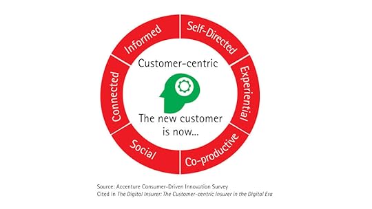
In 2017, there are several important trends that marketers should focus on, from AI and machine learning, to chatbots and VR. All of these new channels and strategies are organised around a very simple concept: businesses needs to embrace a customer-centric approach. In this view, customers are not just the ones you should reach out to but the ones you should draw your marketing strategy around.
Customers are not only more informed than ever before, but also more connected and receptive to establishing personalised relationships with brands and companies.
Companies need to evolve from being product-focused businesses to becoming customer-focused businesses. This requires marketers to work on a one-to-one approach, creating a custom experience in all the different stages of the marketing funnel, using external and internal channels.
With customers becoming smarter, the gap between the perception of how good the online experience is and what customers actually think can be huge. But shouldn’t it be the most important part of the marketing plan? Because it’s actually where customers need to be even more engaged. It’s where customers make the buying decision.
What marketers must do is work on a conversion optimisation plan that they’re able to follow, anticipating the trends of 2017.
Building and testing your Conversion Rate Optimisation Plan
When we talk about a CRO plan, we mean using analytics and user feedback to improve the buyer experience of your users and the performance of your website. CRO means understanding what users are looking for when they arrive at your site and giving it to them.

CRO takes many different forms, sometimes this involves making your call-to-action different for some segments or using words and special formulas for others. It can also mean removing or relocating unnecessarily, complicated or time-consuming steps, as the added friction can prevent a conversion from happening.
Personalisation is key because getting more of the right kind of customers is different than just optimising the conversion rate of a given page.
You should begin with you, putting yourself in your visitors’ shoes and looking closely at your site. Is the graphic clean and unique and Call to Actions clear and easy to find?
When you’re building a CRO plan you need to understand what your numbers mean before actually trying to fix them. Starting with a bunch of hypotheses, a CRO plan allows you to test them out and learn from the process to come out with new ones. You need to know what you’re measuring and attempting to optimise. It’s also important to understand what drives these conversions: isolate each variable and measure how users behave under each set of circumstances.
A CRO plan is a process which defines a consistent, structured and ongoing way to make your online experience better over time, based on your customers’ behaviour.
5 top Conversion Rate Optimisation Strategies
Setting and testing the right hypothesis within your CRO plan is important, but there’s also some more stuff you can implement to boost your conversion rate.At the page level, in fact, there are different elements with can help you get your customer’s attention.
Let’s dive deeply in each of the strategies you can use.
Influence and persuade users using social proof and FOMO
FOMO, which stands for ‘fear of missing out’ is leading a lot of the actions we do online today. It’s what is pushing us to keep checking our Facebook timeline and taking our devices wherever we’re going. But FOMO isn’t a new thing. It can be applied to pretty much all areas of our life, too. There’s the fear that we could be in a better job. A better relationship. Living in a better home. Or a better city.
It’s a very powerful strategy you can implement in your landing page, for example making your offer exclusive for a specific time only period or by telling your users they’re missing out if they’re not pursuing that action in that specific time.
You can apply it in your copy and CTAs, for example stating exactly how long someone can take advantage of the offer or how many products are left before running out of stock (or the price returns to normal).

You can also decide to use a timer like this one below:

The most important thing is to keep using this strategy in your campaigns and all the other marketing automation tools you use.
Using social proof, instead, you leverage other people and their social influence to push users to achieve conversion goals. So, for examples, celebrities, crowd, generic users are all factor influencing others behaviour. Testimonials are very powerful and you can decide to show them up in specific pages to push for easier and faster decisions. For even greater credibility, you can include real attributions, photos and video testimonials.
Social proof can also be about implementing a scoring system for specific products, insert specific certifications logos or media supporting you or a specific product of yours. Just think about how more likely you would buy something if you know that some of your social connections have already bought it.
2. Use lead capture forms
Lead capture forms are a key component impacting your website’s conversion rate. They are the most critical point of your funnel as they’re the final interaction separating your leads from non-leads.
Using tools like Leadformly makes it easier to create high-converting lead capture forms. Driving customers from the start of the purchase funnel, with often little or no consideration of optimising the conversion in the last stages, is a common mistake made by marketers. Often it’s considered as a secondary detail. But lead capture forms have a big impact if we consider their ability to convert.

Take it as an experiment to analyse users behaviour and then use it as a benchmark to build out the whole conversion rate optimisation plan.
3. Use videos to hook users and explain your product
Videos are no longer an “up-and-coming” marketing tactic. It’s here, and it’s a powerful way to communicate your brand story, explain your value proposition, and build relationships with your customers and prospects in all the marketing funnel. ⅓ of all online activities is watching videos. Ads in video format increase purchase intent by 97% & brand association by 139%.
According to a study about web use, the average attention span is 8 seconds, down from 12 seconds in 2000. Technology is affecting us so much that we now have a shorter attention span than a goldfish. But more importantly, it shows that businesses have only 8 seconds to capture attention with their landing pages.
Not only, you need to make sure your hosting is fast enough (so you don’t waste those 8 seconds loading your website), and you also need content that engages people and quickly.
Using videos to engage users by telling a company’s story is a great way to interact with them. They can be claymation, hand-drawn, or digital drawings, but no matter what, they provide businesses with a way to clearly and effectively convey their value proposition.
Following a recent research, including a video on a landing page can increase conversion rates by 80%.
Using a secret weapon like a video on your landing page can help customers not only to learn more about your business but also to keep their attention and push them to buy. With the right script, you can maintain attention every 8 seconds which is approximately every 20 words.
An average explainer video is watched for about 2.7 minutes, compared to the 28% of website text shown to be read on average.
Are you still thinking videos are not worth the effort?
4. Reduce bounce and exit rates
Analysing and understanding your bounce and exit rates is a very important strategy as in both cases, a very high index of both means a lack of engagement of your users towards your website and your products.
If your bounce and exit rates are high, you can start the analysis understanding if your users think your website is perhaps difficult to navigate or to use thanks to user surveys.
Another reason could be related to the device they’re using to navigate.
According to the recent report by We Are Social, 46% of Internet users are surfing the net using their mobile. Ignoring the mobile experience of your website can have a huge impact on your website and after all to your whole business.

5) Highlight your users’ must-have experience
The type of person viewing the page is very important, sometimes even more than the page itself. If people are not converting it may be because they arrived based on a false promise. Those are users you can’t really convert because they are not going to stick to your website.
Putting this in another way, it might be that users are not getting what they’re looking for, meaning you’re not matching their expectation in terms of products or they don’t understand why they should buy. This is a situation you can easily track and understand using ie. Google Analytics thanks to the All Traffic, Referrals, and Search Engines reports under Traffic Sources.
Many users will arrive via search engines, so it is important to know their intent and make sure your site matches those expectations. For example, if you are selling a marketing automation tool but have a large percentage of visitors showing up looking up for performance-based marketing agencies, you have a percentage of visitors who will never buy from you, no matter how optimised your landing pages are.
On a longer term, you’ll not only need to explain your products and understand their expectation but also spec out their experience in must-have elements, convincing them, for example, that their job as marketers won’t be the same anymore without using your solution.

In Summary
Now it’s your turn. Which is the strategy you think will become the most important one to optimise your conversation rate in 2017?
The post 5 Top Conversion Rate Optimisation Strategies in 2017 appeared first on Venture Harbour.
March 20, 2017
15 Call-to-Action Best Practices to Increase Conversions
Let’s cut to the chase; every user that comes to your website and doesn’t convert is a waste of your time and marketing budget. Maximising the number of people who take profitable actions on your site is your top priority and, in the moment that matters most, it’s your call-to-action that give users the final push (or so you hope).
Essentially, these are the most important parts of your site. Get your call-to-action wrong and everything else on the page is just a waste of pixels. And, to help you create CTAs that get results from day one, here are 15 call-to-action best practices to increase conversions.
#1: Make it actionable
Any good call-to-action tells users precisely what you expect them to do. If you want people to sign up, tell them. If you want them to download your mobile app, make yourself absolutely clear.

Your CTA buttons should like they’re ordering people around. Do this now. Do this next. The first word on your button wants to be a verb (start, buy, download, etc.) and the rest of your button text will normally convey value or create a sense of urgency.
#2: Focus on the value
People don’t click your CTA buttons for the fun of it. To get conversions you need to convince people you have something valuable to offer and a small amount of text before your button is often all you have to make believers out of them.

Infusionsoft tells marketers and business owners exactly what they stand to gain by using their platform. You should do the same with your own calls to action.
#3: Create a sense of urgency
People hate to feel like they’re missing out on something and creating a sense of urgency in your CTAs implies this is precisely what’ll happen if users don’t act now. This is especially powerful when you hang temporary discounts and other incentives in front of people’s faces.

You don’t have to be quite this aggressive with your own approach, though. By simply adding the word “now” to your buttons, you can create a more subtle sense of urgency to encourage clicks.

#4: Make it personal
Every user should feel like your website is speaking to them and them alone. This is why using actionable language is so powerful, because it makes your content sounds like it’s talking to them personally. And you can take this a step further by addressing them directly in your CTA text.

The small amount of research into using first (I, me, my) vs second person (you, your) tenses in CTAs suggests the first person might be more effective, but this is by no means conclusive. Either way, they’re both highly effective.
#5: Ease user concerns
Everybody likes to buy in confidence and, if you can reassure people they’ve got nothing to lose by clicking your CTA button, there’s little reason for them to resist.

ActiveCampaign knows people don’t like filling out credit card details for the sake of a free trial. So it moves to reassure people that they can sign up for free without handing over any payment details.
#6: Make it stand out
You can’t expect people to convert if they never see your call-to-action so you better make sure they stand out. Colour contrast is your best friend when it comes to making a CTA button stand out and Invision opts for a very un-subtle pink to capture your attention.

It’s not only buttons that can gain from the high-contrast treatment either. You can create full CTA sections on your page to make them unmissable.

Asana cuts through its white homepage with a bright blue call-to-action section you can’t ignore.
#7: Think beyond the fold
It’s tempting to place CTAs above the fold by default but this isn’t always the best approach. If you can create incentive within a few words, then above the fold CTAs are great –particularly on homepages and landing pages.
 However, if you need to explain more about your offer before you hit people with a call-to-action, you might be better off placing your CTA further down the page. And there’s nothing wrong with having multiple calls to action on your homepage, if you’re targeting more than one action (just don’t go overboard.)

As you can see above, Asana starts with a simple CTA above the fold and places another one below the fold once it conveys more of its message. This is a common design trend for modern homepages, but I don’t recommend this approach on landing pages, which should typically focus on a single goal.
#8: Prioritise one call-to-action
Although giving users too many choices is generally a bad idea, there may be times when you can’t confine your CTA to a single action. In these cases, you’ll need to prioritise the most important action so users don’t get stuck between options.

Here’s how Sketch gives users the option of downloading a free trial while still making that all-important buy button the priority.
#9: Don’t be too creative with button designs
Call-to-action buttons are an accepted UI element that visually tell users there’s something to click. So if your buttons don’t actually look like buttons then people might never realise they’re supposed to do anything.

Above you can see four buttons used on the Visit Humboldt website. The site may get away with these but it’s not 100% clear whether they’re buttons or icons. Most users will probably figure it out but it’s a risk you don’t want to take – so don’t try too hard to reinvent the button.
#10: Make it readable
This sounds pretty straightforward but there’s more to readability than you might realise We’ve already mentioned contrast and this an important part of it – but there’s more.
Choosing your fonts wisely is a good place to start and making sure your text and buttons are large enough to capture attention and read well. There’s also a lot of psychology behind legible text. For example, the human brain recognises the shapes of words before they actually read them, which makes all caps more difficult for us to read.

Going back to our Asana example from before, note the use of font size, spacing and lowercase text – as well as strong colour contrast.
#11: Make it easy to convert
If you expect people to take action on your site, don’t make it difficult for them. Do everything you can to create easy conversions on your site so users have no reason to refuse. For example, on your sign up forms ask for the minimum amount of information possible – only an email address if you can get away with it.

The form above implies it couldn’t be easier to get started with IFTTT, even if there are further stages to the signup process. Forget about asking people to retype their email address and passwords and you certainly don’t need phone numbers or anything else at this stage.
#12: Have at least one CTA on every page
Every visitor is a potential lead and you’re missing an opportunity if you don’t ask them all to convert in one way or another. So put at least one call to action on every page and don’t simply repeat the same CTA every time. Ask yourself why users come to this specific page and how you can turn that reason into a valuable lead.

We put CTAs at the bottom of our blog posts to convert readers once they’ve finished reading our wonderful content.
Even on your blog posts, ask users to sign up to your newsletter, download an eBook or visit a product/service page offering a solution to the problem your article discusses.
#13: Put a CTA at the bottom of every page
You’ll hear a lot of people recommend not doing this but bare with me. Most visitors will hopefully never reach the bottom of your page because they’ll find something compelling long before they get that far. But what about the visitors who do reach the bottom of your page?
In most cases, people end up at the footer of your site because they haven’t found what they were looking for. And when people can’t find what they’re looking for, they tend to leave.

Instapage gives users one last call to sign up for a 14-day free trial when they reach the bottom of a page.
Don’t sit there and let potential leads slip away. Put a call-to-action at the bottom of every page and give users a reason to keep interacting with your brand.
#14: Use exit popups as the final incentive
We recently published an article looking at how you can use exit popups to generate leads that would otherwise leave your site. Yes, I know popups are a UX taboo, but these things really convert and exit popups are about as unobtrusive as they come.

The thing is you probably won’t get results by simply repeating the same offer you proposed on the page. It didn’t work the first time and you’ll only frustrate users by forcing the same message upon them. So try to come up with something compelling enough to make them think twice about leaving.
#15: Don’t get bogged down in tests
While I don’t want to discourage you from testing CTA variations, don’t get bogged down in switching button colours. They’re really not that important. Focus your efforts on creating a more compelling a call to action by making your offer clear, increasing the value proposition, increasing urgency and other factors that evoke a genuine emotional response from people.
A great call-to-action does two things: first, it grabs people’ attention and then it turns their interest into real buying intent. The 15 best practices we’ve looked at today pretty much take you through all the key elements of a call-to-action that stops people scrolling and inspires them to take action. As with any list of best practices, these are general guidelines more than absolute rules. But they should get you off to a good start with designing calls to action that get results from the moment they go live.
The post 15 Call-to-Action Best Practices to Increase Conversions appeared first on Venture Harbour.
March 5, 2017
How to Use Exit Popups to Generate B2B Leads
As a B2B marketer, lead generation is key.
Your target customers need a little more convincing when it comes to selling them on your products or services than someone selling t-shirts.
Because of this, generating high-quality leads and nurturing them with email is a sound way to get more customers for your B2B business.
Great – we have the formula, but how do we put it into practice? More specifically, how do we generate these leads in the first place?
You’re likely already employing a few methods: maybe you’re running ads to landing pages, collecting leads through your blog, or booking product demos on your homepage. That’s awesome – those are all strategies that are sure to help your business generate quality leads.
But in this article, I’m going to discuss a tool that’s often overlooked when it comes to B2B lead generation: exit popups.
I know, I know. Popups – groan.
Here’s the deal, exit popups have been proven to significantly decrease bounce rates and increase time-on-site. Say what you want about them, but exit popups might be just what you need to skyrocket your B2B lead generation.In this article, I’ll cover everything you need to get started generating B2B leads with exit popups. Let’s get started!
What is an exit popup?
There’s a 99.9% chance you’ve seen an exit popup before, especially as a B2B marketer. Unlike other types of popups (like entry or timed popups), exit popups appear based on user action.
Exit popups use computer wizardry to detect when a page visitor is about to leave the page. They appear when the visitor's cursor leaves the browser window, presumably to press the “back” or “close tab” buttons. It usually looks something like this:

Another way to look at exit popups is as a “last-ditch effort” to capture a lead. They often differ from normal popups in their language (“Stop!”, “Wait!”, etc.) and present an offer to incentivise viewers to convert and provide their lead information.
Why do they work?
There’s a ton of reasons why exit popups – and, really, popups in general – work so well when it comes to generating leads, but here are a few of the biggest ones:
They re-focus viewers:
It’s easy for visitors on your website to become distracted or bored. Even if your pages are optimised for lead generation, there’s a variety of things that could pull their attention away, like a Facebook chat in another tab, or even a lack of interest in the content on your site.
Exit popups re-focus viewer attention on your lead generation offer, whether that’s an email subscription or some sort of lead magnet, thus increasing the chances they’ll convert.

They’re attention-grabbing:
Popups are so successful because they’re optimised to highlight your lead generation offer. They’re “lightboxed”, meaning they dim the rest of the window behind the popup, and they literally pop up, helping to pull attention by requiring a viewer to act (either by converting or exiting the popup).
They create urgency:
Compared to your website or landing page, a popup feels “exclusive”. Because they can’t be bookmarked or re-visited (unless they’re triggered on more than one page visit), they’re much more effective at getting people to act immediately.
Conversely, visitors might bookmark your landing page and forget about it later – and that means you’ve lost a conversion.
Though there’s a number of reasons popups are so effective, those are three of the most important. But there’s one more that’s especially important when it comes to exit popups…
The offer
This is the essence of a highly-converting exit popup. Having a strong offer (or lead magnet) can mean the difference between annoying and awesome for your exit popup. It’s really the heart of your popup – you’ll have trouble finding success without an offer that intrigues your visitors.
Think about it from your visitor’s point of view. If your lead gen optimised website or landing page couldn’t get your visitor to convert, an exit popup simply reiterating what they’ve already read is unlikely to garner a conversion. You need something more enticing to incentivise converting on your popup and giving up their lead information.

I mentioned previously, an exit popup is usually your last chance to capture lead information from a website visitor. Once they’ve chosen not to convert on your exit popup, you’ve probably lost that visitor as a lead. So pull out all the stops (as far as is reasonable) to create a great offer and maximise the number of leads you generate.
Some lead magnet ideas:
Free webinar: If hosting webinars is already a core part of your B2B marketing strategy, inviting a visitor who’s on their way out to join your next (live or pre-recorded) webinar might be just what they’re looking for.

Relevant content upgrade: If your visitor is on a specific page, like a post on your blog or a product page for a specific tool, offering additional gated content that’s relevant to the page is an easy way to personalise lead gen efforts for topics we know our visitors are interested in. For example, I might offer “10 Awesome Exit popup Templates” as a content upgrade for this very article.

Contest entry: Running contests (like a sweepstakes or photo contest) is one of the best ways to generate leads – but that’s a topic for another time. Informing your page viewers of a contest you’re running and allowing them to enter right from the popup is an engaging offer with a lot of value for a visitor.
E-book: Though it’s similar to a content upgrade, an e-book offers significantly more content – and more value – to a potential lead. Create an e-book covering topics relevant to your product (for example, The Ultimate Guide to Lead Generation for Small Businesses), and watch the leads roll in.

Free trial: Chances are, if you have a B2B SaaS, you already offer some sort of free trial. Yet, drawing attention to it along with some words of reassurance (“no credit card necessary”, “no contract”, “try it FREE for 14 days”) can address some visitors’ uncertainty and help you get more leads.
How do I create an exit popup?
Though exit popups may have been virtually impossible for a non-code-savvy marketer to implement in the past, the marketing apps of today have made it simple for marketers to create popups from scratch.
There are a variety of apps that you can use to create your exit popup, such as Wishpond and OptinMonster.
Once you have your popup app of choice, it’s really up to you to design your popup. I’d recommend sticking with a template or getting a designer to create something that’s clean, easy-to-read, and on-brand.Let’s look at a few ways to get the most out of your exit popups…
Exit popup ideas and best practices
Best practice: Use a benefit-oriented CTA
Highlighting the benefit received by converting on your popup helps users see the value of your offer in a more concrete way. It highlights the “reward”, which is appealing to a potential lead. Examples of benefit-oriented CTAs include “Generate More Leads”, “Get My Free Templates”, or “Save 20%”.
Best practice: Leverage social proof
One of the most effective ways to convince visitors to convert on your popup is to show them that they’re not alone. Whether you name-drop a company you’ve worked with (“Get the [product] that Apple uses to…”) or highlight your many happy customers (“Join 123,456 other marketers like you”), showing visitors that others happily use your product or service can make a big difference in your conversion rates.
Best practice: Directional cue
This is really a CRO design best practice. A directional cue is a visual element that directs a viewer’s attention towards your conversion goal. This might be an arrow, or the eyes of the person in the image on your popup. This helps naturally draw your viewer’s eyes towards your offer or form, increasing the chance that they’ll convert on your popup.
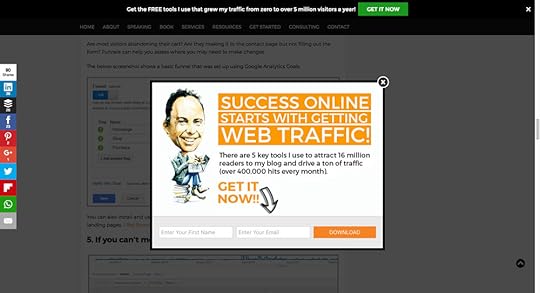
Best practice: Use numbers and data
Giving visitors specific information about how your B2B product or service can benefit them is great – but it’s even better when you’ve got data to back it up. What’s more convincing: “get more leads for your business” or “see how we increase our customers’ conversion rates by 30%”? Using numbers or data – as long as they’re honest and accurate – goes a long way towards establishing credibility with potential customers.
Best practice: Relevant content
Though you could use a single exit popup for all of your pages, that’s hardly the best way to go about generating leads. Instead, create multiple exit popups for the different products or services you offer, including a relevant lead magnet with each of these. Because your visitor is already on a specific page, you have a relatively good idea about what they’re interested in. Taking the time to create more specific popups tailored to viewer interests is an easy way to personalise your lead generation efforts and increase conversions.Here’s what a popup might look like for an Instagram-related article:

Idea: Countdown timer
Invoking urgency is one of the best ways to get a potential lead to act on your offer. Implementing a countdown timer (even if it’s not a real one) is a great way to get people to convert now, rather than waiting to do so at a future time. It makes visitors think your offer may expire in the near future – and that’s not something they want to miss out on!
Idea: Use a negative CTA
Negative CTAs appeal to people’s desire to minimise losses. For example, a negative CTA on a content upgrade for a lead generation e-book might sound like “No, I don’t want to learn how to generate more leads”. It comes off as a little shady, but it’s proven to work – people don’t want to lose out on the offer (especially when they need to explicitly reject it), so they convert.

Idea: Use a progress bar
Including a progress bar on your popup makes viewers feel like they’ve already made it part of the way to claiming your offer – they may as well do the rest. People don’t like to leave things incomplete, so including a progress bar that shows your visitor there’s only one step left to receive your offer can increase conversions.
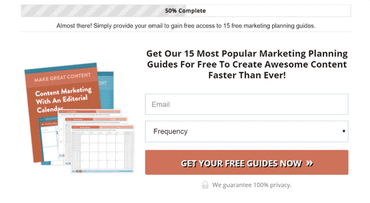
Idea: Display credentials
Show your visitors that your business is the real deal by displaying any awards or accolades you may have received. This helps reduce uncertainty (especially when they’re from credible sources), increasing the chance that a viewer will convert on your popup. That being said, stay away from mentioning any awards from low-credibility sources – this just makes your B2B business look sketchy.
Conclusion
There you have it – a complete guide on using exit popups to generate B2B leads for your business. Though I’ve included a bunch of ideas and best practices, remember that it’s in your best interest to test everything to find out what works best for you.
When it comes to lead generation for B2B businesses, exit popups are one of my favourite tools. They’re easy to set up, simple to design, and have proven time and time again that they’re one of the most impactful ways you can optimise your B2B lead generation efforts. I hope this guide gave you some great ideas for your exit popup efforts, whether you’re just starting out or you’ve been using them for a while. Try these ideas out for yourself, and you’ll see just how awesome exit popups can be for your B2B business.
The post How to Use Exit Popups to Generate B2B Leads appeared first on Venture Harbour.
January 20, 2017
20 Ways We Use ActiveCampaign To Automate Sales, Marketing & Customer Success
Over the past three years, we’ve used ActiveCampaign on eight of our ventures.
In this guide, I’ve shared 20 ways that you can use ActiveCampaign to scale up your business via automation and a more systemised approach to sales & marketing, based on our experience using their platform.
If you’re not using ActiveCampaign, you can create a free trial here – you won’t regret it
What’s in this guide?
The article is split into six sections – feel free to click the link to get to them:
Sales funnels, CRM & lead scoring – This section includes how to use deal pipelines and lead scoring in ActiveCampaign to put your leads into different ‘buckets’.
Marketing automation & lead nurturing – The short, mid and long-term automation workflows we use to nurture leads into paying customers for our sites. Email marketing hacks to boost your open & click-through rates.
Customer success, NPS & client account management – How our customer success team uses ActiveCampaign to collect Net Promoter Score (NPS) data, check-in with customers, and ensure client accounts are healthy.
Weird and wonderful – See how we’ve experimented with automating aspects of our recruitment process, employee onboarding & accounting using ActiveCampaign.
Why ActiveCampaign is awesome
When I started Venture Harbour, we had no CRM system for two years. It wasn’t due to lack of trying – We had tried Pipedrive, Salesforce, Zoho and several others. But they all required so much manual effort to keep them up to date.
After getting my ass kicked by a friend for not having a CRM system, I turned to my Twitter followers to suggest which CRM to use.

While I did receive several good suggestions, none of them was a good fit. CRMs and Venture Harbour just didn’t seem to mix.
Then, a couple of months later, I came across ActiveCampaign while researching marketing automation vendors. I signed up for a trial and saw that ActiveCampaign also had a built-in CRM, but with a difference.
Unlike other CRMs we had tried, ActiveCampaign’s CRM could be almost entirely automated using rules and workflows…now we’re talking.
We signed up for ActiveCampaign about three years ago. Since then, we’ve moved all eight of our ventures over to their service. Here are some of the ways we’re using it.
Systemising sales funnels, CRM & lead scoring
One of my favourite things about ActiveCampaign is their deal pipelines. If you’re familiar with agile or have used ‘kanban boards’ in the past, these will be familiar. ActiveCampaign’s deal pipelines are basically just applying agile to sales.

1. Break your sales funnel into stages
Building a deal pipeline in ActiveCampaign forces you to break your entire sales cycle into a series of steps. Rather than viewing sales a messy and unpredictable beast, you can start to visualise the stages that your deals must go through in order to reach completion.
For Leadformly (the software we created for building conversion-optimised lead capture forms), we break our sales funnel into five stages – from cold leads to paying users.

2. Create a deal pipeline for each segment of your audience
It may not make sense to put all of your deals on the same pipeline. After all, if you serve enterprise and small business clients, these deals will probably vary so much that any report on average deal size or average time to close will be skewed.
Thankfully, ActiveCampaign allows you to build as many deal pipelines as you like, so you can just build different pipelines for your various audience segments.
For Leadformly, we have four pipelines; Enterprise leads, startup leads, agency leads, and SMB leads. This makes it easy to quickly view all of our leads in each category and to compare reports.
3. Leave no leads hanging
Rumour has it that Salesforce.com had a rule where if a salesperson ended the day with any of their leads not having a task assigned to them, that salesperson would be fired.
Tasks ensure that you know when you will next follow-up with every single lead in your database.

In ActiveCampaign, you can easily see if any leads do not have a task assigned to them. While Salesforce’s approach may be a bit extreme (and illegal in some countries), you can still train your sales team to ensure that every lead always has a task assigned.
4. Assign deals
Have multiple sales people? ActiveCampaign makes auto-assigning deals to different sales people easy. You can assign deals based on value, a round-robin approach, or you can setup your own automation rules to assign deals to people based on other criteria e.g. geographic location or lead type.

5. Lead scoring
Lead scoring is one of those features that can make or break your entire sales process. When it’s set up correctly, it creates clarity around which leads your people should focus on and how good a job your marketing team is doing at nurturing cold leads into warm leads.
For Leadformly, we use lead scoring to determine whether a lead is cold, marketing qualified, or sales qualified. We also use it to measure the health of existing customers.
Cold lead (has a lead score below 7 points)
MQL (has a lead score between 7-14 points) – We apply points when people register for our webinars, visit key pages on our site, and engage with our emails. The purpose of this is to separate engaged leads from unengaged leads.
SQL (has a lead score above 14 points) – We use the BANT (budget, authority, need, timeframe) methodology for this. Once we know all four of these criteria and they’ve above our agreed thresholds, the lead is considered sales qualified.
Setting up lead scoring in ActiveCampaign is extremely easy and makes it much easier to set clear KPIs for marketing and sales. You can also identify whether the % of leads that you’re converting into marketing-qualified or sales-qualified leads is increasing or decreasing, and much more.
Marketing Automation
ActiveCampaign has one of the most visual and intuitive marketing automation builders I’ve come across. In fact, it’s so intuitive that almost everyone in our company has built an automation sequence in ActiveCampaign with virtually no training.
If you’re new to ActiveCampaign’s marketing automation builder, it looks like this:

Here are some of the ways we’re using marketing automation to systemise our lead nurturing and marketing campaigns.
6. Create short-term and long-term nurturing sequences
At Venture Harbour, we used to have one big lead nurturing sequence that initially may educate leads on a daily basis but gradually becomes less frequent as the lead gets colder.
We’ve since found it more manageable to break lead nurturing into a short 2-4 week sequence and then a long-term nurturing sequence that leads are added to when they complete the short-term sequence.
The short-term nurturing sequences are primarily educational in nature, making leads aware of relevant blog posts, webinars, interviews and other resources we’ve put together that help them develop their knowledge while positioning our ventures as authorities. We highly segment these to make them as relevant as possible for the different types of leads that enter our marketing funnel.

The long-term nurturing sequences are more about checking in with leads after certain intervals (e.g. 3 months, 6 months, 12 months), or when a certain behaviour indicates they may be thinking about our solution again (e.g. if they visit our website).
It’s worth noting here that the goal of these nurturing sequences is not to convert leads into sales, but instead to convert leads into marketing qualified leads and then sales qualified leads based on our lead scoring system. This helps us separate the leads worth speaking with from those that are currently too cold.
7. Use goals & automation split tests to refine email sequences
In 2016, ActiveCampaign announced a feature that I had been waiting for since 2014 – email automation split testing.
While email split testing is nothing new, very few marketing automation tools allow you to split test emails that are a part of an automation sequence. ActiveCampaign is among the first to do this well.

Theoretically, this means that your automated email sequences can only get better over time because you can setup unlimited split tests to refine your emails over time as you capture more data.
While this feature is quite new, we’ve already managed to increase the open rates of some of our key email campaigns by up to 300%.
8. Use reports to identify when you get highest open rates, then update the time your emails are sent out
One quick win that boosted our overall email marketing performance by 10-15% was using ActiveCampaign’s open rate report to identify which days and hours our emails were getting the highest open rates.

We then used this information to add ‘waits’ in our marketing automation sequences so that important emails were sent on Tuesdays at 10 am when our open rates were up to 4X higher than average.
It’s a simple tweak, but it worked.
9. Use goals to identify the time it takes someone to do something (e.g. visit to purchase time)
When we first launched Leadformly, we spent days trying to build a system for measuring the time between learning about Leadformly and becoming a paid user. We hacked something together with Zapier, Google Analytics & Google Sheets, but it was far from sophisticated.
Then, at the end of last year, ActiveCampaign announced goals – and my jaw dropped.
This meant that ActiveCampaign could now tell you the average time it took someone to reach a certain point in an automation sequence. So we built an automation sequence that triggered when someone signed up for Leadformly and then fired a goal when they became a paid customer.

As you can see, ActiveCampaign not only tells you the average completion time but also the completion rate. You could use this to identify the % and time taken for a customer to leave a review, the % and time taken for a customer to upgrade or buy a new product. The possibilities are endless.
10. Use conditional content to make your emails hyper-personalised
One tactic we’ve experimented with a lot is using data captured from our Leadformly form to personalise the content in our ActiveCampaign emails using ActiveCampaign’s conditional content feature. Basically, this allows you to personalise the content in your email campaigns using rules like ‘If contact’s organisation type = agency, display X, otherwise display Y’.
Here’s an example of a fully-automated email we send out using conditional content.

This email gets a 44% response rate, which is pretty incredible for an automated email. I suspect the reason is because it sounds natural and includes enough personalisation (it references that they’re running an agency) that people suspect it’s been written manually.
We’ve even received a lot of praise from people who’ve identified that it is automated, but are still impressed!

11. Send the same email with a different subject line to people that didn’t open your first email
If you want to increase your email campaign engagement by 10-20%, just send all of your emails twice, but the second time around only send the email to the segment of people that didn’t open it the first time round.
This means that everyone who didn’t open your first email due to bad timing will now get to see it. While the open rate won’t be as high as the first campaign, it’s still going to be opened by some of your list who wouldn’t have otherwise seen it.
12. Send follow-up emails to people that open emails but don’t engage with your offer
If someone opens your email but doesn’t click through to your offer it means that they were intrigued by your subject line, but the offer wasn’t quite right for them.
In ActiveCampaign, you could create a follow-up campaign for these people either asking them what wasn’t attractive – or offering something else that might be more suitable for them.

13. Use in-email surveys to get personalised feedback
One of our most responded-to email campaigns is a simple email that we send to everyone who attends a Leadformly webinar but doesn’t sign up for an account. It looks like this:
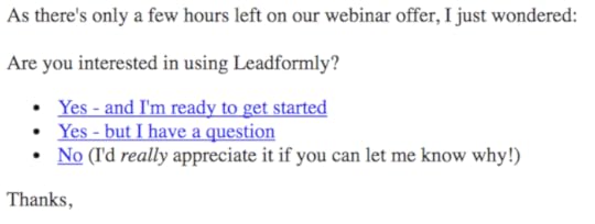
If someone clicks ‘Yes – but I have a question’ or ‘No’ it opens up an email addressed to me with the pre-filled text ‘Hi Marcus, I’m not ready to use Leadformly because…’. We receive hundreds of emails every month from customers like the one below telling us what’s stopping them from signing up, which is an extremely valuable source of feedback.

Customer Success
When we first started investing in tools for our customer success team at Leadformly, we tried Intercom, Drift, Promoter.io, and several others. After several months we realised that most of the functionality we were using in those tools could be replaced by ActiveCampaign.
Here are some of the ways we’re using ActiveCampaign for customer success.
14. Using deal pipelines to manage client onboarding
To quickly see where our new clients are in the onboarding process, we use ActiveCampaign’s deal pipeline functionality. While it’s meant to be used for managing sales pipelines it works well work managing any process that has a clear set of steps – like onboarding.

We’ve created automation sequences to automatically move clients between different steps of this pipeline based on what pages they visit or events they fire from within the Leadformly application. That way our CSMs don’t need to worry about manually updating which column each client should be moved into.
15. Collecting Net Promoter Score
I have to admit, collecting NPS scores in ActiveCampaign is not easy. We had previously used Promoter.io to collect NPS, which is (in theory) a plug and play solution. We struggled a lot with their service, which was one of the reasons for centralising it in ActiveCampaign.
Rather than explaining how we set it up here, I’d recommend reading brilliant article that ActiveCampaign published, which we followed to collect and automate NPS collection.
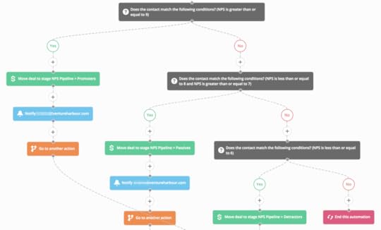
We then took this one step further and built an ‘NPS pipeline’ so that we can visually see which customers are detractors, passives, promoters, or yet to respond to an NPS survey.
16. Automated client onboarding & training
In order to educate our clients and make them successful as quickly as possible, we put all of our customers into a 7-day onboarding sequence, which drip feeds a series of tutorials, videos, and white papers that they can use to learn our software and get better results from their lead capture forms.
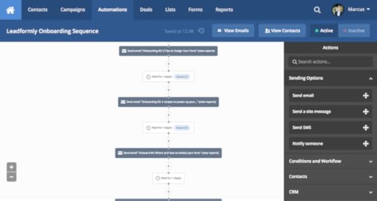
This automation sequence takes some strain off of our support team, as it means that we can answer questions in these tutorials that may have otherwise become support tickets/emails. This also helps our clients get better results from their forms.
17. Automated client cancellation sequences
When someone cancels their account or requests a refund for one our ventures, it’s important that we learn what caused this.
In ActiveCampaign, we automatically trigger a sequence that asks the customer what made them leave, and then adds/removes them from the correct lists and sequences.
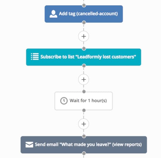
It’s simple but is one less thing that our customer success team need to think about.
The weird and wonderful
While marketing automation is primarily designed for trigger marketing and sales emails, there’s no reason why you can’t use it to streamline other areas of your company. Below are some of the ways we’ve used ActiveCampaign to automate aspects of HR, finance, and employee training.
18. Automate employee onboarding
When a new employee joins Venture Harbour, an automated email sequence is triggered that drip feeds information on how we doing things at Venture Harbour and why.

This ensures that all new employees have a consistent onboarding experience, and are aligned with the company’s bigger picture vision and goals. We can also constantly fine-tune the information we share with new employees to make their first few weeks as good as possible.
While unconventional, using marketing automation to streamline our new employee onboarding has made this process a lot easier.
19. Automatically filter out bad job applicants
We don’t read CVs at Venture Harbour. Instead, we ask all candidates that apply for a job from our website to complete a short quiz that tells us more about them and how they solve problems.
About half of the people who apply for a job complete this quiz, which immediately rules out 50% of bad-fit candidates. At the end of the day, if you’re not willing to complete a 10-minute quiz to be considered for a role at Venture Harbour, you’re definitely not the right fit.
It also gives us a lot of insightful information about candidates. For example, one of our values at Venture Harbour is to never stop learning, so in our quiz we ask ‘What are the last three nonfiction books you read?’. This is perhaps one of the most insightful questions, as the books a person reads reveal a lot about them as a person.
This quiz is sent through a marketing automation sequence, which frees up hours of emailing back and forth with potential candidates, and ensures that we only consider the very best applicants to come in for an interview.
20. Automate the emails you hate sending
I used to hate chasing up invoices. While the majority of our clients paid their invoices on time, there were always a few that needed a nudge or two.
One day I decided to remove myself from the equation and create an automation sequence that automatically follows up on unpaid invoices. By sending the email from a ‘noreply@’ email address rather than my personal email address it depersonalised the message and came across more as an alert rather than a person asking for an invoice to be paid.
Not only was it just as effective as me emailing them, it meant I could stop sending an email that I hated sending – and it saved me time!
Thinking of using ActiveCampaign?
There are few tools that I wholeheartedly recommend on a daily basis, but ActiveCampaign is one of them. If you’re still on the fence – they offer a 14-day free trial, which I’d recommend giving a try. If your experience is anything like ours, you won’t be disappointed.
The post 20 Ways We Use ActiveCampaign To Automate Sales, Marketing & Customer Success appeared first on Venture Harbour.


![[image error]](https://www.ventureharbour.com/wp-content/uploads/2017/04/Google-Mobile-Page-Speed-Benchmarks-Mar2017.png)