Marcu Taylor's Blog, page 25
June 24, 2016
58 Form Design Best Practices (The Ultimate Form Optimisation Guide)
One of my favourite things about running Leadformly is that we’re constantly learning from form optimisation and design experiments.
Below are 58 of the best insights I’ve come across on form design from seeing countless form design A/B tests, and studying the work of companies that have invested heavily into form optimisation.
This post turned into a bit of a monster so I’ve broken it into eight sections. I also made a full checklist that you can download for free to evaluate your own forms.
General form design & structure
Questions & field types
Accessibility & ease of use
Validation & error handling
Trust & social proof
Multi-step forms & progress indicators
Buttons & call to actions
Mobile form best practices
Before we jump in, I should caveat that while most of the tips are based on statistically valid experiments ran across numerous sites and industries, they shouldn’t be taken as gospel. Forms are highly-contextual and depend on more than just the design of the form itself to convert well. With that said, let’s jump in.
General Form Design & Structure
1. Multi-step forms out-perform single-step forms
Splitting your forms into two or three steps will almost always increase form completion. We’ve tested this across all kinds of lead generation forms, from webinar registration forms to B2B enquiry forms, and consistently we’ve found multi-step forms out-perform generic single-step forms.

There are three reasons why multi-step forms work so well:
The first impression is less intimidating than a long form with lots of question fields.
By asking for sensitive information (email, phone) on the final step of a multi-step form, users are more likely to fill out these fields – otherwise they lose the progress made by filling out the previous steps (this is a proven cognitive bias known as the ‘sunk cost fallacy’).
By seeing a progress bar, users are more motivated to complete the form. This is, again, based on numerous proven cognitive biases such as the endowed progress effect.
2. Remove all non-essential fields.
Expedia lost $12 million per year by asking one additional question (company name) in their booking form. Marketo also found that a few non-essential fields were inflating their cost per lead by ~25%.

Every additional field in your form is losing you leads – so consider whether each question justifies the incremental loss in leads or opt-ins.
3. Use conditional logic to shorten your forms
Conditional logic (sometimes called ‘branch logic’) is where you only display a question if a user has answered a previous question in a certain way.
This technique reduces the average length of your form, while also reducing form abandonment by not displaying questions that might be irrelevant to certain users.
One of our clients at Leadformly used this feature to create a unique enquiry form for their web agency. Using conditional logic, their visitors could tell them precisely what service they were looking for just by clicking a series of icons.

4. Top-left aligned labels are best for readability & completion
Google’s UX researchers found that aligning labels above fields on the left-hand side increased form completion time. This is because it requires fewer ‘visual fixations’, as illustrated in the diagram below.

There is one acceptable alternative to top-aligned labels, which I’ll discuss in point #16.
5. Avoid placing questions side-by-side.
Eye-tracking studies have shown that simple one-column layouts are better than multi-column layouts with questions positioned side-by-side.
The only exception to this rule is when asking for dates (day, month, year) or time (hours and minutes), where multiple fields are expected to be on one line.
6. Give people a reason to use your form
Imagine you had a long form that took an hour to complete. Nobody would use it, right?
Well, not if you gave everyone a free Ferrari for completing it. The promise of a Ferrari would give people the motivation to push through, despite the long and poor user experience. While extreme, this example illustrates the role that motivation plays in form optimisation.
In one simple example, BettingExpert received 31.54% more signups by changing their form title and call to action to emphasise why people should sign up.

7. Group related fields together into sections or steps
If your form has more than six fields, it’s considered good practice to group questions into logical sections or steps.
Questions & Field Types
8. Choose field types that reduce the number of clicks required to complete
When Microsoft changed their shutdown prompt from a clickable shutdown icon to a dropdown box, they found that fewer people were shutting their computers down – just because of an additional two clicks.

When choosing which question field type to use, try to optimise for as fewer clicks as possible.
9. Use smart defaults
If you’re asking questions like phone number or country, you should suggest a default phone extension or country based on the user’s IP address.
Exclusive Bonus: Download this post as a checklist for a guide on how to boost your conversions with high-converting lead gen forms.
10. Know when to use radio buttons, checkboxes, and dropdowns
As a general rule of thumb, radio buttons should be used when there’s a range of options and only one option can be chosen.
Checkboxes are should be used when more than one option can be selected.
Where possible, checkboxes and radio buttons should be used instead of dropdowns, as they less cognitive load to process. Typically, I use dropdowns when there are more than six options to choose from.
11. Radio buttons should be vertically-stacked
Vertically-stacking radio buttons (and checkboxes) makes them faster to process compared to a horizontal layout.

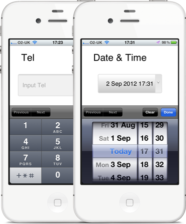
12. Do not slice fields when asking for phone numbers or date of birth.
Sliced fields force the user to unnecessarily make additional clicks to move to the next field. Instead, it’s better to have one single field with clear formatting guidelines in the placeholder.
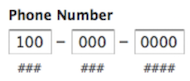
Even if you auto-advance users onto the next field, field slicing imposes stricter validation that has the potential to backfire. In the diagram above, for example, this field slicing would be confusing for anyone entering a phone number outside of the United States.
13. Clearly explain why you’re asking for sensitive information
People are increasingly concerned over privacy and information security. If you must ask for sensitive information, make sure you explain why it is needed using support text below the field.
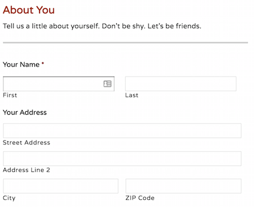
14. When asking for addresses, use a post code / zip code lookup to reduce field entry
When asking users to fill out their address, it’s best practice to just ask for a house number and post code/zip code, and then use a lookup service to suggest the full address.

15. Use placeholders correctly
A placeholder is the light text that appears within a form field. In the example above, you can see a placeholder that says ‘E.g. ‘CR0 3RL…’.
Placeholders should be used to guide users on how to fill out the field if there’s any ambiguity. In other words, you probably don’t need to have a placeholder for fields like ‘First name’ as most people know how to answer their first name.
16. Always display a field label
A field label is the question text that sits above the field. These should always be present and should not be replaced with placeholders. Why? Because when you start entering text into a field the placeholder text disappears which forces people to use their memory to recall them.
The only instance where it may be acceptable to not have a field label is if you’re using inline labels. Inline labels are a hybrid solution that are always in view, but do not take up as much vertical space as top-aligned labels. Below is an example of inline labels being used by BounceExchange‘s form.

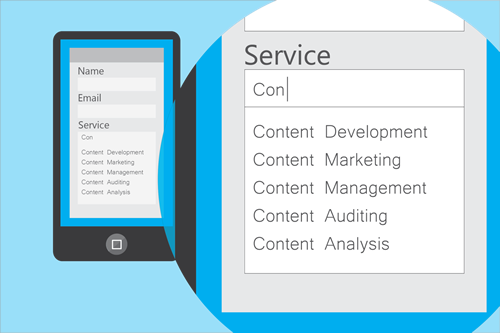
17. Use predictive search for fields with lots of pre-defined options
When asking users to choose their country, occupation, or something else with a large number of predefined options, it’s best to provide a predictive search function to reduce the amount of typing and cognitive load required.
18. If you must ask an optional question, make it clear that it’s optional
While I’d advise removing optional fields or using milestone submissions to ask them after users have already submitted their data, sometimes internal politics require them to be asked.
If you must ask optional questions, make it clear that they’re optional using placeholders.
19. Selectable images are among the most engaging question type
Where it makes sense, use clickable images as a question type. From the data we’ve seen at Leadformly, they’re among the most engaging question types and provide a great form user experience.

20. Be careful when asking for phone numbers
People are increasingly less happy handing out their phone numbers. In fact, one study by Clicktale found that marking the phone number field as optional decreased the form abandonment rate from 39% to 4%.
21. Input fields should be sized accordingly
The size of a field should reflect how much text the user is expected to enter. Therefore, fields like zip code or house number should be shorter in width than fields like the address line.
Accessibility & Ease of Use
22. Avoid using Captchas.
A study by Stanford University found that Captchas will cost you a drop in subscribers / leads of up to 30%. When Animoto removed captchas from their sign-up form, they received 33.3% more signups.
Captchas force the problem of spam management onto the user, causing friction, and ultimately deterring leads. A better alternative would be to use an automated spam detection service like Akismet, or create a ‘honeypot’ using hidden fields. Using a Captcha should be your absolute last resort.
23. Do not rely on colour to communicate
While less common in women, 1 in 12 men have some degree of colour blindness.
When displaying validation errors or success messages, be sure to not rely on making the field green or red. Wherever colour is used, try to also display text and/or icons to communicate a message to the user.
24. Ensure that your entire form can be navigated using the tab key
While many people use the tab key to navigate through forms, this is particularly important for disabled users who may be relying on software that uses the tab function to move from one question to the next.
25. When asking a question that users may not understand, provide clear explanations to guide them to the correct answer.
Insurance lead generation forms are not easy. Unfortunately, there’s a lot of mandatory information that must be asked that can confuse users.
Fortunately, there’s a lot that we can all learn from insurance companies on how to tackle this challenge. ComparetheMarket.com do a great job of providing detailed visual explanations when you hover over a question.

26. Does your form work on all major browsers and devices?
It may sound like common sense, but it’s good to check that your forms work and are easy to use across all major browsers and devices. When in doubt, use a service like BrowserStack.
27. Is your form easy to use in bright or low-light situations?
If people are likely to use your forms outdoors on their mobile devices, it’s best to ensure that your question fields contrast against the form background. Otherwise, users may not be able to see where to tap.
28. Ensure that nothing flashes more than twice per second
If you plan on using blinking cursors, animated progress bars, gifs, or anything else that flashes, ensure that they do not flash more than twice per second. Otherwise this may trigger seizures for some people.
29. Enables browser auto-fill
Browsers like Google Chrome & Firefox now have an auto-fill function that lets users fill out standard form fields in one click.
For this to work, Google Chrome / Firefox look for contextual clues in the ‘name’, ‘label’, and placeholder text. Therefore, it’s good practice to ensure your fields are properly tagged with terms that a browser would recognise e.g. ‘email’, ‘first name’, or ‘city’.

30. Use milestone submissions
How do you keep your forms short enough not to deter users, while still capturing more information if a user is willing to provide more information? Milestone submissions is one option.
Milestone submissions is a technique that allows you to submit the form when a user has reached a certain step in the form, and then continue providing more information if they want to. Toptal.com use this feature to fast-track people who are willing to answer a few additional questions.

Exclusive Bonus: Download this post as a checklist for a guide on how to boost your conversions with high-converting lead gen forms.
31. Optimise the speed of your forms
Users expect websites and forms to load fast. In fact, for every 100 milliseconds Amazon speed up their website, they see a 1% increase in revenue. If you want to increase your conversions, ensure your form is as fast as it can be.
32. Avoid auto-advancing (automatically jumping to the next question)
It’s not expected and generally confusing.
33. Use visual cues and icons to make form fields more intuitive
Our brains process visual images significantly faster than text. As illustrated by the Compare the Market form below, visual prompts can be used to signal how a field should be filled out.

Input Validation & error handling
34. Don’t make your validation too strict
Strict validation is a symptom of lazy programming. It’s bad for users, and your business will pay a price for it.
If there’s a lot of variation in how users answer a field (for example, responding to phone number with +12345678912, +44 12345678912, 012345678912), your programmers should use a rule that converts these to a consistent format on your end.
Alternatively, use field placeholders to clearly show the suggested format.
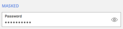
35. Do not ask people to confirm their email or password twice
If you must use an email / password confirmation system, it’s better to have an icon or checkbox that unmasks the password when clicked.
36. If you must use validation, ensure that it’s inline (to the right of the field) and reports errors early on.
Don’t wait until a user hits submit to report validation errors. At the same time, inline validation should not be real-time, as this is likely to report errors before a user has completed the field.

Ideally, inline validation messages should appear around 500ms after a user has stopped typing.
Trust & Social proof
37. Make your form design beautiful
It has been proven that people trust beautifully designed forms / websites more than forms that don’t look as impressive.
38. Address likely concerns near your form
There are likely a number of reasons why people might feel uncomfortable using your forms. For example, how long will it take? Will I need to enter my credit card details? Will I receive annoying phone calls from a sales person?
By addressing these up front, you can break down the barriers and make using your form more of a no-brainer. Freshbooks address their users’ concerns by displaying “No credit card required. No Contracts. Cancel anytime” beneath their form’s call to action.

39. Display strong social proof in close proximity to your form
Statements like ‘used by 100,000 people’ and testimonials by other people in a similar situation are powerful persuasion techniques that make users more likely to trust you and use your form.
40. Be careful using security seals, unless you’re asking for payment
People associate privacy and security seals with making a payment. In the A/B test below, adding a payment seal actually decreased conversions because people thought they would be taking to a page to pay for something.

41. Display live chat or contact information within view of your form
Despite their registration form being very simple, Intercom display a live chat window in clear view to answer any questions or objections you might have prior to registering for an account.

For more complex forms where users might have questions about the form itself this is an extremely powerful technique. Not only does it build social proof, but it also helps potential leads answer any questions stopping them from using your form.
Multi-step forms & progress indicators
42. When using multi-step forms, always display a progress bar
Progress bars encourage completion and reduce your user’s anxiety by clearly communicating how far they are from finishing.
As an interesting side note, we’ve found from our experiments at Leadformly that animated progress bars (like the one on Leadformly.com) typically outperform static progress bars.
Also, starting your progress bar with some progress already made increases the number of people that use the form.
43. Be mindful of your transition speeds
A good friend of mine was capturing leads for his dating company’s website using a 5-step lead generation form. But he couldn’t figure out why people were clicking the next buttons and then abandoning the form.
It turned out that their transition speed was too fast. Users were clicking the next button and not noticing that the content on the step had changed, because it changed so fast. After slowing down their transition speed their conversion increased.
This is one of the most counterintuitive lessons I’ve come across on multi-step form design. After all, we’re often told that faster is better. Not when it comes to transition speeds, it seems.
44. Use clear signposting
A progress bar by itself is not enough. You should also display the the total number of steps and which step the user is currently on to remove any ambiguity. In the example below you can see how BrokerNotes clearly tells users that they’re on step one of two.

Buttons & Call to actions
45. Call to actions should finish the sentence ‘I want to…’
By default, many forms use dull call-to-action buttons like ‘submit’ or ‘send’. These should be avoided and replaced with call to actions that match what the user is hoping to achieve when they complete your form.
A good rule of thumb is to answer the question “I want to…” from the user’s perspective. For example, if it’s an enquiry form for a free consultation, the call to action could be ‘Request My Free Consultation’.
In this study, Unbounce found that even just changing ‘start your free trial’ to ‘start my free trial’ increased clicks of the call to action by 90%.

46. Make sure call to actions are highly contrasted
We’ve all heard about those infamous studies where changing the colour of a button increased conversions. These studies can be dangerous when interpreted literally, as it’s usually not the specific colour that matters – it’s the contrast.
Notice how the orange call to action stands out from the blue/white in the Unbounce example above? That’s what you’re aiming for.
47. Call to actions should be the same width as fields
Uber’s forms use large full-width call to actions that are highly contrasted against the form backgrounds. By making call to actions the same width as fields you remove any doubt over where the button is located.
For an example of how not to do this, see UPS’s form in the tip below.
48. Avoid using ‘clear’ or ‘reset’ buttons
Below is a screenshot of UPS’s registration form. Not only are the call to actions small, but the next button is also right next to a ‘cancel’ button that is styled and located in a similar position to the ‘next’ button.

The risk of accidentally deleting all of the information you’ve entered outweighs the small convenience of having to start again. Most users are aware that refreshing the page or just re-entering information will enable them to start over again. As such, cancel or reset buttons should be avoided.
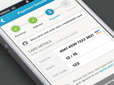
49. Sequence your questions logically
When asking for credit card details, for example, ask for information in the same order that it typically appears on the physical card (credit card number, expiry date, security code).
50. Do not place overly complicated legal messages near your buttons.
If you must have your users agree to lots of complex disclaimers, try to combine these into as few files as possible and keep legal messages as concise as possible.
51. Do not trick users by auto-enrolling them into your mailing list.
This comes across as manipulative and forces most users to make an additional click to opt-out of your list.
52. Clearly explain what’s next upon clicking the submit button
When someone uses your form they might be wondering how long they’ll have to wait, whether they need to prepare anything, or what is going to happen.
Ideally, your form should redirect users to a page that clearly communicates what will happen next and what they can expect.
53. Upon submit, disable the submit button from being pressed again
This is to prevent duplicate submissions, and to also provide an extra signal to the user that their submission has been been successful.
54. Make it clear what the user can expect to happen next
Your call to action (and landing page in general) should clearly communicate what the user can expect to happen as soon as they complete your form.
Mobile form optimisation
55. Use the mobile device’s native features (camera, geolocation, date picker) to simplify tasks
Last year, I spent a lot of time with a forex broker trying to help them optimise their onboarding forms. For regulation reasons, this company had to ask users to submit ‘KYC’ (Know Your Customer) documents, such as their driving license and a recent bill.
On desktop this is a clunky process at the best of time, as users would typically have to abandon the form to scan a document and then upload it.
For mobile users, it was even more difficult. Ultimately, we found that tapping into the mobile device’s camera was the best user experience, as it enabled users to take a photo of their driving license without leaving the form.
I have even seen this same approach used to let users ‘scan’ their credit card, instead of having to fill out their credit card information manually.
56. Question fields and buttons should be at least 48 pixels high.
The average adult finger pad size is about 10mm wide. In web terms, this is approximately 48 pixels. Therefore, when designing forms that are to be used on mobile devices, ensure that your fields are at least 48 pixels high.
57. All form labels & placeholder fonts should be above 16px
After redesigning an entire user interface for a client last year, I received an email from their CEO saying “It looks great Marcus, but I can’t read a thing!”.
The font was 14px, which is a fairly standard font size… for web. But my client was viewing this interface on a mobile device. When designing for mobile or an older audience, your text should be at least 16px in size.
As a side note, iOS devices will zoom in when any text below 16px is tapped, but not if the text is 16px or above, as it’s deemed unnecessary.
58. Use specific HTML input types to show the correct keypad
Ever noticed how, when using a mobile device, the phone displays different keyboards depending on which question you’re asking? Sometimes the ‘.com’ button displays, while other times a date selector comes up?
That’s all thanks to HTML input types. For mobile form design, they’re awesome and you should use them. There are eight input types that are relevant to form design:
input type=”text” displays the normal mobile device keyboard
input type=”email” displays the normal keyboard plus ‘@’ and ‘.com’
input type=”tel” displays the numeric 0-9 keypad
input type=”number” displays a keyboard with numbers and symbols
input type=”password” this hides characters as they’re typed in the field
input type=”date” this displays the mobile’s date selector
input type=”datetime” this displays the mobile’s date and time selector
input type=”month” this displays the mobile’s month/year selector
Now, over to you.
Form optimisation is not an event, it’s a never-ending process. This is why we built Leadformly, as we believe that constantly testing assumptions and design changes can lead to big increases in your bottom line over time.
Even if you were to action all of the advice in this article, you’d be far from complete as there would still be countless variations and assumptions to test.
My hope is that this article has provided you with the inspiration and insight needed to take your forms to the next level and convert leads at a rate that’s higher than if you hadn’t come across this guide.
And on that note, remember to get your free checklist version of the post. If the article has been useful, please do consider sharing it, as it does help more than you’d imagine.
The post 58 Form Design Best Practices (The Ultimate Form Optimisation Guide) appeared first on Venture Harbour.


June 17, 2016
7 Best Form Builders for Marketers & Businesses
Whether you’re looking to capture leads, sign up free trials, or survey your audience, you’ll need to build a form. Below are seven of the best form builders, along with a quick overview of what they’re best for.
Let’s kick off with the best form builder for creating lead generation / lead capture forms.
1. Leadformly (best for lead generation / lead capture forms)
In 2015, we spent a lot of time building and A/B testing forms for our ventures and clients. While we achieved some great results (in one instance quadrupling a form’s conversion rate), we found the process of building lead gen forms surprisingly difficult.

None of the form builders on the market focused on making forms convert well. In fact, most of them just focused on making it easy to build a form, but not making it easy to build a high-converting form.
So, we built our own tool internally called Leadformly. We now use Leadformly forms across virtually all of our ventures and have seen conversion rates as high as 45% for some of our opt-ins and lead capture forms.
I won’t go into too much detail about how it works, but the main difference with Leadformly is that you’re able to use templates that have been pre-tested for different purposes.
For example, if you’re a web agency looking for an enquiry form, or a marketer looking for a webinar signup form, Leadformly has templates that’ve been optimised and A/B tested for those purposes.
One of the final features worth mentioning is Leadformly’s reporting. With Leadformly, you have built-in form analytics, so you can see how your forms are converting, the value of leads they’ve captured, and how people are responding to your questions.

You can check out Leadformly here.
2. Typeform (Best for surveys & questionnaires)
While Typeform has a large range of templates, where they really excel is in running market research, feedback, and customer surveys.
In fact, you can get a nice survey up and running with Typeform in a matter of minutes – and the end result looks a lot nicer and more intuitive to use than if you used a tool like SurveyMonkey.

Their form builder is nice and easy to use, with all of the features you’d expect. My only criticism with Typeform is that their forms look very ‘samey’ and monotonous, conforming (pun intended) to a very specific style that isn’t suitable in a lot of situations.
If you want to get a survey or customer research questionnaire up and running quickly, check out Typeform here.
3. SamCart (Best for product / checkout forms)
When we launched Leadformly, we kept getting asked whether we did eCommerce checkout forms or not. It seemed as though many marketers were not happy with their checkout forms and didn’t know of any good solutions to improve them.
As Leadformly’s focus is on lead generation / lead capture, we had to say no – but we found a solution that does an exceptional job of just focusing on optimised checkout forms; SamCart.
Similarly to how we spent a lot of time understand and optimising lead gen forms, SamCart seem to have nailed how to build a beautiful and well-optimised checkout form experience.

If you’re looking to reduce cart abandonment and drive more sales through your eCommerce site, check out SamCart here.
4. Gravity Forms (Best for payment forms)
In 2015, Gravity Forms got a lot of attention due to some serious security vulnerabilities that were found in their forms. Despite this, they’re still considered a good option for building advanced WordPress forms.
One area where Gravity Forms do a particularly good job of is payment integration. If you want to connect your forms to PayPal, Authorize.net, Stripe, or your accounting software, this is relatively easy to do with their plugin. The only thing to bare in mind is that these integrations are only available of Gravity Forms’ most expensive plan ($199).
The disadvantage with Gravity Forms is that their forms look quite average. While their features enable you to create powerful forms, they ultimately look quite average – and probably not ideal for anything where conversion rates matter.
A screenshot of the Gravity Forms ‘demo form’:
5. Ninja Forms (Best for basic WordPress forms)
If you want to build a basic form without having to touch a line of code for your WordPress site, NinjaForms is a good solution. While nothing fancy, NinjaForms is a good ‘no-frills’ option for getting a generic form up and running.
The main downside to NinjaForms is their pricing, which is extremely confusing. The amount depends on many factors, including the number of forms you build, which features you want to use, and which additional add-ons you need. While their pricing starts at $19, it’s possible that price creep will mean that you pay a lot of money for your form over the long run.
If you want to use their advanced features, such as saving user progress, conditional logic, or multi-step forms, you’ll end up paying small amounts for each of these additional add-ons. Ultimately, if you’re looking to build complex forms, it’ll probably work out a lot cheaper using one of the alternatives mentioned in this post.
6. Qzzr (Best for creating quizzes)
Qzzr is a form builder with a specific focus on build quizzes.
Aimed at publishers, agencies and marketers, their quiz-like forms are designed to increase social engagement and capture leads from your social marketing efforts.

If you’re a high-traffic publisher, or have a large social following, Qzzr is definitely worth a look.
7. Wufoo (Best for simple contact forms)
If you need a simple contact or registration form, and you’re not looking for a well-optimised form, then Wufoo is a nice cheap solution. Their forms may not be the nicest looking, but Wufoo is a well-established brand that’s passed the test of time.

Had any experience with any of these form builders? If so, I’d love to hear your experiences in the comments below.
The post 7 Best Form Builders for Marketers & Businesses appeared first on Venture Harbour.
May 31, 2016
13 Must-Have Lead Generation Tools
Building a predictable lead generation machine is challenging. Once you crack this challenge, though, it’s extremely rewarding as you can scale up faster, and afford to be more selective with who you work with.
When I launched Venture Harbour four years ago, I experimented with everything from creating infographics and sponsoring events, to optimising our lead capture forms to boost our leads. It took about two years of experimentation before we reached a point of having ‘too many’ leads.
Below I’ve shared some of the best tools and tactics I’ve come across for capturing and converting more leads. These are not necessarily silver bullets, however my hope is that regardless of where you are – 10 or 100 leads per month, these tools will get you to the next level.
1. Leadformly
Your form is what separates your leads from non-leads.
Because of this, small improvements to your lead capture form can have significant impacts on your overall conversion rate and marketing performance. At Venture Harbour, we’ve seen numerous 200%+ increases in leads from form optimisation alone.
Leadformly is a tool built by our team at Venture Harbour that makes it easy to build high-converting lead generation forms.
The problem we found was that the forms provided by our email marketing services and CRMs were very basic and were negatively impacting our conversion rates. We looked into various form builder tools and plugins, but none of them offered a good solution for providing conversion-optimised forms.
So we built our own tool for building them.
Leadformly sweats the little things so that you don’t have to. From displaying optimal progress bar indicators, to using conditional logic to segment your leads, we’ve spent a lot of time experimenting with forms to identify what actually increases form conversions. In addition, Leadformly has built-in analytics and audience insights to help you understand your leads and how your forms are performing.
To learn more about Leadformly, checkout out Leadformly.com
2. Intercom Acquire
Intercom is probably the marketing tool that I’m most excited about right now.
Intercom enables you to communicate directly with leads who are visiting your website. You can setup rules to display messages to visitors when certain conditions are met. For example, if a user spends more than 60 seconds on your pricing page and is on their second visit you could display a message like this:

An operator on your team can then speak directly with website visitors, or even jump on video chat directly from the live chat window. The potential for Intercom is incredibly powerful – from gathering product feedback and understanding objections, to collecting leads who are searching around on your website.
It’s difficult to do Intercom justice in words. I’d highly recommend checking them out even if only to understand the potential of what they offer.
3. Lead Forensics
There are many potential leads on your website, yet only a handful fill out your enquiry forms.

While you can significantly increase the percentage of visitors filling out your forms using a tool like LeadFormly, there will always be a few leads slipping through the cracks.
LeadForensics solves this by using the visitor’s IP address to tell you which companies are viewing your website (even if they don’t fill out your enquiry form). One of my clients recently installed this and found that many large brands were visiting their contact page but not filling out our form.
Their sales team could then go to LinkedIn, find the marketing director’s name, and call the company asking to speak to this person. As you can imagine, this not only increased the number of targeted leads their business received, but it also had a great conversion rate as the leads were already familiar with the business.
Want to capture up to 300% more leads without increasing your traffic?
Join me on this free webinar where I’ll share the secrets behind the lead generation strategies of companies from Expedia and HP to startups like Crew – and how they’re generating 1,000’s of extra leads every month.
4. ActiveCampaign
Your ability to capture and convert leads is largely dependent on your email marketing and CRM solution. After all, if you can’t properly segment and use rule-based follow-up with leads, you’ll have a harder job qualifying and converting those leads.
Having tested many email marketing tools and small business CRMs, ActiveCampaign is without a doubt the best solution I’ve come across.
As you can see, ActiveCampaign allows you track every interaction a lead has with your website – and then use these as triggers for your email marketing campaigns.
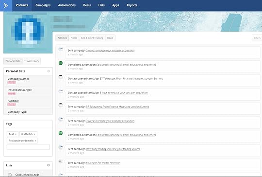
This means you can notify your sales team as soon as a lead visits a certain page on your website. You could also automatically follow up with cold leads every few months, or build email campaigns to nurture them back into warm leads.
5. LinkedIn Sales Navigator
If you’re in B2B sales, LinkedIn’s Sales Navigator is a great tool for capturing leads. Alongside receiving lead recommendations and seeing who’s viewed your profile, the Sales Navigator enables you to save leads into your CRM directly from LinkedIn.

6. Datanyze
Datanyze is an outbound sales tool designed to help software and tech companies save time prospecting. The main benefit of Datanyze is that it shows you the technology used by your prospects – and even helps you find new prospects based on what technology they use.

7. Growbots
About a week ago I received one of the best cold emails I’ve seen in a long time.
This email, I believe, was 100% automated and sent using Growbots. Growbots dubs itself as an ‘AI for sales’ and uses clever rules and a huge database of contacts to do clever outbound lead generation. While I haven’t personally used their service, I’ve heard great things about Growbots from numerous friends in the SaaS community.
8. Quora
Quora has become a de-facto destination for asking and answering questions online. If you search on Quora for topics relating to your business you’ll likely find tens or hundreds of people asking questions that you could provide well-informed answers to.
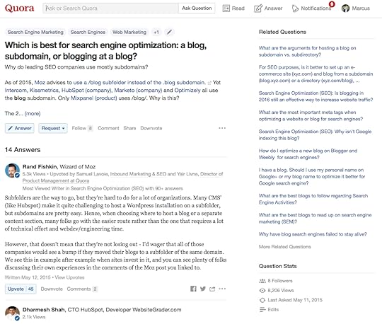
These answers can subtly convey your company’s expertise, which may drive potential leads to contact you.
9. Hoovers
Hoovers pride themselves on being the ‘largest single source of business information’ anywhere. This means that if it is personalised leads that you require for your business, then Hoovers is a great place to look.
10. PadiAct
PadiAct allows you to tailor which website visitors are asked for their email address. This means that when they do sign up they are more likely to go onto make a purchase. You can then follow how well your email subscription list is growing with the easy to understand tracker charts provided by PadiAct.
Exclusive Bonus: Download our Lead Gen Form Checklist for a step-by-step guide on how to boost your conversions with high-converting lead gen forms.
11. Turnstile
Turnstile is a simple feature offered by Wistia, who are considered to be one of the most respected video hosting companies.

Turnstile’s main goal is to collect the names and email addresses of potential customers for you and your business after someone has finished watching a video. By offering an email collector at the beginning, middle or end of your video you can turn this engaged visitors into valuable leads.
12. Qualaroo
Qualaroo is often thought of as a customer research tool. If you’re unfamiliar with their product, they provide unobtrusive mini customer surveys that enable you to communicate with visitors on your website.

One underused tactic is to use Qualaroo for lead generation. In short, you can ask your visitors a series of questions such as ‘What can we do for you today?’ and by step 2/3 of the survey it may make sense to arrange a call or ask for an email.
13. SlideShare
Since joining forces with LinkedIn in 2012, Slideshare has become one of the most effective lead generation tools for reaching a B2B audience. From my experience, the key with Slideshare is to ensure that your slides are well-designed and make sense without any explanation.
When you get these two areas right, there’s a high likelihood that Slideshare will feature your presentation on their homepage for a day or two, driving thousands of views. Following this, your slides should rank well when people search for the topic of your presentation on the platform – putting you in front of targeted leads.
Whichever marketing tool you decide will suit you and your business best, I hope this extensive list is useful – and if you’re aware of any other good lead generation tools that I’ve missed, feel free to share them in the comments below.
The post 13 Must-Have Lead Generation Tools appeared first on Venture Harbour.
13 Must-Have Lead Generation Tools for Marketers
Building a predictable lead generation machine is challenging. Once you crack this challenge, though, it’s extremely rewarding as you can scale up faster, and afford to be more selective with who you work with.
When I launched Venture Harbour four years ago, I experimented with everything from creating infographics and sponsoring events, to optimising our lead capture forms to boost our leads. It took about two years of experimentation before we reached a point of having ‘too many’ leads.
Below I’ve shared some of the best tools and tactics I’ve come across for capturing and converting more leads. These are not necessarily silver bullets, however my hope is that regardless of where you are – 10 or 100 leads per month, these tools will get you to the next level.
1. Intercom Acquire
Intercom is probably the marketing tool that I’m most excited about right now.
Intercom enables you to communicate directly with leads who are visiting your website. You can setup rules to display messages to visitors when certain conditions are met. For example, if a user spends more than 60 seconds on your pricing page and is on their second visit you could display a message like this:
An operator on your team can then speak directly with website visitors, or even jump on video chat directly from the live chat window. The potential for Intercom is incredibly powerful – from gathering product feedback and understanding objections, to collecting leads who are searching around on your website.
It’s difficult to do Intercom justice in words. I’d highly recommend checking them out even if only to understand the potential of what they offer.
2. Leadformly
Your form is what separates your leads from non-leads.
Because of this, small improvements to your lead capture form can have significant impacts on your overall conversion rate and marketing performance. At Venture Harbour, we’ve seen numerous 200%+ increases in leads from form optimisation alone.
Leadformly is a tool built by our team at Venture Harbour that makes it easy to build high-converting lead generation forms.
The problem we found was that the forms provided by our email marketing services and CRMs were very basic and were negatively impacting our conversion rates. We looked into various form builder tools and plugins, but none of them offered a good solution for providing conversion-optimised forms.
So we built our own tool for building them.
Leadformly sweats the little things so that you don’t have to. From displaying optimal progress bar indicators, to using conditional logic to segment your leads, we’ve spent a lot of time experimenting with forms to identify what actually increases form conversions. In addition, Leadformly has built-in analytics and audience insights to help you understand your leads and how your forms are performing.
To learn more about Leadformly, checkout out Leadformly.com
3. Lead Forensics
There are many potential leads on your website, yet only a handful fill out your enquiry forms.
While you can significantly increase the percentage of visitors filling out your forms using a tool like LeadFormly, there will always be a few leads slipping through the cracks.
LeadForensics solves this by using the visitor’s IP address to tell you which companies are viewing your website (even if they don’t fill out your enquiry form). One of my clients recently installed this and found that many large brands were visiting their contact page but not filling out our form.
Their sales team could then go to LinkedIn, find the marketing director’s name, and call the company asking to speak to this person. As you can imagine, this not only increased the number of targeted leads their business received, but it also had a great conversion rate as the leads were already familiar with the business.
Exclusive Bonus: Download our Lead Gen Form Checklist for a step-by-step guide on how to boost your conversions with high-converting lead gen forms.
4. ActiveCampaign
Your ability to capture and convert leads is largely dependent on your email marketing and CRM solution. After all, if you can’t properly segment and use rule-based follow-up with leads, you’ll have a harder job qualifying and converting those leads.
Having tested many email marketing tools and small business CRMs, ActiveCampaign is without a doubt the best solution I’ve come across.
As you can see, ActiveCampaign allows you track every interaction a lead has with your website – and then use these as triggers for your email marketing campaigns.
This means you can notify your sales team as soon as a lead visits a certain page on your website. You could also automatically follow up with cold leads every few months, or build email campaigns to nurture them back into warm leads.
5. LinkedIn Sales Navigator
If you’re in B2B sales, LinkedIn’s Sales Navigator is a great tool for capturing leads. Alongside receiving lead recommendations and seeing who’s viewed your profile, the Sales Navigator enables you to save leads into your CRM directly from LinkedIn.
6. Datanyze
Datanyze is an outbound sales tool designed to help software and tech companies save time prospecting. The main benefit of Datanyze is that it shows you the technology used by your prospects – and even helps you find new prospects based on what technology they use.
7. Growbots
About a week ago I received one of the best cold emails I’ve seen in a long time.
This email, I believe, was 100% automated and sent using Growbots. Growbots dubs itself as an ‘AI for sales’ and uses clever rules and a huge database of contacts to do clever outbound lead generation. While I haven’t personally used their service, I’ve heard great things about Growbots from numerous friends in the SaaS community.
8. Quora
Quora has become a de-facto destination for asking and answering questions online. If you search on Quora for topics relating to your business you’ll likely find tens or hundreds of people asking questions that you could provide well-informed answers to.
These answers can subtly convey your company’s expertise, which may drive potential leads to contact you.
9. Hoovers
Hoovers pride themselves on being the ‘largest single source of business information’ anywhere. This means that if it is personalised leads that you require for your business, then Hoovers is a great place to look.
10. PadiAct
PadiAct allows you to tailor which website visitors are asked for their email address. This means that when they do sign up they are more likely to go onto make a purchase. You can then follow how well your email subscription list is growing with the easy to understand tracker charts provided by PadiAct.
11. Turnstile
Turnstile is a simple feature offered by Wistia, who are considered to be one of the most respected video hosting companies.
Turnstile’s main goal is to collect the names and email addresses of potential customers for you and your business after someone has finished watching a video. By offering an email collector at the beginning, middle or end of your video you can turn this engaged visitors into valuable leads.
12. Qualaroo
Qualaroo is often thought of as a customer research tool. If you’re unfamiliar with their product, they provide unobtrusive mini customer surveys that enable you to communicate with visitors on your website.
One underused tactic is to use Qualaroo for lead generation. In short, you can ask your visitors a series of questions such as ‘What can we do for you today?’ and by step 2/3 of the survey it may make sense to arrange a call or ask for an email.
13. SlideShare
Since joining forces with LinkedIn in 2012, Slideshare has become one of the most effective lead generation tools for reaching a B2B audience. From my experience, the key with Slideshare is to ensure that your slides are well-designed and make sense without any explanation.
When you get these two areas right, there’s a high likelihood that Slideshare will feature your presentation on their homepage for a day or two, driving thousands of views. Following this, your slides should rank well when people search for the topic of your presentation on the platform – putting you in front of targeted leads.
Whichever marketing tool you decide will suit you and your business best, I hope this extensive list is useful – and if you’re aware of any other good lead generation tools that I’ve missed, feel free to share them in the comments below.
The post 13 Must-Have Lead Generation Tools for Marketers appeared first on Venture Harbour.
13 Best Lead Generation Tools
Building a predictable lead generation machine is challenging. Once you crack this challenge, though, it’s extremely rewarding as you can scale up faster, and afford to be more selective with who you work with.
When I launched Venture Harbour four years ago, I experimented with everything from creating infographics and sponsoring events, to optimising our lead capture forms to boost our leads. It took about two years of experimentation before we reached a point of having ‘too many’ leads.
Below I’ve shared some of the best tools and tactics I’ve come across for capturing and converting more leads. These are not necessarily silver bullets, however my hope is that regardless of where you are – 10 or 100 leads per month, these tools will get you to the next level.
1. Intercom Acquire
Intercom is probably the marketing tool that I’m most excited about right now.
Intercom enables you to communicate directly with leads who are visiting your website. You can setup rules to display messages to visitors when certain conditions are met. For example, if a user spends more than 60 seconds on your pricing page and is on their second visit you could display a message like this:
An operator on your team can then speak directly with website visitors, or even jump on video chat directly from the live chat window. The potential for Intercom is incredibly powerful – from gathering product feedback and understanding objections, to collecting leads who are searching around on your website.
It’s difficult to do Intercom justice in words. I’d highly recommend checking them out even if only to understand the potential of what they offer.
2. Leadformly
Your form is what separates your leads from non-leads.
Because of this, small improvements to your lead capture form can have significant impacts on your overall conversion rate and marketing performance. At Venture Harbour, we’ve seen numerous 200%+ increases in leads from form optimisation alone.
Leadformly is a tool built by our team at Venture Harbour that makes it easy to build high-converting lead generation forms.
The problem we found was that the forms provided by our email marketing services and CRMs were very basic and were negatively impacting our conversion rates. We looked into various form builder tools and plugins, but none of them offered a good solution for providing conversion-optimised forms.
So we built our own tool for building them.
Leadformly sweats the little things so that you don’t have to. From displaying optimal progress bar indicators, to using conditional logic to segment your leads, we’ve spent a lot of time experimenting with forms to identify what actually increases form conversions. In addition, Leadformly has built-in analytics and audience insights to help you understand your leads and how your forms are performing.
To learn more about Leadformly, checkout out Leadformly.com
3. Lead Forensics
There are many potential leads on your website, yet only a handful fill out your enquiry forms.
While you can significantly increase the percentage of visitors filling out your forms using a tool like LeadFormly, there will always be a few leads slipping through the cracks.
LeadForensics solves this by using the visitor’s IP address to tell you which companies are viewing your website (even if they don’t fill out your enquiry form). One of my clients recently installed this and found that many large brands were visiting their contact page but not filling out our form.
Their sales team could then go to LinkedIn, find the marketing director’s name, and call the company asking to speak to this person. As you can imagine, this not only increased the number of targeted leads their business received, but it also had a great conversion rate as the leads were already familiar with the business.
4. ActiveCampaign
Your ability to capture and convert leads is largely dependent on your email marketing and CRM solution. After all, if you can’t properly segment and use rule-based follow-up with leads, you’ll have a harder job qualifying and converting those leads.
Having tested many email marketing tools and small business CRMs, ActiveCampaign is without a doubt the best solution I’ve come across.
As you can see, ActiveCampaign allows you track every interaction a lead has with your website – and then use these as triggers for your email marketing campaigns.
This means you can notify your sales team as soon as a lead visits a certain page on your website. You could also automatically follow up with cold leads every few months, or build email campaigns to nurture them back into warm leads.
5. LinkedIn Sales Navigator
If you’re in B2B sales, LinkedIn’s Sales Navigator is a great tool for capturing leads. Alongside receiving lead recommendations and seeing who’s viewed your profile, the Sales Navigator enables you to save leads into your CRM directly from LinkedIn.
6. Datanyze
Datanyze is an outbound sales tool designed to help software and tech companies save time prospecting. The main benefit of Datanyze is that it shows you the technology used by your prospects – and even helps you find new prospects based on what technology they use.
7. Growbots
About a week ago I received one of the best cold emails I’ve seen in a long time.
This email, I believe, was 100% automated and sent using Growbots. Growbots dubs itself as an ‘AI for sales’ and uses clever rules and a huge database of contacts to do clever outbound lead generation. While I haven’t personally used their service, I’ve heard great things about Growbots from numerous friends in the SaaS community.
8. Quora
Quora has become a de-facto destination for asking and answering questions online. If you search on Quora for topics relating to your business you’ll likely find tens or hundreds of people asking questions that you could provide well-informed answers to.
These answers can subtly convey your company’s expertise, which may drive potential leads to contact you.
9. Hoovers
Hoovers pride themselves on being the ‘largest single source of business information’ anywhere. This means that if it is personalised leads that you require for your business, then Hoovers is a great place to look.
10. PadiAct
PadiAct allows you to tailor which website visitors are asked for their email address. This means that when they do sign up they are more likely to go onto make a purchase. You can then follow how well your email subscription list is growing with the easy to understand tracker charts provided by PadiAct.
11. Turnstile
Turnstile is a simple feature offered by Wistia, who are considered to be one of the most respected video hosting companies.
Turnstile’s main goal is to collect the names and email addresses of potential customers for you and your business after someone has finished watching a video. By offering an email collector at the beginning, middle or end of your video you can turn this engaged visitors into valuable leads.
12. Qualaroo
Qualaroo is often thought of as a customer research tool. If you’re unfamiliar with their product, they provide unobtrusive mini customer surveys that enable you to communicate with visitors on your website.
One underused tactic is to use Qualaroo for lead generation. In short, you can ask your visitors a series of questions such as ‘What can we do for you today?’ and by step 2/3 of the survey it may make sense to arrange a call or ask for an email.
13. SlideShare
Since joining forces with LinkedIn in 2012, Slideshare has become one of the most effective lead generation tools for reaching a B2B audience. From my experience, the key with Slideshare is to ensure that your slides are well-designed and make sense without any explanation.
When you get these two areas right, there’s a high likelihood that Slideshare will feature your presentation on their homepage for a day or two, driving thousands of views. Following this, your slides should rank well when people search for the topic of your presentation on the platform – putting you in front of targeted leads.
Whichever marketing tool you decide will suit you and your business best, I hope this extensive list is useful – and if you’re aware of any other good lead generation tools that I’ve missed, feel free to share them in the comments below.
The post 13 Best Lead Generation Tools appeared first on Venture Harbour.
May 4, 2016
10 Ways to Decrease Form Abandonment
Whether you’re looking to optimise your checkout, lead capture, or onboarding forms the 10 strategies below will help drive a high percentage of people through your forms.

Before we jump into these 10 tips it’s important to understand how your visitors’ expectations and experience impact their likelihood of completing your form.
While most advice on form optimisation focuses on improving form usability and ease, this is only the tip of the iceberg. As illustrated in Leadformly’s Form Optimisation Pyramid, there are five elements that influence how likely someone is to complete your form.

Imagine I asked you to fill out a 50-question form as a favour. Your initial reaction is likely to be “…I’m outta here”
Now imagine I offered you a Ferrari for completing the same form. Suddenly, you’re far more likely to complete the form, despite nothing changing on the actual form itself. The thing that changed was your motivation.
Motivation is the foundation of building a high-converting form. Without it, any usability or design-oriented efforts will be wasted. Your form optimisation strategy should start here and then work through the four remaining stages of the pyramid.
With that in mind, here are ten strategies for decreasing form abandonment.
1. Simplify
When in doubt, simplify your forms. There are two very straight-forward ways to do this.
The first is to delete all unnecessary fields and distractions. Asking for a password confirmation? Less than 1% of your visitors will type their password incorrectly, so consider a better approach like masking/unmasking the password field. Asking for their country? Consider capturing this from their IP address and setting it as the default selected option.
The second way to simplify your forms is by using logic to ask different questions to different people.
If your visitors/leads are a mixture of different groups of people, there may be certain questions that are not relevant or required for everyone. Using conditional logic to remove questions based on previous answers allows you to shorten the length of your forms without compromising the data quality.
2. Think cross-device and cross-browser
For the majority of websites, mobile and tablet traffic represents a major segment. Ignoring this in your form design is effectively like burning money.
Given the nature of how we use mobile devices, you need to go beyond making your forms responsive and passing Google’s mobile friendliness test. Your forms probably need to be shorter on mobile, and potentially use more tap-based UI elements such as checkboxes and dropdown menus.
Similarly, there’s nothing worse than losing leads or customers due to poor cross-browser testing.
3. Emphasise trust & counter objections
When we buy things online or signup to lists it’s natural to get a little bit anxious. Whether consciously or not, we often wonder whether there are bad consequences around the corner.
Will I be spammed? Will my email list be sold? Will I regret this purchase? Will my credit card number get stolen or hacked from this site?
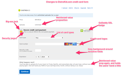
Distrokid, a music distribution service for artists, found that emphasising their value proposition and adding trust signals to their checkout form increased conversions by 60%.
Your visitors are likely to have their own unique cocktail of anxiety-inducing questions running through their mind. Survey your users to understand these concerns, and then address them directly on your forms.
4. Use your words wisely
It’s a common practice to include some variation of ‘no-spam guarantee’ on your forms.
However, because the word ‘spam’ has negative connotations this may actually be hurting your form conversion rates. That’s precisely what ContentVerve found when they tested showing a privacy policy vs. not displaying anything.

Are there words or images in your form that may consciously or subconsciously be deterring people from completing your form?
5. Reduce your minimum required clicks
I’m told that when Microsoft changed their shut down screen from a one-click button to a dropdown menu, a large percentage of users stopped shutting their computers down as often.
This is because a dropdown menu requires three clicks (open the menu, make the selection, confirm the selection) as opposed to the clickable button approach which only required one click.

While not the be all and end all, thinking in terms of ‘minimum required clicks’ can help you to find simpler form elements to reduce clicks, and ultimately reduce the time and cognitive load required to complete your form.
What are you doing to protect your visitor’s sign-up information? You may want to include a privacy policy, or perhaps display your SSL certificate at the bottom of the page, to let visitors know that you take their personal data seriously.
6. Create validation rules that help your users
Validation rules are often used to tell users when they’ve missed a field or entered information incorrectly.
Generally, validation rules are frustrating. I’m sure you’ve used forms in the past where the validation rules make it seemingly impossible to complete. Validation rules can, however, be useful and appreciated by the user.
The best practice is to display inline validation that provides real-time feedback to the user, rather than waiting until the user clicks submit.

7. Invest in the best design you can afford
Design is perhaps the single most important factor when it comes to building high-converting forms. Design impacts trust, first impressions, ease of completion, and even the motivation to fill out the form. In other words, when you improve design, you improve virtually all of the aspects in the Form Optimisation Pyramid above.
For great examples of form designs, I’d recommend searching for forms on Dribbble.
8. Speed it up
We live in a face-paced world, and even a few extra seconds that a webpage can take to load could lose you leads and sign-ups. For more tips on improving page, check out our post on ‘How to Improve Your Page Load Speed by 70.39% in 45 Minutes‘.
9. Make it quiz-like
If you asked 100 people whether they enjoy filling out forms, you’ll likely hear 100 resounding no’s. People fundamentally don’t enjoy filling out forms because they stand between people and the things they want. Filling out forms is a bit like going through customs in an airport – an undesirable necessity that you must do to get your desired outcome (travelling to a new country).
As a marketer or product designer it’s your job to minimise the exposure to forms, or to make them more enjoyable.
One way to do this is to make your forms unlike a form. Instead of text fields and dropdown boxes, you could experiment with an lead capture form that feels more quiz-like, using toggles, sliders, and more engaging elements.
While this may sound counterintuitive and against UX common wisdom, I have plenty of data to back up the effectiveness of this approach. In fact, this is one of the principles that we’ve found make Leadformly’s lead forms so effective.
In one of my favourite case studies, we increased BrokerNotes’ lead capture conversion rate from 13.6% to 41.6% (more than tripling inbound leads) by using a more quiz-like lead capture form.

The TopTal onboarding form is another great example of an engaging quiz-like lead generation form. Want to see more examples? We shared 12 examples of high-converting lead generation forms here.
10. Emphasise the outcome
Form abandonment implies that a user started filling out your form.
This means that they must want whatever is on the other side of your form, whether that’s a free consultation, joining a community, or ordering a product.
The problem is that they don’t want it enough that they’re willing to resist whatever distracted them, or to to overcome whatever hurdles caused them to drop out of your form. Sometimes the solution is simple – remind users why they’re filling out your form.
Tell them about the difference their donation is making, or how their life will improve with your product, or how your service will help them achieve their goals. This booster shot of motivation may be all that’s needed to reduce your form abandonment.
Bonus tip: What gets measured gets managed
It’s uncertain whether it was said by the legendary management consultant Peter Drucker, or by the statistician William Edwards Deming, but either way the quote ‘what gets measured gets managed’ rings true.
I recommend setting up a dashboard with daily statistics on form completion, along with a breakdown of which fields or questions have the highest drop-offs. This will give you a great feedback loop to identify what’s causing your form funnel to leak.
When you know precisely what needs fixing, you can begin to hypothesise variations using the tips above, and then run an A/B test to boost your form completion and conversion rates.
Remember – when you decrease form abandonment this has a huge knock-on effect across all of your marketing KPIs. Your cost per acquisition will go down, your paid ads will have a higher return on ad spend, and your overall ROI will improve.
I hope the tips above are useful, and I wish you good luck in driving your form conversion rates through the roof!
The post 10 Ways to Decrease Form Abandonment appeared first on Venture Harbour.
May 2, 2016
Leadformly by Venture Harbour (Coming soon)
Marketing teams invest huge amounts of time, budget, and creativity into driving traffic and building marketing campaigns… only to unintentionally turn away over 90% of leads at the last step.
The culprit? Forms.
Forms are what separate a non-lead from becoming a lead. They sit at the most critical point in your funnel and impact the results of all upstream marketing activity. In fact, you can do everything right in your marketing, but if your forms are mediocre – your results will be too.
Mediocre lead capture forms not only cost you leads, but also diminish your ROI, inflate your acquisition costs, and create a negative ripple effect throughout your marketing. That’s why we’re putting an end to mediocre forms.
At Venture Harbour, we’ve seen 200% uplifts in leads from optimising lead capture forms. We believe that the insights we’ve discovered on lead capture form optimisation could help thousands of businesses bring in more qualified leads each month.
We’re on a mission to make capturing & converting more leads easier for marketers.
This is why we’re launching Leadformly, a tool that makes it easy for marketing teams to boost ROI with conversion-optimised lead capture forms.
A sneak peek inside Leadformly:

Form builder

Form embed

Reporting dashboard

Form analytics
Want to hear about the Leadformly Early Adopter Program?
We’ll be launching Leadformly in mid-May to a private group of 50 early adopters. After this, we won’t be taking on any new users until later in the year.
If you’re interested in your company getting early access to Leadformly, please fill out the short survey below and we’ll let you let you know about the program once it’s ready.
What feature(s) are important to you in a lead capture form builder?
What's your biggest barrier to building high-converting lead capture forms?
Your Email
I’m Interested
'));
}
} else if (elem.tagName == 'SELECT') {
var selected = true;
if (elem.multiple) {
selected = false;
for (var i = 0; i < elem.options.length; i ) {
if (elem.options[i].selected) {
selected = true;
break;
}
}
} else {
for (var i = 0; i < elem.options.length; i ) {
if (elem.options[i].selected && !elem.options[i].value) {
selected = false;
}
}
}
if (!selected) {
no_error = false;
tooltip = create_tooltip(elem, "Please select an option.");
}
} else if (value === undefined || value === null || value === '') {
elem.className = elem.className ' _has_error';
no_error = false;
tooltip = create_tooltip(elem, "This field is required.");
}
}
if (no_error && elem.name == 'email') {
if (!value.match(/^[\ _a-z0-9-'&=] (\.[\ _a-z0-9-'] )*@[a-z0-9-] (\.[a-z0-9-] )*(\.[a-z]{2,})$/i)) {
elem.className = elem.className ' _has_error';
no_error = false;
tooltip = create_tooltip(elem, "Enter a valid email address.");
}
}
if (no_error && /date_field/.test(elem.className)) {
if (!value.match(/^\d\d\d\d-\d\d-\d\d$/)) {
elem.className = elem.className ' _has_error';
no_error = false;
tooltip = create_tooltip(elem, "Enter a valid date.");
}
}
tooltip ? resize_tooltip(tooltip) : false;
return no_error;
};
var needs_validate = function(el) {
return el.name == 'email' || el.getAttribute('required') !== null;
};
var validate_form = function(e) {
var err = form_to_submit.getElementsByClassName('_form_error')[0], no_error = true;
err ? err.parentNode.removeChild(err) : false;
if (!submitted) {
submitted = true;
for (var i = 0, len = allInputs.length; i < len; i ) {
var input = allInputs[i];
if (needs_validate(input)) {
if (input.type == 'text') {
addEvent(input, 'input', function() {
validate_field(this, true);
});
} else if (input.type == 'radio' || input.type == 'checkbox') {
(function(el) {
var radios = form_to_submit.elements[el.name];
for (var i = 0; i < radios.length; i ) {
addEvent(radios[i], 'click', function() {
validate_field(el, true);
});
}
})(input);
} else if (input.tagName == 'SELECT') {
addEvent(input, 'change', function() {
validate_field(input, true);
});
}
}
}
}
remove_tooltips();
for (var i = 0, len = allInputs.length; i < len; i ) {
var elem = allInputs[i];
if (needs_validate(elem)) {
validate_field(elem) ? true : no_error = false;
}
}
if (!no_error && e) {
e.preventDefault();
}
resize_tooltips();
return no_error;
};
addEvent(window, 'resize', resize_tooltips);
addEvent(window, 'scroll', resize_tooltips);
var form_submit = function(e) {
e.preventDefault();
if (validate_form()) {
var serialized = _form_serialize(document.getElementById('_form_1218_'));
_load_script('https://ventureharbour.activehosted.c...?' serialized '&jsonp=true');
}
return false;
};
addEvent(form_to_submit, 'submit', form_submit);
window._old_serialize = null;
if (typeof serialize !== 'undefined') window._old_serialize = window.serialize;
_load_script("//d3rxaij56vjege.cloudfront.net/form-se...", function() {
window._form_serialize = window.serialize;
if (window._old_serialize) window.serialize = window._old_serialize;
});
})();
The post Leadformly by Venture Harbour (Coming soon) appeared first on Venture Harbour.
January 5, 2016
21 Best High-Converting Lead Generation Forms
Looking for design inspiration to increase your form conversion rates?
Below are 21 of the best lead capture forms I’ve seen on the web, along with a deconstruction of the psychological / design tactics that make them high-converting.
To kick off, let’s start with one of the best converting forms I’ve come across.
1. BrokerNotes (The form that converts at 46%)
A colleague of mine designed a homepage lead gen form for BrokerNotes that, literally overnight, increased the conversion rate from 11% to 46%.

Here’s the form:

We came up with this design after months of surveying users, recording user sessions in HotJar, crunching Google Analytics data, and applying everything we knew about behavioural science to improving the design.
Takeaway #1: Don’t make your forms look like forms
A key concept behind designing this form was to not make it look like a form. Despite common wisdom suggesting that you shouldn’t try to reinvent the wheel with things like forms, people just don’t like forms. When was the last time you got excited after being told to fill out a form? Exactly.

By using non-standard user interface (UI) elements, such as large clickable images and toggle sliders, the form was fun and felt more like using a tool. Of course, the data captured at the end of it was identical to if we used a traditional form.
Takeaway #2: Reduce cognitive load using clickable elements
From a psychological perspective, every UI element required motor action (a mouse click or movement) rather than a cognitive action (having to think and type).
In the same way that a piece of software may be more intensive on your computer’s RAM than others, motor actions are less ‘load intensive’ on the brain than cognitive actions. Therefore by reducing cognitive load – i.e. the amount the user has to think to complete the form, we made it easier for users, increasing form completions.
Exclusive Bonus: Download our Lead Gen Form Checklist for a step-by-step guide on how to boost your conversions with high-converting lead gen forms.
Takeaway #3: Use conditional logic to ask better questions
Another tactic used is conditional logic (a feature in LeadFormly) to hide/display certain questions to certain users. For example, if someone said they were a beginner trader, we wouldn’t ask them which trading platform they prefer, as it’s unlikely they’d have one. For someone who answered that they were an expert, this is an important question to ask.

While this sounds like common sense, most forms ask the same cookie-cutter questions to every user. Conditional logic allows you to capture more information on users, while segmenting them better, by asking the most relevant questions to different audience segments.
2. TopTal
One of the best lead capture forms I’ve come across recently is by TopTal, a site for hiring the top 1% of developers and designers.
Their form has no distractions, is well-designed, and conforms with all of the usual conversion optimisation best practices.

Digging deeper, there are a few things that are quite impressive. Like the BrokerNotes example above, TopTal uses conditional logic to ask different questions to different users based on your previous answers.
Throughout the entire process TopTal also reinforce trust signals such as their phone number and client list.

While subtle, I also like the green progress bar beneath the header, making it clear how far you have to go. My only gripe here is that it moves in very small increments – giving the impression of a very long form.
A final nice touch was that TopTal sends off your form submission to a sales rep once it’s ~40% complete. You then have the option to add more information, which will fast track your enquiry.
3. Creative Design Architects
Creative Design Architects are another great example of a company standing out from the crowd with a well-executed lead generation form. The form uses a lot of visual icons, making it appear less form-like and more engaging.

This form also uses calculations and conditional logic to provide leads with a personalised experience that provides them with instant value (a quote), in return for capturing their information.
4. Salesforce
Salesforce do two things particularly well in their lead generation forms. The first is that they counter common objections and emphasise trust signals with statements like ‘no downloads’ and ‘trusted by 150,000 customers’.

Secondly, Salesforce allow you to register a free trial using social profiles. While not too unusual in the SaaS industry, this is quite a smart approach to lead generation – as it moves away from the user having to fill out a form, while still providing the company with the same data.
5. MusicLawContracts.com
It’s quite rare to see eCommerce sites doing lead generation. For MusicLawContracts.com (a site built by Venture Harbour), we used this lead generation form to simultaneously help direct customers to the right product for them, while capturing email leads.
This form converts at ~26%. In other words, just over 1 in 4 visitors to the home page give us their email address.

The reason why this lead generation form converts so well is because it doesn’t just take – it also gives value to the user. By directing the user to the best product for their situation, this lead gen form appears to be more of a tool than a form.

By capturing these leads at the start of the user’s journey on our eCommerce site we can easily segment between leads that bought and those who didn’t. This provides a number of remarketing and email marketing opportunities, to entice leads to come back and purchase a contract.

6. Hubspot’s Marketing Grader
While it might look like a simple tool, Hubspot’s marketing grader is really a lead generation form in disguise. What’s great about it is that it only asks for two pieces of information before it begins to give you value.

After you’ve entered your web address and email, you’re giving a personalised web audit of your site’s performance. If you click ‘Try Hubspot for Free’ you’ll be asked for more information – if not they’ll still get in touch to try and sell their software.

The lesson here is once again noticing the power of a simple form and giving your visitors some value (e.g. an audit) in return for their details.
7. BounceExchange
BounceExchange’s lead gen form is another non-conventional, yet impressively-designed, example of how you can collect leads without using the usual boring form designs.
What I really like about this form is the conversational tone of the questions. While the questions are perhaps longer than they need to be, it differentiates their form from the usual ‘name, email, phone number’ forms that we’re used to.

In combination with the clear call to actions, a subtle progress bar, and a permanent value proposition for why you should use the form, I imagine that this lead gen form performs particularly well.
8. Xero
Among designers, there’s a never-ending debate about whether form fields should have a title above the field box, or just placeholder text. The argument goes like this: Form fields look better with no title. However, when the user clicks the form field and starts typing, placeholder text disappears, which is a bad user experience.
As you can see, Xero have opted not to have titles above the form fields (except for the country field). But wait…

Xero have created a simple, yet slick, solution by moving the field placeholder text to the title as soon as you start typing:

This simple feature is a smart and stylish solution to the form field / title debate.
9. Base CRM
While Base’s form is actually nothing special, the value proposition of their lead capture form is clever. Instead of focusing on requesting a demo with a sales rep, Base position the value proposition of the demo as ‘speaking with a sales productivity expert’.

While I’ve never heard of the Ryan Thomas, Vanessa Arterberry or Tyler Rosenberg, the use of these images makes it feel more like an expert consultation, increasing the value proposition to fill out the form.
10. SingleGrain
The first thing that’s quite unique about SingleGrain’s lead gen form is that they use a ‘twitching’ call to action (every three seconds or so the button wiggles).

As our brain’s are hard-wired to notice movement, this is a smart way to draw attention back to an already-prominent call-to-action. In combination with the well-crafted personalised headline, I imagine this form converts very well for SingleGrain.
11. CompareTheMarket.com
Shifting back to B2C lead generation, we have CompareTheMarket.com.
If you’ve ever requested an insurance quote online you know just how long and dull the process can be. CompareTheMarket.com have reduced the amount of clicks required to complete this form to the absolute minimum.
One of the ways they do this is by asking questions in a logical order. This enables CompareTheMarket.com to set the most probable answers as defaults to future questions.
For example, once I’ve entered my vehicle registration number, all of the following questions are already answered by default:

Another area that CompareTheMarket.com are particularly strong in is providing good explanations for ambiguous questions. Instead of the usual question mark tooltips, CompareTheMarket.com have full pop out explainers with icons when you hover over any question.
Their handling of optional fields is also particularly interesting. Using the same pop-out explainers from above, CompareTheMarket.com explain how filling out optional fields will benefit your quote. This is a great balance between allowing users who’re in a rush to skip these questions, but still capturing extra information from users who are willing to invest more time to get a better or more accurate outcome.

12. eHarmony
eHarmony use many clever tactics already outlined in the examples above. By using conversational form field text, the word ‘free’, image-based UI elements, relevant imagery surrounding the form, and action-driven call-to-actions, this form is incredibly simple, yet well thought-out.

Like many of the forms, eHarmony also use a black out effect to make the form pop (and reduce distractions).

13. Cottages.com
Cottages.com’s form is pretty standard for a travel site, except for one feature.

When you update the location that you’re looking for cottages in, the text in the call to action changes to show how many matches cottages there are in that area.
This is extremely clever, as the location is the first field you enter, which also happens to be the field that users are most likely to abandon. By quickly displaying how many cottages are in that area, it increases the user’s motivation to fill out the rest of the form.
14. Wealthfront
Before trying to capture your information, Wealthfront give you a personalised investment portfolio plan based on your answers to a few questions.
What I really like about this approach is that it gives the user something of value before asking for anything in return. According to Influence author Dr. Robert Cialdini, this kind of reciprocity can be a powerful trigger for influencing action.
In addition to this, Wealthfront’s form is beautifully designed. With only question per step, clear progress indicators, and mostly one-click answer options, it’s quick and easy to use.

Once you finish answering the questions, you’re redirected to a page that requests your email address in return for displaying your personalised portfolio. By this point, you’ve invested enough time and effort that handing over your email address is a no-brainer.

15. Leadformly
The form on the Leadformly homepage converts approximately 34% of visitors into leads.
While this particular form doubles up as a live demo of Leadformly’s end product, the form incorporates a number of best practices such as conditional logic, multi-step design, strong visual cues, and smart defaults (personalising the default option based on the user’s IP address or previous answers).

Perhaps my favourite thing about this particular form is the animated progress bar, which moves like a barber shop sign. Check it out here.
16. Crazyegg
One of the most significant factors affecting form conversion rates is how much motivation your visitors have to use them in the first place. One of the best ways to increase this motivation is to ensure that your forms sell the benefits of using your form
Crazyegg is a great example of this. Their homepage lead capture form clearly explains that by using their form I will receive a heatmap that will tell me what’s making my website visitors leave.

While this form is designed to connect to my Google account and capture my information as a lead, the wording focuses on the value I’m about to receive.
17. eToro
Lead generation forms can be a nightmare for companies in highly-regulated industries like finance. With so many legal do’s and don’ts, it can be very challenging creating a smooth experience.
eToro are probably one of the best examples of a company that’s doing things right. While their forms could definitely be improved, they have done a good job of asking for lead information over a few phases to break things up.
When you first sign up, you’re required to enter your basic personal information. As you can see, they’ve put a lot of effort into providing clear inline validation, using smart defaults (e.g. predicting my phone extension), and giving me a few different options on how to sign up.

For those unaware, a site like this needs a lot more information than this in order for me to make a trade. They are going to need a copy of my passport, a household bill, as well as a lot of information on how I want to trade. Most companies ask for this all in one go.

eToro have turned this part of their lead gen form into a ‘wizard’ that gives the impression that you’re completing your profile. In other words, they’ve gamified their lead generation forms.
18. WeLoveDates
While simple, WeLoveDates’ lead capture form is very well-polished. From using an image of a happy couple to help the user visualise why they’re using the form, to starting with a simple question that requires no thought, this form uses all of the tricks in the book.

As soon as you start using the form, the rest of the page is blacked out to reduce the likelihood of users being distracted by other links / elements on the page. The form also provides instant feedback by displaying a green tick on the option that you’ve selected.

While their form only requires five pieces of information, WeLoveDates have split their form into five steps.
By asking one question per step (and clearly showing where the user is in the process), this design increases the user’s motivation to complete the form as they get closer to finishing (due to a cognitive bias called the endowed progress effect).

19. Datanyze
While there’s nothing particularly special about the form Datanyze is using (in fact, it violates a lot of form design best practices), I liked how it slides in from the side of the screen when you click ‘request a demo’.

It’s a small thing – but a nice touch none the less.
20. Square
My favourite thing about Square’s lead capture form (and there are many) is their validation messages. When something is entered incorrectly a full width error message appears, making it extremely clear that you need to make a change.

While it’s arguably quite intense, I like it. In addition, Square’s lead capture form feels very sleek and well-designed.
21. The Zebra
Now, I may have saved one of the best until last.
TheZebra.com have one of the best insurance lead capture forms I’ve ever seen. They not only have stunning landing pages, but the process of capturing information is incredibly well thought out.

Once you’ve entered some basic information, TheZebra ‘gamify’ the lead capture form by improving the accuracy of your insurance quote as you enter more information. When you answer additional questions, a percentage meter increases in realtime, encouraging you to answer even more questions.
Insurance is an inherently tough industry for lead capture forms, and TheZebra have created one of the best forms I’ve seen taking into account a tonne of insights that we’ve come across at Leadformly that typically result in higher engagement.
Summary
If you have a lead generation site that you want to optimise, here’s my advice:
Look at the Wikipedia page for cognitive biases. This page lists all of the known and proven ways in which humans make decisions (often irrationally). If you’ve ever wondered why certain conversion optimisation or usability principles work, often it’s grounded in one of these biases.
Use Leadformly. As a co-founder I’m obviously biased, however, we built it because building high-converting forms for our lead gen sites was costing $1,000’s each month in development fees and taking far too long. That’s not even taking into account the weeks of setting up insightful form analytics in Google Tag Manager, integrating them with our other tools, and squashing bugs. Leadformly lets you build powerful lead gen forms like the examples above, with ease.
Test big changes. Don’t waste time testing your call-to-action text – create a radically different form that solves the same problem in a different way. Test that. As we saw in example #1, that’s how you go from converting at 11% to 46% overnight.
The post 21 Best High-Converting Lead Generation Forms appeared first on Venture Harbour.
18 Beautiful High-Converting Lead Generation Forms
Looking for design inspiration to increase your form conversion rates?
Below are 18 of the best lead capture forms I’ve seen on the web, along with a deconstruction of the psychological / design tactics that make them high-converting.
To kick off, let’s start with one of the best converting forms I’ve come across.
1. BrokerNotes (The form that converts at 46%)
A colleague of mine designed a homepage lead gen form for BrokerNotes that, literally overnight, increased the conversion rate from 11% to 46%.
Here’s the form:
We came up with this design after months of surveying users, recording user sessions in HotJar, crunching Google Analytics data, and applying everything we knew about behavioural science to improving the design.
Takeaway #1: Don’t make your forms look like forms
A key concept behind designing this form was to not make it look like a form. Despite common wisdom suggesting that you shouldn’t try to reinvent the wheel with things like forms, people just don’t like forms. When was the last time you got excited after being told to fill out a form? Exactly.
By using non-standard user interface (UI) elements, such as large clickable images and toggle sliders, the form was fun and felt more like using a tool. Of course, the data captured at the end of it was identical to if we used a traditional form.
Takeaway #2: Reduce cognitive load using clickable elements
From a psychological perspective, every UI element required motor action (a mouse click or movement) rather than a cognitive action (having to think and type).
In the same way that a piece of software may be more intensive on your computer’s RAM than others, motor actions are less ‘load intensive’ on the brain than cognitive actions. Therefore by reducing cognitive load – i.e. the amount the user has to think to complete the form, we made it easier for users, increasing form completions.
Takeaway #3: Use conditional logic to ask better questions
Another tactic used is conditional logic (a feature in LeadFormly) to hide/display certain questions to certain users. For example, if someone said they were a beginner trader, we wouldn’t ask them which trading platform they prefer, as it’s unlikely they’d have one. For someone who answered that they were an expert, this is an important question to ask.
While this sounds like common sense, most forms ask the same cookie-cutter questions to every user. Conditional logic allows you to capture more information on users, while segmenting them better, by asking the most relevant questions to different audience segments.
2. TopTal
One of the best lead capture forms I’ve come across recently is by TopTal, a site for hiring the top 1% of developers and designers.
Their form has no distractions, is well-designed, and conforms with all of the usual conversion optimisation best practices.
Digging deeper, there are a few things that are quite impressive. Like the BrokerNotes example above, TopTal uses conditional logic to ask different questions to different users based on your previous answers.
Throughout the entire process TopTal also reinforce trust signals such as their phone number and client list.
While subtle, I also like the green progress bar beneath the header, making it clear how far you have to go. My only gripe here is that it moves in very small increments – giving the impression of a very long form.
A final nice touch was that TopTal sends off your form submission to a sales rep once it’s ~40% complete. You then have the option to add more information, which will fast track your enquiry.
3. Creative Design Architects
Creative Design Architects are another great example of a company standing out from the crowd with a well-executed lead generation form. The form uses a lot of visual icons, making it appear less form-like and more engaging.
This form also uses calculations and conditional logic to provide leads with a personalised experience that provides them with instant value (a quote), in return for capturing their information.
4. Salesforce
Salesforce do two things particularly well in their lead generation forms. The first is that they counter common objections and emphasise trust signals with statements like ‘no downloads’ and ‘trusted by 150,000 customers’.
Secondly, Salesforce allow you to register a free trial using social profiles. While not too unusual in the SaaS industry, this is quite a smart approach to lead generation – as it moves away from the user having to fill out a form, while still providing the company with the same data.
5. MusicLawContracts.com
It’s quite rare to see eCommerce sites doing lead generation. For MusicLawContracts.com (a site built by Venture Harbour), we used this lead generation form to simultaneously help direct customers to the right product for them, while capturing email leads.
This form converts at ~26%. In other words, just over 1 in 4 visitors to the home page give us their email address.
The reason why this lead generation form converts so well is because it doesn’t just take – it also gives value to the user. By directing the user to the best product for their situation, this lead gen form appears to be more of a tool than a form.
By capturing these leads at the start of the user’s journey on our eCommerce site we can easily segment between leads that bought and those who didn’t. This provides a number of remarketing and email marketing opportunities, to entice leads to come back and purchase a contract.
6. Hubspot’s Marketing Grader
While it might look like a simple tool, Hubspot’s marketing grader is really a lead generation form in disguise. What’s great about it is that it only asks for two pieces of information before it begins to give you value.
After you’ve entered your web address and email, you’re giving a personalised web audit of your site’s performance. If you click ‘Try Hubspot for Free’ you’ll be asked for more information – if not they’ll still get in touch to try and sell their software.
The lesson here is once again noticing the power of a simple form and giving your visitors some value (e.g. an audit) in return for their details.
7. BounceExchange
BounceExchange’s lead gen form is another non-conventional, yet impressively-designed, example of how you can collect leads without using the usual boring form designs.
What I really like about this form is the conversational tone of the questions. While the questions are perhaps longer than they need to be, it differentiates their form from the usual ‘name, email, phone number’ forms that we’re used to.
In combination with the clear call to actions, a subtle progress bar, and a permanent value proposition for why you should use the form, I imagine that this lead gen form performs particularly well.
8. Xero
Among designers, there’s a never-ending debate about whether form fields should have a title above the field box, or just placeholder text. The argument goes like this: Form fields look better with no title. However, when the user clicks the form field and starts typing, placeholder text disappears, which is a bad user experience.
As you can see, Xero have opted not to have titles above the form fields (except for the country field). But wait…
Xero have created a simple, yet slick, solution by moving the field placeholder text to the title as soon as you start typing:
This simple feature is a smart and stylish solution to the form field / title debate.
9. Base CRM
While Base’s form is actually nothing special, the value proposition of their lead capture form is clever. Instead of focusing on requesting a demo with a sales rep, Base position the value proposition of the demo as ‘speaking with a sales productivity expert’.
While I’ve never heard of the Ryan Thomas, Vanessa Arterberry or Tyler Rosenberg, the use of these images makes it feel more like an expert consultation, increasing the value proposition to fill out the form.
10. SingleGrain
The first thing that’s quite unique about SingleGrain’s lead gen form is that they use a ‘twitching’ call to action (every three seconds or so the button wiggles).
As our brain’s are hard-wired to notice movement, this is a smart way to draw attention back to an already-prominent call-to-action. In combination with the well-crafted personalised headline, I imagine this form converts very well for SingleGrain.
11. CompareTheMarket.com
Shifting back to B2C lead generation, we have CompareTheMarket.com.
If you’ve ever requested an insurance quote online you know just how long and dull the process can be. CompareTheMarket.com have reduced the amount of clicks required to complete this form to the absolute minimum.
One of the ways they do this is by asking questions in a logical order. This enables CompareTheMarket.com to set the most probable answers as defaults to future questions.
For example, once I’ve entered my vehicle registration number, all of the following questions are already answered by default:
Another area that CompareTheMarket.com are particularly strong in is providing good explanations for ambiguous questions. Instead of the usual question mark tooltips, CompareTheMarket.com have full pop out explainers with icons when you hover over any question.
Their handling of optional fields is also particularly interesting. Using the same pop-out explainers from above, CompareTheMarket.com explain how filling out optional fields will benefit your quote. This is a great balance between allowing users who’re in a rush to skip these questions, but still capturing extra information from users who are willing to invest more time to get a better or more accurate outcome.
12. eHarmony
eHarmony use many clever tactics already outlined in the examples above. By using conversational form field text, the word ‘free’, image-based UI elements, relevant imagery surrounding the form, and action-driven call-to-actions, this form is incredibly simple, yet well thought-out.
Like many of the forms, eHarmony also use a black out effect to make the form pop (and reduce distractions).
13. Cottages.com
Cottages.com’s form is pretty standard for a travel site, except for one feature.
When you update the location that you’re looking for cottages in, the text in the call to action changes to show how many matches cottages there are in that area.
This is extremely clever, as the location is the first field you enter, which also happens to be the field that users are most likely to abandon. By quickly displaying how many cottages are in that area, it increases the user’s motivation to fill out the rest of the form.
14. Wealthfront
Before trying to capture your information, Wealthfront give you a personalised investment portfolio plan based on your answers to a few questions.
What I really like about this approach is that it gives the user something of value before asking for anything in return. According to Influence author Dr. Robert Cialdini, this kind of reciprocity can be a powerful trigger for influencing action.
In addition to this, Wealthfront’s form is beautifully designed. With only question per step, clear progress indicators, and mostly one-click answer options, it’s quick and easy to use.
Once you finish answering the questions, you’re redirected to a page that requests your email address in return for displaying your personalised portfolio. By this point, you’ve invested enough time and effort that handing over your email address is a no-brainer.
15. Leadformly
The form on the Leadformly homepage converts approximately 34% of visitors into leads.
While this particular form doubles up as a live demo of Leadformly’s end product, the form incorporates a number of best practices such as conditional logic, multi-step design, strong visual cues, and smart defaults (personalising the default option based on the user’s IP address or previous answers).
Perhaps my favourite thing about this particular form is the animated progress bar, which moves like a barber shop sign. Check it out here.
16. Crazyegg
One of the most significant factors affecting form conversion rates is how much motivation your visitors have to use them in the first place. One of the best ways to increase this motivation is to ensure that your forms sell the benefits of using your form
Crazyegg is a great example of this. Their homepage lead capture form clearly explains that by using their form I will receive a heatmap that will tell me what’s making my website visitors leave.
While this form is designed to connect to my Google account and capture my information as a lead, the wording focuses on the value I’m about to receive.
17. eToro
Lead generation forms can be a nightmare for companies in highly-regulated industries like finance. With so many legal do’s and don’ts, it can be very challenging creating a smooth experience.
eToro are probably one of the best examples of a company that’s doing things right. While their forms could definitely be improved, they have done a good job of asking for lead information over a few phases to break things up.
When you first sign up, you’re required to enter your basic personal information. As you can see, they’ve put a lot of effort into providing clear inline validation, using smart defaults (e.g. predicting my phone extension), and giving me a few different options on how to sign up.
For those unaware, a site like this needs a lot more information than this in order for me to make a trade. They are going to need a copy of my passport, a household bill, as well as a lot of information on how I want to trade. Most companies ask for this all in one go.
eToro have turned this part of their lead gen form into a ‘wizard’ that gives the impression that you’re completing your profile. In other words, they’ve gamified their lead generation forms.
18. WeLoveDates
While simple, WeLoveDates’ lead capture form is very well-polished. From using an image of a happy couple to help the user visualise why they’re using the form, to starting with a simple question that requires no thought, this form uses all of the tricks in the book.
As soon as you start using the form, the rest of the page is blacked out to reduce the likelihood of users being distracted by other links / elements on the page. The form also provides instant feedback by displaying a green tick on the option that you’ve selected.
While their form only requires five pieces of information, WeLoveDates have split their form into five steps.
By asking one question per step (and clearly showing where the user is in the process), this design increases the user’s motivation to complete the form as they get closer to finishing (due to a cognitive bias called the endowed progress effect).
Summary
If you have a lead generation site that you want to optimise, here’s my advice:
Look at the Wikipedia page for cognitive biases. This page lists all of the known and proven ways in which humans make decisions (often irrationally). If you’ve ever wondered why certain conversion optimisation or usability principles work, often it’s grounded in one of these biases.
Use Leadformly. As a co-founder I’m obviously biased, however, we built it because building high-converting forms for our lead gen sites was costing $1,000’s each month in development fees and taking far too long. That’s not even taking into account the weeks of setting up insightful form analytics in Google Tag Manager, integrating them with our other tools, and squashing bugs. Leadformly lets you build powerful lead gen forms like the examples above, with ease.
Test big changes. Don’t waste time testing your call-to-action text – create a radically different form that solves the same problem in a different way. Test that. As we saw in example #1, that’s how you go from converting at 11% to 46% overnight.
The post 18 Beautiful High-Converting Lead Generation Forms appeared first on Venture Harbour.
12 Best High-Converting Lead Generation Forms
Looking for design inspiration to increase your form conversion rates?
Below are 12 of the best lead capture forms I’ve seen on the web, along with a deconstruction of the psychological / design tactics that make them high-converting.
To kick off, let’s start with one of the best converting forms I’ve come across.
1. BrokerNotes (The form that converts at 46%)
Built using LeadFormly, a colleague of mine designed a homepage lead gen form for BrokerNotes that, literally overnight, increased the conversion rate from 11% to 46%.
Here’s the form:
We came up with this design after months of surveying users, recording user sessions in HotJar, crunching Google Analytics data, and applying everything we knew about behavioural science to improving the design.
Takeaway #1: Don’t make your forms look like forms
A key concept behind designing this form was to not make it look like a form. Despite common wisdom suggesting that you shouldn’t try to reinvent the wheel with things like forms, people just don’t like forms. When was the last time you got excited after being told to fill out a form? Exactly.
By using non-standard user interface (UI) elements, such as large clickable images and toggle sliders, the form was fun and felt more like using a tool. Of course, the data captured at the end of it was identical to if we used a traditional form.
Takeaway #2: Reduce cognitive load using clickable elements
From a psychological perspective, every UI element required motor action (a mouse click or movement) rather than a cognitive action (having to think and type).
In the same way that a piece of software may be more intensive on your computer’s RAM than others, motor actions are less ‘load intensive’ on the brain than cognitive actions. Therefore by reducing cognitive load – i.e. the amount the user has to think to complete the form, we made it easier for users, increasing form completions.
Takeaway #3: Use conditional logic to ask better questions
Another tactic used is conditional logic (a feature in LeadFormly) to hide/display certain questions to certain users. For example, if someone said they were a beginner trader, we wouldn’t ask them which trading platform they prefer, as it’s unlikely they’d have one. For someone who answered that they were an expert, this is an important question to ask.
While this sounds like common sense, most forms ask the same cookie-cutter questions to every user. Conditional logic allows you to capture more information on users, while segmenting them better, by asking the most relevant questions to different audience segments.
2. TopTal
One of the best lead capture forms I’ve come across recently is by TopTal, a site for hiring the top 1% of developers and designers.
Their form has no distractions, is well-designed, and conforms with all of the usual conversion optimisation best practices.
Digging deeper, there are a few things that are quite impressive. Like the BrokerNotes example above, TopTal uses conditional logic to ask different questions to different users based on your previous answers.
Throughout the entire process TopTal also reinforce trust signals such as their phone number and client list.
While subtle, I also like the green progress bar beneath the header, making it clear how far you have to go. My only gripe here is that it moves in very small increments – giving the impression of a very long form.
A final nice touch was that TopTal sends off your form submission to a sales rep once it’s ~40% complete. You then have the option to add more information, which will fast track your enquiry.
3. WeLoveDates
While simple, WeLoveDates’ lead capture form is very well-polished. From using an image of a happy couple to help the user visualise why they’re using the form, to starting with a simple question that requires no thought, this form uses all of the tricks in the book.
As soon as you start using the form, the rest of the page is blacked out to reduce the likelihood of users being distracted by other links / elements on the page. The form also provides instant feedback by displaying a green tick on the option that you’ve selected.
While their form only requires five pieces of information, WeLoveDates have split their form into five steps.
By asking one question per step (and clearly showing where the user is in the process), this design increases the user’s motivation to complete the form as they get closer to finishing (due to a cognitive bias called the endowed progress effect).
4. Salesforce
Salesforce do two things particularly well in their lead generation forms. The first is that they counter common objections and emphasise trust signals with statements like ‘no downloads’ and ‘trusted by 150,000 customers’.
Secondly, Salesforce allow you to register a free trial using social profiles. While not too unusual in the SaaS industry, this is quite a smart approach to lead generation – as it moves away from the user having to fill out a form, while still providing the company with the same data.
5. MusicLawContracts.com
It’s quite rare to see eCommerce sites doing lead generation. For MusicLawContracts.com (a site built by Venture Harbour), we used this lead generation form to simultaneously help direct customers to the right product for them, while capturing email leads.
This form (also built using LeadFormly) converts at ~26%. In other words, just over 1 in 4 visitors to the home page give us their email address.
The reason why this lead generation form converts so well is because it doesn’t just take – it also gives value to the user. By directing the user to the best product for their situation, this lead gen form appears to be more of a tool than a form.
By capturing these leads at the start of the user’s journey on our eCommerce site we can easily segment between leads that bought and those who didn’t. This provides a number of remarketing and email marketing opportunities, to entice leads to come back and purchase a contract.
6. Hubspot’s Marketing Grader
While it might look like a simple tool, Hubspot’s marketing grader is really a lead generation form in disguise. What’s great about it is that it only asks for two pieces of information before it begins to give you value.
After you’ve entered your web address and email, you’re giving a personalised web audit of your site’s performance. If you click ‘Try Hubspot for Free’ you’ll be asked for more information – if not they’ll still get in touch to try and sell their software.
The lesson here is once again noticing the power of a simple form and giving your visitors some value (e.g. an audit) in return for their details.
7. BounceExchange
BounceExchange’s lead gen form is another non-conventional, yet impressively-designed, example of how you can collect leads without using the usual boring form designs.
What I really like about this form is the conversational tone of the questions. While the questions are perhaps longer than they need to be, it differentiates their form from the usual ‘name, email, phone number’ forms that we’re used to.
In combination with the clear call to actions, a subtle progress bar, and a permanent value proposition for why you should use the form, I imagine that this lead gen form performs particularly well.
8. Xero
Among designers, there’s a never-ending debate about whether form fields should have a title above the field box, or just placeholder text. The argument goes like this: Form fields look better with no title. However, when the user clicks the form field and starts typing, placeholder text disappears, which is a bad user experience.
As you can see, Xero have opted not to have titles above the form fields (except for the country field). But wait…
Xero have created a simple, yet slick, solution by moving the field placeholder text to the title as soon as you start typing:
This simple feature is a smart and stylish solution to the form field / title debate.
9. Base CRM
While Base’s form is actually nothing special, the value proposition of their lead capture form is clever. Instead of focusing on requesting a demo with a sales rep, Base position the value proposition of the demo as ‘speaking with a sales productivity expert’.
While I’ve never heard of the Ryan Thomas, Vanessa Arterberry or Tyler Rosenberg, the use of these images makes it feel more like an expert consultation, increasing the value proposition to fill out the form.
10. SingleGrain
The first thing that’s quite unique about SingleGrain’s lead gen form is that they use a ‘twitching’ call to action (every three seconds or so the button wiggles).
As our brain’s are hard-wired to notice movement, this is a smart way to draw attention back to an already-prominent call-to-action. In combination with the well-crafted personalised headline, I imagine this form converts very well for SingleGrain.
11. CompareTheMarket.com
Shifting back to B2C lead generation, we have CompareTheMarket.com.
If you’ve ever requested an insurance quote online you know just how long and dull the process can be. CompareTheMarket.com have reduced the amount of clicks required to complete this form to the absolute minimum.
One of the ways they do this is by asking questions in a logical order. This enables CompareTheMarket.com to set the most probable answers as defaults to future questions.
For example, once I’ve entered my vehicle registration number, all of the following questions are already answered by default:
Another area that CompareTheMarket.com are particularly strong in is providing good explanations for ambiguous questions. Instead of the usual question mark tooltips, CompareTheMarket.com have full pop out explainers with icons when you hover over any question.
Their handling of optional fields is also particularly interesting. Using the same pop-out explainers from above, CompareTheMarket.com explain how filling out optional fields will benefit your quote. This is a great balance between allowing users who’re in a rush to skip these questions, but still capturing extra information from users who are willing to invest more time to get a better or more accurate outcome.
12. eHarmony
eHarmony use many clever tactics already outlined in the examples above. By using conversational form field text, the word ‘free’, image-based UI elements, relevant imagery surrounding the form, and action-driven call-to-actions, this form is incredibly simple, yet well thought-out.
Like many of the forms, eHarmony also use a black out effect to make the form pop (and reduce distractions).
Summary
If you have a lead generation site that you want to optimise, here’s my advice:
Look at the Wikipedia page for cognitive biases. This page lists all of the known and proven ways in which humans make decisions (often irrationally). If you’ve ever wondered why certain conversion optimisation or usability principles work, often it’s grounded in one of these biases.
Use LeadFormly. As a co-founder I’m obviously biased, however, we built it because building high-converting forms for our lead gen sites was costing $1,000’s each month in development fees and taking far too long. That’s not even taking into account the weeks of setting up insightful form analytics in Google Tag Manager, integrating them with our other tools, and squashing bugs. LeadFormly lets you build powerful lead gen forms like the examples above, with ease.
Test big changes. Don’t waste time testing your call-to-action text – create a radically different form that solves the same problem in a different way. Test that. As we saw in example #1, that’s how you go from converting at 11% to 46% overnight.
The post 12 Best High-Converting Lead Generation Forms appeared first on Venture Harbour.