
Nate Silver's Blog, page 46
May 4, 2020
Politics Podcast: Biden Responds To Sexual Assault Allegation
More: Apple Podcasts |
ESPN App |
RSS
| Embed
Embed Code
On Friday, former Vice President Joe Biden personally denied a sexual assault allegation made by Tara Reade, one of his former Senate staffers. In this installment of the FiveThirtyEight Politics podcast, the team reviews how elected Democrats and voters are reacting to the accusation so far and what it means for Biden politically. They also check in on where we are in the course of the coronavirus pandemic and weigh the effect on the 2020 election of a likely third-party run for president by Rep. Justin Amash.
You can listen to the episode by clicking the “play” button in the audio player above or by downloading it in iTunes , the ESPN App or your favorite podcast platform. If you are new to podcasts, learn how to listen .
The FiveThirtyEight Politics podcast publishes Mondays and Thursdays. Help new listeners discover the show by leaving us a rating and review on iTunes . Have a comment, question or suggestion for “good polling vs. bad polling”? Get in touch by email, on Twitter or in the comments.


April 28, 2020
Is Trump Slipping In The Polls Because Of COVID-19?
In this week’s FiveThirtyEight Politics podcast, Nate, Clare, Micah and Galen discuss what Trump’s handling of the COVID-19 pandemic could mean for the general election.
April 27, 2020
Politics Podcast: Is Trump Slipping In The Polls Because Of COVID-19?
More: Apple Podcasts |
ESPN App |
RSS
| Embed
Embed Code
A slew of recent polling in swing states shows President Trump losing ground to presumptive Democratic nominee Joe Biden. In this installment of the FiveThirtyEight Politics podcast, the crew asks whether the narrative of Trump’s handling of the coronavirus crisis has already been cemented, and what Trump could do to turn his numbers around. They also weigh how much responses to the pandemic — among the public and politicians — has been rooted in partisanship.
You can listen to the episode by clicking the “play” button in the audio player above or by downloading it in iTunes, the ESPN App or your favorite podcast platform. If you are new to podcasts, learn how to listen.
The FiveThirtyEight Politics podcast publishes Mondays and Thursdays. Help new listeners discover the show by leaving us a rating and review on iTunes . Have a comment, question or suggestion for “good polling vs. bad polling”? Get in touch by email, on Twitter or in the comments.
April 23, 2020
Coronavirus Cases Are Still Growing In Many U.S. States
Last week, I wrote about how New York has successfully bent the coronavirus curve after an extended period of social distancing. The evidence this week is even stronger. As of Wednesday, just 27.6 percent of newly reported COVID-19 tests in New York City were positive, still a fairly high rate — but substantially down from a peak of 59.4 percent on March 29. Other states are also seeing a decline in new cases — Louisiana, in particular, has seen a highly encouraging turnaround.
Unfortunately, though, New York and Louisiana aren’t the norm. In fact, there isn’t really any norm. While the situation in many states is improving, in nearly half of all states in the U.S., there are as many COVID-19 cases as ever, and in some cases, even more.
As I’ve written before, the number of new confirmed cases can be a deceptive indicator of how much the coronavirus is spreading unless you also account for how many tests are conducted. But the stubborn persistence of the novel coronavirus in many parts of the country isn’t just an artifact of rising testing volume.
In fact, the number of tests has been at a plateau for several weeks in the U.S. But that isn’t necessarily the case in individual states. So in this article, I’ll go through some additional calculations to estimate how the share of positive tests has changed in each state over the past several weeks. Before I go into more detail, though, you should know that the conclusions would largely be the same with whatever metric I chose. Newly diagnosed cases, the positive test rate and the number of deaths are all showing progress in some states — but getting worse in plenty of others. In other words, the United States has not yet turned the corner nationwide.
How to estimate positive test rates
All 50 states and the District of Columbia now make some effort to report both positive and negative test results. In theory, that should allow us to calculate the share of tests that are positive and how that has changed over time. Given that the large majority of infections are probably undetected, no measure is perfect. But our analysis of various testing scenarios suggests that the rate of positive tests is usually a truer indicator of the actual, underlying spread of the disease than the raw number of positives.
However, while most states diligently update their data on the number of positive tests, the quality of reporting on negative tests varies. For instance, while New York publishes detailed reports on the number of positive and negative tests each day, California takes a more casual approach with reporting its negatives. On Wednesday, for example, California reported more than 160,000 “new” negative tests — as compared with just 7,000 negatives on Tuesday. It is highly unlikely that these new tests were actually conducted on Wednesday. Instead, California was likely clearing a backlog of tests that had been conducted days — or even weeks — ago.
Having looked at a lot of this data, I know that California isn’t the only offender. So I developed some techniques to smooth erratic reporting on negative tests, which should allow us to come up with reasonable estimates even in states that don’t have great data. (Because this is a story about the coronavirus and not one on methods for handling dodgy data, feel free to skip to the next section if you don’t care about the nitty gritty.) In any event, I’ll be brief. It’s basically a three-step process:
First, if a state has days where it skips reporting any testing at all — that is, it doesn’t report on the existence of any new positive or negative tests — I spread the data evenly over any skipped days once it does report new tests. For instance, if Alabama doesn’t report any data on Sunday, and then reports the existence of 100 new tests on Monday, I assign half of those tests to Sunday and keep half of them on Monday.
Second, because reporting on negative tests has become more comprehensive over time, I pick a date in each state when its reporting on negative tests first became “usable.” Usable is a low bar and the date varies wildly from state to state. A state’s reporting can still be erratic; that’s what the next step is designed to deal with. But to be usable, a state has to be making some effort at being comprehensive — for instance, by including data both from state-run laboratories and private labs among its negative tests counts. It’s challenging though to pinpoint when a state’s data is usable, and something that has to be done by hand.1
Third, within the window where a state’s negative test data is usable, I apply a polynomial smoother to the negative-test data to iron out daily fluctuations in reporting. The smoother is set to a pretty conservative setting, as we’re mostly interested in getting a sense of the broad directionality of a state’s testing regime — that is, whether tests are increasing quickly, increasing slowly, stagnant, or even declining. Outside of a state’s usable window, we use data for states that did have reliable reporting to estimate how fast test volume was increasing or decreasing. For instance, if Utah’s data did not become usable until March 20, but we know that the average state with usable data was doing 50 percent more testing on March 20 than on March 10, we can use that to extrapolate how much testing Utah may have been doing on March 10.
Note that — other than the first step — we apply this process only to a state’s reporting on negative tests, since reporting on positive tests is usually more timely and reliable.2 The main issue with positive test reporting tends to be day-of-week effects: Some states tend to be better about reporting data on weekdays than on weekends. The simplest workaround for this is simply to look at one full week’s worth of data at a time, which is what we’ll do in the next section.
Where coronavirus cases are growing and shrinking
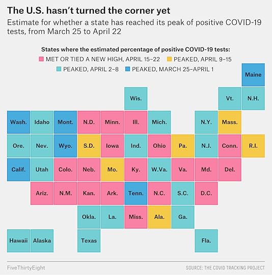
For each state, I’ve estimated the share of COVID-19 tests that produced positive results for the past five weeks — that is, for the seven-day periods ending on March 25, April 1, April 8, April 15 and April 22.3 All data, subject to the adjustments I described in the previous section, comes from The COVID Tracking Project.
Let’s start with the states where things are still getting worse, or at least are not getting better — places where the share of positive tests hit a new high as of April 22.
Where the coronavirus hasn’t yet peaked
States where the estimated percentage of positive COVID-19 tests met or tied a new high in the period ending on April 22
Estimated share of positive tests for period ending:
State
March 25
April 1
April 8
April 15
April 22
Arizona
5%
7%
10%
10%
13%
Arkansas
5
5
6
8
9
Colorado
11
20
23
24
25
Connecticut
11
25
35
35
39
D.C.
7
14
24
21
27
Delaware
3
7
16
17
22
Illinois
12
21
24
23
24
Iowa
3
8
10
13
23
Kansas
4
10
13
10
14
Kentucky
4
7
7
13
15
Maryland
4
11
20
24
24
Minnesota
3
4
5
7
10
Mississippi
5
7
7
9
9
Nebraska
2
5
8
9
18
New Mexico
2
3
6
7
7
North Carolina
3
6
9
8
10
North Dakota
1
3
3
3
8
Ohio
4
10
13
13
24
Virginia
6
12
17
19
22
Source: The Covid Tracking Project
Eighteen states and the District of Columbia made this list, which together are home to almost 95 million people. So if you hear something about how the situation is turning the corner in the U.S., that’s sort of a fiction. With so few people traveling, we’re really seeing a lot of statewide and local epidemics more than a national one, and some of those epidemics are still getting worse.
The states where cases are growing are somewhat varied, too — about evenly mixed between red states and blue states. They are mostly concentrated in the Midwest, although a series of Eastern Seaboard states — North Carolina, Virginia, Maryland and Delaware — also make the list. Connecticut is also on the list, which is something of a surprise since the turnaround is clear in neighboring New York.
On a percentage basis, the biggest week-over-week increases have been in Midwestern states, though: specifically Iowa, Ohio, Nebraska and North Dakota. But these increases aren’t necessarily uniformly distributed throughout the general population. Ohio is having huge problems in its prisons, and meat-processing plants have been centers of outbreaks in states such as Iowa. These outbreaks go to show the limitations of social distancing. It doesn’t work for people who can’t afford to do it, which means that even in places that seem to be controlling the outbreak, there can still be huge numbers of cases among essential workers.
Next up, states that have — at best — tentatively turned the corner, or where the peak of positive test rates came in the week that ended April 15.
Where the coronavirus might be peaking
States where the estimated percentage of positive COVID-19 tests peaked in the period ending on April 15
Estimated share of positive tests for period ending:
State
March 25
April 1
April 8
April 15
April 22
Alabama
6%
12%
12%
12%
8%
Massachusetts
7
20
24
30
29
Missouri
3
8
12
12
11
Pennsylvania
5
15
25
25
24
Rhode Island
6
11
11
17
16
South Dakota
2
4
10
24
21
Source: The Covid Tracking Project
Other than perhaps Alabama, where the share of positive tests fell from 12 percent a week ago to 8 percent this week, all of these states have made at best tentative progress and are only a percentage point or two off their peak of positive tests rates.
So in other words, in about half the country — the 18 states in the previous table plus most of the ones in this table and a couple in the next table — new coronavirus cases are still at or near their peak, after accounting for changes in testing volume.
But there are some encouraging stories: There are 20 states where positive test rates peaked two weeks ago, on April 8.
Where the coronavirus may be past its peak
States where the estimated percentage of positive COVID-19 tests peaked in the period ending on April 8
Estimated share of positive tests for period ending:
State
March 25
April 1
April 8
April 15
April 22
Alaska
2%
4%
4%
3%
2%
Florida
4
10
13
10
8
Georgia
13
25
27
21
21
Hawaii
2
2
4
2
1
Idaho
3
12
15
7
10
Indiana
9
20
22
17
18
Louisiana
7
15
27
14
9
Michigan
22
24
29
28
22
Nevada
5
14
14
13
13
New Hampshire
4
11
13
12
12
New Jersey
19
46
55
53
54
New York
31
43
45
42
31
Oklahoma
2
6
7
6
4
Oregon
4
6
6
5
4
South Carolina
8
13
15
13
12
Texas
4
9
12
11
9
Utah
3
5
6
4
4
Vermont
7
8
9
5
2
West Virginia
2
4
5
4
3
Wisconsin
7
9
11
9
10
Source: The Covid Tracking Project
If you look at the data in more detail, though, it’s actually a bit of a mixed bag. Nevada, New Jersey, New Hampshire and Wisconsin are only tenuous members of this club; their rates of positive tests were nearly as high on April 22 as they were on April 8.
However, the decline in positive test rates has been more robust in New York, Louisiana and Michigan, all of which had very bad outbreaks before.
Florida and Georgia, controversial for their plans to reopen beaches and businesses, fall somewhere in between, with medium-sized decreases in positive test rates. Georgia has actually seen a continued increase in its raw number of positive tests, although it is doing more testing, so its share of positive tests has declined somewhat.
There are a number of Southern states on the declining list. Although the role that weather plays in the spread of COVID-19 is disputed, it’s worth noting that late March was fairly warm in states such as Louisiana, which could have been a factor in these states.
Finally, there are a few states where the estimated rate of positive tests peaked three weeks ago, in the period ending on April 1.
Where the coronavirus may have peaked three weeks ago
States where the estimated percentage of positive COVID-19 tests peaked in the period ending on April 1
Estimated share of positive tests for period ending:
State
March 25
April 1
April 8
April 15
April 22
California
10%
13%
12%
6%
7%
Maine
5
10
6
6
3
Montana
3
7
5
3
2
Tennessee
4
9
7
6
6
Washington
9
13
11
5
6
Wyoming
3
6
5
4
2
Source: The Covid Tracking Project
Most of these states are in the West — and in the case of Washington and California, states that enacted fairly aggressive social distancing measures earlier because the coronavirus hit them sooner than other parts of the U.S. Although, it’s hard to know exactly what is happening in California given how erratic its reporting on negative tests has been.
Remote, geographically isolated states such as Montana and Maine (plus Alaska and Hawaii from the previous list) may have some advantages in containing the spread of COVID-19., though. Namely, they may be rural enough that human interaction is slightly less common. They’re also low-population states that never had terribly bad outbreaks, which may make “contact tracing” possible, or the practice of finding and monitoring people exposed to the disease; this is easier to do when you have a finite number of cases.
Where the fight against COVID-19 stands
So, what to make of all of this — or at least, what to make of the states where the situation is not improving?
A week or two ago, we might have said just to give it more time since there’s a substantial lag between when people get infected and when their test shows up in the data. That lag is typically two or three weeks, though. Since most of the country began implementing social distancing measures in mid-to-late March, we should see the effects of it in the data by now.
And in fact, we do see those effects of social distancing. Cases are decreasing in about half the country. In places where the data suggests COVID-19 cases are still increasing, they tend not to be increasing all that fast — especially when you compare where we are now to the exponential rates of spread we saw initially in New York and Louisiana, which reflected the period before social distancing measures were in place. Of course, the catch here is the spread would likely accelerate again if restrictions were lifted.
Additionally, while these social distancing efforts are almost certainly flattening the curve, the somewhat lax American version of social distancing may not be enough to bend the curve all on its own. In epidemiological terms, bending the curve means getting R — the effective reproduction number — under 1, so that each person who acquires COVID-19 spreads it to less than one new person. If R is less than 1, a disease will begin to die out4, but if it’s above 1, the disease will keep spreading. And if R is near 1, the curve will flatten into a long plateau but not turn downward, which may be the case in some states.
We must also consider the role of the essential workforce, since it doesn’t get the full benefits of social distancing like some of us do. If R is 0.6 among white-collar workers who can work from home, but 1.2 among U.S. Postal Service drivers, 1.7 among factory workers, 3.0 among nurses in hospitals and 4.6 among prison guards, the disease may continue to spread, but with that spread being concentrated among certain occupations and populations. Not that there is necessarily a better way around this, but carving out large categories of essential workers can make it hard for a community as whole to get its R below 1.
Indeed, the states where COVID-19 cases are decreasing often have some other helpful factors in addition to social distancing. As I mentioned, geographically isolated states seem to be doing better, as do warm-weather states. Because the outbreaks were so bad in New York and Louisiana, they may be benefiting from some degree of herd immunity; enough people had COVID-19 there that it may be harder to spread it, assuming that they are immune. (Immunity is a complicated subject, but it’s likely that most people are immune for some period of time.)5. These factors aren’t necessarily enormously important; warm weather is highly unlikely to be a cure-all, for instance. But something that’s enough to tip R from being just above 1 to just below 1 — say, from 1.15 to 0.85 — will have fairly noticeable effects over the course of a few weeks.
In short, the United States desperately needs to work on techniques in addition to social distancing to fight the spread, including better testing, case-tracking, quarantining of sick individuals, and better sanitation and hygiene. Social distancing has likely been very helpful to slow the spread and, in many states, even reverse it. But if it’s the only tool we’re employing — and it’s a costly tool to wield — it may only be enough to allow us to fight the coronavirus to a draw.
How One Modeler Is Trying To Forecast The Toll Of COVID-19
In this episode of the FiveThirtyEight Politics podcast, Galen Druke and Nate Silver speak with Dr. Chris Murray, who created the Institute for Health Metrics and Evaluation’s COVID-19 projections.
April 22, 2020
Politics Podcast: How One Modeler Is Trying To Forecast The Toll Of COVID-19
More: Apple Podcasts |
ESPN App |
RSS
| Embed
Embed Code
Governments across the United States and around the world have relied on forecast models in planning their response to the COVID-19 pandemic. In this special edition of “Model Talk” on the FiveThirtyEight Politics podcast, Dr. Chris Murray — who created the frequently cited Institute for Health Metrics and Evaluation model — discusses how he went about building his model and the challenges he has encountered. Murray says honing the IHME model has been an ongoing process as new data about the virus has emerged as it spread.
You can listen to the episode by clicking the “play” button in the audio player above or by downloading it in iTunes, the ESPN App or your favorite podcast platform. If you are new to podcasts, learn how to listen.
The FiveThirtyEight Politics podcast publishes Mondays and Thursdays. Help new listeners discover the show by leaving us a rating and review on iTunes . Have a comment, question or suggestion for “good polling vs. bad polling”? Get in touch by email, on Twitter or in the comments.
April 20, 2020
Politics Podcast: What Is Motivating The COVID-19 Protests?
More: Apple Podcasts |
ESPN App |
RSS
| Embed
Embed Code
Over the past week, protests against COVID-19 mitigation measures have popped up in state capitals around the country. In this installment of the FiveThirtyEight Politics podcast, the crew discusses what’s motivating the protests, as well as President Trump’s support for them. The team also weighs the electoral pros and cons of possible vice presidential picks for apparent Democratic nominee Joe Biden.
You can listen to the episode by clicking the “play” button in the audio player above or by downloading it in iTunes , the ESPN App or your favorite podcast platform. If you are new to podcasts, learn how to listen .
The FiveThirtyEight Politics podcast publishes Mondays and Thursdays. Help new listeners discover the show by leaving us a rating and review on iTunes . Have a comment, question or suggestion for “good polling vs. bad polling”? Get in touch by email, on Twitter or in the comments.
Nate Silver's Blog

- Nate Silver's profile
- 730 followers

