
Nate Silver's Blog, page 47
April 14, 2020
Has New York Bent The Curve?
There is increasing evidence that New York City and New York state are turning a corner in their efforts to fight back COVID-19, and the timing suggests that the shifts may be a result of social distancing measures.
Whether the state and city have merely flattened the curve to a plateau or actually begin to turn it around is somewhat ambiguous. In his daily press conferences, New York Gov. Andrew Cuomo has described recent data on hospitalizations as good news and emphasized that the curve has become quite flat. On Tuesday, for the first time, New York reported a net decline in hospitalizations, although it remains to be seen whether the trend can be sustained.. The number of people reported as dying from COVID-19 has also been at a plateau in recent days.
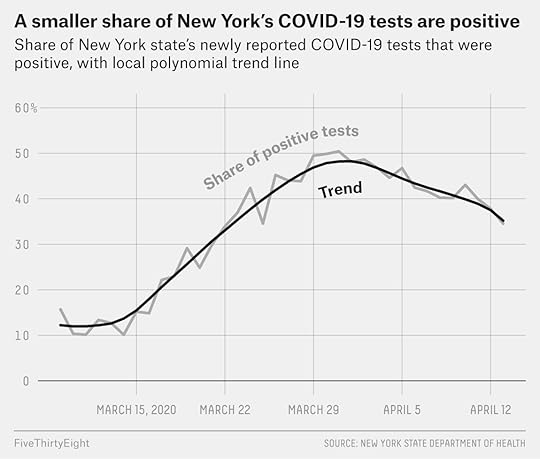
But data on the share of New Yorkers who are testing positive for COVID-19 suggests that the curve has not merely flattened but probably begun to turn down. Among tests conducted Monday, April 13 (and reported on Tuesday afternoon), 34.5 percent were positive, down from a peak of 50.4 percent on Tuesday, March 31. The decline in the share of positive tests has been fairly robust across most parts of New York state, including in all five New York City’s five boroughs, although some more clearly so than others.
Still, if the decline has been steady, it has so far been slow. That may imply that while current social distancing measures are enough to gradually decrease the number of new cases in New York, the number of new cases may continue to simmer at relatively high levels for several weeks or longer — and that they could increase again if these measures are relaxed.
All the numbers in this article come from publicly available data from the New York State Department of Health. (There’s also a downloadable version.) The state has been releasing detailed reports on the number of positive and negative tests conducted each day in each county in the state, including in the boroughs of New York City (which are each their own counties).
Information on the overall number of tests — both positive and negative — is critical, because without it, apparent changes in the number of cases can reflect changes in testing volume rather than the actual incidence of disease in the population. In tests conducted on Sunday and disclosed on the state’s website on Monday, for example, 6,337 New Yorkers were found to have COVID-19, the lowest number of new cases since March 24 and a seemingly huge decline from the 10,575 new cases found on Thursday. (The number ticked up again a bit in tests conducted on Monday, to 7,177.) However, perhaps because of Easter, only 16,756 tests were conducted on Sunday, the lowest number since March 31. (By comparison, 26,336 tests were done on Thursday.) There are many such fluctuations in the data:
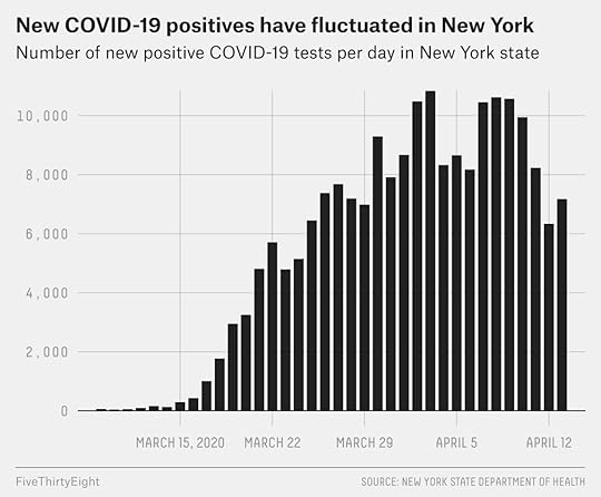
Evaluating the share of tests that turned up positive can paint a clearer picture. The rate of positive tests was climbing statewide through March 31 but has been falling slowly since then.1
It turns out that this Sunday was a pretty good day for New York. The share of tests returning positive results on Sunday was relatively low (37.8 percent) — in fact, the lowest in almost three weeks up to that point (since March 25), although Monday’s figure was lower still. It just wasn’t quite as good a day as the raw numbers imply because of the relative lack of testing.
Adjusting for testing volume doesn’t answer every question. It could be that New York’s criteria for getting tests are becoming more liberal, or more conservative, which could affect positive test rates. These tests are hardly coming from a random sample of the population, in other words.
The still-high rate of positive tests among those who are being tested suggests that there are probably a very large number of undiagnosed cases in New York (as there are in other places). It may even be that literally millions of people in New York City have or had COVID-19. Testing of pregnant women at one NYC hospital late last month and early this month, as reported in a letter to the New England Journal of Medicine, found that around 14 percent of asymptomatic women had COVID-19, and that was at an earlier point in the epidemic than the one we find ourselves in now.
Still, across most of the scenarios that I described in my earlier article on testing, the share of people who tested positive was a more accurate reflection of the shape of the epidemic curve than the raw number of positive tests was without adjusting for testing volume. (Feel free to download our Excel sheet and explore your own assumptions.)
Furthermore, changes in the share of positive tests in New York state are not merely a reflection of where in New York those tests are being conducted. Since upstate New York has a lower rate of positive tests than New York City, for example, doing more tests upstate but fewer in New York City could artificially depress the statewide positive test rate. That is not what’s happening here, however. Instead, if we break New York into three parts, we find a decline in the rate of positive tests in each one.
In New York City — applying a trend line to smooth out slight fluctuations from day to day — the share of positive tests has declined from a peak of around 57 percent on March 30 to around 42 percent now. In five suburban counties that are part of the New York City metro area — Suffolk and Nassau Counties on Long Island, and Westchester, Rockland and Putnam Counties in the Hudson Valley — positives have fallen from a peak of around 50 percent on April 1 to 38 percent now. And in the rest of the state — which I’m referring to as upstate New York, though the definition of “upstate” is controversial — positives peaked at around 22 percent on April 2 and have now fallen to about 17 percent.
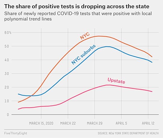
These communities haven’t followed exactly the same curves. The suburbs were home to some initial, very bad outbreaks. However, the city then had steeper, sharper growth and a higher but slightly earlier peak than the suburbs.
In upstate New York, the rate of positive tests was never as high as it was in the city or the suburbs, but it also hasn’t declined as much.
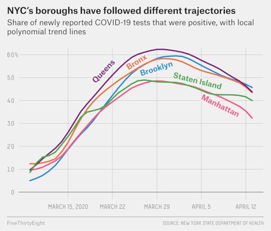
The five New York City boroughs have also had different trajectories. Queens had the highest peak, but has since seen the steepest decline. Manhattan had a lower rate of positive tests than the other boroughs, although that could reflect the fact that residents of Manhattan are wealthier and could find ways to get tested even with limited symptoms.
Staten Island has followed a slightly worrying path, with the rate of positive tests having declined somewhat from their peak, but then leveling off rather than continuing to decline as sharply as in the other four boroughs and in the suburbs. Staten Island is home to many essential service workers such as police and firefighters who are testing positive for COVID-19 at high rates.
But overall, the news is positive in New York. It’s also a sign of the importance of social distancing — which means that the rates of new cases could increase again if measures are relaxed.
If the peak in the rate of positive tests came on or around March 31, it’s likely that the peak in actual infections came sooner than that — probably two or perhaps even three weeks sooner, given the lag between when people get infected and when they become symptomatic, and how long it takes for symptomatic people to get tested and for their tests to show up in the data. That would mean it came in mid-March, a time when New York City was — belatedly, according to some public health officials — closing schools, along with bars, restaurants and other businesses.
The governor’s statewide stay-at-home order, meanwhile, didn’t formally begin until the evening of March 22, which could be reflected in the slightly later peaks outside of New York City.
The decline in the rate of positive tests has not been especially steep, however — at least not until the past two days, when it was sharper. If taken at face value, it would imply that the effective reproduction number (sometimes called R), or how many additional infections are produced by each infected person, is below 1, but perhaps only slightly below 1. When that number is above 1, the number of new infections will continue to increase, while if it’s below 1, the number of new infections will decrease. But if the reproduction number is close to 1 — say, 1.1 or 0.9 — the increases or decreases will be gradual, with a long, relatively flat plateau rather than a sharp peak.
We don’t know for sure yet whether New York is going to follow that course. In Italy, the decline in the rate of positive tests was initially fairly modest, producing a plateau for a week or two, before later picking up steam.
Warmer weather could also help, although the evidence for this is mixed. There is also a lot of uncertainty about how many people in New York ultimately have or had the coronavirus. If many people had it — as implied by the New England Journal of Medicine letter — then herd immunity could potentially play some role in lowering R, though likely not enough to reduce it below 1 on its own until a large share of the population has become immune.
It’s perhaps more likely, though, that New York has been beating COVID-19 by a relatively thin margin so far, and therefore it doesn’t have a lot of margin for error. That’s a lot better than the alternative case where the city and state were losing the fight and the number of hospitalized patients continued to rise at their earlier rates. But it also means that city, state and regional leaders will have to be smart about reopening the economy and relaxing social distancing measures.


April 13, 2020
Politics Podcast: These Are Our Priors For The General Election
More: Apple Podcasts |
ESPN App |
RSS
| Embed
Embed Code
Now that Democrats have settled on a presumptive nominee, the FiveThirtyEight Politics podcast team discuss their priors for the 2020 presidential contest. While seven months — and an unfolding crisis — separate us from Election Day, the 2020 election appears to have similar patterns to 2016’s — for now. The crew also look at where we are in the COVID-19 crisis and how the debate over when to reopen the economy is playing out.
You can listen to the episode by clicking the “play” button in the audio player above or by downloading it in iTunes , the ESPN App or your favorite podcast platform. If you are new to podcasts, learn how to listen .
The FiveThirtyEight Politics podcast publishes Mondays and Thursdays. Help new listeners discover the show by leaving us a rating and review on iTunes . Have a comment, question or suggestion for “good polling vs. bad polling”? Get in touch by email, on Twitter or in the comments.
April 9, 2020
Sanders — And The Media — Learned The Wrong Lessons From Trump In 2016
“The […] pitch is a mix of idealism and a shouting anger about the system, but at its heart is a hard-nosed math: He’s the only candidate with a sizable chunk of the electorate that won’t waver, no matter what, so a field that keeps growing and splitting support keeps making things easier.”
As I’m sure you’ve probably guessed, this passage seems like it could be about Donald Trump’s campaign for the Republican nomination in 20161 — but it’s actually about Bernie Sanders’s quest for the Democratic nomination this year. It comes from an April 2019 feature by the Atlantic’s Edward-Isaac Dovere that I consider to be a lodestar for Sanders’s strategy since it contains a lot of on-the-record reporting from Sanders campaign.2
The article also reveals how the conventional wisdom about how primary campaigns have changed, in light of Trump winning the Republican nomination in 2016 and Sanders’s better-than-expected performance against Hillary Clinton that year. In particular, it reflects several common assumptions in media coverage of the race this year:
In a divided field, the goal is to have the largest, most enthusiastic base.
Reaching out to different factions of your party is not that important — and may even dilute your differentiation from the other candidates. As long as you’re winning the plurality of votes, you’ll win enough states and the rest of the party will eventually come around.
There is no need to make peace with the party establishment. In our populist era, nominations are won from the grassroots up. Voters don’t care about things like endorsements, and “party elites” are largely feckless.
Indeed, if you’d beamed down to Planet Earth from some alien civilization in January 2016 and only seen that year’s primaries, those might be the lessons that you’d take away about how primaries work. They’re a reasonably apt description of the GOP primary, where the Republican establishment belly flopped in trying to stop Trump. The Democratic primary was a bit more complicated. Clinton beat Sanders by a rather clear margin in the end.3 Still, Sanders overperformed expectations by enough as to at least not contradict the notion that 2016 was the new normal.
But focusing on only what happened in the most recent election is a dumb way to do analysis. The media and campaign professionals spend endless amounts of time trying to draw “lessons” from elections because they are so consequential, but you can’t escape the fact that presidential elections happen only once every four years. No matter how many lessons you might try to draw from any one example, you’re still dealing with a sample size of one.
Rather, the history of the primaries — both in terms of how the media covers them and how campaigns wage them — is often one of fighting the last war and overcompensating for perceived mistakes from four years earlier. I’m not claiming to be immune from this either. One of the reasons that I initially bought so heavily into “The Party Decides” hypothesis in 2016 — which implied that Trump’s lack of support from the Republican party establishment would eventually doom him — was because of the Republican primary in 2012, when a series of insurgent candidates (Newt Gingrich, Herman Cain, Rick Santorum) briefly surged in the polls only to eventually lose to the slow-and-steady (and establishment-backed) Mitt Romney.
But Romney’s win in 2012 was in line with the longer history of the primaries, which underscores that building coalitions across the different wings of your party (Romney tried to unite conservatives and moderates, for instance) is usually a good strategy for winning instead of relying on just one faction. And as you can see in the table below, the establishment usually does win out in the end:
The party usually does decide, after all
Endorsement leaders before the Iowa caucuses where no incumbent president was running for that party’s nomination, 1972 to 2020
Year
Party
Endorsement leader before Iowa
Did they have a clear endorsement lead?
Did they win the nomination?
1972
D
Ed Muskie
✓
1976
D
Fred Harris
1980
R
Ronald Reagan
✓
✓
1984
D
Walter Mondale
✓
✓
1988
D
Dick Gephardt
1988
R
George H.W. Bush
✓
✓
1992
D
Bill Clinton
✓
✓
1996
R
Bob Dole
✓
✓
2000
D
Al Gore
✓
✓
2000
R
George W. Bush
✓
✓
2004
D
Howard Dean
2008
D
Hillary Clinton
✓
2008
R
John McCain
✓
2012
R
Mitt Romney
✓
✓
2016
D
Hillary Clinton
✓
✓
2016
R
Jeb Bush
2020
D
Joe Biden*
✓
✓
*Biden has not been formally nominated, but is the presumptive nominee.
Endorsement leaders from 1980 to 2016 are based on FiveThirtyEight’s 2016 system for calculating endorsement points. Endorsement leaders in 1972 and 1976 are based on “The Party Decides.”
Sources: “The Party Decides,” News accounts
Of course, a result like Romney’s win in 2012 that confirms your theories and priors can create its own issues — it can make you overconfident. You may mistakenly assume, for instance, that something is true 100 percent of the time when it’s actually only true, say, 80 percent of the time.
But while overconfidence is a serious problem, it’s probably better than assuming that an abnormal result (say, something that is true 20 percent of the time) is the new normal. You can see lots of this upside-down thinking in media coverage of elections since 2016. Because Trump won the general election as a (modest) underdog in 2016, a lot have inferred that underdogs not only can win, but that they usually win. Before the Virginia gubernatorial election in 2017, for instance, a lot of pundits predicted Republican Ed Gillespie would win despite being narrowly behind Democrat Ralph Northam in the polls. Northam won by 9 points instead.
It’s not just the media who makes these mistakes, however. It’s also the campaigns themselves. So while I don’t intend to do a long post-mortem of the Sanders campaign — instead, see my colleague Perry Bacon Jr.’s comprehensive analysis on what went wrong and why — I do want to take a quick inventory of the ways that the 2020 Democratic primary was different from the Republican primary in 2016.
Most of these problems were fairly predictable and known in advance. To ensure you that I’m not engaging in too much hindsight bias — because it’s always easier to say what went wrong with campaigns once you know who won and who lost — I’d point you toward this cautiously pessimistic take on Sanders from April 2019 and this cautiously optimistic one from just after the New Hampshire primary, which reflects how my thinking about the Sanders’s campaign evolved as it was happening in real-time. I started out thinking that Sanders’s factional, us-versus-them, screw-the-establishment strategy was a poor one. But it seemed to be going about as well as it possibly could after New Hampshire with the rest of the field divided.
So here are some potential flaws in Sanders’s strategy — and reasons why the precedent set by Trump’s win in 2016 might not have applied to his chances this year:
First, Democratic primaries and caucuses do not use winner-take-all rules, while many Republican states do. That makes it much harder for someone to be in a commanding position by narrowly winning primaries. Instead, in a multi-candidate race, you have to eventually broaden your coalition to avoid a contested convention.
In consideration of this, some elements of Sanders’s strategy simply never made a lot of sense. Here’s another key passage from that Atlantic article:
He’s counting on winning Iowa and New Hampshire, where he was already surprisingly strong in 2016, and hoping that Cory Booker and Kamala Harris will split the black electorate in South Carolina and give him a path to slip through there, too. And then, Sanders aides believe, he’ll easily win enough delegates to put him into contention at the convention. They say they don’t need him to get more than 30 percent to make that happen.
Sanders’s campaign was right that it could win around 30 percent of the vote with their base and that they could win early states with that amount … but it never really had a plan for what came after that. Dovere’s article makes it sound as though Sanders was actually counting on a contested convention, an awfully risky approach given that contested conventions are: (i) highly unpredictable and (ii) not likely to be favorable terrain for Sanders, given his lack of support from the establishment and that superdelegates would be allowed to vote on the second and subsequent ballots.
Second, Trump’s ideological ambiguity may have helped him in 2016, while Sanders got stuck in a “lane” this year. Trump may not have done that much traditional outreach to different parts of the GOP, but Republican voters from several wings of the party, perhaps not being quite sure what to make of a candidate like Trump who was reactionary on some issues (say, immigration) and quite moderate on others (say, gay marriage), were nonetheless Trump-curious. And that range of appeal was reflected in the primary results. In the Michigan Republican primary for instance, Trump won the support of 35 percent of “very conservative” voters, 37 percent of “somewhat conservative” voters and 37 percent of moderate voters, according to exit polls.
By contrast Sanders ran further to the left in 2020 than he did in 2016, with a message that shifted from economic populism to a broader and more “intersectional” leftism. This shift was reflected at the ballot box, too. For instance, Sanders won just 24 percent of moderates in the Michigan Democratic primary this year (but 63 percent of “very liberal” voters) — as compared 44 percent of moderates and 59 percent of “very liberal” voters in 2016.
Third, the importance that Democratic voters attached to “electability” and to beating Trump may have made them more willing to take cues from the establishment. Electability is a whole subject unto itself that I’m not going to do justice to here. I do think electability may be a teensy, tiny bit overrated as a reason for why Sanders lost. While perceptions of electability probably hurt Sanders relative to Joe Biden, it also probably helped him relative to candidates who weren’t white men: most notably, Elizabeth Warren.
Still, electability was important. In that Michigan exit poll, 58 percent of Democratic voters said they preferred a candidate that could beat Trump to someone who agreed with them on the issues — and 62 percent of the “beat Trump” voters went for Biden.
Fourth, Democratic party elites had an opportunity to learn from Republicans in 2016, and this may have made them more aggressive in backing Biden after South Carolina. One reason to be careful of declaring a “new normal” in any trend involving human behavior is that humans have an opportunity to learn from what happened last time and change course. The establishment’s failures in 2016 may have made partly elites reluctant to weigh in early on in the race this time around. But once they perceived Sanders as the true front-runner after Nevada, and Biden began to gain a little bit of momentum as he surged to a lead in South Carolina polls, party elites got behind Biden at extremely rapid rates. It’s hard to know if this would have played out the same way if there wasn’t 2016 to learn from.
Fifth, Trump’s success in 2016 may have reflected an unusually weak field of alternatives rather than a new paradigm. I’m not going to spend much time on this one, because it’s rather subjective. Were Warren, Biden, Pete Buttigieg, Kamala Harris, etc. better candidates than Ted Cruz, Marco Rubio, Jeb Bush, John Kasich, etc.? I don’t know. But Democratic voters were certainly much happier with their field of candidates in 2020 than Republicans were with theirs in 2016, which is some indication that the field might have been stronger.
Sixth, Democrats are a more racially-diverse party, which makes coalition building more essential than it is among Republicans. Sanders didn’t do badly with nonwhite voters — winning Nevada largely on the basis of Hispanic support while also winning the support of many younger black voters. That definitely made him a more plausible nominee than Buttigieg, whose support was extremely white, for example. Still, nonwhite support wasn’t a strength for Sanders in a head-to-head race against Biden, who generally beat Sanders by wide margins among black voters and held his own among Hispanics in many states. And Sanders’s outreach to African American leaders didn’t always go smoothly, with many members of the Congressional Black Caucus backing Biden instead.
Seventh, relying on a fixed base of voters can leave you vulnerable to a turnout surge from other candidates. One rather explicit assumption made by the Sanders campaign was that it could turn out more voters than its opponents. Hence, the campaign believed there was not much need to widen their circle to include others. Even their outreach efforts to Sanders-skeptical party leaders focused on trying to browbeat them into explaining why they didn’t support Sanders rather than explaining why they should support him. Again, from that Atlantic article:
That’s the case Sanders and his aides have been making as they’ve undertaken an outreach effort unlike anything from the last campaign, spending hours on phone calls trying to talk political leaders down from being completely opposed to him. They have a basic script: Start out asking where the support for Sanders is among their constituents, then ask why they think those people support him, and then ask the leaders to explain their own skepticism.
One problem with this attitude is that turnout in an election isn’t fixed — especially in primaries and caucuses where participation is low. You may turn out a certain number of people, but your base will not be constant as a percentage of the electorate if turnout goes up. In Michigan, for example, Sanders got nearly as many votes in 2020 (576,754) as in 2016 (599,000). But Biden got 838,555 votes in 2020, as compared to just 581,775 for Clinton in 2016 — part of a general pattern where turnout surged more in Biden’s best areas. So Sanders went from narrowly winning Michigan to losing it by 17 percentage points.
Perhaps Sanders was a victim of his own success in 2016. That is, he did such a good job of turning out voters in 2016 that it was hard to improve on his performance in 2020. Still, there was never really any recognition that his base alone might not be enough to win — and there were never many efforts to expand beyond his base. Indeed, it’s interesting that Sanders doubled down even more on his screw-the-establishment messaging amidst his success in the first three states — rather than trying to pivot to a more inclusive campaign and unify the party behind him.
I've got news for the Republican establishment. I've got news for the Democratic establishment. They can't stop us.
— Bernie Sanders (@BernieSanders) February 22, 2020
Maybe, if a few things had gone differently, it would have worked. Sanders did outlast more than two dozen other candidates, after all. Maybe if Michael Bloomberg hadn’t qualified for the Nevada debate and stumbled so badly there, moderate support would have remained divided between Bloomberg and Biden, and Sanders would have had a lot more wins on Super Tuesday. Maybe Sanders’s “60 Minutes” interview hurt him. Maybe he could have gotten Warren to endorse him. Who knows.
But the Sanders campaign was always pursuing a strategy that claimed to defy the odds, that assumed the old rules no longer applied, and that stuck its thumb in the eye of the establishment. It would have been remarkable if it had succeeded. But it’s no surprise that it didn’t.
April 8, 2020
Politics Podcast: Bernie Sanders Suspends His Campaign For President
More: Apple Podcasts |
ESPN App |
RSS
| Embed
Embed Code
Sen. Bernie Sanders announced Wednesday that he is suspending his campaign for president of the United States. In this emergency installment of the FiveThirtyEight Politics podcast, the crew discusses why he lost, why he decided to drop out when he did and what his role in American politics will be going forward.
You can listen to the episode by clicking the “play” button in the audio player above or by downloading it in iTunes , the ESPN App or your favorite podcast platform. If you are new to podcasts, learn how to listen .
The FiveThirtyEight Politics podcast publishes Mondays and Thursdays. Help new listeners discover the show by leaving us a rating and review on iTunes . Have a comment, question or suggestion for “good polling vs. bad polling”? Get in touch by email, on Twitter or in the comments.
April 6, 2020
Politics Podcast: Wisconsin’s Election Is A Mess
More: Apple Podcasts |
ESPN App |
RSS
| Embed
Embed Code
In this installment of the FiveThirtyEight Politics podcast, we dig into some of the challenges that would accompany holding an election amid the coronavirus pandemic. As of the publishing of this podcast, it was unclear whether Wisconsin would be the only state in the country to hold in-person voting in April — the state is scheduled to go to the polls on Tuesday. The Democratic governor issued an executive order to postpone the election on Monday, but the last-minute move was challenged in court by the Republican-controlled legislature. Late Monday (after we recorded this podcast), the state Supreme Court overturned the governor’s order and it appears the election will happen. The team discusses why the state wasn’t able to agree on a postponement earlier.
The crew also looked at how different parts of the country have responded to the COVID-19 crisis and whether hot spots, such as New York, are beginning to turn a corner.
You can listen to the episode by clicking the “play” button in the audio player above or by downloading it in iTunes , the ESPN App or your favorite podcast platform. If you are new to podcasts, learn how to listen .
The FiveThirtyEight Politics podcast publishes Mondays and Thursdays. Help new listeners discover the show by leaving us a rating and review on iTunes . Have a comment, question or suggestion for “good polling vs. bad polling”? Get in touch by email, on Twitter or in the comments.
April 4, 2020
Coronavirus Case Counts Are Meaningless*
If you follow me on Twitter, you’ll know I’m constantly going on about how the number of COVID-19 cases is not a very useful indicator of anything — unless you also know something about how tests are being conducted.
If you’re a regular reader of FiveThirtyEight, you’re probably used to looking at data in sports — where basically everything that happens on a basketball court or a baseball diamond is recorded — or in electoral politics, when polls (in theory, anyway) survey a random sample of the population. COVID-19 statistics, especially the number of reported cases, are not at all like that. The data, at best, is highly incomplete, and often the tip of the iceberg for much larger problems. And data on tests and the number of reported cases is highly nonrandom. In many parts of the world today, health authorities are still trying to triage the situation with a limited number of tests available. Their goal in testing is often to allocate scarce medical care to the patients who most need it — rather than to create a comprehensive dataset for epidemiologists and statisticians to study.
But if you’re not accounting for testing patterns, it can throw your conclusions entirely out of whack. You don’t just run the risk of being a little bit wrong: Your analysis could be off by an order of magnitude. Or even worse, you might be led in the opposite direction of what is actually happening. A country where the case count is increasing because it’s doing more testing, for instance, might actually be getting its epidemic under control. Alternatively, in a country where the reported number of new cases is declining, the situation could actually be getting worse, either because its system is too overwhelmed to do adequate testing or because it’s ramping down on testing for PR reasons.
Failure to account for testing strategies can also render comparisons between states and countries meaningless. According to two recent epidemiological studies, which tried to infer the true number of infected people from the reported number of deaths, there is roughly a 20-fold difference in case detection rates between the countries that are doing the best job of it, such as Norway and the worst job, such as the United Kingdom. (The United States is probably somewhere in the middle of the pack by this standard.) That means, for example, that in one country that reports 1,000 COVID-19 cases, there could actually be 5,000 infected people, and in another country that reports 1,000 cases, there might be 100,000!
There is also a lot of uncertainty about the true numbers of infections within a given country. According to an expert survey published by FiveThirtyEight, the number of detected cases in the United States could underestimate the true number of infected people by anywhere from a multiple of two times to 100 times. The same holds in other countries. A recent paper published by Imperial College London estimated that the true number of people who had been infected with the coronavirus in the U.K. as of March 30 was somewhere between 800,000 and 3.7 million1 — as compared to a reported case count through that date of just 22,141.
So in this article, I’m going to work through four examples of how various testing strategies can skew case counts, in the hopes of giving you a more hands-on sense for how the mechanics behind the numbers work. These scenarios are definitely not meant as predictions of what will happen in any given country, state or region. They work with hypothetical data, because we don’t know all the parameters we’d need to properly estimate a model anyway. The goal is just to illustrate, given relatively simple assumptions, how reported case counts for a disease can differ from the actual number of infections.
At the same time, the parameters in each scenario reflect what I hope are semi-realistic assumptions that at least loosely approximate the coronavirus situation in different groups of countries. Some countries have relatively robust testing. Some started out with strong testing but then stalled out. Some were way behind on testing but soon caught up. Each of these can have different effects on the pattern of reported cases.
You can even download an Excel spreadsheet and input your own assumptions — though I’m going to wait until the end of the story to give you the link, in the hopes that you’ll continue reading about how this all works before trying to brew up your own scenario.
The not-so-simple math behind coronavirus testing
The core purpose of this exercise is to help you think through how many people might test positive for a disease based on how many people are actually infected with it, given various assumptions about testing. That does require us to make some simple assumptions about the underlying number of infected people in the population. So the scenarios are partly based on what should be a fairly simple, standard epidemiological model.
The most important number in any epidemiological model is R, or the reproduction ratio, which is how many people that a person in one generation passes the disease along to in the next generation. For example, if a disease has an R of 3, that means each infected person transmits it to three more people. So one initial case becomes three newly infected people2 in the next generation, which becomes nine people, which becomes 27 people, which becomes 81 people, and so forth — the very nature of exponential growth is that it gets out of hand quickly!
Assumptions about the R of COVID-19 vary, and to some extent that’s inevitable given that there isn’t necessarily one intrinsic number for how the disease spreads from one infected person to the next. In fact, epidemiologists make a distinction between R0 (pronounced R-zero or R-naught), which is called the basic reproduction ratio, or how fast the disease spreads in the absence of any interventions or any immunity whatsoever, and the effective reproduction ratio, called R-effective or simply R.3 R-effective is likely to be much higher on a cruise ship or in a college dormitory than in the middle of a remote town in Alaska where people rarely encounter one another, for example. Moreover, interventions such as social distancing are being undertaken to bring down R, although actions can vary from location to location. The goal, though, is to get R below 1, which means that a disease begins to die out in a population. (It will die out gradually if R is close to 1 and quickly if it’s close to zero, say, 0.2.) Finally, if a disease has spread very widely throughout the population, R may eventually fall because of herd immunity. In other words, enough people are immune to a disease because they’ve already had it, it will not continue to spread as fast.4
So in these scenarios, I assume that R goes through three different stages that reflect various efforts at containment:
First, there’s an uncontrolled stage where the disease is spreading unchecked throughout the population. I assume this stage has an R of 2.6. The WHO initially estimated R to be between 2.0 and 2.5, but other researchers such as those from Imperial College London have since revised their numbers upward to around 3.0; thus, 2.6 reflects something of a middle ground.
Next, there’s an intermediate stage where some measures are being undertaken — businesses are having their employees work from home, large events are cancelled, and people are avoiding some unnecessary contacts and generally being more careful. But, there are no lockdown or quarantine measures in place. I assume that R falls to 1.4 during this stage.
Finally, there’s a lockdown stage where R falls to 0.7 — or below zero, meaning that the disease begins to die out.
There’s a lot of disagreement about these values — both how fast COVID-19 was spreading initially and how effective various interventions have been at lowering R. So you are welcome to download the spreadsheet at the end of this article and tweak those assumptions. (Note that the scenarios also account for R gradually reducing over time because of herd immunity, so the actual values of R in the scenarios may be slightly lower than the ones stated above.)
Next: How long does a generation last? By a generation, I don’t mean the Baby Boomers or something like that — I mean one round of infections. The number that determines the length of a generation is the serial interval, which is how long it takes, on average, for a person to transmit the disease to the people he infects. For COVID-19, estimates of the serial interval hover between four to five days. So I assume that a generation lasts five days in the scenarios.
I also assume that the disease has varying levels of severity, and that this affects whether people are tested. In particular, I assume that:
10 percent of cases are severe.
60 percent of cases are mild.
And 30 percent of cases are asymptomatic.
Again, this seems to match the consensus of the medical literature on COVID-19 … but there is a lot of disagreement about these parameters — and especially on the number of asymptomatic cases. So I’d welcome you to input different values and see how they affect the results.
However, in considering who gets tested, we also need to think about people who have symptoms similar to those of COVID-19 but who don’t actually have the coronavirus. I haven’t seen much research on this question, but thermometer data seems to find that around 3 percent of the U.S. population typically feels sick at this point in the year. So the scenarios assume that at any given time, 0.1 percent of the population has symptoms that resemble severe COVID-19 symptoms for reasons other than coronavirus (say, a bad flu or bronchitis or pneumonia), and that 2.5 percent have symptoms that resemble mild COVID-19 symptoms for other reasons than coronavirus (say, a mild flu or a bad cold).5 Furthermore, I assume that all people with severe symptoms seek testing (that is, they would get tested if they could), that half of people with mild symptoms do and that 2 percent of asymptomatic people do. All of these assumptions can also be changed in the spreadsheet.
But wait, there’s more! I don’t really consider the scenarios a “model” in the way FiveThirtyEight usually uses that term because we’re not trying to predict anything, we’re just trying to show how different testing strategies can impact the number of reported cases. But, as in the case of real coronavirus models, there are an awful lot of messy, real-world problems we need to consider, too.
One of them is that there’s a long lag between when someone is infected, when they develop symptoms, when they get tested and when those test results are reported. In Wuhan, China, the lag between the development of symptoms and test results being reported was around 10 to 12 days. And considering it usually takes at least a few days for symptoms to develop, the lag between infection and a case showing up in the test statistics is going to be longer still. In these scenarios, I therefore assume that there’s a delay of 15 days (or three generations) between infection and the test results showing up in the data — though if anything I suspect this is too generous, given the huge testing bottlenecks in places such as California.
Another real-world problem is that the tests aren’t perfect. In fact, according to reporting by The Wall Street Journal on Thursday, around 30 percent of people who actually have COVID-19 test negative for it — which is what we’d call a false negative. Other estimates of false negatives aren’t quite so high, so I assume a 20 percent false negative rate in the scenarios.
Then, of course, there’s also the question of false positives, i.e., when a test reports that someone has COVID-19 but they actually don’t. This number is harder to pin down, but we can infer that tests rarely produce false positives. Why? In Iceland, where large numbers of asymptomatic people are being tested, the overall rate of positive tests among this group is slightly under 1 percent. Given that includes people who probably do have the coronavirus (since asymptomatic cases are fairly common), we can assume the rate of false positives is even lower — for the purpose of the scenarios, we’ll guess that it’s 0.2 percent.
However, there’s a bit of a mathematical twist in calculating false positives. Even if false positives are rare, false positives may swamp true positives if the underlying incidence of a disease is low. Say, for instance, that in the early stages of an outbreak in a town of 100,000 people, 100 people or 0.1 percent of the population actually has the disease. If everyone gets tested, then there will be roughly 200 false positives (0.2 percent of the population) — larger than the number of people who are actually sick! This is why some of the discourse around false positive tests is confusing. It can both be true that the rate of false positives is fairly low and that a high share of positive tests are false. For better or worse, this becomes less of an issue as new infections multiply; there are lots of real positives, so they no longer drown out the false positives.
Finally, there are a further set of assumptions we have to make about how many tests are conducted and who gets tested. But those vary from scenario to scenario. So let’s work through the scenarios now:
Scenario 1: Robust growth in testing
To emphasize that these are hypothetical scenarios and to get you in an appropriately abstract mindset, I’m going to ask you to imagine that these scenarios occur in a country called Covidia, which has 10 million people and where the first infected person entered the country on Jan. 1 (although his case wasn’t detected until later).
In this first scenario, Covidia — like most real-world countries — is a little slow to undertake social distancing measures. They take some intermediate steps on March 1, by which time 183,000 people there have already been infected, though far fewer positive tests (just 439!) have been reported. On March 16, with the number of cases still rapidly increasing, Covidia implements a full stay-at-home order (what I’m informally calling a “lockdown”), which reduces R to less than one.
In better news, the testing situation is comparatively good in this version of Covidia. In this scenario, I assume that Covidia starts out with the capacity to do 1,000 tests per generation, and beginning in early February, it improves testing volume by 50 percent per generation until all testing demand is satisfied. I further assume that Covidia rations 75 percent of tests, meaning that tests go to people with severe symptoms before people with mild symptoms, and to people with mild symptoms before people with no symptoms. The remaining 25 percent of tests are available on an on-demand basis.6
So, what does this look like? Here is how the actual number of infections compares to the number of reported cases in Covidia, first in table form…
Covidia Scenario 1: Robust testing
Testing capacity starts at 1,000 tests, but then increases by 50 percent per generation until all demand is met. Most tests are reserved for people with symptoms but some are available on-demand.
Actual infections
Detected cases
Date
R
New
Cumulative
R
New
Cumulative
New Tests RePORTED
1/1
—
1
1
—
0
0
0
1/6
—
3
4
—
0
0
0
1/11
—
8
12
—
0
0
0
1/16
2.6
21
33
—
0
0
0
1/21
2.6
55
88
—
2
2
1,000
1/26
2.6
143
231
—
2
4
1,000
1/31
2.6
372
603
—
2
6
1,000
2/5
2.6
967
1,570
—
2
8
1,000
2/10
2.6
2,513
4,083
—
3
11
1,500
2/15
2.6
6,528
10,611
—
9
20
2,250
2/20
2.6
16,931
27,542
3.1
28
48
3,375
2/25
2.6
43,743
71,285
3.5
87
135
5,063
3/1
1.4
111,883
183,168
3.5
304
439
7,595
3/6
1.3
151,176
334,344
3.1
1,050
1,489
11,393
3/11
1.3
199,043
533,387
2.6
3,299
4,788
17,090
3/16
0.6
253,217
786,604
1.6
8,706
13,494
25,635
3/21
0.6
155,429
942,033
1.5
13,891
27,385
38,453
3/26
0.6
93,310
1,035,343
1.5
21,247
48,632
57,680
3/31
0.6
55,269
1,090,612
0.9
32,515
81,147
86,520
4/5
0.6
32,476
1,123,088
0.9
30,697
111,844
129,780
4/10
0.6
18,993
1,142,081
0.6
27,051
138,895
194,670
4/15
0.6
11,077
1,153,158
0.6
17,391
156,286
292,005
4/20
0.6
6,450
1,159,608
0.6
10,223
166,509
311,929
4/25
0.6
3,752
1,163,360
0.6
6,016
172,525
296,832
4/30
0.6
2,181
1,165,541
0.6
3,624
176,149
284,317
5/5
0.6
1,268
1,166,809
0.7
2,266
178,415
273,403
5/10
0.6
737
1,167,546
0.7
1,494
179,909
263,519
5/15
0.6
428
1,167,974
0.8
1,052
180,961
254,341
5/20
0.6
249
1,168,223
0.8
798
181,759
245,678
5/25
0.6
145
1,168,368
0.9
647
182,406
237,422
5/30
0.6
84
1,168,452
0.9
556
182,962
229,505
6/4
0.6
49
1,168,501
0.9
497
183,459
221,888
6/9
0.6
28
1,168,529
0.9
460
183,919
214,543
6/14
0.6
16
1,168,545
0.9
432
184,351
207,451
6/19
9
1,168,554
1.0
410
184,761
200,601
6/24
5
1,168,559
1.0
393
185,154
193,980
6/29
3
1,168,562
378
185,532
187,581
R is not listed unless there are at least 10 new cases at the start of a generation. Other assumptions common to all scenarios: Country population is 10 million. People are tested only once. Some people with mild symptoms and most with asymptomatic symptoms do not want to be and are not tested. Tests have a 20 percent false negative rate and a 0.2 percent false positive rate. Test reporting lags infection by 15 days.
…and then in chart form:
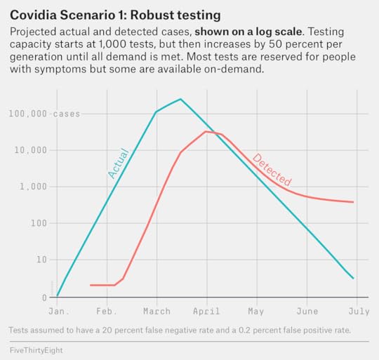
There are quite a few things to look at here. The most obvious and probably the most important one is simply that a 15-day delay between when someone gets infected and when their case shows up in the data as a positive test makes a huge difference. Even if everything else was going perfectly — 100 percent of the population was being tested and the tests are 100 percent accurate — with an R of 2.6, a 15-day delay would result in there being about 18 times more newly infected people in the population than the number of newly reported positive tests at any given time.
The delay matters less as R declines because if the disease isn’t growing as fast, there aren’t as many new people who get infected in the 15-day period between infection and test results. But it still means we’re always looking two weeks into the past whenever “new” data is reported. And remember, social distancing measures that are effective in flattening the curve may take two or three weeks to show up in the data. This is especially so when the demand for testing is near its peak and there are likely to be longer lags in processing test results.7
Next, even with relatively good testing, you’re still likely to miss many cases. By the end of the scenario on June 29, 1.2 million people have been infected at some point in Covidia, but there are only 186,000 detected cases, for a detection rate of about 16 percent (and some of those are false positives so the actual situation is a bit worse than that). What accounts for the missing cases?
First, we assume that many people with mild symptoms or no symptoms do not want to get tested (and nobody forces them to get tested) so they get infected at some point without ever realizing it.
Next, the 20 percent false negative rate means that some cases are missed.
Finally, even where testing ramps up quickly, it may not ramp up quite as fast as the disease itself. The actual peak in new infections in this scenario comes on March 16 — and at that point, testing is not fully scaled up and a lot of people who would like a test still cannot get one.
There’s also a third issue: If testing is increasing, the rate of growth of a disease can be overestimated. Alternatively, if testing is stagnant or decreasing, the rate of growth can be underestimated. Note that in Scenario 1, the R you’d infer from the number of reported cases peaks at 3.5, when the actual R based on infections was not quite as high (2.6 before Covidia began implementing social distancing measures).
In other words, the rapid rates of growth in new cases you can see in a country (say, Germany) when it first gets serious about testing are both a function of the number of tests increasing and the number of infections increasing — and it’s hard to tell what’s what. You can also have problems if there’s a sudden, one-off increase in tests, as we’ll see in the next scenario.
A final issue — I’m not going to boldface it because it’s less important than the others — is that in the late stages of the scenario when there is little disease transmission following a prolonged lockdown, many of the newly detected “cases” are false positives. As I mentioned, false positives can be an issue to contend with when the overall incidence of disease in a population is low. They are not the greatest concern in the U.S. or Europe right now, when we’re still in the peak of the pandemic.
Scenario 2: Sudden, one-time increase in testing
What would a more rapid increase in testing look like? In Scenario 2, I’m leaving all the settings from Scenario 1 unchanged — except for the number of tests. In this new scenario, I assume that Covidia starts out with the capacity to conduct only 100 tests per generation, but then goes on a crash program in February and rapidly increases that number at a rate of 200 percent per generation until it maxes out at 100,000 tests about a month later. This is similar to the situation in the United States, where testing started out slow, improved rapidly and has now stalled out again.
In this scenario, the distortions between the number of infections and the number of people who test positive are more profound. Even though the actual R is “only” 2.6 in the early stages — still a very scary, high number by the way — it will briefly appear to be as high as 7.8 if you’re looking at the number of newly detected cases because test capacity is scaling up so rapidly.
Covidia Scenario 2: Rapid, one-time testing increase
Testing capacity starts at 100 tests, but then rapidly increases over a period of 4-5 weeks before maxing out at 100,000 tests. Most tests are reserved for people with symptoms but some are available on-demand.
Actual infections
Detected cases
Date
R
New
Cumulative
R
New
Cumulative
New Tests RePORTED
1/1
—
1
1
—
0
0
0
1/6
—
3
4
—
0
0
0
1/11
—
8
12
—
0
0
0
1/16
2.6
21
33
—
0
0
0
1/21
2.6
55
88
—
0
0
100
1/26
2.6
143
231
—
0
0
100
1/31
2.6
372
603
—
0
0
100
2/5
2.6
967
1,570
—
0
0
100
2/10
2.6
2,513
4,083
—
0
0
100
2/15
2.6
6,528
10,611
—
0
0
100
2/20
2.6
16,931
27,542
—
2
2
300
2/25
2.6
43,743
71,285
7.8
14
16
900
3/1
1.4
111,883
183,168
6.9
109
125
2,700
3/6
1.3
151,176
334,344
5.4
748
873
8,100
3/11
1.3
199,043
533,387
4.0
4,026
4,899
24,300
3/16
0.6
253,217
786,604
1.6
16,021
20,920
72,900
3/21
0.6
155,429
942,033
1.2
25,032
45,952
100,000
3/26
0.6
93,310
1,035,343
1.2
30,532
76,484
100,000
3/31
0.6
55,269
1,090,612
0.7
35,873
112,357
100,000
4/5
0.6
32,476
1,123,088
0.7
25,332
137,689
100,000
4/10
0.6
18,993
1,142,081
0.6
16,840
154,529
100,000
4/15
0.6
11,077
1,153,158
0.6
10,710
165,239
100,000
4/20
0.6
6,450
1,159,608
0.6
6,623
171,862
100,000
4/25
0.6
3,752
1,163,360
0.6
4,042
175,904
100,000
4/30
0.6
2,181
1,165,541
0.6
2,468
178,372
100,000
5/5
0.6
1,268
1,166,809
0.6
1,529
179,901
100,000
5/10
0.6
737
1,167,546
0.7
974
180,875
100,000
5/15
0.6
428
1,167,974
0.7
651
181,526
100,000
5/20
0.6
249
1,168,223
0.8
461
181,987
100,000
5/25
0.6
145
1,168,368
0.8
351
182,338
100,000
5/30
0.6
84
1,168,452
0.9
287
182,625
100,000
6/4
0.6
49
1,168,501
0.9
251
182,876
100,000
6/9
0.6
28
1,168,529
0.9
231
183,107
100,000
6/14
0.6
16
1,168,545
1.0
216
183,323
100,000
6/19
—
9
1,168,554
1.0
210
183,533
100,000
6/24
—
5
1,168,559
1.0
206
183,739
100,000
6/29
—
3
1,168,562
—
203
183,942
100,000
R is not listed unless there are at least 10 new cases at the start of a generation. Other assumptions common to all scenarios: Country population is 10 million. People are tested only once. Some people with mild symptoms and most with asymptomatic symptoms do not want to be and are not tested. Tests have a 20 percent false negative rate and a 0.2 percent false positive rate. Test reporting lags infection by 15 days.
And on a graph, the slope will look extremely steep for a few weeks. You might be tempted to look at a graph like this and say that Covidia is on a much worse trajectory than other countries:
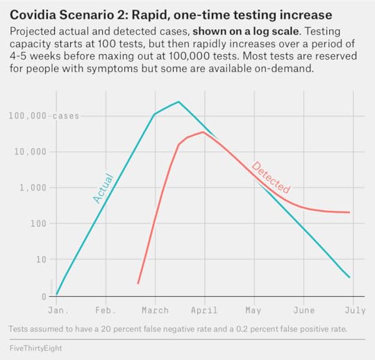
But that isn’t getting the story right. What really happened was: Covidia was way behind on testing and it’s playing catch-up, which means that the number of reported cases will increase at very fast rates until it does catch up. But the actual number of infections at any given time is the same as in Scenario 1. That doesn’t mean the news in Scenario 2 is good, exactly. It means Covidia had a very big COVID-19 problem all along that wasn’t being detected until very recently, but it is now finally starting to get its arms around it.
Next, let’s look at the opposite case: Where testing starts out reasonably strong, but doesn’t scale up very much.
Scenario 3: High test floor, low test ceiling
In this scenario, I assume that Covidia starts out with up to 10,000 tests available per generation. However, it scales up tests very slowly (by just 3 percent per generation) before eventually capping out at 20,000 tests per generation. Furthermore, 100 percent of tests are reserved for symptomatic individuals and there are no on-demand tests available. This situation is broadly analogous to some European countries with centralized, socialized health care systems. For instance, the U.K. has tested only about 160,000 people total as of Apr. 2, or an average of only about 7,000 tests per day since March 19.
In this case, the number of cases is substantially underestimated because there aren’t enough tests at the peak of the epidemic. Only about 5 percent of infections are eventually detected.
Covidia Scenario 3: Testing capacity doesn’t scale up
Testing capacity starts at 10,000 tests, but then increases by only 3 percent per generation before maxing out at 20,000 tests. All tests are rationed so people with more severe symptoms are given priority.
Actual infections
Detected cases
Date
R
New
Cumulative
R
New
Cumulative
New Tests RePORTED
1/1
—
1
1
—
0
0
0
1/6
—
3
4
—
0
0
0
1/11
—
8
12
—
0
0
0
1/16
2.6
21
33
—
0
0
0
1/21
2.6
55
88
1.1
20
20
10,000
1/26
2.6
143
231
1.0
22
42
10,300
1/31
2.6
372
603
1.2
23
65
10,609
2/5
2.6
967
1,570
1.3
27
92
10,927
2/10
2.6
2,513
4,083
1.6
34
126
11,255
2/15
2.6
6,528
10,611
2.0
53
179
11,593
2/20
2.6
16,931
27,542
2.2
105
284
11,941
2/25
2.6
43,743
71,285
2.4
233
517
12,299
3/1
1.4
111,883
183,168
2.5
568
1,085
12,668
3/6
1.3
151,176
334,344
2.3
1,411
2,496
13,048
3/11
1.3
199,043
533,387
1.8
3,301
5,797
13,439
3/16
0.6
253,217
786,604
1.2
5,891
11,688
13,842
3/21
0.6
155,429
942,033
1.1
6,917
18,605
14,257
3/26
0.6
93,310
1,035,343
1.1
7,882
26,487
14,685
3/31
0.6
55,269
1,090,612
0.9
8,746
35,233
15,126
4/5
0.6
32,476
1,123,088
0.8
7,643
42,876
15,580
4/10
0.6
18,993
1,142,081
0.7
6,244
49,120
16,047
4/15
0.6
11,077
1,153,158
0.6
4,477
53,597
16,528
4/20
0.6
6,450
1,159,608
0.6
2,804
56,401
17,024
4/25
0.6
3,752
1,163,360
0.6
1,719
58,120
17,535
4/30
0.6
2,181
1,165,541
0.6
1,047
59,167
18,061
5/5
0.6
1,268
1,166,809
0.6
637
59,804
18,603
5/10
0.6
737
1,167,546
0.6
393
60,197
19,161
5/15
0.6
428
1,167,974
0.7
249
60,446
19,736
5/20
0.6
249
1,168,223
0.7
162
60,608
20,000
5/25
0.6
145
1,168,368
0.7
112
60,720
20,000
5/30
0.6
84
1,168,452
0.8
81
60,801
20,000
6/4
0.6
49
1,168,501
0.8
64
60,865
20,000
6/9
0.6
28
1,168,529
0.9
54
60,919
20,000
6/14
0.6
16
1,168,545
0.9
48
60,967
20,000
6/19
—
9
1,168,554
1.0
45
61,012
20,000
6/24
—
5
1,168,559
1.0
43
61,055
20,000
6/29
—
3
1,168,562
—
42
61,097
20,000
R is not listed unless there are at least 10 new cases at the start of a generation. Other assumptions common to all scenarios: Country population is 10 million. People are tested only once. Some people with mild symptoms and most with asymptomatic symptoms do not want to be and are not tested. Tests have a 20 percent false negative rate and a 0.2 percent false positive rate. Test reporting lags infection by 15 days.
But not only is the number of cases underestimated — the rate of increase will also be underestimated. For instance, in this scenario, R appears to peak in the low-to-mid 2’s when it’s actually 2.6. This is because the rate of new cases is increasing faster than the country’s ability to detect them, even if the country rations as many of the tests as it can so it can test the sickest individuals, as we assume that it does. During the peak of the epidemic in Scenario 3, as many as 58 percent of newly reported tests will produce positive results, which resembles the extremely high rate of reported positives for periods of time in places such as Lombardy, Italy.
So while the slope of reported new cases in Scenario 3 might look more gentle than in Scenario 1 or Scenario 2…
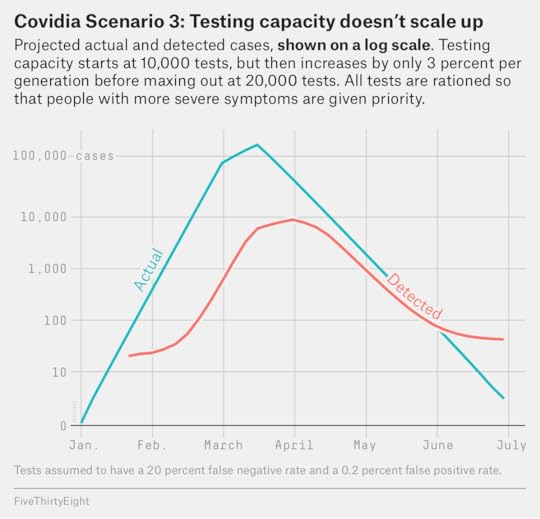
…the country’s situation is actually just as bad. And in some respects it might be worse. Having conducted so few tests, Covidia will miss some extremely ill people in Scenario 3 and they may die as a result of not being able to get medical care soon enough.
That’s not the worst-case scenario, though. Imagine if a country, recognizing that the media tends to fixate on case counts, decides that it can make things look superficially better by decreasing the number of tests that it does.
Scenario 4: A testing decrease
Let’s say that, as in Scenario 3, Covidia starts out with the capacity to conduct 10,000 tests per generation. However, as the case count begins to accelerate, the government panics that the outbreak will make it look bad, so it subtly starts scaling down testing capacity by 20 percent per generation in early March. Meanwhile, being in denial about the scale of the problem, it doesn’t implement a full lockdown until April 10, or more than three weeks later than under the other scenarios.
I should note that this is more of a “thought experiment” than the other three scenarios. Countries from China to Russia to Iran have been accused of publishing unreliable official statistics — but I don’t know whether any countries are deliberately limiting testing to keep case counts down.
Nonetheless, a situation like this obviously turns out quite badly. Almost 30 percent of the country eventually gets infected:
Covidia Scenario 4: Testing declines to conceal outbreak
Testing capacity starts at 10,000 tests, but gradually decreases in the midst of the outbreak. The government also waits several additional weeks to declare a full lockdown. All tests are rationed so people with more severe symptoms are given priority.
Actual infections
Detected cases
Date
R
New
Cumulative
R
New
Cumulative
New Tests Reported
1/1
—
1
1
—
0
0
0
1/6
—
3
4
—
0
0
0
1/11
—
8
12
—
0
0
0
1/16
2.6
21
33
—
0
0
0
1/21
2.6
55
88
1.1
20
20
10,000
1/26
2.6
143
231
1.0
21
41
10,000
1/31
2.6
372
603
1.1
22
63
10,000
2/5
2.6
967
1,570
1.2
25
88
10,000
2/10
2.6
2,513
4,083
1.6
31
119
10,000
2/15
2.6
6,528
10,611
2.0
49
168
10,000
2/20
2.6
16,931
27,542
2.2
97
265
10,000
2/25
2.6
43,743
71,285
2.4
216
481
10,000
3/1
1.4
111,883
183,168
1.8
510
991
10,000
3/6
1.3
151,176
334,344
1.7
942
1,933
8,000
3/11
1.3
199,043
533,387
1.4
1,572
3,505
6,400
3/16
1.2
253,217
786,604
0.9
2,179
5,684
5,120
3/21
1.2
308,235
1,094,839
0.9
1,987
7,671
4,096
3/26
1.1
355,353
1,450,192
0.9
1,759
9,430
3,277
3/31
1.0
384,390
1,834,582
0.8
1,516
10,946
2,622
4/5
0.9
387,571
2,222,153
0.8
1,278
12,224
2,098
4/10
0.4
363,428
2,585,581
0.8
1,057
13,281
1,678
4/15
0.4
160,651
2,746,232
0.8
860
14,141
1,342
4/20
0.4
69,143
2,815,375
0.8
688
14,829
1,074
4/25
0.4
29,415
2,844,790
0.6
543
15,372
859
4/30
0.4
12,452
2,857,242
0.5
342
15,714
687
5/5
0.4
5,260
2,862,502
0.4
182
15,896
550
5/10
0.4
2,220
2,864,722
0.4
81
15,977
440
5/15
0.4
937
2,865,659
0.4
32
16,009
352
5/20
0.4
395
2,866,054
0.3
12
16,021
282
5/25
0.4
167
2,866,221
—
4
16,025
226
5/30
0.4
70
2,866,291
—
1
16,026
181
6/4
0.4
30
2,866,321
—
0
16,026
145
6/9
0.4
13
2,866,334
—
0
16,026
116
6/14
—
5
2,866,339
—
0
16,026
93
6/19
—
2
2,866,341
—
0
16,026
74
6/24
—
1
2,866,342
—
0
16,026
59
6/29
—
0
2,866,342
—
0
16,026
47
R is not listed unless there are at least 10 new cases at the start of a generation. Other assumptions common to all scenarios: Country population is 10 million. People are tested only once. Some people with mild symptoms and most with asymptomatic symptoms do not want to be and are not tested. Tests have a 20 percent false negative rate and a 0.2 percent false positive rate. Test reporting lags infection by 15 days.
Would the country really wait so long to implement a lockdown? Well, if it wasn’t doing enough testing, it might. Because Covidia is reducing the number of tests in this scenario, the number of reported new cases will appear to peak on March 16, even though the actual peak of new infections won’t come until April 5. It will appear that the partial measures it undertook worked, when really they weren’t working well enough:
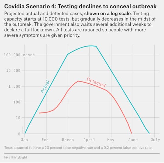
In an instance like this, having information on the number of tests would be quite useful, as a high rate of positive tests could be a sign that you’re only seeing the tip of the iceberg. During the peak of the outbreak in April, as many as 64 percent of tests would return positive results in Scenario 4, the number would be as high as 80 percent if not for false negatives.
I already gave away the conclusion at the top of the story, so I’m just going to repeat it once more, hoping that this article has helped to convince you of it: The number of reported COVID-19 cases is not a very useful indicator of anything unless you also know something about how tests are being conducted.
In fact, in some cases, places with lower nominal case counts may actually be worse off. In general, a high number of tests is associated with a more robust medical infrastructure and a more adept government response to the coronavirus. The countries that are doing a lot of testing also tend to have low fatality rates — not just low case fatality rates (how many people die as a fraction of known cases) but also lower rates of death as a share of the overall population. Germany, for example, which is conducting about 50,000 tests per day — seven times more than the U.K. — has more than twice as many reported cases as the U.K., but they’ve also had only about one-third as many deaths.
Put another way: Doing more tests is good, and likely leads to better long-run outcomes, even if it also results in higher case counts that people will freak out about in the short run. I don’t usually like to be so didactic, but I hope you’ll be a more educated consumer of COVID-19 data instead of just looking at case counts ticking upward on cable news screens without context. That context includes not only reporting about the amount of testing, but also indications such as hospital strain, which are more robust since they aren’t subject to as many vagaries about how tests are conducted.8 Even if you’re not from New York, Gov. Andrew Cuomo’s daily briefings are worth watching because they do the best job I’ve seen of providing this context.
And if you do want to play with your own scenarios to see how all of this works… here’s the link to that Excel sheet. Have fun, but keep in mind that even though there are a lot of parameters you can tweak, the scenarios are still a fairly crude simplification of the complex situation on the ground in any given state or country.
April 1, 2020
So … About That Supposed Lack Of Enthusiasm For Biden?
Welcome to FiveThirtyEight’s weekly politics chat. The transcript below has been lightly edited.
sarahf (Sarah Frostenson, politics editor): Over the weekend, an ABC/Washington Post poll found that most Democrats now back former Vice President Joe Biden, but enthusiasm for his candidacy was, on the other hand, pretty lackluster.
Just 24 percent of his supporters said they were “very” enthusiastic about supporting him. This marked the lowest level of enthusiasm for a Democratic presidential candidate that ABC/Washington Post has found in the last 20 years. And perhaps even more troubling for Biden was that nearly twice as many of President Trump’s supporters (53 percent) said they were “very” enthusiastic about his candidacy.
This, of course, has sparked comparisons to 2016 when former Secretary of State Hillary Clinton found herself in a similar situation — running neck-and-neck with Trump and with only 32 percent saying they were “very” enthusiastic about supporting her in September 2016. Biden, of course, is already 8 points below that mark now.
So does Biden have an enthusiasm problem? What’s the case for why he might and the case for why we shouldn’t read too much into this now?
nrakich (Nathaniel Rakich, elections analyst): I don’t think this is something Biden should worry about, at least not right now. We’ve just come off a knock-down, drag-out, 15-month-long primary fight. And some would argue it’s still going on, with Sen. Bernie Sanders still contesting the nomination!
It’s a lot to ask for the party to be totally united at this early juncture. I’d guess that, by September, Biden will have as good or better enthusiasm numbers as Clinton did in September 2016.
natesilver (Nate Silver, editor in chief): It feels so quaint to be debating a horse-race question in the middle of a pandemic.
But basically: I don’t think enthusiasm is a terribly meaningful indicator above and beyond what is already reflected in polls.
Sanders’s voters were more enthusiastic than Biden’s in the primaries. But he’s actually tended to underperform his polls. Sometimes higher enthusiasm means you have a narrower base, and the other candidate has more room to turn out undecideds, etc.
An important qualification to all of this is that most of the polls so far are conducted among registered voters when really we want to see likely voter polls, which won’t really be reliable for another several months.
nrakich: Yeah, Biden leads in most general election national polls right now, but likely-voter polls tend to be a few points better for Republicans than registered-voter polls, and as Nate says, we don’t have a ton of these polls right now.
perry (Perry Bacon Jr., senior writer): It’s hard to say much about enthusiasm right now since we are still in the midst of the Demcoratic primary ending. For instance, I think enthusiasm around him could still grow, especially after Barack and Michelle Obama have enthusiastically endorsed him, Sanders is behind him, and he has picked a running mate who perhaps excites the party.
sarahf: That’s fair, but how do we reconcile that Trump’s very enthusiastic support is so much higher than Biden’s — 29 points?
perry: Trump is the Republican Party’s candidate, and he just won his primary with overwhelming support. The party is unified behind him. People have voted for him once. I’m not surprised his supporters are fairly enthusiastic about him.
Politics Podcast: Why Trump’s Approval Rating Has Increased
natesilver: I don’t care how much higher a quality is that doesn’t matter.
But honestly, I think this discussion is premature in some ways. The general election campaign hasn’t begun. The primary campaign is in a zombie-like state between being sort of finished and sort of not.
We’re in the midst of a pandemic. And we don’t have very many likely-voter polls, and to the extent we do, they’re not liable to be very reliable anyway at this early stage.
Perhaps most importantly, Democrats can be very enthusiastic about beating Trump even if they’re not that enthusiastic about Biden.
perry: Right, that’s the most important thing.
nrakich: Yeah, I find it hard to get worked up by any general-election polling at this point. We’re still so early in this massive news story that could significantly help or hurt Trump.
sarahf: But is it a bad sign for Biden — and enthusiasm for his campaign — that 15 percent of Sanders supporters in the ABC poll say they’ll vote for Trump?
natesilver: Twelve percent of Sanders primary voters voted for Trump in 2016, and another 14 percent voted for a third-party candidate or didn’t vote. So those numbers are in line with four years ago. And there are fewer Sanders voters than there were four years ago, so if anything those numbers are better for Biden than they were for Clinton.
nrakich: Yeah, historically, that would be a totally normal number. In addition to the numbers Nate cites for 2016, another study found that 25 percent of Clinton voters voted for McCain over Obama in 2008.
So it’s not like this is something past presidential candidates haven’t had to overcome as well. It can make a difference in a close election, but bigger factors (e.g., the national environment, the economy) will probably determine the outcome in the end.
sarahf: OK. So what I’m hearing is that the idea that Biden has a real enthusiasm gap is — at least at this point — overrated! But isn’t it at least somewhat worrisome that there now appears to be an effort to draft New York Gov. Andrew Cuomo for president?
natesilver: Ohhhhh Sarah, this is such trollbait.
nrakich: Let’s be clear — that “ooh, Andrew Cuomo should run for president!” talk is utterly nonsensical, non-serious and half-baked.
sarahf: It is! I’m not defending it. But look at what happened when that talk took off last fall. Former New York Mayor Michael Bloomberg and former Massachusetts Gov. Deval Patrick both entered the race as opposed to throwing their support behind someone else.
natesilver: People don’t understand the process. People think you can magically wave a magic wand and that Cuomo becomes the nominee.
Look, if Biden drops out for some reason (health, scandal, etc.), then, obviously, you’ll need a different nominee.
And I do think Cuomo might be the second-most likely nominee, after Biden.
If you need an emergency replacement nominee because Biden drops out, he’s fairly compatible with Biden ideologically.
And frankly, the “emergency replacement” scenario — while unlikely — is still probably more likely than “Bernie wins all remaining contests by 20 points and wins a pledged-delegate plurality” scenario.
nrakich: I do wonder to what extent people actually believe/want Cuomo to be the nominee, and how much is just a fun daydream.
perry: I live in Kentucky. People are suddenly talking very positively about our Gov. Andy Beshear, who is a Democrat. This is in part because Trump is doing press conferences in which he ignores the evidence and seems as interested in defending himself as he is in addressing the issues. So Cuomo comes off well in comparison, as do other governors, like Ohio’s Mike DeWine, a Republican.
It also helps that Cuomo is doing a lot of media and lives in the media capital of the United States. Plenty of governors would be getting buzz if they were doing a competent job and were based in NYC, for example, Gavin Newsom (California), Jay Inslee (Washington), Beshear, DeWine.
nrakich: I think the Cuomo thing — both talk of him becoming the nominee and his role as a leader on the coronavirus in general — has been overinflated by the New York-centric media.
perry: Also, Biden has not been super-impressive in his media appearances, so there is that.
Cuomo has been better on that front, as have other governors.
sarahf: But Biden has been kind of missing from the coronavirus response, right? Part of that is because, as you all point out, he’s not a current governor tasked with spearheading preventive measures in his state, but it does seem as if it’s harder for him to have a natural place in the conversation.
natesilver: I don’t think anything Biden’s doing right now matters very much.
He’s also done more than the media has generally acknowledged.
perry: I think Biden is in the conversation. But his general ideas (Trump should listen to the medical experts, social distancing should continue) are what basically the media, governors, experts, everyone else is saying. Biden is not trying to stand out in that conversation or be interesting, which I think is normatively good. He is not offering weird ideas to stand out.
natesilver: The narrative is dumb. It’s always dumb at this stage of the campaign, when the primary winner has in all probability been decided but it’s not technically over yet. It would be a lot worse if not for coronavirus since the media would have a lot more news cycles to fill with fake drama.
nrakich: Yeah, Sarah, Biden hasn’t been as much of a presence on our TV sets, but I don’t think that’s his fault, as Nate pointed out. I think cable news just hasn’t been giving him a lot of airtime. The other day, major networks decided to air Cuomo’s briefing on the coronavirus instead of Biden’s speech.
But what Biden has to say on the coronavirus is more relevant to a majority of the country.
natesilver: It shouldn’t give him a lot of airtime!
Biden’s not hugely relevant at the moment.
nrakich: I think they should give him more than Cuomo! Biden might be president at this time next year. Cuomo governs just 6 percent of the country.
natesilver: Cuomo is dealing with the realities on the ground in a way Biden isn’t. And New York has a lot more than 6 percent of coronavirus cases.
He’s also doing a pretty effective job of communicating about coronavirus data and where the state and the country is in combating the epidemic.
I don’t think he’d get as much press coverage if he hadn’t been doing a good job with the communication side of things. It’s earned media in the truest sense of the word.
sarahf: That’s fair. A lot of what’s happening now is outside of Biden’s control, and obviously, there’s a lot we can’t answer, but Americans still rate Trump really highly on the economy — 57 percent said they approve of how he’s handling it, which marked a new high for him in that same ABC/WaPo poll. What’s more, Trump led Biden on this metric, 50 to 42 percent. Couldn’t that pose a real problem for Biden moving forward, especially if it’s harder for him to be a part of the conversation now?
nrakich: I think this is Exhibit A for it being too early to say anything. It seems like the economy is going to be in real trouble. If unemployment hits 30 percent or the gross domestic product growth rate is -15 percent, I don’t think Americans will continue to approve of Trump’s handling of the economy.
natesilver: No, I don’t think anything about the polls right now tells us very much about what the situation is likely to look like in September, or November.
People haven’t been living with this for very long. A lot of the consequences haven’t happened yet. And after the consequences, there’s the opportunity for a rebound, or a second wave.
You just have to be patient. Right now, I spend a lot more time looking at, say, the number of new COVID-19 cases in Italy than at Trump’s approval rating. I’d argue that the former tells us more about his reelection odds than the latter, since it tells us something about the extent to which a coronavirus epidemic can slow down post-peak.
sarahf: I can’t help but think that part of the narrative is being set now, though, about Biden having an enthusiasm problem. Of course, it could be that enthusiasm for Biden doesn’t really matter because enthusiasm to elect anyone but Trump is a bigger motivating factor, but I do wonder how that plays out in the coming months. Even if the enthusiasm gap isn’t real, could the perception of one still hurt Biden?
natesilver: Just one troll question after another.
sarahf: I know! But I think people are thinking about this — and even if it’s premature now — I do wonder how it takes root, even when it shouldn’t.
nrakich: That’s interesting, Sarah. Yeah, I wouldn’t be surprised if cable news continually covers Biden with the implication that he is somehow inadequate or not up to the task of beating Trump. I don’t know if that could become a self-fulfilling prophecy or not.
natesilver: I think if anything people tend to overlearn the lessons of the most recent election. A lot of the templates that people applied from the 2016 primaries to the 2020 primaries led to completely wrong predictions, like vastly understating Biden’s chances.
The fact that Democrats are worried about an enthusiasm gap because of 2016 could easily help Biden because it will scare Democrats into voting.
nrakich: I certainly agree that people try way too hard to retrofit the lessons of the previous election. To many (especially those with an anti-Sanders agenda), Clinton lost because Sanders voters weren’t united around her. But can’t it just be enough that she lost because it was an extremely tight election and that happens sometimes?
perry: Biden could very well lose the general election. And he could lose in the same way that Clinton did — a center-left Democrat wins the primary on the strength of older voters, particularly older black voters, but then loses in the general, with Trump winning in key swing states even as he loses the national popular vote.
But Clinton almost won and Biden very much could win. I don’t think Biden has an enthusiasm “problem,” but having enthusiastic supporters who are donating a lot of money, volunteering and eventually turning out to vote in large numbers always helps. So getting as much of Sanders’s crowd on board as possible will be useful for Biden.
Do I think it would be better for Biden if polls showed people were excited to vote for him? Yes, because I do think there is the potential that “people are holding their nose and voting for Biden” becomes a narrative.
nrakich: I also think a lot of the problem is that no one media members or the Twitterati know personally is enthusiastic to vote for Biden. Which of course speaks to the bubbles they live in. But that can have real effects on the narrative, as Perry said.
perry: But it’s hard for me to look at these polls right now and say Biden has an actual enthusiasm problem — or really many problems at all.
March 30, 2020
Politics Podcast: Why Trump’s Approval Rating Has Increased
More: Apple Podcasts |
ESPN App |
RSS
| Embed
Embed Code
In recent days, President Trump’s approval rating has hit its highest point since the early days of his presidency. The FiveThirtyEight Politics podcast team discusses why and suggests it may not be a good long-term indicator for the president. They also discuss where exactly we are in the arc of the COVID-19 crisis and explain the political debate surrounding the Defense Production Act.
You can listen to the episode by clicking the “play” button in the audio player above or by downloading it in iTunes , the ESPN App or your favorite podcast platform. If you are new to podcasts, learn how to listen .
The FiveThirtyEight Politics podcast publishes Mondays and Thursdays. Help new listeners discover the show by leaving us a rating and review on iTunes . Have a comment, question or suggestion for “good polling vs. bad polling”? Get in touch by email, on Twitter or in the comments.
March 27, 2020
The Coronavirus Isn’t Just A Blue State Problem
Washington state was the initial epicenter of the coronavirus outbreak in the United States. And New York is now the hardest-hit part of the country so far, with hospitalizations increasing at rapid rates — more than 37,000 people had been diagnosed with the coronavirus in New York as of late Thursday afternoon.
Because COVID-19 hit blue, coastal states first, and because politics is politics, the response to the pandemic hasn’t exactly been apolitical.
But blue states are hardly alone in what is becoming a nationwide epidemic. Jefferson Parish, Louisiana — which went for Trump by 15 percentage points in 2016 — has a death rate about equal to that of Manhattan. And as terrifying as the hospital situation is in New York City, hospital capacity is also under strain in states such as Michigan and Georgia.
Overall, although the number of detected cases is higher in blue states, the number is increasing at a more rapid rate in red states.1 Moreover, blue states have conducted more tests per capita than red states, so — given that the large majority of coronavirus cases remain undetected — the lower rate of cases in red states may partially be an artifact of less testing.
Here is the data as of late Thursday afternoon, with states sorted by the increase in confirmed COVID-19 cases between Monday (March 23) and Thursday (March 26).2 All data is taken from the invaluable COVID Tracking Project.
Detected COVID-19 cases are on the rise in red states
Known COVID-19 cases as of March 23 and March 26, according to The COVID Tracking Project
March 23
March 26
State
Detected cases
Per 10k pop.
Detected cases
Per 10k pop.
Change
2016 winner
Texas
352
0.12
1396
0.48
297%
Trump
West Virginia
16
0.09
51
0.28
219
Trump
Massachusetts
777
1.12
2417
3.48
211
Clinton
Oklahoma
81
0.2
248
0.63
206
Trump
Alabama
167
0.34
506
1.03
203
Trump
Missouri
183
0.3
502
0.82
174
Trump
Alaska
22
0.3
59
0.81
168
Trump
Pennsylvania
644
0.5
1687
1.32
162
Trump
Idaho
47
0.26
123
0.69
162
Trump
Indiana
259
0.38
645
0.96
149
Trump
Connecticut
415
1.16
1012
2.84
144
Clinton
New Jersey
2844
3.2
6876
7.74
142
Clinton
Arizona
265
0.36
577
0.79
118
Trump
Michigan
1328
1.33
2856
2.86
115
Trump
North Carolina
297
0.28
636
0.61
114
Trump
Vermont
75
1.2
158
2.53
111
Clinton
Montana
34
0.32
71
0.66
109
Trump
Kansas
82
0.28
168
0.58
105
Trump
Wyoming
26
0.45
53
0.92
104
Trump
Maryland
288
0.48
580
0.96
101
Clinton
Florida
1171
0.55
2355
1.1
101
Trump
District of Columbia
116
1.64
231
3.27
99
Clinton
Georgia
772
0.73
1525
1.44
98
Trump
Illinois
1285
1.01
2538
2
98
Clinton
Louisiana
1172
2.52
2305
4.96
97
Trump
Ohio
442
0.38
867
0.74
96
Trump
Mississippi
249
0.84
485
1.63
95
Trump
Arkansas
174
0.58
335
1.11
93
Trump
Delaware
68
0.7
130
1.34
91
Clinton
Kentucky
104
0.23
198
0.44
90
Trump
Colorado
591
1.03
1086
1.89
84
Clinton
Virginia
254
0.3
460
0.54
81
Clinton
New York
20875
10.73
37258
19.15
78
Clinton
New Hampshire
78
0.57
137
1.01
76
Clinton
California
1733
0.44
3006
0.76
73
Clinton
North Dakota
30
0.39
52
0.68
73
Trump
New Mexico
65
0.31
112
0.53
72
Clinton
Nevada
245
0.8
420
1.36
71
Clinton
Oregon
191
0.45
327
0.78
71
Clinton
Iowa
105
0.33
179
0.57
70
Trump
Wisconsin
416
0.71
707
1.21
70
Trump
Hawaii
56
0.4
95
0.67
70
Clinton
South Dakota
28
0.32
46
0.52
64
Trump
Utah
257
0.8
402
1.25
56
Trump
Rhode Island
106
1
165
1.56
56
Clinton
Tennessee
615
0.9
957
1.4
56
Trump
South Carolina
299
0.58
456
0.89
53
Trump
Minnesota
235
0.42
346
0.61
47
Clinton
Nebraska
50
0.26
73
0.38
46
Trump
Maine
107
0.8
155
1.15
45
Clinton
Washington
1996
2.62
2580
3.39
29
Clinton
Sources: The COVID Tracking Project, U.S. Census
Nine of the 10 states that have seen the most rapid increase in coronavirus from Monday to Thursday are states that voted for Trump in 2016, led by Texas, where the number of reported cases increased by 297 percent.
On average, states that voted for Trump saw a 119 percent increase in cases over this 3-day period, as compared to an 88 percent increase in states that voted for Hillary Clinton (plus the District of Columbia). Weighted by state populations, the difference is slightly larger: 141 percent in states Trump won and 88 percent in states Clinton won.
For now, states Clinton won do have considerably more total reported cases. As of Thursday, Clinton states had 4.29 positive tests per 10,000 people, as compared to 1.13 per 10,000 people in Trump states. A lot of that difference is attributable to New York; without New York, Clinton states have 1.89 cases per 10,000 people.
But the nature of exponential growth is such that these differences could evaporate in a hurry. If reported cases in Trump states continued to increase at 119 percent every three days (about 30 percent per day) while reported cases in Clinton states increased by 88 percent every three days (about 23 percent per day), then the per capita case count in Trump states would surpass that in Clinton states within about 30 days, or by late April.
Hopefully, the rate of increase will slow in both types of states as we begin to see further effects of social distancing measures in the data. However, these measures were generally enacted earlier and have been more forceful in blue states. That means the rate at which new cases are being diagnosed could slow down faster in blue states than in red states, meaning that red states would catch up earlier.
Blue states have also conducted more testing than red states. In states with reliable estimates of the number of positive and negative tests as of Thursday night,3 Clinton states had conducted 21.8 tests per 10,000 people as compared to 12.5 tests per 10,000 people in Trump states.4
Blue states have done more COVID-19 testing
Tests completed per capita as of March 26, in states with reliable reporting on the number of negative tests
State
Tests completed per 10k people*
2016 winner
New York
62.8
Clinton
Louisiana
38.8
Trump
New Mexico
37.2
Clinton
Massachusetts
34.0
Clinton
Vermont
32.2
Clinton
Maine
26.4
Clinton
District of Columbia
26.3
Clinton
Alaska
25.4
Trump
Utah
24.0
Trump
New Jersey
23.1
Clinton
New Hampshire
23.1
Clinton
Minnesota
23.0
Clinton
South Dakota
22.8
Trump
Tennessee
21.8
Trump
Wisconsin
21.1
Trump
Montana
20.6
Trump
Connecticut
18.6
Clinton
Oregon
17.3
Clinton
Nevada
16.6
Clinton
Ohio
14.8
Trump
Rhode Island
14.2
Clinton
Pennsylvania
14.2
Trump
Illinois
13.1
Clinton
Idaho
12.2
Trump
Florida
12.2
Trump
Kansas
10.4
Trump
Michigan
9.4
Trump
Nebraska
8.6
Trump
Georgia
8.4
Trump
Alabama
8.4
Trump
Texas
7.4
Trump
Kentucky
7.4
Trump
Virginia
7.3
Clinton
Arkansas
6.1
Trump
West Virginia
6.0
Trump
California
5.2
Clinton
Oklahoma
3.0
Trump
* Excluding tests that are listed as pending.
Sources: The COVID Tracking Project, U.S. Census
That means the true gap in the number of cases may not be as large as the roughly fourfold difference in reported cases between blue states and red states right now. States such as Louisiana have discovered they have far more cases than they originally realized as they’ve ramped up testing over the past week, and other red states (and blue states) could follow.
COVID-19 has also led to a slightly higher case fatality rate (the number of deaths as a share of the number of known cases) in red states so far. As of Thursday evening, the death rate per case was 1.7 percent in Trump states as compared to 1.3 percent in Clinton states. This could reflect a variety of factors, including potential underreporting of cases in Trump states,5 the age and health of the populations in each set of states, or the efficacy of responses by local health care systems.
However, the higher fatality rate it is a somewhat troubling sign for red states given that many of them are generally at an earlier point in their epidemic curves, meaning that many people who have acquired COVID-19 in those states have done so recently and have not yet developed the most serious symptoms that could lead to long-term hospitalization or death.
Nate Silver's Blog

- Nate Silver's profile
- 730 followers

