
Todd Klein's Blog, page 41
July 11, 2023
SAM & JOE ROSEN – Letterers Part 2
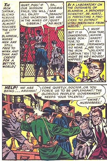
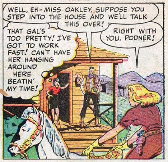 From ANNIE OAKLEY #1, Spring 1948, Timely/Marvel Comics. This and all Marvel images © Marvel.
In Part 1 of this article series, I examined the early work of Sam Rosen, as best I could identify it, up to 1946. I’m not sure what Sam was doing in late 1946 to early 1947, probably lettering for any publishers he could. The Grand Comics Database credits the lettering on this story to him, probably done in late 1947, and an early example of his work for the company that would become Marvel Comics. If the identification is right, I see some changes from what Sam was doing before, but it does remind me of other work credited to him in the 1950s that we’ll be looking at. It occurs to me that, in his early years, Sam was asked to mimic the styles of others, first Howard Ferguson at Fox, then Zoltan Szenic or perhaps Will Eisner on The Spirit. This may be an example of Sam Rosen’s own style emerging at last. He had been lettering since 1940-41 with at least two years off for military service, so call it about five years. That’s enough time to develop a personal style. The letters here are very regular, most would fit in a square, but they’re done with a wedge-tipped pen (as he learned to do it from Ferguson), which adds variety to the strokes, and they have just enough informal bounce to add appeal without looking too uneven. The balloon shapes are well drawn, leaving more air around the lettering than Sam had often done in the beginning. The style points I noticed earlier like vertical sides on the M and a low right leg on the R are no longer present. Of course, this could also be by someone else, but if it is by Sam, he’s found a style that works well for him, and for us, the readers.
 From SECRET HEARTS #1, Sept 1949, DC Comics. All DC images © DC Comics.
Sam’s work must also have appealed to editors, as he was now employed at more companies, including one of the biggest, National Comics, as DC was then known, but his work there was sporadic. He’s credited with lettering all six stories in this first issue of SECRET HEARTS, but DC had two regular letterers, Ira Schnapp and Gaspar Saladino, who were doing the lion’s share of the company’s lettering at the time. This lettering looks quite similar to the ANNIE OAKLEY example, though the G’s are a little different. The letter S is often a style identifier, and they look the same in these two samples, curvy at top and bottom, a little straighter in the middle. The balloon shapes also look the same.
 From MAN COMICS #5, Dec 1950, Marvel
I’m showing stories identified as lettered by Sam in the Grand Comics Database (but not ones with a question mark after his name indicating a guess), and this one is again quite similar to the previous two examples. Here the G’s are more rounded, as in ANNIE OAKLEY, the C’s are a little wider, as they were in SECRET HEARTS. Those are minor variations, in general the style is all very similar to my eye.
In the 1950 census, the entire Rosen family is living on East 27th Street, Brooklyn, New York: father David, mother Esther, and their five sons, including Joe (age 29) and Sam (age 28). David was operating a millery (making hats), oldest son Morton was rebuilding auto parts. Joe, Sam and Jacob are all listed as self-employed artists. Joe and Sam might have been helping each other meet tight deadlines, perhaps they also hired Jacob to help too. As far as I know, he was never credited if so, or perhaps he did some other kind of art.
 From WORLD’S FINEST COMICS #53, Aug 1951
Similar style here, and it’s quite different from DC’s regulars Schnapp and Saladino. It’s very regular with no obvious style points. Another letterer with that look at the time was Ben Oda, but Ben almost always made his letter C’s lean a bit to the right, while these are almost perfectly circular.
 From BLACKHAWK #65, June 1953, Quality Comics
More similar work, the S’s are a bit more angular, something likely to happen when you’re moving the pen fast, suggesting Sam was pushing his speed a bit to make a tight deadline. It all looks fine, though.
 From G.I. COMBAT #25, June 1955, Quality Comics
More similar work, and Sam Rosen is credited with lettering all the stories in this issue. Note the use of three low dashes instead of three dots (an ellipsis) a less common alternative.
 From PATSY WALKER #74, Dec 1957, Marvel
Classic and classy work by Sam in a style familiar from his 1960s story lettering. A little wider here, perhaps because he had more room. Correct use of ellipses this time. Probably done not long before the massive staff and freelancer layoff at Marvel in 1957. After that, nearly all the stories were lettered by Artie Simek for a few years.
 From YOUNG ROMANCE #108, Oct-Nov 1960, Prize Comics
By 1960, Sam’s letter S had become even more angular and straighter across the middle. He’s credited with lettering four stories in this Prize comic, and there’s plenty to do on them. Note the old style breath marks around SOB, parentheses. Later that morphed into radiating dashes. The ellipses are again looking a bit like three dashes rather than dots.
 From TALES TO ASTONISH #16, Feb 1961, Marvel
By 1961, Sam was occasionally getting work at Marvel again. The company was restricted to eight titles a month, but Artie Simek couldn’t letter all the stories, and other letterers were offered work. This one has a very Sam Rosen story title, familiar styles for him that would soon be appearing often on Marvel covers and title pages, and quite different from Simek. They combine energy and bounce in a lively, appealing way. The balloon lettering appears smaller than what Sam had been doing, perhaps something requested by editor Stan Lee. Stan must have liked what he saw, he soon hired Sam as Marvel’s second regular letterer alongside Artie.
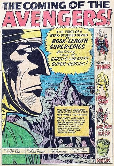 From THE AVENGERS #1, Sept 1963, Marvel
Sam rose to the challenge with excellent work, perhaps spurred on by the fact that he was soon getting printed credit, something all Marvel books had added for letterers due to steady campaigning by Artie Simek. I love this title lettering, and all of it, really. I have to admit, in my teen years reading Marvel’s new superhero comics, I always preferred Sam over Artie.
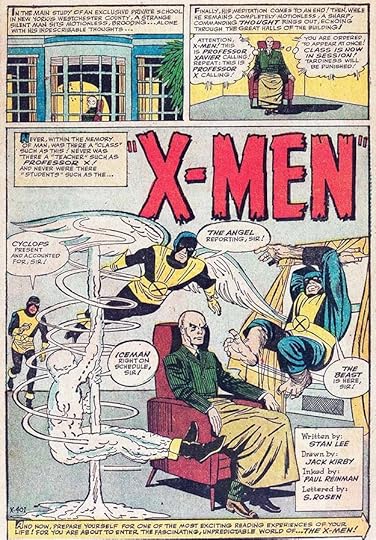 From X-MEN #1, Sept 1963, Marvel
Two landmark first issues out in the same month, Marvel was on the rise. I particularly like Sam’s telepathic balloons for Professor X in the second panel. I don’t know if that style had been done before, but it was often imitated by other letterers later.
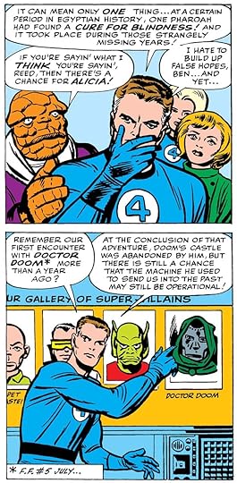 From FANTASTIC FOUR #19, Oct 1963, Marvel
Sam’s story lettering continues to follow the style seen in 1961, the letters are small but wide, the C is evenly rounded, the S is all curves, but straighter in the middle, and it sometimes comes to a point at center right.
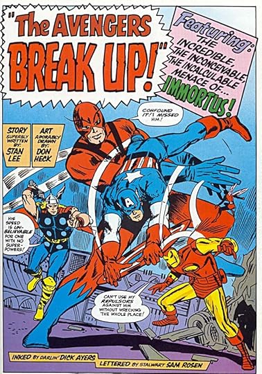 From THE AVENGERS #10, Nov 1964
Sam’s title and display lettering, as seen at the top here, is excellent, full of energy and with a little bounce, yet artfully drawn. He was suddenly doing about three times the work he had been doing, mostly at Marvel, but not only there.
 From THE MIGHTY CRUSADERS, March 1966, image © Archie Comics
In addition to superheroes, westerns, teen humor and more at Marvel, Sam was lettering a short-lived line of superheroes at Archie Comics.
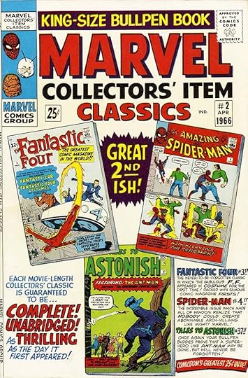 From MARVEL COLLECTORS’ ITEM CLASSICS #2, April 1966
In addition to stories, Sam was now designing logos and lettering covers, including very busy ones like this. Artie Simek had been the main logo and cover lettering man from about 1947 to 1963, but around this time he stepped back and was lettering mostly stories. I’m not sure why, but perhaps he was burnt out, or possibly production manager Sol Brodsky and/or editor Stan Lee liked what Sam was doing and put him on this work. Sam took up the challenge in grand style. The logos from this time may have had input from Sol, but the lettering is all Sam.
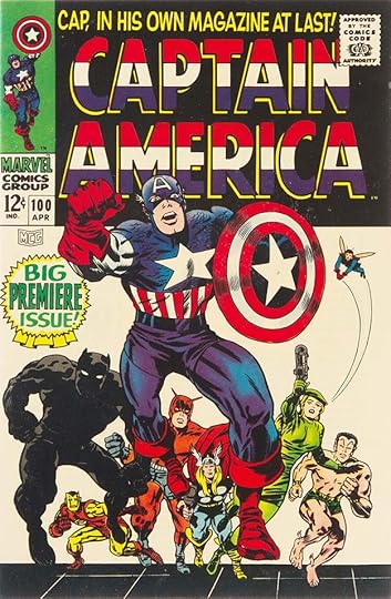 From CAPTAIN AMERICA #100, April 1968
Marvel’s new superheroes were a huge hit with readers, and sales were rising steadily. The older mystery/horror titles that some of them had been appearing in were retitled with the names of the superheroes appearing in them, as here, and Sam Rosen did most of the new logos and cover lettering. The block lettering of CAPTAIN AMERICA is standard stuff, but different from what Simek had been doing in ways that are hard to pinpoint, but clear to me.
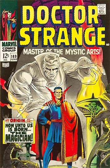 From DOCTOR STRANGE #169, June 1968
For this logo, Sam is imitating the wavy letter style Simek used on STRANGE TALES, but the letter shapes are his, with more elongated ovals having squarer corners on the O’s and C for instance. The subtitle is all his style, as is the caption.
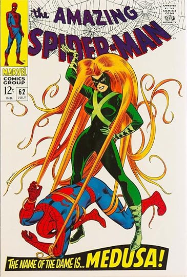 From THE AMAZING SPIDER-MAN #62, July 1968
Sam’s cover lettering was creative and eye-catching, as Simek’s had been, but in a different way that seemed more modern to me as a reader.
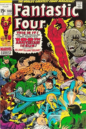 From FANTASTIC FOUR #100, July 1970
I believe this revised FF logo is by Rosen, and it captures the essence of the Brodsky-Simek original while also looking fresh. The burst caption is by Sam. In Marvelmania Monthly Magazine #1 (April 1970, Marvel affiliated), Sam Rosen wrote this about his working method:
The pens I use are either B-6 or A-5 Speedballs, but are modified by grinding down and shaping on carborundum stone. Guide-lines are about 3/16 of an inch apart, separated about 1/16 from one another. For heavy lettering, I use A-6 or B-5, once again ground down until it feels right to me. As for the ink, I generally use Higgins black.
That’s the only information we have directly from Sam.
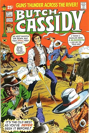 From BUTCH CASSIDY #1, June 1971, Skywald
When Sol Brodsky left staff at Marvel to form Skywald with partner Israel Waldman, Sam Rosen came along to create some logos and do lettering there too, while still doing plenty at Marvel.
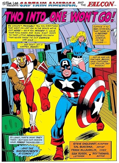 From CAPTAIN AMERICA #156, Dec 1972
Perhaps the increased workload took a toll on Sam Rosen that no one at Marvel understood. I have no facts to support this, but rumors in the business have said that Sam suffered a nervous breakdown, whether from too much work or something else, I don’t know. The last story he worked on is above, he was unable to complete it. The last five pages were lettered by Marvel staffer Morrie Kuramoto, uncredited, and he may also have put in this story title. Sam did no more comics work for the rest of his life. He died April 8, 1992 in Brentwood, NY at age 70, no other information is known. His brother Joe surely knew more, but said nothing about it in his 1982 interview. When I heard the story, I took it as a cautionary tale about putting limits on the amount of lettering work I would accept. It’s sad that Sam Rosen’s hard-won skill and talent stopped so suddenly, but he had to do what was best for him.
In part 3 I’ll focus on the longer career of Joe Rosen, who did lots of fine lettering as well.
The post SAM & JOE ROSEN – Letterers Part 2 appeared first on Todd's Blog.


July 9, 2023
Rereading: FREDDY GOES TO FLORIDA by Walter R. Brooks
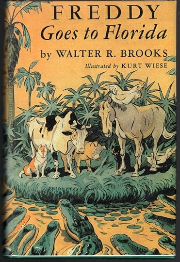
This is the first novel for children by Brooks about the Bean farm animals. Later, Freddy the Pig took the spotlight, but at first it was an ensemble cast with no single leader. The book was originally titled “To And Again,” and published in 1927 with different (and not nearly as good) illustrations. It was reissued in 1949 with Wiese illustrations to match all the other ones he’d done. The text of the book is the same. The Bean farm animals are essentially people in animal guise, though they retain their basic animal natures and habits as well. They talk to each other as people do, and in very entertaining ways, but in the early books they don’t ever talk to humans.
The story begins on a chilly fall morning with Charles the rooster grumbling about having to get up so early to crow and wake Mr. Bean, who is too poor to afford an alarm clock. In talking to a swallow living in the barn about how swallows and many birds migrate to warmer places in the winter, Charles decides the farm animals should do the same thing. He calls a meeting, and a group of animals agree it’s a fine idea, and soon they’ve set off for Florida, where they hope to spend a pleasant winter. Along the way they encounter men who want to catch and sell them, and other hazards of travel they must overcome, including getting through towns and over wide rivers. News of their trip has spread somehow, and when they reach the outskirts of Washington D.C., they’re met by congressmen from their state who offer to give them a tour of Washington and a chance to meet the President. Later, when they do reach Florida, things don’t go so well, as you might guess from the cover picture.
This entire series is charming and fun to read. Brooks was a wise student of human and animal nature, and his stories are a delight. Recommended.
Freddy Goes to Florida by Walter R Brooks
The post Rereading: FREDDY GOES TO FLORIDA by Walter R. Brooks appeared first on Todd's Blog.
July 6, 2023
SAM & JOE ROSEN – Letterers Part 1
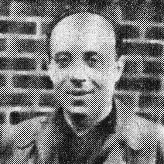 Sam Rosen from MARVEL TALES ANNUAL #1, 1964. All Marvel images © Marvel.
In this three-part article I’ll explore the work of lettering brothers Sam and Joe Rosen, focusing on Sam in Parts 1 and 2, and Joe in Part 3. Much of the biographical info is from THIS post by Alex Jay, and I appreciate his help!
Samuel H. Rosen was born April 4, 1922, Joseph Rosen was born Dec 25, 1920. Their parents were Russian immigrants, with father David having a fruit stand in Coney Island, Brooklyn by 1930, and their five sons were all born in New York City. In the 1940 census the family was living on Mermaid Avenue, Coney Island, and was receiving federal and state relief money to help them get by. Mother Esther cared for the family, the oldest brother, Morton, age 23, is listed as disabled. Joe was 19 and Sam was 18, both were attending college. Younger brothers Jacob, 16, and Emanuel, 12, were in school. We don’t know if Joe and Sam had any art training. David Anthony Kraft published a short interview with Joe in issue #7 of Comics Interview (Fictioneer Books, Jan 1983) in which he described how they began lettering comics:
My father had a fruit store in Coney Island. In 1940, one of the customers he was well acquainted with mentioned that her son was an artist for Timely — the company that’s now Marvel Comics. The son, George Mandel, is now a novelist. This was during the Depression. My father asked her if her son could maybe do something for Sam. So Mandel introduced Sam to the big letterer of the time, Howard Ferguson, who was working for both Timely and Fox. Fox was Ferguson’s lesser account, and soon he gave it to Sam. Sam got me my first lettering job, at Fox, doing THE BLUE BEETLE.
I’ve already written about Howard Ferguson at Fox and Timely HERE, and I’ve listed what I believe are all the stories he lettered HERE. Howard was working with Joe Simon and Jack Kirby in their studio, and probably also sometimes at home, or in the Fox and Timely offices. The Fox work I’ve found for him begins with Sept 1940 cover dated issues, probably work done in the spring of 1940, and runs to Sept 1941 issues, probably work done in the spring of 1941.
 From THE BLUE BEETLE #8, Aug 1941
Assignments at Fox weren’t Howard’s to give, but he could help Sam Rosen learn to letter in Howard’s own style and then recommend him to Fox as his replacement. Above is what I think is an example of Howard’s lettering at Fox late in his time there. It includes his style points of a small downward serif at the top of the letter C, and a G with a small serif in the middle going both ways. The letters also tend to lean slightly to the left.
 From THE BLUE BEETLE #9, Oct 1941
This lettering from the next issue is quite similar, but I see some differences. There’s less space between the lines of lettering, they almost touch in some places. These letters tend to lean slightly to the right, and the balloon shapes are different, tucked closer around the lettering with less air between the letters and the art. Some letters are quite uneven, like the word DEMAND in the center. I think this is Sam’s work, doing his best to imitate Ferguson.
 From MYSTERY MEN COMICS #24, July 1941
Here’s a full page of Ferguson lettering from another Fox title featuring The Lynx.
 From MYSTERY MEN COMICS #25, Aug 1941
I think the Lynx story in the next issue is lettered by Sam, it again has less space between the lines, tighter balloons, and some uneven work.
 From MYSTERY MEN COMICS #31, Feb 1942
A few months later, Blue Beetle stories no longer had lettering very similar to Howard Ferguson’s. Perhaps this is by Sam, or possibly by Joe Rosen, who said his first work was on this character. Other stories from this time and later look nothing like any of their lettering to me.
There’s another interview that mentions Sam Rosen in 1941, working for the Sangor Shop, a comics packager for publishers, also known as Cinema Comics. In Alter Ego #81 (TwoMorrows, Oct 2008), Jim Amash interviewed artist Everett Raymond Kinstler, who said that when he was hired at Cinema Comics, there was another artist working there:
His name was Sam Rosen, and he was a letterer. There was a bullpen that was maybe 10’ by 20’, which contained a couple of drawing tables. Rosen had a drawing board in there.
 From THE SPIRIT, first story, June 2, 1940. All Spirit images © Will Eisner Studios, Inc.
Now we come to a confusing part of Sam Rosen’s lettering career: working for Will Eisner as the letterer of THE SPIRIT, in a weekly newspaper insert known as “The Spirit Section.” There’s no doubt he did that, Joe Rosen confirmed it in his interview, but exactly when is hard to determine. In the 1970s, comics historian Cat Yronwode created a Spirit Checklist which included credits for all the weekly Spirit stories. The first one, above, lists the letterer as Zoltan Szenics with a question mark. Szenics was a letterer at the time who might have worked for Eisner. Usually at the beginning of a new feature, the artist does the lettering, but Will had already been co-running the Eisner-Iger studio, another comics packager, so he had access to freelancers like Szenics. The letters are unusually tall and narrow, except for the round ones, with a definite Art Deco look, similar to the lettering of Charles Armstrong on Prince Valiant.
 From THE SPIRIT, June 23, 1940
This is the fourth strip, with what looks like exactly the same letterer to me, though Cat’s Checklist says it’s by Sam Rosen.
 From THE SPIRIT, June 30, 1940
The fifth strip has a different, and more conventional lettering style with letters that would mostly fit into a square. Could this be Sam’s first work? The problem is that Joe Rosen said he had learned from Howard Ferguson, and Howard was just getting started on his own lettering career at Fox at this time. Beyond that, this doesn’t look like what I think Sam was doing when he followed Rosen at Fox.
 From THE SPIRIT, July 14, 1940
This looks the same as the previous example, with the addition of some upper and lower case work in the first panel that might be by Will Eisner himself, who was an excellent letterer, and often did the feature logo and at least some of the lettering on the first page of these strips. Cat Yronwode did consult Will Eisner while doing her Checklist, but I don’t know if he offered opinions on the lettering. If those credits are from him, perhaps he didn’t remember correctly when Sam Rosen started working for him. Could the first three stories be lettered by Will himself, and the following ones by Szenic? Ironwode has Sam Rosen as the letterer of all the stories from issue 4 on, which I don’t think is correct.
 From THE SPIRIT, Sept 9, 1940
The lettering on this story is a little smaller, but otherwise matches the previous example.
 From THE SPIRIT, Dec 15, 1940
Again about the same lettering style here. I feel sure this can’t be by Sam Rosen yet, there must have been someone else lettering for Will. It reminds me of the lettering of Ira Schnapp at DC Comics, but that seems unlikely.
 From THE SPIRIT, June 15, 1941
One year into THE SPIRIT, and this lettering looks a little different to me, but we’re still not quite at the point where I think Sam Rosen’s lettering was starting to appear at Fox. Notice how the leg of the R is very low and the letters are wide. There’s also a wedge-tipped pen being used I think, making the vertical strokes narrower. This could be the work of Sam Rosen, even though it looks nothing like what I think he was doing at Fox, but could he have landed work with Eisner so early? Maybe so.
 From THE SPIRIT, Aug 3 1941
This is the same style, wide letters made with a wedge-tipped pen, something Sam would have learned from Howard, and looking more confident. Again, the letters are wide, and the right leg of the R is very low. I’m thinking this is Sam Rosen lettering.
 From THE SPIRIT, Dec 28, 1941
This lettering is a bit more relaxed and lively, a good match for the art, is it by Rosen or someone else? I’m not sure. The low R leg suggests Sam.
 From THE SPIRIT, June 14, 1942
This style is a bit different again, still wide, but less relaxed and more like earlier examples, though it leans a bit to the left. The R leg is not as low. It’s always possible that someone else was filling in as letterer on any one of these.
 From THE SPIRIT, Sept 13, 1942
Very wide, and the R leg is lower again. Like the previous one, leans a bit to the left.
 From THE SPIRIT, Nov 15 1942
This style is different again, not made with a wedge-tipped pen, and the letters are often different from previous examples. This is the closest example I can find to what Cat Yronwode said was the final story lettered by Sam Rosen, the one for Nov 29, 1942.
 From THE SPIRIT, Dec 13, 1942
This example looks the same as the previous one, and these may be early examples of lettering by Martin De Muth, who Cat Yronwode credits as letterer from Dec 6, 1942 to June 29, 1947.
World War Two was now on, and Joe Rosen enlisted in the Army Air Corps on August 21, 1942 and was discharged August 28, 1945. Sam enlisted in the Army on February 20, 1943, it’s not clear when he was discharged. It’s very unlikely he would have been lettering while serving, but he was probably back in New York looking for work by 1946. In the book Will Eisner: Conversations by Will Eisner & M. Thomas Inge (University Press of Mississippi, 2011), artist Jules Feiffer said this about going to work for Will in 1946 at 37 Wall Street in lower Manhattan:
“Will sat where the receptionist ordinarily would, in the outer office where he had his drawing table, a rather dark, windowless room, and inside, a larger room than where Will lived, were his staff: letterer Sam Rosen; John Spranger…Dave Berg, and I forget who else was around at the time.”
So, Sam seems to have gone back to work on The Spirit, though he doesn’t show up in 1946 in Cat Yronwode’s Checklist. Let’s look at a few more examples.
 From THE SPIRIT, Feb 14, 1943
This example looks different again, with more rounded letters. Perhaps this is early lettering by Martin De Muth, and the previous two examples are of someone else filling in. Either that or De Muth was a fast learner. Note that here the M’s have slanted sides, while in all the earlier examples they were vertical, and the R legs are not as low.
 From THE SPIRIT, Jan 14 1945
Later in De Muth’s run as letterer, he’s using a wedge-tipped pen but his letter shapes and balloon shapes are about the same, including slanted outside legs on the M in RANSOM and higher legs on the R’s.
 From THE SPIRIT, Jan 6 1946
The same style in this example, though the balloons are more rounded.
 From THE SPIRIT, May 5 1946
But this one is different. It’s closer to the Sam Rosen examples from 1942, with wide letters that lean slightly to the left and very low legs on the R’s. Perhaps this is by Sam, returned from the Army, and getting back into it, though the M’s here have slanted outer legs, so perhaps this is just someone else filling in.
 From THE SPIRIT, Sept 29 1946
This example has wide letters made with a wedge-tipped pen. The M’s have vertical outer legs, but the R legs are not as low as in Sam’s earlier work. Overall it looks professional and confident. This might well be by Sam Rosen. I’m not sure how long he stayed with Eisner this time, but in 1947 Will hired the man he called his best letterer, Abe Kanegson, whose first strip I think is dated May 18, 1947. Cat Yronwode has it as July 6, 1947.
I’ve spent a lot of time trying to pin down Sam’s work on The Spirit, and I’m not sure if I’ve succeeded, but it’s time to move on. We’ll try to pick up Sam’s trail again in 1948 in Part 2.
The post SAM & JOE ROSEN – Letterers Part 1 appeared first on Todd's Blog.
July 4, 2023
Rereading: ME AND THE END OF THE WORLD by William Corbin
 Cover illustration by Jan Palmer
It’s December 1927, and thirteen-year-old Tim is enjoying life in his small Iowa town, looking forward to sledding and ice skating season to begin, but something is worrying him. All the papers are full of news that predictions by religious scholars say the world will come to a sudden end next May. Tim isn’t sure he believes it, some of his friends scoff, but his own mother is on the convinced side. Tim begins to think about things he’d like to accomplish before May, just in case. Things he needs to get sorted, like standing up to Dunk, who’s been bullying him for months. Like apologizing to their neighbor, Mr. Weinstock. Like kissing Judy Felton, who hardly knows he exists. There isn’t a lot of time.
Corbin is an excellent writer, and this is a fine book. Recommended.
Me And The End Of The World by William Corbin
The post Rereading: ME AND THE END OF THE WORLD by William Corbin appeared first on Todd's Blog.
July 3, 2023
Sixteen
That’s how old this blog is, which I began on this day in 2007. Since last year on this day, I’ve added 230,159 words, bringing the grand total to 2,132,509, though about 23,000 are unpublished, posts I’ve written but not yet released. To read all 4,378 posts would take about 140 hours, according to my word count app. This blog is one of my main occupations in the last few years, and I spend time working on it nearly every day. Mostly I research and write posts about comics history, with a focus on letterers, lettering, and logo design. I also do reviews of the books I read or reread. Having finished my Gaspar Saladino research and posts in January of this year, I decided to continue with research and articles on other letterers and logo designers, and I’m still doing that now. Readership has been climbing slowly but steadily, so I feel this work is worthwhile, and I appreciate those of you who visit my blog regularly. Thanks, and I’ll be back with a new article soon!
The post Sixteen appeared first on Todd's Blog.
June 29, 2023
ARTIE SIMEK (and Sol Brodsky) at Marvel Comics Part 5
 From THE FANTASTIC FOUR #1, Nov 1961. This and all images © Marvel.
In 1961, Marvel began a superhero revival that changed the company’s fate forever. Martin Goodman had been noticing DC’s success with revamped superheroes like THE FLASH and GREEN LANTERN, and their new team book with a group of heroes, THE JUSTICE LEAGUE OF AMERICA was selling well. He gave Stan Lee the okay to move back into superhero stories. Lee had become dissatisfied with his comics career and was thinking of quitting. His wife Joan suggested this was an opportunity to try something new in his comics writing, and Lee did that, creating more adult storylines with characters that were not the perfect icons of heroism. Instead they squabbled among themselves, had real world problems, and exhibited character flaws unseen in superheroes to that time. He had a great deal of help from artists like Jack Kirby and Steve Ditko, who took on a major part of the visual storytelling to which Stan added the words lettered by Artie Simek and others. To help with the cover designs for his new approach, Stan called back one of his former Bullpen employees, Sol Brodsky. Here’s what Flo Steinberg recalled in MARVEL AGE #22, Jan 1985:
I came into Marvel in March of 1963. There was just Stan Lee and me in the office, which was two very teeny cubby holes. Sol [Brodsky] would come in a few days a week and help on a freelance basis, doing production work and stuff like that. Stan Goldberg would come in and do the coloring and Artie Simek would come in and do the lettering. At this time, Sol helped launch CRACKED, a humor magazine in the MAD vein. Unfortunately, he encountered personality conflicts with some of the staff members and left to take the position of Production Manager at Marvel in 1964.
Stan Lee was looking for a new direction, and perhaps he felt Sol could help him find one. Sol and Artie Simek had worked together in the Atlas bullpen starting in the early 1950s, so perhaps working together on the new look for Marvel comics was something they both enjoyed. The first title to hit newsstands was THE FANTASTIC FOUR, above, and the logo is unlike anything Artie had done for the company, so clearly the idea for it was Sol’s. Sol told Mark Evanier that he and Artie worked together on the new logos, but some are more clearly Sol’s ideas, like this one. Perhaps he pencilled it and Artie inked it, we don’t know exactly who did what, but that’s likely. To my eye the style is similar to advertising alphabets used in the 1950s, but nothing like it had been seen in superhero comics. Even the use of mixed case is unusual, and the bouncy serif letters almost seem more appropriate for a humor title. The balloons are by Simek, the caption is type. The book was a hit, and more would follow, though Marvel was limited to eight titles a month by their distributor, Independent News. They put out sixteen bi-monthly titles.
 From THE FANTASTIC FOUR #3, March 1962
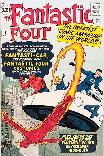
For the third issue, the logo is outlined rather than solid letters, as most comics logos are, to work against any kind of background art, though here only a new subtitle, “The Greatest Comic Magazine in the World!!” is behind it, a good example of Stan Lee’s over-the-top enthusiastic promotion of the new line. The lettering is again by Artie. Marvel did not yet have a strong identifying brand, only a tiny MC for Marvel Comics at upper right.
 From FANTASTIC FOUR #16, July 1963
With this issue, THE was dropped, and the logo gained a black drop shadow which was sometimes also outlined and used for a second color. By this time the new Marvel line was growing enough to have crossovers with other company superheroes like Ant-Man. Familiar Simek styles can be seen in the lettering, and I’m guessing Artie also did these revised versions of the logo, which from this point stayed the same until issue #94 dated Jan 1970. And note the much better brand identification at upper left, more on that below.
 From AMAZING ADULT FANTASY #7, Dec 1961
The second comic with a new look, and actually the same style logo as FANTASTIC FOUR, this one is often forgotten, but the blurb at lower right signals what Stan Lee was going for, even though the short fantasy/horror stories in this series were largely more of what the company had been publishing for some years. In the final issue, though, another landmark concept and character emerged.
 From AMAZING FANTASY #15, Aug 1962
The book dropped ADULT for this last issue, and the logo and lettering are typical Artie Simek work that Brodsky may not have had a hand in, but the first appearance of Spider-Man is striking, and he would soon move to his own title and become perhaps the most popular Marvel character of all.
 From THE INCREDIBLE HULK #1, May 1962
The third new title and concept was The Hulk. This one did not do so well at first, but later became a popular character. The logo on the first issue includes deep telescoping on the word HULK with a central vanishing point, which is something Artie Simek never did, so I think this was again Sol Brodsky’s concept and pencils inked by Artie. The letter shapes and rough outlines are typical for Simek, who probably interpreted the idea in his own way. The lettering, more of Stan Lee’s hype, is Artie’s work as well. I love the giant question mark caption, which serves not only as a container for the words, but as the final punctuation. Of course the art by Jack Kirby and Steve Ditko on these covers was also a huge draw.
 From THE INCREDIBLE HULK #2, July 1962
For the second issue, the telescoping was redrawn much shorter, and note the heavy Simek balloon borders held in red.
 From THE INCREDIBLE HULK #3, Sept 1962
For the third issue the logo was redone again, replacing the central vanishing point with a more typical Simek style of extending the letters down and to the right with no obvious vanishing point. These changes took away Brodsky’s input and essentially made the logo a Simek one. The book only lasted three more issues with this logo, but The Hulk turned up in many other Marvel comics and eventually gained a popular series.
 From JOURNEY INTO MYSTERY #83, Aug 1962
The next new Marvel superhero appeared in this title with no change of logo and typical Simek cover lettering. The energy and excitement was largely generated by the great cover art of Jack Kirby and Joe Sinnott.
 From JOURNEY INTO MYSTERY #104, May 1964
A new Thor logo didn’t appear for almost two years. When it did, it looked very much like Artie Simek’s work, though the letter shapes of THOR, and having THE MIGHTY inside the T might have been Brodsky’s idea. It captured the majesty and power of the character better than any of the Simek cover lettering versions on previous issues. With issue #126, the book’s title became simply THOR, and this logo remained on it until issue #337 in 1983.
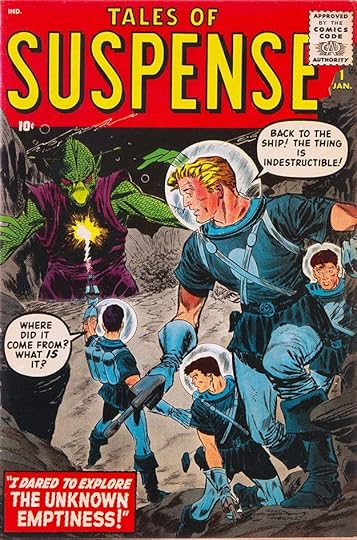
 From TALES OF SUSPENSE #35, Nov 1962
Since Marvel was severely limited in being able to put out new titles, Stan used existing horror/mystery/science fiction titles as part of his new lineup. At first the only obvious change for this one was the logo. Again, this is unlike anything Artie Simek had done previously, so it’s safe to assume the idea was Brodsky’s. Probably he penciled and Artie inked. The soft and rounded frame again reminds me of 1950s ad work, though I can’t pinpoint anything specific. The letter shapes are less in line with what Simek usually did, including the longer top bar of the first S and the gentle curves in the letters.
 From TALES OF SUSPENSE #39, March 1963
With this issue, the book truly entered the new Marvel era with the introduction of Iron Man. The lettering, including this first Iron Man logo, is all by Simek.
 From THE AMAZING SPIDER-MAN #1, March 1963
That same month, Spider-Man’s own series began after his tryout in AMAZING FANTASY #15. This was artist Steve Ditko’s first big success at Marvel. The logo design is unusual in that it’s almost triangular, receding in perspective to the upper left. The letter shapes are Simek block letters except for THE, but the layout is probably by Brodsky, who might have added the spider webs, or perhaps Ditko did that. Simek did the cover lettering.
 From THE AMAZING SPIDER-MAN #2, June 1963
The next issue had a revised logo that aligned with the top of the cover and included more interesting and complex spider webs behind it. Again, possibly by Ditko, who also introduced the corner box with the character’s head in it at left. This was not a new idea, Otto Pirkola had been doing it at Harvey Comics since the late 1940s, but Sol Brodsky and Stan Lee loved the concept, and it was used on all the new Marvel titles going forward, helping to create the Marvel brand.
 From THE AMAZING SPIDER-MAN #7, Dec 1963
With this issue, Simek added an open drop shadow to SPIDER-MAN, and this version of the logo lasted until issue 394 dated Oct 1994, a remarkably long time.
 From SGT. FURY AND HIS HOWLING COMMANDOS #1, May 1963
This title is considered part of the Marvel revamp, even though it looks back to the past, taking place in World War Two. Art by Jack Kirby and Dick Ayers made it exciting, and Stan’s dialogue and character development helped too. This logo is very much in Artie Simek’s wheelhouse, I doubt Sol Brodsky was involved. It lasted until issue #92 in 1971. Fury went on to appear in a more modern series as an agent of S.H.I.E.L.D. Simek did the cover lettering.
 From THE AVENGERS #1, Sept 1963
Following what DC Comics had done in their JUSTICE LEAGUE OF AMERICA, Marvel began putting their new superheroes together in team books, this being the first. It’s a smart idea, as fans of any of the characters’ own books might want to follow them to this one. The logo is again very different from anything Simek had done previously, and I feel it’s very much Sol Brodsky’s idea and pencils, probably inked by Artie, who also did the cover lettering, though the character names and tag line below the logo are type. The logo style again reminds me of 1950s advertising, and Sol was probably putting these covers together, so the type choice, which goes well with the logo, would also be his. The logo would remain until issue #60 dated Jan 1969. Later it was replaced by a memorable logo by Gaspar Saladino that’s still in use today.
 From X-MEN #1, Sept 1963
Another superhero team debuted the same month, this one all new characters. It grew from humble beginnings to also become a popular franchise for Marvel. The letter shapes in the logo are typical for Simek, but the layout with the very large X is not, so I think this one was again penciled by Brodsky, and Artie interpreted it in his own way in the inks. The logo lasted to issue #41 dated Feb 1968.
 From DAREDEVIL #1, April 1964
Another new superhero, and the logo has the fresh look of a Brodsky design, but the letter shapes are again typical of Simek. The square centers in the A’s of the subtitle are interesting. With a few exceptions, this logo lasted until issue #63 dated April 1970. Unlike all the others we’ve looked at, the cover lettering here is by Sam Rosen, a veteran who had worked for Atlas (Marvel) in the 1950s. He had been brought in as a second regular letterer to help Artie in the early 1960s, and was soon doing lots of cover lettering too. He also took over much of the logo work in the second half of the 1960s.
 From TALES OF SUSPENSE #53, May 1964
With this issue, TALES OF SUSPENSE becomes a smaller top line to leave room for a larger IRON MAN logo in the curved frame. The letters of that are by Simek, probably from a Brodsky layout. Note the subtle rough ends on IRON MAN to add interest and texture. The word FEATURING in lower case script is similar to what Ira Schnapp would have done at DC, so perhaps Sol was looking at his work for ideas. The entire logo now fills the frame better. The other cover lettering is by Sam Rosen.
 From TALES OF SUSPENSE #59, Nov 1964
A few months later it changed again when the book was shared with Captain America. Sol Brodsky might have provided the layout, but the new character logos are by Sam Rosen this time instead of Artie. There are subtle differences in the way they form some letters. The R in IRON and the C’s in CAPTAIN AMERICA look like Sam to me. He also did the other cover lettering. From this point on, sales were rising, fans were excited, and most of the logos remained the same for a while. Some time in this year, Sol joined the Marvel staff full time as Production Manager.
 From STRANGE TALES #150, Nov 1966
Still chafing under the eight book a month limit, Marvel was doing more of these split books to get new characters and concepts out there. Doctor Strange was Steve Ditko’s second big hit for Marvel, and a long running backup in STRANGE TALES, but Ditko and Marvel had parted ways by this time, and here the cover and Strange story are by Golden Age great Bill Everett. The bigger story was the beginning of a new espionage series starring an older Nick Fury. The new multiple logo design is by Sol Brodsky, as confirmed on a Bullpen Bulletins page, but I think the inking is by Sam Rosen again. I don’t know who did the cover lettering at the bottom.
 From SUB-MARINER #1, May 1968
When the book limit was finally lifted in late 1967, most of the books with two features turned into two titles, one for each feature. Most of the new logos that were created for those titles are by Sam Rosen (perhaps with Sol Brodsky), except for this one which looks like the work of Artie Simek (probably from a layout by Brodsky). Sol had also been an inker at times, this was his last cover inking job. Perhaps Artie was happy to pass the logo duties on to others and he stuck mostly to lettering stories. Now that the company was growing and increasing their output, many new creators were hired to fill production needs, and other staffers sometimes did logos. In 1971, DC Comics’ best letterer, Gaspar Saladino, also starting working on logos for Marvel, and by the mid 1970s, he was doing many of them. Sol left for about two years to co-create a new line of comics for Skywald, but returned to Marvel when that didn’t sell well. Stan had replaced him with John Verpoorten as production manager, but Sol was given new duties handling British reprints and a line of black and white magazines, and he again often worked directly with Stan.
 From THE FANTASTIC FOUR #9, Dec 1962
Artie Simek deserves to be remembered and celebrated by letterers and lettering fans for another reason: he was instrumental in getting printed credit for letterers at Marvel, and thereby eventually for almost all comics. Above is Artie’s first printed lettering credit, similar credits appeared in other Marvel books out that month, and in most issues that followed.
Comics grew out of newspaper strips, and in early days, many followed the same plan of giving a single creator credit, like “PRINCE VALIANT by Hal Foster,” even though that strip was always lettered by Foster’s friend Charles Armstrong. Some comics creators signed the first page of each story they produced, and those signatures gave readers some idea of who did them if they weren’t removed, but an incomplete one. Joe Simon and Jack Kirby had their names on much of their early work at least from the first Captain America stories on, though again the lettering by Howard Ferguson wasn’t credited. Ferguson did sometimes get his name in as letterer, his credit on the first page of TALLY HO (no number) dated Dec 1944 is probably the first ever lettering credit in comics, but that was a rare occurrence. Even writer and artists credits became uncommon in the 1950s, with DC editor Julius Schwartz’s science fiction anthologies STRANGE TALES and MYSTERY IN SPACE bucking the trend. At Atlas comics, Marvel’s previous identity, artists were sometime allowed to sign the first page of the stories they did, Jack Kirby and Steve Ditko’s names often were allowed to stay, with Stan Lee sometimes adding his own name to theirs. When THE FANTASTIC FOUR began, Lee and Kirby’s names were on the first story page of each issue, though without an explanation of who did what. The same was true for other early Marvel superhero and western stories, but in letters pages and house ads, Stan began promoting his own writing and the work of his artists, so fans finally understood more about who was creating the comics they loved. Suddenly, in FF #9, as seen above, a credit box lettered by Simek made the division of work clear: script by Stan Lee, art by Jack Kirby, inking by Dick Ayers, lettering by Art Simek.
 From JOURNEY INTO MYSTERY #87, Dec 1962
Some credit boxes went into even more detail like the one above, breaking down the writing into plot by Stan and script by his brother Larry Lieber. Similar credit boxes were appearing in all Marvel titles, except for the teen humor ones, at the same time. How did this happen?
Stan Lee claimed the idea for the creator credit box innovation begun in 1962, but in the Academy of Comic Book Arts Newsletter volume 2 numbers 30 and 31 (1975), Marvel staffer Flo Steinberg, remembering Simek after his death that year, said:
Artie spoke often of his time in comics (over thirty years) and rememberd well the “comics crash” of the 50’s, a memory which prompted him to frequent discussions of the freelancer’s uncertain future. An early member of the ACBA, he always spoke up if he sensed he was being overworked or underpaid. Artie demanded respect for the letterer’s craft, and it was given. He reminded editors, writers, and artists that the letterer is an equal member of the comics team, and we agreed. His forthright convictions were heard and led in no small way to letterers being accorded credit lines in Marvel books. He communicated the dignity of his profession, and we were all enriched by it.
Colorists were not credited until 1973, suggesting Simek’s continuing campaign for letterer credit had results. For the first time at any comics company, it was standard practice to list the letterer’s name on each story. DC Comics didn’t follow suit for more than a decade. Among Marvel fans, Artie Simek became a household name! Soon Sam Rosen and others were also getting lettering credits for the first time in their careers, and also benefitted from the attention.
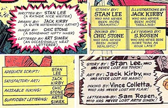 Credit boxes from THE FANTASTIC FOUR #30, 32, 35 and 41, 1964-65
In his scripts, Stan began having fun with this idea, adding amusing or bombastic comments to each creator’s listing, and often making a joke in the letterer listing, as seen above. As a reader, I found this entertaining, and it increased my interest in letterers, who probably enjoyed the jokes too, or at least appreciated the attention and credit. Eventually other comics publishers had to follow Marvel’s lead in this area, though they did so reluctantly. At DC Comics, credits for writers and artists became a regular if small addition to most stories by 1971. Editor names were added in 1976, colorist credits in early 1977, and letterers in the fall of 1977. As readers and fans grew more knowledgable about who was doing what in the comics they read, they wanted to know more, and by the 1980s, hardly any comics were missing credits for everyone involved in making them. Artie Simek started that innovation for letterers, and we all benefitted, professionals and readers alike. Even his own daughter, Jean Simek Izzo, benefitted when she became a letterer at Marvel and DC in the 1960s and 70s. I began working at DC in the fall of 1977, and was unaware for years that letterers had only recently begun getting printed credit for their work there. It was always the case for me, and I’m grateful to Artie Simek for helping to make that happen so we could all take pride in our accomplishments. Thanks, Artie!
The post ARTIE SIMEK (and Sol Brodsky) at Marvel Comics Part 5 appeared first on Todd's Blog.
June 28, 2023
Incoming: SANDMAN BOOK SIX Trade Paperback, Netflix Tie-in

 Cover art by Dave McKean, images © DC Comics
DC continues to put out Sandman collections in support of the Netflix live-action series. If that series gets to about Season Six, they might reach some of this material. Included are SANDMAN: THE DREAM HUNTERS by Gaiman, adapted by P. Craig Russell, SANDMAN: OVERTURE by Gaiman and J.H. Williams III, and SANDMAN UNIVERSE #1 plotted by Neil, written and drawn by Tom Fowler and Bilquis Evely among others. I think the McKean covers are new. Retail price is $34.99. Due out August 1st. Check with your comics retailer, or there’s an Amazon link below.
The post Incoming: SANDMAN BOOK SIX Trade Paperback, Netflix Tie-in appeared first on Todd's Blog.
June 27, 2023
ARTIE SIMEK (and Sol Brodsky) at Marvel Comics Part 4
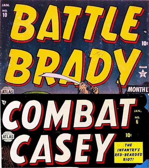 From BATTLE BRADY #10 and COMBAT CASEY #6, Jan 1953, all images © Marvel
Continuing with more logos (and cover lettering) I think were done by Artie Simek, who had been on staff at the company now known as Marvel since at least 1946, and been their main logo designer most of that time. There are a relatively small number of new titles cover-dated 1953, and they all continued previous trends. These logos use styles we’ve seen before, variations on standard block lettering. They do the job, but perhaps Simek was running out of new ideas, and his boss Stan Lee was happy to let him copy what he’d done before.
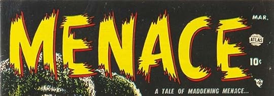 From MENACE #1, May 1953
This horror logo uses the brush stroke look with very pointy and ragged ends that add energy, but in places make the letters seem too thin to my eye.
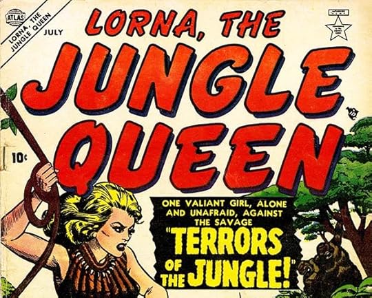 From LORNA THE JUNGLE QUEEN #1, July 1953
Lorna’s logo goes with a more rounded brush stroke look with a drop shadow for added depth. It doesn’t say jungle to me, but I do like Simek’s large caption lettering, the small letters are type. Queen became Girl after a few issues. You have to wonder who did her hair and makeup…
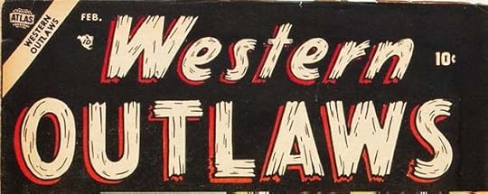 From WESTERN OUTLAWS #1, Feb 1954
Moving into 1954 cover dates, letters shaped like pieces of rough wood were always a safe bet for a western logo. The use of lower case in the first word is unusual. Note that many of these logos have an open drop shadow for a second color, but that could be filled black where it worked better, as in Lorna’s logo above.
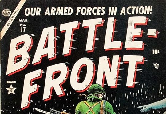 From BATTLEFRONT #17, March 1954
We saw this logo in Part 3 on one line, here Simek hyphenates it to allow the letters to be larger on two lines. The speed lines add motion, though to me these seem to be sending the letters to the left, or backwards rather than forwards, with the normal direction being left to right, as with reading English. Hyphenated logos were fairly common at Atlas, as Marvel was known at this time, and were still seen into the 1970s.
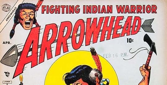
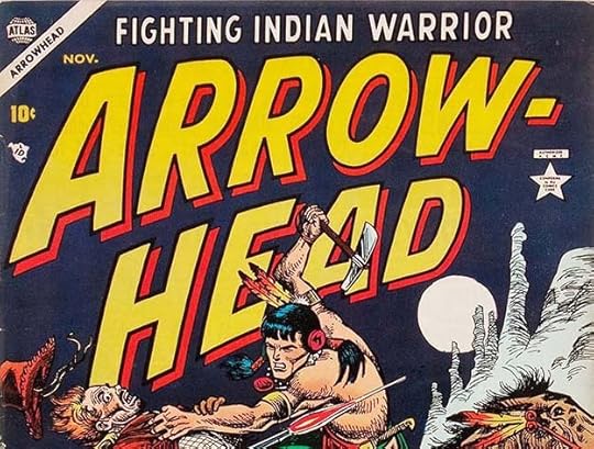 From ARROWHEAD #1 & 4, April & Nov 1954
Here’s another example of a long word first used on one line and then hyphenated. On the first one, the arrow adds interest, and with the speed lines is definitely going right to left. It looks fine here, even though that feels like the wrong direction to me.
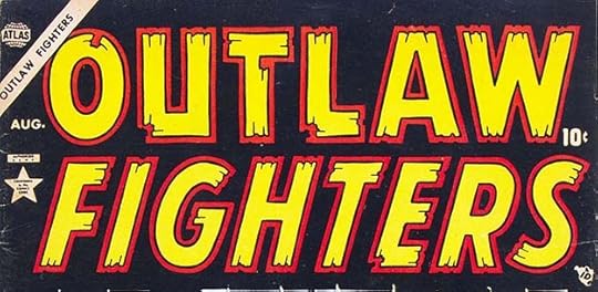 From OUTLAW FIGHTERS #1, May 1954
Another way to make room for a second color is a second thinner outline around all the letters, as Simek did here, but it’s not a choice he made often. It works well.
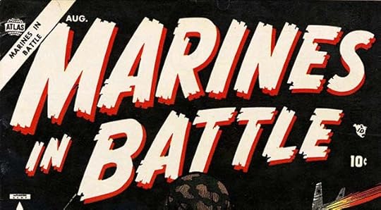 From MARINES IN BATTLE #1, Aug 1954
This logo bucks the trend by being done with solid black letters, which were then reversed white and again in red to work on this black background. All the issues had solid letters, so it was definitely done that way, and not created with outlines that were filled in. I like the square shapes of the uneven stroke ends.
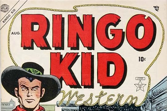 From RINGO KID WESTERN #1, Aug 1954
There were lots of western Kids at Atlas, probably all inspired by real outlaw Billy the Kid. This logo’s rope WESTERN is a nice addition to a familiar Simek style.
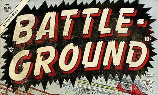 From BATTLEGROUND #1, Sept 1954
Another war title split into two lines using a familiar Simek look. The burst around it adds energy.
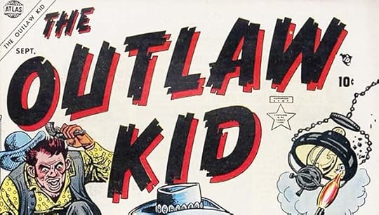 From OUTLAW KID #1, Sept 1954
The appearance of this logo suggests it was done with a wide wedge-shaped pen in parallel strokes, but the open drop shadow with a thin black outline is more likely how it was actually drawn. I like it.
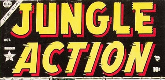 From JUNGLE ACTION #1, Oct 1954
Two more familiar styles. Notice how the speed lines are made more obvious by leaving a small gap over each one in the letter outline, something I first noticed in Ira Schnapp’s THE FLASH logo at DC Comics, but this predates it. Here the letters seem to move left to right.
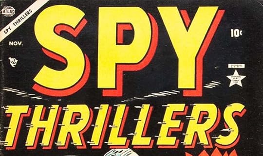 From SPY THRILLERS #1, Nov 1954
The same technique is used on these speed lines, it was probably a common idea from showcard lettering. Note that first issues almost never had the issue number on the cover. Retailers had very full racks, and were reluctant to add new titles, this ploy might have gotten books racked by those who weren’t paying attention. Publishers also sometimes started a new title with a double-digit number for the same reason.
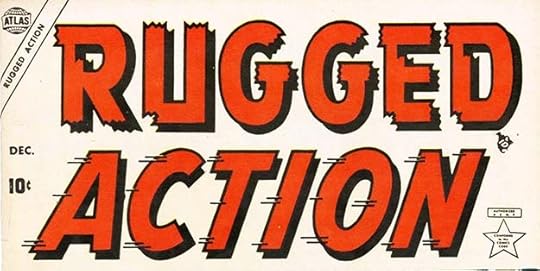 From RUGGED ACTION #1, Dec 1954
Artie could have reused the ACTION from JUNGLE ACTION here, different speed lines shows he didn’t.
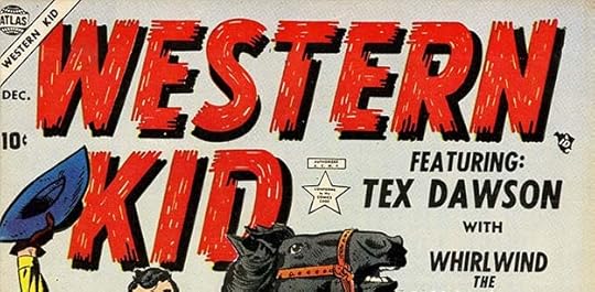 From WESTERN KID #1, Dec 1954
You can’t get more baseline on a kid western than WESTERN KID. I like the texture of multiple pen strokes in these letters with open white spaces.
In MARVEL AGE #22, Jan 1985, an article by Dwight Jon Zimmerman memorializing Sol Brodsky after his passing has this about the second of publisher Martin Goodman’s mass staff firings:
On August 7, 1952, Sol’s and Selma’s first child, Janice, was born. The joyous event unfortunately coincided with a growing recession in the comic book industry that hit in 1953 and 1954. Forced to make drastic cutbacks or close his doors completely, Martin Goodman laid off everyone on staff except Stan Lee. The reorganized company, now called Atlas, survived, but, as [artist] Stan Goldberg recalled, “They needed someone on production to handle things since there was no real staff. I would come in a couple of days a week to help out, but I had a lot of my own freelance stuff, so I couldn’t do much. Stan got in touch with Sol [Brodsky]. Stan was a one-man department, and, with Sol, it became a two-man department.” “Sol and I were the whole staff of Atlas Comics,” Stan Lee said. “I bought the art and scripts, and Sol did all the production. My job was mainly talking to the artists and the writers and telling them how I wanted stuff done. Sol did everything else — the corrections, making sure everything looked right, making sure things went to the engraver and he also talked to the printer. He was really the production manager. And little by little we built things up again.”
This “recession” in comics was partly due to a glut of titles and partly caused by public attention and outcry over extreme violence in some horror and crime comics, leading to a congressional investigation and public comics burnings. Comics publishers got together to self-censor, creating the Comics Code Authority. The most egregious publisher, EC Comics, was essentially put out of the comics business. Atlas had its own crime and horror comics that were not as extreme, and many of those were canceled, but looking at all the new titles that came out in 1954 and 1955, I don’t see much of a cutback, so I don’t know how long the two-man company was in effect. Artie Simek was still in demand as a logo designer and cover letterer. He may have been working at home for a while, but he was still busy. This does mark the beginning of Sol Brodsky’s new role as Stan Lee’s right hand man and production manager, but it didn’t keep Sol from being laid off again in the next Martin Goodman purge in 1957.
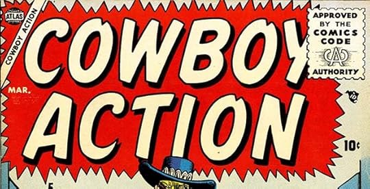 From COWBOY ACTION #5, March 1955
New and existing titles from Atlas now included the Comics Code Authority seal of approval (designed by Ira Schnapp of DC Comics), hoping that would appease parents and critics. The worst of the crime and horror comics were gone, replaced by more westerns, teen humor, jungle, and war titles, and anything else that others were having success with. Artie Simek largely stayed the course with familiar logos that did, to be fair, help readers identify them as Atlas products.
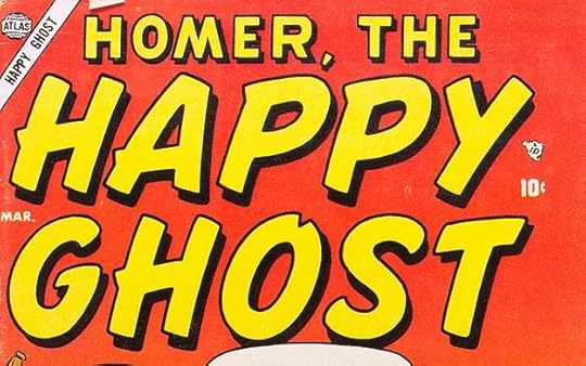 From HOMER THE HAPPY GHOST #1, March 1955
As you you can see, the rollout of the Comics Code seal was not uniform by date. Here Atlas was imitating the popularity of Caspar the Friendly Ghost at Harvey Comics.
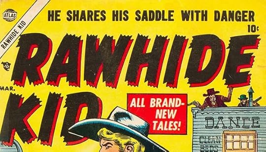 From RAWHIDE KID #1, March 1955
This kid western was more successful than most, but not right away. This initial run lasted 16 issues, to the next cutback in 1957, but it was revived in 1960 with the same Simek logo for a long run of 135 issues to 1979.
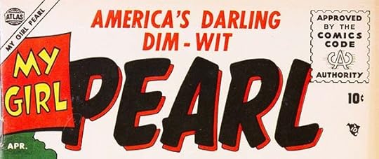 From MY GIRL PEARL #1, April 1955
When Atlas lost the license from CBS for the radio/TV show “My Friend Irma,” they replaced that title with this similar one that readers could buy instead.
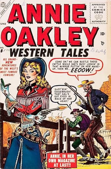 From ANNIE OAKLEY WESTERN TALES #5, June 1955
Around this time, Artie began giving his word balloons much thicker outlines probably to attract attention, and sometimes they were held in a color, like the red one here. It wasn’t Simek’s choice, but that of whoever did the color guide. That person would have marked this border and the type at upper left as a YR hold, meaning 100% Yellow and 100% Magenta but no black, and the separators would have made that happen on their film separations, one for each color of ink. Cyan and Black were the other two colors. The white type on red was the opposite process, reversed out of the magenta and yellow plates.
 From STRANGE TALES #36, June 1955
This is the second logo for this title, pulling back from the horror aspects and toward more fantasy and science fiction tales. Simek liked the idea of size and perspective going in opposite directions to fill a rectangular area at the top of a cover, he did that several times.
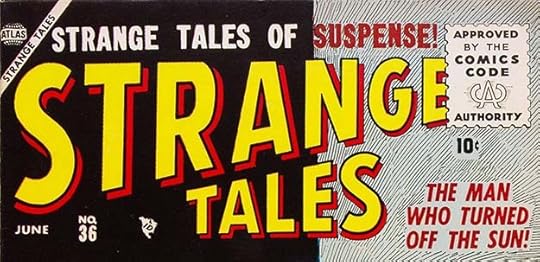
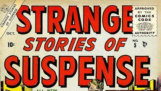 From STRANGE STORIES OF SUSPENSE #5, Oct 1955
“Suspense” was a new code word for mild horror, along with “mystery.” The logos were intentionally less scary, and therefore more bland. This title is also too long.
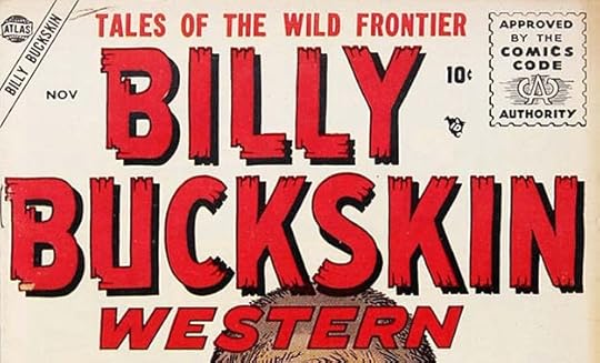 From BILLY BUCKSKIN WESTERN #1, Nov 1955
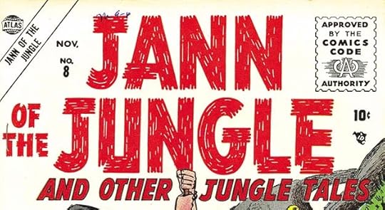 From JANN OF THE JUNGLE #8, Nov 1955
Two more titles with familiar Simek styles that I think work well for these genres.
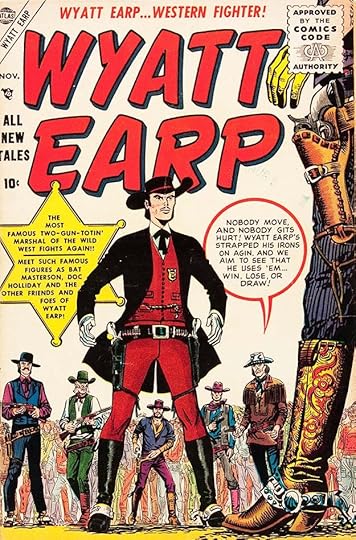 From WYATT EARP #1, Nov 1955
Actual heroes and villains of the old west were fair game for any comics publisher, seeing that their stories and names were not trademarked. This cover has an unusual perfectly round balloon from Artie, and I also like the badge caption, though it’s filled with type.
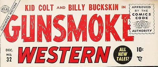 From GUNSMOKE WESTERN #32, Dec 1955
Another option for western characters was to team them up if they weren’t selling that well individually, as here.
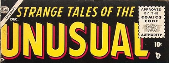 From STRANGE TALES OF THE UNUSUAL #1, Dec 1955
An advantage of these “fantasy/mystery/science fiction” anthologies was that there were no continuing characters, so any time enough extra stories were finished, a new title could be put out. The angled stroke ends on the letters here add interest.
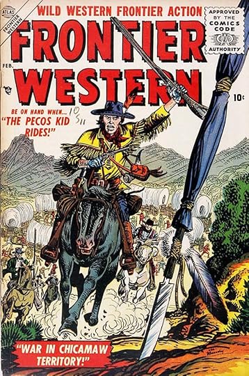 From FRONTIER WESTERN #1, Feb 1956
The same was probably true for western anthologies like this one. Here all the captions are type.
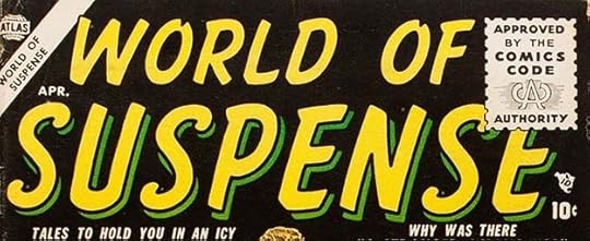 From WORLD OF SUSPENSE #1, April 1956
There’s that suspense word again signalling content meant to scare and thrill.
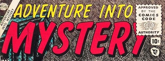 From ADVENTURE INTO MYSTERY #1, May 1956
Mystery was a code word also used by DC Comics in their HOUSE OF MYSTERY, but the comics code meant nothing very graphic or frightening would be inside. And adding the code seal, large, trumped the actual logo letters.
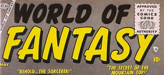 From WORLD OF FANTASY #1, July 1956
Simek was in a rut with these similar logos, but perhaps that’s what his editor Stan Lee and his publisher Martin Goodman wanted.
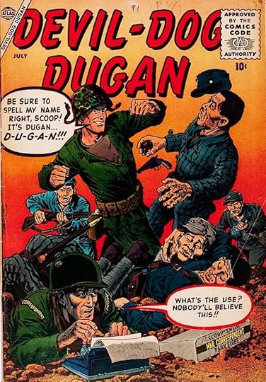 From DEVIL DOG DUGAN #1, July 1956
A word like DEVIL probably wouldn’t have been allowed in a horror title, but it was okay as a wartime nickname. I like these large balloons by Artie.
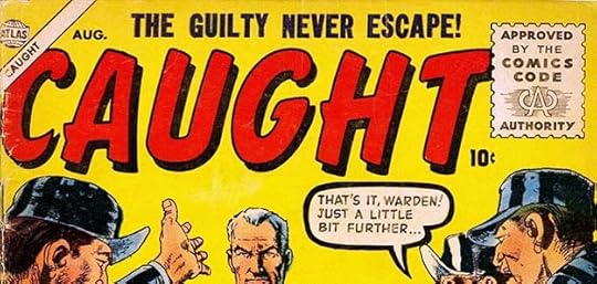 From CAUGHT #1, Aug 1956
Atlas was still trying crime comics now and then, perhaps hoping the comics code seal would help them get past parents.
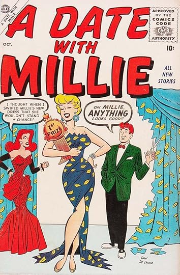 From A DATE WITH MILLIE #1, Oct 1956
This was a spinoff teen humor title for the Millie character, and the word MILLIE in the logo is at least a little different. More thick balloon borders from Simek.
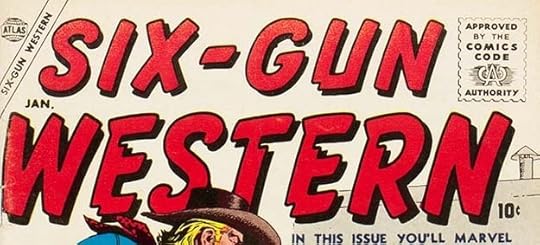 From SIX-GUN WESTERN #1, Jan 1957
I suppose the amount of gunplay in western comics, celebrated in this title logo, wouldn’t go over well today, but western gun violence had a long history in American popular culture from the 1800s on, and there was plenty of it on TV at this time.
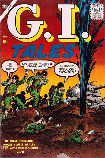 From G.I. TALES #4, Feb 1957
The large first line of this logo is a breath of fresh air, and I’d be tempted to say Artie didn’t design it, but the second line and balloons are typical of him, so he probably did. It only lasted three issues.
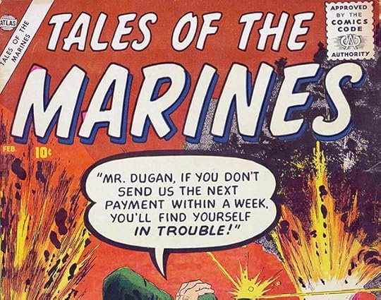 From TALES OF THE MARINES #4, Feb 1957
Back to the usual for this logo, with a nice large word balloon by Artie.
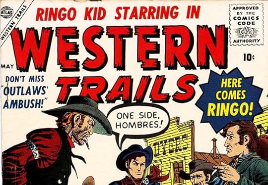 From WESTERN TRAILS #1, May 1957
Ringo Kid was apparently popular enough to star in this spinoff, or maybe they just had too many stories with him. It lasted two issues.
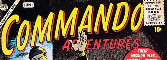 From COMMANDO ADVENTURES #1, June 1957
Using a familiar style but with much thinner letters gives this logo a little variety.
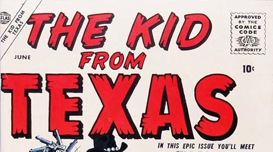
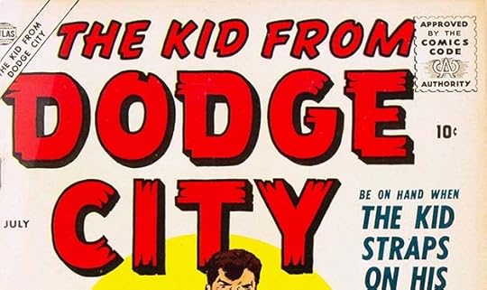 From THE KID FROM TEXAS #1 and THE KID FROM DODGE CITY #1, June & July 1957
Two more kid westerns with similar Simek logos. I’m surprised Atlas never thought of putting all their Kids together into a gang.
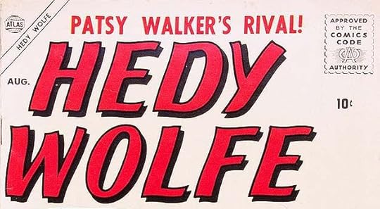
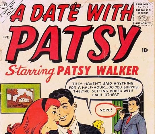 From HEDY WOLFE #1 and A DATE WITH PATSY #1, Aug & Sept 1957
Two more teen humor titles using the logo style I think Simek created for Patsy Walker in 1946, more evidence it might have been his design back then.
These are the last new titles with the Atlas symbol. Martin Goodman had actually shut down his Atlas distribution company in 1956, making a deal with American News Company to distribute his titles. This turned disastrous when American News went out of business in 1957. Goodman had little choice but to make a deal with Independent News, a distributor owned by his rival, DC Comics. The deal limited Goodman to eight titles a month for ten years, forcing him to change his usual plan of flooding the market with titles, and many books were cancelled. This brought on the third mass staff layoff, and once again Stan Lee was the only staffer left for a while. Artie Simek was still needed to letter covers and design a few logos, but now he also began lettering more stories to make a living, even taking work at DC and other publishers for a few months. Sol Brodsky was again laid off, and went on to other ventures like comics for the Big Boy restaurant chain, and founding CRACKED, a Mad imitator.
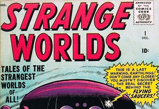 From STRANGE WORLDS #1, Dec 1958
The Atlas symbol was gone from covers, replaced by the Independent News IND symbol. In essence, Goodman’s company had no public identity, but Artie Simek’s logos and Stan Lee’s short mystery story anthologies kept things going. Soon Stan was using artists Steve Ditko and Jack Kirby, among others, to draw his stories, and they attracted readers. Marvel, as we’ll now call it, put out sixteen bi-monthly titles, eight of them came out each month. In 1958, those titles were GUNSMOKE WESTERN, HOMER THE HAPPY GHOST, KID COLT OUTLAW, LOVE ROMANCES, MARINES IN BATTLE, MILLIE THE MODEL, MISS AMERICA (teen humor), MY OWN ROMANCE, NAVY COMBAT, PATSY AND HEDY, PATSY WALKER, STRANGE TALES, TWO-GUN KID, WORLD OF FANTASY, WYATT EARP, and this new title, the only launch of the year. I like the radio balloon by Artie, though having the tail in front of the space ship but some of the burst points behind it looks wrong, flattening the art.
 From TALES OF SUSPENSE #1, Jan 1959
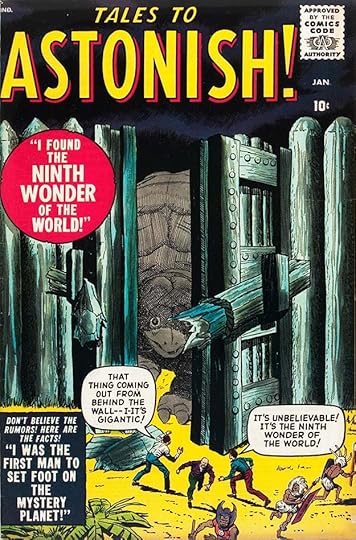 From TALES TO ASTONISH #1, Jan 1959
Two new science fiction/fantasy anthologies began in 1959, filled with more Stan Lee short stories and sporting block letter logos and cover lettering by Artie Simek. These titles would continue into the 1960s and become familiar to Marvel fans, but with different logos.
 From KATHY #1, Oct 1959
This new teen humor title has an appealing mixed case logo by Artie, and a recycled cover idea with his lettering. I think Marvel’s teen humor did okay thanks to their often using the same artists as the ones from Archie Comics.
 From TALES TO ASTONISH #12, Oct 1960
Here’s the more familiar logo for this title that continued when it featured Ant-Man and The Wasp. Simek’s balloon and caption lettering is large, and for the first time we see it being enhanced by a band of color inside his already thick first balloon. The Jack Kirby and Dick Ayers art is eye-catching, too. This is the kind of thing that would interest readers and keep the company going.
 From STRANGE TALES #80, Jan 1961
Here’s where this title picked up the logo familiar to Marvel readers when the book hosted The Human Torch, and then Doctor Strange. Simek returns to the wavy letters he’d used for scary titles in the past.
 From AMAZING ADVENTURES #1, June 1961
The age of Marvel superheroes was about to arrive when this new anthology began with familiar Simek logo and cover lettering styles. It would soon make way for new titles like THE FANTASTIC FOUR with logos by the team of Sol Brodsky and Artie Simek. We’ll continue there in Part 5 next time. Meanwhile, consider the amount of work by Artie Simek in these 52 logos on top of the ones already shown in parts 2 and 3. Perhaps he wasn’t always inspired, but Artie worked hard and his styles represented the company and his own abilities well.
The post ARTIE SIMEK (and Sol Brodsky) at Marvel Comics Part 4 appeared first on Todd's Blog.
June 25, 2023
Rereading: THE BOAT WHO WOULDN’T FLOAT by Farley Mowat
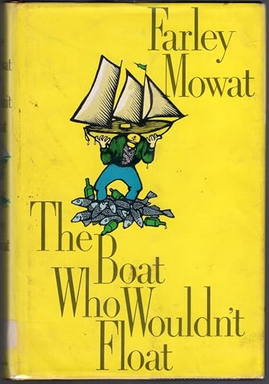
Farley Mowat (1921-2014) was a Canadian writer and environmentalist probably best known for his book “Never Cry Wolf,” made into a 1983 film. My favorite book of his is “The Dog Who Wouldn’t Be,” humorous autobiography about his family and pets in rural Canada. This book is along those lines, though it takes place in the 1960s when Mowat was a successful adult author.
Mowat and his publisher and friend Jack McClelland have decided to search out and buy an old sea-going ship large enough for long pleasure voyages, but small enough to be handled by two. Such boats are scarce, and they finally find one at the eastern end of Newfoundland, a place which can only be reached by a very poor excuse for a road, and also a place usually and famously engulfed in thick fog. The sailor selling the boat is enthusiastic, but Farley can barely make out the shape of the vessel in its cod-fishing harbor, complete with the awful stench of the cod-processing plant and the equally awful output of the factory. The owner, Paddy Hallohan, agrees to fix it up, add a cabin, and make it seaworthy by the time Farley and Jack return to sail it that summer. Needless to say, when Farley gets back, almost nothing is done, the boat is a wreck, and disaster looms, while Jack is due in a few weeks. Plying any able hands he can find with rum, Farley and Paddy and company do their best, which is not enough, but eventually the boat they christen Passion Flower launches and begins one of the most harrowing, dangerous, and hilarious voyages through the Canadian maritime provinces that has ever been put to paper, let alone survived, in a boat that continually tries to sink itself.
Great fun if you can find it, the best kind of armchair adventuring.
The Boat Who Wouldn’t Float by Farley Mowat
The post Rereading: THE BOAT WHO WOULDN’T FLOAT by Farley Mowat appeared first on Todd's Blog.
June 22, 2023
ARTIE SIMEK (and Sol Brodsky) at Marvel Comics Part 3
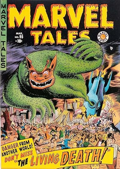 From MARVEL TALES #95, March 1950. This and all images © Marvel.
In Part 1 of this series I outlined the career of letterer Artie Simek, and in Part 2 I discussed logos he might have designed for Timely (as Marvel was then known) mostly in the 1940s. We continue here with logos that first appeared with 1950 to 1952 cover dates, though some may have been done in late 1949, around the time publisher Martin Goodman ordered editor Stan Lee to lay off most of the staff and use up the backlog of inventory stories he’d accumulated. Simek survived that purge because he was needed to design logos and letter covers, as he did on this example. The drippy logo might have been inspired by those being designed by Ed Feldstein at EC Comics, whose horror titles Goodman was imitating. The vertical book name at upper left also copies EC. The large caption has another style Simek liked, the wavy letters in DEATH, while the vibration lines on LIVING are unusual for him but effective. Note that for a while in the early 1950s, Timely was using a Marvel Comic bullet to identify their books. Keep in mind that this is all guesswork based on style, but at least in 1950 there wasn’t anyone else at the company designing logos other than Artie Simek as far as I know.
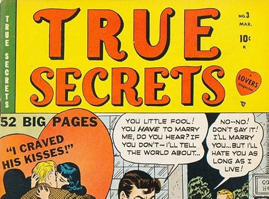 From TRUE SECRETS #3, March 1950
On this romance title, the logo uses ball serifs, something I think Simek did elsewhere, but the letters are kind of thick and clunky otherwise, and the balloon lettering is definitely not by Artie. Still, the logo is probably his.
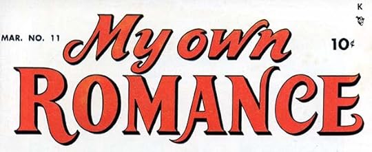 From MY OWN ROMANCE #11, March 1950
I like this one much better, the curled stroke ends add elegance, and the style is perfect for a romance comic. Nicely done by Simek.
All the books the company put out in this year probably used mostly inventory stories or even covers that could have been sitting around for years. Around this time, Goodman moved out of the Empire State Building to new offices at 655 Madison Avenue, where he focused more on other kinds of magazines: true confessions, movie gossip, crossword puzzles, and racy action-adventure titles like MALE and STAG. Stan Lee gradually built up his comics staff again over the next year or two as inventory stories were depleted, hiring back a few staffers from the 1940s. He needed them, as Martin Goodman had no plans to slow down his vast comics output.
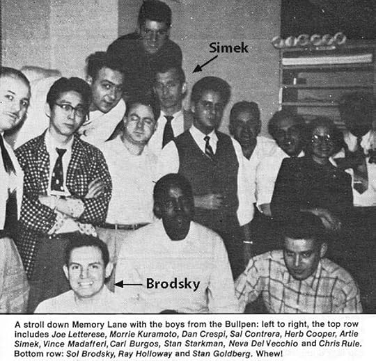 From FOOM #17, 1977, the Marvel Bullpen about 1954.
Let’s take another look at this staff photo. Production staffers often filled several roles, the most important one being getting books ready to send to the printer. This included making any art and lettering corrections needed, and preparing and pasting together the various elements on covers, ads, text pages, and so on, including indicias and character logos. Beyond that, some production staffers focused on lettering, some on art, some on coloring (preparing color guides for the separators). In this group, Joe Letterese, Morrie Kuramoto, Dan Crespi, Herb Cooper, Artie Simek, Stan Starkman and Ray Holloway were letterers, while Vince Madafferi, Carl Burgos, Chris Rule, Sol Brodsky and Stan Goldberg were artists. I’ve found no information on Neva Del Vecchio, perhaps she was a colorist. And, of course, any staffer might be asked to pitch in on any task, and some were probably skilled in several areas. Carl Burgos was the creator of The Human Torch when he worked for the comics packager Funnies, Inc. in the early 1940s, but perhaps he fell on hard times and took a staff job. All these people probably did comics freelance work as well in their spare time, and/or perhaps were paid like freelancers for their staff work, by the page. Simek had already established himself as the company logo designer and cover letterer, but I know that Joe Letterese also designed some logos — he showed them to me, but sadly I no longer recall what titles they were. Perhaps other staffers did some logos and covers as well, as Martin Goodman continued his policy of following any hot trend with a flood of short-lived titles.
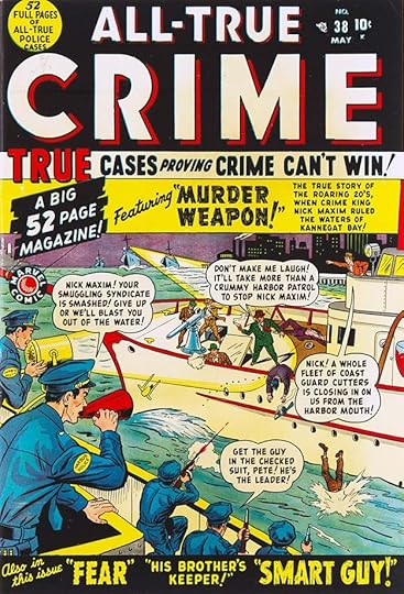 From ALL-TRUE CRIME #38, May 1950
Some title changes seem unnecessary, like changing ALL-TRUE CRIME CASES to ALL-TRUE CRIME. The logos are quite similar, and the numbering continued, so why bother? This cover has lots of lettering by Simek in styles that he often used, and his work becomes easier to identify in the 1950s because of that. When a book received a second-class mailing permit from the postal service it lowered costs for both subscriptions and shipping by mail to some vendors, so publishers tried to hang on to those permits by shifting them from one title to another but keeping consecutive numbering. It made sense at the time, but now adds confusion, and might have puzzled buyers as well. Some of the lettering on this cover, like “HIS BROTHER’S KEEPER” might have been done by Artie using Leroy lettering templates, and the same is true for parts of the lettering on the next few covers. The best clue is the vertical sides of the M, and how almost identical those round-ended letters are. This was a slow process, but made popular by EC Comics, so perhaps something Simek was told to use.
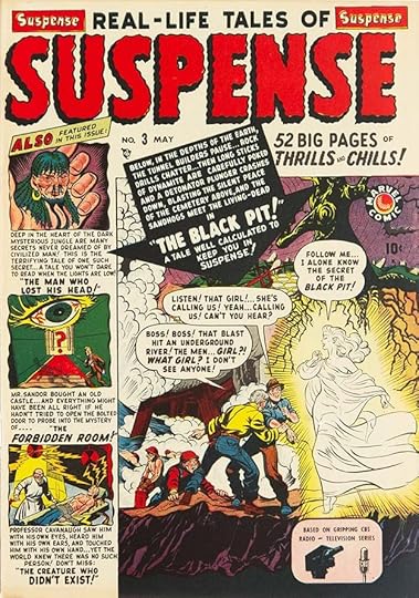 From SUSPENSE #3, May 1950
Some of these covers had lots of lettering, which would have kept Artie busy even if he didn’t do much story lettering. This logo again uses wavy letters for a scary subject.
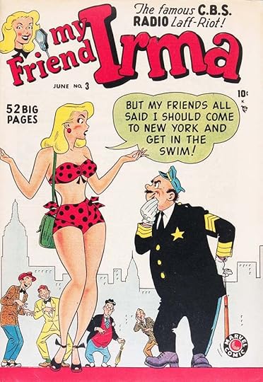 From MY FRIEND IRMA #3, June 1950
Goodman had a deal with C.B.S. Radio to create comics from their programs, and this one ran for many years, as did the comic. The logo looks like Simek’s work, but I thought it might have been based on something from the show. I couldn’t find any evidence of that.
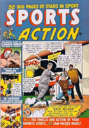 From SPORTS ACTION #3, June 1950
If ever a Marvel title was tailor made for Artie Simek, the avid baseball fan and former player, this is it, though the first issue (called simply SPORTS STARS) and the second don’t seem to have his logos on them. This cover lettering and logo are certainly his work. The speed lines and shading on ACTION work well to add motion.
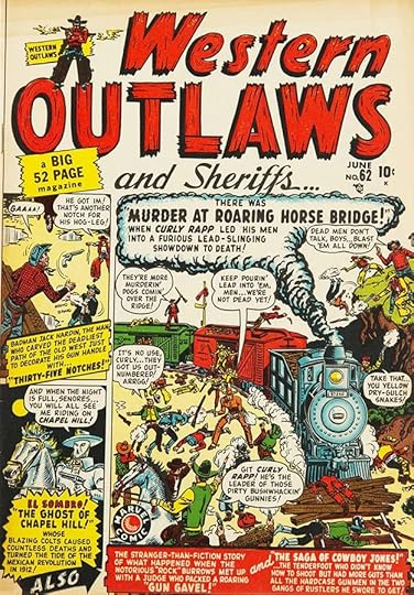 From WESTERN OUTLAWS #62, June 1950
A common style for western logos is rough and ragged pieces of wood, and Artie does that here, with contrasting script for AND SHERIFFS. Again, look at all that busy lettering. Potential buyers might have needed a while just to read the cover.
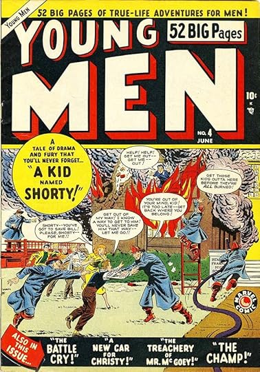 From YOUNG MEN #4, June 1950
This logo is probably Simek’s work, though it’s pretty generic, and the cover lettering too, but the balloons may be by someone else.
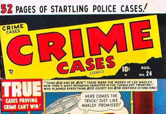 From CRIME CASES COMICS #24, Aug 1950
If crime comics are selling, put out lots of them was publisher Goodman’s plan, and he did. The shapes of these block letters are a little different and therefore more interesting. Artie also did the cover lettering. The wide caption looks like Leroy lettering, but perhaps it’s just Artie being precise and careful.
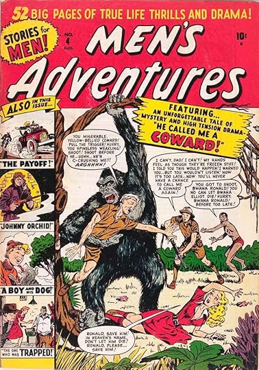 From MEN’S ADVENTURES #4, Aug 1950
This title might have been trying to interest buyers of Goodman’s non-comics magazines for men like STAG and FOR MEN ONLY. In these pre comics code days, content was unpredictable, but often violent.
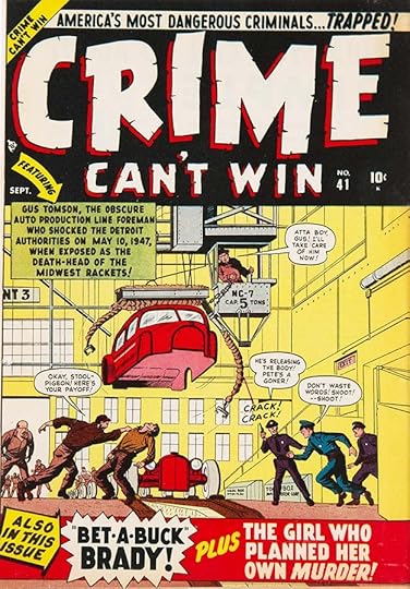 From CRIME CAN’T WIN #41, Sept 1950
Crime comics seemed to promote police triumphing over the bad guys, while all the while glorifying the violence that attracted readers. The cracked letters of the logo are a new idea for Simek that I like, I think all the cover lettering is his too.
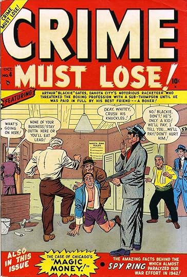 From CRIME MUST LOSE #4, Oct 1950
While CRIME is pretty standard on this logo, MUST LOSE! uses one of Simek’s favorite styles, what looks like brush strokes with very uneven ends. Even the O has an open area as if that’s where the stroke began and ended. The cover lettering is also by Artie.
 From ADVENTURES INTO TERROR #43, Nov 1950
The word TERROR in this logo combines the brush strokes and wavy edges to create a merged style. I’m not sure if it really works, but it sells the concept. The cover lettering is by Simek, but the bottom text is type. Around this time, the production department may have had a headline machine for doing things like that. It created a line of type on photographic paper one letter at a time, run on spools through a darkened box where the operator could position the paper roll with handles, and the letters reversed like a film negative on a large dial (there were different fonts on different dials that could be switched in), exposing each one with a flash of light. Then the paper would run through a developer and out the side. Once dry it could be cut up and pasted onto cover art. I used one at DC when I started. It was kind of fun, but not a big time saver over doing the lettering by hand.
 From AMAZING DETECTIVE CASES #3, Nov 1950
There’s a lot more type on this cover, so in this case a production person might have specified what they wanted and sent it out to a photo-typesetter, a service every publisher needed and used often.
 From THE GUNHAWK #12, Nov 1950
If this logo is by Artie, he was looking at logos by Ira Schnapp at DC Comics, as it’s very similar to some of those. The other lettering is type.
 From LOVERS #30, Nov 1950
This logo and cover lettering definitely looks like Simek’s work to me. The logo letters are an interesting mix of script and lower case type elements.
 From MILLIE THE MODEL #25, Nov 1950
Millie’s book had gone through several logos before settling on this one that I think is by Artie, with appealing rounded letters in a gentle arc. He also did the balloons. I’m not sure what the round icon at upper left is, a hatbox perhaps?
 From THE APACHE KID #53, Dec 1950
This logo style made from many parallel pen strokes, is one that Simek often used, and the curves aren’t so easy to get right. Here it’s obscured by the dark red color over it. The captions might be type except for MYSTERIOUS. This series began with #53, continuing from another western series, RENO BROWNE, that had run three issues, and was itself continued from MARGIE, a teen humor book. The next issue was number 2. Confusing to collectors, but probably done to keep the mailing permit.
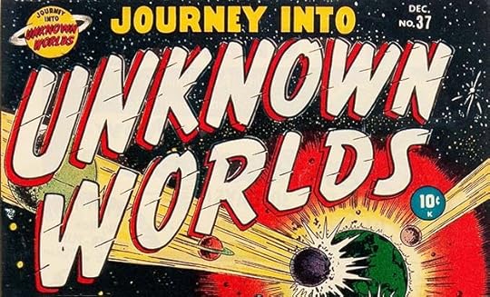 From JOURNEY INTO UNKNOWN WORLDS #37, Dec 1950
I like this logo by Simek, which combines letter shapes meant to suggest brush strokes with an open drop shadow and speed lines, all in a gentle curve and shallow perspective. The Saturn symbol is fun, too. By this time, having done logos for several years, Artie’s skill had risen to meet the needs of many kinds of comics. Notice how the letters of the second word are wider and spaced further apart than the first one to give the words almost equal width. That’s good design.
 From MARVEL BOY #1, Dec 1950
Is this science fiction or a superhero tryout? Perhaps a bit of each, but it only lasted two issues. I like Artie’s logo, the rest is type.
 From LOVE TALES #44, Jan 1951
On the other hand, LOVE here could have benefitted from wider letters to fill the logo area better. Perhaps Simek expected other elements at the side. I like the script TALES.
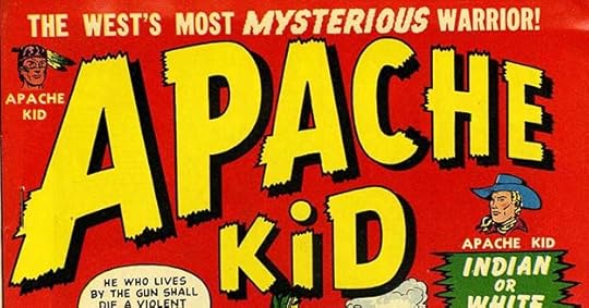 From TEXAS KID #1 and APACHE KID #2, Jan & Feb 1951
Two more western kids. I like the previous version of APACHE KID better, but these are okay, and the drop shadows add depth.
 From LOVE ADVENTURES #3, Feb 1951
Perhaps the romance logo areas were intentionally kept spare as a style choice, a contrast from the busy crime and horror comics. This logo works fine. The captions are type, but I think Simek did the balloons.
 From THE ARIZONA KID #1, March 1951
Simek uses his rounded brush style on this logo, perhaps for contrast from the other new western titles. The banner and star caption are his, the others are type.
 From BATTLE #1, March 1951
Around this time, a few years removed from World War Two, war comics became popular, and of course Martin Goodman jumped on the bandwagon. This is one of Artie’s cleverest logos, with chips being knocked out of the letters, as if by gunfire, adding motion and interest. The arrow caption and balloons are his, the other cover lettering is type.
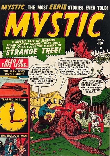 From MYSTIC #1, March 1951
With so many comics on newsstands, it’s a wonder there were still titles like this one available. MYSTIC has Art Deco shapes with wavy outlines and a few notches at the bottom as well as an open drop shadow to allow for a second color. The balloons are by Simek, most of the rest is type.
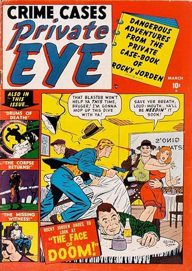 From PRIVATE EYE #2, March 1951
When you have a lot of new titles, changing up the logo layout on one is a good idea, as here, where it’s in a square. The balloons are by Simek, and the word DOOM at the bottom, the rest is type. Someone, perhaps Artie himself, was using the headline machine or getting photo-type a lot now.
 From SPY FIGHTERS #1, March 1951
The cold war made spies a hot topic, and spy comics soon followed.
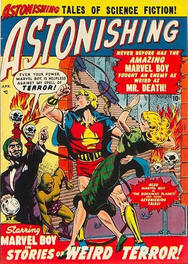 From ASTONISHING #3, April 1951
Marvel Boy moved into this title when his own failed, but only for the first three issues. And it should be said that Goodman was cancelling or revising titles before he even knew if they were successful or not based on sales figures. This logo is in the style of a science fiction pulp, but with more curves in the letters. Artie’s balloon (which may be Leroy lettering) and bottom caption are great, the others are type.
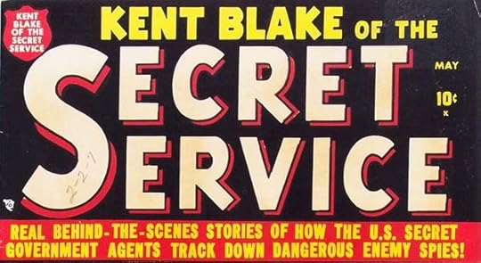 From KENT BLAKE OF THE SECRET SERVICE 1, May 1951
We’ve seen angled lower right legs like these on the K’s and R’s from Simek before, it adds subtle variety to the otherwise bland block letters.
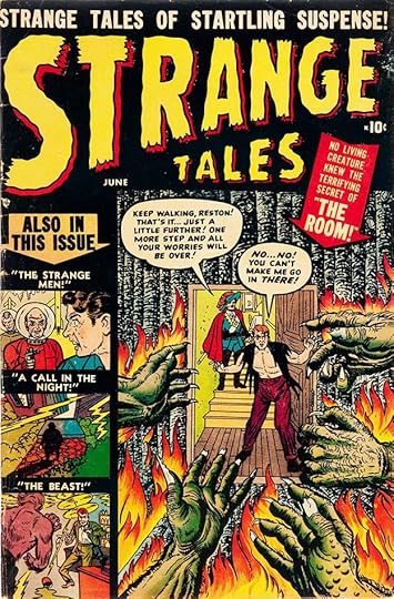 From STRANGE TALES #1, June 1951
Here’s a title that had a long life into the Marvel superhero revival, though with a different logo we’ll get to later. This logo is typical Simek work, and he did the balloons, the rest is type.
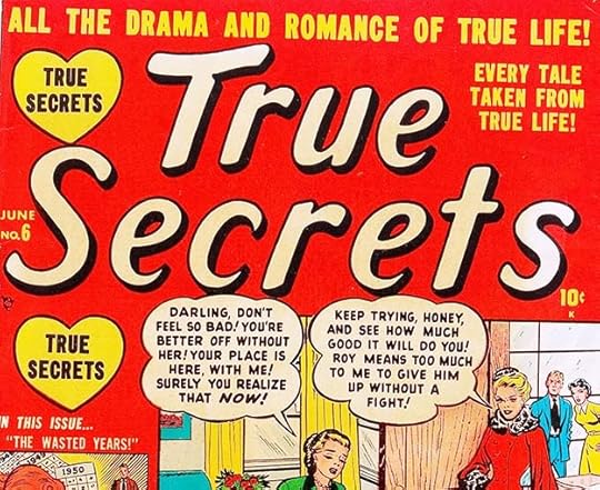 From TRUE SECRETS #6, June 1951
Another stylish romance logo, but here with lots of type around it. The balloons are probably by Artie, but the balloon shapes are not typical for him at the time, too many scallops. Perhaps he was just changing things up for variety.
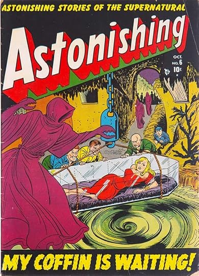 From ASTONISHING #6, Oct 1951
After Marvel Boy departed, this title became another horror/science fiction anthology, something that must have sold well, as there were many of them. The logo has a clean science fiction look, but the bottom caption by Simek is pure horror.
 From COMBAT KELLY #1, Nov 1951
I really like the aggressive, wide, square-ended strokes of this logo, and the way each letter is tipped to the right rather than just slanted. It’s a good look for a war title. Note the small symbol ATLAS after the Y. This stands for Atlas News Company, Martin Goodman’s own distribution arm, and it appeared on all his comics going forward for some years. Because of that, the company became known as Atlas, though that was never an official name.
 From ADVENTURES INTO WEIRD WORLDS #1, Jan 1952
This one doesn’t work so well for me, perhaps because there are too many styles. Also the black telescoping on the second line is nearly invisible, making the line spacing seem off. Simek played up WEIRD as the most important word, and I agree with that, even though it’s copying EC Comics’ titles WEIRD FANTASY and WEIRD SCIENCE. Not his title choice anyway.
 From BATTLE ACTION #1, Feb 1952
War logos should be large and bold, and this one is. I like the burst as well.
 From PATSY AND HEDY #1, Feb 1952
Another logo in the Simek teen humor style he created for Patsy Walker. There would be more.
 From AMAZING DETECTIVE CASES #11, March 1952
This title’s logo could have gone in several directions, Simek chose one of his horror styles with wavy letter outlines.
 From MYSTERY TALES #1, March 1952
The same approach is used on this logo, but with even more frenetic edges. The large caption and word balloon are by Simek, the rest is type.
 From BATTLEFRONT #1, June 1952
This logo could have been broken into two lines, but keeping it as one long word left room for the effective figure work above and below it. It’s possible that was by Artie, but more likely by a staff artist. The large words in the burst are by Simek, the rest is type. Interesting that the bottom banner promotes the title as “Now on sale every month” when this is the first issue.
 From COMBAT #1, June 1952
This logo is similar to G.I. COMBAT published by Quality Comics, and later for many years by DC Comics. The art reminds me of FRONTLINE COMBAT from EC Comics, and the artist, Russ Heath, also worked there. War titles were clearly selling. Fine large caption by Simek.
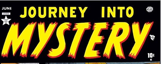 From JOURNEY INTO MYSTERY #1, June 1952
And here we arrive at another long-running title and Simek logo familiar to comics fans as the later home of Thor. That connection still makes me happy to see it, and it’s a fine logo for a horror anthology.
There you have 44 new or revised logos I think were designed by Artie Simek just for comics cover dated 1950 to 1952, and I’ve skipped some I wasn’t sure about. In that same period, for comparison, DC started 25 titles. In Part 4 I’ll look at more 1950s and early 1960s logos and covers I think were done by Artie Simek before the rebirth of Marvel superheroes.
The post ARTIE SIMEK (and Sol Brodsky) at Marvel Comics Part 3 appeared first on Todd's Blog.
Todd Klein's Blog

- Todd Klein's profile
- 28 followers

