
Todd Klein's Blog, page 40
August 1, 2023
AL FELDSTEIN – EC Logo Designer
 From TALES FROM THE CRYPT #24, June-July 1951, EC Comics. All EC images © William M. Gaines Agent, Inc.
Few traditional newsstand comics have been as controversial as the New Trend titles from Bill Gaines’ EC Comics in the early 1950s. They set high standards for artistic excellence, and new lows for violence and gore. Readers loved them, parents and lawmakers, as well as other publishers, did not, and eventually those other publishers drove them off the stands, but for a few years, they sold like hotcakes, from what I hear (I was an infant at the time). One factor in the success was the writing, art, editing, cover design, and logos by Al Feldstein, and it’s the last of those elements I’ll focus on here. Horror comics had appeared before, but there was something about Feldstein’s logos and covers that grabbed readers. His very drippy CRYPT above is a good example. His logos were well designed, and mostly based on block lettering, but with creepy styles that matched the art well. They were also large, and in a uniform layout that made the logo and trade dress demand attention, always a good thing among the competition on newsstands, and if a reader liked one EC title, the others were easy to spot.
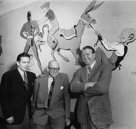
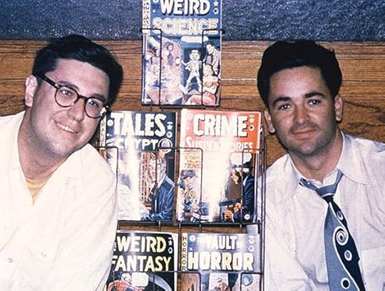 Bill Gaines and Al Feldstein, 1950, image found online
Albert Bernard Feldstein was born October 24, 1925 in Brooklyn, New York to Jewish parents who encouraged his interest in art. After winning an award in the 1939 New York World’s Fair poster contest, he decided to pursue a career in art and attended the High School of Music and Art in Manhattan. While in high school he began working for Jerry Iger in his shop, the S.M. Iger Studio, learning the business of making comics from the ground up. After high school he attended Brooklyn College and the Art Students League. He was in the Air Force in World War Two, and afterward became a comics artist and packager himself for publishers like Fox, Fiction House, and Quality.
 From MOON GIRL #2, Winter 1947, cover art by Johnny Craig
M.C. Gaines had been the co-owner of All-American Comics, a sister company of National/DC Comics. In 1946, he was bought out by National and started his own company, Educational Comics, which put out things like PICTURE STORIES FROM THE BIBLE. Gaines was tragically killed in a boating accident in 1947, leaving his son Bill to run EC. Bill moved away from educational comics and focused on another existing name, Entertaining Comics. At first he imitated other publishers, following whatever trend was popular. He hired Al Feldstein in 1948. In a 1995 interview with Steve Ringgenberg published in The Comics Journal #177 (May 1995), Feldstein remembered:
I was going to do a magazine for them called GOING STEADY WITH PEGGY. Then the sales on the teenage market were showing weakness. It was an industry of a few innovators and a lot of followers. So I said to Bill, “Well, let’s tear up the contract.” He put me to work writing and drawing whatever I could. I was doing westerns and crime, and I came to him one day and said, “Look, Bill, why are we following these idiots, and when the trend dies, getting caught? Why don’t we innovate, and why don’t we have people follow US?” Bill was a science-fiction and horror fan, and I was a horror movie fan, and I said, “Why don’t we try horror?”
They did, and it was a hit, but first let’s see what EC was doing before that. Above is a cover from MOON GIRL that shows the basic template for the EC covers trade dress was in place before Feldstein got there, with the title small in a vertical side banner, a large logo in a solid color box, and the EC symbol or bullet. I don’t know who did the logo, but it’s quite good. I think it might be by cover artist Johnny Craig.
 From GUNFIGHTER #6, Fall 1948
The logos ranged widely in quality, though, this is a perfectly awful one. If it’s by Craig, he definitely lost this gunfight.
 From MODERN LOVE #1, June-July 1949
Here’s an early cover by Feldstein, and I’m guessing he probably did the logo as well as the large lettering in the two captions, while the small lettering is done using the Leroy system by Jim and Margaret Wroten, who Bill Gaines had inherited from his father. There’s something a bit mechanical about Feldstein’s art, and he liked the mechanical look of Leroy lettering. He used it often on covers, and for nearly all the stories he wrote as well. The logo is bland, using standard block letters, though the addition of telescoping on LOVE adds depth and interest. The side banner is meant to be a genre or category in this case, rather than just copying the title.
 From MODERN LOVE #2, Aug-Sept 1949
The second issue has a different and more interesting logo with somewhat Art Deco styling and a drop shadow to add depth. The art is a collaboration by Craig and Feldstein, and the small lettering is by the Wrotens. I surmise the logo and cover design is again by Feldstein, and shows he was thinking about how he might improve rather than just sticking with his first idea.
 From A MOON, A GIRL…ROMANCE #9, Sept-Oct 1949
MOON GIRL changed to this romance title for a few issues before ending, and the logo again looks like early work by Feldstein. The title is too long and awkward, but he does pretty well with it anyway. ROMANCE has similar style points to LOVE in the cover above. But things were about to change at EC, with existing titles becoming horror ones in early 1950. Numbering often continued to preserve second-class mailing permits.
 From THE CRYPT OF TERROR #17, April-May 1950
CRIME PATROL became THE CRYPT OF TERROR with this issue. Johnny Craig did the art, and may have done some of the lettering, but I think the logo and the large caption is by Feldstein. TERROR in the left side vertical bar is again a genre marker, THE CRYPT OF is a bit rough, but TERROR in the logo is effective, taking the kind of ragged-ended open letters being used by Artie Simek at Marvel to wider widths and a higher level of distress, with telescoping to add depth. SUSPENSTORIES is a word I think coined by Feldstein, suspense being another pointer toward horror comics. Since combining the two words didn’t change the pronunciation, it worked better than Charles Biro’s idea over at Lev Gleason, “Illustories.” This is the first New Trend title, though it lasted only three issues.
 From THE VAULT OF HORROR #12, April-May 1950
The second New Trend horror title, continuing the numbering from WAR AGAINST CRIME, has open telescoping on the rough block letters of HORROR that was later filled in solid black, which I think worked better. The top line has a black drop shadow to add depth. The large caption is the same as on THE CRYPT OF TERROR, while the balloon lettering is by the Wrotens. The sign lettering might be by cover artist Johnny Craig.
 From THE HAUNT OF FEAR #15, May-June 1950
The third horror title, changed from GUNFIGHTER, has FEAR in a wavy style that Artie Simek was also using at Marvel, but the line above that is more original. Feldstein is still finding his way with logos, I think, and the somewhat more ragged look of FEAR in the side banner I find the most effective. This was perhaps EC’s first big hit, and it lasted 28 issues, until the company was forced out of newsstand comics. So far we’ve seen nothing very graphic on the covers as far as gore, and only the threat of violence. The Old Witch horror host may have been inspired by a spooky radio show, “The Witch’s Tale.”
 From TALES FROM THE CRYPT #20, Oct-Nov 1950
CRYPT OF TERROR changed to this title, with a new horror host, the Crypt Keeper, seen in the circle right of the logo. TALES again goes with wavy letters, CRYPT is fairly similar to the previous logo, but a bit softer. I like STRANGE in the side banner best of all. Johnny Craig was the go-to cover artist for these books at first, and he did an effective job, though his work isn’t very scary. This title also sold well, and later became the best known EC title because of its use as a movie title and TV series based on the comics.
 From CRIME SUSPENSTORIES #2, Dec 1950-Jan 1951
EC had done crime books before, but under Feldstein’s editorship, this new title took it to even more violent territory. CRIME uses wavy letters again, and SUSPENSTORIES, his made-up word, becomes part of the title, with the third S larger to get meaning across. I think Al also did the large caption.
 From WEIRD SCIENCE #5, Jan-Feb 1951
With this book, EC entered the science fiction genre with what I feel is one of the best Feldstein logos. WEIRD is in a ragged but controlled brush style with black telescoping, SCIENCE is wonderfully electric and energetic, and I love FANTASY in the side bar made of smoke. The word balloon is by the Wrotens, but I think Feldstein did the banner lettering, and his cover is full of depth and fearful events.
 From TALES FROM THE CRYPT #22, Feb-March 1951
A new logo on this issue of TALES FROM THE CRYPT is one I find creepy and effective, with drippy letters on CRYPT and very rough block letters on TALES. Feldstein’s cover art is more gruesome than what came before, and the three horror hosts he created are in boxes at the left side. That idea of creepy characters introducing stories and talking directly to readers is one that Feldstein and Gaines came up with as far as I know, and it was soon copied by others. It was even imitated on TV with horror movie/anthology hosts like Zacherly and Vampira, and possibly even Alfred Hitchcock. Certainly Hitchcock brought the same kind of droll humor as the hosts in the EC comics.
 From WEIRD FANTASY #6, March-April 1951
A second science fiction title, and the logo simply switches the words SCIENCE and FANTASY from the WEIRD SCIENCE logo. I don’t find this FANTASY as effective, but I love the cover image. The large caption is a mix of Feldstein lettering and type, the bottom one is by the Wrotens.
 From WEIRD SCIENCE #9, Sept-Oct 1951
Wally Wood’s art is fantastic here, and more violent and gruesome than early New Trend covers, showing the direction things were going. The amount of detail is staggering. SCIENCE-FICTION in the bottom banner is by Feldstein, the other words are type.
 From SHOCK SUSPENSTORIES #1, Feb-March 1952
A second “crime” comic with another amazing logo. I don’t think there has ever been a more energetic and electrically charged word on a comic than this SHOCK. Who could pass it by without a closer look? Feldstein was smart to start with standard block letters and then embellish them heavily with bursts all around, and the thick border makes it even better. EC’s New Trend was barely more than two years old, but the caption talks about the “EC Tradition.” Their books certainly did have impact, but not always a positive one.
 From THE HAUNT OF FEAR #12, March-April 1952
With this issue, Feldstein did a rougher, ragged version of FEAR that adds energy and creepiness. By now, he and Bill Gaines had found other artists adept at their extreme approach, like “Ghastly” Graham Ingles. You can see why parents might have objected to comics like this.
 From SHOCK SUSPENSTORIES #6, Dec 1952-Jan 1953
Wally Wood was no slouch at fine cover work either, and this one gets into political territory with villains suggesting the Ku Klux Klan, though the idea came from Gaines and Feldstein.
 From WEIRD SCIENCE #17 Jan-Feb 1953
Kind of off-topic, but EC managed to get permission to adapt stories by Ray Bradbury for their comics. Bradbury was not as well known then as he is now, but it was still a coup. He was a comics fan, and obviously reading their titles. In the Feldstein interview, he said:
Bill and I adapted an idea that we thought was different, and it turned out that it was pretty close to Mr. Bradbury’s story, and I didn’t know anything about this. See, I was not the springboard guy, Bill was. He wrote to us and said, “Hey you guys, you stole my story.” And Bill says, “No we didn’t. But here’s $25 and can we steal some more?” So he allowed us to, because he liked what we did.
 From WEIRD FANTASY #21, Sept-Oct 1953
With wonderful cover art like this by Al Williamson and Frank Frazetta, EC’s science fiction titles were showing they could do more than just scare. If I were a teenager when these were coming out, I would have bought them.
 From THE VAULT OF HORROR #33, Oct-Nov 1953
The horror titles, even on some later issues like this one, weren’t always going for the gross stuff. This scene by Johnny Craig is emotionally powerful without that, and effectively chilling.
 From PANIC #1, Feb-March 1954
I’ve not mentioned the EC titles edited by Harvey Kurtzman, the war books FRONTLINE COMBAT and TWO-FISTED TALES as well as the humor comic MAD, because I think Kurtzman designed those logos and covers, but this humor comic was edited by Al Feldstein, and I think he did the logo and left side vertical banner as well as the cover art. By this time, EC was being heavily scrutinized by everyone, including lawmakers, and this issue was banned in Massachusetts because of its parody of the beloved poem, “The Night Before Christmas” by Clement Clark Moore. I don’t think the logo is as effective as Kurtzman’s MAD, and this book only lasted 12 issues. Feldstein would have more success with humor when he took over the editing of MAD later, and for many years.
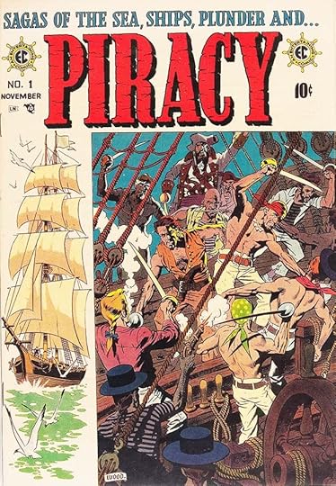 From PIRACY #1, Oct-Nov 1954
In 1954, the publication of Frederic Wertham’s Seduction of the Innocent and a highly publicized Congressional hearing on juvenile delinquency cast comic books in an especially poor light. Several comics publishers formed the Comics Magazine Association of America and its Comics Code Authority. The CCA code was rigorously enforced, with all comics requiring code approval prior to their publication. Gaines refused to join the association. Among the Code’s new rules were that no comic book title could use the words “horror” or “terror” or “weird” on its cover. When distributors refused to handle many of his comics, Gaines ended publication of his three horror and the two SuspenStory titles on September 14, 1954. EC shifted its focus to a line of more realistic comic books known as the New Direction titles. PIRACY, above, was the the first. While still violent, it at least avoided the gore of the horror and crime books, and was more like popular swashbuckling films. I think the logo and top line are by Al Feldstein, though it’s possible letterer Ben Oda had a hand in them. The ship wheels around the EC bullets are a nice touch.
 From ACES HIGH #1, March-April 1955
Four more New Direction titles came out in early 1955. The logo on this one by Feldstein is very traditional block letters with thick outlines, the size of ACES is what grabs the most attention. It seems Gaines and Feldstein were trying to follow popular trends in film now other than horror. Air battles were still violent, but perhaps more acceptable. The hype of the large caption sounds a bit desperate.
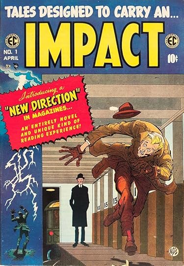 From IMPACT #1, March-April 1955
EC had been using the word impact in other places, here it seems to stand in for drama and action. The story featured on the cover, “Master Race,” was one of EC’s best and most celebrated. Written by Gaines and Feldstein with art by Bernard Krigstein, it’s about a World War Two Holocaust survivor. While the cover by Jack Davis is intriguing, the book’s title is perhaps intentionally vague, and the logo by Feldstein is slightly similar to Harvey Kurtzman’s MAD logo.
 From VALOR #1, March-April 1955
Armed combat in the style of Hal Foster’s Prince Valiant was the theme of this book and cover, and the logo is the best of the New Direction titles in my opinion. Feldstein had to look no further than Valiant for inspiration, but his logo, top line, and banner caption are all excellent work.
 From MD #1, April-May 1955
The last of the New Direction titles has the shortest logo, just two letters, and that allowed Feldstein to go really large with them. The caduceus art between is also well done. Sadly, while these titles might have worked early in EC’s life, the company was now fighting an uphill battle with distributors and retailers, who had been turned against them by the bad publicity. Gaines tried a few other things, but then his distributor, Leader News, went bankrupt, and at that point he threw in the towel and cancelled all newsstand comics, keeping only MAD as a larger magazine that could be placed with a different distributor, and which kept its distance from comics, at least as far as the look of it goes.
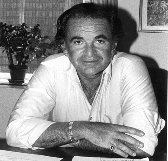 Al Feldstein, 1978, courtesy of photographer E.B. Boatner
At first Harvey Kurtzman continued as the editor of MAD, but when he decided to leave, Gaines called Feldstein back in to edit his remaining magazine. Under Feldstein, sales continued to rise until it was selling in the millions of copies, and supporting a creative crew of talented writers and artists, including a few from the EC days like Jack Davis. Feldstein finally left in 1984 when he couldn’t convince Gaines to go with his ideas about expanding MAD into other media, something that eventually happened anyway. He took up painting and became a successful wildlife artist until his death in 2014. EC Comics and MAD would not have been as successful without him.
The post AL FELDSTEIN – EC Logo Designer appeared first on Todd's Blog.


July 28, 2023
And Then I Read: THE HUNDRED THOUSAND KINGDOMS by N. K. Jemisin

This was Jemisin’s debut novel, published in 2010, the first book of the Inheritance Trilogy.
The beautifully realized and richly detailed world of this story is inhabited by people like those on our own world, but dominated by its creators, living, immortal gods with immense power. First, aeons ago, there was only Nahadoth, the Night Lord, god of Chaos. Then he was joined by his brother, Itempas, god of Light and Order. They loved each other, but their opposite natures clashed, and they often fought. Finally they were joined by a sister, Enefa, goddess of twilight and dawn, of life and death. The three together were in balance, and the world and people they created grew and prospered. Even the gods had children, godlings with their own powers and attributes. Then one day Enefa was murdered, and Itempas and Nahadoth went to war with each other. Itempas triumphed. He put Nahadoth and all the children of the gods into bondage, forcing them to serve the people and greatly restricting their powers. The world was broken by the conflict, and the majority of the people died. When things settled, Itempas chose the Arameri family to rule all the small kingdoms of the world, and they did so with an iron hand and the blessing of Itempas and his priests.
Yeine Darr, the story’s narrator, lives in the barbaric north, but her mother had been the heir to the Arameri throne before she abdicated to marry her Darr father. Yeine’s father is long dead, and her mother recently murdered, when she’s commanded by Dekarta, the Arameri leader, to come to the royal city, the massive god-built towers of Sky. There she learns she’s been named an heir to the Arameri throne, but Dekarta’s children Scimina and Relad want that throne, and at once begin trying to destroy Yeine. The young woman is frightened and feels hopeless until she’s taken under the wing of some of the captive gods and shown that she’s not as powerless as she thinks. With death always around the corner, Yeine begins to discover the truth about her own family and all the strange secrets of the gods and the Arameri.
Wonderful, engrossing, creative, hard to put down. Great characters, lots of surprises, an excellent book. I’m already reading the second one. Highly recommended.
The Hundred Thousand Kingdoms by N K Jemisin
The post And Then I Read: THE HUNDRED THOUSAND KINGDOMS by N. K. Jemisin appeared first on Todd's Blog.
July 27, 2023
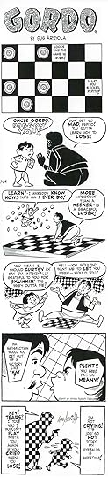
Gus Arriola’s GORDO Lettering

 From GORDO Sunday, Oct 11 1959, all strip images © United Features Syndicate. I’ve restacked the panels in the strips so you can see the lettering better.
GORDO is another comic strip whose use of lettering and design is remarkable, in addition to having appealing characters and writing. It began in 1941 as a humorous soap opera strip about an overweight Mexican farmer with an eye for the ladies, his smart nephew Pepito, and their animals, friends and neighbors in rural Mexico. Over a 45-year run it evolved into an exploration of Mexican culture and history as well as charming cartooning that covered a wide array of topics and characters in fresh ways, as with Gordo’s hungry cat Poosy Gato, above. Often the lettering was an important part of the storytelling, and it was fine lettering.
 Gus Arriola, 1950, from the dust jacket of the first hardcover collection
Gustavo Arriola was born July 17, 1917 in Florence Arizona. In an interview conducted by comics historian R.C. Harvey in The Comics Journal #229 (Fantagraphics, Dec 2000), Arriola describes his own origins:
My father came to the U.S. in the 1890s. I used to say facetiously that I was born in the northern part of Mexico now called Arizona, but it was Florence, Arizona in 1917. And I lived there until I was eight years old. We left Florence in 1925, the whole family, and moved to Los Angeles, where I grew up and got my schooling, graduating in 1935 from high school. We were seven boys and two girls. I was the baby of the family. My sister, Herminia, she was the eldest, and when my mother died of that flu epidemic in 1917 when I was only six months old, my poor sister, who was twenty years old at the time, was left with all this family. So she was the surrogate mother to me.
Los Angeles was magic. The air was different from Arizona. You could smell the orange blossoms. The city was surrounded by orange groves. L.A. was a rapidly growing place because of the movie industry. [I went to] a very good high school, Manual Arts High School, which specialized in shop work. They had four or five art courses — life drawing, design, stage art, and commercial art. I took them all. Manual Arts High School was the only high school in L.A. that had semi-nude models in art classes. That’s where I learned to draw women.
I loved the comics. I used to read them from the minute I could read. I did several comic strips — just for my own amusement — little knowing that I would develop into that later on. I graduated from high school and went to an animation school in Hollywood. In 1936 I applied for a job at Screen Gems as an in-betweener, filling in the action indicated by the animator. I learned how to draw by watching animators work. I did that for a year. [Then] I heard they were forming a unit at MGM. They hired me based upon my experience at Screen Gems. For six months I was an in-betweener, and then I was moved up to assistant animator because I was doing a good job, and I did that for about two years. I really never did feel right about animation. It was too precise an art. I wanted to do stories. I was a story sketch man for about a year and half, and then I sold the strip in 1941.
 Gordo Daily, Dec 15, 1941, from the Los Angeles Daily News
You can see in this early strip how Arriola’s time in animation influenced the style. The drawing is solid, but cartoony. That would evolve over time. The lettering reads fine, though the heavy dialect makes it a little hard to read. That would also change later, but this initial phase of GORDO didn’t last long. As Arriola said in the interview:
By early 1941, I thought I had the idea pretty well in hand, so I went off to New York and made a tour of the syndicates. United Features was the one that wanted to study it. In June of 1941, I got a telegram from Mr. George Carlin, who was the head of the syndicate, saying they were interested in producing it. He flew out and we signed a contract. I had to leave the studio because I couldn’t do both. So I quit my job, scared to death because I was working alone. Somehow I learned to do it; I started putting out six dailies, just the dailies. It started November 24. And then — bang! What happens? Pearl Harbor came in December. I was classified 1-A [by the draft board], so for the next ten months, while waiting to be drafted, I did the strip. It ran until October 1942, when I went into the Army. Luckily, orders came through to report to Culver City — First Motion Picture Unit of the Army Air Corps.
 From GORDO Sunday, May 5 1946, this and all original art courtesy of Heritage Auctions.
Arriola spent the war making training films at Hal Roach Studios in Culver City. He had met his wife Frances, and they were married in 1943 and were able to live off the base. Since he was home evenings and weekends, Arriola was able to restart GORDO as a Sunday strip only, with the first one appearing May 2, 1943. By 1946, out of the Army, he was able to resume the daily strip as well. In the 1940s, it was something of a Mexican LI’L ABNER, with stereotypical characters meeting the expectations of readers from what they saw of Mexicans in films. The art and lettering improved greatly. In the strip above, the regular letters are done with a wedge-tipped pen, with cartoony elements like the U-shaped Y. The emphasized words had pointed corners added with a small pen point to make the stand out better. And Gus was beginning to experiment with Mexican lettering styles, as seen in AMIGOS.
 From GORDO Daily, Oct 18, 1946
Some fantasy elements remained, as in this daily strip’s Cupid, and the symbolic image in the first panel. While there were soap opera elements, animals began to play a larger role, allowing for more humor that would appeal to kids as well as adults. In the interview, Arriola said:
Everything in those early days was purely an experiment. I would bring in whatever animals I might need for a gag. I guess that came from the animation business. And it was natural, too, that a farm would have animals around. They talked among themselves, but they never communicated directly to humans. They were a device to make comments on human foibles.
 From GORDO Sunday, March 3, 1949
The animals also allowed Arriola to break free from conventional storytelling and begin to do more creative things with large lettering, as here. This strip is about Gus himself, struggling to get ideas for the strip. The animals talk to each other, and directly to readers, breaking the fourth wall.
 From GORDO Daily, Nov 16, 1949
More fantasy in this strip, a leprechaun. The animal balloon shapes suggest they are whispering I think, though of course humans can’t hear their talk anyway. In the second balloon, GOLP has modern breath marks around it, showing that Arriola was keeping up with new ideas in lettering. The regular C is very curly, and the G has a wide central serif. And on the left edge of the first panel are marks made to draw the lettering guidelines. Meanwhile, Gus, his wife Frances, and their young son Carlin needed more space, so they moved to La Jolla, near San Diego for a while, also spending time in Arizona in the winter. By 1956 they had resettled in Carmel in northern California, where they would remain for decades. Arriola found kindred spirits there, including magazine cartoonist Eldon Dedini and DENNIS THE MENACE creator Hank Ketcham.
 From GORDO Sunday, Dec 26 1954
Look at the fabulous creative lettering in the final panel of this strip.
 From GORDO Sunday, July 24 1955
Arriola was employing both art and lettering as graphic design elements at a time when few comic strips did anything more than tell simple stories.
 From GORDO Sunday, June 16, 1957
In this Sunday page, Pepito’s sincere adoration of his Uncle Gordo is tempered by the sarcastic thoughts of Señor Dog, creating a funny dichotomy. Arriola was always experimenting. Notice how the balloon shape in the second panel is formed only by shading lines, the balloon border in the third panel suggests an open book, and in the third to last panel, two balloons from the same character are separated only by color. Design on the Sunday pages was striking and original. Even when telling an emotional story, as here, Arriola’s strip is full of humor and charm.
 From GORDO Sunday, March 10 1968
Another great use of large lettering on this Sunday, and more effective humor from the animals. Note the credit line at the top of each strip is now often a pun rather than a real credit, something I enjoyed as a child when reading them.
 From GORDO Sunday, Dec 8 1968
Perhaps my favorite character is the beatnik spider Bug Rogers, whose creative webs often use letters. Arriola takes impressionistic art and lettering to new frontiers in these strips, and they’re also funny.
 From GORDO Daily, Jan 30 1978
While our Sunday newspaper carried GORDO, I never saw the dailies, which are just as clever in a more condensed way.
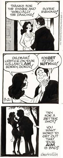 From GORDO Daily, Sept 21, 1979
In the early years, on the farm, Gordo himself was a slob, but later Arriola cleaned him up. Gordo left the farm and became a tour guide for Americans, requiring him to dress better. Arriola said in the interview:
In 1960 when I went to Mexico myself [for the first time, I] saw the country with a new eye. And then I realized that Gordo would be more fun as a tourist guide than as a farmer. That’s where I brought in the folk art and the historical and cultural celebrations. I did away with the dialect and the other ethnic stuff. I didn’t feel I needed it anymore. If I used a Spanish word, I would put the translation below. Art teachers and language teachers used to write and comment on it. We went [to Mexico] nearly every year after that. Some of that Mexican history, it became material for me.
I wish I could find some of the strips about Mexican history and culture, but I’m not seeing any in my usual sources online. I remember enjoying them.
 From GORDO Sunday, Aug 28 1984
What I recall best about the strip is the creative use of letters, especially in the Bug Rogers strips, a late one is above.
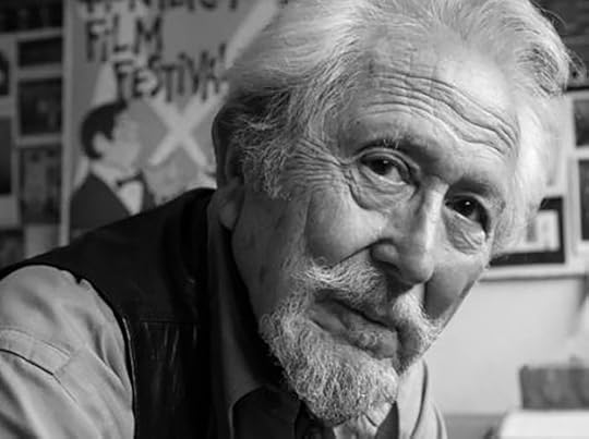 Gus Arriola, 1990s?, Carmel Art Association website
Sadly, Arriola’s son Carlin died in 1980 of complications from an auto accident. A few years later, Arriola decided to end the strip. The last one ran March 2 1985. In the interview, Gus said:
After 44 years, I was kind of burned out. I’d done it all myself — except for a year or so after the War. It just got a little too much for me. After our son died, the fun went out of it.
Gus Arriola died Feb 2, 2008 at the age of 90. He left behind an amazing legacy, decades of fine work on GORDO that deserves to be seen by more people, and I hope in future years more of it gets collected into book form so we can all enjoy it.
The post Gus Arriola’s GORDO Lettering appeared first on Todd's Blog.
July 26, 2023
Rereading: THE PIGEONEERS by Anne Molloy
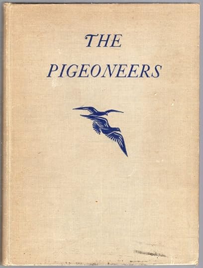
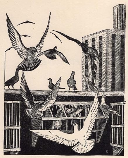 Illustrations by Elizabeth Converse
Written in 1947, this charming story is about Nat and other boys in the Orthopedic ward of a New York City hospital. They are all in stages of long recovery from injuries and surgery, and find the ward a dull place, but that changes when Nat, who looks out the only window, sees a man raising racing pigeons on the roof of the building next door. One day Nat sees one of the man’s racers taken by a hawk, and he lets the man know by writing HAWK on his small blackboard and putting it in the window. Mr. Lombard, the owner of a pet shop on the ground floor, comes to see Nat to find out what happened, and soon he’s befriended all the boys and encouraged them to start their own pigeon club. He brings a nest box over to put on their fire escape so they can see their own pair of pigeons raise young, and each boy is given the chance to send a message home with a pigeon that can be then released by their family with a return message for them. The pigeons brighten the lives of all the boys, and Mr. Lombard entertains them with stories about homing pigeons through history. Finally, a tragedy at Nat’s home is discovered through a pigeon he sent there and its return message, but can help get there in time?
A fine story if you can find it, recommended.
The post Rereading: THE PIGEONEERS by Anne Molloy appeared first on Todd's Blog.
July 25, 2023
CHARLES BIRO – Letterer
 Charles Biro by Bob Wood from DAREDEVIL COMICS #12, Aug 1942
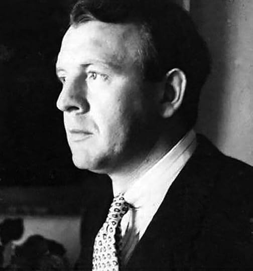 Charles Biro courtesy of Michael T. Gilbert
Charles Biro was much more than a letterer, he was a comics writer, artist, logo designer, cover designer, and co-editor of a successful line of books from publisher Lev Gleason from 1941 to 1955, but my article approaches his work with an emphasis on lettering and logo design. Research by friend and fellow comics historian Alex Jay has been particularly helpful, and this article would be much poorer without it. You can find his article on Biro HERE, and information from Irv Watanabe about Biro he provided is even more helpful. I also appreciate the help of Michael T. Gilbert, who provided photos.
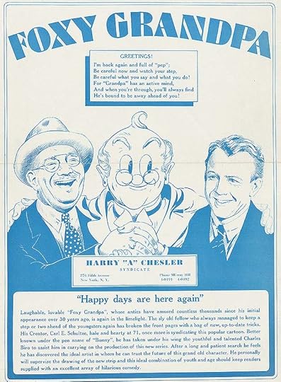
 From a promotional brochure for an unpublished FOXY GRANDPA newspaper strip, 1937. Top image shows Charles Biro at right. Courtesy of Heritage Auctions.
Charles Biro was born in New York City May 12, 1911 to Czechoslovakian immigrants. The family spent some time in France, but then lived in Queens. His brother Louis was an advertising artist in the 1930 census, and in a 1932 newspaper article about his sister’s wedding, Charles is described as a sketch artist for the Van Beuren Film Corporation of Manhattan. This was an animation studio, part of R.K.O., and he worked there until 1937. That year he drew sample strips for FOXY GRANDPA, above, for the Harry “A” Chesler Syndicate, a comics packager, along with at least one other strip, GOODBYLAND. In 1938 he moved to the comics publisher MLJ, later home of Archie Comics. Charles’ art training was sporadic, he attended several art schools in the 1930s. In 1938 he married Frances Bishop, and they moved to Sunnyside, Queens.
 From BLUE RIBBON COMICS #2, Dec 1939, MLJ
For MLJ, Biro created, wrote and drew features like this one, as well as Steel Sterling and Sgt. Boyle, and soon became the art director. At MLJ, Biro met his creative partner Robert “Bob” Wood. Irv Watanabe was working as a letterer at MLJ, and in letters written to Jerry DeFuccio for a never-published Biro biography in 1984 (courtesy of Alex Jay), Watanabe described Biro:
I first met Charlie in 1940, while I was at MLJ. He was always fun loving & had to be the main attraction. I think he was kind & generous. He used to give story plots to Joe Blair many times & in return would receive free lunch.
 Bob Wood, Lev Gleason, and Charles Biro in front of Biro mural, courtesy of Michael T. Gilbert
In 1941, Biro and Wood left MLJ for a better offer from publisher Lev Gleason. It was a lucrative deal that included profit sharing and earned them each 40 to 45 thousand dollars a year, according to Watanabe. Irv joined them when they offered to double his page rate from 50 cents to a dollar, and Watanabe worked for them at Gleason until about 1954.
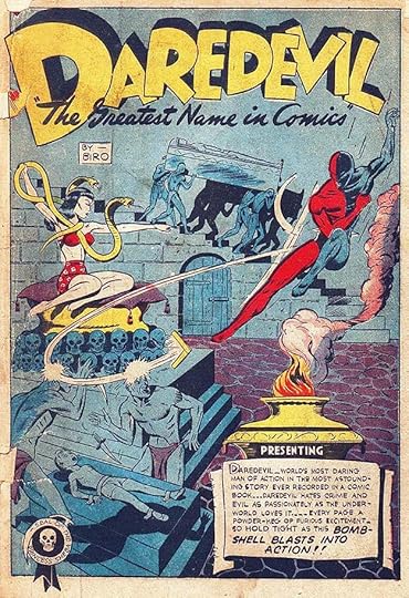
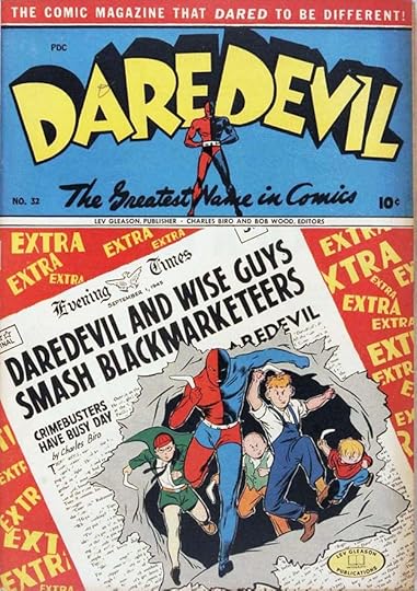
 From DAREDEVIL COMICS #1, July 1941
Wood and Biro’s work for Gleason began with this eye-catching cover drawn by Charles and inked by Bob, with the logo and design by Biro, as would be the case with all his Gleason covers. Irv Watanabe wrote:
Charlie did all the covers of every mag he put out. He even designed all the logos & copy on the cover & even the editorials. He loved to write.
The photo of Hitler is one selling point, but the logo also sells it, though it’s a bit of a mixed bag graphically. The existing characters Daredevil and Silver Streak had appeared earlier in other Gleason titles, but this one, anticipating America’s involvement in World War Two like CAPTAIN AMERICA #1, was a big seller, and launched Daredevil’s own series by Biro and Wood.
 From DAREDEVIL COMICS #2, Aug 1941
The second issue has a much better logo, one that lasted for many years. The staggered letters in an arc are tied together by open telescoping, with a small figure to cement the identification. The top blurb, also long-lasting, shows the kind of hype that Biro often used, and that Stan Lee admired and echoed later at Marvel in the 1960s. Some of the cover lettering is type, but the one at lower right is by Biro. His signature is hard to see, on the stair post to the left of it. From this point on, all the Gleason covers by Biro were designed, drawn, inked, and lettered by him as far as I can tell. He did interior stories for a while, but by 1942 he was mainly writing stories and producing covers.
 From DAREDEVIL COMICS #2, Aug 1941
The first story page has a different Daredevil logo version by Biro, the caption lettering might be by Irv Watanabe, who had this to say about Biro’s working methods and assistants:
Charlie did things the last minute so we got caught in the crisis deadline. I used to work 2 days & nights—sometimes 3 without much sleep. We went to his apartment, first at Sunnyside then Jackson Heights, Queens. He used to start off with a big first page splash then worked on 6 panels & often he’d run out of pages & wound up with 15 to 20 panels on the last page! He penciled the whole 1 to 16 pages & left dialogue to the last but at times I insisted [he do it] as he went along. So grudgingly he’d put copy on 6 or 8 pages then finished the story. Meantime, Norman Maurer, Joe Kubert or Carl Hubbell would tackle inking in figures. I also did the backgrounds on nearly all the stories. After Charlie penciled & put copy in, he’d take a snooze for about 30 minutes & then come back to put only the faces (ink) of all the leading characters. Later to simplify things we’d have hundreds of heads in different poses & sizes on stats & he’d paste them in. Everything was in his head. He created his strips as he went along. He never worked from a script or penciled a rough sketch.
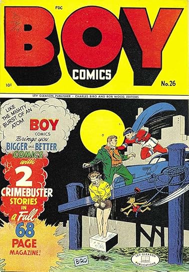
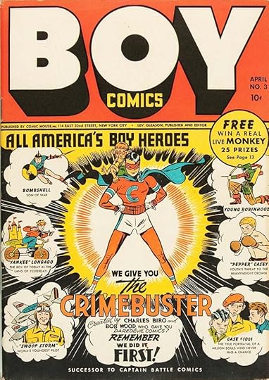 From BOY COMICS #3, April 1942
Publisher Lev Gleason knew Biro & Wood were a success, and for their next project, he allowed Biro to self-promote the team right on the cover. The logo by Biro is simple and very strong, the kind that could be read from across the street, and their new creation, Crimebuster, would again prove popular with readers and run for many years. Some captions here are type, but Biro’s enthusiastic bottom central caption, and he and Wood’s exciting art, sell the idea perfectly.
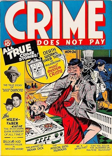 From CRIME DOES NOT PAY #24, Nov 1942
While DAREDEVIL COMICS and BOY COMICS were a success, it was this title that made the most money for Biro and Wood, as well as Lev Gleason, a book that started the crime comics genre, though it was already popular in pulp magazines. The stories were very violent, and horrifying images like this were common. Readers bought them in droves. Not only is Biro’s name on the art, he and Bob Wood are listed as editors under the logo along with publisher Lev Gleason, the first time I think that was done on covers. Taking his cue from crime pulps, the logo is very Art Deco, and CRIME is by far the largest word. Crime comics ostensibly showed criminals being caught and punished, but readers were attracted by the terrible things they did, as touted in Biro’s cover lettering.
 From BOY COMICS #8, Feb 1943
Biro’s covers just kept getting better. Here the villain, Iron Jaw, is a concept readers loved, and they were equally attracted to Crimebuster’s monkey assistant. The caption lettering by Biro is excellent, and the angles make it more interesting. More about Biro and Wood from the Irv Watanabe letters:
Charlie was very good to me. During the war years he raised my salary from $100 to $190 per week. In those years that was pretty good for anyone. Charlie’s success was his personal appeal to kids & a certain personal charm. Charlie went out of his way for charities & got involved with important people—police chief, fire chief, boys’ club of N.Y. His mind was always toward kids, though. A few times he’d stop by a playground & talk to comic book lovers & tell them a coming episode of the book—Daredevil, Boy or Wiseguys. I think his love was Daredevil. It was uncanny how he could dream up a story on the spur of the moment. It was fun to watch him tell a story with all the animation, yelling and crying to get across emotion. His great talent was the way he put feelings to all his characters. It was very exhaustive after finishing the story but he loved telling them. There also should be a mention of Bob Wood, his partner who, too, was a writer & artist—The Claw. I also lettered & did backgrounds. Too bad he was an alcoholic & due to his carelessness brought down the Biro-Wood team.
Does Biro sound like anyone else in comics to you? The Little Wise Guys were introduced as supporting characters in Daredevil, and later took over the book. Wikipedia says about Bob Wood:
Wood’s personal life was marred by drinking and gambling addictions, and he served a total of three years and eight months in prison between 1958 and 1963 for manslaughter.
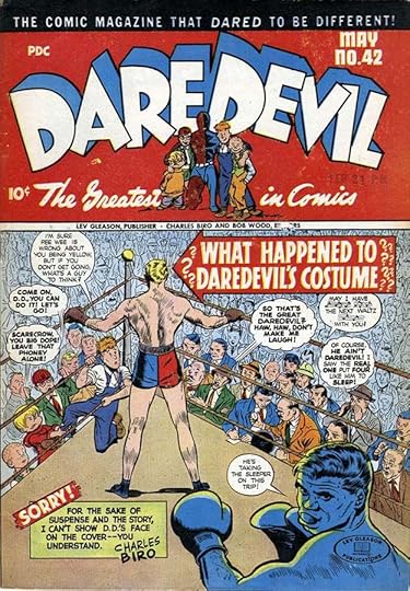
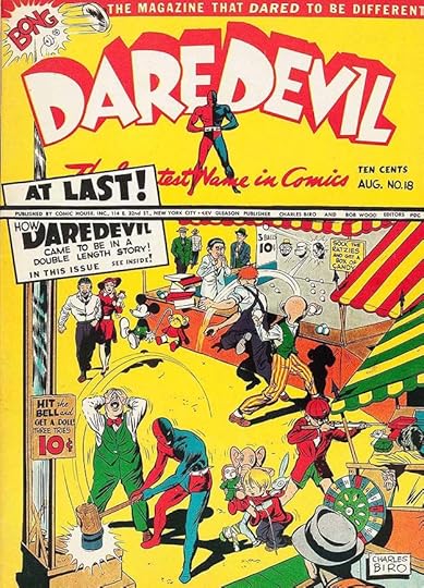 From DAREDEVIL COMICS #18, Aug 1943
Perhaps the line of type below the logo was printed on the cover board, why else would Biro put his big caption both above and below it? Somehow that works anyway. This cover seems busy, but the focal point is Daredevil, and don’t miss following his hammer strike up to the top left. Somehow Charles got away with including Mickey Mouse.
 From DAREDEVIL COMICS #32, Sept 1945
I love the newspaper lettering on this cover, and all the Art Deco extras behind it. The Little Wise Guys are taking a more prominent role.
 From BOY COMICS #26, Feb 1946
Crimebuster kind of bridged the genres of superheroes and crime comics, which kept him around longer than many other superheroes. These explosive captions on the left are exciting.
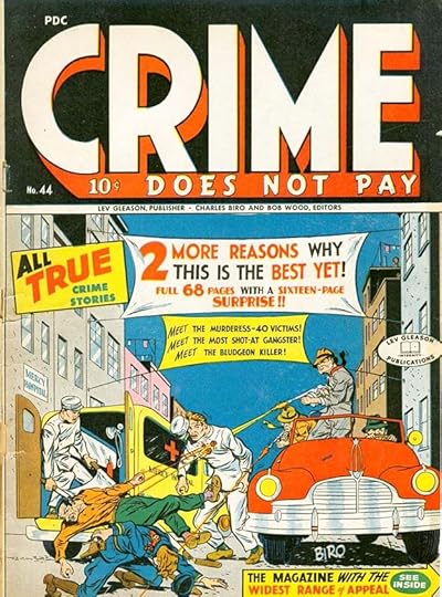 From CRIME DOES NOT PAY #44, March 1946
Biro and Wood’s crime comics were violent, and I’m sure hated by parents, though they did not reach the level of gore later found in EC Comics. Biro’s over-the-top captions make it all sound like fun, don’t they? More about Biro’s writing from Irv Watanabe:
Later in his career when he was popular & financially successful, he relegated his stories to Fran, his wife, who I think was a very good dialogue writer. Charlie would first tell her the plot & she’d letter in the copy as Charlie continued penciling. This was in 1942, ’43 ’44. Charlie would put in the first phrase in pencil & she’d put in the rest. After she finished, Charlie edited it & then I took over. He & his wife, Fran, were a very good comic book team. They’d discuss plot & situations—never discuss what other writers or artists were doing. They were trend setters—always looking ahead. I never saw them read competitor books or even saw an issue anywhere at home or at the office.
 From DAREDEVIL COMICS #42, May 1947
By this issue, the Wise Guys had joined Daredevil in the logo, they were similar to Simon and Kirby’s kid gangs. Note the personal message to readers from Biro at lower left, you can see how appealing that was. The balloon shapes for shouts from the crowd are interesting, scalloped rather that bursts, with extra motion lines around the outside. I also like the music in one balloon, and all the extra question marks in the arrow banner.
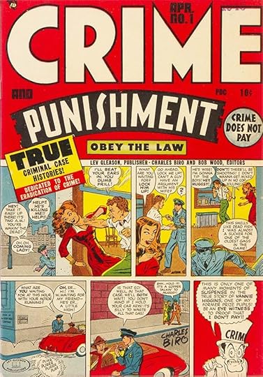 From CRIME AND PUNISHMENT #1, April 1948
This spinoff from CRIME DOES NOT PAY has another effective logo. Note more of Biro’s unique take on shouting in the first two panels. The Crime host character is an odd idea, and the scallops in his balloon suggest only the reader can see or hear him.
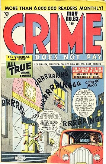 From CRIME DOES NOT PAY #63, May 1948
The burglar alarm sound effects on this cover caught my eye, and there’s another of Biro’s shouting balloons. These captions are full of gangster slang, some of which I’ve never heard, but readers probably knew it from gangster movies. That claim of six million readers might be hype, but the books were certainly selling well. While Biro did the crime covers, he doesn’t seem to have been involved in the stories as writer or artist. Bob Wood was, and also his brother Dick Wood, among others. More about the team from Irv Watanabe:
Charlie loved gambling—Bob, too. One day they were figuring how many miles it was from N.Y. to Chicago by air. The bets went this way, (not card playing but craps & short time gambling chances.) 850 miles (Biro), 800 (Bob) for $50. They changed minds again, 900 miles (Biro) 875 (Bob) for $50. Changed again 925 (Biro) 915 (Bob). Changed 4th time, another figure for another $50. The winner, Charlie collected $100. During the early morning hours, Charlie & Bob had nothing to do so they started pitching pennies against the door. Each penny was for a buck. In walked Lev Gleason to see the commotion! Charlie yells, “Lev, wanna join in?” Gleason had better things to do. Charlie lived to the hilt—not much drinking though. During the war many of the leading cartoonists went on tours for the war effort—like Goldberg, Caniff etc. Whenever they got on stage for a chalk talk, Charlie got the biggest ovation to the dismay of the other cartoonists—simply because kids understood comic books & not syndicated artists.
 From DESPERADO #1, June 1948
Starting in 1948, Biro and Wood began branching out into other genres like westerns. The logo on this one takes up almost half the cover, with the name in three increasing sizes. Who could resist that, or the desperate scene below?
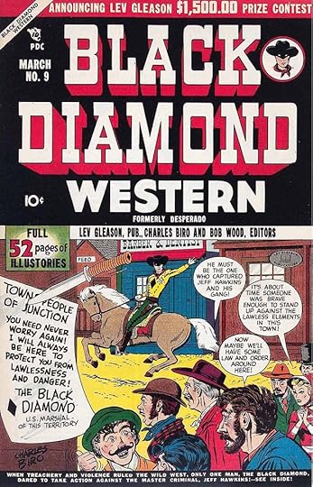 From BLACK DIAMOND WESTERN #9, March 1949
Later the book changed to this title with another giant Biro logo using effective Old West wanted poster lettering. I also love the note at left pinned to the wall.
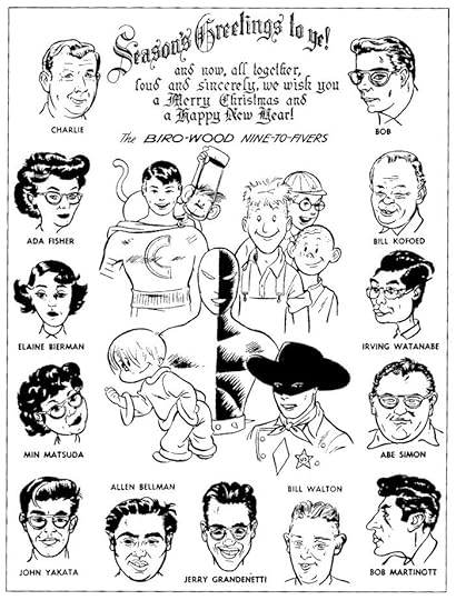 1949 Biro-Wood Christmas Card, from Joe and Jim Simon’s book The Comic Book Makers (Vanguard, 2003)
While they worked exclusively for Lev Gleason, Biro and Wood essentially ran their own shop with many employees, as seen above with their most popular characters. Bellman, Grandenetti and Watanabe all had long comics careers.
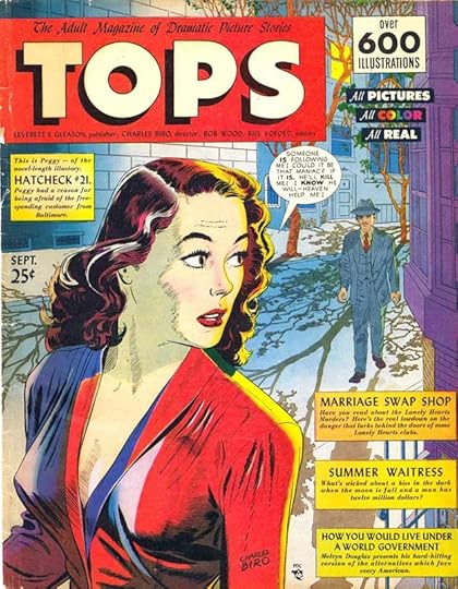 From TOPS #1, Sept 1949
This was an attempt by Biro to break into the slick magazine market (dominated by titles like LIFE and THE SATURDAY EVENING POST) with comics aimed at adults. It did not succeed, and ran only two issues. They’ve recently been reprinted in a deluxe new edition from Fantagraphics prepared and with historical articles by Michael T. Gilbert. Sadly, adults were not interested, nor were children, but lots of fine work appeared inside. It’s hard to see, but in the top left caption, Biro is trying to coin a new name for comics: illustories.
 From LOVERS’ LANE #1, Oct 1949
Biro had more success with romance comics, following the popular trend started by Simon and Kirby in 1947 with YOUNG ROMANCE. Another use of Illustories. Like TOPS, most of the cover lettering is type, perhaps to appeal to older readers, though those readers were more likely to be young girls. Even so, Biro has included a warning, “Not intended for children.” The book has a comics code seal from an earlier incarnation of that idea than the one begun in 1954.
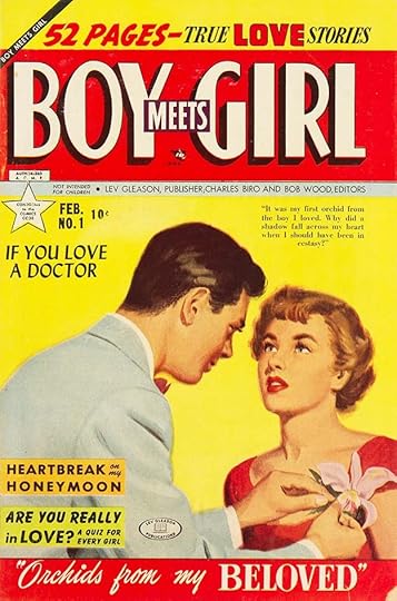 From BOY MEETS GIRL #1, Feb 1950
These romance books have classy logos and mostly type on the covers, this one had painted cover art. They were trying to compete not only with romance comics from other publishers, but teen movie magazines and romance novels.
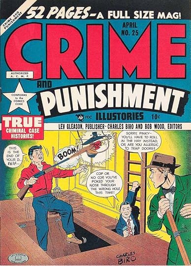 From CRIME AND PUNISHMENT #25, April 1950
Meanwhile, the crime comics continued to roll along with covers by Biro and contents by others, perhaps now a little less violent. Charles is pushing his new word “Illustories” harder here. It never caught on, perhaps because it’s longer and harder to pronounce than “comics.”
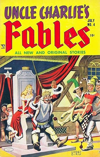 From UNCLE CHARLIE’S FABLES #4, July 1952
This fairy tale comic was probably intended to compete with similar ones from Dell. The painted cover is great, and Biro’s logo is well done. It didn’t last long. Whether kids ever thought of him as Uncle Charlie is a good question, but the persona he projected in his comics was friendly and welcoming.
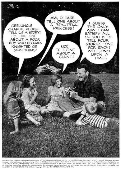 From UNCLE CHARLIE’S FABLES #1, Jan 1952, courtesy of Michael T. Gilbert
Here’s a good example of Biro interacting with children, though I’m sure the photo was staged.
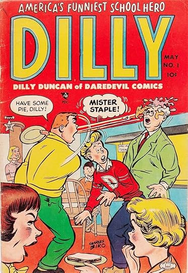 From DILLY #1, May 1953
Perhaps feeling pressure from parents and others angry about crime comics, Biro was trying other things like this Archie knock-off. The logo is bland for him. Another title that didn’t last long.
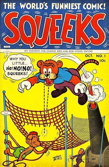 From SQUEEKS #1, Oct 1953
Biro tried a funny-animal title featuring Crimebuster’s monkey side-kick. Not only does the word balloon feature Charles’ motion lines around it, the logo does too. Never one to shy away from promotion, he calls it “The World’s Funniest Comic.” Readers must not have agreed, it also didn’t last long.
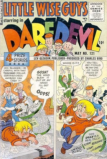 From DAREDEVIL COMICS #121, May 1955
With the stricter new Comics Code in effect, Biro tried to make this title all about the Little Wise Guys, and Daredevil no longer appeared in it. Bob Wood’s name was missing from the masthead, apparently he and Charles had had a falling out. Soon after this, Biro left Lev Gleason and comics behind and moved into the field of graphic design, which his covers had certainly prepared him for. In 1962 he began working for NBC television as a graphic artist, and remained there until his death in 1972. I’d love to know what he did for NBC, but I’ve found no record of it. Though little remembered today, Charles Biro had an impact on comics of the 1940s and 1950s that other creators admired and readers enjoyed. Thanks to the letters written by Irv Watanabe, we can also now credit him for his superbly done logos and cover lettering.
The post CHARLES BIRO – Letterer appeared first on Todd's Blog.
July 20, 2023
ED HAMILTON – Letterer Part 2
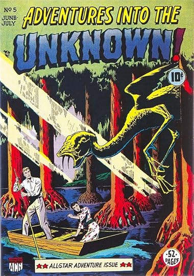
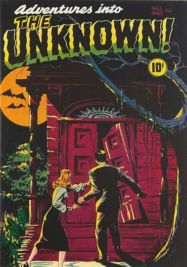 From ADVENTURES INTO THE UNKNOWN #1, Fall 1948. This and all following images from American Comics Group, ACG
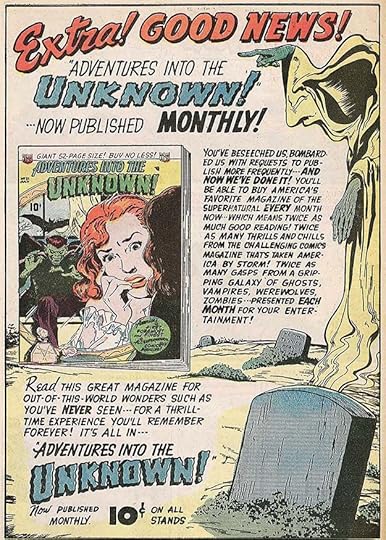
In Part 1 of this article I looked at Ed Hamilton’s comics work for Ben Sangor and Ned Pines, among others, showing how he became their go-to person for logos and house ads as well as lettering many of their stories. By 1948, ACG was co-owned by Fred Iger, who may have been a stand-in financially for his father-in-law Harry Donenfeld, owner of National/DC Comics. Be that as it may, Iger was a smart businessman, and he expanded the company’s titles into new genres. The one that proved most successful for them was horror, and this was their first such title. The logo uses wavy letters for the main word, similar to what Artie Simek was doing at Timely/Marvel for scary comics, though Hamilton’s shapes are more angular, including the script top line. This title is considered the first ongoing horror comic, an anthology of short stories to send chills up readers’ spines, though it was quickly imitated by other publishers, some of whom went much further with blood and gore, like EC Comics. The ACG horror comics were scary, but not bloody.
 From ADVENTURES INTO THE UNKNOWN #1, Fall 1948
Ed Hamilton lettered every story and house ad as well as the covers, it’s as though he was taking charge now of the company’s entire lettering output for this kind of comic. For the first few issues he went back to a wedge-tipped pen for the regular lettering, then reverted to his usual style, at times smaller and more condensed than in the past to fit in large amounts of text. The book must have sold well to garner so much competition, even DC copied it with titles like HOUSE OF MYSTERY and HOUSE OF SECRETS. At first pulp writers like Frank Belknap Long were scripting, but eventually, as with all the ACG comics, most stories were written by Richard Hughes. The book ran 174 issues, until ACG stopped publishing newsstand comics in 1967.
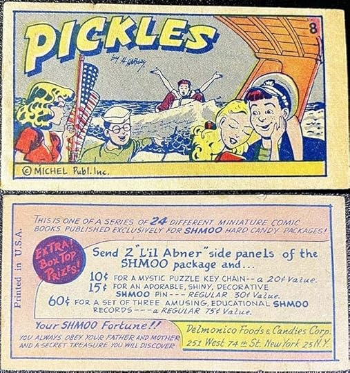 From SHMOO HARD CANDY #8, 1949?, front and back covers
Fred Iger had other ideas about expanding ACG’s business, he began doing custom comics to be used as premiums or giveaways by any company who wanted to pay for them. This is an early example clearly lettered by Ed Hamilton, one of 24 similar mini-comics included in candy packages. The candy was one of many licensed products spun out of Al Capp’s comic strip LI’L ABNER and his stories about The Shmoo. The comics had nothing to do with that as far as I can tell. By about 1950, Iger had set up a Custom Comics division of ACG, and they produced all kinds of product or service-related comics, some small like this, others regular comics size. Clients included the A. C. Gilbert toy company, Montgomery Ward, Tupperware, and the United States Air Force. After ACG stopped publishing newsstand comics in 1967, the Custom Comics division continued into the 1980s. While I haven’t been able to find scans of any inside pages, Hamilton probably lettered many of the stories.
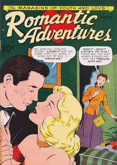 From ROMANTIC ADVENTURES #1, March 1949
ACG next expanded into the romance comics genre, begun by Simon and Kirby at Prize in 1947 with YOUNG ROMANCE, and as usual quickly imitated by other publishers. As always, Ed Hamilton designed the logo. I think he was probably looking at Ira Schnapp’s romance comics logos for DC like GIRLS’ LOVE STORIES, and doing his own version of their flowing script. It’s not as good as Schnapp, but it works fine. Again every story and house ad in this title is lettered by Hamilton, at least in the first few issues I checked. With a title change to MY ROMANTIC ADVENTURES for issue #68, the book lasted 136 issues to 1963.
 From ADVENTURES INTO THE UNKNOWN #5, June 1949
With covers dated on or close to June 1949, ACG finally gained a company symbol designed by Hamilton, seen here at lower left on this cover with a revised logo.
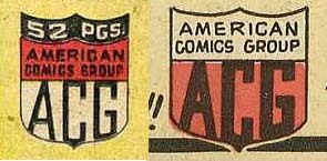 From ADVENTURES INTO THE UNKNOWN #7 & 12
Here are the largest versions I could find from the early uses in this title. The first one had thinner letters, the second had thicker ones for ACG, and a more hand-lettered style above. Both use a shield shape. There might have been other versions later. Soon they were appearing at the top of the covers, giving readers another clue about books they might like.
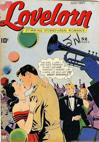 From LOVELORN #1, Aug 1949
The second ACG romance title, which also did pretty well. With a title change to CONFESSIONS OF THE LOVELORN with issue #76, it lasted 114 issues to 1960. Hamilton’s thought balloon border here is different than most, alternating very small and very large loops.
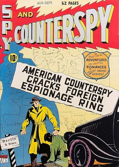 From SPY AND COUNTERSPY #1, Aug 1949
With the cold war on between the Soviet Union and the United States, spy stories were all the rage, and ACG tried this title. I like Hamilton’s bold title with thin telescoping and effective shading in an energetic burst. The other lettering is great, too, including the bolder than usual central caption.
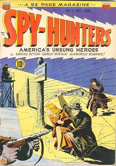
With the third issue, the book became SPY-HUNTERS and ran for 24 issues. Interesting that the perspective and burst go in the opposite direction this time.
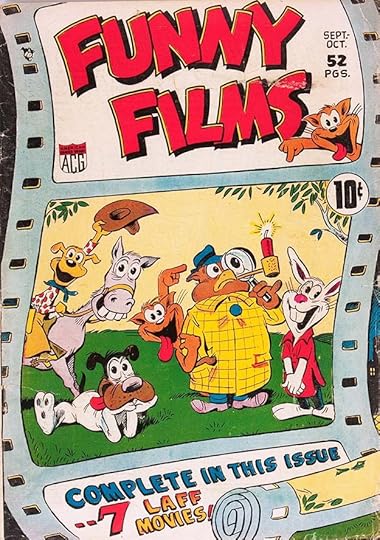 From FUNNY FILMS #1, Sept 1949
Another popular genre was comics about cartoon characters, but licensing those cost money, and the best ones were all taken, mostly by Dell, so ACG simply made up their own and presented them as if they were on film. Ed Hamilton might have designed the entire cover except for the character art. Inside he lettered some of the stories, not all. The book ran 28 issues.
The 1950 federal census finds Ed and Alice still living in the same apartment in Queens as in the 1940 census. No other family members are listed. Ed’s job is Commercial Artist with his own business, so a freelancer. I had wondered if perhaps he was on a salary at ACG, but that suggests he wasn’t, even though the company kept him very busy.
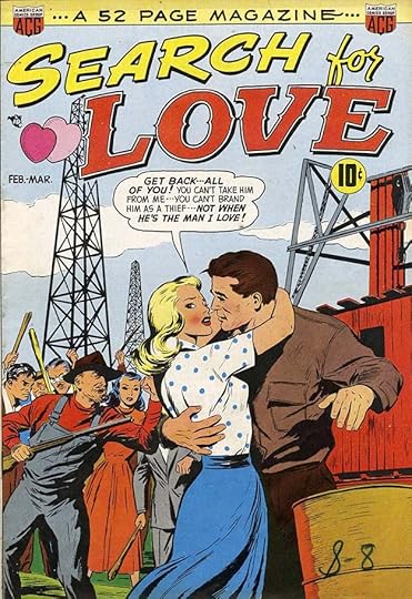 From SEARCH FOR LOVE #1, Feb 1950
A third romance title was tried, with I think the best Hamilton logo of the lot, but it only lasted two issues. The ACG company symbol is now at the top twice.
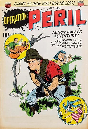 From OPERATION: PERIL #1, Oct 1950
This looks like a fun anthology, long-time ACG artist Odgen Whitney was allowed to sign his name on the cover, something rarely seen at the company to this point. I’m not sure what the blob behind OPERATION is meant to be, oil? PERIL is the selling point, and much larger. It lasted 16 issues.
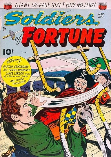 From SOLDIERS OF FORTUNE #1, March 1951
Another adventure anthology, this is about as close to the war genre as ACG got, and it’s not very close, despite the title. Ogden Whitney again signs the cover art. I like the fencing sword piercing the logo by Ed. One thing to notice about Hamilton’s cover lettering, it’s generally done with thin strokes and outlines compared to the bolder, thicker shapes used at other companies like Marvel and DC. Somehow that gives it less impact, but it does make it stand apart from the crowd.
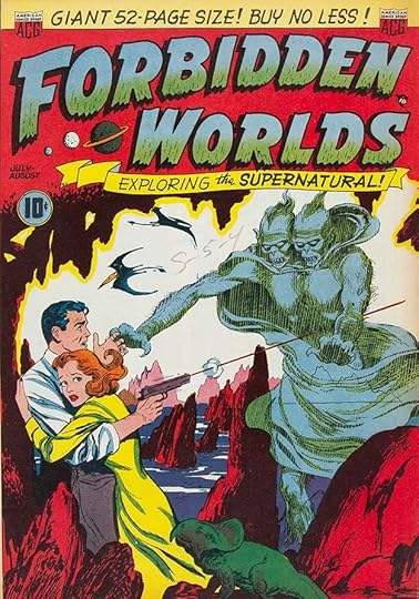 From FORBIDDEN WORLDS #1, July 1951
The second “horror” title from ACG was similar to the first, and did equally well, running 145 issues to 1967. The ACG horror titles are the ones I remember seeing as a child. I found them interesting, but usually opted for superheroes with my money. I like the rough bottom edges and texture in the logo. Note that first issues rarely had “No. 1” on them. Newsstands were already overcrowded, and owners were reluctant to put out new titles. Companies hoped that by not putting the issue number on first issues, they might get some owners who weren’t paying attention to put them out. It must have worked.
 From FORBIDDEN WORLDS #1, July 1951
Hamilton continued to letter and probably design all the ACG house ads like this one, but the lettering lacked the variety and impact of those done by Ira Schnapp at DC, perhaps partly because there was too much text.
 From FORBIDDEN WORLDS #1, July 1951
On story pages, Hamilton’s lettering was often condensed and small to get the large amounts of text into the panels while leaving room for the art, by Al Williamson and Frank Frazetta in this case. The serif lettering in the first panel would have taken extra time.
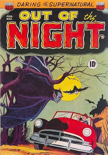 From OUT OF THE NIGHT #1, Feb 1952
This horror title has what I think is Ed Hamilton’s most effective logo of the line. The black background fading away in a dot pattern and the wavy letters seem pretty creepy to me. It lasted 17 issues.
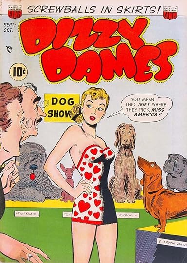 From DIZZY DAMES #1, Sept 1952
I’m not sure who this was intended to appeal to, seems like girls would have found it offensive, and boys uninteresting. It lasted six issues. I find this logo to be Hamilton’s worst.
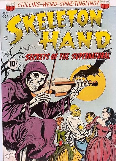 From SKELETON HAND IN SECRETS OF THE SUPERNATURAL #1, Sept 1952
This book has a much too long title, but Hamilton wisely emphasized the first two words. I think he missed a good idea by not making the words look more like bones, or putting a skeleton hand in the logo, though. It lasted six issues.
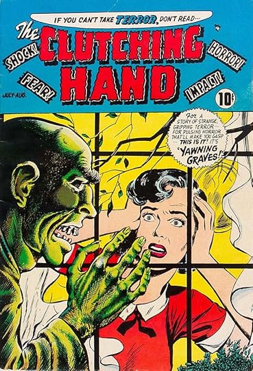 From THE CLUTCHING HAND #1, July 1954
Someone at ACG found hands scary, apparently. The words around the logo are all ones used by EC Comics titles that would soon be banned by the new Comics Code. I don’t like this logo much, but it would work better if it was larger.
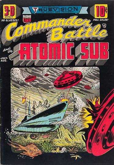 From COMMANDER BATTLE AND THE ATOMIC SUB #1, July 1954
Another ACG title that skirts the edges of war comics, and I think their only attempt to join the fad for 3D, though it wasn’t really that, just drawn with lots of depth, and kind of a cheat. Ed Hamilton’s logo and cover lettering with deep telescoping is effective and uses gray tones well.
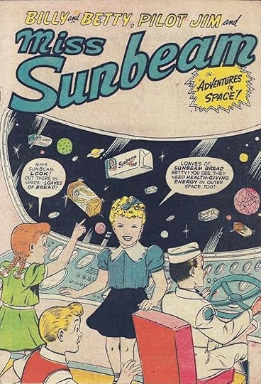 From BILLY AND BETTY, PILOT JIM AND MISS SUNBEAM IN ADVENTURES IN SPACE, no number, 1955
This is the kind of comics size giveaway produced by ACG’s Custom Comics division. Generally the covers were printed on the same newsprint as the interiors to save money, and page counts are often unknown, but I would say eight or 16 pages were likely. Kids probably enjoyed them, no matter how odd. Ed’s logo mimics the Sunbeam bread logo.
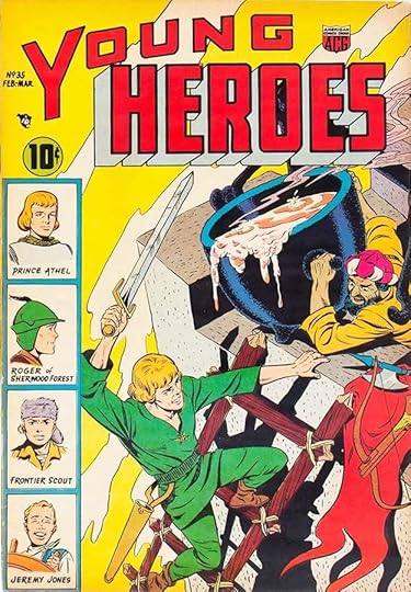 From YOUNG HEROES #35, Feb 1955
ACG was dipping their toes in action hero comics with this title, and starting with issue #35 to fool retailers into displaying it. It only lasted three issues. I like Hamilton’s logo, but whoever pasted it on the cover mistakenly cut out the opening of the O so the art showed through. It should have been part of the telescoping.
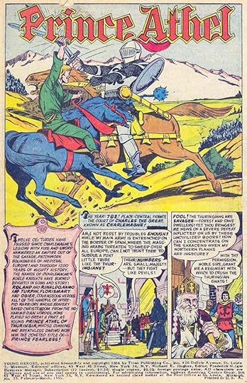 From YOUNG HEROES #35, Feb 1955
Ed did a nice Old English character logo and .some fine lettering on the lead story. In the indicia we see the ACG business office is at 45 West 45th Street, Manhattan. The editor is Richard E. Hughes, and the business Manager is Frederick H. Iger, who bought out Ben Sangor some time in this year and became the sole owner of the company, though perhaps Harry Donenfeld was a silent partner. Fred was related by marriage to both Harry and his business partner Jack Liebowitz, and his uncle was DC letterer Ira Schnapp. Jay (Schnapp) Emmett, founder of the Licensing Corporation of America division of Warner Communications, was a cousin. More about all that in THIS article.
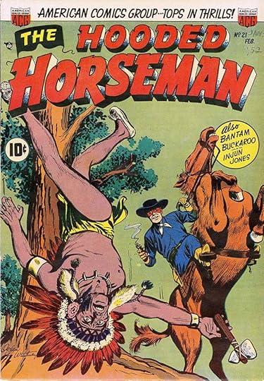 From THE HOODED HORSEMAN #21, May 1955
This western title seems like an attempt to imitate The Lone Ranger. It lasted five issues. Hamilton’s logo style is an interesting choice, more heroic than western with block serifs on some parts of the letters. I like the mask around THE.
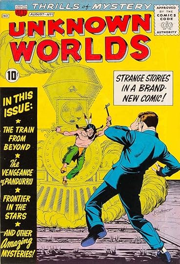 From UNKNOWN WORLDS #1, Aug 1960
It took a while for ACG to launch a third horror title, which was packaged more like science fiction. I like the side banner lettering. One thing about the logo that always puzzled me was the strange shape of the telescoping behind the right legs of the K and R. It looks completely wrong. Why did Ed do that, I wonder? The cover art is signed by Kurt Schaffenberger, who did a lot of work for the company in the 1960s before going exclusively with DC. ACG had joined the Comics Code late, and perhaps reluctantly, but I don’t think their books changed much because of it. This is the first ACG title to have an issue #1 label.
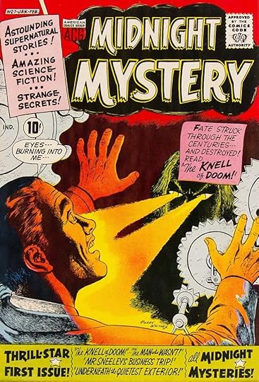 From MIDNIGHT MYSTERY #1, Jan 1961
This horror/science fiction title lasted only seven issues. I like Hamilton’s logo and cover lettering, he saves space in the bottom banner with lower case.
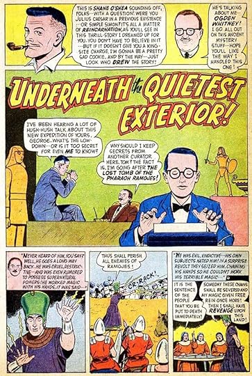 From MIDNIGHT MYSTERY #1, Jan 1961
Inside, perhaps influenced by credits sometimes appearing at DC (in editor Julius Schwartz’s books), the company tried having the writer and artist introduce each story. The artists were real, but all the stories were written by editor Richard Hughes, so the writers were made up, all with different names and appearances. Hughes used the Shane O’Shea pen name in other places too.
 From MAGIC AGENT #1, Jan 1962
ACG put out this attempt to join the superhero revival, but it lasted only three issues, and was more of a spy story mixed with magic and horror, perhaps ahead of its time. The Vertigo imprint at DC in the 1980s would have gone for it, I bet. The logo is simple but effective, with the angled bottom ends of each A adding interest.
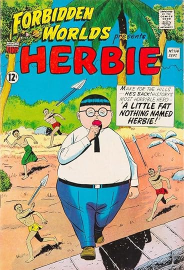
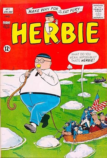 From HERBIE #1, April 1964
The company never seemed to know what to do with the superhero idea until Richard Hughes came up with this satirical approach. Herbie was the opposite of everything heroic, but his power was vast. He was the secret dream of every nerd reading comics, and his stories were clever and funny. After a run in FORBIDDEN WORLDS, his own title launched, running for 23 issues until 1967, when the company stopped doing newsstand comics. Ed Hamilton and artist Ogden Whitney teamed on the logo, creating perhaps the best and funniest one the line had seen. It’s the title and character that ACG is best known for.
 From HERBIE #9, April 1965, original art courtesy of Heritage Auctions
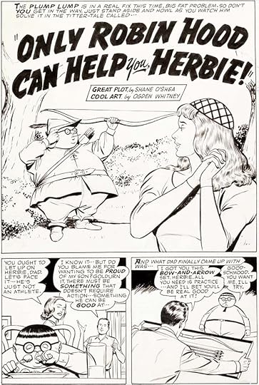
The book did make fun of Herbie’s fatness, but the character always got his revenge by saving the day and being excellent at everything he tried, even if he was barely trying. Richard Hughes wrote all the stories, Ogden Whitney drew them, and Ed Hamilton lettered them.
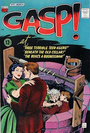 From GASP! #1, March 1967
This final new horror title lasted just four issues, and in 1967, Fred Iger decided to stop publishing newsstand comics and concentrate on custom comics, which we must assume were making more money for him. The business was changing, Marvel was on the rise with a wave of new popular superheroes, and ACG didn’t seem to have creators who could do that, or perhaps Iger just wasn’t interested in trying to follow that trend.
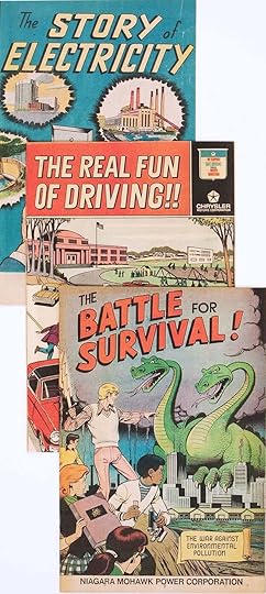
Iger’s Custom Comics continued to put out promotional books like these from the late 1960s through the 1970s and into the 1980s. Most had logos by Ed Hamilton, as these do, and probably lettering by him inside. I’m guessing Ed was fine with his reduced workload, he turned 67 in 1967 after all, and his very busy years with ACG had probably left him able to at least partially retire, with the custom comics as his only work.
Ed Hamilton died Dec 1, 1979, last residence is given as Long Island City, Queens. He’s buried in Flushing, NY, sharing a tombstone with his parents and sister Catherine. Alice died in 1989, she had been living at the same address. As far as I know they had no children. Ed will be remembered by comics fans for his many fine efforts for ACG, where he lettered and designed just about everything, setting the style for the publisher as few letterers have been able to do.
The post ED HAMILTON – Letterer Part 2 appeared first on Todd's Blog.
July 18, 2023
ED HAMILTON – Letterer Part 1
 From FORBIDDEN WORLDS #114, Sept 1963, ACG
From the 1940s to the 1960s, a small comics publisher, American Comics Group, had a presence on newsstands alongside bigger publishers like DC, Marvel, Dell, and Archie. One thing that was different about ACG was their lettering. Nearly every cover and many of the stories were lettered by Ed Hamilton, who also designed all their logos and house ads. As with Artie Simek at Marvel and Ira Schnapp at DC, Hamilton’s unique lettering gave ACG a house style that readers could recognize and follow, even if they never knew who created it. In this two-part article I’ll look at what Alex Jay and I have been able to find out about Hamilton, which isn’t a lot, and I’ll examine his work before ACG and many of the titles he did there. Herbie, a satire of superheroes, was probably the company’s most memorable and funniest character, his first cover appearance is above, and he went on to his own title. Notice how everything on the cover except the Comics Code seal is drawn by Hamilton: the logos, the company symbol, the date and issue number, the price, and of course the caption. This helped give his covers an organic feel different from other comics, at least until undergrounds began doing the same thing in the 1960s.
 Ed Hamilton 1925, courtesy of relative Colleen T. Fay
Edward Thomas Hamilton was born in Port Washington, NY, on the north shore of Long Island, on Nov 11, 1900. In early census records he’s listed as Edwin, but claimed the name Edward beginning in the 1925 NY State Census. He was the oldest of four children, he had a sister and two brothers. His father was a carpenter. Ed served overseas in World War One, we don’t know when he enlisted, but he returned from France in June, 1919. In the 1920 census, Ed’s job is a clerk in an office, but in the 1925 state census, his occupation is cartoonist.
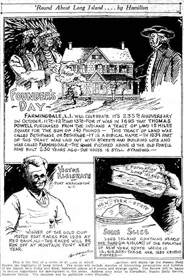 From The Nassau Daily Review, Freeport NY, Oct 9 1930
Alex Jay found examples of his cartooning in a small Long Island paper, a weekly strip along the lines of Ripley’s Believe It Or Not, but focused on local history and personalities. The first one is above, it continued at least into 1931. Both the art and lettering are on the rough side, but the strip worked well enough to run for a while. I don’t know what other cartooning Ed might have been doing, but this is prime practice for lettering comics.
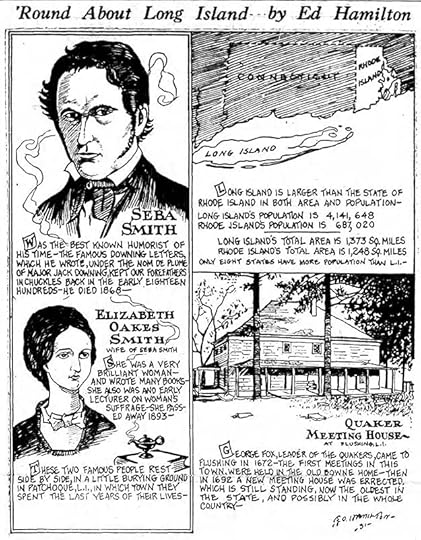 From The Nassau Daily Review, Freeport NY, Feb 12 1931
Here’s the latest strip Alex found, both the art and lettering are slightly improved to my eye. By the 1940 federal census, Ed had married Alice Masset, a Queens native of the same age (her father ran a bronze factory), and they lived in an apartment on 21st Avenue, Queens. On his 1942 draft card, Hamilton lists Dura Products Mfg. Co. as his employer, they were a sign-making company, great training for designing comics logos, but by then he was already getting work in comics.
 From SPEED COMICS #10, July 1940, Brookwood Publishing
In 1940, Hamilton placed two short comics stories he drew and probably wrote and lettered in issues 10 and 11 of this title. The signature matches the one in his newspaper strip. It’s the only example I’ve found of art signed by him. The lettering is different from his strip, more regular, but I can see similarities in style.
 From REAL LIFE COMICS #1, Sept 1941, Pines
 In 1941 Hamilton was working for the Sangor Shop, a comics packager, and Ned Pines. Pines was the son-in-law of Ben Sangor, and he began putting out comics in 1939 under several publisher names including Standard, Better and Nedor. By 1943, many of the same creators were working for Ben Sangor’s American Comics Group. In this title, some of the ACG regulars were already there, including writer/editor Richard E. Hughes (born Leo Rosenbaum). Ed Hamilton may have done the logo and scroll captions on this cover…
 From REAL LIFE COMICS #1, Sept 1941, Pines
…and he lettered this lead story written by Hughes. The title has style elements that Ed would use for decades, including block letters with thin outlines, script letters with sharp angles like OF in the title, and the angular banner. His lettering here is different from what he did earlier, I would say he’d been studying the lettering of Howard Ferguson, and is doing his best to imitate it. The regular letters are made with a wedge-tipped pen, the balloon shapes are flat on the bottom with sides probably made with an ellipse template, and even the letters are like those of Ferguson.
 From REAL LIFE COMICS #1, Sept 1941, Pines
In this closer look, Hamilton has picked up Ferguson letter shapes like the round G with a serif at center going both ways, and a small downward serif at the top of the C. If the story title was more like Howard’s work, this might have fooled me into crediting him.
 From AMERICA’S BEST COMICS #1, Feb 1942, Pines
I see lots of superhero stories lettered by Ed in his Howard Ferguson style in other Pines comics, another example is above. He may have also been doing the cover logos, I’m less sure about most of those. Note the whisper balloons with dotted outlines, and a radio balloon in the second panel with a zig-zag tail but shaped like a thought balloon.
 From COO COO COMICS #2, Dec 1942, Pines
Pines put out titles in several genres, including patriotic heroes like FIGHTING YANK. This house ad for him is by Hamilton, and I think he designed the bottom logo, which was used on the book’s cover. I’m less sure about the top logo.
 From THE BLACK TERROR #1, Feb 1943, Pines
Another house ad by Hamilton, again following styles used by Howard Ferguson in his Timely/Marvel house ads, but with Ed’s own personal style present as well, like the character names at the bottom whose letters seem to bulge out at the middle and have extra side angles. He might have designed the EXCITING COMICS logo, that’s one I’m not sure about.
 From COO COO COMICS #6, July 1943, Pines
Funny animal comics were a staple at Pines, this one is trying to cash in on the popularity of Superman. Hamilton’s lettering is still influenced by Ferguson here, but heading slowly toward his own personal style. Ed only lettered a small number of stories like this, ones produced in New York. Others came out of the Sangor Shop’s California division from animation artists, who either lettered their own stories or had letterers there.
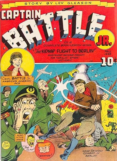 From CAPTAIN BATTLE JR. #1, Fall 1943, Lev Gleason
Here’s something I can’t explain. Lev Gleason comics in 1943 usually had covers, logos, and cover lettering by Charles Biro, but this one has cover art by Don Rico, who also drew the main feature inside, and the impressive logo and lettering is by Ed Hamilton. Perhaps Rico brought Ed in, but I’m not sure how they would have known each other, as Hamilton was otherwise working only for Sangor and Pines, and I don’t see any work by Rico for them.
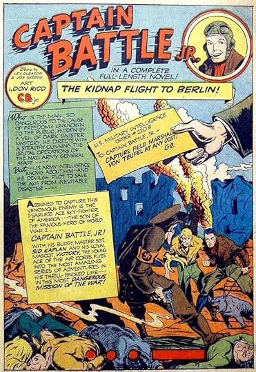 From CAPTAIN BATTLE JR. #1, Fall 1943, Lev Gleason
Only the first chapter of the Captain Battle Jr. story inside is lettered by Hamilton in his Howard Ferguson style, the rest is lettered by at least two others. I don’t see any other lettering by Ed at Lev Gleason, though Don Rico did work for them on other things. This title lasted two issues, the second issue has a different (and poorer) logo, and no work by Hamilton.
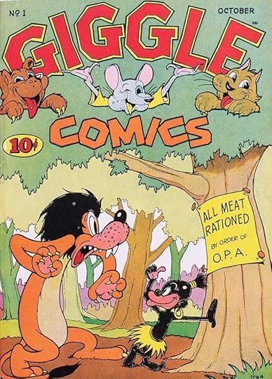 From GIGGLE COMICS #1, Oct 1943, ACG
One of the earliest ACG titles, this is still essentially a product of the Sangor Shop, but the covers were always put together in New York with logos by Ed Hamilton. He’s already following his style of drawing in the price, issue, and date, though the ACG symbol is not yet present. Rounded letters that are broken up into angled sections are something Ed often did, as in the G’s here, and COMICS is all angles.
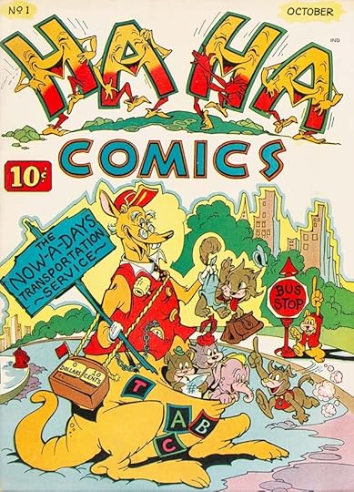 From HA HA COMICS #1, Oct 1943, ACG
Another early ACG humor title out the same month. The Grand Comics Database credits the logo to cover artist Jim Tyer, and he could have designed it, but the other lettering on the cover is by Ed Hamilton. Perhaps Tyer pencilled the logo and Ed inked it.
 From COO COO COMICS #10, March 1944, ACG
By this time, Hamilton’s story lettering had lost all the Howard Ferguson imitation, and this is getting close to the style he would use for the rest of his career. Many of the letters are more angular, especially the S. The balloon shapes are now done freehand rather than with a straight edge and oval templates. The Supermouse character logo is full of Hamilton detail and personality, and the curves are mostly broken into angled sections, as he liked to do.
 From CHUCKLE (no number) 1945, ACG
Sangor put out several funny animal one-shots like this full of material from his west-coast animators. Only a few of the stories are lettered by Hamilton, and therefore probably done in New York, but the logo and cover lettering are his. I think Ed’s humor logos have an underground comics feel, this one would seem at home on an R. Crumb comic.
 From CHUCKLE (no number) 1945, ACG
Ed did letter this story by Carl Wessler, an east coast animator out of the Fleischer Studio. Premonitions of MAUS in the last panel!
 From FUNNYBONE, HI-JINX and MERRY-GO-ROUND, all no number, 1945, ACG
Three more of these double-size collections of funny animal stories for 25 cents with logos and cover lettering by Hamilton. I think HI-JINX is particularly creative and clever.
 From TOPSY-TURVY #1, April 1945, ACG
It’s interesting that even without a company symbol, these comics all have an identifiable brand because of the similar lettering. This one falls somewhere between kid humor and teen humor, and despite the issue number, went no further. ACG had yet to come up with a continuing title, but Cookie led the way to that.
 From COOKIE #1, April 1946, ACG
COOKIE is the first continuing series from ACG, it ran 55 issues. It was kind of in its own niche, the characters acted like teenagers, but looked younger. The logo is by Ed Hamilton except perhaps for the character head by cover artist Dan Gordon.
 From COOKIE #1, April 1946, ACG
This promotional house ad has lots of great lettering by Hamilton, and shows his versatility with script and styles other than typical comics letters. Those letters have changed a little, the S is rounder, and most letters would fit into a square, including the M, which has more vertical sides.
 From THE KILROYS #1, June-July 1947, ACG
Another teen humor book, this one ran 54 issues. The characters are drawn more like actual teens, similar to series like LEAVE IT TO BINKY at DC Comics. There is a DC connection, in 1947, Fred Iger bought into the company, becoming co-owner with Ben Sangor. Iger was the son-in-law of Harry Donenfeld, owner of National (DC) Comics, and the buy-in was probably made with Donenfeld’s money. Iger was strictly on the business side, he was never a comics creator, but he steered the company for the rest of its existence, buying out Sangor’s share in 1955. At the time of Iger’s buy-in, and probably no coincidence, ACG began distribution by Independent News, also owned by Harry Donenfeld. In this logo, Ed Hamilton shows his fondness for very angular script in the subtitle. I don’t see any lettering by him inside the first few issues other than house ads and title pages.
 From HI-JINX #1, Sept 1947
This name was used for a new funny animal series that ran seven issues, combining funny animals with teen humor. The logo and cover lettering are by Hamilton except perhaps the figures in the logo. Again, he did only title page and house ad lettering inside.
 From MOON MULLINS #1, Dec 1947, ACG
Something of a departure for ACG was this six-issue title reprinting a popular newspaper strip, along with other features, perhaps a deal worked out by Fred Iger. The logo again shows Ed’s fondness for angular block letters, and it’s not like any of the strip logos.
 From BLAZING WEST #1, Sept 1948, ACG
Perhaps with Fred Iger’s guidance, ACG began to put out books in other popular genres like westerns. This Hamilton logo suggests to me he was looking at logos by Ira Schnapp at DC for ideas. It works fine, but has little Hamilton style.
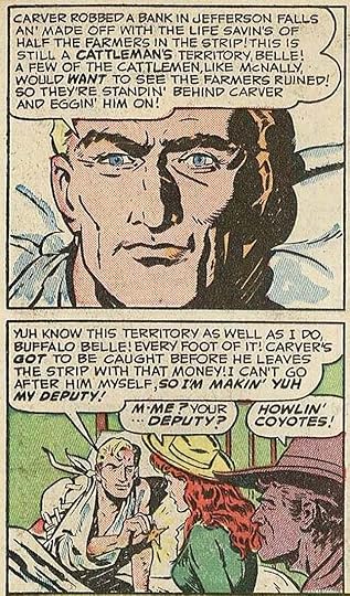 From BLAZING WEST #1, Sept 1948, ACG
Inside, some typical Ed Hamilton story lettering, which has now reached the style he would use for the rest of his career.
I’ll continue the ACG story in Part 2, as the company was about to begin their longest-lasting and most memorable genre, horror comics, and Ed Hamilton was there for every title and cover.
The post ED HAMILTON – Letterer Part 1 appeared first on Todd's Blog.
July 16, 2023
Rereading: RACCOONS ARE THE BRIGHTEST PEOPLE by Sterling North
Sterling North’s “Rascal,” about the pet raccoon he had as a boy, was a favorite growing up, and when this non-fiction book by him came out in 1966, I read it right away and later found my own copy. I was startled to find out that North was living near Morristown, not far from my own home in Pluckemin, NJ, and I even found his property on a topographical map I had of the area from the endpaper map in the book. I wished I could meet him, but never figured out a way to do that before he died in 1974. The opening section of the book is about North’s home and pets and wild animals there, including a family of raccoons, of course. Much of the later book is stories from others North met or corresponded with about their own wild animal pets and encounters. The book gradually becomes a not-subtle tract against hunting and promoting peace between wild animals and man, which North’s own experiences reinforce, as do others in the book. Even a man named Carl Marty, who had his own wild animal-friendly vacation park in northern Wisconsin, and who invited wild animals to enter his home and inn at will, found that wild animals almost never wish to harm humans and their pets, and are more than willing to be friends. The stories are well told, there are lots of photographs, and even though I wasn’t interested in hunting myself, after this book I knew I never would be. Recommended.
Raccoons are the Brightest People by Sterling North
The post Rereading: RACCOONS ARE THE BRIGHTEST PEOPLE by Sterling North appeared first on Todd's Blog.
July 13, 2023
SAM & JOE ROSEN – Letterers Part 3
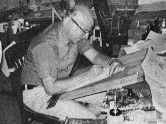 Joe Rosen from COMICS INTERVIEW #7, Jan 1983, Fictioneer Books
Thanks to a two-page interview with David Anthony Kraft from the above-named magazine, we know a little more about Joe Rosen from his own testimony than we do about Sam, who learned lettering first. In the interview, Joe reports: “My brother Sam is a letterer. He worked on THE SPIRIT, for Will Eisner, and on Fox’s THE BLUE BEETLE, in the 1940s. Sam got me into the business and taught me the trade. Sam got me my first lettering job, at Fox, doing THE BLUE BEETLE.”
 From THE BLUE BEETLE #11, Feb 1942
As recounted in Part 1 of this article, Sam was taken under the wing of letterer Howard Ferguson, who trained him to take his place at Fox so he could concentrate on lettering for Timely, the company now known as Marvel. That was in 1941. I have no idea what story or stories Sam gave to Joe, but clearly they were close and helped each other. The example above, which looks somewhat like Sam’s work to me, but not quite, could be by Joe, but that’s a guess, and this is likely too late to be Joe’s first. In the interview, Joe reports: “I started around 1940, 1941. I was lettering when the news came about Pearl Harbor. I was away in the service for three years [August 21, 1942 to August 28, 1945], then I came back after the war and went to National — I don’t recall if it was called National or Detective Comics back then. I’d done some work for them before the war. I did one comic for them called The Shining Knight. I worked up at National when Julius Schwartz was an assistant editor. Let’s see…I worked with Mort Weisinger and Jack Schiff.”
 From The Shining Knight, ADVENTURE COMICS #69, Dec 1941, DC Comics. All DC images © DC Comics.
Shining Knight started as a feature in ADVENTURE COMICS with issue #66 cover-dated Sept 1941. The example above could be by Joe Rosen, but the only scans available to me are quite poor. You can still get some idea of what the lettering was like. Joe’s return to National/DC can be placed to no earlier than 1946, when National merged with All-American comics where Julius Schwartz was an editor (or assistant editor), and the All-American staff joined the National staff at 480 Lexington Avenue. Weisinger and Schiff, National staffers, were there then too. I haven’t been able to identify any of Joe’s lettering at National/DC from 1946-47, nor does the Grand Comics Database list any.
 From MR. DISTRICT ATTORNEY #2, March-April 1948
National/DC Comics had two crime titles based on radio shows, this one and GANG BUSTERS. Ira Schnapp was lettering many of the stories in both, but this four-page recurring feature in issue #2 is not by him. It has slightly wider letters made with a wedge-tipped pen with a little bounce and very round circles. I think it’s the work of Joe Rosen. The display lettering in the last caption here is also unlike Ira’s work. The basic lettering style is similar to what Sam Rosen was doing at the time, and as Joe said he was working for DC at this point, it makes sense to call it his. The editor was Jack Schiff.
 From MR. DISTRICT ATTORNEY #3, May-June 1948
The same feature in the next issue is also by Joe, notice the distinctive rounded title letters, again something Schnapp didn’t do, though I think Ira designed the feature logo at top left. One oddity is the many very small loops in the thought balloon in the first panel.
 From MR. DISTRICT ATTORNEY #16, July-Aug 1950
This story from about two years later has more typical Joe Rosen work, though the wedge-tipped pen style is not evident. Sometimes those points wore down a bit, making the line more even.
 From WITCHES TALES #1, Jan 1951, Harvey Comics
In the interview, Joe said: “I went to Harvey in 1950 and worked there until the 1970s, when I went to Marvel.” For Harvey Comics, Joe did all kinds of stories including horror, science fiction and cartoon characters. This is an early example, he’s listed as letterer on most of the stories in this issue on the Grand Comics Database. The move makes sense, since Ira Schnapp and Gaspar Saladino were getting the majority of the lettering assignments at DC in 1950, perhaps at Harvey he was able to work more steadily. In the interview, Joe continued: “In the old days you were on your own, really. You had to run from place to place, getting work. We were young, so whatever we made was great, you know? I used to get 50 cents a page.” The 1950 census shows that Sam and Joe were still living with their family in Brooklyn, so that made things easier, I don’t know how long that was the case.
 From TOMB OF TERROR #2, July 1952, Harvey
This story probably lettered by Joe has some effective larger display lettering.
 From WITCHES TALES #23, Feb 1954, Harvey
A few years later, and Joe’s lettering is looking more polished, even with all those words to fit in. Note that he was using the old style breath marks, parentheses, around GULP in the first balloon. Later they would become radiating dashes.
 From RACE FOR THE MOON #3, Nov 1958, Harvey
By 1958, horror comics were mostly gone due to the Comics Code, and science fiction was in style due to the real-life space race. Here Joe got to work with penciler Jack Kirby and inker Al Williamson. There’s not much to distinguish the work of Sam and Joe Rosen in the 1950s, so I have to go by where Joe said he was working, but I’m sure they continued to help each other with tight deadlines if needed.
 From WENDY THE GOOD LITTLE WITCH #3, Dec 1960
Joe also lettered lots of cartoon character comics for Harvey like this one, especially in the 1960s. One advantage was simple stories with much less lettering.
 From THE SAINT Daily, Dec 12 1960, original art courtesy of Heritage Auctions.
In the Vital Statistics sidebar in his interview, Joe lists this daily newspaper strip among his lettering. It ran from 1948 to 1962. I don’t know when Joe worked on it, but this Daily could be by him with balloon shapes by the artist.
 From BUNNY #8, April 1969, Harvey
Joe did both cover and story lettering for this Harvey series with artist Hy Eisman, though I think the logo is by Otto Pirkola. There’s a nice variety of styles on this cover.
 From PREZ #1, Aug 1973
Joe returned to DC briefly in 1973, probably brought in by writer Joe Simon, who he would have known at Harvey, to letter issues 1 and 4 of this odd Simon series.
 From DRACULA LIVES! #1, May 1973, this and all Marvel images © Marvel
While it’s not mentioned in his interview, the Rosen family had gone through a major upheaval in 1972 when Sam stopped lettering completely. I find it telling that, in the 1982 interview, ten years later, Joe says, “My brother Sam is a letterer.” Perhaps he had hope that Sam would recover and return, but Sam never did. Meanwhile, Marvel was in need of good lettering, and they called Joe in to take some of Sam’s workload. The earliest credits for him in the Grand Comics Database are for stories in magazine-size black and white magazines that Marvel was putting out to compete with Warren’s CREEPY and EERIE, for instance. These did not need comics code approval, and they didn’t have lettering credits, but the work is very much in the style Joe would use often at Marvel. The lettering is quite small on the page, and is a bit looser and less even than what he was doing before. The small size is something Joe became known for. In the interview, David Anthony Kraft asked Joe when he started lettering smaller, and Joe told him:
“It was when Sam was working for Marvel. He had too much work and I didn’t have enough, so I did a story for him. It was a SGT. FURY. And I thought: There’s only one way I’m going to get all this copy in — by making it as small as it was possible to letter it and still make it clear. I actually was not too sure it would be all right. I’m still not sure. But I’ve never had any complaints about it.”
 From FANTASTIC FOUR #153, Dec 1974
Here’s the first credit I see for Joe Rosen on a Marvel color comic, and again the lettering looks small, it even floats with extra air inside the balloons. This new style of smaller lettering was something writers and artists liked, it allowed more words on the page and more room for the art, making Joe a sought after letterer at Marvel, and soon he was working there exclusively. Joe was happy with the arrangement, and said in the interview:
“When I started, I got the impression that everyone was in it as a short-time proposition to make a few bucks ’til they could go into advertising or whatever. Nobody was in it as a career professional. That’s why I admire Marvel. By instituting credits, they helped make you feel prouder of your work. And by being so successful, they revamped the industry and launched so many titles that they made it possible to have a professional career. Now I’m treated as an employee, with benefits and so on. I’m under contract, which would have been undreamed of thirty years ago. So for me, it’s better financially.”
 From MASTER OF KUNG FU #35, Dec 1975
Joe’s lettering was soon being seen in many Marvel titles. Here he makes a little more room for art by overlapping his balloons across the panel breaks.
 From THOR #265, Nov 1977
Many Marvel comics were written plot first, with the artist using that to pencil the story, then dialogue was written to match the art and the pages were lettered before inking. It worked when artists remembered to leave room for the lettering, as Walt Simonson did here.
 From DAREDEVIL #128, Dec 1975
Joe began lettering DAREDEVIL in 1975, and he lettered 127 issues over the next 16 years, making it the title he was probably most associated with. The story title here it typical for him, well-drawn block letters, but nothing flashy. To me, he didn’t have the same level of creativity in that area as his brother Sam, but he always did a professional job.
 From DAREDEVIL #165, July 1980
When he teamed with Frank Miller and Klaus Janson on the art, Joe’s lettering seemed a perfect match, and it became a favorite run of myself and many others.
 From DAREDEVIL #180, March 1982
With Frank Miller also writing, the balloon placements became a thing of beauty, choreographed perfectly to help tell the story. Here they lead the reader down a vertical stack of panels by careful overlapping.
 From DAREDEVIL #181, April 1982, original art courtesy of Heritage Auctions
Here the title and credit lettering is almost part of the story, and I also like the understated but still larger BLAM at upper left.
In the 1982 interview, Joe was asked about his workload and work schedule. He said he lettered about 40 pages a week, and worked all seven days, saying: “People I know who went into regular jobs don’t quite understand it. They see me around the house all the time and it’s hard for them to understand that I’m working, too.” At the time his regular assignments were SPIDER-MAN, CONAN and DAREDEVIL.
 From THE AMAZING SPIDER-MAN #248, Jan 1984
This story, “The Kid Who Collects Spider-Man,” makes good use of Joe’s small lettering to get a lot of story into the page and leave room for the art.
 From THE INCREDIBLE HULK #409, Sept 1993
Here Joe shows he can do big sound effects too, when asked.
 From THE INCREDIBLE HULK #426, Feb 1995
This is the last issue of HULK lettered with pen and ink by Joe Rosen, the next issue began a run of digital lettering from Comicraft. It may have prompted Joe to retire around this time at age 75, or perhaps he was just ready. I remember hearing about it and being glad he was able to make that choice. Joe’s final word in the 1982 interview is: “All I did was letter one page, and then I lettered another page, and then another and another.” It’s the summary of a long and admirable career. Joe passed October 12, 2009 at age 88.
The post SAM & JOE ROSEN – Letterers Part 3 appeared first on Todd's Blog.
July 12, 2023
Rereading: THE BOOK OF WONDER by Lord Dunsany
 Illustrations by Sidney H. Sime
 This is the fifth book of short fantasy stories by Dunsany. In the earliest ones, The Gods of Pegana and Time and the Gods, Dunsany created his own worlds and mythology. Here that’s faded, so some stories are all in unknown lands, but others are merged with our own world, and stories at least start in real places like London. Another thing unique about this collection is that most of the stories began with a fanciful illustration by Sidney Sime, and Dunsany wrote the stories to explain the pictures. If anything, this sparked the author’s creativity and resulted in fine and entertaining stories, incorporating Dunsany’s dry humor and vivid imagination. Gods don’t come into it much, the protagonists are mainly humans, from crafty thieves to aloof princesses, brave adventurers to a London man who finds a window into another world. Great stuff, recommended. Make sure you get a version with the Sime illustrations.
The Book of Wonder by Lord Dunsany
The post Rereading: THE BOOK OF WONDER by Lord Dunsany appeared first on Todd's Blog.
Todd Klein's Blog

- Todd Klein's profile
- 28 followers

