
Todd Klein's Blog, page 37
September 29, 2023
Rereading: THE SECRET OF THE CRAZY QUILT by Florence Hightower


This story is cleverly told in the form of written memoirs by Jerusha and her Aunt Edith as they recall the tumultuous summer of 1926 that changed so many lives in the small New England seacoast town of Sewell. Jerusha and her brother Freddy had arrived at the family home known as The Haven, and were warmly greeted by their grandfather, Aunt Edith, and their friend Bron Zebra, a young man Edith’s age who makes his living on his boat, and is a close friend of the entire family. At first everything is wonderful, but a neighbor girl, Mary, causes anxiety and trouble for Jerusha with her rude ways and crush on Bron. Smugglers are active in the area, making everyone nervous, and the strange events surrounding the recent death of their grandmother, and the extremely ugly quilt she made, are a troubling mystery. Another mystery is what Bron is doing out in the bay with a married woman on his boat, as Jerusha and Mary discover. Things come to a head late one night when a gun is fired and one of the family is gravely wounded.
This is a cracking good mystery as well as a fine family story. Recommended if you can find it.
Secret of the Crazy Quilt by Florence Hightower
The post Rereading: THE SECRET OF THE CRAZY QUILT by Florence Hightower appeared first on Todd's Blog.


September 28, 2023
Lettering Underground Comix Part 2: Other Hands
 From ZAP COMIX #2, 1968, Apex Novelties, untitled story by Rick Griffin. All images © the creators, except as noted
Continuing this article with creators other than Robert Crumb, featured in Part 1. Underground comics are a large subject, there are hundreds of individual issues. I’m narrowing this article to ones created in the 1960s and 1970s, the formative years, and focusing on creators who drew what I consider interesting and unusual lettering on their stories and covers, at least those I’ve found. Many undergrounds had poor or bland lettering, though I applaud the effort of artists to do everything themselves, as in the early days of comic strips, but some were better at it than others. The center of underground comix publishing was San Francisco, but they came out all around the country, and were often sold in “head shops,” places that also sold drug paraphernalia and other youth-culture items. By the mid 1970s, most of those venues had closed, and the undergrounds that survived did so largely through mail order, at least until the rising tide of comics shops, part of the new direct market, began selling them.
 Rick Griffin, image found online
Richard Alden “Rick” Griffin (June 18, 1944 – August 18, 1991) was an American artist and one of the leading designers of psychedelic posters in the 1960s. As a contributor to the underground comix movement, his work appeared regularly in ZAP COMIX. Griffin was closely identified with the Grateful Dead, designing some of their best-known posters and album covers such as Aoxomoxoa. Griffin’s work in ZAP uses lettering and sound effects as three dimensional elements in ways that no one else did. The balloons in the example above are truly balloon-like, with shading to add roundness, and the sound effects jump off the page, filling that middle panel. The letter styles are also varied and well-crafted.
 From ZAP COMIX #3, 1969, Print Mint, cover by Rick Griffin
Griffin’s cover work was equally impressive, and used the same kind of very three-dimensional lettering and balloons. There’s something about it that’s both elegant and organic, the letters of ZAP might be made of bones. You can see why he was in high demand as a rock concert poster and album cover artist.
 From MAN FROM UTOPIA, 1972, San Francisco Comic Book Company, Rick Griffin
Another fine example of Rick’s cover work with lots of interesting lettering styles. I particularly like the vertical line running down the left side.
 From MAN FROM UTOPIA, 1972, San Francisco Comic Book Company, Rick Griffin
This entire book is Griffin work, short stories or single pages. This page has some fine lettering with a little of the psychedelia he was known for. His work appeared in many underground titles in the early years, and a few in the 1980s as well, though he was even busier as an artist for other media. Sadly, Rick died in a motorcycle accident in 1991, cutting short a brilliant artistic career.
 From HELP! Vol 2 #4, Nov 1962, Warren Publishing, Gilbert Shelton
Like Robert Crumb, Gilbert Shelton’s comics work first appeared in Harvey Kurtzman’s HELP!, where his 1961 creation Wonder Wart-Hog, a Superman parody, made early appearances, as seen above. Shelton’s lettering is uneven, but already interesting, with a large title and several styles of balloon text.
 Gilbert Shelton, image found online
Shelton was born in Dallas, Texas on May 31, 1940. His early cartoons were published in the University of Texas’ humor magazine The Texas Ranger. In 1962 he also published one of the first underground comix, THE ADVENTURES OF JESUS by Frank Stack, using the pseudonym Foolbert Sturgeon.
 From WONDER WART-HOG #1, 1967, Millar Publishing, Gilbert Shelton and Tony Bell
In 1967, two comix of all Wonder Wart-Hog stories came out showing that Shelton’s art and lettering had improved considerably, the lettering here is somewhat similar to what Robert Crumb was doing in ZAP COMIX, with appealing roundness and better balloon shapes. The logo is still uneven, but in a cartoony way that works fine. I like the pie sound effects.
 From FEDS ‘N’ HEADS, no number, 1968, Gilbert Shelton
In 1968 Shelton self-published FEDS ‘N’ HEADS, a collection of strips first published in the Austin underground paper The Rag. The comic featured Wonder Wart-Hog and what became his most famous strip, The Fabulous Furry Freak Brothers. The first edition of FEDS ‘N’ HEADS had an initial print run of 5,000 copies; it was later re-issued multiple times by the San Francisco-based publisher the Print Mint, selling over 200,000 total copies by 1980.
In 1969, Shelton co-founded Rip Off Press with three fellow “expatriate” Texans: Fred Todd, Dave Moriaty, and cartoonist Jack Jackson. Rip Off Comix published 13 issues of THE FABULOUS FURRY FREAK BROTHERS comix from 1971 to 1997, with many issues undergoing multiple printings. The characters resonated with readers, both because they celebrated the drug culture and because they made fun of it in appealing ways. The lettering added to the humor, in my opinion.
 From ZAP COMIX #3, 1969, Print Mint, Gilbert Shelton
Shelton’s work also appeared in ZAP alongside that of Crumb and other early underground stars. Notice the final balloon on this page, which is for loud cries, but rather than a burst, it has large scallops interrupted by small open areas with thin burst lines, an original idea. Shelton’s comics show how well cartoony lettering and art work together, no matter the subject.
 From FURTHER ADVENTURES OF THOSE FABULOUS FURRY FREAK BROTHERS, 1972, Rip Off Press, Gilbert Shelton
Even minor character Fat Freddy’s Cat had his own following, and his own spin-off series. I love the title and sound effects here, and even the tiny lettering is amusing.
 From BIJOU FUNNIES #1, 1968, Bijou Publishing, Jay Lynch
Chicago’s answer to the San Francisco comix boom was BIJOU FUNNIES from Jay Lynch and friends, featuring Lynch’s best-known characters Nard (the human) and Pat (the cat). I like Lynch’s logo here, the rest of the lettering does the job, but isn’t impressive, though I like the FEATURING in the bottom caption, in the style of Ira Schnapp.
 Jay Lynch, 1973, photo © Patrick Rosenkranz
Jay Patrick Lynch (January 7, 1945 – March 5, 2017) was born in New Jersey. At age 17, in 1963, he moved to Chicago where he attended art school and was soon placing cartoons in college humor magazines and underground newspapers, as well as professional humor magazines like Sick and Cracked. In 1967 he became the main writer for Bazooka Joe, the tiny comic strips added to bubble gum packages, something he continued to do until 1990. In 1967 he teamed with fellow cartoonist Skip Williamson to publish an underground newspaper, The Chicago Mirror, which soon became BIJOU FUNNIES.
 From BIJOU FUNNIES #3, 1969, Print Mint, Jay Lynch, original art courtesy of Heritage Auctions
By the third issue, Lynch’s lettering had improved and become more interesting, with similarities to what Robert Crumb was doing, though it was still fairly sedate. BIJOU FUNNIES ran eight issues, and Nard ‘n’ Pat had their own brief series. Lynch contributed to other comix, and later wrote the comic strip Phoebe and the Pigeon People, worked on trading cards for Topps, and wrote for MAD and other humor outlets.
 From DAS KAMPF, 1963, Vaughn Bode (macron over the final e)
 Vaughn Bode, image found online
Vaughn Bode (July 22, 1941 – July 18, 1975) was born and grew up in Utica, New York. He joined the Army at age 19, but later went AWOL. In 1963, at the age of 21, he self-published one of the first underground comix, DAS KAMPF, a military/war satire in the style of the Charles Schulz book Happiness is a Warm Puppy. The cartooning and lettering already showed the loose, appealing style his work would always feature.
 From GOTHIC BLIMP WORKS #4, 1969, Vaughan Bode
Discovered by fellow cartoonist Trina Robbins, Bode moved to Manhattan in 1969 and joined the staff of the underground newspaper the East Village Other, where he helped create the comix insert GOTHIC BLIMP WORKS, which ran eight issues. Among Bode’s contributions were stories about his character Cheech Wizard, above, mostly seen as a hat with legs. The lettering and sound effects are full of energy, and the art has humor leaning toward animated cartoons.
 From JUNKWAFFEL #2, 1972, Print Mint, Vaughan Bod?
The odd juxtaposition of cartoony art and violent subject matter made Bode‘s work stand out from the crowd in comix like JUNKWAFFEL, which ran four issues. The sound effects here are inked with a brush, adding interest to the lines, and extra time was spent putting corners on the emphasized words. Bode was a prolific artist and illustrator, with work appearing in science fiction magazines, men’s magazines, Warren magazines like VAMPIRELLA, and the anthology HEAVY METAL, as well as comix. His life seemed chaotic and sometimes troubled, and Bode’s death was due to autoerotic asphyxiation at the young age of 33. His son Mark continued the work in later years.
 From SLOW DEATH FUNNIES #1, April 1970, Last Gasp, Greg Irons
Greg Irons was another artist who began drawing rock concert posters in San Francisco, and then joined the comix movement. His excellent logo and lettering on this cover shows what he could do.
 Greg Irons, 1972, image © Patrick Rosenkranz
Greg Irons (September 29, 1947 – November 14, 1984) was born in Philadelphia. He moved to San Francisco in 1967, where he soon found work designing posters for Bill Graham at The Fillmore Auditorium. He also worked on The Yellow Submarine animated film.
 From SLOW DEATH FUNNIES #1, April 1970, Last Gasp, Greg Irons
Irons’ three page story inside has fine caption lettering and interesting balloons, particularly the final one, while the sentiments of the story could apply to today.
 From HEAVY TRAGI-COMICS #1, Feb 1970, Print Mint, Greg Irons
Irons also put out a few solo comix like this one, with another fine logo. I love the curly points on the letters and the varied line widths.
 From HEAVY TRAGI-COMICS #1, Feb 1970, Print Mint, Greg Irons
This interior page has a nice variety of small and large lettering, and very stylized balloon shapes. In the mid 1970s, Greg turned mainly to book illustration, and sadly, while on a working vacation in Bangkok, Thailand, Irons was struck and killed by a bus at the young age of 37.
 From IT AIN’T ME BABE COMIX, no number, July 1970, Last Gasp, Trina Robbins
While most of the underground artists were male, Trina Robbins was among a few female artists carrying the standard for women’s liberation. Her iconic cover for this first all-female underground features famous female comics characters charging forward. Trina’s logo is not well drawn, perhaps, but it captures the moment perfectly.
 Trina Robbins then and now, image found online
Trina Robbins (born Trina Perlson; August 17, 1938, in Brooklyn, New York) was an active member of science fiction fandom in the 1950s and 1960s. Her illustrations appeared in science fiction fanzines. Her first comics were printed in the East Village Other. She also contributed to the spin-off underground comic GOTHIC BLIMP WORKS. She left New York for San Francisco in 1970, where she worked at the feminist underground newspaper It Ain’t Me, Babe, leading to the comix of the same name.
 From WIMMEN’S COMIX #1, Nov 1972, Last Gasp, Trina Robbins
Trina also co-founded and contributed to this title featuring all female cartoonists. Robbins’ lettering here shows the influence of mainstream comics while still being quite personal.
 From WIMMEN’S COMIX #8, March 1983, Last Gasp, Trina Robbins
This more polished work for a later issue has a fine logo and typeset captions, showing how Trina’s work evolved over time. Robbins became increasingly outspoken in her beliefs, criticizing underground comix artist Robert Crumb for the perceived misogyny of many of his comics, saying in the book Comics, Comix & Graphic Novels: A History Of Comic Art by Roger Sabin (Phaidon Press 1996), “It’s weird to me how willing people are to overlook the hideous darkness in Crumb’s work…What the hell is funny about rape and murder?”
In the 1980s, Trina wrote and drew graphic novels for Eclipse and Crown Books, wrote and drew series for DC and Marvel Comics, and later became a revered comics historian focusing on female artists and cartoonists. She continues to work on new projects today.
 From COLOR, no number, 1971, Victor Moscoso
Victor Moscoso was another rock poster artist whose work often appeared in ZAP COMIX, but generally with no lettering. His self-published one-shot COLOR is an exception. The cover features great three-dimensional lettering and logo work.
 Victor Moscoso, image found online
Victor Moscoso (born July 28, 1936 in Spain) grew up in Brooklyn, NY, and moved to San Francisco in 1959. He was a busy rock concert poster artist in the 1960s, and his work was also in many undergrounds through the 20th and early 21st century.
 From COLOR, no number, 1971, Victor Moscoso
There isn’t a lot of lettering inside COLOR, but I like the clever work on this page. Moscoso continues to live in the Bay Area.
 From YOUNG LUST #1, Oct 1970, Co. & Sons, Bill Griffith
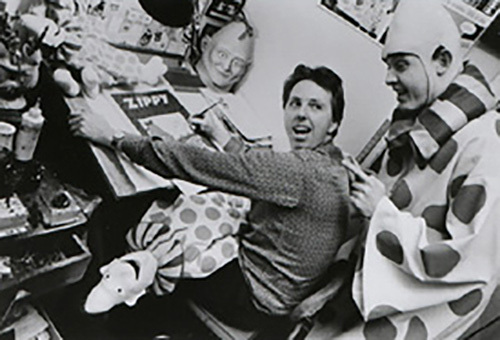 Bill Griffith, 1985, image © f Stop Fitzgerald
William Henry Jackson Griffith (born January 20, 1944 in Brooklyn, NY) began making comix in New York City in 1969 for magazines like The East Village Other and Screw. He moved to San Francisco in 1970 and co-founded YOUNG LUST with fellow cartoonist Jay Kinney as a parody of traditional romance comics. It was popular and successful. Bill’s logo takes its cue from Simon and Kirby’s YOUNG ROMANCE, but with a comix twist, and while his lettering is uneven, it captures the flavor of the original.
 From REAL PULP COMICS #1, Jan 1971, Print Mint, Bill Griffith
Griffith’s most famous character, Zippy the Pinhead, first appeared in this 1971 underground, based on Bill’s fascination with a microcephalic character from the 1936 Tod Browning film Freaks.
 From ZIPPY STORIES, Dec 1977, Rip Off Press, Bill Griffith
Zippy made more comix appearances, then starred in a weekly comic strip for the Berkeley Barb beginning in 1976. It was popular, and gained national distribution. In 1985, Zippy became a daily strip syndicated by King Features, and he and his catch-phrase “Are We Having Fun Yet?” became even more well known, and continues to appear today. The logo and lettering on this cover shows much improvement from Griffith’s early work.
 From FANTAGOR #1, Dec 1971, Last Gasp, Richard Corben
Richard Corben is a good example of a creator who followed his own path and developed a unique style that brought publishers to him. His work is full of muscular bodies, action, creative lighting, and vivid color, using a color separation technique he developed that made his work stand out. His logo on this series is clever and effective with unusual vertical stacking that still reads well.
 Richard Corben, image found online
Richard Corben (October 1, 1940 – December 2, 2020) was born on a farm in Anderson, Missouri, and went on to get a Bachelor of Fine Arts degree from the Kansas City Art Institute, in 1965. After working as a professional animator at Kansas City’s Calvin Productions, Corben started writing and illustrating for comix. His work was soon also being published in Warren magazines like Creepy and Eerie, and in Heavy Metal.
 From ANOMALY #4, Nov 1972, Bud Plant, Richard Corben
Another fascinating Corben logo using stacked and intertwined letters, and three-dimensional shapes created with texture and lighting. Both these logos are for unusual words, but they still read well.
 From GRIM WIT #2, Sept 1973, Last Gasp, Richard Corben
Corben’s work often featured naked people, like his bald strongman Den, first seen on this cover, and a Corben cover was generally a ticket to reader interest and strong sales. The logo on this book is not quite as good as the previous two, and Corben’s balloon lettering was generally weaker than the rest of his art. Later, he often used type instead.
 From GRIM WIT #2, Sept 1973, Last Gasp, Richard Corben
The first page of what became Corben’s best-known epic story, DEN, with a creative logo drawing from Celtic sources. The caption lettering here is fine, and readable even in a dark color, but uneven. Corben’s style found a strong following in both America and Europe, and was used in films, and on album covers. He continued to have a busy career, sometimes as a writer/artist, sometimes illustrating the writing of others, at many comics publishers, and new versions of his work continue to be published.
 From ZODIAC MINDWARP, 1968, East Village Other, Spain Rodriguez
The underground artist known as Spain, or Spain Rodriguez, first made an impact with this tabloid-size insert in New York’s East Village Other newspaper. The title/logo is handsomely done circus-style lettering with an eye in the O. Reportedly it was tabloid size because printers refused to publish the sexually explicit work at comics size.
 Spain Rodriguez, image found online
Manuel Rodriguez (March 2, 1940 – November 28, 2012) was born in Buffalo, New York. He picked up the nickname Spain as a child, when he heard some kids in the neighborhood bragging about their Irish ancestry, and he defiantly claimed Spain was just as good as Ireland. Spain had work in many popular underground comix, including ones featured here, but the nature of his work keeps me from showing much of it. At some point he moved to San Francisco and co-founded The United Cartoon Workers of America with Robert Crumb.
 From INSECT FEAR #2, March 1970, Print Mint, Spain Rodriguez
This cover is in the style of EC Comics, and certainly captures the creepy and horrific nature of those covers. The logo and cover lettering is not as good as what Al Feldstein was doing at EC, but it does hit a raw nerve.
 From ARCADE #3, Fall 1975, Print Mint, Spain Rodriguez
On the other hand, the lettering he did for this adaptation of the poem Kubla Khan by Samuel Taylor Coleridge is creative and gracefully angular, with the large word XANADU the most impressive element, though a bit hard to read. Spain’s character Trashman appeared in many magazines, and in later years he taught and worked on larger illustration projects.
There may well be more underground comix creators whose work could be included here, but these are the ones that stood out to me as letterers and logo designers, at least in the initial comix period of the 1960s-70s. Undergrounds had some interesting effects on the comics world. On one hand, older established creators from the mainstream were inspired to try publishing their own work, and on another, comix provided a stepping-stone for some into the mainstream comics world. In the 1970s and 1980s, a new generation of creators took undergrounds as a model for their own independent publications, too. I’ll look at those trends in another upcoming article. It’s clear that, once a path for self-publishing was forged, there was no turning back to the tyranny of a few New York publishers holding all the cards.
The post Lettering Underground Comix Part 2: Other Hands appeared first on Todd's Blog.
September 27, 2023
Rereading: FREDDY THE POLITICIAN by Walter R. Brooks


The sixth book in the Freddy the Pig series by Walter R. Brooks was originally titled “Wiggins for President,” before being retitled as above to fit in with the rest of the series. Mr. and Mrs. Bean have plans to go to Europe for a few months, and are wondering if their talking animals will be able to run the farm in their absence. To help convince them, Freddy decides the animals need to show how responsible they are by starting their own bank. The First Animal Bank is set up in an otherwise unused farm outbuilding after underground vaults are dug to hold valuables. Freddy is the treasurer, but wants another animal to be president, and the job falls to a new arrival on the farm, a woodpecker from Washington D.C. named John Quincy Adams, after the early U.S. president. His impressive name seems just right for the job. Another project the animals take on is the formation of their own government, the First Animal Republic. Candidates are nominated and begin their campaigns, with Freddy and his friends backing the cow, Mrs. Wiggins, who has a winning personality, an infectious laugh, and lots of common sense. Soon, however, the true plans of the woodpecker and his family surface when he also begins campaigning for president after a slick takeover of the bank. How can Freddy and the Bean Farm animals combat this outside takeover of their ideas and enterprises?
As much fun as all the Freddy books, and the political shenanigans are especially amusing in light of current developments in our own world. Recommended.
Freddy the Politician by Walter R Brooks
The post Rereading: FREDDY THE POLITICIAN by Walter R. Brooks appeared first on Todd's Blog.
September 26, 2023
Lettering Underground Comix Part 1: ROBERT CRUMB
 From ZAP COMIX #1, Feb 1968, Apex Novelties. All images © Robert Crumb except as noted
The 1960s were a time of change in many areas of society, including comics. One factor was the availability of cheap printing for the general public. Independent offset printers were setting up all across the country and small runs of a comic book with black and white interiors and a color cover could be produced for a few hundred dollars. A new generation of cartoonists was exploring that option, first just printing copies for friends, but new kinds of stores were opening up that would sell them. A counterculture focused on drug use, politics, folk, blues and rock music, and free love was gathering young fans in droves, and they were meeting to buy things in head shops that specialized in drug paraphernalia and literature and posters related to the movement. A new type of comics, dubbed “comix” to imply the X-rated nature of much of the content, was arriving on those shelves. One of the earliest and most prolific creators of comix was Robert Crumb, whose anthology series Zap Comix was a hit, and sold well enough to encourage lots of imitators. Crumb’s work sometimes looked back to sources like the comics he loved as a kid, but more often it drew content from past and current music and culture. Both his art and his lettering had a rough quality that was very different from most mainstream comics, but beneath that rough look was solid cartooning and design skill. The content was raw, sexual and violent, free from any kind of censorship. It helped that court rulings at the time were making prosecution for producing or selling such things harder. Underground comix included everything the Comics Code Authority was sworn to prevent, and that made them all the more appealing. Crumb said in the book Comics, Comix & Graphic Novels by Roger Sabin (1996), “People forget that was what it was all about. That was why we did it. We didn’t have anybody standing over us saying ‘No, you can’t draw this,’ or ‘You can’t show that.’ We could do whatever we wanted.” In a way, underground comix reset the idea of making comics back to the beginning, with each creator doing his own complete package. Some were able to produce entire comix themselves, but many joined forces in anthology titles like Zap Comix. The center of comix publishing was San Francisco and nearby Berkeley, California, though comix were published in many parts of the country. No longer did a cartoonist have to live in the New York City metropolitan area and gain favor at the mainstream publishers to reach an audience. In Part 1 I’ll focus on Robert Crumb, in Part 2 I’ll look at other early underground artists and their lettering.
 Robert Crumb, 1969, © Baron Wolman / Iconic Images
 From HELP! #25, July 1965
Robert Crumb was born Aug 30, 1943 in Philadelphia to a troubled family with unhappy parents and five children. They moved often, but Robert and his brother Charles loved comics and animation, and created their own small humor/satire pamphlets named FOO! that they tried to sell door to door with little success. The model was Harvey Kurtzman’s MAD and HUMBUG. When Robert graduated from high school, he found work at American Greetings in Cleveland, Ohio, drawing greeting cards there for four years. In 1965, Kurtzman published some of Crumb’s work in his magazine HELP!, as seen above, where his title lettering is already unusual and interesting. While continuing to draw greeting cards, Robert placed comic strips featuring his own creation, Fritz the Cat, in the men’s magazine Cavalier in 1965-66. He began experimenting with LSD, and an early marriage failed. Crumb followed friends to San Francisco where his work became popular in underground newspapers.
 From ZAP COMIX #1, Feb 1968, back cover
In 1967, Crumb agreed to create his first underground comix for publisher Don Donahue under the name Apex Novelties. The first issue he did was labeled #0, but the art for it was lost for a while, so he continued with issue #1, the first published. As you can see on the cover (at the top of this article) and the back cover, above, Crumb’s lettering and logo design work were an important part of the books, and that would continue to be true through his career. The front cover has elements similar to comic books, including a large, well-drawn logo under a smaller subtitle, a fake comics code seal, and two cover blurbs using display lettering. The back cover is similar to ads seen in old comics, but with a sly, subversive message. Some of the lettering imitates serif type, but it’s all clearly hand-drawn.
 From ZAP COMIX #1, Feb 1968
One of Crumb’s best known characters, Mr. Natural, began in this issue. His big-foot style and textured art works well to draw in readers, and his lettering is appealing and organic. I see lettering influences from Basil Wolverton.
 From ZAP COMIX #1, Feb 1968
Another of Robert Crumb’s interests was old blues records, and on this famous page, he used lyrics from a 1936 song by Blind Boy Fuller, “Truckin’ My Blues Away.” The image in the first panel with its distinctive open title, appeared everywhere for years, becoming a kind of visual symbol for the counter-culture.
 From ZAP COMIX #1, Feb 1968
Not all of Crumb’s work was so benign, his stories were often sexist, racist, pornographic, and violent. Many of them contain material I don’t care to show here, you can find them for yourself online. Despite that, or perhaps because of it, ZAP was popular and sold well.
 From ZAP COMIX #0, 1968
This issue, the first one Crumb drew, came out after issues 1 and 2 when he was able to find photocopies of the missing artwork. Most of it was created in 1967. I love his logo, so full of electric energy, perhaps influenced by the WEIRD SCIENCE logo of Al Feldstein for EC Comics, and the word balloon is large and heavy, with the kind of thick outline often used by Artie Simek at Marvel Comics in the late 1950s-early 1960s. Crumb knew his comics.
 From ZAP COMIX #0, 1968
The title on this page takes the kind of telescoping often used for comics logos in a new direction, with shading lines following the direction of the vanishing point and very large pointed serifs on the letters. The art suggests the kind of thing you might have seen in 1950s science fiction comics and pulp magazines.
 From ZAP COMIX #0, 1968
The title on this page has a three-dimensional organic look that makes it seem almost alive, an approach imitated by others in the early days of undergrounds, perhaps influenced by rock concert posters Crumb would have seen in San Francisco.
 From ZAP COMIX #0, 1968
This strip is funny and full of good comics storytelling and appealing lettering and art. It’s like an early 20th-century newspaper strip in its use of many small panels and complete on one page, and the lettering is not unlike what many of those early strips had. The symmetry in each panel is uniquely Crumb.
 From ZAP COMIX #0, 1968
Crumb’s love of all kinds of comics is evident in the top panel of this page, with nods to funny animals and very rounded letters. The friendly feel of the art allowed him to get away with things more realistic art would not have, I think.
 From ZAP COMIX #0 back cover
Here’s some words about comics from Robert that many of us can relate to, though perhaps moreso older comics fans, before comics were sometimes considered valuable collectibles. The lettering and title are perfect for the subject.
 From ZAP COMIX #2, July 1968
By the time of this issue, ZAP was selling well, and Crumb invited other artists to join him, making the book a many-authored anthology, as it would remain for decades. I’ll look at some of the other art in Part 2. The Crumb cover is a tour-de-force of dynamic, cartoony art and lettering with a fine three-dimensional logo and sound effects. I particularly like the joined O’s in the word TROOTHS in the bottom blurb.
 From ZAP COMIX #2, July 1968
Mr. Natural returned in this issue, an early recurring character for Crumb, with an even better logo that has an Art Deco feel, like so many comics logos of the 1940s-50s. The balloon lettering is thick and rounded, and looks like it took a lot of time.
 From R. CRUMB’S HEAD COMIX Trade Paperback, Viking Press 1968
While the world was slow to embrace underground comix in general, Robert Crumb’s work in particular found favor at mainstream publishers, as seen here. The logo is beautifully done, and perhaps Crumb took more time on it than usual.
 Original cover art for R. Crumb’s Fritz the Cat Trade Paperback, Oct 1969, Ballantine Books, image courtesy of Heritage auctions
Another mainstream book publisher taking a chance on Crumb work, some done for Cavalier magazine, some new. Ralph Bakshi made an animated film of Fritz released in 1972, further putting Crumb on the map in American culture. This logo is again done carefully and well, and has an Art Deco feel.
 From DESPAIR, no number, 1969, Print Mint
While continuing to do some work in ZAP, Robert also put out solo books of comix from various San Francisco publishers, like this one. The logo and art suggest a romance comic but one heading in a different direction that predicts where some self-published comics would be going in later years., and it all has a looser, rougher, but more realistic feel than much of the earlier work.
 From ZAP COMIX #3, 1969, Print Mint
The delightfully graphic title on this story seems like something Basil Wolverton might have done, and shows that Crumb was always trying new things.
 From MR. NATURAL #1, Aug 1970, Apex Novelties
New Mr. Natural stories appeared in this two-issue series with a very different logo, tall script that leans slightly to the left, and has a double outline for a second color.
 From PROMETHEAN ENTERPRISES #3, 1971
This was an underground comix fanzine produced by Bud Plant, Jim Vadeboncoeur Jr., and Al Davoren, and pretty close to an underground itself. I love Crumb’s logo made of swear symbols, surely the first use of them in such an impactful way.
 From UNEEDA COMIX, no number, 1971, Print Mint
Another all-Crumb one-shot with a great cover. The logo is block letters with telescoping in one-point perspective, and the tiny thought balloons are wonderful. Crumb even got away with including Goofy.
 From HOME GROWN FUNNIES #1, Jan 1971, Kitchen Sink Press
Robert went for an old comics anthology look on this cover, with a fine lower case logo and character heads in circles down the left side. The music note balloon is also uniquely his.
 From XYZ COMIX, no number, June 1972, Kitchen Sink
Crumb again imitates the look and format of old comics anthologies here, with a handsome logo and small character figures around the central image.
 From BLACK AND WHITE COMICS, no number, 1973, Apex Novelties
On this cover, the logo takes the opposing words to extremes of perspective and color, while COMICS is very similar to WALT DISNEY’S COMICS AND STORIES, the 1940s anthology from Dell. The balloon and caption lettering is small, but has lots of variety.
 From ARCADE, THE COMIX REVUE #1, Spring 1975, Print Mint
In 1973 the liberal political climate began to swing the other way, and new obscenity rulings made comix harder to sell. Many of the head shops they were sold in closed, and publishers had to rely on mail order or the earliest independent comics retailers. One of the last new underground titles was ARCADE, co-created by Art Spiegleman and Bill Griffith, which lasted seven issues to 1976. Crumb did a fine cover for the first issue with a logo that reminds me of MARVEL MYSTERY COMICS. I like the way some of his balloons have shading, giving them a three-dimensional look.
 From ZAP COMIX #8, 1975, Print Mint
ZAP was still surviving, and Robert did this great cover for issue #8 with a creative angular logo that sort of combines two types of the letter Z.
 From ZAP COMIX #8, 1975, Print Mint
Inside, Crumb’s story has a huge title and interesting initial capital letters in the captions.
 From AMERICAN SPLENDOR #3, 1978, © Harvey Pekar
In 1976, Crumb helped his friend Harvey Pekar start an autobiographical comic, AMERICAN SPLENDOR, with Pekar writing and Crumb illustrating some of the stories, other artists drawing some as well. It was a great combination that proved popular and began a new trend in self-published autobiographical comics that Robert also followed in his own work.
 From WEIRDO #1, Spring 1981, Last Gasp
In 1981, Crumb created this new series with a cover that suggests some of Harvey Kurtzman’s covers for MAD when it went to magazine size. The logo is wonderful, and every issue had a different one, again imitating Kurtzman’s earliest MAD run. They and the covers are all amazing. This was also an anthology with many creators, and Robert’s interior content was sometimes sparse, but always interesting.
 From WEIRDO #8, Summer 1983, Last Gasp
I would not have guessed this cover was by Crumb if it wasn’t signed, it looks more like something Peter Bagge might have done. Plenty of Bagge’s work is inside, and clearly Robert was looking carefully at it.
 From ZAP COMIX #13, 1994, Last Gasp
ZAP continued to come out sporadically until 2005, but Crumb’s work for it became much more autobiographical, as here. I love the heavily textured title and serif lettering, this style is typical of Robert’s later work. One thing you have to say for Crumb, he was honest about himself.

 From THE BOOK OF GENESIS, 2009, W. W. Norton
In more recent years, Crumb’s comix output dwindled in favor of work for other media like album covers, but in 2009 a major new project came out in book form, a version of Genesis from The Bible in Crumb’s cartoon style. It shows he’d lost none of his skill. Crumb remarried in 1978 to Aline Kominsky-Crumb, and both she and their daughter Sophie are published cartoonists as well. His work continues to be collected, republished, and celebrated.
In Part 2 of this article I’ll look at more early underground comics artists and their lettering.
The post Lettering Underground Comix Part 1: ROBERT CRUMB appeared first on Todd's Blog.
September 24, 2023
Rereading: DANGEROUS ISLAND by Helen Mather-Smith Mindlin


Frank and Dorothy Warren have come with their mother to spend the summer in a rented house on Brigantine Island, just north of Atlantic City on the New Jersey coast. They soon meet Mr. Charleston, a friendly young man living in a self-built shack on the bay shore, where he makes a living fishing from his boat. Soon they’ve also met a local boy, Pug, who teaches them how to fish and gather clams, and Mr. Charleston helps them build a sturdy raft from driftwood that he ties to his dock so they can play and fish on it. One day, tired of being in the same place, Mr. Charleston tows the raft and the children to a new mooring further out in the bay before he goes out fishing. Unfortunately the stakes he moored them to come loose, and before they know it, the three children are swept by the tide out into the ocean. A thick fog comes up, keeping anyone from seeing their plight, and eventually they land on a small, rocky island miles from the coast. While Mr. Charleston and the parents are frantically searching for them, the three castaways get by on their deserted island, finding enough to eat, and sleeping in a cave, but then something ominous is noticed. The island is getting smaller! It’s gradually sinking into the ocean. Can the children be found in time? And what unusual secret does the cave hold for them?
This is an exciting read if you’re willing to overlook a few things. For instance, there are no rocky islands off the New Jersey coast, sinking or otherwise. Also, the author doesn’t understand that tides affect all land, including small islands. As a child, I didn’t notice any of that and enjoyed the adventure. Mildly recommended.
Dangerous Island by Helen Mather-Smith Mindlin
The post Rereading: DANGEROUS ISLAND by Helen Mather-Smith Mindlin appeared first on Todd's Blog.
September 21, 2023
BASIL WOLVERTON and HARVEY KURTZMAN – Letterers
 From AMAZING MYSTERY FUNNIES Vol 2 #12, Dec 1939, Centaur
In the early days of comic strips, the creators did everything: writing, art and lettering. Over time, if a strip was popular, the creator could afford to hire assistants who often did the lettering, which was considered an onerous chore by some. A percentage of early strips were always entirely the work of one person, as with Winsor McCay and George Herriman for example, but as assistants and their share of the work were usually unknown, it’s hard to be sure who did the lettering on many strips. In comic books, the demands of volume meant that creation was often an assembly-line process at both shops and publishers, with the work divided into tasks such as writing, penciling, inking, lettering, coloring and editing. A creator might begin with submissions that were all his own, but if he or she was accepted into the business, it was likely that person would become a specialized part of a team, and lettering gradually developed as a niche job done by lettering freelancers or staffers. There were always exceptions in both comic strips and comic books, two important ones in more recent comic strips are Charles Schulz and Gus Arriola. There were a few creators in comics whose work was so singular that it was best produced solo, but those creators tended to work on the fringes, not on mainstream books and characters. Basil Wolverton is a good example, an early story page by him is above. We’ll also look at Harvey Kurtzman later. Wolverton’s art was stylized and quirky, with lots of texture, like pulp magazine illustrations. His lettering was easy to read and professional, in neat lines of even letters, and his story title above is sedate block letters. This is Wolverton trying to fit in with the comic book work of others, I think.
 Basil Wolverton, 1959, image found online
Basil Wolverton was born July 9, 1909 in Central Point, Oregon. He later moved to Vancouver, Washington, and worked as a vaudeville performer, and a cartoonist and reporter for the Portland News. At age 16 he started pitching comic strips to newspaper syndicates. One was accepted in 1929, but never appeared because it was deemed too similar to Buck Rogers.
 Disk-Eye the Detective, possibly from CIRCUS THE COMIC RIOT #1, June 1938, but original art from Basil Wolverton’s Weird Worlds Artist’s Edition, IDW 2014
Wolverton placed a few short stories in this 1938 comic, probably reworked newspaper strips, or this might be an unpublished story. It has a more natural and personal style very similar to underground cartoonists like Robert Crumb in the 1960s. The lettering has more personality too, with interesting thicker letters for bold words that also have squared corners.
 From TARGET COMICS #5, June 1940, Novelty/Curtis
Basil’s early stories are mostly science fiction and lean toward creepy aliens, as here. The story title is again fairly bland in style, but the subtitle text is heading toward horror movies. Special lettering styles are emerging, a decorative first letter in the opening caption, and some larger and bolder words, but this is again subdued work compared to Disk-Eye. The balloon and caption borders stay very close to the letters to leave as much room as possible for the art. Remember that Wolverton was writing as well as doing the art and lettering. Spacehawk ran for 30 episodes until 1942.
 From DAREDEVIL COMICS #12, Aug 1942, Lev Gleason
For Lev Gleason, Wolverton did this strip about an American reporter in Nazi Germany. Again, the lettering and art is more cartoony and quirky, so perhaps that Disk-Eye story is from this time period. The feature logo has lots of bounce, and I like the overlapping letters. The bold words are effective, with extra time taken to point the corners. It seems possible Robert Crumb was looking at Wolverton’s comics work like this when developing his own style.
 From POWERHOUSE PEPPER COMICS #1, 1943, image © Marvel
At Timely/Marvel, Wolverton found a home for his longest-lasting comics feature, Powerhouse Pepper, which appeared as a backup in many humor and teen humor titles and eventually received its own book in 1943. The title character is barely on this page at lower left. He was a strong but not very bright boxer. Much of the dialogue was in rhyme. Wolverton was allowed to sign the stories, as here at lower right, often with silly middle names. The logo is well done with just one oddity, the way the W sits on the lower P. Small jokes and sight gags were common.
 From POWERHOUSE PEPPER COMICS #1, 1943, image © Marvel
A single page filler by Wolverton in the same issue shows where his art was headed, toward large, extremely weird faces. The lettering is a little more sedate, with decorative initial letters on the captions and a well-drawn title.
 From CAPTAIN BATTLE JR. #2, Oct 1944, Lev Gleason
Another example of this feature with lots of alliteration and rhymes in the signs and dialogue. Wolverton is using comics shortcuts like the hearts and sound effects and giant question mark in the bottom row. I also like the label and arrow in the center right panel.
 From Li’l Abner Daily by Al Capp, Oct 21, 1946, © Capp Enterprises Inc.
Wolverton’s ability to create truly disturbing faces paid off in 1946 when he won a contest to draw the face of previously unseen character, Lena the Hyena, for Li’l Abner, taking the prize over half a million other entries. It further encouraged Basil to go in this direction, and brought him attention and fame. No lettering involved, but interesting all the same.
 From POWERHOUSE PEPPER #5, Nov 1948, image © Marvel
Perhaps because of the attention to Wolverton over Lena the Hyena, Timely/Marvel brought back POWERHOUSE PEPPER for four more issues with all new Wolverton stories, suggesting Basil had continued to do them regularly even if they weren’t being used very often by this time. The use of pointing arrows is increasing in Wolverton’s busy pages.
 From WHIZ COMICS #99, July 1948, Fawcett
Considering he was about as far from New York as you could get in the United States then, Wolverton’s work kept turning up in NY-based comics. For Fawcett he did a long series of half-page fillers called The Culture Corner full of alliteration, rhyme, sound effects, and funny art and lettering.
 From BLACK DIAMOND WESTERN #16, Oct 1949, Lev Gleason
For Lev Gleason, Basil did a series of funny western stories featuring this character and his horse. I see it as not only a precursor of underground comics by Crumb, but perhaps also a precursor of EC’s MAD. I love the horse’s balloon in the title banner, and there are lots of funny small signs.
 From BLACK DIAMOND WESTERN #18, March 1950
Another example with lots of amusing signs and small balloons.
 From MISTER MYSTERY #7, Sept 1952, Stanley Morse
Wolverton hadn’t forgotten his first love, science fiction with scary monsters, and stories like this continued to turn up here and there. Basil’s lettering is more conservative here than on his regular series work.
 From MAD #11, May 1954, EC Comics, image © DC Comics
I see similarities in the kind of humor Wolverton liked and what appealed to Harvey Kurtzman, and it was perhaps inevitable that Kurtzman would ask Wolverton to contribute to his MAD. The cover has no hand lettering, but the image is similar to Lena the Hyena.
 From MAD #11, May 1954, EC Comics, image © DC Comics
Wolverton’s feature in the issue has more of his weird faces, and a little of his lettering inside the art, though the captions were lettered by Ben Oda and the title was probably penciled by Harvey. I’m guessing that Kurtzman simply told Wolverton to draw some typical MAD readers, and the results are funny and strange.
 From COMIX BOOK #1, Dec 1974, Kitchen Sink/Marvel Comics
As far as I can tell, full-page strange character art and some art for MAD and other humor magazines that didn’t involve lettering were most of what Basil produced in later years. In the early 1970s, his weird characters were cover-featured on the DC Comics humor series PLOP! A few very short stories appeared in the above experiment by Marvel to publish a mainstream magazine featuring underground comics in collaboration with Denis Kitchen. It seems like the right kind of market for Wolverton, but he wasn’t doing much story art by then. He died in 1978 at the age of 69.
 From POLICE COMICS #25, Dec 1943, Quality Comics
Meanwhile, another writer/artist with an interest in quirky humor was getting started in comics like this one in the early 1940s, penciling and inking short fillers, and possibly writing and lettering them as well, though that’s unknown.
 Harvey Kurtzman about 1960, image found online
Harvey Kurtzman was born Oct 3, 1924 in Brooklyn, New York to Ukrainian Jewish immigrant parents. His family struggled during the Great Depression, but Harvey showed early artistic ability, and his pavement chalk drawings attracted crowds. He loved comic strips. He attended the High School of Music and Art in Manhattan where he met future collaborators Will Elder, Al Jaffee, and others. Harvey showed his portfolio around the comic book publishers and picked up work here and there before being drafted and serving in the Army.
 From TESSIE THE TYPIST #6, Sept 1946, image © Marvel
After the war, Harvey found work at Timely/Marvel doing a long series of one-page gag strips called Hey Look! In this early example, there’s plenty of interesting lettering and sound effects. At this point, Harvey was trying to imitate standard comics lettering in many of his balloons, but at times they go beyond that, as in the final large HIC! in the last panel. The title with googly eyes is effective.
 From HEDY DE VINE #29, Oct 1948, image © Marvel
Two years later, Kurtzman’s own personal lettering style is being used instead, mostly tall, narrow letters in a variety of large sizes for emphasis. The title has been simplified and reversed on a black background. Harvey’s classic signature with a stick figure “man” at the end is in use. There were 150 Hey Look! single pagers at Marvel from 1946 to 1949 in a wide variety of titles, a tough way to make a living in comics, but one that suited the unique talent of Kurtzman.
 From JOHN WAYNE ADVENTURE COMICS #5, Oct 1950, Toby Press
Like Basil Wolverton, Kurtzman’s humor also worked on short, funny western stories. The large rounded brush lettering title matches the similar large display lettering in the balloons. The balloon borders also look like they’re done with a brush. The smaller lettering is even more rounded than the previous Hey Look! example.
 From MAD #1, Oct-Nov 1952, EC Comics, image © DC Comics
In 1950, Harvey began getting regular work at EC Comics, where he was soon writing and editing war titles like TWO-FISTED TALES, doing layouts for other artists, but not much art of his own. Publisher Bill Gaines suggested Kurtzman do a humor title, and MAD was born. Harvey did some of the early covers, like the first one above. I’m not positive the lettering is by him, but it looks more like Harvey’s work than that of his favorite letterer, Ben Oda, to me. Again, Kurtzman wrote most of the stories, providing layouts for other artists, while lettering was usually by Ben Oda.
 From MAD #4, April-May 1953, EC Comics, image © DC Comics
Another Kurtzman cover with balloon lettering that’s definitely his, similar to what he did on Hey Look! Other than MAD covers, I haven’t found much lettering by Harvey from this point on, with one exception.
 From HARVEY KURTZMAN’S JUNGLE BOOK, 1959, Ballantine Books, original art courtesy of Heritage Auctions
Kurtzman and EC parted ways after a few years, and Harvey launched several other humor magazines that he edited and wrote: Trump for Hugh Hefner, Humbug, and Help! for Jim Warren. By the end of its run of 26 issues, Help! had introduced a number of young cartoonists who were to play a major part in the underground comix movement, including Robert Crumb, Jay Lynch, Gilbert Shelton, Spain Rodriguez, and Skip Williamson. None of these books sold well or lasted very long, and Harvey survived doing freelance work for various markets. In the late 1950s he proposed an original paperback book to Ballantine Books of stories he would write, draw, and letter, and after much hesitation by the publisher, the book above came out in 1959 in the same format as their MAD paperbacks. I’ve never seen the printed book, but original art scans from Heritage Auctions show Harvey working small, not much bigger than printed size I think, on paper with printed gray lettering guides. Harvey’s lettering barely follows them, but is lively, informal mixed case, almost like a letter written to readers. The letters are still narrow, and here the balloons are also tall and narrow. My guess is that this is how Kurtzman’s layout lettering for other artists might have looked.
 From HARVEY KURTZMAN’S JUNGLE BOOK, 1959, Ballantine Books, original art courtesy of Heritage Auctions
On this page you can see most of the letters are outlined with a small pen, leaving small open spaces in them. This is carrying the idea of outlined lettering to an extreme, but it reads okay, and is certainly distinctive and interesting, and above all, a personal statement of the creator. While this book was not a financial success, it showed what Kurtzman could have done given free reign. Beginning in 1962, Harvey and his friend and partner Will Elder sold Hugh Hefner on an elaborate painted comic strip for Playboy, a sexy satire called Little Annie Fanny that would be Kurtzman’s main occupation for the next two and half decades. I don’t think any of the lettering was by Kurtzman himself, though he wrote it and did layouts. Harvey’s later work other than on Little Annie Fanny, was sporadic, and he supplemented his income by teaching and working on reprints of his earlier work. He died in 1993 at the age of 68.
Both Wolverton and Kurtzman’s very personal comics may have inspired and encouraged the rise of underground comix in the 1960s, and like the creators of those books, they did their best work entirely on their own, employing quirky humor and stories that included their own unique lettering.
The post BASIL WOLVERTON and HARVEY KURTZMAN – Letterers appeared first on Todd's Blog.
September 19, 2023
JIM APARO – Letterer
 From GO-GO COMICS #6, April 1967, Charlton
By the 1960s, most mainstream comics artists were specialists, focusing on either penciling or inking. There were some who did both, but very few who also did their own lettering. Jim Aparo penciled, inked, and lettered his comics stories from his debut at Charlton in 1967 until the late 1980s, when he began doing only pencils. The last example I could find of his lettering is from 1993, but Aparo worked steadily all those years, producing about one page of penciled, lettered, and inked art a day, and it makes his work unique and personal. Aparo also always signed the first page of his stories, again not common at the time. His lettering above shows style and variety, and is creative and appealing. Also unusual is that he always lettered with a fountain pen.
 Jim Aparo, image found online, probably early 1990s
James N. Aparo (August 24, 1932 – July 19, 2005) was raised in New Britain, Connecticut, and took art classes in high school, but was largely self-taught, using favorite comic strips and comic books as examples to learn from. He tried breaking into comics in New York City in the early 1960s, but had no success, so he worked in advertising close to home in Connecticut for a number of years. In 1967 he met with editor Dick Giordano at Charlton Comics in nearby Derby, CT, showing him samples of his work. Giordano liked it and gave him is first assignment, the feature “Miss Bikini Luv,” as seen at the top of this article. In an interview with Jim Amash for Comic Book Artist #9 (TwoMorrows, Aug 2000), Aparo said about doing the whole job himself:
At the ad agency, I used to do layout work that was in pencil for the client and then they would turn it over to the typesetter to do the paste-up for the mechanical to shoot the ads. Then if there was any fancy script lettering or a special type of lettering that the typesetter didn’t have, I would do it. I was always fascinated with lettering; I liked to letter. [For comics] I used to do the lettering first. I kept it far away from the art area. Very seldom would I have to re-letter something. I did it pretty well. When I started at Charlton, I was still working at the ad agency; I worked for Charlton on a part-time basis. Dick gave me a script to do and with a lot of time to do it.

 From CAPTAIN ATOM #88, Oct 1967, Charlton, original art courtesy of Heritage Auctions
Aparo’s first superhero work was on Nightshade backups in CAPTAIN ATOM, as seen here. Looking at his lettering in the large panel image, you can see it’s a bit lighter than some of the brushed ink areas in the art. Aparo lettered with a Shaeffer fountain pen. That meant the ink had to be a little thinner and paler than the usual India ink used to letter comics in order to flow through the pen, but Jim made it work perfectly for about 30 years. He also used the same pen for thinner lines in his art, and since he was inking, he could make sure the slightly paler lettering wasn’t made even lighter when he erased his pencils. Note that the character name The Image has a serif I, something I think he stopped doing later. In general, Aparo’s lettering is professional, consistent, and easy to read.
 From SPACE ADVENTURES #60, Oct 1967
Aparo’s titles were always strong open letters that sometimes ran together, I think he penciled them and then went straight to ink with his fountain pen. They usually have an informal look, though he might have used a straight edge on this one, it’s a bit more regular. Due to Charlton’s notoriously uneven in-house printing, some of the letters are incomplete or missing on this page. Aparo’s balloons are well-formed freehand ovals with lots of air around the lettering.
 From AQUAMAN #42, Nov 1968, this and all following images © DC Comics
In April 1968, Dick Giordano moved from Charlton to DC Comics as an editor, taking a few of his creators with him. In the Amash interview, Jim remembered:
He took Steve Skeates, Pat Boyette, and me. And Dick took us out and I met them and Ditko. Dick told me that Aquaman was going to need a new artist since Nick Cardy was leaving and had I heard of the character? I said sure, and he said the book would be mine, and I said, “Cool.” I had to pencil the first job. Carmine [Infantino, editorial director] wanted to make sure; he wanted to see it in pencil. Dick said, “This guy does it all right off.” Charlton didn’t see my work until the job was completed. Carmine was happy with my work and then I started turning in the jobs complete. [Pencils, inks and lettering]
Above is a page from Aparo’s third AQUAMAN issue, and the title here is looser, more typical for him. I like the Aquaman feature logo he did, with the letters running together. While Aparo also did many covers for DC, as far as I know he never did the cover lettering for those. I think the cover copy was often written after the art was turned in. At first Jim continued to work on THE PHANTOM for Charlton as well as AQUAMAN, but after a year or two he left Charlton, and thereafter did almost all his work for DC. He was popular with fans, and he had no trouble meeting deadlines at his regular page-a-day schedule, so it worked well for him and for the company.

 From THE PHANTOM STRANGER #25, June 1973, DC Comics
For a while, Aparo had two bi-monthly books, doing THE PHANTOM STRANGER in between issues of AQUAMAN. His story title here is very typical, and like Ben Oda, done freehand. The lighter lines of his fountain pen can be seen in the close-up, but they reproduced fine. It looks to me like the emphasized words are done with double strokes of his pen, which would take a bit longer, but at least he didn’t have to change pens. Or possibly the thicker lines were made by pressing harder. I confess I’ve never lettered with a fountain pen, but that also seems possible. His letters have gotten wider at this point, and he continued to use this style of lettering for many years.
 From THE BRAVE AND THE BOLD #98, Oct 1971
By 1971, THE BRAVE AND THE BOLD was a Batman team-up book, and when Batman teamed with Phantom Stranger in this issue, they asked Aparo to draw it. His style seemed a perfect fit for Batman, and editor Murray Boltinoff soon asked him to become the regular artist on the book, moving over from AQUAMAN. He missed only a few issues from #100 to the final one, #200. Though writer and artist credits were not yet common at DC, Aparo always included them. Readers probably didn’t know he was also the letterer. Here every bit of the lettering is organic, there are no perfectly straight lines, and it works well. Aparo follows a common style at DC of making the first letter of a caption a little larger and bolder. The larger words of the title are probably double-lined.
 From ADVENTURE COMICS #431, Jan 1974, DC Comics
Aparo’s style seems well suited to creepy costumed characters, he handled The Spectre for a run in this book. I love the way the story title swoops around the plane, and the askew thought balloon also adds to the unease.
 From DETECTIVE COMICS #446, April 1975, DC Comics
Aparo’s sound effects were as organic as his lettering. Not flashy, but just the right size to make an impact, and sometimes with a thin drop shadow to help them read.
 From ADVENTURE COMICS #440, July 1975, DC Comics, original art courtesy of Heritage Auctions
A tombstone caption on this splash page gave Jim a chance to do larger display lettering that works well in perspective. The story title is effective, and I like the joined letters.
 From THE BRAVE AND THE BOLD #158, Jan 1980, DC Comics
THE BRAVE AND THE BOLD presented an extra challenge: having to draw a different team-up character or group in each issue, and Aparo did it all with apparent ease. His lettering was up to anything the script asked for, like the large open letters on this page. As with his art, Jim’s lettering was consistently good.
 From THE BRAVE AND THE BOLD #200, July 1983, DC Comics
The final issue of TB&TB included a preview of Aparo’s next project, BATMAN AND THE OUTSIDERS, for which he created the visual aspects of several new characters.
 From BATMAN AND THE OUTSIDERS #19, March 1985, DC Comics
It’s kind of a shame that Aparo didn’t credit himself as letterer for most of his career. Here he shows versatility with a well-designed Old English title. By 1978, all DC comics had lettering credits, so some readers must have figured it out.
 From LEGENDS OF THE DARK KNIGHT ANNUAL #1, Dec 1991, DC Comics
By this time, most of Aparo’s work was being inked and lettered by others, but he was still occasionally doing everything once in a while, as on his pages for this book.
 From BATMAN #489, Feb 1993, DC Comics
Aparo became the regular artist on BATMAN for a while starting in 1993, and at first was doing the inking and lettering. For the first time that I can find, he gives himself credit for lettering here. His title is large and effective. But after a few issues, he was only doing pencils. Perhaps that was his choice, I don’t know.
 From GREEN LANTERN/SUPERMAN: LEGEND OF THE GREEN FLAME, Jan 2001, DC Comics
Aparo continued to work sporadically for DC until about 2000. I was privileged to letter this one page he did returning to The Phantom Stranger as part of a Neil Gaiman story. Aparo passed in 2005 at the age of 72. His work will long be remembered by fans, his lettering will long be appreciated by lettering fans like me.
The post JIM APARO – Letterer appeared first on Todd's Blog.
September 17, 2023
Rereading: WILD GEESE FLYING by Cornelia Meigs


Dick Milton and his family have lived in many places, following their father to jobs around the world, but now their mother and her four children have settled in the Vermont small town home willed to her by her deceased father, while the children’s own father continues to work far away. They love the large house and the woods around it, but for some reason they can’t understand, the people of the town are unfriendly and don’t seem to want them there. It’s more than New England disdain of newcomers, there’s a mystery here that no one will explain to them. Dick makes one new friend in the woods, Jerry Stewart, but he can’t or won’t explain either. As the Miltons become more known, and have opportunities to help their neighbors, some of them thaw and become more friendly, and eventually the truth comes out. Jerry Stewart had been a good friend of their grandfather, and entrusted him with a large sum of money to be invested before Jerry went away to military service. Now that he’s back, there’s no trace of that money anywhere, and the town feels the house should be his to make up for it. Can Dick and his family discover the truth of the missing funds, or must they turn their new home over to Jerry Stewart?
This is my favorite of the Meigs books I’ve read, and I think the only one that has a contemporary 1950s setting rather than a historical one. The characters and plot are engaging, and the writing is excellent. I also like the illustrations by Geer. Recommended.
Wild Geese Flying by Cornelia Meigs
The post Rereading: WILD GEESE FLYING by Cornelia Meigs appeared first on Todd's Blog.
September 15, 2023
Incoming: THE iZOMBIE OMNIBUS

 Images © DC Comics
Just arrived here is another giant collection of comics I lettered. iZOMBIE ran for 28 issues from Vertigo, written by Chris Roberson, art by Michael and Laura Allred. I’ve never been a zombie fan, but these stories were interesting and fun, with great writing and art. There’s also some new material. The series became a popular CW TV series that ran five seasons from 2015 to 2019. I think there was already an omnibus under the Vertigo imprint, this version is due out Oct 24, 2023. Order from your comics retailer or use the link below. Retail price $125.
The post Incoming: THE iZOMBIE OMNIBUS appeared first on Todd's Blog.
September 14, 2023
DANNY CRESPI – Letterer
 From BEWARE! #6, Jan 1974, this and all images © Marvel
Readers of Marvel Comics in the 1970s probably thought they knew the names of all the Marvel letterers because they were listed in the story credits. There was one busy letterer who remained anonymous because his work was mainly on the covers, and therefore not credited: Danny Crespi. The cover above has an early example of that lettering in the bottom blurb, and I suspect he might also have designed this title’s logo, though I have no evidence for that. It’s not by the other frequent Marvel logo designers of the time: Artie Simek and Gaspar Saladino, and it has a style that reminds me of Danny’s cover lettering.
 From FOOM #17, 1977, the Marvel Bullpen about 1954
Daniel “Danny” Crespi was born on February 13, 1926, in Brooklyn, New York. His father, Nissim Crespi, later known as Sam, was born in Turkey and arrived in New York as an immigrant in 1911. In 1920 he married Sarah Asher, and they lived in Brooklyn, where a girl, Rachel, and Danny were born. Some time after 1935 they moved to The Bronx. In 1944, during World War Two, Danny enlisted in the Army Air Corps, and served until 1946. Returning home, in 1947 he was able to use the G.I. Bill to enroll in Burne Hogarth and Silas Rhodes’ new Cartoonists and Illustrators School, later the School of Visual Arts. Thanks to Alex Jay for much of this information, more in his article on Danny HERE.
Around 1948, Danny was hired as a letterer by Timely, as Marvel Comics was then called, and according to an interview by Jim Amash with John Romita Sr., he worked in the Timely offices in the Empire State Building, but in 1949, Timely owner Martin Goodman ordered editor Stan Lee to lay off most of the staff, and in 1950 relocated the offices to 655 Madison Avenue. Gradually the comics staff was rebuilt by Stan, and some former staffers were rehired. I’m not sure if that happened to Danny, or if he was one of the few, like Artie Simek, who was able to stay through the purge, but by about 1954, when the photo above was taken, he was again on staff at Marvel, now often known as Atlas Comics. Danny married Rosalyn Jaffe in 1952. In 1957, comics distribution problems caused Goodman to again lay off nearly all the staff, including Crespi. In an interview by D. Jon Zimmerman published in Comics Interview #9 (March 1984, Fictioneer Books), Danny remembered what he did next:
I began doing freelance lettering in advertising. I told myself, “To Hell with comics — it must be dying if a big company like Timely can close up.” I went to art studios doing board work and paste-ups, then went to the presentation department of BBD&O and did Speedball lettering for them for twelve years. Money-wise it was okay, but I didn’t like freelancing per se. I used to collect lettering assignments from different places and go home and do them. But for presentation work you’re supposed to wait around by your phone ’til they call you, then go over to the studio to work. I don’t like that. I don’t like to wait around for people to call me. I like to belong to one place.
 Danny Crespi, 1975, from the Mighty Marvel Comic Convention Program Book
Well, about twelve years ago [1972], I called up Morrie Kuramoto. I didn’t even know if he was still working at Marvel, but I heard he was. I asked if he had any work for me. He said, “Hey, man, I can use a hand. Come on down!” It was real small. There was no room. In fact, to get me a spare seat, I had to wait for when Marie Severin was working at home. They didn’t even have shelves for supplies. Morrie gave me things to do. The pay was low — all the comics companies paid low wages in those days — but it was steady work. I wasn’t on staff, but I felt like I belonged there. I came to work every day. I would do corrections, paste-ups — everything the Bullpen does now.
Danny became good friends with John Verpoorten, then the head of Marvel’s production department. John offered him a staff job, and Danny accepted, even though the pay was poor, and he continued to pick up other freelance work to do at home in the evening. In the interview, Danny said:
One day John asked me why I was going to other places to get extra work when Marvel had plenty of extra work to give me, if I wanted to work nights. He would go around to everyone and say, “I’ve got Crespi staying here at night and I want you to have your work ready for him to finish by the time you go home.” Eventually I helped him run the Bullpen. [John] used to stay at night when I was working until seven or eight o’clock in the evening, doing cover lettering and cover copy for nine-tenths of the covers.
 From BEWARE! #6, Jan 1974
Until about 1964 most of the Marvel cover lettering was by Artie Simek, but then Sam Rosen began gradually taking over, and was doing most of it by 1968. Sam stopped working for Marvel suddenly in 1972, and the company had to find others to do it, like staffer Morrie Kuramoto and freelancer John Costanza. In 1973, Gaspar Saladino began doing much of the Marvel cover lettering as well as most of DC’s. There are a few examples earlier than this that might be by Danny Crespi, but the first ones I feel sure about are cover-dated January 1974, and were probably done in the fall of 1973. That makes sense if Danny started working on staff that year. Gaspar continued to do some of the cover lettering through the 1970s, but from 1974 to 1978, most was by Crespi. His style has a softness to it that Gaspar’s does not, and his regular lettering, like the top line here, is very wide. His balloon and caption borders tend to be thick, making for easier paste-up on cover art.

 From WEREWOLF BY NIGHT #13, Jan 1974
Another example I think is by Danny. Note the serif on the R in MONSTER, like a kicking shoe, something he often did, and the scribbly heavy border around TABOO is also a style he used. Again the regular lettering is very wide, but more rounded than Gaspar’s, and there’s a thick panel border.
 From SPECIAL MARVEL EDITION #15, Dec 1973
 From MASTER OF KUNG FU #17, April 1974
Crespi did not often do logos, but this one is attributed to him. There are two versions, the first has round tops on the MA. Letterer Tom Orzechowski, who was working on staff at the time, told me: Danny created this, considering it to be a rough. It was approved and put into use, as the person (Roy?) who made the approval didn’t recognize that it was a rough. The second version has squared tops on the MA, and it lasted a while. In addition to lettering many covers, Danny also did letter column headings, character intro logos (used at the top of the first story page), and occasional house ads, all things that were not credited, just as his lettering in the 1940s-50s wasn’t credited. I don’t think he did any story lettering in the 1970s.
 The Danny Crespi Files page 2, compiled by Phil Felix 1984
In 2015, I received a package in the mail from letterer Phil Felix containing about 100 photocopies of lettering and logos from the Marvel offices. Phil wrote:
Here’s the “Danny Crespi Lettering Book” I promised you. I put this together during my time in the Marvel Bullpen as reference for myself, never thinking anybody else would be interested. All these pieces came from Danny’s stash (a giant manila envelope) that he gave me, (except the logos), and all the pieces had the letterer’s name or initials. I never thought to keep a record of those, but I’d say this book is at least 80% Danny Crespi. When he passed, I returned the originals to his family.
Thanks to Phil, I was able to study the many examples of Danny’s cover lettering until I felt I had a handle on which ones were his, and Phil was right, at least three quarters are by Crespi himself. Above is the second page of the collection, I believe all by Danny. These are burst captions, and there are several style points to notice: the thick burst borders, open lettering with a generally rounded look, foot-kick serifs on the R and K of GROTESK, and very wide (beautifully lettered) smaller regular lettering that’s also a bit rounded. In two places there are sections that were cut out and replaced with different lettering, probably last-minute changes. These bursts are similar, and by the same hand, but incorporate a variety of styles, as cover lettering should. Another thing that sets them apart from Gaspar Saladino’s bursts is the random angles of the points, which go in all directions. Gaspar usually did them with all the ends pointing away from the center of the burst.
 From SUPER-VILLAIN TEAM-UP, Feb 1977
The lettering in the copies is grouped somewhat by style, but not by date, and the lettering was for covers dated from 1974 to the early 1980s. This cover uses the burst at the upper left from the page above. When it was prepared for the cover, the open letters were filled around with black and a reverse photostat was made of the top line to produce white letters on a black background, something Marvel often did at the time on covers. It works fine here, and may have been done by Danny himself. The second rectangular caption at the bottom, also by Crespi, has white letters on a red background, which was done at the color separators following a color guide by Marie Severin, or whoever did the guide at the time, but a reversed stat might also have been pasted on the cover art for that.
 The Danny Crespi Files page 19, compiled by Phil Felix 1984
More captions by Crespi, and on some of them, notice how he’s extended the straight border lines beyond the corner. When the blurb was resized and cut out to paste on the cover, it was then easy to give it sharp corner points. I like the texture in the open letters of SHOOT and the rough caption border around it, things Danny may have copied from Saladino.
 From MARVEL TEAM-UP #35, July 1975
This cover uses the BLOOD CHURCH caption from the page above, with the top line held in red on the yellow background by the color separator. Crespi also did the balloons, which might appear on another page of the collection, or not.
 The Danny Crespi Files page 20, compiled by Phil Felix 1984
Captions and blurbs by Danny, with one word balloon at lower right. Note that it doesn’t have a tail, those were added after the lettering was pasted on the cover. There’s lots of variety and texture here, and you can find a few foot-kick R’s. SHOWDOWN DAY is in a style often used by Artie Simek, who was still at Marvel until his death in 1975, but not doing new cover lettering in the 1970s, as far as I can tell.
 From THE HUMAN FLY #6, Feb 1978
That FEAR IN FUNLAND burst from the page above appeared on this cover with the lettering reversed. Danny probably planned it that way, as he used a double border to give space for a color there. The texture in FEAR is more impressive on the original, but it works fine here.
 The Danny Crespi Files page 25, compiled by Phil Felix 1984
Five wide blurbs by Danny on this page, with a few different border treatments. Again, a nice variety of styles and textures, I particularly llike the bullet holes in SHOOTOUT. Crespi was working quite large if these are same-size photocopies. Gaspar generally worked smaller than this, as did I when I did cover lettering at DC. Working larger meant a greater reduction in size for the final use, and that helped cover any flaws in the linework, though I don’t see any here. The top blurb has been cut and pasted, perhaps to change the dimensions of the caption to fit the art better.
 From KID COLT OUTLAW #205, April 1976
That SHOOTOUT blurb is used on this cover with a caption box added to read better against the cover art. AT is reversed white by the color separator, but otherwise it’s unchanged and looks great.
 The Danny Crespi Files page 28, compiled by Phil Felix 1984
Crespi didn’t use round captions as often as bursts, it’s harder to get the words to fit in them, but the one at upper left works fine. I like the lettering in the middle right box with squared corners on TEAMS WITH, another thing Danny didn’t do often. The serifs at the top of KARA-KAI add the look of forward motion and perhaps Japanese style.
 From MARVEL PREMIERE #19, Nov 1974
The KARA-KAI caption appeared on this cover along with a different round blurb. Small words in each are color holds. The colorist would indicate that in the color guide, often by running a colored pencil over it with a note of the color percentages, or at least that’s how it was done at DC.
 The Danny Crespi Files page 46, compiled by Phil Felix 1984
Another good variety of styles and shapes on this page, all by Crespi. Tom Orzechowski described Danny’s cover lettering as fitting between that of Artie Simek and Gaspar Saladino, and I think it was influenced by both. The very angular EXTRA is similar to Gaspar, while LAST STAND is very Simek.
 From THE CHAMPIONS #17, Jan 1978
That bottom blurb appeared on this cover, and it just barely fits in the only space available, the sign of a good cover letterer. Danny would have been looking at the cover art and mentally gauging that space after the logo was in place.
 The Danny Crespi Files page 52, compiled by Phil Felix 1984
Four more large blurbs by Crespi. in the second he’s given DEAD emphasis by adding a second outline, but he didn’t do that in the open centers of the D and A, which looks a bit odd here, I would have filled them in, but Saladino also did this. No open centers in UNLIVING, which has an even thicker scribbly outer border. There’s a foot-kick R on TIGER.
 From THE AVENGERS #131, Jan 1975
The last blurb appeared on this cover unchanged, along with another with reversed letters on black.
 The Danny Crespi Files page 53, compiled by Phil Felix 1984
More wide captions by Crespi, all hand-lettered except MAKE WAY FOR…THE in the second one, which is headline type from a machine Marvel had that set single lines of large type like this, or so I think, as DC had one. Part of the top line in the next to last caption is missing, probably a pasted-on piece that fell off. You can see other pasted-on pieces below that.
 From MAN-THING #21, Sept 1975
The top caption appeared on this cover with another round one. Some of the lettering has been reversed white on black, but the remaining texture around CORNER suggests the open lettering was filled around with black. It’s not as effective this way, but does add a little interest. In the round blurb, SCAVENGER is allowed to overlap the circles, one way to get it larger.
 The Danny Crespi Files compiled by Phil Felix 1984
Also included was a photocopy of this open letter alphabet that Crespi did so his production staffers could cut and paste together a word or two if something was needed quickly and no one was available to letter it. Headline type could also be used the same way, but Danny’s alphabet is better, as it’s clearly hand-lettered and more like other cover lettering. My own open lettering was not too different.
For much more about these files, see these posts on my blog:
The Danny Crespi Files Part 1 Part 2 Part 3 Part 4 Part 5 Part 6 Part 7 Part 8 Part 9 Part 10 Part 11 Part 12 Part 13 Part 14 Part 15 Part 16 Part 17 Part 18 Part 19 Part 20 (final)
In 1985, when I was on staff at DC, I made a similar collection of Gaspar Saladino’s cover lettering, which begins HERE. Interesting that Phil and I had the same idea at almost the same time.
When John Verpoorten died suddenly in December 1977, Danny took over as Production Manager at Marvel, a position he held until his own death on May 30, 1985. In a Bullpen Bulletins article running in Dec 1985 issues, Jim Shooter said:
“The Model Manager” he wasn’t. Oh, he worked hard. Too hard, I always used to tell him. He should have relaxed, put his feet up on the desk and just managed. But, no, he was always running around trying to touch every base at once. Of course, if you really had to find him, you could just listen — wherever you heard people laughing he was probably there. He didn’t seem to mind being teased. He loved it. He laughed with you. Danny’s gone now. He died last week, of leukemia — which he’d had for eleven years, though almost nobody knew — plus complications. I thought nobody’d laugh around here ever again. But, nah, Danny doesn’t want us to mope. He wants us to go to lunch. To enjoy our health. To be happy. To laugh. We’re trying. It’s tough, Danny. We miss you, Danny Crespi.
Many people had warm memories of Danny, some are in the posts linked above. His daughter Susan joined the Marvel staff and became the Production Manager herself for many years, while also doing some lettering in the 1990s. His nephew, Nel Yomtov, was a Marvel editor and colorist. While fans didn’t know his name, Danny Crespi is well remembered by his fellow comics professionals and friends, and now, thanks to Phil Felix, you and I know more about him too.
The post DANNY CRESPI – Letterer appeared first on Todd's Blog.
Todd Klein's Blog

- Todd Klein's profile
- 28 followers

