
Todd Klein's Blog, page 34
November 21, 2023
DAVE GIBBONS – Letterer
 Dan Dare from 2000 AD #56, 18 March 1978, IPC, © Rebellion 2000 AD Ltd
My knowledge of British comics artists and letterers is sparse, but there’s one I know quite well, Dave Gibbons, as we worked together on American comics starting in the 1970s, and have kept in touch. Dave is unusual in that he almost always lettered his own comics work, something as rare in mainstream British comics as it is here in America. The page above is early work by him which already shows a fully professional and excellent art style, and equally excellent lettering. Dave’s work has been consistently good ever since. In April, 2020 I interviewed Dave about his career and lettering, and all the quotes below are from that.
 Dave Gibbons by Todd Klein, 1999
David Chester Gibbons was born April 14, 1949 in London, England. Growing up he enjoyed British comics by artists Frank Hampson, Ron Turner, Frank Bellamy and Don Lawrence because of the detail and precision of their work. He also liked American comics, and told me his favorites were “the usual suspects, basically anything that was by Stan Lee and Jack Kirby or Steve Ditko [at Marvel], and anything that was edited by Julie Schwartz [at DC]. It was the artists I followed more than the writers, it would have been Kirby, Ditko, Infantino, Gil Kane, Joe Kubert, Will Eisner, Harvey Kurtzman, Wally Wood and the whole EC gang. The only EC comics I’d seen when I was a kid was Mad. I think if I’d known there were all those science fiction comics it would have made my head explode.”
Dave continued, “I always loved the comics form, so all the drawings I did when I was growing up were pages of comics with word balloons and captions on them. To me they were an essential part of it. Of course my lettering back when I was eight to ten years old was sort of childish. But my father had trained as an architect, and he worked for the local planning authority. In the evenings and in his spare time to make some extra pin money, he drew plans for houses. Because he worked for the planning department, he knew what would get through and be approved. I’ve got these vivid pictures of him sitting in our dining room in the evening drawing buildings. There were always drawing instruments, India ink and watercolors. I used to look over his shoulder. At one point I think he got worried that he was going to get caught, although there was really nothing underhand involved. The most giveaway thing about an architectural drawing is the lettering style. So, initially what he would do is rule lines out and pencil in the lettering, and then I would ink over the top of it, and the slight inconsistency that I added would disguise it. That was done with a Rotring [technical drawing] pen in ink. Then I graduated to ruling in the lines and blocking in the lettering. It was in an architectural style with a mix of upper and lower case, much more technical looking and without the sort of bounce that you get in a good comic balloon. I went on to be a building surveyor because it was very difficult to see how I could achieve my lifetime ambition of drawing American comics, living in England as I did. Architecture was in my dad’s blood and it was suggested I might do that, but really my heart wasn’t in it, so I compromised by being a building surveyor. There we were again taught formally how to do lettering.” Dave always used Rotring technical pens and India ink to letter. He also tried Pelikan Graphos pens, which were a hybrid technical fountain pen with dip pen style nibs that were popular with other comic book letterers, but Dave’s tool of choice was the Rotring pens, different sizes for bold and larger letters.
 Dan Dare from 2000 AD #56, 18 March 1978, IPC, © Rebellion 2000 AD Ltd
A closer look at Dave’s lettering from the page above. It’s very regular and even, but informality is added by curves in nearly all the strokes, even the I in FIFTY. The E’s and L’s are quite rounded at the bottom, helping to keep the lettering from seeming too stiff and mechanical. For the large lettering in the top balloon, Dave chose a thick pen that almost filled in the centers of the A’s, but it reads fine.
 Dan Dare from 2000 AD #57, 25 March 1978, IPC, © Rebellion 2000 AD Ltd
Dave got a building surveyor job in London, and said, “It just so happened it was around the corner from IPC Magazines, the biggest publisher of comics in the United Kingdom. I got to know a couple of people who worked there through comics fandom, like Dez Skinn, and I used to go and visit him at lunch hour. I made friends with a lot of people who were working there who were also fans, and were my contemporaries. A lot of the older people who had joined post-war were now retiring, and, just as in American comics, there was a sudden turnover and new blood. I hung around and looked over people’s shoulders to see how they worked. One guy I made friends with was Steve Parkhouse, and he used to letter with a Rotring pen. He explained to me how he did it and how he sized the lines on a ruler. We weren’t familiar with the Ames guide, that seems to be a very American tool. Lettering in British comic books in those days was done on finished artwork, penciled and inked artwork, so it was often on a thing called patch paper, which was a good quality paper with a sticky back. If there wasn’t room on the artwork, you would draw and letter your balloons on that, cut them out and stick them down on the artwork. I perfected my own lettering style looking at Steve Parkhouse, Gaspar Saladino, John Costanza and one of my particular favorite letterers, Sam Rosen.”
While on one of his visits to IPC, Dave was offered the chance to letter a page, and that was his foot in the door, and his first paycheck in comics. Dave said, “I got to be known as someone who was quite reliable, and when I stopped being a building surveyor, the first jobs I did when I was trying to break into comics full time were lettering other people’s artwork. That was an important part of my development as an artist as well, I got to study original art up close and see just what it should look like.” Dave started as an artist working on horror and action features for both IPC and DC Thomson in 1976. When IPC’s new title 2000 A.D. began in 1977, Dave was the regular artist on the feature Harlem Heroes. Later he switched over to Dan Dare, as seen above, a project he loved because he’d been a fan of the original series by Frank Hampson. Dave told me, “By that time my style was pretty much set. And I was unusual among British artists in that I did letter my own work. I could do lettered artwork as quickly as I could do unlettered artwork because I didn’t have to draw the bits that were under the balloons. I think one of the things they really liked was that when they got a job from me, it was ready to go.” Indeed, Dave’s style in both art and lettering has been very consistent since that time.
 From DOCTOR WHO WEEKLY #3, 31 Oct 1979, Marvel UK, image © Marvel
 From DOCTOR WHO WEEKLY #4, 7 Nov 1979, Marvel UK, image © Marvel
Marvel UK was the British arm of America’s Marvel Comics which existed to reprint American features. When it began in 1972, the American spellings had to be anglicized, and Dave did some of that early in his career. In 1976 Marvel UK began creating original material for the title CAPTAIN BRITAIN WEEKLY, and in 1979 launched DOCTOR WHO WEEKLY, depicting the popular British science fiction TV show, under the editorship of Dez Skinn. Dave Gibbons was hired as the artist and letterer of the main Dr. Who comic series. Some of those were reprinted in America by Marvel, starting in 1981, with much success. Dave’s work thus became known in the U.S. to both pros and fans.
In the early 1980s, as they had done earlier with artists in the Philippines, DC Comics made a recruiting trip to London seeking British artists to work for them. Dick Giordano and Joe Orlando came over, set up in a hotel room, and British artists came to present their work. Dave was one of them. He told me, “DC basically offered more money, original art return, royalties, reprint fees, even the paper to draw on, and of course it was DC, who I loved as a kid. They got me on board, but they didn’t really have anything solid lined up for me to do, so I started off doing backups.” Dave was able to make his ambition to work in American comics come true with short stories at DC, most often Tales of the Green Lantern Corps in the back of GREEN LANTERN beginning with no. 161, February 1983.
 From GREEN LANTERN #171, Dec 1983, image © DC Comics
I had the pleasure of working with Dave as a writer and letterer on some of them, one of the few times Dave’s art was lettered by someone other than himself. In that case, I did the lettering over his finished art on vellum, which was photostatted, and then pasted onto the art, as seen above.


 From GREEN LANTERN #179, Aug 1984, images © DC Comics
With issue no. 172 of GREEN LANTERN, Dave became the lead story artist, working with writer Len Wein. His comics were as popular in America as they had been in the U.K. Dave’s lettering style fit in perfectly in American comics, perhaps because he had loved and studied them growing up, and doing lettering changes for Marvel UK on American lettering probably didn’t hurt. In the detail above, Dave’s lettering seems more angular and less rounded than in his previous work, with an S shape that reminds me of Gaspar Saladino’s lettering. Dave did GREEN LANTERN for about a year. While that was ongoing, Dave had been talking to writer Alan Moore about a new project Alan was working on, WATCHMEN, and Dave knew he wanted to work on that when it was ready.
 From SUPERMAN ANNUAL #11, Sept 1985, image © DC Comics
There was also another Alan Moore project before that, published in SUPERMAN ANNUAL #11. Dave said, “The first convention DC ever paid me to go to was in Chicago, and they had a cocktail party. I went up to Dick Giordano and said, ‘This new thing that Alan’s writing, I’d like to draw it.’ Dick replied, ‘Okay, what does Alan feel about it?’ ‘Oh, he’d like me to draw it.’ ‘Okay, it’s yours.’ I reeled away from that, thrilled, but not actually realizing what it would mean, and I bumped more or less straight into Julie Schwartz who said, ‘Hey, Dave! Where are you going to draw some Superman for me?’ I said, ‘Who’s writing?’ He said, ‘Who do you want to write it?’ I said, ‘Alan Moore.’ He said, ‘Sure, fix it up.’ It worked out well that we had that to do while we were developing WATCHMEN.” I like the title on this story, and the fact that Dave have himself a lettering credit.
 From WATCHMEN #2, Oct 1986, this and all Watchmen images © DC Comics
WATCHMEN was a groundbreaking project in many ways, including Dave’s suggested storytelling device of making most pages a nine panel grid. Dave also experimented with lettering styles, with Alan Moore’s encouragement. Dave said, “Watchmen was so full, and it was so vital that the lettering read well and didn’t obscure anything important in the pictures, the lettering would be the first thing I would both pencil and ink. Then I would start doing the drawings and make any adjustments so it wouldn’t cut off people’s heads. I really don’t think Watchmen would have been feasible if I hadn’t lettered my own work.”
 From WATCHMEN #2, Oct 1986
Perhaps Dave’s most memorable lettering style was the unusual mix of upper and lower case letters in Rorschach’s Journal, with their slightly ink-splattered captions.
 From WATCHMEN #1, Sept 1986
Rorschach’s speaking voice also had a special style and balloon shape that, to me, suggests a scratchy, guttural delivery.
 From WATCHMEN #2, Oct 1986
Dr. Manhattan’s balloons had a double border to allow a pale blue color inside with a white outline around it. Note that all the present-day balloon shapes are angular rather than rounded…
 From WATCHMEN #4, Dec 1986
…though in scenes from the past, balloons were rounded.
 From WATCHMEN #3, Nov 1986
Dave also did an excellent job with all the signs and newspaper headlines, as seen here. WATCHMEN changed comics, has remained on best seller lists, and has been a fan and critical favorite since it came out. Both the writer and artist’s reputations were secured. As Dave said, “The rest is history.” Each issue took about two months to produce, it was a solid two years of work, “The most profitable work I’ve ever done, and the most enjoyable.”
 From GIVE ME LIBERTY #1, June 1990, Dark Horse, image © Frank Miller and Dave Gibbons
Dave’s next major project as an artist and letterer was with writer Frank Miller on GIVE ME LIBERTY and later series featuring Martha Washington, depicting the life story of a young female soldier in a dystopian future America. It was Dave’s first creator-owned project, I believe.

 From MARTHA WASHINGTON GOES TO WAR #1, May 1994
The series came out sporadically, with a great final issue, MARTHA WASHINGTON DIES in 2007. In the detail view above, it’s interesting to see that Dave’s lettering has grown somewhat more rounded again, especially the S’s.
 From THE ORIGINALS, Dec 2004, Vertigo/DC Comics, image © Dave Gibbons
From 1990 on , Dave began to spend more time writing comics for others to draw. He did some writing for 2000 AD and for DC, beginning with the miniseries WORLD’S FINEST (1990) drawn by Steve Rude and Karl Kesel. Other writing work followed for DC and Dark Horse as Dave was able to expand his areas of expertise. Dave is very proud of THE ORIGINALS, a graphic novel he wrote, drew and lettered for DC in 2004. Around 2000, Dave commissioned Comicraft to create fonts based on his hand lettering, and much of what he’s lettered since then has been with those fonts. In 2006-2007 Dave wrote THE GREEN LANTERN CORPS, bringing him full circle at DC.

 From THE SECRET SERVICE #6, June 2013, Marvel, image © Millarworld, Marv Films & Dave Gibbons
In 2012-2013, Dave was artist and letterer for this six-issue series. He used his fonts, which are remarkably close to his hand lettering.
In 2017, Dave produced a how-to book with Tim Pilcher titled How Comics Work, and in 2023 Gibbons authored Confabulation, An Anecdotal Autobiography. Dave also worked on the game Beyond A Steel Sky for Apple Arcade.
 Image © Dave Gibbons
Dave is always busy exploring new ideas and new venues, while still keeping a hand in comics, and our rare chances to catch up at conventions are a treat. Long may it continue!
The post DAVE GIBBONS – Letterer appeared first on Todd's Blog.


November 19, 2023
Rereading: FREDDY AND THE IGNORMUS by Walter R. Brooks

The eighth book in Brooks’ series about the New York State farm owned by Mr. and Mrs. Bean and their talking animals has a theme, and that theme is conquering your fears.
The Big Woods are not far from the Bean farm, but few animals ever go there. It’s reported to be the home of a terrifying creature called The Ignormus, which no one has actually seen, but that makes the stories about it all the worse. Freddy the pig, the star of this series, decides he should face his fear and explore the Big Woods, but the terrifying white shape he sees there floating down from the trees toward him soon has him on the run. Meanwhile, a series of robberies of food and garden vegetables has Mr. Bean angry, and the animals vow to put a stop to it. Their old nemesis, Simon the rat, has been seen in the area, and he and his family are probably to blame, but how can Freddy and his pal Jinx the cat prove it? The answers must lie in the Big Woods, and new friends from the insect world may be able to help.
Great fun, as all these books are, as the series settles into its regular and familiar format with a threat that Freddy and his friends must overcome. Lots of humor and excitement. Recommended.
Freddy and the Ignormus by Walter R Brooks
The post Rereading: FREDDY AND THE IGNORMUS by Walter R. Brooks appeared first on Todd's Blog.
November 16, 2023
More 1950s Letterers Part 2
 From KID COLT, OUTLAW #137, Nov 1967, image © Marvel
Continuing with other lesser-known letterers whose main work began in the 1950s, with research help from Alex Jays blog. This staff letterer at Marvel Comics in the 1960s and 1970s, Morrie Kuramoto, rarely got his name into print, and seemed to avoid it. When he lettered stories, he usually used the pen name Sherigail, combining the names of his wife and daughter. His story lettering was done with a wedge-tipped pen, and is similar to that of Sam Rosen. Most of what Morrie lettered at Marvel were things that had no credits: cover lettering, house ads, title pages, and occasionally logos, and when he wasn’t lettering, he was doing art and lettering corrections on stories and preparing them for printing. Like his fellow staffer, Danny Crespi, Morrie had a long history at Marvel, but few fans and readers knew his name.
 From Marvel Bullpen photo, about 1954: Joe Letterese, Morrie Kuramoto, Danny Crespi, Herb Cooper and Artie Simek, F.O.O.M. #17, 1977, image © Marvel
Mamoru “Morrie” Kuramoto was born May 28, 1921 in Fresno, CA to Japanese parents. He lived in Pasadena later, and enlisted in the Army in 1942. He was discharged in 1943 for medical reasons not related to combat. His art training isn’t known, nor when he came to New York, but one report says he started working in the Marvel Bullpen in 1946. If so, he may have been laid off in the staff purge of 1949, but was soon hired back, as seen in the photo above.
 From HOMER THE HAPPY GHOST #1, March 1955, image © Marvel
This is one of many 1950s stories with lettering credited to him in the Grand Comics Database. It’s a bit rounder than the first example, but appealing and professional. I like the large open BOO! in the last panel.
 From DAREDEVIL #23, Dec 1966, image © Marvel
Morrie was probably laid off again in the 1957 staff purge at Marvel, then rehired in 1966 when the company was on the rise. He’s credited with cover lettering on quite a few issues, even though the main cover letterers were Artie Simek and Sam Rosen. When the work doesn’t look like either of theirs, it’s likely to be by Morrie, as on this caption. In the sixties, Morrie was often described as a funny and entertaining member of Marvel’s small staff. In an interview with Daniel Best on his website, artist Dave Hunt remembered:
The classic picture I have of Marvel comics was one room in which you had Morrie Kuramoto, Danny Crespi, Frank [Giacoia], Mike [Esposito], myself and a round robin of other people. So within that small room we were talking all the time and I would come home and my teeth would be hurting from laughing. I loved it so much because it was not like going to the office. It was like going to the circus every day. It was like a dream.
 From THE SILVER SURFER #6, June 1969, image © Marvel
Here’s a page from another story lettered by Kuramoto using the pen name Sherigail. Very professional work that again I might have attributed to Sam Rosen. THE END? is in the style of Artie Simek.
 From MILLIE THE MODEL #172, July 1969, image © Marvel
The balloons on this cover are attributed to Morrie, and here he uses thicker balloon borders, perhaps imitating that style by Artie Simek, though the letters aren’t at all like Artie’s work.
 Morrie Kuramoto, 1975, from the Mighty Marvel Convention Program Book, image © Marvel
Morrie passed March 14, 1985 of a heart attack at age 64. An obituary in the Comics Buyers Guide from April 19, 1985, reads in part:
Officially, he was a letterer, though according to Danny Crespi, art and production coordinator, he was able to perform any production job that was tossed his way. “He’d break in every raw recruit who came in here,” Crespi said. “He broke Jim Shooter in. He taught Shooter how to do production work.” Kuramoto was known affectionately as “The Old Man of the Bullpen” and “The Ancient One.” “Morrie and I go back about thirty years,” Crespi said. “He got me my first job at Marvel.”
 From COMBAT #2, July 1952, image © Marvel
Another member of the Marvel Bullpen in the 1950s was Joe Letterese (pronounced letter-easy), a fine name for a letterer. I can only be guided by the Grand Comics Database for his Marvel lettering credits, as on the page above. The style is very even, having regular letters made with a wedge-tipped pen, emphasized words with a round-tipped one, as was usual there at the time. The top line is type, the title is in the style of Artie Simek, and the open sound effects work well.
 Joe Letterese at DC Comics, 1959, photo by Raymond Perry
Joseph F. “Joe” Letterese was born on June 14, 1917, in the Bronx, New York to Italian emigrant parents. For high school, he attended the School of Industrial Arts (founded in 1936), and joined the Army in 1942, serving as an aircraft identifier in England. He was injured in the bombing of London, and discharged in 1943. After some time on the staff of Parents magazine, Joe was hired at Timely/Marvel as a production artist and letterer in the mid 1940s. He was probably laid off in the 1949 staff purge, but soon hired back, as seen in the staff photo above with Morrie Kuramoto. Joe and his wife Katharine lived in Ridgewood, NJ. He was laid off again in 1957 when Marvel publisher Martin Goodman had to cut staff drastically due to distribution problems. Joe moved over to DC Comics, where he became a long-time production staffer and letterer there starting around 1958.
 From ADVENTURE COMICS #267, Dec 1959, image © DC Comics
At DC, Joe again did lots of uncredited story lettering, according to the Grand Comics Database. In the example above, the letters are all made with round-pointed pens, which were more in favor at DC. Joe made the first letter of each caption a little larger and bolder, and his open letters at bottom left add interest.
 From G.I. COMBAT #123, April 1967, image © DC Comics
Another story credited to Joe on lettering, the title of this one is large and effective. The uneven fill on some balloons and captions suggest they were drawn in by artist Russ Heath before Joe lettered them, some artists preferred to do that.
 Image found online, © DC Comics
Perhaps Joe’s most famous work in the 1960s, though few knew it was his, was drawing the sound effects used in the Batman TV show. I don’t know if these are all by him, or if others were also doing them, but Joe was proud of this assignment and often talked about it.
 From WORLD’S FINEST COMICS #239, July 1976, image © DC Comics
By the mid 1970s, Joe was more often lettering covers than stories. Gaspar Saladino was the main cover letterer at the time, but when he wasn’t available, covers were handed to other production staffers as freelance work, and this is one by Letterese.
 From SUPER FRIENDS #2, Dec 1976, image © DC Comics
Another cover with lettering by Joe, and he also told me he designed this Super Friends logo. Joe once showed me some Marvel logos he designed in the 1950s, but sadly, I don’t remember what they were. Nothing related to superheroes. When I started in the DC production department in 1977, Joe sat two seats in front of me, with Morris Waldinger between us. Joe and Morris had been there together since 1958, and were pals. Joe was friendly, but I can’t say we were friends, perhaps too much of an age difference and interest difference between us. All three of us spent most of our time doing art and lettering corrections on interior pages, as well as things like pasting together letter columns. As a comics fan, I found it thrilling, but to Joe and Morris, it was just a job, it seemed to me.
 From JONAH HEX #60, May 1982, image © DC Comics
Joe still occasionally lettered stories, this is one where he received a printed credit. The letters are a little looser than in the earlier examples, but it works fine. I like the Chinese calligraphy.
As I recall, Joe retired from DC in 1982, soon after the offices moved to 666 Fifth Avenue. Joe passed on June 3, 1991 in Wyckoff, NJ, survived by his wife and son, Joe Junior.
 From YOUNG LOVE #63, Dec 1954, Prize
At first glance, this story’s art might seem the work of George Tuska, but it’s actually by Pete Morisi. Pete had been told by an editor he should imitate Tuska’s art, and he liked the idea, but before he started, he asked Tuska if it was okay. Surprised, George said it was. That gives you an insight into Morisi’s moral view, one that would perhaps contribute to him becoming a New York City policeman for twenty years. Morisi sometimes drew stories written by others, but often wrote and drew them, and he’s generally credited with lettering them as well, as in the example above. The lettering has a somewhat blocky look that goes perfectly with the art, and I can see it coming from the same hand. There are a few odd spaces between words where I think a name was replace by the personal pronoun I later by someone else.
 Pete Morisi, 1956, image found online
Peter A. Morisi was born Jan 7, 1928 in Brooklyn, NY. He attended the School of Industrial Art and the Cartoonists and Illustrators School, both in Manhattan. His first comics work was in the 1940s assisting on comic strips Dickie Dare and The Saint, and he had just been hired by Fox Comics in 1948 when he was drafted into the Army. He served in Colorado and managed to continue writing stories for Fox, and also drawing a few. Once back in New York, he worked for many comics publishers, but Charlton Comics eventually became his main employer.
 From FIGHTIN’ MARINES #18, April 1956, Charlton
For Charlton, Morisi did lots of war and western stories, above is an example. The lettering looks similar to the previous page to me, except for the rectangular balloons, which blend well with the art style. Morisi was finding comics work hard to get in the mid 1950s, and decided he needed a more dependable salary, so he studied for and joined the NYPD in 1956, working there until retiring in 1976. He continued to do comics, but always signed his work with the pen name PAM to keep his side job from the notice of his bosses.
 From THUNDERBOLT #51, June 1966, Charlton
Perhaps Morisi’s best known creation as writer and artist was Peter Cannon, Thunderbolt for editor Dick Giordano at Charlton. The book was popular, but Morisi couldn’t keep up with the workload, and after a handful of issues had to give it up to others. This page from his first issue might be lettered by him, but the style is rather different, and I think it was lettered by Jon D’Agostino, allowing more time for Pete on the art. Thunderbolt later appeared from other publishers.
 From VENGEANCE SQUAD #5, March 1976, Charlton
Morisi also worked on Vengeance Squad, and the more blocky lettering on this page looks like his style to me.
Pete settled on Staten Island with his wife Louise in 1973, and did some cartooning for local papers, but did not do much comics work after the 1970s. He passed on Oct 12, 2003, survived by three sons. Mark Evanier posted a fine memorial to him.
 From TOM & JERRY COMICS #136, Western/Dell, Nov 1955
According to the Grand Comics Database, this story and hundreds more were lettered by Rome Siemon, a staff letterer at the California offices of Western Publishing, whose comics came out under the Dell brand name. In an article about him by Mark Evanier, Mark says Rome began lettering for Western in the late 1940s, and was the main letterer at the Los Angeles comics division through the early 1960s, first on staff, then as a freelancer. Other than Carl Barks, who lettered his own stories (or had his wife Garé Barks letter them), and a few other artists who did their own, most of the comics stories from that office have his lettering. Siemon’s letters mostly fit in a square, are narrower than most comics lettering, and they have appealing curves.
 Rome Siemon from Mark Evanier’s blog, date unknown
Jerome Emil “Rome” Siemon was born on August 8, 1900, in Rock Island, Illinois. In newspaper articles from his childhood, he was called Romie, so had already shortened his name. In his teens and early twenties, Rome worked at mundane jobs while playing the piano in jazz bands on the side, and he also did live piano accompaniment for silent films. He married Beatrice Vogel in 1923, and the couple relocated to Chicago, then Moline, IL, where he worked as a hotel manager. A few years later, the family relocated to Los Angeles. Rome’s art training is unknown, but his goal was to become a cartoonist. He drew the single panel Collection Day Chuckles from 1948 into the 1950s, and the strip Little Moonfolks, also known as the Little Folks of Circleville starting in 1949, but neither lasted very long. His staff job at Western was mainly lettering the work of others, but he may have also done some art there.
 From WALT DISNEY’S COMICS AND STORIES #219, Dec 1958, Western/Dell, image © Disney
A later Western/Dell page lettered by Rome in the same style. I don’t know if the character logo is his, but the names over the door would be, and they’re nicely done.
In his article, Evanier writes:
Western operated out of two offices, one in New York and one in downtown L.A., but as the line expanded, they moved into their own building on Santa Monica Boulevard in Beverly Hills on the same block as the local branch of the Friar’s Club. Later, when the company downsized a bit, they moved into the Max Factor Building on Hollywood Boulevard, directly across from Grauman’s Chinese Theatre. When the company got even smaller, they moved into a building in Burbank right across from the Forest Lawn cemetery…which is where Rome Siemon was buried.
Mr. Siemon probably worked in a staff capacity at the building on Santa Monica Boulevard and went freelance, working from home, when they moved to Hollywood. He eventually became the main letterer of comics produced out of that office which included all the Disney books, the Walter Lantz books, the Edgar Rice Burroughs comics, and many others. There were also non-licensed comics produced out of the L.A. office including Magnus, Robot Fighter and Space Family Robinson.
There were a few artists who worked for Western’s L.A. office who usually lettered their own work, including Alex Toth, John Carey, Mike Royer and Warren Tufts. Most did not letter their own work and I would venture that in the sixties, about 80% of what came out of that office was lettered by Siemon.
 From BEEP-BEEP #7, Nov 1960, Western/Dell
Another story lettered by Siemon with delightful rounded sound effects. In the first panel, he uses parentheses, the old style of indicating breathy words, around GULP!
Rome passed on Oct 6, 1969, in Los Angeles. Mark Evanier wrote:
The editors I worked for [at Western] starting in 1971 spoke glowingly of his skill and reliability. A guy who did as much work as he did deserves to be a little better known.
I couldn’t agree more.
 From THE FLASH #265, Sept 1978, image © DC Comics
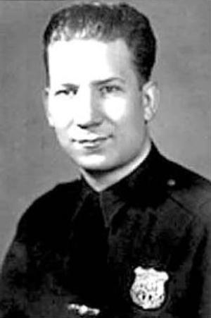
When DC Comics began adding full creator credits to all their stories in the fall of 1977, one of the letterers readers could now name was Milt Snapinn. What they didn’t know is that he’d been a DC employee for more than three decades already. His lettering on this story is competent and professional, with some variation to the letters that adds interest. The story title does the job, but is less accomplished.
 Milt Snapinn from a 1948 National/DC Comics staff photo, image © DC Comics
Milt Snapinn was born Milton Snapinsky on Nov 3, 1927 in Manhattan, New York to Russian emigrant parents. The family later moved to The Bronx. Milt’s art training is not known. In Nov 1945, he filled out a draft card giving his employer’s name as Detective Comics at 480 Lexington Avenue, Manhattan, another name used by DC, the year he started at the company. In his DC Profile, Milt said he intended to replace a stockroom worker for two weeks, but it became seven years. Milt served in the Army from 1946 to 1947, but otherwise spent his entire long career on staff at DC Comics. In March, 1949, he married Adele B. Schaffer in The Bronx. Some time in the early 1950s he changed his last name to Snapinn.
In 1952, Milt moved over to the DC production department for a while, then was asked to help prepare material for foreign publishers. Editorial director Irwin Donenfeld had found out that the film negatives used to make printing plates for all the comics were being melted down to recapture the silver in them. Irwin put a stop to it, demanding that all the negatives be sent to the DC offices, and Milt was soon put in charge of keeping them organized, filling requests for reprints, and later preparing them for foreign reprints by painting over the English lettering in the balloons with red opaque paint. That allowed other countries to add their own lettering in the empty balloons and captions, and if the film was needed for a reprint by DC, the opaque paint could be washed off. In time, this film library grew to a massive size, and Milt was busy enough that he had assistants. Until comics began going all digital and the old film was converted, which took years, the film library was an essential part of the company’s resources.
 From WESTERN COMICS #56, March 1956, image © DC Comics
At some point, like most DC employees, Milt wanted to do some kind of freelance work to supplement his staff pay, and he chose lettering. He began doing showcard lettering and sign painting as a side job, then was able to land freelance comics lettering work. The Grand Comics Database has lettering credits for him beginning in 1948, but after looking at many of those early credits, I think they’re by someone else. The earliest story I found that matches the style of Snapinn’s later credited lettering is above. The letter shapes, the balloon shapes, and the story title look right for Milt in my opinion. He might have used another style at first, I could be wrong, but I put his earliest DC lettering at 1955, published in 1956. Most of his credits from the 1950s are on titles edited by Julius Schwartz, and when I knew them starting in 1977, Julie and Milt were pals, and often played cards together at lunchtime, so that sounds right. In his profile, Milt said he also lettered newspaper strips The Phantom and Abbie & Slats, as well as filling in for Ira Schnapp on Superman and Batman. I don’t know when he did those.
 From WESTERN COMICS #60, Nov 1956, image © DC Comics
Another example from a few months later with similar story title, balloon, and lettering styles.
 From DETECTIVE COMICS #482, Feb 1979, this and following image © DC Comics
My favorite story lettered by Milt, for obvious reasons, is “Bat-Mite’s New York Adventure.” The page above is from my collection. Written by Bob Rozakis, art by Michael Golden and Bob Smith, lettering by Snapinn, color by Anthony Tollin, edited by Al Milgrom, and production work by me, we’re all in the story! It’s a classic that’s been reprinted and collected several times.
 From DETECTIVE COMICS #482, Feb 1979
This detail gives us a good look at Milt’s lettering, as well as Golden’s spot-on depictions of him and Anthony Tollin. As was common at DC, Milt used a round-tipped pen rather than a wedge-tipped one, and it looks to me like he did the slanted emphasized words by simply pressing a little harder with the same pen.
 From SECRET ORIGINS #19, Oct 1987, image © DC Comics
Here’s late lettering example from Milt, the lettering still looks about the same. Milt retired from DC some time in the early 1990s, when he was in his sixties, and he passed on March 31, 1999 in Mount Holly, NJ at the age of 71. While we worked together for ten years, I never knew Milt well, but I liked him, and found him friendly and sometimes funny. I liked his lettering, too.
 From THE ADVENTURES OF JERRY LEWIS #93, March-April 1966, image © DC Comics
It was rare for a letterer to receive credit in a DC Comic in the 1960s, but several have one like this for Stan Quill. This was the pen name of Stan Starkman, who had been working for Marvel and DC Comics since the early 1950s, and perhaps earlier. By 1966, there were several distinctive things about his lettering that make it easy to identify even when he wasn’t credited, which was most of the time: his titles are very angular, and his balloon shapes are too, having many angular loops that sometimes go well beyond the letters. Those letters are made with a wedge-tipped pen, and are wide and well-formed in the classic shapes used in comics.
 From Alter Ego #49, the only photo I’ve found of Stan Starkman
Stanley Keith Starkman was born on May 16, 1927, in the Bronx, New York. His father was a Polish emigrant, his mother was born in New York to Russian parents. The family lived in The Bronx at least into the 1940s. Stan served in the Navy from 1944 to 1946. Nothing is known about his art training. He found work as a letterer at Timely/Marvel and DC Comics possibly as early as 1948, but the Grand Comics Database has no credits for him at Marvel, only at DC. Stan is not in the famous Marvel Bullpen photo from about 1954, but perhaps he was out that day. Stan married Suzanne L. Blau in June, 1951 in Manhattan. By that time, Stan’s parents were living in Bellerose, Queens, NY, and Stan and his wife moved to a house next door to them, and raised their family there. In Alter Ego #134, (TwoMorrows, July 2015), Richard J. Arndt interviewed Marvel staff colorist Stan Goldberg, who said:
Socially we’d go out and do stuff together [in earlier years]. Stan [Lee] and his wife, Carl Burgos and his wife, Stan Starkman—he was a letterer who went to DC, and Herbie Cooper, another letterer who formed his own printing company. These were all guys from the old bullpens.
 From WESTERN COMICS #14, April 1950, image © DC Comics
One of the earliest lettering credits for Stan in the GCD is this story, which does have letter shapes made with a wedge-tipped pen that are similar to his later work. The balloons, while less angular, also have lots of large loops, so I think this could be his work.
 From CHALLENGERS OF THE UNKNOWN #11, Dec 1959 – Jan 1960, image © DC Comics
Many of Starkman’s lettering credits from the late 1950s on are for DC books edited by Jack Schiff. At the time, editors tended to have their favorites, and Stan must have been one of Jack’s, or perhaps a favorite of one of his associate editors, Murray Boltinoff or George Kashdan.
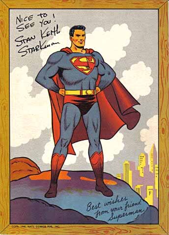 Superman postcard, image © DC Comics
Stan may have been working in the DC production department in 1964 when visiting fan and later comics pro Pat McGreal received a signed postcard from him, as described in THIS article. Or, possibly Starkman was simply finishing up some freelance work in the production room that day.
 From BATMAN #145, Feb 1962
This Batman story from the Jack Schiff era is lettered by Stan, his balloon shapes are not as angular as they would become in a year or two, but they do have large loops.
 From TEEN TITANS #8, March-April 1967, image © DC Comics
One of the latest examples of Starkman’s lettering I could find at DC, this one has balloons with large loops that are again not as angular as on his Stan Quill-credited stories, but the lettering matches his other work.
On the Digital Webbing website, Stan’s son Mark wrote:
After his lettering career ended, he worked in advertising typography for a time but his real passion was photography. His photos won numerous awards. He even started a company, PicTours, where he took a group of amateur photographers on a photo trip and gave a photo workshop (in a specially equipped van) on the way to the site.
Mark reported his parents had retired to Coconut Creek, FL around 2001. Stan passed on Jan 22, 2011 in Pompano Beach, FL at age 83.
 From ADVENTURE COMICS #454, Nov 1977, image © DC Comics
Like others in this article, Morris Waldinger’s lettering first became known to readers when DC Comics started adding full creator credits to all their stories in the fall of 1977. Like Joe Letterese, Morris worked in the DC production department, and I believe he started around 1953. His lettering followed the general style at DC, using round-tipped pens, but was more uneven than that of Letterese. In the 1950s, he was also an artist on dozens of full and half-page fillers used when not enough paid ads were sold. He may also have done art for a few longer stories at DC and elsewhere.
 Morris Waldinger in the DC Comics production department, 1959, photo by Raymond Perry
Morris M. Waldinger was born July 9, 1928 in Manhattan, NY to Polish emigrant parents. Later the family moved to Queens. In 1946, Morris graduated from the School of Industrial Art in Manhattan with a major in cartooning. Two of his classmates were Sy Barry and Alex Toth. Later in 1946, Morris filled out a draft card giving his employer as Centry Kiddie Togs, probably a clothing manufacturer. It’s unknown how and when he landed at DC Comics. When I started there in 1977, Mo (as his friends called him) sat in front of me, with his pal Joe Letterese in front of him. Joe and Mo often talked to and laughed with each other, but I found Morris not very interesting to converse with, as he didn’t seem interested in comics except as a way to make money.
 From MR. DISTRICT ATTORNEY #35, Sept-Oct 1953, image © DC Comics
This is the kind of filler that Morris is often credited with penciling and inking in the 1950s and early 1960s, often for editor Julius Schwartz, but also for others. I would call his art skills passable but unexciting. The lettering on this page is also credited to him, and it does seem similar to his later work. It’s possible Morris was doing this kind of thing on a freelance basis before taking the staff job.
 From SUPERMAN FAMILY #188, March 1978, image © DC Comics
Another story with a printed credit for Waldinger, this one has an interesting alien balloon style, and the lettering is generally good.
When the DC Implosion hit the company in 1978, some staffers were let go. Only one production staffer met that fate, and it was Morris. Sadly, the company had celebrated his 25th year on staff not long before that, putting his start date at 1953. I never knew what Morris did after that, and I never saw him again. I imagine he found other kinds of commercial art employment.
Morris passed on Jan 2, 2006 in Long Island City, Queens, NY. I haven’t found any other information about him, I don’t know if he was survived by family. I hope so. His comics career may have been unremarkable, but he did his best, as we all did.
I’ll continue this series with more letterers from the 1960s next.
The post More 1950s Letterers Part 2 appeared first on Todd's Blog.
November 15, 2023
Rereading: RED HORSE HILL by Stephen W. Meader

 Illustrated by Lee Townsend
Meader wrote a long list of novels for children, many with historical settings, but also books like this that are more about character and setting than history. This was his fourth book published in 1930.
Bud Martin is living alone by his wits on the streets of Boston. His father had been a driver of a team of draft horses before he died, and Bud still has friends at Bull’s Head Stable where his father worked, but when he gets in trouble with the owner, Bud and his dog Tug hide on a freight train and set out into the country to see if they can find the New Hampshire home his mother talked about before she died. They land in Riverdale, a town name he vaguely recalls, but find more trouble there when Tug gets in a fight with a wealthy man’s dog. A farmer, John Mason, witnessed the fight, and defends the boy and his dog, taking them home with him. Before long Bud learns he’s related to John’s wife Sarah, and soon he’s found a new home at their farm, where his eagerness to help with chores and love of the animals, especially their elderly mare Betsy, make him welcome. When Betsy has a foal colt with a brick red coat, Bud names him Cedar, and they grow up on the farm together.
Harness racing is the sport of this time and place, and Bud is soon drawn into that world as well, enjoying the annual races in town, with an idea that Cedar might someday be part of them. Meanwhile, he makes a local friend, and their explorations take them to the abandoned homestead where Bud’s family once lived. There they find an unkempt and starving boy hiding, and soon they’re involved in another side of life in the country, one of human cruelty and stolen horses. When Cedar is stolen, Bud is determined to catch the thief and get his horse back, but how can he do it?
An exciting story with lots of plot but also fine characters. Recommended.
Red Horse Hill by Stephen W Meader
The post Rereading: RED HORSE HILL by Stephen W. Meader appeared first on Todd's Blog.
November 14, 2023
More 1950s Letterers Part 1
 From THE AMAZING SPIDER-MAN #1, Jan 1963, image © Marvel
I’ve already written about some letterers who were busy in the 1950s, this two-part article will cover others who were not as well known. Once again, much of the research and many of the images in these articles are through the kind courtesy of Alex Jay, and found on his blog. Links in the letterer names will take you to his articles about them.
Readers of Marvel Comics in 1963 were beginning to find out who did the lettering on Marvel stories, thanks to printed credits campaigned for by Artie Simek, who was doing much of that lettering. But Marvel started crediting all their letterers, as on this famous story, and readers might have wondered, “Who is Johnny Dee?” It was a pen name used by Jon D’Agostino, who had been working in comics in a variety of roles since the late 1940s, including coloring, penciling, inking, and lettering. Perhaps he used the Dee pen name to fit in better with writer/editor Stanley Lieber’s pen name Stan Lee. His lettering for Marvel at this time was professional, but not flashy, much like that of Artie Simek, and he did a fine job.
 John D’Agostino from his high school yearbook, 1947
John P. “Jon” D’Agostino was born Carlo D’Agostino on June 13, 1929, in Cervinara, Italy. He and his older siblings and their mother arrived in New York City in 1931, where their father was already living in Brooklyn. Jon attended high school at the School of Industrial Art in Manhattan, along with many others who would enter the comics business. One of his classmates was future DC and Marvel artist John Romita. He graduated in 1947, and soon found work as a colorist at Timely/Marvel comics. In a 2011 interview, Marvel/Archie artist and colorist Stan Goldberg remembered:
I found out there was an opening in the coloring department at Timely Comics, so I went up there. They needed another body to be in the room that handled the coloring, and that’s where I worked…The man who was in charge of the coloring department is still a dear friend of mine, Jon D’Agostino.
It’s unclear if D’Agostino survived the 1949 staff purge at Timely by publisher Martin Goodman, but I suspect he didn’t, as a year or two later, Stan Goldberg had become the main colorist at Marvel. Jon was freelancing as an artist for various comics publishers by 1951, and by 1950, he had become friends with Pat Masulli, who worked at Charlton Comics as a colorist, and would be their executive editor by 1955. D’Agostino worked as an artist and letterer for Charlton starting in the early 1950s.
 From ROMANTIC STORY #33, Aug 1956, Charlton
There are many early 1950s stories credited to D’Agostino as a letterer, but I see several different styles in those examples, so I’m not sure about them. Above is the earliest story with lettering I think is probably by Jon. It’s professional and lively, with wide letters. There aren’t many distinguishing style points other than that. The letters lean just slightly to the left, the G is round with a central serif that usually extends both inside and outside the curve. The S has a wide central stroke that descends left to right, and is usually closer to the top curve than the bottom. The J has a serif , and the Y is wide and tends to lean more to the left than the other letters, but there’s quite a bit of variation in all the lettering.
 From RACKET SQUAD IN ACTION #29, March 1958, Charlton
This example is similar in many ways, but made with a wedge-tipped pen, and the W now also leans more to the left. Is it also by D’Agostino? I think so, but I’m not positive. The same is true of many stories with lettering credited to him at Charlton from 1958 to 1961 or so. Thankfully, I can now move on to credited work.
D’Agostino’s first marriage was to Jean D’Onofrio in 1955. She passed away in 1992. D’Agostino married Vivi Testa in 1995. Interestingly, Jon shared a studio with Dick Giordano in 1965, Dick was then the executive editor at Charlton.
 From TALES TO ASTONISH #38, Dec 1962, image © Marvel
Here’s a page from the earliest story with a Johnny Dee lettering credit, an Ant-Man adventure. The lettering is made with a wedge-tipped pen, and is a little smaller than the Charlton examples, but that may have been necessary to fit it all in. The S shapes are similar to earlier examples, the J has a serif, and the Y still seems to lean to the left, though the W does not. It’s fine lettering work.
 From TWO-GUN KID #61, Jan 1963, image © Marvel
Panels from another Johnny Dee story published the same month as THE AMAZING SPIDER-MAN #1. The style is about the same with one change. The exclamation points after bold, emphasized words have a triangular top, ones after regular lettering are single strokes.
 From CAPTAIN ATOM #82, Sept 1966, Charlton, image © DC Comics
Jon was still doing lots of work for Charlton, and they may have been influenced by Marvel to add credits to at least some of their stories, as here. D’Agostino’s lettering is much the same as on the previous example, and it’s interesting to see that his story title is similar to what Artie Simek was doing at Marvel.
 From ARCHIE’S MADHOUSE #58, Dec 1967, image © Archie Comics
In 1965, according to Archie Comics, D’Agostino was hired away from Marvel to become one of their busiest inkers and letterers, and he worked at Archie for the rest of his career. For a long time his work was again often not credited, this page looks like his lettering to me. The S and G are similar to what he did at Marvel, the Y continues to be wide and lean a bit to the left, and exclamation points are now all triangular at the top.
 From ARCHIE’S PALS ‘N’ GALS #193, Nov 1987, image © Archie Comics
It took a while, but by the 1980s, Archie was finally giving full creator credits on their stories. D’Agostino is credited with inking and lettering here. His lettering seems a bit rounder to me, and the exclamation points have reverted to single strokes, but otherwise it’s much the same.
 From JUGHEAD #30, Feb 1992, image © Archie Comics
Another story with credited inks and lettering by D’Agostino is above. The lettering has gotten larger again, and a bit looser, reminding me of the work he was doing in the 1950s. I think after this he often worked on covers rather than stories.
 Jon D’Agostino, image found online
Jon continued to work for Archie until his death on Nov 28 (or 29), 2010. In a memorial article, Archie said:
In June 1965, Jon was hired away from the competition to join Archie Comics, where he was affectionately known as “Dag.” He continued here for over 40 years. Jon will be missed at the Archie Comics offices. Jon D’Agostino’s last interior work will be published in December 2010 in JUGHEAD DOUBLE DIGEST #166, as part of the four-part “Cyrano Jones” story. Jon’s work on covers will continue to be seen throughout 2011.
 From X-MEN #50, Nov 1968, image © Marvel
One of the letterers at Marvel in the 1950s was Herb Cooper, but I have no identified work by him from that time. In 1968, Herb returned to lettering at Marvel, where his name is on this landmark Steranko story in X-Men. The balloon lettering is done with a wedge-tipped pen like Sam Rosen, but his letters are narrower, more like Joe Rosen. It looks fine here, the larger lettering is well done.
 Detail from a Marvel Bullpen photo dated around 1954: Joe Letterese, Morrie Kuramoto, Danny Crespi, Herb Cooper, and Artie Simek, from F.O.O.M. no. 17, 1977, image © Marvel
Herbert Arthur “Herb” Cooper was born on February 16, 1927 in either Manhattan or Brookyn, NY to Russian emigrant parents. Herb attended the Mannes School of Music in New York, and also studied lettering and calligraphy. He served in the Army from 1945 to 1946. He married Marilyn Rapport in 1951. Herb probably joined the Marvel Bullpen lettering staff around that time. In an interview in Alter Ego #134 (July 2015, TwoMorrows), Marvel staffer Stan Goldberg said Cooper left (or perhaps was laid off in the 1954 staff purge) and formed his own printing company. An obituary said he had been a self-employed calligrapher for 40 years.
 From CAPTAIN MARVEL #8, Dec 1968, image © Marvel
Another title page with larger credits for everyone, including Herb. The style is one I would have a hard time picking out if it wasn’t credited.
 From SGT. FURY #110, May 1973, image © Marvel
Cooper’s return to story lettering at Marvel lasted about five years, this is from close to the end of that time. Here his balloon lettering is a bit wider and closer to that of Sam Rosen, while his story title reminds me of ones by Joe Rosen. The bolder and slanted first letters on each name in the credits is interesting.
Herb passed April 23, 1991 at his home in Fords, New Jersey at age 64. His obituary said was an actor with the East Brunswick Community Theater, where he played many leading roles, and he also acted in off-Broadway productions. He was survived by his wife Marilyn and three daughters.
 From ALL-NEW COMICS #5, Oct 1943, Harvey Comics
Here’s a story credited to Martin Epp from 1943, when he was seventeen. He did pencils and inks and probably also the lettering, according to the Grand Comics Database. Perhaps I should have included him in my articles on 1930s-1940s letterers, but Marty was mostly an inker in the 1940s, and he didn’t do a lot of that. The lettering here is made with a wedge-tipped pen, and is a bit uneven, but certainly works fine.
 Marty Epp, George Seifringer, Bob Powell, and Howard Nostrand, 1951 from the book Four Color Fear: Forgotten Horror Comics of the 1950s by Greg Sadowski & John Benson
Martin Henry Epp, Jr. was born July 10, 1926 in New Hyde Park, New York. It’s not known how he came to work for Harvey Comics, but after high school, he joined the Army Air Corps and served in the Pacific Theater as a crew chief. By 1949, he was back in New York attending Pratt Institute, and on June 8, 1950, he married Pratt student Greta Helbig, and they lived in Huntington, NY. Marty’s occupation was listed as commercial artist. By 1951, he was working as an assistant to artist Bob Powell.
 From THE ADVENTURES OF ROBIN HOOD #6, June 1957, Magazine Enterprises
Among the stories credited to Epp as a letterer on the Grand Comics Database is this one with art by Bob Powell. The Old English story title here is beautifully done, and I like the rest of the lettering as well.
 From GUNSMOKE WESTERN #76, May 1963, image © Marvel
By 1963, Epp was lettering for Marvel, and benefitting from the new policy of crediting letterers. I like the serif story title and all the lettering on this page.
 From STRANGE TALES #109, June 1963, image © Marvel
Marty lettered this superhero story, where the title letters have interesting overlaps. He also did inking and lettering for Archie comics in the 1960s, and then seems to have moved on to other kinds of commercial art, including set design. He passed July 30, 2000 in his home in Cooperstown, NY. His wife had died in 1998. He was survived by siblings, a son, and grandchildren. My favorite line in the obituary found by Alex Jay is: Above all else, Marty enjoyed being the life of the party.
 From THE AMAZING SPIDER-MAN ANNUAL #6, Nov 1969, image © Marvel
Another veteran letterer benefitted from the Marvel credit policy, Ray Holloway. His work on this story is professional and appealing, with a fine title, well-made balloon shapes, and lettering I might have guessed was by Sam Rosen if his name wasn’t on it.
 Ray Holloway, third from left playing cards on a drawing board with other creators, Artie Simek at lower right, 1948, from Tom Brevoort’s website
Raymond Alphonso “Ray” Holloway was born on June 8, 1920, in Columbus, Ohio. Ray enlisted in the National Guard in 1941, and in 1942 he married Gladys Mitchell in Manhattan, NY. They were divorced in 1944. In 1948, Ray married Thelma Equiller DeWitt in New York, where he had found work as a letterer at Timely/Marvel comics. In the 1950 census, he and his wife and three children were living in Manhattan, and his occupation is listed as letterer.
 Ray Holloway, center, from 1954 Marvel Bullpen photo, image © Marvel
If Ray was laid off in the 1949 staff purge at Timely, he must have soon been called back, as he appeared in this staff photo. Probably he was laid off again in either the 1954 staff purge, or the one in 1957, but Ray did come back to work at Marvel as a letterer in the 1960s, and was probably freelancing for Marvel again a few years before that.
 From STRANGE TALES #17, April 1953, image © Marvel
One of the stories crediting Ray as letterer on the Grand Comics Database, this is pretty generic work done with a wedge-tipped pen, but it certainly could be by him.
 From JOURNEY INTO MYSTERY #93, June 1963, image © Marvel, original art courtesy of Heritage Auctions
Once he had the chance to letter his own name on the stories, there’s no doubt about Ray’s work, as on this page. His character logo and story title are quite different from those of Artie Simek and Sam Rosen, but his balloon lettering is close to that of Rosen.
 From JOURNEY INTO MYSTERY #93, June 1963, image © Marvel
A closer look shows the somewhat irregular shapes of the open letters and the very consistent and well-made balloon lettering, with perfect verticals and horizontals, and even curves on the round letters.
 From THE DEFENDERS #31, Jan 1976, image © Marvel Comics
Holloway continued to get work at Marvel through the 1970s, though not as much as some of the other Marvel regulars. His work remained consistent and appealing.
 From STRANGE ADVENTURES #214, Sept-Oct 1968, image © DC Comics
Ray also lettered for DC Comics in the 1960s and early 1970s according to the Grand Comics Database, including this first full-length story about Deadman.
 From SPIDEY SUPER STORIES #50, Jan 1981
In 1975, Ray became the regular letterer on SPIDEY SUPER STORIES after the death of Artie Simek, who had been doing most of it, an assignment he kept until 1982. Holloway passed away on May 21, 1989 in Jamaica, Queens. Like many comics creators, he found work and friends in an industry that valued his talent above anything else.
 From CAPTAIN MARVEL #24, Jan 1973, image © Marvel
Another letterer whose work I know mainly from credited stories at Marvel is Charlotte Jetter, though her career goes back well before that. On this example, her display lettering in the titles and balloons is nicely done, using rough lines rather than ruled ones to add interest, and probably to save time.
 Charlotte and Al Jetter, 1952, from Alter Ego #107, (TwoMorrows, February 2012)
Charlotte Haecker Jetter was born November 20, 1914, in Stuttgart, Germany. She came to New York in 1925 with her mother to join family. Some time after that she met Albert S. Jetter, born January 7, 1913, in New York. Their art training and the date of their marriage isn’t known, but by the 1940 census they were living in Flushing, Queens, and both are listed as commercial artists. Al found work at Fawcett some time in the early 1940s as an artist and letterer, and he taught Charlotte to letter as well. Both worked at Fawcett for a number of years. Al became an editor there.
 From MASTER COMICS #114, April 1950, Fawcett, original art courtesy of Heritage Auctions
Above are two panels from a Nyoka the Jungle Girl story with art credited to Al Jetter, and lettering by either Al or Charlotte. Note the color indications in blue, usually done on a copy of the art, not the original.
 From EH! #4, June 1954, Charlton
Charlotte is also credited as letterer at other publishers including Charlton, example above. The lettering here is narrower than in the previous panels, but otherwise similar.
 From GREEN LANTERN #58, Jan 1968, image © DC Comics
I also find this lettering credited to Charlotte in the Grand Comics Database to be similar to the previous examples, though it’s lettered with a wedge-tipped pen. She’s credited as letterer on quite a few DC stories in the later 1960s.
 From GUNHAWKS #7, Oct 1973, image © Marvel, original art courtesy of Heritage Auctions
When Charlotte was finally listed in the credits at Marvel, readers like myself were able to put a name to her work, as with all the Marvel letterers of the time.
 From GUNHAWKS #7, Oct 1973, image © Marvel
In this closer look, the regular letters are made with a wedge-tipped pen, while the emphasized ones are made with a round-tipped one, and a thicker round-tipped point is used on the title. There are several revisions probably by a Marvel production artist.
 Charlotte Jetter from the Mighty Marvel Comic Convention Program Book, 1975
Charlotte in a picture she must have submitted for this convention book, looking happy in a kayak.
 From POWER MAN #36, Oct 1976, image © Marvel
Charlotte’s comics lettering work seems to have ended some time in the late 1970s, this is the last credited example I see for her at Marvel. She and Al may have continued to do other kinds of commercial art. Charlotte passed on September 2, 1990, and Al on March 5, 1997, both in New York.
 From FLINTSTONE KIDS #2, Oct 1987, image © Hanna-Barbera and Marvel
Another husband and wife team in comics were artist Warren Kremer and his wife Grace, who lettered most of Warren’s stories for Ace, Harvey, and Marvel. Grace was already a letterer when they met at Ace, and her style is clear, professional, and has a friendly roundness, as seen above, perfect for the stories Warren often illustrated aimed at young readers.
 Grace Callori, 1941, from her high school yearbook
Grace Callori Kremer was born on March 16, 1924, in Jersey City, New Jersey. She was on the art staff of the school yearbook, The Scroll, and contributed unsigned drawings. At some point after graduating in 1941, she found work in New York City at comics publisher Ace Magazines, where she became a letterer.
 From HAP HAZARD #23, Dec 1948, Ace
Also working at Ace was artist Warren Kremer, born June 26, 1921 in The Bronx, New York. They dated, and worked together on at least one Ace title, HAP HAZARD, above. The lettering on this example is very similar to the earlier one from 1987, suggesting Grace’s style was already set by then. Grace and Warren married in Oct 1947, and were living in Harrison, NJ by 1948.
 From RICHIE RICH AND CASPER #1, Aug 1974, Harvey Comics
In 1948, Warren and Grace began working for other publishers, including Harvey Comics, which soon became their main employer until the company closed in 1982. At first Warren was drawing all kinds of features, from war and horror to humor, but he eventually settled on Harvey’s cartoon character line, which became their main focus in the 1960s. He drew stories about Casper the Friendly Ghost, Wendy the Good Little Witch, Richie Rich, and many others, and Grace was there with him as his letterer. Meanwhile, they had four children, two boys and two girls, and raised them in New Jersey.
 From PLANET TERRY #3, June 1985, image © Marvel
After Harvey stopped publishing comics in 1982, Warren and Grace moved to Marvel, where they worked on similar books for young readers. Here, at last, they were both given printed credits for the first time. I particularly like Grace’s scroll caption on this page.
 From COUNT DUCKULA #7, Nov 1989, image © Marvel
There’s lots of fine lettering on this page, including song lyrics and open titles, but the best thing is the crunched credit for Tom DeFalco.
Warren had a stroke in 1989, leaving him unable to draw. Grace continued lettering at Marvel for about another year, and then also stopped. The team had done fine work for over 40 years, and perhaps it was time to retire. Warren passed on July 24, 2003, and Grace followed on Aug 5, 2012, at the age of 88, survived by children and grandchildren. Their work was enjoyed by generations of children.
More 1950s letterers in Part 2!
The post More 1950s Letterers Part 1 appeared first on Todd's Blog.
November 12, 2023
Rereading: OCTAGON MAGIC by Andre Norton

While best remembered for her science fiction novels for young readers, Andre Norton wrote all kinds of books, including fantasies like this one. The octagonal house featured was a popular if unusual style in the nineteenth century, and it seems likely Norton based hers on a real one.
Lorrie Mallard’s parents are dead, and the grandmother she loves and has been living with had to go to England to help another family member, so Lorrie has been parked with an aunt she doesn’t like so well and sent to a school where the other children make fun of her and tease her. Her walk to school takes her past an intriguing octagonal house, and Lorrie meets the inhabitants one day after rescuing their black kitten, Sabina. The cook and housekeeper, Hallie welcomes her, and takes her to meet the house’s elderly owner and other inhabitant, Miss Ashmeade, who seems to have sprung from a past century, like her house. Miss Ashmeade is unable to walk well, and keeps busy doing needlework, which she soon begins teaching Lorrie. She sends gracious notes home to Lorrie’s aunt, who then allows her to visit regularly. While in Octagon House, Lorrie has magical adventures sparked by a dollhouse replica of the place and a rocking horse that sends her back in time to meet some of the past inhabitants, and take part in their troubles and trials, which often involve helping the poor and unfortunate find safety. Back with her aunt, Lorrie learns a new highway is planned that will require the destruction of Octagon House. What can she possibly do to stop it?
I liked this book when I first read it as a teenager. I still do, though now the plot seems more predictable. Still a good read and recommended.
The post Rereading: OCTAGON MAGIC by Andre Norton appeared first on Todd's Blog.
November 10, 2023
Rereading: THE GHOST OF FOLLONSBEE’S FOLLY by Florence Hightower

Florence Hightower’s novels for children are all mysteries of one sort or another, and this is a good one. It has some elements and character descriptions that might be considered politically incorrect today, but for 1958 it was progressive and sensitive. There is one very large coincidence in the plot, but it doesn’t harm the story.
Mr. Stackpole always wanted to live in the country, and he’s moved his reluctant family to an old, run-down rural New England home to fulfill that desire. Mrs. Stackpole is always supportive, his children Tom, Elsie, and the infant twins Richard and Paul, are less enthused, and their African-American cook Angela Gittens is already thinking of quitting. The house, nicknamed Follonsbee’s Folly after the original owner, needs lots of work, more and more as they look further into it, but Mr. Stackpole remains optomistic, even though his funds are shrinking. For Tom, the best part is the large yard and the woods beyond it running along a river. Tom finds a rowboat that seems in good enough shape to use, but also finds someone camping there who feels the boat belongs to him. Joe is a drifter who’s settled for the summer in this previously abandoned section of woods, and he’s been restoring the boat. Joe and Tom become friends, and finish the boat together, thereafter using it to explore the river.
Meanwhile, strange noises are being heard at the house, and Angela and Elsie are sure it’s haunted. Elsie begins investigating, and turns up surprising information about the Follonsbee family that makes her think there’s more to the house than they’ve yet found. Meanwhile, the conniving real estate agent who sold them the house has plans for a large housing development right next to them that will destroy the woods Tom and Joe are in love with. When a massive rainstorm hits and the river begins to flood, everyone is in danger, and secrets are revealed.
An exciting read and a fine mystery. Recommended.
The Ghost of Follonsbees Folly by Florence Hightower
The post Rereading: THE GHOST OF FOLLONSBEE’S FOLLY by Florence Hightower appeared first on Todd's Blog.
November 9, 2023
KEN BRUZENAK – Letterer
 From AMERICAN FLAGG! #1, Oct 1983, image © Howard Chaykin Inc., this and all original art images courtesy of Heritage Auctions
When the first issue of Howard Chaykin’s AMERICAN FLAGG! was published in 1983, readers were startled and impressed by the amount and variety of lettering from newcomer Ken Bruzenak. Lettering professionals like myself were even more impressed! Ken was a newcomer to comics lettering, but not a newcomer to the world of comics.
 Ken Bruzenak, 2020, © Kristie Bruzenak
Kenneth Steven Bruzenak was born August 30, 1952 and grew up in Finleyville, Pennsylvania. Some of his favorite comics creators were Jim Steranko, Joe Kubert, Al Williamson, Wally Wood and Jack Kirby. He loved pulp heroes like The Shadow and Doc Savage, which were appearing in paperback series in the 1960s. That brought him to Edgar Rice Burroughs’ Tarzan and Robert E. Howard’s Conan. In 1971, he went to a Detroit Triple Fanfair and met Steranko for the first time, briefly. In an excellent interview with Jon B. Cooke published in Comic Book Artist #8 (May 2000, TwoMorrows), Ken remembered:
A couple of months later, there was a Seuling con in New York. I went there, and Steranko was running a seminar on how to write and draw comic books. He ran it three evenings, from 8 PM until 2 in the morning. I still have the folder he prepared. It cost $200. There were eight of us that took this class in a hotel room. We started talking. We talked on the phone a few more times, afterward. He’d just bought a three-story row home in Reading, Pennsylvania, and he was starting up SUPERGRAPHICS. He said he was putting the final touches on The History of Comics Volume Two at that point, and had this big building that needed renovation. I kind of promoted myself as being able to do painting, fixing up the house, work like that.
 From THE STERANKO HISTORY OF COMICS VOLUME 2, 1972, © Jim Steranko
Steranko hired Bruzenak first as a handyman, but he was soon doing print production work too, including paste-ups on The Steranko History of Comics Volume 2 (1972, Supergraphics). From 1974 on he was the main Supergraphics production man, and also did writing and editing on Steranko’s news and features magazines Comixscene/Mediascene and Prevue. Ken worked as Steranko’s assistant until 1984, he describes it as an Old World apprenticeship. But Ken was hoping Steranko would teach him how to draw comics, and there never seemed to be time for that.
 From OUTLAND, Heavy Metal Volume 5 #4, July 1981, image © Jim Steranko
In 1980, Ken lettered Steranko’s OUTLAND, serialized in Heavy Metal in 1981, and published in Europe as a graphic album, but not in America. Ken also inked signs and backgrounds on OUTLAND and Steranko’s CHANDLER, which was lettered with type. Ken told me he patterned this lettering after Alex Raymond’s Flash Gordon.
 From WARP #4, June 1983, First Comics
After OUTLAND, while continuing to work for Steranko, Ken began looking for other work as a letterer. Artist Dan Adkins had become a friend, and took him to DC and Marvel. No work was offered, but Marvel editor Mary Jo Duffy gave Bruzenak a good tip. She knew Howard Chaykin was looking for a letterer on a new book he was planning for First Comics. Ken went to see Chaykin at his New York studio, Upstart Associates. In the 2000 interview, Bruzenak said:
Howard and I had been circling each other for years, like a couple of alley cats. Howard’s story is he was in the Neal Adams “Jets” gang, and I was in the Steranko “Sharks” gang. We knew each other, but were not friendly. Howard looked at my samples, and he knew, working for Steranko, I had solid training. Chaykin took a chance that our differences would mesh, rather than conflict, but he wasn’t ready to start on AMERICAN FLAGG! just yet. He made a phone call to First Comics and recommended me. I started working on the Frank Brunner book WARP at First Comics.
Ken’s initial issue of WARP WAS #4. He also lettered issues of E-MAN at First, and later JON SABLE, FREELANCE. At the time, Ken said he was a fan of John Costanza’s lettering, and in the sample above, his letters are more rounded like John’s. Ken said:
When I started lettering comics, it was like, “Wow! I’m getting paid so much more money, and it’s so easy! I’m not having to sit up five days straight to meet a press date!” And I did! You know, [for Steranko] when press time was upon us, we were doing 24, 36, 48-hour days regularly. Stay up 48 hours, sleep six,stay up another 36…that was “normal.”
 From AMERICAN FLAGG! #1, Oct 1983, First Comics, this and all FLAGG! images © Howard Chaykin Inc.
When FLAGG! arrived a few months later, readers and professionals alike were impressed not only by the complex, layered storytelling, but by Bruzenak’s wide variety of lettering for balloons and signs. Ken said in the interview:
WARP got what it needed, but FLAGG! needed more. When Howard started asking for signage—to me, a sign is a formal typeface, a sign is not just hand-lettering that says “Exit” or something, and Howard asked for a ton of signs. Honestly, Howard overwrote the first six issues, and he was surprised at how much he wrote. I was obliterating so much artwork, it was crazy. The first three issues I probably knocked out half of what Howard drew. [laughs] He’s not stupid. He saw that I was giving him exactly what he wanted. When he asked for a sign in the background, for it to be legible, I had to take a certain amount of space, and if there was a balloon with that, and then there was the figure work on top of that…Howard saw that what he was asking for led to this, and subsequently, he didn’t need to put as much drawing in the panel, so he started doing less and less penciling on the page before I got it. We were working on that goofy DuoTone board which had to be lettered with felt tip pens. Ink would take on it, but Howard had a particular kind of felt tip pen he was using, and I got a batch of them, and was sanding them on emery board to get a point I could letter with! Technically, I was playing with tools I’d never handled before, and then I started doing all this signage. I remember around #4 or 5, he said, “We’re going to have TV screens all over the place, and I need signs.” Then he got sick. So, his part of the job came to a stop for a week, and in that week, I did 40 or 50 signs, TV screen-type things, “Inter-Species Romance,” and “Plexus Rangers.” I sent that to him as a package when he was sick, and he called me up and said, “Holy sh*t!” [laughter] “Okay!” That’s when we really started going crazy doing signage and typefaces. Setting type, having robot type, mixing formal type with balloon type for special effects, using typography as an artistic element on the page. Howard was encouraging all the way, “Go for it, try it.” When I decided to use the formal type—this was before personal computers—I had to have the local newspaper set galley type, which is really a science you know? You count characters, and spaces, and you send it out, and it comes back three days later, and it fits or it doesn’t. If it doesn’t fit, you’re there with a razor blade slicing it up, trying to make it fit. All of a sudden, I’m handing Howard $600 bills for type! He kept saying, “Go for it!”
 From AMERICAN FLAGG! #4, Jan 1984, First Comics
Ken’s hand lettering is equally impressive on the book, with this Old English style a good example. The DuoTone art board had preprinted but invisible tone patterns that were made visible with brushed on liquid chemicals, a darker and lighter tone activated by different chemicals.

 From AMERICAN FLAGG! #5, May 1984, First Comics
Bruzenak’s balloon shapes were equally creative, using an outline with dots and dashes to represent broadcast voices, and in and out zig-zags for song lyrics on this page. Both styles were soon being imitated by other letterers, including myself.
 From AMERICAN FLAGG! #5, May 1984, First Comics
In this example, some of the lettering shapes shift to Cyrillic versions to show the characters are being spied on by Russians, a clever idea and fine result.

 From AMERICAN FLAGG! #10, July 1984, First Comics
In issue #10, Bruzenak’s sound effects are not only important and uniquely styled, but as written by Chaykin, also funny (Papa-Oom-Mow-Mow was the refrain of several early 1960s doo-wop songs). On these original art scans, Ken’s marker lettering looks a bit faded, it was probably darker when he did it.

 From DOC STEARN…MR. MONSTER #1, Jan 1985, Eclipse Comics, images © Michael T. Gilbert
Another long working partnership with writer/artist Michael T. Gilbert began in 1984. In the Cooke interview, Ken said:
Michael called me. He’d seen FLAGG! and he gave me a call, because he wanted wild and wacky stuff. So we did some! It was fun. Funny material was something Chaykin didn’t do a lot of, though when Howard had the cat in AMERICAN FLAGG!, I loved those pages! Michael is like wall-to-wall humor. Even when he’s blowing a werewolf’s brains out with a .45, it’s funny! I knew that for a horror comic, it was going to be all this drippy, gothic, Old English stuff. I didn’t reference comics. I have tons of type books.

 From DOC STEARN…MR. MONSTER #1 Jan 1985, Eclipse Comics, images © Michael T. Gilbert
I think Gilbert’s looser style allowed Ken to explore a wide range of more organic display lettering and balloon styles. His calligraphic captions on this page are excellent, and his work adds to the mix of over-the-top humor and horror. Though sporadic, Ken and Michael continued to produce Mr. Monster comics for many years.
 From THE INCREDIBLE HULK #302, Dec 1984, image © Marvel
 From STAR WARS #91, Jan 1985, image © Marvel
Once FLAGG! was out, the comics world took notice, and Ken was suddenly in demand. He accepted work from Marvel on a variety of titles like THE INCREDIBLE HULK, STAR WARS, and later SILVER SURFER. In 2000, Ken said:
I was the first celebrity letterer. I didn’t realize how big I was until I talked to Tom Orzechowski, when I went out to California. Orzechowski told me he was getting instructions from Chris Claremont to “do things like Bruzenak does.” I feel so bad about that, because Tom does stuff that I envy. The celebrity lasted about three years. Whenever somebody started up a new book, they wanted me. It was nice! Now I’m hustling to get any work at all.
 From THE SHADOW #3, July 1986, DC Comics, image © Condé Nast
 From BLACKHAWK#2, April 1988, image © DC Comics
Ken continued to work with Howard Chaykin often, as on these two projects for DC, which are full of creative sound effects and fine balloon lettering. More would follow. He also worked on other titles for DC and Marvel as well as for Dark Horse, Malibu, Tekno, and Image.
 From AZRAEL: AGENT OF THE BAT #58, Nov 1999
As mainstream comics turned to digital lettering more and more, Ken had fewer clients for his hand lettering, which is what he much prefers to do. Of digital lettering, Ken said:
It’s more about technology than art. It’s becoming erratic in quality, without real personality or individuality. It’s just typing, but that is the way things are going to be.

 Ken Bruzenak logo designs for DC, 1980s, images © DC Comics
When I asked Ken about his favorite logo designs, he said, “Mostly the ones not picked. Chaykin’s logos work the best.” The Shadow logo above is one not picked, a different version was on the book. Bruzenak’s logo for DC’s THE QUESTION cleverly incorporates a question mark inside the Q which also suggests a magnifying glass, and his WONDER WOMAN logo incorporates the revised chest emblem designed by Milton Glaser’s studio without allowing it to overpower the character name. Ken did logos for DC and other publishers in the 1980s and later.
Perhaps Ken’s best work has been with Howard Chaykin. When asked about his favorites, Ken told me:
AMERICAN FLAGG!, BLACKHAWK, and THE SHADOW were peaks for creativity. Those were special in terms of ideas and concepts. I think SATELLITE SAM was a good job, and DIVIDED STATES OF HYSTERIA. Everybody remembers me for FLAGG!, but few want me to apply such a heavy-handed approach, or leave room for it on the page. I keep finding ways to hold my interest, interacting with the art as much as possible. I love the comics form.
The post KEN BRUZENAK – Letterer appeared first on Todd's Blog.
November 8, 2023
Rereading: FREDDY’S COUSIN WEEDLY

With this seventh title in the Freddy the Pig series by Walter R. Brooks, the titles settled into the final pattern of always beginning with the word Freddy, and he and his best friend Jinx the Cat are usually front and center in each adventure.
When Freddy and Jinx visit Freddy’s cousin Ernest at a nearby farm, they meet his son, young Weedly, who is very shy and timid, but Weedly and Jinx take a shine to each other, and Jinx agrees to take the young pig back to the Bean Farm, where they live, vowing to strengthen his character. Continuing from the previous book, Freddy the Politician, the Beans are away in Europe, and the animals have taken on all the farm work themselves, but suddenly a new problem arises. Mr. Bean’s Aunt Effie and her husband have arrived for a visit. Not discouraged by the closed up house, they’ve found a way in and are planning to stay for a while. Effie has a quest, she wants to find the silver teapot given to Mr. Bean by a deceased relative they share, which Effie believes should be rightfully hers. She won’t go home until she’s found it. Further, she and her husband don’t believe the stories they’ve heard about the farm’s capable talking animals, or that they even talk, and decide to take up running the farm themselves.
Meanwhile, Jinx has a plan to help Weedly gain some courage. He goes around to all his animal friends on the farm to tell them about it, and later, when Weedly is introduced around, everyone seems quite afraid of him. That does perk up the young pig, but perhaps too much!
Great fun. This in one of the few Freddy books I could never find, and I only read it when it was republished in 2002 by the Overlook Press, who produced beautiful hardcover facsimiles of the series. All the Freddy books can be read separately, but this one continues right on from the previous book in many ways. Recommended.
Freddy’s Cousin Weedly by Walter R Brooks
The post Rereading: FREDDY’S COUSIN WEEDLY appeared first on Todd's Blog.
November 7, 2023
More 1930s-1940s Letterers Part 2
 From KRAZY KOMICS #6, March 1943, lettering by Gary Keller, image © Marvel
Continuing with more little-known letterers from the early years of comics, and this article would not be possible without the research and information provided by Alex Jay on his blog. Thanks, Alex! Click the linked letterer names to find out more about them there. This page lettered by Gary Keller is full of interesting styles and sound effects. There are shaky letters and balloon shapes from a character suffering from the cold weather in the first two panels, a variety of open letters and sound effects in the second row, an arrow caption in the third, and a thought balloon in the last panel with both bubble tail and shape, and a dotted line.
 Gary Keller, Aug 1942, from a Timely Comics staff photo
Gerrett “Gary” Keller was born on July 30 or 31, 1903, in Rockaway Beach, New York. By 1915, Gary and his parents had moved to New Jersey, living in West Hoboken and then North Bergen. On April 30, 1923 Keller and Lillian Schutz obtained a marriage license in Brooklyn, New York. In the 1920s, Gary worked as a chauffer, and his son and daughter were born. By 1930, Gary was working as a sign painter in Union City, NJ, and he and his wife divorced soon after. In 1940, Keller married Helen Gandenberger. Soon after that, he landed a staff job at Timely/Marvel, and by 1942 he was living in Forest Hills, NY. Several Timely staffers were interviewed for issues of Alter Ego (TwoMorrows), details are on Alex Jay’s blog, here’s what they remembered about Keller. Vince Fago said he was a production assistant and letterer. Dave Gantz said he was like a traffic manager for the lettering department. Bob Deschamps was a neighbor of Keller, and Gary helped him get a job at Timely as an office boy soon after World War Two. Allen Bellman remembered him as a manager of some sort. Al Jaffee remembered Gary as the head of the lettering department, and said:
Gary was substantially older than most of us. He and his wife were really survivors of the Depression, and he was a talented guy. If anything, he should have been a mechanical engineer. I saw some of his mechanical engineering, and he was brilliant. But fate throws us into strange occupations during hard times. Gary told me that he had been a traveler. He’d go from town to town, go into a diner, and for a meal, he’d do their showcase lettering. he was an excellent showcase letterer, which was a specialty in those days, but probably unheard-of now with the advent of computers. So he’d get a free meal by doing this work. He rode the rails and came back and married a woman named Helen. Towards the end of the war, they bought a house, which he fixed up a great deal.
 From KRAZY KOMICS #6, March 1943, image © Marvel
There are few lettering credits from any comics in the 1940s, but Timely/Marvel occasionally listed one or more letterers on the inside front cover of an issue, as seen here, the only printed credit I’ve found for Gary Keller. David Gantz is credited with “Special Effects,” which might be coloring in this case, though that term was also used for letterers. I feel any page from this issue is probably lettered by Gary, since he’s credited so clearly.
 From KRAZY KOMICS #6, March 1943, image © Marvel
Here’s part of another page with some charming music. Keller’s letters are all italic with a heavier line for emphasis. The lettering is competent here, but pretty bland. There must be many more examples of his work at Timely from this era, but none I can positively identify.
Gary was probably laid off in the Timely staff purge of late 1949. In the early 1950s he moved to the Woodstock, NY area, where he again found work as a sign painter. Keller passed on February 14, 1988.
 From AMAZING MYSTERY FUNNIES Vol 2 #2, Feb 1939
In the earliest comics, at least on stories that weren’t reprinted comic strips, it’s pretty safe to assume that the artist did their own lettering, but it’s hard to be sure. Tarpé Mills was one such artist who went on to create a successful comic strip, Miss Fury. Her early comics work, as seen above, has lettering that certainly seems to be from the same hand as the art. Comics creator and historian Trina Robbins, who wrote about Tarpé in her book Pretty in Ink (Fantagraphics 2013), told me she always did her own lettering, and that’s good enough for me! The best things about this early lettering are the story title and the artist signature in the first panel. The rest is readable but uneven, it does the job well enough, and it’s similar to other lettering in comics of the time.
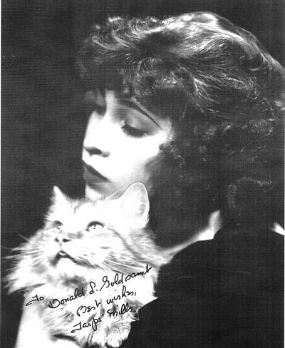 Tarpé Mills, undated photo found online
June Tarpé Mills was born Genevieve Mills on June 13, 1915, in the Bronx, according to Alex Jay’s research, though elsewhere her birth date is given as February 25, 1918. Genevieve’s mother Margaret married twice and had children by both husbands, Genevieve was the child of the second husband, Charles Mills. Her older brother Thomas was the son of the first husband, John Tarpey, who either died or disappeared soon after the marriage. Genevieve’s father was not around long either, he was gone by 1920, and by 1925, the family was in Brooklyn with the children of Margaret’s sister, who had died in 1922, also living with them. By 1930, Genevieve had taken the name June Tarpé Mills, creating her middle name from Tarpey, and was working as an artist’s model. June’s art training is unknown, she doesn’t appear to have finished high school, but one newspaper article said she was a fashion artist before working in comics. When she began placing stories at Centaur in 1938, she dropped the more feminine name June, and signed her work Tarpé Mills for the rest of her comics career.
 Miss Fury Sunday, April 5 1942, Bell Syndicate, this and all Miss Fury art © Tarpé Mills
Around 1940, Tarpé created her most famous character, originally known as Black Fury, soon renamed Miss Fury. The lettering is too small to see in this example, but the logo and signature in the first panel can be admired, both created by Mills, and of course she did all the lettering as well. The strip first appeared on April 6, 1941, and it ran to 1952. Unlike most comic strips, Mills spent a lot of time on the clothing and fashions. Lead character Marla Drake sometimes wore a skin-tight black panther skin that gave her great strength in her alter ego of Miss Fury. That and other revealing outfits were controversial at the time, and some papers refused to run them.
 From MISS FURY #2, Summer 1942, Timely/Marvel Comics
Timely/Marvel reprinted some of the Sunday comic strips as a series of eight issues from 1942 to 1945. If the strips were all done with square panels, as seen above, it was an easy conversion. Tarpé’s lettering can be seen better here, it’s become more regular than what she did at Centaur, but it’s still pretty small and leans a bit to the left. Emphasis is done by underlining in several places and a bolder line in others.
 From Miss Fury Sunday, Nov 14 1943, Bell Syndicate, original art courtesy of Heritage Auctions
This opening panel from the strip gives a better look at the lettering, with an unusual question mark in the second balloon. I love the artist signature.
 From Miss Fury Sunday, Nov 14 1943, Bell Syndicate
An even closer look at two panels from the same strip. The lettering works well, though the left slant bothers me a bit, but this is again an improvement from earlier work. The swear symbols in the last balloon are interesting, and notice how much larger and bolder the exclamation points are. While three dashes are used in one place to indicate a pause, other places have a curly em-dash.
 From OUR LOVE STORY #14, Dec 1971, image © Marvel
Tarpé made a brief return to comics in 1971 with this story, again lettered by her with familiar styles in the left-slanted letters, large exclamation points, and curly dashes. It was the only story by her at the time. Miss Fury was a groundbreaking strip in some ways, and has been collected in reprints a few times, while the character made occasional later appearances with art and stories by others. Mills passed December 12, 1988.
 From CAPTAIN MIDNIGHT #67, Sept 1948, Fawcett
Among little-known comics letterers was Herman Stackel, who drew and lettered this half-page humor feature. I only know it’s by him because a different version of the art, an unfinished one, was found by Alex Jay on Heritage Auctions. The lettering is narrow but lively, done with a wedge-tipped pen except for the bolder letters.
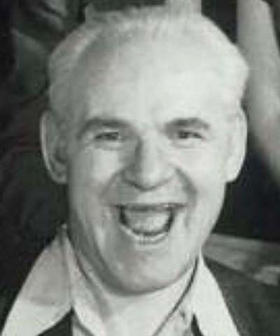 Herman Stackel, 1952, from Alter Ego #107 (TwoMorrows, 2012)
Herman Stackel was born Hyman William Stackel on March 9, 1904, in Kiev, Russia. His family arrived in New York City in 1913 and settled in Brooklyn. Stackel won a poster contest in high school, and in 1923 won a one-year art scholarship to Pratt Institute. That year he also applied for citizenship. Herman graduated from Pratt in 1929 with a degree in Teacher Training in Fine and Applied Art. In 1934, he married Ann Liebman in Brooklyn. Stackel was employed as an art teacher by the Works Progress Administration, and by 1942 was a freelance commercial artist. He served in the Army soon after, his dates of service aren’t known. Around 1942 he began working as a letterer for the Binder Studio and Funnies, Inc., packagers for comics publishers. Artist Leonard Starr met Stackel at Funnies, Inc., and in an interview with Jim Amash published in Alter Ego #110 (2012, TwoMorrows), Starr remembered:
In terms of mentoring or giving lessons, the guy who spent time helping me was Herman Stackel, and that was not artistically. He had a wide range of intellectual knowledge and introduced me to various things, people to read, and stuff to look at. We used to spend hours and hours drinking coffee, and talking. He was at Funnies when I started, and was there after I left. He was a letterer. He was just a terrific guy, and I guess in his later life, work dried up or something. He was very bitter, and I was very, very sorry to hear that. As far as I can remember, he was the only letterer there. He was forty and I was like seventeen, and so it was a whole world I was unfamiliar with, the world that he had experienced on his route to being forty, and he shared his experiences with me.
 From unused version of the feature shown earlier by Herman Stackel, image courtesy of Heritage Auctions
I don’t know why this version of Stackel’s half-page strip was abandoned half-finished, but it gives us a better look at his lettering, which I like a lot. It has great bounce and appealing style. Many other comics pages were lettered by him, but this is the only one I can positively identify. Herman was still working for Fawcett in 1952, it’s unknown when he left comics. He died in March 1990.
 From CAPTAIN MARVEL ADVENTURES #13, July 1942, Fawcett, art by Marc Swayze, image © DC Comics
There have been several brother and sister teams who worked in comics, here’s one you probably haven’t heard of. Marc Swayze began his art career assisting comic strip artist Russell Keaton on his strip Flyin’ Jenny around 1940, doing the lettering among other things. In 1941 he went to New York and was hired by Fawcett, where he penciled and inked Captain Marvel stories like the one above, which I think was lettered by someone else. He was credited as the co-creator of Mary Marvel with Otto Binder. Marc was in the Army from 1942 to 1944, but he must have been appreciated at Fawcett and at the Bell Syndicate who distributed Flyin’ Jenny. Back in New York, he was given full control of the strip and also landed a regular assignment on the Phantom Eagle feature at Fawcett. With those in hand, he returned home to Monroe, LA, and taught his sister Daisy to letter for him.
 Daisy Swayze, date unknown, from the Women in Comics website
Daisy Swayze (a delightful rhymed name) was born around 1907 in Monroe, Louisiana. She graduated from high school in Monroe in 1926. In the 1930 census, her father was a steamboat captain. She and her sister Mildred were living at home when their mother died in 1941. It’s unknown what Daisy did for a living, but when her brother Marc returned home in 1944, she was ready and able to assist him with lettering. Marc was interviewed in the Fawcett Collectors of America Newsletter #11, November 1978, and #41, Spring 1988. He said:
Daisy did just about all my lettering from 1945 on. She was one of the greatest letterers, according to Roy Ald and Will Lieberson. When I left New York with Flyin’ Jenny under one arm and Phantom Eagle under the other, I wrote my sister — sending her lettering samples — and told her I needed her help doing lettering. She had never claimed to have any art abilities, but took on the assignment. At first it was rough, but eventually she developed her own style. Once I received a letter praising the clarity of my lettering. I had to write back and confess it was the work of my sister, Daisy!
 From Flyin’ Jenny Sunday, Dec 10 1944, Bell Syndicate
Alex Jay has studied the lettering on the Flyin’ Jenny strip and found a good way to tell Marc’s lettering from Daisy’s. Here Marc lettered the top tier and Daisy lettered the bottom one. Marc’s M’s have angled sides, while Daisy’s have straight sides. Otherwise the two styles are very similar, with Marc’s just a little larger and with the lines closer together. Both were lettering with a wedge-tipped pen. The strip ended in 1946.
 From WOW COMICS #31, Nov 1944, Fawcett
For Fawcett, Marc did Phantom Eagle, sample above, and other features mostly lettered by Daisy. Look for her straight-sided M’s. Here the lettering is done with a round-tipped pen.
 From LIFE STORY #21, Dec 1950, Fawcett
Later Marc drew romance stories for Fawcett like this one, again lettered by Daisy with a round-tipped pen. After Fawcett got out of the comics business in 1953, Marc worked for Charlton Comics. He was also a musician playing in dance bands, and did oil painting. He wrote a column in Alter Ego from 1996 until his death in 2012.
After her lettering career ended, Daisy found work in the local Tax Assessor’s office for the rest of her life. She died suddenly of a heart attack on May 4, 1972, in Monroe. While her work in comics was largely unknown, her contribution to her brother’s career was an important one.
 From THE SPIRIT SECTION, June 2 1940, image © Will Eisner Studios Inc.
Next we have Zoltan and Terry Szenics, a husband and wife who were both comics artists and letterers. Will Eisner told cat yronwode that Zoltan lettered the early Spirit stories, panels from one are above. The lettering is very Art Deco, using carefully drawn narrow letters, except for the round C, G and O. I suspect Will wanted something similar to the lettering by Charles Armstrong on Hal Foster’s Prince Valiant, It’s pretty close, but this kind of lettering is time-consuming, and perhaps not cost effective for the letterer, and it was dropped for more standard lettering after a few issues. I’m not sure how long Zoltan did them, but Sam Rosen became the regular Spirit letterer some time in 1941.
Zoltan Michael Szenics was born April 9, 1915 in New York City to Hungarian emigrant parents. The family was in Queens by 1920, and Zoltan belonged to several clubs in high school including the art club. Zoltan was also musical, in 1929 he gave a solo violin performance at that year’s graduation. Zoltan graduated in 1933. He found work at the Max Fleischer animation studio in Manhattan. Perhaps he joined a union because, in 1937, he was injured in a fight between picketers and police in front of the studio. Whether that led to him being let go is unknown.
Terezia (Theresa) Woik was born December 26, 1919 in Pestszenterz, Hungary. It’s not clear when she came to New York, but Zoltan must have known her well by 1938 when she was a bridesmaid at his sister Elsie’s wedding. Gill Fox was an editor, writer, and artist for Quality Comics in the early 1940s. In an interview in Alter Ego #12 (Jan 2002, TwoMorrows), Gill remembered:
Well, I pulled in Tony Di Preta to letter, and Zully Szenics, too. They began to help me. Zully would help check art and proofread scripts, but he mostly lettered. His wife became a letterer, too. They were married because of me. Both were Hungarian. He was living with his mother and father and I’d go up there to visit. Once, we were sitting in his room and I saw a girl passing the doorway. I said, “Who’s that?” Zully said, “That’s a girl who came from Hungary to help my mother.” I asked, “Did you ever look at her? She’s beautiful!” Well, a year later they were married. Her name was Terry, and the four of us used to vacation together. Zully came back from WWII and went to art school for nine years on the G.I. Bill. I had met him at Fleischer’s in the inking department, and he was funny as hell. He also inked for us, but he couldn’t create. Zully would set an alarm clock and letter a page before that clock went off. It used to break us up!
Zoltan and Terry were married May 3, 1942, and Terry became a citizen in 1944. Terry must have also had artistic talent, but probably Zoltan taught her what he knew about making comics, and soon they were both getting lettering and inking work at Quality, MLJ/Archie, and elsewhere.
 From TOP NOTCH LAUGH #39, Sept 1943, MLJ
This story is credited Clem and Zoltan for writer Clem Gretter and artist Zoltan Szenics. I think it’s safe to assume Zoltan also did the lettering. I like the texture in the feature logo, but that might have been done for a previous story. The caption and balloon lettering are made with a wedge-tipped pen, and I like the Art Deco H in the caption. The sound effect is lively.
 From ZIP COMICS #41, Nov 1943, MLJ
This story is credited Sahle, Szenics and Goggin for writer Ed Goggin, penciler Harry Sahle, and inker/letterer Terry Szenics, at least that’s what the Grand Comics Database says. The inking and lettering are very similar to the previous example, so think this is actually by Zoltan. It’s hard to pin down any comics work by him after the 1950s, but an obituary said he had been a commercial artist, so perhaps he moved into advertising and other work. Alex Jay found a reference to a film strip he did art for in 1969.
 From PAT THE BRAT #29, Nov 1958, Archie
Terry continued as an inker and letterer for Archie into the 1960s, though of course without any printed credits. The Grand Comics database says this story is inked and lettered by her. The lettering is definitely different from Zoltan’s here, still done with a wedge-tipped pen, but with some wider letters that remind be of Gaspar Saladino’s lettering in places. Terry may have also penciled some stories for Archie.
 From JOURNEY INTO MYSTERY #91, April 1963, image © Marvel
When Marvel Comics started adding letterer credits to all its superhero stories in 1962, Terry Szenics was among those credited. Perhaps she’d been working for the company for a while, it’s hard to say. The balloon and caption lettering on this page is smaller than previous examples, perhaps because there was less room. At least there’s no doubt she lettered it.
 From STRANGE TALES #108, May 1963, image © Marvel
Another example. Title letters made of many strokes are use effectively, somewhat in the style of Artie Simek. The last new work I see from Terry is from 1965 or so. What she did after that is unknown. She may also have worked in advertising.
The Szenics retired to Florida in the late 1980s, and Terry passed there on April 6, 1995 at age 75, survived by her husband and two sons. Zoltan passed on June of the same year at age 80. Their lives and careers were always closely entwined.
 From RANGERS COMICS #28, April 1946, Fiction House
Here’s an ad from Fiction House lettered by Leo Wurtzel with his name at bottom right, the only time he was credited in print. The top display lettering is beautifully done, the rest is professional if less interesting.
Leo Wurtzel was born January 3, 1920, in Manhattan to Austrian emigrant parents. Leo’s father died in 1928, making it a tough struggle for the family. The 1940 census said Leo was a magazine cartoonist living with his mother and brother. His 1941 draft card said his employer was Timely (Marvel) Publications, where he was an artist and letterer. I’ve found no identifications of his work at Timely. Leo joined the Army in 1942, his discharge date isn’t known, but after returning to New York he found work at Fiction House. Artist George Evans remembered him there and called him one of the best letterers of the time.
 From FIGHT COMICS #47, Dec 1946, Fiction House
The lettering on this story is rather different from the ad, but could possibly be by Wurtzel. The sign in the background suggests he had something to do with it, either lettering or inking, but that’s a guess. And that’s as far as I can go with identifying Leo’s comics work. Apparently he had a printed lettering credit in TRUE LIFE SECRETS #5 (Jan 1952) from Charlton, but I haven’t found scans of that issue. I have no other information about what he did for a living after that.
Leo married Lillian Perlman in 1946, and at some point they moved to Brooklyn. His wife passed in 1995. When Leo’s older brother died in 1999, Leo and his two sons and one daughter were listed as surviving family. Alex Jay found a possible obituary for him from 2020, at which time he would have been about 100 years old.
 Biro-Wood Staff Christmas Card, circa 1949, from Joe and Jim Simon’s The Comic Book Makers (Vanguard, 2003)
Among the staffers depicted on this Christmas card from Lev Gleason’s comics company is Irving Watanabe. I don’t know who did the caricatures, but this is the only known early depiction I’ve found of long-time letterer Watanabe.
 From SILVER STREAK #21, May 1942, Lev Gleason
In addition to lettering many of the Lev Gleason comics, Watanabe also occasionally did full art for them, as seen above. The signature at the lower right of the first panel is very stylized and hard to see, but it says Hitoshi Watanabe. The art, story title, and lettering are all quite good, in my opinion.
Hitoshi Irving Watanabe was born February 10, 1919, in Maui, Hawaii to Japanese emigrant parents who worked on a sugar plantation. He was a commercial art major and graduated from McKinley High School, Honolulu. He did about 150 drawings for the book Guidebook for Homemaking in Hawaii by Caroline Wortmann Edwards (New Freedom Press, 1938). He was in New York City working in comics by 1940. In 1984, Irv wrote several letters to Jerry DeFuccio, who was working on a biography of writer/artist Charles Biro that was never published. In one he wrote:
I first met Charlie in 1940, while I was at MLJ. He was always fun loving and had to be the main attraction. I think he was kind and generous. He used to give story plots to Joe Blair many times and in return would receive free lunch. When at MLJ, I was receiving 50 cents a page for lettering but it soon ended when Charlie offered me $1.00.
Biro and his partner, Bob Wood, left MLJ for a lucrative deal with publisher Lev Gleason in 1941. They would essentially be an in-house comics shop for Gleason, as seen in the Christmas card above. They brought Irv with them.
 From DAREDEVIL #112, July 1954, Lev Gleason
Another single-page piece drawn and lettered by Irv Watanabe, you can see his signature at right under the first caption. Irv’s art was sporadic, most of the time he was lettering. The feature title and display lettering on this page are excellent. The caption and balloon lettering are professional and consistent. According to Watanabe’s letters, working with Biro was not always easy. He wrote:
Charlie did things the last minute, so we got caught in the crisis deadline. I used to work two days and nights — sometimes three without much sleep. We went to his apartment, first at Sunnyside, then Jackson Heights, Queens. He used to start off with a big first page splash, then worked on six panel pages, and often he’d run out of pages and wound up with 15 to 20 panels on the last page! He penciled the whole 16 pages and left dialogue to the last, but at times I insisted [he do some] as he went along. So, grudgingly, he’d put copy on 6 or 8 pages, then finished the story.
Irv left Lev Gleason around 1955 to work for advertising company Johnstone & Cushing, where he lettered comics style advertising and probably other things. He was married and had a son by 1959. I first saw his name as a letterer at Marvel in the 1960s.
 From NOT BRAND ECHH #9, Aug 1968, image © Marvel
Irv seems to have become a busy letterer at Marvel starting in 1968, though the Grand Comics Database has a few credits for him in 1966 at DC Comics and Warren. The example above has a fine title and lots of sound effects. There’s plenty of lettering, but Watanabe makes it work without seeming crowded.
 From X-MEN #48, Sept 1968, image © Marvel
This splash page includes beautiful script lettering by Irv, and at Marvel he was credited for his lettering for the first time, which I’m sure he appreciated.
 From RAWHIDE KID #67, Dec 1968, image © Marvel
In the credit box on this story you can see Irv’s reluctance to give himself the same size credit as everyone else, either through modesty or simply a career-long habit of not being credited. I love the open letters in the story title, I can see his advertising experience there.
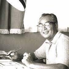 Irv Watanabe, date unknown, image found online
Irv’s Marvel story credits seem to end around 1978, though he was also doing lettering for comics-style advertising for Hostess cupcakes as late as 1981. By 1989 he had returned to Hawaii, probably in retirement, and he passed there on January 7, 1993 at the age of 73. Much of his work was uncredited, but thanks to Marvel, we have a record of some.
Alex Jay has also written articles about letterers from this time where we can’t find any identified work. On his blog you can read about Angelo Grasso, George Kapitan, Veda Lufkin, and Richard Dean Taylor. If more information about those or other little-known letterers of early comics comes to light, I’ll add it here. Some who may have begun in the late 1940s, but whose known work begins in the 1950s will be in a future article. Thanks again to Alex Jay for generously sharing his knowledge.
The post More 1930s-1940s Letterers Part 2 appeared first on Todd's Blog.
Todd Klein's Blog

- Todd Klein's profile
- 28 followers

