
Todd Klein's Blog, page 32
January 9, 2024
Rereading: THE NARROW PASSAGE by Oliver Butterworth

Oliver Butterworth was a teacher who wrote several novels for young readers. By far the most well known is The Enormous Egg, written in 1956, about Nate Twitchell, a boy in rural New Hampshire whose chicken lays and hatches a dinosaur egg. This book from 1973 is also about Nate Twitchell, now a bit older, who is invited by his scientist friend Dr. Ziemer to join a scientific research expedition to the prehistoric caves of France. Nate thinks it will be fun and a great opportunity, but when they get to the caves, he finds he’s mostly wanted to carry dug-up dirt out of the cave for the scientists, and the job is actually boring. But he does make friends with a French boy, Nicol, son of the inn owner, and they decide to do some cave exploring on their own on Sunday, when they both have free time.
What they find is nearly as unexpected as a live dinosaur, but not as funny or entertaining. Crawling through a very narrow passage in a cave that no adult could pass through, they find a cave with many paintings, and one seems to be fresh and unfinished. Then they meet a small old man dressed in animal skins with long hair and a beard. At first they are afraid of each other, but in time this caveman, so he seems to be, becomes friendly, and lets them see the small valley hidden in the hills where he lives. He also does some animal drawings on a pad of art paper Nate has. When the boys return, they’re excited but not sure what to tell the expedition leader, Professor Newall. They don’t want to spoil the cave man’s hidden existence. Professor Newell worms the facts out of them, and insists they look for the hidden valley. What will happen to the cave man, and is he really what he seems?
I enjoyed reading this, Nate is as entertaining as in the first book, but the overall atmosphere is kind of sad, as no good ending seems possible, and Professor Newall is rather mean to the boys. The magic of the first book doesn’t carry over to this one. Eric Blegvad is a fine illustrator, but I didn’t like his work here, perhaps because it doesn’t compare well to that of Louis Darling in the first Nate Twitchell book. Mildly recommended.
The Narrow Passage by Oliver Butterworth
The post Rereading: THE NARROW PASSAGE by Oliver Butterworth appeared first on Todd's Blog.


January 7, 2024
Rereading: THE MARTIAN CHRONICLES by Ray Bradbury


I don’t think I’ve read this entire book since I was a teenager, though I’ve revisited a few favorite stories since. When I first read it, it seemed solidly in the science fiction genre, now I would call it fantasy with sf elements. But my overall impression in this reading was often that these stories reminded me of Twilight Zone episodes. They’re about people and their faults (and sometimes their strengths) even if some of the people are golden-eyed telepathic Martians. I’ve also always thought of the book as a novel, but now I realize it’s short stories with connecting sections added, what’s called in book writing a “fix-up novel.” Looking through the complete works of Bradbury listed at the back (to 1973), I was surprised to see how few actual novels Ray wrote. Even Fahrenheit 451 began as a short story and was expanded into a short novel. Only Something Wicked This Way Comes is a novel, all the other Bradbury books are short story collections.
There are stories here I remember so well I knew the entire plot and some of the text as soon as I saw the story title, like “There Will Come Soft Rains,” and “Usher II.” There were others that I remembered as I went along, and a few I didn’t remember at all, including two that were added to this collection and not in the first edition. All the stories are beautifully written, have wise and sometimes sad things to say about humanity, and are impossible to read without feeling them deeply. It’s masterful work, and many have just that little twist of the unexpected that takes them out of life on Earth as we know it to a place that can only be Bradbury’s Mars — nothing like the real Mars even as it was known then, but a strange and haunting, but also familiar place. Recommended.
The Martian Chronicles by Ray Bradbury
The post Rereading: THE MARTIAN CHRONICLES by Ray Bradbury appeared first on Todd's Blog.
January 4, 2024
Rereading: DREAMWOLD CASTLE by Florence Hightower

This was Hightower’s last novel for children, published in 1978, and it has a different feel from the others in some ways.
Phoebe Smith and her mother Miranda have moved to a small New England town to get away from Boston, where Miranda has a teaching job, but they live in an upstairs apartment in a large house owned by Miss Tarlton, whose family she is always wanting to tell them about when they’d rather be doing other things. Then Mrs. Tarlton’s son Charles returns from Japan and charms Miranda, and they are soon spending a lot of time together. Meanwhile, Phoebe isn’t making any friends at school, and decides to steal her mother’s car and drive back to her aunt in Boston. Phoebe is not old enough to drive, even though she knows how, but the escape ends quickly when she’s smashed into by a limousine. A few days later, one of the popular girls, Constance Mottrell suddenly asks her to sit with her at lunch. It turns out the limousine belongs to her father, and the chauffeur was following Constance, spying on her, when the crash happened. Constance invites Phoebe to her huge family mansion, Dreamwold Castle, to meet her brother Harry, and soon all three are having adventures together at the house, and on the mountain overlooking the town. All of them are interested in mountain climbing and exploring. Then things take a strange turn when Harry and Constance’s older brother Tony turns up. He seems to be on the run from something, and he has a gun. He’s hiding out on the mountain in a secret place, and Phoebe is drawn into helping him. Before long she’s lying to her mother and doing things she knows are wrong, but can’t seem to stop. What will happen when the FBI show up looking for Tony?
While there are mysteries in this story that are gradually revealed, the overall tone is somewhat ominous and somber, and the story doesn’t have the usual happy ending. It’s quite good all the same, and recommended.
Dreamwold Castle by Florence Hightower
The post Rereading: DREAMWOLD CASTLE by Florence Hightower appeared first on Todd's Blog.
December 29, 2023
Todd Klein – Letterer
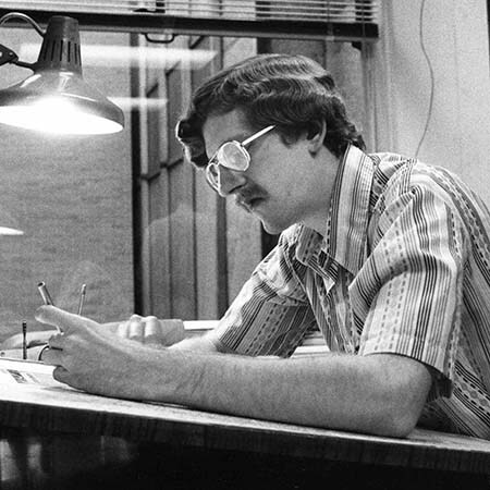 Todd Klein at DC Comics, 1978, photo by Jack Adler
Todd George Klein was born in Plainfield, New Jersey on January 28, 1951. He feels silly writing about himself in the third person, and will stop here. I enjoyed drawing and writing as a child, and was encouraged by my parents and maternal grandfather, Rex Derr, who was an artist, sign painter and jewelry engraver in his spare time. He first showed me how to letter with Speedball pens and India ink. My earliest comics were BATMAN and DETECTIVE COMICS issues sent to me by a relative when I was about seven. Once I knew they existed, I badgered my parents to buy comics for me whenever I saw them, but it was my sorrow that I never lived within walking distance of a place that sold comics when I was growing up. I was a DC fan, with my favorite title being THE JUSTICE LEAGUE OF AMERICA, but in 1963 I was given a few early issues of THE FANTASTIC FOUR by that same helpful relative, which changed my course to being a Marvel fan almost exclusively for about eight years. I remember enjoying tracing the logos and cover characters, thereby ruining many comics.
I decided to pursue an art career in high school after realizing it was my favorite subject, and attended the School of Visual Arts in New York for a year and a half, where my art history teacher was Burne Hogarth of the Tarzan comic strip fame. I was at the Kansas City Art Institute for one semester, then ran out of money and worked at a series of mundane jobs. At one, making installation manuals for air conditioners, I learned many production skills that would come in handy in comics. In my spare time I was drawing illustrations for fanzines, and in 1977 I put together a portfolio which included unpublished comics work and took it to Marvel and DC that summer to try to get into comics. I had no luck at Marvel, but at DC, production manager Jack Adler liked my portfolio enough to offer me a two-week job in his department to fill in for a vacationing staffer. After the two weeks were up, that person quit, and the position was offered to me. It was the luckiest break in my career. I couldn’t believe I was actually working in comics!
 From DC SPECIAL SERIES #10, April 1978, image © DC Comics
I learned the basics of lettering from fellow production staffer John Workman, whose lettering I already admired, and I studied the work of Gaspar Saladino, John Costanza, Ben Oda and others on whose lettering I was making corrections. In a few months I was doing freelance lettering at home in the evenings and on weekends. My tools of choice were the Faber-Castell TG-1 technical drawing pens that Workman recommended, though I did also use Speedball dip pens for some things.
 From STARSTRUCK first published in HEAVY METAL 1982-83, © Elaine Lee and Michael Wm. Kaluta
It took a few years for me to get comfortable with the craft of lettering. Starting in 1980, I began working on STARSTRUCK for Elaine Lee and Michael Kaluta, where my skills were pushed well beyond what I had done thus far, as the story called for lots of special lettering styles and effects. It was good training for my later work on THE SANDMAN for DC.
 From THE SANDMAN #42, Oct 1992, image © DC Comics, original art courtesy of Heritage Auctions
I lettered a wide variety of projects and titles, and also did some writing for DC. In 1987, after ten years on staff, the second half as assistant production manager, I went freelance full time, and my lettering workload increased. My favorite of many projects was THE SANDMAN by Neil Gaiman and various artists. I loved Neil’s work, and he offered many challenges that I enjoyed taking on, including dozens of specific character voices and lettering styles. I think it’s fair to say that it’s my best-known work and made my reputation. I started winning awards for lettering it in 1992.
 Amethyst, Princess of the Gem World logo ™ and © DC Comics, 1993
 The Amazing Spider-Man logo ™ and © Marvel, 1994
While on staff at DC, I did freelance logos, house ads and cover lettering, following in the footsteps of my favorite letterer and role model Gaspar Saladino (and Ira Schnapp before him), and after becoming a full-time freelancer in 1987, I did all kinds of lettering work for Marvel, and soon other publishers like Dark Horse, Gladstone, Disney, Tundra, Image, Tekno, Malibu and more, though my main and most important client remained DC Comics.
 From PROMETHEA #12, Feb 2001, America’s Best Comics, image © DC Comics
In 1998 I took on a new challenge, working with writer Alan Moore and a group of wonderful artists, lettering the America’s Best Comics line, including TOM STRONG, PROMETHEA, TOP 10 and TOMORROW STORIES, and designing the covers and collected editions. This again stretched my abilities and knowledge to new levels, and was a gratifying experience. The line lasted about eight years. I also lettered other comics for DC, Marvel and other clients, and that continues to the present day. Perhaps my next favorite project for DC was lettering FABLES and its many spin-offs from 2002 to 2024, and my favorite project elsewhere was lettering and design work for Alan Moore and Kevin O’Neill’s THE LEAGUE OF EXTRAORDINARY GENTLEMEN, which I worked on from 2002 to 2019 for ABC/DC, then Top Shelf.

It’s been a great life and a rewarding career. I wouldn’t trade it for any other. I’m proud to be a part of the comics community. While I’ve written about many letterers, there are always more that deserve attention. If you have a favorite letterer, let them know, and spread the word. They will appreciate it.
More about my work and career can be found on my website and blog.
The post Todd Klein – Letterer appeared first on Todd's Blog.
December 22, 2023
More 1980s Letterers Part 3
 From MOONSHADOW #2, May 1985, Marvel, image © J.M. DeMatteis & Jon J. Muth
Continuing with a third and final batch of letterers who began in the 1980s. Kevin Nowlan is a comics artist revered for his appealing and individual style over the past five decades, and his lettering is equally appealing and individual. It’s based on the work of Gaspar Saladino, but even from the start he carried that style further into his own territory, as seen above. Nowlan didn’t do a lot of lettering, but when he did, it stood out from the crowd. The reproduction and size of this page from MOONSHADOW isn’t great, but Nowlan’s mixed case script captions and wavy balloons are still remarkably stylish.
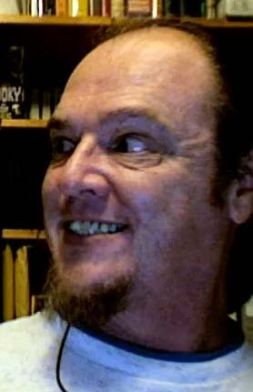
 Kevin Nowlan at Baltimore Comic-Con, 2019
Kevin C. Nowlan was born Feb 7, 1958 in Chadron, Nebraska, the youngest of six children. In an interview with Bob McLeod published by TwoMorrows, Kevin said there was a lot of artistic talent in his family, though he was the only one who pursued art as a career. He went to a trade school that taught design and a minimal amount of illustration. After graduation, Kevin found a job in a print shop and worked on his comics drawing samples. Sending them to fanzines and comics publishers eventually paid off when he landed his first job at Marvel. He felt he wasn’t ready, but editor Al Milgrom told him to do it anyway. That was in 1983.
 From DALGODA #6, Oct 1985, © Fantagraphics
While Kevin’s earliest work at Marvel was lettered by others, for Fantagraphics he did both art and lettering on the backup feature in DALGODA, “Grimwood’s Daughter,” example above, giving a closer look at his lettering. The letters are made with a wedge-tipped pen, and again are very much in the style of Gaspar Saladino, but carrying Gaspar’s shapes even further. The balloon shapes have thin outlines, and are made with oval templates and a straight edge. I was impressed with it when I first saw it, particularly since I was also trying to imitate Saladino, but not doing it nearly as well.
 From TOMORROW STORIES #2, Nov 1999, America’s Best Comics, image © DC Comics
Jumping ahead to 1999, Kevin was the artist, letterer, and co-creator with Alan Moore of Jack B. Quick in TOMORROW STORIES. I loved every panel, and was able to work with Kevin on the covers he did for the series. The logo design is his, and Kevin also famously designed the HELLBOY logo for Mike Mignola.
 From IMMORTAL HULK: TIME OF MONSTERS #1, July 2021, image © Marvel
Kevin continues to do wonderful art and lettering sporadically for Marvel and other companies. I love his display lettering and sound effects on this example. His art and lettering are instantly recognizable and unique.
 From WARP #18, Dec 1984, © 1First Comics
Before he became known largely as an artist and writer of Oz graphic novels and THE AGE OF BRONZE, Eric Shanower was lettering comics like this one. His letters are made with a round-tipped pen, are very regular and consistent, with one distinguishing style point: the letter E has a longer central stroke than the ones at the top and bottom.
 Eric Shanower
Eric James Shanower was born Oct 23, 1963 in Key West, FL. Eric’s family lived in many places, including Hawaii and California, where he graduated from high school. He attended the Joe Kubert School from 1981 to 1984, graduating with a BA, and received his first paid comics assignment, lettering the issue above, the next day.
 From THE ENCHANTED APPLES OF OZ, April 1986, 1First Comics, © Eric Shanower
Eric discovered and loved the Oz books by L. Frank Baum and others at age six, and decided to create his own, a desire that was first realized with the publication of his first original Oz graphic novel, above. Eric wrote, illustrated, and lettered this and and three more, two from First and the last from Dark Horse in 1992. All are masterful and capture the spirit of the original books beautifully. Eric has been involved in many other Oz projects, and with his partner David Maxine, founded Hungry Tiger Press to publish some of them. He also scripted Oz graphic novels for Marvel.
 From THE ELSEWHERE PRINCE #1, May 1990, image © Marvel
Shanower has worked as artist and letterer on other comics projects like this one based on concepts by Moebius. A closer look at his lettering shows the longer central stroke of the E more clearly, and other distinctive letter shapes like the narrow U.
 From AGE OF BRONZE #30, June 2010, © Eric Shanower
In 1998, Eric began self-publishing a well-researched epic retelling of the Trojan War story, AGE OF BRONZE, which he again wrote, drew, and lettered. 33 issues saw print from Image Comics up to 2013, issue 34 was released in digital form in 2019. Eric continues to work on other self-published projects available through the Hungry Tiger Press website.
 From MEGATON MAN #1, Nov 1984, Kitchen Sink Press, image © Don Simpson
In the 1980s, among the many new small comics publishers, there was room for the kind of individual styles and approaches previously seen mostly in underground comics, and Don Simpson was one of the new creators given a chance to shine. His work was dynamic, and full of action, while also funny and satirical. He lettered all his own stories from the start, as here on his first published creation, MEGATON MAN. While the subject and lettering is a parody of Marvel, it’s still interesting and original. I love the way the bombastic second balloon fades behind the character, and the story title is great.
 Don Simpson
Donald Edward Simpson was born Dec 3, 1961 in Livonia, MI. In a recent interview with Jason Bergman published on the Comics Journal Website, Don reports he started drawing his own comics as a young child, and through junior high and high school, created many characters. That culminated in Megaton Man in the early 1980s, originally intended as a one-shot Marvel parody, and sent out to over a dozen comics publishers before finding a home at Kitchen Sink. Simpson said:
It took me 13 months to do the first issue. Then Denis Kitchen said, “Can you do this every other month?” I didn’t know what the hell I was doing, but I said, “Sure!” I had done no world-building, I had no characters apart from parodies and pastiches, I had no plot in mind, I had no 300-issue plan like Dave Sim. I just figured, “Well, they’re giving me a chance to do this; I’m gonna try to do it.”
 From BORDER WORLDS #4, Jan 1987, Kitchen Sink Press, image © Don Simpson
BORDER WORLDS began as a backup in MEGATON MAN, then moved to its own title. It was a more serious science fiction drama. Don’s lettering, while a bit subdued, retains an appealing bounce.
 From 1963 #1, April 1993, © Image Comics
Simpson worked for various publishers into the 1990s, and also tried self-publishing. For Image, he lettered 1963, Alan Moore’s homage to Marvel comics in the 1960s, and he did fine work on the titles and balloons, using a style that was more like those old comics, with a wedge-tipped pen for the regular letters. Sadly, the series was never finished, and after the comics industry downturn in the mid 1990s, Simpson was finding it hard to make a living. He took a job at a bookstore, and decided to go back to school. Eventually Don became a teacher, a career he pursued for many years, until deciding to do new comics work a few years ago.
 From X-AMOUNT OF COMICS: 1963 (WHENELSE?!) ANNUAL, 2023, Fantagraphics, image © Don Simpson
One of Don’s recent projects is his own follow-up to 1963. If anything, his lettering has gotten better over the years, I love the ease and confidence of his work here. Don is now one of the few creators doing pen lettering in a world of digital fonts, and it’s a delight to see. I hope he continues.
 From ZOT! #2, May 1984, Eclipse Comics, image © Scott McCloud
Carrie Spiegle was the daughter of veteran west-coast comics artist Dan Spiegle, and likely was taught by him to letter. She often lettered his comics work, but also lettered for others, at first for Eclipse Comics, example above, where she’s credited as C. McCarthy, probably a married name. Her regular letters are made with a wedge-tipped pen, and there’s lots of them on this busy page, dominated by a fine large sound effect.
 Carrie Spiegle, image found online
Carrie E. Spiegle was born May 27, 1956 in Ojai, CA. I’ve found no information about her early life or schooling. In addition to her own name, and the last name McCarthy, she’s used Carrie Lundquist, perhaps another married name. I believe she has always lived in California, currently in Santa Barbara.
 From CROSSFIRE #7, Dec 1984, Eclipse Comics
Here’s Carrie working with her father, a team that I find very effective, and they probably did, too. I can’t think of another example of a father and daughter team of this kind in comics.
 From ACTION COMICS #612, Aug 1988, image © DC Comics
Through the second half of the 1980s into the 1990s, Carrie did lots of lettering for many publishers, including DC Comics, as seen above, again teamed with her father, but she also lettered stories drawn by others, including THE ROCKETEER by Dave Stevens.
 From INDIANA JONES AND THE SPEAR OF DESTINY #4, July 1995, © Dark Horse
One of the last lettering jobs I found for Carrie was on this comic, again working with her father, and sporting a creative title. By the late 1990s, both Carrie and Dan Spiegle’s work faded out in comics, and I don’t know what she’s done since then. Dan passed in 2017 at age 96.
 From THE VISION AND SCARLET WITCH #7, April 1986, image © Marvel
Like many others in the 1980s, Bill Oakley honed his lettering skills on staff in the Marvel Bullpen, while taking freelance lettering work to do at home. This early story by him shows he learned quickly, using the Marvel favorite Hunt 107 wedge-tipped pen on the regular letters, and adding excitement with fine sound effects.
 Bill Oakley, about 1987, from the files of David Anthony Kraft, courtesy of Shaun Clancy
William Douglas Oakley was born April 1, 1964 in Oneonta, NY. He attended the Joe Kubert School for a year, around 1985, but in an interview with Dwight Jon Zimmerman published in Comics Interview #54 (March 1988, Fictioneer), Bill said:
The amount of homework that we got just kind of soured my taste for comics in a way. I didn’t feel I could handle that workload, so I thought, you know, what else could I do that’s still in the comics industry? Lettering, I thought, was a good choice.
Bill was hired to work in the Marvel Bullpen around 1986, and stayed for a few years while also very busy lettering Marvel stories at home, the example above is one of his first.
 From SUPERMAN #18, June 1988, image © DC Comics
By 1988, Bill was freelancing full time, which allowed him to also pick up work from DC Comics, as seen above. Here his letters are somewhat narrower, perhaps to get more in, and the balloon shapes, which are drawn freehand, are beautifully done.
 From X-MEN #22, July 1993, image © Marvel
Oakley continued to do lots of lettering for Marvel as well, here his title is masterful, and I again admire his balloon shapes. Bill was fast, and a hard worker, in his interview he describes barely having enough time to eat and sleep.
 From X-MEN #41, Feb 1995, image © Marvel
When digital lettering began to appear at Marvel, Bill was determined not to be left behind, and he developed fonts from his own hand lettering. His father-in-law, Norman Quackenbush, helped him, resulting in the credit seen here: Oakley/NJQ. My guess is that Norman typed out the lettering and did things like the credits, and Bill drew the balloon shapes. In these early days of digital lettering, it would have been pasted onto the original art, or placed on vellum overlays.
 From THE LEAGUE OF EXTRAORDINARY GENTLEMEN #1, March 1999, America’s Best Comics, image © Alan Moore and Kevin O’Neill
Perhaps Bill’s best hand lettering appeared on Alan Moore’s LEAGUE OF EXTRAORDINARY GENTLEMEN. Bill lettered the first two series and began the third, but was unable to complete it before he died of cancer on Feb 16, 2004 in Utica, NY at the age of 39. Bill had been unable to get health insurance due to preexisting conditions, but was helped out on that by DC Comics. He continued working from his hospital bed until the end to meet deadlines and help his family. He was survived by his wife Leslie, who he married in 2002, a son, and seven siblings and other family. He was a fine letterer, and it’s a pity his career was so brief. He is greatly missed by friends and family.
 From STARSLAYER #30, July 1985, © 1First Comics
Like others in these articles, Willie Schubert broke into comics lettering at a smaller company, First, and then expanded his client list to include nearly every comics publisher in the 1990s. This early example shows his distinctive style, with letters that lean a bit to the left, and made with a wedge-tipped pen in some places.
 Willie Schubert and Todd Klein, Colorado 1998
William Schubert was born March 19, 1952, I haven’t found out where. His entry into comics came in the early 1980s when he was living near the First Comics offices in Chicago. He did lettering for several comics proposals by fellow fans Len Strazewski, Brian Augustyn, and Paul Fricke that were submitted to editor Mike Gold at First. Those proposals were rejected, but Gold hired Willie as a letterer, and he was soon working on First titles like STARSLAYER, NEXUS, and BADGER.
 From AMERICAN FLAGG #40, May 1987, 1First Comics, image © Howard Chaykin
Schubert lettered for nearly every First title, you can see his style more clearly in this detail view. While following styles set by Ken Bruzenak, Willie makes it his own through his letter shapes, which combine rounded elements with angled horizontal strokes. The sound effect works well with alternating slants. In 1998, Willie became the third letterer to create digital fonts from his hand lettering, which he used on LONE WOLF AND CUB at First, as described in THIS article.
 From MAJOR BUMMER #10, May 1998, image © DC Comics
He was also still doing hand lettering for DC Comics and other clients. This page has an energetic sound effect and a clever special balloon style for the monster.
 From DEATHSTROKE #38, Feb 2019, image © DC Comics
After doing less comics lettering in the 2000s, and taking on other kinds of work, Willie told me in 2020:
I was hunted down by John McCrea and lettered a series for him at Image. I revisited BADGER at the new incarnation of First Comics. Besides those, I’ve been working as the letterer of Christopher Priest’s books. He lobbied hard to get me on DEATHSTROKE, and I lettered everything else he did at DC. Now he has me working on VAMPIRELLA and an upcoming spin-off from that series.
Willie has a unique style that survives in his digital lettering, as seen above. I hope he continues to have opportunities to use it.
 From PACIFIC PRESENTS #1, Oct 1982, Pacific Comics, © Steve Ditko
In the early 1980s, a new letterer emerged often crediting himself simply as Cody. This was David Cody Weiss, and as you can see above, his letters were small, regular, and fairly narrow, made with a round-tipped pen. The story title on this, one of his first assignments,is probably at least penciled by Steve Ditko, and it’s clever and creative.
 David Cody Weiss from his website
David Cody Weiss was born in 1950 in New York City. I have no other information about that, or his early life or art training. He started as a calligrapher, and did signage and name cards for the Seventh World Fantasy Convention in Berkeley, CA in 1981. Tom Orzechowski saw his work there and mentored David on some commercial lettering. He then went to New York trying to break into comics and became a temp worker at Marvel. Connections he made there led to his first lettering assignments, like the example above.
 From CAPTAIN CARROT AND HIS AMAZING ZOO CREW #20, Nov 1983, image © DC Comics
Once back in California, David began getting assignments from Roy Thomas, like this one for DC. Again, his small lettering worked well on a team book, leaving more room for the art. David kept in touch with Orzechowski, and they sometimes worked together over the next few years. He was busy at DC and other companies through the 1990s. He was the first letterer I know of to create digital fonts from his lettering, which began appearing in print in 1988. I’ve written about that HERE. In 1989, Weiss joined the staff of Disney Comics, where his lettering diminished and his work as a writer grew. His wife, Bobbi Weiss, also worked as a letterer at Disney, and later became a busy freelance writer.
 From LOONEY TUNES #18, Sept 1995, image © DC Comics
Here’s an example of a story co-written by Bobbi and David and lettered by David, one of the last examples I found of his lettering. I think the lettering is digital. Bobbi and David have a WEBSITE detailing their writing and creative projects, mostly aimed at children.
 From STIG’S INFERNO #1, 1984, Vortex, image © Ty Templeton
Ty Templeton is a Canadian comics creator whose first work was the series STIG’S INFERNO from Vortex, a parody of Dante’s “The Divine Comedy.” From that initial effort, Ty showed his mastery of comics writing, art, and lettering, though all three would improve with time.
 Ty Templeton, image found online
Tyrone Templeton was born in Canada on May 9, 1962, the son of Canadian celebrities Charles Templeton (also an occasional cartoonist) and Sylvia Murphy. His WEBSITE has an entertaining bio, which is fun to read though short on facts, but worth a look anyway. After bringing STIG’S INFERNO to Eclipse Comics in 1987, he began landing work at other publishers.
 From SECRET ORIGINS #49, June 1990, image © DC Comics
Ty proved to be an artistic chameleon who could handle any subject and style with apparent ease, but his best work allowed him to be funny, as in this example. The lettering is a little more regular, but still full of bounce and charm.
 From MIRACLEMAN #0, Dec 2022, image © Marvel
Again, any style from Winsor McCay to George Herriman is fair game for Ty’s humor, and comics publishers continue to call on him for his unique and funny comics, often short fillers like these. Ty also teaches comics, and lots more about his work can be found on his website.
I hope you’ve enjoyed the profiles in this three-part article, the last in my series of “More Letterers.”
The post More 1980s Letterers Part 3 appeared first on Todd's Blog.
December 20, 2023
More 1980s Letterers Part 2
 From JUSTICE #23, Sept 1988, image © Marvel
Continuing with more letterers who began in the 1980s, Michael Heisler first found work at Marvel in 1987, above is one of his earliest stories. The balloon letters are made with a wedge-tipped pen, probably the Marvel letterer favorite Hunt 107, and I like the organic and thick-bordered sound effects.
 Michael Heisler by Chris Provinzano, 2011
Michael Heisler was born Oct 22, 1962 in Pittsburgh, PA. He studied art at Carnegie Mellon University there, graduating with a double major in drawing and painting in 1985. After about a year of low-paying jobs, Mike decided to try comics lettering, something he felt he could do, but early attempts to break in at First Comics in Chicago didn’t pan out. In March, 1987, Mike showed his comics art samples to then Marvel editor-in-chief Jim Shooter at a store signing in Pittsburgh. Shooter told him his art needed more work, but he could probably get hired as a letterer at Marvel. He brought his samples to New York and showed them to then Marvel production manager Jim Novak, and was offered a job in the Marvel Bullpen. Heisler told me:
Practically from my first week in the Bullpen I was picking up lettering jobs, and for the entire time I lived in the NYC area I was never out of work.
 From THOR #420, Aug 1990, image © Marvel
On this handsome splash page, Mike’s story title reminds me of the work of Joe Rosen, and the title lettering is classic Marvel work. In 1990, Heisler moved over to become an assistant editor, while still doing lots of freelance lettering. When Image Comics was formed in the early 1990s, Michael joined Homage Studios to letter and eventually write comics for Jim Lee and Marc Silvestri. From 1995 to 1997 he was editor-in-chief at Lee’s WildStorm division of Image.
 From BATMAN: LEGEND OF THE DARK KNIGHT #51, Sept 1993, image © DC Comics
Heisler also found time to letter for other companies like DC Comics, as seen here. Later he became a busy letterer at Dark Horse where he was the sole letterer on Star Wars titles for eight years.
 From LADY MECHANIKA FCBD #1, Aug 2021, image © Joe Benitez
Michael’s skills as a digital letterer have kept him in demand from many publishers, as seen in this example with lots of creative variety. He lives and works today in Pittsburgh.
 From GRIMJACK #4, Nov 1984, © 1First Comics
Steve Haynie is a letterer who worked his way up through the smaller companies, and his first published story, above, shows a professional mastery of balloon lettering, and effective display work in the title and sound effects.
 Steve Haynie, 2023
Steven Patrick Haynie was born April 16, 1984 in Quantico, Virginia. His family moved to South Carolina when he was a few months old, and Steve continues to live there. When asked about his art training, Steve told me:
A lot of art paper and sketchbooks were filled with drawings. My notebooks in school were full of drawings. Like others, I wanted to draw comic books or a comic strip. In junior high I took a mechanical drawing class, and that included proper lettering. A few years later I had a mechanical drawing class at the tech school I attended after high school. I had to use an Ames lettering guide. My samples went with me to conventions. Dick Giordano spent time with a lot of aspiring artists who presented their work. He spent time with me. You would give me reviews, too. Fandom friends who were trying to created their own comics let me work on their projects. Of course, I was sending out samples to different publishers.
The first pro job I did was on a story for Pacific Comics’ ALIEN WORLDS. At the same time I got a phone call from Joe Staton at First comics offering me work on an eight page back up story that appeared in GRIMJACK # 4. Getting that phone call was one of the most incredible moments in the life of a comics fanboy! First gave me more work, and I gained a friend out of it, Mike Gold. Around that time I got more work from Comico and a few other companies as I sent out more samples.
 From NEXUS #19, April 1986, 1First Comics, image © Mike Baron & Steve Rude
Steve went on to other books at First Comics, like NEXUS, where his titles were strong and effective.
 From SECRET ORIGINS #50, Aug 1990, image © DC Comics
Steve worked his way up to DC Comics by 1990, here’s a closer look at his lettering. It’s made with round-tipped pens, is easy to read, and looks good.
 From THE NEVERMEN #3, July 2000, © Dark Horse
Steve was a busy letterer for many companies, including Dark Horse, Disney, Image, Marvel, Acclaim and Valiant. His work on this story shows the influence of Artie Simek in the balloon shapes, and has a great sound effect. Steve’s comics work ended around 2001.
 From ELVIRA’S HOUSE OF MYSTERY #1, Jan 1986, image © DC Comics
Kurt Hathaway’s first few lettering jobs were for DC Comics, he began freelancing there in 1985. The sample above has fine balloon lettering made with round-tipped pens, and the balloons are wide ovals with flattened tops and bottoms. The story title is excellent.
 Kurt Hathaway on a film set
Kurt Hathaway was born June 9, 1960 in Providence, RI. At age six, his family moved to Narragansett, where he grew up. He studied at the Rhode Island School of Design, and transfered to the New York University Film School in 1980, graduating with a BA in 1982. He pursued a film career in New York, then in Hollywood starting in 1989, but Kurt told me:
Getting into comics was kind of a way to have bargaining power on film job offers. Since we’d work 6 to 9 months [or whatever] — then be out of work until the next job was found. The idea was not only to have work going in between film jobs — but to have the ability to turn down low-paying job offers even if out of work for three months. I’d have a choice, and not have to grab whatever came along. But it was kind of a double-edged sword. I couldn’t really NOT do comics work when I was on a film — I had to do both to maintain client continuity. I was always an artist, but didn’t have the chops or desire to be a real comics artist, so I turned to lettering. I started in 1983 or so, turning pro in 1985…?
After breaking in at DC, Kurt became a busy letterer for many smaller publishers including Eclipse, Eternity, Malibu, First, Now, Comico, and Dark Horse. He also did sporadic work for Marvel. When Image Comics began in 1993, Kurt was hired as the main letterer, and soon a writer and editor, for Rob Liefeld’s Extreme Studios division.
 From YOUNGBLOOD #4, Feb 1993, © Image
In this example, Kurt’s hand-lettering is enhanced by some effective special balloon styles. He would soon be working digitally for Image, and turning out an incredible number of pages.
 From HOURMAN #22, Jan 2001, image © DC Comics
Kurt returned to letter for DC in the late 1990s, where his digital fonts and scary styles were put to good use, as seen above. He also developed a parallel career as a filmmaker in Hollywood. Kurt wrote:
My first Hollywood job was on “Nightmare on Elm Street Part 5.” I met my wife on “Pump Up The Volume,” she was my assistant in the cutting room. I still have my hand in film work operating a teeny-tiny production company called VikingDream7 Productions. Most of the work I do is for comics clients, making Kickstarter videos.
 From ALAN MOORE’S CINEMA PURGATORIO #18, April 2019, Avatar
More recently, Kurt worked with Alan Moore on Avatar’s CINEMA PURGATORIO, as seen above, and he has also worked recently for Zenescope. Kurt continues to be busy as both a letterer and filmmaker.
 From ARAK, SON OF THUNDER #26, Oct 1983, image © DC Comics
Bob Lappan was hired by DC Comics to work in the production department in the early 1980s, and he was soon also doing freelance lettering. His first published story is above, and note his distinctive lower-case credit. His balloon lettering was always small, and on this page leans slightly to the left, but it’s clear and readable. The lower case lettering in the quote is well done, as is the story title.
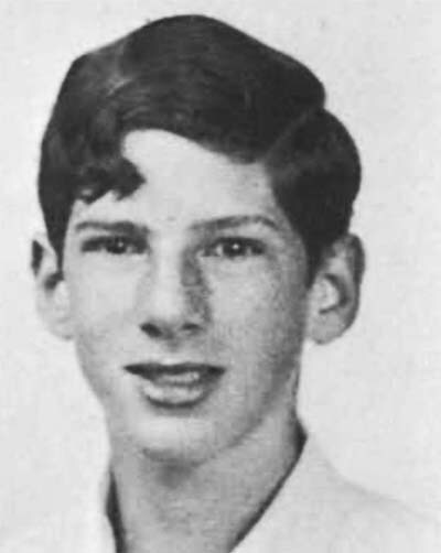 Robert Lappan, 1968, Princeton High School Yearbook
Robert Lappan was born April 1, 1951 probably in Princeton, NJ, where he went to high school. I haven’t found out anything about his art training, but I remember from our time working together that he spent some time working as a book binder, and as far as I know, continues to live in Princeton.
 From UNDERSTANDING COMICS, THE INVISIBLE ART, 1983, Tundra, © Scott McCloud
Another production worker at DC in the early 1980s was Scott McCloud. While doing his day job, Scott was also working on two projects, his comic ZOT!, and his amazing exploration of the comics medium sampled above. To letter it, he chose Bob Lappan, who did an equally amazing job on the many lettering challenges. Here you can see Bob’s own lettering style developing, with small letters that mostly fit into a square, and strokes that are a bit uneven, which adds interest.
 From ZOT! #4, July 1984, Eclipse Comics, image © Scott McCloud
Lappan also became the regular ZOT! letterer with issue #4, and again had plenty of opportunity for creative styles, as on this page. McCloud and Lappan’s work together was an excellent creative partnership.
 From JUSTICE LEAGUE INTERNATIONAL #24, Feb 1989
Bob also lettered lots of comics for DC, where his small letters made him a favorite on team books like this one. Bob didn’t seem to mind the extra work of many balloons per page. I believe his last DC lettering work was in 2005.
 From WONDER MAN #1, March 1986, image © Marvel
Many young letterers were shown the ropes in the Marvel Bullpen in the 1980s, Ken Lopez was one, and his first work at Marvel was as a high school intern in 1980. By the mid 1980s, he was working in the Bullpen, and landing freelance assignments like the one above. Ken’s letters are made with a Hunt 107 wedge-tipped pen, and probably other pens as well. Some of his letters lean slightly to the left. By 1986 he was the regular letterer on books like THE PUNISHER and GUARDIANS OF THE GALAXY due to his speed and creativity. He also designed logos for Marvel, and later for DC.
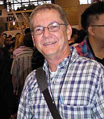
 Ken Lopez, 2023
Kenneth Lopez was born Sept 4, 1963 in Brooklyn, NY. After high school, he studied art at Pratt Institute, and then took a staff position in the Marvel Bullpen for a few years, while also doing lots of freelance Marvel lettering.
 From ROBOCOP #15, May 1991, image © Marvel
Ken went freelance full-time in 1989, and continued to letter books for Marvel and other publishers. The sample above shows his style had developed wider letters that now lean a bit to the right, and his sound effect works well. From 1992 to 1994, Ken lettered for Valiant Comics.
 From SUPERMAN, THE MAN OF STEEL #37, Sept 1994, image © DC Comics
In 1994, Ken began regular freelance lettering for DC Comics on books like this one, and his style brought a Marvel look to DC that I think works fine. He was tapped for important projects like SECRET IDENTITY.
 From YOUNG JUSTICE #29, March 2001, image © DC Comics
Ken’s lettering appeared on many DC titles. I like the larger lettering in the lower balloons on this page and the angular sound effect. In 2003, Ken joined the DC staff as Art Director of Digital Lettering. He created digital fonts for the company, and helped set up DC’s in-house lettering department, which lasted for about ten years. Lopez moved to Burbank, CA with the company, and his current title is Design Director — Periodicals.
 From WHAT IF…? #25, Feb 1981, image © Marvel
 Another letterer who began as an intern at Marvel in the fall of 1979 is Jack Morelli. He was soon also given freelance lettering jobs. Jack told me his first was for Marvel’s STAR TREK #14, cover dated June 1981 over Gil Kane art. The example above came soon after, and was printed first. Jack said in the beginning he was using a filed-down Speedball B-6 for the regular letters and an A-5 for bold (if I have that right, or it might be the reverse). In any case, the regular letters have the look of a wedge-tipped pen that was popular at Marvel at the time. The balloons are well-made and easy to read, and the title has fine telescoping on the larger word.
 Jack Morelli, around 1979, image © Eliot R. Brown
John Morelli was born Oct 26, 1962 in the Sheepshead Bay neighborhood at the southern end of Brooklyn, NY, to a family of fishermen, and one of his earliest jobs was helping out on their boat. Jack told me he thought that would become his career, but he loved to draw, and an aunt convinced his parents to send him to the High School of Art and Design in Manhattan, where he studied art. His internship at Marvel in 1979 went well, and immediately after graduation in 1980, he was hired full time to work in the Bullpen. He and Rick Parker were regular Bullpen letterers and production artists together, and Jack was there for 20 years. Jack learned lettering from the old guard at Marvel: Danny Crespi, Morrie Kuramoto, and Marie Severin. After a while he was convinced by other Marvel letterers to switch to a Hunt 107 pen, but told me he never felt comfortable with the smaller point holder, and many years later, he went back to his original pen points.
 From FORCE WORKS #13, July 1995, image © Marvel
I like the angular title on this page, and the mixed-case display lettering in the balloon. Jack’s caption lettering has become wider, and has that Hunt 107 look common at Marvel.
 From SUPERGIRL #33, June 1999, image © DC Comics
Jack told me that when digital lettering became the norm at Marvel, he began to have trouble getting work, even though he did develop his own font, as I described in THIS article. He left his Marvel staff job and began freelance lettering for DC Comics, as seen above. I think the story title is type, but the rest is hand-lettered, including the effective mixed case captions. Jack had married Marvel colorist Christie Scheele in 1987, and they moved to Chichester, NY, near Woodstock, by 1993. When DC also went to all-digital lettering, Jack had to take other kinds of work like driving a tow truck.
 From ARCHIE #576, Aug 2007, image © Archie Comics
Then around 2004, Jack was contacted by Victor Gorelick at Archie Comics, who offered him lettering work. At first Jack did that part time, but when Archie’s main letterer, Bill Yoshida, passed in 2005, Jack was offered the chance to take over as much of Yoshida’s workload as he could handle. Morelli quit his other jobs and became the new regular Archie letterer. Some of that work was done by others like Janice Chiang and John Workman, but Jack did the majority. And at Archie, hand lettering was still the main method. I love Jack’s story title and balloon lettering on this page, though the credits use fonts.
 From JUGHEAD #5, May 2016, image © Archie Comics
Jack also sometimes did digital lettering, as seen here, but he told me in our recent conversation that new stories in the many Archie digest-size comics are still being lettering by him with pens and ink. That could make him the last man standing from the hand-lettering days at the older companies. He won a Harvey Award for Best Letterer in 2015 for his work on AFTERLIFE WITH ARCHIE. I hope he continues to do work he enjoys at Archie for many years.
 From MAGE #1, May 1984, Comico, image © Matt Wagner
Bob Pinaha is a letterer who, like Steve Haynie, worked his way up through small publishers and became a regular at DC Comics. His first lettering was for Americomics, closely followed by work like this for Comico, where he became the regular letterer on MAGE. In an interview with Bill Chadwick published in Comics Interview #9 (March 1984, Fictioneer), Bob said:
When I did the first issue of MAGE for Comico, Matt Wagner, the artist, had all the balloons inked in when he sent me the artwork, so all I had to do was place the lettering in the balloons according to the script. But he’d have enormous balloons where maybe four or five words went, and in another panel have twenty-five words in a tiny balloon!
 Bob Pinaha, 1984, from the estate of David Anthony Kraft, courtesy of Shaun Clancy
Robert M. Pinaha was born July 26, 1953 in South Amboy, NJ. He studied at the Pan-American Art School in New York. Bob was an avid comics reader and collector, and while working as a freelance graphic designer in New Jersey, he began sending out lettering samples to all the comics publishers, having his first success in 1983. He also became friends with comics artist Rudy Nebres, who encouraged him to try lettering.
 From POWER GIRL #1, June 1988, image © DC Comics
After working at publishers like Comico and WaRP Graphics, Pinaha landed his first assignment at DC in 1985. The lettering in the example above shows much improvement in size and style, and works well.
 From HAWKMAN #27, Dec 1995, image © DC Comics
This page from 1995 shows fine examples of special balloon styles, and is competent and professional. Bob’s hand-lettering for DC continued until the company moved to all-digital in 2003. His wife Agnes was also a letterer for Defiant and DC from about 1993 to 1996.
 From FANTASTIC FOUR ANNUAL #16, 1981, image © Marvel
Another veteran of the Marvel Bullpen, Ron Zalme came to Marvel as an early graduate of the Joe Kubert School in the late 1970s, and by 1980 was beginning to land freelance lettering assignments like this one. I like his title and credit scroll, and the lettering works fine, though it’s uneven.
 Ron Zalme from Rick Parker’s Facebook page
Ronald Zalme was born July 11, 1954? (year uncertain) in The Hague, Netherlands. His family moved to West Orange, NJ when he was two, and Ron attended school there. His college years began at Upsala College, where he graduated wth a BA in 1976, and he then attended the Joe Kubert School, and joined the Marvel Bullpen in 1978. On his Facebook page, Rick Parker wrote:
I was especially glad to have Ron around, because his interests in comics seemed more akin with mine. By that I mean his drawings were more cartoon-oriented than super-hero related. Ron was put in charge of setting up the covers — an important job in comics. Making sure everything was right. A lot goes into a cover. Not only do you have the art, but then the title of the comic book has to be added and any cover blurbs and word balloons and sound effects as well as the corner symbol and the UPC barcode and most importantly the price.
Ron soon became the Assistant Production Manager, and then the Production Manager until about 1985.
 From MARVEL FANFARE #6, Jan 1983, image © Marvel
Another story lettered by Ron with an excellent title. In addition to his staff job and freelance work for Marvel, Ron built up a freelance design business, and went freelance full time in 1985.
 From TABOO #1, 1988, image © Steve Bissette
While his later work in comics was not widespread, Ron did a few excellent logos, like this one for Steve Bissette’s horror anthology TABOO. Ron married Linda Welch, a sculptor, in 1977, and they have three children. They live in Stillwater, NJ, and Ron’s WEBSITE lists a wide range of clients, publishers, and projects he’s worked on, largely for the children’s market.
More 1980s letterers in Part 3!
The post More 1980s Letterers Part 2 appeared first on Todd's Blog.
December 18, 2023
More 1980s Letterers Part 1
 From CODENAME: DANGER #2, Oct 1985, © Lodestone
As the comics market grew again in the 1980s, many more letterers found work both at mainstream and smaller independent publishers. I can’t profile every one, but in this three-part article, I’ll cover 24 of them. First up is Pat Brosseau, whose early work is shown above. The letters are standard for comics of the time, and made with a round-tipped pen. The various balloon shapes all work well, and I like the musical one.
 Pat Brosseau from his Facebook page, 2015
Patrick J. Brosseau was born Aug 11, 1964 in Saint Johnsbury, VT and grew up in Lyndonville, VT. He attended the Joe Kubert School for comics art in 1984-85, and in the summer of 1985, sent lettering samples to all the comics publishers and received work from some of them, like the example above. Pat’s friend and fellow Kubert School classmate Bill Oakley had found a job in the Marvel Bullpen, and in 1986, Pat joined him there, and worked on staff at Marvel from 1986 to 1988. They both worked under letterer Jim Novak for about a year, and he became another good friend. Pat moved from his staff job to freelancing full time.
 From BLUE DEVIL #21, Feb 1986, image © DC Comics
This story may also be one Pat landed before starting at Marvel, the lettering looks similar to the example above. I particularly like the thought balloons with what looks like storm clouds inside at the top left.
 From DOCTOR STRANGE, SORCERER SUPREME #30, June 1991, image © Marvel
By 1991, Pat had developed a more distinctive personal style with a slight lean to the left and a letter A with a rounded or squared-off top that probably hadn’t been seen in comics since the brief career of Paul Lauretta in the late 1930s. It made it easy to spot Brosseau’s lettering, and I like it.
 From HELLBOY: WAKE THE DEVIL #2, May 1997, Dark Horse, image © Mike Mignola
Pat lettered for many publishers, including Malibu, Eternity, First, Dark Horse, Archie, Skybound, Image, and DC. In the sample above, it’s interesting to see that, while he used his distinctive A in the regular lettering, for larger display lettering it was a more standard shape. Pat joined the DC Comics staff lettering department from 2004 to 2012, where he was usually required to use fonts licensed or owned by DC.
 From AMERICAN CARNAGE #6, June 2019, image © DC Comics
After that he went freelance again, sometimes lettering with digital fonts made from his hand lettering, as seen above. Brosseau’s fonts use letters with a more obvious wedge-tipped pen shape, and the A is even more square. I like the fact that it sets his work apart. Pat is still a busy freelance letterer today.
 From WARLORD #45, May 1981, image © DC Comics
Perhaps the most surprising thing I found out about a letterer who began in the 1980s was the career path of Pierre Bernard, Jr. I met him when he was freelancing for DC, though I didn’t know him well. He did lettering at DC for a few years, and then found work as a designer at ad agencies, and TV shows in New York, first for David Letterman, then for Conan O’Brien. Conan’s writers liked him, found him funny, and began using him in on-screen comedy bits, and for a while he had his own feature on the show, “Pierre Bernard’s Recliner of Rage,” which you can find examples of on YouTube. I’m never up late enough for those shows, so I had no idea! Pierre’s lettering for DC was good but not exceptional, this example was done with a wedge-tipped pen for the regular letters, and a round-tipped one for the bold letters. The story title is a good idea, but the open areas are too thin, and partly filled in by the poor printing methods of the time.
 Pierre Bernard Jr. from the Conan O’Brien show, undated
Pierre Bernard Jr. was born June 14, 1961 in Brooklyn, NY. He attended the High School of Art and Design in Manhattan, graduating with a major in illustration, then attended Parsons School of Design, also in Manhattan, receiving his BFA in illustration. I think he was at Parsons when he was lettering for DC, though I don’t know the years he was there. His volume of lettering work was not large, but I’m sure it helped pay some bills.
 From WORLD’S FINEST COMICS #275, Jan 1982, image © DC Comics
On this story he credited himself as simply Bernard Jr., and here he seems to be using round-tipped pens for everything. There’s a nice amount of variety in the styles and balloon shapes, and this open title works better.
 From ELVIRA’S HOUSE OF MYSTERY #5, July 1986, image © DC Comics
This is one of the last comics lettering jobs I found for Pierre. I like the rough-edged sound effects, and the open script title. Bernard Jr. moved with the Tonight Show to Los Angeles in 2009, and continued his TV design work and comedy bits there for a while, soon finding other design work and projects on the west coast. A good interview with him is HERE. He doesn’t mention his comics lettering, which is only a small part of his work history.
 From GREEN LANTERN #181, Oct 1984, image © DC Comics
John Clark was a comics fan who broke into lettering at DC Comics around 1983 with the help of his friend, artist Don Newton. His early work here is competent, though the story title is uneven. I like the bird sound at the beginning of the last balloon.
 John Clark, NY Comicon 2010
Leonard John Clark was born June 21, 1953 in San Antonio, TX, the youngest of five siblings. Soon after, his family moved to Arizona, where he lived for about 40 years. John tells me he didn’t have any formal art training, but did take a correspondence course in cartooning, “The Art Director’s Course” by Pat Masulli and Tony Tallarico of Charlton. John said, “I guess I learned something from it.” He continues:
My first sort of job in the comic book industry was when Bruce Hamilton hired me to help him produce the Carl Barks Library. Disney was pleased with it and that led to Hamilton acquiring a license to produce comic books, after Western Publishing got out of the business. So I sort of oozed into comic books sideways. On the Gladstone Comics, I did mostly production work but discovered I had a knack for lettering and started working on a lot of the translated Egmont stories. Concurrently, Don Newton helped me get occasional lettering work at DC. That led to Roy Thomas seeing my work, and when he got Newton to start drawing INFINITY, INC. he asked me to letter it. I never did much for DC, but Thomas’ work evolved into freelancing for Eclipse, Blackthorn, Viz, and other independents.
 From UNCLE SCROOGE ADVENTURES #324, June 1988, image © Disney
At Gladstone, John became one of the regular letterers for stories written and drawn by Don Rosa for the European comics published by Egmont and then reprinted by Gladstone. He also sent some of that work my way when he became the Gladstone comics editor, including Don’s wonderful “The Life and Times of Scrooge McDuck.” I thought John’s lettering for the Rosa stories was excellent, I love the sound effects here. John told me:
When Gladstone’s comic book license lapsed, Disney took it in house and hired me to do quite a bit of freelance lettering for them. Then Gladstone got the license back and I became Editor-in-Chief. Then Gladstone gave it up and Steve Geppi got the license, formed Gemstone Comics, hired me to be Editor-in-Chief, and I moved to Maryland, where I stayed until Gemstone gave up the license in 2008.
 From UNCLE SCROOGE #324, Dec 2003, image © Disney
Here’s one of the later Egmont stories from Rosa lettered by John. I particularly like the sign on Gyro’s cart. John said:
I moved to Texas in 2015, near my brother. Today I’m mostly retired but still letter a half-dozen or so Manga books per year for Carl Horn at Dark Horse Comics. I also edit The Cowboy Chronicle, a quarterly magazine devoted to cowboy sports.
 From ELRIC: BANE OF THE BLACK SWORD #3, Dec 1988, © 1First Comics
Susan Dorne is a letterer whose work appeared mainly at smaller publishers beginning in 1987. Her lettering on this Moorcock story adapted by Roy Thomas shows promise, and is easy to read. Her career is an example of the wider world of comics opening up in the 1980s, with many small publishers finding traction with fans in comics retail shops even with no newsstand distribution, making room for new creators.
 Susan Dorne, 2008
Susan Backofen Dorne was born in Rockville, CT in 1958. She collected comics from an early age, and studied calligraphy with an uncle. She majored in engineering at the University of Connecticut, and had help from collector friend and letterer Steve Haynie, who advised her on preparing lettering samples, which she mailed to all the comics publishers. Eventually she landed work at Malibu on a four-issue series BONES, out in 1987, and more followed at First, Comico, Blackthorne, Triumphant, Caliper, Claypool and others.
 From E-MAN #1, Oct 1993, Alpha Productions, image © Joe Staton
This example from a few years later shows great improvement, and I think Susan’s lettering complements the art of Joe Staton well on the book.
 From FREEX #15, Jan 1995, Malibu
Susan’s lettering for Malibu showed she had the skills and variety to work on superhero comics, I like the rough balloons and the double outline on this page.
 From ELVIRA, MISTRESS OF THE DARK, April 2000, Claypool Comics
Toward the end of her career, Susan was doing fine work for Claypool like this story, with an excellent title and creative credits. Susan’s work tapered off around this time due to the advent of computer lettering. She continues to live in Connecticut.
 From HOUSE OF MYSTERY #300, Jan 1982, image © DC Comics
Phil Felix began lettering for DC Comics in 1981, and would work for Marvel and other companies later, but he’d already been a comics letterer for a few years, working for Harvey Kurtzman on the Playboy soft porn satirical humor strip Little Annie Fanny. That experience gave him a good start, and his early DC work, as seen above, is already professional, with a strong title.
 Phil Felix, image © Eliot R. Brown
Philip Hugh Felix was born Dec 23, 1954 in Milford, NJ. He attended the School of Visual Arts in the 1970s, where one of his instructors was Harvey Kurtzman, probably leading to Phil working for him.
 From Little Annie Fannie, Playboy, Aug 1980
Phil graduated with a BFA in 1979, and continued to work with Kurtzman until 1988 on Little Annie Fanny, I’m guessing the example above has his lettering, as it’s similar to the DC lettering above, and somewhat different from the earliest Fanny strips.
 From THE ‘NAM #9, Aug 1987, image © Marvel
By 1983, Phil was on staff in the Marvel Bullpen, and also doing freelance lettering there. His style had become more angular, with almost triangular P and R loops, as seen above, and the balloon shapes are made with oval templates. Phil worked under Marvel Bullpen veteran Danny Crespi, and said he learned a lot from him, later compiling a photocopied collection of Crespi’s cover lettering that I studied on my blog beginning HERE. Phil left the Bullpen in 1987, continuing to letter for Marvel as well as DC and other publishers and clients.
 From IRON MAN #302, March 1994, image © Marvel
This page has some fine sound effects by Phil, and continues to showcase his more angular style and templated balloon shapes. The energy in the lettering matches that in the art well.
 From BATMAN ADVENTURES #5, Oct 2003
Once Marvel went to all digital lettering, Phil did more work for DC Comics. This page has an excellent stylish title with effective bullet holes in each O. Around this time, DC also made the transition to all digital lettering, and Phil then moved on to Archie Comics, which continued to use hand lettering for about another decade. Phil lives on his farm in western New Jersey.
 From ALIEN ENCOUNTERS #7, June 1986, Eclipse Comics
When artists Bo and Scott Hampton began placing comics work at various publishers in the mid 1980s, their sister Tracy was enlisted to letter for them, and she did a fine job. In the early example above, the letters are made with a round-tipped pen, they lean slightly to the left, and have a nice bounce. Breathy words like GASP are set apart inside both breath marks and parentheses.
 Tracy Hampton Munsey, 2022
Tracy Hampton Munsey was born Aug 14, 1961 in Columbia, SC. She achieved a college degree in psychology. When asked about her schooling and entry into comics, she told me:
I never had any official, school-oriented art training. Instead, I had my brothers, Bo and Scott Hampton. Who could ask for better art instructors, especially with the added perks of having them around 24/7 and free. I was always doodling and drawing on something. One day Bo handed me an Ames Lettering Guide and put me to work lettering one of his projects—such trust, since back then letterers worked on the original artwork! It sold and after that I was off and running.
 From BATMAN: NIGHT CRIES, April 1993, image © DC Comics
Perhaps Tracy’s finest lettering is on this original graphic novel co-written by Archie Goodwin and Scott Hampton, with painted art by Scott. Tracy’s work retains an informal charm that helps balance the dark subject matter.
 From SUBHUMAN #4, Feb 1999, © Dark Horse Comics
On this story from writer Mark Schultz, Tracy used a creepy balloon style for the creepy creature. She told me:
As much as I enjoyed lettering for many years, when computer lettering became the rage, I began dedicating more of my time to painting and writing. I am now an author publishing under the name T.H. Munsey.
A search on Amazon will quickly turn up several novels by Tracy in the Suspense/Horror category, and they all have painted covers by her, which I find to be excellent. She now lives in Florida with her family.
 From CAPTAIN CARROT AND HIS AMAZING ZOO CREW #7, Sept 1982, image © DC Comics
Tim Harkins broke into comics as a letterer at DC with this story from 1982. Nothing like jumping in at the deep end with a busy and wordy team book! Tim did a fine job, though the story title is at least partly by Gaspar Saladino from the issue’s cover.
 Tim Harkins, date unknown, image found online
Timothy Harkins was born Dec 24, 1958 in Richmond, Staten Island, NY. I haven’t found out anything about Tim’s art training or how he got into comics, but in addition to lettering, he also worked as a penciler and inker for DC and other companies, specializing in cartoon-style humor.
 From AIRBOY #34, Dec 1987, Eclipse Comics
A few years later, this example show’s Tim’s mature lettering style, which is slightly slanted, made with a round-tipped pen, and full of appealing curves and bounce. His sound effects are also well done.
 From ROBIN #46, Oct 1997, image © DC Comics
This lettering for DC is similar, but without the overall slant. Like John Costanza, Tim seemed to add life and energy in every word balloon.
 From CARTOON NETWORK STARRING #7, March 2000, image © DC Comics
Also like Costanza, Tim’s own art worked great on cartoon-based comics, as seen here, and his lettering was the perfect complement. After DC moved to all digital lettering in 2003, Tim continued as an artist for a while, and then seems to have left comics. I haven’t discovered what he did after that, but the photo I found, above, suggests he’s doing well.
 From ARAK, SON OF THUNDER #9, May 1982, image © DC Comics
Like his brother Adam, Andy Kubert’s earliest work in comics was as a letterer. This story at DC shows his balloon and caption lettering was professional from the start, and the story title is creative.
 Andy Kubert by Luigi Novi, 2011, image found online
Andrew Kubert was born Feb 27, 1962, and grew up in Dover, NJ, where his father artist Joe Kubert founded the Joe Kubert School for comics art. Andy was an early student, and later a teacher at the school.
 From THE NEW ADVENTURES OF SUPERBOY #49, Jan 1984, image © DC Comics
Andy’s title on this retro story picks up style points from the work of Ira Schnapp, showing his interest in comics history. The burst balloon is well done.
 From THE SAVAGE SWORD OF CONAN #160, May 1989, image © Marvel
Also like Adam, Andy soon moved from lettering to art, as this story he penciled, inked and lettered demonstrates, with art much in the style of his father Joe Kubert. Both Andy and Adam would become star artists at Marvel and DC, but their lettering gave them an early way in. Andy continues to teach and work at the Joe Kubert School and lives in northern New Jersey.
More 1980s letterers in Part 2!
The post More 1980s Letterers Part 1 appeared first on Todd's Blog.
December 17, 2023
EARLY SUPERMAN LETTERING
 From ACTION COMICS #1, June 1938, image © DC Comics
Until the publication of this comic book, newspaper strips dominated the comics world of the 1930s, but Superman would soon change that. From his first appearance, he was wildly popular, and sales of ACTION COMICS containing his stories increased in sales quickly. Who was creating Superman stories?
 Jerry Siegel and Joe Shuster, early 1940s
Jerome “Jerry” Siegel was born October 17, 1914 in Cleveland Ohio. Joseph “Joe” Shuster was born July 10, 1914 in Toronto, Canada. In 1924 his family moved to Cleveland where Joe met Jerry in high school and the teenagers began their long collaboration, starting with a science fiction fanzine. Siegel and Shuster first prepared Superman as a comic strip and tried for several years to sell it that way before turning to comic books as a last resort. Meanwhile, beginning in 1935, they had become regular contributors to the comics of Major Malcolm Wheeler-Nicholson with features they created like Doctor Occult and Federal Men. Siegel wrote the stories and Shuster did the art, but they had a hard time making a living at it, until the success of Superman. That meant the lettering was probably all done by Joe Shuster.
 From NEW FUN #6, Oct 1935, Doctor Occult by Siegel and Shuster, image © DC Comics
Here’s a sample of Joe Shuster’s lettering, pretty standard for the time, easy to read, and effective enough, but nothing special.
 From ACTION COMICS #1, June 1938, this and all Superman images © DC Comics
The lettering in the first Superman story, which had been prepared as a newspaper strip a few years earlier, is just the same, and also by Joe Shuster. But Joe had poor eyesight, and when Superman was a success, and National (DC) Comics demanded more and more stories about him, the Siegel and Shuster Shop was born, and assistants were hired. The shop worked out of the pair’s home town of Cleveland, Ohio. Comics historians have identified some of the assistants in the Cleveland years as Paul Cassidy, Dennis Neville, Wayne Boring, John Sikela, Leo Nowak, Hi Mankin and Ed Dobrotka. But who was doing the lettering? Probably several of the assistants lent their hands to it.
 From ACTION COMICS #8, Jan 1939
The earliest Shuster assistant so far identified as a letterer is Paul Lauretta, who lettered and inked most of the Superman stories in ACTION COMICS issues 6-10. In the sample of his work above, the lettering is similar to that of Joe Shuster, though the letter “A” is rounded at the top. I’ve written about Lauretta HERE.
 From Superman Daily strip Nov 1, 1941. Image courtesy of Heritage Auctions
In January, 1939, Siegel and Shuster’s original dream of a Superman newspaper strip became a reality when National (DC) Comics made a deal with the McClure Syndicate. Siegel wrote and Joe Shuster illustrated with help from his growing studio, including his brother Frank Shuster, who became the regular letterer of the strip, and many comics stories as well, beginning in early 1940. Frank’s style is distinctive and professional, with regular letters that mostly fill a square shape. His letter R is particularly memorable, having a very rounded right leg that often doesn’t connect to the left leg, and his work improved the overall look of the Superman pages and stories he lettered. I’ve written about Frank beginning HERE. He lettered the Superman newspaper strip and comics stories until about 1943, when he was drafted into the Army. His main replacement was Ira Schnapp, beginning a busy career as a full-time letterer for National/DC Comics. Ira was older, and was not drafted like so many other young comics creators.
 From ACTION COMICS #28, Sept 1940
In ACTION COMICS issues 28 to 34, the Superman stories are illustrated by Hardin “Jack” Burnley. Born January 11, 1911 in New York, Burnley was the first artist contracted directly by the publisher and not Siegel and Shuster to help fill their Superman needs. He began as a sports cartoonist for King Features, and started selling single-page sports fillers to DC in 1938.
 Elizabeth Burnley Bentley, courtesy of her family
When the company hired him to work on Superman, and other characters later, all his comics were lettered by his sister Elizabeth “Betty” Burnley Bentley, born August 2, 1916, the youngest of the family’s four children. Betty wrote about that period in a short essay for Robin Snyder’s newsletter The Comics! Volume 14 no. 10 (2003):
My brother, Jack Burnley, asked me in 1939 if I would like to do the lettering on the Superman cartoons he was illustrating. I had never done lettering before, but I do have artistic talents, so I was interested in giving it a try. Jack was pleased with my efforts, so I went to work for him in his apartment and I also kept up the files of material that might be useful. I never worked for Detective Comics [DC] nor met any of the [other] artists and writers, but I did hear stories of them and know their names. After a while, Starman and Batman were added to the lettering assignments. This all turned out to be a fun job for me in many ways. Jack has a very extensive collection of Jazz records that we listened to as we worked. My other brother, Ray, had joined us and was inking some of the backgrounds. Jack’s wife, Dolores, provided treats from the kitchen and so we were a family group and it was very pleasant working there. So it went for about three years. Then World War Two was going on and I felt that I should contribute something to the war effort. I regretfully stopped working for Jack, became a draftsman in a Defense plant and helped to design experimental planes for the Navy.
 From ACTION COMICS #31, Dec 1940
In that same issue of The Comics by Robin Snyder, Jack Burnley remembered:
My sister, Betty Bentley, did all of the lettering in my comics work from late 1939 until the end of my Starman series in September, 1942. She had considerable artistic talent but was untrained and had no interest in pursuing an art career. Her lettering was straightforward, aimed at complete legibility, with no stylistic flourishes.
The lettering on that first story is a bit stiff and uneven as Betty learned on the job, but three issues later, the lettering had settled into a professional groove that matches her brother’s art well. If anything I think it’s better than the Joe Shuster model she was probably told to follow.
So, even though comic books were considered the lower-class stepchild of newspaper comic strips, they were providing steady work, financial success, and even professional careers as letterers for a few. The same thing was happening with other popular features and characters, as comics gathered momentum.
The post EARLY SUPERMAN LETTERING appeared first on Todd's Blog.
December 15, 2023
ALEX JAY – Logo Designer
 Logo design for Walt Simonson by Alex Jay, image © Marvel
Logo design in comics had always been a haphazard thing. A few publishers hired art directors who designed logos, but it was more common to have them created by artists or letterers or production staffers. In the 1980s, for the first time, larger comics publishers like Marvel and DC were willing to pay enough for a logo to make it possible for a freelance designer to make a living mainly doing logos as their contribution to comics, and a few did. My friend and fellow comics historian Alex Jay is a perfect example. We met some time in the 1980s when he and I were competing for logo work, and he was stiff competition, as his designs were powerful, creative, and original, like the memorable one above. Alex has put in countless hours of research assistance on this blog and on his own blog, Tenth Letter of the Alphabet, where more about the design process for his logos can be found, including a complete logo gallery.
 Alex Jay by Chris Lee, 1992
Alexander Jay was born August 15, 1953 in Florence, Arizona, near his hometown of Coolidge. Alex’s parents, Larry and Laura, owned a grocery store where he read the latest comic books. His favorite was THE FANTASTIC FOUR. Several summer vacations were spent at Disneyland, Knott’s Berry Farm and Pacific Ocean Park. One of his favorite toys was the Fireball XL5 rocket ship. Alex spent his allowance on Mad paperback books, Famous Monsters of Filmland and Aurora monster model kits.
In 1964 Alex’s family moved 24 miles to Casa Grande where his father built a supermarket. Alex watched his father use a lettering brush and green and red tempera paint to write the weekly food specials on sheets of butcher paper for display in the window. At a sixth grade show-and-tell Alex saw the Marvel Comics collection of Chip Goforth and became a comic book collector. A couple of years later, left-handed Alex bought his first lettering book, ABC of Lettering, by Carl Holmes (1965, Walter T. Foster).
In high school Alex contributed cartoons and a logo to the school newspaper. He shared fanzines and comics with future comic book artists Michael Adams and Tony Salmons. In 1968 he attended his first comics convention in New York City, which was organized by Phil Seuling. Alex and friends attended several San Diego Comic-Cons in the 1970s, as well as two Phoenix Cons organized by Bruce Hamilton and Don Newton. Alex met C.C. Beck at the 1972 con.
In 1971 Alex was in the Arizona State University (ASU) advertising design program which included a course in lettering. A couple of years later, with new instructors, the program emphasized graphic design. Alex became familiar with the work of designers Herb Lubalin and Seymour Chwast; lettering artists Gerald Huerta and Michael Doret; and the design publications U&lc, Print, Communication Arts and Graphis. Alex was selected for the ASU Graphic Design Workshop which provided the opportunity for students to get real-life experience: meeting the client; submitting designs for approval; creating and preparing the art for reproduction; and delivering the production art to the printer. He also did work for the student-run graphics office. He met future comics artists Rich Chidlaw, Richard Sala and Rusty Falk.
 From EMPIRE, Berkley Books 1978, and ALFRED BESTER’S THE STARS MY DESTINATION, Baronet 1979
In 1977 Alex set his sights on New York. Before moving, he attended the San Diego Comic-Con and met Byron Preiss, who was impressed by his portfolio of logos and graphic design work. In New York, Alex designed logos for the Byron Preiss Visual Publications’ graphic novels EMPIRE and THE STARS MY DESTINATION, and graphic story collections THE ILLUSTRATED HARLAN ELLISON and HARVEY KURTZMAN’S STRANGE ADVENTURES.
 From MARVEL PREMIERE #54, June 1980, image © Marvel
Alex did production work and several logos at Neal Adams’ Continuity Associates. While there, he met letterer Tom Orzechowski, who referred him to Jim Salicrup at Marvel for “Caleb Hammer,” his first logo there (“The Coming Of” is by someone else).
 From AMERICAN FLAGG! #1, Oct 1983, First Comics, image © Howard Chaykin Inc.
Having worked with Alex on projects for Byron Preiss, writer/artist Howard Chaykin commissioned this excellent logo for AMERICAN FLAGG! from him. It was a hit for First Comics. Alex told me:
Howard said he wanted large block letters (and no flag designs) which I did but I also did several alternate logos and he chose the eagle/shield design. He said it reminded him of the National Recovery Act (NRA) logo. Next, I refined my design, and Howard changed the eagle’s head into a hawk.
 From THOR #338, Dec 1983, image © Marvel
Alex did more logos for Marvel, but this one was commissioned directly by writer/artist Walt Simonson, who liked it so much he gave Alex a large credit in the issue’s letters page. I also think it’s one of Alex’s best, combining elements of celtic forms and large beveled shapes on THOR.

 From MACHINE MAN #1, Oct 1984, images © Marvel
Alex’s clever and futuristic MACHINE MAN logo was for Marvel editor Larry Hama. I feel it loses some impact in red on the cover, but it goes well with Barry Windsor Smith’s cover art.

 From THE NEW MUTANTS #26, April 1985, images © Marvel
This X-Men spinoff title logo was commissioned by editor Ann Nocenti. The open telescoping really pops on that Bill Sienkiewicz cover. I like the pointed serifs and matching curves in the crossbars of the A and H. To draw the logos, Alex used an array of tools: circle and ellipse templates, French curves, triangles, an adjustable French curve and triangle, technical pens in widths from triple zero to four, and a number 2 pencil. Corrections were made with an X-Acto blade, white paint or ink eraser. Very few logos were drawn freehand. The original art was done on vellum, Bristol board or illustration board. While in New York, Alex studied calligraphy with Jeanyee Wong and Paul Shaw at The New School.
 From THE GREEN LANTERN CORPS #201, June 1986, image © DC Comics
This is first of many logos designed by Alex for DC Comics, commissioned by Design Director Richard Bruning. Clearly the cover art by Joe Staton and Bruce Patterson was drawn to fit around the logo. Alex used both an open drop shadow and beveling to add depth.

 From X-FACTOR #10, Nov 1986, images © Marvel
This logo was also commissioned directly by Walt Simonson. I love the complex two-faceted telescoping that gives the logo weight and depth. The overly-busy frame on this first cover use didn’t help it, but it still reads fine.

 From X-FORCE #1, Aug 1991, images © Marvel
X-FORCE was commissioned by Marvel editor Bob Harras, and went through several versions, which you can read about on Alex’s blog HERE. On this first cover, Alex’s final logo was stretched vertically, something Marvel was fond of doing at the time. I think it was a bad idea in this case, it would have looked and fit better as provided.

 From WONDER WOMAN #63, June 1992, images © DC Comics
This logo revamp was commissioned by DC’s Curtis King. It has pointed serifs, unusually shaped O’s, narrow open telescoping, and incorporates the Milton Glaser Studio WW emblem in a bottom bar.

 From CATWOMAN #1, Aug 1993, images © DC Comics
Alex did several versions of this classy logo for DC Art Director Robbin Brosterman, this one was used for the ongoing series. I love the claw-like points of the C, the shape of the O, the solid letters, and the wide spacing.

 From BATMAN #500, Oct 1993, images © DC Comics
On this revamped logo for Curtis King at DC, Alex did another classy treatment of the letters with small pointed serifs, angled arms on the A’s, a large B, and a black drop shadow, but the bat shape was retained from the previous version.

 From JLA #1, Jan 1997, images © DC Comics
For this new logo commissioned by Design Director Georg Brewer at DC, Alex went very three-dimensional, with deep telescoping and a logo that curves out at the viewer. I’m not sure who did the shield behind it. Alex also designed several other Justice League spinoff logos.

 From LUCIFER #1, June 2000, images © DC Comics
I think this is my favorite Alex Jay comics logo, I love the combination of elegance and menace that perfectly captures the character.
You can find many more on Alex’s website. He also designed logos for First, Eclipse, Defiant, Image and Dark Horse Comics. He continues to live in New York City, and his designs have appeared in the annuals of AIGA, Type Directors Club, Graphis, Print, Creativity and PIE Books. Alex is married to Amy, and has a son, Aaron.
More about the design and designers of comics logos is on the LOGO LINKS page of my blog.
The post ALEX JAY – Logo Designer appeared first on Todd's Blog.
December 13, 2023
More 1970s Letterers Part 2
 From THE INCREDIBLE HULK #219, Jan 1978, image © Marvel
Here are more letterers whose careers began in the 1970s. In 1977, Marvel hired Rick Parker as a production artist, doing art and lettering corrections. Rick had been there a few years earlier with his then-girlfriend letterer June Braverman (profiled in Part 1), but at that time Rick didn’t want to compete with June by asking for freelance work. By 1976, June had moved to Arizona, so Rick decided to try getting work at Marvel himself. He wasn’t accepted as an artist, but the following year landed the staff job. The page above is from his first credited story as letterer, and the work looks good to me, though the sound effects are a bit wimpy. The regular balloon lettering is done with a wedge-tipped pen and reminds me of Sam Rosen’s lettering. The emphasized words are larger and bolder, and really stand out, adding to the drama.
 Rick Parker, 1976
Richard Lowell Parker was born Aug 31, 1946 in Miami, FL and grew up in Savannah, GA. Rick said he didn’t see many comic books as a child, but was influenced by comics strips like Mutt and Jeff and Little Orphan Annie. After serving in the Army, he received an art degree from the University of Georgia, and moved to New York City in 1973 to attend Pratt Institute, getting his masters degree there in Aug 1975. Rick worked as a taxi driver for a while before landing the production job at Marvel, where he stayed about a year and a half before going freelance full time as a letterer. He also began to get work as an artist from Marvel in the early 1980s mostly on short humor pieces, some of which he also wrote.
 From WHAT IF? #7, Feb 1978, image © Marvel
Another early page lettered by Rick. I like the balloon shapes and the larger display lettering in the title and credits. While at Marvel and later, Rick also pursued a fine art career with work consisting of paintings, drawings, collage, assemblages, sculpture, lithographs, photographs, performance, and conceptual art. He was the founder of the Barking Dog Museum in New York City (1975–1987).
 From ALPHA FLIGHT #16, Nov 1984, image © Marvel
A closer look at Parker’s lettering from 1984. The letters have become a little more curved in some places, and are consistent and easy to read. This is fine lettering in the Marvel style. Rick wrote this about his lettering tools:
I used a Hunt 107 point for the thick and thin lettering. I clipped the tip with scissors, just a tiny bit and at a slight angle, and smoothed it down on wet/dry Emory paper by writing the word JOHNSON and SPORTS over and over again (those two words had all the movements of the alphabet) and then on a piece of glass wet with my own spit (gross, huh?). For the bold lettering I used an A-5 Speedball point straight out of the box and later a B-6 and sometimes an FB-6 Flicker point. For extra bold I used a B-5½ and a B-5. For borders I used a Rapidograph tech pen. My Ames Guide was usually set to 3.25 or 3.5 and for the Spider-Man and Hulk newspaper strips which I did for a time, I set it at 4. One’s goal should be to do everything the same every time, including the amount of ink in the ink jar, so that when you are working the only variable is you.
Rick is married to writer Lisa Trusiani, who he met at Marvel. He told me:
I met her in 1988 when she first started there. We were both in unhappy married relationships. By 1990, I was divorced and she was separated from her husband and living alone in NYC. We began dating and got married in 1992.
 From BEAVIS & BUTT-HEAD #5, July 1994, image © Marvel
“Beavis & Butt-Head” was an odd animated series by Mike Judge about two teenage slackers that first appeared on MTV in 1992, and began a regular series in 1993. In 1994, Marvel started a licensed comic series that was drawn and lettered by Rick, and it became the work in comics he’s probably best known for, running 28 issues. Rick’s lettering was intentionally different from his regular Marvel work, it has an underground comics look to me, with left-slanted letters and wavy balloon shapes. Rick captures the humor of the cartoons well. After this series ended in 1996, most Marvel lettering was being produced digitally, but Parker found work at DC and other publishers as a letterer for a few more years, and as an artist for publishers like Papercutz.
 From THE GRAVEYARD BOOK #1, 2014, image © Dark Horse and Neil Gaiman
In the 2010s, Rick’s hand-lettering skills were featured in several adaptations of Neil Gaiman books by artist P. Craig Russell at Dark Horse, sample above. I think Russell did the balloon shapes, the fine lettering is by Parker. Rick also produced the graphic novel DEADBOY, and he has several autobiographical graphic novels in the works. He and Lisa raised two sons in New Jersey, and they moved to Maine in 2012.
 From QUACK! #3, April 1977, Star*Reach, image © Scott Shaw
Carol Lay first began lettering comics by friends like Scott Shaw for alternative titles before landing work at Marvel, DC, and other publishers. She also found work as an artist and writer in comics. Her lettering on this story is very underground in style, but easy to read and with a nice variety of styles.
 Carol Lay, 2015, from her website
Carolyn Lay was born in 1952, in Whittier, CA. She’s the youngest of the family, with four older sisters. She graduated from UCLA with a Fine Arts degree at age 23, and then did some commercial art before one of her friends gave her a crash course in comics. Carol realized she had found her calling, using her skills and interests in drawing, storytelling, logic, and complex puzzle solving. She met other aspiring comics artists at conventions, and was soon working with them, as seen above.
 From KULL THE DESTROYER #25, Feb 1978, image © Marvel
It’s not clear how Carol began lettering for Marvel, but her work there was closer to the Artie Simek style the company favored. The story title on this example is particularly well done.
 From THE OZ-WONDERLAND WARS #3, March 1986, image © DC Comics
Carol is perhaps best remembered as the artist of this Captain Carrot spinoff for DC, THE OZ-WONDERLAND WARS, for which she also lettered issues 2 and 3. It was a fun project combining DC funny animals with characters from the Oz books and Alice in Wonderland. Carol’s lettering is creative and has variety.
 From BIZARRO WORLD, April 2005, image © DC Comics
In 2005, Carol did art, lettering, and coloring for this two-page Krypto story for a DC anthology, with lettering that’s again more personal and a good match for the art. Carol continues to find work at publishers like Ahoy Comics, as well as writing and cartooning for other markets.
 From KAMANDI #17, May 1974, image © DC Comics
In 1974, Jack Kirby hired a second inker/letterer, D. Bruce Berry, whose first work with Kirby is above. Mike Royer had been doing the same dual job on all the Kirby comics at DC, and now Berry took on some of the work. His lettering is similar to Royer’s, perhaps intentionally.
 D. Bruce Berry, date unknown, image found online
Douglas Bruce Berry was born Jan 24, 1924 in Oakland, CA. He served in the Army Air Forces in World War Two, and then worked in advertising for many years. Bruce did art and a small amount of lettering for various fanzines in the 1960s. I don’t know how he came to be hired by Kirby, but he worked with him starting in 1974.
 From 1ST ISSUE SPECIAL #1 (Atlas), April 1975, image © DC Comics
While I don’t think Berry’s work with Kirby was quite as good as Royer’s, it served well enough. Here he’s added a large open initial capital to the caption, and the sound effects are lively and have interesting overlaps.
 From NEW GODS #6, Nov 1984, image © DC Comics
When Kirby returned to DC in the 1980s to finally complete his Fourth World saga, his inker and letterer on the new material was again Berry. I love the machine-screen caption on this page, and the sound effect works well. Bruce does not seem to have worked in comics after this, and I don’t know anything else about him except that he died in Long Beach, CA in 1998.
 From WITZEND #11, 1978, image © William E. Pearson
Bill Pearson is a comics writer, letterer, and publisher, who began working with Wally Wood on WITZEND, and then took over that alternative comics series with Wood’s blessing. This Flash Gordon parody is all by Bill, including the art. His lettering is already easy to read but a bit uneven.
William E. Pearson was born July 27, 1938 in Belle Fourche, South Dakota. He began working as a technical illustrator at publisher Ziff-Davis in 1957, and worked at several other commercial art jobs while attending New York’s School of Visual Arts. His commercial art jobs supported WITZEND, which was sold only by subscription and carried no ads. The magazine lasted into the 1980s. Pearson was involved in Wood’s T.H.U.N.D.E.R. AGENTS for Tower Comics as a writer, and became an editor at Charlton Comics in the 1970s, wrote POPEYE THE SAILOR comics for Gold Key, and worked for many other comics companies.
 From FUNNY STUFF STOCKING STUFFER #1, March 1985, image © DC Comics
Bill’s lettering for this funny animal one-shot at DC is charming and full of variety, with mixed case captions and nice display lettering and signs.
 From THE HOBBIT #1, 1989, image © Eclipse Comics and the Tolkien estate
In 1989, Bill’s fine hand lettering graced a wonderful painted adaptation of Tolkien’s THE HOBBIT by Dave Wenzel. the wedge-point lettering is masterful, as is the Tolkienesque letter in the round panel.
 From DARK HORSE COMICS #19, March 1994, image © Disney
In the 1990s, Bill was lettering for Dark Horse, as on this Star Wars Droids story. The balloon lettering is now all done with a round-tipped pen, but the R2D2 ballon is fun, and the sound effect has great energy. Pearson became a mystery novelist in the 2000s and later, and now lives in Arizona.
 From MARVEL CLASSICS COMICS #35, 1978, image © Marvel
Diana Albers began lettering for Marvel in 1978, or perhaps 1977, and I’ve found out nothing about her other than that. Her mixed case lettering on this page is fine work, and the regular balloon lettering looks good too.
 Diana Albers, date unknown, image found online
This photo is reported to be of Diana, suggesting there’s more to know about her somewhere online, but I can’t locate it.
 From MARVEL TEAM-UP #130, June 1983, image © Marvel
When she lettered regular Marvel titles, Diana’s work was consistent and professional, with a fine, dynamic sound effect on this page, and good Vision lettering at upper left. She worked on many issues for many titles.
 From MARVEL COMICS PRESENTS #113, Sept 1992, image © Marvel
This story has great angular sound effects and open initial letters in the captions. Even the poor printing can’t keep the lettering down. Diana’s work at Marvel stopped around 1993, and she doesn’t seem to have worked at any other publishers.
 From SECRET SOCIETY OF SUPER-VILLAINS #13, March 1978, image © DC Comics
Having a father as a longtime artist and editor at DC couldn’t have hurt the chances of landing work there for his sons Adam and Andy, but they proved equally talented as artists, and Adam also began as a letterer. His work here uses a wedge-tipped pen for the regular letters, which are a bit uneven but easy to read, and the story title is creative.
 Adam Kubert, date unknown, image found online
Adam Paul Kubert was born Oct 6, 1959 in Dover, NJ. He began lettering at age twelve, his Wikipedia page says, and of course attended the school founded and run by his father Joe Kubert. The first credited story for him as letterer I found is above, but he was probably doing uncredited lettering for Joe’s war titles before that.
 From SGT. ROCK #394, Nov 1984, image © DC Comics
By 1984, Adam was a busy letterer at DC, and also beginning to get assignments as an artist. His lettering on this page is more regular, and reminds me of the work of John Costanza, who was also brought into comics by Joe Kubert.
 From BATMAN VS. PREDATOR #1, Jan 1992, image © DC and Dark Horse
 By 1991, Adam was inking his brother Andy’s pencils on prestige projects like this one that he also lettered. His work had developed a more personal style that blends perfectly with the art. Adam later became a popular artist for Marvel Comics as well as an instructor at the Joe Kubert School. He continues to work for Marvel and DC and as a teacher.
 From MARVEL TWO-IN-ONE #45, Nov 1978, image © Marvel
Another letterer at Marvel beginning in the 1970s was Michael Higgins. His balloon lettering was in the Marvel style, using a wedge-tipped pen for the regular letters. His sound effects are creative, I like the drop shadow on POP!
 Michael Higgins, 1970s, photo from the files of David Anthony Kraft, courtesy of Shaun Clancy
Michael P. Higgins was born June 8, 1957 in Brooklyn, NY. I haven’t found out anything else about his early life or how he came to work at Marvel, but after beginning as a letterer, he was hired as an editor in 1982, and also worked as a colorist into the 1990s.
 From CAPTAIN AMERICA #276, Dec 1982, image © Marvel
Higgins became a fine letterer in the Marvel manner, as seen here, with very consistent work, and he did plenty of it. I met Mike in the mid 1980s at Marvel when visiting there, and when I went freelance full time in 1987, he was one of the Marvel editors who offered me lettering work.
 From MARVEL ADVENTURES #16, July 1998, image © Marvel
Higgins continued to do hand-lettering at Marvel even after they had moved to mostly digital lettering, as seen above, and his work always looked good. In the 1990s he preferred to use the name Ul Higgins, and is sometimes credited that way. I don’t know what he’s been doing since.
 From ARMY AT WAR #1, Oct-Nov 1978, image © DC Comics
Soon after the DC Implosion of 1978, a new person joined the DC production department, Albert DeGuzman. I got to know him pretty well, as he was given the seat in front of me left vacant by the departure of Morris Waldinger. Albie, as he liked to be called, was a smiling, friendly young man from the Philippines. He was soon doing freelance lettering, this example, the first credited to him, might have been produced before he joined the DC staff. It’s uneven in places, including the title, but a good start.
 Albert DeGuzman, 1983, in the DC offices
Alberto Tobias DeGuzman was born Feb 15, 1951, in Manila, Philippines. I’m not sure when he came to New York, but I know he was working for DC as a retoucher and restorer of old comics stories from the company’s golden age that they had no film negatives for. The process used then was to either photograph old comics pages and try to remove some of the colors in the process, or to bleach the color out of the pages, and then make copies. Either way destroyed the original comics and still needed lots of work to make it look anything like the original printings. DC used Albie and probably other artists for that, so he had to be good with a brush and with a lettering pen too. Possibly he started that work in the Philippines, and with the promise of more came to New York. He did well at his staff job, was a hard worker, and was funny and a pleasure to have as a seat neighbor. He and colorist/cover assembler Bob LeRose became good friends, I didn’t know him as well, but we were friendly and talked a lot.
 From DETECTIVE COMICS #495, Oct 1980, image © DC Comics
A closer look at some of DeGuzman’s lettering. The regular letters lean left a bit, but are well-shaped and consistent. I find the story title a bit clunky, but it does the job, and the dot texture adds interest. The large sign lettering works fine.
 From THE ADVENTURES OF SUPERMAN #499, Feb 1993
Some time in the 1990s, Albie went freelance full time, and did lots of story lettering for DC. The example above has an excellent sound effect, and I think the balloon shapes are made with oval templates, something I was also doing at the time. At some point, Albie also became involved in estate agent, and he turned out to be very good at it, from what I hear.
 From BIRDS OF PREY #49, Jan 2003
DeGuzman continued to be prolific letterer for DC until the company went to an all-digital workflow in 2003. This is from one of his last stories. He did some lettering for Bob Layton’s Future Comics, then I think moved into real estate full time. He would call me to catch up every few years, and I was very sad to hear of his passing on Jan 3, 2022. His Facebook page has been kept alive with loving tributes by his large family, who miss him dearly.
 From SUPERBOY AND THE LEGION OF SUPER-HEROES #232, Oct 1977
One more new letterer at DC Comics in the late 1970s, Clem Robins has an appealing style based on the work of his and my favorite letterer, Gaspar Saladino. The printing on this early example isn’t good, but you can still read everything, and the title has great energy.
 Clem Robins, 2010, photo by Carl Samson
Clement Jared Robins was born Dec 16, 1955 in New York City. His father, Seymour “Rob” Robins had a thriving design and packaging studio in New York with many big-name corporate clients. Clem learned some things about drawing and painting from his father, then attended the Art Student’s League in New York. Clem was a comics reader and fan growing up, and while at ASL he began looking for comics lettering work around New York, and was first hired by Western, but then moved on to DC Comics and soon was also lettering for Marvel.
 From THE DEFENDERS #79, Jan 1980, image © Marvel
A few years later, Clem’s lettering had improved in my opinion. His title is creative and clever, and the balloon lettering, while still showing the influence of Saladino, has become identifiably by Robins. Clem told me:
When I finished at the [Art Student’s] League, I went to Kansas to study the Bible at a college there, and dropped out of the industry for a few years. I re-entered it in 1985, but had to work my way up through the Indie companies to get back in with Marvel and then DC.
 From A DISTANT SOIL #9, WaRP Graphics, image © Colleen Doran
Here’s an example of that, and the black and white art allows the lettering to shine.
 From CAPTAIN AMERICA #385, May 1991, image © Marvel
Back at Marvel in 1991, Clem’s letters had become narrower, perhaps to get them into a smaller space, and the result reminds me of John Costanza’s lettering at the time. The title might be type. Clem married Lisa Boswell in 1992, and they’ve lived in Cleveland, OH for more than twenty years.
 From HELLBLAZER #100, April 1996, image © DC Comics
A close look at Robins lettering for a Vertigo/DC title he was long associated with. Here, with more room, his letters are wider again. Clem said:
One tends to get a reputation based on the projects one gets to do. I got in with DC’s Vertigo imprint in the early 1990s. I did 100 issues of HELLBLAZER, and various other strips. I was uptight about going digital, but by 2001 I saw the writing on the wall, and began experimenting with digital lettering.
Clem not only became a masterful digital letterer, but by adding many variations of each letter to his fonts, created work that’s very hard to tell from hand-lettering. I’ve written about that HERE.
 From HELLBOY: THE ISLAND #1, June 2005, image © Mike Mignola
Robins also did lots of work for Dark Horse Comics, including many issues of HELLBOY, sample above. I think this is hand-lettered, and it looks great. Clem’s lettering was in demand from many publishers and he continues to work for Image Comics and others today as well as enjoying being a fine art painter. Long may it be so.
Next, I’ll continue with letterers of the 1980s.
The post More 1970s Letterers Part 2 appeared first on Todd's Blog.
Todd Klein's Blog

- Todd Klein's profile
- 28 followers

