
Todd Klein's Blog, page 35
November 5, 2023
Rereading: THE LAST BOOK OF WONDER by Lord Dunsany

 Illustrations by Sidney H. Sime
Published in 1916, when Dunsany was serving in World War One (as told in his brief preface), the author seemed to be turning away from the fantasy stories of his earlier books, while at the same time remembering them fondly. Many of the stories have a mundane real-world setting with a single fantasy or horror element, like “Thirteen At Table,” which is a very English ghost story involving fox-hunting. There are a few stories with the old otherworldly flair, as seen in the illustration above by Sime, though the gods of Pegana are absent. The longest story by far is “A Tale of Land and Sea,” which returns to the pirate Captain Shard from an earlier book, this time in the seas of our world. He is pursued by the navies of several nations, and seems to fall into a trap in the Mediterranean Sea, but then unveils his plan to turn his pirate vessel into an actual ship of the desert. Clever and fun. This book is worth reading, but not quite as magical as Dunsany’s earlier short story collections. Still recommended.
The Last Book of Wonder by Lord Dunsany
The post Rereading: THE LAST BOOK OF WONDER by Lord Dunsany appeared first on Todd's Blog.


November 2, 2023
More 1930s-1940s Letterers Part 1
 From SUB-MARINER COMICS #25, Spring 1948, lettering by Mario Acquaviva, image © Marvel
I’ve already written articles about the best-known and most prolific comics letterers of this period, but there were others who I feel deserve to be profiled, at least briefly. Since letterers were rarely credited, there are many pages of comics from these years whose letterers are unknown, but thanks to the research of comics historian Alex Jay and others, we do have some information on the following people. Most of what I know about them is from Alex’s blog, he’s graciously allowed me to summarize his research and use some of the images he gathered. This two-part article would not be possible without his help, and if you want to know more, click the linked letterer names to go to the articles about them there, where you’ll also find plenty of other comics and design history information. Thanks, Alex!
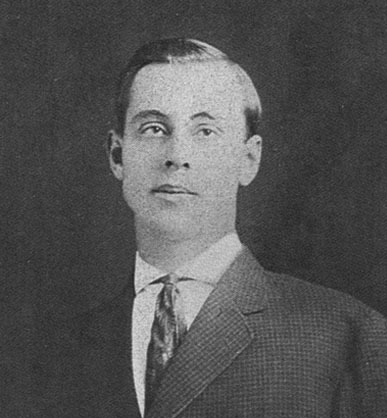
 Mario Acquaviva, Aug 1942, from a Timely Comics group photo
Mario Ciro Acquaviva was born on May 2, 1917 in Manhattan, New York City to Italian emigrant parents. They and Mario’s siblings also lived in Queens and The Bronx when he was growing up. In the 1940 census, he was an artist with the Works Progress Administration. Any art training he had is unknown. He enlisted in the Army in Jan 1941, but seems to have served near home until 1944. In Oct 1942, he married Lucy Zaccarde. Around that time, he began working for Timely/Marvel comics. He’s credited in KRAZY KOMICS #5, Jan 1943, as “special effects,” which probably meant lettering. He undoubtedly lettered many comics pages, and perhaps also designed logos, though we don’t know which ones. In 1944-45 he served in Europe in the Battle of the Bulge, and after his discharge returned to Timely.
 Secrets Behind the Comics, 1947, front cover, this and other images from the book © Stan Lee
In 1947, Mario worked with Timely’s editor-in-chief Stan Lee on this 100-page pamphlet self-published by Lee. Most of it is hand-lettered by Acquaviva, so it gives us plenty of Mario’s lettering to look at, and a few pages are by Mario explaining how he letters comics, the first such how-to I know of. Those are below.

As you can see, Mario’s lettering is very even and regular, almost like type. It’s probably done with Speedball style B pen points, which give a consistent line, so no thick and thin variations. Artie Simek, who was also at Timely then, had a very similar lettering style, perhaps he modeled his after Mario’s.


Here’s Mario himself as drawn by artist Ken Bald, who I believe did all the figures and other explanatory art for the book. The examples of a Sub-Mariner page shown are hard to see here, they may have been clearer in the actual book.

Acquaviva shows pencil guidelines for lettering being drawn with a T-square and pencil, so if he used an Ames lettering guide, it’s not shown or mentioned. He used a Speedball FB-6 pen for the lettering. At the time, art was generally drawn twice the size it would be printed, so an unmodified FB-6 (the same as a B-6 but with a Flicker double ink reservoir) would probably have worked fine, with perhaps a B-5 for bold emphasis.

The shown finished page is the same one in printed form at the top of this article, so that’s at least one story we know was lettered by Mario! It’s not clear if Acquaviva survived the 1949 Timely staff purge, I suspect he was laid off then along with all the letterers other than Artie Simek, but he might have been kept on for a few more years. By 1953, Acquaviva was working as an inker for Dell on Roy Rogers comics, which he did for several years, and by 1959 he was working as an inker and letterer for Archie Comics, which continued into the 1970s. In 1981, he and his wife retired to Florida, where he passed March 14, 2007. He was survived by two daughters and their families.
 From KEEN DETECTIVE FUNNIES #8, July 1938, Centaur
An early comics artist who lettered his own work, Ray Burley, credited himself as R. A. Burley on this and other stories he wrote drew and lettered. His style is similar to that seen in comic strips of the time, pretty regular and even, but with just enough variation in the letters to make it interesting. The title is nicely done in an Art Deco style. The balloon shapes are roughly rectangular, but uneven, and the balloon tails are partly open and partly a single line.
 R.A. Burley as a young man, photo from pulpartists.com
Raymond Albert “Ray” Burley was born on February 23, 1890, in Ainsworth, Nebraska. By the 1900 census, he and his parents and two brothers were living in Blaine, Washington state. By 1910, the family was in Everett, Washington, and Ray, age 20, was employed by the Westbrook Sign Company as a sign painter. He was in New York City by 1917, where his draft card says he was an unemployed artist. He served in the Army from 1917-1919. After his release, he studied at the Art Students League in New York, and found work as an illustrator for pulp magazines and children’s books. He also did comics stories for Centaur through the early 1940s as well as for DC Comics.
 From ANIMAL COMICS #14, April 1945, Western/Dell, lettering by Ray Burley
From the mid 1940s into the 1950s, Ray Burley worked as a letterer for Dell, where he often lettered stories by Walt Kelly. Kelly was a fine letterer himself, but perhaps thought it made more sense to use a regular Dell letterer to save time. In The Best of Pogo: Collected from The Okefenokee Star (1982), Kelly’s assistant George Ward recalled Burley:
… All those beautiful comic pages were lettered by an old-timer named Ray Burley who lived in the West Village about six blocks from my apartment. Burley was an interesting character. He always had a pipe in his mouth. He did a beautiful lettering job and Walt was very pleased with his work. However, we did laugh that every time we got the lettered pages back from Burley, we had to clean the pipe ashes off.
Burley’s lettering was usually all italic, as seen above, and the character logo and story title may have been penciled by Kelly, while the balloon shapes were added by Kelly or perhaps George Ward as part of the inking.
 From POGO POSSUM #11, Jan-March 1953, Western/Dell
Burley continued to letter Pogo stories for the character’s own title at Dell, and by that time Walt Kelly was also doing Pogo as a comic strip, so busier than ever. This all-black page must have saved him a little work, and it highlights the Burley lettering well. In the 1950s, Burley’s reputation as a painter grew, and he was commissioned to paint some large murals. More on his career is HERE. In the 1960s, Ray moved to San Diego, CA, where he began a new career as a fine art painter of seascapes that were exhibited in galleries. I haven’t found any examples. Burley passed away on October 4, 1971, in San Diego, CA, age 81.
 From NEW ROMANCES #13, Sept 1952, Standard/Pines
In the late 1940s, two women who lettered comics roomed together perhaps to save money. Nadine French King was one, and I’ve found no confirmed lettering examples from her, but she was interviewed by John Benson for his book Confessions, Romances, Secrets, and Temptations: Archer St. John and the St. John Romance Comics (Fantagraphics, 2007). Nadine had this to say about working for comics publisher Archer St. John, and about her roommate:
I started working for him in 1948, probably sometime that spring. At that time I shared an apartment with Duffy Mohler and her little girl, Liane. Duffy had been married to “Red” Mohler who, I believe, was a cartoonist, but they were already divorced when I met Duffy. She had studied art at Syracuse and had gotten a job in the art department at Parents Magazine when she came to New York. That’s when she started lettering. She started for a few cartoonists, and eventually she was lettering for just about everybody in comics.
Mohler had been lettering for a few years when they met, and she taught King to letter when they roomed together. An example of Mohler’s lettering is above, I find it very professional and polished, probably lettered with a wedge-tipped pen. The title and scroll captions are well done, as are the balloon shapes.

Mohler’s work at the time wasn’t credited, but Alex Jay found this scan of the original art of the same page where you can just make out the name Duffy Mohler written at upper left under the story number R672-1.
 Helen S. Chu, 1941
Helen “Duffy” Sui Fong Chu Mohler was born Sui Fong Chu on June 11, 1917, in China. She was given the English name Helen by her parents when they settled in America. Her father, George Chu, had been born in San Francisco, but returned to China to marry, where Helen was born. George came back to America in 1917 to establish himself in a laundry business, and his wife and daughter joined him in 1921 in Philadelphia. By 1922, George had moved his laundry business to Gloversville, NY, where Helen and her siblings grew up. Helen’s art talent was already evident in school, she had a display of her watercolors in a town storefront in 1932. After high school, she was a student at the College of Fine Arts at Syracuse University, majoring in painting, where she received honors. She graduated in 1941. Moving to New York City, she attended the Art Students League and the Grand Central School of Art. She landed staff jobs at Parents magazine and Fawcett, where she began lettering comics. In 1944 she married cartoonist William “Red” Mohler, and acquired the nickname Duffy. Their daughter Liane was born in 1945, and they divorced in 1946. An article about her on the Women in Comics website says:
She lived with Nadine French, who also lettered and worked as support staff for St. John. Being a freelance artist gave Mohler the flexibility she needed as a single mother, and she found work with a wide variety of publishers. Throughout her commercial career, she continued her work as a fine artist.
 From WEIRD WAR TALES #103, Sept 1981, image © DC Comics
In addition to Fawcett, St. John, and Pines/Standard, Mohler worked for Gold Key, Archie, and DC Comics, and probably others, into at least the early 1980s, as seen above, the only story I’ve found with a printed credit for her. I haven’t found any examples of her fine art. Mohler passed away on June 19, 2008. The Social Security Death Index said her last residence was New York, New York.
 From CAT-MAN COMICS #30, Dec 1945, Continental
L. B. Cole was an artist, editor, and publisher of comics starting in the 1940s. At first he ran a shop that packaged work for several publishers. In 1942 he married Ellen Kovach, and he taught her to letter. She became a prolific letterer on his comics. Above is a close look at her work. She used a wedge-tipped pen to give a variety of thick and thin lines, and her letters leaned to the left. Her S has a short lower curve that makes it seem ready to fall to the left, but generally her work is professional and appealing.
 Ellen Cole © E. B. Boatner, 1970s
Ellen Kovach Cole was born Helen Dolores Kovach to Austrian emigrant parents on December 20, 1918, in Maxwell, Pennsylvania. When she met L. B. Cole in Manhattan, she was a waitress. After their marriage in 1942, she began helping her husband with his comics work. In an interview published in Comic Book Marketplace, #30 (December 1995), L. B. Cole remembered:
We were hard pressed to get letterers, particularly, and editors, because we were doing a book every calendar day. Basically, we were turning out 365 books a year. She was and is a very brilliant lady. At that time she edited every piece of copy that came out of the company. Well, she started to practice what was called thick and thin lettering. It was not but about a month that she became so adept at it that she was producing about 20–30 pages a day, maybe more. Literally the best lettering that I have seen, but of course I am a bit prejudiced. However everybody said that her lettering was about as good as it ever gets. She oversaw the lettering that we had to buy from other outside help.
 From CAT-MAN COMICS #29, Aug 1945, Continental
Here’s another example of Ellen’s lettering, and I think we can be sure it’s by her because she appears as a character in the story. This example has slanted lettering for the captions, two of which have an interesting notched lower border.
The Coles got out of comics in 1964, starting a new business making instructional films. Beginning in the 1970s, they were popular guests at comics conventions, sparking new interest in L. B.’s work. He died in 1995, and Ellen passed on March 7, 2007, in New York. Ellen’s lettering was never credited, but it had a major impact on her husband’s successful comics career.
 From THE SPIRIT SECTION, April 10 1943, image © Will Eisner Studios, Inc.
Will Eisner’s THE SPIRIT had several letterers over its decade-plus run. From late 1942 to about 1946 it was Martin DeMuth, sample above. His lettering was regular and even, but fairly sedate. I like the Art Deco style of the larger emphasized words on this page. DeMuth’s comics career wasn’t a long one, and it was preceded by a creative and unusual occupation he and his wife Flora came up with that provided them with a steady income and lots of interesting travel.
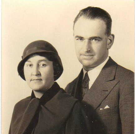 Flora and Martin DeMuth, 1930
Martin Smith DeMuth was born in Cardington, Ohio on April 16, 1895. By the 1910 census, he and his family were living in Marion, Oregon. In his first year of college in Berkeley, CA in 1916, his drawings were being published in the college magazine. Martin was drafted in 1917 and served in the Army until 1919. By 1920 he was living in Manhattan, where he won a poster contest. He was then a student at Columbia University and attending the Art Students League. He also worked for the Army Recruiting Service drawing posters and doing cartoons and articles for their newsletter, a job which included travel to places like Hawaii. Martin met illustrator Flora Nash in New York, and they were married in 1926, but couldn’t afford a honeymoon. They came up with a clever scheme to get one, proposing to a cruise line a service they could provide to passengers: a daily Memogram newsletter and postcard of activities, sights and events illustrated by either Flora or Martin, and printed by them through some secret process in their stateroom. The postcards could be then mailed home by passengers to entertain their families. Some examples are HERE. The DeMuths made this their occupation for six months of each year from 1926 to about 1939, and Martin was soon also doing lectures and slide shows to entertain passengers on ships and potential ones on land.
 From THE SPIRIT SECTION, Jan 21 1945, image © Will Eisner Studio, Inc.
By 1940, many cruise ships were out of commission due to World War Two. I don’t know how Martin transitioned from those tour adventures to lettering The Spirit for Eisner, but in the example above you can see he was quite good at serif mixed-case lettering, probably something he’d been doing for his Memograms. I also like the swear symbols in the first balloon.
 From THE SPIRIT SECTION, Sept 23 1945, image © Will Eisner Studios Inc.
Martin was also good at script lettering, and it probably amused him to be lettering his own name in this example. Martin was still occasionally lettering The Spirit as late as 1950, and he continued his travel lectures in the 1940s. I don’t know what he did for a living after that. Martin passed on March 6, 1961, I believe in South Kent, CT. Flora later moved to Hawaii, where she passed in 1976.
 From BLACKHAWK #33, Oct 1950, Quality, image © DC Comics
One area of comics with even fewer established credits than story lettering is logo design, especially during the early years. Some are known and well-documented by me on my blog, but many logo designers are unidentified. Al Grenet was an editor and logo designer for Quality Comics. He claimed to have designed all their logos, but I doubt that based on other information about him. I do think he designed this handsome logo for BLACKHAWK, replacing the existing block letter one with this more interesting curved and telescoped version that features a large B and Art Deco style. This logo was used for many years by Quality, and then DC Comics.
 Al Grenet with unknown artist, 1955, photo © Al Grenet
Alfred “Al” Grenet was born Alfred Grünberg on February 28, 1915, in Budapest, Hungary. Grenet and his family left Europe and arrived in New York in 1920. Al filed to become a citizen in 1936, and became one in 1939. By that time he was already working in comics. In an interview with Jim Amash published in Alter Ego #34 (March 2004, TwoMorrows), Grenet said:
I started out at seventeen as an errand boy in a drugstore. I got promoted to cashier and was in charge of the errand boys. I saw an ad in the newspaper — Walt Disney was looking for artists. I went up and took the test, but they didn’t like what I did, so I did other jobs until 1938, when I saw another ad in the paper for an artist. It was Eisner & Iger. They gave me a week’s trial and I stayed there for five years, until I went into the Army.
Grenet began as an apprentice who erased pages and corrected mistakes during his first year at Eisner & Iger. After that he did lettering and backgrounds. He enlisted in the Army in March 1943 and served until Dec 1945. When he got back to New York, there was no place for him with Iger, so he found a job as a production artist at Quality Comics where he eventually became the editor.
In the Amash interview, Al claimed to have designed all the Quality logos from the early 1940s on, but that doesn’t agree with other known facts. Eisner and Iger, among other comics packagers, may have been supplying Quality with stories and covers, but it seems unlikely Grenet would have been assigned cover logo designs there so early in his career. Also, some of the Quality titles began while Al was in the Army. I do think he had become their main logo designer by the mid to late 1940s when he was on staff, and I’ll show a few more he probably did below.
 From HEART THROBS #1, Aug 1949, Quality Comics, image © DC Comics
When Quality got out of the comics business in 1956, some of their titles were bought by DC Comics, including this one. Grenet’s logo is effective but predictable for a romance comic, and DC kept it without the hearts for about two years before having Ira Schnapp do a new one.
 From LADY LUCK #86, Dec 1949, Quality Comics
This was a short-lived title, but I like the four-leaf clovers behind the block letters.
 From BUCCANEERS #19, Jan 1950, Quality Comics
A nicely-crafted telescoped logo in an ornate 19th-century style.
 From G.I. COMBAT #1, Oct 1952, Quality Comics, image © DC Comics
In my opinion, this is Grenet’s best logo for Quality. The ragged stroke ends, the bullet holes, the staggered letters, and the deep drop shadow all capture the danger and drama of wartime stories. The bullet holes soon disappeared, but the logo remained the same otherwise through the Quality run and a very long DC Comics run to 1987. You can find more probable Grenet logos in Alex Jay’s article.
Grenet’s work at Quality allowed him to marry and raise a family on Long Island. When Quality stopped publishing comics, Grenet edited other magazines for them, also designing their logos, until the company folded in 1957. Then he became a freelancer and a salesman. In 1978 Grenet moved to Florida. He passed away on August 1, 2006, in West Palm Beach.
 From COO-COO COMICS #22, Feb 1946, Pines
The Sangor Shop was a comics packager started by Ben Sangor in 1939 that used artists in New York and Los Angeles, the latter drawn from the animated cartoon arena. Head of the Los Angeles studio was Jim Davis (not the creator of Garfield) who did a lot of the art himself and hired others from animation to do more. Once sent to New York, Sangor packaged the mostly funny animal stories for his nephew Ned Pines, and also for his own comics company, the American Comics Group, as well as National/DC Comics and others. Once they got busy, Davis decided they needed a letterer, and he hired Melvin “Tubby” Millar for that. An example of his stylish and appealing lettering is above, according to the Grand Comics Database, who I’m relying on to identify the work. The letters have great curves and curls, and wide letters made with a slightly wedge-tipped pen.
 Melvin Millar, image found online
Melvin Eugene Miller was born May 6, 1900 in Portis, Kansas. His father was a railroad worker. He served in the Navy from 1918 to 1922. There are several differing reports of Melvin’s art training, two say he studied at Chicago Academy of Fine Arts, two say he was at the Kansas City Art Institute, but after that he worked for a time at a film advertising company in Kansas City, and then headed to Hollywood to find work in animated cartoons, changing the spelling of his last name to Millar. He was successful, working for Warner Bros. from 1931 to 1944 under Leon Schlesinger, where he became friends with Fritz Freleng and often worked on Porky Pig cartoons. Later he also worked briefly for Disney, and became a teacher at the Hollywood Art School. He became the main letterer for Jim Davis and his comics studio around 1945, and continued into the 1950s, while also doing cartooning, children’s books, and single-panel strips for syndication for many years.
 From GIGGLE COMICS #47, Nov 1947, American Comics Group
Having been an animator himself, Tubby, as he had been known since childhood, was adept at adding the same kind of roundness and curves to the lettering as the artists did in the art. Here his title and open letters are beautifully done.
 From REAL SCREEN COMICS #26, Oct 1949, image © DC Comics
The lettering is smaller on this story, probably because there’s more of it to fit in, but it has many of the same curved letter shapes. If Millar also did the panel and balloon borders, their appealing brushwork and variety are a great match for the art, but they may be by the artist, Jack Bradbury.
 From FOUR COLOR #468, May 1953, Western/Dell, image © Disney
Millar is also credited on a number of Dell Disney stories as letterer, though the style is more subdued and less curvy. If this is his lettering, perhaps he decided to do it more like other Dell comics of the time, or possibly this is by someone else.
Millar was married twice, his first wife, Myrtle, died in 1940. His step daughter continued to live with him until at least 1950. By 1967, he was remarried to Helen. and in an interview with the Valley News, said:
A cartoonist is an artist, but an artist is not necessarily a cartoonist. Artists reflect themselves, whereas cartoonists reflect the situation in a gentle satire. It’s the humor or satire of the idea that makes the cartoonist.
Millar passed on Dec 30, 1980 in Burbank, CA, having lived his dream. He was active as a cartoonist into the 1970s.
More in Part 2!
The post More 1930s-1940s Letterers Part 1 appeared first on Todd's Blog.
November 1, 2023
Rereading: TIME AT THE TOP and ALL IN GOOD TIME by Edward Ormondroyd


 Illustration from Time At The Top by Peggie Bach
I’m a fan of time-travel stories, always have been, and these connected books are entertaining ones. Susan Shaw lives with her father in an old apartment building in New York City. She’s having a very bad day when she meets an elderly lady on the street and rescues the lady’s hat. The woman mutters something odd as a thank you, “I’ll give you three.” Susan has no idea what this means, but soon finds out. Back home, she decides to get away from her problems by going up to the roof of the apartment. She enters the ancient, sluggish elevator and pushes the button for the top floor, the seventh. Something odd happens, and the elevator opens instead into the hallway of a very different place: a large Victorian home in a rural neighborhood in 1881. Susan soon meets a girl her own age who lives there, Vicky, and before long she’s drawn into a plot to try to save Vicky’s mother from a suitor who Vicky is sure is only after her mother’s money. Susan manages to adjust to the startling changes in her situation, and is soon using her acting ability to help Vicky and her brother Bobbie get rid of the slimy fortune hunter, Mr. Sweeney, by convincing him they’re penniless. Then they all discover that Vicky’s mother has lost her money for real, and the family must soon move away. All seems lost until Susan has an idea, but it will require her to return to her own time and place on the elevator. Will that use up the last two rides?
The second book continues the story with a much more complicated situation, in which Susan’s father travels back with her to 1881 on the elevator, and they are both hard pressed to save Vicky’s family from both the persistent treasure hunter and a truly awful relative, who’s arrive to take charge. Even the fortune they’ve found may not be enough to help.
I enjoyed rereading these, though the first book is better, the second gets overly tricky and complex. Still, both are recommended.
Time At The Top by Edward Ormondroyd
All In Good Time by Edward Ormondroyd
The post Rereading: TIME AT THE TOP and ALL IN GOOD TIME by Edward Ormondroyd appeared first on Todd's Blog.
October 31, 2023
JOHN WORKMAN – Letterer and Artist
 From THOR #337, Nov 1983, image © Marvel
A unique letterers in comics from the 1970s to the present is John Workman, whose distinctive letter shapes and style make his work stand out from the crowd. He’s perhaps best known for his many collaborations with writer/artist Walt Simonson, as on THOR, above, where large letters for Odin add to the drama, and John’s balloons, open at the panel borders, make a style statement, and leave more room for the art. John has also had a long but sporadic career as a writer/artist, as well as being the art director of Heavy Metal for a few years. We met in the DC Comics production department when I was hired in 1977, and have been friends since.
 John Workman by Rick Spanier, 1970s
John Elbert Workman, Junior was born June 20, 1950 in Beckley, West Virginia. He and his family lived in West Virginia and Maryland, then moved to Aberdeen, Washington in 1958, where John grew up. John told me he started collecting comics in 1961, buying them used for five cents each. He loved the Marvel books of the 1960s as well as Superman, Batman and Captain Marvel from an earlier era, but what impressed him most were the EC comics he found. Later he was a fan of Will Eisner’s The Spirit and the Disney duck stories of Carl Barks. He started getting work published in small local fanzines, then reached a wider audience in a California one called Voice of Comicdom in 1967, where he shared space with future comics writers and editors Bill Dubay, Marv Wolfman and Len Wein. He was also drawing and sometimes writing for local advertising. During this time he met fellow artist Bob Smith through a mutual friend, and they began to collaborate. John met comics creator Basil Wolverton in 1969, who was very encouraging, as was Carl Barks when he saw a Donald Duck sample page John had done. In 1972 John, with help from Bob, did two comics series, the science-fictional Sindy and the humorous Fallen Angels for two California-based men’s magazines.
 From “Key Club” written and drawn by John for STAR*REACH #2, April 1975, © John Workman and Star*Reach Productions
In 1974, John met upcoming comics artist Dave Stevens, of The Rocketeer fame, at a small comics convention in Portland, Oregon, and Dave encouraged John to submit his work to a new magazine being launched by Mike Friedrich, Star*Reach. John created the short story Key Club and sent it off to Friedrich, and it was published in issue #2. I think both the art and lettering are terrific. I liked it so much, I bought this page from John. In a 2017 panel at the Baltimore Comic-Con that Workman and I did together with Bob Greenberger, John said, “I wondered, ‘Why am I here with Neal Adams and all these people? How did that happen?’ I found out years later there was a guy who was supposed to have a story in that issue, but he didn’t get it done, so Mike put mine in. The guy was Dave Stevens.” Despite John’s modesty, Mike Friedrich liked his work and published more of it in later issues, and he was very supportive of both John and Bob Smith. He set up a phone call with Dick Giordano, then at Neal Adams’ Continuity Associates studio in New York. Both Dick and Neal liked their work and encouraged them to come to New York City, which they did in late June of 1975.
John said, “Bob Smith and I piled into my old green car and drove 3,000 miles to New York in order to work in comics. We got some work immediately from Marvel, but when we went over to DC, nothing was happening there. We met editor Jack C. Harris and writer/production man Bob Rozakis, they liked our stuff. We made a later appointment with editor Gerry Conway to show him this Plastic Man thing we had in mind. When we showed up that day, Gerry was in conference with a writer, so we were waiting in the reception area. Bob Rozakis came by and said, ‘Oh, you guys are here again. Who are you here to see?’ I mumbled, as I tend to do, and said ‘Conway,’ and Bob replied, ‘Oh, he’s not busy, come on!’ We followed him down the hallway past Gerry Conway’s office and I wondered what was going on. I looked at where he was taking us and the sign said, ‘Carmine Infantino, Publisher.’ Bob took us in there, we showed Carmine our work, and we got jobs immediately, because of my mumbling. So, I advise you to mumble whenever you can.” Bob Smith was hired as a freelance inker, while John took a drawing board in the DC production department, which like Marvel’s bullpen, was where comics art was prepared and corrected for printing. He was soon picking up freelance lettering work there, too.
 From DETECTIVE COMICS #472, Sept 1977, image © DC Comics
John now dislikes his earliest lettering for DC, and said, “I wasn’t happy with what I was doing until I worked on the DECTIVE COMICS issues. Artist Marshall Rogers and I talked beforehand about what he had in mind for the lettering. I went back and looked at the style of lettering in early issues of BATMAN. It was the first stuff I did where I felt I had linked to the art so the art and lettering became a single thing.” Among the style points I like are the rounded rectangle balloons and the reversed first letter of the captions.
 From DETECTIVE COMICS #475, Feb 1978, image © DC Comics
On this cover with larger balloon and caption lettering, John’s mature style is emerging in the wide, angular, thin-line letters that are unlike what anyone else was doing at the time.
On his lettering tools, John told me, “I used Speedball pens at first. Later on I read about a type of Sheaffer fountain pen Jim Aparo used. I got one and found that my stuff suddenly acquired a bit of the look of Aparo’s lettering. Around the same time I started using Rapidograph technical drawing pens. They seemed to do the trick, and I had a bit more control than I did with the Speedball pens. I was using those when I went to work at DC. In 1976, I was walking past an art supply store with a sign in their window about Faber-Castell TG-1 technical pens at $4 each. I bought a few. That night, a Rapidograph I was using to letter a story for DC literally fell apart in my hand. I opened up the Castell and was incredibly happy with that pen. I used Castells for decades, and still do.” John was my informal lettering teacher at DC, and I followed his lead to the Castell pens, which I also still use.
 Workman logos from his time at DC, 1977.
John also designed logos for DC while on staff, though on a freelance basis. These are two of my favorites. Both have a rough energy that suggests the art of Jack Kirby as well as the dynamic logos of Gaspar Saladino. More about John’s DC logos here:
JOHN WORKMAN’S DC LOGOS Part 1 Part 2 Part 3
After working on staff in DC’s production department for about two years, John’s career took a sudden turn when he was offered a job on the staff of a new magazine from the publisher of National Lampoon. He wrote, “One day, Peter Kleinman at Lampoon called me at DC and told me that I’d been recommended for the position of Art Director at Heavy Metal. Neal Adams had made the suggestion. After meeting with him, I got the job.” John left DC near the end of 1977. Much of Heavy Metal reprinted translated stories from the French comics magazine Métal Hurlant and other European sources, and one of John’s job requirements was to reletter those stories in English. John reports, “I hand-lettered, on vellum over enlarged copies of the pages, reduced the letters to final printed size, and placed the lettering on print-size photostats of the art. The people who did our film work then incorporated my lettering into the final films used for plate-making. When I started at Heavy Metal, I immediately made some changes that streamlined the process and saved money. Those relatively simple changes saved over $40,000 for the company. The majority of the work was done on staff unless we were under deadline pressure. Then I took work home with me and did some at night while watching TV.” In our 2017 panel, John said, “What I learned at Heavy Metal was incredible. I didn’t try to be Moebius or Druillet, but I tried to simulate what they were doing, and I learned so much from Moebius.”
 From ALIEN: THE ILLUSTRATED STORY, 1979, image © 20th Century Fox & Heavy Metal
While still on staff at DC, John lettered a three-part Captain Fear story drawn by Walt Simonson, their first work together. It was published later in THE UNKNOWN SOLDIER #254-256, August-October 1981. When the adaptation of the film Alien was given the green light in 1979, John first wanted to have Carmine Infantino draw it and Walt Simonson ink it. In our panel, John said, “I called Carmine and his phone was busy, so I called Walt, and we talked a bit, and by the end of the conversation Walt was doing the entire job. Walt brought in Archie Goodwin. His ideas, his storytelling…it couldn’t have been better.” John, of course, lettered the book, and in the sample page above you can see his style of balloon borders that open at the panel edges was in place by then, and often seen on his work since. John told me he got the idea for that from earlier work by Carmine Infantino and Al Williamson. The creative partnership of Simonson and Workman continued for decades at Marvel Comics and other publishers, and ALIEN, THE ILLUSTRATED STORY was the first comic to appear on the New York Times best-seller list.
 From Heavy Metal, 1981, drawn and lettered by John.
Workman seems to have blossomed at Heavy Metal, becoming more than just a reletterer of foreign stories. After a while he brought in his brother Bill to help, as seen above.
 From National Lampoon, 1978
In the 2017 interview, John said, “My wife is involved a lot in this particular thing. She was working for one of the Wall Street firms, and one of the guys she worked with was a fellow named John Badalamente, who was a very nice guy, had a very interesting life, and weighed about 450 pounds…a big fellow. One Saturday morning, Cathy and I were going to a grocery store. On the way, we started kidding about how John was not really John Badalamente…he was Elvis Presley, and he had faked his death and was now living in Brooklyn. As we kidded about this, we realized that we had what could be a possible Foto Funny for Lampoon, so when we got back from the store, I sat down and, in 15 minutes, I drew up a Foto Funny in comics form. I took it into the office on Monday figuring I’d show it to the Lampoon people, but I made the mistake of first showing it to one of my compatriots, and that person said, ‘I don’t really think Lampoon would be interested in it.’ So, discouraged, I tossed it into my desk drawer and went about my work. But my wife, bless her, kept bugging me about it. Finally, to get Cathy off my back, I took the Foto Funny downstairs to [editor] P.J. O’Rourke’s office. He said ‘Yeah, do this!’ Everyone loved it. It sold to different countries, and I got extra money for that. If you come up with an idea that you think is good, stick to it.”

 From THOR #339, Jan 1984, images © Marvel
John exited Heavy Metal in 1984, but before that he’d started taking freelance lettering assignments, becoming the regular letterer on Walt Simonson’s THOR with issue no. 337. It was a stellar run well-liked by readers and fans, and John’s lettering was an important part of the book. Walt and John’s work together seems a perfect symbiosis. Simonson is a good letterer himself and knows how to lay out the sound effects and place the balloons well. In the first example, there’s lots of lettering, but it’s all easy to follow. And the dynamic sound effect and special balloon in the second are full of energy. John also had a long run lettering THE FANTASTIC FOUR written and drawn by John Byrne, and worked on GRIMJACK at First Comics. In 1987 he reunited with Steve Englehart and Marshall Rogers on SILVER SURFER at Marvel.
 From TIME TWISTERS #12, Dec 1988, Fleetway/Quality © John Workman
From time to time, John was also able to get some of his art and writing published, this cover for British reprints is a nice example. In the 2017 interview, John said, “It’s one of my favorite pieces of my own art because it all just flowed right out. Usually I have to fight that piece of paper to make everything work, but this one was so easy, and I loved drawing all the monsters.”
 From THOR #400, Feb 1989, image © Marvel
About this pinup, John said: “For the 400th issue of THOR I did a drawing of Sif, Thor’s lady friend, and I asked before I even started on it if Joe Sinnott could ink it, and they said yes, and I was so thrilled. I did tighter pencils than I should have. I found out later that Joe likes to work with loose pencils, but he did a beautiful job on the inks, and he did things I never would have thought of, the background elements and all. Clouds are hard to do. Joe did them beautifully.”

 From DOOM PATROL #62, Dec 1992, images © DC Comics
John returned to DC on DOOM PATROL in 1987, including memorable stories written by Grant Morrison. John said, “It was so strange, I really enjoyed it.” I particularly like John’s version of electric balloons in the second example. By the mid 1990s, John was also lettering for Topps, Image, Dark Horse, Malibu and Tekno. After the boom and bust in comics in the 1990s, John mainly worked for DC and Marvel, though he also lettered Erik Larsen’s SAVAGE DRAGON for Image. The Englehart-Rogers-Austin-Workman team returned for BATMAN: DARK DETECTIVE in 2005, which John enjoyed.

 From ARCHIE & FRIENDS #84, Oct 2004
Archie Comics was looking for a new letterer in 2003, and Bob Smith, already working for them, recommended John, who said, “I enjoyed working for Archie, even at the reduced page rate. The amount of lettering per page was less, so the pay worked out fine. In addition to lettering, I wrote a few stories and also realized a long-standing goal by writing, penciling and lettering a two-page Archie story,” seen above. John’s lettering for Archie continued for years, and he particularly liked working on MEGA MAN for them. On the story shown, I love the rambling balloon tails.

 From RAGNARÖK #12, Dec 2016, IDW, images © Walter Simonson
Beginning in 2014 John continued his partnership with Walt Simonson on the series RAGNARÖK from IDW, a different take on Norse mythology. If anything, John’s lettering has become more personal and stylized but is still easy to read and appealing. The first example is a page of Walt’s layouts that John received and lettered. Below is the final printed page. When you’re the writer and artist, you can afford to work pretty loose, Walt’s layouts remind me of a few I’ve seen from Joe Kubert.
 From RAGNARÖK: THE BREAKING OF HELHEIM #6, July 2020, IDW, image © Walter Simonson
Another series of this title ran six issues, ending in 2020. I find both Simonson and Workman at the top of their game here.

 From BATMAN #16, April 2017, images © DC Comics
John returned to BATMAN in 2016, and said this about the series: “Tom King was the writer and David Finch the artist on that. I loved the artwork and Tom’s writing is very good. That first one was an especially difficult page because of all the jumping around of viewpoint and time on those first three panels.”
When not working with Walt Simonson, where he still letters on the art boards, John has come up with a creative and unusual method of doing digital lettering. He letters on a tablet over digital scans of the art, so it’s really a combination of hand and digital work. John said, “That is the most fun as far as doing this stuff on the computer. This is hand-lettered into the computer, but where I have my real fun is in the placement of the balloons. I move things around a lot, trying to make everything work.”
 John Workman and Todd Klein in my studio, June 2015
In recent years John has also had runs on Superman comics for DC as well as projects at Image and Marvel. I hope he continues to share his unique lettering style with all of us for many years to come, and I also hope we continue our long friendship.
The post JOHN WORKMAN – Letterer and Artist appeared first on Todd's Blog.
October 29, 2023
Rereading: ARE ALL THE GIANTS DEAD? by Mary Norton


Best known for her Borrowers books, and Bedknob and Broomstick, this book by Mary Norton is unlike the others, but equally delightful.
James, an English boy who likes science fiction, has a magical friend, a woman named Mildred, who appears to him while he’s asleep, and invites him along on fairy tale adventures. Mildred is a sort of gossip columnist for fairy tale characters, who live in a fanciful world containing castles and royalty as well as goatherds and innkeepers. They are all part of some fairy tale, sometimes more than one. This time, Mildred brings him to the castle shared by Cinderella and Sleeping Beauty and their husbands, where he meets a princess, Dulcibel, who is fated to marry a frog prince, something she’s frightened about. Mildred and James then travel through a forest to a village where James is put into the care of two innkeepers, both named Jack. You might guess from the book’s title which Jacks those are. While Mildred is away at a royal wedding, James gets into all kinds of trouble and adventures with Dulcibel, who has run away from her castle, and before long the last of the giants is on their trail.
Clever and fun, though not as good as Norton’s other books. Wonderful illustrations by Brian Froud, though. Recommended.
Are All the Giants Dead by Mary Norton
The post Rereading: ARE ALL THE GIANTS DEAD? by Mary Norton appeared first on Todd's Blog.
October 26, 2023
Digital Lettering for Comics
 My lettering desk and work station, © 2023 by Todd Klein, as are all the following images, except as noted
Before I even begin this article, I must highly recommend The Essential Guide to Comic Book Lettering by Nate Piekos (Image 2021). It’s the book I wish I’d had when I started digital lettering, and it’s far more comprehensive and detailed than what you’ll find here. If you’re serious about lettering comics digitally, Nate’s book is what you need. I’m going to present a very basic and bare-bones look at what I do, which is all I feel there’s room for in a blog article.
Above is my computer work station. Left to right on the tables: laser printer, scanner, small Wacom tablet (in front of scanner), 27-inch iMac, Apple Superdrive disc reader (below iMac), paper holder, spot lamp. Behind the iMac are two external hard drives for backup and a surge protector/battery backup power supply. A wireless keyboard is on an under-desk slide-out tray, a wireless mouse is on the file cabinet to the right.
Digital lettering, and the hardware and software used to produce it, is something that’s constantly in flux, with new versions, upgrades and tools coming onto the market all the time. I can be sure that the more specific the recommendations I make, the more likely they will be outdated by the time you’re reading this, so I’ve opted to keep things as general as possible. Whichever hardware and software you use, study the manuals, tutorials, and any information you can find about them online. The more you know, the easier your process will be. Personally I’ve always learned on my own, following tutorials and by trial and error, but if classes and instruction work better for you, look for those options.
Unlike hand-lettering, digital requires a significant cash outlay to get started, but you may already have some of what you need. Most of the comics industry works with Apple hardware and operating systems, but you can letter with others as long as your files are compatible. Most letterers work on a desktop computer with a large screen, but some use a laptop and a second monitor to get the space needed for everything they want to see at the same time. A few work on tablet machines with a stylus where the screen is interactive. Get hardware with the highest amount of processing speed, memory, and storage space you can afford. Consider getting at least one external drive for backup, two is better, and cloud backup is another option. You should also have a printer to see what your work looks like on paper. A laser printer is recommended. After hardware, the next most important item is a chair you can sit in comfortably for hours. I use an Aeron chair by Herman Miller.
The most important software you’ll need is Adobe Photoshop, Adobe Illustrator, Adobe InDesign, and Adobe Acrobat Pro. These now come together in a package with other Adobe programs that you license for a monthly fee. The subscription model for software that Adobe and others have adopted is disliked by many users, and rival software of equal quality without it might change the game, but for now, if you want to work with publishers, you should go with Adobe’s Creative Cloud subscription. One advantage (or sometimes disadvantage) of the subscription is it includes frequent updates. Beyond that, you’ll want to shop for and buy some commercial comic book fonts. The best selections at present are from Comicraft and Blambot. Begin with a family of regular balloon and caption fonts at first and perhaps one or two sound effect fonts. As you learn and work with them, you’ll discover what additional fonts you might need. Both font providers have yearly sales that are worth planning for.
Software that works with images comes in three basic types.
1. Painting and photo editing programs work with pixels and produce images that can be many different sizes and resolutions. They’re not recommended as a lettering program, but you’ll want one to work with images of comics art or to produce online-ready images. Adobe Photoshop is the standard for creating comics art files, but others are also used. Common file formats for art are PSD (Photoshop), best for files with layers, TIFF (Tagged Image File Format), best for printing, and JPEG or JPG (Joint Photographic Experts Group), best for small size previews and online images. These files can have several different color environments. The most common are RBG (Red, Blue, Green) for on-screen images and CMYK (Cyan, Magenta, Yellow and Black) for print images. For anything that’s going to be printed, you must use or convert to CMYK, and image resolution for print should be at least 400dpi (dots per inch) for painted art and 600dpi for black and white line art. For images that will only appear online, RGB is fine, and resolution can be lower. You can to see how that will look on your own computer.
2. Drawing programs work with vectors and Bezier curves and produce images and shapes that can be enlarged or reduced without any loss of quality, unlike pixel images. Adobe Illustrator is the standard for lettering comics. Common file formats are AI (Adobe Illustrator) and EPS (Encapsulated Postscript). Illustrator works in layers, so you can place an art file on the bottom layer, lock it, and then do all the lettering on another layer above that, or as many layers as you need. EPS files are more universal, but have some limitations.
3. Page and book design programs are used to combine all the elements you need to produce a final product, with art files on one layer, lettering files on another above that, as many pages as needed, and any other elements you want to add like logos, additional images and type. Adobe InDesign is the program most often used for that, and it works well with the other Adobe products. The only file format for this is INDD (InDesign). All these Adobe programs can save your work as a PDF (Adobe Acrobat), which can be viewed by almost any computer, making it ideal for proofing. PDF files can also be used for printing. Note that Illustrator and Photoshop can create print-ready work, but for anything complex, or that might need tweaks and changes, InDesign is the way to go.
 My Adobe Illustrator setup, closer looks below
All the Adobe programs have a a variety of ways to set up your work environment. Above is mine for Illustrator, with tools along the left side, then an open document, then palettes on the right. Some palettes are stacked behind others.
 Tools on the left side of my Adobe Illustrator setup
At the top of the tool area are a double row of all the tools. Ones with a small black triangle at lower right include other tools hidden in a clickable palette. You can click and drag those away from the toolbar, and position them below the main toolbar, as I’ve done here with six small tool palettes, ones for Pen types, Size and Slant, Eraser and Scissors, Rotate and Reflect, Shapes, and Type. As you can see, there are lots of tools to learn and understand. The most-used tools for lettering are the Selection tool (black arrow), Direct Selection tool (white arrow), Pen tool, Type tool (letter T), Oval and Rectangle Shape tools, Rotate tool, Scale tool, Hand tool (for moving the entire image on your screen), and Zoom tool. Spend time familiarizing yourself with these tools, and note that most also have keyboard shortcuts that can save you time, especially when switching back and forth between things like the Oval and Rectangle shapes for balloons and captions.

Palettes are used often, and can be set up many ways. Shown here is a typical setup for me, but some palettes are stacked, and clicking on the names of the ones behind bring them to the front, as with the bottom one: Layers in front, Gradient and Stroke behind. There are many more palettes, and they’re all accessed by clicking on the Window pull-down menu at the top of the Illustrator screen. If you have room on your computer, you can set up a second row of frequently-used palettes to the right of the first row. I often do that, but to show them here I’ve stacked more than usual. Again, take time to explore and experiment with all the palette options until you understand what they do. Adobe tutorials are helpful.
 Sample of my Illustrator Template
Next you need a template for lettering. I create my template on a letter-size page, one of the options when you open a new document in Illustrator. First set up some layers in the Layers palette (at lower right on my setup) by clicking on the Create New Layer icon at the bottom edge of the palette, then typing in the name of each layer. As you can see, I generally use seven layers: INFO, lettering, balloons, sfx1, sfx 2 (for sound effects), art and Guide. When you have your layers, click on the INFO layer to make it active for the next task.

Open Preferences under the Illustrator menu at the top left of the window. Choose Inches for General preferences, assuming you work in inches. You may find other Preferences you’d like to adjust as you learn.

Open the Rectangle Shape tool by double clicking on it and type in the Trim Size of the pages you’ll be working on. Most U.S. comics have a trim size of 6.625 by 10.1875 inches. (If you’re working on something else, make sure you get the trim size from the printer or publisher.) Click on the page away from the tool to create a box of this size.

In the Color palette, give the box a Fill of None (white box with a red diagonal) and a Stroke of 100% Cyan and 100% Yellow, solid Green. Center your box on the template page.

If the rulers are not visible on your document, Go to Rulers on the pull-down View menu at the top of the Illustrator window and make them visible. Next you need to set the rulers to make the upper left corner of the Trim Box at the 0,0 starting point for both the horizontal and vertical rulers. Do that by clicking and dragging from the small corner box where the rulers meet down to the corner of the Trim Box. You will see the corner symbol of the box when you’re over it. Release your drag-click there. Now your rulers are set to start at the upper left corner of the Trim size.
Most comics art is prepared with an extra .125 inches on all sides for bleed, in other words the art runs (or can run) to the edge of the paper. The Bleed area is trimmed off after printing, but must be there to give the printer room to make sure the border of the art is removed. This Bleed box is 6.875 by 10.4375 inches, and has a black outline in my example above. Centered inside the trim line is a Safe Area box that all lettering must fall within to make sure it doesn’t get trimmed off. This is .25 inches in from the trim on all sides, and measures 6.125 by 9.6875 inches. It’s indicated by a dashed red line in the example (dashed lines are an option in the Stroke palette). Non-bleed comics art panels usually stop near the safe area edge. Set up the Bleed and Safe Area boxes the same way you did the Trim Size box, and center them outside and inside the Trim Box using the rulers. When you have these in place and centered, lock the INFO layer so you can’t move the boxes accidentally.

The layer at the bottom labeled GUIDE has guidelines added by me at the borders of the safe area and trim size, seen as light blue lines in the example. Click on that layer to add Guides. To use Guides, check your Illustrator tutorials, they’re accessed from the View menu at the top. Guides are visible to you, but non-printing. If you click on the vertical ruler and drag right, you will pull out a new guideline, which with be set where you stop dragging and release it. The same is true for the horizontal ruler at the top. The guidelines make it easy to align anything to the boxes. When you have your guidelines where you want them, lock the GUIDE layer. Once you have your template boxes set up, you can add identifying text along the sides in the INFO layer, seen on the right side of my template in the example: my name as letterer, and places for the book, issue, and page number. Save this Illustrator document as your template with a new name and keep it where you can find it.

To begin lettering, open your template, rename and save it as a working file. Choose the Lettering layer, then choose your comic book font in the Character palette. The arrow to the right of the font name gives you a pull-down menu of all the active fonts on your computer. If you’ve installed your comic book fonts, they will be there. Mine is shown set for ToddKlone with the style Roman, though I’ll change it to Wedge for the following examples. Other choices in the Character palette will set the size of your letters, the space between lines, and other aspects of the type. The values shown are the ones I generally use for printed-size lettering, though different fonts may need different settings. Before you begin entering text, go to the Paragraph palette and choose Align Center for balloon lettering, or Align Left for captions.

Choose the Type tool, click anywhere on your template and begin to type. For balloon lettering, you usually need to create line breaks that will fit into an oval shape, as in the example on the Illustrator setup image above, though many balloons are wider than that and have much smaller letters. Once you have some text entered, you can experiment with the size and spacing options in the Character palette to get the look you want, and also adjust the line breaks to get the shape you want. You’ll need to Zoom in on the work area to see it more clearly, and the best way find out if you have the right lettering size and space between lines (kerning) is to print out a sample and compare it to some printed comics you like. While doing your sample lettering, don’t forget to use the upper case serif “I” for personal pronouns and lower case non-serif “I” for all other examples of that letter. Try using the alternate characters in the upper and lower case spots on your keyboard for pairs of the same letters to add variety (a feature of comic book fonts that use all capital letters). Other options may be available using the special keys next to your Space bar. A full display of all the glyphs (or individual objects) in your comic book font can be seen in the Glyphs window accessed from the Type menu in the top bar. You can place any particular glyph by double-clicking it when the Type tool is active. If you’ve come this far, congratulations, you’re lettering!

Now let’s make a word balloon around some text. Select the balloon layer in the layers palette. We want a balloon that has a white fill and a black outline. You can set these individually in the Swatches or Color palettes, and the thickness of the outline can be set in the Stroke palette. A quicker way is to select a preset option in the Graphic Styles palette. You can add new presets to that palette by dragging a balloon with the Fill and Stroke colors and Stroke Width you want into the Graphic Styles palette, but do that on your original Template file to make it always available.
For the following instructions, refer to the lettered identifiers at the upper left of each balloon in the image above. Select the Oval tool. Hold down the Option key on your keyboard to make the oval grow from the center. Click on the center of the text and, without releasing, drag down and to the right, as in the blue arrow in Figure A. You’ll see the oval form and can adjust the size, it will not be final until you release it. If the centering is off, you can use the arrow keys on your keyboard to nudge it so the text is centered. If the size or centering is way off, Delete and try again until you have what you want.
Let’s make a triangular balloon tail. With the same graphic style chosen, click just inside the balloon to set the first point of the tail, then click outside to set the end of the tail, as in Figure B. Click a third time inside the balloon to complete the triangle, as in Figure C. The tail should not be too thin or too wide, look at printed comics to get an idea of what works well. The individual points can be moved with the Direct Selection tool (the white arrow) once you’ve clicked away from the tail to deselect it.

When you have what you want, select the balloon and the tail and join them by clicking the first shape in the Pathfinder palette, which joins shapes. It will now look like Figure D, and be one complete balloon.
A curved tail is harder because you have to use Bezier curves by clicking and dragging with the Pen tool, and this will take some practice. In a balloon with no tail, click again inside the balloon with the Pen tool to set the first point of the tail, but without releasing, drag to the right to extend the Bezier curve, as seen in Figure E. The amount is again something that takes practice. Release and click again to set the end point of the tail. Don’t drag that one. Finally, click again inside the balloon to set the third point of the tail, and again drag to extend the Bezier curve and make the curve similar to the one you already have. You should aim for a curve that is consistent, with the tail getting gradually thinner, as in Figure F. After creating your curved tail, you can adjust each point position and the Bezier curves using the Direct Selection tool. Illustrator calls the curve adjusters “handles,” they have round end points when selected. The handles will move together like the ends of s seesaw, but you can separate them or retract one of them using the open V in the Pen tools. You can always delete and start over, too. Bezier curves are the trickiest part of Illustrator, but practice with them will improve your skills. When you have what you want, join the tail and the balloon in the Pathfinder palette, as in Figure G.

Let’s add some emphasized words to the text. In Figure H, I’ve selected the word OVER by double-clicking on it, or you can run over the letters with the Text tool. In the Character palette I’ve clicked on the arrow right of the style, the second pull-down menu under the font name, and chosen Heavy Italic. The result can be seen above, and in Figure I, where I’ve also selected the I and SURPRISING! for the same treatment. The result is in Figure J. In Figure J, the word SURPRISING! is too wide for the oval balloon shape. I’ve selected it and, in the Character palette, changed the width in the box for that (the T with a horizontal arrow under it) from 100% to 90%. I rarely go below 90% or above 110% because the letters become too distorted. The result is in Figure K, but the S in SURPRISING is still too close to the balloon border. I’ve adjusted that in Figure L by clicking on the bottom point of the balloon with the Direct Selection tool, then moving the left Bezier handle to the left a bit, making that curve wider. There are many more options in Illustrator’s tools to discover and play with, these are just a few examples.

Here are some of the other common (or uncommon) balloon types you might want to make. Captions borders are made with the Rectangle Shape tool, but without holding down the Option key, so you drag it from upper left to lower right. Burst balloons have one long point for the tail and many smaller ones that aim away from the center of the balloon and vary in size. (I’ve put in an oval Guide, shown in blue, to help me get the inside points in the right places. Any drawn object can be made into a Guide.) Rough balloons can be drawn with the Pencil tool, but are easier to make with the Roughen effect. This is under the Effect top menu in the Distort & Transform section. Try different values in each box to see what happens. Whisper balloons are made in the Dashed Line section of the Stroke palette. This one has dashes of 6 points and gaps of 6 points. Electric balloons can be made from an oval in two steps. First you need to add points to the oval either with your pen tool, or with the Roughen effect set to a Size of .1, detail of about 10, point type Smooth for evenly-spaced points. These points will not be visible yet. Next go back to the Effects top menu and choose the Pucker & Bloat option under Distort & Transform. Now you can add inward scoops by putting in a negative number, this is about -5. When adding tails to any shape with Effects, draw the tail as described above, then choose the tail and the object. In the Pathfinder palette, click on the menu at top right and choose Make Compound Shape. This will keep the tail and the balloon separate items, but they will appear to be one. Later, if you need to, you can select them again and click the Expand button on the Pathfinder palette to make them truly one shape and remove the Effect without changing anything. Adding a positive number in Pucker & Bloat will give you a type of thought balloon, but I prefer to draw those with the pencil tool using a small Wacom tablet and stylus. I can make them look better that way. Thought balloons are rarely used in comics today, so you may not need them.
Other comic book fonts are handy in some situations, like my upper and lower case one shown in the bottom two examples, but only use them when there’s a good reason, and don’t overdo it. Both type and balloons can have colors added for effect, and more complex balloon borders can be created by adding layers below the top layer with different colors. The one shown at lower right has a balloon with a black fill and a white outline, while a matching balloon below it has a thicker black outline, creating a double border (more on stacking items below). Again, this sort of thing needs to be used sparingly, but can work well in the right situation. You can experiment with the other Effects and the many other choices available in the top menus and in the toolbar. Illustrator is a complex program with lots of options, but the ones shown here are the most useful for lettering comics. Some letterers keep a section of their Template outside the work area for pre-made balloons, tails and captions in many different sizes and styles they can copy and paste into any job and adjust to fit their current needs. I’ve always preferred to draw most of what I need on the fly, but I do that for complex styles once in a while. You may find it quicker to reuse already drawn elements.

Here are some of my title and sound effects fonts in black as typed, and with a variety of color and layer treatments. I use the two sound effects layers for these, beginning in sfx1, then moving any additional layers to sfx2. The same can be done with titles. It keeps elements other than regular lettering and balloons separate, making them easier to handle as a group. Any type enters as black, by default, but you can add color as wanted from your Swatch or Color palettes. Bright or light colors tend to work best in comics, particularly if you aren’t lettering over final colored art, as is often the case.

To create a black outline around open type, as with INTRODUCING, select the element with the Selection tool and give it a light color, second image. In the Edit top menu select Copy, then select Paste in Back. Then move your item from the sfx1 to the sfx2 layer by clicking on the highlighted box at the right end of the layer in the Layers palette and dragging it down to the layer below. With that item selected, you can now add a black outline in the Color or Swatches palettes and add thickness by increasing the point size in the Stroke palette. The third example in the image above shows that, the bottom example is the two versions together, one on top of the other. Slightly offsetting this object by nudging it with the arrow keys will give you a drop-shadow effect, as seen in TITLES AND SOUND EFFECTS. The same thing was done to RRIIPP.

For the KA-POW I also added another layer with the Roughen effect used to give it a ragged shape. WHAM! has several layers with different colored outlines, and an offset black drop shadow at the bottom. The front layer uses a color gradient made in the Gradient palette. Experiment with these and other effects to create something that works for you. Note that it’s often easier with complex elements like these to convert your live editable type to Outlines. This is in the Type pull-down menu at the top of the Illustrator window. Once converted, the type is no longer editable with the Type tool, but you can move or change individual points and letters with the Direct Selection tool, handy for staggering or resizing letters. Experiment with all these options, it’s the fun part of digital lettering!
 Sample comic art page in Adobe Photoshop from BOOKS OF MAGIC #20, May 2020, images of this art © DC Comics
This page of art was created by artist Tom Fowler, who scanned his drawn and inked page and placed it in the DC Comics art template at printed size, which is perfect for my lettering needs. The outside dimensions of the image are at Bleed size, and you can see the light blue Guides set up in Photoshop the same way as in Illustrator to indicate the Trim and Safe boxes. Again, this is my Photoshop setup, with Tools in a vertical row on the left, palettes on the right. I won’t be going into more detail on this, but Photoshop works in similar ways to Illustrator. This same file went to the colorist. I rarely see the colored version until the book is printed, the colorist and I work at the same time. Often I’ve had to letter on art that was not in a print-size template. If it’s at the correct proportions, I can simply reduce it when I place it in my lettering template. If not, I need to contact the editor and the artist to see what needs to be done to make the art fit the printed size. Sometimes I’m lettering over pencils, layouts, or other unfinished art to meet a deadline, later to be replaced by the final inked art. There are many ways to produce art by hand and digitally, but it all comes down to: will it be printed? If so, it must meet the minimum standards of print-ready art usually set by the publisher and printer. If it will only appear online, the options are greater.

Here’s that art file placed on the Art layer in my lettering template in Illustrator using the Place command under the top File menu. Once there, I align the top left corner of the art with the top left corner of the Bleed box while zoomed in on that area.

When it’s in place, I double-click the Art layer in the Layers palette, which opens an options box. I click Dim Images to: and enter 30%. That grays the black line art down to 30% gray, making it easier to see what I’m doing. (When I’m finished I remove that effect.) I lock the Art layer so I can’t change it. I fill in the issue number and page number in the INFO layer, then lock that. I select the lettering layer and start working from the writer’s script provided by DC, which I can also have open on my desktop to the right of the Illustrator file, so I can see it while I work. The standard program for that is Microsoft Word, but other word processors can be used. Usually I’m zoomed in to about 300% in the area I’m lettering to see everything clearly. Many letterers like to copy and paste the dialogue and caption text from the script file into their document, then format each piece and place it. I’m a fast typist and find it easier and quicker to simply type each piece where I want it and format it as I go, breaking the lines and adding alternate characters where needed.

On this page, the final panel is a song, so I’ve used an italic style and added music notes (done in two layers to add a gray outline around the light blue notes). There are no examples on this page, but where balloons need to trim along panel borders, you can either use a Clipping Mask under the Objects top menu or create a new balloon shape where the trimming is needed and use the Minus-Front option in the Pathfinder palette to subtract it from the existing balloon. There are many other uses for those tools, experiment with them to see how they work. When I’ve finished lettering a page I usually print it out to see how it looks, as a printed copy reveals anything I might have missed on-screen.
 First page of FABLES #158, June 2023, lettering proof in Adobe Acrobat, image © Bill Willingham and DC Comics
When all the pages are lettered, I make PDF proofs from Illustrator. To make the proofs smaller, I open each page in Photoshop and create a JPG at 400dpi. I have an Action for this in Photoshop, to save time. (Actions are a way to automate frequently-used processes in both Photoshop and Illustrator.) Those JPG proofs are gathered into a new multi-page proof document in Adobe Acrobat Pro, which is sent to the editor and others for proofing. Later I get corrections, do those, and create revised proofs. (In this example I had the colored art file from colorist Lee Loughridge, often I’m working only over black and white line art.)

When everyone is happy, I make final files. I open each page, delete the INFO layer, delete the art, and set the overprinting for the lettering. This happens in the Attributes palette. I select all the type by option-clicking the Lettering layer in the Layers palette and convert it to outlines using the Create Outlines option under the top Type menu. This means the type is no longer live and editable, so I want to make sure everything is finished and approved before doing it. Now each letter is a vector shape with a black fill (assuming all the lettering is black). With all the lettering selected, I check the Overprint Fill box in the Attributes panel. This means that, if any of the type is on a colored caption or balloon, the type will print on top of the color. In the balloons layer, I select all the captions and balloons with black outlines and check the Overprint Stroke box in the Attributes panel. Then where the balloons and captions meet the coloring or line art, those outlines will print on top of them. Without overprinting, Illustrator will instead make a hole in what’s below, and there’s a danger of thin white edges showing where the elements meet, which looks bad. When the overprinting is set, I create a new final file for the page with FINAL in the name. Finished files are collected and sent to DC, where their production department will combine my lettering files with the colorist’s final color files in Adobe InDesign. If you’re working for a smaller company that doesn’t follow that plan, you may be asked to create final print-ready files yourself, which is why you might need to know and use InDesign. Or you might be asked to produce final files in Illustrator using the final color files and making those into high-resolution print-ready PDF files. There are many options and workflows in comics, and if you freelance you will run into a variety of them.
There’s plenty more to learn about lettering comics digitally, but that covers the basics, enough to get you started. I don’t letter for anyone who requires files with live type and the fonts used, but if you do, I recommend lettering with commercial fonts, and publishers should buy their own font licenses, not get them from you. Don’t be surprised if your work for employers like that gets changed after it leaves your hands, often not for the better. If you’re doing everything yourself, creating print-ready files with all lettering converted to outlines, you’ll have the satisfaction of knowing that everything will print just the way you prepared it, always a good feeling! Good luck with digital lettering, it’s challenging to learn, but can be a satisfying accomplishment.
The post Digital Lettering for Comics appeared first on Todd's Blog.
October 25, 2023
Rereading: POOR STAINLESS by Mary Norton


Mary Norton’s beloved Borrowers series, about tiny people living in the cracks and crevices of an old English manor house, had four volumes issued from 1952 to 1961, and a final one in 1982. Between the fourth and fifth, there was this short picture book beautifully illustrated by Beth and Joe Krush, who did the same for all the American editions. (The British ones are mostly illustrated by Diana Stanley.)
The story is about a reckless boy borrower, Stainless, who likes to torment Arrietty, the daughter of the main viewpoint family, parents Pod and Homily, living under the kitchen floor. In this book, Homily and Arrietty are sewing, and Homily tells the story of poor Stainless, and how he disappeared, the marshalling of all the Borrowers to search for him, their failure to find him, and what did happen to Stainless. It’s charming and at times funny, but a minor addition to the Borrowers series. Still fun to read and enjoy the art. Recommended.
The post Rereading: POOR STAINLESS by Mary Norton appeared first on Todd's Blog.
October 24, 2023
JANICE CHIANG – Letterer
 From JUNGLE ACTION #16, July 1975, image © Marvel
Janice Chiang has had a long and busy career as a comics letterer, beginning in 1975 and continuing to the present. Above is an example of her early work while briefly on staff at Marvel. Her later style had not yet fully developed, but you can already see her talent and creativity.
 Janice Chiang, 1980s, photo by Danny Louie
Fay Janice Chiang was born in The Bronx, New York December 28, 1955, and grew up in East Elmhurst, Queens. Her parents, mother Hop Kun and father Bay Doc, were Chinese immigrants. In a 2010 interview with Michael Aushenker (published on his Cartoon Flophouse blog in 2012), Janice remembered:
My father came to New York when he was thirteen-and-a-half, sponsored as a paper son [a fake relative] with a Chinese laundry or restaurant business. He did hand laundry. My mom and dad ran a business at home. They were really accessible. My dad converted the garage attached to our apartment building into a hand-laundry storefront. I had two older sisters and a younger brother. One of my sisters is Fay Chiang, a well-known poet. All of us connected with the fine arts. The creativity in the family home situation fit into writing and artwork. My sisters Fay and Jean were at Hunter College, so I was the third Chiang there. When we went to Hunter, Fay was in the anti-war movement. She was bringing literature into the house from progressive thinkers, from the Black Panthers. It gave me a broad view of what was going on.
Basement Workshop, an Asian-American multi-arts organization, was taking up community issues, Civil Rights issues. Larry Hama was a founding member of that organization. He’s an artist and musician. That’s how I got into comics. Larry’s sort of my big brother and mentor. I’ve known Larry since I was thirteen. I never finished Hunter College, I just left. Basically, I made a lot of decisions that were unconventional. Struggle is a big part of my life. You see something and you move forward rather than stand there and being scared. Larry Hama’s partner, Ralph Reese, taught me how to letter. They were working together under the name of Crusty Bunkers [the gang of inkers at Neal Adams’ Continuity Studios]. I’d go there, and Ralph would show me a few things and then I’d go home and work on it, different kinds of lettering and somehow it evolved. The big-name letterer I really liked was Joe Rosen. I loved Rosen’s hand because he had an interplay of thick and thin lines. I don’t like blocky, one-dimensional strokes. That goes back to my background. My father taught me how to use a calligraphy brush.
 From ASTONISHING TALES #31, Aug 1975, image © Marvel
In 1975, Janice joined the Marvel Bullpen with help from Neal Adams, who contacted staffer Danny Crespi. Soon she was trying out her lettering skills on stories like this one. Janice recalled:
The Bullpen was one big open area. Freelancers would come in and drop off their art. I was younger than most people there. I was nineteen. I was fixing letterers like Jean Simek, Annette Kawecki, and Sam Rosen. John Verpoorten was my supervisor. I worked there for three months, and then I left the comics industry, going back to community organizing. I worked on how to get the word out if there’s a demonstration by creating graphics. I did that for a couple of years. Once you know time/date/place, you’re off and running. I would do artwork, I learned to silk screen. Back then, I was a rebel, a mover and shaker, a revolutionary. To get jobs for Asian-American construction workers, African and Latin construction workers, a lot of people came out of the antiwar movement. They would teach us how to close down a construction site.
That’s how I met my husband, Danny Louie. Around the construction of the Confucius Building, a high-rise development, a federally-funded project in the heart of New York’s Chinatown. There was a big structure being built and no Asian-American workers on site. We said, “Something’s wrong here.” The builder refused to hire Chinese applicants. Outraged by this blatant discrimination, a coalition of Chinatown residents, students, and professionals came together to demand the right of access for Asian-Americans to some of those construction jobs. The leaders formed Asian Americans for Equal Employment (AAFEE, later to become AAFE) to coordinate demonstrations, marches, and picketing around the Confucius Plaza site. After six months of unrelenting demonstrations, the Confucius Plaza struggle ended with AAFE’s first victory for minority rights and equal employment opportunity when the builder was pressured into hiring twenty-seven minority workers, including Asian Americans.
 From THE UNCANNY X-MEN #149, Sept 1981, image © Marvel
I spent five years in Chinatown. For a period, I worked in auto factories. In 1980, my son Calvin was born, and I was thinking, “How am I going to raise him?” So I said, “Let me see if they remember me at Marvel.” Luckily, the Bullpen was intact: Danny Crespi, Morrie Kuramoto and Jack Abel were there, Marie Severin. This time, Louise Jones Simonson was an editor, I was so happy to see a woman editor. Louise gave me my first book to letter, a Conan issue drawn by John Buscema. It scared me. I thought to myself, “Take a deep breath! Sit down!” I was really nervous. I‘d pencil it and come back and ink. It took so long. It took two hours for one page. I thought to myself, “This is ridiculous!”
Despite that initial fear, Janice did well, and Louise gave her other freelance lettering assignments, like one above. Soon she was busy on many Marvel titles, with long runs on CONAN THE BARBARIAN, TRANSFORMERS, ROM, ALPHA FLIGHT, and more. She must soon have increased speed with practice.
 From AVENGERS ANNUAL #11, 1982, image © Marvel
This page shows Janice using special balloon styles, including one inked with a brush, and one with square sides.
 From CONAN THE BARBARIAN #158, May 1984, image © Marvel, original art courtesy of Heritage Auctions
A closer look shows Janice’s appealing rounded style. Her line is thick and thin, and her touch is light. Her balloon shapes are hand-drawn and generally symmetrical. Janice said:
I use a [Hunt] Crowquill and Speedball C-6, for inside the balloon lettering, B-6 to outline balloons and bold lettering; a B-5.5 for borders and sound effects lettering; and the Crowquill for balloon points and for touch-ups. I have a glossary of 40 styles that came from drawing them in pen and ink, but what I handle in general is about eight to ten. You don’t want to make things too complicated.
 From WORLD’S FINEST COMICS #282, June 1982, image © DC Comics
By 1982, Janice was also lettering for DC on stories like this one. I remember meeting her around that time when she brought finished pages into the production department, where I was working. As a freelancer, and not under contract, Janice was able to take work wherever it was available. In 1983 she also began working for First Comics.
 From ELFQUEST: SIEGE AT BLUE MOUNTAIN #3, July 1987, image © Richard and Wendy Pini
In 1986, Janice lettered Wendy and Richard Pini’s ELFQUEST at Marvel, and that continued into later Elfquest work for Apple Press and WaRP Graphics, as seen above. I love the title treatment with letters that shift from black to open in a broad triangular shape suggesting a mountain.
Since about 1985, Chiang has lived in Woodstock, New York, with her husband, Danny Louie. When asked by Michael Aushenker how she managed to work so far away from Manhattan early on in her career, she responded that, in the old days:
Federal Express helped me out. I’d overnight it from Woodstock. Basically, we built up the Federal Express business here. It was insane. When I was doing a lot of monthlies, I’d work on five to ten pages at a time…and I never dropped the hot potatoes.
 From FIRESTORM, THE NUCLEAR MAN #68, Feb 1988, image © DC Comics
 From HAWK AND DOVE #4, Winter 1988, image © DC Comics
Janice was also busy at DC, where she worked on popular characters like Firestorm, and was the letterer of early work by Rob Liefeld on HAWK AND DOVE. Her somewhat small letter size allowed more room for the art, and that’s always popular with artists.
 From IRON MAN #249, Nov 1989, image © Marvel
This page from IRON MAN shows Janice using decorative first letters in her captions, and appealing open block letters with thick verticals and thin horizontals.
 From GHOST RIDER #41, Sept 1993, image © Marvel
For GHOST RIDER, Janice came up with black flame sound effects and balloon borders. She said:
I did this crazy flaming balloon. When I came into the industry, it was pretty straightforward. I would think, “Let me do something special for Ghost Rider. Why don’t they run away and scream? It’s a skull with a flaming head.” I was working out at the gym and I had an idea. I know, let’s give him a flaming balloon. That was fun. I started weight training because it takes a lot of will power to make me sit still. That’s basically for fifteen years — there were no weekends. I don’t know how I did it. My husband was able to be out in the woods and raise my son. He worked in advertising. You’ll have to ask my family that, but basically we’re all alive and standing!
 From BUFFY THE VAMPIRE SLAYER #1, Sept 1998, image © Dark Horse and The WB network
In 1998, Janice began working on this series based on the popular TV show. She worked for many publishers in the 1990s and later, including Acclaim, Disney Comics, Scholastic, Tokyo Pop, Continüm, Random House, NBM, and Papercutz.
 From IMPULSE #50, July 1999, image © DC Comics
Janice had a long run on this Flash spinoff title, I love the creative credits in the center panel. While DC remained friendly to hand-lettering until 2002, at Marvel and other publishers there was an increasing trend toward digital lettering in the mid 1990s. Janice said:
In terms of going from hand lettering to digital lettering, it was not difficult. What was difficult was that nobody would show me. This was in 1996. Marvel did a lockout on hand-letterers in ’96. That whole year, I didn’t letter a comic. Jon Babcock — he pulled together a bunch of us traditional hand-letterers: Jack Morelli, Phil Felix, Mike Higgins — at Jon’s house. He said to us, “You guys need to see how this works.”
 From DEMON: DRIVEN OUT #3, Jan 2004, image © DC Comics, digital lettering by Janice Chiang
If you look any of my work, it’s as if I hand-lettered it. Not one sound effect is repeated. I’ve learned to use Illustrator as if I’m hand lettering. But I find it very straitjacketing to use InDesign, as in the Manga translation industry. I feel so much freedom using Illustrator to create sound effects. That’s the fun of it. For anyone in the industry, there’s a time when there’s a lot of work and there are fallow points. You have to be ready for a change of style or methodology. In 1996, [at Marvel], the hand letterers had no work. I just sat down and drew the letter forms, balloons and sound effects I used in my work. I created a glossary for myself. I think a lot of people who ran digital thought I would drop by the wayside and disappear, but having done it for so long, you don’t stop the way you’re doing something. You learn a new way to look at things. The people who were there at the digital divide, when they see me today, they’re uncomfortable.
 From LIFE WITH ARCHIE #1, Sept 2010, image © Archie Comics
Janice continued to do hand-lettering for Archie Comics in the 21st Century, as seen above, and I think her warm, rounded style is a perfect match for the art. I also like the story title.
 Daily from The Amazing Spider-Man newspaper strip, Aug 24, 2011, image © Marvel
Her hand-lettering skills have been on display for many years in the Spider-Man newspaper strip. The larger size of this stacked Daily gives an excellent look at Janice’s calligraphic approach to lettering, in many places you can see the heavier starting point of her strokes and the effective variation in the line weights.
 From SUPERMAN SMASHES THE KLAN #1, Dec 2019, image © DC Comics
Janice is sometimes asked to use fonts designed by others, as on this page, but she makes the work her own with clever color effects and caption shapes, as in the second panel. She’s proud to have worked on SHATTERED: THE ASIAN AMERICAN COMICS ANTHOLOGY for The New Press in 2012, on DC SUPER HERO GIRLS, and on Gene Luen Yang’s SUPERMAN SMASHES THE CLAN for DC. She’s currently working for Storm King Productions on titles like JOHN CARPENTER’S TALES OF SCIENCE FICTION. Janice recently received awards for her work from Comics Alliance and ComicBook.com, and in 2023 she was honored with an Inkpot Award at San Diego’s Comicon International for her achievements in the world of comics. I can’t think of a more deserving person to receive it.
The post JANICE CHIANG – Letterer appeared first on Todd's Blog.
October 20, 2023
Incoming: 7 SOLDIERS OMNIBUS

 Images © DC Comics
Another massive Omnibus hardcover has arrived, this one weighing about five pounds and running 792 pages. This is a new second edition. It collects the bookend titles, which I lettered, and seven four-issue miniseries. Lots of top artists joined Morrison, from J.H. Williams III to Doug Mahnke, and plenty more. I confess I only read what I needed to know from the miniseries, but I enjoyed the bookends. It’s due out Nov 28, check with your retailer, or use the Amazon link below. Retail price is $125.
Seven Soldiers by Grant Morrison Omnibus
The post Incoming: 7 SOLDIERS OMNIBUS appeared first on Todd's Blog.
October 19, 2023
More Comic Strip Lettering
 Calvin and Hobbes Daily by Bill Watterson, May 20 1986, this and all images © the strip owners and syndicates, this and all original art courtesy of Heritage Auctions
In other articles I’ve written about some of my favorite comic strip artists who did their own lettering like Walt Kelly’s Pogo, Charles Schulz’s Peanuts, and Gus Arriola’s Gordo, as well as early strip letterers Charles Armstrong and Frank Engli. I wrote about many early comics strips and their lettering in this series:
Lettering Terms and Pioneers Part 1 Part 2 Part 3
I also wrote about the comic strip lettering of men known primarily for comic books (or not at all) in these articles:
Frank Shuster, Superman Letterer Part 1
Gaspar Saladino’s Newspaper Strip Lettering
Ira Schnapp’s Newspaper Strips Part 1 Part 2 Part 3
Saladino (and Schnapp) Lettering on DONDI
That covers a lot of strip lettering, but there have been hundreds of fine strips, and many of them have interesting and creative lettering. In this article I’m going to do brief looks at some I admire, mostly more recent strips. There are a few problems I have to overcome. First, strip letterers are never credited, so I’m looking for strips where the lettering and art style match, suggesting they were lettered by the artist. That points toward gag-a-day humor strips. Second, adventure strips tend to have a more uniform lettering style, are sometimes lettered by assistants, and/or in later years use digital fonts, so I’m steering clear of those. Some strips I like have bland lettering that doesn’t do much for me, so I’ve skipped those too. There are probably many strips with great lettering I haven’t seen, but here you’ll find ones I know and like with what I consider original and interesting lettering. Calvin and Hobbes by Bill Watterson is a fine example, as you can see in the sample above, and he’s one of several creators here who started out as newspaper editorial cartoonists, a job which requires the cartoonist do their own lettering unless they’re using typeset captions, and that skill carried over to their comic strip work. More on Watterson below.
 King Aroo Daily by Jack Kent, Dec 25 1962
My first and oldest example is a strip often compared to Pogo, at least as far as the art style goes, and it features some of the same kinds of word play and humor as that strip, but perhaps not as well done. Jack Kent’s lettering had a more generic look when the strip began in 1950, but by the 1960s, it featured this appealing style with very curly S’s that seem to match the calligraphic look of the art. The other letters lean to the left a bit, and are almost as quirky, but easy to read. I also like the one-sided balloon tails. King Aroo missed the success of Pogo, and ran in a limited number of papers until 1965.
 From The Wizard of Id Daily by Brant Parker and Johnny Hart, May 6 1969
Johnny Hart already had a popular strip, B.C., when he collaborated with his friend Brant Parker on The Wizard of Id in 1964, which also became a long-running hit. Here’s where I run into trouble over the lettering, it looks the same as on B.C., so does that mean Hart lettered and Parker did the art? That’s possible but seems unlikely. Perhaps an unknown assistant lettered both? The lettering is appealing and the sound effects have a 1950s advertising look, but this is one of many strips where the letterer isn’t clear to me.
 Broom-hilda Daily by Russell Myers, Nov 11 1972
Russell Myers began Broom-Hilda in 1970, and it’s still running today. I feel more confident that the lettering is by him as well, as it matches the style of the art perfectly. I like the sound effect in the first panel, with shading and drop shadow, and the larger display lettering in the last panel is great, too.
 From Hagar the Horrible Daily by Dik Browne, Nov 28 1973
Dik Browne began doing advertising art and comics and broke into strips as the artist of Hi and Lois, a collaboration with Mort Walker of Beetle Bailey fame. Hagar the Horrible, his own creation, began in 1973, the story of a funny Viking family. Although the lettering is pretty standard, it has nice bounce, and I’m guessing Browne’s advertising work trained him as a letterer. Later he had help from others, including his son Chris, but I think this early strip is very likely lettered by Dik himself.
 Shoe Daily by Jeff MacNelly, Jan 22 1981
Jeff MacNelly is another strip artist who began as an editorial cartoonist for newspapers in 1970. He started Shoe, about a group of birds who work for a newspaper, in 1977, and this is a fine example of serif typewriter style lettering from it. The lettering clearly matches the art style, and also MacNelly’s editorial cartoon lettering. He continued to do both to much acclaim until his death in 2000.
 Calvin and Hobbes Daily by Bill Watterson, April 21 1986
Another fine example from one of my all-time favorite strips, Calvin and Hobbes. Watterson drew and lettered it for about ten years from 1985 to 1995, and it was hugely successful, but Bill became unhappy over the size and reproduction of the strip, and in later years has refused all public appearances and contact. This is one strip we can be sure was lettered by the artist, as he called it a “low-tech one-man operation,” and said he did the lettering with a Rapidograph pen, and he used a crowquill pen for odds and ends. His sound effects here have the same manic energy as the art. The balloon lettering leans left a little, and the ink in his pen is thinner and lighter than other ink on the page, but it reads fine and works well.
 Bloom County Daily by Berkeley Breathed, Jan 17 1987
Berkeley Breathed is another artist who began briefly as an editorial cartoonist before selling Bloom County, his first comic strip. It owes a debt for its look and style to Gary Trudeau’s Doonesbury, but I feel both the art and lettering soon became better than that inspiration. In this example, the large letters in the third panel with trailing dots below echo the agony of the character perfectly, but in a funny way. All the lettering is lively and full of energy. If you look closely you can see the blue pencil guidelines Breathed put in first for the lettering, but where he wanted larger letters, he ignored them. This strip also ran originally for about ten years, later morphing into other strips starring some of the same characters, including Opus the penguin, perhaps the standout.
 Pickles Daily by Brian Crane, Sept 2 1992
Brian Crane’s lettering on Pickles reminds me of Charles Schulz’s on Peanuts, both have rounded Y’s and large, bouncy letters. Crane doesn’t often explore the possibilities of lettering as Schulz did, but I still find his work appealing.
 From Liberty Meadows Sunday by Frank Cho, April 5 1997
Liberty Meadows is a strip I’ve never seen in a newspaper, but I’ve enjoyed reading the collected editions, and read reprints online. The strip ran from 1997 to 2001, and then continued in a comic book series for a few more years. Today Frank Cho works mainly as a cover artist for comics, a book illustrator, and does private commissions. His lettering is unique and personal, with lower case A’s among the capital letters, and slight bounce and roundness overall. His display lettering is large and effective. This is an early strip, his letter S has become more stylized since then. We can be sure Frank does his own lettering, he recently did a lettering demo video and posted it on Facebook and Instagram. I can’t link to it here, but look him up in either place to find it. Frank uses an Ames Guide to draw horizontal guidelines, and a Micron Pigma marker for lettering and balloon shapes.
 Mother Goose and Grimm Daily by Mike Peters, March 27 2001
Mike Peters is another editorial cartoonist who began Mother Goose and Grimm as a sideline, and it’s had a successful run ever since. Again, the lettering is a stylistic match for the art, both use wedge-tipped pens I would say, with corner pointing on the emphasized words with a smaller pen. In the first balloon you can see a lettering change was pasted in by Peters. Mother Goose is a very stylized goose, while Grimm is her sarcastic dog, and the real star of the strip. Mike’s balloon and panel borders are made with lively brush lines, similar to those of Walt Kelly on Pogo.
 Mutts Daily by Patrick McDonnell, April 2 2003
Another current favorite strip (for years) is Mutts by Patrick McDonnell. I love the art, the humor, and the lettering. There’s no doubt Patrick is drawing the lettering, the style matches the art perfectly, right down to the open texture in his display lettering and music notes here. There’s an old-style underline in the first balloon for just a little emphasis, while in the second the word SING is thicker for the same reason. McDonnell has the rare ability to convey a great deal of expression, body language, and information with just a few choice lines.
 Mutts Daily by Patrick McDonnell, Nov 15 2008
I’ve only found a few examples of Patrick’s original art online, hand-colored by him, but in many strips he plays with the ideas and conventions of lettering and sound effects in clever and funny ways. He clearly knows his strip and lettering history. The strip began in 1994. His cat Mooch and dog Earl are friends and the strip’s stars, their owners and acquaintances are supporting players. It’s a strip that makes me happy, and a wonderful example of a cartoonist who does it all himself.
 Cul de Sac Daily by Richard Thompson, March 26 2008
Richard Thompson began working as a newspaper staff artist and cartoonist in 1982. He launched Cul de Sac in 2004, the whimsical adventures of the Otterloop family, starring children Alice and Petey, a comic book fan, as seen above. His art and lettering used lots of thin lines and mixed case letters that lean left, but are easy to read. The strip approached the level of psychological insight achieved by Peanuts, but with a more modern take. Sadly, Thompson died of Parkinson’s Disease in 2016 after a long and courageous public struggle to keep his strip going, which he did until 2012.
 Pearls Before Swine Daily by Stephen Pastis, March 19 2013
Stephen Pastis took an unusual route to becoming a strip cartoonist, beginning his career as a lawyer who liked to draw, and gradually learning from the work of other cartoonists and summoning the courage to submit his ideas to newspaper syndicates. Pearls Before Swine was accepted in 2000, and has been running ever since. The animal characters are clearly human stand-ins that express various aspects of Pastis himself, who also appears in the strip. His lettering is fairly bland, but I like the narrow letters made with a wedge-tipped pen or marker, and you can see in the example that he’s following penciled guidelines. The lettering is interesting enough to get into this article, and the strip often makes me laugh.
 Zits Daily by Jerry Scott and Jim Borgman, Nov 22 2017
Jim Borgman had a long career as an editorial cartoonist before teaming up with writer/artist Jerry Scott to create Zits, the funny adventures of teenager Jeremy Duncan and his family and friends. Scott writes, Borgman letters and does the art, and his lettering skills are excellent, as seen not only in the regular balloons here, but especially in that dynamic burst scream. It’s another strip that makes me laugh often, and impresses me with its art and lettering skill.
There you have my comic strip lettering picks not covered elsewhere. I’m sure there are more that deserve praise and attention, these are the ones I know and like best.
The post More Comic Strip Lettering appeared first on Todd's Blog.
Todd Klein's Blog

- Todd Klein's profile
- 28 followers

