
Todd Klein's Blog, page 33
December 11, 2023
More 1970s Letterers Part 1
 From RED SONJA #1, Jan 1977, image © Marvel
While some comics publishers in the 1970s were hitting setbacks, others like Marvel were increasing output regularly, making room for new creators of every kind, including letterers. In this two-part article, I’ll look at a few creators who lettered as well as doing other things, and letterers who are less well known. Frank Thorne was a writer, artist, and letterer when he had the chance, but for Marvel he was working as an artist, and was usually able to letter his own work. That made things easier for everyone, as he could turn in finished pages that were inked and lettered already. His lettering for RED SONJA was excellent, it used a wedge-tipped pen for the balloon letters, along with a round-tipped pen for emphasized words, and the organic caption borders went well with the organic panel borders. His title has beautiful lower case script for UNICORN, too bad the dot over the I wasn’t colored.
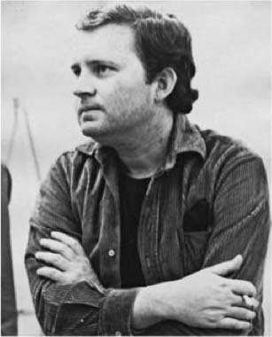
 Frank Thorne, early 1970s, image found online
Benjamin Franklin Thorne was born June 16, 1930 in Rahway, NJ to a working-class family. He loved Alex Raymond’s Flash Gordon comic strip, and that sent him on a path toward comics, though he also pursued careers as a jazz trumpeter and a stage magician. He began getting work in comics in 1947 at age 17 while attending Manhattan’s Art Career School. In 1952 he married his wife Marilyn, and they remained together the rest of their lives. Also in 1952 he drew a Perry Mason comic strip for King Features that lasted less than a year.
 From FOUR COLOR #496, Sept 1953, The Green Hornet, Western/Dell
He moved on to comics for Western/Dell where he often penciled, inked, lettered, and colored, one source says. The story above might be lettered by Frank, but I can’t be sure, so I’m starting my look at Frank’s lettering career in 1971, though he was likely lettering long before that.
 From THE FAR OUT GREEN SUPER COOL #1, 1971, Social Welfare Research Foundation
This rare annual series was written, drawn, and lettered by Thorne for distribution to schools and social agencies in Newark, NJ. The goal was to familiarize children in the fourth through sixth grades with the laws governing juvenile deliquency. I found no inside images, but the logo and lettering here are by Frank.
 From RED CIRCLE SORCERY #8, Aug 1974, image © Archie Comics
In 1974, artist Gray Morrow edited a few horror/mystery titles for Archie under the Red Circle logo. Thorne did several stories for it like this one. His lettering, using wedge-tipped and round pens, is professional, consistent, and has just enough organic bounce and variety to be appealing. Frank was a frequent visitor to comics conventions in the 1970s in costume as The Wizard, usually with one or more women portraying Red Sonja. He and comics creator Wendy Pini put on regular shows at cons in those roles. Frank did comics work for DC and other publishers, and starting in the 1980s, found a lucrative niche for himself producing soft porn comics stories for Playboy, Heavy Metal, and other slick magazines. In the 1990s he did more of that for Fantagraphics, all lettered by him as well. Frank and Marilyn both died on the same day, March 7, 2021. I met them in the 2010s, and they were charming and fun to talk to.
 From THE RAWHIDE KID #103, Sept 1972, image © Marvel
Marvel welcomed several new letterers in the early 1970s, one was Denise Vladimer (later Denise Wohl), whose work on this story is credited. The story title reminds me of Artie Simek, but the balloon lettering, made with wedge-tipped and round-tipped pens, is more like that of Gaspar Saladino, though not as consistent. It looks good.
 Denise Vladimer from The Mighty Marvel Comic Convention Program Book, 1975, image © Marvel
I haven’t found out much about Denise Vladimer Wohl. Ancestry suggests she was born July 1952, and she attended Abraham Lincoln High School in Brooklyn in 1970. Denise worked in the DC Comics production department for a few years in the early 70s. She may well have done freelance lettering at the time, but there’s no record of it. It was after moving to Marvel that she began to get printed credit. Denise married Larry Wohl in 1975, and her lettering credits reflect that change. The story above is the first one credited to her, and her lettering at Marvel runs to 1979.
 From POWER MAN #39, Jan 1977, image © Marvel
A later story credited to Denise Wohl, and the regular letters are a little smaller, perhaps to get everything in. The sound effects are well done.
 From MARVEL TEAM-UP #80, April 1979, image © Marvel
Another page from near the end of her Marvel lettering with handsome signs and fine lettering that’s unfortunately printed too heavy, making parts of it run together. I don’t know where Denise went from here, but she made a surprising return to comics in 2007 as the publisher of SEVEN, which had only one issue. It was written by Jim Shooter, who Wohl might have met at Marvel, and THIS site has photos of the release party, which include Denise and her family. I’m guessing it did not sell well. I don’t know anything else about Denise Wohl’s life and career after that.
 From THE OUTLAW KID #13, Dec 1972, image © Marvel
Marvel hired June Braverman as a letterer in the early 1970s, and she lettered for them from 1972 to 1974. The story above is the first one with her printed credit. Both the title and lettering are in the style of Artie Simek, and they work fine.
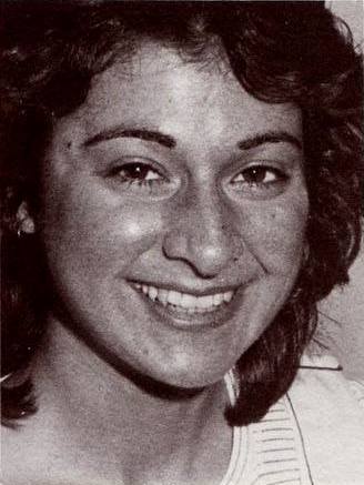
 June Braverman from her high school yearbook, 1965
June H. Braverman was born in 1948 on Long Island, New York, I haven’t found the exact date or place. By the 1960s, she and her sister Lynn and their parents were living in Hewett, Long Island, where June went to high school, as seen above. Note she was in the Art Club. She graduated from Carnegie Mellon University in Pittsburgh with an art degree around 1971, and then went to grad school at Pratt Institute in Brooklyn, where she met Rick Parker. Rick doesn’t know how or when she began working at Marvel, but that must have been at the same time she was at Pratt.
 From IRON MAN #68, June 1974, image © Marvel
A closer look at June’s lettering, though I think the last three lines in the bottom balloon are by someone else. The rest of this lettering is wider and a bit looser than the first example, suggesting Braverman was getting more confident and working faster.
 From MAN-THING #20, Aug 1975, image © Marvel
The style is much the same in this later example. I like the wobbly balloon at the bottom and the sound effect. This story may have sat for a while before being published. June seems to have done fine at Marvel as a letterer, but perhaps decided it was not the career she wanted.
 June Braverman by Rick Parker, from memory, 2023
Rick Parker and June were dating, and she introduced him at Marvel so he had an in when he decided to try to get work there. Rick told me she left Marvel in 1974 and moved to Tuczon, Arizona, where she married a doctor, Joel Greenspan, in September. That’s all I was able to learn about June Braverman.
 From GHOSTS #13, March 1973, image © DC Comics
If you were reading DC’s war, mystery, and western titles in the early 1970s, you witnessed the introduction of artists from the Philippines, which had its own robust original comics at the time. Tony DeZuniga was the first, beginning in 1970, and in 1971 DC publisher Carmine Infantino and editor Joe Orlando traveled to the Philippines on a recruiting trip. Soon many other Filipino artists were working for DC, including Alfredo Alcala, Mar Amongo, Ernie Chan, Alex Niño, Nestor Redondo, and Gerry Talaoc, who drew and inked the story above. At first they worked in their home country, and they needed a local letterer so they could send in finished work. They hired Esphid Mahilum, and his lettering was excellent. I’m not sure if he was an English-speaker, but I never saw any mistakes in his lettering, so he probably was. The title of this story may have been penciled by Talaoc, but it’s well-inked by Mahilum, and the balloons have an appealing organic edge.
 Esphid Mahilum, 2020, from his Facebook page
Esphid Mahilum, often credited as Esphidy, was born Oct 2nd 1952 in Escalante, Negros Occidental, Philippines. I don’t know his lettering history before it began appearing at DC in 1973, when he was twenty-one years old, but at some point he was part of the Nestor Redondo Studio. It’s not clear if he came to America with other Filipino artists, but he might have. If so, he probably moved back later.
 From THE UNKNOWN SOLDIER #246, Dec 1980, image © DC Comics
The Filipinos were used in various ways by DC. Here, the story was penciled by Dick Ayers, then sent to the Philippines, where Esphid lettered it and Talaoc inked it. The lettering is now wider and very regular, with rows that are close together, and it reads fine. The thought balloon has lots of small loops.
 From SGT. ROCK #416, June 1987, image © DC Comics
A closer look. Here some of the vertical strokes lean slightly to the left, and the R and B have very narrow loops. The display lettering at the top is excellent. The balloon shapes are thicker than earlier examples. Mahilum’s lettering seems to have ended around this time. He also lettered a few stories for Marvel and Eclipse. Toward the end of the 1980s, Filipino artists were seen less often in mainstream comics, but the best of them had fans here who continued to follow their work. I don’t know what Esphid did after 1987, his Facebook page, or perhaps that of his son, it’s not clear, suggests he passed in 2021, leaving behind children and other family.
 From CHARLTON BULLSEYE #4, March-April 1976, Charlton Comics, E-man © Joe Staton
Peter Iro was born Nov 14, 1967 in Sarasota, FL, and seems to have lived there most of his life. That’s all I’ve been able to find out about him His career as a comics letterer begin with this story, as far as I can tell, and he lettered for Marvel, DC, and other publishers into the 1990s. The lettering here is lively, with a cartoony bounce that goes well with Joe Staton’s art.
 From MS. MARVEL #13, Jan 1978, image © Marvel
The lettering is a bit more regular on this example for Marvel, but still with appealing bounce and variation while being easy to read. Some letters lean slightly to the left. I like the rough double border on the bottom balloon.
 From ELVIRA’S HOUSE OF MYSTERY #1, Jan 1986
A closer look at Pete’s lettering for this DC title. The regular letters are made with a wedge-tipped pen, and there are a few changes from the examples above, as in the more curved right leg of the R. The letters here are also more regular. I don’t know what Pete Iro did after he stopped lettering comics, but he did that well.
 From CHAMBER OF CHILLS #3, March 1973
In August of 1972, Dave Hunt answered a want ad and began working in the Marvel Comics bullpen, where he did art and lettering corrections, and probably other work like putting together covers. The Grand Comics Database has possible credits for Dave on cover lettering as early as the fall of 1972, and that could be so, but I’m not sure about them. I do know that Dave was willing to try any kind of freelance work for the company, and he did lettering, coloring, and inking, the latter being the skill I think he did best. Above is what I believe is Dave’s first story lettering, which would have probably been done in late 1972, and is not credited, but Dave’s own records, published in his autobiography Dave Hunt An Artist’s Life (ComicArtAds, 2018) include it. The title and lettering are similar to that of Artie Simek, though a wedge-tipped pen was used for the regular balloon lettering.
 Dave Hunt and Todd Klein in my studio, 2013, photo by Ron Jordan
David Victor Hunt was born Aug 2, 1942, in Newark, NJ. His father worked in the automotive industry, and had some cartooning skills. Dave loved comics from an early age, and he was able to keep and reread the ones he was given. He started drawing at a very young age, encouraged by his parents and teachers. He went to college at Rutgers University in New Brunswick, NJ, where he took science and drafting classes, but found more pleasure in a few art classes. He married at age 21 in 1963, and his son Ben was born in 1967. He also studied art at Kean College, and graduated there with an art degree. His first job was in the art department of publisher Macmillan in New York, where he learned the production skills that proved useful at Marvel. He was also painting in his spare time, and continued to do so all his life. Once he got in at Marvel, comics became his main career. Dave’s autobiography tells interesting stories of working in Marvel’s very small Bullpen in 1972, and a larger one a year or two later.
 From MARVEL TEAM-UP #19, March 1974, image © Marvel
This story from about a year into his Marvel time has an interesting title with almost cloud-like shapes for STEGRON and rougher ones for the bottom line. The balloon and caption lettering works well.
 From DAREDEVIL #117, Jan 1975, image © Marvel
This page has some fine bursts and sound effects. I like the rough-ended letters in the first burst. Perhaps because he was also on staff every day, Dave doesn’t seem to have usually done more than one kind of freelance work at a time. On other stories he was the colorist, and eventually mainly an inker.
 From X-MEN #96, Dec 1975, image © Marvel
Near the end of Dave’s time at Marvel, he was working on X-MEN, and Dave later told me if he’d stayed longer, he might have become the regular inker, but DC Comics offered him a better deal with a higher page rate and regular work as an inker, and Dave made that move. He was living in Piscataway, NJ at the time, and when I started at DC in 1977, we became friends. We visited each other’s homes, and I did some background inking for Dave a few times before deciding I was happier lettering. Dave went on to many years of fine inking at DC and other companies. We saw each other occasionally, and I was sad to learn of his passing on March 5, 2017 at the age of 74. I recommend his autobiography if you’d like to know more about him.
 From National Lampoon #35, Feb 1973, image © National Lampoon Inc.
Alan Kupperberg is another creator who broke into comics in the early 1970s, and who was willing and able to do any kind of freelance work, including lettering. His first credited lettering is on this comics story about President Taft, and it was difficult to find an excerpt I felt comfortable showing here because of the content. The lettering is well done, using a round-tipped pen and having very regular letters and horizontal rows that are close together.
 Alan Kupperberg by Jack Adler, 1972, image found online
Alan Kupperberg was born May 18, 1953 in New York City. His younger brother is comics writer Paul Kupperberg. He graduated from the High School of Art and Design in 1971, and was in the DC Comics production department for a year or two after that. Alan then worked at Neal Adams‘ Continuity Associates and was a member of the Crusty Bunkers, a group of artists who assisted Neal on art assignments for comics publishers, often to get rush assignments finished. He started freelancing for Marvel Comics in 1972, and DC Comics soon after, in various creative roles: penciler, inker, letterer, and later as a writer.
 From THE INCREDIBLE HULK #172, Feb 1974, image © Marvel
Here’s an early story at Marvel with Alan’s lettering credit. The title is well done, as is the balloon and caption lettering. One difference from the earlier sample is the letter S is more angular with a wide center stroke.
 From DETECTIVE COMICS #441, June-July 1974, image © DC Comics
At DC, Kupperberg lettered this chapter of Archie Goodwin and Walt Simonson’s Manhunter, though the sound effects and probably the balloon shapes are by Walt. Fine work by everyone!
 From OBNOXIO THE CLOWN #1, April 1983, image © Marvel
While Alan could do any kind of comics, as a writer I think he was best at sarcastic humor, and this is a prime example. Alan did everything except edit the book and create the character. The character logo, title, and lettering all look good, and I like the smaller lettering in the balloon at bottom right.
Alan continued to work mainly as an artist at DC and Marvel through the 1990s, as well as a comic strip artist on Howard the Duck, The Incredible Hulk, and Little Orphan Annie. He wrote and drew some interesting autobiographical stories about his early years in comics that I first saw when he posted them on Facebook. I had met Alan a few times at DC, but got to know him better on Facebook, where he helped me with information about the DC offices for my blog. Late in life he moved to Rancho Mirage, CA, where he died of cancer on July 16, 2015 at the age of 62, too young.
 From FRANKENSTEIN #11, July 1974, image © Marvel
Annette Kawecki is another letterer who began at Marvel in the early 1970s. The title on this example is well designed telescoped letters, and the balloon lettering seems to be done with round-tipped pens in the style of Artie Simek. The balloon shapes are also like those of Simek.
 Annette Kawecki, 1970s, image found online
Annette Renee Kawecki was born in Syracuse, NY in May of 1952, and went to Nottingham High School there, graduating in 1969. I haven’t found out anything about her art training, or how she came to Marvel Comics as a letterer. I do have information about where she went after comics, more on that later.
 From POWER MAN #49, Feb 1978, image © Marvel Comics
By 1978, Annette was lettering many issues for Marvel, and doing it well. I like the titles on this story, and all the lettering is professional and easy to read, even where poor printing has caused some letters to run together.
 From ROM #15, Feb 1981, image © Marvel
There’s an excellent sound effect on this page that’s full of energy and excitement. The balloon lettering is narrower than earlier examples, and the regular letters are made with a wedge-tipped pen.
 From CAPTAIN CARROT AND HIS AMAZING ZOO CREW #6, Aug 1982, image © DC Comics
Kawecki also lettered for Mike Friedrich’s Star*Reach, Atlas/Seaboard, Eclipse, and DC Comics, as seen above, where she again uses telescoping in the story title. Lots of balloons and captions on this page, but it all works fine.
In the mid 1970s, Annette must have felt she needed a career change, and she returned to school to get a medical degree. She attended Hunter College in New York while continuing to letter for Marvel and other clients. She then attended the State University of Buffalo, graduating in 1982. Annette began practicing as a Psychiatry Specialist that year, and has done so ever since. A bio on this medical site lists practices in Kingston, NY, Burlington, MA, and Holyoke, MA. Though her lettering was good, Annette’s second career is probably more lucrative and perhaps more fulfilling for her.
 From DAREDEVIL #118, Feb 1975, image © Marvel
One more letterer hired by Marvel in the early 1970s was Karen Mantlo, who first worked under the name Karen Pocock, as seen above. The title of this story has great work on the word CIRCUS, but the rest is poorly laid out. The balloon lettering reminds me of Artie Simek’s work, but the regular letters are done with a wedge-tipped pen.
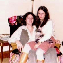 Bill and Karen Mantlo, 1970s, image found online
Karen Subek Pocock Mantlo was born Oct 28, 1945, though I haven’t found out where. She was living in Manhattan by 1965, when she married Jeffery Pocock. That marriage did not last, though she kept the Pocock name when she started working at Marvel around 1974. At some point she met writer Bill Mantlo, and they married in 1974, with Karen thereafter lettering as Karen Mantlo. Possibly Bill brought her in at Marvel, perhaps she worked in the Bullpen.
 From MARVEL TEAM-UP #50, Oct 1976, image © Marvel
A closer look at Karen’s lettering, it’s a bit uneven, but reads well and works okay. I like the unusual radio balloon tail in the second panel. All the lettering is now done with round-tipped pens.
 From THE SPECTACULAR SPIDER-MAN #4, March 1977
A page from near the end of Karen’s time as a letterer at Marvel. She got the job done, but her sound effects aren’t so good here. Karen and Bill Mantlo had a son and a daughter, and she may have given up lettering to raise them. Bill continued to write for comics into the mid 1980s, then started a new career as a public defender. Sadly, he was struck by a car while rollerblading in 1992, and suffered severe brain damage, now requiring constant care. I’m not sure whether he and Karen are still married, but she did no more work in comics after about 1977.
Continuing with less well known letterers of the 1970s in Part 2!
The post More 1970s Letterers Part 1 appeared first on Todd's Blog.


December 9, 2023
Rereading: PONY FOR KEEPS by William Corbin


I am not the target audience for books like this, a story of an orphan girl who falls in love with a neighbor’s pony, but I’ve yet to come across a book by William Corbin that wasn’t well-written, and this is no exception.
Katherine Louisa, known as Katty Lou, has come to a new foster family in rural Oregon, Mr. and Mrs. Kirby. Mr. Kirby is quiet and friendly, Mrs. Kirby is opinionated, talks constantly, and has nothing good to say about the March family across the road and their horse business. She forbids Katty Lou to ever go there. But the lure of horses is strong, and the girl soon finds herself disobeying that order regularly, first hiding to watch the three March men and their horses, riding instruction, and horse training. When she’s discovered by the youngest, Homer March, she’s terribly frightened, but gradually he gentles her just as he does horses, through kindness and command. Katty Lou is full of self-hatred and low self esteem, but through her love of the foal she saw born one morning, Tipsy, and the friendship of Homer, she begins to come out of her shell. At least until Mrs. Kirby finds out. Then Katty Lou is threatened with a return to the orphanage, and all seems lost. Homer March has a plan for her, though, that will make her wildest dreams come true, or possibly wreck them forever.
Recommended, I also love the art.
Pony For Keeps by William Corbin
The post Rereading: PONY FOR KEEPS by William Corbin appeared first on Todd's Blog.
December 8, 2023
JIM NOVAK – Letterer and Logo Designer
 From STAR WARS #1, July 1977, image © Marvel and Disney
I’ve long admired the lettering and logo design work of Jim Novak. When I started working at DC Comics in 1977, he was doing some of the best lettering at Marvel. We met once, briefly, at a convention, and I spoke to him briefly once on the phone, but I didn’t know him. I regret that I didn’t make more of an effort to do so. Jim passed in 2018, so there’s no longer any chance to change that. For this article I’m relying on several sources: Alex Jay’s blog, Jim’s interview in Comics Interview #1 (Feb 1983, Fictioneer Books), some photos from the files of David Anthony Kraft, a recent conversation with his wife Lidia, and a remembrance by Pat Brosseau, as well as insights I can draw from his work. The lettering on the page above is typical of that work: strong, wide letters made with a Hunt 107 wedge-tipped pen and I think the 107 was just pressed harder for bold emphasis. The style is similar to that of Gaspar Saladino, but somehow cleaner and more regular than that of the man Jim called “The Master.” It’s fairly large for the time, and takes up a lot of the page, but never interferes with the storytelling. Beautiful work.
 Jim Novak, 1973, from his high school yearbook
James Richard “Jim” Novak was born on September 14, 1955, in Chicago, Illinois, the oldest of four children. At some point his family moved a few miles west to Hillside, IL, where Jim and his siblings went to high school, and where he did art and lettering for his senior yearbook. In his Comics Interview with David Anthony Kraft, Jim said:
I was always interested in every facet of comics. I had and still have a twelve-by-twelve foot room in my parent’s basement. I used to go down there and do the writing, drawing and lettering on a whole book of my own at about age thirteen, fourteen or fifteen.
There was a guy who painted signs and he was looking for an assistant. I needed a job and said I could learn, so he hired me. It was pretty easy for me, and I learned to design lettering. And I figured that was a good way to break into comics. I also learned how to use a pen and a brush and got to be pretty good. When I was seventeen, I went to New York and spoke to John Verpoorten at Marvel and he said he would let me know about a job. I was getting homesick and moved back. I told him I didn’t think that I could hack it in New York. About a year and a half later, I was working at the sign shop again and was really sick of it, because I had done everything there was to painting signs. That’s when I came back to New York, but Marvel wasn’t hiring at the time. I went to DC and got my first [lettering] job from Jack Adler for WONDER WOMAN. I was there for two or three jobs.
 From WONDER WOMAN #214, Oct-Nov 1974, image © DC Comics
The lettering on this story is credited in the Grand Comics Database to Gaspar Saladino with a question mark, but I believe it’s Jim’s first comics story lettering. The shapes of the letters are very much like what he would be doing soon at Marvel, and not as much like Gaspar’s at the time. The Star in STAR in the title shows his creativity. Jim continues in Comics Interview:
As I did the work, I remember thinking I was never going to get anywhere in this business, because it took me three hours to do a page — and, at that time, the rate was four dollars a page at DC. As time went on, I got faster and the rates have improved dramatically.
That trial by fire learning process is one I remember well, and quite typical. Jim said:
Then Marvel called me back and Sol Brodsky said they had a staff position. I felt it would be in my best interest to work on staff and get the benefit of other people’s experience. I was on staff almost three years.
 From MARVEL SPOTLIGHT 25, Dec 1975, image © Marvel
I think Novak took that job in the Marvel Bullpen in 1975. There he would have been doing paste-ups and corrections on comics pages, and beginning to land freelance lettering assignments to do at home. Above is the first story where he’s credited as letterer, but he may have worked on stories for the black and white magazines before this where letterers weren’t credited. The lettering here is a bit stiff, but quite professional. In the interview, Jim said:
That’s when I started to learn about lettering and I got better and better. A few of the people in the field who helped me out are Danny Crespi, who took me under his wing; Irving Watanabe, who gave me a lot of advice, and whose lettering you hear little about; and Gaspar Saladino, purely for style. Roy Thomas gave me CONAN and liked my work. I was on staff almost three years. I thought then maybe I should freelance.
 From HOWARD THE DUCK #7, Dec 1976
Jim did indeed get better quickly, this story from a year later than the previous example shows his balloon lettering in the style he would use for many years. It’s based on the style of Saladino, but Jim’s letters are a bit more rounded and very appealing to the eye. Here his open display lettering in the burst balloon and the sound effect are strong and full of energy.
 From STAR WARS #1, July 1977, image © Marvel and Disney
By 1977, not only was Novak lettering many titles for Marvel, he was also being tapped as a logo designer, or in this case a logo revisionist. Alex Jay’s article on the complex history of the Star Wars logo shows the version that Jim did used a different W, differently shaped R’s, divisions between the first two and last two letters (but those were restored for issue two of the comic), and a much heavier outline. In the interview, Jim said:
The STAR WARS logo has kind of an unusual story behind it. They brought in their logo from the studio and Stan Lee wasn’t crazy about it — the letters weren’t Marvel style. So I ended up redoing it. It was way before the movie even came out.
Alex Jay thinks Jim’s design may have influenced what the studio did going forward, but his exact logo was only used on the comics. Jim added:
I don’t recall seeing the one they probably spent a couple thousand dollars on. [I was paid] twenty-five dollars.
 From IRON MAN #124, July 1979, image © Marvel
Going freelance meant time for even more story lettering for Jim, like the example above. Here his balloon lettering looks a bit narrower. The story title uses a block letter style he liked with 45 degree angles on some corners.
 From POWER MAN AND IRON FIST #50, April 1978, image © Marvel
 From DAREDEVIL #166, Sept 1980, image © Marvel
Jim was also working as a logo designer. As that job is rarely credited in print, we probably don’t know all the logos he designed, but these are ones credited to him that I always liked. The first uses perspective to push out the center at the reader, and in the second, the shapes are curved in perspective, not an easy thing to do. Novak was certainly looking at the logo designs of Gaspar Saladino for inspiration, and even copying some of Gaspar’s letter shapes, but his designs are still strong and original.
 From POWER MAN AND IRON FIST #68, image © Marvel
Novak’s sound effects were always dynamic and impressive too, even when lousy printing tried to bury them, as on this page.
 From CREEPSHOW, 1982, New American Library
Jim did more work for this 1982 film directed by George A. Romero from a screenplay by Stephen King. In the interview, Jim said:
It’s basically a movie about a kid reading a comic book. His father grabs it away from him and throws it out the window. The wind comes and blows the pages. It stops at a splash page and the camera zooms in, and the movie goes into live action from there. It’s made up of five stories very much influenced by EC Comics. Jack Kamen was working with them, and he’s an old-time EC artist who knows Marie Severin. She referred him to me. They first needed a title for the promotion pieces. I designed the CREEPSHOW logo and brought in one sketch, which they loved. About a year later they needed the splash pages, ads, and I guess the last page of each story. Each segment has its own title, which I did. The concepts were basically mine and they loved them, so I was really happy.
The comics version of the movie also came out in 1982 with scripts by King and art by Berni Wrightson. Novak did all the lettering. In the interview he mentions seeing his logo in six-foot-high letters in Times Square, NY. That must have been thrilling!
 Jim Novak designing the logo for Comics Interview, 1982. This and following photos by Michael Plotino from David Anthony Kraft’s archives, courtesy of Shaun Clancy
In 1982, Marvel staffer and writer David Anthony Kraft decided to publish a magazine consisting only of interviews with comics professionals for his Fictioneer Books imprint. Other magazines ran interviews as part of their content, this was the first, and perhaps only one to do it exclusively. Recently photos have surfaced in a collection bought by Shaun Clancy from the Kraft estate showing Jim Novak designing the logo. Above is the best view of the logo in progress, with the sheet of reference material. The idea was that each letter in the word INTERVIEW would be in the style of a different well-known comics logo.

A better view of the reference sheet. This was done in Novak’s home, with photos taken by Michael Plotino, the brother of Jim’s wife Lidia.

Still working on the penciled letters.

The best photo of Jim himself at work, with lots of pens, pencils, and other drawing tools in the background.

My favorite photo from the group is of Jim and his wife Lidia. She told me they met at a New Year’s Eve party hosted by friends in 1980, and they were married in July, 1982.
 From Comics Interview #1, Feb 1983, Fictioneer Books
The final logo doesn’t work very well as a logo, but it’s great as a quiz for readers. Without doing research, I can only identify five of the sources.
 From CLOAK AND DAGGER #1, Oct 1983, image © Marvel
Novak continued to create more fine logos for Marvel like this one, which again has complex curves and perspective.
 From WEB OF SPIDER-MAN #1, April 1985, image © Marvel
The main word of this logo uses traditional telescoped letters in two-point perspective with WEB OF and the spider as effective contrast.
 From DOCTOR STRANGE #72, Aug 1985, image © Marvel
Whenever I picked up a Marvel book lettered by Jim, I enjoyed looking at the lettering as much as reading the story. He made it seem effortless.
In a remembrance letterer Pat Brosseau wrote about Novak, he said:
I first met Jim Novak when he was appointed the new production manager of the Marvel bullpen [in 1987] and I was also working there. I had read his name many times before this in the credits of my favorite Marvel comics and greatly admired his lettering style. He had an easy-going personality and was super friendly to me, just a kid from Vermont and fresh out of art school. He also had a unique style of management when he was my boss, installing a bullhorn outside his office and berating you if he saw you come in late in the morning, but always in a funny way. He didn’t stay long with his role at Marvel, maybe a year, and then he returned to his thriving freelance letterer career.
 From THE SENSATIONAL SHE-HULK #16, June 1990, image © Marvel
Here’s a closer look at Novak’s balloon lettering. Many letterers that worked for Marvel used a similar style, but I think Jim did it best.
 From ELEKTRA ASSASSIN #1, Aug 1986, image © Marvel
This logo design shows creativity and contrasting styles that work together perfectly.
 From THE PUNISHER: WAR ZONE #1, March 1992, image © Marvel
Jim liked angular letters, and three-dimensional shapes, both included in this fine logo.
 From FANTASTIC FOUR #402, July 1995, image © Marvel
Look at the energy and creative shapes in this massive sound effect. Great stuff! But changes were coming to comics as digital lettering began making inroads. In his remembrance, Pat Brosseau wrote:
At first [Jim] seemed interested in the possibility of lettering digitally, buying a computer, scanner, and Fontographer, but he seemed to lose interest at some point in the early 2000s. Maybe because it just wasn’t the same to him as his beloved hand lettering.
Jim’s wife Lidia confirmed that, while he tried digital lettering, he didn’t find it as satisfying as pen lettering, and didn’t get far with it.
 From SPIDER-GIRL #25, Oct 2000, image © Marvel
The last lettering credit I found for Jim was on this story, and it’s all hand lettering. Magnificent hand lettering, but not what Marvel wanted by this time. It seems that Jim found the perfect job, he was excellent at it, and he loved it, but changes in technology took it away from him. Lidia said it was the tragedy of his life, and when he could no longer letter comics by hand for Marvel, he lost interest in lettering. Jim didn’t pursue lettering work for other companies. He had never been comfortable with attention or admiration from fans, and he withdrew from the world of comics conventions too.
Lidia told me that Jim loved nature and animals. Their yard became a showplace for his landscaping and gardening projects, and he enjoyed feeding birds and animals there. He worked for a while at a nearby garden center, where he found some new friends, but eventually decided he was happier at home with Lidia and their cats. She said he did a lot of writing, but it was mainly for himself, he didn’t try to get it published. Jim’s world shrank, and depression became a gradually growing factor that weighed him down. Jim passed on April 20, 2018, and he will long be remembered for his fine work, admired by fans, and by other letterers like myself. He is missed by his friends, and especially by Lidia.
The post JIM NOVAK – Letterer and Logo Designer appeared first on Todd's Blog.
December 6, 2023
More 1960s Letterers Part 2
 From NOT BRAND ECHH #11, Dec 1968, image © Marvel
Continuing with another group of less known letterers of the 1960s, with valuable research help from Alex Jay. The letterer of this story, Jean Izzo, was the daughter of long-time Marvel letterer Artie Simek, the only example I can recall of a father-daughter lettering connection. Not surprisingly, her work looks at lot like that of her father, but there are appealing creative touches in the title, and I like the way two balloon tails take a sharp angle.
 From FANTASTIC FOUR SPECIAL #7, Nov 1969, image © Marvel
Gloria Jean Simek Izzo was born Sept 4, 1948, in Queens, NY. Her parents must have divorced not long after that, as by the 1950 census, she was living with her father and grandfather. I haven’t found out much about Jean’s personal life, but she sometimes used the name Jean Izzo, sometimes Jean Simek, and also Jean Hipp. Izzo was a married name, and I believe Hipp was too. Jean may have started out working in the Marvel Bullpen in the 1960s, but by the 1970s, she was lettering for other publishers as well as Marvel, including DC Comics and Warren. Her lettering career continued into the 1990s.
 From CREEPY #41, Sept 1971, Warren
Here’s one of the Warren stories with lettering credited to Jean, and she did a fine job on the EC-style title.
 From BATMAN #244, Sept 1972, image © DC Comics
Jean is credited with lettering this Batman story with great art by Neal Adams and Dick Giordano. As usual for the time, there was no printed lettering credit. To me this looks more like Artie Simek lettering than anything else at DC at the time.
 From LEAGUE OF CHAMPIONS #8, Dec 1992, Heroic Publishing
One of Jean’s last credited stories was from small publisher Heroic. Her lettering still looks very much like her father’s to me, and works well here. At some point, Jean relocated to Las Vegas, NV. She passed on Jan 5, 2012.
 From DONALD DUCK #127, Sept 1969, Western/Gold Key, image © Disney
This is one of many stories lettered by Bill Spicer for Western. Mark Evanier reported that Spicer essentially took over for Western’s long-time letterer Rome Siemon, who I profiled in THIS article. The letters are wide and regular, and use lots of curved shapes, perfect for Disney humor. The display lettering in the first panel is beautifully done.
 Bill Spicer, undated, image found online
William Walter Spicer was born Oct 1, 1937 in Los Angeles, CA. He became an avid science fiction fan in his teen years. He learned professional lettering techniques while working at an ad agency from 1955 to 1967, and he became a letterer for Western Publishing in 1967.
 From FANTASY ILLUSTRATED #1, Winter 1963-64, Bill Spicer
A few years earlier, Bill began publishing one of the first independent comics-related magazines, Fantasy Illustrated, which contained work like this story, penciled and lettered by him, with finished art by another future pro, D. Bruce Berry. The name changed to Graphic Story Magazine, and reached issue 16 in 1974, though later issues had few comics stories and were focused on comics history. This early lettering is not as polished as his Western work, but it reads well and looks fine.
 From THE FLINTSTONES #1, Oct 1977, image © Marvel and Hanna-Barbera
Spicer lettered hundreds of stories for Western until 1982, and when Marvel got the license for Hanna-Barbera comics in 1977, he lettered some of those too. Here he used a wedge-tipped pen to make very consistent letters in symmetrical balloons.
 From WARP #2, April 1983, First Comics
By 1983, Bill was lettering for other publishers, and finally getting printed credit for his work, as on this great Steve Ditko story. The feature logo is in the style of Artie Simek.
 From DARK HORSE PRESENTS #1, July 1986, image © Paul Chadwick
In 1986, Spicer began working with Paul Chadwick on Concrete, a partnership that lasted for many years.
 From CONCRETE #6, Feb 1988
A closer look. For Concrete, Spicer used round-tipped pens, and his lettering remains consistent and easy to read. It’s small but wide. Bill lettered for other publishers, including Disney and Viz, but his work with Chadwick has the longest history, continuing until at least 2007. I don’t know if Bill is still lettering today.
 From CREEPY #23, Oct 1968, Warren
Another busy artist with a long career who often lettered his own work was Tom Sutton. He first landed comics work at Marvel, but the earliest stories he lettered himself were for Warren, as seen above. The large title on this story is dynamic and effectively creepy. The lettering is pretty small here, and somewhat uneven, but it reads fine.
 Tom Sutton, date unknown, image found online
Thomas F. Sutton was born April 15, 1937 in North Adams, MA. He described it as a small, rural, quiet town. After graduating from high school, Tom joined the Air Force, and was able to begin his comics career there drawing a strip called Johnny Craig for the military’s Stars and Stripes newspaper. Returning to civilian life, Sutton worked in various places as a freelance commercial artist while also studying art on the G.I. Bill. In 1967, he began getting comics work at Marvel and Warren around the same time. His style was energetic, detailed, and cartoony while also effectively scary when that was appropriate. His own lettering was a good match.
 From NOT BRAND ECHH #11, Dec 1968, image © Marvel
This example is the first story I’ve found with his lettering credit, and it emphasizes the cartoony side of his art, with lots of great display lettering and a fine title.
 From NOT BRAND ECHH #11, Dec 1968, image © Marvel
A closer look at another page, his lettering is angular and uneven here, and not typical for Marvel, but it works fine.
 From VAMPIRELLA #1, Sept 1969, Warren
At Warren, Tom did the first Vampirella story in her initial issue, capturing the teasing sexuality and horror in her blood bath perfectly. Again, the lettering is uneven, but right for the art.
 From GIANT-SIZE MAN-THING #5, Aug 1975, image © Marvel
A few years later, Tom’s captions have taken on an organic edge, and the story title is also organic in a style he often used, almost like something from an underground comic by Robert Crumb. Everything is a little loose, but charming and appealing. Many covers and stories by Sutton for Charlton Comics had a similar approach, and Tom found work at a wide variety of comics publishers.
 From ALIEN ENCOUNTERS #10, Dec 1986, Eclipse Comics
Tom’s work on this story has an excellent type-based title, and lots of interesting balloon lettering. For DC Comics, Sutton drew the feature “I…Vampire,” and penciled nearly the entire run of their STAR TREK series, but those were lettered by others. In the 1990s, Sutton did erotic comics for Fantagraphics, and also had gallery shows of his fine-art paintings. Tom died of an apparent heart attack in his Amesbury, MA apartment on May 1, 2002 at age 65.
 From GHOST RIDER #1, Feb 1967, image © Marvel
John Verpoorten is mostly remembered as the production manager at Marvel from 1970 until his death in 1977, but he began working at the company as a freelance inker and occasional letterer in 1967. There are only two examples of his lettering with a printed credit, one is above. As usual at this time, John seems to be trying his best to imitate the style of Artie Simek, Marvel’s veteran letterer. He did a good job, the story title, the balloon shapes, and the letters themselves are all similar to Simek’s work.
 From FANTASTIC FOUR SPECIAL #7, Nov 1969, image © Marvel
John Verpoorten was born May 15, 1940 in New York City. I’ve found almost no personal information about him, but in the 1950 census he seemed to be living on 2nd Avenue, Manhattan with his father, a much older brother, and his grandmother, based on their ages. His father was an elevator operator and he and the grandmother were born in Holland. John was a student at the School of Visual Arts in Manhattan for four years, and then found work in Tom Gill’s studio, Gill was the long-time artist on THE LONE RANGER comics and a teacher at SVA. By 1967, John had begun freelance work at Marvel, where a Bullpen Bulletin entry described him as 6 feet 6 inches tall and 290 pounds, clearly a big man.
 From TWO-GUN KID #87, May 1967, image © Marvel
This is the other story with a lettering credit for John. I imagine he learned lettering from Tom Gill, and was happy with any kind of freelance work Marvel would give him, though most of that was inking. The lettering here is wider, seems to be done with a wedge-tipped pen, and reminds me more of Sam Rosen’s work.
 From MILLIE THE MODEL #151, July 1967, image © Marvel
Verpoorten is also listed as lettering a handful of MILLIE THE MODEL stories in the Grand Comics Database, where the lettering had no printed credits. This example looks about the same as the one above to me.
In 1969, Marvel production manager Sol Brodsky left to start a new company, and John was hired to replace him. Marvel was quite small at the time both in office space and staff numbers, so Stan Lee must have had confidence in John’s ability to get the most out of that staff. Several have described him as imposing. Danny Crespi became a friend, and reported that John encouraged him to take on cover lettering at Marvel to help make ends meet around 1974.
John was found dead in his home on Dec 15, 1977 at age 37. It seems likely overwork and his weight were factors. His lettering career was brief, but I thought worth including because of his impact and reputation as a staffer at Marvel.
 From ARCHIE AND ME #4, Oct 1965, image © Archie Comics
I was not a reader of Archie comics growing up except when nothing else was available, so I missed a lot of fine lettering by Bill Yoshida. I’m depending on the Grand Comics Database to identify his early work for the company like the page above. The letters are very regular and most would fit in a square. I think they’re made with a slightly wedge-tipped pen, and they remind me of the lettering of Ben Oda, with good reason.
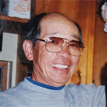 Bill Yoshida, date unknown, image found online
William Saburo “Bill” Yoshida was born on December 2, 1921, in Brawley, California to Japanese emigrant parents. His father was a gardener, and in the 1930 census the family lived in Beverly Hills, CA perhaps on the grounds of the home where he worked. At first Bill followed his father’s profession, and on his 1942 draft card, he’s described as a self-employed gardener. A month or two later, the family was forcibly evacuated from their home, along with many others of Japanese descent thought to be a possible threat during America’s war with Japan, and sent to an internment camp in Manzanar, CA, a remote desert location. Bill was released in 1944 and relocated to Chicago, where by 1950 he was married to Dorothy and had two sons. In an obituary by Jim Amash in Alter Ego #48 (May 2005, TwoMorrows), Bill was said to have worked there as a chef and nightclub singer. A few years later the marriage ended in divorce, and Bill move to New York, remarrying Sachiko Terada. He worked several jobs as a cook and chef.
 From ARCHIE #173, June 1967, image © Archie Comics
Now we come to the comics part. Yoshida was in an all-Japanese bowling league in New York City. One of his teammates was Ben Oda, and Ben taught Bill to letter. He advised him on assembling a lettering portfolio, and Yoshida was hired by Archie Comics in 1965. I can’t be absolutely sure the pages I’m showing here are lettered by Bill, but they all look like the same hand, and are credited to him on the Grand Comics Database. Bill spent the rest of his life lettering for Archie, but also did work for other publishers including Tower, Harvey, Marvel, DC, and Warren. CREEPY #15 (June 1967) says about their lettering:
The penciled pages are given to Ben Oda for lettering. Lately we have also been using up and coming young letterer Bill Yoshida to help lighten Ben’s burgeoning burden.
 From PEP COMICS #229, May 1969, image © Archie Comics
This page credited to Yoshida shows The Archies band with fine display lettering for the lyrics.
 From LIFE WITH ARCHIE #231, May 1982, image © Archie Comics
There are lots of sound effects on this page, and the lettering is a little larger, something that may have been done so stories would read well in digest-size comics, and Archie put out lots of those full of reprints.
 From ARCHIE AT RIVERDALE HIGH #110, Aug 1986, image © Archie Comics
By 1986, Bill was finally getting printed credit for his lettering, something he’d been doing over twenty years. It was only the half-way point of his Archie lettering career.
Bill and his family moved to Waldwick, NJ in 1969. He was nominated for Eisner Awards for Best Lettering in 1996 and 1999. Late in 1999 he was diagnosed with cancer, but continued to work for another four years. He passed on Feb 17, 2005 in Waldwick.
In a press release, Archie Comics remembered Yoshida:
It was Bill’s love of humor that made him a natural for lettering the Archie Comics line. His work complemented the art, as good lettering should. Bill was a dedicated company man, ever-conscious of deadlines and never missing them. His lettering style became the company look. Bill lettered an average of 75 pages a week for 40 years, for an approximate total of 156,000 pages. He’ll be missed as much for his humanity as for his dedication to his craft.
 From VAMPIRELLA #1, Sept 1969, Warren
Beginning in the 1960s, Mike Royer was an artist for Western Publishing who assisted others, and sometimes did his own complete art and lettering, though I haven’t found any credited work of that kind for him. In 1969, he also began doing art and lettering for short horror stories at Warren like the one above. His lettering is very regular and even with most letters fitting into a square, though his title and sound effect here have bounce and energy.
 Mike Royer, 2020, image found online
Michael Whitman Royer was born June 28, 1941 in Lebanon, OR. He moved to California in the mid 1960s to pursue a career in comics, first landing work at Western Publishing, where he assisted Russ Manning, Warren Tufts and others, as well as drawing his own stories, some of which he probably lettered. In the late 1960s he was also working for Warren, as seen above, but his name became widely known when he was hired by Jack Kirby in 1971 to ink and letter stories for Jack’s Fourth World titles at DC Comics. In his book Kirby, King of Comics (2008, Abrams), Mark Evanier wrote:
From the early seventies on, Jack’s favorite inker was Mike Royer. At first it was in part a geographic advantage: Kirby was in Southern California, and so was Mike. Jack wanted, as much as possible, to keep his work away from East Coast editorial types. But Jack soon came to appreciate Royer in other ways, especially the fact that that Mike decided to ink as opposed to reinterpret. Jack was very fast, and Mike’s job description required that he keep up with him, matching him page for page and also lettering the work, to boot.
 From THE NEW GODS #5, Oct-Nov 1971, image © DC Comics
The early issues of Kirby’s interconnected books at DC were lettered by John Costanza, with Royer taking over in the fall of 1971. His lettering is again regular and even, but the titles have more energy and bounce, probably following Kirby’s lead, and even the regular lettering is a bit looser. This lettering seems to be done with round-point pens.
 From THE DEMON #10, July 1973, image © DC Comics
More than a year later, this page uses a wedge-tipped pen for the regular letters, while the larger display lettering and sound effect are still full of energy and excitement.
 From SILVER STAR #2, April 1983, Pacific Comics
Royer also worked with Kirby at Pacific Comics on titles like this, where his very organic story title probably began with a roughed in one by Kirby. It’s a unique style that they developed together.
 From AUTUMN ADVENTURES #1, 1990, Image © Disney
After Kirby moved away from drawing comics, Royer worked on newspaper strips, and in 1979 took a staff job at Disney as a designer, where he did logos like this one for Disney’s foray into producing their own comics in the 1990s. Later he became a freelancer for Disney specializing in Winnie the Pooh projects. Since 2000, Royer has worked on many TV and toy projects as a designer. He and his wife Laurie now live in Medford, OR.
I’ll continue this series soon with more letterers of the 1970s.
The post More 1960s Letterers Part 2 appeared first on Todd's Blog.
December 4, 2023
More 1960s Letterers Part 1
 From THE PEACEMAKER #1, March 1967, Charlton Comics
The 1960s were a difficult period to find first-time employment at mainstream comics publishers, even the smaller ones like Charlton. There were more opportunities in underground and alternative comics, which I’ve already written about, but even there getting started wasn’t always easy. The first generation of comic book creators was generally still active at publishers like Marvel, DC, Western, and Archie, the market had taken a downturn in the 1950s, and even with some new interest from the Batman TV show, and increasing success for Marvel’s superheroes, comics sales were not encouraging. In fact, many in the business thought comics were on the way out. Pat Boyette was one creator who bucked the trend, as seen above, working mostly for Charlton, but other publishers as well. He did the art and lettering on nearly all his work, and both have a sparse, simple, and accessible style that go well together. In this two-part article I’ll look at his comics and that of other letterers who began in the 1960s, and are perhaps not as well known as some I’ve already written about, at least as letterers. Thanks go to Alex Jay for his invaluable research help, and I’ve pulled from other sources too, which will be linked below.
 Pat Boyette, undated photo found online
Aaron “Pat” Boyette was born July 27, 1923 in San Antonio, TX, and he lived there most of his life. Pat had several successful careers in other fields before entering comics, beginning as a broadcaster, first on radio before World War Two. He became a disc jockey and announcer for station WOAI in San Antonio until drafted, and after serving, resumed his career at KONO. He soon transitioned to TV, and was primarily a newscaster for twenty years for several stations. He also became a low-budget film maker along the lines of Roger Corman. In the mid 1960s, in his early forties, Boyette decided to try his hand at comics. He randomly selected a Charlton comic, cold called the company to make sure they would accept samples, and mailed some. A year later he received a call from editor Dick Giordano who liked his work, and sent him scripts to draw.
 From SHADOWS FROM BEYOND #50, Oct 1966, Charlton
Boyette’s first published work is above, and as you can see, it’s already professional and appealing, with fine storytelling and lettering. His only previous comics work was on a local comic strip, Captain Flame in the 1950s. Pat seems to have been one of those people whose talent shines no matter what they take on.
We can be sure Boyette lettered his own work because of his working method. He got permission from Giordano to work smaller than usual, on letter-size paper, close to printed size, and always sent in finished inked and lettered work. His friend artist Tom Sutton said, “Lettering at that size is madness. But you couldn’t tell!”
 From FIGHTIN’ FIVE #40, Nov 1966, Charlton
A month later, Boyette’s best known character, Peacemaker first appeared with a script by Joe Gill, art and lettering by Pat. Though full creator credits were not yet being used, Boyette’s elongated signature is at bottom right. The character was later sold to DC Comics and appeared there in the 1980s.
 From THE MANY GHOSTS OF DR. GRAVES #1, May 1967, Charlton
When Pat did a cover, he also usually did the lettering, and when it was a first issue, the logo as well. All those elements work together perfectly here.
 From BLACKHAWK #242, Aug 1968, image © DC Comics
By 1968, Dick Giordano had moved to DC Comics, and asked Boyette to help with a deadline problem. Pat put together some Blackhawk material very quickly, as usual with his own lettering and feature logo, but the experience led Pat to continue with Charlton, where his deadlines would not be so frantic.
 From CREEPY #37, Jan 1971, Warren
Boyette worked for other publishers in the 1970s, and many consider his best work to be horror stories he wrote, drew and lettered for Warren, as above. Boyette said Warren never asked for changes, and published almost everything he sent them. Here you can see Boyette’s distinctive early S, which is all curves and rises in the center section.
 From KORG: 70,000 B.C. #6, May 1976, Charlton
He did all kinds of stories for Charlton, the one above is again all by him, with excellent display lettering in the feature logo and title. Here the S is less curvy.
 From CLASSICS ILLUSTRATED #17: Treasure Island, Jan 1991, First Comics
Boyette’s work continued to appear sporadically into the 1990s, always beautifully drawn and lettered. Mark Evanier, who used Boyette on Hanna-Barbera comics he edited, remembered the artist:
Pat had a warm, friendly, radio-trained baritone voice that made you like him the minute you spoke to him on the phone. He was enormously humble about his comic book work, forever deflecting compliments, always hoping that he would some day do work that was worthy of the praise that many heaped on what he’d done. He was very fast — and willing to work very long hours — so he often bailed out editors in deadline crisis situations. We spent hours on the phone, talking about everything under the sun and, unlike many in comics, you could talk at length with him about something other than comics. I only got to spend time with him in person twice but I liked him on the phone and I liked him even better in the flesh.
Boyette passed on Jan 14, 2000, in Fort Worth, TX, at age 77. He was survived by his wife Bette and daughter Melissa.
 From SUPERMAN’S GIRL FRIEND LOIS LANE #54, Jan 1965, image © DC Comics
Vivian Lipman began working in comics at MLJ (Archie) and Timely (Marvel) in the early 1940s in a variety of roles: editing, writing (mostly text pages and puzzles), inking, and probably lettering, though I haven’t found any examples of that I’m sure about. She became a letterer at DC in the mid 1960s, according to the Grand Comics Database, which has quite a few stories credited to her like the one above. The lettering style is all slanted, which other DC letterers were doing at the time (perhaps an editorial preference), and the letters are even and regular, with very round O’s. The other thing that I notice is the thought balloons have many tiny scallops, while the regular balloons have few.
Vivian Lipman Berg was born Jan 4, 1923, in New Rochelle, NY, the youngest of four children. Her parents were Russian emigrants. She studied art at Cooper Union in Manhattan, where she met her future husband, MAD artist Dave Berg. They were married in 1949. She helped him with ideas for his MAD feature, “The Lighter Side of Dave Berg.” in a 1977 interview with the Daily News of Tarrytown, NY, Berg said:
Vivian, loves to read so she helps with the research. For example, for a “lighter side of modern technology,” she read the book “Future Shock” for ideas. Discussion and the comic followed.
It’s not known how she came to DC, but MAD and DC were owned by the same company starting around the same time, so it’s an easy connection.
 From SUPERMAN’S PAL JIMMY OLSEN #94, July 1966, image © DC Comics
Another story with lettering credited to Vivian, here the slant is less, and the speech balloons have more loops, but it’s otherwise much the same. Both books were edited by Mort Weisinger, so he may have been the one who first hired her.
 From THE DOOM PATROL #117, Feb 1968, image © DC Comics
Berg also worked for editor Murray Boltinoff, as on this story. This time the slant is almost gone from the balloon lettering. The story title is well done, I like the texture in BLACK from small open areas, and the credits (rare for DC at the time) have nicely lettered script.
I don’t see any lettering credits for Vivian after the 1960s. In the 1980s and later she was a magazine writer and illustrator. At some point the Bergs moved to California. Dave passed in 2002, Vivian died in California on Dec 21, 2014 at the age of 91.
 From TALES OF SUSPENSE #91, July 1967, image © Marvel
Another letterer whose name I saw in Marvel comics for a few years is Al Kurzrok. This story is one of the first credited to him. The lettering is done with round-tipped pens of various sizes, and I like the variety of balloon shapes and styles. The title is a bit clunky, but has lots of energy.
 Al Kurzrok, 1965, photo by Don Paulsen
Allan Lance “Al” Kurzrok was born on October 30, 1939, in Brooklyn, New York. His father Irving was a doctor and an award-winning amateur tennis player. In an interview in the Sarasota Herald-Tribune in 1986, Al said he started drawing at age seven and decided to pursue cartooning at age twelve, encouraged by his parents and cartoonist friends of theirs like George Wunder and Ham Fisher. He was also a music fan and began interviewing black musicians at the Apollo Theater at age 17, around 1956. He spent some time as a music journalist, as the photo above suggests. Al studied four years at the School of Visual Arts in NY, and tried to pursue a fine art career, but it was a struggle, so he decided to try comics, and found work at Marvel starting in 1967.
 From NOT BRAND ECHH #2, Sept 1967, image © Marvel
I like Al’s lettering more on this humor story, where his rounded titles and a variety of display lettering work well.
 From SGT. FURY #90, Aug 1971, image © Marvel
In 1970-71, Kurzrok wrote five stories for SGT. FURY, but only lettered this one. The lettering reminds me of Artie Simek’s work, a frequent letterer on this title, and probably what Al was going for. Kurzrok was reported to be on staff in Marvel’s bullpen in these years. In the mid 1970s, he was doing production work at MAD rival CRACKED.
Kurzrok changed careers in 1977, studying to become a counselor, and he used comics to help him teach children. In 1980, while at the University of South Florida, he drew 102 comic strips meant to help children deal with mortality, loss, grief, anger, jealousy, greed, and anxiety. In the Herald-Tribune article he said:
The comic strips deal with big issues but they use humor, a fun approach and very different points of view. I envision parents and children reading them together, interacting with the characters and role-playing. And I have always been a proponent of good mental health beginning at home.
Kurzrok was a therapist in Florida by 1980, and published several books. He taught at the Ringling School of Art and Design. He passed on May 3, 2005 in Sarasota.
 From KID COLT, OUTLAW #139, March 1968, image © Marvel
Another letterer who benefitted from the complete creator credits policy at Marvel was Shelly Leferman, though by 1968, he’d already been working as a commercial artist and cartoonist for a while. The lettering on this page follows the style of Artie Simek, which I’m sure new Marvel letterers were encouraged to study, and it looks good.
 Possibly Shelly Leferman, 1944-45, details below
Sheldon “Shelly” Leferman was born on August 22, 1922, in Stamford, Connecticut, the youngest of three children. His father was a newsdealer, driving a delivery truck for magazines. Shelly’s art training is unknown, but he’s reported to have done gag cartoons for newspapers and magazines in the early 1940s. He worked for a photo-engraving company in Stamford in 1942. He enlisted in the Navy in 1943, and served in the Pacific Theater as a seabee. The book Cargo Soundings Album (1946) documented that service with many photos, and Shelly is listed among the servicemen. The photo above from the book is not labeled, but could be Leferman doing some painting. I knew Shelly when he worked for DC in the late 1970s, and I think it could be him.
 From ADVENTURE COMICS #361, Oct 1967, image © DC Comics
After returning home, Shelly continued to work for printing companies and as a cartoonist, though I haven’t found any examples. At some point he was hired by King Features, where he colored Sunday newspaper strips, and starting around 1967 he began lettering for DC Comics, Marvel, and other publishers. The story above is the first one credited to him at DC. The work is similar to the Marvel page above, though DC did not credit letterers at the time.
 From THE AVENGERS #86, March 1971, image © Marvel
At Marvel, Shelly did get credit, lettering his first name here as Shel. I like the title.
 From ACTION COMICS #483, May 1978, image © DC Comics
DC finally began crediting letterers in late 1977, here’s a story with Leferman’s name on it. When I started at DC in 1977, I remember Shelly coming into the DC production room to talk to Anthony Tollin and Bob LeRose. He may have known Bob from previous jobs, and he may have also been doing coloring that he would have handed in to Tony. I don’t think I talked to Shelly more than to say hello, and didn’t get to know him, but he was a regular visitor into the 1980s.
 From JONAH HEX #87, Oct 1984, image © DC Comics
A late lettering job by Leferman for DC, this work is, in my opinion, the best of his lettering. Very regular and with appealing letter shapes. His work in comics faded out in the 1980s, but he took an art director job at Stew Leonard’s, a restaurant chain based in Norwalk CT, retiring in 2000 at age 78. He passed March 30, 2007.
More in Part 2!
The post More 1960s Letterers Part 1 appeared first on Todd's Blog.
December 3, 2023
FREDDY AND THE PERILOUS ADVENTURE by Walter R. Brooks

I never found a hardcover edition of the ninth book in the Freddy series, but this 1986 trade paperback works fine, the inside pages are from the original printing. I don’t care for the cover design and art, but you can’t have everything.
This is a fun story about Freddy, the Bean farm duck sisters Alice and Emma, and the adventurous spiders Mr. and Mrs. Webb in a runaway hot air balloon. The plot has a few elements that are a bit hard to swallow: that Mr. Golcher, the balloon owner, would send his balloon up with only talking animals aboard; and that when the gas release valve becomes stuck shut and Freddy has no way to get them down, the balloon balloon owner would then report his property stolen and also demand payment for it from Mr. Bean.
That aside, the balloon ride is entertaining, they meet an eagle on the way who has a little history with Freddy, and when they finally do get the balloon down, things become even more interesting. Freddy finds out he’s a wanted pig, and must use a disguise to get to his friends at the farm and Boomschmidt’s circus to help him out of his troubles, and some police officers are on his tail. Meanwhile, Alice and Emma discover their long-lost Uncle Wesley, who is not quite as brave and wise as they remember. The big finish has elephants in it, and another balloon ride.
Funny and clever, recommended.
Freddy and the Perilous Adventure by Walter R Brooks
The post FREDDY AND THE PERILOUS ADVENTURE by Walter R. Brooks appeared first on Todd's Blog.
November 30, 2023
More British Letterers Part 2
 From WARRIOR #12, Aug 1983, Quality Communications
I first saw and loved the art and lettering of Steve Parkhouse when he teamed with writer Alan Moore on “The Bojeffries Saga,” which initially appeared in WARRIOR, as seen above, and was later collected as a trade paperback. The art is creative, funny and appealing, and so is Steve’s lettering. By this time, he’d been in comics for a number of years on both sides of the Atlantic.
 Steve Parkhouse, 2019, courtesy of Annie Parkhouse
Steve Parkhouse was born May 2, 1948 in London. He’s a comics creator who can do it all, working as an artist, a writer, a letterer, and a colorist, though not always all at the same time. He first placed some pin-up art in British weeklies FANTASTIC and TERRIFIC in 1967.
 From WESTERN GUNFIGHTERS #4, Feb 1971, image © Marvel
In 1969, Steve and his college friend Barry (Windsor) Smith came to New York and did some work for Marvel, Steve as writer and Barry as artist. Steve said he also did lettering for some of that work, and since there’s no lettering credit on this story, I’m guessing he lettered it. If so, he did a fine job imitating the Marvel house style of Artie Simek and others. Steve returned to England in 1970 and began working on staff at IPC, where he met his future wife, letterer Annie Halfacree. In the mid 1970s he met Dave Gibbons there and helped him get started with lettering comics.

In the late 1970s he was working as a writer for Marvel UK with artists Paul Neary, David Lloyd, John Bolton, and Dave Gibbons or Mike McMahon on Dr. Who stories, as seen above, where he also did some of the lettering. I like the sound effects on this McMahon page, and Steve’s lettering is full of personality.
 From WARRIOR #1, March 1982, Quality Communications
When WARRIOR began from Quality, Steve was there from the first issue, as seen above, and it’s in that title he and Alan Moore first published The Bojeffries Saga.
 From WARRIOR #12, Aug 1983, Quality Communications
 From WARRIOR #19, June 1984, Quality Communications
Two more great samples from Bojeffries with an excellent variety of lettering, sound effects, signs and titles by Steve. Parkhouse did many more comics in various roles over the next few decades.
 From 2000 AD #1426, Feb 16 2005, image © Rebellion 2000 AD Ltd
Steve had begun digital lettering by the time of this story, using fonts he created from his own hand lettering, which I think work well.
 From RESIDENT ALIEN #1, Sept 2011, Dark Horse
More recently, Steve and writer Peter Hogan have produced a hit series for Dark Horse, RESIDENT ALIEN, for which Steve does the art, coloring, and lettering, using a different digital font. It became a popular TV series starting in 2021. Steve and Peter continue to work on new stories.
 From CAPTAIN BRITAIN #4, April 1985, Marvel UK, image © Marvel
Another busy letterer in British and American comics starting in the early 1970s is Annie Parkhouse, seen credited with her maiden name in this example. I always felt Annie’s lettering was more like American work than many of her contemporaries, with well-made letters that combine angularity and roundness as well as slight curves with an appealing result that’s a pleasure to read.
 Annie Parkhouse at work, 1971, courtesy of Annie
Annie Halfacree Parkhouse was born in Rye, Sussex, in 1951. She studied ceramics at Carlisle College of Art. In a 2021 interview with Chloe Maveal at The Gutter Review, Annie said:
My mother worked as a bookkeeper at a printer and newspaper publisher. They printed many of the comics for IPC Magazines. In 1970, my mother had been complaining about me being unemployed after leaving school, as I had turned down a University offer. The sales director of the printing company said he would take me to IPC in London to see if they had any jobs going. That’s when I began work on Lion, preparing art for printing. Cleaning, drawing up if the artist had left too much room for the lettering — as if that happens these days! — and making lettering corrections/changes. I was there for two and a half years, I went freelance [as a letterer] in 1972. Being freelance was my dream job!
 From MARVEL SUPER SPECIAL #26 (Octopussy), 1983, image © Marvel
I haven’t found any art images from Annie’s lettering work in the 1970s, here’s part of a page from early work for Marvel, an adaptation of a James Bond film. As with Dave Gibbons, the lettering seems more obviously hand-made than much of what was appearing in British comics at the time. I like that.
 From VIGILANTE #17, May 1985, image © DC Comics
British writers and artists also liked her lettering, and asked for it when they worked for American comics, as in this example. The title is classic block letters, but with a modern feel.
 From DOCTOR WHO MAGAZINE #102, July 1985, Marvel UK, image © Marvel
Annie’s lettering was also in demand in Britain, where she worked on many titles. Annie and Steve Parkhouse had been together since 1972, and moved to Carlisle in 1975 when they were both freelancing. They married in 1987.
 From HELLBLAZER #1, Jan 1988, image © DC Comics
While continuing to letter many British stories, Annie also worked on quite a few American comics. She may have the most U.S. comics lettering credits of any British letterer working from her home country, at least in the pre-digital age. Her work on edgy titles like HELLBLAZER was excellent, her down-to-earth approach helping to keep it real.
 From 2000 AD #847, Aug 7 1993, image © Rebellion 2000 AD Ltd
A close look at a few balloons. The angled horizontal strokes on the L and E add interest, and almost every line has a very slight curve and variation in stroke width, complementing the variety of line weights and widths in the art.
 From 2000 AD #1887, June 25 2014, image © Rebellion 2000 AD Ltd
Annie continues to work on 2000 AD, having taken over as the main Judge Dredd letterer after the passing of Tom Frame. She now uses fonts created for her by Steve that I think work well, and which make effects like the reversed lettering here easier. Both she and Steve have been mainstays of British comics for decades, long may it continue.
 From DOCTOR WHO MAGAZINE WINTER SPECIAL 1981
I’m not sure when letterer Elitta Fell first began working in comics, the earliest credits for her in the Grand Comics Database are for 1981. Her style is organic and leans a bit to the left.
 Elitta Fell, date unknown, image found online
Elitta spoke of her start in comics in an interview at the Inside Kent website:
Looking for a home occupation many years ago in the USA, I applied to become a layout artist for the Yellow Pages in New York. On return to the UK, I joined Marvel Comics UK, based at that time in Sevenoaks, and eventually became a freelance letterer, writing the text in speech balloons for Marvel, DC, and 2000 AD, etc.
 From WARRIOR #16, Dec 1983, Quality, color from the US reprint
Elitta was one of the letterers on Alan Moore and David Lloyd’s “V for Vendetta,” sample above. This closer look at her work shows it’s similar to that of Annie Parkhouse in some ways. I like the borderless burst balloons, though that may have been artist Lloyd’s choice.
 From HELLBLAZER #23, Oct 1989, image © DC Comics
On this page, Fell’s letters lean more to the left except for a few emphasized words, and the letter shapes are somewhat different, more rounded.
 From WEIRD WAR TALES #2, July 1997, image © DC Comics
The style on this page is about the same. I like the very jaggy tail on the radio balloon in the first panel. In her 2018 interview, Fell said:
[My comics work] led me to becoming a freelance graphic designer for local and national companies. As I was, by then, completely computer-oriented, I wanted a more hands-on craft for my free time, so tried a few different ones such as pebble mosaics, rag rug-making and batik before I finally fell in love with silk painting with its wonderful colours and different techniques – a whole new world opened up to me!
The article has some beautiful examples of her silk painting, and mentions she has a studio where she gives instruction. I hope that continues to be the case.
 From WARRIOR #3, July 1982, Quality
Another letterer who worked on “V for Vendetta” is Steve Craddock. Steve was a letterer and writer for British and American comics from about 1982 to 1988. I’ve found out nothing else about him, or what he did before or after that. On this page, he’s used a wide wedge-tipped pen, something rarely seen in British comics, perhaps at the suggestion of artist David Lloyd.
 From THE MIGHTY WORLD OF MARVEL #13, June 1984, image © Marvel
By 1984, Steve was lettering with a round-tipped pen like most British letterers, and his style is not too different from 2000 AD regular Tony Jacobs. I wouldn’t have put Craddock’s name to this work if it wasn’t credited in print.
 From ESPERS #1, July 1986, Eclipse Comics
Steve followed David Lloyd into American comics like this one, where his mixed case captions work very well.
 From AARGH!, 1988
In England, Steve lettered this story for Alan Moore’s protest comic against homophobia in the British government. All proceeds and services were donated.
 From WASTELAND #10, Sept 1988, image © DC Comics
Back in America, Steve again worked with David Lloyd on this horror anthology. His lettering always looked professional and well made. And that’s all I can say about Steve.
 From REVOLVER #2, Aug 1990, Fleetway
Ellie de Ville’s lettering work began appearing in British comics in 1990. This early example is very angular with narrow letters and angled horizontals.
 Ellie de Ville, date unknown, image found online
I have no information about Ellie DeVille (the actual spelling of her last name rather than the comics one) before 1990 other than that she was a teacher who professed to have no interest in comics. Becoming a letterer was “serendipity,” she said, though dating a comics artist and swearing at a comics editor helped her get work. In an interview, she mentioned teaching English as a second language.
 From JAMES BOND 007: A SILENT ARMAGEDDON #2, May 1993, Dark Horse
Once started, Ellie became one of the most prolific letterers for British comics, and she also did a fair amount of lettering for American ones, as seen above, though by this time her style had changed, becoming easier to read.
 From JUDGE DREDD MEGAZINE Vol 3 #1, July 21 1995, Fleetway, image © Rebellion 2000 AD Ltd
de Ville’s lettering was appealing and had an organic style with angled horizontal strokes. Her letter U here is distinctive for a long extension at the bottom of the right vertical, and her balloon shapes were always done with templates, perfectly round or oval. Her question mark has a very wide and angular loop.
 From FLEX MENTALLO #3, Aug 1996, image © DC Comics
Her tree-shaped balloons on this page were a lot of extra work, but they look great, and I love the heart symbol in the balloon above. Ellie’s mixed case caption lettering is perfectly done for comics, with very short extenders allowing the lower case to be larger and read well.
 From HEARTTHROBS #1, Jan 1999, image © DC Comics
The scroll captions and decorative initials on this page are all fine examples of de Ville’s lettering skill.
 From 2000 AD #1460, Oct 12 2005, image © Rebellion 2000 AD Ltd
By 2005, Ellie was using digital fonts based on her hand lettering, including a quirky Q with the cross stroke on the left side. It all works fine.
Ellie died of pancreatic cancer on Dec 24, 2019 after a brief illness. She was lettering right to the end from her hospice bed. Many tributes to her can be found online. Her editor at 2000 AD, David Bishop wrote:
First met her in the early 90s, was delighted to get Ellie lettering on the Meg. A consummate professional, always ready with a smile and a witty aside. A total gem, will be much missed.
Her friend, editor Jenny Wackett said:
The main thing I will remember most about the amazing Ellie DeVille is that her door, her home, her heart was open to everyone, and all those that entered fell in love with her — whether you were strangers, work buddies, next door neighbours or faraway friends from India, Mexico and Japan. Everyone was welcome.
 From 2000 AD #398, Dec 29 1984, image © Rebellion 2000 AD Ltd
After receiving that letter and lettering sampler from veteran Bill Nuttall in late 1983, as seen in Part 1 of this article, Richard Starkings began to get lettering assignments at 2000 AD and WARRIOR starting in late 1984. His early style seen here is similar to Nuttall, while also having the consistency and regularity of Tom Frame, the other letterer Rich cites as an influence, though it’s wider than Frame’s work.
 From CAPTAIN BRITAIN #4, April 1985, Marvel UK, image © Marvel
Soon Rich was also lettering for Marvel UK on stories like this with a dynamic rough title. His caption lettering is getting a bit more rounded. He was soon hired as an editor there as well.
 Richard Starkings early in his comics career, photo by Steven Cook
Richard Alan Starkings was born Jan 27 1962 in Liverpool, UK. In an interview with Robert Piotrowski, originally published in Marvel Vision magazine, 1996, Richard said:
I spent most of my time at school designing logos for the names of the particular classes I was sitting through. I was always fascinated by letters. I would rarely draw pictures. I preferred to write down a word and try to make it look interesting instead. I came out of college with a degree in English Literature and found a job as a proofreader. I think being able to spell is one of the unstated qualifications for being a letterer, so it was actually a good start. Ironically enough, it was at the National Computing Center in England. I was an editor and designer at Marvel UK for five years before I decided to give my attention to lettering full time. When I moved to the States in ’89 I was basically just doing books to get by.
 From DETECTIVE COMICS #575, June 1987, image © DC Comics
Even before that move, Starkings was lettering American comics, brought along by British artists that liked his work. Here his style is definitely rounder and more organic than earlier examples, with a little bounce, a slight lean to the left, and more curved strokes. This is the work I first saw by Rich, and I liked what I saw.
 From BATMAN: THE KILLING JOKE, July 1988, image © DC Comics
This book really brought Rich’s name to people’s attention. The story by Alan Moore and art by Brian Bolland were both groundbreaking and controversial, and the lettering was a good complement to the art. By 1992, Starkings had moved from New York to California, and was beginning learn the programs he would need to letter comics digitally. He hired designer John “J.G.” Roshell as his assistant and eventual partner, and together they designed digital fonts and founded Comicraft, offering digital lettering to comics publishers like Marvel and Image, and soon selling fonts. I’ve written more about that HERE.
 From SWAMP THING #146, Sept 1994, image © DC Comics
While some publishers were more willing to consider digital lettering, in the beginning it was often printed out and pasted on the comics art. At DC Comics, even that was a hard sell, and Rich continued to do hand lettering for DC for a while, as seen above. His interpretation of Swamp Thing’s rough balloon shapes here, originally created by Gaspar Saladino and continued by John Costanza, works fine. Comicraft’s digital fonts took a while to catch on, and digital lettering in general was slower to take hold in Britain, but by the 2000s, it was being done there too. While Starkings is still doing digital lettering, it’s mostly on books he writes and publishes like ELEPHANTMEN and ASK FOR MERCY, which have found success with readers.
I’m sure there are more British letterers that could be included in these articles, perhaps information about them will be written by others. I’ve done my best with the limited resources available to me on this side of the pond. Hope you enjoyed reading it.
The post More British Letterers Part 2 appeared first on Todd's Blog.
November 29, 2023
FAYERWEATHER FORECAST by Florence Hightower

Another fine mystery novel for young readers, this one is full of eccentric and flamboyant characters.
When Lucy Fayerweather’s father comes to take her away from summer camp early with a sad family story about why, Lucy knows he’s up to his usual tricks, and in this case taking her quickly before he has to pay anything. Sure enough, they’re soon with Lucy’s mother and her brother Bob, also pulled from his camp, and their baby sister Bitsy. Fabian Fayerweather’s new play has been canceled, Clara Fayerweather’s antique business has fallen apart, and the family is on the road fleeing from creditors, hoping to stay with Fabian’s sister Aunt Clara in the old family home in rural New England. She had been planning to marry her beau Eustace Wilkes, but he suddenly disappeared a few years ago. Lucy and Fabian’s brother Edward, who has some mental health issues, lives with her.
Aunt Lucy is delighted to welcome them, and the Fayerweathers soon settle in to country life, but Bob is on a private mission to find out what happened to the missing Eustace. Slowly he gathers clues while also enjoying the company of Edward, while Lucy finds friends in some neighbor girls. Another neighbor, Bradley Wilkes, the brother of Eustace, becomes the focus of tricks and torments from Bob and Edward, even while Bob begins to narrow down his search. Things come to a head when Edward blows up Bradley’s front porch, and Bradley makes plans to have him put in an asylum. Can Bob’s detective work save the day?
An excellent read full of warm hearts and sneaky con-artists as well as a cracking good mystery. Recommended.
Fayerweather Forecast by Florence Hightower
The post FAYERWEATHER FORECAST by Florence Hightower appeared first on Todd's Blog.
November 28, 2023
More British Letterers Part 1
 From 2000 AD #52, Feb 18 1978, this and all 2000 AD images © Rebellion 2000 AD Ltd
Having written about the lettering of Dave Gibbons, I felt I should also look at the work of other British letterers. I’ve only seen a small sample of British comics work except for some that was reprinted in the U.S., and my resources for this are more limited both for information about the letterers themselves, and access to art scans, but I’ll do what I can and we’ll see how it goes in this two-part article. The name I’ve heard and seen most often is that of Tom Frame, who was the main letterer for Judge Dredd stories in 2000 AD for decades, the sample above is from his first story as the regular Dredd letterer. His narrow letters are so consistent they could easily be mistaken for type, but for most of his career it was all hand lettering. He became so associated with Dredd that even other letterers felt the character did not look or sound right without Tom’s lettering.
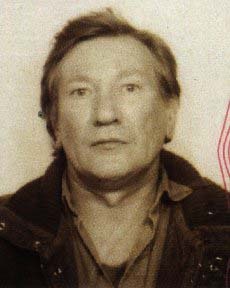 Tom Frame from David Bishop’s website
Thomas William Frame was born Oct 19 1931 in Sunderland, England. In 1939 his family had moved to Kettering, Northamptonshire, and by 1956 he was living in London. I have no other information about his early life, art training, or how and when he got into comics.
 From 2000 AD #4, March 19 1977
Tom’s first credited work in the Grand Comics Database is for this story in issue 4 of 2000 AD, though there is an unsourced single page reprint dated 1962, so it’s likely Tom was lettering well before this. There’s some type on this page as well as Tom’s hand lettering, but it all seems pretty similar at this size.
 From 2000 AD #499, Dec 6 1986
Here’s a closer look at a later non-Dredd story. I think the title and credits are by the artist, but the lettering is Tom’s. I have to admit when I saw his work occasionally in reprints, I thought it was type. You have to look very closely to find differences between pairs of the same letter, but they are there.
 From 2000 AD #620, April 1 1989
Another Dredd example with some fine display lettering sound effects. The credits shield has a bit of humor for his name, “John Tom” to go along with the other two creators named John.
On his blog, writer David Bishop said about Frame:
His lettering was as much a part of Dredd as the future lawman’s badge or gun. Tom took a great deal of care with and pride in his work, and rightly so. But he wasn’t just a letterer. For a long time in the early 80s Tom coloured the covers and centre-spread of 2000 AD, making the most of the primitive printing facilities used on the weekly. If you ever needed a living embodiment of curmudgeon, Tom was it — but he was kind-hearted grouch, with a face that spoke volumes about a life well lived. He was a demon on the pool table, frustrating his opponents and smiling at their misfortunes. But most of all he was an exemplary professional who cared about telling stories and always strove to do his best, even if he did leave the occasional set of artwork in a curry house after a long night’s drinking!
 From 2000 AD #1426, Feb 16 2005
At some point Tom joined the digital lettering age by using fonts created from his hand lettering, as seen above. I can’t think of a letterer whose work was better suited for that transition. One interesting feature is the letter I, which has tiny serifs. They’re so small that they work equally well inside words as they do for the personal pronouns. Tom’s career since 1977 included lettering several hundred stories, the majority featuring Judge Dredd. He died of cancer on July 14, 2006 in London. A center-spread memorial to him featuring the work of many artists appeared in 2000 AD #1508 dated Oct 4, 2006.
 From 2000 AD #3, March 12 1977
Next I’ll look at a few other early 2000 AD letterers, and it’s quickly apparent that the style Tom Frame was using, with small, narrow letters, was essentially the house style for the magazine, and perhaps for other British comics of the time. This example is by John Aldrich, and it’s pretty similar to Frame’s work except in the emphasized words, which get wider and more square at times. I have no information on Aldrich except that letterer Annie Parkhouse, in a 2006 interview, said of letterers she admired:
Johnny Aldrich, with whom I shared an office. He used a Graphos pen, which I could never master, and relied on a blob of dried ink to build up for his inimitable style.
 From 2000 AD #150, Feb 2 1980
A closer look at Aldrich lettering from a few years later, and here you can see it’s gotten a bit wider, with distinctive S shapes and a very slight lean to the left.
 From 2000 AD #862, Nov 20 1993
A later example from Aldrich with a nice variety of display lettering in the balloons and sound effects. I don’t see any lettering credited to Aldrich after this year.
 From 2000 AD #1, Feb 26 1977
Yet another regular at 2000 AD was Bill Nuttall, beginning with the first issue, though the GCD has a few possible previous credits, and he actually had a much earlier start. Nuttall’s style is wider than Frame and Aldrich, and his letters are somewhat closer to what you might find in American comics.
 From 2000 AD #1, Feb 26 1977
A closer look at Nuttall lettering from another page of the same story. It’s a bit less consistent than others in the issue, but I actually like that. The word ALIEN in the last balloon has squared corners.
 From 2000 AD #358, March 3 1984
This later example shows Nuttall’s work getting narrower, perhaps to fit the magazine’s overall style, but it still has a little bounce and variety that make it appealing. the horizontal strokes are all angled up from left to right, a conscious choice that adds variety and energy. I like the special balloon style at lower right.
 Bill Nuttall lettering sampler, courtesy of Richard Starkings
In 1983, Richard Starkings wrote (or rather hand-lettered) a long missive to Nuttall asking for advice about becoming a letterer. A few days later he received back an equally long letter full of advice, as well as this sampler containing a variety of styles and also some information about Bill himself. From it we learn he was born in 1923 in Barnsley, Yorkshire, and came to London in 1949, where he attended the Camberwell School of Art and then the Central School of Art. He also says that year, when he was 26, he took his first job as an artist. From the letter we can infer he began lettering comics some time in the early 1950s.
His letter has lots more information about his tools and working process. He writes:
For many years I used a Rapidograph [pen], which has lots of character. Now I use Rotrings — they have less character, but are quicker. Sizes range from 0.1 to 0.8. Also you will need a set of William Mitchells Script Pens for doing heavier display-type work and onomotapoeia.
Richard told me this letter and sampler changed his life, and he feels extremely fortunate to have made this encouraging connection. Parts of both letters can be seen on the inside covers of the book Comic Book Lettering the Comicraft Way by Starkings and Roshell (Active Images, 2003). Richard found out from Bill’s son that he was able to retire to a cottage in Chislehurst, Kent and paint during his final years. He passed some time in the 1990s, we haven’t found out when.
 From 2000 AD #3, March 12 1977
One more of the 2000 AD letters was Tony Jacob, and I’ve found out nothing about his life, training, or career other than credits in the Grand Comics Database for this title from 1977 to 1986. I’m guessing he was also an older person with a previous career in comics. His style is in the same mold as others we’ve looked at, though on this page all the caption and balloon lettering is slanted except for some computer data captions. Some of his balloons are rounded rectangles.
 From 2000 AD #358, March 3 1984
This later story shows more individual style, the letter E is almost a C with a center stroke, and the letters are no longer slanted except for the emphasized words. The display lettering at bottom right is well done.
 From 2000 AD #498, Nov 29 1986
A late story lettered by Tony, some of his balloon shapes are still close to rounded rectangles, and others are wavy bursts rather than pointy ones. I like this lettering, but that’s all I can say about Tony Jacobs.
 From 2000 AD #2, March 5 1977
Another letterer at 2000 AD with a career stretching back to the 1940s was John S. “Jack” Potter, though I only have credits and images for his lettering from this magazine. Potter’s work is again in the style of Frame and others seen above, the magazine’s house style, with narrow letters drawn very consistently. I found a well-written obituary for Jack that fills in many details about his career. He was born in 1921 and began working in an art studio in the 1930s. He was in the Air Force in World War Two, and then with an ad agency for a few years after that. Jack drew some humor strips for Mick Anglo’s studio in the late 1940s, but beginning in 1953 concentrated on lettering for magazines like Thriller Comics, Tiger, Lion, Knockout, and Valiant through the 1960s and early 1970s. His name only became known to readers with the advent of 2000 AD’s credits boxes, but he was busy on the title from the beginning, as seen above.
 From 2000 AD #585, July 30 1988
A typical story page from a decade later shows Jack’s letters getting a little wider.
 From 2000 AD #585, July 30 1988
This detail from another page gives a closer look at his work, which I like. Still very regular, but with a bit more personal style in evidence. In the memorial, letterer Derek Pierson said:
Jack Potter was THE man, when it came to lettering! He was the man we all strived to match…but could never quite! Johnny Aldrich and I and a few others admired his expertise and we used to copy every letter of the alphabet to try and capture his style.
British editor David Hunt said:
Without fail, Jack would visit us on a weekly basis to deliver his finished lettering and to pick up new scripts/artwork for him to complete in the following seven days. Easy-going, friendly, a ready wit and with a smile on his face, it was always a pleasure to have Jack in the office.
Jack Potter died on Sunday, 5 October 2014, aged 93, survived by his wife Doris and son Steve, who was also a letterer, see below.
 From 2000 AD #53, Feb 25 1978
Steve Potter is the son of Jack Potter, and they both worked as letterers at 2000 AD at the same time for a number of years. I can’t think of any other case like that. Steve’s style is very similar to that of his dad’s, but it also has a bit more roundness like that of Tony Jacobs. I’m not sure if Steve did the feature title on this story, but it looks great.
 Steve Potter, date unknown, image found online
 From 2000 AD #53, Feb 25 1978
A closer look at part of another page, The angled bottom legs of his L and E give his lettering that slightly rounded look that I find appealing, and the display lettering in the burst is well done.
 From 2000 AD #759, Nov 30 1991
Later hand lettering by Steve with effectively creepy lettering for the creepy character Judge Death. I don’t think Steve created this style, but he does it well.
 From 2000 AD #1199, June 28 2000
This more recent story is lettered by Steve with digital fonts based on his hand lettering. The fonts capture his style well, retaining the curved bottom legs of the E and L. Steve also worked on HALO JONES, STARLORD, ROBO-HUNTER, NEMESIS THE WARLOCK and other titles into the early 2000s.
More British letterers in Part 2!
The post More British Letterers Part 1 appeared first on Todd's Blog.
November 22, 2023
Rereading: FIFTY-ONE TALES by LORD DUNSANY


From the title, you might think this was a long book, but it’s a mere 112 pages because the stories are quite short, running from half a page to three pages. Most are more vignettes than stories. Dunsany had begun that way in his earliest story collections, but these are even shorter than the majority of those. It’s illustrated only by the photo of the author in his military uniform, the signature is printed. Perhaps Sidney Sime wasn’t available.
Here the Gods of Pegana are largely absent, though more universal gods like Time and Death are frequently present. Some stories take place in modern London, others in remote parts of the world, but only a small number in what we would recognize as the fantasy realms of Dunsany’s earlier books. The author still manages to paint an overall picture of lovely lost things and wry twists of fate. I can see readers of the time enjoying one or two tales after dinner with a brandy and cigar.
Not his most interesting book, but worth reading and recommended.
Fifty-One Tales by Lord Dunsany
The post Rereading: FIFTY-ONE TALES by LORD DUNSANY appeared first on Todd's Blog.
Todd Klein's Blog

- Todd Klein's profile
- 28 followers

