
Todd Klein's Blog, page 39
August 22, 2023
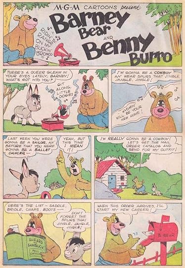
CARL (and Garé) BARKS – Letterers
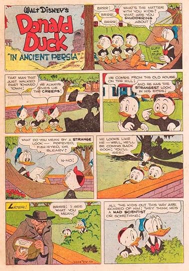
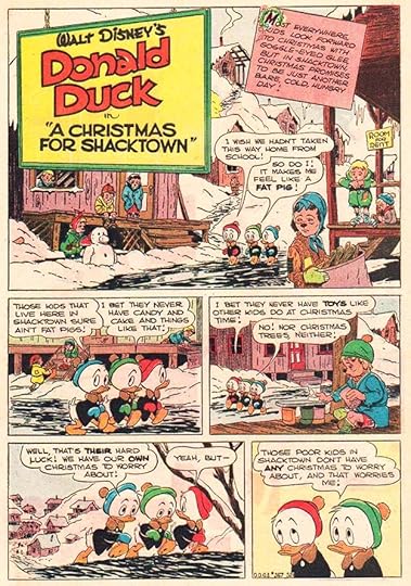
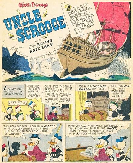
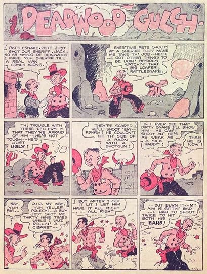
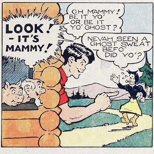
 “The Victory Garden,” from WALT DISNEY’S COMICS AND STORIES #31, April 1943, Western/Dell, this and all Disney comics images © Disney
Walt Kelly was not the only artist from the Walt Disney Studios to find success at Western/Dell Comics. Another who had a long and popular run there with stories featuring Donald Duck and other Disney characters, including some he created like Uncle Scrooge, was Carl Barks. Though never credited in the comics, fans soon came to know and love his work, calling him “The Good Duck Artist.” For many years he wrote, drew and lettered his stories. Later his third wife Garé became his regular letterer. Above is the first comics story written, drawn, and lettered by Barks. His lettering was just as professional as his art, and the invention of crow language is a funny and creative idea. I also like the way Donald’s three nephews speak individually but together form a complete sentence, much as they do in the Disney cartoons. Barks always used an Esterbrook no. 356 pen point to ink and letter his comics, as he wrote in a 1973 letter to Scott Matheson.
 Carl Barks about 1945, from Carl Barks and the Art of the Comic Book by Michael Barrier (M. Lilien 1982)
CARL BARKS was born March 27, 1901 on a farm in Merrill, Oregon. Hearing problems in childhood made his education difficult, and he was unable to finish high school. He had many occupations to make ends meet, including farmer, woodcutter, mule driver, cowboy and printer, life experiences that would later inform his comics. Since his early childhood Carl spent his free time drawing on any material he could find. He attempted to improve his style by copying the drawings of his favorite comic strip artists from the newspapers where he could find them.
 From The Calgary Eye Opener, 1920s, image found online
Carl always enjoyed drawing, and took some mail-order lessons as a teenager, but did not have much early success selling his work until he began placing cartoons in the Minneapolis-based men’s magazine, The Calgary Eye-Opener, where he was eventually hired as an editor and writer as well as an artist in the 1920s. Most of his work there didn’t have much lettering, but the cartoon above is an exception, and the lettering looks good to me. In 1935, Barks applied as an artist-trainee at the Walt Disney Studios in Los Angeles and was hired. He worked his way up through the ranks to become a story idea man and storyboard artist for Donald Duck cartoons. Barks left Disney in 1942 and was soon hired by Western Publishing/Dell as an artist for their Disney comic books. His work impressed them so much he was offered the chance to write and draw his own stories. The one at the top of this article was the first of about 500 stories he created for the company.
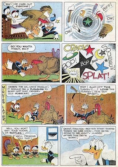
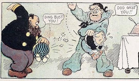
 From WALT DISNEY’S COMICS AND STORIES #33, June 1943
Bark’s balloon lettering used loose but consistent wide letters with a slight lean to the left. The casual slightly curved approach is a good match for the art. His sound effects are lively and animated, the one on this page has added stars to emphasize the impact. I also love Donald’s circling birdies thought balloon in the bottom left panel, another animation idea.
 From FOUR COLOR #29, Sept 1943
Barks’ story titles on the ten-pagers in WALT DISNEY’S COMICS AND STORIES were usually simple, but on some of the longer book-length stories for FOUR COLOR, Western’s anthology comic, he did more creative titles. As a reader, I can see Barks trying to break out of the simplicity of animation-style art at times, doing more detailed and expansive work, as here. On the other hand, his newspaper headlines make no effort to look like type, and are simply larger versions of his regular lettering.
 From OUR GANG COMICS #13, Sept 1944
Early in his time at Western, Carl also created a series of stories about these MGM characters. Perhaps for variety, the lettering is all slanted. I love the music lettering, and the catalog name at lower left.
 From FOUR COLOR #62, Jan 1945
I find this the most creative and interesting story title by Barks, the character logo is beautifully done, and I love the way the story title extends into the water, adding depth and impact. By this time, Carl’s balloon lettering has gotten a bit wider, and emphasized words are not only bolder but a little larger. Again you can see Barks striving for more than cartoon art.
 From WALT DISNEY’S COMICS AND STORIES #75, Dec 1946
But in the Donald Duck ten-pagers, comedy was king, and animation style sound effects were used effectively. I also like the vertical lettered caption in the fifth panel. Here I see Barks leaning into his lettering style more, his letter forms use lots of curved strokes and very few straight ones. Look at the Y, the stem is very short and the two arms form a wide curve. It all matches the curved character art and billowy balloon shapes well.
 From FOUR COLOR #178, Dec 1947
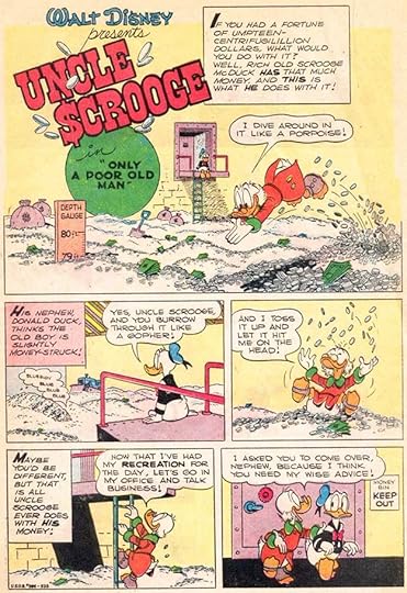
In this story, Carl Barks created his best character, the irascible, wealthy miser Scrooge McDuck, Donald’s Uncle. The story title gets things off to a festive start, with a handsome wreath decoration. Scrooge’s lettering is the same as everyone else in the story, but the words give it a chill. Barks is now sometimes using larger decorative first letters in his captions.
 From FOUR COLOR #275, May 1950
The longer adventure stories in FOUR COLOR allowed Barks to take Donald and his nephews on thrilling adventures around the world, stories with drama, intriguing plots and nefarious characters like the Mad Scientist seen above, but there was always plenty of humor as well. I like the title of the book Donald’s reading.
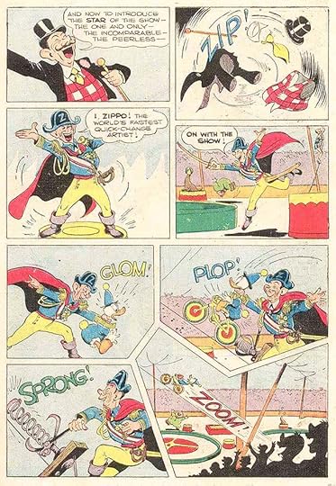 From FOUR COLOR #300, Nov 1950
At other times, Donald gets into trouble trying out a new job, like a clown here, where the story is played for laughs, helped by Barks’ energetic sound effects. I particularly like GLOM! as the ringmaster grabs clown Donald by the neck. It’s a rarely used word from the Scots “glaum,” to grab.
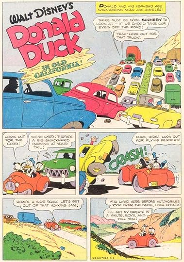 From FOUR COLOR #328, May 1951
This story has a fine title. I’m not sure if Barks was drawing the character logo again every time, but it looks like it.
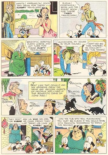 From FOUR COLOR #328, May 1951
In this page from the story, we see Donald and his nephews entering the world of old Spanish California, with great character name lettering by Barks in the wide panel. Most of the human-like characters by Barks had dog noses to retain just a bit of animation style, but Carl was doing more realistic art than what was usually seen in Disney comics. Readers appreciated his extra effort, and labeled him “the good duck artist” for it.
 From FOUR COLOR #367, Jan 1952
This well-loved story has a fine Barks title and decorative first caption. In it, many of Carl’s characters, including Uncle Scrooge and Gladstone Gander, join in a true Christmas story where Scrooge becomes generous despite himself.
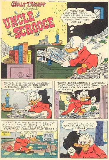
 From FOUR COLOR #386, March 1952
This story is considered the first issue of Uncle Scrooge’s own series, and Barks has fun with the character’s bin full of money. I don’t know if Carl designed this Scrooge logo, he might have. His captions are slanted, and the first letters are much larger and bolder.
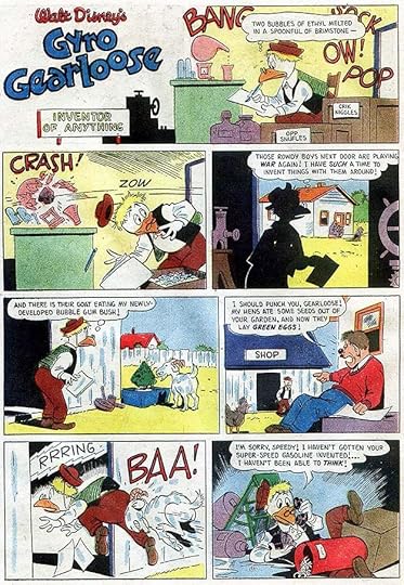
 From WALT DISNEY’S COMICS AND STORIES #140, May 1952
This story introduced another favorite Barks character, the chicken-like inventor Gyro Gearloose. Carl’s lettering remains consistent and appealing, always retaining a cartoony bounce. Note the old-style breath marks around Gyro’s panting, parentheses.
 From UNCLE SCROOGE #5, March 1954
But by the time of this comic, the lettering looks different. It’s by Barks’ wife Garé, and while it follows Carl’s style in general, the lettering is more regular and less bouncy. She also makes the dots in the exclamation and question marks larger, actually a tiny circle.
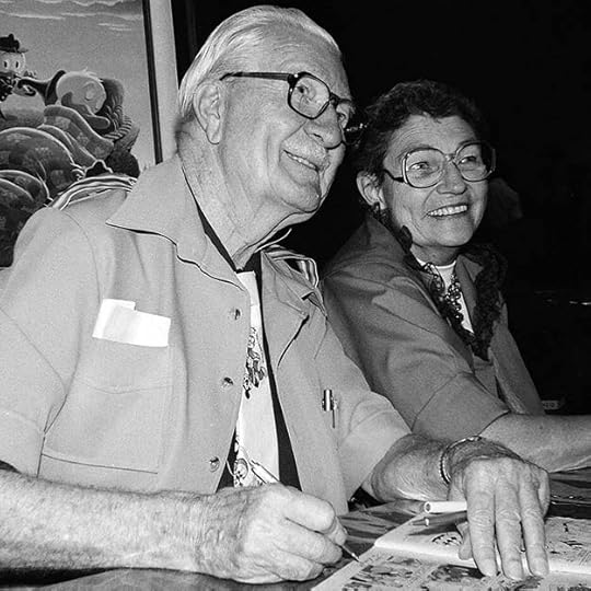 Carl and Garé Barks, 1982, San Diego Comics Convention, courtesy of Jackie Estrada
Margaret (Garé) Wynnfred Williams was born December 6, 1917 in Hilo, Hawaii. After Carl Barks divorced his second wife Clara in 1951, he met Garé, an accomplished painter, and they married in 1954. By that time she had been assisting him with lettering and background inking for a year or so.
 From UNCLE SCROOGE #14, June 1956
After a while, Garé’s own lettering style emerged. Her letters were smaller and narrower than Carl’s, which left more room for the art. Carl probably penciled these sound effects, and Garé inked them, but hers also have narrower strokes, and are more rounded. They work fine. She probably inked the character logo over Carl’s pencils too. Nearly all the Gyro Gearloose appearances have her lettering.
 From UNCLE SCROOGE #25, March 1959
She also lettered most of the UNCLE SCROOGE issues that Barks wrote and drew. I don’t know who did the anchor behind the A in the first caption here, but it’s a nice touch. There’s no denying that the stories and art on Barks duck comics were the main attraction, but the clear, simple lettering was important in its own way.
Carl Barks retired from drawing comics stories in 1966, thereafter contributing only scripts and a few covers. He followed his wife’s example and took up painting. Once he got permission to paint his Disney characters from the company in 1971, that became a new lucrative career for him. Garé Barks died on March 10, 1993. Carl passed on August 25, 2000 at the age of 99. His influence on generations of comics readers was large, especially in Europe where his work was even more popular than in America. While his lettering was never flashy, it served him well.
The post CARL (and Garé) BARKS – Letterers appeared first on Todd's Blog.


August 20, 2023
Rereading: THE CLOCKWORK TWIN by Walter R. Brooks

 Cover and illustrations by Kurt Wiese
This is the fifth book in the Freddy series by Brooks, but he was still finding his way and introducing new characters that would become regulars as the series went on. The story begins with a massive flood near the farm where Adoniram Smith lives with his aunt and uncle, who work him hard and treat him poorly. Watching the rising waters from a summer house on the edge of the river, Adoniram rescues a dog from the water. It’s a talking dog named Georgie, and the two are happy to meet. Soon the entire summer house is swept into the river by a large floating tree, and the Smith farm is left far behind. In the flood they rescue a rooster named Ronald, who can also talk. In a large town, their floating tree lodges against a large department store, and the three riders break in, finding it has food to keep them all alive. Later, as the flood recedes, they meet Freddy the pig and Jinx the cat, off on an expedition from the Bean Farm. They bring the lost animals back with them. Georgie’s owner was a boy who looked just like Adoniram, and they hope to find that boy, who might be his twin, but meanwhile, Uncle Ben, a clever inventor, creates a clockwork twin for him to play with. Then Adoniram’s aunt and uncle show up to collect him, they want him back to do all their farm work. Mr. and Mrs. Bean want to adopt Adoniram, but can’t stand against the law, so it’s up to the animals to save the boy. What can they do against a stubborn farmer with a shotgun? Freddy has a plan.
New characters introduced here that would often return are Mr. Bean’s eccentric Uncle Ben, the inventor, and Mrs. Church, a wealthy woman who takes to Freddy and the other farm animals and sometimes helps them. Great fun and recommended.
The Clockwork Twin by Walter R Brooks
The post Rereading: THE CLOCKWORK TWIN by Walter R. Brooks appeared first on Todd's Blog.
August 18, 2023
Rereading: MRS. WAPPINGER’S SECRET by Florence Hightower
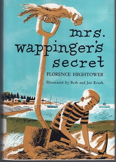
Charlie Porter and his family have arrived at their summer vacation cottage on Osprey Island on the coast of Maine, but things are different for Charlie. Last summer he was into frogs, an interest he shared with an elderly neighbor, Mrs. Wappinger, and was happy enough doing the usual vacation things like swimming, boating, and playing with his island friend Peter. This year Charlie has a new passion: digging for buried treasure. He’s delighted to find out that Mrs. Wappinger shares that interest thanks to research she’s done on her ancestor Roger Osprey, the original settler on the island. Roger was a Tory spy working against the American Revolution, and during that time he was found out and had to flee suddenly for British territory. Mrs. Wappinger believes he left behind some items of great value, and that they might be found in the buried foundation of his home, which is in her front yard. Before long, Charlie and Mrs. Wappinger, witnessed by her feisty parrot Joe, are happily digging for treasure, but will they be able to find anything before the summer is over and Charlie has to go home? And what about the annual island races, his friend Peter, nosy store owner Mr. Buxton, and another annoying neighbor, Mr. Simpson, angry about Charlie’s digging in front of his cottage? Things come to a head when Mrs. Wappinger is injured and Charlie has to cross the sound in his brother’s boat to get help from the mainland on his own.
This 1956 novel is a well-written story with appealing characters and a fun plot that gets thrilling toward the end. The excellent illustrations by Beth and Joe Krush add much to the book. Recommended if you can find it.
Mrs Wappingers Secret by Florence Hightower
The post Rereading: MRS. WAPPINGER’S SECRET by Florence Hightower appeared first on Todd's Blog.
August 17, 2023
WHEN LETTERING BECAME A PROFESSION
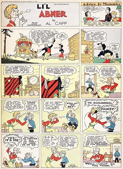 From L’il Abner by Al Capp, March 11 1936, © Capp Enterprises Inc.
As the twentieth century progressed, comic strips became a larger and more profitable business. Publishers like William Randolph Hearst bought strips for their own line of papers, but around the country and the world other newspapers and their readers were clamoring for them, and newspaper syndicates were launched to act as agents, licensing and distributing successful strips to as many newspapers as would pay the licensing fees. King Features, one of the earliest, was begun by Hearst to distribute the comic strips he owned. By the mid 1930s there were 130 syndicates offering 1,600 features (including comic strips) to more than 13,000 newspapers. Comics creators were paid a fee by the syndicates for each paper their strip appeared in. This was lucrative for artists with popular strips. The rare creator who owned his work, like Bud Fisher, could do better, but many artists made good money. This allowed them to hire assistants to help with the workload. Sunday comic strips were often a tabloid-sized page, about 10 by 15 inches printed, with the original art sometimes twice that size or more. They were time consuming, but at least there was a week to create one.
 From Mutt and Jeff by Bud Fisher, July 3 1923
With the success of Bud Fisher’s daily Mutt and Jeff, newspapers increasingly wanted daily comic strips too, and as the century progressed, syndicates asked for six daily strips and one large Sunday strip each week for most features. Some creators, like George Herriman on Krazy Kat, were up to the task, but it was a workload few artists could handle on their own. Syndicates who controlled a strip could hire one artist for the Sunday page, another for the dailies. Even then, those artists might hire assistants to keep up with deadlines. Successful strips where the artist was in control also often used hired help. In that way, making comic strips became divided into specialties. The strip creator, whose name was on it, might only pencil the strip, or just the main figures, hiring assistants to pencil backgrounds, ink everything, and do the lettering, one of the easiest parts of a comic strip to delegate. Bud Fisher’s Mutt and Jeff added a Sunday page in 1918, and Fisher became increasingly dependent on assistants after that. Some that are known are Billy Liverpool (the pen name of Myer Marcus), Ed Mack, Ken Kling, George Herriman and future children’s book author/artist Maurice Sendak. We don’t know who did what exactly, but it’s very likely assistants were doing the lettering. Fisher lost all interest in drawing the strip in the 1930s, and he was wealthy enough so he didn’t need to. Starting in 1932, Al Smith became the main artist, and he continued on Mutt and Jeff until 1980, an amazing run of 48 years. (Thanks to Alex Jay for much of that research, and more on later assistants.)
 From Joe Palooka by Ham Fisher, Sept 24 1932
Other strips undoubtedly followed the same course. Many cartoonists who broke in as assistants were able to use their connections and talent to launch their own strips, often to the dismay of their former bosses. For instance, Al Capp worked as a “ghost artist” or secret replacement for Ham Fisher (no relation to Bud) on the strip Joe Palooka starting in 1932. In 1934 he launched his own strip, Li’l Abner, which angered Ham Fisher. When Li’l Abner became successful enough for Capp to hire assistants himself, he made no secret of it. They included Andy Amato, Harvey Curtis, Walter Johnson and legendary artist Frank Frazetta. Again, we don’t know who was doing the lettering, but it’s likely many Capp assistants did some. Keep in mind that on new strips, or less successful ones, it was usually the artist doing the lettering.
 From Prince Valiant by Hal Foster, Jan 1 1939, © King Features Syndicate, Inc.
Often lettering was considered an entry-level job, something for the new hire, the aspiring cartoonist, to do while learning the craft and working up to more creative tasks like inking and penciling. Many artists started that way. There may well have been lettering specialists on comic strips in the early 20th century who liked that work and stuck with it, but whose names are not known or recorded. Chronologically, the first lettering specialist whose name I’ve learned is Charles F. Armstrong, Hal Foster’s letterer on Tarzan and Prince Valiant. Armstrong was the letterer only on those strips beginning in 1931. Though he did other kinds of lettering for advertising, and he did it well, he was happy in his role as Foster’s letterer, and they were good friends. I’ve written about Armstrong HERE.
 From Terry and the Pirates by Milton Caniff, Sept 25 1936, © Tribune Content Agency LLC
The second lettering specialist whose name I’ve learned is Frank Engli. He began working on the strip Dumb Dora for his friend Bil Dwyer as letterer and sometimes penciler and inker in the early 1930s, and met Milton Caniff at that time. Caniff admired Engli’s lettering, and in 1936 he and studio-mate Noel Sickles hired Engli as their full-time letterer. Engli wrote, drew, and lettered two short-lived strips of his own, and also did advertising lettering, but most of his career was as the uncredited letterer for Milton Caniff on Terry and the Pirates, and then Steve Canyon. I’ve written about Engli HERE. If there were regular letterers on other popular strips in the first few decades of the 20th century, I haven’t found evidence of them.
 From THE FUNNIES #23, July 19 1930, Dell
Newspaper comic strips were a huge success in America, and many were reprinted in book form in varying sizes and formats from the early years of the 20th century on. In 1929, The Funnies began weekly publication in the same format as newspaper Sunday comic strip sections: unstapled tabloid-size sheets, selling for ten cents, later five cents. It contained all new material, and was the first American comic book to do so. I haven’t found any scans of interior pages, but the Grand Comics Database has the first issue indexed, and the format was one or two features per tabloid page, like a newspaper Sunday comics section, filled out with text pages and puzzles.
 From THE COMICS #9, Aug 1938, Dell
The only creator name I recognize in that first issue of THE FUNNIES is Boody Rogers, a cartoonist with a humorous style who assisted others on newspaper strips until he launched his own, Sparky Watts, in 1940. Above is a sample of Rogers’ work from a later Dell comic. He did his own lettering, which I think looks good. THE FUNNIES ran 36 issues, sometimes weekly, in 1929 and 1930, but doesn’t seem to have caught on with readers, or perhaps The Great Depression did it in.
 From FAMOUS FUNNIES #1, July 1934, Easter Color Printing
After experiments with giveaway comics and one-shots by publishers Dell and Eastern Color, FAMOUS FUNNIES began appearing monthly on newsstands in 1934 in a smaller size, 7.75 by 10.5 inches, reprinting newspaper Sunday strips. Most strips were simply reduced in size from larger tabloid newspaper versions (which Eastern Color also printed for newspapers), making the lettering hard to read on some. There were advertisements and text articles, but with the strips already in hand, they were easy to produce, though the book didn’t start turning a profit until issue #12. Each issue had about 60 pages to fill, so it was only a matter of time before inventory of available comic strips would run short, but there were lots of other strips out there to license, and beginning with the second issue, a small amount of new material was also included. The series lasted as mostly strip reprints until 1955, paving the way on newsstands for other comic books.
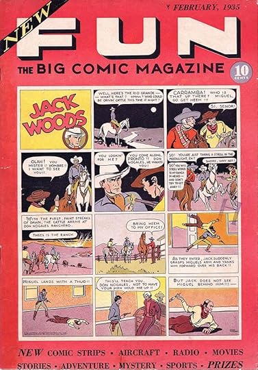 From NEW FUN, THE BIG COMIC MAGAZINE #1, Feb 1935, National Allied Publications, image © DC Comics
In 1935, NEW FUN was the second American comic book to contain all new material. Bucking the trend of FAMOUS FUNNIES, publisher and creator Major Malcolm Wheeler-Nicholson’s first few issues were tabloid size like THE FUNNIES and 32 pages. Later the company’s titles would shrink to the more common smaller size and increase in length to the usual 64 pages. Who was filling these pages? Often it was young artists hoping to break into comic strips using comic books as a stepping stone. Even in the early days, it wasn’t easy for comic book publishers to find enough new material to keep their titles on schedule, or for artists to keep up with the demands of the volume of material needed. At first, most features were a single page or less like a Sunday comic strip, but soon longer stories were helping fill those pages. It was a heady time for young creators, and careers in comics were being made. In the next few years National Allied would add new titles, the number of reprint titles increased, and all-new material competition began arriving from other publishers.
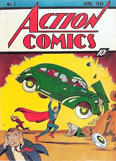 From ACTION COMICS #1, June 1938, image © DC Comics
What really blew the lid off the comic book craze was Superman by Jerry Siegel and Joe Shuster. From his first appearance in ACTION COMICS No. 1, he was a hit with readers. Major Wheeler-Nicholson’s publishing company, always on shaky financial ground, had been taken over by Harry Donenfeld by the time Superman hit newsstands, and even he did not have much faith in the character at first. His editors kept the costumed character off the covers of some early ACTION issues, but when sales figures began coming in, that quickly changed.
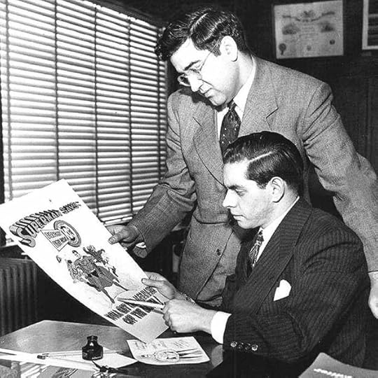 Jerry Siegel and Joe Shuster, early 1940s
Jerome “Jerry” Siegel was born October 17, 1914 in Cleveland Ohio. Joseph “Joe” Shuster was born July 10, 1914 in Toronto, Canada. In 1924 his family moved to Cleveland where Joe met Jerry in high school and the teenagers began their long collaboration, beginning with a science fiction fanzine. Siegel and Shuster first prepared Superman as a comic strip and tried for several years to sell it that way before turning to comic books as a last resort. Meanwhile, starting in 1935, they had become regular contributors to the comics of Major Malcolm Wheeler-Nicholson with features they created like Doctor Occult and Federal Men. Siegel wrote the stories and Shuster did the art, but they had a hard time making a living at it, until the success of Superman. That meant the lettering was probably all done by Joe Shuster.
 From NEW FUN #6, Oct 1935, Doctor Occult by Siegel and Shuster, image © DC Comics
Here’s a sample of Joe Shuster’s lettering, pretty standard for the time, easy to read, and effective enough, but nothing special.
 From ACTION COMICS #1, June 1938, this and all Superman images © DC Comics
The lettering in the first Superman story, which had been prepared first as a newspaper strip a few years earlier, is just the same, and also by Joe Shuster. But Joe had poor eyesight, and when Superman was a success, and National (DC) Comics demanded more and more stories about him, the Siegel and Shuster Shop was born, and assistants were hired. The shop worked out of the pair’s home town of Cleveland, Ohio. Comics historians have identified some of the assistants in the Cleveland years as Paul Cassidy, Dennis Neville, Wayne Boring, John Sikela, Leo Nowak, Hi Mankin and Ed Dobrotka. But who was doing the lettering? Probably several of the assistants lent their hands to it.
 From ACTION COMICS #8, Jan 1939
The earliest Shuster assistant so far identified as a letterer is Paul Lauretta, who lettered and inked most of the Superman stories in ACTION COMICS issues 6-10. In the sample of his work above, the lettering is similar to that of Joe Shuster, though the letter “A” is rounded at the top. I’ve written about Lauretta HERE.
 From Superman Daily Nov 1, 1941. Image courtesy of Heritage Auctions
In January, 1939, Siegel and Shuster’s original dream of a Superman newspaper strip became a reality when National (DC) Comics made a deal with the McClure Syndicate. Siegel wrote and Joe Shuster illustrated with help from his growing studio, including his brother Frank Shuster, who became the regular letterer of the strip, and many comics stories as well, beginning in early 1940. Frank’s style is distinctive and professional, with regular letters that mostly fill a square shape. His letter R is particularly memorable, having a very rounded right leg that often doesn’t connect to the left leg, and his work improved the overall look of the Superman pages and stories he lettered. I’ve written about Frank beginning HERE. He lettered the Superman newspaper strip and comics stories until about 1943, when he was drafted into the Army. His main replacement was Ira Schnapp, beginning a busy career as a full-time letterer for National/DC Comics. Ira was older, and was not drafted like so many other young comics creators.
 From ACTION COMICS #28, Sept 1940
In ACTION COMICS issues 28 to 34, the Superman stories are illustrated by Hardin “Jack” Burnley. Born January 11, 1911 in New York, Burnley was the first artist contracted directly by the publisher and not Siegel and Shuster to help fill their Superman needs. He began as a sports cartoonist for King Features, and started selling single-page sports fillers to DC in 1938. When the company hired him to work on Superman, and other characters later, all his comics were lettered by his sister Elizabeth “Betty” Burnley Bentley, born August 2, 1916, the youngest of the family’s four children. Betty wrote about that period in a short essay for Robin Snyder’s newsletter The Comics! Volume 14 no. 10 (2003):
My brother, Jack Burnley, asked me in 1939 if I would like to do the lettering on the Superman cartoons he was illustrating. I had never done lettering before, but I do have artistic talents, so I was interested in giving it a try. Jack was pleased with my efforts, so I went to work for him in his apartment and I also kept up the files of material that might be useful. I never worked for Detective Comics [DC] nor met any of the [other] artists and writers, but I did hear stories of them and know their names. After a while, Starman and Batman were added to the lettering assignments. This all turned out to be a fun job for me in many ways. Jack has a very extensive collection of Jazz records that we listened to as we worked. My other brother, Ray, had joined us and was inking some of the backgrounds. Jack’s wife, Dolores, provided treats from the kitchen and so we were a family group and it was very pleasant working there. So it went for about three years. Then World War Two was going on and I felt that I should contribute something to the war effort. I regretfully stopped working for Jack, became a draftsman in a Defense plant and helped to design experimental planes for the Navy.
 From ACTION COMICS #31, Dec 1940
In that same issue of The Comics by Robin Snyder, Jack Burnley remembered:
My sister, Betty Bentley, did all of the lettering in my comics work from late 1939 until the end of my Starman series in September, 1942. She had considerable artistic talent but was untrained and had no interest in pursuing an art career. Her lettering was straightforward, aimed at complete legibility, with no stylistic flourishes.
The lettering on that first story is a bit stiff and uneven as Betty learned on the job, but three issues later, the lettering had settled into a professional groove that matches her brother’s art well. If anything I think it’s better than the Joe Shuster model she was probably told to follow.
So, even though comic books were considered the lower-class stepchild of newspaper comic strips, they were providing steady work, financial success, and even professional careers as letterers for a few. At the same time, Howard Ferguson was following a similar career as the letterer for Joe Simon and Jack Kirby, beginning in 1940. I’ve written about Howard starting HERE. Brothers Sam and Joe Rosen were also getting started in the early 40s, and Ed Hamilton took on most of the lettering at ACG. There were plenty of others finding regular work as letterers, some known to us, some unknown. The idea of a freelance letterer working independently for a wide variety of clients was a few years away, but by 1950 that was possible for letterers like Ben Oda, and continues to this day, though of course with digital lettering being the main method now rather than pen and ink. A few comics creators still do their own lettering, but chances are good your favorites have all the words added by a professional letterer, and most are now receiving credit for their work, as they did not for the first few decades of comics.
The post WHEN LETTERING BECAME A PROFESSION appeared first on Todd's Blog.
August 15, 2023
LETTERING TERMS and PIONEERS Part 3
 From The Yellow Kid by R.F. Outcault, Feb 14 1897. Many of the images shown are in public domain, those that aren’t are © the respective syndicates or owners.
I’m continuing to look at elements of lettering as described in Part 1 of this article, beginning this time with sound effects. Sounds made by inanimate objects were slow to emerge in comic strips. Many early strips showed things like explosions, car crashes and fist fights with no sound at all, as if they might have been scenes from a silent film, even when characters spoke in word balloons in the same strip. Eventually sounds needed to tell the story began to appear using the same kind of thin block lettering as in speech balloons. The alarm clock in this strip is a good example, The clock has both circular and radiating motion lines, but the small sound effect lettering tells the story better.
 From Zoo Zoo by George Herriman, Dec 22 1906
Sometimes early sound effects were even smaller than the balloon lettering. I suppose this door bell might have been a quiet one, though the radiating motion lines help draw the eye to it. Note also the long dash at the end of this word balloon, suggesting unfinished or interrupted speech.
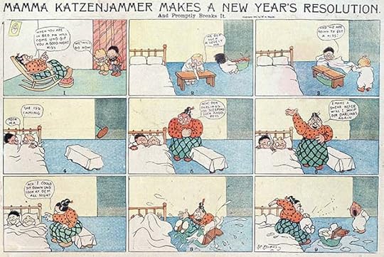
 From The Katzenjammer Kids by Rudolph Dirks, Dec 5 1909
Here we have a bowling ball in a hat which has fallen from a hatrack onto what looks like a hard floor. Surely that would make a louder sound than the way it’s drawn! Again, though, some radiating lines help indicate the impact.
 From The Yarns of Captain Fill by C. Wl Kahles, Jan 15 1910
This strip shows two workmen banging on a large metal drum while someone is sleeping inside. The banging sound effects should have been a lot louder than the snoring! These radiating lines are wavy.
 From The Kin-Der-Kids by Lyonel Feininger, July 22 1906.
In the case of quiet sound effects like air escaping from holes in a hot air balloon, they had to be surrounded by air cloud shapes to be seen at all. Dashed lines from the holes to the shapes help show the connection.
 From Krazy Kat by George Herriman, July 15 1916
Finally in Krazy Kat, a running gag of Ignatz Mouse throwing a brick at Krazy gave George Herriman a reason to make sounds a little bigger and more important, but not much bigger.
 From The Katzenjammer Kids by Rudolph Dirks, Oct 11 1914
Eventually sound effects grew larger for really loud sounds, like explosions. The second panel above I think shows the hot air balloon exploding, and the sound effect is almost big enough to reflect that, though impact is lost by having it made of thin lines.
 From Round One Teddy by Sals Bostwick, Nov 9 1924
Sounds continued to grow bigger and more visible. Here ZING! is tiny but PLOP is quite large for the amount of noise it probably made, which adds to the humor. The punctuation in the balloon is odd, and hard to interpret out of context. Note again the long dashes suggesting interrupted speech.
 From Captain Easy by Roy Crane, April 21 1935
Eventually sound effects were sometimes drawn as open letters with heavy outlines and filled with a bright color, a trend that continued into early comic books and one that’s still common today.
 From Little Sammy Sneeze by Winsor McCay, July 16 1905
Human and animal sounds could also be emphasized with large or open display lettering (perhaps so called because they displayed the talent of the letterer). Always ahead of his time, this strip by the prolific Winsor McCay had each episode revolve around the uncontrolled sneeze of a small boy, highlighted in massive red-filled letters, all the more vivid compared to McCay’s usual small lettering. I’ve cut off the subtitles of the strip to make it larger, but I love them: “He Just Simply Couldn’t Stop It” and “He Never Knew When It Was Coming.”
 From Monkey Shines of Marseleen by Norman E. Jennett, April 19 1908
Norman Jennett’s Marseleen was an early user of large open letters for sounds like a crying baby, all the more unusual in the way they rotate around the baby’s cradle until almost upside down.
 From Krazy Kat by George Herriman, Feb 4 1922
Herriman’s Officer Pupp makes his point with large open letters in Herriman’s idiosyncratic style.
 From Alley Oop by V. T. Hamlin, Nov 17 1935
By 1935, an entire panel of Alley Oop filled with nighttime animal sounds keeping Oop awake told the story perfectly. As you can see, large open block lettering describing sounds, often filled with color, had become a unique feature of comics lettering.
 From Krazy Kat by George Herriman, Sept 16 1928
This Sunday Krazy Kat used a wide variety of sound effects to represent night noises, even though they weren’t very large or different from each other. (Incidentally, Herriman’s lettering is clearly his own, in the same style as the rest of his art, something that would change in years to come in some strips.) Through sound effects, comic strip artists had found a new tool that could help tell stories with lettering in a way not seen in any other medium of the time.
 From Barney Google by Billy DeBeck, March 29 1934
In addition to word balloons and sound effects, comic strip artists created new vocabulary elements and symbols that readers soon came to understand as visual shorthand for specific sounds, actions, or non-verbal speech. This Barney Google strip has quite a few, let’s look at them.
 From Barney Google 1934, detail
Stars, in this case six-pointed ones, could add loudness and impact to sharp blows. They were also used after a hard blow to the head to suggest the mental impact on the character. In the balloon is another example of a double dash to suggest an interruption in speech.
 From Barney Google 1934, detail
In the second balloon here we have swearing symbols. Comic strip artist Mort Walker called them grawlixes. Others have named them obscenicons or profanitype. They can include non-letter typographic symbols such as @#$%&* as well as stars, spirals, thunderbolts, exclamation points and growly squiggles. In the first balloon we have two different sets of short dashes. The first is three dashes, which I think is meant to represent a pause, the same thing for which an ellipsis or three dots is generally used. The second is again two dashes, representing an interruption in speech. A subtle difference in comics punctuation.
 From Barney Google 1934, detail
Music notes in a balloon or out of it suggest a character humming, whistling, or playing a musical instrument. Such music is usually made-up nonsense, but occasionally it’s real music, as when Schroeder plays his toy piano in Charles Schultz’s Peanuts, and it’s often considered part of the lettering.
 From Barney Google 1934, detail
A word balloon filled with one or more giant question marks or exclamation points express something no words or picture can quite equal, a wordless and soundless expression that the reader immediately understands.
 From Barney Google 1934, detail
This is more a matter of art than lettering, but motion lines add greatly to the impact of sound effects, and might be considered part of them at times.
 From Barney Google 1934, detail
Here a smaller question mark in a balloon carries a subtly different message, while GULP in descending bubbles for a character drinking expresses sound in a unique way.
 From Barney Google 1934, detail
Flying water droplets are important elements of cartoon art, and also contribute to the understanding of the sound effects.
 From Barney Google 1934, detail
I had to include the final panel payoff, what a tour-de-force of humor, sound effects and unique comics symbols from Billy DeBeck! At the end of the balloon are three dashes, again suggesting a pause.
 From Li’l Abner by Al Capp, July 7 1937
Early on, breathy sounds like GULP or SIGH had no special treatment, but over time some artists put punctuation around them to show there was something different going on. In this panel, Al Capp has added little bursts at each side of the GULP, and parentheses around those. Capp also used parentheses to indicate thoughts, whispers, or quiet asides, but some artists used just parentheses to indicate vocal sound without voice. In comics these gradually became dashed parentheses and then small burst lines at each side of the word. I call them “breath marks.” That idea might have come from Capp’s small bursts.
 From Lady Bountiful by Gene Carr, Nov 1 1901
Speaking of swearing symbols, I’ve traced their use back to at least 1901 in this obscure comic strip. Some of these are hard to interpret, but Lady Bountiful at least knows what’s meant.
 From Thimble Theatre by E. C. Segar, Jan 1 1928
Perhaps the most creative and delightful use of swearing symbols is this one from Thimble Theatre in its early years before Popeye became the star. It’s hard to imagine actual words that could live up to that!
 From Little Nemo in Slumberland by Winsor McCay, Jan 2 1910
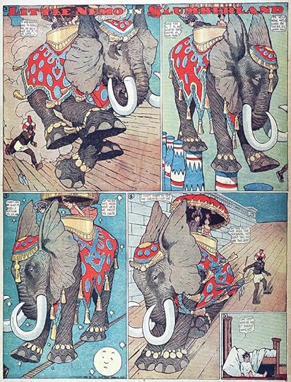
Before we leave this topic, here’s the first of two creative and innovative uses of lettering in the work of Winsor McCay. In this strip, giant word balloons denote the screams of pain from a character with an attack of gout. McCay didn’t play with large lettering often, but here it’s startling and claustrophobic. The giant balloons have roundness and depth created by the shape of the letters, as they crowd the characters out of the images.

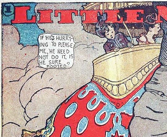
 From Little Nemo in Slumberland by Winsor McCay, Dec 1 1907
Even more remarkable is this strip where the character Flip is knocking down letters from the title, using a piece of the bottom panel border, both things usually assumed by readers to be unseen by those in the comic. Nemo and his friends have been closed out of a banquet hall, and Flip decides to try eating title letters instead. “Oh! Flip! You’re spoiling the drawing!” Nemo exclaims. Flip replies, “Why don’t the artist feed us then? Oh! This is great! Try it!” McCay’s idea is funny and brilliant, suggesting that elements of lettering and borders can become tools, props and even food for the characters in a meta way that breaks through the assumptions of the reader, presenting a completely new understanding of how comics can work. In this, as in many things, Winsor McCay was ahead of his time.
The post LETTERING TERMS and PIONEERS Part 3 appeared first on Todd's Blog.
August 14, 2023
Rereading: THE STORY OF FREGINALD by Walter R. Brooks


This is the fourth book by Brooks about the talking animals of the Bean Farm, but only one of those animals is in it as a supporting character, and relatively briefly: Freddy the Pig. Most of the story revolves around a young bear who joins a traveling circus.
Freginald the bear cub began life with the name Louise, even though he was a boy bear, due parents who couldn’t agree on a name, and a verdict from a grumpy great-grandfather. He hated his girl name, and when he meets a lion sleeping in his woods, he starts a conversation. Leo, the lion, is part of the Boomschmidt circus, and he invites Louise to come meet his friend, Mr. Boomschmidt, who might take him on. That does happen, and the circus master wants him to be billed as Louise the Bear, even though Freginald hates that name, because it will attract the curious. When Mr. Boomschmidt finds out that Louise also writes poetry, that’s added to his resume, and the circus animals and staff agree to call him Freginald instead of Louise eventually.
As the circus travels north, Freginald gains new friends like another Louise, a baby elephant, and Eustace, a diving mouse. Freginald and Leo get captured by a group of animal thieves living in an abandoned farm they’ve taken over, and the whole circus has to come rescue them, leading to a few more animal recruits. When they near their regular performing area in New York State, another circus begins to follow them and steal their business. Freginald finds out some sinister things about the other circus master. Can another new friend, Freddy the detective pig, help him save the circus from financial ruin?
In the first three books, animals could talk to each other, but not to people. Brooks realized the difficulties of that in the third book, “Freddy the Detective,” where Freddy has a tough time telling anyone about the criminals he’s found. In this book, Brooks does a smart thing. He begins with new animals and humans that talk to each other as if it was completely normal, and by the time Freddy is introduced, having him also talk to humans seems normal too. The rest of the many books in the Freddy series kept that change. The Boomschmidt circus, and particularly Leo and Mr. Boomschmidt, became regular recurring characters in the series, another fine choice by Brooks, as they’re quite funny. Freginald himself appeared rarely, as he was a bit too similar to Freddy to be needed.
Like all the Freddy books, this is entertaining, and full of great characters and adventures. Recommended.
The Story of Freginald by Walter R Brooks
The post Rereading: THE STORY OF FREGINALD by Walter R. Brooks appeared first on Todd's Blog.
August 10, 2023
LETTERING TERMS and PIONEERS Part 2
 From The Brownies by Palmer Cox, June 7 1903. Many of the comic strips shown are in public domain, where they aren’t, the images are © the respective syndicates or owners.
In this article I’ll take a closer look at some of the elements of comics listed in Part 1, beginning with captions. Comic strips as we know them today grew out of earlier combinations of words and pictures like political cartoons, where drawings were often paired with a descriptive block of lettering or set type in or below the art. Today we would call them captions, and many book illustrations of the time also had captions. Silent films followed a similar path with title and intertitle cards that were sometimes typeset and sometimes lettered by hand. Many early comic strips used captions to help tell the story, as in the example above of The Brownies by Palmer Cox, which uses rhyming ones.
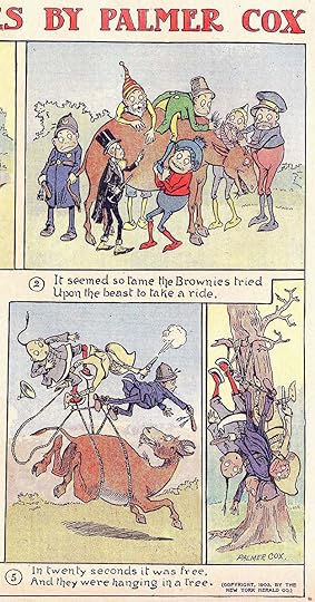 From The Brownies by Palmer Cox, 1903, detail
The captions are beautifully lettered in upper and lower case with distinctive shapes for some letters, like the T and G, and Cox’s open letter title is equally charming. Some comic strips always relied exclusively on captions to tell their stories, along with the art of course. At least one, Prince Valiant, still does today. While typeset captions were sometimes used, hand-lettered ones are a better match for hand-drawn art, and also easier for artists in the days before desktop publishing when type had to be set at a type house or printing plant, then pasted on the art. Note that Cox’s captions were numbered, reinforcing the English language natural reading order of left to right in each row of panels, then down to the next row, helping new readers understand how to follow the story. To give the art in panels 1 and 2 more room, he’s put the captions in the top of the panels below.
 From Buck Rogers by Phil Nowlan & Dick Calkins, Jan 6 1930
 From Wash Tubbs by Roy Crane, April 28 1935
Large initial capital letters were sometimes used in captions, carrying forward a tradition begun in medieval manuscripts (but those were far more ornate), and often used in printed books of the 19th and early 20th centuries. That idea can be found in some comics today.
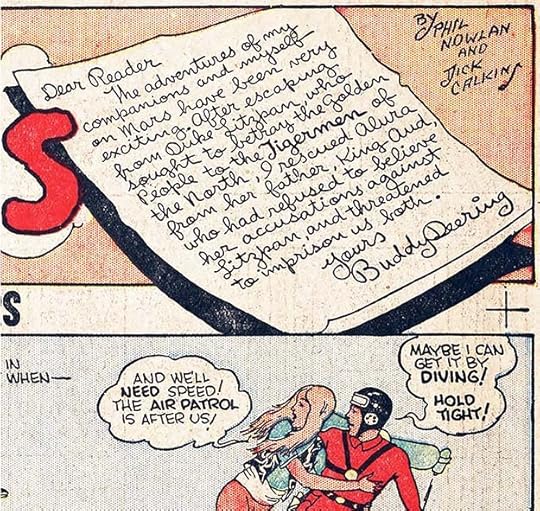 From Buck Rogers by Phil Nowlan & Dick Calkins, Jan 6 1930
Specialized captions like this cursive writing note from Buck Rogers also evolved to help tell stories in more complex ways. I’m reminded of epistolary novels like Dracula by Bram Stoker, which tell a story through a series letters, newspaper articles, and diary entries, Diary captions in comics follow that tradition, though readers today may have a harder time reading any kind of script, so now they’re more often done with simpler lettering.
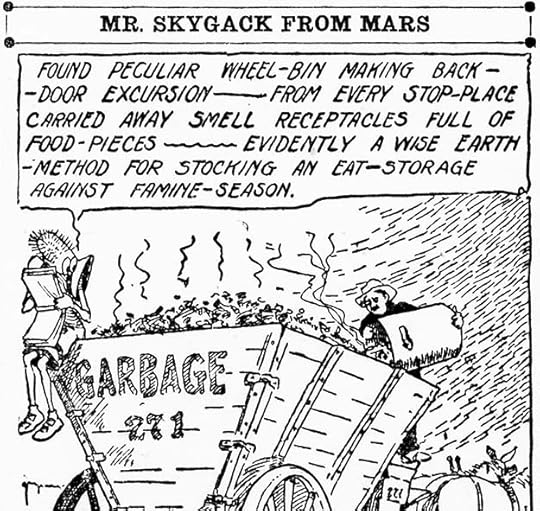 From Mr. Skygack from Mars by W. Aird MacDonald, 1912
The earliest diary captions I’ve found were a regular feature of this largely forgotten comic strip, where the main character, a Martian, tries to explain what he sees on Earth with funny results. The style is standard block lettering, but slanted.
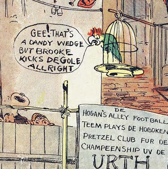 From Hogan’s Alley by George Luks, Oct 11 1896
When I think of words in comics, the first thing that comes to mind is word balloons, also called speech or dialogue balloons, which are occasionally seen in the earliest comic strips and before (see Part 1), and gradually grew in importance and frequency over the next decade or two. Generally by the late 19th century, they were all upper case sans-serif block letters, the easiest to draw and the easiest to read. Within that parameter, there are many variations of style individual to each strip and each artist. The one above by George Luks is crude but readable, with letters made with a flexible pen nib that creates lines of various thicknesses. As in Winsor McCay’s Little Nemo, the balloon barely contains the letters with little space around them, and some words are almost run together. The tail does at least go right to the parrot’s mouth.
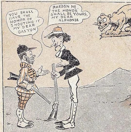 From Alphonse and Gaston by Frederick Opper, Dec 29 1901
These balloons have more even letters, though the first one tilts to the left. Single line tails are used, which were common at the time, and on an open background they work fine. Letter spacing is too wide in places, making GASTON read like GAS TON, but it works well enough. Some letters appear broken, but that may be from the printing process.
 From Buster Brown by R. F. Outcault, May 29 1904
Outcault’s balloon lettering here is very regular, though narrow. Most of the letters are sans-serif, but the personal pronoun I has small serifs at the top at bottom, something that gradually became a tradition of comics lettering. Note that Outcault does not put serifs on the other letter I’s.
 From Bringing Up Father by George McManus, May 8 1913
Every strip artist had his own style in the art and in the lettering, and there was lots of variation. McManus did small letters that floated in large rectangular balloons. The lines of lettering tilt slightly down to the right, suggesting no level pencil guidelines were drawn in first.
 From Barney Google by Billy DeBeck, June 25 1920
DeBeck’s letters are looser with almost no straight lines, but he does use the serif I for the personal pronoun. His tails are single lines, and none are used on the first two balloons, where they touch the speakers. Note that there are very few periods ending sentences in these strips, either it’s an exclamation point, a question mark, or nothing. At the time, comic strip line work was printed from metal plates, and the men who made those plates went over them and removed any small spots, assuming it was unwanted dirt, so periods were avoided since they were likely to be removed anyway.
 From Winnie Winkle by Martin Branner, Jan 20 1924
This lettering is very regular with lots of straight lines, though it does all tilt down slightly toward the left. So far we haven’t seen any emphasized words, but here YOU is underlined twice for emphasis, and the punctuation is doubled and tripled. There’s space between the lines of lettering, and space around it in the rectangular balloon. For the first time here we see the tails beginning to open up, which makes them easier to see against background art. I’m amused to see the expression “Holy Socks!!,” as I thought Alan Moore created it for Timmy Turbo in TOM STRONG.
 From Buck Rogers by Phil Nowlan and Dick Calkins, June 8 1930
The balloons in Buck Rogers are rounded and billowy, with open tails that have snaky curves. Emphasized words are done with a thicker pen point, but are otherwise about the same size.
 From Li’l Abner by Al Capp, Jan 10 1937
Al Capp’s Li’l Abner began in 1934. Both the art and lettering is well-crafted and stylized. While Capp set the style and did the early lettering, he often used assistants who probably also did a lot of the lettering. In this example, the emphasized words are very large and thick, with squared corners, which takes more time, as it’s done either by outlining each letter with a fine-tipped pen and then filling in the black center, or by drawing the letters with a thick pen and then pointing the corners with a fine one. Both emphasized and regular letters are very square and lined up well horizontally. In the first balloon, there’s a quiet remark in the middle set apart by both parentheses and quote marks. Capp wasn’t taking any chances it would be misinterpreted! The balloon shapes leave air around the lettering in most places, and as in Buck Rogers, are billowy like clouds, but with straighter bottom edges. The tails are kind of a mix of open and closed. Capp’s lettering style, like his art, stands out and makes an impact.
 From Terry and the Pirates by Milton Caniff, lettering by Frank Engli, Sept 25 1936
Milton Caniff made a wise choice hiring Frank Engli to letter his comic strips, Engli’s work is modern and appealing, and I think he set the style going forward, as many others copied him. He used a wedge-tipped pen, giving the letters variation between thick and thin lines depending on direction. His letters are consistent and line up well, but also have a small amount of looseness that feels inviting. His balloons are gracefully rounded with large loops, and his tails are open to read well against the background art. Comics balloon lettering style is a tree with many branches, but the direction of growth is clear, and with this strip and lettering, I feel it reached maturity.
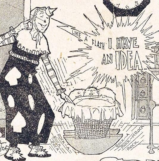 From Monkey Shines of Marseleen by Norman E. Jennett, April 19 1908
Other kinds of word balloons were slow to develop. The unusual comic strip Monkey Shines of Marseleen utilized all kinds of specialized lettering including a type of thought balloon which was drawn more like a burst of lightning, literally a flash of inspiration, in which Marseleen the clown thinks, “Like a flash I have an idea.” This happened similarly in other Marseleen strips. It’s a thought balloon that looks like a burst balloon.
 From Buck Rogers by Phil Nowlan and Dick Calkins, April 27 1930
Buck Rogers by writer Philip Nowlan and artist Dick Calkins began in 1929, and was a popular and successful science fiction adventure strip, garnering many imitators. The lettering on this page is in a different style than the other examples shown above, so perhaps Calkins was using assistants for that at times. Thought balloons took many forms in different strips, and even in the same strip. Here it’s given a dashed or broken line but a standard tail.
 From Buck Rogers by Phil Nolan and Dick Calkins, July 27 1930
This example from a few months later is back to the earlier lettering style with more curves and bounce, and here thought balloons are surrounded by very jagged borders, but these are telepathic balloons, which the character is projecting into the minds of the other characters.
 From Alley Oop by V. T. Hamlin, April 7 1935
In the humorous prehistoric adventure strip Alley Oop, begun in 1932, a character’s thought balloon is given many tiny circular scallops on the edge to distinguish it from the speech balloon next to it. The thought balloon has no tail, but overlaps the speech balloon, which also has scallops, but not as many, and an open tail.
 From Alley Oop by V. T. Hamlin, Dec 20 1936
This example from more than a year and a half later takes a different approach to thought balloons, with jagged burst-like borders and jagged tails. But I think this lettering may be by someone else, perhaps an assistant, as the letter shapes and style are not quite the same. Perhaps Hamlin wasn’t concerned about being consistent.
 From Terry and the Pirates by Milton Caniff, lettering by Frank Engli, March 19 1939, this and other original art courtesy of Heritage Auctions
Terry and the Pirates has the earliest example I’ve found of the later standard thought balloon with scalloped edges and a tail of diminishing bubbles. I think Frank Engli created this style, and as with his other lettering, many followed his lead. Engli’s bubble tail doesn’t quite point to the character’s head, but it’s close. The emphasized word in it is underlined, an older style that Engli often used for slight emphasis. Note two other types of punctuation often used in comics, a dash to indicated an interruption in speech, and an ellipsis or three dots suggesting a pause in speech.
 From Smokey Stover by Bill Holman, April 5 1936
One episode of the humor strip Smokey Stover brought back the “idea burst” balloon last seen in Monkey Shines of Marseleen, in this case with a tail ending in a fist striking the character’s head for funny emphasis.
 From Li’l Abner by Al Capp, Jan 19 1937
By the late 1930s, burst balloons had become more common. In Li’l Abner they were used to emphasize loud speech. The tail goes down to Pappy Yokum, and is curved, but the burst points are so long my first thought was that Abner was speaking.
 From Alley Oop by V. T. Hamlin, July 17 1938
In Alley Oop a different sort of burst with radiating lines gives similar emphasis to an argument with symbols suggesting swear words, more on that to come. Oop’s balloon ends in a double dash instead of a single longer dash, another common way to indicate an interruption in speech. That may have evolved from typewritten scripts. There’s no long dash key on a manual typewriter, so scripters used a double dash instead.
 From Terry and the Pirates by Milton Caniff, lettering by Frank Engli, Feb 12 1939
In Terry and the Pirates, a voice from a radio is surrounded by a jagged burst and has an electrical or lightning bolt tail. This is another style I think Frank Engli created that was imitated by others, and it became a standard style for balloons to radios, TVs, and loudspeakers. Engli stuck with the long dash for an interruption in speech.
I’ll continue with sound effects and other special lettering ideas in Part 3 of this article.
The post LETTERING TERMS and PIONEERS Part 2 appeared first on Todd's Blog.
August 8, 2023
LETTERING TERMS and PIONEERS Part 1
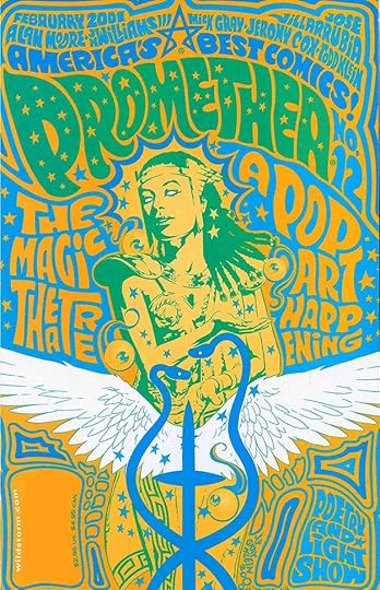 From PROMETHEA #12, Feb 2001, America’s Best Comics, written by Alan Moore, art by J.H. Williams III and Mick Gray, lettering and coloring by Todd Klein
Comics are the combination of words and pictures that make you laugh, in the newspaper and online, or the comic book adventures of your favorite superhero, and so much more. Most comics fans and readers focus first on the art, but the words are equally important, and the visual presence of those words is an integral part of the unique medium of comics. While some comics are solo creations of a single individual, and while some artists make the words part of their art (and are letterers themselves), the majority of comics are a team effort, and the look, shape and style of those words in comics reveal the craft and artistry of a letterer. Often in the history of comics letterers went uncredited and unnoticed, except by others inside the comics business who recognized their value and sought to hire them. The best letterers had a vital impact on the final product, even if readers didn’t know their names, or recognize their existence. My blog, and its dozens of articles about letterers and their work, is my own effort to redress that inequity. It’s my love letter to the craft and art I’ve made my career, an overview of the lettering work that informed and inspired me, and the sum of what I’ve been able to learn about those who created it. It’s an ongoing process for me, and for you, my readers, that I hope you enjoy as much as I do. In this three part article I’ll start by describing various lettering elements and then looking at how comics and lettering developed. In parts 2 and 3 I’ll go into more detail about some of the elements and how they evolved.
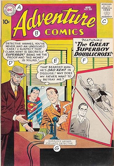 From ADVENTURE COMICS #263, Aug 1959, image © DC Comics.
Here’s the cover of one of the first comics I ever owned. Let’s look at the various lettering elements on it. Almost everything here except the cover art by Curt Swan and Stan Kaye is by Ira Schnapp, DC’s main letterer and designer at the time.
A) Company symbol, in this case the DC Bullet
B) Book logo
C) Comics Code Authority seal of approval
These three items along with the price, date, and issue number (all typeset here), make up the “trade dress,” or elements that repeat on every issue of the series.
D) Word or dialogue balloon
E) Thought balloon
F) Caption or blurb describing the contents or story
G) Sign
There are more possible cover lettering elements, including other types of balloons and blurbs, but this cover has a nice variety.
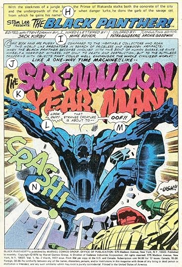 From THE BLACK PANTHER #2, March 1977, image © Marvel Comics
Next we have the splash page, or first story page, of a Marvel title with art by Jack Kirby and Mike Royer featuring more lettering elements.
H) Recurring character description and character logo, in this case by Danny Crespi
I) Creator credits, something that did not start appearing regularly in comics until the early 1960s at Marvel, this and all other lettering is by Mike Royer.
J) Caption, with decorative larger first letter
K) Story title, perhaps sketched in by Kirby
L) Burst balloon
M) Rough balloon
N) Sound effect
Not lettering, so not labeled, but the Indicia is all the publishing and legal information at the bottom.
In the days when comics were entirely created by hand, letterers were expected to add sound effects, signs, titles, and anything of noticeable size created with letters (though some artists preferred to do their own large letters or sound effects). Often they also inked the panel borders. Logos and company symbols were generally designed once and used many times. While in some cases graphic designers were hired for that as a separate job, in comics it was often letterers who got those assignments, as well as jobs like lettering house ads and other kinds of ads, title pages, and so on.
 From the book “Mon Livre d’Heures” by Frans Masereel, 1919
There are comics with no words. Early examples are the woodcut novels of Flemish painter and graphic artist Frans Masereel (1889-1972) and similar books by artists like American Lynd Ward.
 Elephunnies by Walt Kelly from ANIMAL COMICS #22, Sept 1946
While comic books and strips without words are uncommon, many comics have wordless stories or sequences. Notable examples are the mostly wordless comic strip Henry by Carl Thomas Anderson, the GON manga series by Japanese cartoonist Masashi Tanaka, and short pieces by Walt Kelly. There are many more.
 From ALPHA FLIGHT #6, Jan 1984, image © Marvel
Comics sequences using only words are also rare, but a memorable example is the fight scene in a snowstorm by John Byrne, lettering by Michael Higgins, above, which was controversial at the time, with fans labeling it a stunt and a cheat, if I recall correctly. Nothing wrong with the lettering, though!
 From HABIBI by Craig Thompson, 2011, Pantheon, image © Craig Thompson
More recently, sections of this large graphic novel by Craig Thompson include instructional sequences that are all lettering and calligraphy, also by writer/artist Thompson. In this case, the design and layout are as important as the text.
In most cases both images and words work together to complete the comics reading experience. Comics can have everything in a single panel, as in comic strips like Dennis the Menace, but generally they’re a series of images that tell a story using the passage of time: sequential art. Even single-panel strips with recurring characters imply a sequential story over multiple examples. The origins of comics are a subject of much discussion and differing opinions, and many have tackled the subject, but I’ll give it a try next.
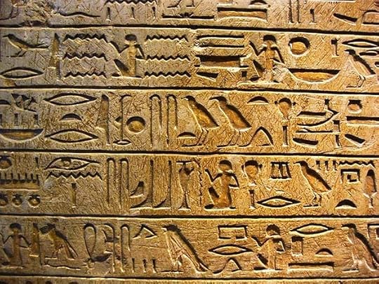 Egyptian hieroglyphics, image found online
People have been telling stories with pictures at least since the Neolithic era cave paintings from earlier than 40,000 years ago found around the world. Pictures became codified into language in ancient Egypt’s hieroglyphics, above, and more subtly in ancient Chinese writing. Ancient Greek pottery told stories in pictures with captions or labels.
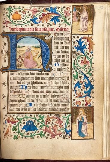 Dutch Book of Hours, 1470
Beginning in late Roman times, illuminated manuscripts of holy texts and other written works beautifully combined written words with illustrations.
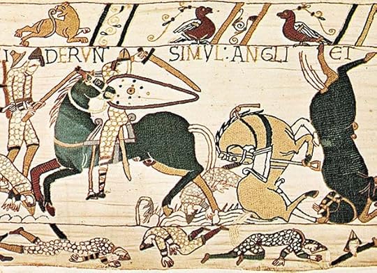 The Bayeux Tapestry, finished about 1077
The Bayeux Tapestry dating to the 11th century, tells the story of the Battle of Hastings in a series of pictures with descriptive text running through its seventy scenes and over 220-foot length. These are all early examples of words and pictures combining to tell stories, and there are many more from many cultures.
 From GOD’S MAN by Lynd Ward, 1929, Cape and Smith
Printing had a large effect on storytelling with words and pictures because it allowed each image to be seen by many more people. Woodblock printing developed in China as early as 220 A.D., first as a method to put images on cloth, then on paper by the fifth century. It had come into use in Japan and Europe by around 1400 A.D. It remains in limited use today, and in the 20th Century, entire books of sequential art were created with it, as in the example shown earlier by Frans Masereel, and the one above by Lynd Ward. Cutting away the areas of each block that would be uninked or white was laborious, but many copies could be made. It was not a process to fill newsstands, though, and creating small but readable lettering with this method was also difficult.
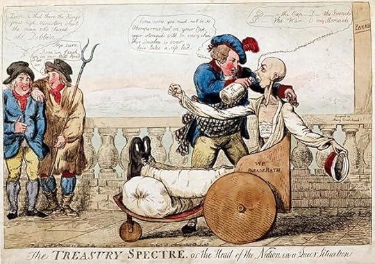 The Treasury Spectre by Isaac Cruikshank, 1798, hand-colored engraving on paper
Engraving on metal began to appear in Europe in the 1400s in jewelry-making. By the 1700s it was being used in printing. Lines are cut in a sheet of metal, usually copper at first, later steel, with sharp tools called burins. The finished image is covered with a viscous black ink, then wiped off with a rag leaving ink in all the incised areas. Slightly moistened paper is pressed onto the inked plate in a press, transferring the ink to the paper. Several hundred copies of an engraved image can be made this way, more with steel plates. By the end of the 18th century, this form of print-making, easier than cutting woodblocks, was being used by artists to create satirical and political cartoons like the one above by Isaac Cruikshank.
 The Treasury Spectre by Isaac Cruikshank detail, 1798
The print includes word balloons written in handsome script with interesting snake-like tails, proof that the idea was not new in comic strips or comic books.
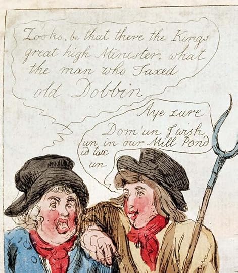
 The Treasury Spectre by Isaac Cruikshank detail, 1798
The image is symbolic, and parts are labeled like signs, while a well-lettered caption runs across the bottom.
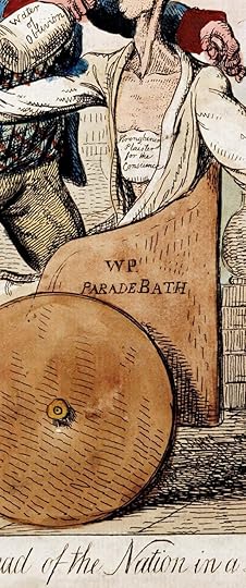
 The Treasury Spectre by Isaac Cruikshank detail, 1798
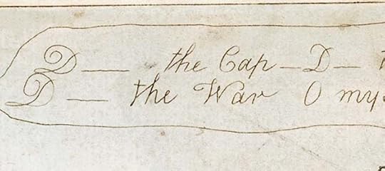
At upper right is a caption with repeated uses of D—— for Damn, an early example of censored lettering, in this case censored by the artist.
 The Treasury Spectre by Isaac Cruikshank detail, 1798
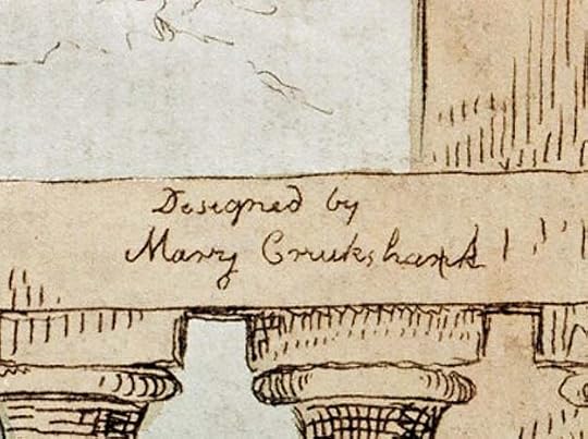
And finally, in small script on the bannister is “Designed by Mary Cruikshank.” She was Isaac’s wife, and clearly a part of his artistic work. I wonder if she did the lettering and added her own credit?
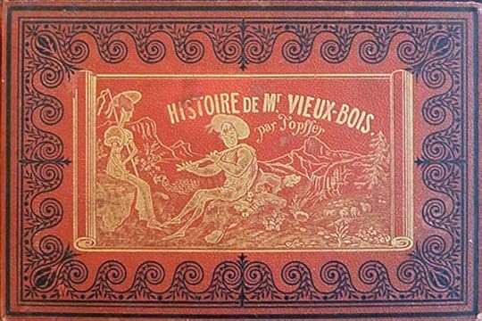
 From Histoire de Mr. Vieux-Bois by Rodolph Töpffer, 1837, cover and sample page divided to show the lettering better
Rodolphe Töpffer was a Swiss school teacher with a talent for drawing and caricature. In the 1820s he began drawing humorous stories in a series of panels with captions to amuse his students and friends. The first one drawn, though not the first published, is shown above. It was printed using an early form of lithography called autography that allowed Töpffer to draw with a pen on special paper rather than inscribing lines as in engraving, giving the art a looser and more cartoon-like feel that looks familiar to us today. His captions were written in cursive French below each image, sometimes telling the story, sometimes giving dialogue. This and other similar books by Töpffer are considered the first European comics. An unauthorized translation of Histoire de Mr. Vieux-Bois, replacing the cursive writing with typeset text, was published in England in 1841 and in the United States in 1842 as The Adventures of Mr. Obadiah Oldbuck, now considered the first American comic book.
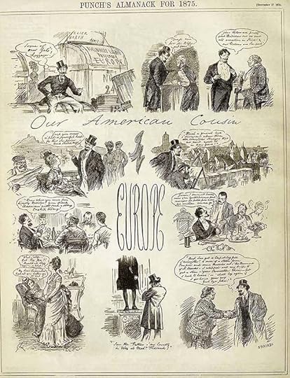 Our American Cousin in Europe by Charles Samuel Keen, from Punch, Dec 17, 1874, London
By the 1870s, new rotary presses that printed on rolls of paper made printing large runs much easier, and many new magazines were begun, including some that focused on humor like Punch in England and Vanity Fair and Puck in America. Political cartoons were common in all of them, as well as other humorous drawings.
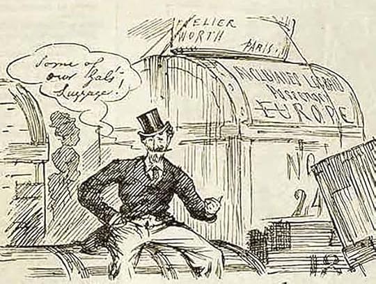 Our American Cousin in Europe detail, “Some of our Gals’ Luggage!”
This page by Charles Samuel Keen features a series of panels, loosely sequential, and word balloons containing cursive script. The balloons and tails are similar to what Cruikshank was doing about 80 years earlier. It sure looks like a comic strip to me.
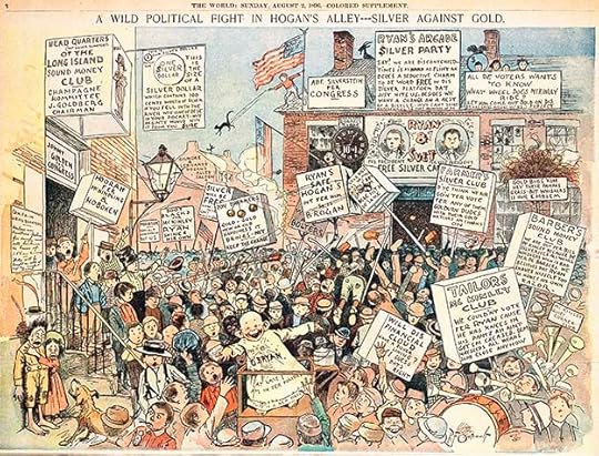 Hogan’s Alley by Richard F. Outcault, from The World Sunday, Aug 2, 1896
Comic strips as a form of storytelling developed gradually in America from the late 1880s to the late 1890s. One impetus was the circulation war between two New York City newspapers, Joseph Pulitzer’s New York World and William Randolph Hearst’s New York Journal. Both papers developed hugely popular Sunday color supplements made possible by new four-color rotary presses and photographic reproduction. In addition to many other kinds of features, they ran what we now call comic strips. Artists were able to draw images with pen and ink, and those images were photographically reproduced as black line art. Color was added by a separate photographic process. One of the earliest comic strips was Hogan’s Alley by Richard F. Outcault, who had begun doing political cartoons for the humor magazines a few years earlier. Outcault started working for Pulitzer’s newspaper in 1894, and was lured to Hearst’s paper in 1896 where he did a similar strip. The original Hogan’s Alley was then taken over by George Luks.
 Hogan’s Alley detail, 1896
Hogan’s Alley and Outcault’s other strips had lots of lettering, most of it on signs. The featured character, a bald-headed barefoot boy in a long nightshirt, who became known as The Yellow Kid, had his dialogue written on his shirt, though Outcault and Luks occasionally also used word balloons for other characters.
 Hogan’s Alley detail, 1896
Following the tradition of many political cartoons, Outcault’s signs and other lettering are mostly all capital block letters, which are easier to read at small sizes, and that became the standard lettering style for most comic strips. While some strips followed this example of one large panel, others began dividing their page into smaller panels, thereby using sequential storytelling.
 The Katzenjammer Kids by Rudolph Dirks, from The New York Journal – American Humorist, Dec 29, 1901
 The Katzenjammer Kids detail, 1901
One of the first strips to tell stories in a series of panels was about two naughty boys and their parents, The Katzenjammer Kids, begun by Rudolph Dirks in 1897. It was also one of the first to regularly use speech balloons, as seen in the example. The strip is the longest running in comics history, with new strips appearing until 2006, and it’s still appearing in reruns. Once strips like these proved to Hearst and Pulitzer that they sold newspapers, comic strips and their creators had found a permanent place in American popular culture, and that popularity spread to the rest of the country and later the rest of the world. Characters such as The Katzenjammer Kids, The Yellow Kid, Outcault’s Buster Brown, Frederick Burr Opper’s Happy Hooligan and his Alphonse and Gaston, Bud Fisher’s Mutt and Jeff and others became well known to readers who followed them avidly in the Sunday supplements and later on the daily comics page. Not only were the strips a success, so were the cartoonists, who were often the subject of salary bidding wars between rival publishers like Hearst and Pulitzer.
 From The Katzenjammer Kids by Rudolph Dirks, March 12, 1905
The comics sections of these and other papers became so important that the page one strip often included elaborate titles drawn just for that day’s Sunday paper by the strip artist.
 From The Katzenjammer Kids, details, 1905
Dirks must have been paid well to make it worth his while to hand-letter this title for the entire comics section, not to mention drawing a large extra panel of the strip.
 From Little Nemo in Slumberland by Winsor McCay, Sept 30, 1906
Perhaps the most celebrated early comic strip artist today is Winsor McCay, who began creating strips in 1903. This example of his best-known comic strip, Little Nemo in Slumberland showcases his amazing artistic talent.
As you can see, McCay’s lettering was usually conservative and small with narrow letters and word balloons whose borders hugged the lettering as if to leave as much room as possible for the drawings. Of course the size of the printed page was quite large, about 15 by 21 inches, so perhaps the printed lettering is not as small as it seems here.
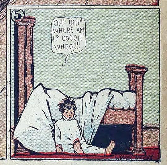 Little Nemo in Slumberland, detail, 1906
McCay’s amazing strip always ended the same way, with Nemo falling out of bed and waking up from his incredible dreams. The newspaper strips of the 20th Century’s first decade were truly incredible, and more wonders were to come, as creators stretched the boundaries of what readers understood, and established a new visual language. We’ll look at more of that in Part 2.
 From A. Mutt by Bud Fisher Dec 10 1907
In the early days of comic strips, the art and characters, what we would call today the intellectual property, was assumed to belong to the newspapers that bought them, and the strips were often copyrighted by the newspapers. This led to lawsuits when creators moved from one paper to another, beginning with R.F. Outcault’s strip Hogan’s Alley featuring the Yellow Kid. When Outcault moved from Pulitzer’s New York World to Hearst’s New York Journal American in 1896, a court case decided that the strip name belonged to Pulitzer, who hired another artist to continue it. Outcault was able to draw a very similar strip for Hearst, but had to put it under another name, and he had no right to stop Pulitzer from continuing Hogan’s Alley. A similar thing happened when The Katzenjammer Kids creator Rudolph Dirks moved from Hearst’s paper to Pulitzer’s. There a court case determined that Hearst owned the name, and he continued the strip with other artists, while Dirks retained rights to the characters, and continued his strip with Pulitzer under the name Hans and Fritz. Both strips went on for many years.
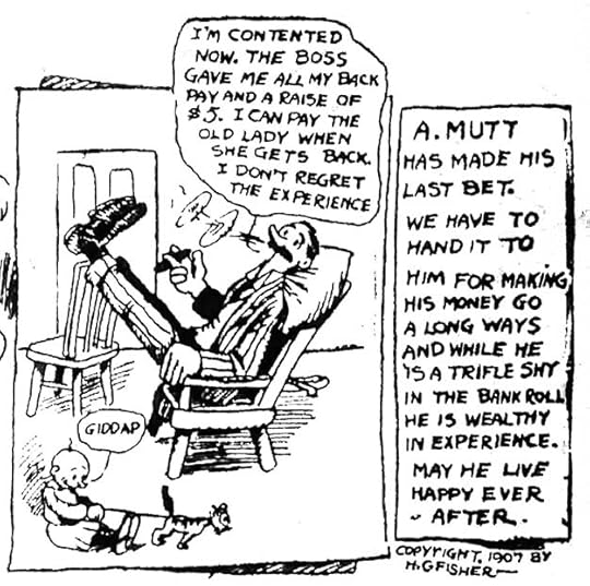 A. Mutt 1907, detail
Harry Conway “Bud” Fisher was born in Illinois in 1885. He was a sports cartoonist for The San Francisco Chronicle in the early 1900s. On November 15, 1907 he began a daily comic strip on the sports page titled A. Mutt about a hapless fellow betting on horse races. Fisher’s was the second attempt at a daily strip, the first being A. Piker Clerk by Clare Briggs, which lasted mere months starting in 1903 in The Chicago American. After only a few weeks, Fisher’s strip was noticed by William Randolph Hearst, who made a deal with Fisher to bring it to his paper, The San Francisco Examiner. In the final A. Mutt strip by Fisher in The Chronicle on December 10, 1907, the artist lettered a copyright notice into the bottom right corner, “Copyright 1907 by H. C. Fisher.” The Chronicle let it go by, or perhaps no one noticed it, but this small bit of lettering allowed Bud Fisher to gain control over the copyright of his strip, and stop The Chronicle running a version by another artist. The following year Fisher’s strip gained another main character, Jeff, and Mutt and Jeff went on to become one of the longest-running and most popular comic strips in America. Fisher moved his property several times to different distributors, gaining income and licensing rights, and the characters were in a series of films. By 1916 he was making more than $150,000 a year, an immense sum then, when the average yearly income was about $700. That barely noticeable bit of lettering changed the course of Fisher’s life, and also changed comics history, establishing an early example of creator ownership that others would strive to follow in the decades to come.
The post LETTERING TERMS and PIONEERS Part 1 appeared first on Todd's Blog.
August 6, 2023
Rereading: ONCE ON A TIME by A. A. Milne

 Cover and illustrations by Susan Perl
Before Winnie the Pooh, A. A. Milne had a successful writing career, including this book from 1917, a humorous, light-hearted fairy tale aimed at adults, but certainly fine for children too. It reminds me of some of Terry Pratchett’s Discworld novels, the ones that take place in small rural kingdoms with just enough magic to get people into trouble.
King Merriwig of Euralia and his daughter Hyacinth are having breakfast in their favorite place in the royal castle, atop the wall enjoying the view of their country, when an odd disturbance happens. The King of Barodia has been given a pair of seven league boots, and decides to try them out in the direction of the Euralian castle. He suddenly soars over the breakfast party, startling them, and a moment later soars back to Barodia. This becomes his morning routine, which outrages King Merriwig. He orders his guard to shoot arrows at the interloper, and soon the kingdoms are at war, and Merriwig marches off to the border with his guards. Hyacinth is technically in charge of the kingdom, but she’s dominated by the strong-willed Countess Belvane, who soon has her signing all kinds of money away for her pet projects, most of which simply enrich the countess. Hyacinth feels she needs help, and sends for a potential suitor, Prince Udo of Araby, but on the way he’s transformed into an odd creature that’s part rabbit, part lion, and part sheep. This makes his chances of helping Hyacinth small, but he agrees to try anyway, until Udo realizes that he’s more attracted to Countess Belvane than he is the princess. Meanwhile, King Merriwig is having some trying times on the battlefield, even with his invisibility cloak and his magic sword, because the king of Barodia also has one of each. Hyacinth and her lady in waiting Wiggs don’t know what to do, but then a stranger appears in the woods outside the castle who might be able to help.
Fun and funny, recommended.
The post Rereading: ONCE ON A TIME by A. A. Milne appeared first on Todd's Blog.
August 3, 2023
OTTO PIRKOLA – Harvey Comics Logo Designer
 From CASPER THE FRIENDLY GHOST #27, Dec 1954, Harvey Comics. This and all Harvey images © Harvey.
Harvey Comics was founded in New York City in 1941 by Alfred Harvey, and he was joined soon after by his brothers Robert and Leon. They specialized in licensed radio and newspaper strip characters such as The Green Hornet, Joe Palooka, Blondie and Dick Tracy. In 1952, they licensed cartoon characters from Famous Studios, a unit of Paramount Pictures, including popular favorite Casper the Friendly Ghost. Harvey bought rights to the Paramount characters in 1958, and produced some new cartoons and lots of comics about them. They also created their own characters in the same vein like Richie Rich. Their art director and logo designer in those years was Otto Pirkola. In this article I’ll look at some of the logos I believe he designed, there were many more.
 Otto Pirkola, 1955, by Stan Harfenist, courtesy of Shaun Clancy
Otto E. Pirkola was born March 13, 1908 on Long Island, New York to Finnish parents. He graduated from Freeport High School in 1927, where he was the art editor of the school newspaper. He pursued an art career and worked on movie posters for RKO Radio Pictures in the 1930s. In World War Two he served in the U.S. Coast Guard, and after that he was back in New York working for magazine publishers. In an interview with Ken Selig (who worked with Pirkola at Harvey) by Jim Amash published in Alter Ego #89 (Oct 2009, TwoMorrows), Selig remembered:
Otto Pirkola, whom [Harvey] hired as the art director, was a master of logos. Otto was largely responsible for the logo look of Harvey Comics. Otto came aboard about 1949 from McFadden Publications. Otto was an unsung hero at Harvey, because I always considered the comic book as a poster. He gave the comic books a posterish look with his logos, and that’s the first thing you saw. You didn’t see the body of the cover when you looked at the usual newsstand or candy store where you bought your comics. You saw the logo first, so it had to stand out. Otto had a very friendly nature. It was just Otto and myself when I started [in 1954]. I got a job as a board man, and a board man’s job was to make corrections.
 From BABE RUTH SPORTS COMICS #1, April 1949
This is the earliest Harvey logo I think might have been designed by Otto, based on similarities to some of his later ones. The logo seems like type at first glance, but a closer look shows variations between each pair of the same letters. The rest of the cover lettering is type. Pirkola’s logo has just enough subtle curves and gentle bounce to add energy and appeal to the subject. If Otto designed the cover as well, having Babe Ruth’s head at top left echoes what he would later do with the cartoon character books. The Harvey Comics symbol or bullet at upper right predates Pirkola.
 From SAD SACK COMICS #1, Sept 1949
Harvey tried many kinds of comics, but their main focus in the 1940s was licensed newspaper strip titles. At times they used existing strip logos, but this one looks like a new logo based on the bouncy block letters of the strip. The letters are well made, and the double outline is perfectly done to allow for a second color. We see a character head at upper left again, clearly something Otto thought was important. Pirkola was not a comics letterer, so the balloon was probably lettered by someone else.
 From BLONDIE COMICS MONTHLY #16, March 1950
Another excellent logo loosely based on the staggered block letters of the strip logo. Again, the letters and outlines are well proportioned and appealing. No character head, but the title would gain one in 1951. Pirkola’s covers tended to be visual gags without word balloons, and captions were often type.
 From DAGWOOD COMICS #1, Sept 1950
Chic Young’s name is larger on this title, perhaps contractually, so DAGWOOD is smaller, but still well-designed, and his head is at top left. Much has been made of that idea as used by Marvel in the 1960s (instigated by artist Steve Ditko on THE AMAZING SPIDER-MAN #2), but Pirkola was there first.
 From FAMILY FUNNIES #1, Oct 1950
Here lots of character heads form a frame around the central image. Even young kids who couldn’t read would recognize some of them. The logo is again well-crafted, I like the arc and lower case of FUNNIES. That word was once interchangeable with the word comics, but lost popularity over time.
 From FLASH GORDON #1, Oct 1950
The FLASH GORDON logo on this comic is not like any of the ones on the Alex Raymond comic strip, but the curve and angle of the bold block letters add movement and interest. Ken Selig said in his interview that the Harvey brothers had class and the respect of newspaper people, like those at King Features. That was why so many newspaper strips were licensed to them.
 Other genres at Harvey, 1951-53
Harvey, like most comics publishers in the 1950s, tried all kinds of comics, including war, romance, and horror, as seen above. The logo styles are quite different from what we’ve seen before, and from each other. The war logo imitates what Artie Simek was doing at Marvel, the romance logo is handsome mixed case script, and the horror logo again follows the lead of Simek. It seems likely Otto Pirkola designed them, though I don’t see any style elements that point to him. Perhaps he was just a good mimic when he needed to be. The caption lettering on all three is probably by Joe Rosen, the main story letterer for Harvey at the time, and it’s interesting to note that there’s no Harvey bullet on that horror cover, as if the company was a bit ashamed of it, or didn’t want kids to associate that kind of comic with their other books. A few years later, Harvey put out a few comics from Joe Simon and Jack Kirby, and later still, Joe Simon was a Harvey editor on a small line of action/adventure books, and Joe did the logos for those.
 From LITTLE AUDREY #25, Aug 1952
In 1952, the Paramount cartoon characters began getting their own titles at Harvey. St. John had been publishing them, but lost the license, and Harvey continued the numbering from the St. John issues on several titles like this one, hoping to keep readers. I think this is where Otto Pirkola found his true calling, his cover designs and logos for the animation books are all excellent, much better than the St. John versions. The contrast between LITTLE and AUDREY is well done, the script top line is excellent, and we already see Otto using a character figure at upper left to identify and help sell the series. I think only Dell’s cartoon character logos were as good as Pirkola’s.
 From HARVEY COMICS HITS #60, Sept 1952
This title was used for all kinds of one-shots or tryouts, in this issue the Paramount characters first appeared, with Herman and Katnip featured, and head shots of Baby Huey and Buzzy the Crow. Also inside were Little Audrey and Casper, among others. Otto’s logo is excellent, and it was used twice, here and on issue 62, the last of the series, before becoming a new title with issue #3.
 From HARVEY COMICS HITS #61, Oct 1952
For this issue, Otto designed one of his best logos for Casper, and it’s quite different (and better) than the titles of the cartoons. I think it was a brilliant decision to go with sturdy mixed-case block letters that have just a few ghostly stroke-end elements rather than doing the whole thing that way. It helps carry the idea of a FRIENDLY ghost by not to make it too scary. The thin drop shadow adds weight and depth, and the pale blue color shading, matching the ones on the character, cement the connection. No character figure in the logo this time, but that would come soon.
 From CASPER THE FRIENDLY GHOST #7, Dec 1952
With this issue, Casper moved into his own title, and the cover artist is already messing with the logo by putting a ghost character partly inside it. The logo reads fine anyway, and the idea that Casper would be frightened by a skeleton is amusing. The cover artist for many of these early cartoon covers is not known, but Warren Kremer was already a busy cover artist at Harvey, and any of these could be his work.
 From CASPER THE FRIENDLY GHOST #12, Sept 1953
With this issue, Pirkola adds a much larger and more obvious Harvey logo at top left, and a character figure below it. This would be the plan going forward, and those elements helped identify the company and brand for readers. The barely readable tagline inside the H below HARVEY is FAMOUS NAME COMICS. Perhaps it was hype at this point, but the company was onto a good thing, and it would soon be true as readers bought the animated titles in droves.
 From LITTLE DOT #1, Sept 1953
The first of Harvey’s own animation-style characters to receive a series was Little Dot. She had been a backup feature in other comics since 1949, and was now a perfect companion to the Paramount titles, and even more profitable, since there was no licensing fee to pay. It’s clever and interesting that Otto chose to use stripes in her logo rather than dots, making for effective contrast and an appealing style. The new Harvey symbol and character head are in place.
 From FUNNY 3-D #1, Dec 1953
3-D comics were a fad at this time, and Harvey got into it briefly, and not successfully, with a few one-shots such as this. I like Pirkola’s logo and cover design.
 From PARAMOUNT ANIMATED COMICS #7, Feb 1954
With this issue, Baby Huey became the star of this series, and later in his own. The Pirkola logo and trade dress work fine, I would have put BABY closer to Huey and closer to Paramount. Someone did an open sound effect that should have been a different color, but it was missed by the separators.
 From CASPER THE FRIENDLY GHOST #27, Dec 1954
With this issue, Pirkola introduces a stamp-like frame for the character corner image, month, and issue number. It lines up with a black box now framing the Harvey symbol, and the words inside the H are simplified to just HARVEY COMICS. This is the style used going forward on all the animation-based comics, and I think it works well. Marvel would copy the basic idea in the 1960s.
 From PAT SULLIVAN’S FELIX THE CAT #62, Aug 1955
Felix the Cat was created in 1919, one of the earliest animated cartoon characters. His cartoons were distributed under the Paramount banner, but there’s no Paramount tagline on his Harvey comic. He may have come to Harvey as part of the Paramount deal. The comic continued numbering from a series by Toby, which in turn had continued one from Dell. Pat Sullivan owned the studio that created the character, but the cat’s creation was later attributed to Otto Mesmer. Pirkola’s logo is delightfully large and appealing, a solid color rather than outlined. We’re now in the era of the Comics Code Authority, and their seal of approval was welcome on these Harvey cartoon comics, I’m sure.
 From LITTLE LOTTA #1, Nov 1955
Little Lotta was another Harvey creation, first appearing as a backup in LITTLE DOT comics, and often with her. She’s about as close to a cartoon superhero as the company got, she not only had a super-appetite, but super-strength, employing both to comic effect. I doubt a character making fun of weight problems would work today, but then it was considered okay. Otto’s logo is again a solid color, something he began to do more often, and the mixed case letters are predictably fat. I don’t know why the T’s are slightly slanted, but it does add variety and perhaps a bit of humor.
 From SPOOKY #1, Nov 1955
For readers who found Casper too soft and babyish, his cousin Spooky might have been more appealing. He first appeared in CASPER THE FRIENDLY GHOST #10 (June 1953), predating a few cartoon appearances, so he was created by Harvey. Following the Casper style, he added freckles, a derby hat, and a Brooklyn accent. I love the hat and eyes in Pirkola’s logo, and also his charming serif top line. The solid letter logos worked great on these simple covers where they didn’t have to run over any art.
 From BABY HUEY, THE BABY GIANT #1, Sept 1956
When Baby Huey got his own title, it was again solid letters with a small tagline to the right. The H of HUEY is close to the Harvey H, but the angled lower right leg makes it different. The longer bottom leg of the E fills the gap in the Y well.
 From FELIX’S NEPHEWS INKY AND DINKY #1, Sept 1957
The Harvey cartoon-style comics sold well, and nearly all of them had spinoff titles, some had dozens, all with logos by Otto Pirkola, at least through the 1960s. I’m only going to show a few favorites. I like his block-serif lower case letters in this logo, but I’m not sure he needed character heads, since they were already in the stamp at upper left. The ones in the logo do identify which kitten is which, alike except for hat color.
 From HOT STUFF, THE LITTLE DEVIL #1, Oct 1957
My second favorite Pirkola logo is this one, for a Harvey character created by Warren Kremer. I think the flaming slanted block letters are just the right combination of cute and dangerous, like the character. Ken Selig reported in his interview that the character was shown to him and Otto Pirkola to get their reactions, as they were churchgoers, and they both liked it.
 From HARVEY HITS #3, Nov 1957
HARVEY HITS was another title for tryouts and one-shots, and the third issue is the first one cover-featuring Richie Rich, another Warren Kremer creation who would become Harvey’s most popular and best-selling character. He first appeared in LITTLE DOT #1 in 1953, but didn’t get his own series until 1960. By the mid 1960s, he was appearing in dozens of spinoffs, and later in a cartoon show. The block serif logo is wide but not tall to leave room for the main logo, but it works well, and Richie’s tagline in wide but thin serif letters is already present. Kremer’s idea, originally sparked by the TV show “The Millionaire,” was appealing to kids, just like Carl Barks’ Uncle Scrooge, because they could dream about having all that money. Unlike Uncle Scrooge, Richie was always kind and generous.
 From HARVEY HITS #7, March 1958
Wendy first appeared in CASPER THE FRIENDLY GHOST #20 (May 1954), and had a tryout run in this title before getting her own. Created by artist Steve Muffati, like Casper, she’s the opposite of what her nature would suggest. Otto Pirkola’s logo has extra angles and bounce to add interest, and the heavy outline breaks his previous pattern of solid logos.
 From THE FRIENDLY GHOST, CASPER #1, Aug 1958
Perhaps because these Paramount characters were purchased by Harvey around this time, Casper was launched in a new title that rearranged the name, but was otherwise about the same. This cover shows the mutual attraction between he and Wendy.
 From WENDY, THE GOOD LITTLE WITCH #1, Aug 1960
The Funday Funnies in the top line was a cartoon anthology featuring existing Paramount cartoons and new ones of Harvey’s own characters like Wendy. To indicate that, Otto Pirkola created a new Harvey mascot above the H logo, a jack-in-the-box, and both the shape around the H and around Wendy’s character symbol are TV-screen shaped, as is the box in the cover art. The show was later syndicated as “Casper and Company.”
 From RICHIE RICH #1, Nov 1960
Finally getting his own title, Richie Rich was soon the most popular Harvey character, and he also appeared in over 50 spinoff series. Pirkola’s new logo is clever, using diamonds to punctuate the I’s, and the slab-serif mixed-case letters have appealing bounce signaling that, despite his money, Richie was a fun character. I have to admit I never read a Richie story, but he appealed to lots of readers. Pirkola was kept busy over the next decade with logos for all the spinoffs.
 From NIGHTMARE AND CASPER #1, Aug 1963
This is a spinoff I like, and shown for the new trade dress by Pirkola with the TV-shaped character boxes running down the left side. This kind of anticipates what DC Comics would do with many of their annuals. Nightmare’s logo is a nice variation on Casper’s.
 From STUMBO TINYTOWN #1, Aug 1963
Begun as a backup character in HOT STUFF, Stumbo was a good-natured giant loved by his tiny neighbors, again the opposite of what one might expect. Another Warren Kremer creation. Stumbo’s logo has cracks to add interest, and a large figure by Kremer leaning on it.
I could go on with many more spinoffs, but I think what I’ve shown carries the message that Pirkola was a fine logo and cover designer who helped Harvey’s newsstand appeal with his talent. Otto retired from Harvey around 1970, succeeded by Ken Selig, and for a while lived in Finland, then relocated to Palm Beach, Florida, where he died on November 22, 1992. Long-time Harvey artist Ernie Colón said of him, “Otto was one of the nicest people I ever met. He was also a real craftsman in everything he did. I remember his lettering and design work for Harvey had a clean, fresh approach.” Like many early creators in comics, readers didn’t know his name, but they enjoyed and appreciated the work of Otto Pirkola.
The post OTTO PIRKOLA – Harvey Comics Logo Designer appeared first on Todd's Blog.
Todd Klein's Blog

- Todd Klein's profile
- 28 followers

