
Todd Klein's Blog, page 43
May 26, 2023
Rereading: ROCK HOUNDS by Evelyn Sibley Lampman

Ed Herrick and his friend Duane have exciting plans for the summer. They’re rock collectors, and will be returning to a dedicated science camp in the Oregon desert to find more specimens for their collections, where they had a fine time last year. The arrival of Ed’s cousin Priscilla to stay with his family for the summer doesn’t bother him, even though they take an instant dislike to each other, because he’ll be leaving for camp soon. Then Ed’s mother finds out she has to go away herself to care for Ed’s grandmother, and the only place for Priscilla is at the same camp. Ed is disgusted, and Priscilla isn’t happy about this either. She puts on a brave front, but isn’t much interested in science or rocks. When they arrive at camp, though, Priscilla finds a new friend in Ginny, a girl her own age who is also a rock hound, and gradually Priscilla comes around, even through the anger and disdain of Ed, and begins to enjoy herself. Then things get more serious when Priscilla discovers a strange Indian boy hiding out in a nearby canyon with his horse, who demands she bring him food every day from the camp. Priscilla has to agree before he’ll let her go, and then her life becomes complicated. Meanwhile, Ed has his own problems, and is teased by the other campers until only Priscilla will be friendly to him. Does she dare reveal her secret?
A fun read. Ed’s dislike of girls is played up a bit much, but the story moves right along, and is subtly educational as well as entertaining. Recommended if you can find it.
Rock Hounds by Evelyn Sibley Lampman
The post Rereading: ROCK HOUNDS by Evelyn Sibley Lampman appeared first on Todd's Blog.


May 25, 2023
Rereading: THE SHIP THAT FLEW by Hilda Lewis

The four Grant children: Peter, Sheila, Humphrey, and Sandy (Alexandra) live in an English town next to the ocean and near a seaside resort town, Radcliff, where they seldom go in the tourist season. But one day Peter, the oldest, has to go there on his own by bus for a dentist appointment, and afterwards he wanders into a dark, narrow street he’s never seen before and enters a little shop, where a model ship in the window has caught his eye. The proprietor, an old man with an eye patch, offers to sell the marvelous Viking-style carved wooden ship for “all the money you have and a bit over.” Peter gives the man every coin he has, which includes tuppence he owes his father, and the boat goes carefully into his pocket. Peter no longer has bus fare, so he decides to cut across the sandy bay to get home, but he’s caught by the tide, and wishes he could get home. He feels movement in his pocket, takes the ship out, and it grows large enough for him to step inside. Then it slowly and majestically flies out of the bay and brings Peter to his own lawn. Delighted, Peter steps out, and the ship shrinks back to pocket size. Soon all four children are having adventures on the ship, which can grow to any size needed and travel in time as well as space. It not only takes them to Egypt of their time, but to visit ancient Egypt, the Viking gods, and England’s own past.
I liked this book when I first read it, and it holds up pretty well, but is not as interesting as the best books of E. Nesbit, which were clearly the model, and the children are not as interesting as Nesbit’s children. For me the best part is when they bring a princess they meet in the time of William the Conqueror back to their present time in the ship, and see how she reacts to their own 1930s England (the book was first published in 1939). The illustrations by Nora Lavrin are somewhat like those of Pauline Baynes, but not as good. Still, an enjoyable story and available in a recent reprint.
The Ship That Flew by Hilda Lewis
The post Rereading: THE SHIP THAT FLEW by Hilda Lewis appeared first on Todd's Blog.
May 24, 2023
Rereading: FREDDY THE DETECTIVE by Walter R. Brooks
 Cover and illustrations by Kurt Wiese
From 1927 to 1958, Walter R. Brooks wrote a series of humorous adventure stories featuring the talking animals of the Bean Farm in upstate New York. This is the third one, and it set the format for most of the ones that followed, focusing on Freddy the Pig, a smart animal willing to take up any new plan or idea, a poet, a writer, and a natural leader. Jinx the cat is his frequent side-kick and protector, and his friends include Mrs. Wiggins the cow. Those three form a detective agency at the farm after Freddy reads some Sherlock Holmes stories. Before long they have real cases to work on, including the theft of a toy train from the Bean farmhouse, which they discover is being used by Simon the rat and his family to steal grain from the barn, as a sort of armored car where Jinx can’t get at them. Freddy also discovers some human robbers living in a remote house in the woods, but his biggest case is one where Jinx is accused of killing a crow. The book ends with a classic courtroom drama that’s both funny and clever.
The Bean animals (and others they meet) can talk, and are essentially humans in animal form, though in the early books like this one, they don’t talk to humans, making Freddy’s detective work against the human criminals more difficult. The books are full of social commentary and wise insights into human nature disguised as animal behavior. I loved the entire series, and will gradually reread them all. My copy of this book is the Overlook Press facsimile edition from 1998, Overlook reprinted the full series. I recommend them highly.
Freddy the Detective by Walter R Brooks
The post Rereading: FREDDY THE DETECTIVE by Walter R. Brooks appeared first on Todd's Blog.
May 23, 2023
EARLY BATMAN LETTERERS
 From DETECTIVE COMICS #27, May 1939, this and all DETECTIVE images © DC Comics
There are many early comic books where the letterers are unknown. Credits for lettering were unheard of at the time. In many cases the artist did his own lettering, but if an artist was successful enough to hire someone else to do it, those names are often lost to comics history.
 Bob Kane, 1940s, image found online
One exception is in artist studios where the assistants are partially or fully known, and that was true with Bob Kane’s studio in the early years of Batman. Some of Kane’s assistants had careers in comics long after they stopped working for him, and several were around long enough to supply information to comics historians about what they did. The Grand Comics Database has a lot of that data, where it’s known, and I’ve used it as a resource here. Robert Kahn was born October 24, 1915 in New York City. After high school he changed his name to Kane and studied art at Cooper Union before working at Fleischer Animation Studios in 1934. He began selling humorous and funny animal stories to comic book publishers in 1936, including National Allied Publications, the company that became DC Comics. With the success of Superman, DC was looking for more heroic adventure features, and in 1939 Bob Kane sold them Batman, which he co-created with writer Bill Finger.
 From DETECTIVE COMICS #27, May 1939
Bob Kane is notorious for hiring other artists and writers to produce Batman work for him and taking all the credit, but at least in the first few years there’s now a pretty good record of who did what. I’m going to focus on DETECTIVE COMICS, for which Kane’s studio supplied Batman stories to National/DC Comics from 1939 to 1943, and possibly later. Stories done for BATMAN and WORLD’S FINEST COMICS follow a similar pattern. In the beginning, before Batman was a hit, it’s safe to assume that Kane did everything himself, including the lettering. Looking at the first page of the first Batman story, above, the lettering is uneven, but easy to read, and fairly typical for the time. Let’s compare it to other examples of early Kane comics work that came before Batman.
 From WOW – WHAT A MAGAZINE! #2, Aug 1936, Henle Publications
This is from the earliest Kane story I can find a scan of. I think the lettering must be by Kane, and it’s fairly similar to the Batman example. For instance, the G has a wide serif in the center going both ways. The M in both has mostly straight sides.
 From DETECTIVE PICTURE STORIES #5, April 1937, Comics Magazine Co.
Another early story by Kane with similar lettering. The G again has the wide central serif, but the M here has more angled legs.
 Peter Pupp from JUMBO COMICS #5, Jan 1939, Fiction House
Another early Kane story that was drawn in 1937 for the Iger & Eisner studio and first printed in the British comic WAGS #40. A similar serif in the G, and these look more like the ones in the Batman story. All this lettering is uneven and not well done, but better than some from this period. Note that it’s produced with a pointed pen rather than a wedge-tipped one. I think we can see that Kane himself most likely lettered at least the first Batman story, and probably the first few. Once he knew Batman was a hit and he could sell stories about him regularly to DC, Kane began hiring assistants to help with the art. He’d already hired writer Bill Finger, who is now known as the co-creator of Batman, even though Bob Kane took all the credit while Finger was alive, and until near the end of Kane’s own life in 1998. In fact, it was in Bob’s contract with DC that only he would have a credit on all Batman stories no matter who actually worked on them. That policy held for many years.
 Sheldon Moldoff, 1945, courtesy of Ken Moldoff
Batman stories in DETECTIVE COMICS 30 to 35 (Aug 1939 to Jan 1940) had lettering and backgrounds by Sheldon Moldoff. He was born April 14, 1920 in Manhattan and raised in The Bronx. Moldoff was introduced to cartooning by future comics artist Bernard Bailey when they lived in the same apartment house as children. His first sale to DC was a sports filler appearing on the inside back cover of Action Comics no. 1 in 1938, and he probably met Bob Kane around then.
 From DETECTIVE COMICS #30, Aug 1939
Moldoff’s lettering on these early Batman stories looks good, better than the previous ones credited to Kane. The letters are more even and consistent, and they line up well in horizontal rows.The upper and lower case in the newspaper panel is well done for the time.
 From DETECTIVE COMICS #30, Aug 1939
A closer look shows that most letters would fit into a square. The vertical lines tend to lean slightly to the left in places. There are variations in the letters, but overall the lettering has a professional look. Sheldon was a talented artist, and it didn’t take long for him to find other work in comics. He became the regular Hawkman artist beginning with FLASH COMICS no. 4, April 1940, and was soon doing lots of covers and stories for All-American Comics, which merged with DC a few years later. That explains why he wasn’t a Bob Kane assistant for long. Moldoff was drafted in 1944, and returned to his art career in 1946. He worked for several publishers before returning to DC as a “ghost artist” for Bob Kane on Batman from 1953 to 1967. In 1967 he was let go by DC with other creators over a benefits dispute and afterwards worked in animation and on promotional comics for restaurants. Sheldon was a fan favorite at comic book conventions in his later years. He died in 2012.
 Jerry Robinson at his drawing board in the New York Times building, Times Square, 1940
Moldoff was replaced by Jerry Robinson as background artist and letterer on Batman stories in DETECTIVE COMICS 36 to 42 (Feb to Aug 1940). Sherrill David “Jerry” Robinson was born January 1, 1922 in Trenton, NJ. He attended Columbia University in New York City as a journalism student. In the summer of 1939, his mother sent him to a resort in the Pocono mountains for the final week before school started. In the book “Jerry Robinson, Ambassador of Comics” by N.C. Christopher Couch (Abrams 2010), Jerry said he was wearing a white painter’s jacket that he’d used as a canvas for his cartooning. “I just drew various stuff all over it.” His first day at the resort, Jerry threw on his jacket and headed to the tennis court. Someone tapped him on the shoulder and asked, “Who did the cartoons?” The questioner was Bob Kane, who had created Batman a few months earlier. He asked seventeen-year-old Jerry if he’d be interested in working on Batman comic book stories. Jerry decided he was, once he’d seen an example, and had soon taken the job while still attending school. He, Kane, and Bill Finger gathered first in Kane’s apartment to hash out the stories, and Kane would pencil them before Robinson took the art home to finish. Later Kane rented a room for their studio in the New York Times building. Soon Jerry and Bill Finger had also created Robin and The Joker.

Robinson’s lettering is all italic, and narrower than either Kane’s or Moldoff’s. I find it a little harder to read than either, and it’s pretty uneven, but Jerry did add interest with decorative initial capitals in the captions. They’re somewhat crude, but the idea is good: a black circle in which the first letter of the first word in the caption is created in white negative space. Robinson said his R chest symbol for Robin came from that same idea. The scroll caption in the fourth panel doesn’t work very well, but it’s also a nice touch.
 From DETECTIVE COMICS #39, May 1940
A closer look. Jerry was trying to get the many words into as small a space as possible to leave more room for the art, and at times pushes the boundary of readability. The decorative C in CHINATOWN gave him some trouble, it reads more like COHINATOWN. What I see here is someone figuring out lettering as he went along, and getting paid to do it, which is not a bad thing. National/DC Comics was anxious to publish whatever the studio could produce. Within a year, Robinson had become the primary inker on Batman. He also designed many of the story logos, as well as the cover logos for Robin’s first appearance and Batman’s own title.
 George Roussos in the Times Square studio, 1941, courtesy of Marie Steinberg
Beginning with DETECTIVE COMICS 43, George Roussos was hired to help on Batman stories, where he soon took over the lettering and some inking as well as penciling backgrounds. He was born August 20, 1915 in Washington, D.C. and was orphaned as a child, then sent to live in the Brooklyn Orphan Asylum in New York. Roussos had no formal art training, he learned by studying the comic strips he liked. He went on to a long and prolific career in comics. His nickname early on was “Inky” because of his facility with a brush.
 From DETECTIVE COMICS #44, Oct 1940
Roussos’ lettering followed Robinson’s example of being all italic. It tended to be small, as seen above, but the letters were well formed and consistent. It’s generally easy to read, with the one quirk being the unusual exclamation marks.
 From DETECTIVE COMICS #44, Oct 1940
A closer look shows they’re a wide triangle over a dot. A bit hard to read at first, but once you get used to them they’re fine. George’s question mark was very small, but in general I like his lettering. It was on all the Batman stories in DETECTIVE from issues 43 to 59 (Sept 1940 to Jan 1942), and perhaps some later ones.
After working for Bob Kane for about a year and a half, Robinson, Roussos and Finger all took an offer from DC to work for them directly. Robinson said this happened in 1940 after about a year of working for Bob Kane, who may have continued to do some penciling for a while, but in 1943 he stopped working on Batman comic book stories to focus on a Batman newspaper strip that ran from 1943 to 1946. Perhaps the move was a bit later in 1941, but while they may have worked in the DC Comics bullpen, Robinson, Roussos and Finger’s Batman stories continued to look and read about the same for the next few years. Robinson moved on to other comics publishers around 1946 and eventually found a career as a comic strip creator and a political cartoonist. In later years he founded the Bill Finger Award, connected to the Eisner Awards, for under-credited comics creators, in honor and memory of his friend Bill, who passed in 1974. Robinson died in 2011. George Roussos worked for many comics publishers, including Marvel, where in 1972 he became the company’s in-house colorist for many years. He died in 2000.

From issues 60 to 72 (Feb 1942 to Feb 1943), a very different style of lettering appeared on the Batman stories. It’s larger and more angular than what Roussos was doing.
 From DETECTIVE COMICS #63, April 1942
The letters, made with a wedge-tipped pen, tend to lean to the left, and most of the horizontal strokes slant up a bit from left to right. The S has a wide horizontal central stroke. The exclamation marks have a single stroke over a dot. The Grand Comics Database suggests these may be lettered by Ira Schnapp, but it’s nothing like his work, as we’ll see later in this article. I don’t know who the letterer is, perhaps someone else in the DC bullpen or a freelancer hired by the company.
 From DETECTIVE COMICS #73, March 1943
Stories in issues 73 to 83 (March 1943 to Jan 1944) have what may be the work of another unknown letterer. The Grand Comics Database credits them to George Roussos, but this is quite different from what he was doing a year or two earlier, so I don’t quite buy it. If he did claim it, his lettering went through a serious transformation.
 From DETECTIVE COMICS #73, March 1943
A closer look shows the lines of lettering have lots of space between them, and the letters tend to lean slightly to the left. The shapes are consistent, and this looks pretty good, if a bit small.
 Dick Sprang, 1940s? Image found online
Richard W. Sprang, born July 28, 1915, was a commercial artist who came to New York in 1936 and found work in pulp magazines. As those declined over the next decade, he took on more and more comics work. In 1941, he did a few Batman stories for DC that were held in inventory in case Bob Kane was drafted. They saw print in issues 84 and 85 in 1944. After that he did other Batman stories that appeared in the character’s self-titled book.
 From DETECTIVE COMICS #84, Feb 1944
The image quality here is poor, but the lettering and art are credited to Sprang. The lettering is close to what George Roussos was doing at the time, so perhaps Sprang was told to imitate that.
 From DETECTIVE COMICS #86, April 1944
Sprang also taught his wife Lora to letter, and she did that on many of his stories, and later on lots of stories for DC not by Dick. This story is credited to her on the Grand Comics Database, and it’s the first of what I think are new Sprang stories for DETECTIVE, not older inventoried ones. Lora Sprang used a pen name, Pat Gordon, though I’m not sure why, as lettering at the time was never credited anyway. If this is her work, it looks good, very even and regular letters that fill the balloons and captions well. One odd thing is that the question marks mimic those of George Roussos from 1941 with a wide triangular shape over a large dot. The Batman stories in issues 87 to 99 (May 1944 to May 1955) have art by Dick Sprang, and the lettering is credited to either Dick or Lora (as Pat Gordon) on the Grand Comics Database. Dick Sprang continued to be one of the Bob Kane “ghost artists” at DC until 1963.
 From DETECTIVE COMICS #88, June 1944
Here are two panels from a story with lettering credited to Dick Sprang. It’s all italic, and again the exclamation marks are similar to what George Roussos did when he was the main letterer. Dick and Lora Sprang moved to Arizona in 1946, continuing to work for DC by mail. They divorced in 1951, and Lora moved back to New York, where she continued to letter for DC until 1961. After retiring from comics as a full-time job, Dick returned for occasional stories, and like Sheldon Moldoff, he became a favorite at comics conventions in his later years. He passed in 2000.
 From DETECTIVE COMICS #100, June 1945
With issue #100, letterer Ira Schnapp began working on these Batman stories, and his style was quite different from everything that came before. Ira used a pointed pen for lettering rather than a wedge-tipped one, so his letters don’t have the thick and thin variations, for instance.
 From DETECTIVE COMICS #100, June 1945
A closer look shows Schnapp in his prime. He was lettering the Batman newspaper strip at this time, as well as the Superman strip, and lots of other stories for DC, and beginning to letter covers and logos too. His lettering is a bit sedate, and slightly Art Deco at times, but very readable and consistent. A few later stories have lettering credited to Pat Gordon (Lora Sprang), but from this point on Ira did most of them
I hope you’ve enjoyed getting into the weeds with me in this post. With so many 1930s and 1940s stories with lettering that can’t be credited, I find it refreshing that much of it for Batman can be.
The post EARLY BATMAN LETTERERS appeared first on Todd's Blog.
May 22, 2023
Rereading: IT’S LIKE THIS, CAT by Emily Neville

I first read this when it was published in 1963, or perhaps the year after when it won the Newbery Medal. I liked animal stories, and stories about New York City, and this covered both.
Dave Mitchell is fourteen and lives with his parents in Manhattan near Gramercy Park. His father is a lawyer, but they aren’t wealthy, and seem very middle class. Dave is always fighting with his dad, causing his mother to have asthma attacks, so when that happens, he goes out on the street, spending time with his school friend Nick, or an older woman, Kate, who keeps a number of cats in her apartment, considering them her family. Dave is taken with a young tom cat at Kate’s and agrees to take him home, even though his parents might not like it. He keeps Cat (as he names him) in his room when not outside, and while his father is against it, he doesn’t forbid it. Some of the book is about Dave and Cat, some is about Dave’s adventures in the city, like going to the Fulton Fish Market, and to Coney Island with Nick, where they meet some girls. Dave isn’t thrilled about that, but one of the girls, Mary, seems nice, and they meet again other times. Meanwhile, Dave tries to bring Cat on the family’s summer vacation, and he escapes from the car on the Long Island Expressway in a traffic jam. Despite his father’s scornful laughter, Dave jumps out too, and he and Cat make their way home. Then Cat is getting into fights, and has to be treated at the vet, who tells Dave the best way to keep Cat alive is to have him neutered. Dave isn’t sure he wants to do that.
This was just as interesting and fun to read as I remembered, a fine book, and worthy of the Newbery. Recommended.
It’s Like This Cat by Emily Neville
The post Rereading: IT’S LIKE THIS, CAT by Emily Neville appeared first on Todd's Blog.
May 21, 2023
Rereading: THE ENORMOUS EGG by Oliver Butterworth


A charming story written in 1956, full of humor and appeal, especially for dinosaur fans. Nate Twitchell is twelve, and lives with his parents and sister in a small, rural New Hampshire town where nothing much exciting happens. At least until Nate finds one of their hens sitting on an enormous egg that seems different from any hen’s egg, it has a somewhat soft and leathery feel. Nate befriends Dr. Ziemer, a paleontologist from Washington D.C. who is vacationing on a nearby farm, and when Dr. Ziemer sees the egg, he gets quite excited, and tells Nate to monitor it carefully. At first it seems the hen will never get it hatched, but after six weeks, an amazing creature emerges. Dr. Ziemer believes it’s a baby Triceratops dinosaur. How it came to be born millions of years after the dinosaurs went extinct is a mystery, but he and Nate are thrilled. Dr. Ziemer has a hard time convincing his fellow scientists to take him seriously. When they do and begin to arrive, everyone agrees the dinosaur, which Nate names Uncle Beazley, is the real thing. Soon reporters and the curious gather to see this wonder, and Nate has to deal with all kinds of offers for his discovery, but Nate and Uncle Beazley like each other and want to stay together. As the dinosaur continues to grow, that becomes more difficult.
Great story, wonderful illustrations by Louis Darling, highly recommended.
The Enormous Egg by Oliver Butterworth
The post Rereading: THE ENORMOUS EGG by Oliver Butterworth appeared first on Todd's Blog.
May 18, 2023
RAYMOND PERRY, More New Photos and Documents
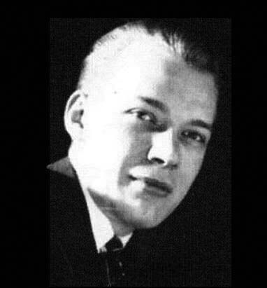
 Raymond K. Perry 1920, this and all photos courtesy of Bennett Kashdan
As I said in THIS previous post, I recently received a package of notebooks, photos, and documents from the estate of former DC Comics employee Ray Perry that had been among the papers of Bernard Kashdan, former DC accountant and business manager. The Kashdans and I don’t know how the papers came to be there, but since I’d already written several articles about Perry, he sent them to me. Everything related to Perry’s comics career is in the previous article, this one includes photos and documents that connect only to his fine art career and personal life, ones I thought interesting enough to show. Ray was born in 1876 in Sterling Illinois. He came to New York City around 1905, where he did all kinds of art, from book and magazine illustrations to paintings to stained glass window designs. Ray would have been about 44 years old in the photo above, but he looks younger, a handsome man with a flamboyant tie.
 Emilie Perry from 1927 passport
He and his first wife Emilie, who was a singer and musician, traveled in art and society circles at least until the Great Depression hit in 1930, probably less so later. This is the only photo I have of Emilie, her name in some places is spelled Emilia or Emily, but on the passport it’s Emilie, so I’m going with that.
 Ray Perry as Hamlet at a Salmagundi Club masquerade event, 1920
Ray joined several organizations in Manhattan relating to art, including the Salmagundi Club, which must have happened before 1920, as he’s seen here in an elaborate costume for one of their parties.

This organization was about history, not art related. The Sons of the Revolution accepted members whose ancestors could be proven to have served the U.S. in the American Revolution in some way. This application includes proof that Ray’s ancestor Tristram Moore did so, and includes a line of ancestors from the 1700s to Ray. The group owns and operates Fraunces Tavern, touted as the oldest building in Manhattan, where meetings and parties were held.
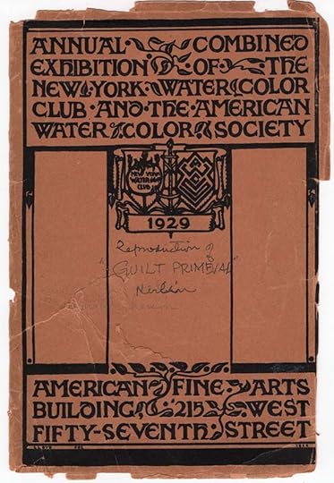
Perry painted in both oils and watercolors, and was a member of the American Watercolor Society from at least the mid 1920s. This battered exhibition program from 1929 was among his documents, and he saved it because a painting of his was shown inside.

The painting is titled “Guilt Primeval,” and features a robed figure with a sword in the background, and male and female figures in the foreground. Probably these are Adam and Eve, and the background figure is the angel that cast them out of Eden. Ray wrote here: I think it was this picture that influenced George Pearce Ennis to mention me briefly in his article in Ency. Britannica Vol XXIII p 412.

This document is an Honorable Discharge from the New York National Guard. Perry enlisted with them in 1927 at the age of 41 it says here, but he must have shaved a decade off his age, he was actually 51 then. He served for three years, qualified as a Marksman, and his character is described as Excellent. He would have served at the 107th Infantry Armory on Park Avenue between 66th and 67th Streets. Perhaps Ray felt this was something he wanted to do for his country, though America was not at war. The change of residence might have been to New Jersey, but that’s a guess.

Also among the papers is a cancelled passport issued in 1927 that covers both Ray and his wife Emilie. Their address is 150 East 34th St, New York City. The pages show travel stamps from Italy and France. This must have been the trip described in the New York Post, April 13, 1927, as found by Alex Jay:
Raymond Perry, an artist with the Ethridge Company, sails today to visit fifteen Italian cities on behalf of one of the company’s clients, who is seeking a series of first-hand pen drawings of certain architectural landmarks in Benito Mussolini’s reborn empire. Mr. Perry will make the drawings on tour, sending them back several at a time. From Italy he will go through the chateau country of France, thence to Paris and London, where he will make a study for the company of England’s poster mediums.
This trip of several months sounds like a wonderful experience. Their home address is given in other places as 159 East 34th Street, so either the number changed, or they moved.
 Ray Perry and Louise Marion Wilde, June 1945, Montclair, NJ
On Friday, January 26, 1945, Emilie Perry died suddenly while attending a concert at Carnegie Hall. She was 71. This must have been a sad day for Ray, it’s not clear if he was with her at the concert. In a newspaper report, their home address is given as 145 East 34th Street, so perhaps they had moved again. Despite this shock, Ray remarried in December 1945, his second wife was Louise Marion Wilde. She was a music teacher who gave piano lessons, and it was also her second marriage. She was living in northeast New Jersey, not far from New York City. Several towns are mentioned including Montclair. Louise was born in 1888, so about seven years younger than Ray, who was 69 at the time.


This photo was taken in Perry’s 34th Street apartment on April 21, 1948 at a party for Ray’s brother Dr. William H. Perry. I’ve added closer views of the two Perry paintings, and his wife Louise is labeled in the second one. The smaller painting seems symbolic, like the Adam and Eve one, but I can’t say what the subject is. The large painting is of a Native American leader, but I don’t know if it’s a real person.
In the 1950 census, Louise and Ray are listed as living in an apartment in East Orange, NJ, no other family members with them. Louise had children from her previous marriage, but they were all grown and on their own. I suspect Ray kept the New York apartment as his painting studio, and perhaps he also stayed there during the week, as it was an easy walk to the National Comics offices at 480 Lexington Avenue (near 47th Street). The East Orange apartment may have been Louise’s and where she gave piano lessons, so it made sense for her to keep it. This is all guesswork on my part.

The back of this photo says “Sis at Brookhaven Station about 1945.” I think this is Ray’s sister Lynda. It suggests that Ray still had the Brookhaven cottage in the 1940s, though it was later sold. Lynda was born in 1882, making her 63 that year, but she looks remarkably young for that. Perhaps the picture is from years earlier, or it’s another person. Or maybe she also inherited youthful looks.

The Perry cottage at Brookhaven, perhaps the 1940s.

Here’s a photo of Ray’s brother Dr. William H. Perry from 1948 looking all of his 70 years, he was about two years younger than Ray.

This is a fine photo of Ray looking a bit older, perhaps from the early 1950s.

And this is Ray working on a large painting in his New York apartment, perhaps adding details with an oil pastel, or this may all be pastels. Behind him you can see the same painting by Ray shown earlier. The large painting seems to have a huge bird in it, but I can’t identify the figures or subject. I think this is also from the early to mid 1950s.
 Raymond Perry by Jack Adler, 1960?, courtesy of Michael Catron
This photo was not among those sent to me by Bennett Kashdan, but taken by Ray’s fellow DC production department staffer Jack Adler. It’s of Ray playing his cello, showing musical talent that hasn’t been discussed previously, but perhaps something that attracted his two musical wives. In the diary and scrapbook, Ray writes in 1955: I played on my cello, especially enjoying it. In my early years on staff at DC, Jack was my boss, and I remember him saying that he visited Ray in a nursing home, where he probably took this picture. Ray’s New York Times obituary of Nov 16, 1960, found by Alex Jay, reads:
Raymond Perry, art editor of comic books, painter, designer and book illustrator, died Tuesday night in Dresden Madison Nursing Home at 36 East Sixty-seventh Street. He was 84 years old. Mr. Perry, who formerly lived at 145 East Thirty-fourth Street, had been art editor of the National Comics Publications, Inc., of 575 Lexington Avenue, for the last twenty years. He also had designed windows for Churches and libraries in Pennsylvania. Portraits by him are in the Seventh Regiment Armory and Fraunces Tavern in New York, and the Poe Cottage in Philadelphia.
Jack Adler’s description of Ray at the end of his life was that he was alone, and had no family, but his second wife Louise lived another fifteen years, and Ray’s brother William was alive. Ray was also in touch with nephews and nieces as late as early 1960, as shown by letters and postcards pasted into his diary. I find it a bit odd that there are no “survivors” listed in that obituary. Another one from the Patchogue Advance of Long Island, near where the Brookhaven cottage was, says: Surviving are his widow, the former Mary MacLennan; a daughter, Miss Nancy Farrell; and a brother, Dr. William Perry of Sacramento, Calif.
Other than his brother, this seems completely wrong, and those wife and daughter names don’t show up anywhere else. Jack Adler’s impression that Ray was alone may have been wrong, but I wonder where Louise was when he was in the nursing home? A letter from the wife of Ray’s nephew Lowell Stone dated July 15th 1969 begins: Dear Louise and Ray, We were greatly pleased to receive your letter announcing your visit to the far west. We will be at airport to pick you up. They were together then, it seems.
As for his paintings, as seen in some of the photos above, Bernard Kashdan wrote to someone asking about that in 1961: Mr. Perry, in contemplation of the few years remaining to him, had given away all his paintings and other property of any value. Perhaps Ray and Louise had had a falling out, and that’s why Bernard was handling his affairs and had his personal documents. This is a mystery I can’t unravel.
Meanwhile, I’ve located a Perry family member that would like to have his papers and photos, and I will be sending them soon. I hope you’ve enjoyed this exploration of Ray Perry’s life as much as I have. Thanks again to Alex Jay and Bennett Kashdan for research help and images.
The post RAYMOND PERRY, More New Photos and Documents appeared first on Todd's Blog.
May 16, 2023
RAYMOND PERRY AT DC COMICS, New Info and Photos
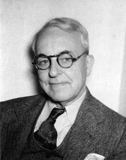 Raymond K. Perry, about 1950, this photo scan courtesy of Bennett Kashdan, all others by me of material provided by Bennett. (On the back of this photo, in Ray’s handwriting, it says “The Cynic.”)
I’ve written several articles about long-time DC staffer Ray Perry, the main one is HERE, with others HERE and HERE, and Alex Jay has a detailed look at Perry’s early life and artistic career HERE. To summarize, Perry was born Sept 16, 1876 in Sterling, Illinois. By 1895 he was attending the Chicago Art Institute, where he was spoken of highly of by his teachers, and won awards. By 1898 he was doing magazine illustrations and on his way to a commercial art career. By 1905 he was living in New York City, and in 1907 he married Emilie C. Russell. He was a self-employed artist and she was a musician and singer. He served in World War One in the Army’s Pictorial Publicity Division, and in the 1920s Perry did illustrations for books and magazines while developing a fine art career as well, joining the prestigious Salmagundi Club for artists, exhibiting in top art shows, and designing stained glass windows. By 1925 the couple also had a cottage in Brookhaven on Long Island, and participated in society and art events in Manhattan and elsewhere. The Great Depression of the 1930s brought this life to an end, or at least curtailed it. Ray and Emilie lived in an apartment on East 34th Street, Manhattan, and Ray was advertising his services as an art teacher. Perry continued to paint and gave some lectures, but commercial work probably dried up and few could afford to buy his paintings. Around 1935, at age 59, he began his comics career when he was hired by Major Malcolm Wheeler Nicholson as an artist. His art first appeared in NEW FUN #4 dated May 1935, small strips about knights of old. Perry’s painting skills probably steered him into coloring as well, and when the Major’s company was taken over by Harry Donenfeld and Jack Liebowitz around 1938, Ray Perry joined others employed by the Major as part of the staff of National (DC) Comics, where he became the main cover colorist by 1940, and at some point he was given the title of color editor. Later, Ray also did lots of text page headers, both lettering and art, and he was skilled at both. He remained on staff at National/DC nearly until his death in Nov 1960. He also continued to paint, doing portraits of many DC staffers and friends, among other work.
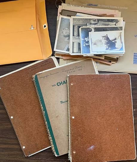 Perry papers and photos
Bennett Kashdan doesn’t know how Ray Perry’s papers came to his family, but his father, Bernard Kashdan, was DC’s accountant and then business manager for many years, and he also sometimes acted as manager for the estates of some employees, so possibly they came to him that way. Bennett found them among papers from his mother Harriet’s apartment, she is 96 and still with us, but she doesn’t know anything about the Perry papers, or remember much about Ray himself. The items consist of three ring-bound notebooks, family photos, and other documents. Two of the notebooks are nearly all French language lessons written out by Perry, either for himself or for his sister Lynda. One is dated 1949. Only a few pages from these are of interest:

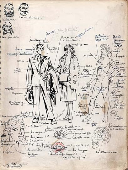
These two pages are pencil layouts and inked drawings used as diagrams for French names for parts of the body and clothing.
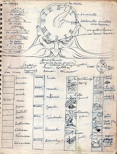
This page has a weighed-down father time with a clock head, and more thumbnail images for seasons, days, months, and weather.

The third notebook is labeled “Scrap Book and Diary,” and has entries from 1955 to 1960, the year of Perry’s death. There are only a few pages of hand-written diary entries like this one, most pages are pasted-on newspaper clippings, things that interested him, from poems to articles about artists and writers, art images, news of the day, quotes from famous people, and a few postcards and notes from friends. There are also several pages of snapshots by Ray of DC staffers, I’ll be getting to that shortly. This first page begins:
A new Diary. I kept a diary for many years but destroyed most of it, except some pages which contained sketches. An artist’s diary should consist mostly of sketches anyway.
The date 1955 is written here. Perry was 79 years old, and the funeral of his sister Lynda is mentioned, but his brother William was still alive, and there are two newspaper clippings about him.
On the next page is this entry:
’55-March 15 Wed Cont. – Last night I had a pain in my appendix region and there had been an upset stomach condition; when this occurs with me, I feel that death may be near, an anxiety I share with Whitney Ellsworth.
Ellsworth is someone Ray had been working with since the Major hired them both around 1935, and he was the Managing Editor at National/DC Comics for many years. They must have been friends. Despite worrying about his health, Ellsworth lived to 1980.
Another entry on the same page:
I had Chauncey Ryder’s sketch in mahogany about 5 x 6 framed and parked it with Ben Weinstein as a token for his work on my income tax papers. But he tried it out in his apt and decided it was too sombre among his more colorful pictures, 2 or 3 being mine.
Weinstein was DC’s business manager at the time. This shows how many of Perry’s paintings were given to DC employees for one reason or another, though in this case the art is by someone else, Chauncey Ryder, probably a friend.
Another entry:
Today at noon time I finished my 16 by 20 oil sketch of Sterling Westray our colored factotum at National Comics & he is delighted with it & will send it to his mother in Pennsylvania. He is a good type, honest and reliable; he was chauffer for Orbach for 4 or 6 years & has been a bar keeper.
Factotum is a rare word today, it means an employee who does all kinds of work. What might be called an assistant or go-fer.
One more entry from these early pages of the notebook:
At noontime Irwin Donenfeld asked me to make a color sketch of him & I consented, beginning tomorrow. Jay Bennett also asked. My pic of Sterling Westray sold them they said. I hope some of such in the higher brackets will come across with a few ducats occasionally. (Still hoping 11-9-58)
This shows how Perry’s painting talent was used by DC management, but not valued enough for them to pay him anything.

This page of the notebook is typical of many, two pasted-in newspaper articles. The one on the left relates to a news story of the time, Victor Riesel, labor columnist for The New York Daily Mirror, was blinded by acid thrown by a “thug,” and here is being honored by The Society of Silurians, a newspapermen’s group. Ray writes below:
This was a pleasant party because I had a small part in it. I was called to take a bow as the designer of the memorial presented to Victor Riesel, Soldier of Truth.
On the right is an article about Ray’s brother William H. Perry.
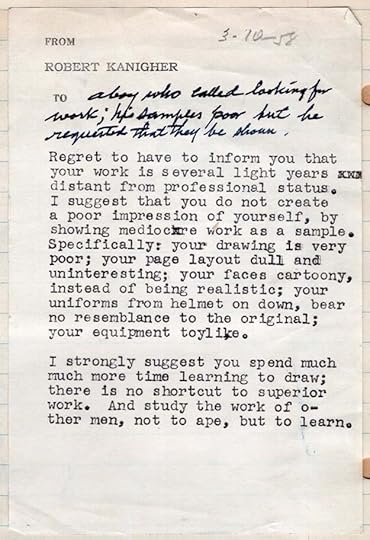
Here’s a rejection note from editor Robert Kanigher. I’m not sure why Perry had it, but he pasted it into his notebook. I find the criticisms harsh, but of course we don’t see the work it’s written about, probably samples for Kanigher’s war titles.

This large item is folded in half and pasted into the notebook on one side. The sample portrait used, as noted by Perry at lower right, was a “Portrait of Mr. Al Plastino showing 2 views of head.”

A black and white version of this painting was shown in the book “Last Superman Standing: The Al Plastino Story” by Eddy Zeno (TwoMorrows, 2015), thanks to Alex Jay for the link.

This page has two pieces of Perry art pasted in. On top is a text page header done for WONDER WOMAN #104 dated Feb 1959, perhaps a particular favorite. As usual, Ray did the lettering and art. I can’t identify the bottom one. If it’s from a comic, it must have appeared on an inside cover, it’s on slick white paper rather than newsprint. Perhaps a war title.

Now we come to my favorite part of the notebook, three pages of candid snapshots by Ray titled “Friends at National Comics Inc.” The photos are all dated May 28, 1959 in blue ballpoint at the bottom of each photo with the person’s name, and there are additional comments at the side. I’ll show them in order.

Jack Schiff, “Editor.” This one is blurry, the quality of the photos varies, but I think you can still get an idea of what Schiff looked like in 1959. Staffers wore jackets and ties. In the background is an old-fashioned telephone and a typewriter.

Jack Adler, “Color Separator and Photog”
Great photo of Jack, my first boss at DC, coloring a comics page. You can’t see much of it, but the figure above his left hand suggests a romance comic story. Ray calls him a color separator, which is something he did on DC covers with gray tones. This looks like he’s doing a color guide for pages using Dr. Martin dyes, as I also learned to do, see THIS article. In 1959, Jack did not yet require the glasses he needed when I knew him.

Arthur Gutowitz, “Accountant.” Arthur was DC’s main accountant in 1977 when I started, but at this time he was Bernard Kashdan’s assistant, according to Bennett. Bernard left DC around 1976, and Arthur took the top accounting spot. He has a more modern telephone and two tie pins.
Morris Waldinger, “Artist.” This is the only good photo I’ve seen of Morris. When I started at DC I sat behind him. He was a production artist, doing corrections on story pages for the most part, he also did filler page art. I believe he started working in the production department in 1954. I found Mo, as I knew him, dull company. He wasn’t much interested in comics except as a way to make money. He and Joe Letterese were friends, Joe sat in front of him, and they talked quietly to each other and laughed together often. Morris was laid off during the “DC Implosion” of 1978 and I never saw him again.

Bernie Kashdan. “C.P.A.” (Certified Public Accountant). A little blurry, but a good photo of Bernard. I don’t know who is in the background, but he seems to be wearing a bow tie. The art on the wall is interesting, but I can’t say whether it’s comics art. Added: Bennett tells me it’s a Miro print, and he still has it.

Joe Letterese, “Artist & Letterer.” The best picture I’ve seen of him. Joe had been at Marvel earlier in the 1950s, and I believe was let go there in the 1957 purge by Martin Goodman, and found work at DC soon after. He was a long-time production artist, doing corrections on story pages, and he also lettered them as a freelancer. When I knew Joe, he had given up the mustache, but otherwise looked about the same. He retired from his staff job in the early 1980s. I talked to him once or twice about working at Marvel, and he showed me a few logos he did there, but I don’t recall what they were now. Nothing related to superheroes. He did freelance cover lettering at DC when Gaspar Saladino wasn’t available, and I was soon also being given some of that work. I can’t say we were friends, but he was always friendly. Another guy who wasn’t much interested in comics except as a source of income.

Herbert Siegel, “Office manager, factotum and very good friend.” (last three words underlined.) Siegel was a long-time employee of National Comics owners Harry Donenfeld and Jack Liebowitz from their early days as publishers of erotic pulp magazines like SNAPPY and SPICY ADVENTURE STORIES. In 1938, they were indicted by Federal prosecuters on pornography charges, and Siegel took the fall for them, the only one convicted. He was fined $250 and given a suspended sentence. The full story is HERE. From then on, Herbie had a job for life with National Comics, essentially a go-fer, or as Perry says, a factotum to Donenfeld and Liebowitz. Perry’s friendship with him suggests he was also a nice man.

Saving the best for last, Ira Schnapp, “Artist & letterer, old friend and fellow promoter of culture in the Production Department.” I’ve long suspected that Ira and Ray, both interested in fine art, would have had a lot to talk about, and this confirms it. This is only the second known photo of Ira at work at DC, and only the fourth photo of him known to me, a great find that delights me. Ira seems to be holding a pencil, his lettering pens are in the background. Wish I could tell what he’s working on.
There are more photos and documents I’d like to show of Ray, his family, and his art, but they don’t really fit in here, so I will do that in another article soon. That’s all that relates to DC in the notebook. Thanks again to Alex Jay for research assistance, and to Bennett Kashdan for sending me the material.
The post RAYMOND PERRY AT DC COMICS, New Info and Photos appeared first on Todd's Blog.
May 11, 2023
Incoming: THE UNWRITTEN COMPENDIUM ONE

 Images © DC Comics
I no longer keep up with what’s being published, so this is a nice surprise. I thought it was an excellent series, and I enjoyed lettering it. A thoughtful and at times frightening exploration of magic and reality intersecting in the person of Tom Taylor, the inspiration in name for a series of fantasy novels written by his father, but as an adult, Tom is finding out he’s a lot more involved in the magic described in the books than he realized, and it’s coming to destroy him. This new collection contains issues 1-30 plus the graphic novel “Tommy Taylor and the Ship That Sank Twice,” and goes on sale in mid-June. Check with your comics retailer, or there’s an Amazon link below. Retail price is $59.99.
The post Incoming: THE UNWRITTEN COMPENDIUM ONE appeared first on Todd's Blog.
May 9, 2023
BEN ODA – PROLIFIC LETTERER
 From MAD #4, April-May 1953, EC Comics, © William M. Gaines Agent, Inc.
If you were a reader of comics and newspaper strips from the 1950s through the 1980s, you saw lots of Ben Oda’s lettering, even though most of it was not credited. Ben worked for everyone. He was the lettering star of many comics publishers and newspaper strips, the man they trusted to get things lettered professionally and on time. From his earliest days with the Simon and Kirby studio, to work at EC Comics, example above, through years at Western Publishing, Warren, and DC Comics, Ben worked hard and slept little to meet everyone’s deadlines, while at the same time juggling a half-dozen or more newspaper strips from Prince Valiant to Flash Gordon, Terry and the Pirates to Dondi. In this article I can only scratch the surface of the work he produced while outlining his life and career. I had help with that from my research partner Alex Jay as well as three of Ben’s children, Ken, Marcine, and Barbara, and couldn’t have done it without them.
 From THE SACRAMENTO BEE, Sacramento CA, March 8 1937
Ben Hatsutaro Oda was born to Japanese parents in Florin, CA, near Sacramento, on Dec 21, 1915, the youngest of two children. His parents worked in a basket factory, and Ben’s father had passed by the time he was seven. Ben seemed to have two major interests growing up, art and sports. After high school, he was a student at The Sacramento Junior College, where he and four fellow students won first prize in an art competition among junior colleges across California, article above found by Alex Jay. For more on Ben’s early life and family, see Alex’s blog article HERE. As for sports, his son Ken wrote to me: He was a very good athlete and competed in several sports when he was younger. He played baseball, basketball and I believe some football. He also was a golfer and had a 180 plus bowling average even into his later years.
 Ben Oda as a member of the Fort Sheridan All-Stars baseball team, photo courtesy of Ken Oda
In 1940 at age 25, Ben attended the Chouinard Art Institute in Los Angeles, and after graduation was hired by Walt Disney Studios, where he worked on Pinocchio, but he was not there long. In February, 1941, Ben was drafted and served in the Army as a medic until 1945. He was also trained as a paratrooper. Some months later the U.S. entered World War II and Ben found himself being transferred all over the country. His Army years provided Ben with an opportunity to further his education, and after a tour of duty in France he found himself attending classes at the University of Illinois at Champaign and later at Yale University in New Haven, CT, where he studied languages. While stationed at Fort Sheridan, Illinois with the First Medic Corps, Ben wrote and drew a comic strip called “Donald Doc” for the camp newspaper, The Fort Sheridan Tower. I haven’t found any examples of that, Ben’s first comics work. From the title, it may have been influenced by his Disney experience. Ben continued his sports activities at Fort Sheridan, playing on their baseball team, as seen above, and their basketball team. In a 1980 DC Comics profile, Ben reported his best accomplishment in those days was when the Fort Sheridan basketball team beat rival Camp Grant—just after that team had clobbered the number one college team in the country. “It was my biggest thrill,” recalls Ben. “The Camp Grant commander was so proud of his team—he made sure that any professional athletes who got transferred to his command stayed at Camp Grant and played on his teams. We showed him.”
 Ben and Michiko Oda about 1947, photo courtesy of Ken Oda
After getting out of the service, Ben moved to New York looking for work. At the home of a friend, he met Michiko Morita, his future wife. They married and were living at 601 West 110th Street, Manhattan in 1948, by coincidence, the same apartment building where DC Comics letterer Ira Schnapp and his family lived in the 1930s and early 1940s. I don’t know if they were there at the same time or met. By then, Ben had begun his busy comics lettering career.
The Joe Simon and Jack Kirby studio was supplying comics stories to publishers like Harvey and Prize after they returned from World War Two military service around 1945. Their main letterer was Howard Ferguson, but in early 1946 Ferguson’s wife died, leaving him with a daughter, Elsie, to care for. Some time in 1946, Howard and Elsie returned to Detroit, MI to live with Howard’s mother for about two years, and Simon & Kirby needed a new studio letterer. They found one in Ben Oda.
 The Simon-Kirby Studio, 1949. Standing left to right, Jack Kirby, Joe Simon, Bill Draut, Marvin Stein. Seated, Ben Oda. From the Kirby Unleashed portfolio, 1971
 In a 1998 interview with Mark Evanier at the San Diego Comic Con, Joe Simon said: “Howard Ferguson was the greatest letterer and Ben Oda was the second greatest letterer.” Like Joe and Jack, Ben served in World War Two, he was about their age, and he had at least some comics experience. I don’t know how the hiring came about, but it was a great move for everyone, and Ben proved to be a quick study and a hard worker.
 From HEADLINE COMICS #26, Sept-Oct 1947, Prize
I feel the best way to find Ben’s earliest lettering work is to look at what came after Howard Ferguson from the Simon & Kirby studio. Ferguson lettered most of the stories in HEADLINE COMICS issues 23-25 dated March to August 1947, but comics were cover dated about two months ahead of when they were released, and work on them was done two months or more before that, so Howard may have completed his lettering in 1946. There are two stories in issue 25 and two in issue 26 lettered badly by someone else, but the other stories in issue 26, example above, have good lettering in a similar style to Ferguson. I think this is the earliest published lettering by Ben Oda, no doubt told to imitate Ferguson as best he could. On this title page, Joe Simon may have lettered or at least penciled the story titles, also true of other stories in this and the next few issues. The caption lettering in the figure is what I think is all by Ben. It’s a little small, and a bit stiff, but otherwise looks fine. I don’t know how far ahead of the printing schedule Simon and Kirby might have been on Prize stories, but this one may have been lettered in early 1947.
 From HEADLINE COMICS #27, Nov-Dec 1947, Prize
A closer look at two panels I think are lettered by Oda from issue 27. It’s done with a wedge-tipped pen on the regular letters, and a thicker pen on bold and slanted emphasized words like LOOK OUT! The letters are very even, the lines are very straight, all things Ben would have copied from Howard. There isn’t much here to identify a lettering style, the letters are close to perfect, but in a few places, like the word CAR in the second caption and CONTROL in the bottom left balloon, the letter C seems to lean to the right a bit. That’s the best way I know to identify Ben Oda’s early lettering, and he’s just beginning to do it here. Another tendency of his was to make the bottom leg of the letter E a bit longer than the other two, you can also see hints of that here in a few places. In general the letter shapes follow the style of Howard Ferguson, though Ben did not imitate two of Howard’s style points: a serif going both ways on the center horizontal of the G, and a small descending serif at the top of the C.
 From HEADLINE COMICS #31, Aug-Sept 1948, Prize
By the time of this story, Ben had been lettering for Simon & Kirby about a year, and his work looks more relaxed and confident. Ben had settled in and was turning out fine work on nearly every story from the studio. Some of the C’s here lean right a bit, some don’t, but to my eye this is clearly the same style as the previous example.
 From YOUNG ROMANCE #2, Nov-Dec 1947, Prize
Around the time Oda was hired, Simon and Kirby were launching a new genre, romance comics, beginning with YOUNG ROMANCE, but I don’t see any definite evidence of Ben’s lettering in the first issue, which might have been completed before he started. Two of the stories are lettered by Bill Draut, who often did his own lettering, the others are similar to both Ferguson and Oda, but not quite the same as either to my eye. By the second issue, sample above, I do see Ben’s lettering on several stories, similar to what he did on HEADLINE COMICS #26, still a bit small and stiff.
 From YOUNG ROMANCE #3, Jan-Feb 1948, Prize
By the time he lettered this story in issue #3, it was looking more confident. Again there are just a few hints of Ben’s developing style points, the right-leaning C and the longer bottom leg on the E.
 From YOUNG ROMANCE #11, May-June 1949, Prize
Another year or more later, and Ben’s lettering still has some right-leaning C’s, and just a few E’s with longer bottom legs. Interestingly, some of the G’s have a serif going both ways, in the style of Howard Ferguson, perhaps showing that Oda was still looking at Howard’s work for inspiration. There was plenty to letter on these romance stories, and Ben’s work made them look good and easy to read.
 From BOY’S RANCH #1, Oct 1950, Harvey, original art courtesy of Heritage Auctions
Simon and Kirby were also doing work for Harvey Comics, including what they later called their favorite title, BOY’S RANCH, nearly all lettered by Ben Oda. Two panels from the original art, above, give an excellent clear look at Ben’s lettering. Some C’s lean right, some G’s have the extra serif, a few E’s have the longer lower leg. Note that Ben’s S is getting more angular and less rounded. Speed was important to meet deadlines, and Ben was getting busier, beginning to take on lettering at other comics publishers beyond his work for Simon and Kirby. By the time of the 1950 census, Ben and Michiko had been joined by their first son, Ken. Another son, Robert, and two daughters, Marcine and Barbara, would follow. No doubt supporting his family was a strong incentive for Ben to work fast and widen his lettering clients.
 From TOMAHAWK #2, Nov-Dec 1950, image © DC Comics
Here’s part of a page from a rare story for DC Comics at this time with familiar Oda style points.
 From TWO-FISTED TALES #18, Nov-Dec 1950, EC Comics, image © William M. Gaines Agent, Inc.
Ben found steadier work at a smaller company, EC Comics. Most of their lettering was done using the Leroy lettering system by Jim and Margaret Wroten, but artist Harvey Kurtzman disliked that more mechanical look, and he brought in Ben Oda to letter his stories and many of the stories in EC books he edited. The page above by Kurtzman has Ben’s style points like the right-leaning C.
 From FRONTLINE COMBAT #1, July 1951, EC Comics, image © William M. Gaines Agent, Inc., original art courtesy of Heritage Auctions
A closer look at Oda lettering for a Kurtzman title shows his more angular letter S.
 From MAD #1, Oct-Nov 1952, EC Comics, image © William M. Gaines Agent, Inc.
 From MAD #23, May 1955, EC Comics, image © William M. Gaines Agent, Inc.
Kurtzman’s most famous title at EC was MAD, an irreverent humor and parody comic for which Ben Oda did all the lettering, though the story titles and sound effects may have been at least penciled by Kurtzman. A closer look at some of Ben’s MAD lettering is at the top of this article. While most of EC’s titles were forced out of business in the mid 1950s due to their over-the-top gore and violence, MAD survived for decades, though once it switched to magazine size to avoid censorship, most of the lettering was done with set type. When they did comic book parodies, though, Ben lettered many of them.
 From BATTLEFRONT #32, June 1955, image © Marvel
Oda did a small amount of story lettering for Atlas/Marvel Comics in the mid 1950s, often war stories like this one. The last two examples, while cover dated 1955, were probably lettered in 1954. When Simon and Kirby started their own comics publishing business, Mainline, in 1954, Ben was the letterer. The company didn’t last long. Around that time, Simon and Kirby brought back Howard Ferguson to letter some of their romance and other stories until his death in 1957. I don’t know if that’s because Ben didn’t have time for it all, but Oda picked up those titles again after Ferguson’s work on them ended. The Simon and Kirby studio broke up around 1957, though Joe Simon continued to edit the romance titles for Prize, and he took an editing job at Harvey, where he used Ben Oda often. Ben also lettered for Ziff-Davis, Hillman, Stanley Morse, St. John, Quality, ACG, Farrell, Charlton, and other comics publishers in the 1950s. There were probably few where his work didn’t appear. After the 1950 departure of Will Eisner’s favorite letterer Abe Kanegson, Oda also lettered The Spirit for Eisner for its few remaining years.
 From FOUR COLOR #1083, MEN INTO SPACE, March-May 1960, Dell/Western
Around 1958, Ben began doing lots of comics lettering for Western Publishing, released under the Dell name, and later Gold Key. They covered a wide range of topics, often adapting TV shows and movies, or using cartoon characters. The page above is one example.
 RIP KIRBY Daily newspaper strip by John Prentice, Oct 5 1956, image © King Features Syndicate, Inc., original art courtesy of Heritage Auctions
In the mid 1950s, Ben moved into another area of comics lettering, newspaper strips, where he soon had lots of work. This example is the earliest I’ve found, there could certainly be earlier ones. Note the right-leaning C’s in some places. In the 1980 profile at DC Comics, Ben listed these strips as ones he’d worked on: Rip Kirby, Prince Valiant, Flash Gordon, Dondi, On Stage, Quincy, Gil Thorpe, Dr. Kildare, The Phantom, Steve Canyon, Kerry Drake, Secret Agent X-9, The Dropouts, Terry and the Pirates, and Tarzan.
 From DONDI Daily strip by Gus Edson and Irwin Hasen, April 19, 1958, image © Chicago Tribune, original art courtesy of Heritage Auctions
Ben took over Irwin Hasen’s DONDI strip in 1958 from Gaspar Saladino. Ben was often not the first letterer on a strip, sometimes he took one on when it changed artists, or when the previous letterer dropped out, but once he had it, Ben rarely let it go. Strip deadlines are relentless, worse than comics, which come out only once a month, and many strip artists relied on Ben to meet their deadlines. Hasen, in an interview with Mark Evanier for his Point of View column in The Comics Buyers Guide, said of Ben:
“He was a Japanese-American who’d fought in World War II as a paratrooper. He was a wonderful person and a slave to several of us cartoonists. He lettered On Stage, The Heart of Juliet Jones, Dondi, a couple of others…We would all give him the keys to our apartments and Ben would come in the dead of the night, like Santa Claus. He’d slip in and the strips were on the drawing board. He’d sit right down, and it didn’t matter how late he had to work…two, three o’clock in the morning, whatever. But he’d do the lettering and then he’d leave, as quiet as a mouse…“
 From ON STAGE Sunday by Leonard Starr, Aug 28, 1960, image © Chicago Tribune, original art courtesy of Heritage Auctions
By 1960, Ben’s lettering had softened a bit, and become less angular and more rounded. This is most obvious in his letter S, but all the straight strokes are a little more curved and casual. This may have come from working as fast as possible. In another Point of View article by Mark Evanier, he tells this story about Ben:
The one time I met Oda, it was at a New York comic convention — either ’75 or ’76 — and he took the train in on a Saturday to deliver three (yes, three) pages to Paul Levitz so that Paul could get them to an inker who needed work on Monday. Ben was not there for the con; he intended to just drop work off and split…and he would have, had I not introduced myself, dropped the name of Kirby, and dragged him off for a cola and a chat.
I still have the notes I took at that impromptu interview. At one point, Ben demonstrated a point by taking my Flair pen and lettering a whole line of copy on my pad. Evelyn Woods couldn’t read a stop sign in the instant it took Ben to letter that sentence. The main thing I jotted down was what an enormous fan he was of all the artists whose work he lettered. He also said that, of all the varied employers he’d had, only one or two had ever treated him poorly. (Which I can believe. There are editors who would swap blood relatives for one letterer like Ben.)
Later on, I heard a wonderful story about him. Artists are forever cobbling up presentations for newspaper strips they hope to sell. Many of them wanted to hire Ben to letter their samples, but Ben felt bad about taking money from an artist, especially given how few of these submissions ever pay off. So he finally established a policy: As long as they didn’t need it A.S.A.P., he would letter samples free for any professional artist. If the strip later sold, he would expect the job of lettering it, but that was not mandatory. The artist who told me this said it was not a matter of Ben trying to drum up work. “Ben always had all the work he could handle,” he explained. “It was just his little gift to his fellow professionals.”
In 1960, Ben and his family moved to Englewood Cliffs, NJ, overlooking the Hudson River and northern Manhattan, and an easy drive into the city. Ben’s son Ken told me:
One thing that I remember most about my dad is that he was very dedicated to his work and his family. I can’t think of anyone who worked harder and longer than he did. He worked from home most of the time and even on weekends. During the day after he finished his lettering, he would drive his car into Manhattan or towns in New Jersey and deliver his finished product to other artists. He usually left our house in the afternoon and didn’t get home until after traffic died down in the evening. So he avoided the morning and afternoon rush hour, that was a good thing. After he got home, he would eat and then go back to doing work that he picked up that day.
Ben’s daughter Barbara remembered:
Growing up in the household with my parents was very different than other families. My dad was always working! He would actually work 24 hours a day! Many times late at night, I would see him hunched over on his drawing board asleep! It’s ironic how he would letter Superman comics, I would consider him “Superman!” He would smoke cigarettes and drink coffee all day long. In the afternoon he would leave to deliver the “Pages or Strips” and would not come home until late evening. We did not sit down together during the week as a family for dinner since dad always came home late. It’s a shame because my mom was an excellent cook and she always had to warm up his food. Sometimes our outings on Saturday or Sunday with my dad would be to deliver his work to wherever he had to go, New York City, Daily News Building, Long Island, etc. Then he would treat us to ice cream. Those were special times we spent with our dad. We really never went out dinner and never went on vacation as a family.
Ben’s daughter Marcine told me:
He was always busy, working 24/7. He had a love for sports, so on rare occasions when he had a little time he would take us to different events. I have wonderful memories of going to Yankee and Shea Stadiums, and Madison Square Garden for basketball games, the circus and the Ice Capades! Sometimes during the weekends we would take a ride out to Long Island where he delivered his work, and afterwards, we would stop to get ice cream. That was always a treat! I remember the times my dad took us to the movies…he would always end up falling asleep sometime during the beginning of the show! These are memories I hold dear to my heart, especially because I knew how busy and tired he was, yet he tried to make quality time for all of us. Thanksgiving and Christmas were the two days out of the year our dad didn’t have to leave the house, so we had dinner together as a family before he went back to work in his “workroom.”
 From CREEPY #1, 1964, Warren Publishing
In 1964, Jim Warren, the publisher of the horror film magazine Famous Monsters of Filmland, began putting out horror comics like CREEPY and EERIE in a similar large magazine format. His aim was to recreate the horror comics from EC a decade earlier, and he hired many of the same artists as well as letterer Ben Oda, credited on the title pages, as seen above. This is likely Ben’s first published lettering credit. He also designed cover logos for the company.
 From CREEPY #1, 1964, Warren Publishing
By this time, Ben’s lettering had softened a bit more, and his letter C now sometimes had a downward curve at the top end, as seen here in a few places. It was still clear and easy to read, but had a more informal look. Ben continued to letter all the Warren comics for a few years.
 From DETECTIVE COMICS #380, Oct 1968, image © DC Comics
In 1968, one of DC Comics’ busiest letterers, Ira Schnapp, was retired, and I think Ben Oda was brought in to help fill that lettering need. DC editor Joe Orlando would have known Ben’s work well from his EC Comics days, and really, everyone in comics knew his work, his speed, and his reliability. He was soon picking up more and more work from DC, and by 1980, was lettering comics exclusively for that company, doing top titles like SUPERMAN, BATMAN and THE FLASH, though Ben was still also lettering a number of newspaper strips. The page above is the earliest one I’ve found for him at DC. The story title is typical for him, he liked to do them freehand to save time rather than ruling them out with templates and a straight edge.
 From THE FLASH #253, Sept 1977, image © DC Comics
In the fall of 1977, DC finally began crediting letterers on all their books, and readers could at last put a name to the work Ben was doing. When I started working in the DC production department in the summer of 1977, Ben was a familiar sight. He would come in most afternoons, smiling and greeting friends, weighed down with a giant portfolio full of work he’d done, or pages and strips he’d picked up that day to be lettered. I wish I’d talked to him more, I have to admit I wasn’t as much of a fan of his work then as I am now, I was busy trying to imitate Gaspar Saladino. After visiting his edtors, Ben often sat at an open desk or drawing board in the production room doing some of his work, and he would be there when I left for the day around 4:30. Sometimes he was there the next morning when I arrived about 8:30, either still working, or asleep with his head on the desk next to a pile of finished pages. I could see Ben was working too hard, but he loved what he did, and was committed to supporting his family.
 From ACTION COMICS #514, Dec 1980, image © DC Comics, original art courtesy of Heritage Auctions
By 1980, Ben’s lettering had softened further, but was still clear and readable. What readers didn’t see was the increasing number of mistakes, which if Ben saw them he would remove with an electric eraser and reletter. Ones he missed were fixed by production artists like me, and it was hardly surprising given his workload. On the rare occasions when he wasn’t working, Ben bowled with a team, and took part in tournaments that his team sometimes won. Occasionally he found time to golf. While he worked at home, he followed his favorite sports teams on TV. His daughter Barbara told me:
In 1984, I asked my dad to teach me lettering. How perfect that would be and I knew he would be proud that someone in the family would be able to take after him and follow in his footsteps! He bought me all the supplies, pens, inks, electric eraser, a portfolio briefcase just like he used to carry all his work in. We started from scratch with calligraphy, he was going to teach me his way of lettering. He had the biggest smile and gleam in his eyes. I would practice every night at home and come over on weekends to NJ from CT to show him my progress. I didn’t do so bad and Dad was very patient. If all worked out I could work at home and take the train into NYC. Well, things didn’t work out as planned…
Ben’s son Ken told he he sometimes helped out by doing things like inking panel borders, but all the actual lettering was by Ben himself. Ken also helped by making deliveries of finished work for his dad.
 Oda family, 1979, courtesy of Barbara Hurd. Bottom row Ben’s son Ken and wife Liz, daughter Barbara, and Ben’s wife Michiko. Behind, son-in-law Larry and Ben’s daughter Marcine, Ben at right.
Barbara remembered:
November 20, 1984, was when my mom called me and said dad was having chest pains, he was in ICU for eight days in Englewood Hospital, NJ. Every day when I went to visit he asked us to bring work to him! How crazy is that? I said, “I cannot do that, you need a drawing board, pens, ink etc.” He told me he will never stop working until he dies…and that is definitely what he did. He dedicated his life to his work. Even though we did not get to spend much time with him as a family, we always knew he was home. He never scolded or yelled at us, he was a man of reason. He was honest, a caring, a very humble man. He always thought about others first and everyone that came in contact with him loved him! His dream one day if he ever was to retire (which would never have happened even if he lived to 100 years old) was to move to Arizona. My mom eventually fulfilled his dream.
Ben died on November 28, 1984, a month short of his 69th birthday. In an article in The Comics Buyer’s Guide no. 585, February 1, 1985 (Krause), the DC staff remembered him. Anthony Tollin said, “None of us ever saw Ben cross. He would take huge amounts of work and be cheery the next day. The strongest epithet he used was ‘son of a gun.’” Joe Orlando, who had known Ben since the EC days, said, “He was an absolutely virtuous man. He was a hard worker and a consummate professional. He was also very thoughtful and kind. He would drive 50 miles to deliver a job. Ben was the one man who never treated me any differently from when I was a beginner to when I was an editor at DC. He had the same amount of respect for me throughout our relationship. And I had the same for him.”
Mark Evanier reported in an article on his blog dated June 27, 2012:
When Ben passed, DC Comics (and other clients) missed him in many ways but one was the sudden crisis in production. Ben was a vital component in the assembly line of comics and now he was missing. DC editor Joe Orlando told me this story. Everyone had always assumed Ben had a staff of folks working with him. I don’t know where it came from, but the assumption was that Ben had trained his wife and kids and maybe even the family dog to letter just like him. Given his awesome output, that seemed logical. At Ben’s funeral, Orlando decided he should approach Ben’s family and let them know DC wanted them to keep lettering for the firm. Joe knew the production schedule would be devastated by the loss of Ben…but Joe was also concerned that the family had lost its main source of income. So he told Ben’s widow that she should send someone around to pick up lettering work. She looked at him funny and asked, “Who would do the lettering?” Joe stammered, “Don’t you all letter? Haven’t you all been doing a lot of that work?” She shook her head. “We helped with erasing pages and ruling pencil guidelines but Ben was the only letterer.” This was kind of like finding out that Walt Disney had animated Snow White all by himself. It eventually took about six people to replace Ben Oda at DC. But of course in a sense, no one ever replaced Ben Oda.
In a memorial column run by DC in June, 1985 titles, DC editor Andrew Helfer said:
You probably never thought twice about Ben Oda. He was never the guest of honor at a comics convention. Fans never begged him for his autograph. The spotlight never touched him. He was just one of the hundreds of people who put the finishing touches on comics. But Ben Oda had a fan club. An exclusive group. We kept its very existence a secret. Instead of calling it “The Ben Oda Fan Club,” we called it DC Comics. To us, Ben was not only our favorite comic book letterer, he was also our favorite human being. When Ben told a story, he became a kind of Japanese Will Rogers, a homespun humorist with a shy smile that could melt ice. Dozens of wrinkles etched into his face, laugh lines mingling with the ones that simply come with age, always aware of the humor in life, and enjoying every minute of it. And perhaps, when all is said and done, this was the most wonderful thing about Ben — his uncanny ability to make us smile, to make us laugh, to lift us out of our late-afternoon doldrums — to simply be Ben. These were his gifts to us, these were the things we took for granted, and these are the things we will miss the most.
 From THE FLASH #345, May 1985, image © DC Comics
It’s impossible for me to take on the task of cataloging the comics and comic strip lettering work of Ben Oda, but he may well have been the most prolific comics letterer of all time in his 37 year career. He was so prolific just for DC that his work was still being published months after his death. The story above is one of the final ones to see print. Ben made a giant impact on comics.
 From ARCHIE’S GIRLS BETTY AND VERONICA #300 Dec 1980, © Archie Comics
One more act of kindness from Ben that changed the life of a friend. William Saburo (Bill) Yoshida was born December 2, 1921 in Brawley, California. During World War Two, he and his family were imprisoned in an internment camp for Japanese Americans. After the war, Bill had various jobs; singing in a nightclub, playing guitar, and working as a chef. He was in New Jersey in the 1960s, and bowled in an all-Japanese league in New York City. One of his friends and teammates was Ben Oda. Ben taught Bill to letter comics, and he was hired by Archie Comics in 1965. He worked there as a letterer for the next 40 years, averaging 75 pages a week. He was twice nominated for an Eisner Award for Best Lettering. His work was clear and readable, as seen above, and showed the influence of his teacher. Bill Yoshida passed on February 17, 2005.
Thanks again to Alex Jay and Ben’s family for research help and images.
The post BEN ODA – PROLIFIC LETTERER appeared first on Todd's Blog.
Todd Klein's Blog

- Todd Klein's profile
- 28 followers

