
Todd Klein's Blog, page 47
February 8, 2023
Incoming: ADAM STRANGE: BETWEEN TWO WORLDS Deluxe Edition
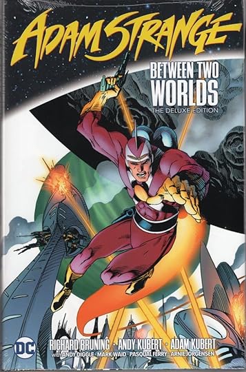 Image © DC Comics
When you’ve lettered as much as I have for DC Comics over the last 45 years, and they send you copies of hardcover reprints, this is the kind of unexpected thing that turns up. I worked on the three-issue prestige format series by Bruning, Kubert and Kubert that makes up much of this collection, filled out with material from JLA #20-21 and another Adam Strange series from 2004. I remember liking that first series at the time, the story and art were good, and I’ve always had a fondness for the character’s original appearances in MYSTERY IN SPACE when I was a young comics reader. The list price is $49.99, and it’s due out on March 14th. Amazon link below, or look for it at your comics retailer.
Adam Strange Between Two Worlds Deluxe Edition
The post Incoming: ADAM STRANGE: BETWEEN TWO WORLDS Deluxe Edition appeared first on Todd's Blog.


February 6, 2023
And Then I Read: FANTASTIC FOUR FULL CIRCLE by Alex Ross
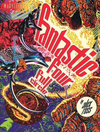 Published by Abrams ComicArts 2022, © Marvel
Abrams’ Charlie Kochman was kind enough to send me a copy of this book, and it’s an impressive package. Sized at 8.5 by 11 inches, the dust jacket includes a fold-out origin of the Fantastic Four in Ross’s painted style, but the art for the rest of the book combines several other techniques. Much of the art seems to be reproduced from Alex’s pencils, though some black areas might be inked.
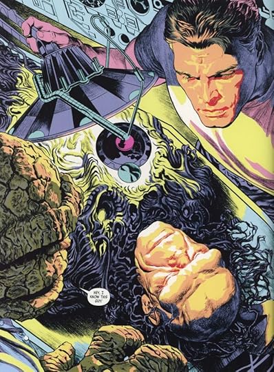
The coloring, by Ross and Josh Johnson, varies a lot, from limited color ranges, to color holds, to flat colors on some pages, as here…
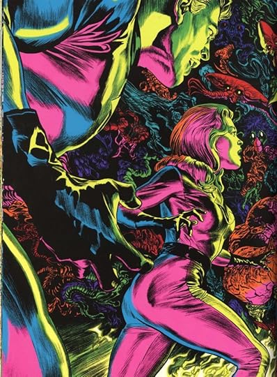
…and when the story enters the Negative Zone (as it was bound to do), the colors get wilder, suggesting black-light posters to me. The drawing skills and page design are excellent, I found the colors sometimes distracting, but generally I liked them. As for the story, this seems like one that begins with where Alex wants to go visually and tries to wrap a story around that. It works okay, the dialogue and drama are fine, but as a whole it doesn’t quite add up to a memorable story. Still, well worth your time, and clearly the result of lots of hard work from Alex. Recommended.
The post And Then I Read: FANTASTIC FOUR FULL CIRCLE by Alex Ross appeared first on Todd's Blog.
February 3, 2023
Rereading: THE FLOOD AT REEDSMERE by Hester Burton
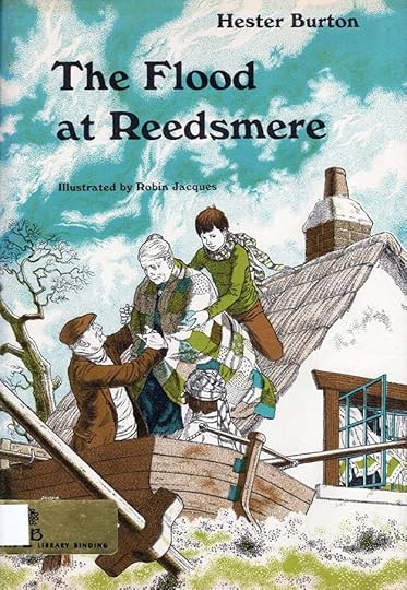
Hester Burton was the author of many historical fiction works for young readers. This is the American version of her first book, a fictional account of a small coastal town in the English counties of Norfolk and Suffolk based on the actual 1953 North Sea flood that devastated the area. (The British title was “The Great Gale” published in 1960.) The illustrations by Robin Jacques are wonderful, I always pick up his work when I see it.
The town of Norfolk is small, clustered on the west side of Reedsmere Broad. Just east of the Broad is a line of dunes, and beyond it the North Sea. At the north end of town is Reedsmere Hall, the manor house, the parish church, and the Pickerel Inn. At the southern end of the Broad is the home of the Dr. Vaughn and his family, with children Mark and Mary Vaughan, who will lead the narrative, but many of the townsfolk will have important roles to play in the coming storm and flood. Mark and Mary love boating on the Broad, and with the wind rising and the storm approaching, they worry about their friends, the elderly couple Jim and Hepzie Foulger, who are the only ones living on the east side of the Broad in a small cottage next to the dunes. On the night of the flood, no one yet knows how bad things will get. Dr. and Mrs. Vaughan drive off to a dinner in another town, leaving Mark and Mary home alone in their living room. The wind is fierce, and they watch the water rise around their house. Suddenly it’s seeping through the windows and inside! The children carry what they can upstairs away from the water, but some things are too big to move.
Now they’re even more worried about Jim and Hepzie, whose house must surely be flooded. They decide to take the risk of going out in their rowboat to try to bring the old couple to safety. The wind and weather are horrible, and Mark and Mary can see the ocean waves breaking over the dunes into the Broad. They struggle with their boat, and finally reach the Foulger cottage, where Jim has cut a hole in the thatch roof to let them out. Mark and Mary are able to get the couple into their boat, and with Jim’s help, they row to the church, where other flood victims are already gathering. This is just the beginning of a seemingly endless night of danger and disaster that the people of the town must struggle through, with some help from American soldiers stationed nearby.
Exciting, a fine read with wonderful characters and surprising turns in the story. Recommended.
The Flood at Reedsmere by Hester Burton
The post Rereading: THE FLOOD AT REEDSMERE by Hester Burton appeared first on Todd's Blog.
February 1, 2023
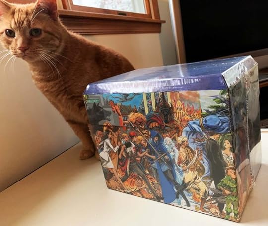
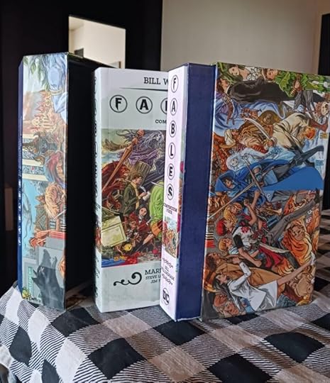
Incoming: FABLES COMPLETE 20th ANNIVERSARY BOX SET
 Images © DC Comics, second image via Rick Taylor
Three large, heavy boxes arrived yesterday, each containing one of these unusual box sets of the complete FABLES saga (issues 1-150 plus specials and spinoffs). Inside the wraparound panorama art by Mark Buckingham and lift-off lid are the four large trade paperback collections issued last year. If you don’t have the FABLES series yet (I do), this is a handsome way to get them. Not cheap, list price is $240, but I see Amazon is already offering pre-orders at $216, link below. Should be available Feb 28th.
The post Incoming: FABLES COMPLETE 20th ANNIVERSARY BOX SET appeared first on Todd's Blog.
January 31, 2023
Saladino (and Schnapp) Lettering on DONDI
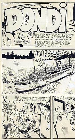
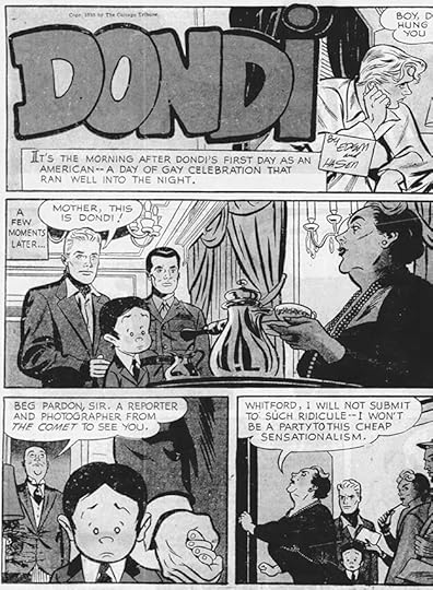
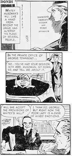
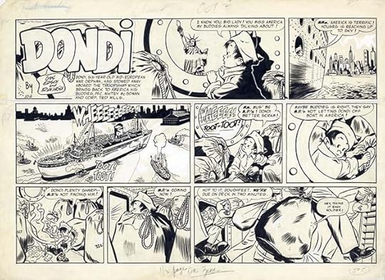 All images © Chicago Tribune-New York News Syndicate. From the first DONDI Sunday strip, Oct 2, 1955
Last week I received this question from Patrick Daniel O’Neill: “I recently saw the very first Sunday page of Edson and Hasen’s “Dondi”, and the logo looked to me like Ira Schnapp’s work. Would you know if he did it?” Irwin Hasen had been an artist for National (DC) comics and its sister company All-American Comics since the early 1940s, and in the 1950s, he was working on one-page humor and longer stories for many DC titles in many genres, including romance, western, science fiction, and war, where his stories were sometimes lettered by Ira Schnapp. I think Hasen visited the DC offices frequently, and the idea that he would have asked Schnapp to design the logo for his first comic strip, DONDI, in 1955, was an intriguing one. I located a large scan of the original art for the first Sunday strip, above, including that logo, and found something that surprised me. The strip was lettered by Gaspar Saladino! When I finished my overview of Gaspar’s career, I said there was bound to be more work by him out there not yet identified, and here was some!
 From DONDI, Sunday 10-2-55
Here’s a closer look at the logo and some of the art and lettering. Hasen’s work for DC, especially for the war titles, would have often been lettered by Gaspar, so it’s not a surprise that Hasen might have asked Saladino to letter DONDI. The lettering here has the wide, angular style of Gaspar’s work. As for the logo, I see some Saladino inking there, but the basic design is probably by Hasen.
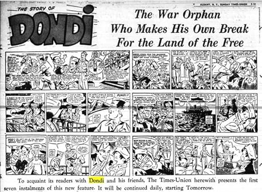 From the Albany Sunday Times-Union, 10-1-55
This promotional piece from another paper is from an article on The Daily Cartoonist website by D.D. Degg. I think the DONDI logo is all Hasen, and it shows he knew what he wanted, but the execution is uneven, particularly the second D. I suspect he asked Gaspar to do an inked revision for the first Sunday strip, and it appeared as above for some time. The Saladino inking clue is the way the letters are first outlined with a thinner pen, which remains in some places, then the outer edge of the entire logo is gone over with a heavier outline to read better. The letter shapes are more consistent, too.
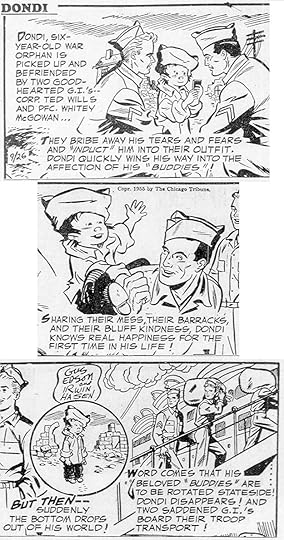 From The Chicago Tribune, 9-26-55
Here’s the first Daily strip broken into three sections so you can see the lettering better. Again, definitely by Saladino. If nothing else clues you in, look at the letter S with a wide central stroke that’s almost horizontal in many places. The character’s origin is kind of rushed through, but it works, and the strip proved quite popular. The syndicate licensed it to a growing number of other papers, and writer Gus Edson and artist Irwin Hasen must have been quite pleased with their success. At the time, strip artists usually ran their own shop and were expected to supply finished work, so Hasen would have subcontracted the lettering to Gaspar, and penciled strips would have passed from Hasen to Saladino, then lettered ones passed back for inking. This probably often happened at the DC offices. Now I needed to find out how much of the strip Gaspar lettered, as all the examples I’d seen (later ones) were lettered by Ben Oda. Thanks to Newspapers.com, I was able to look at all the printed strips from the beginning to find that out. They have good, clear copies of The Chicago Tribune. The paper helped promote their new strip by printing it larger than many of their other strips of the period, at least for the first few weeks. Daily strips are usually lettered a week at a time, with two strips on a page of comics art paper, while Sunday strips are much larger and often needed sooner so that color and separations can be done. I found Saladino lettering on both.
 From DONDI Daily, 10-11-55, courtesy of Heritage Auctions
Here’s original art from an early Daily lettered by Gaspar, who I think also lettered the signs in the last panel, and maybe the signatures over Hasen’s pencils. As you can see, Dondi has arrived in America. Later he would always have black circle eyes, here they’re not quite that yet.
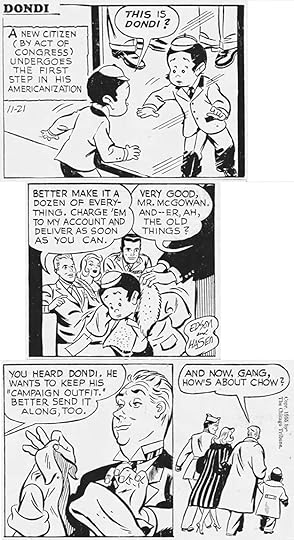 From The Chicago Tribune, Monday 11-21-55
As I went through the newspapers, I came to this strip and recognized a different but equally familiar style. Perhaps Saladino was too busy at the time, and Hasen tapped veteran DC letterer Ira Schnapp to fill in for him. Schnapp’s letters are smaller, less wide, more rounded, and clearly different from Saladino’s. He had plenty of experience lettering comic strips, he was the main letterer of the SUPERMAN strip for decades, both before and after this.
 From The Chicago Tribune, Sunday 11-27-55
Ira did two full weeks of the strip, Dailies and Sundays, which suggests that in the beginning at least, Hasen was producing them in date order. This is scanned from the color comics supplement, but in black and white, obviously.
 From The Chicago Tribune, 12-25-55
After that two-week break, Saladino was back on the strip for many months, here’s part of the Christmas Day Sunday.
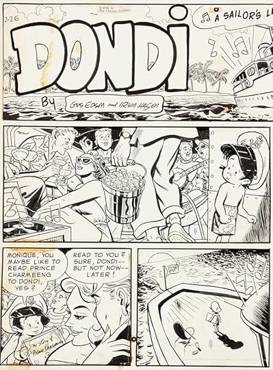 From DONDI Sunday, 2-26-56, courtesy of Heritage Auctions
Here’s part of the original art for another Sunday. The lettering is right on the art, but it looks like the art was cut and pasted on the bottom two panels, perhaps an editing change made by Hasen.
 From The Chicago Tribune, Monday 8-13-56
Saladino’s lettering continued uninterrupted until the Daily above, which is lettered by Ben Oda. Ben was a very busy letterer who worked on many strips, and he did all the Dailies in this week and the following week, while the Sundays were still by Saladino. Ben’s style at the time is right between Schnapp and Saladino, with letters that fit mostly into a square like Schnapp, but larger and made with a wedge-tipped pen like Saladino. His work is so regular it can be hard to identify, the best clues are the letter C, which tends to lean forward a little, and the E, which has a slightly longer bottom leg.
 From The Chicago Tribune, Sunday 8-26-56
This is the final Sunday lettered by Gaspar, and his final DONDI lettering as far as I know. Note that the second balloon in the large middle panel is by someone else, probably a last-minute correction. Saladino did two Sundays after Ben was lettering Dailies, suggesting Sundays were being done ahead of Dailies at the time. I spot-checked through the next few months and found only Ben Oda lettering. Ben was a workhorse, and once he was given a strip, he rarely let it go. Hasen is on record as loving Oda’s lettering, and has said that Ben would come to his studio and letter for him when deadlines were tight, sometimes in the middle of the night. That’s probably one reason why Hasen made the switch. Another might be that Gaspar was very busy at DC, and perhaps couldn’t always get to DONDI right away.
So, I have new work by Saladino and Schnapp to add to their career retrospectives, which I will do as soon as this article is published, you can find them on my COMICS CREATION page. I will also update the articles there about the comic strip work of both letterers. Here’s a summary.
Schnapp lettered these strips: Monday 11-21-55 to Sunday 12-4-55
That’s 2 Sundays and 12 Dailies.
Saladino lettered these strips:
Monday 9-26-55 to Sunday 11-20-55
Monday 12-5-55 to Sunday 8-12-56
Sundays 8-19-56 & 8-26-56
That’s 46 Sundays and 264 Dailies, a substantial amount of lettering.
Using the equivalent to comics pages I’ve been following, which is that 6 Dailies equal 3 comics pages, while 1 Sunday equals 2 comics pages, this will add roughly 224 pages to Saladino’s estimated career page total, and 10 pages to Schnapp’s. I’m glad I found this work by both of them, and I’m sure there’s more out there somewhere.
The post Saladino (and Schnapp) Lettering on DONDI appeared first on Todd's Blog.
January 28, 2023
Me at 72

Kind of surprised I made it this far, but happy about it. Life is good. Will be celebrating quietly with wife Ellen and cat Leo today at home.
The post Me at 72 appeared first on Todd's Blog.
January 27, 2023
And Then I Read: VOYAGE NORTH by Julia Jones
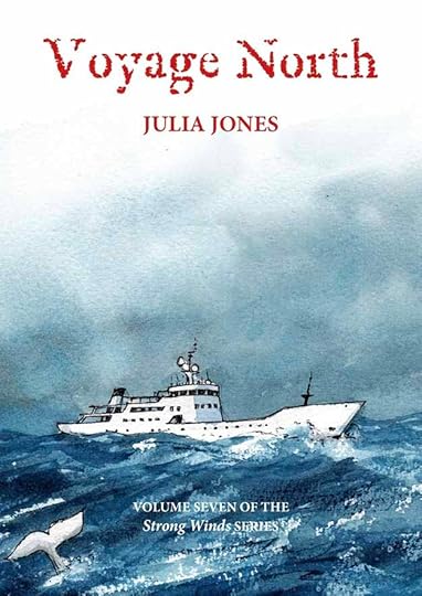 Cover illustration by Claudia Myatt
This is the seventh and I think final book of the Strong Winds series, which I’ve been enjoying for over ten years. Julia Jones was inspired by the books of Arthur Ransome about children sailing and having adventures, but her books are very much of their own time. They are more complex than Ransome’s stories, and they include topics he wouldn’t have considered appropriate for children, like social inequity issues, racism, crime, and international politics. My only complaint has been that there often isn’t enough sailing in the series, but this final one has plenty, even if some of it is motor driven. Plenty of action and excitement, too, and loose threads from the other books are sewn up nicely.
Donny Walker has been living on the Suffolk coast of northeast England with his deaf mother Skye, and they’ve made many friends there, but the biggest mystery in Donny’s life is the identity and career of his father, who he never knew. At the end of the sixth book, “Pebble,” Donny is offered a chance to learn about his father from someone who knew him, the Russian oligarch Aradky Ivanov, if he will join the former Russian Admiral on his super-yacht, MV Raisa as it flees the English coast with an illegal radioactive cargo, heading North toward Finland. Donny agrees, leaving everyone he knows behind, and he’s soon wondering if he made the right decision. Ivanov is badly wounded and in need of medical care, but because of their cargo, no port will allow them to land. On board it’s just Captain George, Donny, and the possibly dying Ivanov until three stowaways surface. They are Russian teenagers Tatiana and Vasily and German AWOL soldier Luther, who hid on the boat to escape authorities. They consider themselves eco-terrorists, and planned to take over Raisa, but things don’t work out for them, and soon they are conscripted into the crew, forced to help keep the ship going and all of them alive. When it finally reaches a port that will accept them in Finland, even more trouble is in store for everyone. In this suspenseful story, twists and turns abound. There are kidnappings, a damaged sunken submarine with friends of Ivanov on board, fierce storms, frantic escapes on sea and land, political intrigue, surprising heroics, and some hair-raising sailing. Donny Walker eventually finds out much more about his father and family than he ever expected.
Recommended, but start with the first book of the series, I’ll list links to all of them.
The Salt-Stained Book by Julia Jones
A Ravelled Flag by Julia Jones
The Lion of Sole Bay by Julia Jones
The post And Then I Read: VOYAGE NORTH by Julia Jones appeared first on Todd's Blog.
January 25, 2023
Paul Lauretta’s Comics Career 1937-40
 From “The Federal Illustrator,” Summer 1939
Paolino “Paul” Joseph Lauretta was born Dec 28, 1917 in Lawrence, MA to a family of Italian immigrants. He attended Lawrence High School, where he was the staff artist for “The Lawrencian.” After graduation in 1934, he became the staff artist for a local paper, “The Lawrence Telegram.” Paul was an aspiring comics artist, and he created an exclusive comic strip for the paper, “Rocky Baird,” first strip seen above. I don’t have access to the newspaper, but a clipping from it I found says the strip began on Monday, June 29, 1935, and that it was to run daily. I don’t know how long it ran. The only reason we have this first strip is that it appeared in the Summer 1939 issue of a correspondence art school magazine, “The Federal Illustrator,” along with some brief information about Paul and his work. My friend and fellow comics historian Alex Jay uncovered the article, and has kindly allowed me to write about it.
 From “The Federal Illustrator,” Summer 1939
Here’s the cover of the magazine, and you can see it’s copyrighted by Federal Schools, Inc. In a 2018 “Print” online article by Steven Heller, he writes:
Don’t be confused by the title. The Federal government did not actually own the Federal Schools, but there was a connection. The school was founded as the Federal School of Applied Cartooning in Minneapolis in 1914 as a branch of the Bureau of Engraving Inc. to train illustrators for both the growing printing industry and the Bureau itself. It was responsible for the ubiquitous Draw Me! ads found on matchbooks and in the columns of magazines and comics. The school actually continued until 2016.
I don’t think the school was connected to the government agency, The Bureau of Printing and Engraving, which produces postage stamps, paper currency, and other government work, The Bureau of Engraving Inc. seems to be a separate company. The fact that Lauretta was featured in their magazine suggests he took their correspondence courses, and I’m sure they were happy to promote his success with “Rocky Baird.” Lauretta also sold the strip to the Comics Magazine Company, run by William H. Cook and John F. Mahon, former employees of Major Malcolm Wheeler-Nicholson’s fledgling comic book company (that became DC Comics) who went off on their own, taking some of the Major’s writers and artists and their work with them, and it’s possible Lauretta was one of those. “Rocky Baird” strips appeared in issues 4 and 7 of FUNNY PICTURE STORIES dated Feb and June 1937, the latter being one of the final comics from the publisher. Lauretta’s work must have been liked, because he was soon getting more work in comics, including on Superman. Before I get to that, let’s look more closely at the “Federal Illustrator” article.
 Detail from “The Federal Illustrator,” Summer 1939
Here’s a closer look at two panels from the full page strip above. Lauretta was writing, doing all the art, and also the lettering. I think he was good for the time in all three areas. The balloon and caption lettering has a distinctive A with a rounded top, but is otherwise typical of comic strips of the period. The larger display lettering for SOLD! is well done.
 From “The Federal Illustrator,” Summer 1939
This second page about Paul Lauretta’s work has a toned panel from his strip, and more interesting information. We learn that Lauretta has “just reported the sale to Detective Comics, Inc., New York City of a six page feature to be run each month.” That company was started by Major Malcolm Wheeler-Nicholson, but by 1939 had been taken over by Harry Donenfeld and his business partner Jack Liebowitz, and was soon known as National Comics, though the name Detective Comics endured in their DC corner symbol. The article above touts the possibility of making good money through syndicated comic strips, though I don’t think “Rocky Baird” was ever syndicated. It would be interesting to see what else there is about Lauretta in the Fall 1939 issue of the magazine, but we don’t have that one.
 From ACTION COMICS #8, Jan 1939, image © DC Comics
Somehow Paul Lauretta met Superman artist and co-creator Joe Shuster and worked on the character’s ACTION COMICS strips in issues 6 to 10, cover dated Nov 1938 to March 1939. The Grand Comics Database credits him with lettering and some inking on those stories. In the sample above, the lettering certainly looks similar to the “Rocky Baird” lettering, including the round-topped A. I also think Lauretta’s art style is similar to Shuster’s, but I’m no expert on that. Did Paul travel to the Shuster studio in Cleveland, OH to do this work? If so, he didn’t stay long. His lettering is on all the Superman pages in ACTION #6-7 and 9, part of issue 8, and just the first six pages of 10. The Superman stories were all being done in Cleveland at the time as far as I know.
 From MARVEL MYSTERY COMICS #2, Dec 1939, image © Marvel
Lauretta’s comics work next showed up at Timely (Marvel) with a new feature he seems to have created, American Ace. The first chapter appeared in MOTION PICTURE COMICS WEEKLY #1, a book that was produced but never distributed, alongside the first appearance of Bill Everett’s The Sub-Mariner. American Ace was not as successful, the first chapter appeared again in this issue of MARVEL MYSTERY COMICS, and another chapter was in issue #3.
 From MARVEL MYSTERY COMICS #2, Dec 1939, image © Marvel
A closer look at part of the page shows the same style of Lauretta lettering with round-topped A’s as was used on “Rocky Baird” and his Superman work.
 From MORE FUN COMICS #49, Nov 1939, image © DC Comics
Around the same time, another new feature created by Lauretta appeared in this title from National (DC) Comics. (I’m assuming his solo credit on these features means he wrote and drew them.) Paul was clearly working hard to come up with a successful property and shopping his work around the Manhattan publishers.
 From MORE FUN COMICS #49, Nov 1939, image © DC Comics
The reproduction from microfilm is really poor on this page, but you can just make out more of the same Lauretta lettering style with the round-topped A’s, and the title work by him on all these strips is excellent.
 From AMAZING MYSTERY FUNNIES #24, Sept 1940
Another new feature by Lauretta had a solo appearance in the final issue of this title from Centaur Publications, in some ways a successor to the Comics Magazine Company. More fine title work.
 From AMAZING MYSTERY FUNNIES #24, Sept 1940
A closer look shows that Paul’s lettering has become more regular, and I think looks better than in earlier efforts. His A is now almost square at the top in some places. Of all these features, King Carter was the most successful, appearing in six-page installments in MORE FUN COMICS issues 49-54, the last of those dated April 1940. This is surely the feature described in the “Federal Illustrator” article as sold to Detective Comics, Inc.
That’s where Lauretta’s published comics work stopped as far as I know. I have a note from a source that I can’t locate at the moment that Paul was working on a King Carter title for National, but paper shortages caused by World War Two postponed that, and then he was drafted. Lauretta did cartoons and strips for government publications while in the army, Jerry Bails’ suggests that was 1942-46, and afterward did commercial art and some teaching, and was a staff artist for Western Electric, but apparently did no more comics work. He died October 20, 2000 in Methuen, Massachusetts.
Despite a promising start, Paul Lauretta’s comics career was short, and he is little remembered except for his contributions to Superman stories. Thanks to Alex Jay’s new information from “The Federal Illustrator,” we now know a bit more about it.
The post Paul Lauretta’s Comics Career 1937-40 appeared first on Todd's Blog.
January 21, 2023
Rereading: THE WITCHES’ BRIDGE by Barbee Oliver Carleton
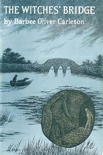 Cover illustration by Edward Gorey
Dan Pride has been raised in Europe, but the death of his parents brings him back to his family’s ancestral home in the marshes of coastal Massachusetts. The Pride home sits on an island in the marsh reached by two bridges. One includes the equally old Witches’ Bridge, named for Dan’s Puritan ancestor Samuel Pride, who was accused and executed as a witch. Samuel, like Dan, played the violin, and people of the area claim he haunts the island, and that his violin can still be heard when the fog rolls in from the ocean.
Dan hopes his uncle Julian will be a friend and welcome him, but Dan is met by the hired man Billy Ben, who is quick to fill Dan with the superstitions and fears of the locals. Uncle Julian proves a cold, sickly person who seems to have little understanding or friendliness for Dan, leaving him sad and fearful. Dan tries to help Billy Ben with chores, but doesn’t get on well with those. Then he meets a boy from a nearby cottage on the mainland, Pip, and they explore the marsh together. Dan is happy to have a friend, but later finds out that Pip might not really be the friend he seems, and feels alone again. A great mystery surrounds the death of Dan’s grandfather, who was planning to settle the family’s long feud with the Bishop family nearby when he was found dead near the Witches’ Bridge, without the briefcase he was bringing to the Bishops to close a deal on the purchase of a shipyard. Dan decides he must find out what really happened, and find the missing papers. He gets some help from a hermit living on his own small island and others, but he also finds many in the town against him, and soon Dan is also being accused of terrible things. How can he prove he’s innocent and solve the mystery?
I enjoyed reading this again, though this time I found it more melodramatic than I remembered, almost gothic in tone. I liked the characters and plot, the setting is well envisioned, and the mystery and its solution is satisfying, so in all, this book is recommended.
The Witches’ Bridge by Barbee Oliver Carleton
The post Rereading: THE WITCHES’ BRIDGE by Barbee Oliver Carleton appeared first on Todd's Blog.
January 19, 2023
Incoming: DOOM PATROL BY GERARD WAY AND NICK DERINGTON: THE DELUXE EDITION
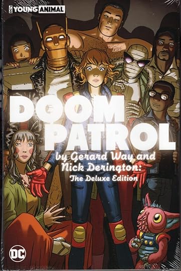
 Images © DC Comics
Just arrived is this fancy oversized hardcover reprinting the 12-issue series I lettered as well as a second series I didn’t. I enjoyed working on it, I found the writing by Way and the art by Derington entertaining, and the characters and stories were fun and different, though clearly inspired by the earlier Doom Patrol work of Grant Morrison and company. Retail price is $49.99 in the U.S. It’s due in comics shops Feb 28. There’s an Amazon link below if you’d like to order it there.
Doom Patrol by Way and Derington Deluxe Edition
The post Incoming: DOOM PATROL BY GERARD WAY AND NICK DERINGTON: THE DELUXE EDITION appeared first on Todd's Blog.
Todd Klein's Blog

- Todd Klein's profile
- 28 followers

