
Todd Klein's Blog, page 45
April 6, 2023
Rereading: GRAEME AND THE DRAGON by Naomi Mitchison
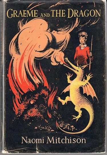
When I first saw the cover of this book, I was intrigued by the subject and attracted by the illustration, which I soon discovered was by Pauline Baynes, who also did many small illustrations throughout. Baynes was already a favorite for her illustrations for the Narnia books by C.S. Lewis, and books by J.R.R. Tolkien (she was friends with them, as was the author, apparently) and she did a wonderful map of Middle Earth that used to hang on my wall. The book itself was entertaining, though perhaps lightweight.
Graeme lives with his sister Petronella and his parents in a home in suburban England, probably near London. His friend Simon lives next door, and they sometimes play together. Graeme is fond of making bonfires, and in a way that would probably not be allowed in a children’s book today, he loves to set fires of any kind. One day while preparing a bonfire at the back of his garden, he finds a baby dragon, who is happy to help set the fire alight with his breath. The dragon has an appealing personality, he’s vain, and crafty, and at times disobedient, getting Graeme and Simon in trouble until they learn how to control him with the help of a magic umbrella they find that can change his size. Each chapter is an amusing story, and many were originally told by the author on the BBC radio program “Children’s Hour.” Logic is set aside, but humor and cleverness abound. Social satire is also present in some stories.
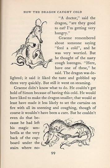
The charming illustrations go a long way toward making this a fun read, and some made me laugh, like the ones on this page. Just now, I read the Wikipedia entry on Mitchison, which is extensive and surprising. I would never have expected such a daring and adventurous author to be behind these essentially gentle tales. I recommend the book if you can find it.
Graeme and the Dragon by Naomi Mitchison
The post Rereading: GRAEME AND THE DRAGON by Naomi Mitchison appeared first on Todd's Blog.


April 4, 2023
GASPAR SALADINO LETTERING ON TWO UNPUBLISHED STRIPS
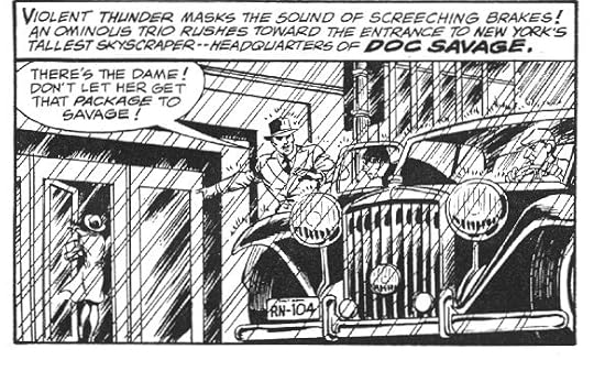
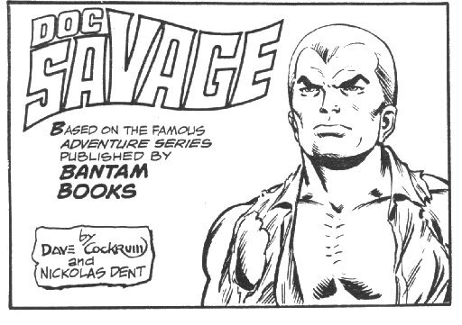 This and all Doc Savage images are © Condé Nast
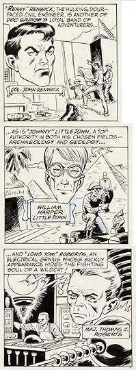
Two newspaper strips I’ve never seen with lettering by Gaspar Saladino turned up in my Facebook feed this weekend. This one was done in 1978 by comics artist Dave Cockrum. The writer credit might be a pen name or a real relative of Doc Savage creator Lester Dent, I haven’t found out anything more about that.
The usual plan for new strip ideas submitted to syndicates who might buy them was to create one Sunday strip and at least a week of six Daily strips, though two or three weeks was more common. I found the Doc Savage Sunday at THIS site, but it has each panel scanned individually. This is panel 3 with some excellent Saladino title and text lettering.
Panel 4 gets the action moving. I’m guessing Gaspar was hired by the creators. At the time he was lettering THE WORLD’S GREATEST SUPERHEROES strip for DC Comics, and would have been well known to Dave Cockrum when Dave worked at DC.
I found some original Dailies at the Heritage Auction site. This one must be from the first week, where the characters were being set up. If the strip had sold, these introductory strips might have been run separately in newspapers before the strip joined their regular lineup. I’ve stacked the panels vertically to showcase Gaspar’s fine lettering.

There are also strips like these with lettering but no inks, suggesting this is as far as the project went, and probably intended to be week two of Dailies. Perhaps the creators found out that rights for such a project were already tied up elsewhere by the intellectual property owner Condé Nast.
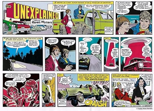
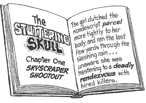
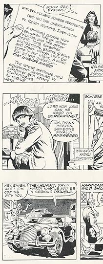
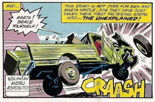 From THE UNEXPLAINED, 1979, all images © Copley News Service
The other strip from 1979 seems like an action/horror one with a fine lineup of creators: writer Marv Wolfman and artists Ross Andru and Mike Esposito, all successful in comics for many years. In a 2020 tweet, Marv said the strip was sold to Copley, and this Sunday and three weeks of Dailies were prepared, as well as a promotional poster, but not enough newspapers were willing to buy the feature to make it financially feasible, so it went no further. The images I found are probably from the syndicate’s promotional package that would have gone out to prospective buyers at newspapers across the country.
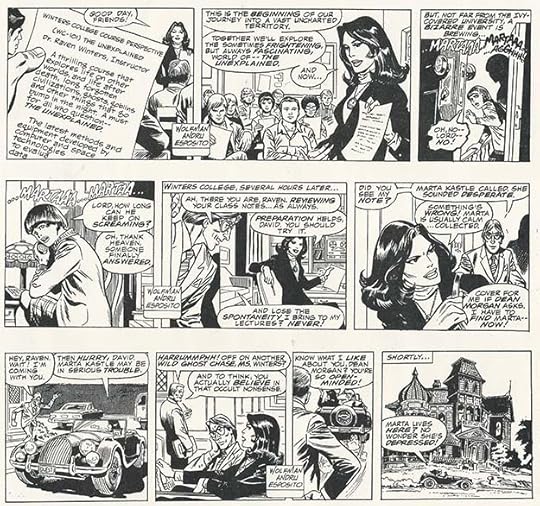
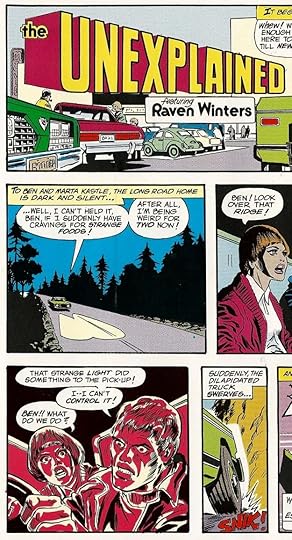
Three dailies on a single page as they would have gone to buyers, I’ve also added some panels enlarged to show the lettering and art better. The strip looks like one I would have enjoyed reading. The lead character, Dr. Raven Winters, might have had some connection to Baron Winters in the comics series NIGHT FORCE by Wolfman and Gene Colan published by DC in 1982, or maybe Marv just liked the name and reused it.
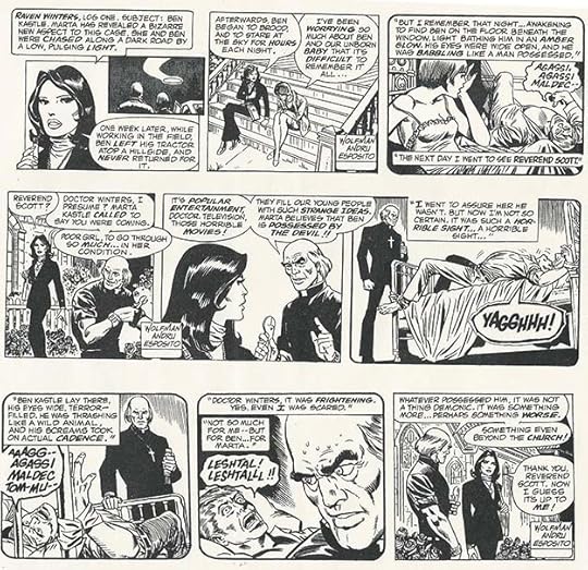
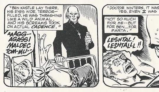
Another page of Dailies with some fine display lettering by Saladino. Too bad it wasn’t a success, but the days of serious continuity strips were already in decline by 1979 in favor of humor ones. I’ll be adding these strips to my Gaspar Saladino career overview HERE once this is up on my blog.
The post GASPAR SALADINO LETTERING ON TWO UNPUBLISHED STRIPS appeared first on Todd's Blog.
April 2, 2023
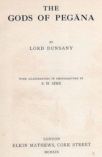
Rereading: THE GODS OF PEGANA by Lord Dunsany
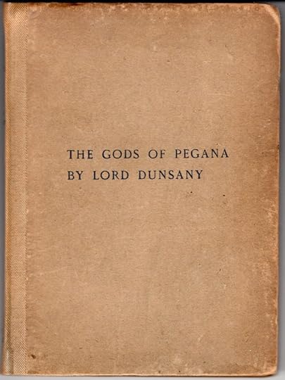
 My third printing copy, 1919
This is not really a book of stories, it’s mostly a briefly outlined mythology created by the author, Edward John Moreton Drax Plunkett, 18th Baron of Dunsany, in 1905. The style has several influences, including Celtic mythology, Hindu mythology, possibly Chinese mythology, and perhaps “The Arabian Nights.” Dunsany (rhymes with unrainy) was also reading Nietzsche at the time, and there are element of irony and humor perhaps picked up there, as well as the seemingly unorthodox beliefs of the author. Dunsany’s gods have a hierarchy, with MANA-YOOD-SUSHAI at the top, who created the lesser gods, then settled down to a very long nap that will only end when all his creations do. The lesser gods, each with powers and specialties, create worlds in which to meddle from their home in lofty Pegana, worlds inhabited by men and animals and so forth. This is the game of the gods, and we are their playground, it’s suggested. Some of the pantheon are Kib, sender of life, Sish, destroyer of hours with his hound Time, Slid, god of streams, rivers and oceans, Mung, god of death, Limpang-Tung, god of mirth and minstrels, and Yoharneth-Lahai god of dreams and fancies. Below this pantheon are the lesser or home gods, who live among men and not in Pegana, with specialties as specific as Pitsu who strokes the cat and Hobith who calms the dog.
After all these gods are described, there are stories about prophets among men, and their attempts to represent the gods to men, often coming to unfortunate ends. My favorite of these, and one of the stories that’s more like a story, is in “Of the Thing That Is Neither God Nor Beast.” The prophet Yadin searches for wisdom in the desert and his prayers are answered by three flamingoes whose call is “Going South, Going South.” Somehow Yadin is able to fly with them to the uttermost South and learn many wondrous things.
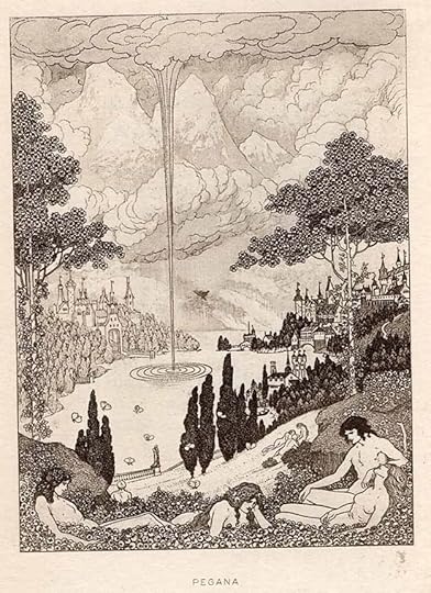
As important as the writing to this book are the eight photogravure tipped-in illustrations by S. H. Sime. It’s impossible to do them justice with a scan here, but I’ve added one anyway above. The photogravure process allowed Sime to create extremely detailed pictures that really need a magnifying glass to appreciate, with lines as thin as tiny hairs, and amazing textures. Later printings are simply photo-screened versions of these plates that convert them to dots, losing all the fine details.
Having created his gods, Dunsany went on to write more stories about his imaginative world in later collections. This slim volume of 94 pages is a fascinating and entertaining work of world creation that predates Tolkien by many years, and perhaps influenced him. Recommended, though much better with the original illustrations in photogravure.
The Gods of Pegana by Lord Dunsany
The post Rereading: THE GODS OF PEGANA by Lord Dunsany appeared first on Todd's Blog.
March 29, 2023
Rereading: THE HIDING PLACE & TINKER’S CASTLE by Winifred Mantle
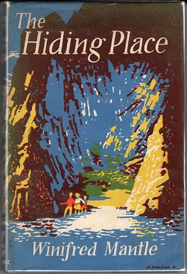 Cover art by Ronald Benham
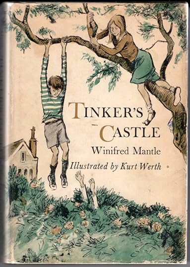
These are the first two of several mystery/thrillers for young readers by Mantle featuring Julia and toddler Adam Wescott and Mirabel, Norman and Clare Lester, who are next-door neighbors in a town outside London. Older teenager Ian Wescott is also featured in the first book. He’s taken a job helping at his uncle’s antique shop in London for the summer. Both families have fathers that are away, traveling on business. Julia gets to know the Wescotts when she climbs the tree between their properties, and she becomes friends with Norman and his cat Oby first. When Julia’s mother is called away to help her father after an auto accident, she and Adam are cared for by their hired day-help Mrs. Cuttle, who works for both families. One evening Ian appears in Julia’s tree unexpectedly, asking for help. He’s run away from London after being threatened by a Mr. Butts at his uncle’s shop. The uncle is also away on business, and Ian has found a rare stolen silver spoon worth lots of money that Mr. Butts had been trying to get Ian’s uncle to sell. He recognizes it from a newspaper story on the theft that resulted in a murder, and hides the spoon, but realizes Mr. Butts will be after him for it. Ian has a plan to escape to a secret hiding place in the Lake District he had discovered on a previous family holiday there. Julia, Mirabel and Norman help Ian get the camping things he needs and see him off, but Mr. Butts soon shows up demanding to know where Ian is. He threatens the children, but a good scratching from Oby helps shoo him off.
Ian’s mother, Mrs. Wescott, learns that Ian has disappeared in London, and she goes there to look for him leaving the children with only Mrs. Cuttle to watch them. She is home sick, so they’re on their own. They decide to follow Ian and join him in his secret hiding place, but things get complicated when Norman insists on bringing Oby and Adam along. The children get help from a nosy woman, Mrs. Mackenzie, who travels north with them, and won’t go away. Is she in league with Mr. Butts? Will he soon be after them too?
In the second book, the children go on holiday together to Tinker’s Castle Lodge. Norman is disappointed to find out that there isn’t a real castle there, but the huge mansion and large grounds next door make nearly as good a place to explore. Norman has once again smuggled Oby along. The children meet Philip Ridley, the nominal owner of the estate, and his pet capuchin monkey Simeon, but Philip’s guardian, Captain Ridley, dislikes them as much as he does Philip, and he threatens to kill Simeon. The children help Philip hide Simeon from Captain Ridley, who has taken an interest in Mirabel, driving her off to the local town on dates. The others all hate him, and with good reason. It’s clear after an incident at the mansion that Captain Ridley would not mind if Philip was put out of his way for good so he could take over the estate. A tense game of cat and mouse ensues with the children barely one step ahead of Captain Ridley until things all come to a head when Philip hides a family treasure, an ancient Roman goblet worth lots of money that Captain Ridley wants to sell.
These are excellent reads if you can find them. Recommended.
The Hiding Place by Winifred Mantle
Tinker’s Castle by Winifred Mantle
The post Rereading: THE HIDING PLACE & TINKER’S CASTLE by Winifred Mantle appeared first on Todd's Blog.
March 23, 2023
Incoming: SANDMAN BOOK 5 TP
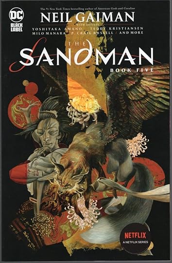
 Cover art by Dave McKean, images © DC Comics
I missed noting this one when in came in a few weeks ago. Book Five of the Netflix tie-in reprints includes SANDMAN MIDNIGHT THEATRE, THE SANDMAN: THE DREAM HUNTERS (prose edition) and THE SANDMAN: ENDLESS NIGHTS written by Neil Gaiman (and Matt Wagner on the first item), art by a host of legends. Retail price is $34.99. Look for it at your comics retailer, or see below for an Amazon link.
The post Incoming: SANDMAN BOOK 5 TP appeared first on Todd's Blog.
March 21, 2023
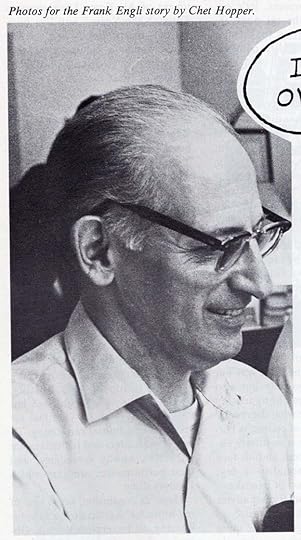
FRANK ENGLI – MILTON CANIFF’S LETTERER
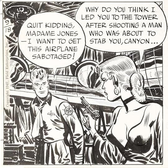 From STEVE CANYON Daily, Sept 18, 1947 by Milton Caniff and Frank Engli, © Field Enterprises. All original art courtesy of Heritage Auctions.
In the world of newspaper strips, there was generally one artist named, but often that artist had help from others who were not credited. These unknowns might do any part of the job, including backgrounds, inking, lettering, even help with main figures. There were probably artists who specialized in lettering for strips whose names remain unknown. The earliest one I have a name for is Charles F. Armstrong, Hal Foster’s letterer on TARZAN and PRINCE VALIANT, they began working together on on strips in 1932. The next one I know of is Frank Engli. He was a talented artist in his own right, and produced two short-lived comic strips entirely created by him, but Engli loved to do lettering, and he was good at it. When he teamed up with Milton Caniff on TERRY AND THE PIRATES in 1936, they formed a partnership that would last for decades on three strips, TERRY, MALE CALL, and STEVE CANYON. I think his lettering had an influence on both comic strips and comics books.
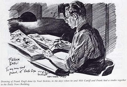 Engli by Noel Sickles from CARTOONIST PROFILES #9, Feb 1971
This story begins with a group of artist friends. Milton Caniff and Bil Dwyer were both born in 1907 in Ohio, while Noel Sickles was born there in 1910. They met while attending Ohio State University in 1925. Sickles was a talented but largely self-taught artist who found work as a political cartoonist at the Ohio State Journal in the late 1920s. Caniff was hired as an artist at the Columbus Dispatch around the same time, and Sickles and Caniff shared a studio. Dwyer also worked for the Columbus Dispatch, but by 1930 the Great Depression had thrown all three artists out of work. Dwyer decided to move to New York City around that time to try his luck with the newspapers, magazines, and syndicates there.
Frank Engli was born in Chicago on Nov 10, 1906. He lived in Michigan with his parents in 1920, and later studied at the Chicago Academy of Fine Arts. In an interview with Jud Hurd for CARTOONIST PROFILES #9, Frank Engli remembered: “After I finished my art schooling, I took a 10,000 mile hitch-hiking trip around the country just for the experience — rode freight trains, went to the oil fields in Texas, washed dishes, and, all in all spent only $75 on the entire trip. After I got home I came to New York and met Bil Dwyer, who was doing gag cartoons at the time.” Dwyer and Engli began sharing a Manhattan apartment/studio in 1931.
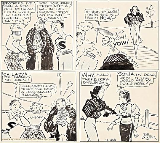 DUMB DORA Daily strip, Nov 22, 1933, by Bil Dwyer with help from Milton Caniff. All printed newspaper strips © the respective owners.
In 1932, Caniff and Sickles also decided to move to New York seeking work. Both found it in the Associated Press bullpen. Caniff did general assignment art for several months, drawing the comic strips DICKIE DARE and THE GAY THIRTIES, then inherited a panel cartoon named MISTER GILFEATHER in September 1932 when Al Capp quit the feature. Sickles was assigned to the action/adventure strip SCORCHY SMITH whose creator, John Terry, was suffering from tuberculosis. The series, which started in 1930, was heavily influenced by Roy Crane’s adventure strip WASH TUBBS. Sickles initially illustrated the strip as a ghost artist, but he signed his own name after Terry’s 1934 death.
When Caniff arrived in New York in 1932, he called their friend Bil Dwyer. As Caniff remembered in an interview with Will Eisner (first published in THE SPIRIT numbers 34 & 35, Kitchen Sink Press, 1982):
I called him just socially and told him I was in town to say hello. I didn’t know where he lived, on Christopher Street. I didn’t even know where Christopher Street was. So he said, “My God, I’m glad you called! I’ve got a problem here. Come on down!” This was like the first night I was in town and he had been submitting things to King Features and selling gags, by the way, to the magazines, Colliers and The New Yorker. Anyway, he had submitted a gag-type strip to King Features and he got a call back saying that Paul Fung was being pulled off DUMB DORA and Dwyer had the assignment. Here he was suddenly with six strips and a Sunday page to do and he’d never done anything except single panels. And he was in trouble. Frank Engli was helping him…he did the lettering.
Caniff agreed to pitch in, and in the example above, his work is most obvious on the female figures. Engli’s lettering hadn’t yet found the style he would be using a few years later, but perhaps he was asked to follow what had been done before on the strip. In the few examples I’ve found, the style is the same. Caniff only worked on DORA for a while, but he and Engli got to know each other then.
Here’s what Engli had to say about this time in the CARTOONIST PROFILES interview: “For three years I did all the lettering on the DUMB DORA comic strip, much of the penciling, and sometimes, when he was away, I’d ink the whole strip. During this time I got a job as art director at the Western Electric plant in Kearny, New Jersey. My work included doing a full page of cartoons each month for the plant newspaper, advertising lettering, plus posters and billboards.”
In 1933, Engli helped another art school friend, Zack Mosley, get started on his strip SMILIN’ JACK, but it’s not clear if he lettered any of it. DUMB DORA was canceled near the end of 1935, and Frank went to work as an in-betweener and opaquer on Betty Boop and Popeye cartoons at the Fleischer animation studio in Manhattan from 1935 to 1936. Meanwhile, Noel Sickles was having success with SCORCHY SMITH, and in 1934, Milton Caniff was asked by the Chicago Tribune Syndicate to launch a new strip called TERRY AND THE PIRATES. It began running Oct 22, 1934. Caniff and Sickles had again formed a studio together In New York, where they helped each other meet deadlines. At first, each artist probably did his own lettering, as was common in the early days of most strips. As Caniff remembered in the interview with Eisner:
It was at that time we decided that between us we’d hire a lettering man. We went back to Engli. Between Sickles and me we were able to afford to have him quit his job and come to work for us. He was glad to be able to leave the animation place. It was a backbreaker — hell on the eyes.
In the Hurd interview, Engli recalls that when Caniff started TERRY, “I happened to be one of the first guys to write and congratulate him. I had no thought of a possible job in mind so I was pleasantly surprised a couple of months later when he got in touch with me and asked if I’d like to do the lettering on the strip. Thus began our association. Milt and Noel Sickles and I worked in a small studio in the Daily News building for a time.”
 From SCORCHY SMITH, Dec 12, 1933, probably lettered by Noel Sickles
 From SCORCHY SMITH, Jan 22, 1936, lettered by Frank Engli
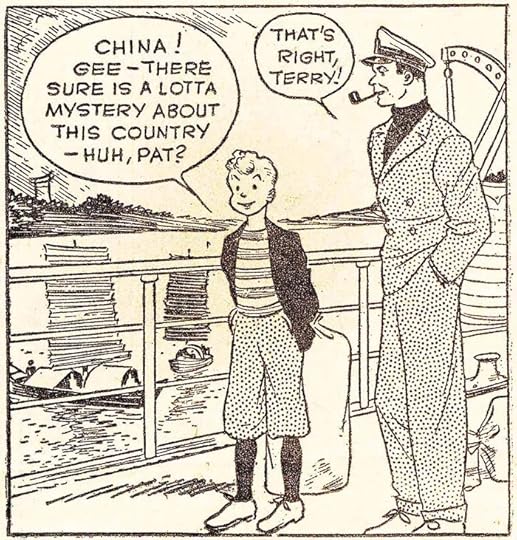 From TERRY AND THE PIRATES, Oct 19, 1934, probably lettered by Milton Caniff
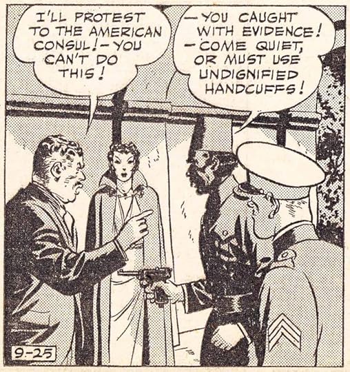 From TERRY AND THE PIRATES, Sept 25, 1936, lettered by Frank Engli
Compare the examples above to see what Frank Engli brought to the two strips. His style was now more angular than on DUMB DORA, with wide letters, and for TERRY he used a wedge-tipped pen that gave appealing contrast between the vertical and horizontal strokes. Up to this time, most comics lettering was done with a pointed pen, giving a more even line. In the rare cases where a wedge-tipped pen was used, the letters were usually more rounded. Note the letter S with a straight middle section connected to curves at each end, later emulated by long-time comics letterer Gaspar Saladino.
 From LIFE Magazine, Jan 6, 1941, Milton Caniff’s studio, photo by Herbert Gehr
Before Engli was in the new arrangement for long, Noel Sickles became bored with SCORCHY SMITH and moved on to commercial illustration. His last strip ran Oct 24, 1936. Engli and Caniff continued to work together on TERRY AND THE PIRATES. By 1941, TERRY had become a great success, and Caniff was able to have a much larger studio with places for his secretary, and Frank Engli, seen at upper center above.
 Unused photo by Herbert Gehr for LIFE Magazine, Jan 6, 1941, showing Engli lettering TERRY.
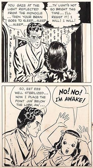
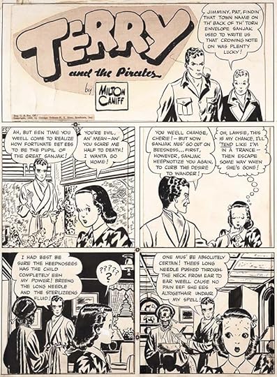 From TERRY AND THE PIRATES, March 19, 1939
Frank Engli’s lettering style on TERRY was not only appealing to the eye, it was innovative. In addition to his angular wedge-tipped pen letters, I believe he was the first person to letter thought balloons with a tail of bubbles decreasing in size, as seen in the third panel here, something that became the standard method in strips and comic books.
 From TERRY AND THE PIRATES, March 19, 1939
While Engli used underlining for slight emphasis, shouts and screams used larger, bolder letters, often with squared corners as above.
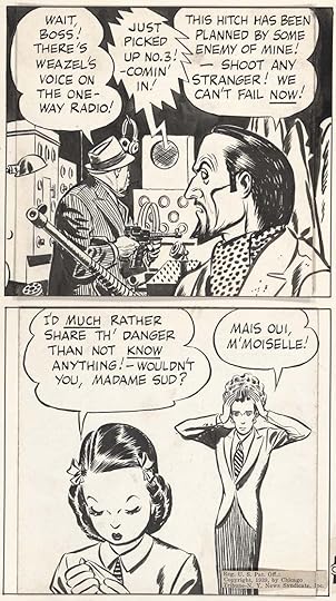 From TERRY AND THE PIRATES, Feb 12, 1939
I think Engli was also the first to use jagged triangular shapes on radio balloons and tails, as seen in this example, which again became a common way to do them.
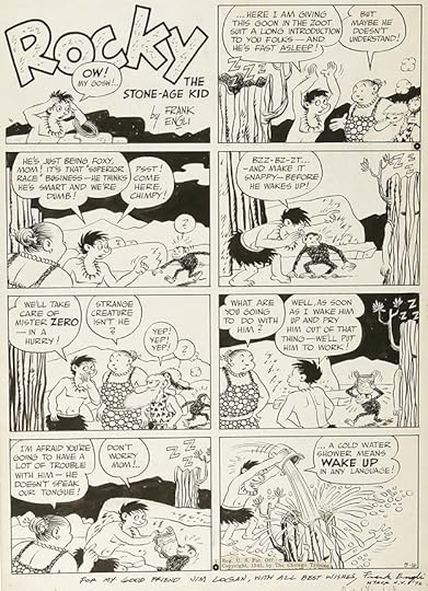 ROCKY THE STONE-AGE KID, May 16, 1943
In addition to his work for Caniff, Engli found time to create two strips entirely on his own, doing the writing, art, and lettering. The first, ROCKY, ran from August 25, 1940 to October 31, 1943. You can see some similarities in the art style to DUMB DORA.
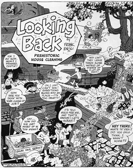
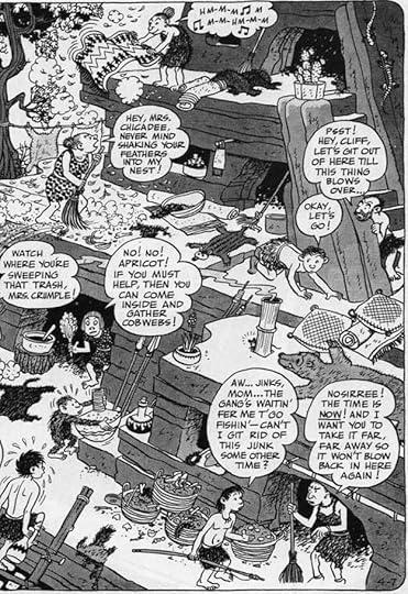 LOOKING BACK, April 7, 1946, from CARTOONIST PROFILES #9
The second strip, LOOKING BACK, also about prehistoric people, ran from December 30, 1945 to May 25, 1947. I’ve split it in half to show the lettering better.
 From MALE CALL, 1943
MALE CALL was a strip done by Caniff and Engli for U.S. military newspapers from 1943 to 1946. In this example we see two different handsome script styles by Engli.
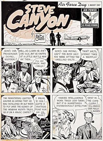 From STEVE CANYON, July 27, 1947
By 1946, Milton Caniff had become unhappy with TERRY, and started a new strip where he had more creative control, STEVE CANYON, featuring an Air Force pilot. The first strip appeared Jan 13, 1947, and continued for several decades with fine Engli lettering in the same styles he’d used on TERRY.
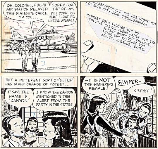 From STEVE CANYON, Oct 16, 1960
On this example we see Engli using printed type for a telegram and both larger letters and underlining on the word SIMPER.
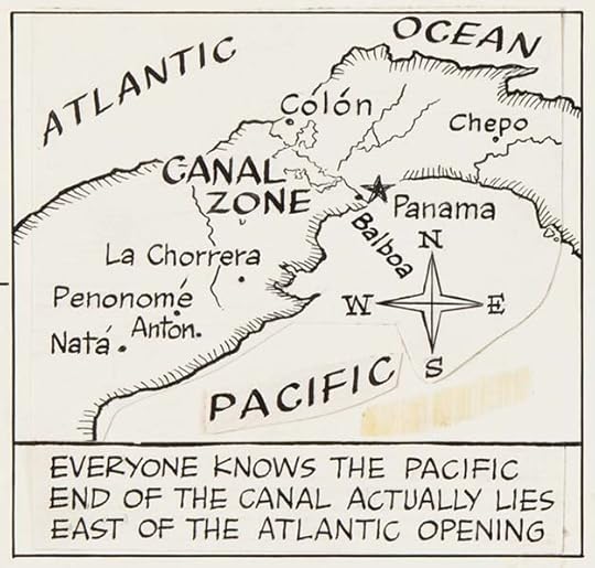 From STEVE CANYON, Aug 19, 1962
On this page Engli has lettered a map with lots of variety, lower case in some places, and serif letters on the compass points.
Here’s how Engli described his lettering method in the Hurd interview:
I use the Esterbrook Probate Stub pen #313 on all balloon lettering and the C-Series flat chisel edge Speedball pens for heavier stuff. When I start with a new pen, in order to get the oil off, I stick it in my mouth, lick it a few times, dip it into some water and wipe it off. When the oil is off, a little of the ink will dry on the pen, and this coating will help hold the ink better on succeeding dips. By the way, even though these 313s are theoretically all the same, they do vary — sometimes you pick one up and you can’t get to first base with it — it scratches the wrong way or something like that — and the best thing is to throw it away. Naturally, the same thing is true of all pens. I use the standard black Higgins ink and buy it in the large bottle size. I then fill one of the regular small-size bottles from which I work. Every once in a while I wash out the small-size bottle, clean it thoroughly and then fill it fresh so that I’m not picking up a lot of sediment on my pen point each time I dip in. The pen I use gives the lettering a certain dark weight, and because of the way I space it, it’s nice and strong when the reader looks at it. Individual letters in a word never touch. The spaces between lines of lettering are about one third the height of the lettering and I never measure guidelines with a ruler. They are done by sight only, with a T-square. In this way I’m varying the height of the lines very slightly, and I also vary the height of the individual words a very little bit. All this is done deliberately to keep away from the precise hard, cold type in the rest of the newspaper. I also leave plenty of air space between the balloon outline and the lettering. I prefer straight balloon tails pointing at the speaker’s mouth or head — not too far away. I don’t use curved, limp or wiggly lines for balloon tails, incidentally. I guess all cartoonists are aware of the fact that you use differently-shaped balloons when indicating a voice coming from a radio or a telephone, etc., and that yelling and emphasis can be shown with underlined or heavy lettering. Once, as an experiment, I reduced a panel I had lettered to postage stamp size, and I was delighted to see that I could still read the balloons clearly. Milt draws, and I letter, for 1/2 reduction, and we work on Strathmore medium three-ply paper using the rougher side of the sheets. I stay away from a plate finish in all my work because the pen slides too much and I require excellent control. I use a pen point about a week — sometimes two weeks. I flex the pen upside down, and if the thin hair line between the two sides of the point stays open, the pen is too old and I throw it away. I have to think about things like the humidity too because that affects your paper and your ink. Lettering always heavies up in humid weather. If you can hear your pen scratch on the paper, then you know the paper is right and that it’s nice and crisp and hasn’t been affected by too much humidity.
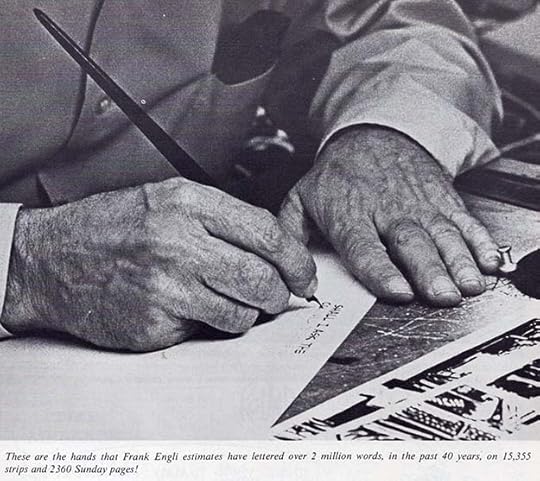 From CARTOONIST PROFILES #9, Feb 1971
Some time in the mid 1930s, Frank married his wife Mary, and their daughter Marylee and son Frank Junior followed.
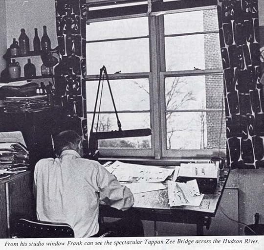 From CARTOONIST PROFILES #9
By 1940, the Engli family was living in Nyack, New York on the west bank of the Hudson River, and remained in that area until at least 1971, as seen above.
 Frank Engli from CARTOONIST PROFILES #9
In the 1971 Hurd interview, Engli said, “Even today, after all these years, I still love to do a page of lettering. I didn’t go into this branch of the profession because I wanted to become known as a specialist — I just liked to do the work. For a while I did gag cartoons for Colliers, The Saturday Evening Post, The New Yorker, but I soon found out that was a full-time job. I’ve done the lettering on ‘L’il Ivory’ pages for Ivory Soap, for Camel cigarettes, French’s Mustard, Instant Postum, Mr. Coffee Nerves, General Electric and Alka Seltzer. Also posters, charts, and color slides for McGraw-Hill, St. Regis Paper and Volkswagen. Political campaign posters for people like Bill Mauldin, when he ran for Congress, and on another occasion, a 30-foot banner with letters three feet high on canvas. This latter, naturally, was my biggest lettering job! And, in recent years, among all these other things, I directed a home-study art course in greeting cards. In addition, of late, I’ve gotten into doing titles for animated movies.”
 From CARTOONIST PROFILES #9, lettering sample sheet by Engli sent to prospective clients.
By 1975, Engli had moved to Arizona. In a Feb 2 article in World-Herald Magazine, Milton Caniff described how STEVE CANYON was produced at the time: “I take a ruled Sunday page, which Frank Engli (an associate) has already prepared, rough out in pencil what will be involved as far as drawing is concerned, indicate wording for the balloons, then send it off to Frank (in Tucson, Arizona) who does the lettering in ink. Next, Engli sends the page on to Dick Rockwell (a nephew of Norman) in Peekskill, New York for inking.” Caniff once described Engli’s lettering as “especially good,” and their partnership remained strong until Engli was forced to retire due to illness in early 1977. He died at age 70 in Los Angeles, CA on February 16, 1977. Other letterers continued on STEVE CANYON in his style, including Shel Dorf, until the strip ended with Caniff’s death in 1988.
If you’ve read much of my blog, you might know that Gaspar Saladino was a friend and my favorite comics letterer, working at DC Comics and other publishers from late 1949 until the early 2000s. I see lots of Engli influence in Gaspar’s lettering right from the beginning, and throughout his career. I think he was a TERRY and CANYON fan. He probably didn’t know Frank Engli’s name, but he certainly absorbed his style. From the early 1940s on, the use of wedge-tipped pens for lettering became much more popular. Again, I think other letterers were looking at Engli’s work, liking it, and copying some of what he did. Letterers like Abe Kanegson, Walt Kelly, and Ben Oda all show Engli’s influence in my opinion. Frank Engli made a fine career using his lettering skills, even if his name went largely unknown by readers and fans. He deserves to be remembered for it.
The post FRANK ENGLI – MILTON CANIFF’S LETTERER appeared first on Todd's Blog.
March 16, 2023
And Then I Read: THE CITY WE BECAME by N. K. Jemisin
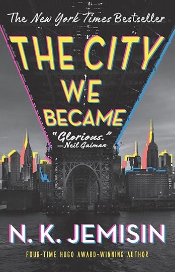
I loved Jemisin’s Broken Earth trilogy, so I read the first book of her latest series. It takes place in New York City of today, and suggests that NYC is about to achieve a new kind of awareness through a few of its citizens. Other cities of our world have already been “born” in the same way, though some have failed and fallen apart in the past. New York’s imminent birth will happen through six different people, one representing each of the city’s boroughs, and one to encompass them all. Making this much harder, an unknown force from outside our reality is trying to manifest right on top of New York and not only cause the city to fail, but to replace it with something horrible instead that will lead to the destruction of everything we know. The intruder takes many forms, some are huge monsters, some are ghostly appendages and tentacles, some are embodied in the “Lady in White,” who attacks the people chosen to represent each borough individually before they even understand what’s happening. A homeless man is befriended by Sao Paulo, a man from that city who embodies it, and who’s come to help NYC through its difficult transition. Paulo tells his new friend he is to be the conduit for the entire city, but isn’t believed. Then the man is pursued by a monster, and begins to understand. He uses a new surge of energy rising inside him to defeat the first intruding danger, but then falls into an exhausted coma in a place where he’ll be hard to find.
The narrative then begins to follow another of the chosen, this time a man newly arrived in the city who will represent the borough of Manhattan. He too feels strange new energy inside himself, but he’s hampered by amnesia, and can’t remember his own name or anything about his past. Before long he too is threatened by a different kind of monster, a human one, in a park at the upper end of Manhattan. Not knowing what’s going on, things look bad until he gets help from some new friends and begins to understand just what he can do to fight the intruder. That’s just the beginning, as each of the boroughs comes into their new awareness, and faces attack. Only bringing them all together will give them hope of winning this odd interdimensional war, and the Woman in White will do all she can to prevent it, with special attention given to the young woman representing Staten Island.
I didn’t like this as much as the other Jemisin books I’ve read. It certainly has its moments, but the story seems too plot-driven, and I didn’t feel I got to know the characters well before they’re thrown into peril. One main character’s back story is a complete mystery, the others have theirs filled in largely through exposition, but I didn’t feel much connection to them, with the exception of the woman chosen to embody Staten Island, who is given more time in the book. Also, Jemisin clearly did lots of research, and the characters often seem to be imparting lots of that rather than reacting like real people. In general the pace of the book is frantic, rushing from crisis to crisis, rather than building slowly to the drama, as Jemisin did so well in her Broken Earth trilogy. The fit of the concept onto a real city I’ve spent time in (though admittedly mostly in Manhattan) was not a good fit for me, your mileage may vary. Certainly it’s an exciting page turner at times. I also thought the ultimate reveal behind the intruders was predictable. A much better science fiction book about New York is “Time and Again” by Jack Finney in my opinion. Mildly recommended.
The City We Became by N K Jemisin
The post And Then I Read: THE CITY WE BECAME by N. K. Jemisin appeared first on Todd's Blog.
March 14, 2023
Letter Perfect WIZARD Article 1996
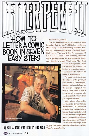 Images from WIZARD #54, Feb 1996, © Gareb Shamus Enterprises Inc.
In 1996, when I was 45, I was already beginning to letter digitally, but the majority of my lettering was still done by hand. I was contacted by writer Paul Grant, who I knew through Compuserve I think, about doing a how-to article for WIZARD magazine, then a popular newsstand monthly used as a resource for comics fans, collectors and buyers. I agreed, and planned out a tutorial with Paul that would be illustrated with photos taken in my studio as well as my hand-lettered title and item numbers. I can’t recall exactly how the writing process went, but I probably sent my suggested text to Paul and he put it in the final form seen here. I can see he made some clarifying additions. I found my copy of the magazine recently, and while some of the type is small, I thought the four page article might be of interest.
After it came out, I photocopied it and sent it to friends and family. In my attached note sent with the mailing, I said, “The photo-shoot was something. They sent two New York City photographers down to our place [in southern New Jersey] in a raging rainstorm. The two, lead photographer Rob Kinmonth and his assistant, filled our living room and my studio with equipment, and had lights and wires everywhere, including outside the studio window in the rain! Luckily, Ellen was at work, so she missed it all, and the cats were too scared to get in the way. They shot twelve rolls of film in three hours, then off they went. Quite an experience.”
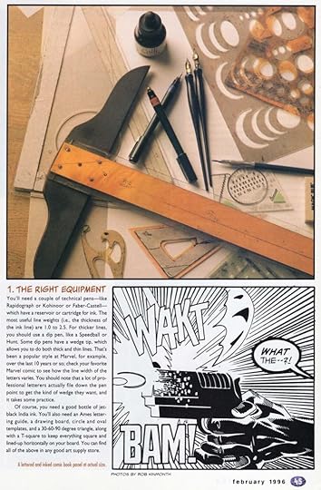
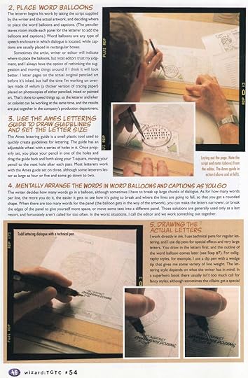
Sorry about the image quality, this is the best I can get on the blog. One problem that came up when I knew the photographers were coming was that I had no penciled comics pages to letter, which is one thing they wanted to see.
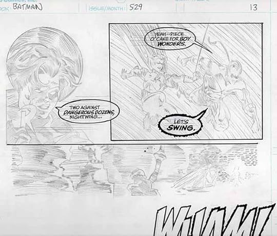
I did have photocopies of a recent Batman story, and a blank piece of DC art paper, so I created my own penciled panels by tracing over a photocopy on my light box to give me what I needed. A finished inked panel Xerox is on the second page of the article, above, while on page 3 is my imitation pencil art being lettered, original above.
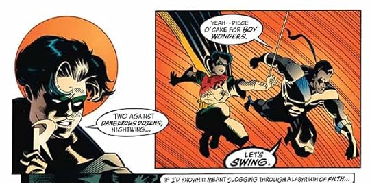 From BATMAN #529 page 13
And here’s the printed version, written by Doug Moench, art by Kelley Jones and John Beatty, colors by Greg Wright, letters by me.
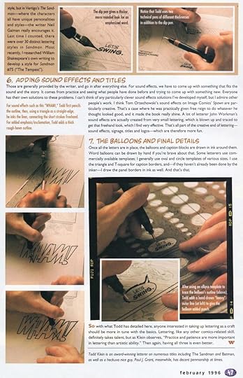
The photos are hard make out especially on this last page, but you can see some of the process. I would continue to letter pages for DC Comics by hand until about 2002, but starting in 1995 I was already doing cover lettering on my first Apple desktop computer, printing out the lettering, faxing it to DC, then when approved, mailing the printouts. Soon DC was using computers too, and I was able to send digital files instead. We’ve come a long way since then, and I haven’t lettered anything by hand in years, so this is now ancient lettering history, I guess. My own ancient history, too!
The post Letter Perfect WIZARD Article 1996 appeared first on Todd's Blog.
March 12, 2023
Rereading: THE INVISIBLE ISLAND by Dean Marshall
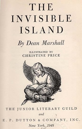
The four Guthrie children, Alan, Dit, David, and Winkie, live in a rented apartment with their parents, and struggle to maintain the quiet their landlord and neighbors want. A new neighbor, John Leigh, understands their problem, and suggests there might be a home for the family in the small rural town he’s from. This idea meets with approval, and soon the Guthrie family is moving to a lovely country home on a large parcel of land. At the back of their new yard is a lake and a wide stream, and beyond that is forest. The Guthrie children have been camping before, and the idea of camping in the woods appeals to them. The family explores those woods and discovers they’re surrounded by two branches of another small stream, making it technically an island, though one invisible to the eye. The children beg to be allowed to camp on the island, and they’re given the chance. Tents and supplies are brought over on a raft they build, and soon they have a cosy camp. Exploring the island is one of their activities, and exciting discoveries are made, but strange things also happen suggesting someone else is also there, hidden from sight. There are hills to climb, a secret cave, a stone hut to build, shipwrecked sailors, and more appealing adventures.
The author’s full name was Clara Dean Marshall, and her books are enjoyable reading. I like this one from the endpaper map on. Recommended.
The Invisible Island by Dean Marshall
The post Rereading: THE INVISIBLE ISLAND by Dean Marshall appeared first on Todd's Blog.
March 9, 2023
Rereading: TREASURE MOUNTAIN by Evelyn Sibley Lampman
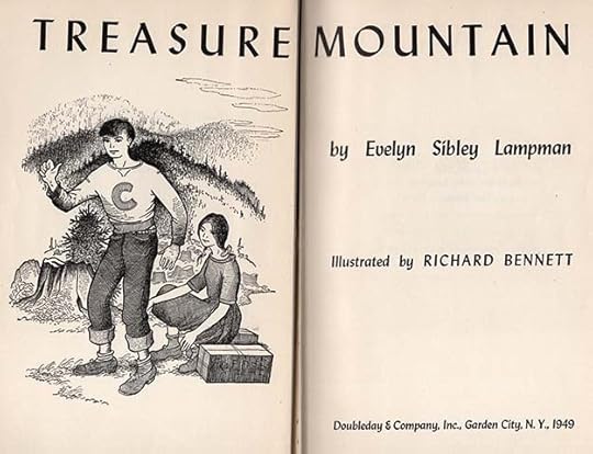
Hoxie and Irene are native American children whose parents have died, and they’ve been placed in a government-run school at Chemawa in Oregon, where they feel a bit like prisoners. An unexpected letter arrives inviting them to come and stay for the summer with a great aunt they’ve never met in Nehalem on the Oregon coast. Their Aunt Della Sisson doesn’t read or write, so the letter has been written by the Nehalem postmaster. The children are happy for a chance to escape school, and hitchhike their way to Nehalem, where the postmaster drives them to the remote cabin of their aunt. It’s a primitive shack on a hillside over the water’s edge, and their aunt turns out to be very old, and hard to communicate with, as she will not speak any English. At first the children are almost sorry they came, but gradually they and their aunt grow to like and understand each other, especially after Hoxie and Irene begin to remember the native language they were taught as young children. Soon they are helping Della in her basic survival existence, gathering blueberries and clams and weaving baskets to sell, catching fish to eat, and learning to find and prepare native herbs and plants from the nearby mountain that once belonged to Della’s tribe, of which she is now the lone survivor.
Hoxie and Irene make a few local friends, and soon learn that a pirate treasure is said to be buried somewhere on this part of the coast. Della has heard the stories, but wants no part of any such treasure. One of the children’s new friends is doing a large dig for it, but so far has had no luck, and Hoxie starts his own dig nearby. The children have always planned to return to their school at summer’s end, but then they learn the school has been closed, and realize they must make a new life with Della. Bad news arrives when the local tax collector tells them she owes seven years of back taxes on her property, and if she can’t pay it soon, the land will be sold. Will the children find a way to save their new home?
Lampman was a prolific writer of books for young readers, this is her second one. It’s skillfully done, and a pleasure to read. Native Americans often figure in her stories, handled with sensitivity and care. Recommended.
Treasure Mountain by Evelyn Sibley Lampman
The post Rereading: TREASURE MOUNTAIN by Evelyn Sibley Lampman appeared first on Todd's Blog.
Todd Klein's Blog

- Todd Klein's profile
- 28 followers

