
Todd Klein's Blog, page 42
June 21, 2023
Incoming: SANDMAN OVERTURE ABSOLUTE EDITION New Printing
 Image © DC Comics
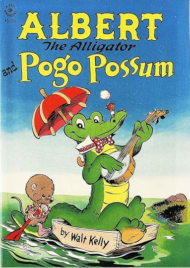
A new printing of this massive deluxe hardcover has arrived. The only difference I see on the outside from the 2018 printing is the replacement of the Vertigo logo with a DC one. It’s surprising to me that the original series came out ten years ago, it seems more recent, but that happens when you’re old! Written by Neil Gaiman, art by J.H. Williams III, who also did some of the coloring, the rest is by Dave Stewart, lettered by me. Actually a prequel to the Sandman series, so not a bad place to start. Certainly the best printing and paper, not to mention larger size than other editions. Retail price $150. My copies will go on eBay some time in August probably. Amazon link below.
Sandman Overture Absolute Edition
The post Incoming: SANDMAN OVERTURE ABSOLUTE EDITION New Printing appeared first on Todd's Blog.


June 20, 2023
ARTIE SIMEK (and Sol Brodsky) at Marvel Comics Part 2
 From MARVEL TALES #93, Aug 1949. This and all images © Marvel
In Part 1 of this series I outlined the life and career of Artie Simek, who I believe was working for Timely, the company now known as Marvel Comics, by the spring of 1946, and who worked there until his death in 1975. In Parts 2 to 4 I’m going to look at some of the logos and cover lettering that I think were Artie’s main occupation at Marvel, at least until 1957, and a good part of his work until the mid 1960s. Above is an example that has the kind of wavy letters Artie often used on scary subjects. There’s very little real evidence of who designed logos for Marvel until the early 1960s, so this is mainly guesswork based on style, and not every logo is covered because some of them are so bland and ordinary that they give no clue as to who did them. Before we get into logos I think might have been designed by Simek, let’s go back to the beginning.
 UNCANNY TALES, April-May 1939
 MARVEL SCIENCE STORIES #5, Aug 1939
Before he started publishing comics, Martin Goodman published pulp magazines, which, like comics, needed large, colorful, eye-catching logos. I don’t know who designed logos for Goodman’s pulps, but they were effective.

 From MARVEL COMICS #1, Nov 1939, and MARVEL MYSTERY COMICS #3, Jan 1940
Here are two of the first few comics published by Goodman, and you can see how similar the logos are to the ones on his pulps, so I’m guessing they were done by the same unknown designer. Many early Timely (Marvel) comics had similar pulp magazine inspired logos, and the same was true at other publishers. Block letters were the most frequent design choice.
 From CAPTAIN AMERICA COMICS #1 & 2, March-April 1941
One exception in the vast unknown is the designer of these two Captain America Comics logos. Joe Simon claimed credit for them, he liked to design logos for books he worked on and edited. The top one is the most interesting, with the stars, flag banner, and angled stroke ends on some letters. The caption lettering is probably by Howard Ferguson, and he might have helped with the logos. The second one is more standard block lettering with telescoping to make it three dimensional, though still with slightly angled stroke ends, and both are well done. Simon was hired by Martin Goodman as his first comics editor, and Joe might have had a hand in other logos for the company during the short time he was there. The second of these was on the rest of the book’s long run.


 From THE HUMAN TORCH #2, Fall 1940, and SUB-MARINER #1 & 2, Spring & Summer 1941
A few other early Timely logos broke the pattern of standard block letters like the first and last of these. I particularly like the flaming HUMAN TORCH logo and the large burst around it. Joe Simon might have been involved, or another possible designer is artist Alex Schomburg, who did the cover art for these issues and many other early Timely covers. He was also doing illustrations for Goodman’s pulps, and he had a good eye for detail and structure, but those are guesses. It’s unlikely that Torch creator Carl Burgos or Sub-Mariner creator Bill Everett were involved, as they were working for Funnies, Inc., who supplied stories to Goodman, while the covers would have been done separately at Timely.
 From JOKER COMICS #1, April 1942
There were a few exceptions, but most early Marvel logos went with block lettering in some way. Here the letters are tilted to various angles, but does that make them funny enough for a humor comic?
 From MILLIE THE MODEL #1, 1945
Millie’s logo used well-designed serif letters that were probably meant to look like the logo of a fashion magazine. Other variations followed.
 From PATSY WALKER #1, Summer 1945
Martin Goodman imitated whatever trends seemed to be popular, these two titles were in the teen humor category, a success for Archie comics at MLJ. Patsy’s first logo is appealing mixed case italic letters.
 From PATSY WALKER #6, Aug 1946
With this issue, a different all-caps style begins, and the letters have graceful curves, while the S is the only one with ball-end serifs. Could this be an early logo by Artie Simek? My first guess would be no, but then I found other logos from the 1950s using the same style that are very likely by Artie, so it probably is an early one by him. And unlike most Marvel titles, this one kept the same logo until it ended in 1965. Simek was often asked to do new logos for existing or relaunched titles, so the fact that this one didn’t change in almost twenty years suggests he did it and thought it didn’t need changing.
How did Artie become a logo designer at Timely? As far as I know he was a self-taught artist, and the only pre-comics published and credited work known for him are his sports cartoons. Those have lots of comics-style lettering, suggesting Artie was a comics reader, but no logos. The other well-documented activity by Artie was baseball and stickball, but none of those things would have made him much money, so he must have had other jobs. His entry in the 1940 census offers no clues, it lists no job or occupation for him and shows him still living at home at age 24. Perhaps Simek found work using art, where he could develop logo design skills, but if so we have no record of it. Somehow he landed a staff production job at Timely, where his lettering would have been useful. Perhaps he looked at existing Timely logos, or logos on other magazines, and when asked to do some, used them as reference and found it was another skill he could develop. That sounds a bit far-fetched, but it’s about how it happened for me when I was hired by DC Comics in 1977.
 From CINDY #27, Fall 1947
This teen humor title starts with standard block lettering for the logo. It might have been done by Artie, imitating others already in use, but it’s so bland there’s no clue to who designed it. The cover lettering does look like Simek to me, another area where Artie’s work was seen more and more often.
 From CINDY SMITH #39, May 1950
When the book was briefly retitled CINDY SMITH, the logo used the same style shown above for PATSY WALKER that I’m guessing was by Simek. This has the ball-end serifs on the S and C, and the same graceful curves and shapes. The timing of this logo is worth noting, it was probably commissioned in late 1949 after the first large staff layoff required of editor Stan Lee by his publisher Martin Goodman, so it’s unlikely there was anyone else left to design it other than Artie, who somehow managed to weather all the layoffs.
 From JUSTICE #7, Fall 1947
Another generic logo on this book, but the cover lettering looks like Simek’s work. The curved in perspective arrow is well done
 From OFFICIAL TRUE CRIME CASES #24, Fall 1947
Some of this cover lettering is type, but the balloons and bottom right caption look like Artie’s work. He might have done the logo, one clue is the barely visible rough ends on TRUE CRIME CASES.
 From ALL-TRUE CRIME CASES #26, Feb 1948
When the title and logo changed, there were no rough ends. The shape of the R’s is interesting. The cover lettering is probably by Simek, and the color treatment in the balloons kind of presages the heavy borders he would later use on covers. Note also the parentheses around GASP in the second balloon, the original way breath marks were indicated. That changed to dashed parentheses that morphed to the radiating marks used later.
 From TWO-GUN KID #1, March 1948
This is another title with a bland block letter logo, but one that remained unchanged until the title ended in 1977, again remarkably long for the company. Could it have been designed by Simek, who thought it was fine and didn’t need changing? Impossible to say. The cover lettering here is probably by him.
 From MITZI’S BOY FRIEND #2, June 1948
When Mitzi’s own title spun off this one, her name remained in block letters, but wider and thicker ones that suggest Simek to me, as does the style of the second line drawn to imitate rounded brush strokes. I’m not sure about the balloon lettering, but it’s probably by Artie.
There were other staff letterers at Timely, at least until the layoff of 1949, the main one being Mario Acquaviva, who started working at the company in 1942 while in the Army but stationed locally, but then served in Europe for a while. When he returned, he was put in charge of letterers at Timely, according to a 2009 interview with Leon Lazarus in Alter Ego #90 (TwoMorrows). Lazarus worked under him as did Veda Lufkin, Alberta Tews, Danny Crespi, Gary Keller, Morrie Kuramoto, Bob Lander, and probably more. I’m not sure how payment was handled, whether letterers were paid by the page or on salary, but probably the former, and the pay rate was likely low. If any of those people designed logos, there’s no record of it. Most of the production staffers at Timely in 1949 were laid off, though a few were rehired in the early 1950s.

 From KID COLT #1 & #3, Aug & Dec 1948
Kid Colt, another long-running western character, began as a hero, but soon became an outlaw, as seen above. The first issue logo is nicely done, but I think not by Simek. The new one on issue #3 might be his, though it’s generic except for the off-model W. Again, this logo lasted a very long time, until the final issue in 1979, so it might also have been one that Artie did and liked, so he resisted revising it, but that’s only a guess. The caption lettering on both is probably by Simek, not sure about the balloon.
 From COMPLETE MYSTERY #1, Aug 1948
This cover is full of Simek lettering, it must cover a third of the page, and DEAD in the logo is the first example I’ve found of the wavy-edged letters he liked to use for scary subjects. I imagine he also did the book in the logo. This title was short lived, and each of the four issues has a different logo, all probably by Simek.
 From LAWBREAKERS ALWAYS LOSE #1, Spring 1948
This and the previous title are two of many crime comics Timely was putting out in response to success in that genre by Charles Biro and others started by CRIME DOES NOT PAY from Lev Gleason, beginning in 1942. As usual, Goodman’s knockoffs were second-rate imitations that didn’t last long. Simek might have done this block letter logo, which at least uses interesting perspective, and the cover lettering looks like his.
 From LOVE ROMANCES #6, May 1949
Romance comics was genre started by Joe Simon and Jack Kirby with YOUNG ROMANCE at Prize in 1947. Goodman was quick to follow this trend with many romance titles of his own. The logo on this one is generic block letters which could have been designed by anyone.
 From LOVE ROMANCES #13, Oct 1950
But this revised logo looks more like Artie’s work, and it was done after the 1949 layoff, so even more likely to be his. His cover lettering is getting bolder than ever here to attract attention, and I really like the jagged square ends of the large caption.

 From LITTLE LENNY #1 and LITTLE LIZZIE #1, June 1949
Another genre Goodman tried was little kid humor. I don’t know if Simek did these logos, but I like them, and think they work better than standard block letters.
 From COMEDY COMICS #8, July 1949
A teen humor anthology with a logo probably by Simek. I think he did the balloons too. The letter shapes of COMEDY are slightly Art Deco.
 From LITTLE ASPIRIN #1, July 1949
Another little kid humor book with a similar logo approach and Simek balloon and label lettering.
 From CAPTAIN AMERICA’S WEIRD TALES #74, Oct 1949
Superheroes fell out of favor after the end of World War Two, with only the top sellers surviving. Captain America was Timely’s top seller, but even it was failing by this time, and Goodman tried turning it into a horror title. It only lasted two issues. I think the logo is by Artie, though he didn’t use drippy letters very often, and he also did the round caption.
 From FILM FUNNIES #1, Nov 1949
Cartoon-inspired funny animals was a genre that Timely never did very well, this one lasted two issues. I think the logo and cover lettering is by Simek.
 From LITTLE LANA #8, Nov 1949
One more kid humor title, and the logo is quite ambitious. I think it’s by Artie, though I’m not sure he did the balloon. This is the last new Timely title begun in the 1940s, I’ll continue next time with more 1950’s titles and logos.
Thanks to Alex Jay for his invaluable research help.
The post ARTIE SIMEK (and Sol Brodsky) at Marvel Comics Part 2 appeared first on Todd's Blog.
June 18, 2023
Rereading: GREEN SMOKE by Rosemary Manning


This was in my grade school library, and later I found my own copy. Sue is on holiday at Constantine Bay in Cornwall with her parents. While they sunbathe on the beach, Sue explores over the rocky ridge next to it, and in a small, secluded cove she finds a cave, out of which trails a wisp of green smoke. There’s a large sneeze, and a much larger burst of smoke comes forth. Soon, Sue has met the dragon who lives in the cave, hiding from most people, but willing to talk to Sue. The dragon’s personality makes this story work, he’s a bit vain, a glutton for the buns and other treats that Sue brings him as they get to know each other, and loves to tell stories about his own past, and of people he knew like King Arthur. The stories take up much of the book, and they’re beautifully retold with humor and wonder. Susan and the dragon also go on a few expeditions, one to meet his friend, a mermaid. The dragon has some magic in him, for instance he can magically place notes to Sue under her pillow, and he can fly invisibly with Sue. He’s ashamed of his youth, when he was fierce and ate people, he’s much gentler now. He’s a bit quick to take offense, but he and Sue enjoy a few weeks of stories and adventures in this charming book. There were a few sequels that I remember not liking as well, this one is recommended.
Green Smoke by Rosemary Manning
The post Rereading: GREEN SMOKE by Rosemary Manning appeared first on Todd's Blog.
June 15, 2023
ARTIE SIMEK (and Sol Brodsky) at Marvel Comics Part 1
 From FOOM #17, 1977, the Marvel Bullpen about 1954, this and all Marvel images © Marvel
In these articles I’ll be studying the logo and cover work of letterer Artie Simek and production man Sol Brodsky at Marvel Comics. Part 1 is a biography and career summary of the two men, Parts 2 to 4 will be a look at the many logos I think Artie Simek designed from the late 1940s to the early 1960s, and Part 5 will focus on the logos Brodsky and Simek worked on together that helped usher in Marvel’s rise in the early 1960s, and also Simek’s important role in getting printed credits for letterers. First some background on the company.
 MARVEL COMICS #1, Nov 1939, the first comic book from the publisher.
In the mid 1930s, Martin Goodman and his brothers entered the New York publishing business with a line of pulp magazines. Like Harry Donenfeld and Jack Liebowitz, who moved from pulps to comics with the company that became DC, Goodman saw the success of DC’s Superman as a signpost to profits, and in 1939 he began publishing comic books with the title MARVEL COMICS, soon MARVEL MYSTERY COMICS. At first Goodman bought content packaged by Lloyd Jacquet’s shop Funnies, Inc., who provided Goodman’s early successes The Human Torch, The Sub-Mariner and other characters. By 1940 Goodman had hired Joe Simon as an editor, who with his partner Jack Kirby created CAPTAIN AMERICA, the most successful series and character Goodman had in his first decade as a comics publisher. Simon gathered a small staff to produce comics in-house for Goodman, including letterer Howard Ferguson, and Goodman hired his wife’s cousin, Stanley Lieber, as their office assistant. His first work in comics was writing text pages for CAPTAIN AMERICA under the name Stan Lee. By late 1941, Simon and Kirby had left Goodman and their creations for him over unpaid royalties, and Stan was put in charge of Goodman’s comics line, which went under a variety of company imprints, but was generally known as Timely Comics in the 1940s and Atlas Comics in the 1950s. Goodman’s strategy was to follow whatever trend seemed popular and to flood the newsstand with a large volume of short-lived titles. When superheroes waned in popularity after the end of World War Two, many other genres like war, westerns, funny animals, teen humor, crime, and horror took their place.
 Inside front cover of TERRY-TOONS COMICS #47, Aug 1946
In 1943 Goodman’s comics publishing company moved to the fourteenth floor of the Empire State Building in Manhattan, and by 1946 the staff under Stan Lee had grown to over twenty people, as seen on the staff list from TERRY-TOONS COMICS #47. Along with artists of future fame like Al Jaffee, Jim Mooney, and Mike Sekowsky were some letterers including Mario Acquaviva and Arthur Simek.
 Artie Simek from FANTASTIC FOUR SPECIAL #7, Nov 1969
Arthur Milton Simek was born January 6, 1916 in Queens, New York, the youngest of three sons. His two passions were sports, especially baseball and stickball (a street or indoor version of baseball), and drawing. He played on various teams in high school and later, though probably never rising to the level of paid teams, and newspaper reports of him spoke of “great fielding.” He became the manager of the Elmhurst Islanders Baseball Club in 1940, but soon gave up that position to be their pitcher. For lots more about Artie’s early life and his stickball and baseball career, see THIS post from Alex Jay, whose research has been invaluable to this article.
 Artie Simek sports cartoon in the Long Island Daily Press, Sept 21, 1940
Pursuing his other interest, Artie began drawing sports cartoons, often about baseball, for the Long Island Daily Press. Alex Jay has found 21 of them running from July 13, 1940 to September 19, 1941. Simek also had sports cartoons in the Star-Journal of Long Island City, New York in 1944, some in the Brooklyn Dodgers and New York Giants club magazines, and other places. For many more of Artie’s sports cartoons, see THIS article on Alex’s blog. As you can see in the example, they often featured word balloons and other lettering very much in the style of comic books. The Star-Journal’s sports column by Lou O’Neill for April 21, 1944, had the following:
Simek, who used to be an athlete himself, lives at 74-22 46th Avenue, Elmhurst, and found out that he got a greater bang out of drawing athletes than participating with them in various sports. SOOOoooooo, he gave with the India Ink and the fancy lines only to meet with plenty of rebuffs when his work failed to display that professional touch. But Artie never said quits in sports and he never said quits as a sports cartoonist. For more nights than he admits to, he passed up movies and other entertainment to practice away hour after hour. That his labors have borne fruit is obvious after one look at his drawings today.
It’s unknown exactly how or when Simek began working at Timely Comics, but another article in the Star-Journal of April 9, 1946 suggests he was doing so by then: “Former sports cartoonist Art Simek of Jackson Heights is now making strides in the cartoon field…Draws such horror funnies for the kiddies he can’t sleep nights…” While the writer says Artie was drawing comics, it’s more likely he was lettering them, I don’t know of any comics stories he drew, but I could be wrong. The TERRY-TOONS staff list, above, was likely created in early 1946 as well, so certainly he was there by then. In 1944 he married Emily Ehring and they had a daughter, Gloria Jean, so perhaps becoming a family man encouraged Artie to take a staff job with steady income.
 From THE HUMAN TORCH #29, Winter 1947, Sub-Mariner story
We don’t know exactly what Artie was doing at Timely, but the lettering on this story looks like his work to me. Like most of his later lettering (and his sports cartoons), it’s done with a pointed pen rather than a wedge-tipped one, and the letters are very even and regular, most would fit into a narrow rectangle. The line weight is fairly heavy, with emphasized words slanted and heavier, and the balloons tend to be wide with blunted ends. It almost suggests Leroy lettering, but it’s clearly hand-drawn. There isn’t a lot of story lettering at Marvel in the 1940’s that looks like this, though, so what else was Simek doing? We have a clue in an interview with former Timely production man Leon Lazarus from Alter Ego #90 (Dec 2009, TwoMorrows):
“We were on the 14th floor of the Empire State Building. The letterers were gathered in the production room, away from the artists. In that room with me were many people. Mario Aquaviva was in charge of the letterers, but Artie Simek was over him. Artie was a tall, skinny guy, very nice and quiet, with a big Adam’s apple. He never pushed anyone around. He didn’t letter stories, he did logos.”
 From MYSTERY TALES #5, Nov 1952
That suggests Simek had become a logo (and cover lettering) specialist by the late 1940s, something he did for many years at Marvel through their Timely and Atlas incarnations into the rebirth of Marvel super-heroes in the 1960s. I don’t know how that happened, perhaps Artie simply found it was something he could do well enough to satisfy Stan Lee and Martin Goodman. On the example above, the logo letters are shapes Simek often used, and both they and some of the caption lettering have wavy, rough outlines he also liked for scary stuff. The word balloon, though larger, is similar in style to the ones in the page shown above. Even with so many new titles being produced, logos would not have been enough to keep Artie fully occupied, but if you add in the cover lettering on many issues (some used only type), that would certainly have kept him busy. I’ll discuss Simek’s logos in more detail in later parts of this article series.
According to Sean Howe in his book “Marvel Comics: The Untold Story” (HarperCollins 2012), publisher Martin Goodman was an unpredictable boss, at times generous, and other times hard-nosed. Comics editor Stan Lee made a practice of buying extra stories to use as backups if something was running late, and in 1949, Goodman discovered a large stack of these paid-for stories in a closet. He ordered Lee to use up this inventory and lay off most of the staff creating new work. Around this time, Goodman moved out of the Empire State Building to new offices at 655 Madison Avenue, where he focused more on other kinds of magazines: true confessions, movie gossip, crossword puzzles, and racy action-adventure titles like MALE and STAG. Stan Lee gradually built up his comics staff again, some are in the first photo in this article, as Goodman continued to put out lots of new titles, but the staff purge would happen again in 1954, when congress was putting pressure on comics to self-censor violent content, and in 1957 when Goodman’s distributer went bankrupt and he was forced to sign a distribution deal with Independent News, owned by his rival DC Comics. The deal limited Goodman to eight new titles a month, far fewer than he had been putting out. Again, the staff was fired as Lee was ordered to use up inventory, this time almost everyone but Stan Lee was let go. Artie Simek was still needed to letter covers and do logos, but he often worked at home. Staff letterers Joe Letterese and Stan Starkman found work at DC, other staffers like Sol Brodsky went to other companies or out of comics. Simek had remarried to Dorothy Ashburn in 1952, and now also had two sons, Glenn Arthur and Wayne, so the income from his Marvel work was needed, and when new stories eventually began to be produced, often short horror or fantasy tales, Artie lettered most of them. Before that, when work was slow, Simek did some story lettering for DC Comics and other publishers for the first time. In an interview with artist Joe Giella in Alter Ego #52 (Sept 2005, TwoMorrows), Joe reported: “Artie Simek was on staff at Timely. He lived in Queens, and he also used to work out of his bedroom; he had a little drawing table in there. I used to drive to his home and pick up jobs he’d lettered, then take them home and work on them.”
 From WESTERN OUTLAWS #9, June 1955
By the mid 1950s, Artie’s balloon borders on covers were often thicker and were sometimes held in a color to grab more attention. The bottom circular caption here is all type, probably done on an in-house headline machine, perhaps by Simek himself. Even in the lean times after the 1957 purge, Atlas Comics, as Marvel was known in the 1950s, was turning out those eight issues a month, and they needed logos and cover lettering by Artie when they weren’t all type.
 From FANTASTIC FOUR #5, July 1962
In 1961, Marvel began a superhero revival that changed the company’s fate forever. Martin Goodman had been noticing DC’s success with revamped superheroes like THE FLASH and GREEN LANTERN, and their new team book with a group of heroes, THE JUSTICE LEAGUE OF AMERICA was selling well. He gave Stan Lee the okay to move back into superhero stories. Lee had become dissatisfied with his comics career and was thinking of quitting. His wife Joan suggested this was an opportunity to try something new in his comics writing, and Lee did that, creating more adult storylines with characters that were not the perfect icons of heroism. Instead they squabbled among themselves, had real world problems, and exhibited character flaws unseen in superheroes to that time. He had a great deal of help from artists like Jack Kirby and Steve Ditko, who took on a major part of the visual storytelling to which Stan added the words lettered by Artie Simek and others. To help with the cover designs for his new approach, Stan called back one of his former Bullpen employees, Sol Brodsky.
 Sol Brodsky, from THE MIGHTY MARVEL COMIC CONVENTION PROGRAM BOOK, 1975
Solomon Richard Brodsky was born April 22, 1923 in Brooklyn, NY, the oldest of four children. He decided early in life to pursue a career in cartooning, and took a job sweeping floors at Archie Comics (MLJ) to break into the industry. He did some early art for several publishers, including Timely starting in 1942. Brodsky served in the U.S. Army Signal Corps during World War Two, and afterward he married Selma Cohen in 1948 and they had two children, Janice and Gary. Some time around 1950 he started penciling and inking for Atlas Comics, and joined the Marvel Bullpen. He was laid off in the 1954 staff purge, but fellow artist Stan Goldberg recalled in MARVEL AGE #22 (a Sol Brodsky memorial issue, January 1985): “They needed someone on production to handle things since there was no real staff. I would come in a couple of days a week to help out, but I had a lot of my own freelance stuff, so I couldn’t do much. Stan got in touch with Sol. Stan was a one-man department, and with Sol it became a two-man department.” Stan Lee, in the same magazine, said, “Sol and I were the whole staff of Atlas Comics. I bought the art and scripts and Sol did all the production. And then little by little we built things up again.” Brodsky was laid off once more after the 1957 Atlas line cutback and pursued other publishing ventures, including comics for the Big Boy restaurant chain. In 1958 he became the founding editor of CRACKED, a MAD lookalike.
 From AMAZING ADULT FANTASY #7, Dec 1961
While working for CRACKED, Brodsky continued to freelance for Stan Lee, and according to Mark Evanier, who asked Sol about it, he and Artie Simek developed the logos for the Marvel superhero revival beginning in 1961. Sol did not specify exactly who did what, but it’s likely that Sol did pencil designs and Artie inked them, though the process may have varied, as some of the logos look more like typical Simek work than others. First out was the new title THE FANTASTIC FOUR with a logo that suggests 1950s advertising lettering to me, but few recall the matching logo from the same time for AMAZING ADULT FANTASY, both shown above. The latter had the tag line, “The Magazine That Respects Your Intelligence,” showing where Stan Lee wanted to take his new books, though that particular one was still full of the short monster stories Atlas had been featuring in several titles for some years. I’ll discuss the Brodsky-Simek Marvel logos in detail in Part 4 of this article series.
From 1958 to 1967, Marvel was limited by Independent News, their distributor, to eight titles a month, but they did sixteen bimonthly titles. When the quota was lifted in 1968, new Marvel titles began hitting the newsstands on a regular basis, and more creative talent of all kinds was needed, including letterers. Sam Rosen had joined Artie Simek as a regular letterer on stories and covers in the early 1960s, and he began doing logos as well, suggesting that Simek was cutting back in that area, while Artie seemed satisfied just lettering stories. In 1971, Gaspar Saladino began doing logos for Marvel, and when Sam Rosen stopped lettering in 1972, he stepped into the main logo designer role. More bad news would soon follow. Sadly, a black-bordered box in the Sept 1975 Bullpen Bulletins pages in all Marvel comics said:
On February 20th, 1975, early in the morning, the comic book industry lost one of its foremost talents. ARTIE SIMEK died. For some thirty-odd years, the majority of his life, Artie produced a veritable mountain of work and gained a reputation for being a true professional. He was one of the cornerstones in building the mighty world of Marvel and his efforts cannot be ignored. To those of us who were privileged to know Artie, he was a valued friend, a unique personality, and an irreplaceable co-worker. He will be missed.
That heartfelt tribute was probably written by Stan, who had worked closely with Artie for much of his career.
Sol Brodsky was in and out of Marvel over the years, joining the staff as production manager in 1964, leaving in 1970 to launch Skywald Publications, and returning in 1972 as Vice President of Operations. Essentially, when he as there, he was always Stan Lee’s right-hand man. Sol passed on June 4, 1984. Both Simek and Brodsky had seen a remarkable evolution in the company and international blockbuster franchise now known as Marvel, and played important parts in it. More on Artie Simek’s many logos and the Brodsky-Simek logos to follow.
The post ARTIE SIMEK (and Sol Brodsky) at Marvel Comics Part 1 appeared first on Todd's Blog.
June 13, 2023
And Then I Read: INK BLOOD SISTER SCRIBE by Emma Törzs

I read a review of this new first novel on NPR, it sounded right up my alley: a library of hidden magic books. I read the ebook and loved it.
The Kalotay family is hiding a dangerous secret deep in a basement vault, a library of books that can be read with the help of the reader’s blood to put spells into effect, real magic. Father Abe is the librarian, his wife Cecily helps, their two girls, Esther and Joanna, live a happy childhood with them. Joanna, like her parents can hear the magic, and read the spells, and Abe trains her to use them and protect the library. Esther cannot, nor does any magic have an effect on her. When Esther is eighteen, she’s sent away by Abe because her presence puts them all in danger. Someone is looking for the library, and Esther would be their way in. Sadly, without really explaining to her sister, Esther begins a nomadic life, changing homes and jobs once a year to confuse the finding spell. Cecily wants to break the wards that protect the Vermont house and library so that Joanna can have a normal life, but Abe insists its too dangerous. They split, and Cecily takes up residence in the nearby town.
One day Joanna finds Abe dead on the front lawn clutching a magic book she’s never seen before. She tries desperately to contact Esther, but can’t. Cecily won’t or can’t tell her what she knows. Joanna’s life becomes a lonely one, trapped in the house by responsibility, the sole protector of the library. Esther, as the book opens, is in Antarctica, working on a base there as an electrician. She’s found a lover, Pearl, and is tired of leaving everything behind once a year. What could trouble her in this isolated place? She decides to stay past the travel date, and that’s when all the trouble starts her her.
Meanwhile, we meet Nicholas, wealthy nephew and heir to a much larger magic library near London. This one is also older, having been started in the 1600s, and kept in the control of Nicholas’s family. His uncle Richard is in charge, a charming, clever man who uses the library to make a great deal of money by creating custom spells for rich clients. Those spells must be written in blood. The writer is Nicholas, with help from Maram, a woman who is the chief librarian and like a mother to the boy. Nicholas’s life is also in danger, as demonstrated by an attack on him in the company limousine leaving London, in which his bodyguard Collins is just able to save him. Like Joanna, Nicholas leads a lonely life, and his health is constantly threatened by the loss of blood needed to write new books and further the family business.
These two main threads gradually come together in surprising ways, the characters are wonderfully real, the situations are full of suspense and emotional resonance. It’s a fine book that I had a hard time putting down. One of those where you keep checking to see how far along you are because you don’t want it to end, rather than being impatient for that. Highly recommended.
Ink Blood Sister Scribe by Emma Torzs
The post And Then I Read: INK BLOOD SISTER SCRIBE by Emma Törzs appeared first on Todd's Blog.
June 11, 2023
Rereading: THE WEE MEN OF BALLYWOODEN by ARTHUR MASON


Before Terry Pratchett’s Wee Free Men, there were the Wee Men of Ballywooden, a band of charming Irish fairies described in stories by Arthur Mason, and beautifully illustrated by Robert Lawson. This was Lawson’s first illustrated book, and the illustrations are not only full of their own charm, but also replete with detail and very accurate to the stories.
There are two long stories in this book, first issued in 1930 (I have the 1952 reprint). In “The Night of the Big Wind,” a hurricane of sorts hits the Wee Men’s seaside Irish town and causes havoc, not the least of which is blowing the Wee Men out over the ocean to a place they’ve never seen and know nothing about. Each of the Wee Men has a name indicating his craft or specialty. In this story, the Paver leads the band, but his magic has been blown away by the wind, and he must depend on others in the band for help in finding a safe place to regroup and figure out a way home. Willie the Wisp has his light to help them, and the Meadow Sniffer uses his nose to lead them, but a large dog in their way is a problem. The Midsummer Mower volunteers to lead the dog on a merry chase away from the band, and soon they find an abandoned cottage to rest in. But how will they ever get home?
In “Coggelty-Curry,” a Jackdaw has stolen one of the Wee Men’s most valued possessions, their bagpipe, and flown away over the ocean with it. This time it’s the Pilot who takes charge, ordering a fleet of fairy ships pulled by curlews in pursuit. The Wee Men follow the trail of the Jackdaw to a tropical island, where the naughty bird is charming all the wild animals with his bagpipe music. How can they catch him and get their treasure back?
These are engaging stories and full of Irish folk wisdom and inventive characters. The illustrations make them even better. Recommended if you can find it.
The Wee Men of Ballywooden by Arthur Mason
The post Rereading: THE WEE MEN OF BALLYWOODEN by ARTHUR MASON appeared first on Todd's Blog.
June 8, 2023
Rereading: OUR LADY OF DARKNESS by Fritz Leiber
 Cover art by Richard Powers
I like the writing of Fritz Leiber, though I didn’t buy it as often as some other authors, but I read a shorter version of this story called “The Pale Brown Thing” in the Jan-Feb 1977 issues of “The Magazine of Fantasy and Science Fiction,” and thought it was the best and scariest story I’d read in a long time. That year I attended a science fiction convention where Leiber was a guest, and I bought the hardcover (a longer version) and had him sign it. I haven’t read it since. One thing I didn’t realize on first reading is how autobiographical the main character is.
Franz Westen is a writer of horror stories living in an old San Francisco apartment building at 811 Geary Street. He’s still mourning the death of his wife and recovering from a bout of alcoholism that followed, but he’s been sober now for a while. He has friends among the apartment building neighbors, including a young female concert pianist, Cal, with whom he’s developed a new relationship, and two male friends, Gun and Sol, as well as the landlord and his family. Franz enjoys looking out his window at distant Corona Heights, and while examining that rocky park with his binoculars, one day sees something that frightens him: a strange, perhaps non-human figure dancing at the crown of the rock. He decides to explore the place in person. When he does, more strange things happen, and worst of all, when he looks back at his own apartment window, he seems to see the same brown figure gesticulating at him while hanging out of his own window. Franz has been investigating a former San Francisco resident author and perhaps cult leader, Thibault de Castries after finding a strange book by him in a used book store, and soon he finds more and more evidence that de Castries was on to something evil and powerful happening in the city that might still be active, and perhaps it’s now focused on Westen himself. Could the strange dancing figure be part of it? If so, how did it get into his apartment, leaving no trace except scraps of shredded paper?
While I didn’t find it as scary this time, I admire the writing of this book, and enjoyed rereading it. It draws influences from interesting places, like H.P. Lovecraft and Clark Ashton Smith, as well as invoking the time and place and real emotions of the author remarkably well. Recommended.
Our Lady of Darkness by Fritz Leiber
The post Rereading: OUR LADY OF DARKNESS by Fritz Leiber appeared first on Todd's Blog.
June 6, 2023
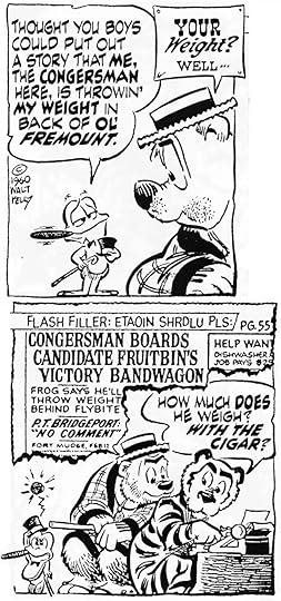
Walt Kelly, George Ward, Henry Shikuma and POGO
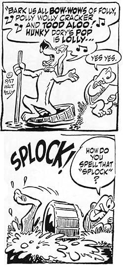
 From POGO Daily, Oct 9 1963, original art from my collection.
 This and all POGO images © Okefenokee Glee & Perloo, Inc. Used with permission.
 Of all the comic strips I’ve seen, not one has better lettering than Walt Kelly’s POGO. The strip has many fine qualities: excellent art, clever writing, charming characters, witty humor, canny satire, whimsy, wisdom…but that amazing, glorious lettering is what gets my attention first. Walt Kelly was a comics genius whose storytelling had many facets. His lettering is an important one, and he had help doing it from his assistants George Ward and Henry Shikuma, though Kelly himself always blue-penciled the lettering they produced. You can see that above, he even penciled the elaborate question mark in the fanciful circus-poster lettering. He was fortunate to have assistants who were skilled enough to create finished letters equally as good, or sometimes better, than the masterful work Kelly did himself.
 Walt Kelly, 1950s, photo by Ed Wergeles for Newsweek, courtesy of Carsten Lacqua
Walter Crawford Kelly Junior was born August 25, 1913 in Philadelphia, Pennsylvania. At two, his family moved to Bridgeport, Connecticut, where Walt grew up. In the book Walt Kelly, The Life and Art of the Creator of Pogo (2012, Hermes Press), Thomas Andrae writes:
Kelly was a precocious artist, starting to draw at age three by copying his favorite comic strips. He was especially influenced by Percy Crosby’s kid strip SKIPPY and Roy Crane’s adventure saga, WASH TUBBS. Kelly was also inspired by the artistry of his father who painted theatrical scenery and taught his son to draw.
During and after high school, Kelly worked as a reporter and editorial cartoonist for the Bridgeport Post, where he drew a daily comic strip about circus owner P.T. Barnum. (I haven’t found any examples.) In 1934 he went to New York City to study art and find illustration work.


From NEW COMICS #1, Dec 1935, images © DC Comics
Among other things, he wrote and drew a two-page excerpt from Jonathan Swift’s Gulliver’s Travels for NEW COMICS #1 from National Allied Publications, later DC Comics. As you can see, he was already doing ambitious lettering. In 1936 Kelly went to California to work for Disney. He was there six years, half in the story department, half in animation. He worked on Snow White, Pinocchio, Fantasia, The Reluctant Dragon and Dumbo as well as short cartoons. Kelly left in 1941 and returned to New York looking for comic book work, armed with a letter of recommendation from Walt Disney himself. He soon found a home at Dell Comics on both Disney and non-Disney features.
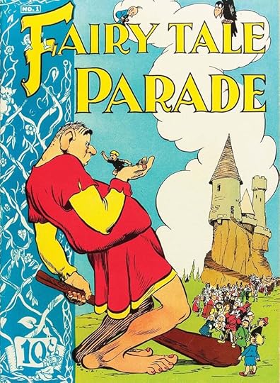
 From FAIRY TALE PARADE #1, June-July 1942, Dell Comics, front and back covers
Editor Oscar LeBeck was delighted with Kelly’s work (who wouldn’t be?), and gave him FAIRY TALE PARADE which Walt produced cover-to-cover: writing, art, and everything else. His lettering and logo design skills were already impressive. Kelly often designed logos for other Dell books he worked on, including OUR GANG COMICS (based on the short comedy films) and seasonal titles like SANTA CLAUS FUNNIES and EASTER WITH MOTHER GOOSE.
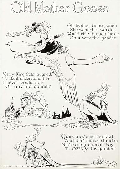 From FOUR COLOR #59 Mother Goose and Nursery Rhyme Comics, Dec 1944, Dell
Kelly’s lettering skills were equally evident inside the comics, where he liked to illustrate poems. His lettering is precise enough to pass for type, but has organic warmth clearly from the same hand as the pictures. Kelly’s knowledge of and skill with lettering, logos and type design is amazing for an artist who was also so talented at drawing appealing, lively figures and animals. He really had it all.
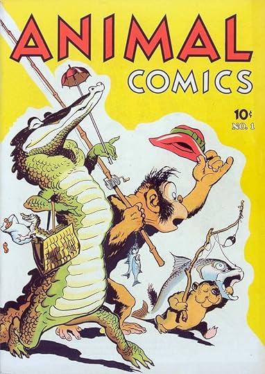 From ANIMAL COMICS #1, Dec 1942, art by H. R. McBride, Dell
It was in another Dell title, ANIMAL COMICS, that Kelly’s future path was set. In the first issue, Albert the Alligator starred in a five-page story by Walt, with Pogo Possum in a bit part. Over time, Pogo became Albert’s partner in the stories…
 From FOUR COLOR #105, April 1946, Dell
…which gained their own recurring title in Dell’s long running anthology variety series FOUR COLOR in 1946. Albert, Pogo and friends also appeared regularly in ANIMAL COMICS until 1948, then returned in sixteen issues of POGO POSSUM from Dell, 1949 to 1954.
 First POGO Daily, Oct 4 1948, The New York Star
In the summer of 1948, Walt Kelly joined the staff of a new left-wing newspaper, The New York Star, doing editorial cartoons and other work. Kelly had gotten comic strip rights to Pogo from Dell, and offered it as a daily newspaper strip to The Star, where it appeared Monday through Saturday starting October 4, 1948. While the art and balloon borders are by Kelly, the lettering doesn’t look like his work. It’s by Walt’s first assistant, George Ward.
 Walt Kelly and George Ward, 1955, courtesy of Michael Barrier
George Arthur Ward was born February 18, 1921 in Scranton, Pennsylvania. By 1940 he and his family were in Philadelphia, where Ward attended the Hussian School of Art. George joined the Marines in 1940 and served overseas from 1942 to 1944. He did cartooning in the service, and while in Australia in 1943 presented a bound book of his cartoons to the President’s wife Eleanor Roosevelt, who was visiting his camp. After returning to civilian life, Ward had a short-lived art studio in Philadelphia with comics artist Joe Maneely, then moved to New York, finding work at various newspapers and magazines. In a 1977 interview with Bill Crouch Jr. published in The Best of Pogo (1982, Simon and Schuster), Ward said:
“On August 10, 1948, I got a job in the art department of The New York Star. What an interesting crowd it was on the art side of the paper—and of course Walt Kelly drew a daily editorial cartoon, and was art director. One day Kelly walked into the art department with his Pogo daily and asked who could do some lettering for him. I said I would. He handed me his blue-penciled strip, told me what he wanted, and I did it. He was happy with my lettering and later asked if I would continue. Walt was busy with The Star, but at home in Connecticut, he was turning out those beautiful Dell comic books for Western Printing. I started working with Walt there in October 1948 and this was mostly comic book stuff — inking and some lettering. He would ink all the main characters and skip where he felt I could ink. [Many of] those comic pages were lettered by an old-timer named Ray Burley (1890-1971). He did a beautiful lettering job and Walt was very pleased with his work.
“Seven months was the life of The New York Star. When the paper folded, Walt asked if I would work with him. I said yes. I’d work in my Greenwich Village apartment awhile and then visit him for two or three days in Connecticut. It was a great setup as I had a small apartment in Kelly’s house. I believe this lasted until around September 1949.“
The New York Star ceased publication on January 28, 1949. By May of that year, the Hall Syndicate had picked up the daily strip, and added a Sunday strip beginning January 1950. In order to get it syndicated, Walt had to give up ownership, but he badgered Bob Hall, the syndicate head, and beginning January 1, 1952, the strip included the words “copyright Walt Kelly.” From then on, POGO was in Kelly’s control. George Ward asked for time off from POGO in late 1949 and did other freelance work from 1950 to 1952, but by December 1952 he was back with Kelly until April 1959. It’s not clear who lettered the strip in those years, probably Walt himself. George said, “Later Walt hired an excellent letterer, Henry Shikuma, who was a great help to Kelly and remained with him for many years.”
 From POGO Daily, July 15 1949
 From POGO Daily, Oct 22 1949
While George Ward’s lettering had been stiff and a bit heavy at first, as seen in that first daily, over the following year it became more relaxed and picked up elements of Kelly’s cartoony art style as Ward gained experience and skill. In these examples, the letters are a better match for the art, and seem to be made with a pen that’s just slightly wedge-shaped, adding a little variety to the lines depending on direction. And of course, Ward was following Kelly’s blue-pencil layouts, and no doubt getting his suggestions on how to make the lettering better.
 Two panels from POGO Daily, Feb 1 1950
By early 1950 when these strips were done, George Ward had probably taken his leave of absence, and the lettering is likely by Walt himself. With the demise of The New York Star, he would have had more time to work on POGO, but there were also the larger Sunday strips to do, so it was lots of work. The expressive quality of the lettering here, and the open sound effect, suggest Walt to me, and as on the early Dell comics, the lettering seems in the same style as the art.
 From POGO Daily, May 29 1950
Pogo eventually had a huge cast of over 500 named characters. With Deacon Mushrat’s debut in the strip, above, Walt made extra work for himself with the character’s Old English speech, suggesting hymnals and old Bibles. It’s a brilliant way to create a distinctive voice, and Kelly had the skill to make it work, though it’s harder to read than regular lettering. He felt his audience would be up to the challenge, and never changed Mushrat’s style through dozens of appearances. Many more character and situational styles followed.
 From POGO Daily, June 6 1951
About a year later, Kelly’s sound effects and emphasized balloon words have developed a square-cornered look made by pointing the corners with a small pen. It’s extra work, but it helps give them weight and importance.
 From POGO Daily, June 22 1951
Kelly’s most ambitious and elaborate style was created for the P. T. Barnum parody, P. T. Bridgeport, the ultimate showman and promoter. Not only is almost every line in a different style or two, but printer’s symbols like stars and pointing hands add even more over-the-top emphasis. Bridgeport’s balloons mimic circus posters, and later, as seen on the first image in this article, they even had pins at the corners, as if fastened to the paper. That breaks the illusion of the strip as a window into another world, but somehow it works, and is no more surreal than those pointing hands. Can’t you hear P.T. holding forth loudly like a barker at a carnival? There’s no pandering in this strip, readers had to step up to the reading challenge, and were rewarded with laughs.
 From POGO Daily, Oct 19 1951
Later in 1951 the regular balloon lettering gets variable thick and thin strokes from a wedge-tipped pen, but this aspect came and went at first. Walt adds a new twist in Pogo’s unusual question mark balloon shape, with dots suggesting uncertainty. The language of Pogo is as playful as the art and lettering, sometimes suggesting a Southern accent as might come from Georgia swamp creatures, other times Kelly’s unique ideas. Often the strips are so full of everything they’re tiring to read in large amounts, but a strip a day works fine.
 From POGO Daily, June 9 1953
With George Ward back on lettering in 1953, and following Walt Kelly’s blue-pencil lettering layouts with skill, another character with a unique style is introduced, the undertaker vulture Sarcophagus MacAbre. His balloon mimics a funeral card with a heavy black border and artful mixed case lettering done with a wedge-tipped pen. The curlicues are another nice touch. In some later appearances the character reverted to regular balloon style.
 From POGO Daily, April 2 1954
 From POGO Daily, Oct 12 1954
Kelly was always ready with a funny style for any occasion. In the first example, the dog detective’s balloons include script entries in his investigation notebook complete with dotted lines to write them on, and in the second example, a sneeze was never so specifically unpronounceable!
 From POGO Daily, Dec 23 1957
By 1957 the Pogo lettering had reached what I consider its mature style. George Ward was usually using a pen with a broad wedge tip for the regular letters that created very wide horizontal strokes and narrow vertical ones, leaving just tiny gaps between the horizontal strokes of the E, for instance. The emphasized words and sound effects had added thickness on the vertical strokes and squared or pointed ends on most strokes. The balloon and panel borders continued to be done with a brush, perhaps sometimes by Kelly, and had lots of width variation and fluid charm. It was a look not mirrored in any other lettering of the time that I know of. Indeed, I think it was beyond the skill of many comics letterers.
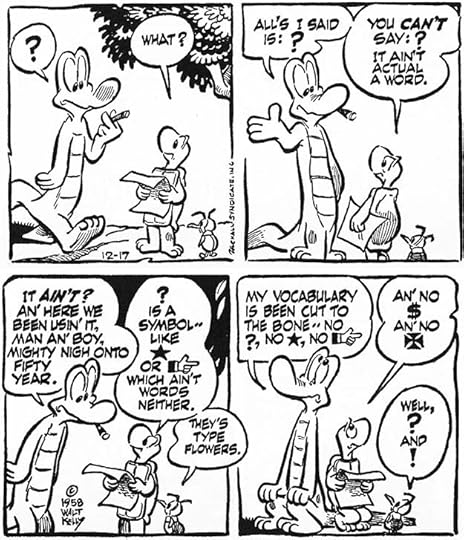 From POGO Daily, Dec 17 1958
This strip has fun with the conventions of comics lettering in a way that I find funny, and I believe it also represents a changing of the guard, as lettering was handed over to a new Walt Kelly assistant, Henry Shikuma.
 Henry Shikuma, University of Hawaii 1949
Henry Takashi Shikuma was born in Honohina, Hawaii on April 23, 1922. He entered the University of Hawaii in 1940, but after the attack on Pearl Harbor he volunteered for the Hawaii Territorial Guard. He was discharged in February 1942 because of his Japanese ancestry, but was soon drafted into the Army and served in the 442nd Regimental Combat Team, 522nd Field Artillery Battalion in France and Germany. After the war he earned his bachelor of fine arts degree at the University of Hawaii in 1949 and moved to New York with his wife Ellen to continue art studies at Pratt Institute. He was Walt Kelly’s assistant from 1958 until Kelly’s death in 1973, and continued on the strip until it ended syndication in 1975. In an interview with Bill Crouch Jr. published in Outrageously Pogo (1985), Henry remembered how he met Walt Kelly:
“Kelly had a lot of friends at Pan American Airlines, where my wife worked. We met one year at a Pan Am Christmas party. He said something like, “Oh, I hear you are a commercial artist. Would you like to show me some of your work?” At the time I was with the display department of Alexander’s Department Store, and I soon forgot about our conversation at the party. Sometime later I got a telephone call from Walt and he said, ‘When are you coming down?‘ I responded that I didn’t think he was serious, but he insisted I come see him.
“So I got a batch of stuff together and went to his studio on East 54th Street. He said, “What do you think about working for me?” He already had George Ward as an assistant. Kelly and George Ward seemed to have personalities that were very simpatico. They both smoked cigars, like to hang out in saloons, and had an eye for a pretty woman. In about 1961 he closed his studio and started working at home, which was a good-sized brownstone townhouse on East 89th Street, very close to where I lived on First Avenue. Then he let George Ward go.”
That Christmas party must have been in 1957. I’ve looked carefully through the 1958 strips and I can’t find evidence of a change of hands in the lettering, so the transition was smooth. In the interview, Henry said of the lettering, “I always worked with a pen point that had been filed. It made the downstroke thin and the cross stroke thick. George Ward showed me how to do it. Kelly would of course always put the lettering in with blue pencil before I inked the dialogue.” Shikuma also helped out inking backgrounds, as George Ward did.
 From POGO Daily, April 22 1959
It became obvious what an excellent letterer Henry Shikuma was when he tackled the Old English style used for Deacon Mushrat. Shikuma’s version is much more accomplished than Kelly’s or Ward’s, the letters are consistent, readable, and accurate while still an appropriate style match for the art. Mushrat’s version of Old English never looked better.
 From POGO Daily, June 17 1959
Shikuma was up to any challenge Kelly threw his way, such as the strips where a cloud of gnats spelled out sports headlines.
 From POGO Daily, Oct 29 1959
As Walt Kelly’s interest in world politics grew, Henry Shikuma’s skill allowed Kelly to use alternate alphabets like the Cyrillic characters given to these Russian seals. Notice that they have the same kind of thick and thin line approach as the rest, but in a different way, using serifs.
 From POGO Daily, Feb 12 1960
As if P.T. Bridgeport’s circus poster style wasn’t trouble enough, Walt Kelly started giving him newspaper headline balloons in 1960. Shikuma handled it all with skill, and even when he was imitating type, managed to make it just organic enough to be obviously not type. Walt must have been delighted with his new assistant. In the Crouch interview, Shikuma said, “On Sunday strips we worked six weeks in advance. With the dailies we tried to keep about four weeks ahead, but Kelly always let it slip to three. I literally used to go down to the syndicate flapping the strip in the wind to help it dry. Kelly was amazing. Sometimes he’d go away for a weekend and come back with two Sundays and two full weeks of dailies all penciled out. He never had a set schedule. He’d just want the work back from me as quickly as possible.”
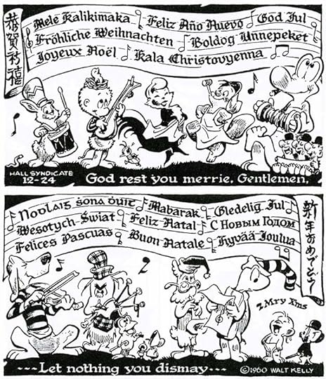 From POGO Daily, Dec 24 1960
Henry Shikuma’s skill was impressive, and it was a tool that Walt Kelly made good use of on the 1960 annual Christmas song strip, a lettering tour-de-force! It’s interesting that Hawaiian is the first language used, Shikuma’s home state. I hope Henry got a Christmas bonus for this one.
 From POGO Sunday, April 20 1975 by Selby Kelly, lettered by Henry Shikuma
Kelly passed on October 18, 1973 at age 60, losing a struggle with diabetes and alcohol. His wife Selby Kelly drew the strip for about a year and a half, with scripts from their son Stephen, then it was discontinued. A revival with other creators and letterers, including art by Kelly’s daughter Carolyn, lasted from 1989 to 1993. George Ward worked as a cartoonist and as a magazine staffer, including for Newsweek, for many years. He died on February 22, 2003 at the age of 82. Henry Shikuma died on November 25, 1985 in New York at the too-young age of 63. Together, these three men left a legacy of comics genius that will long be remembered.
The post Walt Kelly, George Ward, Henry Shikuma and POGO appeared first on Todd's Blog.
June 1, 2023
And Then I Read: SOUL MUSIC by Terry Pratchett

This is part of the Death sub-series of Discworld books, but he isn’t in it much. It’s also a send-up of rock music, just as “Moving Pictures” was a send-up of Hollywood films. There are lots of in-jokes, but I liked this one better.
A young harpist, Imp Y Celyn, comes from his mountain home to Ankh-Morpork hoping to make a living as a street musician. He finds that the Musicians Guild makes that impossible, but with two equally unemployed musicians, troll percussionist Liam and dwarf horn player Glod, Imp finds a new direction. When his harp is destroyed, he buys a powerful magic guitar that enthralls audiences and Imp himself, instigating a wave of new sounds they call “Music With Rocks In It.” Imp becomes Buddy, and soon the canny salesman Dibbler, scenting lots of money to be made, is their manager.
Meanwhile, Death is distraught over the demise of his former apprentice Mort and Mort’s wife (and Death’s daughter) Ysabell. Their daughter, Susan, is in a fine boarding school with little memory of her grandfather, but when Death decides to vacate his post and try to dull his pain on Discworld, Susan is thrust suddenly into his role. As often happens, she has to learn on the job, with some help from Death’s horse and the Death of Rats. But when she encounters Buddy and his music, all bets are off.
The many rock music references in this book felt less strained than in “Moving Pictures,” and the plot and characters are entertaining. Recommended.
The post And Then I Read: SOUL MUSIC by Terry Pratchett appeared first on Todd's Blog.
May 30, 2023
WIZARDS OF LEROY (AND WRICO) LETTERING
 Leroy diagram by Keuffel & Esser, 1940s. S: pen socket, A: tightening screw, N: adjusting screw, B: lock nut, M: tracer pin, H: tail pin.
In 1867 William J.D. Keuffel and Herman Esser, both German immigrants, began selling drawing materials, drafting supplies and surveying equipment in New York. By the early 1930s they had trademarked the Leroy name and products in the U.S. and Canada, which were intended to be used by draftsmen, mapmakers and architects on their drawings and diagrams. The device above is a Leroy Scriber, which uses various size templates having capital letters, numbers and basic punctuation, all on one side for small letters, on two sides for larger ones. Some templates include lower case letters. They also made specialized templates for things like map symbols. The original pens were small and open at the top. You put ink in with a dropper, probably often. All the templates I’ve seen use the same block letter sans-serif alphabet patterned after what draftsmen were already doing by hand.
 My Leroy set, purchased in the 1970s
In my own set, the scriber looks different, but works the same. Instead of the original pens, I used Faber-Castell TG-1 technical drawing pens without the long handle. They fit in the pen socket perfectly. Above are other templates. The tail pin runs along the wide horizontal groove at the bottom, the tracer pin goes into each letter as you need it, and as you guide the tracer pin through the shape of the letter, the pen makes the same shape in ink on the paper. The arm holding the tracer pin is adjustable, producing slanted letters with the same template. You vary the line width using different pens.
It’s a slow and time-consuming method of lettering. You hold the T-square firmly in place with one hand while keeping the template against the top edge and sliding it to the right position with the other to ink each letter. Correct spacing comes by trial and error while watching the ink pen. It took me at least four times as long as regular freehand lettering. I lettered one story with it, and vowed to never do so again! (I made a font from it.) As with most things, if you practice enough, you’re bound to get faster and better at it. That’s what happened to Jim Wroten.
 James Wroten and Margaret Scott from their high school yearbooks, 1932 and 1933
James Oscar “Jim” Wroten Junior was born October 24, 1914 in Baltimore Maryland. His wife-to-be and future lettering partner Margaret E. “Skippy” Scott was born there July 8, 1915. They met and dated, but after graduating from different high schools in 1932 and 1933 in the Great Depression, employment was hard to find. Jim’s uncle located a job for him with Keuffel & Esser in Morristown, NJ around 1935. He worked as a salesman, and became their best Leroy lettering demonstrator, often featured at trade shows. He continued to work for them into World War Two. In 1937 they married and Margaret joined Jim in New Jersey. In an interview with Bhob Stewart on his Potrzebie blog for September 8, 2011, Margaret said, “Jim was the best Leroy letterer around. He taught me how to do it. I liked working with him, and I happened to like Leroy lettering. I think it’s a very fine kind of lettering.”
 From ALL-STAR COMICS #8, Jan 1942, All-American Comics, first appearance of Wonder Woman, this and all Wonder Woman images © DC Comics
The creators of Wonder Woman were writer William Moulton Marston and artist Harry George Peter, who probably met in New York through mutual interests in women’s suffrage. All-Star Comics publisher M. C. Gaines hired Marston as a consultant, then asked him to create a new series with a female superhero, which became Wonder Woman. Marston’s choice for artist was H. G. Peter, and Marston and Peter handled the production of all the Wonder Woman stories themselves. Peter had a studio at 130 West 42nd Street in Manhattan, but by early 1944 they shared rented space at 331 Madison Avenue and 43rd Street with the name Marston Art Studio on the door. Like the Shuster studio handling all Superman stories at first, and Bob Kane’s studio producing all the Batman stories, the Marston Art Studio turned in complete, finished stories, but that arrangement by contract lasted longer for Wonder Woman, at least until Marston’s death in 1947.

 Details from ALL-STAR COMICS #8, Jan 1942
Wonder Woman stories used Leroy lettering from the beginning, and at first I thought they were all lettered by the Wrotens, but that didn’t explain the poor skills shown in early stories. On the page above, the lettering is done with a single size template and all slanted, suggesting the letterer might not have known how to adjust the tracer pin to regular letters, though that could simply have been a style choice. For emphasis, a few words are underlined, and in two spots larger bold words are hand-lettered, as are the exclamation marks. Space between letters in each word is fairly consistent and readable, but spaces between words vary a lot. The hand-lettered initial capital A in the first caption is a nice touch, but in the second panel the caption border almost touches the lettering, and the lettering layout and line breaks are poorly done in places. This doesn’t seem like the work of K & E’s best Leroy letterer. I think at first H.G. Peter did the Leroy lettering himself (perhaps he had learned it for other projects), and once Wonder Woman was ongoing, it was also done by his assistants. Jill Lepore, in her book The Secret History of Wonder Woman (2014 Knopf Doubleday) quotes Marston’s wife Elizabeth saying the Marston Art Studio office manager Marjorie Wilkes Huntley helped with inking and lettering on Wonder Woman. In Les Daniels’ book Wonder Woman: The Complete History (2000 Chronicle Books) he says while Peter penciled the stories, covers and strips and inked the main figures, he was assisted by a series of female commercial artists. It’s likely they also did lettering. Perhaps Peter saw Jim Wroten demonstrating his Leroy skills at a trade show, or possibly Wroten called on Peter as a K&E salesman, and his skill prompted Peter to offer him work. In the Bhob Stewart interview, Margaret Wroten said, “Our studio was in Doc Marston’s office. We were on the 12th floor. The art studio where Harry G. Peter worked was upstairs, on the 13th floor.” The Wrotens joined the Wonder Woman team in 1945, after Jim quit his job with K&E to letter full time, with Margaret helping. “That’s how we started.”
 From SENSATION COMICS #14, Feb 1943
In Wonder Woman stories of 1941 to early 1945, the lettering remains all italic, as above. The spacing of letters in words and spacing between words is variable and uneven. It reads fine, but look at the word SMUGGLED in the first balloon, which has extra space between the GL and ED, while SECRET in the second ballon is crammed together to fit even though there’s extra space between the words on that line. Readers wouldn’t have noticed these things, but they add an unconscious sloppiness to the lettering to my eye.
 From SENSATION COMICS #41, May 1945
Suddenly in issue #41, the lettering is much improved. It’s regular rather than slanted, emphasis is added with a different, bolder pen point, and letter and word spacing is consistent. Exclamation points are done with the Leroy template. I think the Wrotens took over with this issue, and on WONDER WOMAN with issue #13.
 From WONDER WOMAN #13, Summer 1945
This page from that issue has the improved lettering I credit to the Wrotens. I believe the balloon and caption borders were added by the artists after pages were lettered.
 From WONDER WOMAN #16, March-April 1946, this and all original art courtesy of Heritage Auctions
The lettering on this page of art is beautifully done and seems error free, but the balloon at lower left has pasted-on lettering, either a correction or a script change. The last line has fallen off.
 Detail from WONDER WOMAN #16, March-April 1946
A closer look at two panels. While I don’t think Leroy lettering is a good choice for comics, the Wrotens certainly did it well. Working in the same office, one floor below Peter and his assistants, would certainly have made things easier for everyone. Peter was 61 when he started working on Wonder Woman, but he and his studio produced a large volume of work. In 1945, when the Wrotens began, Wonder Woman was appearing in every issue of SENSATION COMICS, COMIC CAVALCADE, and in a short-lived daily comic strip as well as her own title, all lettered by Jim and Margaret Wroten. All-American Comics merged with its sister company, National (DC) comics in 1946.
 From WONDER WOMAN #77, Oct 1955
William Moulton Marston had others scripting for him at times, and after his death in 1947 that continued for a short while, but DC soon gave the writing assignment to editor Robert Kanigher instead, and he continued to write Wonder Woman stories for many years. Artist Harry G. Peter was replaced on covers in 1949, allowing DC to give the character a somewhat more modern look there, but he continued to draw all the interior stories with his assistants nearly until his death in early 1958 at age 78. The lettering on this late Peter story has fine Wroten lettering. The word HEADQUARTERS in the caption is on a replacement piece that’s taped on. AMOUNT in the balloon below is also on a patch. The Wrotens were busier by now, and perhaps errors were more common.
 From LAND OF THE LOST #4, Spring 1947, EC Comics
In the Bhob Stewart interview, Margaret said: “We got started doing Wonder Woman, and through that we met Mr. [M. C.] Gaines and did work for him because Doc Marston and Mr. Gaines were good friends.” Gaines was the co-publisher of All-American Comics, and when that company merged with National/DC, he was bought out, and started his own comics company, EC, standing for Educational Comics. He continued to employ the Wrotens for some of his titles like LAND OF THE LOST. Margaret said they were also picking up work from other publishers like Fox and Hillman, and their Leroy work there in the 1950s is easy to find.
 SILLY MILLY Daily by Stan Mac Govern, from The New York Evening Post, Nov 21, 1947
They also lettered other newspaper strips after the Wonder Woman one ended, like SILLY MILLY and DEBBIE DEAN. The strip above features Jim Wroten as a character!
M. C. Gaines died in 1947 in a tragic boating accident, and his son William “Bill” Gaines took over the comics publishing business. Bill inherited a small line of Educational Comics aimed at children. He decided to go a different way, changing the company name to Entertaining Comics, and by the early 1950s was publishing horror, science fiction and crime comics with graphic content that parents hated but readers loved. Through those changes Bill Gaines continued to employ the Wrotens. Bill Gaines said in a 1983 interview for The Comics Journal (Fantagraphics): “I kind of inherited the outfit. My father, when he did Wonder Woman, used Leroy lettering by a guy by the name of Jimmy Wroten. How the hell he got involved in comics I don’t know, but it suited us very well. My father was using it on everything.” Not quite true, but Bill Gaines did use the Wrotens on many of his new stories.
 From WEIRD SCIENCE #18, March-April 1953, this and all following EC art © William M. Gaines Agent, Inc.
Most EC titles were edited and written by Al Feldstein. His stories were laid out on EC art paper with the panels and lettering penciled in by Feldstein, but usually no art. Those went to the Wrotens, who lettered them before the artists drew anything. Bill Gaines said, “Al was a script-oriented person, although he is an artist — and a pretty good one. When he started writing, he was more interested in the script than the art. Because Al used so many words we found we could do it more clearly with Leroy lettering.” The first page of each Feldstein story followed the same plan as the one by Wally Wood above. The top area was left open for the artist to design the title, and Wood’s is excellent.
 Detail from From WEIRD SCIENCE #18, March-April 1953, EC Comics
The Leroy lettering was almost always at the top of each panel, and the artist put in the panel and balloon borders. The Wrotens were using a wider range of Leroy template sizes, and their emphasized words were now bold, slanted, and larger than the rest. Large initial capital letters also began each caption.
 From HAUNT OF FEAR #12, March-April 1952
Margaret Wroten said, “When we went into the horror comics, the lettering practically took up half the panels. All you were getting was heads, a lot of heads. Bill Gaines was paying $2.50 a page. I’d count the words sometimes and find 400 to 500 words on a page. That’s a lot of words. When it got so terribly heavy, I think we just reduced the size of the template. We had to go down to a no. 140 template, I think, because you couldn’t use a no. 175 with all those words on a page. We got it done. We always got it done. We worked night and day on those things. Many nights we stayed up until nine o’clock to get something out they needed the next day. We delivered and picked up our own work. We tried to proof everything before we sent it down. If Bill found a mistake or made a change, he would mark it in blue in the margin, and then we would correct it. Sometimes when there would be changes or he would want to do something else, we would put [the lettering] on little strips, cut them to fit and put them on with rubber cement.”


 Samples from three EC stories with art by Jack Davis from HAUNT OF FEAR #17, Jan-Feb 1953, Al Feldstein from CRYPT OF TERROR #19, Aug-Sept 1950, and Graham Ingels from TALES FROM THE CRYPT #31, Aug-Sept 1952
Each of the EC artists handled the balloon shapes in their stories differently. Those by Graham Ingels were particularly energetic. In the Feldstein sample, he asked for upper and lower case for the journal entries, something seldom seen in EC stories. Even with different art and balloon styles, the very regular and consistent Leroy lettering by the Wrotens pulled it all together and gave most EC comics a unified look.

 From IMPACT #1, March-April 1955, EC Comics
A famous story from EC was Bernie Krigstein’s Master Race. He did an excellent dry-brush title. Some of the lettering has been pasted on the art, indicating a script or art change, or perhaps a layout change from Feldstein’s original by the artist. These books were controversial and led to an outcry from parents and the public. The Comics Code, instigated in 1954, was instrumental in putting EC Comics mostly out of business by 1955, and that meant less work for the Wrotens. When H. G. Peter died in 1958, they were no longer wanted as letterers on Wonder Woman either, as DC took over story production and stories after that were lettered by Gaspar Saladino.
 From The Count of Monte Cristo, art by Lou Cameron, CLASSIC COMICS #3, March 1942, Gilberton
Another New York publisher, Gilberton, often used Leroy lettering starting in 1942, as seen above. The Leroy style helped give Gilberton’s CLASSICS ILLUSTRATED line a scholarly textbook look. This example is too early to be by the Wrotens. They might have done some stories for Gilberton, but by the 1950s the company was using artist and draftsman Robert MacLeod for that, as described in THIS article by Alex Jay.
Margaret told Bhob Stewart: “The last comic books we did were for EC, and then Jimmy just got out of it. He went into doing charts, badge cards, formulas for chemical houses and floor plans for trade shows all over the country. We sublet part of the studio during the 1960s.” The Wroten studio remained open until Jim Wroten died on May 28, 1980. By that time they were in Forest Hills, NY. Margaret died on January 23, 2011. Their unusual comics lettering didn’t find new imitators except for creators who were fans of EC Comics and occasionally tried to copy their approach. Today there are fonts made from Leroy lettering, but as a comics lettering choice it has largely passed into history.

 From MAGIC COMICS #30, Jan 1942, David McKay
One other comics artist, Jimmy Thompson, used a similar lettering style, but is it Leroy? Comparing this work by him to the Wroten examples, I don’t think so. Both are regular and somewhat mechanically precise, but Thompson’s are a bit wider and some letters have different shapes, especially the G, E and R.
 Jimmy Thompson in cigarette ad, Winnipeg Tribune, April 8, 1930
George “Jimmy” Orlando Thompson was born October 3, 1907 in Toronto, Canada. He began drawing one-page sports cartoons for Canadian newspapers in 1925. In 1937 he emigrated to the U.S. and drew the comic strip War on Crime for the Ledger Syndicate. He was soon drawing western features for comic books focused on Native American characters, with the 76-page story Red Eagle for FEATURE BOOK #16 in 1938 being one of the earliest. In 1943 he switched to super heroes, working on Robotman and Captain Compass for DC Comics and The Human Torch and The Angel for Timely (Marvel) Comics. He also worked on Mary Marvel and Captain Midnight for Fawcett. After a busy few years in comics, Thompson died on September 16, 1949 at the age of 41, a loss to the field.
 From STAR-SPANGLED COMICS #26, Nov 1943, image © DC Comics
Some of Thompson’s super-hero comics use lettering similar to his early work like this Robotman story, though here there’s also a more condensed template used for the large letters HELLO, FRIEND. After some searching, I discovered the source of this style.
 Wrico Lettering Guide templates with sample alphabet made with ball-point pen
Wood-Regan made another type of lettering guide named Wrico, patented 1926, where shapes cut out of a plastic strip could be used to form letters. These shapes look like what Jimmy Thompson was using, and I’ve seen photos of another set for making narrower, condensed letters, as shown in the art. Some letters are made using more than one template shape. For instance, an H was made using the vertical sides of the largest square under the letters HIL above, and the horizontal center line was made using the bottom of the smaller square next to it. Like Leroy, this would have been a time-consuming process, but perhaps one that got easier with practice. Thompson’s lettering looks great. He was clearly a perfectionist even with lettering. Hopefully as he did more of it, he got faster. Thompson also used Leroy lettering on some of his later work at Marvel, and some of his DC stories were lettered by Ira Schnapp, whose very regular hand-drawn shapes are not too far from this look. I don’t know of any other artist who used the Wrico templates, but Thompson clearly liked what he could do with them, and the lettering works well with his very precise art.
Thanks, as always, to Alex Jay for research help.
The post WIZARDS OF LEROY (AND WRICO) LETTERING appeared first on Todd's Blog.
Todd Klein's Blog

- Todd Klein's profile
- 28 followers

