
More 1980s Letterers Part 1
 From CODENAME: DANGER #2, Oct 1985, © Lodestone
As the comics market grew again in the 1980s, many more letterers found work both at mainstream and smaller independent publishers. I can’t profile every one, but in this three-part article, I’ll cover 24 of them. First up is Pat Brosseau, whose early work is shown above. The letters are standard for comics of the time, and made with a round-tipped pen. The various balloon shapes all work well, and I like the musical one.
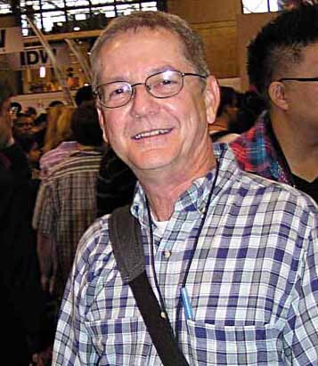
 Pat Brosseau from his Facebook page, 2015
Patrick J. Brosseau was born Aug 11, 1964 in Saint Johnsbury, VT and grew up in Lyndonville, VT. He attended the Joe Kubert School for comics art in 1984-85, and in the summer of 1985, sent lettering samples to all the comics publishers and received work from some of them, like the example above. Pat’s friend and fellow Kubert School classmate Bill Oakley had found a job in the Marvel Bullpen, and in 1986, Pat joined him there, and worked on staff at Marvel from 1986 to 1988. They both worked under letterer Jim Novak for about a year, and he became another good friend. Pat moved from his staff job to freelancing full time.
 From BLUE DEVIL #21, Feb 1986, image © DC Comics
This story may also be one Pat landed before starting at Marvel, the lettering looks similar to the example above. I particularly like the thought balloons with what looks like storm clouds inside at the top left.
 From DOCTOR STRANGE, SORCERER SUPREME #30, June 1991, image © Marvel
By 1991, Pat had developed a more distinctive personal style with a slight lean to the left and a letter A with a rounded or squared-off top that probably hadn’t been seen in comics since the brief career of Paul Lauretta in the late 1930s. It made it easy to spot Brosseau’s lettering, and I like it.
 From HELLBOY: WAKE THE DEVIL #2, May 1997, Dark Horse, image © Mike Mignola
Pat lettered for many publishers, including Malibu, Eternity, First, Dark Horse, Archie, Skybound, Image, and DC. In the sample above, it’s interesting to see that, while he used his distinctive A in the regular lettering, for larger display lettering it was a more standard shape. Pat joined the DC Comics staff lettering department from 2004 to 2012, where he was usually required to use fonts licensed or owned by DC.
 From AMERICAN CARNAGE #6, June 2019, image © DC Comics
After that he went freelance again, sometimes lettering with digital fonts made from his hand lettering, as seen above. Brosseau’s fonts use letters with a more obvious wedge-tipped pen shape, and the A is even more square. I like the fact that it sets his work apart. Pat is still a busy freelance letterer today.
 From WARLORD #45, May 1981, image © DC Comics
Perhaps the most surprising thing I found out about a letterer who began in the 1980s was the career path of Pierre Bernard, Jr. I met him when he was freelancing for DC, though I didn’t know him well. He did lettering at DC for a few years, and then found work as a designer at ad agencies, and TV shows in New York, first for David Letterman, then for Conan O’Brien. Conan’s writers liked him, found him funny, and began using him in on-screen comedy bits, and for a while he had his own feature on the show, “Pierre Bernard’s Recliner of Rage,” which you can find examples of on YouTube. I’m never up late enough for those shows, so I had no idea! Pierre’s lettering for DC was good but not exceptional, this example was done with a wedge-tipped pen for the regular letters, and a round-tipped one for the bold letters. The story title is a good idea, but the open areas are too thin, and partly filled in by the poor printing methods of the time.
 Pierre Bernard Jr. from the Conan O’Brien show, undated
Pierre Bernard Jr. was born June 14, 1961 in Brooklyn, NY. He attended the High School of Art and Design in Manhattan, graduating with a major in illustration, then attended Parsons School of Design, also in Manhattan, receiving his BFA in illustration. I think he was at Parsons when he was lettering for DC, though I don’t know the years he was there. His volume of lettering work was not large, but I’m sure it helped pay some bills.
 From WORLD’S FINEST COMICS #275, Jan 1982, image © DC Comics
On this story he credited himself as simply Bernard Jr., and here he seems to be using round-tipped pens for everything. There’s a nice amount of variety in the styles and balloon shapes, and this open title works better.
 From ELVIRA’S HOUSE OF MYSTERY #5, July 1986, image © DC Comics
This is one of the last comics lettering jobs I found for Pierre. I like the rough-edged sound effects, and the open script title. Bernard Jr. moved with the Tonight Show to Los Angeles in 2009, and continued his TV design work and comedy bits there for a while, soon finding other design work and projects on the west coast. A good interview with him is HERE. He doesn’t mention his comics lettering, which is only a small part of his work history.
 From GREEN LANTERN #181, Oct 1984, image © DC Comics
John Clark was a comics fan who broke into lettering at DC Comics around 1983 with the help of his friend, artist Don Newton. His early work here is competent, though the story title is uneven. I like the bird sound at the beginning of the last balloon.
 John Clark, NY Comicon 2010
Leonard John Clark was born June 21, 1953 in San Antonio, TX, the youngest of five siblings. Soon after, his family moved to Arizona, where he lived for about 40 years. John tells me he didn’t have any formal art training, but did take a correspondence course in cartooning, “The Art Director’s Course” by Pat Masulli and Tony Tallarico of Charlton. John said, “I guess I learned something from it.” He continues:
My first sort of job in the comic book industry was when Bruce Hamilton hired me to help him produce the Carl Barks Library. Disney was pleased with it and that led to Hamilton acquiring a license to produce comic books, after Western Publishing got out of the business. So I sort of oozed into comic books sideways. On the Gladstone Comics, I did mostly production work but discovered I had a knack for lettering and started working on a lot of the translated Egmont stories. Concurrently, Don Newton helped me get occasional lettering work at DC. That led to Roy Thomas seeing my work, and when he got Newton to start drawing INFINITY, INC. he asked me to letter it. I never did much for DC, but Thomas’ work evolved into freelancing for Eclipse, Blackthorn, Viz, and other independents.
 From UNCLE SCROOGE ADVENTURES #324, June 1988, image © Disney
At Gladstone, John became one of the regular letterers for stories written and drawn by Don Rosa for the European comics published by Egmont and then reprinted by Gladstone. He also sent some of that work my way when he became the Gladstone comics editor, including Don’s wonderful “The Life and Times of Scrooge McDuck.” I thought John’s lettering for the Rosa stories was excellent, I love the sound effects here. John told me:
When Gladstone’s comic book license lapsed, Disney took it in house and hired me to do quite a bit of freelance lettering for them. Then Gladstone got the license back and I became Editor-in-Chief. Then Gladstone gave it up and Steve Geppi got the license, formed Gemstone Comics, hired me to be Editor-in-Chief, and I moved to Maryland, where I stayed until Gemstone gave up the license in 2008.
 From UNCLE SCROOGE #324, Dec 2003, image © Disney
Here’s one of the later Egmont stories from Rosa lettered by John. I particularly like the sign on Gyro’s cart. John said:
I moved to Texas in 2015, near my brother. Today I’m mostly retired but still letter a half-dozen or so Manga books per year for Carl Horn at Dark Horse Comics. I also edit The Cowboy Chronicle, a quarterly magazine devoted to cowboy sports.
 From ELRIC: BANE OF THE BLACK SWORD #3, Dec 1988, © 1First Comics
Susan Dorne is a letterer whose work appeared mainly at smaller publishers beginning in 1987. Her lettering on this Moorcock story adapted by Roy Thomas shows promise, and is easy to read. Her career is an example of the wider world of comics opening up in the 1980s, with many small publishers finding traction with fans in comics retail shops even with no newsstand distribution, making room for new creators.
 Susan Dorne, 2008
Susan Backofen Dorne was born in Rockville, CT in 1958. She collected comics from an early age, and studied calligraphy with an uncle. She majored in engineering at the University of Connecticut, and had help from collector friend and letterer Steve Haynie, who advised her on preparing lettering samples, which she mailed to all the comics publishers. Eventually she landed work at Malibu on a four-issue series BONES, out in 1987, and more followed at First, Comico, Blackthorne, Triumphant, Caliper, Claypool and others.
 From E-MAN #1, Oct 1993, Alpha Productions, image © Joe Staton
This example from a few years later shows great improvement, and I think Susan’s lettering complements the art of Joe Staton well on the book.
 From FREEX #15, Jan 1995, Malibu
Susan’s lettering for Malibu showed she had the skills and variety to work on superhero comics, I like the rough balloons and the double outline on this page.
 From ELVIRA, MISTRESS OF THE DARK, April 2000, Claypool Comics
Toward the end of her career, Susan was doing fine work for Claypool like this story, with an excellent title and creative credits. Susan’s work tapered off around this time due to the advent of computer lettering. She continues to live in Connecticut.
 From HOUSE OF MYSTERY #300, Jan 1982, image © DC Comics
Phil Felix began lettering for DC Comics in 1981, and would work for Marvel and other companies later, but he’d already been a comics letterer for a few years, working for Harvey Kurtzman on the Playboy soft porn satirical humor strip Little Annie Fanny. That experience gave him a good start, and his early DC work, as seen above, is already professional, with a strong title.
 Phil Felix, image © Eliot R. Brown
Philip Hugh Felix was born Dec 23, 1954 in Milford, NJ. He attended the School of Visual Arts in the 1970s, where one of his instructors was Harvey Kurtzman, probably leading to Phil working for him.
 From Little Annie Fannie, Playboy, Aug 1980
Phil graduated with a BFA in 1979, and continued to work with Kurtzman until 1988 on Little Annie Fanny, I’m guessing the example above has his lettering, as it’s similar to the DC lettering above, and somewhat different from the earliest Fanny strips.
 From THE ‘NAM #9, Aug 1987, image © Marvel
By 1983, Phil was on staff in the Marvel Bullpen, and also doing freelance lettering there. His style had become more angular, with almost triangular P and R loops, as seen above, and the balloon shapes are made with oval templates. Phil worked under Marvel Bullpen veteran Danny Crespi, and said he learned a lot from him, later compiling a photocopied collection of Crespi’s cover lettering that I studied on my blog beginning HERE. Phil left the Bullpen in 1987, continuing to letter for Marvel as well as DC and other publishers and clients.
 From IRON MAN #302, March 1994, image © Marvel
This page has some fine sound effects by Phil, and continues to showcase his more angular style and templated balloon shapes. The energy in the lettering matches that in the art well.
 From BATMAN ADVENTURES #5, Oct 2003
Once Marvel went to all digital lettering, Phil did more work for DC Comics. This page has an excellent stylish title with effective bullet holes in each O. Around this time, DC also made the transition to all digital lettering, and Phil then moved on to Archie Comics, which continued to use hand lettering for about another decade. Phil lives on his farm in western New Jersey.
 From ALIEN ENCOUNTERS #7, June 1986, Eclipse Comics
When artists Bo and Scott Hampton began placing comics work at various publishers in the mid 1980s, their sister Tracy was enlisted to letter for them, and she did a fine job. In the early example above, the letters are made with a round-tipped pen, they lean slightly to the left, and have a nice bounce. Breathy words like GASP are set apart inside both breath marks and parentheses.
 Tracy Hampton Munsey, 2022
Tracy Hampton Munsey was born Aug 14, 1961 in Columbia, SC. She achieved a college degree in psychology. When asked about her schooling and entry into comics, she told me:
I never had any official, school-oriented art training. Instead, I had my brothers, Bo and Scott Hampton. Who could ask for better art instructors, especially with the added perks of having them around 24/7 and free. I was always doodling and drawing on something. One day Bo handed me an Ames Lettering Guide and put me to work lettering one of his projects—such trust, since back then letterers worked on the original artwork! It sold and after that I was off and running.
 From BATMAN: NIGHT CRIES, April 1993, image © DC Comics
Perhaps Tracy’s finest lettering is on this original graphic novel co-written by Archie Goodwin and Scott Hampton, with painted art by Scott. Tracy’s work retains an informal charm that helps balance the dark subject matter.
 From SUBHUMAN #4, Feb 1999, © Dark Horse Comics
On this story from writer Mark Schultz, Tracy used a creepy balloon style for the creepy creature. She told me:
As much as I enjoyed lettering for many years, when computer lettering became the rage, I began dedicating more of my time to painting and writing. I am now an author publishing under the name T.H. Munsey.
A search on Amazon will quickly turn up several novels by Tracy in the Suspense/Horror category, and they all have painted covers by her, which I find to be excellent. She now lives in Florida with her family.
 From CAPTAIN CARROT AND HIS AMAZING ZOO CREW #7, Sept 1982, image © DC Comics
Tim Harkins broke into comics as a letterer at DC with this story from 1982. Nothing like jumping in at the deep end with a busy and wordy team book! Tim did a fine job, though the story title is at least partly by Gaspar Saladino from the issue’s cover.
 Tim Harkins, date unknown, image found online
Timothy Harkins was born Dec 24, 1958 in Richmond, Staten Island, NY. I haven’t found out anything about Tim’s art training or how he got into comics, but in addition to lettering, he also worked as a penciler and inker for DC and other companies, specializing in cartoon-style humor.
 From AIRBOY #34, Dec 1987, Eclipse Comics
A few years later, this example show’s Tim’s mature lettering style, which is slightly slanted, made with a round-tipped pen, and full of appealing curves and bounce. His sound effects are also well done.
 From ROBIN #46, Oct 1997, image © DC Comics
This lettering for DC is similar, but without the overall slant. Like John Costanza, Tim seemed to add life and energy in every word balloon.
 From CARTOON NETWORK STARRING #7, March 2000, image © DC Comics
Also like Costanza, Tim’s own art worked great on cartoon-based comics, as seen here, and his lettering was the perfect complement. After DC moved to all digital lettering in 2003, Tim continued as an artist for a while, and then seems to have left comics. I haven’t discovered what he did after that, but the photo I found, above, suggests he’s doing well.
 From ARAK, SON OF THUNDER #9, May 1982, image © DC Comics
Like his brother Adam, Andy Kubert’s earliest work in comics was as a letterer. This story at DC shows his balloon and caption lettering was professional from the start, and the story title is creative.
 Andy Kubert by Luigi Novi, 2011, image found online
Andrew Kubert was born Feb 27, 1962, and grew up in Dover, NJ, where his father artist Joe Kubert founded the Joe Kubert School for comics art. Andy was an early student, and later a teacher at the school.
 From THE NEW ADVENTURES OF SUPERBOY #49, Jan 1984, image © DC Comics
Andy’s title on this retro story picks up style points from the work of Ira Schnapp, showing his interest in comics history. The burst balloon is well done.
 From THE SAVAGE SWORD OF CONAN #160, May 1989, image © Marvel
Also like Adam, Andy soon moved from lettering to art, as this story he penciled, inked and lettered demonstrates, with art much in the style of his father Joe Kubert. Both Andy and Adam would become star artists at Marvel and DC, but their lettering gave them an early way in. Andy continues to teach and work at the Joe Kubert School and lives in northern New Jersey.
More 1980s letterers in Part 2!
The post More 1980s Letterers Part 1 appeared first on Todd's Blog.


Todd Klein's Blog

- Todd Klein's profile
- 28 followers

