
SAM & JOE ROSEN – Letterers Part 2
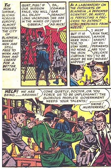
 From ANNIE OAKLEY #1, Spring 1948, Timely/Marvel Comics. This and all Marvel images © Marvel.
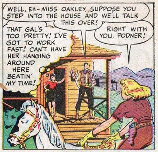
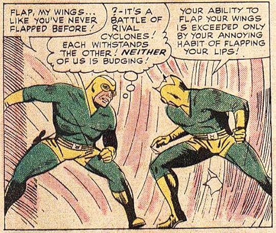
In Part 1 of this article series, I examined the early work of Sam Rosen, as best I could identify it, up to 1946. I’m not sure what Sam was doing in late 1946 to early 1947, probably lettering for any publishers he could. The Grand Comics Database credits the lettering on this story to him, probably done in late 1947, and an early example of his work for the company that would become Marvel Comics. If the identification is right, I see some changes from what Sam was doing before, but it does remind me of other work credited to him in the 1950s that we’ll be looking at. It occurs to me that, in his early years, Sam was asked to mimic the styles of others, first Howard Ferguson at Fox, then Zoltan Szenic or perhaps Will Eisner on The Spirit. This may be an example of Sam Rosen’s own style emerging at last. He had been lettering since 1940-41 with at least two years off for military service, so call it about five years. That’s enough time to develop a personal style. The letters here are very regular, most would fit in a square, but they’re done with a wedge-tipped pen (as he learned to do it from Ferguson), which adds variety to the strokes, and they have just enough informal bounce to add appeal without looking too uneven. The balloon shapes are well drawn, leaving more air around the lettering than Sam had often done in the beginning. The style points I noticed earlier like vertical sides on the M and a low right leg on the R are no longer present. Of course, this could also be by someone else, but if it is by Sam, he’s found a style that works well for him, and for us, the readers.
 From SECRET HEARTS #1, Sept 1949, DC Comics. All DC images © DC Comics.
Sam’s work must also have appealed to editors, as he was now employed at more companies, including one of the biggest, National Comics, as DC was then known, but his work there was sporadic. He’s credited with lettering all six stories in this first issue of SECRET HEARTS, but DC had two regular letterers, Ira Schnapp and Gaspar Saladino, who were doing the lion’s share of the company’s lettering at the time. This lettering looks quite similar to the ANNIE OAKLEY example, though the G’s are a little different. The letter S is often a style identifier, and they look the same in these two samples, curvy at top and bottom, a little straighter in the middle. The balloon shapes also look the same.
 From MAN COMICS #5, Dec 1950, Marvel
I’m showing stories identified as lettered by Sam in the Grand Comics Database (but not ones with a question mark after his name indicating a guess), and this one is again quite similar to the previous two examples. Here the G’s are more rounded, as in ANNIE OAKLEY, the C’s are a little wider, as they were in SECRET HEARTS. Those are minor variations, in general the style is all very similar to my eye.
In the 1950 census, the entire Rosen family is living on East 27th Street, Brooklyn, New York: father David, mother Esther, and their five sons, including Joe (age 29) and Sam (age 28). David was operating a millery (making hats), oldest son Morton was rebuilding auto parts. Joe, Sam and Jacob are all listed as self-employed artists. Joe and Sam might have been helping each other meet tight deadlines, perhaps they also hired Jacob to help too. As far as I know, he was never credited if so, or perhaps he did some other kind of art.
 From WORLD’S FINEST COMICS #53, Aug 1951
Similar style here, and it’s quite different from DC’s regulars Schnapp and Saladino. It’s very regular with no obvious style points. Another letterer with that look at the time was Ben Oda, but Ben almost always made his letter C’s lean a bit to the right, while these are almost perfectly circular.
 From BLACKHAWK #65, June 1953, Quality Comics
More similar work, the S’s are a bit more angular, something likely to happen when you’re moving the pen fast, suggesting Sam was pushing his speed a bit to make a tight deadline. It all looks fine, though.
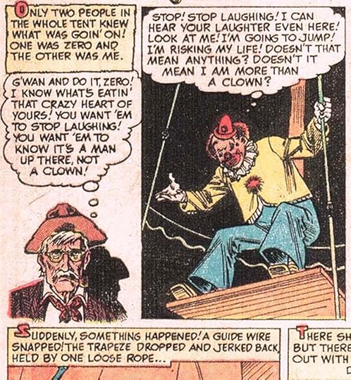
 From G.I. COMBAT #25, June 1955, Quality Comics
More similar work, and Sam Rosen is credited with lettering all the stories in this issue. Note the use of three low dashes instead of three dots (an ellipsis) a less common alternative.
 From PATSY WALKER #74, Dec 1957, Marvel
Classic and classy work by Sam in a style familiar from his 1960s story lettering. A little wider here, perhaps because he had more room. Correct use of ellipses this time. Probably done not long before the massive staff and freelancer layoff at Marvel in 1957. After that, nearly all the stories were lettered by Artie Simek for a few years.
 From YOUNG ROMANCE #108, Oct-Nov 1960, Prize Comics
By 1960, Sam’s letter S had become even more angular and straighter across the middle. He’s credited with lettering four stories in this Prize comic, and there’s plenty to do on them. Note the old style breath marks around SOB, parentheses. Later that morphed into radiating dashes. The ellipses are again looking a bit like three dashes rather than dots.
 From TALES TO ASTONISH #16, Feb 1961, Marvel
By 1961, Sam was occasionally getting work at Marvel again. The company was restricted to eight titles a month, but Artie Simek couldn’t letter all the stories, and other letterers were offered work. This one has a very Sam Rosen story title, familiar styles for him that would soon be appearing often on Marvel covers and title pages, and quite different from Simek. They combine energy and bounce in a lively, appealing way. The balloon lettering appears smaller than what Sam had been doing, perhaps something requested by editor Stan Lee. Stan must have liked what he saw, he soon hired Sam as Marvel’s second regular letterer alongside Artie.
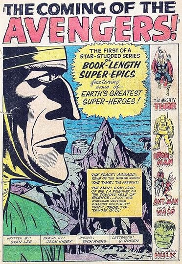 From THE AVENGERS #1, Sept 1963, Marvel
Sam rose to the challenge with excellent work, perhaps spurred on by the fact that he was soon getting printed credit, something all Marvel books had added for letterers due to steady campaigning by Artie Simek. I love this title lettering, and all of it, really. I have to admit, in my teen years reading Marvel’s new superhero comics, I always preferred Sam over Artie.
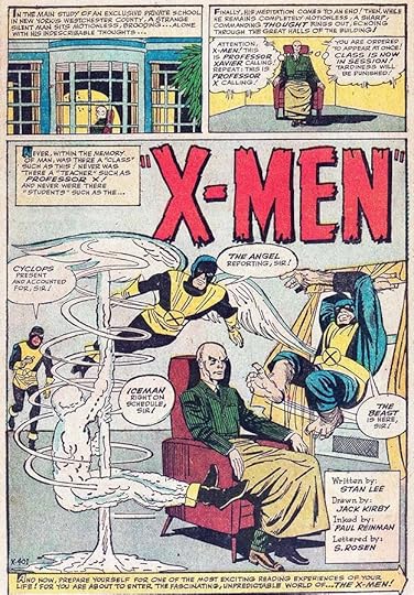 From X-MEN #1, Sept 1963, Marvel
Two landmark first issues out in the same month, Marvel was on the rise. I particularly like Sam’s telepathic balloons for Professor X in the second panel. I don’t know if that style had been done before, but it was often imitated by other letterers later.
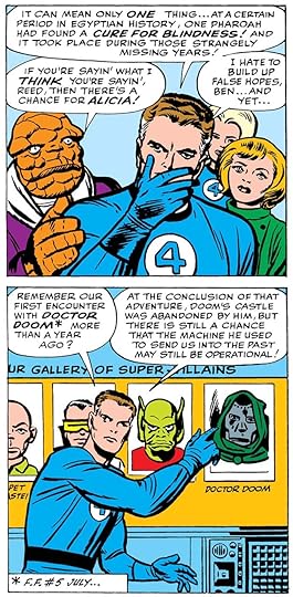 From FANTASTIC FOUR #19, Oct 1963, Marvel
Sam’s story lettering continues to follow the style seen in 1961, the letters are small but wide, the C is evenly rounded, the S is all curves, but straighter in the middle, and it sometimes comes to a point at center right.
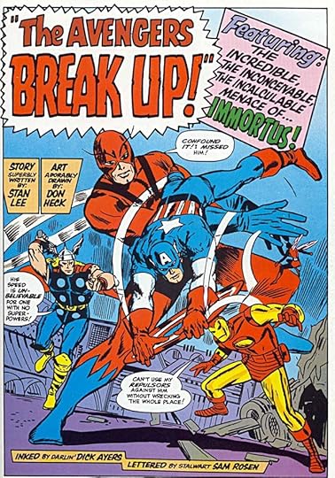 From THE AVENGERS #10, Nov 1964
Sam’s title and display lettering, as seen at the top here, is excellent, full of energy and with a little bounce, yet artfully drawn. He was suddenly doing about three times the work he had been doing, mostly at Marvel, but not only there.
 From THE MIGHTY CRUSADERS, March 1966, image © Archie Comics
In addition to superheroes, westerns, teen humor and more at Marvel, Sam was lettering a short-lived line of superheroes at Archie Comics.
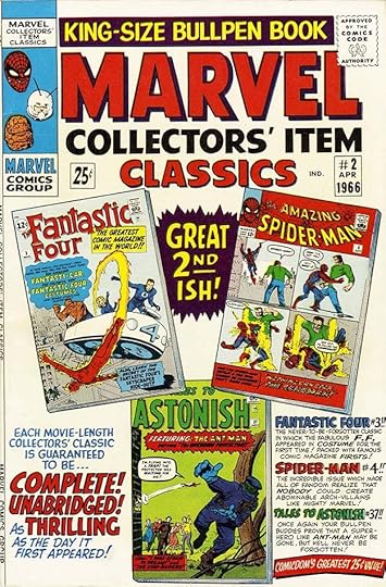 From MARVEL COLLECTORS’ ITEM CLASSICS #2, April 1966
In addition to stories, Sam was now designing logos and lettering covers, including very busy ones like this. Artie Simek had been the main logo and cover lettering man from about 1947 to 1963, but around this time he stepped back and was lettering mostly stories. I’m not sure why, but perhaps he was burnt out, or possibly production manager Sol Brodsky and/or editor Stan Lee liked what Sam was doing and put him on this work. Sam took up the challenge in grand style. The logos from this time may have had input from Sol, but the lettering is all Sam.
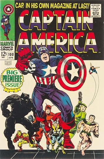 From CAPTAIN AMERICA #100, April 1968
Marvel’s new superheroes were a huge hit with readers, and sales were rising steadily. The older mystery/horror titles that some of them had been appearing in were retitled with the names of the superheroes appearing in them, as here, and Sam Rosen did most of the new logos and cover lettering. The block lettering of CAPTAIN AMERICA is standard stuff, but different from what Simek had been doing in ways that are hard to pinpoint, but clear to me.
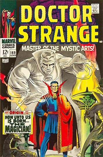 From DOCTOR STRANGE #169, June 1968
For this logo, Sam is imitating the wavy letter style Simek used on STRANGE TALES, but the letter shapes are his, with more elongated ovals having squarer corners on the O’s and C for instance. The subtitle is all his style, as is the caption.
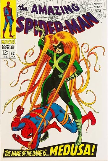 From THE AMAZING SPIDER-MAN #62, July 1968
Sam’s cover lettering was creative and eye-catching, as Simek’s had been, but in a different way that seemed more modern to me as a reader.
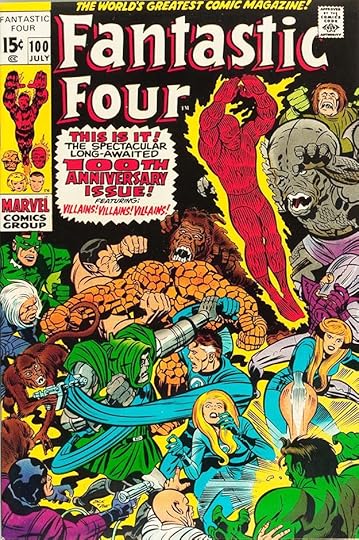 From FANTASTIC FOUR #100, July 1970
I believe this revised FF logo is by Rosen, and it captures the essence of the Brodsky-Simek original while also looking fresh. The burst caption is by Sam. In Marvelmania Monthly Magazine #1 (April 1970, Marvel affiliated), Sam Rosen wrote this about his working method:
The pens I use are either B-6 or A-5 Speedballs, but are modified by grinding down and shaping on carborundum stone. Guide-lines are about 3/16 of an inch apart, separated about 1/16 from one another. For heavy lettering, I use A-6 or B-5, once again ground down until it feels right to me. As for the ink, I generally use Higgins black.
That’s the only information we have directly from Sam.
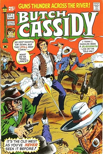 From BUTCH CASSIDY #1, June 1971, Skywald
When Sol Brodsky left staff at Marvel to form Skywald with partner Israel Waldman, Sam Rosen came along to create some logos and do lettering there too, while still doing plenty at Marvel.
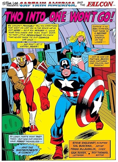 From CAPTAIN AMERICA #156, Dec 1972
Perhaps the increased workload took a toll on Sam Rosen that no one at Marvel understood. I have no facts to support this, but rumors in the business have said that Sam suffered a nervous breakdown, whether from too much work or something else, I don’t know. The last story he worked on is above, he was unable to complete it. The last five pages were lettered by Marvel staffer Morrie Kuramoto, uncredited, and he may also have put in this story title. Sam did no more comics work for the rest of his life. He died April 8, 1992 in Brentwood, NY at age 70, no other information is known. His brother Joe surely knew more, but said nothing about it in his 1982 interview. When I heard the story, I took it as a cautionary tale about putting limits on the amount of lettering work I would accept. It’s sad that Sam Rosen’s hard-won skill and talent stopped so suddenly, but he had to do what was best for him.
In part 3 I’ll focus on the longer career of Joe Rosen, who did lots of fine lettering as well.
The post SAM & JOE ROSEN – Letterers Part 2 appeared first on Todd's Blog.


Todd Klein's Blog

- Todd Klein's profile
- 28 followers

