
Oxford University Press's Blog, page 901
September 21, 2013
Give peace a chance in Syria
When Ban Ki-moon, speaking in The Hague, called recently on member countries to “give peace a chance” in Syria, and condemned the supply of weapons to both sides, he was taking part in a ceremony at the Peace Palace to mark the centennial of its foundation (a result of the Hague Peace Conference in 1899) which otherwise was ignored by the media.
Not much more attention may be paid to the UN International Day of Peace on September 21, which will also be marked by special events at the Peace Palace. First declared by the General Assembly in 1981, the Day of Peace was fixed to its present date in a resolution (2001), co-sponsored by Britain, calling for the day to be observed as “a day of global ceasefire and non-violence”. One has to search for any British (or most other UN member-states’) interest in the event since then, and most activities are organised by the non-official Peace One Day campaign.
These institutions and events belong to a counter-narrative of peace thought and argument over the past century and a half which is usually neglected by historians and stifled by the narrative of war. Yet there are signs in the present Syrian crisis that the opposing views of those who wish to “give peace a chance” have begun to be heard more clearly. And the contrast with what happened ten years ago in the run-up to the Iraq war is notable.
First was the readiness of the UN Secretary-General himself to speak out before the event, warning the US and its allies that any military action without Security Council approval would be in breach of the UN Charter. In 2003, his predecessor Kofi Annan only pronounced the Iraq War “illegal” after it had been carried out.
Public opinion has grown much more sceptical, across the whole political spectrum, of the evidence offered to justify war. This has nothing to do with alleged “war weariness” or “isolationism”. It is, rather, a healthy wariness, based on the experience of Iraq, of government assertions backed up by unspecified intelligence.

The United Nations Security Council Chamber in New York
Public opinion is also much more attuned to the question which before the Iraq War was only raised by committed critics: what will be the actual consequences of military action? There is a widespread and articulate feeling that “it will only make things worse”. The public ear, we may say, has been tuned in to the complexity of the Middle East situation not only by the disastrous consequences of the Iraq War, but by the mixed fate of what can no longer be so easily called the Arab Spring.This popular unease lay behind the failure of the British parliament to endorse Prime Minister Cameron’s resolution (even though tentatively worded) envisaging a military strike on Syria. This, coupled with similar unease in the US, then forced President Obama to seek Congressional support before any military action.
Also in marked contrast to the diplomatic run-up to the Iraq War (and to the earlier Gulf War of 1990-91), the Soviet-sponsored proposal for a solution to the chemical weapons issue in Syria, accepted by the Assad regime, was not shot down or discredited by Western governments at the start. This has led to a more hopeful diplomatic atmosphere which may even lead to dialogue between the US and Britain with Iran – essential for any regional settlement. None of this would have been possible if the missiles had been launched.
Finally, there is concern not only with the failure of the UN Security Council to unite in action, but with the lack of UN reform which would make the organisation more in tune with a world greatly changed since 1945.
There is no shortage of ideas on ways to enlarge the Security Council or to modify the veto power– as set out in Paul Kennedy’s study of The Parliament of Man (2006) — only a lack of resolve by member states, and particularly by the Permanent Five, to explore these ideas. A real opportunity for UN reform was missed in the early 1990s when the end of the cold war made it at last possible.
There is growing recognition too that UN Resolution No. 1973 for humanitarian intervention in Libya was misused by the US and its allies to further regime change, poisoning the atmosphere for future agreement in the Security Council by Russia and China. The implementation of any future resolution of this kind will be watched more closely to ensure this does not breach its terms.
Are we now witnessing a more rounded and thoughtful attitude to questions of war and peace in international affairs, and the final abandonment of Western triumphalism which followed the ending of the cold war? Are we seeing what the anthropologist Douglas Fry, in the recently published collection of essays on War, Peace, and Human Nature, calls “a dramatic shift away from ‘nature, red in tooth and claw’” to the view that humanity is peaceful rather than warlike by nature?
War is still very much with us, and we still have a long way to go, but perhaps we are beginning to realise again that, as St Augustine put it, “It is a higher glory to stay war with a word, than to slay men with a sword.”
John Gittings is a peace historian and the author of The Glorious Art of Peace: from the Iliad to Iraq. He has previously written for OUPblog on World Humanitarian Day and the Cuban Missile Crisis.
Subscribe to the OUPblog via email or RSS.
Subscribe to only current affairs articles on the OUPblog via email or RSS.
Image credit: The United Nations Security Council Chamber in New York, 2005. By Bernd Untiedt, Germany [CC-BY-SA-3.0], via Wikimedia Commons
The post Give peace a chance in Syria appeared first on OUPblog.


 Related StoriesError, metaphor, and the American road to warStriking Syria when the real danger is IranThe first tanks and the Battle of Somme


September 20, 2013
Carnival Cruise and the contracting of everything
By now, you’ve heard the stories of passengers urinating in bags, slipping on sewage, and eating stale cereal aboard the Carnival Cruise ship that was stranded in the Gulf of Mexico — not exactly the fun-filled cruise for which the passengers had signed up and paid. Several lawsuits have been filed which Carnival is seeking to dismiss, claiming its contract prohibits them. Commentators reluctantly agree that it may be an uphill slog for the unhappy passengers because of the contract. Carnival Cruise’s contract, available on its website, restricts the company’s liability for most claims. It also contains a class action waiver, a mandatory arbitration clause, and a venue provision which requires that all claims be brought in Florida. This makes a lawsuit much more expensive for any individual passenger to bring.
There are some defenses to contracts that the law recognizes. The most applicable of these to this situation is “unconscionablity.” The defense of unconscionability recognizes the reality of the mass consumer contract and is raised in cases where a consumer signs a take-it-or-leave-it standard form but the terms are so unreasonably one-sided that the court should not enforce them. Consumers don’t read standard contracts because they can’t change them anyway — they are non-negotiable. Consumers (and that’s all of us) assume they’re harmless because everyone signs them. Anyway, we have no choice — it would be hard to function in this society if we didn’t accept standard form contracts. Banks, car rental companies, and credit card companies all use them.
But something has been happening to unconscionability as a defense to consumer contracts — its power and relevance have been diminishing in the past couple of decades. Coincidentally, it was Carnival Cruise that helped bring about this change.

About 20 years ago, a passenger slipped on a mat while on a cruise and tried to sue Carnival Cruise. At issue was whether she, a resident of Washington, was required to file her suit in Florida, as required by the terms of the ticket/contract. The case made it all the way to the US Supreme Court which held that the passenger was bound by the terms. In so ruling, the Supreme Court specifically stated that this was a unique case given the maritime setting, and that its decision should not alter what it means to call something a contract. But of course, it did. The Carnival Cruise decision created a sea change of unintended consequences and brought us to where we are today — the contracting of everything everywhere.
Courts sympathized with companies’ desire for seamless transactions and so ruled that backs of tickets, and pieces of paper slipped into boxes were “contracts,” — even though the consumer never signed anything and didn’t notice the terms. And then something else happened — technology advanced. The commercial world became paperless. Even our contracts became electronic. At first, companies required consumers to scroll through electronic pages and then click check boxes to indicate agreement before using a website. But marketing departments didn’t like the way these scroll boxes created a hiccup in their users’ online experience — so companies started to get rid of them. Instead, they used hyperlinks, with or without checkboxes, to indicate there was a contract and left it to the consumer to click on them to read the terms – which few ever do. Amazingly, courts have started to enforce these, too, as contracts.
Today you can’t use email, check your bank balance, or shop online without being subject to a contract. There are so many contracts that we don’t even try to read them anymore. It would be hard to get anything done if we read every contract that was thrust in our direction. That’s because mass consumer contracts are not intended to be read — they are intended to protect companies. Consumers often don’t read terms because there’s just too much information. It’s too difficult to sort out the relevant from the irrelevant. The Carnival Cruise contract, for example, is about a dozen pages of fine print.
Consumer contracts don’t have to look the way they do. Companies could do better. Hotels typically make guests sign a contract when they check in — and then they make them initial a provision stating that if they smoke in a non-smoking room, they have to pay a hefty cleaning fee. The extra step serves a purpose. Other companies, too, can draft their contracts in a way that’s more effective at communicating. They can draw a consumer’s attention to a particular provision.
You might wonder what’s the harm? Most of the passengers on the stranded Carnival Cruise ship would still have bought their tickets if they had read the terms of their contract.
But standard form contracts contain lots of different provisions. While you might be sympathetic to Carnival Cruise’s need to limit its business risk by eliminating class actions, you might be less sympathetic to find out that in the same contract (that probably none of the passengers read) is this clause:
“Carnival and/or its promotional partners have the exclusive right to include photographic, video and other visual portrayals of Guest in any medium of any nature whatsoever for the purpose of trade, advertising, sales, publicity or otherwise, without compensation to Guest, and all rights, title and interest therein (including all worldwide copyrights therein) shall be Carnival’s sole property, free from any claims by Guest or any person deriving any rights or interest from Guest.”
In other words, you might find your smiling mug on Carnival’s next brochure — even if you spent your cruise urinating in a plastic bag, slipping on sewage, and eating stale cereal. After all, you agreed to the contract — whether you knew it or not.
Nancy S. Kim is the author of Wrap Contracts: Foundations and Ramifications. She is a law professor at California Western School of Law and a visiting professor at the Rady School of Management, at the University of California, San Diego.
Subscribe to the OUPblog via email or RSS.
Subscribe to only law articles on the OUPblog via email or RSS.
Image credit: Image via iStockphoto.
The post Carnival Cruise and the contracting of everything appeared first on OUPblog.

 Related StoriesCodes and copyrightsKing Richard’s wormsError, metaphor, and the American road to war
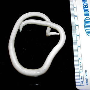
King Richard’s worms

The grave site of Richard III, discovered in Leicester on 25 August 2012. Photo by Chris Tweed. Creative Commons License via Wikimedia Commons.
It has been said that the only persons who refer to themselves as “we” are royalty, college professors, and those with worms. In the 4 September 2013 issue of the Lancet, Piers Mitchell and colleagues present evidence that Richard III, one of England’s best known medieval kings and the deformed villain of Shakespeare’s Richard III , had two reasons for referring to himself in the first person plural. Not only was he a king, but he also appears to have had worms. Mitchell et al base the latter conclusion on the presence of multiple eggs of the roundworm, Ascaris lumbricoides in soil taken from the sacral area (i.e. the location of the intestine) of Richard’s recently unearthed skeletal remains.Finding ascaris eggs in the resting place of King Richard’s intestines is interesting but hardly surprising. Even today, ascariasis (infestation of the human intestine by A. lumbricoides) is all too common, especially in areas of the world lacking proper sanitation. In such places, in fact, as many as 80% of the population is infected by the worm. Fifteenth century Britain had no proper system for dealing with human excrement. Therefore, it is likely that the vast majority of its people — royalty as well as commoners — harbored A. lumbricoides in their intestines.
And yet, likely as it is that Richard III did have worms, the findings of Mitchell et al do not prove it to be so. Although A. lumbricoides eggs were found in the soil where Richard’s “intestines would have been” at the time of his burial, they were also detected (though in lesser number) in “the control [soil] sample from outside the grave cut.” Thus, Richard’s apparent ascariasis might simply have been the consequence of his having been interred in soil already seeded with eggs of the roundworm, rather than evidence of an infection of his own.
An adult Ascaris lumbricoides worm. CDC Division of Parasitic Diseases. Public domain via Wikimedia Commons.
Such problems, in fact, are common when trying to determine the clinical significance of archeological findings. For example, if and when the teeth and fragments of bone Hugo Chavez had removed from Simon Bolivar’s casket in July 2010 are finally examined by Venezuela’s State Forensic Laboratory, the results of the analyses will likely generate many more questions than answers. The actual assays being performed have not been revealed to the public, but presumably will include ones for arsenic (in an attempt to validate Chavez’s claim that Bolivar was assassinated), Mycobacterium tuberculosis (the pathogen generally believed to have killed the general), and paracoccioidomycosis (a fungal infection having all the characteristics of Bolivar’s final illness). If and when the results are available, the challenge will be interpreting their meaning. Were the remains examined actually those of El Libertador? If arsenic or the fungus responsible for paracoccidioidomysis is found is it because Bolivar was poisoned or infected by Paracoccidioides braziliensis or because his remains had rested in soiled contaminated by these? If the TB bacillus is not found, is it because the general died of something other than tuberculosis, or because the infection had simply not spread to the teeth or pieces of bone that were examined? For reasons such as these, archeological post mortem examinations rarely close the book on the etiology of disorders of giants of the past. Rather, they tend only to open the book at some new page.Philip A. Mackowiak is Professor and Vice Chairman, Department of Medicine, University of Maryland School of Medicine, Baltimore, Maryland. He is the author of Diagnosing Giants: Solving the Medical Mysteries of Thirteen Patients Who Changed the World.
Subscribe to the OUPblog via email or RSS.
Subscribe to only health and medicine articles on the OUPblog via email or RSS.
The post King Richard’s worms appeared first on OUPblog.

 Related StoriesPoetry of the PreambleThe first tanks and the Battle of SommeThe demographic landscape, part II: The bad news
When are bridges public art?

By David Blockley
The costly controversy over the abandonment of the ambitious Wear Bridge scheme and current plans by Sunderland City Council to ‘reduce down to a simpler design’ is a manifestation of what can happen when thinking about various forms of art is confounded.
I am going to suggest that if structural art rather than architectural art were used for the redesign then an iconic solution can still be delivered within all constraints including affordability. Then I will set out four criteria that you could use to judge.
Let’s start by looking very briefly at what we mean by art. As we all appreciate art is not straightforward – it is many faceted and difficult to ‘pin down’. Nevertheless we can probably agree that art is something of more than ordinary significance. It helps us to see the world differently – we experience it emotionally. It can inspire, deepen and confuse as it provokes us to see the world and the human condition through ‘new eyes’. Examples include reaching out to the mystical, the divine and the aesthetic, capturing likeness (portrait) and sheer beauty. Interpretive art includes impressionism, modernism (in many forms such as cubism and minimalism) and some post-modernist pieces that may be designed to shock such as Tracey Emin’s famous unmade bed. In all cases art has depended on the highly talented and inspirational individuals with exceptional craft skills.

The Angel of the North
I find that one useful way of thinking about public art is to recognize a spectrum of forms of art that depend on context, i.e. where the art form is exhibited. At one end we have the fine arts and crafts – normally found in galleries, churches and halls. Artwork installed outside has a context or environment that is integral to the whole experience, for example Antony Gormley’s Angel of the North. The Orbit in the London 2012 Olympic Park is a sculpture where people are invited to enter the space and so their safety has to be a priority and the art can no longer be the work of one inspired individual. Of course the idea of the piece still has to be inspirational but many people will contribute to its fulfillment. Next on the spectrum is architectural art – usually a building and not primarily an artwork. Architectural form concerns the sense and use of space, occupancy by people, symbolism and relationship to setting and it can be decorative and sculptural. The art now becomes part of a bigger picture and there are major constraints of delivering functionality, affordability, sustainability and safety. Finally at the very end of our spectrum is the less well-known concept of structural art – an idea first muted by David Billington in his book The Tower and the Bridge (Princeton University Press, 1983). This becomes particularly important when the physical forces become large. Structural form is about the need to live with the forces and hazards of the natural world including self-weight, wind, snow and earthquakes. Well-designed structural form can have the beauty and excitement of controlled strength. Billington built on the ideas of the Roman Vitruvius who wanted his buildings to have firmitas, utilitas and venustas or durability, utility and beauty. A more modern interpretation might be resilience, purpose and delight – indeed venustas is a Latin term for the qualities of the goddess Venus and so has a sensual meaning too.
I have built on these ideas to suggest four criteria to judge whether a bridge is a piece of public art. The first concerns the ‘fine art’ component – the intensity of your initial emotional reaction. When you first look at a bridge is your eye drawn, are you stimulated, engaged and absorbed? The Gateshead Millennium Bridge in the UK had that effect on me when I first saw it. I just wanted to walk on it, touch it and photograph it. The Millau Viaduct in France has the ‘wow’ factor. So my first criterion is to what extent do you agree with the statement: When I first saw this bridge I experienced a powerful emotional reaction.

The Gateshead Millennium Bridge
My second criterion is about composition and harmony. A bridge in context is an exercise in composition as surely as when an artist paints a picture or prepares a sculpture. Good composition needs balance. However while symmetry is balance, balance is more than mere symmetry. Asymmetry can be balanced if it creates a sense of interesting flow on a visual journey without rifts or abrupt changes. So to what extent do you think: The bridge is in total harmony with its context.
Photographic snapshots of people are more interesting when people are not merely standing still with arms by their sides but are doing something natural. A sculpture is effective when there is implied movement as in the muscles of Michelangelo’s David even though he is just a slab of stone. So my third criterion is to what extent do you think: The bridge gives me a sense of controlled strength and frozen movement.
My final criterion is whether: The bridge has clear form that makes sense to you. Many people will judge by line, shape, texture and contrast. In a concern to deal with the large physical forces the structural engineer will look for clarity and unity of flow of force through the structure. You can think of the flow of force through a bridge rather as water flows through pipes. If a structure is allowed to find its own shape (subject to particular constraints) for a natural flow then it will self-adjust to a position in which the internal forces are in equilibrium and contain minimum energy. This is the key to structural art because these natural structural forms are also very pleasing and indeed delightful. Through a better understanding the natural flow of force we can attain a natural harmony between firmitas, utilitas and venustas – resilience, purpose and delight.
Professor Blockley is an engineer and an academic scientist. He has been Head of the Department of Civil Engineering and Dean of the Faculty of Engineering at the University of Bristol. He is a Fellow of the Royal Academy of Engineering, the Institution of Civil Engineers, the Institution of Structural Engineers, and the Royal Society of Arts. He has written four other books including Engineering: A Very Short Introduction and Bridges: The science and art of the world’s most inspiring structures.
The Very Short Introductions (VSI) series combines a small format with authoritative analysis and big ideas for hundreds of topic areas. Written by our expert authors, these books can change the way you think about the things that interest you and are the perfect introduction to subjects you previously knew nothing about. Grow your knowledge with OUPblog and the VSI series every Friday and like Very Short Introductions on Facebook.
Subscribe to the OUPblog via email or RSS
Subscribe to only Very Short Introductions articles on the OUPblog via email or RSS
Subscribe to only art and architecture articles on the OUPblog via email
or RSS.
Image credits: 1) By Tellyaddict at en.wikipedia [Public domain], from Wikimedia Commons 2) By Axel Steenberg [CC-BY-2.0 ] via Wikimedia Commons
The post When are bridges public art? appeared first on OUPblog.

 Related StoriesA fresh musical start for fallFrancesca Caccini, the composerOn the Man Booker Prize 2013 shortlist
September 19, 2013
A fresh musical start for fall
Leaves are changing, temperatures are cooling, and students are returning to the rigors of school. For those of us in the music industry, fall can also be a time of personal renewal. As autumn commences, we have the opportunity to turn the page from summer pursuits and ignite fresh and innovative initiatives. Whether you are a performing artist, educator, member of a non-profit, or music administrator, fall can offer a new beginning. For many of us it’s when the year truly begins; it’s a time when we consider expanding our work and meeting the challenges of outmoded practices and perspectives.
 With each new fall season, I begin a search for fresh wisdom to inspire my work and the work of my clients. Last week one of my clients shared the following Carl Jung quotation with me: “The creation of something new is not accomplished by the intellect but by the play instinct acting from inner necessity. The creative mind plays with the objects it loves.” This quote captured my imagination and delight. It reminds us about how we can expand our creativity and access new ideas for our work.
It’s that play instinct, however, that can get buried in the fast-paced world of technology, the onslaught of overstimulation by the external world, and even our own self-imposed limitations. I call these self-restrictions “show-stoppers” and here are just a few common “truths” that we wrongly tell ourselves:
I didn’t win the Van Cliburn Competition (actually I’ve never won anything) so I will find it next to impossible to have a career.
I am too old. If I haven’t done it by thirty, forget it.
I didn’t go to a conservatory or well-known school and will therefore have few opportunities available.
I don’t have enough repertoire, concertos, sonatas, (fill in the blank).
The repertoire that interests me will never have a market.
There are too many pianists (or whatever) already.
I can’t do that (because other professionals aren’t able or haven’t done it).
It will take forever to develop my career and it is probably too risky anyway.
There’s no place for me because the market is already saturated.
I can’t have a career without management.
Do you have a few of your own show-stoppers to add to the list? There are effective ways that we can move beyond them, so as autumn unfolds let’s play more and work less!
Jill Timmons is known to international audiences and educators as a leading consultant in arts management and the author of The Musician’s Journey: Crafting Your Career Vision and Plan. Her consulting firm, Artsmentor LLC, has helped countless music organizations and individual artists meet the challenge of today’s market place. Timmons has performed as a pianist under the auspices of the NEA, the USIA, and has been heard on NPR, with concert tours throughout the US, Germany, Switzerland, Austria, France, Spain, and Chile. Dedicated to American composers, her discography includes recordings on the Centaur, Capstone, and Laurel labels. Find more resources at the Musician’s Journey companion website.
Subscribe to the OUPblog via email or RSS.
Subscribe to only music articles on the OUPblog via email or RSS.
Image credit: A young Asian woman with her clarinet. Photo by tmarvin, iStockphoto.
The post A fresh musical start for fall appeared first on OUPblog.

 Related StoriesFrancesca Caccini, the composerLearning to sing: lessons from a yogi voice teacherKeith Moon thirty-five years on
The demographic landscape, part II: The bad news
In the first part of this post, I showed how we used a classic mapping technique — contour plots — to explore the demographic landscape, examining the texture of the lives and deaths of billions of people from more than forty countries. Our maps showed how a third variable, mortality rates, varied against two others: age and time. Just as the coordinates of physical terrain are latitude and longitude, so the coordinates of mortality terrain are age and year, or age-time.
Previously, we saw how these contour maps highlighted the good news we found in demographic changes. Today we explore the bad news.
Period effects: The dinosaurs of the twentieth century
Our demography has been scarred by the two World Wars. In our maps these appear as two thin clusters of ovals, like onions that have been flattened then cut open. Topographically, these oval clusters show mortality risk jutting shard-like out of the lowlands of early adulthood like the kite-shaped plates of a stegosaurus. These are period effects, disruptions to the usual order. The bathtub-shaped age-specific mortality risks for the cohorts of men who had come of age by the onset of these wars had spikes in them. Women of the same age, though protected by patriarchal gender inequality from the front line, were still exposed to much of this additional risk, especially if they had the misfortune of having one’s home located in what turned into a battlefield.
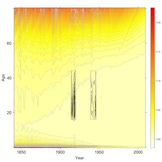
Male contour map, with period effects highlighted. The rectangles mark out the two World Wars.
War and pestilence
War and pestilence are bedfellows. The squalor of the World War I trenches and close-quarter living, the mass transport of men from country to country, poor diet and hygiene, chronic stress. These are just some of the factors which meant that young adults, usually most resilient to harm from disease, were disproportionately victims to the H1N1 influenza virus, which spread across the world in 1918.
World War II killed more in absolute terms, as by then the world’s population was much larger, but World War I killed more of those alive at the time. This was because World War I was not just a war of nation against nation, but also of pathogen against human. The H1N1 influenza virus infected around half a billion people, and killed over 50 million. The pandemic half-decimated the human race, killing up to one person out of every twenty people alive at the start of 1918.
Our maps hint at how the virus may have spread from host to host in a deadly game of conquest. Start in the trenches and roll a die. If it’s a six, then the host dies and the game is over. Role a four or a five (say) and the host recovers but stays a carrier. With fewer hosts remaining (dead or immune) a waiting game begins. A few months or years later, sooner if they’re sicker, and the host returns home. Victim one, the Soldier, passes to Victim Two, the Spouse, and the die is rolled again. If both virus and new host are still alive, then wait nine months, and Victim Three, the Child, is born. One virus, three chances.
Contour maps tell this grim story as follows: look separately at the male and female mortality maps for the same country. If males are exposed to the virus earlier and harder, then we can expect their spike to be earlier and higher — a greater concentration of ovals, slightly further to the left — than for females. There is some evidence in the maps that this took place, although as the data are reported by year rather than month the image is fuzzy.
In the contour maps, the tell-tale signs of transmission from Victim Two to Victim Three are different still. As baby boys and baby girls are about as common, and exposed to the virus at about the same time, we can expect spikes in infant mortality due to the virus to be synchronised for boys and girls, unlike for young adults where they were out of phase. We can also expect it to occur slightly after the onset of the additional mortality for females. Again, this appears to be the case.
The hidden scar
The contour maps reveal an epilogue to the above, turning a massacre into a murder-mystery. Look at the contour maps, and you will see ‘scars’ running along the south-west to north-east diagonal. Like a rake drawn across the ridges of a sand dune, the scars represent abrupt distortions to broader trends. These scars are cohort effects. They mean that, for one unlucky cohort, each of the mortality hurdles have been moved forward slightly, meaning (say) that the mortality risk that would otherwise have been faced at aged 40 is instead faced at 37; the hurdle faced at 35 is instead faced at 33, and so on, continuing all the way from childhood to old age.
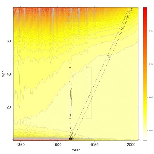
Female contour map, with World War One period and cohort effects highlighted.
The unlucky cohort was born in the wake of World War I. The epilogue this fact tells us is that, even when babies were not killed by the privation and pestilence of the era, they were in many cases harmed and weakened by these conditions, and so slightly more fragile to the misfortunes of later life. The surprising and grim inference to draw from the scars is that the 1918 influenza pandemic may still have been killing people at the turn of the twenty-first century.
With contour maps, data become landscapes. The broad brush descriptions above introduce these landscapes and the art of reading them. However, we have only really scratched the surface of these surfaces. With hundreds of landscapes from over forty nations to explore, in some cases stretching back more than 250 years, there is still much to discover.
Jonathan Minton has worked at the School of Health and Related Research (ScHARR), University of Sheffield, for two years. In September 2013 he will be taking up a new role within Urban Studies at the University of Glasgow to investigate trends in urban segregation as part of the Applied Quantitative Methods Network (AQMeN).The visualisations developed from a PhD in Sociology & Human Geography at the University of York, and a friendly argument with his former PhD supervisor, Danny Dorling, about the interpretation of two lines on a graph. The visualisations use data freely available from the Human Mortality Database, and the open-source statistical programming language R. He is the co-author of the paper ‘Visualizing Europe’s demographic scars with coplots and contour plots‘, published in the International Journal of Epidemiology.
The International Journal of Epidemiology is an essential requirement for anyone who needs to keep up to date with epidemiological advances and new developments throughout the world. It encourages communication among those engaged in the research, teaching, and application of epidemiology of both communicable and non-communicable disease, including research into health services and medical care.
Subscribe to the OUPblog via email or RSS.
Subscribe to only health and medicine articles on the OUPblog via email or RSS.
Image credit: Both figures by the author. Do not reproduce without permission
The post The demographic landscape, part II: The bad news appeared first on OUPblog.

 Related StoriesThe demographic landscape, part I: the good newsPolio provocation: a lingering public health debateCan neighborhood parks and playgrounds help fight childhood obesity?
September 18, 2013
Are you daft or deft? Or, between lunacy and folly
The subject promised by today’s title has been simmering on my back burner for a long time, but now that the essay on simpleton is out, I am ripe for tackling it. Lunacy and folly began to interest me in connections with the words mad and dwarf. Mad is puzzling because its Middle High German cognate means “pleasing, pleasant.” The solution lies in the fact that the original root seems to have referred only to “change,” as in the Latin verb mutare, from which English has numerous references to mutability. (Remember how the protagonist of Wilhelm Hauff’s “Caliph Stork” and his companion said mutabor, mutabor and turned into birds? (No magic works like knowing the first person passive singular of the first conjugation, futurum, in Latin.) While in their new shape, they were prohibited from laughing, but, naturally, broke the interdiction and ran the risk of never losing their wings.) Change is a broad concept, so that it does not come as a surprise that the offspring of the ancient root developed into several unpredictable directions: from “altered” to “mutilated; deranged” and their opposite “pleasing.” Such are the inscrutable ways of historical semantics.
Dwarf is an even more difficult case. I believe that the original form of the noun, extant in all the Germanic languages except Gothic, was dwesgaz. (We know mainly a fourth-century translation of the New Testament into Gothic. The word for “dwarf” does not occur there, though it probably existed in the language and sounded like dwizgs, masculine or neuter.) This dwezg- may be a cognate of Engl. dizzy and Dutch dwaas “foolish” (an almost the same adjective occurred in Old English). Dwarfs, I suspect, far from being creatures like their namesakes in the Grimms’ fairy tales and Disney movies, made people “dizzy” (that is, deprived the otherwise normal and healthy individuals of the power of reasoning), just as elves made them elf-shot (afflicted with a disease supposed to come from a wound by an elf), and the Greek gods made them “en-thus-iastic,” which might be good or bad, depending on how far their “enthusiasm” went. (Compare crazy below.) Engl. giddy also meant “possessed by a god or spirit.” So it happened that, enveloped in etymological dizziness ~ giddiness, I began to look at the origin of words meaning “mad” and “foolish.” Some of them have a curious history.
Daft goes back to Old English, in which its sense was “mild, gentle, meek” (the root, again on the evidence of Gothic, meant “be, become fit”). Why “fit, suitable” yielded “stupid” and “bereft of sound judgment” is far from clear; nor does the presence of Middle Engl. daff “simpleton, fool” of unknown origin dispel the obscurity. To confuse us even more, we notice that daft is a doublet of deft. Originally, deft also meant “gentle, meek,” later “skillful; neat; pretty.” The starting point of daft and deft was the same, namely “fitting, convenient.” Language shows that the world seldom appreciates virtue. Gentle and meek people are “mad,” and so are those who are too trustful, as evidenced by German albern “stupid” (no connection with elves), from alawari “friendly”; English and Icelandic had close cognates. The starting point was “trust, confidence.” Don’t confide in your fellow men—such is the message of the Old Icelandic poem titled “The Speeches of the High One”; the High One is Odin, the greatest god of the Scandinavian pantheon.
It is not improbable that the following words were derived from the same root, even if the second batch represents a different vocalic grade: Old Icelandic dapr “sad,” German tapfer “brave” (from “heavy, weighty”?), Dutch dapper, again “brave,” but Engl. dapper “neat, trim.” From “heavy” to “powerful”? From “powerful” to “brave”? But “trim” and especially “sad”? Even Russian dobryi “kind” and Latin faber (as in Engl. fabric, fabricate) possibly belong here. Virtues and vices, joy and sadness appear entwined. Mad and sad, witless and skillful, meek and powerful, heavy and trim…. The knot is hard to unravel.
Silly, known only since the late Middle English period, is, from a phonetic point of view, a continuation of seely “happy, blessed.” The Standard has a few words in which short i was changed before a single consonant to close long e (as in German Heer “army”) and turned by the Great Vowel Shift into long i (the vowel we hear in Engl. eel). Occasionally the deceitful, deceptive modern spelling reflects the old form, as happened, for example, in the word breeches (pronounced and occasionally spelled as britches), in which the same change of short i to long i has occurred. Seely “blessed” poses no problems. German selig still means the same. The noun from which seely was derived meant “time; occasion; good fortune; happiness,” and we have Gothic sels “good, kind.” Someone who is too happy must be silly. An excess of valiance may result in sadness. This is all in line with the wisdom of the High One.

Illustration from La Folle journée ou Le Mariage de Figaro. Jacques Philippe Joseph de Saint-Quentin. Bibliothèque nationale de France. Public domain via Wikimedia Commons.
Fool is a borrowing from French, ultimately from Latin. Its root is the same as in follicle (literally a small sac) and bellows, belly, and ball (native words). Latin folles “puffed cheeks” may have suggested the idea of a vain person, but even without folles one can imagine how inflation makes one think of self-importance and stupidity. Windbags are not called this for nothing. The path from “foolish” to “mad” is always short. French fou, from fol, means “mad.”Imbecile (from French, from Latin) did not signify a person of low intelligence. The etymological sense of Latin im-becillus was “weak,” presumably from “unsupported,” for baculum meant “stick, staff.” Thus, from “unsupported” to “feeble” and “feeble-minded.” The etymology of idiot is well-known. It too made the familiar way from Greek into Latin and from there into French and English. The Greek idiot was a private person, one not engaged in public affairs, hence a despicable ignoramus. Idio- “one’s own, private” is familiar to English speakers from idiom (“a peculiarity of language”) and idiosyncrasy. Linguists also use the term idiolect “the speech habits peculiar to a particular person.” One cannot even stay away from an active engagement in public affairs without being called an idiot. That is probably why people sitting on numerous committees are so smart.
Being called mad would be impolite, but crazy is bandied about all the time. Craze is a gift from Scandinavia. The word meant “piece, fragment,” and in Icelandic also “a dainty.” Crazy, used about a structure (“dilapidated, rickety, shaky”) and a pavement (“formed of irregularly shaped pieces”), reminds us of the oldest meaning of the adjective. Craze may be related to crash, its original meaning being “to shatter.” So here we have the progression from “unsound, liable to fall to pieces” to the now obsolete “failing in health” and finally to “being of unsound mind” and, to use Henry Cecil Wyld’s elegant definition of crazy about “rendered unreasonable by exaggerated fondness.”
Such is the tale told not by, but about idiots.
Anatoly Liberman is the author of Word Origins And How We Know Them as well as An Analytic Dictionary of English Etymology: An Introduction. His column on word origins, The Oxford Etymologist, appears on the OUPblog each Wednesday. Send your etymology question to him care of blog@oup.com; he’ll do his best to avoid responding with “origin unknown.”
Subscribe to Anatoly Liberman’s weekly etymology posts via email or RSS.
Subscribe to the OUPblog via email or RSS.
The post Are you daft or deft? Or, between lunacy and folly appeared first on OUPblog.

 Related StoriesNo simplistic etymology of “simpleton”Looking “askance”Three recent theories of “kibosh”
Error, metaphor, and the American road to war
For too long, sheer folly has played a determinative role in shaping US military policy. Before Washington commits to any new war or “limited action” in the Middle East, it would be prudent to look back at some of our previous misjudgments. Even if it should appear that a “tailored” and “narrow” American intervention in Syria could be both life-saving and law-enforcing, we should raise one unavoidably vital question: why, again and again, do we manage to get ourselves drawn into plainly losing military ventures?
As a democratic society, it should be easy for us to recognize various pertinent connections between governmental error and public opinion, that national leadership failures must ultimately be a composite reflection of popular misunderstandings.
 What have we been doing wrong? Have we simply been inclined to choose poor leadership? As a free people, are we incapable of selecting the best available candidates for high public office? Is this damaging incapacity an inevitable consequence of certain far-reaching personal deficits, crippling liabilities that are both intellectual and educational? Thomas Jefferson would have replied to these intersecting questions, unhesitatingly.
Against John Adams, who had decided to divide classes in America according to “gentlemen” and “simple men,” Jefferson chose instead to identify a less orthodox measure of social differentiation. Remarked Jefferson, in what amounted to an oddly revolutionary dialect (his enemies had often dubbed him a “Jacobin”), the distinguishing criterion of class in the new nation should hinge entirely upon the degree of confidence in popular self-government.
Even for Thomas Jefferson, then seriously fashioning the developing American democracy, there were abundantly firm constraints on who should and should not be allowed to participate. But, the principal author of the Declaration did openly favor those who would unambiguously identify with “the people,” over those, like Adams, who had determined to fear them. While Adams had been concerned with stemming off violent actions by the “mob,” Jefferson’s thoroughly different preoccupation was to prevent any oppression by a “democratic” government.
How does this earlier preoccupation relate to American military ventures? Although Jefferson had expressed a clear democratic faith in “the people,” he had also made such faith contingent upon a prior and proper public education. Believing unreservedly in a diffusion of knowledge “among the masses,” he announced in his first inaugural address that an enlightened American public was a sine qua non for successful governance. Not surprisingly, he remarked, if forced to choose between government without newspapers, and newspapers without a government, he would cheerfully opt for the latter.
So why did we have to wait so many painful years for McNamara‘s mea culpa, for his nefariously-calculated delay that eventually cost tens of thousands of American and Vietnamese lives? If Thomas Jefferson were still available to answer this question, his response would likely be both predictable and helpful. Taking a page from Alexis de Tocqueville, prominent French critic of American life in the early 19th century, and author of Democracy in America (1835 & 1840), Jefferson would have punctured the oddly Edenic myth of a young America that could flourish without any evident regard for intellectual life and work.
Jefferson, like Tocqueville, would have observed that the new country’s war policies could never be on proper course, unless the people’s core ethos were driven by something other than bourgeois accumulation and relentless imitation. An early spokesman for what we now call “American exceptionalism,” Jefferson cleared a clarifying path to the even more critical and nuanced democratic sentiments of Ralph Waldo Emerson. The iconic American Transcendentalist too had favored an enlightened American commonality of vision, but significantly, one that would be more conspicuously devoted to individual self-affirmation and “inwardness.” Emerson, like Tocqueville, understood that an uneducated and uncultivated democracy would quickly usher in devastatingly new forms of “majority tyranny.”
Status quo ante bellum? Today, even a conceptually purposeful war could remain a conflict that can never be won. Never. Not militarily. Not on the usual battlefields.
How, in sum, do we Americans manage to descend, again and again, from one significant war policy forfeiture, to the next? The most obvious answer seems to lie in the continuing intellectual and political inadequacies of our leaders. In turn, recalling Jefferson’s earlier wisdom about democracy and education, we must look far more closely at an underlying American society that has willfully substituted short-term indulgences and distractions for long-term understanding.
Somehow, “we the people” have entered into a protracted bargain of sequential surrenders, now accepting myriad bribes and amusements in exchange for abandoning intellectual obligations and citizenship responsibilities.
In candor, our third president was right-on-the-mark. Himself an avid reader, one who was well-acquainted with leading philosophical and jurisprudential ideas of the late-eighteenth century, Thomas Jefferson had already understood that enduring wisdom in democratic governance must ultimately depend upon antecedent wisdom among “the people.” For certain, he never intended the sort of rampant and vulgar vocationalism that currently dominates our formal education. Instead, Jefferson had imagined a thoroughly enriching curriculum, a profoundly humanistic plan of study that would strongly favor a steadily expanding attention to history, literature, and the arts.
This promising Jeffersonian curriculum was to be embedded in a substantially improved larger society, one that valued dignified learning over insubstantial entertainments. For us, today, embracing any such Jeffersonian plan will not be easy, but in the long term, there is really no other way to avoid stumbling into yet another futile American war, in Syria, or anywhere else. In the immediate or very short-term, meticulous American applications of “surgical” force against the tyranny in Damascus could turn out to be necessary, reasonable, and even law-enforcing — especially if still expressible as part of a much wider international coalition of states — but only if these applications are undertaken for defensibly compelling reasons, and for verifiably crucial objectives.
In part, at least, Thomas Jefferson’s life and writings still offer us an apotheosis of American democratic possibility, a usable template for national decision-making based upon abiding respect for true learning, and a rejection of intellectual imposture. Armed with such a template, we might, finally, advance beyond the tragically recurrent folly of futile American wars.
Louis René Beres (Ph.D., Princeton, 1971) is Professor of Political Science and International Law at Purdue. He is the author of many books and articles dealing with international relations, international law, art, literature, and philosophy. Professor Beres’ most recent article on Syria, Israel, and International Law was published in the Harvard National Security Journal (August, 2013). He is also a regular contributor to the OUPblog.
If you are interested in learning more about Jeffersonian thoughts and ideas, check out Thomas Jefferson: The Revolution of Ideas by R. B. Bernstein, which finds the key to this enigmatic Founder not as a great political figure, but as leader of a “revolution of ideas that would make the world over again”. It is also part of the Oxford Portraits series, which offers informative and insightful biographies of people whose lives shaped their times and continue to influence ours.
Subscribe to the OUPblog via email or RSS.
Subscribe to only current affairs articles on the OUPblog via email or RSS.
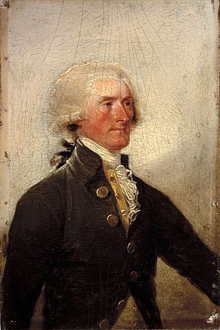
Image credit: Thomas Jefferson by John Trumbull 1788. The White House Historical Association. Public domain via Wikimedia Commons.
The post Error, metaphor, and the American road to war appeared first on OUPblog.

 Related StoriesStriking Syria when the real danger is IranIsrael’s survival in the midst of growing chaosThe case against striking Syria
Can neighborhood parks and playgrounds help fight childhood obesity?
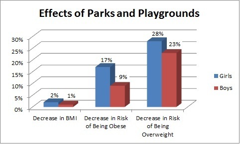
The prevalence of childhood obesity in the United States has risen dramatically across all racial, gender, and ethnic groups since 1980. Approximately three out of ten children and adolescents in the United States are overweight or obese. Compared with normal-weight children, obese children are at a higher risk for chronic diseases such as cardiovascular diseases, bone and joint abnormalities, and sleep apnea. Furthermore, obesity imposes adverse effects on cognitive, social, and psychological development in children and has long lasting negative impacts on adult health, employment, and socioeconomic status. Stopping and reversing the childhood obesity epidemic requires promoting active lifestyle and increasing energy expenditure. Parks and playgrounds are important places for children to engage in physical activity. We evaluated the effect of neighborhood parks and playgrounds on childhood obesity by examining their effects on body mass index (BMI) and the risk of being overweight or obese, using the 2007 National Survey of Children’s Health.
By studying a national population of children aged 10-17, we find that neighborhood parks/playgrounds have significant effects on childhood obesity (see below). Compared to girls without parks/playgrounds in their neighborhood, girls living in a neighborhood with a park or playground had lower BMI (by 2%). They were also 17% less likely to be obese and 28% less likely to be overweight. Similar, although smaller, park/playground effects were observed among boys. Boys living in neighborhoods with such facilities had slightly lower (1%) BMI and were 9% and 23% less likely to be obese or overweight.
We find significant differences in availability of neighborhood parks/playgrounds across regions. For example in Mississippi, only 54% of children reported that they had parks/playgrounds in their neighborhood while the proportion is 91% in New Jersey. In Washington, DC, 4% of white children live in a neighborhood without a park or playground compared with 15% of black and Hispanic children. Disparities in availability of neighborhood parks/playgrounds affect the ability of these populations to use neighborhood facilities and meet daily recommended level of physical activity.
We find that park/playground effects vary across demographic segments. For example, these effects are more pronounced for non-Hispanic white children than for black and Hispanic children. At the same time, we also find that the effects for children in low-income households are larger than for those children in high-income households. These findings have important implications in light of the fact that obesity rates are much higher among Hispanic and black children than non-Hispanic white children and among low-income children than high-income children. The results suggest the need to better understand social, cultural, and other factors that may presently be limiting physical activity through use of neighborhood recreation facilities.

It is reasonable to expect that other neighborhood characteristics, such as safety, also influence park/playground effects. Based on a self-perception measure of neighborhood safety, we find that the effects are larger for children in unsafe neighborhoods than for those living in safe neighborhoods. Although an unsafe neighborhood is likely to discourage its residents from outdoor physical activity, our results suggest that adding a park/playground in an unsafe neighborhood may provide a relatively safer place for physical activity, thus leading to an improvement in weight outcomes. It is important to devote community resources (e.g. policing, community volunteers) to maintain parks and playgrounds as safe venues for children to engage in physical activity, especially in unsafe neighborhoods. Other neighborhood amenities such as community centers/kids’ clubs attenuate the park/playground effects for both genders. This suggests that neighborhood parks/playgrounds and community centers/kids clubs are likely to be substitutes.
The results in this study suggest that improving a neighborhood’s built environment through the addition or maintenance of parks and playgrounds is an effective strategy for combating childhood obesity. Such policy interventions must consider the socioeconomic status of the targeted children as well as other neighborhood amenities.
Maoyong Fan and Yanhong Jin are the authors of “Do Neighborhood Parks and Playgrounds Reduce Childhood Obesity?” (available to read for free for a limited time) in the American Journal of Agricultural Economics. Maoyong Fan is an Assistant Professor of Economics at Ball State University, whose current research interests include economics of obesity and environment and health. Yanhong Jin is an Associate Professor of Agriculture, Food and Resource Economics at Rutgers University, whose current research interests include food and health economics.
The American Journal of Agricultural Economics provides a forum for creative and scholarly work on the economics of agriculture and food, natural resources and the environment, and rural and community development throughout the world. Papers should relate to one of these areas, should have a problem orientation, and should demonstrate originality and innovation in analysis, methods, or application.
Subscribe to the OUPblog via email or RSS.
Subscribe to only business and economics articles on the OUPblog via email or RSS.
Image credit: (1) Chart courtesy of Maoyong Fan and Yanhong Jin. (2) Group Of Children Riding On Roundabout In Playground. © monkeybusinessimages via iStockphoto.
The post Can neighborhood parks and playgrounds help fight childhood obesity? appeared first on OUPblog.

 Related StoriesCodes and copyrightsThe demographic landscape, part I: the good newsPolio provocation: a lingering public health debate
The demographic landscape, part I: the good news
If demography were a landscape, what would it look like? Every country has a different geographical shape and texture, visible at high relief, like an extra-terrestrial fingerprint. But what about the shape and texture revealed by the demographic records of the people who live and die on these tracts of land?
Maps show the fingerprints of the physical landscape on a human scale, letting us see the forests for the trees, the regions for the forests, and the countries for the regions. They are powerful visualisation techniques, knowledge tools for comprehending enormity.
Our visualisations use a classic mapping technique, contour plots, to explore the texture of life and death of billions of people from more than forty countries. Contour plots show three dimensional structure on a two dimensional page, using nothing but a series of lines. The lines show where, over two dimensions, the values of a third dimension are equal. A classic application in physical geography is showing how height above sea level varies as people travel east or west, or north or south. Travel alongside a contour line and your journey will be flat; travel through many contour lines packed close together, and you will either be climbing or abseiling.
We used contour maps to show how a third variable, mortality rates, varied against two others: age and time. Instead of the horizontal axis showing west to east, it shows year, earliest to most recent; and instead of the vertical axis showing south to north, it shows age, ranging from newborns to 80 year olds. Just as the coordinates of physical terrain are latitude and longitude, so the coordinates of mortality terrain are age and year, or age-time.
Within these maps, our trajectory as individuals is always along the diagonal: we age one year per year. As researchers, however, we can imagine walking along age-time in any direction, or even flying over it in a helicopter. Our contour plots present a high resolution description of these abstract terrains.
What’s the value of doing this? Demographers are typically interested in three kinds of mortality effect: age effects, period effects, and cohort effects. In our maps, we can explore age effects by looking south to north, period effects by looking west to east, and cohort effects by looking across diagonals. We can also see how these age effects have changed with time, and imagine how the terrain would have extended into the past and may extend into the future. We can compare the records of different nations, exploring how demographic changes may have occurred sooner or later, or faster or slower, in some nations than others.
How to see the good news
The picture is mixed and complex, but not ambiguous. It shows that, as people interested in public health, and as people who care about people, we have much to be proud of. Within England and Wales, and almost every other nation we looked at, we saw two changes to the demographic landscape which made it less hazardous for everyone. These two changes are two good news stories that deserve to be told, and they are both to do with bathubs.
Why life is like a bathtub
The diagonal tracts of age-specific mortality risk that we travel along as we age used to be ‘bathtub shaped’: very high in infancy, low throughout the rest of childhood and into middle age, and then rising exponentially as middle age becomes old age. The first piece of good news: we broke the left side of the bathtub!

Three-dimensional visualisation of the ‘bathtub’, based on female mortality patterns using data from England & Wales. Infant mortality on the left; elderly mortality on the right.
Why broken bathtubs are good for babies
Infant mortality changed from an everyday tragedy to something much rarer. At the start of the twentieth century, about one child in four was expected not to reach its fifth birthday. By the middle of the century, this had dropped to around one-in-thirty, and by the end of the century it dropped further, to around one-in-a hundred and fifty. This marked the end of the large family, as parents no longer needed to have many children to protect against the risk of none living to adulthood and passing on the family legacy. With fewer mouths to feed at home, opportunities for women at work opened up, and the march towards gender equality took apace. With far fewer babies to bury, a source of great human misery stops being as numbingly commonplace.
Taking a steamroller to outrageous fortune
The second piece of good news: we’ve been steadily flattening the right side of the bathtub for decades. We can see this by travelling flat, along a contour line marked 0.01, which represents a one-in-one hundred risk of dying in the next year. Imagine this as a hurdle people have to clear in order to keep travelling towards older age. At the start of the twentieth century, men faced this hurdle when they were in their late thirties, and women when they were in their early forties. By the time the twentieth century came to an end, this hurdle has been pushed back almost a generation, to the late fifties for men, and the mid-sixties for women. This is just one of many contour lines which have been pushed back during the Twentieth century. Even better news: so far the contours are continuing to recede into ever older ages, with no signs of stopping.

Female contour map, with 0.01 contour highlighted.
Jonathan Minton has worked at the School of Health and Related Research (ScHARR), University of Sheffield, for two years. In September 2013 he will be taking up a new role within Urban Studies at the University of Glasgow to investigate trends in urban segregation as part of the Applied Quantitative Methods Network (AQMeN).The visualisations developed from a PhD in Sociology & Human Geography at the University of York, and a friendly argument with his former PhD supervisor, Danny Dorling, about the interpretation of two lines on a graph. The visualisations use data freely available from the Human Mortality Database, and the open-source statistical programming language R. He is the co-author of the paper ‘Visualizing Europe’s demographic scars with coplots and contour plots‘, published in the International Journal of Epidemiology.
The International Journal of Epidemiology is an essential requirement for anyone who needs to keep up to date with epidemiological advances and new developments throughout the world. It encourages communication among those engaged in the research, teaching, and application of epidemiology of both communicable and non-communicable disease, including research into health services and medical care.
Subscribe to the OUPblog via email or RSS.
Subscribe to only health and medicine articles on the OUPblog via email or RSS.
Image credit: Both figures by the author. Do not reproduce without permission
The post The demographic landscape, part I: the good news appeared first on OUPblog.

 Related StoriesAre the differences in acceptance of LGBT individuals across Europe a public health concern?Polio provocation: a lingering public health debateCodes and copyrights
Oxford University Press's Blog

- Oxford University Press's profile
- 238 followers

