Peter M. Ball's Blog, page 10
March 8, 2022
The Lessons We Learn From the Smiley Face
The yellow smiley face was first designed in 1963. State Mutual Life Insurance hired the designer, Harvey Ball, to create the logo attached to a company-wide “make friends” campaign after a merger decimated morale. They paid him $45 for the creation of two eyes, a smile, and a yellow circle.
Nobody trademarked the smiley face, although plenty of found ways to copyright specific expressions of it. In 1970 the Spain brothers, Murray and Bernard, appended the words “Have a Happy Day” underneath and made a killing selling merchandise with the ubiquitous symbol. Contemporary operating systems all agree that the smiley face is a useful icon or emoji, now represented by the ascii digits of a colon and a closing bracket —  — but each system has its own expression of those emojis when the OS interprets the characters and translates them into graphics.
As you might expect, the smiley face is a copyright nightmare once you dig into its origins. The Spain brothers took credit for the creation on national TV when appearing on Whats My Line in the seventies, despite knowing good and well that the originator was Ball. A second group attempted to take ownership of the design in 1971, when a French journalist launched The Smiley Company (and they seem to have been successful, with the Smiley Company fending off a copyright claim by Walmart in over 100 countries back in 2005). In 2001, Harvey Ball’s son Charlie started a non-profit dedicated to reclaiming the rights to his father’s work.
I love the history of the smiley face because it touches upon so many of my favourite mantras for writers:
Take care of your copyrightsNever think you can predict which work will take offNever doubt that a simple idea can be greatAnd, sometimes, even Capitalism can’t contain the right idea hitting at the right time

March 2, 2022
We Are All Unintentional Hypersigil Machines
We’ve been watching Doom Patrol, a television show that riffs heavily on Grant Morrison’s ground-breaking run on the comics in the late eighties and early nineties. Naturally, this sent me scurrying off to revisit Morrison’s philosophy of narrative as a hypersigil—an extension of the chaos magic philosophy of creating a glyph that codifies your intention and imbuing it with energy to effect change in the world.
For Morrison, a hypersigil was an extended work of narrative that served the same purpose. Stories designed to change the self and the world. He created three works that were explicitly hypersigils—The Invisibles, Flex Mentallo, and The Filth—all of which were created during or around his Doom Parol run.
Morrison is batshit insane, of course, and that’s part of his charm as a creator, but it’s interesting to watch some of his more out-there ideas get teased out by other writers.
For example, the curation of a social media profile lends itself to the process of sigilization, with users offering up a vision of their life and what’s meaningful in it, investing it with attention and intention, then creating a feedback loop where that increased attention reinforces the vision they’re curating.
Social media as subconscious magic powered by a story of the self told by the self. Fictions that make themselves real.
And what’s interesting about this is the way Morrison sounded like an outright mad bastard when he first started banging on about hypersigils on the internet, but it was also a time when this kind of active curation of the self wasn’t commonplace. We passively received more narratives than we created, and the choice to incorporate something part of your identity was relatively contained. You might be a hardcore SF fan around other hardcore SF fans, but you probably weren’t sharing your weird-ass Babylon 5 theories with friends at work.
Now, the bits of your life deemed important enough to like, share, or talk about on social media are likely to bleed out into the rest of your life. Every day you make choices about the way you think of yourself, which changes the way other people think of you.
Morrison may be barking mad, but the hypersigil is an intriguing metaphor for what’s become an incredibly commonplace way of engaging with the world.
February 22, 2022
Narrative Poetics Dances A Tango With Publishing Technology
The narrative poetics of comic books are driven by the stories relationship with the physical page. Everything must be in a particular page-count, with each scene allotted a certain number of panels and pages, and certain narrative beats work better at the bottom right of a two-page spread just before we flip the page.
Prose seems like the writing process exists oustide the demands of the page, but that’s a function of distance and changing technology. Consider the description of writing a ten cent library, 20,000 word “nickel novel” from John Milton Edwards’ The Fiction Factory:
The libraries, as they were written by Edwards, were typed on paper 8-1/2″ by 13″, the marginal stops so placed that a typewritten line approximated the same line when printed. Eighty of these sheets completed a story, and five pages were regularly allowed to each chapter. Thus there were always sixteen chapters in every story.
(Edwards, John Milton. The Fiction Factory)
Edwards is one of the pen names for William Wallace Cook, a pulp writer active around 1910 to the early 1920s, responsible for a prodigious output in the twenty-odd years he worked as a full-time writer. A pulp era where the cost-per-page and printing technology constrained word counts to fit the pages available in the publishing format.
While I’ve never worked in an environment where the relationship between page and prose was quite that explicit, I got started as a prose writer back in 2007, trying to write short stories of 6,000 words or less (and preferably 4,000 words or less). Novellas and novelettes were harder to get published, because so few markets wanted to devote the page count to them (or risk alienating a screen-reader with long walls of text). The ability to tell an evocative tale in 2,000 to 4,000 words was a valuable skill in that environment, and stories went untold because they didn’t fit into that space.
Less so, these days, when stories are increasingly coming out in every conceivable size and format. In recent years the novella have made de a big-time comeback in both digital publication and print, courtesy of ebooks and print-on-demand technology that make them cost effect. The long tail on digital book sales makes even tricky formats, such as the 10,000 word novelette, a surprisingly useful thing for a writer to have on their backlist.
And so the industry shifts on its axis, and the poetics of SF storytelling adjusts itself in subtle ways.
February 15, 2022
The Back Cover Synopsis in the Backlist-driven world
We used to sell books by telling you how exceptional the story was. The whole back cover synopsis pushing you to invest in the character journey and atmosphere of the story contained within. Selling you on the author was a secondary concern, because the author was an invisible presence nine times out of ten. Your primary relationship was with the book, the bookseller, and the story, not the person who wrote it.
Then blogs came along, and then Facebook, and then Twitter. YouTube and TikTok and Tumblr and Snapchat and Patreon and gods know how many others that I’m ignoring in that list. Find an author and like their work? Odds are you’ll be following them on one platform or another, the first step in a long-term relationship.
Which raises an interesting question for marketing books: do we now sell readers on the author and the contents of the book? Make them sound like the kind of author that needs to be followed and engaged with beyond this one story?
Inviting a long-term commitment from a reader might not sell the current book as efficiently as the traditional conventions around the back cover synopsis, but the long-term relationship sells books in two directions: through the backlist, as readers realise there’s more there; and in the future releases the author may make.
Selling the individual book is a solid choice in the velocity model of publishing, where everything focuses on the now, now, now, but the transition to backlist-focused business models makes the second option far more palatable.
February 8, 2022
On the Fragility of Habits
It doesn’t take much to disrupt a habit once it’s established. Our habitual behaviours are often context specific, triggered to run in response to a particular form of stimuli. Go on a two-week break from work and those routines that run like clockwork go out the window — making it easier to adopt new habits that felt impossible a week before (or lose the thread of good habits that you’d like to keep ) .
Your morning ritual that gets you up, dressed, and out the door can be thrown off by the simple act of leaving your shoes in the wrong place, or running out of shampoo while you’re in the shower. Morning routines are often a chain of habits, each one triggering the next, and one small crack will echo through your morning. Those shoes you left in the wrong spot mean you’re thinking instead of doing, watching the clock to check times and fretting about what needs to be done instead of running through the morning on autopilot.
Before too long, you’ve walked out the door without your lunch. Or your keys. Or those documents you needed. All because you left your shoes beside the couch, instead of tucking them under your bed.
Routines get thrown by little things.
Which means unleashing a big change on your life — starting a new job, inviting a partner to cohabitate with you, a major illness — will echo through every habit you’ve built up and disrupt them all.
The upside: they build fast, and you can connect them to your old habits with a little effort.
The downside: it feels like you’re living in the heart of chaos, and life has spun out of control for a while. Because you’ve got to think and plan to do things again, for the first time in a long while.
And the easiest routines to pick up are usually the ones designed to help you cope and soothe the frustration of all this chaos in your world, rather than the ones that move you forward and thrive in the new normal.
Rebuilding the useful routines is work, and it pays to do it consciously instead of hoping it’ll come along.
February 1, 2022
Behind The Scenes On A Cover Redesign
Last year I did a new cover for Alan Baxter’s Shadow Bites: A Horror Sampler, a free bundle of stories and novel excerpts for folks who’d like to get a taste of Alan’s work. It’s a project from a longer conversation Al and I were having about title development, the stuff we’ve both been doing in the indie publishing space, and the difference between the titles where development has been nigh perfect (The Roo) and the stuff that could do with a little spruce.
Here’s the original and the refresh side-by-side for context. Original is on the left, my revamp is on the right.
[image error]I won’t comment too much on the original, as it’s not my work and wasn’t specifically design with Al’s book in mind, but I will break down some of the reasons I pushed Alan to consider making a change. Mostly, these reasons have nothing to do with the cover design, and everything to do with a mismatch between the books goals and the design.
For me, the starting point for covers isn’t “is this a good/pretty cover?” but “does this cover fit the title development for the title?”, which is a slightly knottier question that benefits from a little thought. Title development starts with an emotion—you figure out what you want the reader to feel about the book, then work your way back through elements such as cover design, price, title, subtitle, trim size/format, production value, interior design, and synopsis to make sure that everything is working in sync.
Some of those decisions were already made by the time Alan and I were talking: Shadow Bites is Al’s loss leader, an invitation for new readers who’d like to check out his work for free and decided if they’d like to buy more. It’s ebook only, a mixed-bag of stories and excerpts that range from otherworldly horror to action-horror or urban fantasy horror, and the titles and subtitle were set in place.
But here’s what I was advocating for from a title development stand-point:
It may be free, but it needs to look expensive! This one was a big one, because Al’s back catalogue has a lot of really nicely designed books in it, and the original cover stood out in all the wrong ways when you stacked it beside the rest. Beyond that, we come back to the emotion—something like the sampler should have the thrill of new discovery mixed into its DNA. The cover should be as evocative and enticing as the fiction inside, because it’s where you first make that promise of something cool.
Alan’s name needed to be big and legible at thumbnail size. One of the un-spoken assumptions about book cover design these days is that every book cover is an ad. Not just at the point of purchase, but every time a reader picks up their e-reader and thumbs through the list of unread titles. Even if they don’t actually pick Shadow Bites as their next book, that subtle reminder of Alan’s name every time they scroll through helps remind them he’s an author they wanted to keep an eye on.
Al’s name was the element that disappeared entirely in the original cover—subsumed into the chaos of the design. Rather than being pulled towards the name or the title, my eyes naturally pulled towards the large, dark area on the cheek of the screaming face. We debated whether the cover would work better if the name became a block colour, but I was already thinking of other ways the cover could change for the better. The two issues above were the big picture changes, but there were a half dozen smaller considerations that went into new design. I’m going to post a larger version of the redesign here, ’cause I’m going to talk about really small-scale stuff, and it might be useful to get in and see more detail.
[image error]And a quick list of small-scale design decisions I’m really proud of, mostly emerging out of the process.
The Zombie Dog cover image is a neat little tactical choice I’m pleased to have been able to make. Originally, I went searching for monster maw images on stock art sites, hoping to find something that could look like it was devouring the title. Then I stumbled across the zombie dog from TPXYA Illustration and knew it was the winner. The image does three things for the cover that are really useful.
1) a neat horror image that won’t look out-of-place among other horror novels. It’s also an overtly supernatural horror monster, which is a little cleaner than the fractured face of the original cover (which could beread as psychological horror)
2) It’s a subtle link to some action-horror franchises which feature undead dogs, such as the Resident Evil films. Even if you aren’t familiar with those films, the notion of an undead dog conveys a different type of motion and threat compared to human zombies, and that dynamic works for the book.
3) The dog links link back to Alan’s social media persona, where his love of his dog features heavily in a lot of the posts. It’s the most lightly subliminal thing going on on this cover, but the goal here is to get people to invest in Alan and his work, and that continuity may help as they go from book to Facebook/Instagram.
And yes, points 2 and 3 are really small things that folks won’t consciously notice, but I’m all about reinforcing brand where I can on something like this.
Moving on, then. The Big Chunky Title Font is a step away from some of the horror conventions in books, but it’s done with a reason. Do a tour of the big magazines that publish horror short stories every month, and you’ll often find big, chunky mastheads at the top of the page. Since the free stuff in the sampler is all short fiction and novellas – and the sampler itself is occupying a similar, temporary space that magazines used to occupy – the title font is making a subtle allusion that helps set the tone for a new reader.
The Orange and Teal Shading, which is so faint that you probably haven’t noticed it yet. Look on the left side of the cover image and there’s a subtle light blue shading over the background, while the right side of the image has an orange-red shade. This pulls double duty as a design element—it gives the cover depth and pulls your eyes towards the centre, and it evokes any number of action-horror, sci-fi, and fantasy films where Orange and Teal is the dominant colour scheme.
The Use of an Unaltered Font on A Horror Sampler and the pitch. While I distressed the larger fonts and added textures to give them a worn feel, the font in the square box advising readers this is a sampler (and what’s contained within) is left untouched and in a pristine white. That makes it the biggest point of contrast on the front cover, and the place where the eyes tend to rest naturally in the same way the dark cheek on the original cover pulled the eyes towards it.
The goal here is to make that resting point information rich, reminding people about what the book is (a sampler) what they’re getting free (three stories and a novella) and what call to actions will probably follow (buy some longer works). Separating them out into the list makes it easy to process, but also reinforces that Alan is a guy whose work has breadth, with a deep backlist to go devour if you enjoy the sampler. In a crowded marketplace, that’s a not inconsiderable advantage.
There are probably other things that came up along the way that I didn’t make note of, but this is already slightly longer than intended. And we don’t yet know if the new cover is going to make a big difference to the downloads of the sampler—title development and cover design is often a series of best-guesses based on experience and core principles, and it’s ultimately the marketplace that tells you whether you got things right or wrong.
I think it’s edging up on something that is better aligned with Al’s goals for the book, though, and I’m quietly confident it’ll work based on the feedback Alan got from early previews on his social channels.
If not… well, the nice thing about the current publishing landscape is that it’s easy to try again. And we all get an insight into the way my brain works when I’m sitting down to design covers these days, and the tiny decisions that frequently crop up that were invisible to me three or four years ago when my default was “image, same font, done.”
If you’d like to sample Alan’s work, you can download a copy of Shadow Bites for free at most major ebook stores.
And if you need a cover, I’m available for hire as a freelance cover designer if you’d like me to take a crack at one of your books, and have some pre-made covers that might fit if you’re working to a budget.
Chapbook 2 of 52: Deadbeats
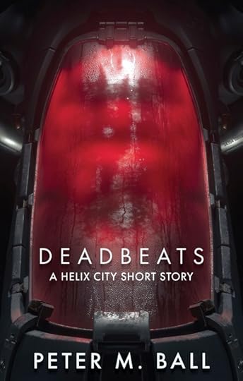
Funny thing about the Chapbook challenge: it feels as though I’m always behind, given that I’m only posting about the second chapbook now, but that’s largely because the folks who see them first are signed up to my Patreon (where Chapbook number 4 just dropped and I’m preparing for number 5).
It’s also because print is slower to set-up than an ebook, and the print editions of Deadbeats only landed on our doorstep yesterday. It’s now up in the new Eclectic Projects Store in addition to all good bookstores.
ISBN 9781922479242 (Print); 9781922479235(ebook)
Print Edition shipping Feb 2022$1.99 – $10.99Shop now
January 25, 2022
Getting Small And Cumulative
The negative effects of stress are magnified by a lack of self-efficacy and control. The more you feel like you’re unable to shift the needle in a stressful situation, the faster you inch towards stress induced burn-out.
We often advise new writers to focus on the things you can control. You can’t control whether publishers buy your work, or how many people end up reading your book, but you do have control over how much you write, what sort of stories you tell, how you revise, and how you build up parts of your author platform. You have control over how you respond to setbacks and what ideas you put into the world.
The hardest part is learning to let go of your ambitions, all the big picture hopes and dreams, and narrow your focus on what needs to happen today in order to progress your career forward. Writing 500 words never feels as exciting as releasing a book or getting great reviews, but those small, incremental gains in word count are the minor cogs that keep your entire career running.
Ironically, I’m currently feeling stressed out and more out-of-control than usual. Partially it’s the pandemic, partially it’s stress associated with my day job, and partially it’s a bunch of personal stuff that makes life complicated. There’s very little control, a whole lot of stress, and lots of big-picture ambition with no day-to-day steps to focus on.
It’s time to take a lesson from my writing career and bring my focus down. What small, elementary things do I need to achieve that will have the greatest impact further down the line?
January 18, 2022
The Choke Points in the Entertainment Business (and Wrestling)
One of the recurring refrains in Todd Henry’s The Accidental Creative is the importance of unnecessary creating or back-burner creating. The creative work that you do that’s not on spec or on demand, but something that’s done because you’re curious, refining new skills, or simply interested in the subject.
My accidental creating often revolves pro-wrestling, where I’ve done the occasional fanfic project for the Total Extreme Wrestling game and take deep dives into the mechanics and business of wrestling storytelling. This has often spawned insights here on the blog, the occasional paid writing gig, and countless ideas that have informed my practice as both an author and a publisher.
This week, I listened to one of my favourite wrestling storytellers, Paul Heyman, being interviewed by the 90s pro-wrestling cultural phenomenon known as Stone Cold Steve Austin. A huge part of the interview revolved around why Heyman’s 90s wrestling project, Extreme Championship Wrestling, ultimately folded and got bought out by the industry leviathan WWE, and Heyman broke down not just the wrestling industry, but the whole damn entertainment industry, into a three-chokepoint system where a failure at any single point will doom your enterprise.
For Heyman, a successful entertainment company needs Content, Financing, and Distribution. If you don’t have the content, you don’t have a company, and in a balkanised industry like TV where different providers traditionally provided one component of the triad, there’s a hunger for content that we’re seeing play out in new ways via the new distribution systems like streaming channels.
If you don’t have the financing to produce your content, then you’ve got no way to forward your vision to the world. There’s a reason superhero films and fantasy epics became way more popular as CGI made them cost-effective to produce, and this applies on both the blockbuster scale (where the CGI is good) and the low-budget arena (where you can do sub-part to serviceable CGI on a home computer now if you’ve got enough time and patience).
The third chokepoint in Heyman’s model boils down to distribution: if you can’t expose your audience to your product and give them access to your work, it doesn’t matter how much content you have or how much you invested in it. Exposure and access are what pay your bills and deliver a return on your financial investment. The more exposure you have, the more options that open up for you beyond your original concepts.
THE THREE CHOKEPOINTS IN PRO-WRESTLING
Heyman’s three choke-point model makes for an interesting way of looking at the history of pro-wrestling, which has routinely gone through big shifts in the landscape as new players or options changed assumptions around one or more chokepoint.
Heyman’s company, ECW, frequently gets positioned as great content with a terrible business owner at the helm. That framing arose largely because the company, as a content provider, lost its distribution, which meant they finally closed owing 7 million dollars to various stakeholders, wrestlers, and employees.
Intriguingly, their pay-per-view provider owed ECW over three million by the time the company folded, but the provider held back once ECW lost their TV deal. The assumption was that the provider would pay pennies on the dollar of what they owed while the company was in bankruptcy, and thus it was better to let them die (although, as Hayman note in the interview, that same pay-per-view company was hungry for content a few months later, and got held over a barrel when negotiating with new providers).
In contrast, a wrestling company that launched in 2002—TNA—could happily lose the same amount of money in a month because they were funded by millionaires, and are seen as something of a success despite making a loss for nearly two straight decades before finally being sold (unsurprisingly, after losing their TV deal, which led to distribution problems).
Meanwhile, the WWE made its name by embracing new distribution models and becoming the first truly national wrestling company by broadcasting on coast-to-coast network TV. WWE consolidated its dominance by providing an industry-standard, company specific digital network to handle its own distribution of shows and pay-per-views on a worldwide scale, although in the US those same shows are now moved over to NBC’s Peacock streaming service because (dun dun dah!) the new streaming service was hungry for content to make it competitive.
Meanwhile, the internet—which enables cheap distribution and dramatically lowers the financing costs of producing a show—has created a new wave of “big” indie wrestling companies that are cult hits among fans, many of which created names that were capitalised on by plucky newcomer All Elite Wrestling when it launched in 2019. Like TNA, AEW is funded by a millionaire, which has opened up many options for them, although unlike TNA their content has improved as they’ve gone along instead of becoming a tedious chore to follow.
The history of wrestling companies are basically an endless chain of companies booming, busting, and evolving in response to those three chokepoints and changes that take place around them.
Which leads me to an interesting thought:
Aren’t Books Entertainment?
Which connects us back to the talk of Unnecessary Creating, and why it’s so valuable. After thinking through the implications and history of those chokepoints in wrestling, I immediately started looking at the things that will kill a writer or publisher. Despite being very different industries, they’re still entertainment…and the chokepoint is still the same.
But this post is already quite long, so that’s the topic for another day.
This post originally appeared at my Eclectic Projects patreon, and exists thanks to the support and interest of my patrons. If you’d like to get early access to my fiction and non-fiction, you can join them at www.patreon.com/petermball
January 13, 2022
Chapbook 1 of 52: Briar Day
As mentioned in yesterday’s post, I’m attempting to publish 52 chapbooks throughout 2022. You can read a little more about it here. Today, let’s talk a little about the first cab off the rank:
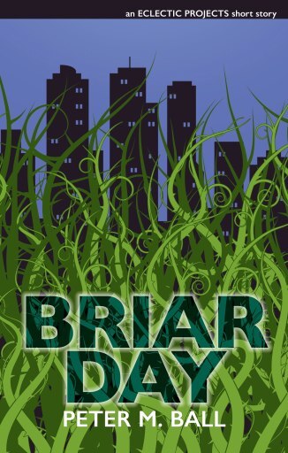
Available in ebook from all great bookstores right now and in print next week, but you can get it as a patron bonus if you sign up for my Eclectic Projects Patreon.
Now, for those who like such things, a peek behind the scenes.
Stress Testing An IdeaFollowing up on yesterday’s thoughts on “Just In Case” publishing, I thought it might be useful to peek below the surface and look at what monetising a project like this really looks like (while also stress testing some of the assumptions in Dean Wesley Smith’s challenge, which provoked this challenge)
From my perspective, there’s three core costs associated with a publishing project:
The cost of actually writing and editing the work.The cost of getting the book to market.The cost of keeping the book for sale and marketing it to readers.WRITING AND EDITING COSTSMy writing and editing cost are pretty much negligible, since this is a reprint of an existing story I produced back in 2010 and it’s already gone through editorial three times — once for the original release, once when it was reprinted in The Year’s Best Australian Fantasy and Horror that year, and once again when it went into The Birdcage Heart & Other Strange Tales.
I included a fairly meaty author’s note to the end of the story — something more substantial than the brief note you’d get in the Collection — but that was a relatively quick addition I could produce inside of a half-hour.
Unlike a traditional publisher, I don’t have to pay an advance for this book, so my writing and editing coss (assuming the $50 an hour rate I’d normally hire myself out as for freelance work) is basically $25. It may not be perfect, but the cost of getting it perfect isn’t really justified for this particular project.
(I should probably note here that all costs are listed in Australian dollars, so it will look slightly different if you’re working in another country)
PRODUCTION COSTSMy core philosophy with indie publishing, right from the beginning, has revolved around keeping costs down. If I can find a cheaper way to do things, from cover design to layout, I’m perfectly happy to invest in a high-cost tool so long as it saves me time and defrays the long-term expenses over the length of it’s use.
All of which means that producing a chapbook like this is relatively inexpensive.
My two hard coss are ISBNS and Cover Art, which adds up to $9.60 (two ISBNS from a pack of 100) and $4 (two pieces of stock art used in design, acquired as part of a year-long subscription).
Everything else is something of a soft cost, especially compared to traditional publishing.
For example, I use Vellum for ebook and print layouts, which comes with a hefty upfront price tag ($359 Aus), but streamlines the layout process immensely. It’s also a cost that’s defrayed with every additional release—Briar Day is about the 40th book I’ve used Vellum for, which puts the actual cost around $8.95 per book (and getting cheaper-per-book with every release).
My actual math when I weighed up purchasing the software (and a Mac to use it) worked on the theory I’d use Vellum for about 200 books over the length of my license. So lets call it $3 for the sake of argument.
I have an Adobe subscription for cover designs, which is probably my major expense. My plans about $45 a month, but like Vellum it’s defrayed because I use it for so many projects (and, now, my day job and freelance gigs). Most of the layout work for this was done in December, where I used Adobe for four projects this month, so let’s call it $11.25 (Truthfully, the utility of the subscription is greater than that, but I don’t want to mess around with the math)
The other major expense is time, so lets call it an hour for layout (would have been faster, but I was picking the format for the entire series) and another two hours to do the cover (ebook is fast, print cover is slow).
So that’s another $150 that needs to be made up to break even, and brings my total production expenses to $164.25 (And I could, conceivably, get that down further if I were pressed to do so).
DISTRIBUTION AND MARKETING COSTSMost distributors who deal in ebooks will work on a royalty-scare arrangement, which means they’ll let you set up and offer a book for nothing. This is the big shift compare to traditional publishing, where you’re in competition for sparse resources, and your book can’t be found unless it’s physically on shelves.
But I’m doing a print edition, which does come with some set-up costs ($50 through Ingram Spark, the POD service attached to Ingram Distribution). Fortunately, I got that fee waived because I’m a member of an organisation that gets free set-up, and a member of another organisation that gets free alterations to the book after set-up (ordinarily a $25 fee).
I’m a member of both these orgs primarily for these benefits, and they cost me about $160 bucks (but together they shave the cost off approximately 120 set-ups or revisions a month, which makes membership a steal). So let’s call my distribution fees about $3, which is what it normally works out as.
The only other cost is ordering print books I might want to have on hand for sale, and to supply folks who have signed up to Patreon at the “I like print books” level. So let’s call that 10 copies at this stage, which will cost me about $5.50 a piece.
Which brings my total production cost to $58, plus whatever I spend marketing this book, which will likely consist of “making the occasional blog post” and “putting it into the occasional newsletter promo.”
Lets call that another $20, to account for the books’ share of the fees I pay to my ebook delivery partner I use at Brian Jar and for my newsletter.
So my total costs including time, marketing, and production is about $267.25. That’s a mere fraction of the thousands I’d be investing to do a similar project through a trad pub system, but still a daunting break-even point for an ebook.
Returns on an ebook sale will vary depend on where it’s sold, which distributor sells it, and what international exchange rates are doing at the time, but my rules of thumb run something like this:
A short story ebook sold at .99 cents will earn about .40 cents Australian, which means I’d need to sell 669 copies of this story to break even.A short story ebook sold at $3.99 Australian (Brain Jar’s standard chapbook price) will earn about $2.50 Australian, which means I’d need to sell 107 copes to break even. A print copy selling at $14.99 through Ingram or Amazon will earn about $2.80, which means I need to sell about 95 copies to break even.Any ebook I sell direct through my website will earn around $3.50, so I’d only need to sell 76 to break even.But any print copy I sell direct earns around $5, which means I’d only need to sell 54 books to break even (when I’ve talked about direct sales of print being a big game changer, this is why, and it’s a reminder I really need to set up a store for direct sales of these).Am I going to sell any of these quantities on the day of release? Almost certainly not. I’ve been tracking short story sales for a few years now, and for an author with my platform I figure I’ll sell about 10 to 20 in the first year, then settle into a nice rhythm of selling 3 to 5 copies of a stand-alone story per year in various formats.
These sale quantities remains relatively consistent whether I price at 99 cents or 3.99, but the higher price point gives me the option of doing short-term sales, which help generate leads down the line, so I default to the $2.99 US/$3.99 AUS price point for shorts because the break-even point is just shy 1/6th of the sales.
Truthfully, the book will likely sale in a whole range of different sales points, so I’m going to assume the break even point is somewhere between 120 and 150 copies. That may still seem daunting, but you’ve got to remember my perspective on all this is shaped by being involved in digital publishing for over a decade…and my RPG releases from 2005 still sell despite being aimed at people playing a version of D&D that’s about to become four editions out of date.
I’m 45 in 2022, and if we assume that I keep writing for another twenty years and my profile doesn’t really change, this release will almost certainly hit the break-even point and start making a profit right as I hit retirement age. But here’s the thing: profiles change, and one of the big changes is how many leads you’re generating for your work.
Every short story in your backlist serves as a potential lead generator, and it can do it in multiple different ways. It’s a product you can run a sale on, and draw people to a particular site. It’s a book you can give away as a lead magnet and get people onto your newsletter list. It’s a book people might stumble over while searching for a particular topic, and if they read it…well, you may note the subtle ways it points people towards one of my collections or my Patreon if they’d like to see more tales.
The other thing to keep in mind: value accretes over time and through connection. Even something as simple as blogging the process of doing 52 chapbooks changes the way they’re valued, just as seeing a row of them all lined up together will make them more attractive. I’ve made a note to visit my sales assumptions for the year again at the end of the year, to see how they’ve changed as a result of the challenge.
(which makes this a good time to remind folks: Briar Day is available in ebook from all great bookstores right now and in print next week, but you can get it as a patron bonus if you sign up for my Eclectic Projects Patreon).
Of course, there’s also value to doing this that’s beyond the monetary returns, but that’s a conversation for a different release