
Jordan Castillo Price's Blog, page 45
June 26, 2012
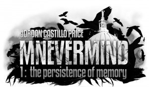
Mnevermind cover art
Mnevermind 1: The Persistence of Memory is up for voting at the Rainbow Awards Cover Art Contest through July 3. If you enjoyed the artwork, I'd love it if you voted!
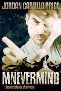
Vote Here for #1716!
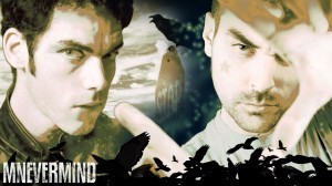
Read the first chapter of Mnevermind or download the wallpaper at JCP Books
Vote Here for #1716!
Read the first chapter of Mnevermind or download the wallpaper at JCP Books


June 23, 2012
Gaze into my cover art...
I was so happy with the final cover for Turbulence 2: Autopilot Engaged! Here it is side by side with Into the Bermuda Triangle so you can see them together. I built the cover with the screen split three ways: a "sketch" of what I wanted on the left as a reference, the Turbulence 1 cover on the right to ensure they looked like each other, and the Autopilot cover I was working on in the center.
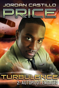
Instead of trying to make the colors look the same, I contrasted them, picking up the highlight peaches and oranges from cover 1 and making them the main color in cover 2, and using cool green tones as an accent. I also gave Dallas a pale green shirt figuring he'd look (kind of) like he and Paul worked for the same organization.
I hunted for the perfect Dallas model for a really long time. I'm so thrilled with this one. I had Paterson Joseph "cast" as Dallas in my head so I was jazzed to find a model with similar eyes.
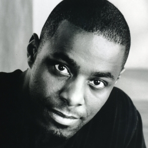
Find out more about Turbulence 2 in the June issue of JCP News!
Instead of trying to make the colors look the same, I contrasted them, picking up the highlight peaches and oranges from cover 1 and making them the main color in cover 2, and using cool green tones as an accent. I also gave Dallas a pale green shirt figuring he'd look (kind of) like he and Paul worked for the same organization.
I hunted for the perfect Dallas model for a really long time. I'm so thrilled with this one. I had Paterson Joseph "cast" as Dallas in my head so I was jazzed to find a model with similar eyes.
Find out more about Turbulence 2 in the June issue of JCP News!
June 21, 2012
Photoshop - Starving Years Lettering
Since
 rakashun
was curious about the lettering effect in The Starving Years cover (and it was deceptively simple to do) I thought I'd provide an under-the-hood look.
rakashun
was curious about the lettering effect in The Starving Years cover (and it was deceptively simple to do) I thought I'd provide an under-the-hood look.
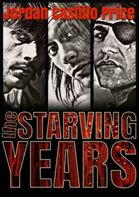
Anything visual starts with a concept. In this case, my concept was to have words filled with gore, so I knew I needed very thick, plain, legible lettering that would still be readable with several effects applied.
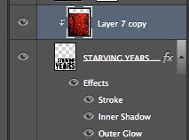
I set the type in Photoshop which I don't normally do. (Typically I'd get it just the way I wanted it in Illustrator and place it as a smart object.) But I wasn't doing any fancy modifications to the letterforms so I could keep it all in Photoshop. The word "the" is on its own layer, both so I could control the rotation, and so I could control the effects individually. Because the point size is so much smaller, the stroke size I use on the rest of the lettering wouldn't work for the "the". It would start swallowing up the word. So I need to scale down the effects correspondingly on its own layer.

I added an ivory stroke, an inner shadow (which you can't see quite yet with the letters black) and a red outer glow. If you'd like to add a dark outer glow, you need to change the glow's blend mode to one of the darkening modes like "multiply." Alternately, you could use a red drop shadow if you want the effect to have a "direction" to it, but in this case I wanted it to be centered on the lettering. You can really see the effects scaling on the word "the" in the show below.

Next I found a stock image with a cool texture and color that I could clip into the words to create my gore. By itself it looks clearly like paint, but I knew that once it was clipped into the lettering it might look gory. I needed to do two texture layers, one to clip into the "the" and another to clip into the other words.

Here's what the layers panel looks like with the texture layer clipped to the text layer, indicated by that little right-angle arrow next to the thumbnail. You clip a layer to the layer below it by op/alt-clicking on the line between the layers. (That's kind of tricky/hidden as there's no obvious button or command. But you'll see the cursor change when you do it)
Closeup of the final result, with the layers below turned on. The clipped texture appears in the lettering only, and what's great is that you can move the texture around to place the chunks and gore to their best advantage.
 Thank you to all of you who voted for The Starving Years in the last round of the Rainbow Awards Cover Art Contest. It was the top-voted cover!
Right now Mnevermind 1: The Persistence of Memory is up for voting (number 1716). If you enjoyed the cover, I'd love your vote!

rakashun
was curious about the lettering effect in The Starving Years cover (and it was deceptively simple to do) I thought I'd provide an under-the-hood look.Anything visual starts with a concept. In this case, my concept was to have words filled with gore, so I knew I needed very thick, plain, legible lettering that would still be readable with several effects applied.
I set the type in Photoshop which I don't normally do. (Typically I'd get it just the way I wanted it in Illustrator and place it as a smart object.) But I wasn't doing any fancy modifications to the letterforms so I could keep it all in Photoshop. The word "the" is on its own layer, both so I could control the rotation, and so I could control the effects individually. Because the point size is so much smaller, the stroke size I use on the rest of the lettering wouldn't work for the "the". It would start swallowing up the word. So I need to scale down the effects correspondingly on its own layer.
I added an ivory stroke, an inner shadow (which you can't see quite yet with the letters black) and a red outer glow. If you'd like to add a dark outer glow, you need to change the glow's blend mode to one of the darkening modes like "multiply." Alternately, you could use a red drop shadow if you want the effect to have a "direction" to it, but in this case I wanted it to be centered on the lettering. You can really see the effects scaling on the word "the" in the show below.
Next I found a stock image with a cool texture and color that I could clip into the words to create my gore. By itself it looks clearly like paint, but I knew that once it was clipped into the lettering it might look gory. I needed to do two texture layers, one to clip into the "the" and another to clip into the other words.
Here's what the layers panel looks like with the texture layer clipped to the text layer, indicated by that little right-angle arrow next to the thumbnail. You clip a layer to the layer below it by op/alt-clicking on the line between the layers. (That's kind of tricky/hidden as there's no obvious button or command. But you'll see the cursor change when you do it)
Closeup of the final result, with the layers below turned on. The clipped texture appears in the lettering only, and what's great is that you can move the texture around to place the chunks and gore to their best advantage.
Thank you to all of you who voted for The Starving Years in the last round of the Rainbow Awards Cover Art Contest. It was the top-voted cover!Right now Mnevermind 1: The Persistence of Memory is up for voting (number 1716). If you enjoyed the cover, I'd love your vote!
June 20, 2012
Two random observations
The American Lung Association should really figure out a better way to shorten their name.

Also, I needed to add "captcha" to my anonymous commenters, as I've been deluged by comment spam. It's too bad since I have a few regular commenters who aren't on LJ and come through as "anonymous." Sorry, guys.
Also, I needed to add "captcha" to my anonymous commenters, as I've been deluged by comment spam. It's too bad since I have a few regular commenters who aren't on LJ and come through as "anonymous." Sorry, guys.
June 14, 2012
Expect JCP News next week
Whooooo - I have just had a hell of a rough week. I think the worst parts are done. (I asked the repairman to not come today and finished staining the deck myself. He was taking too long and made me uncomfortable. Frankie, who bit the veterinary tech and sent her to urgent care, has now finally completed three animal-control mandated "I don't have rabies, really" exams.)
But I've decided it would be sane to give my newsletter and Turbulence 2 an extension. They should come out next week sometime.
Puffy seems to be having himself a great week, anyway.
But I've decided it would be sane to give my newsletter and Turbulence 2 an extension. They should come out next week sometime.
Puffy seems to be having himself a great week, anyway.
June 7, 2012
Notion Potion #2: Don't Make Yourself Hurl
How to stop being your own worst enemy and get down to the business of being creative! Stop by and read my column Notion Potion #2 at Reviews by Jessewave!
The Starving Years in Rainbow Awards Cover Contest
If you dug the cover I created for The Starving Years, you can vote for it here! It's number 1565.
Edited to add: Magic Mansion is also on the ballot at number 1508.
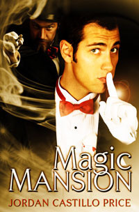
Edited to add: Magic Mansion is also on the ballot at number 1508.
May 29, 2012
Fluid: Channeling Morpheus 8 re-release!
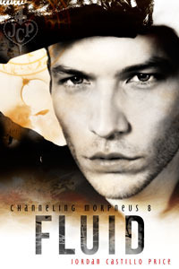 Fluid
FluidChanneling Morpheus 8 (Second Electronic Edition)
It's been a couple of decades since Wild Bill has been able to savor the bite of an ice-cold, freshly tapped keg. Twenty-odd years since the shivery pucker of a cheap, boxed wine has assaulted his palate. But that doesn't mean Bill's forgotten how to party.
Wild Bill and Michael have holed up in a week-to-week hotel in an iffy Milwaukee neighborhood, and even though it's been a year or two, the fringe art happenings are just as edgy as Bill remembers.
There's a girl covered in frosting in the middle of the hors d'ouvres table, and she's begging them to dip. And the host of the party wants to lure them into the range of his mechanical eye. It's all fun and games, until a tryst turns deadly.
Note: this is a re-release of Sweet Oblivion: Fluid originally published in 2009 by Changeling Press
Purchase or Read an Excerpt
Available now in PDF, Mobi and Epub at JCP Books
At BN.com for the Nook
And at Amazon for the Kindle
(An aside, I saw the photographer blogged about this particular shot of the Wild Bill model. I think it was her favorite. She said this was why she liked working with pros!) (Bill is a professional model...that's sexy.)
May 25, 2012
Bug-lovers unite!
How weird is this...I was just thinking I wanted a spider field guide, and the Audubon insect and spider guide for iPod/iPad went on sale for 99¢!
http://itunes.apple.com/us/app/audubon-insects-spiders-field/id367683509?mt=8&ign-mpt=uo%3D4
I was freaking my cats out last night by playing cardinal calls on the iPad from the Audubon bird guide :D
Man...now I'm kicking myself for not getting a photo of that weird ginormous shiny fly that was hanging out on my chive flowers earlier. And the big stripey spider that walked by.
May 24, 2012
Gorgeous spring hike
I'm fortunate enough to live in an area with beautiful natures all around. I started my morning with a hike in the state park woods (which is empty Mondays through Thursdays, so it's not only pretty but serene) and opted to take a mountain bike trail, just for the heck of it. It was just right: challenging, hilly, a good workout, but not too long.
As I walked back to my car, I decided to take a map with me and mark what I'd walked. And then it occurred to me I could try to fill up that whole map by, say, the end of June.
Some of the trails might take me 4-5 hours to walk...something to work up to!
I didn't see any exciting wildlife today, but there were a few flowers blooming I'd never seen before, and probably 5 different kinds of butterflies. (Hm, I wish I had a butterfly field guide...)


