
Jordan Castillo Price's Blog, page 46
May 19, 2012
Kablooey - an exercise in particle effects in Photoshop CS6
I've been eager to try to expand my proficiency with brushes in photoshop, so I checked out some of the tutorials at the NAPP website. They may have some free tutorials...I've been a member for years and I find the software/hardware discounts I get through them always pay for my membership. This particular tutorial was members-only.
There was a wonderful tutorial on using particle effect brushes with text by Mark S Johnson. It involves a text layer with effects applied and two layers of particles, some in-focused and some soft focused. Here's my result (click for ginormous size to see detail.)
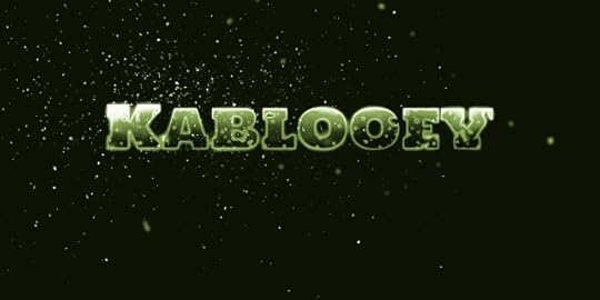
What's fabulous is the particle brushes are available for free at wegraphics.com
There was a wonderful tutorial on using particle effect brushes with text by Mark S Johnson. It involves a text layer with effects applied and two layers of particles, some in-focused and some soft focused. Here's my result (click for ginormous size to see detail.)
What's fabulous is the particle brushes are available for free at wegraphics.com


May 15, 2012
Introducing Turbulence, new paranormal series
 JCP News May issue is out!
-Flying High
-Blogs n' Recs
-The Persistence of Memory in ebook
-Magic Mansion in paperback
-JCP on Pinterest
-New free series, Turbulence
Visit JCP News page
May 13, 2012
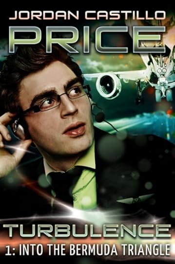
Turbulence 1 cover art deconstructed
I've been itching to share some Photoshop and cover art tidbits, and decided to start with Turbulence. I'll include thumbnail images in the post, and you can click any you want to enlarge.
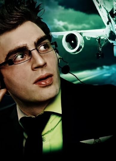
I found my pilot and I found my aircraft for the cover, but they would look atrocious together if I just put them on the cover as-is.
 The model is definitely my protagonist, but his lighting is all wrong and his red shirt is distracting. This plane looks awesome, I adore the perspective and sense of drama, but it's too bad it's monochromatic.
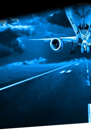 I have other images of planes with color. I decide maybe I can make the plane image look less monochromatic with some painting and effects.
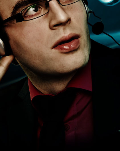
The first thing I did was pull Paul (that's my protagonist's name) into some software by OnOne called PhotoTools, and because I'm so organized, I even wrote myself a note as to which filters I used, because chances are I'll want to use more photos from this very brightly lit shoot in the future. My note to self says, "layer has OnOne "just enough darkness" and "golden haze??" applied so he looks less marzipan." This is the first time I've used the Photoshop note tool in years.
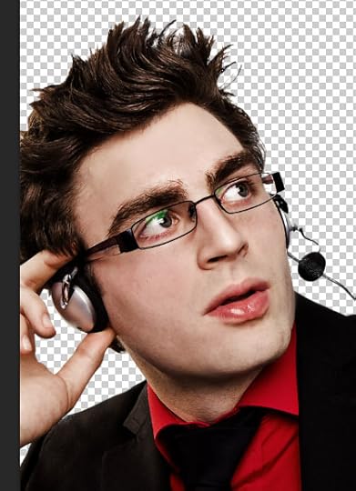 So, here he is extracted from his background, with those two filters applied. I like the midtones in his face a lot better now. And he looks less marzipan.
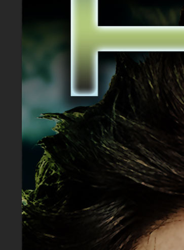 Unfortunately, even with my darkening, his edges are still not wonderful when he's composited with the background. It's not the fault of my selection either. The selection is pretty good. It's that the way the original shot is lit, his edges are just very bright. On the left you can see the edge of his hair looking too bright.
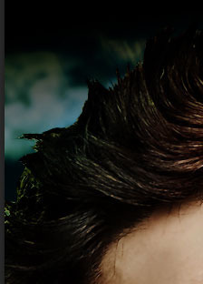
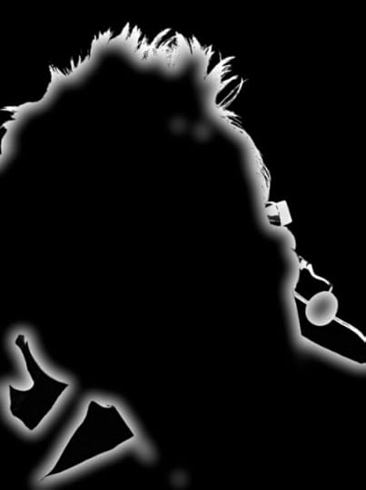 My solution is to create an adjustment layer to make him really, really dark, but to mask that adjustment layer so it only affects his edges. Here is the mask, and also his hair blending better with his background. Edges are really fussy, and I think the reason why most bad Photoshop compositing looks bad is that the designer doesn't understand how to handle edges.
 Moving on...gotta do something about that red shirt because it doesn't look very pilot-like to me at all, plus it will draw the eye down to the lower left hand corner of the cover.
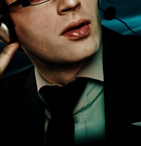 It's easy enough to make an adjustment layer to desaturate it and brighten it so it looks like a medium bluish green-gray shirt. I decide that's fairly pilot-like.
I also add some First Officer's wings, and a shadow over those so they don't look stuck-on.
 Then I begin adding some greenish gradient overlays to the entire composition and decide I like the way the overlays greenify the shirt. It seems to be pulling the composition together in a way that makes the Paul layer work with the airplane layer (which, you will recall, is too blue and monochromatic, so I've still got to deal with that....
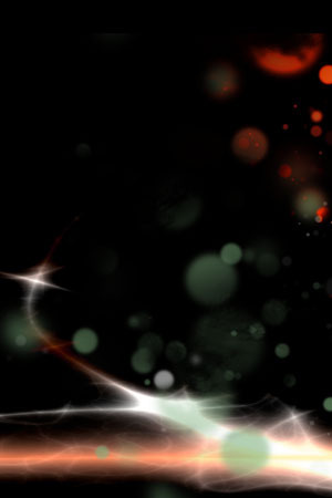 It's time for lighting effects (right), probably my favorite thing in the world lately. The effects on the Into the Bermuda Triangle cover feature a large flare behind the title. I got that from a stock art site...I collect abstract elements that catch my eye. It's also got some bokeh, which are the round, hazy dot-things that look like ghost orbs. I painted those with a paintbrush set to a green I picked up inside the composition to start unifying things. I'm not so great with Photoshop paintbrushes quite yet. I plan on exploring them more this year. I also noticed that I was really loving some of the oranges and peaches in the flare, so I picked those up and painted the orange bokeh in the upper right.
What's awesome about incorporating oranges and peach tones was that it gave the illusion of color to my overly-monochromatic jet photo. Yay! I also picked up the peach tones in my lettering.
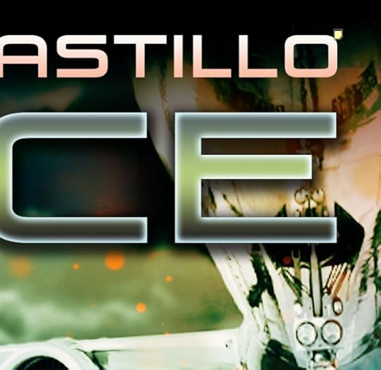 I could have used a preset style on my typography, but I find they always look wrong to me. Canned. This particular effect on my last name is only three styles: a gradient overlay, an inner glow, and a soft drop shadow to make it stand out from the airplane layer. There's a kickass course at Lynda.com by Nigel French on using layer effects if you want to be an effect ninja.
And now, here's my final cover, with unifying color effects applied and typography in place.
Watch out for Turbulence 1: Into the Bermuda Triangle officially being released with my May newsletter!
I found my pilot and I found my aircraft for the cover, but they would look atrocious together if I just put them on the cover as-is.
The model is definitely my protagonist, but his lighting is all wrong and his red shirt is distracting. This plane looks awesome, I adore the perspective and sense of drama, but it's too bad it's monochromatic.
I have other images of planes with color. I decide maybe I can make the plane image look less monochromatic with some painting and effects.The first thing I did was pull Paul (that's my protagonist's name) into some software by OnOne called PhotoTools, and because I'm so organized, I even wrote myself a note as to which filters I used, because chances are I'll want to use more photos from this very brightly lit shoot in the future. My note to self says, "layer has OnOne "just enough darkness" and "golden haze??" applied so he looks less marzipan." This is the first time I've used the Photoshop note tool in years.
So, here he is extracted from his background, with those two filters applied. I like the midtones in his face a lot better now. And he looks less marzipan.
Unfortunately, even with my darkening, his edges are still not wonderful when he's composited with the background. It's not the fault of my selection either. The selection is pretty good. It's that the way the original shot is lit, his edges are just very bright. On the left you can see the edge of his hair looking too bright.
My solution is to create an adjustment layer to make him really, really dark, but to mask that adjustment layer so it only affects his edges. Here is the mask, and also his hair blending better with his background. Edges are really fussy, and I think the reason why most bad Photoshop compositing looks bad is that the designer doesn't understand how to handle edges.
Moving on...gotta do something about that red shirt because it doesn't look very pilot-like to me at all, plus it will draw the eye down to the lower left hand corner of the cover.
It's easy enough to make an adjustment layer to desaturate it and brighten it so it looks like a medium bluish green-gray shirt. I decide that's fairly pilot-like.I also add some First Officer's wings, and a shadow over those so they don't look stuck-on.
Then I begin adding some greenish gradient overlays to the entire composition and decide I like the way the overlays greenify the shirt. It seems to be pulling the composition together in a way that makes the Paul layer work with the airplane layer (which, you will recall, is too blue and monochromatic, so I've still got to deal with that....
It's time for lighting effects (right), probably my favorite thing in the world lately. The effects on the Into the Bermuda Triangle cover feature a large flare behind the title. I got that from a stock art site...I collect abstract elements that catch my eye. It's also got some bokeh, which are the round, hazy dot-things that look like ghost orbs. I painted those with a paintbrush set to a green I picked up inside the composition to start unifying things. I'm not so great with Photoshop paintbrushes quite yet. I plan on exploring them more this year. I also noticed that I was really loving some of the oranges and peaches in the flare, so I picked those up and painted the orange bokeh in the upper right.What's awesome about incorporating oranges and peach tones was that it gave the illusion of color to my overly-monochromatic jet photo. Yay! I also picked up the peach tones in my lettering.
I could have used a preset style on my typography, but I find they always look wrong to me. Canned. This particular effect on my last name is only three styles: a gradient overlay, an inner glow, and a soft drop shadow to make it stand out from the airplane layer. There's a kickass course at Lynda.com by Nigel French on using layer effects if you want to be an effect ninja.And now, here's my final cover, with unifying color effects applied and typography in place.
Watch out for Turbulence 1: Into the Bermuda Triangle officially being released with my May newsletter!
April Ebook Cover Design Awards posted
Check out TheBookDesigner blog if you haven't--it's a wonderful resource for new typographers and cover designers. Every month Joel does a roundup of cover art. Magic Mansion's cover is in April's batch.
May 11, 2012
Thank you for the reviews!
Thank you so much to the five kind souls who left reviews of The Persistence of Memory on Amazon! I would gush and tell you how it means the world to me since I'm out here on my own doing this all without publisher backing...but instead, here's a rather backhanded and lackluster "thank you" from Vic. With a dance.
Personalize funny videos and birthday eCards at JibJab!(let's see if this embed works...)
Personalize funny videos and birthday eCards at JibJab!(let's see if this embed works...)
May 7, 2012
Psychological thriller? How did I manage that?
I must have ticked a different checkbox than I usually do when I set up the book...WOO HOO, Mnevermind 1 is ranking in the Psychological Thriller category! If you have read and enjoyed it, I would be absolutely giddy if you left a review on Amazon.
May 4, 2012
Just in time for the weekend: Mnevermind 1
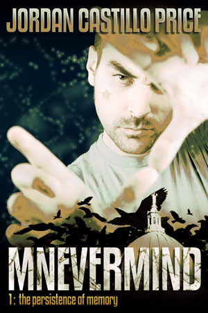 I'm gonna do my big "buy this book" email on Monday, but in case you're looking for a fun way to spend your weekend, you can grab Mnevermind 1: The Persistence of Memory now.
At JCP Books in PDF, Mobi and Epub (payment via Google Checkout OR Paypal)
At Amazon for Kindle
At B&N for the Nook
May 2, 2012
The Persistence of Memory, Chapter 1 sneak peek
Take a sneak peek at Mnevermind 1: The Persistence of Memory, on JCP Books! Chapter 1 is posted, and a bonus wallpaper.
Notion Potion #1: One Sip at a Time
Today is the launch of my new creativity column called Notion Potion. The inaugural article, One Sip at a Time, will focus on a subject that Packing Heat listeners know is near and dear to my heart: taking small, consistent steps toward your goal.
Even though I've talked about it several times, it's the sort of advice that bears periodic repeating.
Come have a look, and I'd LOVE it if you commented!
Even though I've talked about it several times, it's the sort of advice that bears periodic repeating.
Come have a look, and I'd LOVE it if you commented!
April 30, 2012
Turbulence - new series coming soon!
I'm bursting at the seams with eagerness to show off my new cover art!
If all goes to plan, it will be live for the 5/15 issue of JCP News :D
(subscribe here if you like!)
If all goes to plan, it will be live for the 5/15 issue of JCP News :D
(subscribe here if you like!)


