
R. Scot Johns's Blog, page 15
February 19, 2012
Further Thoughts On KF8

Now that I've been working with KF8's fixed-layout awhile, I thought I'd share a trick or two I've learned in case you're interested. Like Apple's iBooks, KF8 has a lot of quirks and peculiarities all its own, but if you learn the way it works then you can often find a way to bend the rules.
ORIENTATION LOCK
Although the Kindle Publishing Guidelines state that the two available options for the "orientation-lock" metadata entry are either portrait or landscape, you can actually enter "none". This disables the lock and allows the content to reorient to the tablet's current position. This would seem most useful with reflowable content since, of course, with fixed layout the aspect ratio is set, and while the content will auto-zoom or shrink to fit the screen, it does so to the longest edge. This makes a page in portrait layout very small in landscape. However...
ZOOMING IMAGES
There are two alternate ways to insert images into KF8, as indicated in the samples provided for Children's Books and Comics. In the former a div element is created with an id that references the image source in the related css. In this mode the image is locked within the div block, and only content inserted into an overlaid region mag element can be zoomed. However, in the comic sample, the background image is simply referenced using standard html img src= tags. This allows for the region zooming feature which magnifies a specific area of the background image within a defined mag target frame. The magnification is actually created by restoring an oversized background image to its actual size (the image on the screen being shrunk to fit), with the frame acting as a window that lets you view only the selected area at full resolution.
But you don't have to create a window to do this at all. If you simply double-tap on an area of the background image that's not covered by a mag target tap zone, the entire image will "zoom" to the only window available: the Kindle Fire screen itself. Any text overlays will disappear, leaving only the selected image, with a circled X in the upper-right corner to facilitate exiting the zoom mode. While in this mode you can use pinch-and-zoom to view the image larger, rotate to either orientation (if the lock has been set to "none" as mentioned above), and drag the image around the screen with your finger. With the image size now upgraded to 800kb, this allows for images of relatively high quality at 1024x1748 - the width of the display screen in landscape orientation, and nearly three times the height. This seems a natural size for the full resolution image, since you can view full width in landscape and scroll up and down to see the rest of the image.
Unfortunately, the Fire is not as advanced as the iPad in having the cool "snap back" feature which keeps the image from being zoomed larger than the chosen viewport size. Still, this provides a way for the user to view and scroll the entire background image at a higher resolution without resorting to smaller cropped sections. Those, of course, can be added as well, so long as an obvious area remains where the background can be double-tapped (and the user knows the feature is available).

TEXT WRAPPING
My primary goal with KF8 fixed layout at the moment (and iBooks as well) is to create text that appears to wrap around images when in fact there is no text wrap feature available in the Kindle code other than around square boxes. To my mind the ability to wrap around complex objects is one of the fundamental advantages of Pages and the new iBooks Author drag-and-drop feature, and one for which I'm nearly will to cave in and buy a Mac. Still, there are ways around it in KF8.
While KF8 does not allow the use of left/right: #px; tags within mag target boxes, you can replace them with margin-left / margin-right tags instead, or text-indent for left indentations only. But in order to do so you will need to wrap each individual line of text in <p> tags and position them each separately. In the image to the right, for example, the first full paragraph is set to text-align: justify, but each line after that is a separate paragraph, positioned using either right-align (plus some word-spacing and/or letter-spacing to adjust the line width to my liking), or the default left alignment with an indent or left margin setting for just that line. This requires separate line entries in the css (i.e. p.line3 {...), each of which can then be individually manipulated.
This is somewhat tedious, to be sure, but the end result appears to be a text wrap function that does not, in fact, exist. In actuality, there is no image to wrap the text around, since the figure is simply part of the background.
TEXT SHADOWS
While KF8 (and iBooks as well) allow for text shadows in the css, they only allow for one. In other words, you cannot create complex, multi-color shadows using multiple, sequential text-shadow entries. Both KF8 and iBooks will only recognize and last entry given, which overrides any others entered above it. For my current project I required both a dark text shadow to offset the text against light areas of background color, as well as a glow layer to lighten darker areas behind the text. This was achieved by using multiple duplicated text layers on a z-index stack. The top layer has a fairly dark green drop shadow (1px 1px 3px #185244), while the bottom (otherwise identical) text layer provides a large light green surrounding glow, centered on the text rather than offset (0px 0px 40px #edffe7). I had already lightened up the text area somewhat in the background image itself, so not all of the lightening seen in the image above is from the text glow, but any stray dark areas are evened out somewhat and the text rendered more easily readable by its higher contrast with the background art.
ZOOMING TEXT
Below is a shot of my current Ring Saga project with the text zoomed in the Kindle Fire on the left and the same page seen in its full two-page spread on the iPad on the right. While you can retain the shape of wrapped text in the zoomed text box, you can also format the mag target separately, which I've done here, using fully justified text over a parchment backdrop. This gives the user the option of reading the text in something closer to a standard book layout, while also being able to view the art layout. Instructions for doing this are in the Guidelines, but I thought I'd offer an example of what I've done. It's certainly not as ideal as the iPad's ability to zoom fixed layouts to any size desired using pinch-and-zoom, but it's better than no option for enlarging text at all.

And while I'm on the subject of text, the function I'm most disappointed with in KF8 fixed layout is not having access to dictionary definitions by tapping words. Without that feature the purpose of embedding live text is virtually rendered null and void, particularly given that the search functionality is disabled as well. The only reason I can see for going to all the trouble of adding live text is in the hopes that Amazon will get its act together and fix these issues at some later date. For the time being, however, KF8 is little more than a PDF that's really frigging hard to make.


February 12, 2012
KF8 Graphic Novel Sample

There is now a KF8 graphic novel sample file available on Amazon's KF8 Overview page. This makes clear a number of questions posed by the somewhat sketchy graphic novel section in the Kindle Publishing Guidelines update. So if you're interested in how the Kindle Fire Panel View works, you can now open up the sample and have a look behind the scenes.
Among the things I've noticed is that metadata entries are included for both "comic" and "children" book-types, rather than one or the other. The "hybrid experience" mentioned in section 5.3.4 of the Guidelines does not state explicitly that both content types must be specified in order to create magnified text boxes in graphic novels, nor even that you can add both. Nor is the specific functionality of these two classifications anywhere clearly defined, but it is presumed the "comic" setting allows for image zoom, while "children" provides the text box magnification feature. However, a quick test in changing "children" to "comic" in my own KF8 version of The Ring Saga made no difference that I could ascertain, as text boxes still zoomed just the same.
Additionally, there are a few unique elements in the .opf's metadata section, most notably in two new zero reset functions:
<meta name="zero-gutter" content="true"/>
<meta name="zero-margin" content="true"/>
Presumably these are designed to remove the default white space in the margins of the Kindle app, although their use is not included, nor explained, in the Publishing Guidelines, and I'm only guessing at the purpose of their inclusion. Certainly this is not required for fixed-layout content on the Fire.
There is also an enhanced doctype declaration in the html files:
SYSTEM "http://www.w3.org/TR/xhtml1/DTD/xhtml..."
as well as the additional meta element:
meta http-equiv="Content-Type" content="text/html; charset=utf-8"
Neither of these are present in the KF8 children's sample, but presumably they provide enhanced functionality not present in the 1999 standard but not yet finalized in HTML5.
Regardless, the sample provides much clearer examples as to how the Panel View region magnification functions, and how the larger resolution images can be used. The CSS in particular provides a wealth of information about how the mag regions are created and positioned, although at best it still seems an extremely tedious process of trial and error will be required to fine tune the zoomed image's location. Still, at least it's now possible to do, which is a start.

February 7, 2012
DAZ Free Software Offer

For a limited time only DAZ is giving away over $800 worth of 3D rendering and modeling software, in three of the best programs out there. For anyone at all interested in giving 3D art a try, this is an awesome opportunity to grab some top notch tools.
DAZ Studio 4 Pro is the latest edition of the award winning 3D animation program which boasts some of the most leading edge advances in model manipulation and rendering, including the new Genesis figures that can morph into almost any shape or form imaginable. While you can buy the basic version of DAZ for a meager fifty bucks, the Pro edition normally retails for $430, and is well worth every penny for what you get. I've been using Poser for several years now (including the new Poser Pro 2012), but with the release of the Genesis figures I've been wanting badly to upgrade my plain vanilla DAZ to the Pro edition (and now I have!). Both programs are very similar, so if you know how to use Poser, you'll be able to dive right in to DAZ without any trouble. For those who've never used a 3D animation program, the learning curve can be quite steep (and tortuously unending), but in no time you'll be creating truly stunning works of art, even if you can't draw a stick figure to save your life. All of the art for The Ring Saga was created using 3D models.
Bryce is an environment creation tool, with the ability to produce utterly astounding digital worlds for your characters to populate. I honestly haven't used it much, as it's almost overwhelming in its possibilities, but if you want to build a fantastic backdrop for your 3D creations, this is the tool to use. Bryce Pro 7 retails at $250, so you can save yourself enough to buy a Kindle Fire and have some left over. The package comes with a ton of awesome content to get you started as well, from water planes to lush foliage, a multitude of terrain types, and a wide variety of skies.
Hexagon is a modeling tool for those who want to create their own 3D models instead of relying on the common stock of what's available to buy (which is a lot, by the way). I haven't done any modeling at all from scratch, so I'm looking forward to testing this program out. You can do a lot with morphs alone (my Alberich character was created entirely by morphing the crap out of a standard male figure model), but to create truly unique creations you really have to start from scratch and design your own. Plus, once you do you can sell them to others who don't want to bother! Hexagon 2.5 would set you package $150, but today it's free!
Click the image above to check it out.

Kindle Publishing Guide Updated

Amazon has quietly updated their Kindle Publishing Guide to include new content in the section concerning the creation of graphic novels. There was no official announcement of this update that I'm aware of, but the Guide now bears the edition number 2012.2, presumably indicating the year and month of release (the first version came out on January 11th, but bore no edition number).
The new section covers how to create Panel View magnification targets to zoom selected sections of a page. As with the rest of the Guide, the details are sketchy at best, and the questions it leaves many. Unfortunately, Amazon has not provided a sample graphic novel to use as reference as they have for children's books and the standard KF8 format. Additionally, all the KF8 graphic novels that I've downloaded so far are DRM'd, so that I haven't been able to crack them open and look at their underlying code. I'm still having some issues getting absolute positioning to work correctly with text layers in the zoom regions, which is a bit frustrating to say the least.
Of primary importance, however, is the increase in the allowed size of image files to 800Kb in order to account for the necessary higher resolution graphics that are required. With zoom factors ranging up to 250%, recommended image resolution is as much as 1560x1500 pixels for a half page in landscape orientation, or 1536x900 for a full page image set to the default 150% zoom factor. This allows small print in fixed layout to be viewed at larger sizes, and artwork details to be viewed up close. In addition, the Panel View provides a "guided view" with the zoomed sections proceeding sequentially with each swipe.
Beyond allowing for zooming areas to view more detail, the benefit applies to full page images in general, as high quality art can now be added without having to use highly compressed jpegs that blur and distort details even at their default size. The down side, of course, is larger overall file size, effectively removing the 70% royalty option for graphic novels, since the bandwidth charge would likely be greater than the profit margin (see my post here for more on that). However, at the 35% royalty margin no bandwidth fee is assessed, so your ebook file can be a large as you like (within reason, of course: no one wants to fill up their Kindle with just one book).

February 5, 2012
EPUB3: DOA
Barely more than a month ago, on January 1st, I made the prediction that the newly released ePub3 specification would "fail in its effort to heal ebook format fragmentation." This was, in fact, my number one prediction, and while it's hardly earth-shattering, it's happened faster than expected, and for the very reasons I outlined.
Less than two weeks into 2012 Amazon released the main specs for their new KF8 format, based mainly on ePub, but with a whole new set of a proprietary requirements for fixed layout features such as area magnification, and with severe restrictions on others such as image size and orientation. In addition, they use their own metadata entries to declare fixed layout properties. While KF8 is in essence an ePub in its structure, once converted into mobi via KindleGen it becomes proprietary and can only be read on a Kindle system. ePub files themselves are not recognized by Kindle devices.
Then, just a week later, Apple announced their new .ibooks format, along with the only tool that can be used to make it, iBooks Author. Again, the underlying structure is essentially an ePub, but with a host of new code elements that are entirely unique to Apple, with no relation whatsoever to anything in ePub. So complex and undefined are these new elements that there is no possibility of coding them by hand, so that what was once in essence an ePub is now something altogether different. And of course, it can only be read in Apple's iBooks system (and currently only on the iPad).
This is the direction things are going. As mentioned in my prediction, advances in technology and innovation in individual applications are far outpacing ePub's ability to keep up, to the point that very soon these formats will likely do away with the ePub structure altogether, since there's no inherent reason that they need it if the end goal is to produce a unique proprietary format. With KF8 you can at least begin with an ePub file and then modify it to meet the Kindle Fire requirements. But Apple has removed even that possibility. IBooks format files must be built from scratch, using their software, or not at all (and they must be sold via Apple's iBookstore, and consumed via Apple tablets).
Of course, Apple still accepts ePubs in their standard iBooks model (albeit with some custom modifications, such as the com.apple file), as does Barnes & Noble (though only for reflowable texts: BNKids format is so proprietary they won't even release the spec), but for fixed layout ebooks ePub3 has never really had a chance.
The idea of creating an open standard that many reading systems can handle is a noble, but unrealistic goal. It's just not a practical business model on which to build an empire. Success at the level at which Apple and Amazon are competing is accomplished by creating brand identity and loyalty. This is how Apple has sustained itself for many years, and how the Kindle became the first successful ebook reader. Certainly there are many other factors, among which producing a quality product is foremost. But to create a product of quality one must first create a product that stands apart from the others, and that by its very definition is a proprietary product.
While we will likely never see a major ePub3 reader, the market will be swamped with generic devices and off-brands that will do the job. But none of them will be truly great, relegating ePub3 to the sidelines and the cheap or free titles. Because of this it is unlikely ePub3 will ever reach its full potential.

February 3, 2012
How To Create Fixed-Layout iBooks, Part 7

Now that you have a working fixed-layout ebook filled with pretty images you'll probably want to add some text. After all, what's a story without words? In this installment of the iBooks tutorial we'll look at how to add live text as a layer over or around your art.
EMBEDDING FONTS
While you can rely on any of the fifty or so fonts and variations already included on the iPad, you will likely want to use others at times to create a certain look or feel. In the screenshot of my Ring Saga project above several different fonts are being used to achieve the stylistic effect I want. To do so you must include the font in your ebook package.
Bear in mind, however, that many commercial fonts don't allow embedding, so be sure to look at the font's properties to see if embedding rights have been restricted. You'll want to do this before you spend a lot of time creating your ebook file, only to discover that you have to replace your chosen font with something else that's only moderately close.
First, create a folder in your OEBPS directory named "fonts" and put your chosen font file there. This isn't necessary, and you can put your files anywhere you like, but it's always good practice to keep things neat and orderly so that you can find what you're after when you need to. If you only have a single font to embed you can just as easily add it at the root level, but if you're building something fairly complex it's best to organize each set of elements in their own location.
Next, you need to list this new addition in your manifest, so open up your content.opf and add a line that references the font. Here's the sample template entry:
<item id="Storybook" href="http://feedproxy.google.com/~r/TheAdv..." media-type="font/truetype"></item>
The item id can be anything that makes sense, although you'll never reference it anywhere using this id. Enter your href as a relative location from the content.opf itself, as it is here with the folder/file name provided. The media-type defines what kind of font it is, and for the iPad this can be TrueType, OpenType or SVG.
Finally, before we begin formatting our text, we need to specify that we're using embedded fonts in the com.apple.ibooks.display-options.xml way back up there in the META-INF folder. Add the following line to the platform(s) of your choice:
<option name="specified-fonts">true</option>
Without this entry system fonts will be used to render your text instead.
CREATING YOUR CONTENT
Before you can format your text you'll need to add some. If you take a look inside the sample template at the html for page 2 you'll find a line of text that has been added in a paragraph tag. You'll also see that in the <head> section a css stylesheet for page02 has been referenced so that the reading system knows where to find the formatting data for this text.
<link href="http://feedproxy.google.com/~r/TheAdv..." type="text/css" rel="stylesheet"/>
<p class="line1">Start your story here!</p>
The template includes only a single line of text, prompting you to start your own story, but for a slightly more complex example here's the html for the left page of the Ring Saga screenshot above:

In the body we find a header, three separate lines of text with individual class references, a fourth paragraph with multiple lines separated by breaks, a fifth line which includes an external link, and a final line containing a page number. Giving each of these paragraph elements their own class allows you to format them individually, both in terms of style and placement. But they can also share overall paragraph formatting features, such as color and alignment, or the use of a specific embedded font.
This is done in the CSS file (or files) referenced on this page. Here we see that two separate CSS files have been referenced, one for overall ebook style properties and a second for the specific content on this page. Although this can all be done in a single file, if your ebook contains a lot of complex formatting this file can become bloated and difficult to navigate very quickly. Using one general style sheet along with separate ones for each page is far cleaner, as well as making it much easier to find and fix any stray errors that may creep in.
CALLING YOUR FONTS
All your major text formatting should be done with CSS rather than in the HTML file itself (aside from specific instances such as italics or bold and the like). Therefore, if you're using embedded fonts to format your text it's in the CSS that you must reference them. You do this using the @font-face entity:

You generally enter just the font-family, its base style and weight (i.e. italic, bold), and a source that references the font location, using the format shown, giving absolute location from the file's root level.
All other font formatting is given in the tags for that particular element or class. So here, for example, we see the sample template paragraph formatting for our one line of text, which gives a default set of parameters at the paragraph level, such as size and color, as well as some overall positioning information that tells the system we want to place our elements using absolute positioning with no added pixels for margins, etc. Any of these general settings can be overridden at the class level for individual elements.
I won't get into CSS specifics, as that's a subject of its own, but iBooks supports a fairly large range of elements, including text shadows and spacing between both words and letters.
 An example of some formatting you can apply is shown here in the formatting for my copyright page text. Colors can be given by name, RGB values, or hexidecimal codes as shown here. Text shadows are given as four elements, the first two being the vertical and horizontal distance shifted (with positive and negative values allowed), the amount of blur, and the color of the shadow.
For the first few lines of text on my copyright page I also used text-transform for uppercase (for p.class "line1") and font-variant for small-caps (lines 2 and 3). The hyperlinked web url in the last line is active, by the way, although for purely aesthetic reasons I've changed the default blue to white in order to make it match the rest. You could also remove the default underline using text-decoration="none", but I left that as a visual cue that the link was live.
POSITIONING YOUR TEXT
Because we're creating fixed layout ebooks here, the exact number of pixels is...well...fixed. This allows us to position elements precisely where we want them by specifying their location vertically and horizontally in pixels. This can be done from any edge, although the default is to place the upper left corner of an element using its distance from the top and left edges. However, it's often easier to use the nearest edge, for example, if you have a small image or a line of text near the bottom that you want to align with a right margin.
You can also use relative positioning to align blocks of text using right-align, center, or justify with margin settings to control the distance from the edges.
The positioning information itself is given for each and every separate element, as for line1 in the sample template example above, which begins 300 pixels from the top and 100 pixels from the left edge of the page. For the lines of text on the right page of my Ring Saga sample shown at the top I simply specified the exact location in pixels where I wanted each separate line to begin. This gave me the ability to create the smooth, flowing contour of the text block's left edge. The text layer remains "live," allowing the use of dictionaries, search functions, and text-to-speech if so enabled. You can also double-tap the text to zoom to the line width.
Positioning such as this can be a very tedious and time-consuming process, filled with much frustration and endless trial and error, but it helps to think in terms of the total page size. A page 1024 pixels wide, for example would have a center point at 512, and ten divisions of roughly a hundred pixels each. Some simple math proves very useful in determining such things as line spacing and margins. One efficient trick is to pull a final page layout into Photoshop, resize it to the your chosen iBooks dimensions, and set the rulers to show pixels. You can then simply place your crosshairs over the point you want to position, note the location in pixels on the horizontal and vertical rulers, and enter those into your CSS file for that element.
One final note regarding the z-index might be mentioned here. Because we've placed our background image at -1 on the stack no further adjustments are required to place your text layer atop the image. However, you may wish to create multiple layers, either of art or text (or both) for one reason or another. This is particularly useful for overlapping individual image elements, but you can also create complex text layers this way as well. Unfortunately, iBooks only allows one text shadow element to be applied to each text layer, but you can create complex shadows and glow effects by duplicating text layers and blurring or changing the color of the ones below. For example, 0px 0px 30px #ffffff would create a white glow completely surrounding your text. Use your imagination.

January 29, 2012
How To Create Fixed-Layout iBooks, Part 6
We now come to the final file we will need to make our fixed-layout iBook complete... at least in terms of functionality, that is. But once you build this file you can load your ebook onto the iOS device of your choice and see it in action. And that's when the real work begins. For now we'll focus on the final puzzle piece required, the content.opf.
As its name suggests, the content file is a descriptive listing of the ebook's physical contents, that is, the actual component parts included in the archive, not its literary or artistic content. OPF stands for open packaging format, which refers to the specification that defines the structure and semantics of the package. There are four essential elements that make up the content.opf file, each of which we'll take in turn.
First, however, you will notice that a new declaration element has replaced the previous !doctype and html namespace references:
<package xmlns="http://www.idpf.org/2007/opf"
unique-identifier="book-id" version="2.0">
This provides a reference to the official opf spec at the International Digital Publishing Forum website. Those are the good folks who have been piecing this thing together over the years and working diligently to keep it up to date (not an easy task at the rate technology is changing).
The second element in this declaration is the unique-identifier which you should recall we made a reference to in the toc.ncx metadata section. The dtb:uid entry there will show up again in a moment, linking it with the reference here. The "book-id" element is sometimes written as "BookId" or some such instead. It's just a reference, so it can really be anything you like, so long as it matches what we enter below.
1. Metadata
The first section is where the metadata for your ebook content lives - and this time I do mean artistic and literary content. This section can be just a few short lines giving just the bare essentials of title, language, and identifier (the only ones technically required), or add a host of other information that can be useful for identifying and cataloging your title. In this, more is always better, as individual systems can ignore non-relevant portions, but cannot make them up if not provided.
Before we get to the metadata proper, however, we must declare our reference systems, of which we'll be using two:
<metadata xmlns:dc="http://purl.org/dc/elements/1.1/"
xmlns:opf="http://www.idpf.org/2007/opf">
Dublin Core (dc) is the primary set of metadata elements in use in ebooks, but the opf spec add some specifics that are useful for fine-tuning our statements, so we declare both here, even though we've already referenced the opf spec above. The general practice is to state the <dc element followed by an opf specifier. So, for example, you might include this line of metadata:
<dc:identifier opf:scheme="ISBN">ISBN#</dc:identifier>
where the generic Dublin Core identifier is defined as an ISBN number via the opf:scheme. You would, of course, replace the temp ISBN# entry with your own actual data, given that you have one. An ISBN is required in order to upload directly to the iBookstore, but many aggregators will supply them for you for a fee.
<identifiers>
Other identifiers can be used instead of, or in addition to, an ISBN, and can be almost any unique string of data, such as a website URL or UUID. I've included the "book-id" identifier in the sample template, but here is where you would insert the UUID mentioned previously in the toc.ncx lesson. The idea is just to include some string of data which is unique to this specific incarnation of your work, and ideally includes some type of version number, since ebooks don't often have specific editions as print books do. Each time you update the ebook's content, however trivial, you should alter this data string, preferably in a logical and expressive way that will allow users (i.e. collectors of your awesome body of brilliant work) to identify the particular version they are holding. The UUID is particularly useful in that it can be decoded to discover the exactly moment and location of creation, but looks like utter gibberish otherwise.
<title> <creator> <publisher>
You are required to include a title, for obvious reasons, but not an author, as works can be anonymous. The dc:creator element has a wide range of specifiers, including such functions as author, illustrator, editor, etc., and there can be multiples of each. These can be added using either the id tag or an opf specifier, or both. There's also a publisher element for that entity, and you can add generic contributor elements as well for any others whose roles remain unspecified. I won't go into all the possibilities, as you can visit the referenced websites in the declaration above for complete listings of your options.
I will mention here, however, the opf:file-as tag, as this allows you to specify how you want your work to be listed in catalogs, which is generally last name first. If you leave this out your book will be listed under your first name in iBooks, which is totally lame and cries out amateur.
<date>
There are several opf events you can use for your date entry, including date of creation, copyright, and publication, of which you can include one, all, or none. Your choice. You can also just include the year and leave off the month and day if you like, but if you include the month and day you must use the year-mth-day format of ####-##-##.
<rights>
A statement of your rights is allowed, and just typically states All Rights Reserved (or creative commons, public domain, or whatnot). You can be as specific or general as you want here. In all of these entries, by the way, any of the id="en_whatever" tags can be included or removed. I have included these to show where you would add specific entries for different territories in which you plan to distribute your work, for example if you're doing translations into different languages or reserving/selling specific rights in different countries. In most cases, if you're getting this involved you'll want to consult a literary agent or legal representative who knows publishing law.
<language>
The third and final element you are required to include is a language tag, and this should employ the standard RFC 3066 Unicode language identifiers, using either the base two-letter code, or that plus a secondary string. So, for example, English can be either plain en, or en-us for United States dialects, or en-gb for Great Britain strains, or any of a host of others. Generally just the base language is all that anyone needs, but you never know. You can find the codes online.
<type> <subject>
Using the type element you can enter category data such as whether the work is fiction, non-fiction, poetry, etc., and/or a specific genre or classification, such as historical fiction or art history. Subject, on the other hand, is where you would add Library of Congress headings, or other subject info, such as those used by Amazon to categorize their entries. One reason you're adding all this extra information is precisely so that retailers can add it to their product pages. Adding it here facilitates the quick and accurate transfer of metadata concerning your work, and this is your chance to make sure it's right.
<description>
This is where you would place the back jacket blurb or other descriptive content that tells the reader what the book is about. Anything you might desire a potential customer to know could go here, including reviews, extracts, or a general description such as what you would read on any book page. Give it some thought as it will show up all over the Internet on every ebook retailer, and once it's there it's there for good.
<format>
One other tag you might include is format (iBooks in this case, but ePub or Kindle or whatever elsewhere). This might seem redundant since you've got the ebook right here in front of you, but not everyone reading this data will, and it's one more way this specific iteration of your work can be identified. For example, a library may be looking at a metadata listing in search of a particular format to include in their catalog, and other general ebook retailers will want to identify the format for their customers before selling it to them via whatever systems are put in place down the line as ebooks become more common.
2. Manifest
Just like a shipping invoice, the manifest lists all the items included in the package. Every file in the OEBPS folder must be listed here, with the exception of the content.opf itself. In addition, any files in the META-INF folder are excluded, since in order to get to the manifest the system will already have employed those files.
Each item gets its own entry, starting with item id that includes a descriptive name of your choice. This is followed by a media-type and an href which gives the file's location. Either can come first, but both must be included.
The media-type tells the system what kind of file the item is, and must be correct for the item to function (the file extension isn't enough in itself, apparently). I have provided the main media types you might use, although for images you can also have image/png or image/tif files. Note that all html files are listed as application/xhtml+xml, regardless of what extension you use for the actual file itself (.xhtml, .html, .xml, etc.). You can also use OpenType and SVG fonts in addition to TrueType.
3. Spine
The spine is a linear listing of the ebook contents in the order they will be presented, just as the pages in a print book are attached in specific order to the spine (hence, the name). Here you enter each html page you create using the item id you specified in the manifest above, as such:
<itemref idref="item1"/>
where the idref is equal to the item id in the manifest. Only the html pages themselves need be entered, and not their component parts (i.e. css, images, etc.). Just list them all in the order you want the reader to see them.
4. Guide
The iBooks asset guide states that this section is required, but I've seen iBooks work just fine without it. For fixed-layout ebooks it's altogether an irrelevant set of data. In standard ebooks this is where the drop down menu items are entered, but in fixed-layout iBooks that function is replaced by a set of thumbnails along the bottom and a drop down menu that leads you to a thumbnail grid. However, for the sake of completeness, I'll describe it anyway, as it might come into play in subsequent updates down the line (the Kindle KF8 format still employs it, for example).
Whereas the spine is a logical listing of every page in the ebook, the guide is a list of major waypoints along the way, such as chapters, appendices, table of contents, etc. As mentioned earlier, this is equivalent to the NavMap in the toc.ncx, and should essentially mirror it, although the NavMap can contain much greater detail since it allows page anchors. The guide, by contrast, can only handle major page divisions, and if included should have at minimum an entry for the cover (type="cover"), table of contents (type="toc"), and the first page of text (type="text"), as these three type tags have some built in functionality in ebooks: text, for example, shows up in the drop down menu in Kindle ebooks as "Go To Beginning" and the toc tag in either takes you to the html contents page. Additional entries for an index or appendices prove useful where this works, so if for some reason you decide to make a standard reflowable ebook, now you know what this section's for and how to use it. However, for fixed-layout you can just as easily leave it out.
TEST YOUR EBOOK!
You now have enough content and supporting files to load your ebook into iBooks via iTunes and give it a test run. If anything goes haywire you'll generally get an error message on the relevant page giving you a line and column reference to the offending element. Of course, if it doesn't load at all you'll have to backtrack and work out your error. I've tried to make this as easy as possible by providing a working template into which you can simply add your own content.
Of course, all you have so far is a book of pictures, which is fine if you're making a photo album, but you'll likely want to add some text even to that, so in the next installment I'll discuss embedding fonts and adding active text to your growing book.

January 27, 2012
How To Create Fixed-Layout iBooks, Part 5
Now that you have a page created for your iBook file you'll need to tell the reading application what to do with it. This requires three separate files to accomplish, but you'll only need to make them once, and then add in additional information for each new page that you create.
THE CSS FILE
The first of these is the css formatting data for the content on the page. In the sample template you'll actually find two style sheets, one named styles and the other page02. If each page in your fixed-layout ebook contains similar formatting for the text you can just create one css file and reuse it for every page. But chances are if you're doing a graphic novel or illustrated book with complex text layouts you'll need to make a different one for every page, as I have done in mine.
However, there will still be certain elements that will apply to every page, such as the page size and full page art positioning. If you open up the styles.css file here's what you'll find:
This is about a basic a css file as you'll ever see, and more often there will be a whole lot of other stuff in here, providing overall defaults for text styling and placement. For example, you will usually include your chapter header styles and a base paragraph style for the main body text, plus any special formatting you might use in your book, as well as embedded font information and the like. But I decided to save that discussion for the text section instead. For now we'll just set some general defaults for the document.
1. The "body" element
The "body" element defines the page size once again, so these need to match the pixel dimensions you enter in the page content html. This is a bit redundant, but required. The body element specifically defines the overall "container" that will hold your content.
It's also a good idea to set the default margins and padding to "0" just to give you a clean slate to work on. I'll talk about this more when we get to adding text, but in order to fill a page with and image edge to edge you need to remove any margins that might be set by the reading system. Since we're working with one specific program and a limited range of platforms here this isn't really an issue. But in a web based reader, for example, the browser will often add some default settings you don't want, such as base font size and spacing and whatnot. You can zero all that here, but the only one you really need to worry about right now is margin spacing. This way you can add your own margins later when we get to text without having to account for any additional defaults imposed upon your content by the reader.
2. The "img" element
One of the fundamental aspects of a fixed-layout ebook is the ability to precisely place images, and to overlay them with text, or even other artwork. Additionally, fixed-layout allows you to completely fill the page with art, with no white space surrounding it at all. This is called "full-bleed" in the print industry, due to the fact that the image is printed slightly larger than the final size, with some of it bleeding past the borders in order to ensure it reaches to the edge when cropped. Here, of course, your image will be exactly the size you make it.
The "z-index" is how you place your page elements in the vertical stack, with "0" being the default. Thus, in order to place your artwork behind the text, you simply drop it down one level by assigning a negative value to the img element. You could, of course, add a positive number to the text layer instead (or in addition), but since there will generally be only one background image, but a lot of text, it's easier just to change the img default to -1. You can then add other layers above this by stacking them in the css for each page.
Again, you need to enter your page dimensions here if you want to create full-bleed backgrounds, and zero out your margin and padding, as well as top and left positioning. You'll also see a "position" element set to "absolute" here, which allows us to place our images exactly using pixel references rather than placement relative to other elements. All your content can now be precisely positioned simply by giving the number of pixels vertically from the top or the bottom, and the number of pixels from either the left or right. Generally you'll use top and left, but sometimes it's easier to work out placement from the nearest edge.
In order to completely fill the page with art, you simply create an image with the same dimensions as the page (such as our cover art) and it will now be placed by default in the upper left corner at "0,0" and fill up the entire page.
You now have a completed cover page with both content and css. But we still have to tell the system how to find these files and when to display them, and this requires two additional pieces to our puzzle.
THE .NCX FILE
The toc.ncx file is a navigation control xml document which, as the name suggests, tells the reading system how to navigate the file. In this respect it functions as the table of contents for the file, and this is where the elements that make up the functional table of contents come from, that is, the one that shows up in the iBooks drop-down box in the upper menu bar and allows you to jump to another section of the book.
You can also include an actual table of contents as one of your html pages, complete with internal links, but these are generally less useful since you have to navigate to it first before going where you really want to. In addition, illustrated works such as graphic novels and children's books don't commonly employ tables of contents in the standard sense, although heavily formatted fixed-layout ebooks such as textbooks or travel guides will certainly want them.
But either way you will want to (and are in fact required to) include at least a few basic waypoints in the ncx, in particularly the cover and first page of actual story content. It's a good idea to at least put in chapter markers as well for every major section of the book.
If you open up the toc.ncx in the sample template you'll see the standard xml declaration/encoding data that we'll discussed before, followed by a new set of references:
The ePub format is actually an amalgamation of several earlier specifications that have been modified and developed through the years, with the .ncx being an artifact from the original accessibility functions inserted by the Daisy consortium to assist users with sensory or mobility impairments. Thus, the ncx doctype and namespace references point to the daisy.org site for their functionality. You don't need to know what any of this means, but just be aware of it and make sure to add it in.
1. The <head> element
The head element contains the document type definition (DTD), a name that is wholly unsuited to its function, as nowhere do you actually define the document type within it, or even within this file. There are four lines of meta data that do need to be included here, however, even though only the first two actually apply to ebooks at all.
Every ebook requires a "unique identifier" (uid) to set it apart as a separate digital document, not just from all the other ebooks out there, but as a specific version of this document. You will need to replace the "0" content element here with your own identifier. This can be virtually anything, really, from a website url devoted to this book, to a version number string that includes enough data code (title, author, date, etc) to make it unique to any other ebook.
You can also generate a uid code using a web-based resource such as UUIDGEN, which will create a random string based on such factors as your IP address and the date and time. You will also enter this code in the content.opf we will create next, and the two must match.
This is the only element that actually applies to the table of contents, and simply defines the number of levels in the toc hierarchy. For works of fiction this will almost always be "1" for simple chapter sections, but for non-fiction works there can be several levels of subsections within each chapter. Add one additional number for each subheading you'll be using.
These last two are left over from physical print book metadata and are not relevant in ebooks generally, since the number of pages in reflowable ebooks varies greatly depending on the display screen and chosen font size. However, since fixed-layout ebooks do have a specific number of pages, you could enter that information here if you so choose. I'm not sure it will be used anywhere, but as this is metadata it might conceivably be included one day in the iBooks retail page listings for fixed-layout ebooks, so that potential purchasers can know how long the ebook is. This seems quite useful information to me, and since the metadata can be entered one would like to think it might be used.
The "totalPageCount" is the overall number of pages in the file, including front matter and appendices, whereas "maxPageNumber" would be the actual count of numbered pages, minus ancillary material.
2. The <docTitle> element
Here is one of the two places you'll enter the title of your magnum opus. The other is in the content.opf, and the two must match. Enter it as you want it to be listed.
3. The <navMap> element
The "navigation map" section is where you insert the entries in your table of contents, entering "navigation points" for each item you want to show up in the iBooks drop-down menu. Here we have just two, corresponding to the two main elements in our sample template, the cover and first page:
Each navPoint has an id which can be anything, but a simple numbered order is most practical. The playOrder element is what tells the device how to list the entries, although entering them here in any other order than the way you intend them to show up would be simply idiotic, not to mention confusing.
Within the <navLabel><text> element enter the text you want to appear in the table of contents list, exactly as you want it to show up (i.e. capitalized and spelled correctly for those of you who communicate by text these days).
Finally, the content src references the content file you create for that page. You can wait until all you content is created to make the .ncx file, or you can add them one by one, which you might want to do in order to test the file as you progress. It's also often easier to do it bit by bit to keep from getting thoroughly confused.
To create subheadings within the table of contents (as specified in the metadata depth element), you would simply add them below their parent entry, but before the parent entry's closing tag. So, for example, if you want a second level element beneath the Chapter 1 entry, start a new navPoint entry after the <content src="page02.xhtml"/> line, but before the following </navMap> closing tag. You can create as many nested levels as you like this way, so long as you specify the number of levels in the metadata section.
Lastly, you can create table of content entries for mid-page subheadings using fragment references which point to anchors in your document, by adding references after the name of the content source file, such as: ..."page02.xhtml#section2"/>. Of course, you'll need to be sure to add the proper anchor at the specified location in the document, as in <a href="section2>Section Header Title</a>.
[By the way, you might notice an error in the template .ncx here where I used copy and paste to create the second navPoint entry rather than typing it out again, but neglected to delete the #cover anchor, which I had only added as an example, since you would never actually use one there]
And that completes your toc.ncx file. At least until you create more content, that is.
NEXT UP: The Content.opf File
THE CSS FILE
The first of these is the css formatting data for the content on the page. In the sample template you'll actually find two style sheets, one named styles and the other page02. If each page in your fixed-layout ebook contains similar formatting for the text you can just create one css file and reuse it for every page. But chances are if you're doing a graphic novel or illustrated book with complex text layouts you'll need to make a different one for every page, as I have done in mine.
However, there will still be certain elements that will apply to every page, such as the page size and full page art positioning. If you open up the styles.css file here's what you'll find:
body {
width: 738px;
height: 985px;
margin: 0;
padding:0;
}
img {
z-index: -1;
width: 738px;
height: 985px;
position: absolute;
padding: 0;
margin: 0;
top: 0;
left: 0;
}
This is about a basic a css file as you'll ever see, and more often there will be a whole lot of other stuff in here, providing overall defaults for text styling and placement. For example, you will usually include your chapter header styles and a base paragraph style for the main body text, plus any special formatting you might use in your book, as well as embedded font information and the like. But I decided to save that discussion for the text section instead. For now we'll just set some general defaults for the document.
1. The "body" element
The "body" element defines the page size once again, so these need to match the pixel dimensions you enter in the page content html. This is a bit redundant, but required. The body element specifically defines the overall "container" that will hold your content.
It's also a good idea to set the default margins and padding to "0" just to give you a clean slate to work on. I'll talk about this more when we get to adding text, but in order to fill a page with and image edge to edge you need to remove any margins that might be set by the reading system. Since we're working with one specific program and a limited range of platforms here this isn't really an issue. But in a web based reader, for example, the browser will often add some default settings you don't want, such as base font size and spacing and whatnot. You can zero all that here, but the only one you really need to worry about right now is margin spacing. This way you can add your own margins later when we get to text without having to account for any additional defaults imposed upon your content by the reader.
2. The "img" element
One of the fundamental aspects of a fixed-layout ebook is the ability to precisely place images, and to overlay them with text, or even other artwork. Additionally, fixed-layout allows you to completely fill the page with art, with no white space surrounding it at all. This is called "full-bleed" in the print industry, due to the fact that the image is printed slightly larger than the final size, with some of it bleeding past the borders in order to ensure it reaches to the edge when cropped. Here, of course, your image will be exactly the size you make it.
The "z-index" is how you place your page elements in the vertical stack, with "0" being the default. Thus, in order to place your artwork behind the text, you simply drop it down one level by assigning a negative value to the img element. You could, of course, add a positive number to the text layer instead (or in addition), but since there will generally be only one background image, but a lot of text, it's easier just to change the img default to -1. You can then add other layers above this by stacking them in the css for each page.
Again, you need to enter your page dimensions here if you want to create full-bleed backgrounds, and zero out your margin and padding, as well as top and left positioning. You'll also see a "position" element set to "absolute" here, which allows us to place our images exactly using pixel references rather than placement relative to other elements. All your content can now be precisely positioned simply by giving the number of pixels vertically from the top or the bottom, and the number of pixels from either the left or right. Generally you'll use top and left, but sometimes it's easier to work out placement from the nearest edge.
In order to completely fill the page with art, you simply create an image with the same dimensions as the page (such as our cover art) and it will now be placed by default in the upper left corner at "0,0" and fill up the entire page.
You now have a completed cover page with both content and css. But we still have to tell the system how to find these files and when to display them, and this requires two additional pieces to our puzzle.
THE .NCX FILE
The toc.ncx file is a navigation control xml document which, as the name suggests, tells the reading system how to navigate the file. In this respect it functions as the table of contents for the file, and this is where the elements that make up the functional table of contents come from, that is, the one that shows up in the iBooks drop-down box in the upper menu bar and allows you to jump to another section of the book.
You can also include an actual table of contents as one of your html pages, complete with internal links, but these are generally less useful since you have to navigate to it first before going where you really want to. In addition, illustrated works such as graphic novels and children's books don't commonly employ tables of contents in the standard sense, although heavily formatted fixed-layout ebooks such as textbooks or travel guides will certainly want them.
But either way you will want to (and are in fact required to) include at least a few basic waypoints in the ncx, in particularly the cover and first page of actual story content. It's a good idea to at least put in chapter markers as well for every major section of the book.
If you open up the toc.ncx in the sample template you'll see the standard xml declaration/encoding data that we'll discussed before, followed by a new set of references:
<!DOCTYPE ncx PUBLIC "-//NISO//DTD ncx 2005-1//EN" "http://www.daisy.org/z3986/2005/ncx-2...
<ncx xmlns="http://www.daisy.org/z3986/2005/ncx/" version="2005-1" xml:lang="en">
The ePub format is actually an amalgamation of several earlier specifications that have been modified and developed through the years, with the .ncx being an artifact from the original accessibility functions inserted by the Daisy consortium to assist users with sensory or mobility impairments. Thus, the ncx doctype and namespace references point to the daisy.org site for their functionality. You don't need to know what any of this means, but just be aware of it and make sure to add it in.
1. The <head> element
The head element contains the document type definition (DTD), a name that is wholly unsuited to its function, as nowhere do you actually define the document type within it, or even within this file. There are four lines of meta data that do need to be included here, however, even though only the first two actually apply to ebooks at all.
<meta name="dtb:uid" content="0"/>
Every ebook requires a "unique identifier" (uid) to set it apart as a separate digital document, not just from all the other ebooks out there, but as a specific version of this document. You will need to replace the "0" content element here with your own identifier. This can be virtually anything, really, from a website url devoted to this book, to a version number string that includes enough data code (title, author, date, etc) to make it unique to any other ebook.
You can also generate a uid code using a web-based resource such as UUIDGEN, which will create a random string based on such factors as your IP address and the date and time. You will also enter this code in the content.opf we will create next, and the two must match.
<meta name="dtb:depth" content="1"/>
This is the only element that actually applies to the table of contents, and simply defines the number of levels in the toc hierarchy. For works of fiction this will almost always be "1" for simple chapter sections, but for non-fiction works there can be several levels of subsections within each chapter. Add one additional number for each subheading you'll be using.
<meta name="dtb:totalPageCount" content="0"/>
<meta name="dtb:maxPageNumber" content="0"/>
These last two are left over from physical print book metadata and are not relevant in ebooks generally, since the number of pages in reflowable ebooks varies greatly depending on the display screen and chosen font size. However, since fixed-layout ebooks do have a specific number of pages, you could enter that information here if you so choose. I'm not sure it will be used anywhere, but as this is metadata it might conceivably be included one day in the iBooks retail page listings for fixed-layout ebooks, so that potential purchasers can know how long the ebook is. This seems quite useful information to me, and since the metadata can be entered one would like to think it might be used.
The "totalPageCount" is the overall number of pages in the file, including front matter and appendices, whereas "maxPageNumber" would be the actual count of numbered pages, minus ancillary material.
2. The <docTitle> element
Here is one of the two places you'll enter the title of your magnum opus. The other is in the content.opf, and the two must match. Enter it as you want it to be listed.
3. The <navMap> element
The "navigation map" section is where you insert the entries in your table of contents, entering "navigation points" for each item you want to show up in the iBooks drop-down menu. Here we have just two, corresponding to the two main elements in our sample template, the cover and first page:
<navMap>
<navPoint id="navPoint-1" playOrder="1">
<navLabel><text>Cover</text></navLabel>
<content src="http://feedproxy.google.com/~r/TheAdv...
</navPoint>
<navPoint id="navPoint-2" playOrder="2">
<navLabel><text>Chapter 1</text></navLabel>
<content src="page02.xhtml"/>
</navPoint>
</navMap>
Each navPoint has an id which can be anything, but a simple numbered order is most practical. The playOrder element is what tells the device how to list the entries, although entering them here in any other order than the way you intend them to show up would be simply idiotic, not to mention confusing.
Within the <navLabel><text> element enter the text you want to appear in the table of contents list, exactly as you want it to show up (i.e. capitalized and spelled correctly for those of you who communicate by text these days).
Finally, the content src references the content file you create for that page. You can wait until all you content is created to make the .ncx file, or you can add them one by one, which you might want to do in order to test the file as you progress. It's also often easier to do it bit by bit to keep from getting thoroughly confused.
To create subheadings within the table of contents (as specified in the metadata depth element), you would simply add them below their parent entry, but before the parent entry's closing tag. So, for example, if you want a second level element beneath the Chapter 1 entry, start a new navPoint entry after the <content src="page02.xhtml"/> line, but before the following </navMap> closing tag. You can create as many nested levels as you like this way, so long as you specify the number of levels in the metadata section.
Lastly, you can create table of content entries for mid-page subheadings using fragment references which point to anchors in your document, by adding references after the name of the content source file, such as: ..."page02.xhtml#section2"/>. Of course, you'll need to be sure to add the proper anchor at the specified location in the document, as in <a href="section2>Section Header Title</a>.
[By the way, you might notice an error in the template .ncx here where I used copy and paste to create the second navPoint entry rather than typing it out again, but neglected to delete the #cover anchor, which I had only added as an example, since you would never actually use one there]
And that completes your toc.ncx file. At least until you create more content, that is.
NEXT UP: The Content.opf File
January 26, 2012
How to Create Fixed-Layout iBooks, Part 4
So finally we get to put some content in our book! The first thing you must know is that in fixed-layout ebooks there must be a separate file for every single page. Because you'll be placing all your content precisely, you must define the area in which you will be working. This is why deciding on the size and shape of the page is so important, and here is where I'll show you how to do it. In addition, every page must be the same size and shape. Only their content will be different.
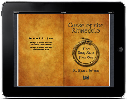
In this part we'll create the first page you'll likely want to make, which is the cover. Whereas in Kindle ebooks you are discouraged from including the actual cover image in the file, adding it instead during the upload process, in iBooks you must include it yourself.
Since the cover is generally a single full page image with the title text included it will make an ideal introduction into how to create a fixed-layout page. You can, of course, add the titles and any other text as a separate layer, but we'll save that for later and only focus on the artwork here.
I should mention that Apple frowns on using images that include text, requiring that any text within the ebook be created as an active layer. This is so that functions such as dictionary definitions, searches, highlighting, text-to-speech, or any other accessibility features be fully functional. Otherwise there would be no difference between the basic fixed-layout format and a standard pdf. However, this requirement does not apply to outer covers, or to title pages or other places where highly customized text is desired. Bear this in mind in your textual choices.
THE FIXED-LAYOUT PAGE
If you open up the template cover.xhtml file in your editor of choice, you'll see something like the following:
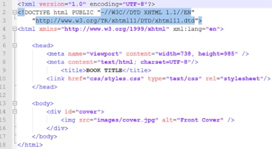
The first few lines provide our language declaration, and note that here we include an additional encoding statement which defines the document as using the "UTF-8" character set. There is also a DOCTYPE declaration which defines the file language as html, and provides the necessary referents.
Finally, there is an xml:lang statement defining the coding language as being written in English. This, of course, assumes you're an English speaker writing for an English audience, which I'll also assume since you're reading this. All of your html files should be encoded with this set as shown. Just copy and paste it as is.
THE HEAD ELEMENT
The next section is where you define the characteristics of the page, and link to the style sheet you'll use to format the page contents.
1. meta name="viewport"
Apple uses a feature called the "viewport" in iBooks to define the actual size of a page. This is not necessarily the size of the iPad display itself, although it can be. As I discussed at great length in the last part, your content is best created at a larger size than the actual iPad screen, for several reasons. Foremost this is so that users can zoom the image up to view more detail, such as reading smaller print. But also as I mentioned so the ebook doesn't become obsolete as soon as a higher resolution screen comes out.
That said, you are certainly free to make your book in any size and shape you wish. If you want to keep your file sizes small and have no need or wish for anyone to zoom your pages larger than the iPad screen, then create each page at the default resolution, as I discussed before, so that a single page will fill the screen in portrait orientation without being zoomed. Don't make each single page the size it will appear in a two-page spread in landscape orientation, because the iPad will zoom it up automatically to fill the screen when viewed as a single page in portrait orientation, and it will look like garbage. But the larger image will look just fine when shrunk to fit beside its opposing page in a two-page spread.
Whatever size you decide on, enter it on the first line here in the "width" and "height" attributes, where the numbers shown are the exact number of pixels that define the size of your page.
2. meta content="text/html"
This may seem a little bit redundant, since you've already given this information above, but here it refers to the actual content of the page and not the coding language of the document. Or so I've been told. Just put it in.
3. <title>
This is utterly pointless, since it doesn't show up anywhere. In fixed-layout ebooks there is no actual header in the upper margin (or footers for page numbers either, by the way, so you'll have to put those in yourself if you want them - see my Ring Saga sample chapter for an example). I imagine this is what that was meant to be, but as I said it won't appear anywhere, so you can put whatever you like there. Use it as a way to describe the page contents if you like, of put some jokes in for curious ebookworms. It really doesn't matter. I'm not even sure it needs to be there, but I haven't tested it.
4. link href=
This is the other line that really matters, as it tells the reading system where to find the formatting information for this page. That data is kept in a separate CSS file, and only the actual page content is located here. CSS (Cascading Style Sheet) is a "stylesheet" as the last element declares, which we'll get to shortly. You can create one and put all your formatting information in it, or make a separate one for every page, or even both, but any formatting that needs to be applied to this page must be referenced here.
The href= element is the only one you'll need to change, as it must specify the location of the specific style sheet you want to apply to the content of this page. Beat in mind that the css file location is relative to where this page is, so if you've put the html page file and its css file in the same folder all you have to do is list the file name. But if the css is in a separate folder, as in the example, then the relative path must be given. If they're in separate folders, start the line with ".../" which tells the OS to start looking at the root level (such as ".../css/styles.css" for example).
Obviously, we haven't created any css files yet, so just give it a name that makes sense and use that name when we get to that point. Or leave it as is and come back to change it later.
THE BODY ELEMENT
Now at last we get to the heart of the matter. The body container holds the actual content of the page, and it's written just like any standard website using html. You'll want to know at least the basics of html, but you don't need a lot. There are hundreds of thousands of quick reference guides out there on the web for free. You can open up ebooks and look at the code it's made of to learn how specific things are done. But for now we'll just keep things simple.
1. <div id="cover">
All we want on this cover page is a single image, so our body only has one element, contained within the <div> tags. Normally you'll just call up the divider using <div> all by itself, closing it with </div> after your content. But in order for your cover image to show up as a thumbnail on your iBookshelf you need to add the id="cover" element and attribute. We'll reference this elsewhere - in the content.opffile - and this is where that file reference will find what it's looking for.
2. <img ...
Since all that's on this page is the cover image, chances are you'll want that image to fill the entire page from edge to edge. To do so, all you need to do is create or resize that image to the exact dimensions of the viewport size you chose for your book.
To insert the image into the page, you call it up using the <img tag, followed by that file's location, or "source" (src), which you reference just as you did for your (currently nonexistent) css file. Technically, the image file is nonexistent as well, as I haven't told you to put it in the image folder yet. But you can do that now, or any time you like. The template already has folders for images, css, and fonts as well. You can just drag and drop yours into the appropriate one, and then delete the other.
Warning! If you delete the only file in a folder, it will delete the folder too, so put your image in there first before deleting the ones you don't want. Of course, you can recreate the folder, but I just thought I'd mention it to save you time.
3. alt=
The text you enter into the "alt" element is usually what you would see pop up if you were to hover a mouse over this image. Of course, the iPad has no mouse, and as cannot hover your finger to make this happen, what you write here will never show up anywhere. However, it is used to vocally describe image content to visually impaired readers who are using verbal accessibility features. So give some thought to what you put here. Most people don't, and I imagine it's a great annoyance to those who would enjoy a bit more information than "front cover". It's unlikely very many visually impaired readers will be avid graphic novel fans, but you never know. I haven't done any research on those statistics, so it's probably best to hedge your bets and add a little something extra. That said, it is required to put something there, but what is left entirely up to you. At any rate, that's what "alt" is for.
You can now save your file and close it down. Be sure you've added the closing tags at the end or you'll get some nasty error messages upon loading the file into iBooks. Chances are you'll miss some of these (I always do), and it will be a pain to go back in and fix them, so just take a moment now to look the file over before moving on.
Congratulations! You have just created the cover for your book. Unfortunately, the file will not yet load successfully into iBooks, as you have no css, and you're still missing two other crucial files. We'll focus on those next so that you can start to get your work in progress functional enough to have a look at what you've got.
NEXT UP: The CSS File
January 25, 2012
How to Create Fixed-Layout iBooks, Part 3
Before we can continue building our fixed-layout ebook we'll need some content to put in there. This is, of course, the reason we're here undertaking this project, so I would presume you already have something you want to make an ebook out of, and as we're focusing on fixed-layout format you've likely got some heavy art to include. First, however, you must understand the nature of the medium that you'll be working in.
In standard ebooks the size and placing of elements onscreen can change, which makes everything relative to everything else. But in fixed-layout ebooks everything is...well... fixed, and consequently the size and position of every element is absolute. In order to place those elements accurately, therefore, you must know precisely where you want them to be and how to put them there. This will require a slightly technical explanation, so bear with me for a moment.
DISPLAY RESOLUTION
The current iPad screens contain 1024x768 pixels at a resolution of 132 pixels per inch. However, the pixel density of 132 is irrelevant since the total number of pixels is fixed. In print, a resolution of 100 pixels per inch would make a 1000x1000 pixel image print out at 10" x 10" square, whereas a resolution of 200 pixels per inch would make that exact same image print at only 5" x 5". But on a fixed digital screen both images will appear exactly the same, although a higher resolution image will generally look crisper since the original art will tend to have more detail.
The iPhone4S and iPod Touch have a screen resolution of 960x640 pixels at 326 pixels per inch. With nearly three times the density of pixels, the smaller screen has nearly as many total pixels (614,400) as the larger, but lower resolution iPad (786,432 total), even though the iPhone display is only 3.5" and the iPad nearly three times that at 9.7". This is why the smaller screen has the ability to display almost as much detailed content as the larger one.
To make matters worse, resolution will continue to increase until the larger tablet screens reach the pixel density of the smaller ones. Fortunately for us, 326 pixels per inch is pretty much the upper limit of the human eye's ability to discern individual details, so increasing pixel density further would be pointless. But when the iPad's 9.7" screen reaches the iPhone's level, its total pixel area will be 2529x1897 for a massive total of 4,797,513 pixels, every one of which you'll need to fill with content and color.
Now, some of those pixels can be duplicated, so that, for example, one pixel in a 1024x768 image created today will be displayed by a 4 pixel square in the 264-ppi 2048x1536 display rumored to be coming on the iPad 3 due out this April. Theoretically, the image should look pretty much the same, although in fact it will be zoomed and pixelated and somewhat fuzzy by comparison, since that 1024x768 image will only fill the middle of a screen with four times as many pixels (twice as many wide, and twice as many high), and it will be the display processor that calculates what color to make those extra pixels, not you. Crisp edges will become fuzzy where black meets white and the display logically selects three shades of gray as a compromise for the three new pixels it must fill in.
More importantly, these are all pixels that could contain more detail and present a clearer, crisper image. For this reason it is recommended that you always create artwork at the highest resolution possible to future-proof your hard work against the higher resolution screens that are surely coming. In the iBookstore Asset Guide Apple themselves recommend using images that are "at least twice their intended display size" for this reason, as well as enabling users to zoom in to see more detail.
FILE SIZE LIMITS
Complicating matters are two further issues we must take into consideration. First is Apple's two million pixel limit for each individual image. This is apparently not a hard and fast rule, but images larger than this may not display properly, or cause the iBooks app to crash. Given this restriction, the largest single image size legally allowable in the iPad's 4:3 aspect ratio would be 1224x1633, a total of 1,998,792 pixels. Of course, you can place more than one of these on a page, and two of them side by side makes up a full landscape spread. But this brings up our next consideration, which is total file size.
Since .epub files use .zip compression in their packaging, they must adhere to the zip archive's current 2 Gb limit, and this is a hard and fast rule which cannot be broken. Now, two gigs is a pretty enormous file, so there's really not a lot of concern here. But as files get bigger and enhanced ebooks include more content, it becomes increasingly possible this limit might be reached, particularly if a lot of video is embedded. The 28 images included in my Ring Saga sample chapter bring its total size to over 24 Mb - a long way off from two gigs, but it's only one chapter of a proposed 450-500 page project, each page of which is roughly 1 Mb at a quality setting of 10 in Photoshop. More compression can, of course, bring these file sizes down, and may be necessary for the final complete ebook. But where quality is concerned, the less compression the better. It's a compromise each ebook artist will have to make for themselves. And if screen resolution continues to increase, even these image sizes will be too small.
The bottom line is that when you're creating high quality artwork for a graphic novel or illustrated ebook with full-page images, you should ideally create them as close to the two million pixel limit as possible and work from there. I create my original artwork at upwards of 4000x3000 pixels or so and then shrink to fit. The iPad, by the way, automatically resizes larger images to fit the screen, in whichever orientation it's being viewed. You can double-tap to view full screen, or pinch and zoom to view the image at full size.
ACTUAL IPAD SCREEN SIZE
Although the iPad's total screen size is 1024x768, Apple's "recommended page size" in the Asset Guide is only 985x738, due to space taken up by the faux book pages and menus. Consequently, this is the size I've used in the template to give you the official example. However, since the upper and lower menus go away (leaving blank space above and below the pages), if you want to completely fill a horizontal view with a two-page spread, the actual optimized page size you should use is 1024x682, or increments thereof. At this aspect ratio, the maximum image size within the two million pixel limit would be 1732x1154 (1,998,728 pixels).
Recent updates have included the option to turn off the faux book borders in standard iBooks editions, via the font display menu, but since this menu is not available in fixed-layout iBooks, the faux book pages are there whether you want them or not. This may change at some point down the line, of course, particularly seeing that the new .ibooks format no longer has them (although they may just be turned off in the few textbooks I've looked at). But for the time being, you'll want to take them into consideration when creating your art layouts, as I have done above, since removing them will slightly alter the full page aspect ratio.
SPANNING IMAGES
Fixed-layout iBooks actually allow you to use a single image to fill a two-page spread by spanning the image across the pages. However, given all I've just said I highly recommend against this, since Apple's pixel limit only applies to each individual image. If you use one image to fill two pages, you have effectively cut the maximum size of your artwork in half, with only one million pixels per page. This is still enough to fill up the pages currently, but only just, and tomorrow it will look like crap. Additionally, it's a whole lot of extra effort and confusion to format for no real good reason. It is vastly easier to cut an image precisely in half in Photoshop than to span it across two pages. You have to create two separate page files either way, and the seams match up perfectly. This is what I've done in the Ring Saga sample, so have a look at that as an example.
However, in the interest of giving you a full range of options, I'll include the information anyway, as there may be occasions when it could be handy. For example, if a smaller image runs across two pages of, say, a magazine-style layout, or a travel guide or some such, particularly since this would allow you to adjust the image placement without having to go back in to Photoshop and crop it up again.
But I won't get into that just yet. First we'll build some single pages.
NEXT UP: Creating Your Cover


