How To Create Fixed-Layout iBooks, Part 7

Now that you have a working fixed-layout ebook filled with pretty images you'll probably want to add some text. After all, what's a story without words? In this installment of the iBooks tutorial we'll look at how to add live text as a layer over or around your art.
EMBEDDING FONTS
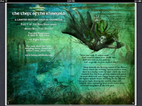
While you can rely on any of the fifty or so fonts and variations already included on the iPad, you will likely want to use others at times to create a certain look or feel. In the screenshot of my Ring Saga project above several different fonts are being used to achieve the stylistic effect I want. To do so you must include the font in your ebook package.
Bear in mind, however, that many commercial fonts don't allow embedding, so be sure to look at the font's properties to see if embedding rights have been restricted. You'll want to do this before you spend a lot of time creating your ebook file, only to discover that you have to replace your chosen font with something else that's only moderately close.
First, create a folder in your OEBPS directory named "fonts" and put your chosen font file there. This isn't necessary, and you can put your files anywhere you like, but it's always good practice to keep things neat and orderly so that you can find what you're after when you need to. If you only have a single font to embed you can just as easily add it at the root level, but if you're building something fairly complex it's best to organize each set of elements in their own location.
Next, you need to list this new addition in your manifest, so open up your content.opf and add a line that references the font. Here's the sample template entry:
<item id="Storybook" href="http://feedproxy.google.com/~r/TheAdv..." media-type="font/truetype"></item>
The item id can be anything that makes sense, although you'll never reference it anywhere using this id. Enter your href as a relative location from the content.opf itself, as it is here with the folder/file name provided. The media-type defines what kind of font it is, and for the iPad this can be TrueType, OpenType or SVG.
Finally, before we begin formatting our text, we need to specify that we're using embedded fonts in the com.apple.ibooks.display-options.xml way back up there in the META-INF folder. Add the following line to the platform(s) of your choice:
<option name="specified-fonts">true</option>
Without this entry system fonts will be used to render your text instead.
CREATING YOUR CONTENT
Before you can format your text you'll need to add some. If you take a look inside the sample template at the html for page 2 you'll find a line of text that has been added in a paragraph tag. You'll also see that in the <head> section a css stylesheet for page02 has been referenced so that the reading system knows where to find the formatting data for this text.
<link href="http://feedproxy.google.com/~r/TheAdv..." type="text/css" rel="stylesheet"/>
<p class="line1">Start your story here!</p>
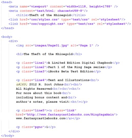
The template includes only a single line of text, prompting you to start your own story, but for a slightly more complex example here's the html for the left page of the Ring Saga screenshot above:

In the body we find a header, three separate lines of text with individual class references, a fourth paragraph with multiple lines separated by breaks, a fifth line which includes an external link, and a final line containing a page number. Giving each of these paragraph elements their own class allows you to format them individually, both in terms of style and placement. But they can also share overall paragraph formatting features, such as color and alignment, or the use of a specific embedded font.
This is done in the CSS file (or files) referenced on this page. Here we see that two separate CSS files have been referenced, one for overall ebook style properties and a second for the specific content on this page. Although this can all be done in a single file, if your ebook contains a lot of complex formatting this file can become bloated and difficult to navigate very quickly. Using one general style sheet along with separate ones for each page is far cleaner, as well as making it much easier to find and fix any stray errors that may creep in.
CALLING YOUR FONTS
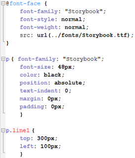
All your major text formatting should be done with CSS rather than in the HTML file itself (aside from specific instances such as italics or bold and the like). Therefore, if you're using embedded fonts to format your text it's in the CSS that you must reference them. You do this using the @font-face entity:

You generally enter just the font-family, its base style and weight (i.e. italic, bold), and a source that references the font location, using the format shown, giving absolute location from the file's root level.
All other font formatting is given in the tags for that particular element or class. So here, for example, we see the sample template paragraph formatting for our one line of text, which gives a default set of parameters at the paragraph level, such as size and color, as well as some overall positioning information that tells the system we want to place our elements using absolute positioning with no added pixels for margins, etc. Any of these general settings can be overridden at the class level for individual elements.
I won't get into CSS specifics, as that's a subject of its own, but iBooks supports a fairly large range of elements, including text shadows and spacing between both words and letters.
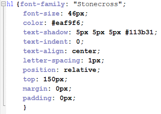
 An example of some formatting you can apply is shown here in the formatting for my copyright page text. Colors can be given by name, RGB values, or hexidecimal codes as shown here. Text shadows are given as four elements, the first two being the vertical and horizontal distance shifted (with positive and negative values allowed), the amount of blur, and the color of the shadow.
For the first few lines of text on my copyright page I also used text-transform for uppercase (for p.class "line1") and font-variant for small-caps (lines 2 and 3). The hyperlinked web url in the last line is active, by the way, although for purely aesthetic reasons I've changed the default blue to white in order to make it match the rest. You could also remove the default underline using text-decoration="none", but I left that as a visual cue that the link was live.
POSITIONING YOUR TEXT
Because we're creating fixed layout ebooks here, the exact number of pixels is...well...fixed. This allows us to position elements precisely where we want them by specifying their location vertically and horizontally in pixels. This can be done from any edge, although the default is to place the upper left corner of an element using its distance from the top and left edges. However, it's often easier to use the nearest edge, for example, if you have a small image or a line of text near the bottom that you want to align with a right margin.
You can also use relative positioning to align blocks of text using right-align, center, or justify with margin settings to control the distance from the edges.
The positioning information itself is given for each and every separate element, as for line1 in the sample template example above, which begins 300 pixels from the top and 100 pixels from the left edge of the page. For the lines of text on the right page of my Ring Saga sample shown at the top I simply specified the exact location in pixels where I wanted each separate line to begin. This gave me the ability to create the smooth, flowing contour of the text block's left edge. The text layer remains "live," allowing the use of dictionaries, search functions, and text-to-speech if so enabled. You can also double-tap the text to zoom to the line width.
Positioning such as this can be a very tedious and time-consuming process, filled with much frustration and endless trial and error, but it helps to think in terms of the total page size. A page 1024 pixels wide, for example would have a center point at 512, and ten divisions of roughly a hundred pixels each. Some simple math proves very useful in determining such things as line spacing and margins. One efficient trick is to pull a final page layout into Photoshop, resize it to the your chosen iBooks dimensions, and set the rulers to show pixels. You can then simply place your crosshairs over the point you want to position, note the location in pixels on the horizontal and vertical rulers, and enter those into your CSS file for that element.
One final note regarding the z-index might be mentioned here. Because we've placed our background image at -1 on the stack no further adjustments are required to place your text layer atop the image. However, you may wish to create multiple layers, either of art or text (or both) for one reason or another. This is particularly useful for overlapping individual image elements, but you can also create complex text layers this way as well. Unfortunately, iBooks only allows one text shadow element to be applied to each text layer, but you can create complex shadows and glow effects by duplicating text layers and blurring or changing the color of the ones below. For example, 0px 0px 30px #ffffff would create a white glow completely surrounding your text. Use your imagination.

Published on February 03, 2012 20:37
No comments have been added yet.


