
James Maliszewski's Blog, page 47
August 12, 2024
Escape from C'thulhu
Speaking of minigames, Phil Foglio's What's New with Phil & Dixie humorously treated this topic in issue #60 of Dragon (April 1982). The last game tested by the titular characters is Escape from C'thulhu [sic]. According to Phil, it's very easy to play: Just open the box, read aloud the enclosed incantation ...


August 11, 2024
A (Very) Partial Pictorial History of Troglodytes
Since last week we looked at lizard men, I thought it would make sense to examine troglodytes next, since they're both humanoid reptilian monsters. There are, of course, lots of differences between them, starting with their alignment – troglodytes are Chaotic Evil, while lizard men are Neutral – I can nevertheless easily imagine someone confusing the two. With that in mind, how did TSR era Dungeons & Dragons visually distinguish between them?
The earliest illustrations I can find of troglodytes come from the AD&D Monster Manual (1977), both by Dave Sutherland. Sutherland gives trogs a much shorter snout and a large crest on their heads. These are both features that can be found in most of the depictions that follow.
 The second illustration from the Monster Manual gives us a better look at these monsters' legs, as well as their scaly skin. Both pieces of art hide the troglodyte's tail in shadow, but it is there, if you look carefully.
 Sutherland provides two additional depictions of trogs on the front and back covers of the original 1978 release of the module Descent into the Depths of the Earth. Here's the front cover, which shows them as looking little different from those in the Monster Manual.
 The back cover of the module is interesting, because it depicts not only a troglodyte, but also an exceptionally long-nosed troll and a bugbear.
 A troglodyte next appears in the Tom Moldvay D&D Basic rulebook (1981), as drawn by Bill Willingham. Willingham's take on the monster is clearly inspired by Sutherland's, but with a few new elements. First, ridges or frills like the head crest also appear on both arms. Also, the monster's face looks a bit more fishy or amphibian, with large, blank eyes and a mouth that reminds me of a catfish's.
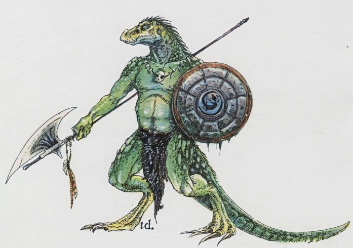
 In 1982, as part of the AD&D Monster Cards, we get Jeff Dee's nifty take on troglodytes. Once again, it's broadly consonant with Sutherland's original, but Dee's version has a slightly more dinosaur-like appearance. Coupled with the stone axe it's holding, Dee gives the trogs a kind of Lost World flavor that I really like.
 The same year, we get Jeff Easley's version in the AD&D module The Lost Caverns of Tsojcanth. Though recognizable because of their head crests, these troglodytes look a bit fishy in appearance. Take note of their eyes and mouths, not to mention their scales, which strike me as more piscine than reptilian in appearance.
 1982 seems to have been a big year for troglodyte illustrations, because we get one by Jim Holloway in Against the Cult of the Reptile God. Though we don't get to see the entirety of the monster, what we do see suggests that it's closer to Sutherland than any of the other artists we've examined. It's also a return to a more clearly reptilian depiction, as you can see from its mouth and eyes.

In 1985, Citadel Miniatures released a troglodyte miniature that's also very reptilian in appearance. If you look carefully, you can see not only its crocodile-like scales but also its cranial ridges (which are smaller).

Two years later, in 1987, Ral Partha gained the AD&D miniatures license and released its own version of the troglodyte. Here's a trio of them, which, to my eyes anyway, don't look all that different than traditional depictions of lizard men. They do have the cranial ridges at least, though, like Citadel before them, they're much smaller than in previous depictions of them.
 AD&D Second Edition's Monstrous Compendium (1989) saved the troglodyte for its second release (MC2), which suggests that TSR didn't see troglodytes as being as important as lizard men, who appeared earlier. True or not, we get this absolutely atrocious illustration of them (by Daniel Horne) that looks like an anthropomorphic horny toad with some serious dental problems. Yikes!
 Then, in 1993, Tony DiTerlizzi provides this illustration for the Monstrous Manual. It's something of a break with previous versions. DiTerlizzi opts for a newt-like, amphibian appearance rather than a reptilian one.
 Reviewing this sampling of troglodyte artwork from the TSR era of Dungeons & Dragons, I'm struck by two things. First, there is some degree of consistency in the depiction of these monsters, with most artists looking to Dave Sutherland's Monster Manual art as a foundation. Second, each post-Sutherland illustrator (with the possible exception of Holloway) put his own spin on the troglodytes by giving them some fish-like or amphibian characteristics. I can certainly understand why they might do this, since it's a good way to distinguish trogs from lizard men (and other reptile men) visually. At the same time, I think this variability contributes to rather than diminishes the conflation of troglodytes and lizard men, which likely explains why my vision of troglodytes is very close to that of Sutherland.
How about you? How do you view troglodytes?
August 8, 2024
Capture Action Packed Fantasy Adventure
In light of yesterday's post about Revolt on Antares, this advertisement from issue #58 of Dragon (February 1982) seemed like it would be of interest.
 I owned and enjoyed all these games in my youth. After Revolt on Antares, I think Saga was probably my favorite, though Vampyre was also fun. Does anyone make games like this today? I don't mean reprints of older games, like
Ogre
, but new, original minigames with simple components that can be played in an hour or so? If so, I'd love to hear about them.
I owned and enjoyed all these games in my youth. After Revolt on Antares, I think Saga was probably my favorite, though Vampyre was also fun. Does anyone make games like this today? I don't mean reprints of older games, like
Ogre
, but new, original minigames with simple components that can be played in an hour or so? If so, I'd love to hear about them.
August 7, 2024
Retrospective: Revolt on Antares
 While I've briefly touched on TSR's 1981 mini-game Revolt on Antares a couple of times before, I've never done a proper Retrospective post on it. I've decided to rectify that this week, both because it's an excellent, fun-to-play little hex-and-chit wargame and because, of all TSR's mini-games, it's the one with which I had the most experience playing. Consequently, I've got a lot more to say about Revolt on Antares compared to its seven sister games published over the course of 1981 and 1982.
Before getting to the game itself, I'd briefly like to draw attention to its place within the history of TSR. Revolt on Antares came out in '81, during a time when TSR was rapidly expanding both its release schedule and its ambitions. Though Dungeons & Dragons remained the company's bestselling line of products by far, there seems to have been genuine concern that its popularity was faddish and could not be sustained forever. TSR, therefore, began to experiment with other games (and approaches to games) as a hedge against the possible collapse in interest in D&D.
Mini-games, like Revolt on Antares, were part of that experiment. Coming on a clear plastic case, the game consisted of a short, 16-page rulebook, a sheet of cardboard counters, a colored map, and a pair of dice. Tom Moldvay designed the rules, while Kevin Hendryx served as its developer. Graphically, it makes full use of TSR's stable of young artists, like Jeff Dee, Dave LaForce, Erol Otus, Jim Roslof, and Bill Willingham, all of whom I'd consider representative of this experimental period in the history of the company. Dee's cover is especially memorable to me, probably because of how I often I played Revolt on Antares with my friends at the time.
As wargames go, this one is quite simple – but that was a big part of its appeal to me. Though I knew a lot of guys into wargames in my youth, I never really devoted much effort to playing them myself, with a couple of exceptions here and there. For the most part, this was simply a matter of not being sufficiently interested in wargames to devote the time necessary to learn and play them. I'd much rather have been playing roleplaying games than the Rise and Decline of the Third Reich.
What immediately appealed to me about Revolt on Antares was its science fiction setting. I've been a huge fan of SF since I was a young child, growing up in the immediate aftermath of the Apollo program and watching reruns of Star Trek on a grainy black-and-white TV with my aunt. And, of course, like all little boys at the time, I was a fan of Star Wars. The combination of these facts with my TSR fanboyism made it perhaps inevitable that I'd purchase Revolt on Antares almost as soon as I saw it.
The simplicity was, as I've already noted, a plus, especially when compared to other SF wargames I attempted to play around the same time. The rulebook quickly establishes the basic scenario:
Imirrhos, ninth planet of the star Antares, lies on the edges of Earth's Imperial Terran Empire. As the Empire grows weaker, Imirrhos boils with unrest and intrigue. The seven local ruling families (or "houses") fight for power. Some want the Terrans to leave, others need Imperial support. A few know of the Silakka, an alien race that is waiting to invade ...
The rulebook then offers up three different scenarios for play. The basic scenario is for two players and concerns the revolt against Terra. One player takes the role of a house leader leading the revolt, while the other is the Imperial Terran consul, who is attempting to crush the rebellion. The second scenario is also for two players and concerns the defense of Antares against the invading Silakkans. The third – and, in my opinion, most fun – scenario is for 2 to 4 players, with each player taking on the role of one or more houses as they jockey for control of Imirrhos.
A big part of the appeal of Revolt on Antares are its characters. Each of the houses is led by a character with both a name and a unique ability. For example, House Orsini is led by Messalina Orsini, whose power of fascination enables her to subvert the loyalty of opposing units, while House Edistyn is led by Nureb Khan Edistyn, whose precognition ability allows him to roll two dice instead of one in combat, taking the best result. In addition, there are "Galactic Heroes" whom you can recruit, like the assassin Corvus Adromeda and Dr. Death, who can animate the bodies of fallen units as zombies. These heroes act much like house leaders in their use but may be recruited by any faction. There are also ancient alien artifacts, such as the Force Cannon and Energy Drainer, whose possession and use adds yet more mayhem into the mix.
Looking back on it now, it's clear that what made Revolt on Antares so appealing to me was its world building. Though the information Moldvay provides about Imirrhos and its inhabitants are as brief as its rules, they are surprisingly evocative. Names like Black Dougal Mackenzie or Ward Serpentine possess a certain mystery that made me want to know more – and, in the absence of such information, my friends and I imagined it for ourselves. That's precisely the stuff from which good games are made and, by that standard, Revolt on Antares is a very good game.
From a purely objective perspective, it's nothing special. As I keep saying, the rules for combat and movement are very, very simple. I'm sure long-time wargamers would justifiably scoff at their lack of depth. I can't really argue against such judgments, except to say that I had a blast playing Revolt on Antares again and again, each time coming up with new ideas about the implied setting of the game – not bad for a little game published four decades ago!

A Tale of Two(?) Dungeons
In the comments to last week's post about The Official Advanced Dungeons & Dragons Coloring Album, an anonymous poster theorizes that "the map used here is identical to the one in the Holmes basic set intro adventure" to which commenter Frank replies that it's "not identical, but very close." In the interest of discussion, here's what the Holmes Basic Set map looks like:
 Meanwhile, the map from the Coloring Album looks like this:
 If you look carefully at the two images, you'll see that Frank is indeed correct: the dungeons are very similar to one another but not quite identical. Even so, many of the most iconic features of the Holmes dungeon are still present in the Coloring Album version, like the sea caves at the bottom left and the rat warrens at the middle top. Zach Howard, over the excellent blog Zenopus Archives, has a useful post in which he looks at some of the similarities and differences between the two versions.
I'm fairly confident that the map appearing in the 1977 D&D Basic Set was created by Holmes himself, though I'm 100% certain of this fact. If so, that makes its reappearance in the Coloring Album, albeit in modified form, all the more fascinating to me. Why was it chosen? Was it because its compactness made it especially suitable for the pared down "D&D Lite" of the Coloring Album? Why not make an entirely new dungeon map? I suspect the answer is probably fairly mundane, but I can't help but wonder.
August 6, 2024
A (Very) Partial Pictorial History of Lizard Men
Lizard men were introduced into Dungeons & Dragons in the pages of its first supplement, Greyhawk (1975). The first illustration of them appears on the inside cover of Supplement I, provided by Greg Bell. As we'll see, this image established the general outlines of what D&D's lizard men look like and nearly all of those that follow will use it as the foundation on which to build their own specific interpretations.
 The next time we see a lizard man is the Monster Manual (1977), with artwork provided by Dave Trampier. There's a lot of similarity between Tramp's depiction and that of Bell above, like the tattered loincloth, spiny ridges on the head, and serpentine tongue. This is my default mental image of a lizard man, probably because it's the first one I ever saw.

In the 1980 Rogues Gallery , Jeff Dee provided an illustration of a lizard man – or, rather, a human who was reincarnated as a lizard man by druidic magic. Aside from the additions of bracers and pirate boots, the latter of which are quite common in Dee's artwork, this looks pretty similar to the work of both Bell and Trampier.
 That same year, Grenadier Models acquired the AD&D miniatures license, producing numerous boxed sets of 25mm figures. One of these sets, Denizens of the Swamp, featured lizard men on its cover by Ray Rubin. The lead lizard man looks almost identical to Trampier's version from the Monster Manual.
 The Sinister Secret of Saltmarsh was published in 1981 and contains this piece by Harry Quinn. Once again, we can see the influence of both Bell and Trampier, though I'd say Trampier has the upper hand. Look, for example, at the skull necklaces the lizard men are wearing, as well as their shields.
 The module's immediate sequel, Danger at Dunwater (1982), also features lizard man art, this time depicted by Timothy Truman. Truman's take on the monster is much more bestial and savage.
 The same year, the AD&D Monster Cards appeared. Jim Roslof offereed us his take on the lizard man, which doesn't differ all that much from the one found in the Monster Manual. Note again the presence of the skull necklace.
 The 1983 Dungeons & Dragons cartoon series featured lizard men several times during the course of its run. Here's a trio of them, one of which (again) wears a skull necklace.

Jim Holloway's depiction of lizardmen in the AD&D Second Edition Monstrous Compendium is notable for downsizing the head and back ridges while also extending them to the end of the tail. Holloway also shortened the snout and shrank the size of the mouth.

Tony DiTerlizzi's interpretation of lizard men appeared in the 1993 Monstrous Manual. It's very distinctive in many ways, such as the legs. Interestingly, DiTerlizzi gave the lizard man a polearm that looks very similar to the one Greg Bell included in his original illustration. I wonder if this was intentional.
 Lizard men are not monsters about which I think a great deal, so it was instructive to take a look at their depiction during the TSR era. While there are undoubtedly many I've not included here – feel free to post your favorites in the comments below – what strikes me most about the ones I have included is how similar they are. Greg Bell laid a foundation in 1975 that Dave Trampier then built upon; all subsequent artists have either directly copied or slightly altered their work.
August 5, 2024
REPOST: The Articles of Dragon: "A Special Section: Dwarves"
 For issue #58 (February 1982) of Dragon, I'm going to cheat a little – well, a lot – by focusing on not just one but four different articles. I think it's justified, though, because the articles cover closely related topics and three of them were written by a single author, the inestimable Roger E. Moore, in those days when he was not yet the editor-in-chief of Dragon. "A Special Section: Dwarves" is also an important collection of articles, one that, in my opinion, marks a turning point in the history of D&D. Indeed, it's a collection that makes me wonder if perhaps the Silver Age didn't begin sooner than I have suggested in the past, for these articles were extremely influential and ushered in not just explicit follow-ups by Moore himself, but also a growing codification of not just D&D's non-human races but many other aspects of its fictional milieu.
The first of the four articles is "The Dwarven Point of View," which presented a psychology of the dwarves, explaining aspects of their thoughts process and, by extension, the society and culture that arose from them. "Bazaar of the Bizarre" featured two new (and forgettable) dwarven magic items, while "Sage Advice" answers a battery of increasingly nitpicky questions about dwarves. "The Gods of the Dwarves" is probably the most well-known of the four dwarf articles in issue #58, if only because it was officially canonized by Gary Gygax, who included it in his 1985 Unearthed Arcana expansion to AD&D. I'll also never forget "The Gods of the Dwarves" because it included an illustration depicting Berronar, the dwarven goddess of safety, truth, and home, with a beard:
 I've long had a fondness for this piece of artwork, both because I relentlessly used it in my youth to bludgeon those who denied that female dwarves had beards (in contradiction of both Tolkien and Gygax – so you know it had to be true!) and to emphasize that dwarves aren't just short, stocky humans. They are, effectively, an alien race and to expect them to conform to human ways is absurd, not to mention demonstrating a severe lack of imagination.
When this quartet of articles was released, I adored them and made every effort to incorporate as much of them into my ongoing campaign as I could. Nowadays, I have much more mixed feelings about them, chiefly because they, almost certainly unintentionally, became the fount from which subsequent discussion of dwarves flowed. That is, later writers – and even TSR itself – treated Moore's ideas as normative, the result being that, as the '80s wore on, the portrayal of dwarves in AD&D became less diverse. At the time, I didn't care; indeed, I was very happy with "official" information on dwarves and all the demihuman races, because I wanted my campaign to conform to the conceptions of my betters in the hobby. In retrospect, though, I feel less happy with these articles and wish their influence had been more limited.
(The original version of this article and its comments can be found here.)
August 2, 2024
The Quest
As promised, here's a closer look at one of the pieces of art found in The Official Advanced Dungeons & Dragons Coloring Album.
 This piece is accompanied by the following text:
Welcome to a world of bold adventurers, strange races, magic and monsters! Here at the Green Dragon Inn, a busy inn in a town on the shores of the Lake of Unknown Depths, a group of adventurers have met to plan a daring expedition in search of fabulous treasure. They sit at an outside table, quaffing amber ale and charting their course to wealth beyond belief.The Lake of Unknown Depths is a body of water within Gary Gygax's World of Greyhawk setting. The Green Dragon Inn is another locale from that setting, found in the River Quarter of the Free City of Greyhawk itself. However, the text doesn't explicit connect it to the Free City, asserting instead that it's found a nameless "town" on the shores of the lake. I can't help but wonder if this omission/obfuscation was deliberate.
In any case, the text continues:
In the left foreground, a pair of halflings, thieves by trade, ponder their part in the expedition. Ruddy-complexioned, their sandy hair and hazel eyes match their dusty gray and brown garments.
I wish I'd remembered this illustration last month when I was looking at the depiction of halflings during the TSR era of D&D. The two halflings shown here look more like some sort of fairytale creature, such as a leprechaun or brownie, than Tolkien's hobbits.
Across the table, the dwarven fighter's bright green eyes glow excitedly from his tanned face. Gold adornments glitter against the somber background of his dark brown beard and even darker waistcoat. Next to the dwarf, observing the party's map, is Sertern [sic] the cleric who, like his deity St. Cuthbert, favors blue for garb and silver for decoration.
Serten – spelled with only one "r" – was a player character in Gary Gygax's Greyhawk campaign, played by Gary's son, Ernie. His name, like that of the magic-user Tenser, is an anagram of "Ernest." Like the one described here, he was a cleric of St. Cuthbert. If it weren't for the fact that the name is consistently spelled as "Sertern," not "Serten," I'd have assumed the difference was due to a typographical error. However, it would seem to have been deliberate.
Behind and to the left of Sertern is a golden haired and russet garbed ranger, famed as a valiant fighting man. The elf to the right, indicating the goal on the chart, is both fighter and thief. His drab clothes suggest no particular identity, but his pale skin and auburn hair mark him as a wood elf. At his side stands another dwarven fighter, sporting a scarlet cap and gray beard.
I assume that the references to colors throughout the text is intended as an aid to anyone who might choose to use the Coloring Album for its intended purpose. Even so, I must admit that it lends a certain vibrancy to the text it might otherwise lack. It's also a nice antidote to the notion that fantasy worlds come only in various shades of brown and black.
Gesturing with his tankard, the renowned fighter opposite wears his armorial colors: deep yellow for shirt and cap, green for trousers and vest. Two lesser warriors, lower right, are honing the sword blades to razor-like keenness. The swords themselves are works of art with gilded hilts and precious gems. The innkeeper, his wife and the stableboy are all busy caring for the wants of the adventurers, for they know the party will soon set forth on their quest – possibly to return loaded with bright gold!
Gygax won't win any awards for his prose, but he nevertheless paints a decent picture, especially when paired with the artwork of Greg Irons. Taken together, they present a somewhat grounded, even grubbier fantasy world of the sort one might find in the works of, say, Robert E. Howard or Fritz Leiber. I found myself thinking of Dave Trampier's treasure hunters from the back of the Monster Manual. The characters depicted here are all rough, hardened men on the make rather than conventional heroes. That's pretty cool in my opinion – and certainly in keeping with the literary roots of the game.
August 1, 2024
Fight On! Returns
Fight On! fanzine is one of the foundational products of the Old School Renaissance, first appearing in the Spring of 2008. Over the course of the next five years, indefatigable editor Ignatius Ümlaut put together fourteen issues filled with contributions from every corner of the OSR and beyond. I am now happy to announce that, after more than a decade of quiescence, issue #15 of Fight On! has finally arrived, the first of many new issues, I hope.
 Issue #15 is dedicated to the memory of J. Eric Holmes, editor of my beloved 1977 D&D Basic Set. Its contents consist of the following:
Ten Ways to Holmesify your Game (Zach Howard)Special Ability Charts (Attronarch) The Orthogonal Dwarf (Olle Skogren) Gremlins! (Calithena) Maze Master’s Miscellany (Alex Schroder & Cal) The Catacombs under Old Samora (Philipp H.) Knights & Knaves: Holmes Town Heroes (Tony A. Rowe) Bringing It All Back Holmes (Clark/Grodog/Cal) Maps from the Maze of Peril (J. Eric Holmes) Distributary of Darkness (Alex Zisch) The Silken See (Motley Dice) Grognard’s Grimoire (Richard Rittenhouse) The Wizard’s Satchel (J. Blasso-Gieseke) Artifacts, Adjuncts, and Oddments (Rittenhouse) Victory or Death! (Gabor Lux) Megadungeon Workshop Extravaganza! (Kesher) Calvero! (István Boldog-Bernád) Creepies & Crawlies (James Maliszewski) Tables for Fables (Al, Greco, Wetzel, and Rients) The Darkness Beneath (Alex Schroder & Lior Wehrli) Henchmen-Я-Us: Pole Arm Caddies! (Calithena) Chainmail: Battle for Bronzolo (Settembrini) Doxy, Urgent Care Cleric (Linneman & Green) Education of a Magic User (Douglas Cox) Wham! (Tom Gordon)
I'm incredibly happy to see Fight On! return. I contributed to the inaugural issue, along with several others that followed. I cannot exaggerate the importance the fanzine played in fostering and disseminating original old school RPG material to a wider audience. I hope its return is not a temporary one and we can look forward to many more issues in the years to come. I know I'll do my best to help support and promote it.
Print copies are available here, while PDFs can be found here.
PSA
I will be traveling over the next few days, during which time I likely won't be checking email or otherwise online. This also means I won't be approving any comments made between now and next Tuesday (August 6). However, I have queued up a few posts for your enjoyment while I'm away, but regular posting will resume next week, once I've returned and worked my way through any tasks that have accumulated during my absence.
Thanks!
James Maliszewski's Blog

- James Maliszewski's profile
- 3 followers

