
Emily Henderson's Blog, page 38
October 10, 2024
SUPRISE! Our Second Rugs USA Line Drops Today And We Couldn’t Be More Excited – COME SEE!

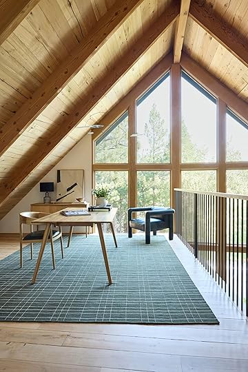
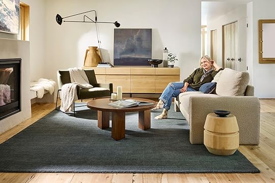
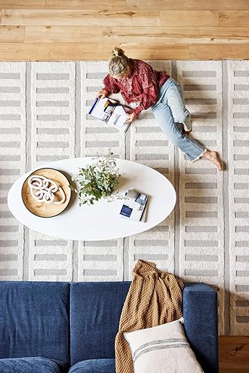
Welcome to our second line of rugs with Rugs USA, I’m just so pumped about them. This time around we chose more cushy solids with a lot of forgiving cozy textures and I really designed them to go in my house and the river house, which is pretty darn exciting. We hope/think you are going to love them just as much. A huge thanks to Jess who took the lead on these rugs (and will celebrate her 8-year workaversay in a couple of weeks – ALL THE HEART EMOJIS). The team all met at the mountain house this summer and captured the rugs in this environment, with the hope that the styling was simple enough for you to picture it in your home. Without further ado – here are SOME of my favorites of round two (with links to all of them at the end).
The Elliot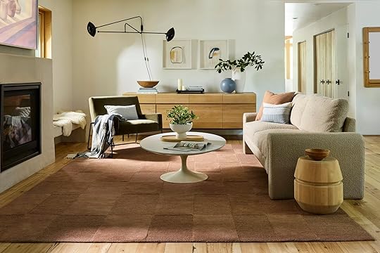
I’m calling it that this color is becoming more and more of a neutral for me. It’s a really warm mauve, with a decent amount of brown undertones making it work with so many different colors. The dual pile gives it a pattern, with ZERO busyness for those of us who want a mellow rug. It’s soft, feels super high quality, and comes in a few other colors as well. And yes, it’s named after my daughter 
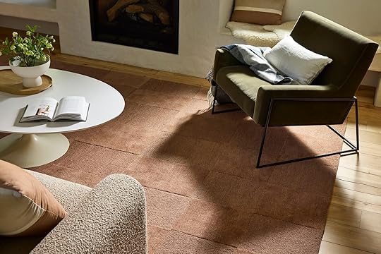
I love this color with creamy neutrals, deeper greens, and of course blues. The Rugs USA team really nailed our colors.
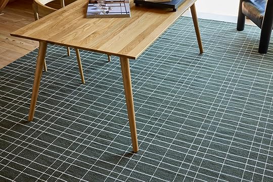
The Starke
This is my favorite rug pattern in the collection, so I named it my maiden name (Yes, I used to be Emily Starke which was admittedly a very cool name). This is a broken stripe, tonal pattern and we had it made in a few different greens because we realized those were very much missing in the last collection.

This is The Starke in Hunter Green which I LOVE and am going to use in my brother’s river house living room. It has some awesome blue undertones (and shout out to the Article sectional that I bought right before we left for Oregon a few years ago- it’s unbelievably comfortable). Again, this rug has a super soft pile and the color variation makes it really forgiving (i.e. hard to see dirt or wear and tear).
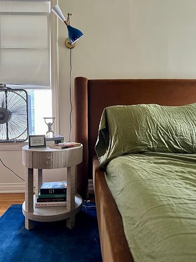
 The Harvey
I keep finding so many places to put The Harvey Rug (named after my brother’s dog for some reason, lol). This is a flat weave and has multiple types of stitching in grays and black. The background is nice cream (not too bright white). I used this in my brother’s mudroom and closet and you’ll see below it comes as a runner.

 right photo: photo by kailtin green | from: my brother’s river house mudroom reveal
I like that it is a pattern, but it’s not too high contrast and has a more organic feel to it. I suppose it is another broken stripe (my favorite and in my opinion the most versatile pattern) and the stitching just makes it feel more special (and it’s wearing really well in my brother’s mudroom – the dirt vacuums up easily).
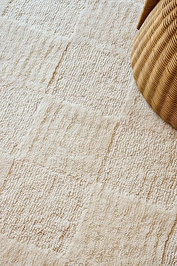
The Marlowe

This is another neutral with a plaid bent to it that is utilitarian but really warm and soft enough to also work in cozier rooms (it looks like a flatweave but it has a really low pulled pile). For those of you who like the warmer, neutral, minimal, California Casual vibe, this one is great for you.
The Charlie
Ok, for all your high-traffic areas The Charlie is a simply stitched plaid in two very classic colors – green and blue. Great for entries, playrooms, family rooms, kitchen runners, or hallway runners – anywhere that you want something really durable and able to hide dirt.
And while I’m not sure this is official, the other side has a simple stitched stripe and looks reversible to me
Named after our lovely Portland gal, The Gretchen is awesome. It’s a really warm clay/caramel color that is cushy and soft, but with a black stitch that keeps it looking custom and special. it’s a grid pattern with extra detail and two different pile heights.


I LOVE this rug and of course, now wish we had done it in more colors.
The Southwest (MORE COLORS)

The Southwest was one of the best-selling rugs last year so we made three new colors. We photographed this brown one which is obviously great for neutral spaces that need some grounding, but I’m obsessed with the color below.
This color is named “charcoal” but it’s clearly a really dark green/blue. Almost midnight or indigo. The color is so pretty without being black or flat. We are using this in my brother’s game room (formerly called the library) – the stripe still makes it look special, but it’s so simple and rich.


It also comes in a green, ivory, and a brick!
The (New) Merrick
The Merrick was by far my favorite rug from the first drop without me knowing it. I have now used it in so many projects because the pile is soft and the pattern makes it more forgiving even though it was a cream rug. So we made it in a reverse colorway – the pile is a blue/green with a cream base. We all happy gasped when we got the sample:)
We are using this in my brother’s family room AND Kaitlin’s living room. It’s fun but calming all at the same time.


The Merrick still comes in the cream colorway (like in the first drop) but with two additional options. Dark blue threading and a brick color threading. It’s honestly a little hard to see the difference between the blue and black options, but if you want more of a blue undertone this might be for you.
The Robyn
Named after one of my closest lifelong friends, The Robyn is a neutral checkerboard tonal pattern. The Robyn also comes in a dark green checkboard pattern (which we are likely using in the River House dining room).

It’s very soft, with varying tones of cream. Of course, I recommend creamier rugs in rooms with less shoe and kid traffic, but that kinda goes without saying (just get the green one if you love it).
The Caitlin

Named after our dear partnership and revenue gal, The Caitlin is a warm brown/mauve and cream. It’s a checkerboard, stripe, graphic but organic pattern that can definitely handle some wear and tear but is not flat woven (so it’s a bit softer). Great for family rooms, hallway runners or anywhere you want a simple pile in a more fun pattern.
There are many we didn’t photograph that I’m rather obsessed with – The Mallory, which comes in the prettiest warm and sophisticated purple (yes, PURPLE) which we all agree is so pretty. It’s technically called Dark Brown but it’s really a vey deep warm purple. The right purple will be having a huge moment this year (I think Olivia Rodrigo is fueling this) and this one is the prettiest one on the market if you ask me (and very affordable).
And The Remy is another great tonal pattern!

1. The Hendo | 2. The Starke (Rust) | 3. The Annie | 4. The Mallory | 5. The Austin | 6. The Morgan | 7. The Corbett | 8. The Oscar | 9. The Merrick (Rust)
Head over to Rugs USA and see the full collection and stay tuned for many a makeover the next few months using some of my favorites. And don’t forget to come back tomorrow to see the winners of the Fix It Friday rug giveaway.
A huge thanks to Rugs USA for being such a great partner on this, and to my team – Jess, Mal, Gretch, Caitlin, and Kaitlin for all you do. The crew at the mountain house was also incredible – looking at you photographer Mark Weinberg, stylist Getteline Rene, and producer Tara Elmore. We were so grateful to have such a talented crew. xx
*Styled by Getteline Rene
**Photos by Mark Weinberg
The post SUPRISE! Our Second Rugs USA Line Drops Today And We Couldn’t Be More Excited – COME SEE! appeared first on Emily Henderson.


October 9, 2024
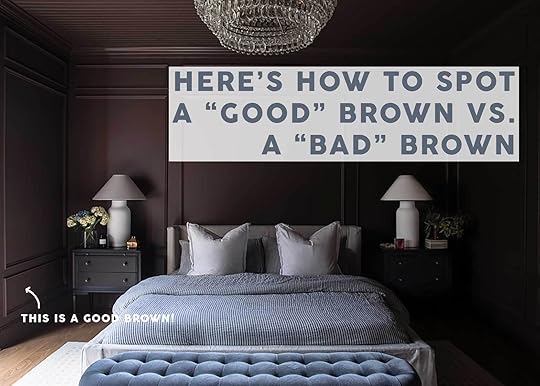
Yes, Brown Is Back, But Here’s What You *Have* To Know To Get It Right (Because It Can Go Oh-So-Wrong)
“Brown is making a comeback.” The year was 2015, and the collective design “we” was at the height of our blonde wood Scandi obsession. That surprising quote that stuck with me for the last nine years was uttered by a woman named Toma Clark Haines, a whip-smart, savvy entrepreneur I got connected with for a story back in my magazine days. I was to travel with her around parts of England, Amsterdam, Belgium, and France for a feature story on buying antiques abroad. She runs an antique tourism company called The Antiques Diva, and trust me when I tell you that she knows her stuff.
We were standing in the basement (truly, an understatement for the vastness of the space because it went on and on and on, twisted and turned) of a castle in Belgium that was both a person’s residence and also their showroom of sorts for their antique dealership. The majority of the pieces, all with pedigrees as old as 300-400 years old, were mid- to dark-toned brown wood. Some wore chipping paint in creams and blues and grays, but brown reigned supreme. I recall thinking they were beautiful but “not my style.” By the time I left that week-long trip, my thoughts on brown wood and antiques in general would be forever changed.
Brown was a far cry from what I was seeing on the floor of retailers back home in the States, but by this point, I also knew that design cycles start far earlier than we think they do, often at the top end of the market that eventually, even a decade later, trickle down to the mainstream.
I nodded and thought “Imagine if she’s right.” I had spent the better part of the previous five years painting all my brown wood furniture in varying shades of milky farmhouse colors like chalky Swedish blue and Robin’s egg green (I’m so sorry). My heart still hurts for the beautiful acorn veneer mid-century modern chest I bought at an antique mall in Boca Raton, Florida, that I promptly spray-painted a shade of cobalt blue. When I posted the final result on Instagram, it was met with a chorus of approval. Sure, it was striking and fun, but in retrospect, I 100% ruined it. Forgive me, friends, for I didn’t know any better.
And yet here I am, nearing the year 2025, and I can confidently say that brown is indeed back. What once was a bad word in many design circles is now the very subject of this post. I’d say it’s funny how that happens but it’s really just how trends work. My social feeds are replete with Reels of painted furniture being stripped back with captions like “You’ll never guess what was hiding under here!” in the same way we were all enchanted by the prospects of hardwood masked by wall-to-wall carpeting. “Can you imagine there’s actual WOOD under all this paint?!? Wow!”
Our acceptance of brown back into our lives didn’t just start though. It crept in slowly through neutrals like flax, oatmeal, and cream. Beige, which so many of us swore off after the height of “Tuscan” tastes, was finding its place back in our homes where white used to be. It was warmer, less jarring, sunkissed. It said “Nancy Meyers” rather than “art gallery” and after years stuck in our homes during the pandemic, I think we all welcomed back the warm hug that is an eggshell and ivory paint. We started calling it “mushroom” and leaned into taupe.
View this post on InstagramA post shared by Lone Fox by Drew Michael Scott (@lonefoxhome)
View this post on InstagramA post shared by Jake Arnold (@jakearnold)
These colors drew us into our social feeds, calling our thumbs like sirens to bookmark and save the work of Amber Interiors and Jake Arnold, two designers that do warm neutrals (and yes, brown) so dang well you don’t even realize you’re crushing on brown and beige before you are. Drew Michael Scott of Lonefox made us all pause and go “Huh….” when he picked a rich chocolate brown color for the cabinets in his coffee bar…and then proceeded to slather much of his home in the earthy shade as we looked on.
Like John Green famously wrote in The Fault In Our Stars (though I think it’s riffed off Hemingway) “I fell in love the way you fall asleep: slowly, and then all at once,” that’s a very romantic way to describe how I think brown landed in our homes again. We watched others with a more skilled hand try it out first; painting walls, bringing in brown velvet sofas, going for the darker wood tones rather than the light. There were a few “If they like it for their own homes, good for them, but it’s not for me,” until we feel ourselves soften. We find ourselves pinning the brown linen bed, the glossy truffle-toned side table, the nubby coffee-colored throw. Slowly, and then all at once.
View this post on InstagramA post shared by Amber Lewis (@amberinteriors)
While I can wax poetic about how brown got a seat at the design table again, there are some nuts and bolts to discuss, as well. Because my friends, all browns are not created equal, and ultimately, that’s what we’re here to discuss today.
How To Pick The Right Tone Of BrownI read Chris Loves Julia say the following sentiment that I totally agree with: “Brown brings in a depth that black can’t and a warmth that gray can’t. It feels romantic and intimate.” Black is edgy and interesting and grounding, but brown is deep, evocative, and warm. These hues do totally different things, and they both belong in the design of our homes. But like I said, brown, unlike black, has so much variety and it’s not all great. You want to go for browns with red, almost mahogany undertones rather than yellow or orange. Even a brown with some green behind it can feel fresh and modern. Let’s look at some examples.

There are two things happening in all of the products above: The browns are flat, one-note, and nearly orange (and yes, I did just write a post about how orange is great but this does not apply). The materials feel unnatural, like acrylic and bad corduroy. Brown works best in textures and natural materials such as linen, wool, and wood. Velvet is also great because it gives it so much dimension, which is needed for such a dark shade. You want the brown to say “mocha” and “ganache” and “chocolate.” Think about the difference between a chocolate croissant from a French bakery vs. a jumbo pack of 12 from Costco (also, I love Costco, so no hate here, just trying to paint a picture). It should feel luxe and rich, even if it’s a $20 pillow from Target.

Top row: Landon Hand Knotted Rug | Reclaimed Wood Decorative Pedestal | Handmade Moroccan Zellige 4×4 Chocolate Brown Terracotta Tile | Bottom row: Portola Pleated Sofa in Mahogany Classic Velvet | Paola & Joy Evie Sculpted Table Lamp (E27) – Walnut | Mishka Wood Side Table
All the browns above, while still rich and dark and warm, are soft. Natural, some even neutral. They have variety via wood grain and color dappling and the nap of velvet. The silhouettes of the products feel timeless and storied. THIS is what you’re going for.
The Best Brown Paint ColorsYou know a color is really and truly in the zeitgeist of design when you start seeing it on walls. It’s easy to bring in a pillow and a vase, but when it’s on all your surfaces, that’s truly a commitment. Brown, like most other deep and moody shades, works well with the color-drenching technique, but in my opinion, it’s crucial that the room you use it in gets beautiful light.
I scoured beautiful homes and some of my favorite images, put on my sleuth hat and found out some of the best brown paint colors used by designers and those with great design eyes (for instance, that gorgeous brown in the hero image is the primary bedroom in the home of Chris Loves Julia, where they used Farrow & Ball’s London Clay). All of these browns are warm, interesting and vary in undertones between red, black, and green. If a lot of your furniture is a lighter wood tone or a wood tone that leans yellow, you’ll want a black or green-toned brown. If you have dark ebony, red-toned or neutral-toned woods (like walnut) a brown with mahogany undertones is your best bet. But again, ALWAYS test a paint color, especially something like this, in your specific room so you can see how the light interacts with it. It could change a neutral brown into a greenish-brown, for instance, depending on what’s outside your window.

1. Mocha Brown by Benjamin Moore | 2. Midsummer Night by Benjamin Moore | 3. Salon Drab by Farrow & Ball | 4. Dark Clove by Sherwin-Williams | 5. Whitney Portal by Portola Paints | 6. Sable by Sherwin-Williams | 7. Tarpley Brown by Benjamin Moore | 8. Rue Bourbon by Valspar | 9. Coffee Date by Clare | 10. French Press by Benjamin Moore | 11. London Clay by Farrow & Ball | 12. Dark Truffle by Behr
What Colors Should You Pair With Brown?Whether you’re sprinkling brown around your home or pulling out your paintbrush, you may still need some guidance on what to pair it with. Since brown is a “neutral” color, it goes with basically everything (yes, even black), but I cooked up some ideas for you below:
Warm NeutralsThis is the most obvious place to start. As I mentioned earlier, we’ve been in solid “beige” territory for the last year or two, which opened the runway for full-on brown. This is the space that Amber Lewis lives in mostly (see below), and while it’s a bit too muted for my tastes, it can be really nice, calm, warm and inviting. The key is to use varying tones of cream, beige, brown, and even warm grays (this includes your wood tones, as well). You don’t want to introduce too much contrast, so keep the hues in a tight spectrum.
If you prefer something a bit brighter and happier, you can widen the spectrum with some truer whites and maybe even some black, as well.
View this post on InstagramA post shared by Amber Lewis (@amberinteriors)
View this post on InstagramA post shared by Birgit Maria Otte (@birgitotteinterior)
 Cool Neutrals
I know that warm tones just aren’t for everyone. You can still go brown in a cooler palette, though! I love the primary bedroom in the home of Chris Loves Julia (below) because it’s “brown” but doesn’t feel earthy. They achieved this by keeping some of the soft goods in the realm of grays, taupes, and steely blue.
View this post on InstagramA post shared by JULIA MARCUM · CLJ
(@chrislovesjulia)
 Earth Tones
Cool tones not your thing but warm neutrals a little too simple? Try some earth tones instead! Brown is crucial to an earth tones palette because uh, it’s one of the most “natural” colors (what does that even mean? ha). I love seeing it used with reddish terra cottas, muted mossy greens, and even a dash of cornflower blue. Both of the below images have lighter ivory wall colors, which I think really helps to keep this palette from feeling too 1970s basement.
View this post on InstagramA post shared by Casey Kenyon (@caseykenyon)
View this post on InstagramA post shared by Karen Asprea (@karenaspreastudio)
 Bright & Bold Colors
Because there isn’t an Arlyn post without some color, I had to bring this palette in, too. Brown is a wonderful color to root some bold choices like yellow, emerald green, even fuchsia, plum, and lavender. Use it in place of grey or black for something that feels less severe and easier on the eyes.
View this post on InstagramA post shared by Architectural Digest (@archdigest)
View this post on InstagramA post shared by Karen Knox – Making Spaces (@makingspacesnet)
View this post on InstagramA post shared by Lindsay Gerber Northart (@lindsaygerberinteriors)

Aaaand that’s it, my friends. We’ve talked bad browns, good browns, paint colors, color palettes, and even got a little fancy and romantic with some brown storytelling. WHAT A JOURNEY! I know brown isn’t for everyone, some of us are still scared and scarred from earlier in this century (and even further back to the ’70s and ’80s…woof!), but I hope you can see that brown can really be used in modern, fresh and beautiful ways.
So, thoughts?
Until next time…
Opening Image Credits: Design & Photo by Chris Loves Julia
The post Yes, Brown Is Back, But Here’s What You *Have* To Know To Get It Right (Because It Can Go Oh-So-Wrong) appeared first on Emily Henderson.
October 8, 2024
The Look for (Way) Less: Simple Upgrades To Prep Your Home For Guests This Fall

Fall is upon us! For EHD, the month of October marks the beginning of our busiest season of the year – and I’m sure you can relate. This time of year is soundtracked by a steady drumbeat of gatherings: Halloween! Dio de los Muertos! Thanksgiving! Diwali! Hanukkah! Kwanzaa! Christmas! New Years! – and the back-to-back nature of the seemingly-endless gatherings can often feel overwhelming.
But it doesn’t need to be that way. A few simple (and budget-friendly!) upgrades can improve both the form and function of your home, just in time for holiday hosting season. I wanted to partner with Wayfair here for four reasons: their selection is almost endless, their pricing can’t be beat, the shipping times are extraordinary, and (most importantly!) they’re an EHD audience favorite. So, without further ado: here are my 15 suggestions to make life in your home a little easier, warmer, and brighter this fall.
For The Pantry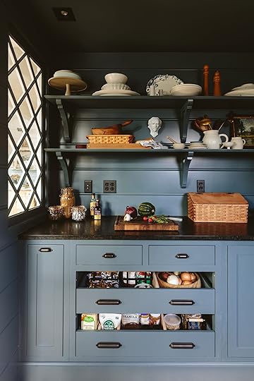
 photo by kaitlin green | from: farmhouse pantry reveal
On the hunt for a plastic-free food storage alternative? Look no further than this solid wood bread box. It brings a nice hit of vintage charm and it serves as a welcome home for the crusty loaf you scored at the farmer’s market last weekend. Pro tip: stash it next to the coffee maker so any guests can treat themselves to an easy breakfast, should they rise before you.
For The Kitchen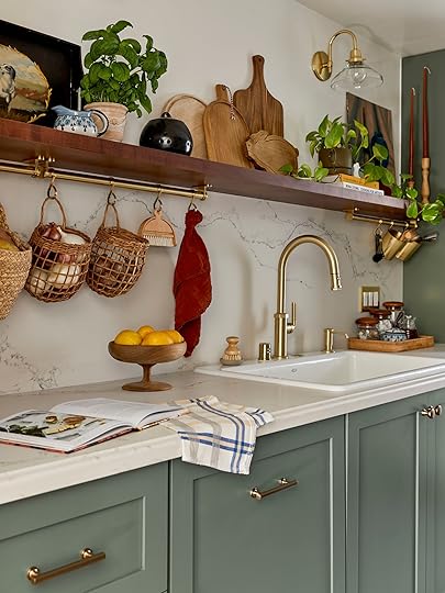
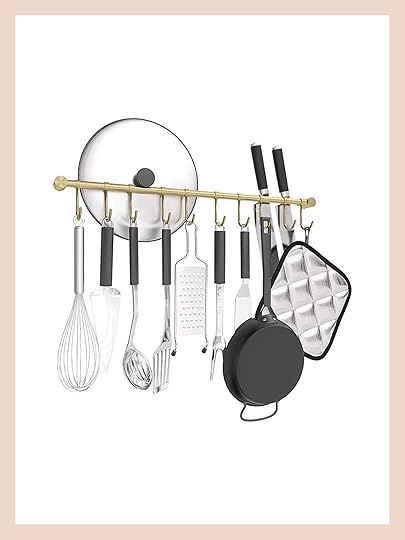 design and photo by sara ligorria-tramp | styled by emily bowser | from: sara’s galley kitchen “update” turned into a full renovation (and the result is well worth the wait) | Knife Block
If you’re going to be working in the kitchen this holiday season, consider investing in a classic kitchen rail. It can free up some crucial countertop space, but it also looks so. darn. pretty! We’ve traditionally opted for solid brass rails, but these stainless steel alternatives are similarly sturdy and more reasonably priced. The look for less, indeed!
For The Entry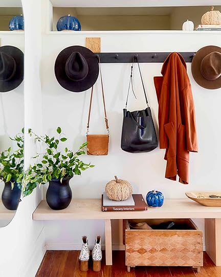
 design by jess bunge | photo by sara ligorria-tramp | from: jess’ studio apartment living room reveal
Take it from me: you do not want your guest’s wet winter coats, umbrellas, and bags piled upon your freshly-laundered sheets. Upgrade your entryway with a classic peg rail for a clean, simple, streamlined storage solution. If you need a little extra space, consider an option with a built-in shelf – here’s a sleek modern version, and here’s a more traditional farmhouse-style shelf/rail combo.
For The Bar Shelves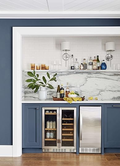
 design by styling by emily henderson and brady tolbert | photo by sara ligorria-tramp | from: the ultimate family-friendly media room + wet bar
Stylist hack: in a pinch, colored glassware always elevates a space. Try it for yourself – cover up those amber hobnail glasses with your finger and compare. See how much life they bring to this bar area? It’s funny: it really is always the littlest things that make your home feel finished. This set of 6 hobnail glasses are identical, and they’ll only set you back $29 – they might just be the pop your shelf needs to take your styling to the next level. (Your guests will love the high-end restaurant feel, too. Total win/win.)
For A Guest Bed
 photo by kaitlin green | from: kaitlin’s bedroom reveal
Nothing says “fall” like a solid wool blanket – doubly so if it’s been crafted in a seasonal tone, like this rich plum. I like these blankets for a few reasons: their generous size (55″ x 72″), their all-wool construction, their variety of prints and colors, and their reasonable prices. You could stash it in the guest room, but I have a feeling that you’re going to want to keep this one for yourself.
For The Awkward Space
 photo by sara ligorria-tramp | from: julie’s huge (and diy packed) bedroom upgrade
The easiest way to fill the awkwardly-sized problem space on your wall? Add a perfectly-scaled mirror. It almost looks custom, offers a ton of function (you can never have enough full-size mirrors if you share your home with others – we always need them at the same time, don’t we?), and, as always, Wayfair’s pricing can’t be beat: you can grab this chic all-glass and metal dupe for only $93.
For Any Shelf
 design by julie rose | photo by sara ligorria-tramp | from: a mid-century eclectic living room reveal
I’m heartbroken to say it: not all of us have the luxury of scoring weird stuff at our local flea markets. It’s not fair! But alas: it turns out you can grab a near-perfect dupe for this slinky sculpture – an EHD go-to styling piece that now lives with Mallory – for only $24. It’s fun, unexpected, and the perfect finishing touch to add a little height and whimsy to any shelf or surface without overpowering the vignette. If I could only grab one piece of shelf decor from Wayfair, it would be the slinky. EVERY TIME. Instantly memorable.
For…Everywhere!
 styled by emily bowser | photo by sara ligorria-tramp | from: new reveal: this organic, punchy bedroom might be our new favorite makeover
Nothing beats sinking your toes into a warm sheepskin rug on a brisk Sunday morning. NOTHING! It’s one of those little luxuries that can take your morning mood from dark and glum to comforted and cozy. Flank the sides of your guest bed (or your own bed, TBH) for a spa-like experience; toss one on the back of a chair or sofa to signal the changing of the seasons; or drape one across a bench at the bottom of your bed for a sublime shoe-donning experience every morning. You can never go wrong here – they’re a simple, dreamy upgrade.
For The Family Room
 photo by kaitlin green | from: farmhouse family room reveal
In more casual rooms, consider swapping your art lights in favor of an articulating sconce. They’re a bit less precious, more utilitarian, and they bring more warm, ambient light to a chilly fall evening. I can’t imagine curling up in a cozier spot on a rainy day – can you?
For The First Impression
 photo by sara ligorria-tramp | from: make your home fall-ready with 7 simple tricks (using all target)
For some instant impact, trade your entry rug for one with a classic pattern in a fall hue. You can’t go wrong with a stripe, but this year, I’m loving this earthy plaid – the tone is so rich and pretty. (If you want to take your entry to the next level, search for a rug that echoes the colors of your outdoor decor! The continuity between spaces leaves a great first impression with your visitors. “How cohesive and beautiful this home is,” they’ll whisper to each other. What could be better?
For The Media-Obsessed
 design by emily bowser | photo by sara ligorria-tramp | from: emily bowser’s beautiful hardworking, multipurpose room reveal
If you’re a DIY pro, you can check out Bowser’s step-by-step magazine rack instructions here. But if you, like me, are a little less than handy, might I suggest this minimal, Scandi-style magazine rack? Sure, it’s technically a kids’ bookshelf – but NO ONE NEEDS TO KNOW. (And honestly, isn’t it a little cooler this way? Nothing beats some creative reuse!) Fill the shelves with your copies of Elle Decor, House Beautiful, or Dwell for the chicest periodical storage in town.
For The Chef
 design by brady tolbert | photo by tessa neustadt | from: brady’s kitchen reveal
My favorite kitchen/dining upgrade? A pair of sculptural salt and pepper grinders. These lacquered wood Bobbin-shaped mills come in 12 cheery colors that’ll bring a jolt of life to your kitchen and joy to your dining table. Added bonus: these make an INCREDIBLE host gift, if you’re looking for a little thank you gift for your friends or family this season!
For The Dining Room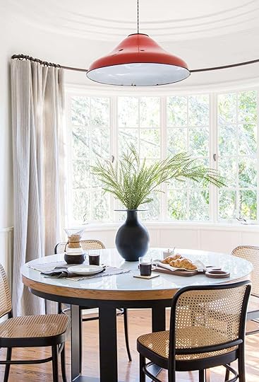
 lead design by ginny macdonald | photo by tessa neustadt | from: the griffith park dining nook reveal
Sometimes, a hit of red is all you need to brighten your spirits as the days get shorter. (Side note: I don’t want to say we called the “unexpected red” trend in 2019, but, well…we totally called it.) We used a vintage enamel pendant to bring a jolt of color to our Griffith Park project, but you can grab the same look (for only $60!) with this modern metal pendant.
For The Centerpiece
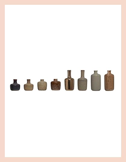 photo by sara ligorria-tramp | from: a modern and organic dining room makeover
When in doubt, nix the centerpiece in favor of a cluster of bud vases. It’ll take no time, but it looks like a million bucks. You can collect these over time, or you could grab a curated set in a seasonally-appropriate color palette (this set of 8 stoneware vases is only $49!) If you want to get REALLY ambitious, toss a few grocery store blooms in each vessel and send them home with guests after a long, lazy dinner party.
For The Living Room
 photo by kaitlin green | from: farmhouse living room reveal
The next few months are hectic enough – who has time to stress about sofa styling? Make it easy on yourself. Opt for an extra-long lumbar (or two!) in a pattern that won’t show mess. I like this $46 option by Jean Stoffer, because you can zip off the cover for spot cleaning (an essential for anyone hosting kids – those hands are touching everything!).
What say you – any other easy swaps you’d recommend?
Opening Image Credits: Photo by Sara Ligorria-Tramp | From: Make Your Home Fall-Ready With 7 Simple Tricks (Using All Target)
The post The Look for (Way) Less: Simple Upgrades To Prep Your Home For Guests This Fall appeared first on Emily Henderson.
October 7, 2024
My Brother’s Playful Shared Kids Bathroom Reveal (Including Cute Double Vanities)
While this house has a lot of contemporary lines (with hits of traditional vibes throughout), it’s still a house for a family with two elementary school-aged kids (6 and 9). They share a hall bathroom that is a nice size and Max and I were able to design it to be happy and playful, and yet use high-quality material that will last (and obviously grow with them). I honestly never pictured this bathroom like this – it’s really sweet and charming and full of layers that are far from “contemporary”. Some of this is in the styling, for sure, but whatever it is I love looking at these photos and every time I walk in I get that surge of, “Oh this is so fun”.
Where Are We In The House?
Ok, we are on the second floor and you can see the kid’s rooms are nearby. The bathroom is pretty big – although I see that the floor plan has changed since this above version to NOT have a separation between the vanity area and the toilet/bath. It’s part of the house that was designed to be vaulted so it has high ceilings. When they did the window plan they chose a huge window in here – so it has a lot of natural light.
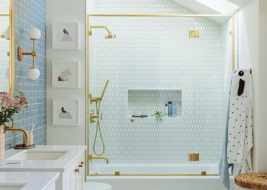
Three Different Tiles
Max Humphrey and I chose the tile (we co-designed many of the bathrooms together), but this tile is more him, I’d say (and I love it). That guy is a master at selecting and mixing tiles. He generally takes more risks than me but still stays within a restrained palette which you all know I love. We worked within Ann Sacks Made line (made in Portland, which we are big fans of) which has a huge variety of colors. What I love so much about it is the variation of the color at the edges in both the penny tile on the floor and the shower tile – it gives it a lot of dimension and texture (the outline isn’t the grout, it’s the tile).

Shower Door (custom) | Tub
I should back up and say that my brother and SIL didn’t want a tub in here – their kids take showers so they didn’t see the point of a tub (and thought it would be hard to get in and out of). But as an avid bather, I pushed back hard saying how bad for resale it would be not to have a tub for kids. So they chose the most shallow tub (one that would be easy for the kids to get in and out of as a compromise. At times I feared that it would look too basic and not special enough, but as we built the rest of the design elements now I hardly notice that it’s just an alcove tub. The shower surround that we customized (with much agony, more on that later) really helps it feel more elevated.
Also a huge shout out to Anne Usher, the architect who planned the skylight in here – the light that it brings into the shower is incredible and makes this area of the room come alive.

Tray | Pot | Leave-in Conditioner | Shampoo | Conditioner
We used a leftover Caesarstone slab for the niche (making it as big as possible to be in scale with the shower wall). The tray and little pot are from a local resin maker, Swift and Stone who I found at a market and immediately reached out to for this bathroom (you can see her work on the vanities as well).
Mixing Tiles


We mixed three different scales – the larger blue vanity wall, the medium shower tile and the small penny on the floor. The tones of them all looked really cohesive together and it feels highly customized and yet really cohesive.
Purist Faucet Line FTW

Rite-Temp® Bath and Shower Trim Kit | MasterShower® Transfer Valve Trim | Wall-Mount Handshower Holder | Round Two-Function Handshower | Metal Shower Hose
Always and forever I love the Purist line from Kohler. Of course, you have a variety of finishes (we chose vibrant brushed moderne brass) and different handle profiles (we chose the cross for this bathroom). It’s just simple, modern, streamlined, and timeless. We have this line all over . It feels more contemporary there and here it leans more transitional – it’s really easy to mix in most styles, IMHO.
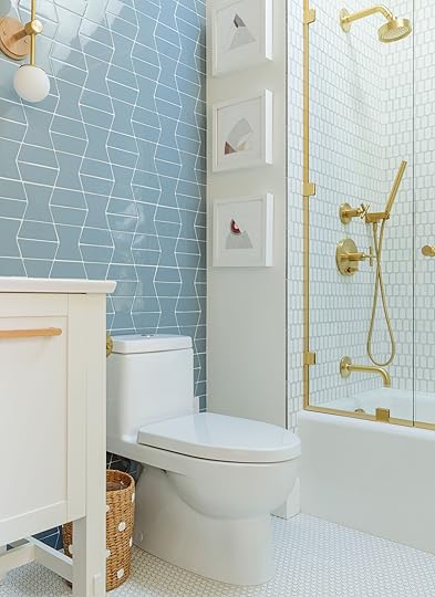

Art | Toilet | Waste Basket | Hooks | Hooded Puppy Towel | Solid Towel | Hamper
The toilet is tucked on the other side of the vanities. We hung embroidery art from the OG Portland project by local artist Annie Odorisio and then styled the opposite wall with robe/towel hooks and a cute wicker hamper to warm it all up. You’ll see in here a circle motif everywhere, which I think really helped it feel more playful and fun for kids.

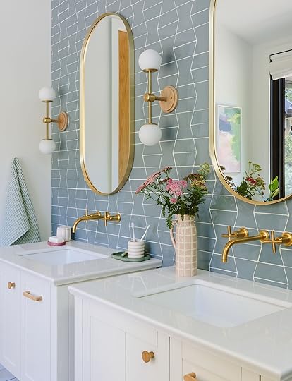
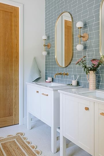
Sconce | Mirror | Faucet | Sink | Vanity | Wood Handles and Knobs | Flower Jar | Soap Dish | Tray | Pitcher | Bubble Jar | Flower Toothbrush Holder
Alright – a his and hers vanity that I seriously wish we had for our kids (who share and quibble and it’s a thing). These are two Tresham vanities that have a simple (and even shaker) vibe to them and then we made them more modern with the wood handles (from Etsy). If you are wondering why they are so close, we did too. In the plans, they were 18″ apart but the room just didn’t allow it so somewhere something was off. At first, I was like “uhhhh…” and then we just worked with it and now I barely notice that they are so close and I even think it’s really sweet. They both have their own storage and counters.

With the more traditional tilework and vanities, I wanted to finish the room in a way that went more modern and contemporary like the rest of the house. So once I found these sconces from Worsley I showed them to my SIL and we both were like, “these are them.” I love that they are graphic, with these playful round glass shades (which also provide great soft light), and you can choose from a variety of metals and wood tones (we chose brushed brass to match the faucets and cornsilk oak for the wood). The three of them flanking the pill shaped mirrors. I like how they call back to the penny tile, the shower faucet shape, the rug, and even the bench.

The backsplash tile goes from floor to ceiling (although it originally didn’t – it stopped at 7′ which felt weird so we had to order more tile and cross our fingers the color would match perfectly). The pattern and color make this room come alive – it’s a pattern mixed with three different tiles, stacked in a repeat (this is a Max Humphrey move that I am into).
The Tresham vanities also come with an integrated countertop and sink, making it a really easy one-and-done situation. I have this vanity in our mountain house guest room and love the joinery of the base. It comes in a couple of different sizes (I wish it came in 60″ or 72″ TBH – I think it’s awesome.)
If you are opening up the walls and changing plumbing (or in this case, building a new house basically) definitely think about wall mount faucets. They really do free up space and I think give a more custom look (we didn’t do this in every bathroom – I like to mix it up).


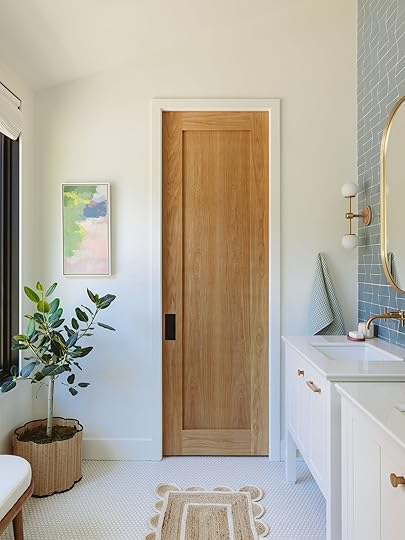
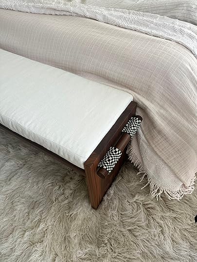
Art (vintage) | Woven Basket | Pocket Door (custom) | Rug | Waffle Towel
The room is pretty wide in a great way and we were able to add something opposite the vanities. The pocket door was custom (and white oak) and I hung a piece of art that I’ve had forever that worked perfectly in here. I continued with the circle/scallop motif with the rug (from Etsy), wicker pot (from The Container Store, can also be a cute trash can) and bench (from AllModern).

Pitcher | Tray | Bubble Jar | Flower Toothbrush Holder
We bought a lot of these resin (not pottery, which is nice for kids) bathroom accessories from Swift and Stone which she makes in a variety of colors and sells both locally and on Etsy.
 Top Down Bottom Up Window Treatments


Opposite the vanity is this large window with black frames and while I’m so grateful for the natural light, these kids needed some privacy. So we had Decorview make the same shades that we have in our guest room that I love. They are modern Roman shades that as you can see can be used from the top down or bottom up (therefore letting nice light in through the top).

It turned out to be far more of a mix of modern/traditional than I had predicted 3+ years ago, in such a good way. It’s really spacious, airy and bright with playful elements, but executed so well by a great team. Thanks to Max Humphrey, Anne Usher (architect), and JP Macy of Sierra Construction (general contractor). All resources linked below.
Bathroom Resources
Tile: Ann Sacks
Trim Stone: Caesarstone
Wall Color: Alabaster by Sherwin-Williams
Hardware: Kohler and Etsy
Lighting: Worley’s Lighting
Vanity: Kohler
Vanity Accessories: Swift and Stone
Mirror: Kohler
Plumbing: Kohler
Windows: Marvin
*Architect: Anne Usher
**General Contractor: JP Macy of Sierra Custom Construction
***Interior Designers: Emily Henderson (me!) and Max Humphrey
****Styling: Emily Henderson (me!)
*****Photos by Kaitlin Green
The post My Brother’s Playful Shared Kids Bathroom Reveal (Including Cute Double Vanities) appeared first on Emily Henderson.
October 6, 2024
The Link Up: Em’s Top TV Show Rec, Gretchen’s Great Charging Stations, And The Perfect Gift For The Taylor Swift Lover In Your Life

Happy Sunday and happy October everyone! The week started off a little rocky after Em and her family got stranded at a concert Sunday night. But everyone got home safe and a big shoot week was ahead (more River House we can’t wait to show you!). But in the meantime, we hope you loved seeing Jess’ cousin’s DIY nursery reveal because there are so many great ideas for any room, regardless of age! Ok, onto the links…
This week’s house tour may have you redefining the term “new build.” Pierce Jordan, a Dallas-based residential builder, worked with architect, Juan Carlos deLeon, to build his dream European-inspired home. His main request to his designer, Evan Krenzien, was “I want to incorporate things that I got from my grandmother or my mom”. Let’s just say we think mission accomplished:) Check it out here!
From Emily: I’m obviously not alone in talking about the new hit rom-com Nobody Wants This. Hopefully, the numbers will prove to the network gods that we need more of these (I mean – hey executives, have you ever seen the numbers on these rom-com books we all read???? HUGE!!). If you haven’t heard of it it’s Kristen Bell and Adam Brody playing a podcaster and rabbi, respectively, and they date even though there are some serious obstacles. The dialogue is really funny and charming, and the relationship feels healthy and supportive. Noah (Adam Brody) feels like a modern evolved guy that might still be rare, but is sure nice to see on the big screen. I’ll watch any romance, as you know, but prefer the feel-goods that actually show healthier relationships with normal stumbles. Watch Nobody Wants This now on Netflix (it’s 8, 30-minute episodes so yeah, you could start and finish it tonight).
From Mallory: I’m finally becoming a cargo pant girl, everyone! I snagged these bad boys for only $30 at Nordy’s Rack and they are silky, green, and VERY FUN. If the baggy cargo pant thing has also not really been your thing, these might convert you too
From Caitlin: This week, I was really moved by the new Netflix documentary Will & Harper, in which Will Ferrell and Harper Steele (of SNL fame) navigate not only America but also a changed relationship (Harper came out as a trans woman in 2022). Four of my closest friends transitioned as adults (including my best friend, Bailey!), so Will & Harper’s relationship really pulled at my heartstrings – it’s just so nice to see a documentary that approaches the subject with love and care instead of fear and condescension. To whit: if you’ve ever had a politically correct or socially unacceptable question about trans people, it’s answered in this documentary. And if you’ve never met a trans person, this is a great place to learn! I’d really really love it if you had a chance to check it out. (PS. If nothing else, it has a 99% fresh rating on Rotten Tomatoes…so it’s a dang good movie, to boot!!!)
Also From Caitlin: On the topic of good movies – have you seen Megalopolis?! Dennis and I went to the famously-stunning Grauman’s Chinese Theatre for an IMAX showing last Sunday (that’s right – two LA locals went to the Walk of Fame, on purpose) and MAN. What was that??? (Den’s a big movie buff, and his review was as follows: “It was a movie.” The Roman-meets-biophilic set design was pretty neat, at least? But really – WHAT WAS THAT?!)
Target not only came out with some VERY cute fall decor but they just launched this adorable pet collection called The Cuddle Collab. If you are a cat or dog owner (or know someone who is) check it out!

Color Blocked Dog Collar | Pet Couch Mat | Cat Canvas Cave Tent


Catisserie Cat Toy Set | Woven Striped Pet Bed | Dog and Cat Carrier Duffel Bag
From Gretchen: It’s come to my attention that I am an Apple product collector. I’ve got my iPhone, a true necessity, but I also manage and hold onto the work iPhone (another must-have with the amount of content I collect on the daily). Then there’s my work laptop and my older-but-still-very-necessary laptop I use just for video editing. I’ve been pretty good about wearing my old Apple watch–wild how many steps one can clock on a shoot or shopping day–which amazingly still works after manyyy years. And I’m happy to report the ridiculously spendy Airpod Max headphones I linked up forever ago have been getting a LOT of use. Of course, I still have my old in-ear Airpods, which in truth are just back-ups I never use because they hurt my ears. And then we can’t forget about the iPad and Apple Pencil which receive heavy use anytime there’s a mock-up or a doodle that needs drawing for work. It’s a lot to manage and charge. The cord conundrum is so real and I’ve realized it’s essential for me to have a station and a system where I can plug the whole family in at the end of the day, getting it ready for the next. By my bedside, I have this awesome charging dock for my three personal essentials: my phone, my watch, and my headphones. If I’m not juicing up this trifecta overnight, my morning walk just won’t happen. Before I invested in the headphones, I used and loved this charging dock for just my iPhone and watch, which is a little more affordable, too. Then at my desk, I use this organizer to create a “work only” charging station for the rest, with shorter, less tangle-able cords that stay put and dividers that hold my work phone, iPad, and an extra battery pack or two. I will say this one is somewhat visually noisy, but I appreciate that everything lives together and for homes with multiple iPads or Kindles, this could be a game changer to keep everything together!
For the last 13 years our main gal at Article, Sarah Chapelle, has also running the EXTREMELY popular Instagram account, Taylor Swift Styled where she posts the exact fashion pieces that Taylor gets photographed. Sarah’s investigative powers are magical. But the even bigger news is that she got a book deal because of it, going deeper into songs, lyrics, and behind-the-scenes insights! She’s spent two years working on it and we couldn’t be happier/more proud of her. The great news is that you can preorder it today and get it in your hands in TWO DAYS when it’s officially on sale. So if you have a Taylor Swift fan in your life (we definitely all do:)) then this book, TAYLOR SWIFT STYLE: FASHION THROUGH THE ERAS, is the absolute perfect gift. Congrats Sarah!!!
From Arlyn: There was a week or two there where it felt kind of like fall in LA, and now of course it’s 100 degrees again on the east side. But I know the chill is coming soon, and has probably already arrived in some places. I just wanted to give a shoutout to one of my favorite “essentials” brands that I like to hit up every few years when the weather changes and I find myself needing some new undershirts, outerwear, sweaters, etc. Uniqlo is awesome for those types of things and I think is a good match-up of quality vs. pricing. I’ve had many things from there for years, and my husband loves the jogger+sweatshirt combos they offer. He’s worn them so much that I can’t believe they haven’t ended up as a pile of loose thread by now, but they’re still going strong. Their HeatTech line is great (got me through a December trip to Quebec), and I’m eyeing a new packable down jacket since the one I’ve loved for nearly five years no longer fits. Darn.
From Jess: Guess who is trying a new shampoo that she’s loving?? Me! My favorite TikTok hairdresser, Mary, was raving about this line, Typebea, and lamenting that it wasn’t getting the hype it deserved (I agree because it was the first time I had heard about it!). But it was this shampoo in particular that she was talking about. Anyway, it smells great, really cleanses/exfoliates my scalp, and has an ingredient in it that stimulates hair growth which I am always here for! 10/10 so far if you are looking to try something new.
Thanks again for stopping by and see you tomorrow for a River House reveal post!! xx
Opening Image Credits: Design by Rebecca Butler | Photo by Veronica Crawford | From: An EHD Alum Nursery Reveal With DIY Ideas So Good That Grown Ups Will Want To Steal Too
The post The Link Up: Em’s Top TV Show Rec, Gretchen’s Great Charging Stations, And The Perfect Gift For The Taylor Swift Lover In Your Life appeared first on Emily Henderson.
October 5, 2024
A Quick MOTO Bedroom Update: Caitlin And Jess Have Fun New Additions But Also Need Some Help!
Hello!!! We promise we haven’t forgotten you or our bedrooms. But admittedly, Caitlin and I both know we haven’t been as on top of our bedroom progress as we had hoped. SO SORRY!! However, progress has been made (I actually have a very exciting announcement:))!! So today we wanted to give a little update on the progress and ask y’alls opinion about a couple of things we are a little stuck on. Design should always be collaborative! So we’ll spare you a long intro and just get right to it. Caitlin take it away…
CaitlinI know. I KNOW! I know what you’re thinking. “Caitlin, you’ve been working on this space for over a year. What’s the holdup?” It’s a fair ask, so I’d like to see your question and raise you an inquiry of my own: am I, uh, dumb? Because guys – I can’t figure out how to go faster. How are you managing your decorating budget with your more necessary expenditures? Am I totally missing something? (Seriously, I’m asking.)
Maybe you can relate – it just feels like a struggle to prioritize my own home when there are birthday presents to buy, destination bachelorette parties and weddings to attend, cross-country moves to pay off, car payments, medical bill installments…it all adds up so fast! So time and time again, this (functional, livable, halfway-finished) space is pushed to the back burner. I’ve been struck by the curse of the “good enough for now” room – has anyone else been afflicted? PLEASE ADVISE.

 i have made a few investments, though…
But it’s not all doom and gloom! Over the past few months, I was able to stash away a seemingly-paltry sum – just over $1,000 – which I spent on a few essential upgrades. My biggest splurge was on this vintage Danish teak and mahogany gentleman’s chest. It’s perfectly sized for the space (4′ wide and nearly 4′ tall!) with an ultra-functional combination of dressers and shelves. I paid $750 in total for this one – including delivery from the Palm Desert area, over two hours away! – so it wasn’t cheap, but it was well worth the wait.

 den’s dresser (can you tell i have a very patient partner?!)
That’s a keep-forever piece of furniture, folks! I love the classic proportions, the warm-but-not-too orange wood finish, and the simple raised detail of the drawer pull. Let me sell you on the vision a bit: imagine framed art on the wall, a vintage statement lamp with a punchy shade, and a full-length mirror hung to the left side of the dresser. This $98 mirror is my current frontrunner, but I’m thinking about painting the frame in some way. Thoughts?
 and this is den’s side (with a close up of my sconce!)
Looking into the room, you may clock two new additions: plug-in Stilnovo-style sconces! The damage? $127.45 for the pair, and $84.73 for the TaskRabbit who mounted them to the plaster wall. The shipping took an eternity and we had to manually assemble each sconce, but I couldn’t be more pleased with the finished product. I still need to mask the cords a bit (using this tutorial from Sara, bless her), but I’m holding off until we land on a paint color. To that end: help! The cognac/cobalt/olive/gold color palette is MUCH more flexible than I’d anticipated – it looks good with every paint color I’ve thrown into my mockup! When all of your options are good options, how do you decide? (I’m open to suggestions. Begging for them, even!)
 caved and bought a kindle last week in an attempt to free up some space – SO worth it
It wouldn’t be an update post without an admission of regret: I don’t think I made the right nightstand call. I grabbed these Serena & Lily-style side tables at TJ Maxx, and they’re a perfect fit in so many ways…but now, after the addition of the wood dresser, they look a little out of place. Too coastal? Too glam? Too fussy? These nightstands do technically check all of my boxes – the right size, the right shape, the right functionality – but something is off. Am I overthinking, or do you agree?

 the painting, by panca, was purchased with my first ehd paycheck!
Man – the room gets more and more unhinged as we go! DON’T JUDGE ME, PLEASE. This is my dresser, stylishly adorned with the 12-year-old television from my first apartment in LA. I love having two TVs in the house – Dennis can play EAFC with his friends in the living room while I binge Investigation Discovery in the bedroom – but this placement is GARBAGE. Den’s view of the TV is often blocked; I’m essentially parallel with the screen, which is surprisingly not conducive to productive viewing; and, most importantly, I’m wasting SO MUCH GOOD STYLING SPACE. The flat surface that houses our monstrous black box will soon play host to 9 square feet of art, trinkets, and ephemera. Just you wait!!!
 can’t wait til these are outta this area!
Which brings us to our final wall: a big, blank, shoe-corralling YAWNFEST. I’m imagining a Frame TV hiding up here, mixed amongst some sort of gallery wall. (A TV we can both watch while laying in bed at night, no strange positioning required! Can you imagine?) Ideally, I’d like to move the shoe storage out of the bedroom entirely – we have a lot of hall space, and I think I could figure out a way to hide them with some sort of skirted table – but I am very open to suggestions.
I know that this all doesn’t seem like much, but it’s felt like a lot of progress to me! I do still have a few large expenses looming: a good vintage light fixture (and an electrician to install it – our building still has the original wiring, and I know my skill level), the Frame TV, high-quality framing for a few precious art pieces, and maybe some swapped nightstands…but I can (truly) see the light at the end of the tunnel! I know I can DIY some window treatments; I know we can handle painting; I know that eventually, it’ll cool down enough to warrant making the bed with more than a sheet. It’s getting there! But man, I’ll take all the feedback I can get. What say you???
JessAlright, first things first… I NO LONGER AM SLEEPING ON THE FLOOR!! Let me tell you that I. Feel. Different. More together. More distinguished. Maybe less embarrassed to have friends see my bedroom. It’s been amazing. The first night was wild. It was like I was sleeping on a tower overseeing all of my land. After that, I nearly set up an office in my bed but knew I’d have no chance of actual productivity. But man, between my new custom Buildlane bed (saying that is still a dream come true) and my Tuft & Needle mattress, you can’t tell me that when I’m in that room I’m not a full-blown freaking princess. Here is a sneak peek. AHHH!!
BUT WAIT. Please please know that literally 95% of the bedding and the rug will change! Right now this room is a hundred shades of beige but NOT in a way I think is good and to me it just looks drab. So avert your eyes from those things and focus on that beautiful bed and incredible bench:)

Can you stand it!? I have a bed and it’s one that I know I’ll love forever. I said it in my last post about the design process, but the goal was not only to design exactly what I wanted for this room but to also make sure this bed was versatile style-wise for the future. I chose fabrics and colors I’ve loved my whole life so regardless of what room and style I put with this bed, it will work. I will also steam it a little more before the shoot I promise. But I kinda love the lived-in look.

This is a much better representation of what the colors look like in person. Warm but elevated (that’s at least what I’m telling myself the vibe is). As a reminder, I got these incredible fabrics from Kravet. The velvet is and the linen is . I also couldn’t be happier with Buildlane’s construction! It’s exactly what I envisioned. If you are a designer that needs custom furniture I can’t recommend either of these companies more.
Oh, and that little wall sticker in the first bedroom photo is the paint color I’ve chosen! White Flour by Sherwin-Williams.


If you can believe it allllll of these sticker samples are white. Like white, white! But as you can see, in my room some go blue, purple, and even yellow. Wild, right?? I even ordered the one that Sara used in her living and dining room and it’s the top middle one. It’s so blue in my room but perfect and happy in hers. Before I ordered the samples I was sure that was going to be the one before I put it up on my wall. That’s why testing is sooooo important in the space you are painting. Recs are great but it’s impossible to make a final call without getting a swatch in the actual room. DON’T DO IT, K??
I know that painting it a different white seems a little nuts to some but that’s exactly what I did in my last apartment and it made all the difference. It felt brand new in the best way so I am pumped to get this color up on these walls! Plus, since I’ve lived there for almost 4 years my wonderful landlord is paying for the painter. Thank the lord since I legit have 11 doors in my bedroom (french doors and screens to the balcony) as well as all that trim. So could I do it myself?? Technically yes but it’s a no for me dawg.
Now, let’s hear it for the bench!
I am still pinching myself that I, Jessica A. Bunge, have a Katy Skelton piece in my home. Due to some back-ordering issues for that I had picked out, I decided to go solid with the main bench fabric. I matched the color to the off-white in which turned out to be this Kravet Basics. It’s actually so so perfect and gives me a lot more room to play with pattern on the bedding. Plus if I’m totally honest, I was getting a little “square happy” and very grateful to have been pushed to pull back a little:) Look, your girl loves a square shape and sometimes I need to be saved from myself!
So again, PLEASE ignore the bedding and rug you see. It’s NOT how it will look when it’s done. Can you tell I’m extremely nervous people will think that I think this looks good?? It just doesn’t do the bed or bench any justice!
Now, I have two questions on a different topic. I’m not sold on what I should do for my curtains.

Question #1: I love the lightness of my simple linen IKEA panels but have dreams of them being a soft warm taupe. Should I get new ones or try to stain them with maybe tea?? My only concern is that I do really like them as-is and could save them for the future. The I could just get new panels in the color I want.
Oh, and here’s yet another ask to please pardon the mess that was my bedroom last year! This was the only decent picture I had to show the curtains. I also realized I’m going to have to get them hemmed if I don’t raise the rod which is annoying but not the end of the world. See next question…

Question #2: I’m undecided about where I would hang my curtain rod. As you can see it’s currently it’s on the window moulding. I’ve always intended to raise it above to give the room more height. But since this is a 110-year-old building maybe that’s not the move? But I’m also planning on doing a tile border under the crown moulding so covering the majority of that side might look strange? Thoughts??
Now, I typed this question and then I made these graphics and I’m more torn. I way prefer the rod above the moulding (I realized I did in my living room lol) but picturing the tile and having them under the rod does seem odd. I just don’t know. I guess I’ll tile first and then decide?? Again, thoughts?
Ok, that’s where we’re at and again, we promise we are moving as fast as we can! Any thoughts on our questions would greatly be appreciated:) BYEEEE xx
The post A Quick MOTO Bedroom Update: Caitlin And Jess Have Fun New Additions But Also Need Some Help! appeared first on Emily Henderson.
October 4, 2024
Not Ugly Sound-Dampening Hacks To Quiet The Noises Coming Into Your Home (YAY For Some Peace And Quiet)
Here’s a fun fact: I haven’t always been a design fiend. When I moved to Los Angeles in 2012, it was for a job in the recording industry. I started my career as a runner (read: dignified gofer) for the famed alternative producer John Feldmann (if the name doesn’t ring a bell, this song might!); at night, I shared a dumpy 2 bedroom crash pad in the valley with 6 (!!!) now-prolific producers, songwriters, and musicians. I was making $500 a month, I was scrappy, and I was surrounded by noise 24/7. At 20, it was a dream. At 32, I look back with bewilderment: who was that?
Because now, the click-clack of my downstairs neighbor’s clogs drives me up the wall. The muffled conversations, the creak of her floorboards, the high-pitched sneezes, or the guttural nighttime coughs – they’re too much. The 20-year-old rat who’d zonk out in a cacophonous frat house after a 16-hour work day has aged into a 32-year-old crone who really values a little peace and quiet, you know?
But this is where I need to say “thank you” to all of those former roommates of mine because they taught me every DIY soundproofing trick in the books. There were the ugly fixes – like egg crates taped to the ceiling or mattresses jerry-rigged to the walls with bungee cords – but there were also some smart, not-hideous sound-dampening techniques. That’s what we’ll be talking about today. Let’s jump right in with a twist on an old favorite…
An Extra Thick Rug Pad

1/2″ Felt Pad | 7/16″ Memory Foam Pad
Your best soundproofing will come from a felt or acoustic foam floor underlayment – so keep that in mind, future renovators! – but a thick rug pad can help dampen sound, too. I prefer felt because its dense fibers are better suited to absorb sounds from speech or music, but this thick memory foam can also help (and it’s a total dream to walk on, BTW).
But wait, there’s more! For bonus sound dampening, cut up an old rug pad and place it underneath your sofa, bed, or any other large furniture piece in your home. It’s an inconspicuous extra layer of protection that can help trap any other rogue sound waves.
And A Sturdy Rug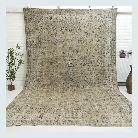

Vintage Turkish Rug | Custom Moroccan Rug
For the ultimate reduction in sound, opt for the tightest weave you can afford. Keep an eye out for rugs with a higher KPSI, or knots per square inch. A good rug will have at least 100 KPSI, while a great rug will have over 300 knots per square inch.
Etsy and eBay are your friends here – focus your search on vintage handwoven Turkish, Persian, Moroccan, or Tibetan rugs to find sound-dampening floor coverings that won’t break the bank. (Surprisingly, pile height is less of a factor here – a higher pile only accounts for a 2% reduction in sound, on average.)
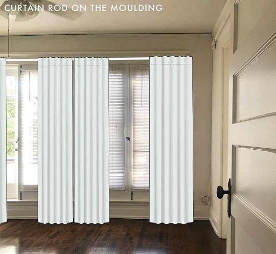
Thick, Correctly-Mounted Window Treatments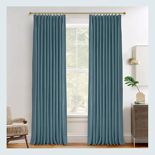
The advice here isn’t just “get heavy drapes.” Au contraire, mon frere. We’re talking specifics. If you’re really trying to block sound, you need to get prescriptive with fabric weight – you’re looking for a material that’s 12 oz to 18 oz/yd, specifically. This info isn’t always readily provided, but it’s worth asking about – not all velvets were created equally! (Homerilla offers an affordable velvet drape that weighs a bit more than 13.5 oz/yd, FYI.)
Now, let’s talk install: you’re going to want 100% fullness here (e.g. a 50-inch window requires 100 inches of curtains), and, for most effective sound dampening, the rod should extend 3″ to 4″ off the wall. I’d recommend this French-return style rod in particular – it extends 4.5″ off the wall and it was specially designed to eliminate light leak, too. (A real double whammy for anyone trying to get the darkest, quietest room possible!)
Add Bookshelves

Walnut & Mahogany Bookshelf | Pine Bookshelf
The denser, the better! If you can, go for a wood bookshelf. Softer woods (pine, balsa, MDF) are good for absorbing sound, whereas harder woods (oak, birch, walnut) will block sound entirely. If you’re trying to drown out a loud next-door neighbor, try some hardwood shelving on your shared wall! But if you’re looking to drown out more ambient or street noise, a softer wood might be your best bet. (Or, like the Old El Paso commercial says, porque no los dos?)
Dress Up The Walls
The walls are your canvas – literally. Hang ALL of your art. Hang a tapestry or a rug. And if that’s not enough, try hanging some aesthetically-appealing acoustic panels (yes, they exist!). I’m partial to the Felt Right tiles in particular because they’re well-made, easy to install, thoughtfully designed, and super multifunctional – install them a mess-free accent wall, add some pins to use a few panels as a cork board, or line the walls of your playroom with life-sized versions of Tic Tac Toe or checkers to keep the rumpus contained.
Fill The Gaps

Custom Draft Stopper | Acoustical Caulk
Bad news for my fellow old home dwellers: the gaps in our doors and windows are doing us dirty. A gap as small as 1% in any type of barrier will leak up to 30% of sound from one side to another; a gap of 5% will leak 90% of sound. Opt for a draft stopper in every door that faces a source of noise, and consider filling any gaps in your windows and doors with a specially-formulated acoustical caulk.
Pop In Some Plants

Woolly Pockets | Preserved Moss
Even better if you opt for pieces with rough bark or thick leaves (like ficuses or rubber trees), which are especially well-suited for absorbing a bit of sound. If you have a really green thumb, consider installing an indoor green wall (I love Woolly Pockets for this purpose – they make a great Christmas gift, too) or try hanging a few preserved moss panels (if your style is a bit more minimal, the latter is a great way to bring some life to your space without eating up any floor space!).
Invest In Permanent Solutions

Indow Inserts | Solid Core Door
If the DIY fixes aren’t really cutting it, you may want to consider investing in a few more permanent upgrades. Indow Inserts are custom-made to your exact window specifications, and they’re engineered to block out sound, heat, drafts, and more. If replacing your windows isn’t in the budget (or if you love your vintage glass windows, like I do!), an insert will make your home more comfortable in a number of ways.
And while you’re at it, consider swapping your doors! Replace a hollow, builder-grade door with a sturdy, solid-core option. I love the quality of Simpson’s doors (both interior and exterior – dreaming of one of their Dutch doors one day!), but you can also find great replacements at your local architectural salvage shop. Every little bit helps!
Turn Up the White (or Brown) Noise
Let’s break it down! White noise covers up all audio frequencies equally. If you’re struggling with hearing yourself think over your neighbor’s conversations or over general street noise, a white noise machine will help drown out those sounds entirely.
Brown noise, on the other hand, is best to drown out those low, rumbling, irregular frequencies. I prefer the sound (it’s more like a thunder rumble or a wave crash, to my ear) and I’ve found it to be more effective at masking snoring and idling cars. There are actually a ton of different noise colors, though, and our ears interpret these sounds differently – perhaps pink or green noise is more your speed?
Reevaluate Your StyleI’m sorry, minimalists – maximalists are the sound-dampening champions. I’ve witnessed this firsthand, too! When I moved into my apartment in 2019, I wouldn’t have even been able to tell you that I had downstairs neighbors. They lived in my building for 19 years and their apartment was a home, in every sense of the word – they had stocked bookshelves, tightly-packed furniture with worn traffic patterns in the rugs, and packed China cabinets filled with mementos from their travels. I never heard a peep!
But in 2022, those neighbors bought a home. And my new neighbor – an elusive woman who loved Japandi style and bare floors – became my de-facto new roommate. I heard her cooking. I heard her getting ready in the morning. I heard her talking on the phone. I heard her crying. I heard her working from home. I heard her ALL THE TIME. (I’m only finally able to admit all of this publicly because she moved out last month!)
 left: photo by david tsay, from:
styled
| right: design by mallory wackerman, styled by emily bowser, photo by veronica crawford, from: the big reveal: a full look inside mal’s 500 sqft resort-like hollywood oasis
left: photo by david tsay, from:
styled
| right: design by mallory wackerman, styled by emily bowser, photo by veronica crawford, from: the big reveal: a full look inside mal’s 500 sqft resort-like hollywood oasisTo that end: if you’re in an older building, or in a place that’s poorly insulated, or if you’re the dreaded top-floor roommate, you may want to consider turning up the maximalism a bit. Take a page out of Mallory’s book – her restrained color palette makes this studio apartment feel calm, while her thoughtfully-placed furniture and decor will deaden noise from her neighbors.
Sodd a few thick blankets to your sofa! Hang a gallery wall! Or, if nothing else, throw down a rug (with a pad!) in your frequently-used spaces. Together, we can all make quieter, more sound-dampened homes! (To be fair, there are still more technical solutions out there – you could DIY acoustic panels with fiberglass; you could install a suspended floor and fill the void with rockwool; you could cut holes in the walls and squirt in some spray foam insulation – but for the most part, you should be able to make a substantial difference without breaking out the power tools.)
Please let me know if you’ve discovered any sound-dampening solutions of your own – I would love to hear about them! (And in case you’re wondering – three of those old roommates of mine were nominated for Grammys before their 30th birthdays. All of that DIY soundproofing in our dumpy 2 bedroom apartment really paid off, huh?!)
Opening Image Credits: Photo by David Tsay | From: Rustic Modern House Tour
The post Not Ugly Sound-Dampening Hacks To Quiet The Noises Coming Into Your Home (YAY For Some Peace And Quiet) appeared first on Emily Henderson.
October 3, 2024
Robyn’s Living Room Update: New Paint And Next Steps

It’s been a while and yet things are happening behind the scenes, I promise. This is one of my best friend’s homes that they moved into last year (we did her basement/family room, mudroom, guest bath, and tween bedroom of their old home before they moved). She lives nearby and I knew I could help so I took it on, thinking that it could be fast and fun. While it has been fun, nothing is fast anymore (design takes time y’all) but today I’ll show you where we are at (and if all goes as planned, we’ll be shooting in less than a month). There is still 25- 30% left to do, mostly all the stuff that I love (i.e. styling). I’ll walk you all through it now.
As a reminder, this is what it looked like when they moved in – great bones, but needed a point of view that reflected their style. They had mostly starter furniture that they had had for over a decade. They were ready for more high-quality pieces. At the time I had a few pieces of furniture from Rejuvenation leftover from my house that I couldn’t make work in my home so I pitched them this partnership in hopes of making it a win/win for all. Here is where we are at:

Chandelier | Leather Sofa | Swivel Chairs
We replaced the lighting which was a HUGE change in the room. The chandelier in the dining room made that room so much better (and it comes in dark red shades, too). We painted the built-ins this dark color, Mount Etna, and it’s absolute perfection (thank god). It was a bit of an investment – $3k to paint so I was so relieved to come over and see that it was PERFECT (we got multiple quotes, some as much as $4,200- WILD).

Facing the fireplace (which is also their TV room) we have the pretty leather tufted sofa which feels so classic and cool. Above it I want to put a gallery wall with an articulating sconce. The rug is perfect – so big, cozy, and forgiving (they have two sons and dogs, so we wanted a busier rug and we ordered it before our first rug line came out).

While the paint color is perfect, the shutters are still my biggest problem. Functionally they love them, but I don’t think they are right for the house. So I finally ordered some readymade ones that we’ll try to turn into curtains – either cafe curtains or a DIY Roman shade. Wish us luck!

We tried out this Article chair and ottoman that we had from another project and sadly it doesn’t work.

This chair and ottoman is so big and comfy but I think it’s a bit low and long for the space. Plus now that the fireplace is painted dark it’s not working. It was never intended for this project, I just had it from another project and it wasn’t being used so I brought it over to try out. It’s a GREAT chair, btw.

We are letting the paint cure for a bit to make sure it doesn’t get pulled up with books and frames, and then we’ll style it all out.
The Dining Room
This room has just come alive – it was pretty darn boring before – just neutral walls and white built-in. We wallpapered it in this William Morris Snakeshead and it’s just so good.

Wallpaper (Indigo/Cumin) | Pulls | Knobs | Rug
The wallpaper with the paint color and the new hardware. The dining table is a family heirloom and the chairs are a nice contrast (in both shape, color and style). I’m debating getting cushions for them…

We have a lot of styling to do, but that’s all easy for me. The rug in here looks SO GOOD and that chandelier could not be more perfect. I want to get pretty accessories (photo frames, a mirror, some lamps, better pillows, etc) and then figure out this curtain instead of the shutter situation.
We have it on the calendar to shoot in a month so coming at you really really soon
The post Robyn’s Living Room Update: New Paint And Next Steps appeared first on Emily Henderson.
October 1, 2024
The Stylist Secret To The Perfect Flower Or Greenery Arrangement (Hint: It’s All About the Vase)

There are alot of things in our homes we don’t give that much thought to until they become an issue. They can be things like dealing with the annoyances of a crappy can opener that you didn’t realize was so crappy until you bought an actually great one (I’ve had this one for six years and love it, FYI!). Or maybe the pile of shoes in your entryway was tolerable until it wasn’t and you realize you need some serious storage solutions (like this cabinet!).
For me, it was only recently that I realized why I struggled so much with making my grocery store florals and greenery (and even fancy bouquets I was gifted) look good. Spoiler alert: I was putting no mind into what vase I was using.
 design by arlyn hernandez | styling by emily edith bowser | photo by sara ligorria-tramp | from: 3 years in the making then an unexpected move: arlyn’s bedroom reveal is a lesson in the beauty of “unfinished” design
Truthfully, I don’t actually have many vases in my arsenal of home decor. I have a few cheap glass pieces that came with flowers I received through delivery services (you know the type). Then there are the decorative vases that aren’t even watertight that are really just for styling out a surface to add height or color (and no flowers). I went through a phase where I was big into using drink pitchers and jugs because I liked the whimsy they added to a vignette. But beyond that, I found myself really struggling every time flowers and branches came into my house.
And then I dared to ask myself…why? Why was this seemingly simple task of popping stems into a receptacle not really working for me? I brought the question up casually to Jess, and we both boiled it down to one thing: I wasn’t using the right vases for the right flowers. I was just grabbing whatever and hoping for the best. The vase you use directly affects how your flowers, branches, and greenery stems look, and it’s absolutely not one size fits all.
There is a better way. A far more calculated way, in fact, and today, I’ve got the cheat sheet for you.
 design by emily henderson and ARCIFORM | photo by kaitlin green | from: family room reveal – by far the coziest room in the house and here’s whyHow To Pick The Right Vase: A Cheat Sheet
Oftentimes, there are actual answers to things I think are some sort of magical power. Floral arranging is one of those things (both magical and calculated). My “hope for the best” mentality was no longer serving me, so, I did what I always do in those situations: go deep. Deep down the rabbit hole. I studied beautiful images from this blog (styled by Emily Henderson and Emily Bowser), all my saved posts on Instagram, flipped through magazines, and even looked at a ton of retail listings to see how specific vases were being used. And from there, I distilled things down to usable, actionable information for myself and now, you.
Granted, there will be plenty of times when you can make anything look great in any vase (magical powers I tell ya). And stems of greens, especially thin ones with spaced-out leaves, will work basically in any shape. But for a good starting point, I hope the graphic I made below is helpful for you!

In general, when it comes to the height of a vase compared to the flower stems going into it, you’ll want to aim for something that is 1/2 to 3/4 the length of what you cut your stems. There are exceptions to this, like a low fishbowl arrangement…more on that later. For long, drippy and droopy greenery, use a vase that is 1/3 to 1/2 the length of the stems you cut. That way they have room to feel organic and whimsical but still anchored.
Now, let’s get into some more specifics…
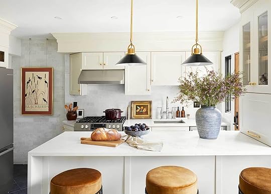 design & styling by rashida banks | photo by keyanna bowen | from: rashida’s totally transformed kitchen reveal (that includes one of our favorite “new classic” kitchen trends)For Large Branches & Large, Wild Arrangements: Use an Urn or Hourglass Vase
It’s hard to argue how impactful a big, bushy arrangement can have on the styling of a room. As much as I wish I had a home that always had a gorgeous spray of greenery, I typically only buy it when I get the itch for something new, or if I have a dinner party (or a photoshoot). But whenever you find yourself in a situation where you’re pulling out a vase for a large, wild grouping of flowers or branches, what you need is an urn style (or even an hourglass shape).
The bulbous body shape of these juxtaposed with a smaller opening is a great vehicle for letting stems spread out inside the vase for a good lean outside of the vase. This is especially helpful for plant varieties that don’t have a lot of flexibility (like cherry blossoms, for instance). These types of vases are also really stately, refined, and downright classy. They look beautiful at the center of a dining table, on a long credenza, or even on a kitchen island. If you know you love hefty branches, make sure the vase is heavy enough to support the weight of the extension of the branches.
I also really love an hourglass vase for flower arrangements that are really varied with lots of different florals with some good flop but also standing varieties (think eucalyptus vs. hydrangeas).

1. Tan Whitewash Ceramic Urn Vase | 2. Blue & White Floral Porcelain Vase, 12″ | 3. Ethel Vase | 4. 12″ Brown Glass Decorative Wide Jug Vase – Hearth & Hand with Magnolia | 5. Provençal Large Vase | 6. Green and White Distressed Vase with Handle | 7. 8.5″ Asher Ceramic Vases | 8. 14″ Joshua Handcrafted Ceramic Vase | 9. Al Centro Ceramica Tirreno Vase | 10. Verso Table Vase by Ferm Living | 11. Blomus Colora Matte Porcelain Vase | 12. Ophelia Clear Hand Blown Glass Large Vase 17″
 design & styling by emily edith bowser | photo by sara ligorria-tramp | from: emily bowser’s beautiful hardworking, multipurpose room reveal (+ get ready for her diys)For Large Droopy Greenery & a General Go-To: Try a Cylinder Vase
If there is any vase out that that is a regular jack-of-all-trades, it’s the cylinder vase. It works for a lot of varieties but looks best when they are about half the height of the arrangement inside of them. I wouldn’t use one of these (unless it’s short) for things like roses, daisies, or tulips (see the fishbowl section). Flowers that are meant to stick straight up feel a little out of place in a cylinder if you ask me. These are excellent for basically any type of greenery and again, a varied bouquet. They’re also great for really whispy florals like a spray of baby’s breath, for instance. You want some width to whatever goes in these, not just a straight line up and down from flower to the bottom of the vase. Get me?
A super versatile type of cylinder vase is a pitcher and even a crock (like #5 and #7). I wouldn’t necessarily go about reusing a pitcher I used as a vase to serve drinks, but it can be used to water other hour plants when not in use as a vase, and a crock can be used to hold kitchen tools, a collection of rolling pins, etc.

1. Tinted Glass Ribbed Jug Vase Olive Green Hearth & Hand with Magnolia 9″ | 2. Wind & Fire Vases by Marie Michielssen | 3. Tall Tan Ceramic Checkerboard Vase | 4. Jacqueline Vase in Pink Speckle | 5. Eden Pitcher | 6. Gradvis Vase 7.5″ | 7. Silo Crocks | 8. Tall Modern Glass Vase Threshold 11″ | 9. etúHOME Large French Mason Jar Vase – 14.25″ Tall | 10. Dapple Vase | 11. Tall Ceramic Vase With Lines | 12. Hex Vase by BZIPPY
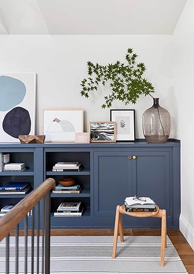 design: emily henderson | photo: sara ligorria-tramp | from: portland reveal: you’ll never guess what this bookcase is hiding…
I find the hardest vase to work with is the bottleneck vase, but it’s because I don’t think I was using them appropriately. Bottleneck vases are exactly what they sound like: a vase that comes up to a tight bottleneck. It can be round, shapely, narrow, whatever. And the neck can be super long and skinny or even just short but very tight when compared to the body of the vase. In the past, I’ve tried to shove a full bouquet into a bottleneck vase and, uh, that’s like me trying to squeeze my size 8 feet into my toddler’s jelly sandals. It ain’t gonna work, folks.
Use these for plopping down 2-3 stems of branches (an asymmetrical lean like the photo above is awesome), or even splitting up a single bouquet of flowers into multiple vases without them looking sparse. Hot tip: be sure to trim off excess leaves that might be on the stem part that’s inside the vase for a cleaner look. Otherwise, your vase’s neck is going to be crowded with leaves and look a little junky.
For “Leggy” Stems or Just a Few Hardy Branches: Bottleneck Vase is the Way
1. Cloudnola’s Reversible Flip Vase Green and Pink | 2. Raawii Strøm Vase | 3. Boblitt Handmade Glass Table Vase | 4. Chinese Retro Porcelain Ceramic Vase | 5. Holmegaard Flora Medium Neck Glass Vase Smoke Grey 9.4″ | 6. 2429 Cassiopeia Vase – Shamrock | 7. Serene Spaces Living Clear Glass Bottle Vase – 6″ | 8. Zeri Amber Glass Vase 10″ | 9. Terranova Vase
 design & styling: arlyn hernandez | photo: sara ligorria-tramp | from: reveal: arlyn’s bright & happy rental living room makeoverFor Short Stems Or Tidy Single-Flower Arrangements: Give A Fishbowl (Or Bud Vase) A Go
And finally, two pretty different vase types that I jammed into a single graphic (sorry). Briefly, use a bud vase for, well, buds. Small flower clippings, a single little whisp of leaves on a stem, or even a tiny little arrangement. I love a bud vase for small flowers like ranunculus, a clipping of lilac, pansies, billy balls…that kind of thing.
The fishbowl is kind of my new favorite. I tend to buy a lot of single-flower bouquets because they feel tidy, modern, and easy. (Don’t get me wrong, I LOVE a wild arrangement, but I’m just into this at the moment). Fishbowls are particularly useful for heavy-headed flower types like peonies, hydrangeas, and even roses, mums, etc. Any flower without too much flop works great here because they look great cut down fairly short where the bulb itself is the star, rather than the greenery.
That’s not to say something else would work in a fishbowl, but you should always have one of these on hand! They’re great in the center of a dining table that you’re actually dining at because the body is low and sturdy (as opposed to setting up just to be pretty or even as a “station” for appetizers, etc.).
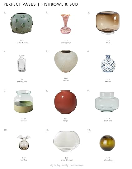
1. Barrel Cactus Vase by Matthew Ward Studio | 2. Luna Bud Glass Vase | 3. Colored Glass Vase | 4. Handcrafted Café Hammered Glass Vase – 5″ | 5. Rose Bowl Vase in Pistachio Glaze by Bob Dinetz- 6″ | 6. Blue and White 4″ Porcelain Ceramic Vase | 7. etúHOME Colorblock Flower Vase | 8. Ceramic Round Decorative Vase Dark Red – Threshold designed with Studio McGee | 9. Holden 7” Glass Table Vase | 10. Vietri Hibiscus Glass Gray Bud Vase | 11. Amata Round Clear Glass Vase | 12. Aurora Handmade Glass Table Vase
One last tip before I sign off that has been a total gamechanger for me (which is kind of a duh moment but literally NO ONE on this planet taught me how to cut and display flowers so it’s been a learning curve for me): Never underestimate the power of *twisting* your bunch of stems before placing inside a vase, especially with a fishbowl vase. This ensures full coverage of the opening, and that your flowers don’t stick straight up. You want them to kind of “fall” out of the vase visually. It even works to take a little twine and tie some around the center of your gathered stems, then twist the top and bottom of the stems in opposite directions. I promise this will make a HUGE difference for the finished product.
While I feel like there is so much more I can say on the topic (who knew there was so much to talk about with regards to vases and flowers!), I think I’ll leave you here. I really hope this was helpful for anyone who has struggled with flowers like I have. Be sure to save that graphic I made on Pinterest or wherever you collect things like that to reference back to the next time you have some greenery or flowers to set out. It’s going to make things much more effective and visually beautiful, I promise!
Until next time, friends.
Opening Image Credits: Design by Emily Henderson and Arciform | Photo by Kaitlin Green | From: Introducing Our Farmhouse Primary Bathroom Reveal (FINALLY)
The post The Stylist Secret To The Perfect Flower Or Greenery Arrangement (Hint: It’s All About the Vase) appeared first on Emily Henderson.
September 30, 2024
An EHD Alum Nursery Reveal With DIY Ideas So Good That Grown Ups Will Want To Steal Too

Today is a VERY special day for me because today I get to brag about my wildly talented cousin Becca and the truly incredible job she did designing her precious baby boy, Sunny’s, nursery. Get ready for some chic DIYs that you’ll want for your own rooms! Becca is an EHD-alum (I owe her everything!) and has such a special eye for all things design so no one who knows her was surprised it turned out so perfect. It’s pretty awesome to have another design-obsessed weirdo in the family that only lives 15 minutes away from you:) The first time I saw this room finished I got really emotional. Becca was pumped lol. I think her exact words were “I couldn’t have asked for a better reaction.” Now, despite our family’s genetic disposition of being big sappy criers, I don’t typically cry upon entering a pretty room. But clearly, this was different. My baby cousin was having her first baby and the love and care she poured into this room was palpable. So when she mentioned she wanted to find a photographer for a newborn photoshoot I suggested EHD alum, Veronica. Her portraits are so special and I may have thrown out the idea that since she also is amazing at interior photos, maybe she could snag a few shots of the nursery since Becca had worked so hard on it. Was I selfishly thinking we could use them on the blog?? I’ll never say! But I mean…two birds amirite?? Becca admitted to also thinking the same thing:)
I sent Becca a bunch of questions so we could get inside the mind of this DIY/style genius. I started my journalistic deep dive with a pretty standard but I think, important question:
What was the inspiration for the room? Did anything spark the overall look?“I think Sunny’s name was the initial inspiration. We knew we wanted to name our baby Sunny whether we were having a boy or a girl. We found out we were having a boy and I knew I wanted to create a fun, cheery, gender-neutral space. So much nursery decor is either some hue of pink or some hue of blue and I didn’t want to be boxed in – so I just looked for colors I liked from sources that weren’t specifically designed for children. I did A LOT of searching on Pinterest to figure out how I wanted to add color to the walls without it feeling overly baby, but still feel youthful and fun. I fell in love with the two pillows I found for Sunny’s glider and used those as the starting point for everything else.”

Dresser | Floor Lamp (DIY!) | Red Spray Paint | Toy Giraffe | Glider | Sun Pillow | Stitched Cowboy Pillow | Curtains | Blackout Shades | Curtain Rod | Curtain Rings | Side Table | Rug
This is the view when you first walk into this room. The colors she chose are the ideal mix of a soft warm hug and happy pops of playfulness. It feels perfect for a nursery but since most of what she bought wasn’t baby-specific, almost all of the pieces have serious longevity. But now let’s get to the first high-impact DIY…
What’s the story behind the lamp and were you nervous to paint it? Any spray painting tips/how long did it take?“So I actually found the red lamp on the street a few years ago, SCORE! It was black originally and pretty scratched up so I knew it needed a revamp before moving into the nursery. I watched the EHD unexpected red theory video on Instagram and was sold! I had to try it. It was actually pretty easy and quick. I did a little taping, set up an outdoor space with some cardboard to contain the mess, layered on two super intense masks (because I was very pregnant), and got to it! A couple of spray painting tips: 1) definitely follow the directions on the can, spray from a slight distance, and allow a little dry time in between coats so you don’t get drip marks. 2) don’t do it under a tree, I learned that the hard way. You get lots of fallen leaves and pollen stuck in your wet paint!”


Painting something you already have isn’t a new idea but man is this example a great reminder to go for it. When she asked me what I thought of painting it red after she saw our reel, I immediately said, “YES”! Plus, like she said it was a little beat up but the shape is so good that giving it a new very fun life was the perfect way to add that pop to the room.

Art (vintage) | Changing Tray | Checkered Changing Cover
Now, each piece of art has a personal story which automatically gives the room soul, charm, and personality. And this circus piece is one of my favorites:
“We found the circus painting at a vintage shop in San Diego. It was actually the first thing we bought for the nursery. The Ringo Starr art over the crib is an actual animation cell from The Beatles Yellow Submarine movie. I have a dog named Ringo and a husband who’s beyond obsessed with the Beatles, so it was his present last Christmas. All the little Beatles knick-knacks throughout the room were his as a little kid.”

Pendant | Crib | Mobile Attachment Arm | Mobile | Crib Mattress | Fitted Sheet | Cloud Mat | Baby Gym Frame | Baby Gym Toys | Ceiling Paint Color | Wall Paint Color
Ok first we’re going to talk about DIY #2 then we’ll touch on a hot topic I’m sure at least half of you are wondering about…why did she choose a white gilder and a white rug??
Did you paint the ceiling or did the painters?“Yep! Another crazy pregnant project! I painted that bad boy myself, with a bit of assistance from Jason (I did it right after the closet, so I was tired!!).”
How did you decide on the width of the painted trim?“I talked to my beautiful cousin, Jess!!! Her suggestion was to make sure it didn’t line up with any of the door frames or the curtain rods. So either go higher or lower. Of course I knew how high I was going to hang the curtains because of the handy-dandy EHD curtain hanging guide (can you tell I’m an alum/avid follower?). So I picked to have the ceiling color go lower to pack a bit more of a punch. Quick tip for painting this one because you DO want a perfectly straight line: after you tape, use the edge of a credit card and run it firmly along the edge of the tape to really get out any air bubbles and gaps.”
Ha. I totally forgot we talked about it when I asked her this question but so happy my advice was helpful!
I’m sure you are getting why the love was so palpable when I walked in because her literal sweat and maybe a few tears went into this room (no blood to my knowledge, thankfully!)
How has the white glider and rug been holding up?“Ok I know this is going to be a comments topic – what was I thinking putting so much white upholstery in a baby’s room?! So impractical, right?! WRONG! I did my research, y’all. 1) the rug is washable, and while it’s way too big to actually fit in a washing machine, I have a similar one in my living room and it cleans like a dream. Plus, I read a ton of great reviews of it from other parents. 2) the glider is white, yes, but here’s my logic: so is baby spit-up! It’s already been projectile spit up on and you’d have no idea. Plus the boucle fabric is forgiving.”
Next up, isn’t a DIY but it is a Facebook Marketplace vintage find! But since she was clearly in a DIY mood she wasn’t sure if she also wanted to give this vintage tall dresser a little refresh. I thought it would be fun to show you our little text convo about it (while also revealing that I am a notoriously delayed texter and I can’t seem to stop (though honestly, only a day behind is pretty good for me). I wasn’t always this way! Maybe a good 2025 New Year’s resolution:))

Here’s the dresser’s origin story:
“Found the vintage dresser on Facebook Marketplace for $200! It was actually a prop on a TV show apparently, so that’s fun. I thought about refinishing it a bit but ultimately decided to leave it as is. Partially because I was entering my 3rd trimester and too freaking tired! But I think it was the right call. I like the warmth it adds to the space. I was a little hesitant about how many dressers there were in this room: the vintage one, the built-in one in the closet, and the one used for the changing table. That’s a lot of drawers!! But it’s been amazing – you can never have too much baby storage.”
 Mustard Stripe Paint Color | Dresser (vintage) | Garland | Yellow Wire Baskets (similar) | Black Race Car | Floor Basket
Ah, it’s perfect! Her exhaustion really paid off because I love that the handles stayed light. Staining them dark wouldn’t have worked with how the room turned out. I also love how the body’s wood ties in with the wall shelves. Chef’s kiss Becca!
But the real chef’s kiss are those painted stripes. TO DIE FOR. The closet didn’t come with doors so they had to make the decision to either enclose or embrace. And ummm, embracing was the right choice if you ask anyone with eyes.
Let’s get into the process:

“I used 1-inch tape, but the width of each stripe is kind of in between tape sizes so I measured the width I wanted each stripe to be and made little tick marks in pencil across the bottom of the wall and then used a laser level to create a straight line up the wall and taped along that. It probably would have been much easier if I made the stripes the same size as an existing size of painter’s tape, but I like to make things difficult, so I had to layer multiple pieces of tape to get the width of each stripe. The closet stripes BY FAR took the longest of anything in the room. Taping was a big part of that”
“But before I started I got some tips from a couple of my favorite muralists (@tolahome) about how to create my imperfect stripe. Y’all ready? Start by creating a PERFECT stripe. Sounds like unnecessary extra work, but it was very necessary. Tape it all off, don’t worry about any little paint leaks under the tape that happen because you’re going to make them imperfect anyway. After painting remove all the tape, get a smaller angled paint brush, and then hand-trace the outline of each stripe to get it to look “imperfect”. Don’t try to be imperfect, because, believe me, trying to hand-paint it perfectly straight will be imperfect enough. And start practicing your hand painting in an area that won’t be seen easily (you don’t want to see what the stripes look like behind that dresser). Also if you’re 6 months pregnant like I was, it’s very helpful to recruit a partner or friend to get the hard-to-reach areas that your belly just won’t let you get into. Overall it took about a week of pretty long days to complete.”

Mint Frame | Hangers | Size Dividers
The imperfectness is so so perfect!
Do you have a favorite part of the room? Does Jason?The stripes are definitely my favorite part. They’re just so fun! I specifically love the corner with all the cute hanging baby clothes, the framed photo of Jason’s mom, and the stripes in the background! The stripes are Jason’s favorite too. He says he loves how it ties the whole room together. So they were definitely worth the trouble.
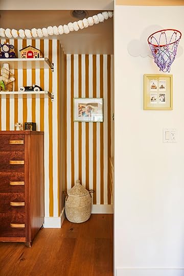 Whose idea was the basketball hoop?
“Instagram’s idea. The ad algorithm knows me way too well. It’s clearly more for Jason and me right now, but eventually Sunny will appreciate it too.”
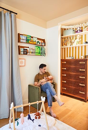
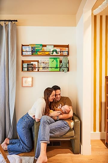
Wall Shelves | Pink Frame | Green Bench
How sweet is this little family!? All the photos Veronica took completely captured their essence:) If you live in Southern California hire her! Arlyn and Sara have also hired her for engagement and family shoots and they are just as special.
Ok back to Becca!
About how long would you say it took?“Maybe a few months total. I’m already someone who constantly has home design on the brain, so when the nesting phase of pregnancy hit, it hit HARD AND FAST. I did an endless stream of photoshopping in and out different items to see what I liked best. The painting was the longest/hardest part – it took MUCH longer than I expected. Mainly because I was obsessed with the idea of “perfectly imperfect” stripes. Too straight and they wouldn’t have the whimsy that I wanted; too messy and they’d look, well, messy. And I couldn’t find wallpaper with the color/design of stripe I wanted so I decided I had to do it myself. While very pregnant.”
Now after having that sweet baby, is there anything you want/need to add?“Honestly no! There are a few practical things we have in there that are missing from the photos: a monitor, diaper pail, sound machine, yoga ball (because this kid needs constant bouncing). But that’s about it!”
When you were designing were you thinking of longevity as he gets older?“Yes! I think everything could easily transition to a fun toddler room and beyond. Jason was a little concerned that the ceiling was a little too pink and that Sunny wouldn’t like it as he got older, but pshhh! If he hates it, we’ll paint it a different color. Right now we just have to love it. And honestly, it’s my favorite room in the house!”

For some reason Becca “forgot” to answer my final question: Is it hard being so cool and beautiful and good at everything? I’m guessing it comes very natural to her:) Well, it was a pleasure getting to share a little piece of my heart with you all today. I couldn’t be happier for Becca and Jason and might be a little jealous of Sunny having probably the most perfect room. Becca, you nailed it (duh) and hopefully someday we can share more of your beautiful home<3
Love you, mean it.
*Design by Rebecca Butler
**Photos by Veronica Crawford
The post An EHD Alum Nursery Reveal With DIY Ideas So Good That Grown Ups Will Want To Steal Too appeared first on Emily Henderson.
Emily Henderson's Blog

- Emily Henderson's profile
- 10 followers

