
Emily Henderson's Blog, page 34
November 19, 2024
24 Toddler & Little Kid Gift Ideas That Are A Guaranteed Home Run (From A Toddler Parent Who Knows)

Babies are fairly easy subjects for gift-giving. Maybe a soft little book, something for them to chew on, a play mat, and something musical and they’re set. But toddlers, well…that’s a whole other ball game. The world of toys really opens up for the 1-5 age set (more like 2-5, but I’m sneaking in a few things that could be good for 1-2-year-olds, too). That’s when they start to have a say in what they like and want to play with, interests arise (hello Frozen, Bluey, and Daniel Tiger!), and the roads diverge between educational and enriching toys to just pure entertainment.
All of that to say, if you’re buying a gift for a toddler, you’re going to face A LOT of options. It can be mind-numbing, but fear not, for I, a mom of an almost-three-year-old (HOW?!?) has your back. Today, I present to you my toddler gift guide, comprised almost entirely of vetted gifts that my household actually owns and my kid loves. These are the things she reaches for time and time again. If I got rid of all the other stuff in her play arsenal, she probably wouldn’t care as long as she has these things—I say that and, of course, she’ll end up looking for the most obscure ball she got in a birthday party goodie bag no doubt.
In our home, we tend to stick to open-ended toys for about 75% of my daughter’s options. That both extends the life of the toy (meaning, it can span more ages because a child changes how they play with the thing more easily), and also expands their brains and creativity. We do, of course, also have some character-based things, some very specific “electronics,” and plenty of “babies.”
I could have made this 50+ items long, but I edited myself down to some universal “home run” picks to help you check off all those little people in your life and get praise from their parents. And if nothing here rings your bell, hey…Playdough, stickers, blocks, a giant vat of bubble solution, or Hot Wheels are always solid bets, too.

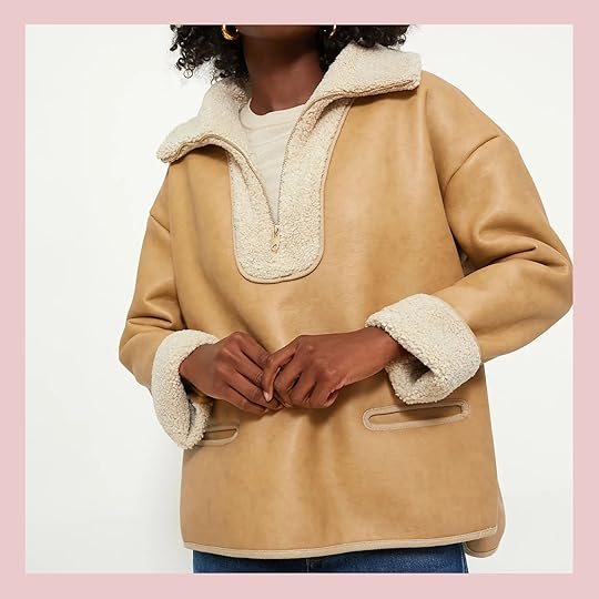
 Classic 74-Piece Set Magna-Tiles | Magna-Tiles Storage Bin/Playmat
I am not the first person to include Magna-Tiles in a gift guide for young kids by a long shot, but that’s because of one reason: they are amazing. Costly, but amazing. I was lucky enough to find a 100-piece set on major sale at Lakeshore last year for about $80 (normally $120), but you can pick from a bunch of different set sizes. My girl didn’t take to them immediately when we got them around her second birthday, but at around two-and-a-half, they have become a daily toy. We bowl with them, use them over a flashlight to see colors mix, build towers and robots and camels and car garages. They are truly an amazing open-ended toy. And if you’re gifting to someone you know who already has these, don’t overlook the immense value of a storage bin!

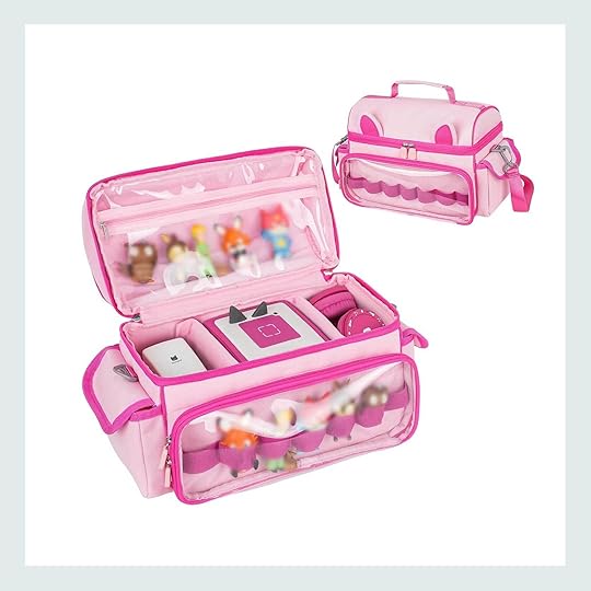
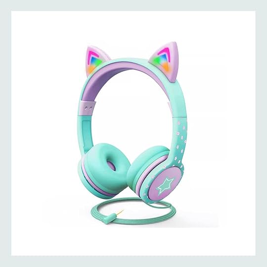 Toniebox Audio Player Starter Set | Carrying Case Compatible with Toniebox Starter Set | Wired Kids Headphone with Led Cat Ears
The other toy on nearly constant rotation in our home (and our car) is my Evelyn’s beloved Toniebox. She was obsessed with this thing from the moment she unwrapped it last Christmas (she was just shy of 2 at that point). It’s a screen-free speaker that works with little characters you place on top. They have musical Tonies, story-telling Tonies, bi-lingual Tonies, and so many more. A nice extension to this gift if you have the budget—or if the gift receiver already has a Toniebox—is a carrying bag and wired headphones. We have these two pictured and they’ve been so great for us.
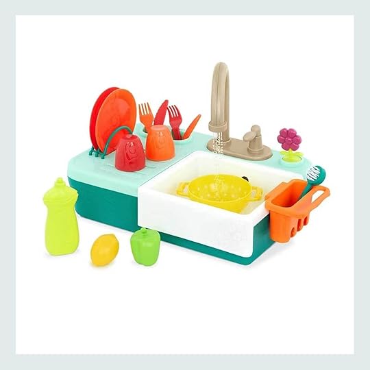
 B. toys Running Water Play Sink | Mold & Play Sensory Sand Set
I’ve never met a toddler who didn’t want their hands constantly in water or sand. We don’t have this exact sink (ours came in a Lovevery subscription box-keep reading) but it’s very similar. It’s great because you add water to an interior basin and it recycles it once it goes down the drain so it’s constant running water.
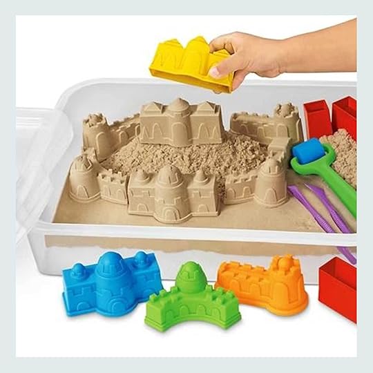
Another great sensory toy is kinetic sand, and while they sell it by that name in all different kind of cool sets, I recommend getting something more like this that comes with a bin and top to keep things under control and clean up super easy.

 Kid’s Kitchen | Tiny Land Double-Sided Easel for Kids
If you’re looking for a bigger ticket item that also happens to be big (kids love a large box, trust), I’d go the route of a very cute play kitchen or an art easel. We gave our daughter a similar play kitchen (hers is no longer available) for her second birthday and she can tinker with this thing for an hour.
And while we don’t actually have this easel because we don’t have room for it, our small tabletop easel is regularly out and I just know she’d love this one if we had it. It has a side for chalk and paint with a paper roll at top. I gave a similar one to my nephews over a decade ago and it was a constant in their playroom for years.

 Water Wow! – Water Reveal Pad Bundle | 3 Pack Reusable Sticker Book
Not all beloved toys have to be spendy, and bonus points if they are portable. Like I mentioned at the start of this post, stickers are great (as are coloring books), but once they’re all plucked from their backing (or pages colored), the jig is up. So may I introduce you to reusable sticker books and Water Wow water reveal pads. These get heavy use in our home, but I also love to keep a few in the car, in the bag we bring to restaurants or outings that require keeping our toddler entertained, and on planes.

 Micro Kickboard Mini Plus Kick Kids’ Scooter with LED Lights | Toddler Willow Rain Boots
Some days at our neighborhood park, the patch of concrete near the slide structure looks like a scooter convention rolled in. And the Micro Kickboard is by far the most common one in the crowd. We’ve tried a few other brands via friends, and even got a hand-me-down Skiphop scooter from our Buy Nothing group, but nothing feels as sturdy and durable as this one. The wheels also have LED lights in them, and boy do toddlers love things with flashing lights.
You know what else toddlers love? Rain boots. My daughter went through a phase where putting on her rain boots first thing in the morning and clomping around for hours was part of our daily routine. If I give her a choice between basically any shoe and rain boots, she’ll pick the boots 9 out of 10 times. They aren’t just cute though, they’re versatile! They’re great shoes for preschool where my kid always seems to be slathered in paint, mud, water, and shaving cream. Sneakers wouldn’t stand a chance.

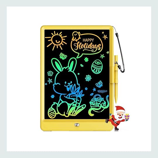 Akito the Fox Kidamento Digital Camera | Bravokids LCD Writing Tablet
This digital camera is on my daughter’s Christmas list this year, so we don’t have this quite yet, but we’re pretty excited about it. It’s for ages 3 and up so it might take a moment for her to acclimate, but she LOVES looking at pictures on our phones, and she gets so excited when my husband takes out his proper camera to take photos. They also have a version that prints out a photo similar to a Polaroid.
We aren’t an iPad family (no judgment at all for those who are) but especially when we’re on the go in the car or on a plane, it’s nice to have something small, mess-free, and tablet-like to entertain our kid. We recently added this LCD writing tablet to our travel toy stash and it was a hit! She scribbled on it, we scribbled on it, we put toys on top for her to trace, we write out letters and numbers and shapes for her to recite…it’s a load of fun for less than $20.
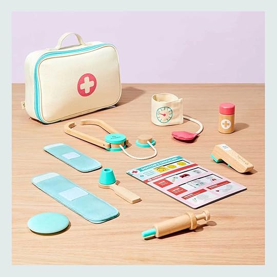
 Pretend Play Doctor’s Kit | Star Belly Dream Lites Stuffed Animal Night Light Dreamy Green Dino
You can’t go wrong with a pretend kit of any kind, as kids this age love pretend of any kind (well, most of them do). This doctor’s kit is great because it all tucks away into a zipper bag so things don’t go spilling out everywhere. Bonus points if you add some actual bandages (we love the ones from Welly) because nothing seems to capture the attention of a toddler quite like a narwhal bandage.
Oh, the hours of quiet, calm fun we have with my daughter’s Star Belly doll. She received a unicorn from a friend on her second birthday, and since then, we’ve spent many hours lying on the floor of her dark bedroom, looking up at the ceiling at the projected stars and rainbows and butterflies. Hearing the most enchanted “wows!” coming out of her mouth is the sweetest feeling in the world. It would also be good for a child who might be nervous about sleeping alone in a dark room (it has a 20-minute self-timer).
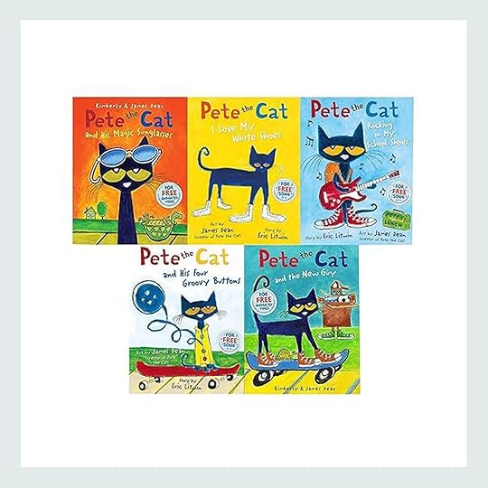
 Pete the Cat Series 5 Books Collection Set | Bluey 5-Minute Stories: 6 Stories in 1 Book
Books! Books! Books! My mission in life is to get my kid to love reading, and so far, two years in, it’s working (jokes on me when she gets to decide for herself in a few years and likely won’t want to do anything I want her to do, ha). But anyhow, while we’re huge Eric Carle, Eric Hill, and Mo Willems book fans, another kid book series my girl LOVES as much as we do is the Pete the Cat collection. The stories can be a little silly but so much fun. Another story-time gold-star winner in our house is the 3- and 5-Minute Stories books. There’s one for almost any character or movie or show. We literally read the Daniel Tiger 3-Minute Bedtime Stories book every single night for like two months in a row.

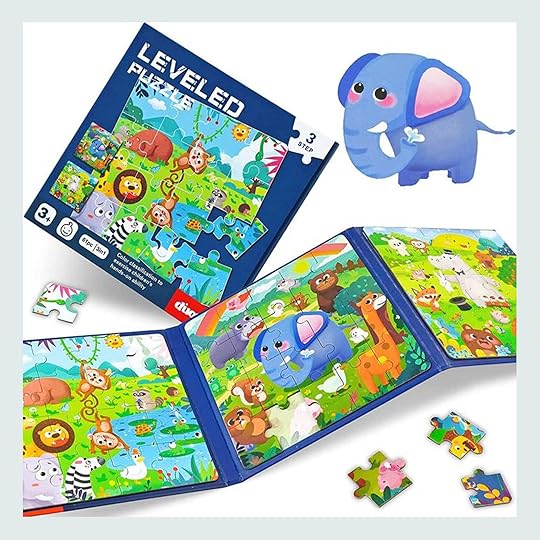 Wonder Forge Eric Carle Matching Game | 3 in 1 Magnetic Puzzle Book
Speaking of Eric Carle, matching games are a great introduction into the world of “board” games. We have like four different types of “memory” games and Evelyn never tires of them. Same goes for jigsaw puzzles, but heads up…get the magnetic kind! We have both traditional jigsaw and this magnetic trio and this one is far easier to keep together and all the pieces in check.
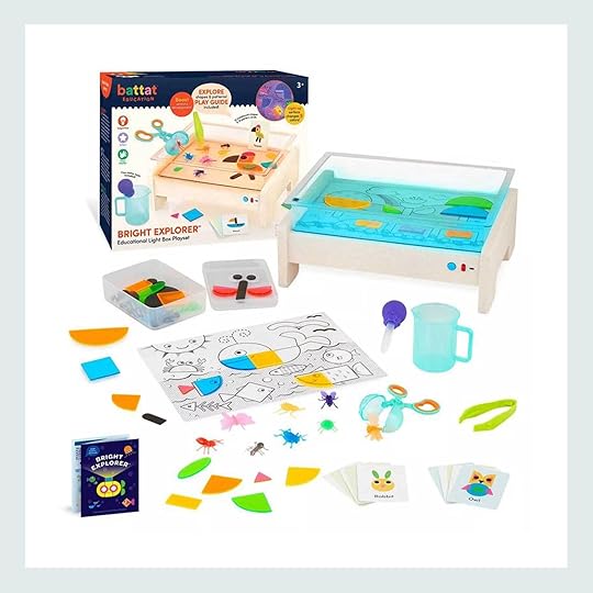
 Battat Education Bright Explorer Educational Light Box Playset | Assorted Giant Soap Bubble Makers
I’m SO excited about this light box we’re giving our daughter this Christmas. She uses a similar one at school and loves exploring all the things she can put on top. You can “color” with the tiles, create shapes from cards, and so many other things. It’s a gift that seems way pricier than it really is (it’s about $35) and is both fun and educational.
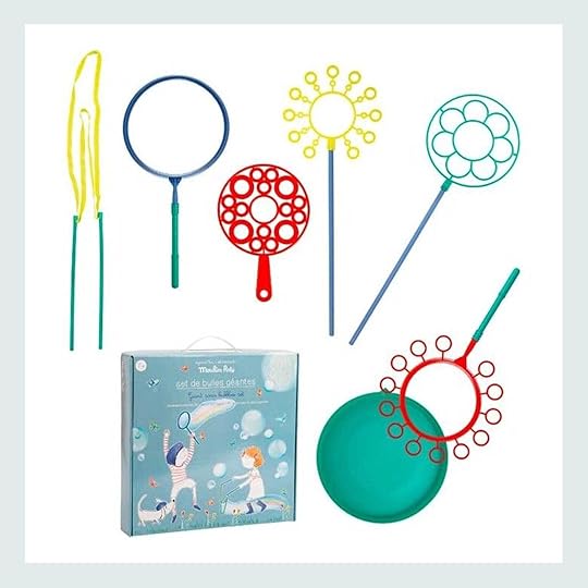
Something I just recently learned during a Parent Education talk at my girl’s preschool is that blowing bubbles is a calming activity rather than a stimulating activity, and kids need both “ups” and “downs” to their days to help keep them regulated. So anytime my daughter is all kinds of wild or dysregulated, out come the bubbles. This set makes different sizes (we’re fans of GIANT bubbles) so it keeps things varied.
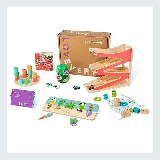
Lovevery Play Kit Subscription (Or Gift)
And finally, far and away, the best toys we’ve gotten in all my daughter’s two-and-a-half years always come from Lovevery. We’ve had the subscription since her newborn days, and not only are the toys beautiful and sturdy, but they take away the weight and worry that I’m not giving Evelyn what she needs when she needs it. They have it all figured out from a developmental perspective, and include a booklet for the caregivers to learn themselves how to best play with their child with the toys provided, and how to “extend” the toys as well into older ages. The boxes are pricey but are the best investment we’ve made to her learning and engagement in terms of playthings.
—
By the time I got to the bottom of this list, I thought of about 20 more things to recommend (play tents, play tunnels, stepping stones, dinosaur and animal figurines, silicone tea set!), but in all honesty, kids don’t really need *that* many things. Just like adults, there can be a paralysis of choice that happens when there’s too much to choose from, so keep that in mind! Please feel free to ask me for more specifics if you’re looking for them down in the comments, and I’d be happy to help in any way.
Good luck and happy gifting!
Opening Image Credits: Photo by Tessa Neustadt | From: Decorating For The Holidays – Family Friendly Style
The post 24 Toddler & Little Kid Gift Ideas That Are A Guaranteed Home Run (From A Toddler Parent Who Knows) appeared first on Emily Henderson.


November 18, 2024
Kaitlin’s 70s Inspired, Colorful And Cool Living Room Revealed (Y’all, I’m So Jealous)

BOY, do I feel some satisfaction with this one – every time I walk in I’m like “Damn, this is just so good”. It really demonstrates the power of good furniture, a good layout, and some color and pattern. Fine, and some dope tile and a new window. But this blank slate turned out far better than I had imagined. Like I thought we were going to make it better, sure, and more functional, of course, but for how much effort we put into it (not very much, TBH) it is a grand slam. Of course, a ton of credit has to go to my partner in design, Article, because indeed we were able to furnish every major piece of furniture and have it arrive within weeks of ordering. And the best part is that it doesn’t look like a weird set or match too much or anything. You wouldn’t know that it came from one store. Let’s show and tell.
Here’s a little fun video if you want to check that out first! (just wait for the ad to play):
The Leather Sofas
Leather Sofa | Leather Loveseat | Coffee Table | Rug | Lamp
Two years ago I sat on this sofa at my friend’s house in Lake Arrowhead and could personally attest to the comfort (squooshy, not too firm with a nice supportive back, and great height for elbows). So without much convincing, I forced these sofas on Kaitlin. We knew that we needed a lower sofa in front of the window, and leaning into the 70s vibe really worked here. We ordered the sectional (a sofa and a loveseat) and ended up separating them (for now) because we liked how it filled out the room more (plus hot tip – dudes don’t always love to cuddle with other dudes while watching a game, so it gets WAY more use during game day as two different pieces). The leather is so beautiful and SOFT (I don’t know how they do it, but it’s buttery, not tight). It also comes in a lighter, caramel color too. And yes this entire collection (the Cigar) is completely modular meaning you can “build” your perfect configuration and the pieces have sturdy attachments underneath to lock the individual pieces together or, as we have them here, slide away to be kept apart.

Leather Sofa | Brown Lumbar Pillow | Cream Pillow | Leather Loveseat | Plaid Blanket | Cream Check Lumbar Pillow | Coffee Table | Footed Planter | Blue Candlestick Holders (similar) | Burgundy Bowl (similar) | Green Tray (similar) | Rug | Lamp
We floated it out from the wall, and while I wanted to add curtains to frame the window Kaitlin had other plant plans and bought this awesome sculptural plant from Dennis’ 7 Dees. Then we added the lamp to enhance this 70s vibe and create a great ambiance. She was right – we didn’t need curtains, just needed something tall and sculptural to soften the lines.

Media Units | Big Art on the Left | Vertical Wooden Frame Piece | Little Piece | Horse Art Print | Frame TV | Frame TV Art
The blank wall is totally transformed – two matching media units (The Torme) created a low long built-in look that not only created a lot of record and game storage but was a great surface and grounding element for a gallery wall above. Each unit features adjustable shelves inside and soft close fronts but the real kicker are the thoughtful design details – those rounded legs and beveled doors are chef’s kiss. And yes, that is a Frame TV (non-spon, just can’t stop using them) along with a few other pieces that Kaitlin sourced from The Yo Store, a vintage painting and Gretchen even made her that little painting. It’s SO GOOD.

Media Units | Big Art on the Left | Vertical Wooden Frame Piece | Little Piece | Horse Art Print | Frame TV | Frame TV Art | Lamp | Chrome Bowl | Stone Squiggle | Wood Tray | Footed Bowl
The art on the Frame TV is from this amazing artist that Kaitlin also found named Abigail Bell. Go check her stuff out!
The Coziest Green Chair
Chair | Ottoman | Pillow | Side Table | Footed Planter | Planter | Tile (in Forest and Mallard) | Rug
The green chair and ottoman are excellent and are real “stars” of the show. They’re from Article’s new Sanders collection – a striking yet minimal Scandi-inspired style for them. How good is the rich mocha brown sofa it also comes in? So comfortable, such a pretty color. Again, I know I have a lot of good stuff in my home, but everything in here looks so good together that I want it all!
The Fireplace
Obviously one of the biggest changes we made was tiling the fireplace with this incredible blue and green tile from Clé Tile. I know (from first hand experience) that these things are hard to pull the trigger on, that they aren’t cheap ($1,200 labor, $1k in tile) and the fear of not loving the outcome can be high. But all of us agreed that this tile would be perfect and lo and behold it SURE IS.

Tile (in Forest and Mallard)
Clé just does such a great job with their color combinations and the texture is always so warm. Of course, now I want to clad over our brick fireplace instead of lime wash it…I’m so easily influenced!! We had the installer just miter the edges so it had a clean line, then Kaitlin and her husband chose a really nice complementary grout color.

Tile (in Forest and Mallard) | Mirror | Bar Cabinet | Lamp | Wood Tray (similar) | Blue Martini Glasses (vintage) | Wall Art | Basket (no longer available) | Leather Sofa | Throw Blanket (similar) | Throw Pillow | Rug
We finished off the major pieces with this bar cabinet in the corner – contemporary and playful (and I love how the round elements contrast so well with the vertical and square elements of the fireplace). Popped on a squiggle mirror (your regular reminder to NOT sleep on Article’s decor) and a really graphic oxblood colored lamp and this vignette worked instantly. I bought this framed print from Form & Function, one of my new favorite stores in Portland that has a ton of Scandinavian accessories (and vintage furniture).


Left: Tile (in Forest and Mallard) | Mirror | Bar Cabinet | Lamp | Wood Tray (similar) | Blue Martini Glasses (vintage) | Wall Art | Right: Leather Sofa | Brown Lumbar Pillow | Cream Pillow | Leather Loveseat | Plaid Blanket | Cream Check Lumbar Pillow | Coffee Table | Blue Candlestick Holders (similar) | Burgundy Bowl (similar) | Green Tray (similar) | Rug | Lamp
Kaitlin did a lot of the shopping for accessories (she has great taste and didn’t make sense for me to try to guess what she’d like, lol). I brought in a few pieces from Schoolhouse that I’m obsessed with, but otherwise, she went to the usuals: World Market, Anthro and Target. She had a ton of books and trays to play, as well as the turntable and cool speakers that her husband was excited to show off.

The thing that makes me the happiest is how much Kaitlin and Corey love this room. They NEVER USED IT and now they not only use it nightly but they invite friends over to hang in, they host so much more, and they truly love their house so much more. As a friend/designer, it’s actually really thrilling to be a part of it.

Emil’s Outfit: Denim Blazer (similar) | Top | Jeans | Boots | Kaitlin’s Outfit: Top (vintage) | Jeans (Kaitlin refers to them as the “best jeans ever!”)
A huge thanks to Article for partnering on this living room – it’s always such a pleasure. We’ve used Article’s furniture for years and years in projects ranging from bedrooms to living rooms and the experience has been consistently remarkable. If anything, I think their offerings have just gotten better. The quality and value of the furniture can’t be beat, the style offered is simple with some extra edge and usually delivered very quickly. If you want to treat yourself I suggest having them put together the furniture and take away the boxes – it’s a full-service treat.
*Design and Styling by Emily Henderson (me!) and Kaitlin Green
**Photos by Kaitlin Green
The post Kaitlin’s 70s Inspired, Colorful And Cool Living Room Revealed (Y’all, I’m So Jealous) appeared first on Emily Henderson.
November 17, 2024
The Link Up: Em’s Two Favorite Plaid Coats, Cailtin’s Must-See/Feel-Good Documentary, And Potentially The Cutest Placemats:)
Happy Sunday everyone. We have been trying our hardest to get some very exciting design content made for you and that includes three reveals within the next two weeks! And it starts tomorrow with our photographer’s beautiful living room. Hope they bring a smile to your face. Ok, let’s get to this week’s links.
This week’s house tour is in the running for our favorite home tour of the year. Do yourself a favor and step inside SNL’s Heidi Gardner’s Kansas City dream home. It’s a midcentury modern heaven complete with a disco ball range hood. We think enough said:)


From Emily: The universe is finally answering all my “plaid coat” dreams. If you have been following closely (thank you) I’ve been wearing the same plaid wool coat for easily 8-9 years and while it’s still in OK shape (the lining is ripped) I was always in the market for an additional one, based on how often I wanted to wear it. Sure, others have tempted me and I’ve liked some enough, but I recently found two that check the box, unlike most others. This plaid coat (with the pops of cobalt) hangs really well, feels tailored around the shoulders, comes in slightly, and then just drapes. It’s very flattering and so easy to throw on, which is the point! It should easily dress up an outfit but still be comfortable. I really don’t like when they try to make a body-con shape with it or have lots of ties – I want to be able to layer underneath it without it looking shlubby!! For that coat, I’m wearing an XS (I’m not an XS) because they were out of smalls and I love the fit but it’s too small to button. I was going to exchange it, but I’ve found that the cut/fit besides that is so good and I don’t really need to button it (if it were much colder I’d wear more of a parka). But point is, I think it’s perfectly sized. Now, this other one is also SO GOOD – nice structure in the shoulders, easy to button (wearing small) then open. This one is even easier to layer over a sweatshirt or thin sweater and immediately makes a basic outfit look cool, young, and stylish. I almost consider it like a thicker, longer blazer – because they are so comfortable and are medium weight – you don’t get hot when you go inside the grocery store or on the subway.
From Caitlin: This week, Den and I scored invites to the premiere of a FABULOUS new documentary, The World According to Allee Willis. Allee was a prolific female songwriter – she penned September, Boogie Wonderland, the Friends theme song, and the entire Broadway soundtrack of The Color Purple, to name a few – but she also struggled to square her massive ambition with the limited opportunities available to her as a woman. (Prescient, huh?) I laughed out loud (the celebrity interviews are incredible – everyone from Mark Cuban to Patti Labelle!), I cried (darn you, tender Paul Feig!!!), and it was a total visual treat. (The ultra-talented director, Alexis Spraic, invited us to take a tour of Allee’s 1930s Moderne home a few days before we saw the film – more on that here – and it was EXTRAORDINARY. If the story doesn’t leave you inspired, Allee’s interiors absolutely will.) The documentary was just the pick-me-up I needed – so bright! So human! So loving! – and I have the feeling that you’ll love it, too. See it in theaters this week or stream it next weekend – it’s worth the 90 minutes, I PROMISE!
Also From Caitlin: Here’s an unsexy reminder to use your FSA/HSA funds before the end of the year! ICYMI, you can use your funds on certain Amazon purchases. We just bought this Theragun (incredible – the app makes it so easy), a seemingly neverending supply of tampons, and enough Supergoop sunscreen to stock a medium-to-large size storefront. Look for the FSA/HSA labels on the right side of each page (or just pop it into search) to find all eligible products.

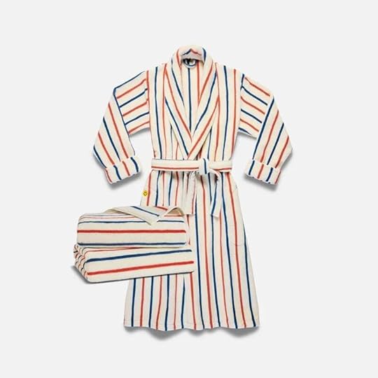

Bath Mat | Super Plush Robe and Towels Bundle | Terry Slippers
Brooklinen’s extremely fun collab with KULE was such a fun surprise when we saw it! If you love a classic stripe and a playful aesthetic then this collab might be perfect for you (or someone on your list:)) Go check out all the towels, robes, mats, and accessories!
From Arlyn: I had to read The Anxious Generation for a book club I was leading at my daughter’s preschool, and I think it’s a wildly important read for all parents. Some of the participants in our book club didn’t really like the author’s voice or approach, but by the end, we all agreed it was crucial to look past any issues with the person delivering the news and digest the news for what it’s worth. The book is all about the mental health crisis our adolescents are facing, and why research shows that a shift from a play-based childhood into a phone-based childhood (heavily in part due to social media) is the culprit. It’s not all doom and gloom, as the book ends with lots of really great actionable takeaways and recommendations based on the age of your child. It’s all fairly hard to swallow and frankly, quite scary at times, but overall, I highly recommend this for anyone with young and pre-teen/teen children.


Blithe Bookends (Set of 2) | Noor Chandelier | Cascading Serving Bowl
Another incredibly exciting collaboration that was just announced is the Lolly Lolly Ceramics collab with Lulu and Georgia. Lalese Stamps, founder and owner of Lolly Lolly Ceramics, is an insane talent who mugs we’re sure you’ve seen. So to get to see more of what she can do is pretty awesome. We’re pretty obsessed with the lighting but you have to see it all.
From Mallory: I was in desperate need of some everyday placemats (which is also good timing because Thanksgiving is in fact around the corner!) so I snagged these in black when I was at Anthropologie and I am obsessed party people!! My friend who was with me when I grabbed them was apparently “very skeptical” and thought I was making a weird choice. But then once I put them on the table and styled it out a bit he said he’s never been more wrong about something lol…they look AMAZING when they’re all together because the shape is so unique and fun. Plus, they come in a ton of colors (I love the black because it’s so forgiving) and they can go from holiday to holiday. Highly recommend!
VELUX (our favorite skylight resource) is having their Autumn Glow Giveaway where you can win two solar-powered Fresh Air skylights – that’s the kind you’ve seen in our projects over the past few years – plus shades and installation. We promise they will transform wherever you choose. You have til 11/30 to apply so go now!
From Gretchen: If you’ve been looking for an affordable but expensive-looking sphere-shaped pillow, this one from World Market is a stunner! We shot Kaitlin’s living room this week (the reveal is live tomorrow and it’s one of my absolute FAVES). She bought a bunch of new pillows to style out her space and they were all so cute! A few didn’t make the cut picture-wise (too many good ones to choose from) but I walked away really wanting this little ball pillow for my own home! It’s perfectly nubby and the taupe color is a refreshing take on boucle.
From Jess: I happened to mention to my dad that I really hated my tiny freezer/lack of ice cube situation. He then went on to mention how he had this great counter ice maker for his Airstream. He loved that it was pretty quiet and the design was nice/simple. I responded with, “O that’s great, I’ll have to check it out.” Well, I didn’t even get a chance before it was at my doorstep on Monday. I am extremely lucky to have him as my dad:) I’ve now been using it for a few days and it’s great! Having ice on demand is pretty incredible lol. It’s smaller so is perfect for a single person (maybe two) who loves ice. Plus it’s under $100.
Thanks for stopping by as always and see you tomorrow for the big reveal. xx
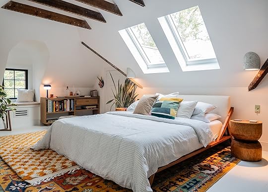
Opening Image Credits: Design and Photos by Hilton Carter | From: Bring The Light In! Hilton Carter Totally Transformed His Attic Into Bright, Plant-Friendly, Guestroom
The post The Link Up: Em’s Two Favorite Plaid Coats, Cailtin’s Must-See/Feel-Good Documentary, And Potentially The Cutest Placemats:) appeared first on Emily Henderson.
The Link Up: Em’s Two Favorite Plaid Coats, Cailtin’s Must-See/Feel-Good Documentary, And Potenitally The Cutest Placemats:)
Happy Sunday everyone. We have been trying our hardest to get some very exciting design content made for you and that includes three reveals within the next two weeks! And it starts tomorrow with our photographer’s beautiful living room. Hope they bring a smile to your face. Ok, let’s get to this week’s links.
This week’s house tour is in the running for our favorite home tour of the year. Do yourself a favor and step inside SNL’s Heidi Gardner’s Kansas City dream home. It’s a midcentury modern heaven complete with a disco ball range hood. We think enough said:)
From Emily: The universe is finally answering all my “plaid coat” dreams. If you have been following closely (thank you) I’ve been wearing the same plaid wool coat for easily 8-9 years and while it’s still in OK shape (the lining is ripped) I was always in the market for an additional one, based on how often I wanted to wear it. Sure, others have tempted me and I’ve liked some enough, but I recently found two that check the box, unlike most others. This plaid coat (with the pops of cobalt) hangs really well, feels tailored around the shoulders, comes in slightly, and then just drapes. It’s very flattering and so easy to throw on, which is the point! It should easily dress up an outfit but still be comfortable. I really don’t like when they try to make a body-con shape with it or have lots of ties – I want to be able to layer underneath it without it looking shlubby!! For that coat, I’m wearing an XS (I’m not an XS) because they were out of smalls and I love the fit but it’s too small to button. I was going to exchange it, but I’ve found that the cut/fit besides that is so good and I don’t really need to button it (if it were much colder I’d wear more of a parka). But point is, I think it’s perfectly sized. Now, this other one is also SO GOOD – nice structure in the shoulders, easy to button (wearing small) then open. This one is even easier to layer over a sweatshirt or thin sweater and immediately makes a basic outfit look cool, young, and stylish. I almost consider it like a thicker, longer blazer – because they are so comfortable and are medium weight – you don’t get hot when you go inside the grocery store or on the subway.
From Caitlin: This week, Den and I scored invites to the premiere of a FABULOUS new documentary, The World According to Allee Willis. Allee was a prolific female songwriter – she penned September, Boogie Wonderland, the Friends theme song, and the entire Broadway soundtrack of The Color Purple, to name a few – but she also struggled to square her massive ambition with the limited opportunities available to her as a woman. (Prescient, huh?) I laughed out loud (the celebrity interviews are incredible – everyone from Mark Cuban to Patti Labelle!), I cried (darn you, tender Paul Feig!!!), and it was a total visual treat. (The ultra-talented director, Alexis Spraic, invited us to take a tour of Allee’s 1930s Moderne home a few days before we saw the film – more on that here – and it was EXTRAORDINARY. If the story doesn’t leave you inspired, Allee’s interiors absolutely will.) The documentary was just the pick-me-up I needed – so bright! So human! So loving! – and I have the feeling that you’ll love it, too. See it in theaters this week or stream it next weekend – it’s worth the 90 minutes, I PROMISE!
Also From Caitlin: Here’s an unsexy reminder to use your FSA/HSA funds before the end of the year! ICYMI, you can use your funds on certain Amazon purchases. We just bought this Theragun (incredible – the app makes it so easy), a seemingly neverending supply of tampons, and enough Supergoop sunscreen to stock a medium-to-large size storefront. Look for the FSA/HSA labels on the right side of each page (or just pop it into search) to find all eligible products.
Bath Mat | Super Plush Robe and Towels Bundle | Terry Slippers
Brooklinen’s extremely fun collab with KULE was such a fun surprise when we saw it! If you love a classic stripe and a playful aesthetic then this collab might be perfect for you (or someone on your list:)) Go check out all the towels, robes, mats, and accessories!
From Arlyn: I had to read The Anxious Generation for a book club I was leading at my daughter’s preschool, and I think it’s a wildly important read for all parents. Some of the participants in our book club didn’t really like the author’s voice or approach, but by the end, we all agreed it was crucial to look past any issues with the person delivering the news and digest the news for what it’s worth. The book is all about the mental health crisis our adolescents are facing, and why research shows that a shift from a play-based childhood into a phone-based childhood (heavily in part due to social media) is the culprit. It’s not all doom and gloom, as the book ends with lots of really great actionable takeaways and recommendations based on the age of your child. It’s all fairly hard to swallow and frankly, quite scary at times, but overall, I highly recommend this for anyone with young and pre-teen/teen children.
Blithe Bookends (Set of 2) | Noor Chandelier | Cascading Serving Bowl
Another incredibly exciting collaboration that was just announced is the Lolly Lolly Ceramics collab with Lulu and Georgia. Lalese Stamps, founder and owner of Lolly Lolly Ceramics, is an insane talent who mugs we’re sure you’ve seen. So to get to see more of what she can do is pretty awesome. We’re pretty obsessed with the lighting but you have to see it all.
From Mallory: I was in desperate need of some everyday placemats (which is also good timing because Thanksgiving is in fact around the corner!) so I snagged these in black when I was at Anthropologie and I am obsessed party people!! My friend who was with me when I grabbed them was apparently “very skeptical” and thought I was making a weird choice. But then once I put them on the table and styled it out a bit he said he’s never been more wrong about something lol…they look AMAZING when they’re all together because the shape is so unique and fun. Plus, they come in a ton of colors (I love the black because it’s so forgiving) and they can go from holiday to holiday. Highly recommend!
VELUX (our favorite skylight resource) is having their Autumn Glow Giveaway where you can win two solar-powered Fresh Air skylights – that’s the kind you’ve seen in our projects over the past few years – plus shades and installation. We promise they will transform wherever you choose. You have til 11/30 to apply so go now!
From Gretchen: If you’ve been looking for an affordable but expensive-looking sphere-shaped pillow, this one from World Market is a stunner! We shot Kaitlin’s living room this week (the reveal is live tomorrow and it’s one of my absolute FAVES). She bought a bunch of new pillows to style out her space and they were all so cute! A few didn’t make the cut picture-wise (too many good ones to choose from) but I walked away really wanting this little ball pillow for my own home! It’s perfectly nubby and the taupe color is a refreshing take on boucle.
From Jess: I happened to mention to my dad that I really hated my tiny freezer/lack of ice cube situation. He then went on to mention how he had this great counter ice maker for his Airstream. He loved that it was pretty quiet and the design was nice/simple. I responded with, “O that’s great, I’ll have to check it out.” Well, I didn’t even get a chance before it was at my doorstep on Monday. I am extremely lucky to have him as my dad:) I’ve now been using it for a few days and it’s great! Having ice on demand is pretty incredible lol. It’s smaller so is perfect for a single person (maybe two) who loves ice. Plus it’s under $100.
Thanks for stopping by as always and see you tomorrow for the big reveal. xx
Opening Image Credits: Design and Photos by Hilton Carter | From: Bring The Light In! Hilton Carter Totally Transformed His Attic Into Bright, Plant-Friendly, Guestroom
The post The Link Up: Em’s Two Favorite Plaid Coats, Cailtin’s Must-See/Feel-Good Documentary, And Potenitally The Cutest Placemats:) appeared first on Emily Henderson.
November 16, 2024
Gift Guide – *Some* of My Favorite Things Right Now- Fashion, Jewelry, And Beauty (Including What I’m Asking For)

I’m famously hard to shop for, “impossible” they say (it’s true). But I’ve learned that saying “please don’t get me anything!!” results in stress for all. And listen, I wouldn’t want anything under the tree at all except we don’t want the kids to think that this holiday is just about them – we have to even it out a bit. So I combed all my favorite shops, and while I’m obviously not asking for all of this stuff, you bet I sent Brian and his Mom some links (she was jonesing to check some boxes). They don’t have to stress and I get some things I want 

On Emily: Beanie | Parka Jacket | Jeans | Sneakers
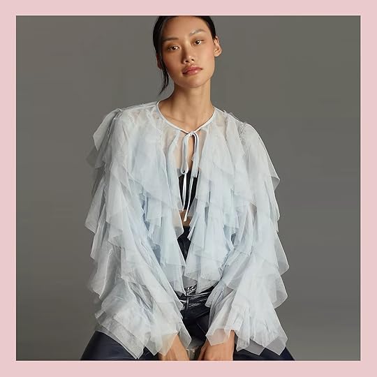
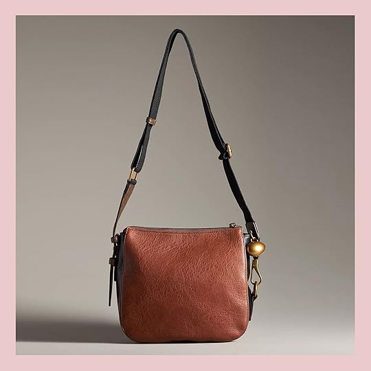
Not on Emily: Brown Leather Crossbody Purse | Green Clutch | Boots
I did recently get a few things that I threw on for you – that puffy coat that I get compliments on every single time I wear it (which is most days). It’s hard to see the collar, but it’s an electric blue stripe – stylish, comfortable, and yes, you can wear it over pajamas for drop-off and look effortlessly cool (LOL). The clog boots in the background are excellent (very, very comfortable considering the height), and the jeans have cargo pockets that I feel are really flattering.

On Emily: Beanie | Parka Jacket | Jeans | Sneakers
Not on Emily: Brown Leather Crossbody Purse | Green Clutch
I feel like outerwear and accessories are something you can buy others and/or not need to try on in a store (i.e. a safer gift bet), so there are a lot of coats, bags, and shoes on this list.
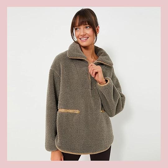

Olive Rhodes Shearling Quarter Zip | Utility Capelet
I like a longer fleece that drapes well (versus one that makes my upper half more voluminous) – the contrasting trim on the zipper pockets are top notch and that capelet on the right is ridiculously cute (I find these are especially good for tall people).
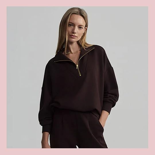

Hawley Half-Zip Sweat | Gear Check Vest
You won’t believe how soft this Varley double soft fabric is on that brown quarter zip – it falls and drapes so perfectly – I reach for it daily, and I’ve washed it like 15 times, and it’s still in perfect shape (comes in a lot of colors, too). The vest on the right would fit over my weighted vest while I walk the dogs (y’all, I’m up to a 25 lbs vest now – a real psychopath over here).
Shearling Barritt Quarter Zip | Khaki Drew Short Trench Coat
That shearling quarter zip (I guess I love quarter zips?) is so cute, giving Aspen The short trench on the right is awesome – so good for spring and fall.

Suzy Denim Jacket | Margarita Jumpsuit
If you are in need of a new oversized denim jacket, this chore coat looks really great to layer over (I love the huge pockets, double buttons, and sleeves), I put this jumpsuit in my cart immediately – I love the ones that aren’t trying to show off curves and instead look utilitarian (Buttercup ate the crotch out of my favorite ones from The Great that I’ve worn for 8 years).


Black Waxed Large Canvas Tote | Wellington Cabana Tote
Two really great looking utilitarian bags – weekend, trunk bags, groceries, etc.

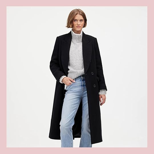
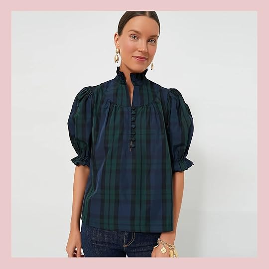
On Emily: Plaid Coat | Blouse | Jeans | Boots
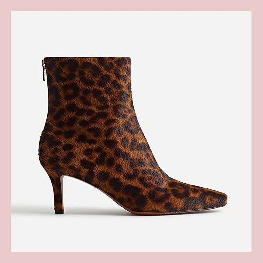
Not on Emily: Brown Leather Crossbody Purse | Green Clutch | Boots | Socks | Sneakers
By far my favorite purchase of late is this plaid coat – it fits like an oversized coat but the cut is really flattering and I have found that I can mix that pattern with so many different blouses (like my favorite new blouse above). The boots I’m wearing there are also EXTREMELY comfortable and I think the pointy toe is really elongating (I love the clogs, but they are higher and therefore less “running around town” shoes, so I wear these boots almost everywhere right now).
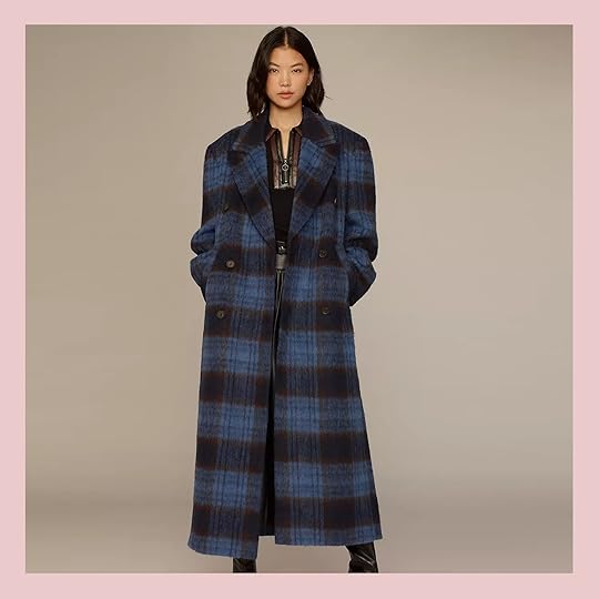

Checked Long Coat | Bouclé Long Coat
I should do a full plaid coat roundup – there are so many great ones on the market right now. The scale and color of the blue plaid are so awesome – oversized and cool.


Oversized Double-Breasted Topcoat | Puff-Sleeve Double-Breasted Wool-Blend Long Coat | Wool Blend Oversized Coat
For those wanting more versatility, the black and gray overcoats are cool and might be easier to dress up if you work in an office.


Gun Club Check Atelier Blazer | Double-Breasted Elbow-Patch Plaid Jacket
I have to stop myself from buying everything from Emerson Fry (it’s been 15 years now of loving them). Their cuts and fabrics are supreme (and a small American-made business). The blazer on the left looks like something I would wear all the time. The “elbow patch” feature on the right one is where it’s at for me.

Sequin Longline Jacket | Natalia Velvet Jacket
Now for some fun. The sequin jacket is so fun – I love that you could dress up jeans and a T-shirt for a night out and look instantly like you care. The velvet blue color of that little jacket is perfect.
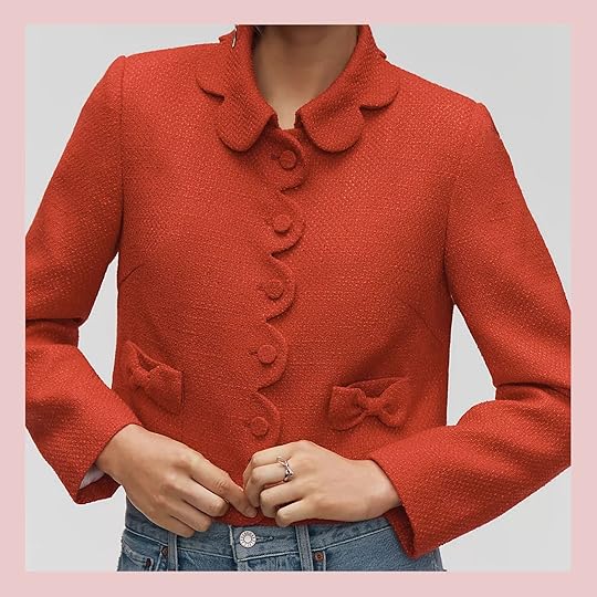
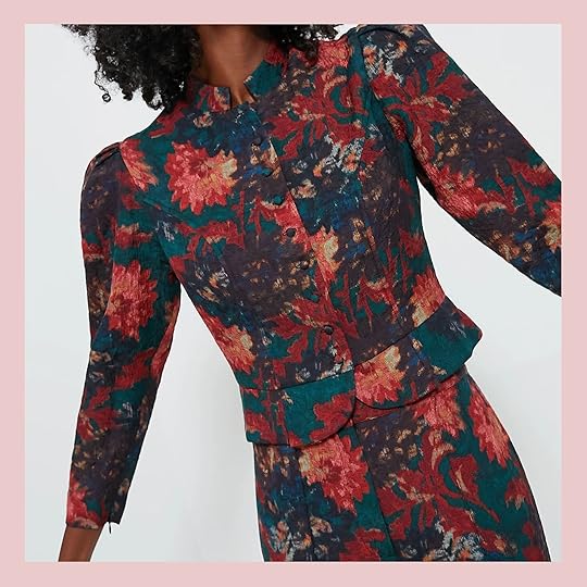
Scallop Tweed Lady Jacket | Persimmon Floral Jacquard Mirabelle Jacket
I am not as into the lady jacket trend as most people (I think my boobs are just too big) but these two felt wayyy cooler and more special than others. I ordered the set on the right and I’ll shoot it when I get it. How fun for holiday parties??

Faux-Fur Coat | Tulle Bomber Jacket
I bought that faux fur coat, rationalizing to myself that it’s a staple that I’ll love forever (it’s crazy soft and while it is bulky by nature, it’s somehow flattering. Leave it to Anthro to make a tulle bomber jacket – over a graphic T and with some drop crotch jeans and you have a festive night out that is comfortable and carefree.


Sezane is another brand where I want EVERYTHING. That lacy white collar would pop out so nicely under a sweatshirt or even layered under a denim shirt or dress (true story).


Lace-Inset Top | Scarlet and Hot Pink Grove Blouse
I’m not done with Victorian tops (never will be) and that lace detail keeps it interesting. The colorblocking on that red blouse is powerful – makes me want to give a TED talk about something!

Blackwatch Selena Blouse | Ivory Plaid Nicole Shirt
Holiday, but make it casual and cool (and I’d wear both of these year-round). I ordered these already, fearing they’ll sell out. The dark plaid one on the left also comes in black velvet (which I’m also very tempted by).

Taylor Crossbody Bag | Petit Moyen Bag
For a more utilitarian vibe (with a zipper) I love that simple leather boxy bag (with the charm). If you really want to ask for a splurge or surprise someone who has good taste, just go to Clare V – that navy blue purse is versatile and is totally timeless.


The Essential Curve Shoulder Bag | The Brigitte Satchel
The red curve bag is really big (and such a pretty accent color to all my blues). The checked satchel will make any basic outfit look way more fashion-forward.

Margot Ankle Boots | The Dimes Stiletto-Heel Ankle Boot
Ugh, I don’t need those patent leather boots but they are SO GOOD – the patent color is excellent, the buckle would look so cute with tights – the French really know how to dress. I can also convince myself that I’d wear these leopard stiletto boots – under jeans they look fierce, with barrel pants they’ll look cool proportionally, and of course dressing them up will elongate your leg.

Birkenstock Boston Big Buckle Shearling Clogs | Yellowstone Allistar Pointed Boots
Blue, fur, gold – check check check. Then if you have been looking for the right boots to invest in, goodness I love these cowboy boots (in collaboration with the show Yellowstone). They are the least cheesy ones I’ve seen, honestly – they look real and less try-hard than any others (IMHO).
This might seem like a boring gift to ask for or give, but I LOVE this bucket bag so much – it’s perfect for throwing anything in. I use it for design materials for work, park picnics, groceries, farmers market, laundry, and last-minute weekend packing. Strangely versatile and expensive ($90) so not something you want to buy yourself.
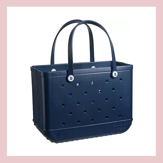

Bogg Bag | Waxed Canvas Gathering Bag
I love the idea of the waxed canvas bag for site visits (where I get dust on everything). Such cute pockets and straps.
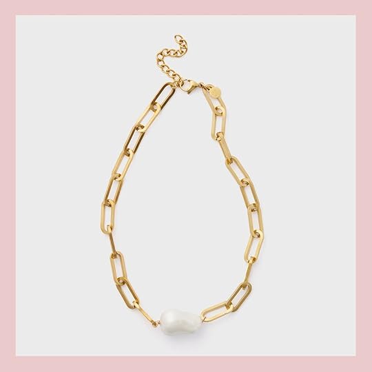
Chunky Chain Necklace (similar) | Gold Hoops | Oval Medallion Necklace | Gold and Black Heart Necklace | Interlocked Necklace | Simple Heart Necklace
I’m not crazy into jewelry so this is going to be mostly what I have that I love to layer together. I’ve been wearing the medallion and the heart necklace nonstop (not together, with simpler chains – in fact, these from Target are so awesome and I forgot to put them on the list). I like how most of these have a detail – they feel special but pretty easy to throw on and dress up an outfit.

Gold Elizabeth Necklace | Gold Calder Heart Necklace
I sent both these links to Brian (and the two below). Statement necklaces are back and I tend to lean away from big jewels, but I sure can do pearls and medallions.


That silk scarf is so easy for me to justify – you can wear it like nine different ways and the colors are so pretty.

Hair: Dry Bar The Double Shot Blow-Dryer Brush | Ouai Anti-Frizz Creme | Dry Bar Liquid Glass Miracle Smoothing Sealant
Skin: Vial Capsules | Eye Pads | ExfoliKate Cleanser | Shani Darden Intensive Eye Renewal Cream with Firming Peptides | ExfoliKate Mask | Reusable Cleaning Pads
Makeup: Ole Henriksen Pout Preserve Hydrating Peptide Lip Treatment | Saie Glowy Super Gel Lightweight Dewy Multipurpose Illuminator | Tower 28 LipSoftie Hydrating Tinted Lip Treatment Balms | Merit Bronze Balm Sheer Sculpting Bronzer | Merit The Minimalist Perfecting Complexion Foundation and Concealer Stick | Charlotte Tilbury
Hollywood Flawless Filter | Laura Mercier Tinted Moisturizer Natural Skin Perfector Broad Spectrum SPF 30
Well, that’s quite the list. Yes, this is all stuff I own and love (including the new blow-dryer oval curling brush that is excellent. The Merit concealer is the best (I wear Dune), the Kate Somerville mask is immediately effective, the Charlotte Tilbury highlighter is game-changing, and the ISDIN vials really do seem to add a lot of moisture.

Hair: Dry Bar The Double Shot Blow-Dryer Brush | Ouai Anti-Frizz Creme | Dry Bar Liquid Glass Miracle Smoothing Sealant
Skin: Capsules | Eye Pads | ExfoliKate Cleanser | Shani Darden Intensive Eye Renewal Cream with Firming Peptides | ExfoliKate Mask | Reusable Cleaning Pads
Makeup: Ole Henriksen Pout Preserve Hydrating Peptide Lip Treatment | Saie Glowy Super Gel Lightweight Dewy Multipurpose Illuminator | Tower 28 LipSoftie Hydrating Tinted Lip Treatment Balms | Merit Bronze Balm Sheer Sculpting Bronzer | Merit The Minimalist Perfecting Complexion Foundation and Concealer Stick | Charlotte Tilbury
Hollywood Flawless Filter | Laura Mercier Tinted Moisturizer Natural Skin Perfector Broad Spectrum SPF 30

Hair: Ouai Anti-Frizz Creme | Dry Bar Liquid Glass Miracle Smoothing Sealant
Skin: Vial Capsules | ExfoliKate Cleanser | Shani Darden Intensive Eye Renewal Cream with Firming Peptides | ExfoliKate Mask | Reusable Cleaning Pads
Makeup: Ole Henriksen Pout Preserve Hydrating Peptide Lip Treatment | Saie Glowy Super Gel Lightweight Dewy Multipurpose Illuminator | Tower 28 LipSoftie Hydrating Tinted Lip Treatment Balms | Merit Bronze Balm Sheer Sculpting Bronzer | Merit The Minimalist Perfecting Complexion Foundation and Concealer Stick | Charlotte Tilbury
Hollywood Flawless Filter | Laura Mercier Tinted Moisturizer Natural Skin Perfector Broad Spectrum SPF 30
I don’t feel highly qualified to talk about beauty stuff, but when I went to Sephora to shop I asked the salesperson what people are freaking out about and they guided me to Tower 28 lip gloss (LOVE – so soft and plumping without stinging), and anything Saie.


NuFACE Mini+ Toning Set | Sunday Riley Go To Bed With Me Gift Set
As far as what I personally want – yes I’d like the mini Nuface – I usually spend January – March resetting myself so my nightly routine gets super dialed in, I’d love to try this. This “go to bed with me” kit sure is good marketing – I need a system otherwise I go rogue and just use so many random products that might not work well together.
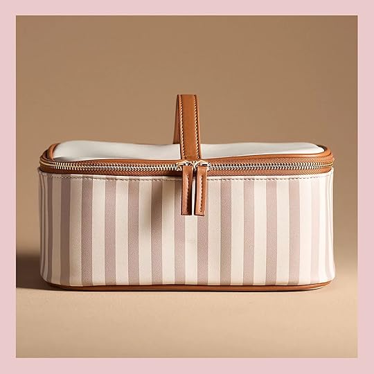
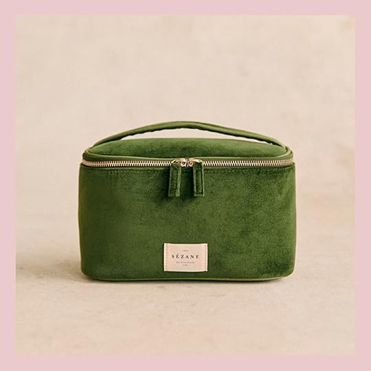
Striped Cosmetic Case | Grand Vanity Case
I’m in the market for a new cosmetic case – both are so pretty.

Lastly, the robe that I bought for myself (and give as a gift). It’s not that it’s the softest or somehow dries you more magically, but I typically feel so frumpy in big terrycloth robes (not like in the movies). All I can say is that I feel good in this one – I think simply having a busy fun pattern and having it be a bit oversized looks better. Not sexy…just better.
I’m sure I forgot like a million things (like this red light face mask that I love), so perhaps more to come I hope if nothing else it gives you some ideas of what to ask for or where to shop for others. xx
*Photos by Kaitlin Green
The post Gift Guide – *Some* of My Favorite Things Right Now- Fashion, Jewelry, And Beauty (Including What I’m Asking For) appeared first on Emily Henderson.
November 15, 2024
Kaitlin’s Living Room Intro – How We Broke Some Design “Rules” So They Could Actually Use The Room

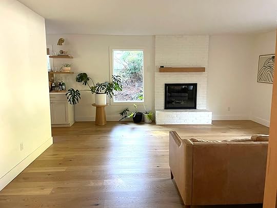
Kaitlin Green, our wonderful photographer and good friend, had a real problem, a tragedy even – no one sat in their living room. Like ever. And it’s so cute! Nothing was “wrong” with this room, and yet no one ever used it. This is my favorite problem to solve because the reason is always simple: the room lacked a purpose, no draw, no reason to be in there. They bought this house as a fixer a few years ago, renovated it, and put their old furniture in here – the box was checked. And the living room, in particular, has sat empty of people since then. You see the family of four watched a small TV in the family room shared with the kitchen, and then they had their basement which was a bigger den/playroom for their girls. With two small kids, and two busy working parents, this room just never got the attention it needed to become the room we all knew it could be. We needed to break some rules in order to USE this room – which in my opinion is the #1 goal of any home – to create rooms that people want to and do spend time in.
Wait, What is Wrong With This Room?

As you can see it had so much potential – a beautiful floor, a huge window, and a pretty mid-century-style slatted separation wall that gave it some architectural interest. They suffered from what a lot of people do:
Dueling focal points – A fireplace and a huge window, but no obvious “TV” wall. And the fireplace just wasn’t grounding the room enough, it didn’t command the presence it needed to (same with mine, this makeover totally inspired me, TBH). It’s also a pass-through room, but at least the conversation area is off to the side creating a natural walkway.The fear of putting a TV in their living room – I get that, but I just KNEW that they’d use the room if they had a big TV near the kitchen.Not a lot of natural light – It doesn’t look like it the photos, but the window is facing north and has an overhang – the light was just flat and dead – the room either needed to be painted a color to give it some movement or they needed to add a window for natural light to bounce around.An Empty Floating Wall (That Is The First Thing You See)


But when you walk into the house you see this wall first – BAM. Like immediately. It’s a floating wall that separates the living room from the kitchen/dining/family room. This wall needed something. It’s actually a great layout, just needed to be better utilized. They had their old sofa facing two chairs, with the fireplace behind it and a small credenza on the floating accent wall. It was fine. Nothing was offensive or “wrong,” just no one wanted to be in there.
What The Heck Do You Do To This Wall?
Here you can see the layout better – the entry is behind the slatted wall. Of course, we talked about this wall being treated differently – Accent color? Wallpaper? Mural? Built-ins? Tile? Paneling? We went through ALL of the options. But we needed to figure out the TV situation while also addressing this wall. Perhaps the answer was connected? Here were the challenges:
We all agreed that the fireplace was kinda boring. They wanted to tile over the brick and if so then we can’t have THREE different types of walls in here (the slatted, the accent wall, and the fireplace). I’m sure someone could make it work but it felt like a lot to me.If we were to add a TV in this room then where could it go? Which rule do we break? The high and small TV over fireplace faux pas? The TV facing a huge street-facing window faux pas? The small TV next to the fireplace in a corner faux pas? The TV in front of the window faux pas? All of these are “wrong” and yet one of them is what we did.We can’t really paint the white walls because there is no stopping point going into the dining room and kitchen. And honestly, they didn’t want to paint the walls – they like color, but they liked that the whole main floor flowed so well and felt so open. I agreed. Painting would break it up a lot without a natural border to do so.

So Kaitlin solved the first problem by adding a window – something that they had wanted to do for a while and once I got involved I inspired them with my manipulation skills (“we either paint the walls or we need a window”). And you know what? The window cost $1200 (including the window) and took two days, which isn’t nothing, but worth every penny (I think that’s a very good deal if you ask me).

Here you can see how much more light it brought in, moving the light around the room and therefore making it feel bigger, brighter and so much happier. (These photos were taken the day that our partner (Article) came to deliver the furniture – Kaitlin gave her furniture away to a friend). Now the culprit was the fireplace. Sure we could paint the brick, but they were up for tiling over it, which excited all of us.
The mantel could easily be removed (was installed with a cleat) and the simplicity of the floor-to-ceiling on one plane (besides the bench) made it really easy to envision. We went through all the options – Zellige? A pattern? Stack? Stagger? Mosaic? Two different colors?


In my mind, we needed to layout the living room so that the fireplace was more of a focal point (especially if they were going to invest in tiling it). You can’t put two chairs in front of it, blocking the view and basically saying “Nothing to see here, move along” which is what people did in this room. We wanted them to walk in, see this fireplace, and feel invited to sit and stay a while. Here’s a little sneak peek of the tiled fireplace:) Clé Tile gifted the most beautiful tiles and it turned out perfect.
Now that it’s all done (YAY), all I can say is that we broke a few rules, added a bunch of warmth and color, and I’m extremely pleased to say that their family has used it almost every night since – friends, kids, entertaining guys for Duck games. I’m so excited to show you how it turned out on Monday.
The post Kaitlin’s Living Room Intro – How We Broke Some Design “Rules” So They Could Actually Use The Room appeared first on Emily Henderson.
November 14, 2024
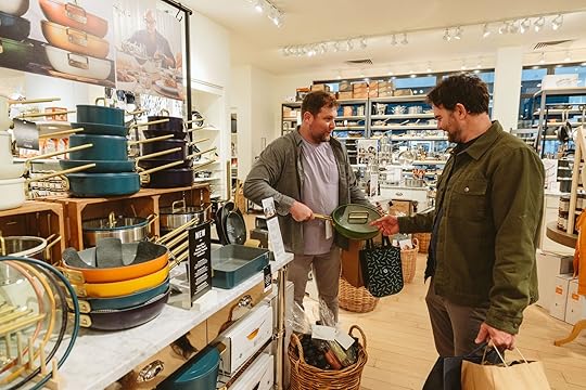
What The Heck Do Men Want For Christmas?? I Took My Brother And Husband Shopping To Find Out – Their “Dude-Bro” Gift Guide Is Here :)

(This post is written by Brian Henderson, FYI, anything in italics is by me (Emilly), and boy was it hard to not interject myself more, LOL. It’s that time of year again! Grab a candy cane latte, curl up in a reindeer-skin blanket, and get ready for some dude-bro holiday gift guiding.)
We’re doing things a little differently this year, not just because I haven’t changed my style in a decade and tend to link up the same boring pair of pants every year, but because we wanted to bring in a second opinion on what to buy a guy for the holidays. So, we called on Emily’s brother and my favorite ray of sunshine, Ken.
A little backstory about us bothers-in-laws: Ken and I have hit it off the first time we met and have been tight ever since. We have a lot in common; we both grew up playing sports, we both love stupid comedies and the Oregon Ducks, and we both would do anything for one Miss Emily Henderson. But there was a fateful night that almost tore us asunder. The year was 2017, when the subject of high school football came up. He had played outsider linebacker in school, I played quarterback, and we both fancied ourselves as pretty damn good. So when the question arose of who would have gotten the better of whom back in our heydays, things got a little heated. Too heated. He insisted he would crush me like a Diet Coke can, while I reminded him that I was hella fast with a wicked stiff-arm and there was no way he could touch me. Things escalated. People got nervous. It was all in good fun. In the end, Ken did the right thing: he relented. He finally admitted that I was way too fast and my stiff-arm was way too strong, and there was no way, like, not a chance in the world, he could ever have taken me down. Seriously, like, zero-percent chance. And everyone knows it. And I’m glad that we can finally move on.
Anyway.
This past week, Ken and I took a little trip to the mall together to shop with Emily for our “Dude-Bro Gift Guide”, and we had a blast. I don’t know why men don’t go shopping with each other more often, it makes the whole thing much more enjoyable. By the end of the day, I was bursting out of dressing rooms, doing Julia Roberts twirls to his sultry Richard Gere nods. The result is this 2024 Dude-Bro gift guide (because I figured a lot of our readers struggle with what to get the men in their lives – it’s so good!!). We hope you like it. And if you don’t, Ken will come to your house and try to tackle you (but don’t worry, he’ll be easy to stiff-arm).
A Bit About These GuysNow I (Emily) get to brag a bit – these guys are “typical” cis-male, sure, in the sense that they like to play sports, grill, and want women to admire their bicep bulge, but they are also thoughtful, exceptionally involved dads, and like cool stuff that they’ll use consistently and doesn’t break. Their styles are actually pretty different so the fact that they agree so much on the below proves that these things are perhaps universally loved (I got a real thrill at them both geeking out about the newest XL air fryer). Back to Brian:

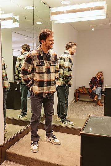
Everyday Flannel Plaid Button-Up Shirt
First up, we went to American Eagle, which surprised me last year with some really good flannel shirts and didn’t disappoint this year either. Here we are, twinning in a nicely cut button-up that can go both “Date-night” and “Dude-hang”.


Then Ken got into the Footloose spirit with this Sherpa-lined denim jacket. I also own one and get compliments on it all the time. I think there’s something about a Sherpa denim jacket that makes us feel like high school rebels again.

I’m a sucker for jackets and coats, and both of these would get a lot of use. The tweed overcoat is what I would wear to anything in the city (it layers well over sweatshirts).
American Eagle for the flannel win, again!
This is me awkwardly describing the ways in which these jogger sweats are comfy.

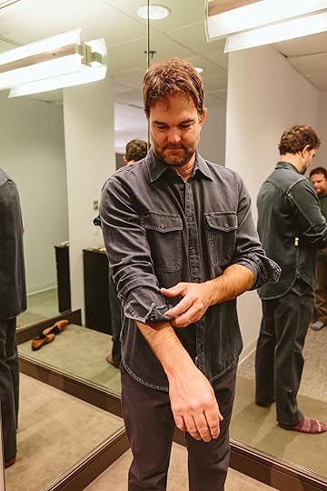
Sherpa-Lined Corduroy Shirt-Jacket
Next, it was off to J. Crew for some timeless looks. We both admired how good the green sherpa-lined shacket looked on each other.
Twinning! (Note from Emily – these men have different builds (but VERY buff, of course) so when they both looked and felt really good in something it indicates to me that it was a universally flattering cut – i.e. strong wide shoulders and a good drape that men with a super slight, ahem, *beer* belly might like).

Sherpa-Lined Corduroy Shirt-Jacket
Note from Emily – while both these guys have a more utilitarian vibe (i.e. not for office jobs) I think that many guys like this look for weekends. They aren’t models but they both looked so good in this cord/sherpa jacket.


Back to Brian: And the long-sleeved henley made us both look fit! Highly recommend. Emily always says I look “hot in a henley”. (He does look hot – y’all a henley is a T-shirt that looks like they might be a logger, in such a good way, but not all are cut this good)

We love smiling and we love stores! But seriously, this chambray button-up is now in my date night rotation. (I love it, too. We also love chambray…all day…ugh, sorry)

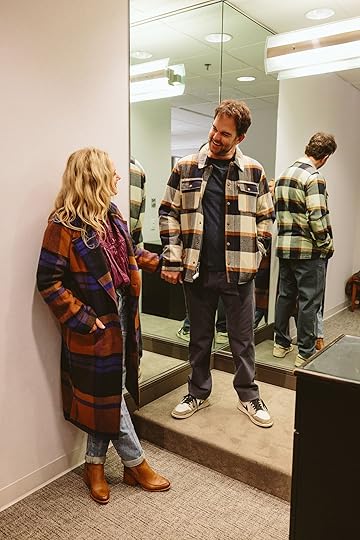
Emily’s Outfit: Coat | Blouse (similar) | Jeans | Booties | Ken’s Sweater – Ribbed Merino Wool Baseball Cardigan Sweater
And Ken is putting this cardigan in his date night rotation. With his wife. Not with Emily.
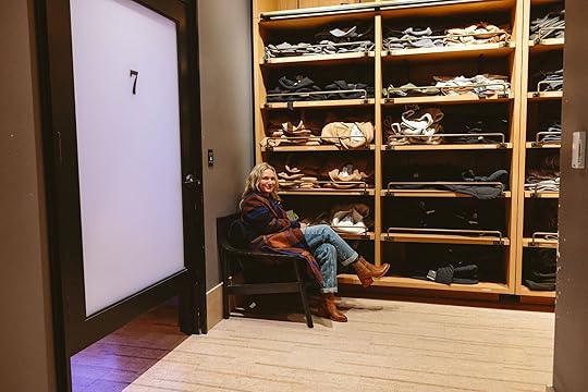
Then we hit Nordstrom for some fancy gear.

Doug Good Feather Bondi Reversible Quilted Jacket
You ever hear of a Reverse Cowboy? This reversible jacket from Faherty is legit. I love almost everything they make. Ken and I both bought this jacket (he’s in an XL, I’m in an L). It’s solid.
Check this out.

Doug Good Feather Bondi Reversible Quilted Jacket

Brian: Plaid Fleece Lined Shirt Jacket | Ken: Plaid Fleece Lined Shirt Jacket
Green plaid twins. Yah, we like green plaid. Both of these fit really well. GO DUCKS (but also if you don’t like the Ducks these are just great plaid shirts).

Epic Cotton Blend Quilted Shirt Jacket
This is the look I give when I have to get something, especially when it’s a little pricey. This cozy puffed shirt is the perfect everyday addition to my wardrobe. I can picture myself cozying up at my writing desk with this thing. (This shacket makes him feel handsome, strong, and put together – he’s worn it daily since we bought it).


Ken: Tellis Slim Fit Jeans | Brian: Straight Fit Flat Front Stretch Twill Chinos
We tried on pants and both really like their hipster in-house brand. Very flattering. Plus the in-house tailor made things fit perfectly (they needed to be shortened an inch or so – look at these handsome men!).
Quilt Lined Cotton Shacket | Straight Fit Flat Front Stretch Twill Chinos
I love this classic plaid from Levis. It’s insulated and warm, and the perfect fall or winter jacket for Portland. This one’s a keeper. I think most guys would agree.
Jack Engineered Denim Button-Up Shirt | Straight Fit Flat Front Stretch Twill Chinos
Emily was pushing pretty hard for more date night shirts, could that have a deeper meaning? I dunno. All I know is, I love this button-up. (This shirt is spendy, Brian was horrified that I made him try it on, but indeed it’s sewn and cut in a way that makes every man look hot, IMHO).

Hyperloop Hoodie | Tellis Slim Fit Jeans
Ken seems very happy in this soft hoodie, either because of the cozy fabric and flattering fit, or because it’s Oregon Duck colors.
Abercrombie??
Cropped Zip Workwear Jacket | Cropped Vegan Leather Zip Trucker Jacket | Hooded Workwear Bomber Jacket
I grew up in a time when Abercrombie & Fitch was where you went if you wanted to smell like a car freshener and get body-shamed by shirtless male models posing as salesmen. But now, it’s pretty damn cool! I really liked this hooded jacket.


And have been wearing this hoodie non-stop since giving it to myself as an early Xmas present. (It looks so good on him).
Here’s Em waiting for me as I played with all the lighting options in the dressing room. It’s like a discotheque in there.

I stopped wearing jeans like six years ago, but thought I’d give them a chance again. I like these ones a lot. (We all agreed that these were neither dad jeans nor too baggy-jean-try-hard).

GCI Outdoor RoadTrip Rocker Chair
Our next stop was Dick’s Sporting Goods (of course) where Ken sprinted around like a kid in a candy shop. He took a rest on a foldable rocker, which he insists is a MUST for any kids’ sporting event or family camping trip. We have a couple, and I have to agree with him, they’re a game changer in the “lounging dad recliner” arena.


Solo Stove Mesa XL Fire Pit | YETI Hopper M20 Soft Backpack Cooler
Camping is huge up here in the PNW, so naturally we’ll have some outdoor gear on our list.

Stanley 8 oz. Classic Wide Mouth Flask
And this flask is strictly for cold water.

Em and I have been looking for a good water jug option for parties. I rented a couple of Gatorade barrels last time and she was NOT impressed with the aesthetics.


YETI 12 oz. Rambler Colster Slim Can Insulator
Can’t go wrong with a YETI. I requested (and better get) these YETI beer koozies. (I bought two).

Here’s Emily teaching us how an escalator works – we were both too scared to ride it when we first saw it, but…


Look at these big boys! We did it!

Ken is a self-proclaimed “Lulu-head”, so we popped in to check it out.

New Venture Classic-Fit Long-Sleeve Shirt
He swears this is the best dress shirt he’s ever owned and he owns a bunch of them. Seriously, he could not stress how good this shirt is. He says it’s comfortable and wicks away sweat and keeps its shape. I’ll have to try one myself.

He also loves the stretch and comfort of their men’s pants. It was a thing.

And our last stop was Williams-Sonoma so we could shop like newlyweds. But for real, we were both very into their stuff.
GreenPan Stanley Tucci Ceramic Nonstick Junior Essential Stanley Pan, 4 1/2-Qt.
For instance, did you know Stanley Tucci has his own cookware collab?? It’s awesome. And check out the gold accents. Chef’s kiss. We are both the main family cooks so we let our enthusiasm loose since we were together in here.

Philips Premium Digital Smart Sensing Airfryer XXL with Fat Removal Technology
We both use our air fryers frequently but lament the trays are too small. So we checked out these XXL fryers and compared trays. It was a real tray-measuring contest.

And that’s it! We made it out of the mall with full hands and full hearts (can’t lose).
If you’re looking for more than just clothes, here’s a hand-picked list of more gift ideas for the dude-bros in your life. They are items that one of us either owns and swears by or really wants for Xmas this year.

Steakhouse Steak Knives (Set of 8)
Yes, I want these steak knives. Sturdy and stylish.

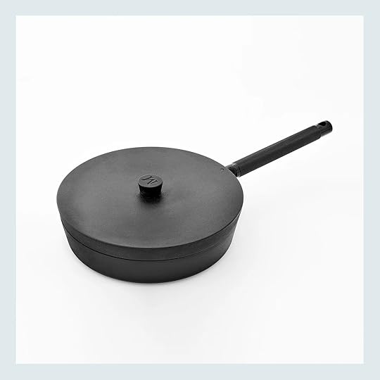
Matty Matheson: Soups, Salads, Sandwiches Cookbook | 10″ Cast Iron Pan
Matty (Matheson) is my favorite chef and soups, salads, and sandwiches are my favorite things to eat. I love this cast iron pan to cook burgers and steaks on – the temperature stays evenly hot and I only have to wipe it out with a paper towel in order to call it “clean” (right?)

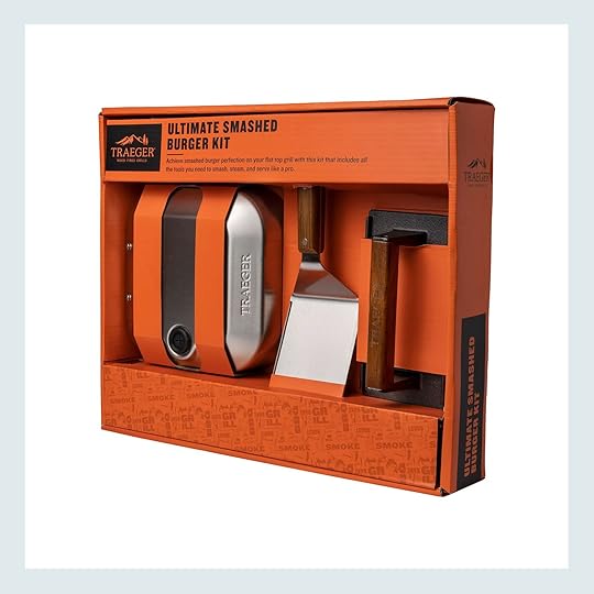
Grill Press | Smash Burger Kit
Smash that burger – but you need a tool. I’ve been using a small heavy pan on top of my other heavy pan. I need one of these (and most non-pro grillers do, too).
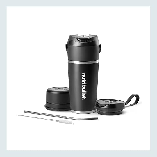
Ken loves this to-go blender. You prep it all in the one cup, throw in your protein powder/bananas/yogurt/creatine, blend, and leave the house. Nothing to clean up. Win/Win.


6″ Woven Flow Shorts | Dri-FIT Flex Stride 7” Shorts
I wear these Nike shorts for every workout. I prefer the lined version so I don’t go through thousands of pairs of undies. These shorts don’t chafe, dry quickly, and are so comfortable. I even wear them to swim in rivers should I want to do an unpredicted cold plunge.


Comfort Blend Boxer Brief 5″ | Comfort Performance No Show Athletic Running Socks
And speaking of undies, Ken swears these are the best ever made. They apparently have a lot of room for the balls and are so soft and feel like you are nude otherwise (and don’t cut in, because even men don’t like that either). Brian wears a medium and Ken a large, FYI. He claims that these socks don’t make his feet sweat and they are neither ever too hot nor cold. Like he’s really passionate about these socks and undies.


Portable Bluetooth Waterproof Speaker | Wireless Noise Cancelling Over-the-Ear Headphones
I’ve used this JBL clip for years – I put it on my backpack, use it in our gym, hang it on a tree when we have outdoor parties. It’s lasted forever. Listen, there are a few noise-canceling headphones out there, I strap on these when I go shovel pig shit for 2 hours every Sunday and listen to my podcasts (but buy them on sale, they are expensive).


My other brother-in-law, shout out to John, has this drone, and it’s his favorite (and he’s a drone dude). Emily has the Meta glasses, I’m not a huge gadget dude so I don’t need them. Basically, you can record everything you see, save it, upload it, post it, etc – all from these glasses. It’s creepy spy shit and it’s such a fun gift (Emily has the Rayban versions).


Handheld Percussion Massage Gun | Headlight
Ken says this is the better, cheaper Theragun. If you or yours has the Theragun you probably don’t need both, but if you never bought one in the first place he has read all the reviews, has it, and loves it. He also thinks that more people need headlights. We need headlights to feed the animals after 4 pm or before 7 am so I’m getting this for us, but he claims it provides the best light and lasts the longest.
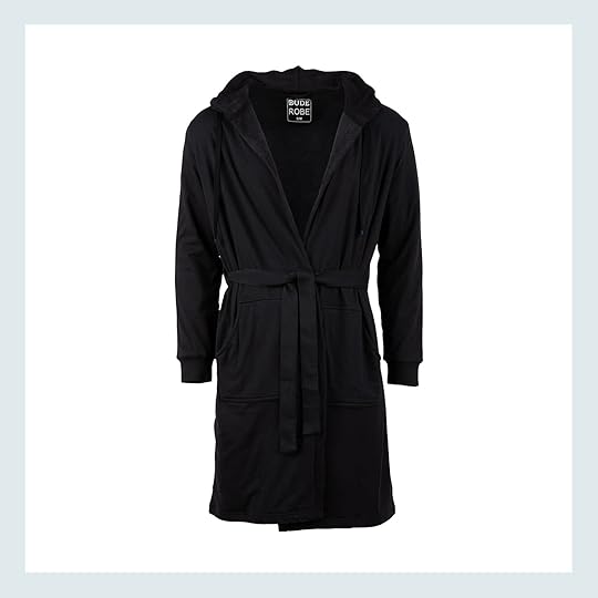

Hooded Bathrobe with Pockets | Slippers
DO NOT GET KEN STARTED. This robe, omg, this robe – he loves it more than his comfy ball underwear. It’s nicely oversized, has terry cloth on the inside, has an attached belt (not to be lost in the laundry), and has hidden pockets on the inside (?? LOL). He’s a big guy and he feels pretty good in this robe so… Meanwhile, I love these slippers and am excited to wear them every morning (and have since last Christmas).


Large Zipper Dopp Kit | Tin Cloth Travel Kit
We like dopp kits, we have face and hair stuff, too!!! But we never buy them. Both of these are great, solid gifts. Please.


Old Salt Shawl Sweater | The Cascade Shawl Cardigan
A few clothing items that weren’t at the mall, but are definitely on my list this year. Most dudes I know love a sweater that makes them feel both cozy and smart at the same time. Both of these will do nicely.

I know the basics about what is flattering (vertical stripes?) so something warm that does that thing is a big value-add to my closet.
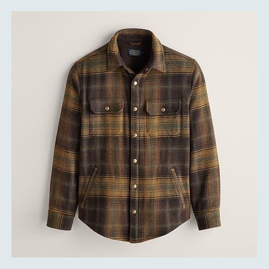

Plaid Forest Shirt | Stockman Stretch Snapshirt
Dear, Santa. Both of these shirts are dope.


All the reviews of these jackets are good, which matches how good they look. I’m in.
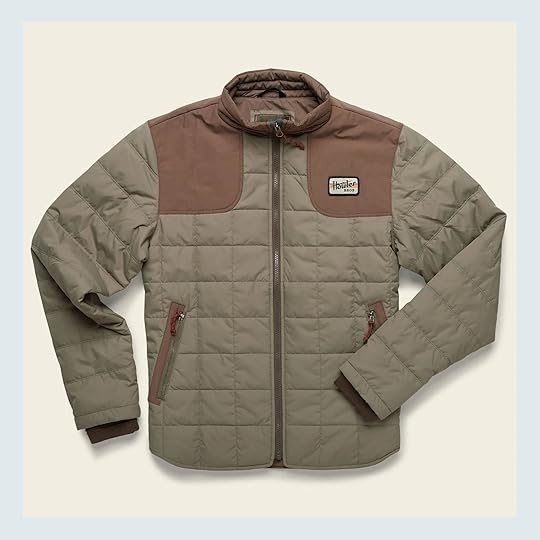
I’ve had this jacket for two years. Why do I love it? t looks masculine, the shoulder detail makes you look strong in the ways you want to. It’s super versatile (I can wear it on a date or out with the boys). It’s got pockets with zippers and is super comfortable. 10/10.
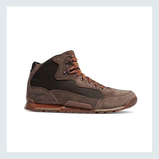

Skyridge Boot | Air Jordan 1 Low OG “Wolf Grey”
I get compliments on both of these Danner hiking boots whenever I wear them. And the Air Jordan 1 is my everyday, goes with everything shoe. Every guy needs a Jordan 1, IMHO.

Heritage Kit Bag 32L | Bi-Fold Wallet
We like to look casual when we go away with our boys for the weekend – get us this duffle (no wheels necessary). And some of us like classic wallets (me).
How about something dangerous?

From Ken: “Best knife ever“. That guy knows knives, collects knives, and for whatever reason says this one is the best.

Ken says this is what everyone needs to have in their car – it’s the best multi-tool on the market. Can get you out of all the emergencies with just one gadget (Brian doesn’t have this so I’ll be buying this for him but also I want this).

Random, I know, but I got this EGO electric blower this fall, and MAN OH MAN is it awesome. Super powerful, not very loud, and electric! Does the job extremely well. See?

Even the alpacas love it!
That’s it. Thanks for reading, we hope you have a wonderful holiday season.

Oh, and just so you know, Ken can lift 500 lbs three times in a row and is incredibly strong.
But it still doesn’t mean he would have tackled me back in high school.

*Photos by Kaitlin Green
The post What The Heck Do Men Want For Christmas?? I Took My Brother And Husband Shopping To Find Out – Their “Dude-Bro” Gift Guide Is Here :) appeared first on Emily Henderson.
What The Heck Do You Buy Men?? I Took My Brother And Husband Shopping – Introducing The Official: Dude-Bro Gift Guide!
(This post is written by Brian Henderson, FYI, anything in italics is by me (Emilly), and boy was it hard to not interject myself more, LOL. It’s that time of year again! Grab a candy cane latte, curl up in a reindeer-skin blanket, and get ready for some dude-bro holiday gift guiding.)
We’re doing things a little differently this year, not just because I haven’t changed my style in a decade and tend to link up the same boring pair of pants every year, but because we wanted to bring in a second opinion on what to buy a guy for the holidays. So, we called on Emily’s brother and my favorite ray of sunshine, Ken.
A little backstory about us bothers-in-laws: Ken and I have hit it off the first time we met and have been tight ever since. We have a lot in common; we both grew up playing sports, we both love stupid comedies and the Oregon Ducks, and we both would do anything for one Miss Emily Henderson. But there was a fateful night that almost tore us asunder. The year was 2017, when the subject of high school football came up. He had played outsider linebacker in school, I played quarterback, and we both fancied ourselves as pretty damn good. So when the question arose of who would have gotten the better of whom back in our heydays, things got a little heated. Too heated. He insisted he would crush me like a Diet Coke can, while I reminded him that I was hella fast with a wicked stiff-arm and there was no way he could touch me. Things escalated. People got nervous. It was all in good fun. In the end, Ken did the right thing: he relented. He finally admitted that I was way too fast and my stiff-arm was way too strong, and there was no way, like, not a chance in the world, he could ever have taken me down. Seriously, like, zero-percent chance. And everyone knows it. And I’m glad that we can finally move on.
Anyway.
This past week, Ken and I took a little trip to the mall together to shop with Emily for our “Dude-Bro Gift Guide”, and we had a blast. I don’t know why men don’t go shopping with each other more often, it makes the whole thing much more enjoyable. By the end of the day, I was bursting out of dressing rooms, doing Julia Roberts twirls to his sultry Richard Gere nods. The result is this 2024 Dude-Bro gift guide (because I figured a lot of our readers struggle with what to get the men in their lives – it’s so good!!). We hope you like it. And if you don’t, Ken will come to your house and try to tackle you (but don’t worry, he’ll be easy to stiff-arm).
A Bit About These GuysNow I (Emily) get to brag a bit – these guys are “typical” cis-male, sure in the sense that they like to play sports, grill, and want women to admire their bicep bulge, but if I could stereotype them a bit more (which they gave me their permission to), Ken is more “frat boy” and Brian is more “hipster” and they are both forward-thinking, smart dads. So the fact that they agree so much on the below proves that these things are perhaps universally loved (they are both heavily involved parents, as you’ll see by their geeking out about the newest XL air fryer). Back to Brian:
Everyday Flannel Plaid Button-Up Shirt
First up, we went to American Eagle, which surprised me last year with some really good flannel shirts and didn’t disappoint this year either. Here we are, twinning in a nicely cut button-up that can go both “Date-night” and “Dude-hang”.
Then Ken got into the Footloose spirit with this Sherpa-lined denim jacket. I also own one and get compliments on it all the time. I think there’s something about a Sherpa denim jacket that makes us feel like high school rebels again.
I’m a sucker for jackets and coats, and both of these would get a lot of use. The tweed overcoat is what I would wear to anything in the city (it layers well over sweatshirts).
American Eagle for the flannel win, again!
This is me awkwardly describing the ways in which these jogger sweats are comfy.
Sherpa-Lined Corduroy Shirt-Jacket
Next, it was off to J. Crew for some timeless looks. We both admired how good the green sherpa-lined shacket looked on each other.
Twinning! (Note from Emily – these men have different builds (but VERY buff, of course) so when they both looked and felt really good in something it indicates to me that it was a universally flattering cut – i.e. strong wide shoulders and a good drape that men with a super slight, ahem, *beer* belly might like).
Sherpa-Lined Corduroy Shirt-Jacket
Note from Emily – while both these guys have a more utilitarian vibe (i.e. not for office jobs) I think that many guys like this look for weekends. They aren’t models but they both looked so good in this cord/sherpa jacket.
Back to Brian: And the long-sleeved henley made us both look fit! Highly recommend. Emily always says I look “hot in a henley”. (He does look hot – y’all a henley is a T-shirt that looks like they might be a logger, in such a good way, but not all are cut this good)
We love smiling and we love stores! But seriously, this chambray button-up is now in my date night rotation. (I love it, too. We also love chambray…all day…ugh, sorry)
Emily’s Outfit: Coat | Blouse (similar) | Jeans | Booties | Ken’s Sweater – Ribbed Merino Wool Baseball Cardigan Sweater
And Ken is putting this cardigan in his date night rotation. With his wife. Not with Emily.
Then we hit Nordstrom for some fancy gear.
Doug Good Feather Bondi Reversible Quilted Jacket
You ever hear of a Reverse Cowboy? This reversible jacket from Faherty is legit. I love almost everything they make. Ken and I both bought this jacket (he’s in an XL, I’m in an L). It’s solid.
Check this out.
Doug Good Feather Bondi Reversible Quilted Jacket
Brian: Plaid Fleece Lined Shirt Jacket | Ken: Plaid Fleece Lined Shirt Jacket
Green plaid twins. Yah, we like green plaid. Both of these fit really well. GO DUCKS (but also if you don’t like the Ducks these are just great plaid shirts).
Epic Cotton Blend Quilted Shirt Jacket
This is the look I give when I have to get something, especially when it’s a little pricey. This cozy puffed shirt is the perfect everyday addition to my wardrobe. I can picture myself cozying up at my writing desk with this thing. (This shacket makes him feel handsome, strong, and put together – he’s worn it daily since we bought it).
Ken: Tellis Slim Fit Jeans | Brian: Straight Fit Flat Front Stretch Twill Chinos
We tried on pants and both really like their hipster in-house brand. Very flattering. Plus the in-house tailor made things fit perfectly (they needed to be shortened an inch or so – look at these handsome men!).
Quilt Lined Cotton Shacket | Straight Fit Flat Front Stretch Twill Chinos
I love this classic plaid from Levis. It’s insulated and warm, and the perfect fall or winter jacket for Portland. This one’s a keeper. I think most guys would agree.
Jack Engineered Denim Button-Up Shirt | Straight Fit Flat Front Stretch Twill Chinos
Emily was pushing pretty hard for more date night shirts, could that have a deeper meaning? I dunno. All I know is, I love this button-up. (This shirt is spendy, Brian was horrified that I made him try it on, but indeed it’s sewn and cut in a way that makes every man look hot, IMHO).
Hyperloop Hoodie | Tellis Slim Fit Jeans
Ken seems very happy in this soft hoodie, either because of the cozy fabric and flattering fit, or because it’s Oregon Duck colors.
Abercrombie??Cropped Zip Workwear Jacket | Cropped Vegan Leather Zip Trucker Jacket | Hooded Workwear Bomber Jacket
I grew up in a time when Abercrombie & Fitch was where you went if you wanted to smell like a car freshener and get body-shamed by shirtless male models posing as salesmen. But now, it’s pretty damn cool! I really liked this hooded jacket.
And have been wearing this hoodie non-stop since giving it to myself as an early Xmas present. (It looks so good on him).
Here’s Em waiting for me as I played with all the lighting options in the dressing room. It’s like a discotheque in there.
I stopped wearing jeans like six years ago, but thought I’d give them a chance again. I like these ones a lot. (We all agreed that these were neither dad jeans nor too baggy-jean-try-hard).
GCI Outdoor RoadTrip Rocker Chair
Our next stop was Dick’s Sporting Goods (of course) where Ken sprinted around like a kid in a candy shop. He took a rest on a foldable rocker, which he insists is a MUST for any kids’ sporting event or family camping trip. We have a couple, and I have to agree with him, they’re a game changer in the “lounging dad recliner” arena.
Solo Stove Mesa XL Fire Pit | YETI Hopper M20 Soft Backpack Cooler
Camping is huge up here in the PNW, so naturally we’ll have some outdoor gear on our list.
Stanley 8 oz. Classic Wide Mouth Flask
And this flask is strictly for cold water.
Em and I have been looking for a good water jug option for parties. I rented a couple of Gatorade barrels last time and she was NOT impressed with the aesthetics.
YETI 12 oz. Rambler Colster Slim Can Insulator
Can’t go wrong with a YETI. I requested (and better get) these YETI beer koozies. (I bought two).
Here’s Emily teaching us how an escalator works – we were both too scared to ride it when we first saw it, but…
Look at these big boys! We did it!
Ken is a self-proclaimed “Lulu-head”, so we popped in to check it out.
New Venture Classic-Fit Long-Sleeve Shirt
He swears this is the best dress shirt he’s ever owned and he owns a bunch of them. Seriously, he could not stress how good this shirt is. He says it’s comfortable and wicks away sweat and keeps its shape. I’ll have to try one myself.
He also loves the stretch and comfort of their men’s pants. It was a thing.
And our last stop was Williams-Sonoma so we could shop like newlyweds. But for real, we were both very into their stuff.
GreenPan Stanley Tucci Ceramic Nonstick Junior Essential Stanley Pan, 4 1/2-Qt.
For instance, did you know Stanley Tucci has his own cookware collab?? It’s awesome. And check out the gold accents. Chef’s kiss. We are both the main family cooks so we let our enthusiasm loose since we were together in here.
Philips Premium Digital Smart Sensing Airfryer XXL with Fat Removal Technology
We both use our air fryers frequently but lament the trays are too small. So we checked out these XXL fryers and compared trays. It was a real tray-measuring contest.
And that’s it! We made it out of the mall with full hands and full hearts (can’t lose).
If you’re looking for more than just clothes, here’s a hand-picked list of more gift ideas for the dude-bros in your life. They are items that one of us either owns and swears by or really wants for Xmas this year.
Steakhouse Steak Knives (Set of 8)
Yes, I want these steak knives. Sturdy and stylish.
Matty Matheson: Soups, Salads, Sandwiches Cookbook | 10″ Cast Iron Pan
Matty (Matheson) is my favorite chef and soups, salads, and sandwiches are my favorite things to eat. I love this cast iron pan to cook burgers and steaks on – the temperature stays evenly hot and I only have to wipe it out with a paper towel in order to call it “clean” (right?)
Grill Press | Smash Burger Kit
Smash that burger – but you need a tool. I’ve been using a small heavy pan on top of my other heavy pan. I need one of these (and most non-pro grillers do, too).
Ken loves this to-go blender. You prep it all in the one cup, throw in your protein powder/bananas/yogurt/creatine, blend, and leave the house. Nothing to clean up. Win/Win.
6″ Woven Flow Shorts | Dri-FIT Flex Stride 7” Shorts
I wear these Nike shorts for every workout. I prefer the lined version so I don’t go through thousands of pairs of undies. These shorts don’t chafe, dry quickly, and are so comfortable. I even wear them to swim in rivers should I want to do an unpredicted cold plunge.
Comfort Blend Boxer Brief 5″ | Comfort Performance No Show Athletic Running Socks
And speaking of undies, Ken swears these are the best ever made. They apparently have a lot of room for the balls and are so soft and feel like you are nude otherwise (and don’t cut in, because even men don’t like that either). Brian wears a medium and Ken a large, FYI. He claims that these socks don’t make his feet sweat and they are neither ever too hot nor cold. Like he’s really passionate about these socks and undies.
Portable Bluetooth Waterproof Speaker | Wireless Noise Cancelling Over-the-Ear Headphones
I’ve used this JBL clip for years – I put it on my backpack, use it in our gym, hang it on a tree when we have outdoor parties. It’s lasted forever. Listen, there are a few noise-canceling headphones out there, I strap on these when I go shovel pig shit for 2 hours every Sunday and listen to my podcasts (but buy them on sale, they are expensive).
My other brother-in-law, shout out to John, has this drone, and it’s his favorite (and he’s a drone dude). Emily has the Meta glasses, I’m not a huge gadget dude so I don’t need them. Basically, you can record everything you see, save it, upload it, post it, etc – all from these glasses. It’s creepy spy shit and it’s such a fun gift (Emily has the Rayban versions).
Handheld Percussion Massage Gun | Headlight
Ken says this is the better, cheaper Theragun. If you or yours has the Theragun you probably don’t need both, but if you never bought one in the first place he has read all the reviews, has it, and loves it. He also thinks that more people need headlights. We need headlights to feed the animals after 4 pm or before 7 am so I’m getting this for us, but he claims it provides the best light and lasts the longest.
Hooded Bathrobe with Pockets | Slippers
DO NOT GET KEN STARTED. This robe, omg, this robe – he loves it more than his comfy ball underwear. It’s nicely oversized, has terry cloth on the inside, has an attached belt (not to be lost in the laundry), and has hidden pockets on the inside (?? LOL). He’s a big guy and he feels pretty good in this robe so… Meanwhile, I love these slippers and am excited to wear them every morning (and have since last Christmas).
Large Zipper Dopp Kit | Tin Cloth Travel Kit
We like dopp kits, we have face and hair stuff, too!!! But we never buy them. Both of these are great, solid gifts. Please.
Old Salt Shawl Sweater | The Cascade Shawl Cardigan
A few clothing items that weren’t at the mall, but are definitely on my list this year. Most dudes I know love a sweater that makes them feel both cozy and smart at the same time. Both of these will do nicely.
I know the basics about what is flattering (vertical stripes?) so something warm that does that thing is a big value-add to my closet.
Plaid Forest Shirt | Stockman Stretch Snapshirt
Dear, Santa. Both of these shirts are dope.
All the reviews of these jackets are good, which matches how good they look. I’m in.
I’ve had this jacket for two years. Why do I love it? t looks masculine, the shoulder detail makes you look strong in the ways you want to. It’s super versatile (I can wear it on a date or out with the boys). It’s got pockets with zippers and is super comfortable. 10/10.
Skyridge Boot | Air Jordan 1 Low OG “Wolf Grey”
I get compliments on both of these Danner hiking boots whenever I wear them. And the Air Jordan 1 is my everyday, goes with everything shoe. Every guy needs a Jordan 1, IMHO.
Heritage Kit Bag 32L | Bi-Fold Wallet
We like to look casual when we go away with our boys for the weekend – get us this duffle (no wheels necessary). And some of us like classic wallets (me).
How about something dangerous?
From Ken: “Best knife ever“. That guy knows knives, collects knives, and for whatever reason says this one is the best.
Ken says this is what everyone needs to have in their car – it’s the best multi-tool on the market. Can get you out of all the emergencies with just one gadget (Brian doesn’t have this so I’ll be buying this for him but also I want this).
Random, I know, but I got this EGO electric blower this fall, and MAN OH MAN is it awesome. Super powerful, not very loud, and electric! Does the job extremely well. See?
Even the alpacas love it!
That’s it. Thanks for reading, we hope you have a wonderful holiday season.
Oh, and just so you know, Ken can lift 500 lbs three times in a row and is incredibly strong.
But it still doesn’t mean he would have tackled me back in high school.
*Photos by Kaitlin Green
The post What The Heck Do You Buy Men?? I Took My Brother And Husband Shopping – Introducing The Official: Dude-Bro Gift Guide! appeared first on Emily Henderson.
November 13, 2024
Deal Or No Deal: Here’s How To Know Whether Your Vintage Mid-Century Modern Find Is A Good/Fair Price

In the (cleaned up and less mean) words of Regina George from the movie Mean Girls, “Get in [friend], we’re going shopping!” The real quote swaps the word friend for “loser” and well, no one here is a loser, ESPECIALLY because we’re talking about how to WIN at vintage shopping. Today, I’m introducing a new series we’re calling Deal or No Deal, where I connect with an expert on a given home product or service, and help us all learn what’s a fair price for it. First up: Mid-century modern furniture, mostly because it’s a wildly popular category of second-hand and vintage designs that isn’t going anywhere anytime soon—or ever—in our living spaces, but also because it’s an EHD favorite.
Vintage mid-century modern furniture (or MCM for short) runs the gamut of pricing, as frankly, so many other vintage and antique pieces do, as well. So while there isn’t an exact science, hopefully, you’ll walk away from today better equipped to feel good about what you paid for your scores, rather than having that icky feeling in the pit of your stomach that perhaps you were bamboozled. Our expert today is Ellen LeCompte, owner of mid-century modern vintage dealer Amsterdam Modern in Los Angeles. I emailed with Ellen to pick her brain as someone whose job it is to buy and then price/resell mid-century modern furniture. She imparted a lot of wisdom, but before we dive into that, along with our pricing cheat sheet I put together with her help, I want to talk a little bit about what exactly makes something mid-century modern, and what you need to know about it to better understand anything you’re purchasing.
 i bought this circa 1960s bassett dresser from a mcm dealer i found on craigslist. it was in near perfect condition and i think i paid about $800 for it. design by arlyn hernandez | styling by emily bowser | photo by sara ligorria-tramp | from: arlyn’s bedroom reveal is a lesson in the beauty of “unfinished” design
While you may read “mid-century” and think “Ah okay, 1950s,” mid-century modern design is actually classified by furniture and architecture that came about after the Modernist movement (1900-1930s, roughly) but before Post-Modernism (1970-1990, again, roughly). Meaning, MCM spans from the ’40s—sometimes even the late ’30s—all the way to the early ’70s.
And in fact, did you know that the term “mid-century modern” didn’t even come to be until writer Cara Greenberg (who I worked with on a freelance capacity for a bit while I was an editor at Luxe Interiors + Design) released her acclaimed book “Mid-Century Modern: Furniture of the 1950s” in 1984. Anyhow, there are so many opinions online about what MCM actually is. Is it an aesthetic? Is it a time period? My personal, humble, mildly-expert opinion is that it is both.
 design by julie rose | photos by sara ligorria-tramp | from: a mid-century eclectic living room with kilz primer and paint – the dark room problem solved
After WWII, there was a movement toward mass production due to new technologies and access to new materials like plywood, plastic, fiberglass, glass, and metal. What we know today as mid-century modern furniture came about from a need and desire for functional, affordable, and easily available furniture and decor, a direct opposite of the ornate and traditionally hand-crafted (read: expensive and not quick to produce) furniture of decades and centuries before. Families were looking to embrace a modern and organic lifestyle, and MCM answered that. And the reasons the style was so popular when it first came on the scene is why it still persists today.
“It’s timeless design, with clean, simple lines,” says LeCompte. It’s practical, stripped down but also innovative. You’ll find, unlike pieces from periods prior, a mix of materials. Metal (mostly chrome) with leather, vinyl, or wood. Glass with chrome or wood. Silhouettes are either streamline or introduce soft, organic curves, which weren’t seen that often before the ’30s or ’40s.
Mid-century modern is actually an American design movement that was highly influenced by Danish Modernism (what LeCompte’s company specializes in, more on that in a bit), as well as the German Bauhaus, which was both a style and school of design. There is of course Italian mid-century modern (it’s SO good), and all-in-all, much of these designs can be grouped together under the MCM umbrella for the sake of this article. You’ll also find that collection of eras, regions and designers across dealers, unless they specialize in one specific niche.
 design by emily henderson | photo by sara ligorria-tramp | from: styling to sell – the final entry reveal (that’s real estate agent approved)
Here are a few names you may know (or not), all pivotal minds, makers and designers during the mid-century design movement:
Charles and Ray EamesGeorge NelsonHerman MillerArne JacobsenEero SaarinenGio PontiHans WegnerFlorence KnollCharlotte Perriand Finn JuhlMarcel BreuerAlvar AaltoLudwig Mies Van Der RohePaul McCobbLe CorbusierThe list feels endless, so I encourage anyone who wants to dive even deeper into the MCM universe and all the ingenious work that came out of the era (truly groundbreaking stuff, most of which still feels wildly fresh and innovative today, almost 100 years later) to explore all these names and more. It’s good stuff.
ANYWAY! Back to how to buy it. Let’s let LeCompte do some of the talking here:
 design by emily henderson | photo by tessa neustadt | from: a modern makeover with method
Arlyn Hernandez/ EHD: What does Amsterdam Modern specialize in?
Ellen LeCompte/Amsterdam Modern: Mid-century modern furniture, specifically Dutch design. We find pieces with more of an emphasis on wood and metal; there was a lot of innovative metal design after the war as wood was scarce and metal was an abundant wartime material. For example, this Coen de Vries coat rack and these Friso Kramer chairs. Although I purchase and ship from Holland, many of the pieces are from all over Europe.
EHD: What questions should someone ask a vintage dealer of MCM pieces before buying?
AM: Some examples of things to ask are where did you get it, what company made this/what designer designed this, do you have the history (mostly because people like a back story), is it original or a reproduction, and how rare is it—I always like to know if it was hugely popular back in the day or seldom seen as that will drastically affect pricing. You’ll also want to know if it’s been restored, refinished, or reupholstered.
 design by emily henderson | photo by sara ligorria-tramp | from: styling to sell: how we staged our dining room and kitchen (with the changes i should have done years ago!)
EHD: There seems to be a huge price variation in mid-century modern furniture (like anything else). Do you have any tips for buyers when purchasing to make sure they are paying a fair price?
AM: Google! Do your research before buying. Find out as much about the piece or designer or maker before buying, then Google, Google, Google! See what other places are selling it for and in what condition to get a sense of the range that’s fair. Keep in mind, though, that sometimes, it is a perceived value you are paying for, meaning, you’re paying for curation and the ability and privilege of a dealer to bring inventory to you. There are always similar designs to the expensive (uber-trendy) pieces, so seek those out for better pricing. If you like a specific piece but it’s above your budget, search around for other designs by the same designer that might be more readily available, hence lower in price. The look and feel in your home will be the same, just more affordable.
 design by emily henderson | photo by zeke ruelas | from: introducing my living room
EHD: What MCM designers or specific pieces are you seeing a high demand for? What’s “on trend”?
AM: On trend means there’s a higher demand, which means there’s a higher perceived value (and actual price tag). Some things that are popular right now are pieces by Ligne Rose, Togo, Marsala, Tobia Scarpa, Mario Bellini, and de Sede seating from the ’70s.
I’m trying to stay away from buying items that are now re-issued designs, unless it’s too good to turn down. And designs that have been on trend and will always be on trend: Eames anything, Børge Mogensen (and style of), Charlotte Perriand, most MCM furniture made of oak, and pine is making the limelight, too.
EHD: In terms of wood species, what are common materials found in mid-century modern furniture?
AM: Teak, teak, and more teak, especially for most Scandinavian MCM pieces. There were some great Danish pieces done in oak, as well. Other popular woods were rosewood (not endangered) and walnut. You could find pine, as well, which is very trendy right now, along with oak.
 design by emily henderson | photo by tessa neustadt | from: 1 credenza 4 ways: bold mid-century contemporary
EHD: If I find a MCM piece and I notice it has a veneer, is that bad? Should someone look for solid wood?
AM: Veneer is the norm for mid-century modern, solid is rare. MCM pieces usually have solid edging and legs, but table tops and drawer facing were typically veneer because it was easier to choose continuous grains in large sheets that could be used on drawer fronts, or book-matched doors.
EHD: What’s the difference between mid-century modern and Danish/Scandinavian modern?
AM: MCM is more streamline with hard edges, and can include color. Danish modern is more organic, traditionally craft-based. You’ll find more teak, oak, curves or raw edges, and furniture made primarily of wood.
 design and photos by malcolm simmons | from: malcolm’s first london reveal – his modern traditional dining room (+ the easiest “chair rail” hack)
Thank you Ellen! Now, for pricing. Again, how a vintage piece is priced is dependent on so many things. Condition—for example, if it’s already been restored or reupholstered vs. in its original state—availability or perceived rareness, demand, and even the knowledge of the seller. You could have a regular owner just trying to offload some furniture from their collection or in say, an estate sale, who doesn’t know what they have and you’ll get a steal of a deal.
The graphic below summarizes the range of prices Ellen put together. You’ll find all kinds of pieces that fall outside of these ranges, surely, but this should be a good guide. A trick I like to use is going to 1stDibs, finding either the exact piece or something similar by the same designer, and looking at their pricing guidance chart.

To satisfy the Google Gods, I’m also sharing this information in a bullet list below, as well as a link to the actual item picture if it’s of interest to you):
Highboy Dresser: $950-$1,550Item picture: Teak Mid-Century Modern Highboy Dresser, $1,495 at 1stdibs6-Drawer Dresser: $1,000-$3,850Item picture: Broyhill Brasilia Midcentury Walnut and Brass 6 Drawer Dresser, $3,895 at 1stdibsCredenza or Sideboard: $2,450-$3,250Item picture: Mid-Century Italian Teak Sideboard, $2,950 at Amsterdam ModernMedia Console or Cabinet (though this is often just credenza because media needs were very different in the ’50s and ’60s): $795-$2,550Item picture: Franz Ehrlich style Mid-Century Sideboard with Metal Handles, $2,250 at Amsterdam ModernDining Chair Set: $1,450-$3,250 (depending on how many chairs)Item picture: Kai Kristiansen “Compass” Chair, 1958, $625 at Amsterdam ModernDining Table: $950-$3,250Item picture: Classic Mid-Century Eero Saarinen Style Tulip Dining Table by Cees Braakman, $2,450 at Amsterdam Modern3-Seater Sofa: $795-$3,250Item picture: Robert Parry 3 Seater Gray Velvet Sofa, $3,250 at Amsterdam ModernAccent Chair: $1,150-$3,250Item picture: Bauhaus Leather and Chrome Armchair, $1,150 at Amsterdam ModernAccent Tables: $950-$3,250Item picture: Claus Straub Oak and Slate Coffee Table – 1960, $1,450 at Amsterdam Modern—
And there you have it! I’d love to do more deep dives like this into an era of furniture or even a home design service, so please chime in in the comments with any ideas or requests. Also, a fun little game is adding photos of any of your own personal “gets” in the category with the corresponding back story.
Until next time, dear reader…
Opening Image Credits: Design By Arlyn Hernandez | Styling By Emily Bowser | Photo By Sara Ligorria-Tramp | From: Arlyn’s Bedroom Reveal Is A Lesson In The Beauty Of “Unfinished” Design
The post Deal Or No Deal: Here’s How To Know Whether Your Vintage Mid-Century Modern Find Is A Good/Fair Price appeared first on Emily Henderson.
November 12, 2024
Bring The Light In! Hilton Carter Totally Transformed His Attic Into Bright, Plant-Friendly, Guestroom
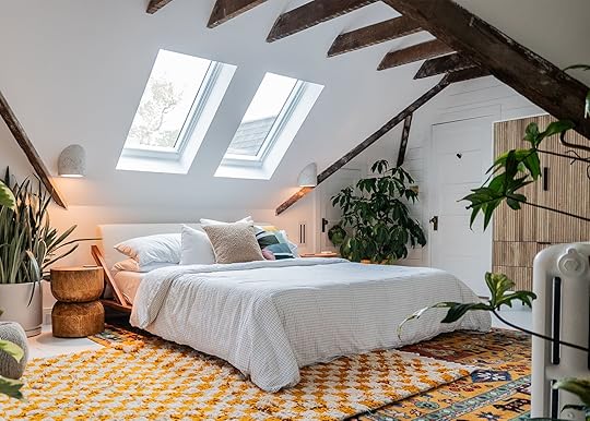
Hi! Happy Monday. I thought it’d be nice to kick off this new week with a bright, happy, inspiring makeover from our dear friend, Hilton Carter. Shall we step inside? (Take your coat off. We’ll catch up.) Now, you might know Hilton from his series of hit books, his incredible Plant Rants, or from his fabulous Target collection…but today, we’re hanging out inside his newly-renovated attic. It’s the hit of positive energy and cheery light that we could all use on these dark fall nights – you’re going to love it.
Let me catch you up to speed: with a second daughter on the way, Hilton needed to carve out space for a usable guest room. “Before this, the third floor was mainly used for storage and my Peloton,” he says. “It wasn’t insulated and of course was the hottest room in the house. Great for working out, but not for having guests stay over. Two of the dormers were used for storage and the other for HVAC.”

Hilton needed to make it guest-ready as quickly as possible – “mainly [for] in-laws visiting to help with the kids at the moment,” he says” – and undertook a few key transformations. He replaced the falling plaster with new drywall; he removed the carpeting and had the floor insulated; he updated the HVAC; he chose to open the ceiling to give the room more height (such a wise call!); he removed a dormer; and he carved out space for two new skylights. “I can’t exist in space without plants, so in order to make sure any plants brought into this room could live their best life, I needed to add more daylight. So we added two skylights and let the skies in!”

“For me, it was exciting seeing the roof getting cut open and seeing the light fall into the room.
And then: design inspiration. “The carpet covering the floor had to go and just as you would expect, there was nice wood flooring underneath,” Hilton says. “But it would have taken a lot to restore them to look as nice as the floors and the rest of the house.” He turned to a trusted friend, Leanne Ford, who “convinced me to paint them white…like, Leanne Ford white…like, WHITE WHITE,” Hilton says. “And as she does it, ALL WHITE EVERYTHING.”
He complemented the monotone look by transforming his newly-revealed beams into a design element. “I knew there would be beams there, but it was unclear if they would be right to keep exposed,” Hilton says. “I’m very happy we did – it really helps the look and feel of the room.”


“The goal was to make the guest room bright and welcoming,” Hilton continues. “It felt like such a dark space and the addition of skylight filled the room with natural light. Now that they’re in, the room is just full of joy.”
We’re also no stranger to skylights here – we’re Velux loyalists, having installed them in more projects than I can count! – so I was happy to see that Hilton opted for the same high-quality product that we love. (PS. ICYMI, I’d urge you to enter the Autumn Glow giveaway! You can win two solar-powered Fresh Air skylights – that’s the kind you’ve seen in our projects over the past few years – plus shades and installation. Someone has to win and I’d be so excited if it was you!)
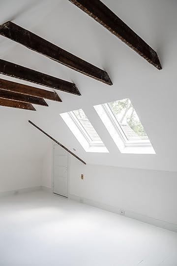

Once the room had been painted, Hilton added a bit of charm and architectural detail back to the space. “I decided on the shiplap because with making the decision to paint the entire room white, I thought having two walls with shiplap would create a nice accent but also mimic the lines of the wood flooring,” he says. “And no, it wasn’t DIY. They were purchased.” (Great news for those of us who lack the tooling and/or focus to cut our own planks for our walls!)
“As someone that can stare at a blemish on a white wall until it drives them absolutely nuts, painting my floors white seemed like punishment,” Hilton says. “But after thinking about how I wanted the room to feel bright and vibrant, having the entire room white could create that instantly, especially when reflecting light from the skylights…with so much white, it’s time to add color!”
And on that note…are you ready to see how he styled his space?

HOW CUTE IS THIS? Do you not just want to cuddle up here, grab a book from the shelving unit, and watch the clouds pass overhead? There are so many smart, thoughtful details – let’s dive in, starting with those graphic layered rugs, which served as the jumping-off point for the color palette. “With them covering so much of the room, I knew that I could fill the room with bright vibrant colors,” Hilton says.
I love how the flat weave and the plush woven rug work together here – they’re a big statement on their own, but they’re balanced here by the quiet white backdrop. Certain hues of yellow can come off as loud or overpowering, but this warm ochre base tone leaves Hilton’s room feeling luxe, cozy, and comfortable. (“I doubled up on the rugs because I love a good layered look and because I just couldn’t make up my mind,” Hilton says.”)
Be sure to clock the outlets and switches that flank both sides of this king-sized bed, too – those are some of the smart, thoughtful details I mentioned! If you’re hosting guests regularly, rethinking the placement and positioning of your lighting and outlets will take your guest room experience to the next level.
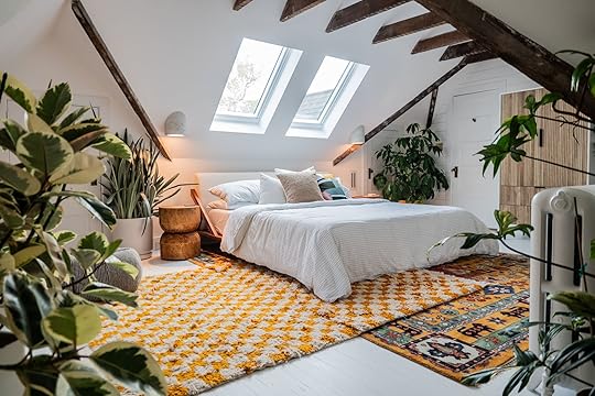
None of Hilton’s spaces would feel complete without a few well-chosen plants…so naturally, we had to get the lowdown on how he landed on the plants for this room. “My plant styling process always starts with the amount of light that is coming into the room,” he says. “With the addition of the skylights, I was able to place whatever plant I wanted up there because the room is full of light. With my options being endless, my next thoughts were what would fit under the vaulted ceilings perfectly.”
He ended up sourcing a Schefflera, Snake Plant, Satin Pothos, Monstera Thai Constellation, Philodendron Florida Beauty, Philodendron Xanadu, and a Ficus Tineke for this room. (And I urge you to watch this clip for more plant styling tips. You can see how Hilton is training some of his vines to grow up the beams – it’s super neat, but also super helpful for those of us who struggle with trailing plants!)

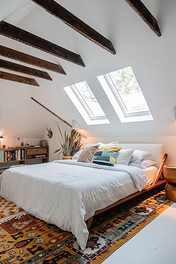
Guests are already returning with rave reviews. “The room has been enjoyed by my mother-in-law, brother-in-law, and a few friends. All have loved it and have overstayed their welcome,” Hilton kids. “I’m joking. We wanted to make a guest room that would make our family and friends feel at home. We’re lucky that they want to stay with us. Especially with a toddler and infant in the house.”
Weary guests can open or close the skylights’ shades with the tap of a remote, so a good nap (or a restful night’s sleep) is never too far away. “Once it was completed my wife and I were very jealous that it wasn’t our bedroom. Good thing we made plans to make sure our bedroom was also going to be renovated and styled so that we wouldn’t feel too bad about it,” he jokes. (It turned out super cute, too – catch up on their primary suite here!)
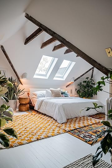
But wait, there’s more! “We decided to remove the wall and door into one of the dormers to open up, giving us a nice little nook,” Hilton says. You can take a peek at this secret area (and the adorable bistro set that Hilton sourced) by checking out this video tour. It looks great in the photos, but the warmth and care just shine through this clip.
View this post on InstagramA post shared by Hilton Carter (@hiltoncarter)
Thanks to our pal Hilton for the tour of his inspiring home, thanks to Velux for the tip-off on the giveaway (don’t forget – you have til 11/30 to apply!), and thanks to you for being here! I hope that this bright space can make your day a little brighter, too. Any thoughts?
*Design and Photos by Hilton Carter
The post Bring The Light In! Hilton Carter Totally Transformed His Attic Into Bright, Plant-Friendly, Guestroom appeared first on Emily Henderson.
Emily Henderson's Blog

- Emily Henderson's profile
- 10 followers

