
Emily Henderson's Blog, page 36
November 1, 2024
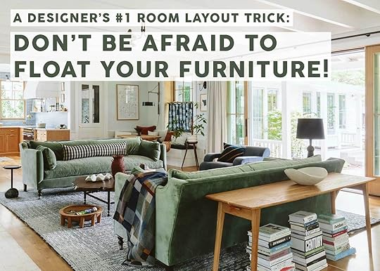
Fix It Friday: Struggling With How To Arrange Your Living Room? We Help 4 Readers Find Solutions (Including One Universal Trick That 9/10 Works)
Figuring out how to lay out the furniture in your home is a funny thing. When you see a room that has a great, functional layout, it looks so easy. But then you step into a blanket space, have a grab bag of furniture to use, and you freeze. It can be HARD. There are many right ways in any given room to arrange pieces, but there are also plenty of wrong ways. And by wrong, I just mean not best suited to maximize your space, your seating, and even your square footage.
Today, I’m helping four readers on the layout struggle bus because sometimes, you’ve gotta call in the reinforcements. And friends, after reading their submissions (and dozens of others), I started to realize there was a common thread throughout many homes. Sure, some spaces were legitimately wildly hard to figure out, between doors, windows, and oddly shaped rooms, so I really feel for those homes. Sometimes, it’s a best of worst worlds scenario.
But today, I picked homes that I felt were more universal, with some more takeaways for the majority of the people here reading. Let’s dive in.
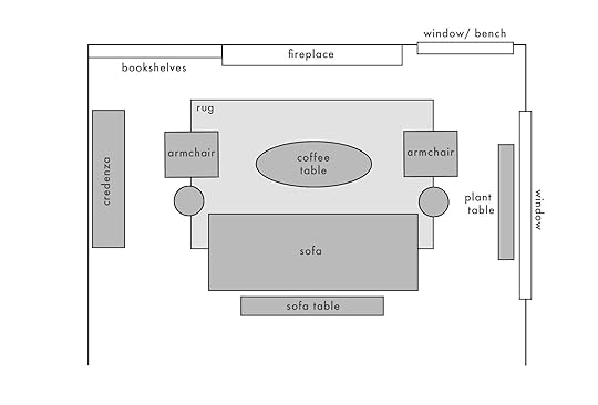
Facing The FireplaceFrom the reader: “Our living room has been a struggle for me since we moved in! The dimensions from fireplace to barstools is 15’9″ and the width from the wall to glass slider is 18’5″. I know the area rug is too small for the width of the couch (~7’5″), and I probably just didn’t buy the right couch. The space is really small and backs up to the kitchen island so it’s hard to figure out optimal seating/livable/entertaining arrangement. I’m also thinking the TV is just too high and while I’m dreaming maybe shave off the top of the fireplace casing and reface the whole thing. I’m honestly just unsure how to make this room livable and look decent. HELP please!” – Erin H.
Dearest Erin, fear not, I’ve got you! Because the space butts up against the island, you kind of just have to be okay with some things feeling a little tight, but I have ideas for a much better arrangement that doesn’t leave a giant empty space at the end of the rug or an awkward position for viewing TV. Plus, I think we can get in more storage to boot (or change where the TV is entirely, but that might not solve the awkward TV viewing thing). Here’s what I’m thinking:
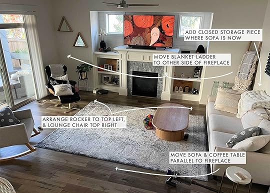
When I first looked at this, I immediately had the itch to get that sofa off the wall. Pushing it to the right wall makes the seating kind of disappear, and then just opens up space that isn’t being used for much (I’m guessing it’s a little play area due to the toys on the floor). Here are a few more angles:

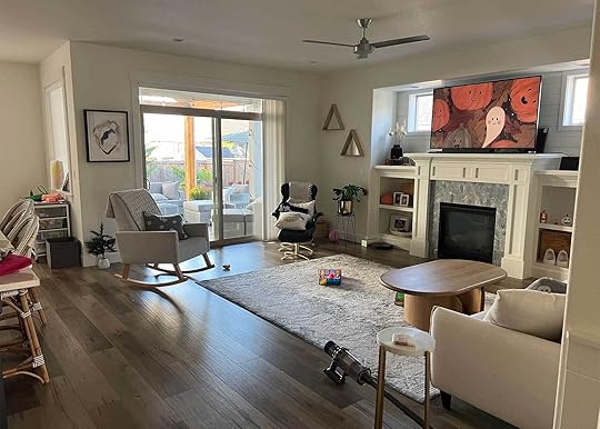
If she were to shift the sofa to face the fireplace at the edge of the rug where it currently is, she could then move the chairs to the opposite side of the rug, closest to the fireplace and built-ins. I can see one more nestled onto the rug to be more in arrangement with the sofa, and then placing the lounge chair in the right corner. I’d move the blanket ladder to the left under where those triangle mirrors are, and then add some great storage piece on the wall where the current sofa is. She can either leave the TV up high where it is now so it’s opposite the couch, or move it to be on top of the new storage unit if it’s low enough. That’ll still be awkward for viewing, but it would feel out of proportion with the height of the sofa at least. To help with the TV on the wall, they could try to see if an extended arm tv wall mount like this one might be helpful. Because the space is small, this still leaves room in front of the sliding glass doors to move around, and in front of the storage piece (that can be used for toys, games, etc.!). Here’s a floorplan I put together:

Please remember this is NOT to scale. I did try to estimate the size of the sofa she mentioned (7.5″ roughly) to the size of the room, but it’ll likely feel a bit more squished than you see here, though totally liveable and kind of cozy.
Another option that I just thought about while writing this is taking the sofa and putting it in the opposite spot that it’s in now (in front of the sliding glass door but with at least 3-4 feet of distance), then putting the chairs on the other side of the room (but closer to the seating area then they are now), and still adding some kind of media cabinet with TV. This would shift the focus of the room from the fireplace to the media cabinet, which I don’t love, but it’s worth a try, especially if Erin were open to getting a much larger rug (9×12 would be great) where all the seating could be placed atop it. The larger rug would be helpful for the arrangement in the floor plan I brought forward, too, as it’ll make the room feel bigger and more purposeful than the smaller 5×8 (I’m guessing) she has.
Move Away From The WindowFrom the reader: “I have a living room that I feel like should be very straightforward, however, I am stumped with our layout. We have two young kids and are reclaiming our living room from being used as a playroom to an actual functional living room. We want to pull the couch forward off the window, add a table for plants there, and then add two more chairs to replace the IKEA one for a better seating arrangement. However, when we pull the couch off the window, the space behind it is quite awkward (maybe not enough room for anything?) And the same on the opposite side of the room. When we add chairs, suddenly everything feels very tight. Maybe I need to change the orientation of the furniture, but I don’t know where to begin.
The room itself is quite large (16’x15′), so it feels like there should be plenty of space. But what we’re finding is everything is quite awkward. There isn’t enough room to walk around the furniture how we’d like when we pull the couch off the wall. You can see that we’ve already taped some markers on the carpet for some chairs that we have our eye on. Also some tape on the hardwood for a larger console that we’re thinking of purchasing. But now I don’t know if we need to look for different options. But the space feels SO BIG, and we know we need more furniture, but maybe the layout we have in mind isn’t quite right. As you can see I’m going in circles in my head.” – Liz W.
A room that’s both too small and too large, what a conundrum! I get it. Liz, you seem to be dealing with a similar situation as Erin from above. Too much open space but not enough room for actual furniture. Before diving into my suggestions, I do want to say a quick thing that I often have to remind myself of. Whenever you change the orientation of the furniture in a room, you have to live with it for at least a week or so. Anything you do is going to shock the sense a little, and possibly feel too tight because your body isn’t used to working within the new space confinements. Give it some time, let it breathe, and *then* decide if it works for you or not. You’ll be surprised how things start to feel the more you live with them.
Anyway, let’s have at this space…
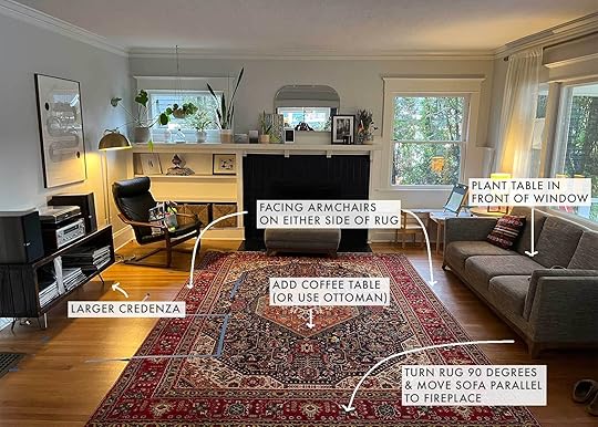


This room is kind of the flip of the room before it, with the large span of window on the right side, and a full wall on the left. It’s not quite as wide, so there’s less opportunity to have pieces overly spread out (a common mistake!), but I’m using a similar technique. First things first, turn the rug 90 degrees so the width of it follows the width of the room (a good rule of thumb for a rug, FYI). Then, move the sofa off the window to face the fireplace. The back of it will be open to what I’m imagining is a walkway into the rest of the house, so they can either leave it bare or add a narrow sofa table. I like keeping the arrangement tidy, so I’d place one of each of the new chairs they’re eyeing on either side of the rug in front of the sofa, add in side tables, bring in a thin plant table in front of the window as they like, and swap the music cabinet they have now for the larger piece she linked. This way, the space feels better for entertaining, and conversation and is oriented just generally better to the shape of the room.
Here it is in a floorplan:
I see this layout and take in a deep sigh of relief. Probably because I like symmetry but also because I truly do think it makes better use of the space. Now, for the third room.
You Guessed It: Float The SofaFrom the reader: “My living room layout issue is that this room contains the front door and also connects to the dining room. The room dimensions are 20’2″ x 13′. The current layout leaves a lot of unutilized space behind the couch and in corners. I am having trouble figuring out where to place furniture that doesn’t block the door and dining room circulation and also looks right for the space.” – Lucy C.
Let me tell you a very quick story. I sat down at my desk to plot out floorplans for all these readers by hand. I did it one at a time on an individual basis. What would work best for each of their houses given the room and space? I sketched, I changed a few sketches, and finally landed on something that felt really good. Then, I put them all side by side and laughed. Hard. With the exception of one room (the last one), I had plotted out the SAME arrangement for every room.
Now, maybe this is because I’m a one-trick pony. Or maybe, just maybe, I realized why so many people have issues with their room layouts. I’m going to say something loudly for everyone to take note of. Ready?
TAKE YOUR FURNITURE AWAY FROM THE WALLS!!!!
Especially your sofa. Yes, sometimes, a sofa or sectional is great up against the wall. There’s nothing wrong with it AT ALL. But if your room doesn’t feel like it’s working and all your big pieces are around the perimeter of your space, GET THEM IN THE CENTER OF THE ROOM.
Our rooms need to breathe. When everything lines the walls, it can strangle a room while also leaving waaaaay too much open space in the center. Seating feels far apart from the action (either from each other, from the TV or a focal point like a fireplace), it can feel cold, or just disjointed. When you bring everything into the center, specifically the seating, it feels like a proper arrangement. A conversation area that makes sense.
Also, do NOT feel like you have to fill every corner and every wall and every nook. When I studied magazine layout back in my college days (I thought I was maybe going to be an art director for a minute there), I learned one of the biggest secret weapons of good design: white space. You have got to leave room for air; for nothing; for visual boredom.
Phew, okay, now that I have that off my chest, let’s see me do the same thing I’ve already done twice.
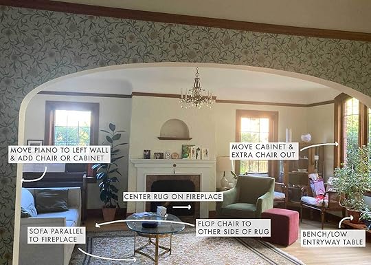


This room is very similar to some of the others we’ve already seen except for having it also include the entry of the home. So I tried to also work on a remedy for not having any kind of landing strip. (The grate on the floor to the left of the front door makes me think you can’t really put anything there like a cabinet.)

I know this reader likely put the sofa where she put it because they thought placing it in front of the dining room entryway would block the flow of traffic. But as long as it’s deep enough into the living space, it’s totally fine to have the back of a sofa to another room. I once studied the sets of some of my favorite sitcoms and shows and quickly realized that because they are shot on a set, there aren’t many walls to put furniture, so their living room furniture often floats in the middle, with the back of the sofa facing another room or just open space. And this is why the rooms actually felt so friendly and inviting. DO WHAT THE TV SHOWS DO, my friends!
So, yet again, I pulled the sofa away from the wall to be parallel with the fireplace. The rug doesn’t look like it’s in the center of the room, so I’d center that on the fireplace, as well. I think moving the green armchair and ottoman to the opposite side would help the flow from the front door. Not the mention, it could easily be turned to sit and engage with anyone playing the piano. Speaking of which, I think it would be so much nicer to move the piano off the window and onto the blank wall where the sofa no longer would be. I’d finish off that wall by moving the rubber tree to one side of the piano, and grabbing one of the armchairs from the far right corner (or even the display cabinet) and putting it in the opposite corner by the piano.
Regardless, the two chairs, side table, and display cabinet that is in the right corner need to be lightened up. It’s too much furniture, and I know she’s just trying to fill up spaces. But again, LET IT BREATHE! I think leaving one chair angled with a small drinks table would be just enough. And in front of the window, a low bench with some open surface space would provide extra seating, a place to sit and put on or take off shoes, as well as a “table” area for a keys bowl or something for the entryway (though a wall-mounted shelving unit on the wall by the door would also help with this).
L-Shaped StrugglesFrom the reader: “We have struggled with our L-shaped living room since we moved in 15 years ago. Then, we bought an awkwardly shaped sectional (not an L, but 3-sided) which added to the challenge with no other options for moving furniture. We like mixing old with new and after 15 years with this sofa, we plan to move it to our kids’ playroom and upgrade the living room furniture. Would love your expertise as to what could work here to give the cozy/homey vibe similar to Emily’s TV room, but not so boxy. The room has a bay window bump out in the front which has challenged me as well bc I don’t want to block it, but maybe that makes sense?” – Jenna S.

I’ve got a trick both for this reader and for anyone reading in a similar predicament: When you have a strange L-shaped room, treat it like two different spaces. Suddenly, it’s not an L, it’s two blocks of space, instead. So that’s what I’m suggesting here. Move down the seating as far down into the room as it makes sense, and create something else where you opened up a spot.
As the reader mentioned wanting to get new furniture, I would suggest either a long 100-inch or more sofa, or a proper L-shaped sectional. Not the kind with the chaise but the one where the back of the sofa carries around to the other side. I’m also moving the TV from the corner onto the flat wall in front of where the new sectional will be. (The seating won’t be in a drastically different place, but once you try to not make it connect with the long part of the L, it will suddenly feel like it makes much more sense, I promise.)
Since she mentioned Emily’s TV room, I wanted to bring in some of the same elements she employed in that. On the other side of the sofa, there should now be enough room (I hope) for a cozy seating area. Two small chairs atop another small rug, a side table, and some bookshelves or walls that go all the way across to create a library feel would be so great. And the same goes for the top left edge of the room. It kind of seems like that’s a lost space, but if this reader treats it instead like a walk-through little art gallery with purposeful art and photography on both sides of the area, it could feel really cool.
When you’re working with tight areas, don’t be afraid to take charge and go big. Often, it makes the room feel bigger, and not as cramped as you think it will. Just a thought!
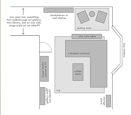
I also suggested maybe a low bench with some art above it next to the TV cabinet where I’m placing it now in case there’s room for that. I didn’t get dimensions for this space so it’s hard to tell exactly how much square footage I’m working with.
—
So…what did we (mostly) learn here today, class? STOP PUTTING YOUR FURNITURE UP AGAINST THE WALL ALL THE TIME. ::deep breath:: Tough love, I know, but you’re going to see how much better your living rooms in particular feel once you make the switch.
Thanks all for following along, and by all means, throw in some of your own suggestions! This is such a sharp, clever bunch of readers who might have better ideas than even I have.
Until next time…
Opening Image Credits: Design by Emily Henderson and ARCIFORM | Photo by Kaitlin Green | From: The HIGHLY Anticipated…Farmhouse Living Room Reveal
The post Fix It Friday: Struggling With How To Arrange Your Living Room? We Help 4 Readers Find Solutions (Including One Universal Trick That 9/10 Works) appeared first on Emily Henderson.


October 31, 2024
Caitlin And Jess SCORED BIG At The Famous LA Downtown Modernism Flea Market…Come See!

It’s the most wonderful time of the year! Well, the second most wonderful because the LA Downtown Modernism flea market happens twice a year (April and October). I (Jess) will never forget when I first saw Emily go having never heard of it. It truly seemed like the most amazing flea because it was curated to the style I was looking mostly for – more midcentury modern, less antique. And look, there are so many amazing markets where antiques and more primitive pieces are at the forefront and I love those too. But baby, when you get a flea market that’s not only perfectly curated to your style but it’s a wonderfully manageable size (not too big, not too small)…I think that’s what they refer to as heaven.

 can you tell the dodgers are in the world series?
So Caitlin and I (sadly Mal couldn’t join) decided to hit the early morning flea life again and got up to get in line at 7 am for an 8 am opening time to see what treasures we could find. The photo on the left shows how far back we were getting there at that time but we were in with the first group (I believe they stagger at the start so as to not overcrowd). Oh, and it costs $10 to get in. They also have merch which Caitlin decided to get in on with her cute tote! I promise this isn’t sponsored, but just a deep love for an incredible flea market and a chance to show off all of our great finds this time around. Hope you’re ready for some old-school diary blogging.
Modernica
But before we get into our finds, A HUGE part of this market is that Modernica, the market’s host and known for its incredible MCM ceramic pots and modern furniture, has a big ole sale on its stock. If that’s what you are there for then you must head straight to another line for that section. It usually dies down after an hour or so but of course, the sooner you get in, the more options you have:)


We didn’t get shots of their pot section but you’ve definitely seen them in many EHD projects. Here are some shots of the furniture about two and a half hours into the market. We thought we’d just take a peek but didn’t have any intention of buying anything there.
Jess
I thought I’d start and save Caitlin’s even more exciting finds for last:) Let me first show you some of the things I loved but didn’t buy before I get into the things I loved and did buy! Naturally, I saw this metal white and brass lamp and fell in love immediately. But I am on a strict “no lamp purchasing” policy…unless they are matching sconces…which I didn’t find. I also really fell hard for that yellow ashtray oddly enough. I’ve never been a smoker of any form beyond a random one-off, but man, while this ashtray would be useless to me it was so sexy and was in a very fun color. The perfect pop of yellow I’ve been needing?? In another 1960s life maybe, ha.

I wish there weren’t so many things behind this INCREDIBLE hanging ceramic piece to really do it justice but I think you get the picture. I didn’t ask about it so I have no idea the price or maker but my god it took my breath away. Also, how cute is that ceramic candlestick holder on the back of that table?!


If I had the space (and a bigger budget), these would have been mine. They are so cool and interesting with a heavy focus on blocky shapes…of which I continue to be obsessed. I can’t remember the exact price but I believe it was somewhere in the $300 range. Oh, it should be noted that the prices at this market are in the mid to high-ish range (I guess that’s pretty subjective). There are a ton of steals and the dealers are open to a little respectful haggling, but this isn’t a $5 bin kind of market just to give you an idea.


Ugh, THOSE CHAIRS. I was with Caitlin when I saw them and she said she had already asked about them and they were $2,200 for the pair. I didn’t need them but I was still bummed lol. I hope they went to a good home! Then the rolling boxes on the right I loved too but also didn’t have a place for them and they were $395 for the pair.
What I Bought
Ok, now let’s get into what came home with me! The first thing I saw and considered was this glass lantern (?). I believe it’s meant to be a part of the light fixture but I was looking at it as a cool sculpture to put on my shelf. The seller originally wanted $60 but then said it was a “must-go” and would take $40. I said I’d think about it, asked Caitlin and my cousin who was also there with us, and got the confirmation that it was cool. I often need second and third opinions:) So back to the man I went and claimed my new weird sculpture. Who knows, maybe someday I’ll return it to its original form and make it a pendant.


This was actually my last purchase of the day…a Oaxacan wedding bell from the 1960s for $45. We were told by the seller that Charles and Ray Eames famously turned one of these bells into a home doorbell at their Case Study home. Interesting design fact…

Right before the bells, I saw these two carved 15″ wood diamonds and loved them immediately. I thought they were $35 for both to which I offered $25 but there were $35 each, haha. I offered $50 and they were mine! I think they are so cool and plan to mount them on my bedroom wall. We’ve got some 3-D art people!
This one was my splurge at $150 but it’s so so beautiful and cool!!! It’s 9″ tall with the top being a whopping 10.5″ so the proportions are pretty interesting. I also was drawn to it because so many of the pieces I have are matte, I needed some gloss in my life!
And look at this stunning top. I feel so lucky it’s mine. I know I would have regretted passing it up. Happy belated birthday to me?? (She said for the 7th time this month).


The second purchase of the day (and the final one of the post for me) was this Paul Klee book. If I’m honest I was most attracted to the cover’s pattern and colors. I need more of that for my living room so I was pumped to grab this guy for $35. I also really love the inside cover too if I ever want to go more neutral. So happy with it!
So that’s it from me and now I give you Caitlin. She’s got it all! Steals, deals, and a piece of furniture she and her boyfriend might be fighting over (in the good way!!). Take it away Caitlin…
Caitlin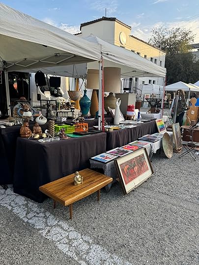
Let me set the scene: it’s 8 AM. The doors have just opened to the market. The sun is shining, there’s a beautiful breeze, I’m wearing a surprising number of layers (we do have seasons in LA – they just last for about 4 hours), I’ve downed an iced matcha, and I have $175 burning a hole in my pocket (after $10 for admission and my $15 tote). This is the first booth I spot upon entry, and I am THRILLED.
Little did I know that I would, within the next two hours, absolutely decimate my aforementioned budget. Destroyed. Gone. BLOWN TO SMITHEREENS. I don’t know what happened at this market, but I felt much like a werewolf when exposed to moonlight. Downtown Modernism, filled with all of its beautiful objects, transformed me into some sort of vintage-shopping animal. I COULD NOT STOP. I was like Donna Meagle and Tom Haverford combined, having apparently brought myself out on some sort of impromptu “treat yo’ self” day.


Lesson learned: IT IS VERY EASY TO SPEND MONEY AT DOWNTOWN MODERNISM. I mean…look at these booths! Look at the curation! If you haven’t been, please know that you will find far more than you’d ever expect. Do not be like me! YOU WILL SPEND MORE THAN $175! Budget accordingly.
But real talk: Art! The lamps! The vessels! And the candleholders – oh, man, there are candleholders for DAYS. I couldn’t get enough, clearly. I loved that wooden articulating number on the right, but I was so charmed by the shape and finish of all the surrounding pottery. There’s not a single dud on either of these tables, guys! Any piece would be the perfect finishing touch on your credenza, bookshelf, or wall, or coffee table. AND IT’S ALL VINTAGE! If I had to imagine my own ideal version of heaven, it would be walking the aisles of Downtown Modernism.


I mean…you’ve seen my house. I’m sure you can imagine what seeing the Gaetano Pesce UP7 stool surrounded by bright, hand-pinched, ceramic animal figurines does to me. (That’s the giant foot in the back, for people who have hobbies outside of “learning furniture names.” What’s it like to have a life?)
OKAY, OKAY – the scene has been set. CAN I PLEASE SHOW YOU WHAT I BLEW MY CASH ON NOW? (I know I’m joking a lot about overspending, but I am so happy with my scores. And, in a miraculous twist of fate, my travel to an upcoming wedding clocked in at a fraction of the price I’d allocated for the trip, so it all evened out! But this is NOT a normal thrifting experience for me, before you go thinkin’ that I’m some sort of heiress.)
What I Bought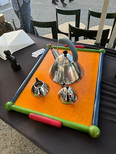
While taking the first picture I showed you, Jess walked behind me and whispered that there was a REALLY good primary color tray at the neighboring table. I’d been inside the actual Downtown Modernism venue for less than 2 minutes – normally I recommend a full lap before making any purchases – but once I saw it, I had to bring it home! (Den and I christened this piece later that afternoon by piling it full of Buffalo Wild Wings takeout.)
I paid $100 and had no knowledge of the provenance or maker (and honestly, I was too excited to see the rest of the market to ask), but it turns out that it was hand-made in Italy by Manzoni Pietro for Vietri back in the 1970s. I had a feeling it was high-quality based on the proportions, finish, and wood stain, but I’M SO PLEASED!
I know what you’re saying: that’s an umbrella stand. You live in Los Angeles, one of the few American cities in which residents famously have little-to-no use for umbrellas. But hear me out: THIS WAS MY WHITE WHALE!
I spotted this 1960s Italian umbrella stand a few months ago on Facebook Marketplace, but missed out to a speedier buyer. This was devastating to me, as I had been hoping to use this piece as a north star (palette-wise, at least) in our living room design. I found the stand listed for sale on a few other vintage sites, but couldn’t swing the $1,800 price tag…so imagine my glee when I nabbed this lil’ number for TEN $10 BILLS. (That’s $100, if you’re not in the mood for mental math.) The next time we shoot my living room – it’s a work in progress right now! – this will have THE place of honor, right next to the front door. Keep your eyes peeled for it, okay?

This was the one that really did me in. I passed this vessel (with a built-in flower frog!) three times – and negotiated twice – before finally giving in and sending a Venmo for $270. It’s a one-off 1960s piece from the estate of a famous ceramicist whose name I am forgetting (criminal!!!!) and OH MY GOD, I LOVE IT. Seeing this weird little UFO vase on its sweet tripod legs moved me! It made me think about Dennis, who has a tattoo of an alien eating pizza on his arm, and I thought it’d echo the graphic shape of these $20 (!) lamps I scored at the Rose Bowl earlier this month.
I’m a big fan of simple styling – having a lot of stuff on my surfaces stresses me out – so I CANNOT WAIT to see this piece play the singular starring role in a future coffee table vignette. You know how Sarah Snook is about to play all 26 roles in The Picture of Dorian Gray on Broadway? This vase is the Sarah Snook of my coffee table setup. It does it all!


OKAY, I LIED. This was the piece that really did me in. A newly-upholstered, freshly-refinished Eames-style chair. (I believe it’s by Selig, based on the base and the comfort level – they’re famously the most comfortable replicas out there!) And I’ll be real: I paid – gulp – $1,200 for it, negotiated down from $1,400.
Den and I had been talking about a lounge chair for a while, and I had already homed in on an Eames-style chair for a few reasons – they’re timeless, they work with pretty much every style, and they’re easily source-able. I was planning to find one on Marketplace and have it reupholstered, but was struggling to find a workable piece with a salvageable wood frame and un-rusted base. I hadn’t anticipated that I’d find a piece at Downtown Modernism that would coordinate with our planned living room updates, but there it was! It works for the space and it takes a DIY or two off my plate – no complaints here.
After I drove it home (and Den carried it upstairs, bless him), it was an IMMEDIATE HIT. Den sat down, stretched out, and immediately asked me, “Are we going to fight over this chair?” The joke is on him, though – our cat, Buffalo, is OBSESSED with the ottoman. She races for it, she spends all day on it, she will hop up and walk all over your legs until you remove them so she can lounge. She physically cannot spend enough time on this ottoman, for reasons I cannot fully understand. (Turns out he is going to be fighting over the chair – just with an 11-pound senior feline, not me.)
Last but not least: I bought a cute old Myrtlewood bowl for a lone $10 bill. (It’s available for $30 on Etsy, if you’d like to grab one for yourself.) I love the ball feet, the size (perfect for topping coffee table books!), the wood tone, and that one day it could be used for holding change or buttons or some other small collection in a bedroom or bathroom. I like it! WILL I SEE YOU AT THE NEXT DOWNTOWN MODERNISM? Throwing it back to Bungo for her closing thoughts…

In the words of the great Hilary Duff, “Well, that’s my life. Thank you so much for spending time with me. I hope you enjoyed it, because I know I did.” Thrifting, flea marketing, and online vintage hunting are some of our favorite things to do, and getting to share our finds makes it even better. See you in April at the next one!
Oh, and Happy Halloween!
The post Caitlin And Jess SCORED BIG At The Famous LA Downtown Modernism Flea Market…Come See! appeared first on Emily Henderson.
October 30, 2024
LOOK FOR LESS: 3 Ready-To-Install Living Room Designs, Based On EHD’s 3 Most Popular Living Rooms
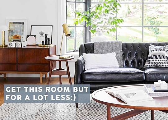
I think we can all relate to the feeling of seeing a room, wishing we could recreate it in our home but then are quickly confronted with the brutal reality that nearly everything in said room is out of budget. It happens to me almost daily as I scroll through Instagram…healthy, I know! However, today, I am going to even out the scales a little. I chose three beloved EHD living rooms and recreated them using exclusively Wayfair products. That’s right! A real deal “look for less” and while I’m truly not one to brag, I did a pretty unreal job. But to be fair Wayfair made it so easy. We all know they have A LOT on their site but y’all it’s also very good and I’m pretty pumped to show you how similar these looks are. And considering they are having Black Friday Preview sale of up to 70% off along with their fast shipping, you could have your whole room done or refreshed before the holidays get too wild and busy. Ok, ready for these rooms??
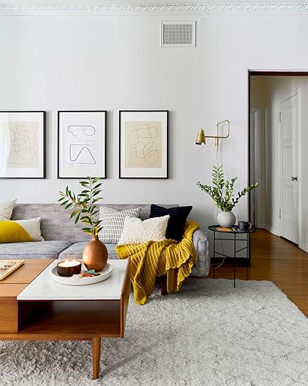
The Portland Project Living Room photo by sara ligorria-tramp | from: portland project living room reveal
Ah, the first . Can you believe we revealed this six years ago but it could have just as easily been revealed this year? Not dated in the least bit. Why? Classic styles, a calm, neutral color palette, and just the right amount of modern elements.
 photos by sara ligorria-tramp | from: portland project living room reveal
Take these two shots above! The main pieces are both vintage but from different eras keeping the design exciting, fresh, and with plenty of “tension“. But the color palette and consistency of materials are what make it all work together. Ok, now let’s get into the deals!

Furniture: Sofa | Coffee Table | Tripod Side Table | Sling Chair | Wood Block Side Table | Green Chair | Pedestal Side Table | Credenza | Side Chair
Lighting: Floor Lamp | Brass Task Lamp | Sconce (set of 2) | Brass Dome Lamp | White and Brass Dome Lamp
Textiles: Rug | Dark Gray Blue Patterned Pillow | White and Gray Pillow (set of 2) | White Textured Lumbar Pillow | Black and Cream Throw Blanket | Navy Lumbar Pillow (set of 2) | Blue and White Throw Blanket
Decor: Tall White Vase | Blue Tray | Ceramic Box | Brass Tray | Black Candlestick Holders | Black Vase
Not the exact same design but VERY much the same essence. I was so pumped when I found this sofa! It’s under $750, is 81″ and the lines are so good. Then the mix of dark wood tones was an essential part of this design so the coffee table, all the side tables, credenza, pedestal side table, and side chair all worked so beautifully together. I know the credenza may look pretty different from the original but again, it’s really about the essence and overall aesthetic. Plus it’s just cool. The lighting miiiight be my favorite though (as it typically is in most rooms) and it was SO easy to find comparable options. The white and gold beauty is under $100! And yes, I chose one of our Rugs USA rugs (and did for all three living rooms) because I know that the quality and designs are good and they are a great price. Wasn’t going to take a chance on another brand. Sorry, not sorry:) The last thing I’ll say is I LOVE that black vase. Actually, they have so many great ones as you’ll see throughout this post. Don’t sleep on their smalls.
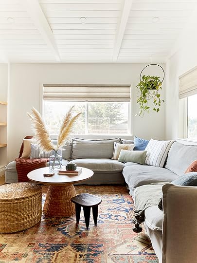
The Glendale Living Room photo by tessa neustadt | from: final glendale living room reveal
This living room is what I feel like living on a stylish cloud looks like. It’s light, airy, textured, and Care Bears are bound to start jumping around at any second. But in all non-cloud seriousness, this version of Emily’s old Glendale home was perfect and everyone agreed.

 photos by tessa neustadt | from: final glendale living room reveal
It was a no-brainer that I needed to recreate this one because it’s also timeless. Still calm and neutral but a bit more eclectic and “happy”. But I think the real name of the game for this one is” more is more” when it comes to pillows…but you can’t use they same one twice, ok??

Furniture: Sectional | Coffee Table | Pouf | Brown Leather Chair | Black Side Table | Gray Upholstered Chair | Dresser
Lighting: Blue Lamp | White Lamp
Textiles: Rug | Blue Patterned Blanket | Cream Throw Pom Blanket | Cream Tassel Pillow | Blue Striped Pillow | Rust Pillow | Blue Boucle Pillow | Blue Plaid Lumbar Pillow | White and Blue Striped Throw Blanket | White Textured Pillow | Blue Tassel Pillow | Green Pillow (set of 2) | Pink Tassel Pillow | Cream and Black Pillow
Decor: Terracotta Vase | Woven Tray | Ceramic Bell | White Vase | Turquoise Bud Vase | Blue/Green Vase | Turquoise Planter | Tall Black Vase
The base of this room is obviously the sectional. And what I think is so great about this design is that it shows you how to have a gray sofa but not lean into gray for the whole space (unless that’s your preference). If you notice in all of the textiles, the colors are either pretty muted or have a grayish undertone. That’s why it works so perfectly with the sofa. But naturally, the design needed warmth, and wood/organic fibers are the easiest way to do that. Emily had vintage chairs in her design but I really thought this leather chair and this dark gray chair were great options for a similar feeling. But the pillow game on Wayfair is vast and I honestly had a hard time only picking these 10, ha. I pinned a lot more. Otherwise, what did I tell you about their smalls?? How good are these vases and planters? Very impressed.
The Farmhouse Living Room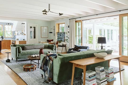 photo by kaitlin green | from: farmhouse living room
What, you thought I wouldn’t be able to recreate the farmhouse living room? WRONG. It was just as easy as the other two! Emily’s traditional modern eclectic vibe isn’t necessarily an easy thing to “copy” on a tighter budget but as I’ve already proven, the options on the site are so vast that it was so much fun.
 photo by kaitlin green | from: farmhouse living room
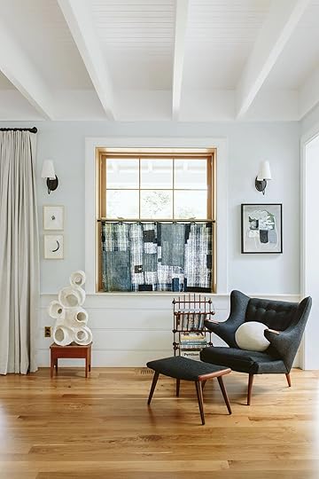
 photos by kaitlin green | from: farmhouse living room
Here are more photos so you can really take in all of the elements and be even more impressed by the “similar” options”. Ok, ready?

Furniture: Sofa | Coffee Table | Live Edge Side Table | Gray Chair | Foot Stool | Blue Chair | Drink Table | Console Tables | Blue Gray Cabinet | Wood Chair | Wood Cabinet
Lighting: 2-Light Sconce | Black Table Lamp | Paper Floor Lamp
Textiles: Plaid Pillow (set of 2) | Throw Blanket | White Ball Pillow | Gold Pillow | Rug
Decor: Terracotta Vase | Ceramic Bowl (on coffee table) | Cream Sculptures | Striped Vase | Black Pillar Candle | Yellow Pillar Candle | White Decorative Bowl | Magazine Holder | Black Abstract Vase (with hole) | Wooden Decor Links | Black Vase
See!! This sofa is a little more expensive than the other two but much cheaper than the original (and has a ton of excellent reviews). I did take some creative liberties with the rug choice but I love this rug. It’s affordable and the vibe is still very much in line with the overall style of the room. I couldn’t believe that they had that awesome live edge side table. It looks way more expensive than $159, right? I also was impressed when I found those two side chairs. They are pretty perfect. The “sofa table” are those two console tables that look so good next to each other (you can see the example if you click over to the product). This is also my last callout on Wayfair’s awesome small decor game. I mean those cream sculptures, that terracotta vase, the wooden decor links? All so chic and cool.
I’m sure it’s apparent that I had A LOT of fun doing this. Not only because these are some of my favorite EHD living rooms too but because the “one-stop-shopness” of Wayfair made it fun. Not having to search the entirety of the internet for a chair is so nice. You get style and more affordable options. And as a reminder, they are having their Black Friday Preview with up to 70% off along with their fast shipping (which happens all year long). So next time you see a room you love, you now know where to go to recreate it:)
And thank you Wayfair for partnering with us on this super fun post! Your inventory is unmatched and there really is something for everyone.
Love you, mean it.
Opening Image Credits: Photo by Sara Ligorria-Tramp | From: Portland Project Living Room Reveal
The post LOOK FOR LESS: 3 Ready-To-Install Living Room Designs, Based On EHD’s 3 Most Popular Living Rooms appeared first on Emily Henderson.
October 28, 2024
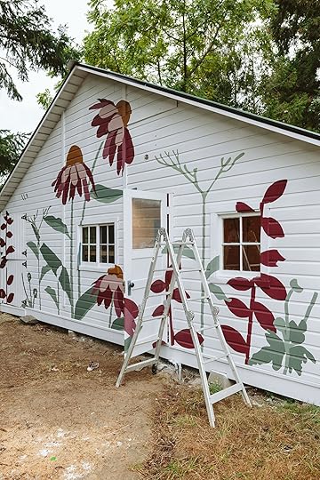
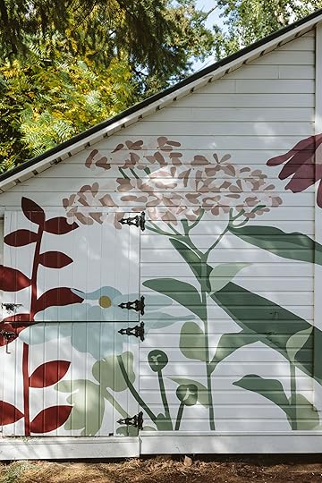
Dreams Coming True!! The Barn Floral Mural Reveal Is Finished And You NEED To See It
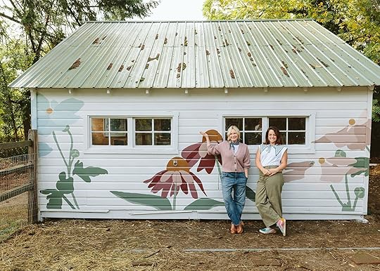
Oh, today is a GREAT day. I get to do the ultimate “show and tell”, my childhood favorite school activity turned career. The mural on the barn, by Racheal Jackson, is done (and has been for weeks) and I couldn’t love it anymore. When we started this process I didn’t really know what I wanted beyond it being covered with farm-like flowers. I was very drawn to Scandinavian Folk flowers and I was very drawn to Racheal’s work (plus we are both locals to Portland and friendly). So where we landed is that perfect mix. Ultimately, I felt that the folk flowers could look too “pre-school/daycare” for the scale of the property and since this barn is a bit far from the house I liked the idea of bigger, more organic-looking flowers (not realistic, but definitely grounded in our actual flowers). Like most incredible art (and what I often advise to actually splurge on), this mural was not a necessity, and yet the joy I get daily seeing it – out my writing window, on the way to feeding the barn animals, with our many neighborhood friends coming over – it’s just really special.
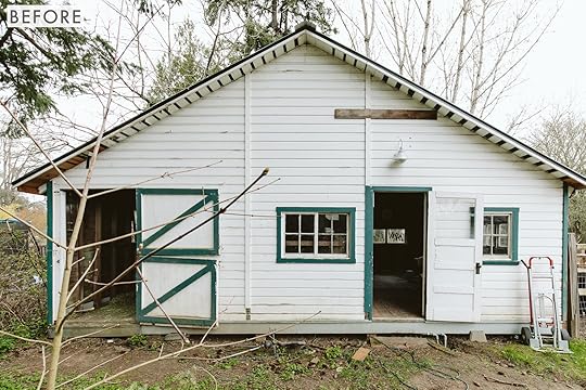
The barn before had two halves – on the left is where the pigs and alpacas get fed and sleep, and on the right is the now “craft shed” (aka art barn, since we can’t seem to internally call it anything else. It’s old and of course not in the best shape, but cute, with windows and original doors. We gave it a fresh coat of paint but left the rest up to Racheal.
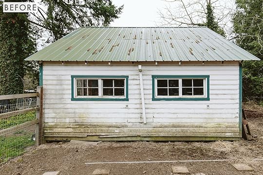
The paddock side here is what I was worried about – so dirty! Will the animals continue to rub their dirty bodies all over it as they seek shade in the summer? Maybe. Will they roll in the mud and then snuggle over there in the winter? Maybe. So I almost skipped the mural on this side, but I am SO GLAD I didn’t. And I realized the best solution is, (DUH!) just two long benches along this wall, screwed into the barn so that the pigs can’t move them.
Flower Inspiration
We decided the most cohesive course of action is to take inspiration from the flowers from the garden that we LOVE – and just blow them up and tweak the tones a bit. I gave Racheal a tour of the property, pointing out my favorites and why.

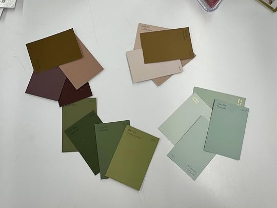
The whole yard has tones of soft and deep pinks – sure, some of them are more saturated (like the echinacea below) so we went a bit deeper than that (I didn’t want hot pink on the mural, year-round I felt it would be too jarring).


Racheal took this inspiration and she drew up a rendering to send me. We went back and forth, tweaking it for hours. What I’ve learned about myself (consistently) is that I long to be a really low-maintenance person but know that if I don’t speak up even about smaller things before they get permanently installed, I always regret it. She was so patient with me as I asked her to play with composition (I wanted to see my most favorite flowers – the echinacea from my writing window) and I wanted it to be full enough, but with some negative space and of course, balanced but with some tension (not perfectly symmetrical). Here is a screengrab of our back-and-forth:


Once I approved the composition I thought we were good to go, but then I got nervous about colors – Rachel is far more bold than I am, and Brian’s reaction was that he was scared. While I know many of you want me to not listen to my husband as he’s not a designer and not visually as invested in the outcome of this mural (he was all “go for it, that’s your thing”) he lives here too and I want him to LOVE IT. I realized quickly that it was about the color palette. He was scared of the flowers, too (thought they were big and just woah) but I was so sure of the actual mural that I didn’t want to start all over. So the morning that she was supposed to start I panick texted her with a “Hey can we tweak and can I approve the colors beforehand?” This mural was an investment on my end so I really really wanted to make sure that I felt 100% about it. I sent her some of my favorite colors (more muted burgundy pinks – cocoa berry, glamour, rosemary) and she deepened them and added accent colors. She sent me the colors from the paint store before she left and after tweaking more I felt SO GOOD about them. THANK GOD.
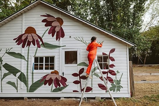
After approved, she came over and projected the mural on the barn and sketched it out (at night). And then the next day came over to start.
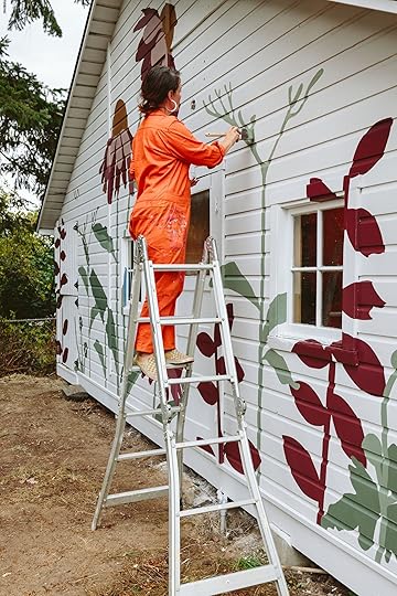
What an absolute thrill to be able to do this – It’s a different level/brand of adulting to be able to hire one of your favorite artists to paint a mural on your barn. I felt (and feel) so lucky and grateful.
I don’t need to say much about her process, this isn’t a how-to, it is a “look at this!” post
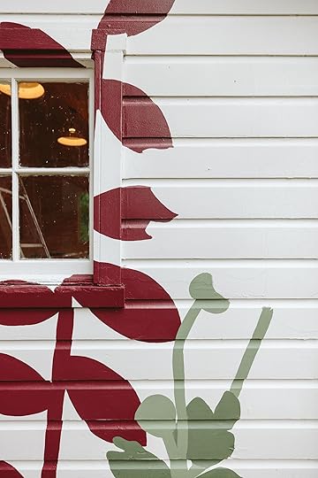
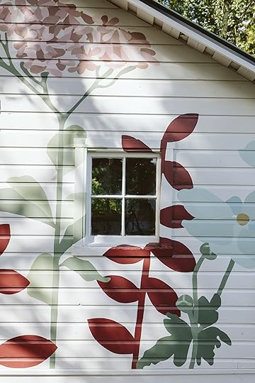
I love how she went over the windows and doors as if they were just solid walls – continuing the florals.
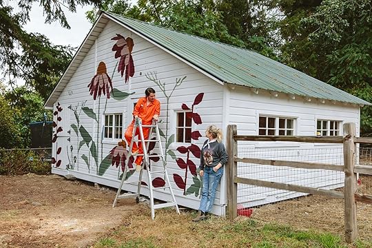
About 1/2 way Kaitlin came over and snapped a few photos (I think it took Racheal three not-full days to do this – we had some rain).
Here’s the video with the finished product if you want to check it out (Just wait for the ad to play!)

Here she is!!!! I honestly couldn’t love it anymore. It makes me just so happy every time I walk out there and of course, now I’m ready to invest in the landscape (and hardscape) outside of the barn. We are starting that soon – something natural (likely a flagstone landing pad with plants and shrubs).

I love the composition. I love how the flowers were from our own yard. I love that the colors are many of the tones and colors we have inside our house. It all feels cohesive and intentional while being totally unexpected and artful.


Bert and the boys watched her paint the whole thing – it was SO CUTE (if you are on social make sure that you watch the reel that we made that shows them sitting and watching her). The pigs of course rubbed up against it and got paint all over them.

Look at our funny farm! Against such a pretty mural. WHAT A FUNNY LIFE WE HAVE UP HERE


A huge thanks to Racheal Jackson (i.e. Banyan Bridges) for bringing her talents to my home. While we still have so much work left on the property (feels never-ending) I hope to bring in more elements like this. We went safe with our house and sometimes it just feels so grown up for Brian and me – but this mural really helps tell more of a story of who we (or I, lol) am.

I feel so incredibly lucky to have her work here, permanently. I was nervous. What if I invested in something that ultimately I didn’t love? Sure I could paint over it, but not if the whole internet saw it! These were the fears I had the day before because you just don’t know how any piece of art is going to look before it’s finished.

I honestly couldn’t be happier with it. It’s visually so pleasing – large scale, easy for the eye to understand, cohesive color palette, etc – but more than that it’s just joyful and wild and all the things that Banyan Bridges does so well.

Thank you Racheal for your talented hands and brain:) And thanks for our prom picture, lol. Make sure to go follow Racheal on her Instagram (and of course she is always up for custom murals and art – both inside and out). Next up is landscaping this bad boy to give it the real “after” it deserves (without just dirt in front of it). Coming at you in spring (hopefully). xx
*Mural by Racheal Jackson
**Photos by Kaitlin Green
The post Dreams Coming True!! The Barn Floral Mural Reveal Is Finished And You NEED To See It appeared first on Emily Henderson.
October 27, 2024
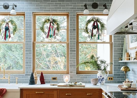
The Link Up: Em’s New Favorite Fall Candle, A Perfect Lightweight Turtleneck Top, And A Carbonater We Bought And LOVE
Happy Sunday everyone! We told you we had two amazing reveals, didn’t we? So different but both are incredibly perfect. In case you missed them, we’re talking about the farmhouse craft shed/art barn and the river house primary bathroom. And in even better news, we have another SUPER FUN farmhouse reveal tomorrow. Can you guess what it is?? While you’re thinking let’s get to these links.
This week’s house tour is about a very special home in Guatemala, designed by the owners Molly Berry and her husband Juan. We feel like this quote says it all, “Decorating took time. The couple sourced materials from the sustainable tree farm Juan manages (alongside cocoa, he grows endangered tropical hardwoods like mahogany, rosewood, and teak) to construct everything from the coffee table to kitchen island stools.” Go take a look at this warm, intentionally designed home!
From Emily: It should be no surprise that our favorite food chef/blogger would make such delicious-smelling candles, and yet when I opened them up we were so blown away by how good the Half Baked Harvest x Sniff candles, smelled. They smell like the holidays in the best of ways (not chemically, just like delicious smelling scents like apple cider smash and pumpkin smash (that has the following notes: pumpkin spice • cinnamon stick • cardamom • whiskey • brûléed orange • salted maple • roasted chocolate). A huge congrats to Tieghan Gerard for making another product I love (and I’m so excited about her upcoming book called Quick and Cozy – you can pre-order it here which always helps the author:))
From Jess: I just got maybe my most favorite sports bra yet. It’s from Vuori (my first purchase from them) and it’s the perfect mix of simple and a drop of sexy. I love the look of the straps on the back and the tiny cutouts on the side. Clean and cool. It says it’s medium support so better for walking, yoga, pilates, errands, etc. Less great for running or jumping, especially if you have larger boobs. I’m VERY tempted to get another because I want to wear it all of the time!
From Gretchen: Two, separate friends of mine were rocking equally adorable jackets recently and when I asked each of them where they were from, they both had the same answer: Old Navy! Now, I’m no stranger to a good Old Navy find, but man, their clothes have really been catching my eye lately. Sadly, one of the jackets is already sold out (maybe it’ll come back in stock soon? Fingers crossed!) but the other cute, quilted jacket is still available in a few sizes! I tried on my friend’s in a size large and it fit perfectly. Nice and lightweight, still roomy, and I appreciate that it covers my butt. A great jacket for fall–I’m adding it to my cart as we speak!
From Caitlin: You know J. Crew’s famous all-cotton tissue turtlenecks? They’re currently less than half the price over at J. Crew Factory (and I think the Factory ones are higher quality, to boot!). Every few years, I get SUPER into layering with turtlenecks – I guess the obsession has returned this year. I’m really excited to pair them under this denim shift dress with some sheer tights (these tights don’t rip and are more than worth the investment), some cute socks, and whatever shoe fits with the vibe. Long live turtlenecks!
From Mallory: One of my favorite designers/artists is Luke Edward Hall and I really want to incorporate some of his vibe/essence into my new apartment…so in doing some research I ordered this book of his (which came out in 2019) and I’m devouring every single page. The reason I bought this book over some others is because of his work for the Parker Palm Springs and The Flamingo Estate (they’re phenomenal) and I wanted to get a closer look. Highly recommend checking it out (it’s also cute on a coffee table or bookshelf!)
From Arlyn: In my house, we don’t really buy juices or sofas. I could strictly drink water and my daily coffee and be happy, but sometimes, I want my beverage during mealtime to feel a little more special. We were going through two 8-can packs of sparkling water on a weekly basis and finally decided to invest in a carbonator instead. I did a ton of research weighing aesthetics, performance, price, and bubble quality. While I was tempted to pull the trigger on a much more expensive yet beautiful model from Aarke, after reading reviews, I actually settled on the Drinkmate Omnifizz instead, and let me tell you, it makes a mean bottle of sparkling water. The bubbles are so small and fizzy, so it feels more like Perrier than La Croix. Plus, it’s one of the only models that lets you carbonator almost any beverage (we gave some rose a whirl and really enjoyed it). It doesn’t require any electricity so no need to plug it in, and they have a great recycling program for the CO2 canisters. We’re so happy we finally made the switch.
Thanks for stopping by and hope you’re ready for another VERY fun farmhouse reveal tomorrow. See you then! xx
Opening Image Credits: Architect: Anne Usher | General Contractor: JP Macy of Sierra Custom Construction | Interior Designers: Emily Henderson (me!) and Max Humphrey | Styling: Emily Henderson (me!) | Photo by Kaitlin Green | From: The River House Primary Bathroom Reveal (Including A Sauna!! And Mirrors In Front Of The Window)
The post The Link Up: Em’s New Favorite Fall Candle, A Perfect Lightweight Turtleneck Top, And A Carbonater We Bought And LOVE appeared first on Emily Henderson.
October 26, 2024
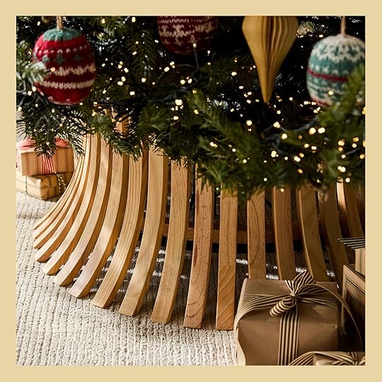
Editor’s Picks: Our Favorite 2024 Holiday Decor
Look, we know Halloween hasn’t even come and gone so posting about the December holidays feels like a real “straight to jail!” offense. But the unfortunate truth of the matter is that things sell out earlier than anyone would like them to. I should know best given that I’m a strict “no-tree till December 1st gal”. Or at least until after Thanksgiving. So if you are able to take in just a little holiday cheer today then boy do I have some CUTE decor options for you to look at. And let me tell you we are starting out STRONG…
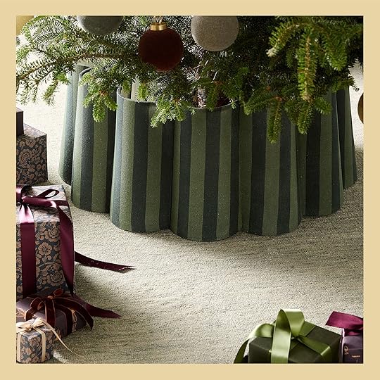
Ruffle Linen Tree Collar | Modern Wood Tree Collar
Immediate yes to both of these tree collars! It makes me want two trees so I could look at them both all season long. Clearly, they are two very different styles but equally as wonderful and timeless. The tonal green scalloped stripe is so playful yet elegant and the MCM wood collar is almost too cool and chic. Do you have a preference?


Velvet Clip-On Bow Ornament Set (Set of 6) | Lanie Linen Stocking
Bows were a BIG trend last year so the retailers took note. These velvet clip-on bows are so sweet and elegant and also come in red. Could you make them yourself? If you’re crafty, absolutely. But for those who prefer a more turnkey solution, these are great. You also may have seen that Sarah Sherman Samuel came out with a Christmas collection with Lulu and Georgia. As you’d imagine, it’s wonderful and chic. This stocking is a perfect example of that! I love the soft colors, the alternating stripe orientation, the scalloped trim, and the sweet poms.

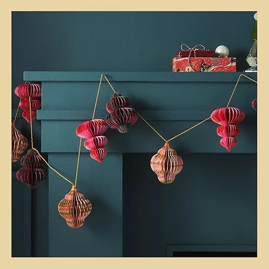
Shooting Stars Garland | Penelope Paper Accordion Garland
I LOVE garlands so much. High impact without much effort. I think these two options above are perfect on their own but can easily be added to a greenery garland. Think how magical that would look! But what I really love is how whimsical these two are. The paper accordion one has all those patterns and I just don’t think I could love it more.

Kello Ceramic Bells (Set of 5) | LED White Holiday Ceramic Snowflakes
I have a lot of Christmas figurines from growing up and they bring me so much joy every time I get them out to decorate. But I am seconds away from buying the Sarah Sherman Samuel ceramic bells. They are modern yet timeless and a set you could pass down. SO special. Then another sweet option are these LED ceramic snowflakes! So cute and festive and could be put anywhere in your house.


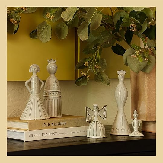
Wood Reindeer | 3pc Ceramic Deer Christmas Figurine Set
I really love to decorate with reindeer (as I said, I have a lot of Christmas figurines) and what I love about these is that they are Christmasy without screaming Christmas in your face. The wood ones are going to be a little bit bigger, ranging from 9″ to 21″, so bigger impact. Then the ceramic ones are 5″ tall. Either way, they are sweet but minimal and would add a special little touch to your holiday decor.
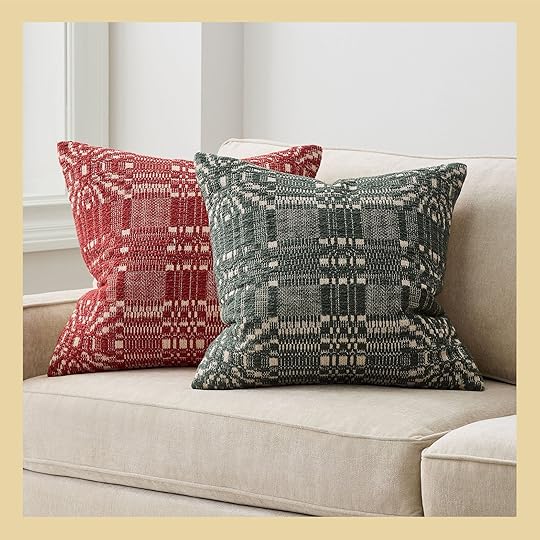
Heritage Pillow Cover | Tree Kilim Spruce Green and Arctic Ivory Throw Pillow Cover
For those who are seasonal pillow people (or aspire to be one), I LOVE these options. The plaid ones are the perfect mix of holiday and style. These aren’t your “fa la la la la” style pillow if you want something a little less “it’s Christmas!” But I also love this tee pillow. It’s still on the quieter side but so cute and simple.

Musical Snowman Handmade German Tealight Candle Holder | Venezia Spruce Green Glass Taper Candle Holder
More whimsy!! Crate and Barrel has a few of these handmade musical German candle holders and while on the more expensive side, this is something to keep forever and pass down. I can only imagine how much I would have loved seeing this every year growing up! But for a more affordable candle holder, that is also fun and festive, these glass candle stick holders are perfect. They come in a bunch of colors and depending on your home’s color palette they could stay out all year.


White Snowman Candles (Set of 4) | Stargazer Flameless Pillar Candle
How cute are these little adorable snowman tea lights!? I love the idea of these being scattered about or put on a holiday tablescape. Tiny accents are always so fun. But for something else firey:) These flameless pillar candle are stunning! Click through and look at how they are styled. They are a little bit more of an investment (especially if you want a lot) but I was shocked when I realized they were flameless and you could also use these year-round.

Silver Metal Menorah | Hanukkah Marble Menorah Candle Holder
It would be great if there was more Hanukkah decor out earlier but I really loved these two menorahs. The silver one is a bit more expensive but the chrome is so beautiful and I think would reflect the light of the candles in such a pretty way. Then the marble one is so affordable and is a cool modern twist on the classic design! Both are wonderful options.


2pc Paper Honeycomb Tree Christmas Figurine Set | Stargazer Supernova Twinkling Stake Light
Finally, we have some accordion trees and this amazing twinkling stake light. I have a few of the accordion trees from West Elm that I love after seeing them in Emily’s house but these Target ones are a bit more affordable. They are one of my favorite pieces every year. Then I just think that starlight light is so special! It can go outside or be put in an indoor plant. It would be impossible for your home to not feel more magical with this light in it.
Ok, that’s it for holiday decor today! Hope this got you a little more excited for the coming months and that you have a wonderful rest of your weekend.
Opening Image Credits: Photo by Kaitlin Green | From: The OFFICIAL First Farmhouse Christmas! (+ A Great Ribbon Hack And My Dream Color Palette)
The post Editor’s Picks: Our Favorite 2024 Holiday Decor appeared first on Emily Henderson.
October 25, 2024
Clutter No More: 13 Budget-Friendly Storage Ideas For Every Room (+ Inspiration To Nail The Look)
If there’s one thing I’ve learned, it’s that you can never have too much storage (or maybe I just have too many throw blankets – jury’s out). Whether it’s a bench that keeps the holiday decor out of sight or a trunk that makes your living room feel a bit more put together, finding those pieces that sneakily double as storage is kind of the secret to making your space feel effortless. So, in case you’re ever staring at that pile of stuff and wondering where it should all go, we’ve rounded up a handful of clever solutions that might just help – no reno or big budget required.

 photo by kailtin green | from: art barn reveal
You know that scene in Stepbrothers, where Will Ferrell asks for permission to build bunk beds? “It’ll give us so much extra space in our room for activities,” he says. That’s the same case I’d like to make for the storage benches we installed in the art barn. (We obviously bought the unfinished pine, but they come in a few other tones and shades, too.) Craft supplies? Toss them in the banquette. Holiday decorations? There’s room for those, too. If it needs to be stored, it can fit in the banquette. Highly recommended for anyone making the most of a small space. (PS. Add cushions for a true built-in look – no one will know you didn’t splurge on a carpenter.)

 lead design by julie rose | styled by emily bowser and assisted by lauren day | photo and production by sara ligorria-tramp | from: a dark attic becomes the most joyful bedroom for three kids
Is your kids’ room a bit short on space? Look no further than this sub-$400 bed frame, which combines the functionality of a dresser, a bookshelf, AND a bed. You’ll love having a dedicated place for your child’s clothes; your child will love having a dedicated place to display whatever treasure they’re newly-obsessed with this week. Everybody wins! What’s not to love?
 design by velinda hellen design | styling by emily bowser | photo by sara ligorria-tramp | from: velinda’s first freelance client reveal part II: her 7 expert tips on mixing a lot of the styles
Oh, you thought those were just nestled coffee tables? THINK AGAIN. This wicker end table opens to reveal storage space for blankets, pillow covers, games, or anything else you’re trying to conceal from your holiday visitors. Added bonus: if you’re suffering from too-small coffee table syndrome (a classic design ailment that affects millions of homes every year), a nestled table like this is the cure – it’s a functional, beautiful, and smart addition to any living room.
 design by julie rose | photo by sara ligorria-tramp | from: a mid-century eclectic living room
While we’re on the note of coffee tables – this MCM-inspired lift-top table is a classic for good reason. Sure, it can serve as a makeshift dinner table for your DoorDash order…but it can be so much more than that, too! It’s a safe place to store and display breakables (swinging dog tails won’t stand a chance against the open shelf). It’s a makeshift WFH space (sometimes you just need to work from the sofa, you know?). It’s a correspondence station (set up your stationary inside; pop it open to write the thank you notes you’ve always wanted to send). But more than anything, it’s just a great coffee table. 10/10!

 photo by bethany nauert | from: fdr chic – a dude’s mix of antique, mid-century and bohemian style
Could I write a post on design-forward storage without highlighting a storage trunk? It’s a jack of all trades – style it as a coffee table, an end table, an end-of-bed bench, a nightstand…the options are endless. If you can’t find a great local vintage option (or if secondhand isn’t your thing), this trunk offers a beautiful mix of textures.
 design by william hunter collective | styled by velinda hellen and erik staalberg | photo by sara ligorria-tramp | from: william hunter primary bedroom
This solid wood nightstand offers the best of both worlds: open storage up top for your pretty things, and a drawer below to mask anything you’d rather keep private. This mid-toned wood is gorgeous, too – it’s easy to mix-and-match with any existing wood pieces in your home. (And, I mean…look how great it looks in a color-drenched space! It’s an easy way to add some life and tension to your room.)
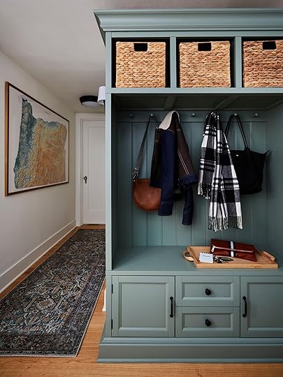
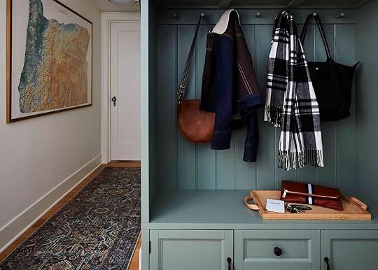
 design by pricilla frost | styled by emily henderson | photo by kailtin green | from: my best friend’s basement budget mudroom
Don’t let the beige finish fool you: this under-$300 hall tree is the perfect candidate for an upgrade. We totally transformed the piece above with a coat of paint, some new hardware, and a bit of added moulding. A ready-made piece like this one is the easiest way to get a built-in look without spending big bucks on custom cabinetry!

 design by velinda hellen | styled by velinda hellen and emily bowser | photo by sara ligorria-tramp | from: a colorful, happy home makeover
Free up some crucial cabinet space with an affordable kitchen island that displays your pretty bowls, dishes, or decanted pantry essentials. I love that this petite version offers a warm wooden top, too – it’s a perfect solution for those looking for a prep surface in a small kitchen!

 design by melanie burstin | photo by tessa neustadt | from: freck office reveal
The semi-skirted console is like a mullet: business in the front, party in the back (or, uh, behind the curtain? Sorry, this metaphor is getting away from me). Get the look at home with this console table from Wayfair, an affordable tension rod, and a fabric of your choice. Stash the unsightly stuff behind the curtain, and keep your favorite pieces easily accessible on the countertop. It’s obviously functional in a kitchen, but I also love it in an entry. (No more staring at dog leashes and poop bags the moment you open the door – what a concept!)

 design by arlyn hernandez | styled by emily bowser | photo by veronica crawford | from: arlyn’s kitchen reveal
The only thing I love more than a cabinet with a fluted glass door is a cabinet with a fluted glass door that’s almost 75% off. (Your eyes don’t deceive you – it’s THAT good of a deal.) This one obscures juuuuuust the right amount, too – use it as a pantry, like Arlyn did, or throw it in a living room for a pretty storage solution that doesn’t need to be straightened up constantly.

 design and photo by sara ligorria-tramp | styled by emily bowser | from: sara’s primary bedroom reveal
I’ve previously recommended these collapsing metal under-bed storage bins, but I’ve found a new great option to share! This pair of solid wood drawers are made from solid pine, FSC certified, and harvested from sustainably managed forests. I know what you’re thinking: they must be expensive. THEY’RE NOT! Grab them for $115 total – that’s just $57 for a bin you’ll be able to use forever. They’re ideal for linens, out-of-season clothes, shoes, or whatever else you’re currently struggling to reach under your bed.

 design and styled by emily henderson | photo by kaitlin green | from: kaitlin’s basement reveal
I’m on a mission to bring the filing cabinet back into fashion. I don’t know when these fell out of style – or when “offices with only a desk and nothing else” became popular – but I’m here to tell you: filing cabinets can be beautiful AND functional! Look for a wood tone that echoes the shade of your desk for a more seamless, designed look (this rich mahogany shade is nice!). I promise: it feels SO GOOD to have a dedicated spot for medical records, tax returns, or any other important piece of paper you need to hold on to. Why not give them a pretty home?
 design by
kirsten blazek
| photo by
virtually here studios
| from: creative director and founder of a1000Xbetter kirsten blazek’s soulful, vintage filled home
design by
kirsten blazek
| photo by
virtually here studios
| from: creative director and founder of a1000Xbetter kirsten blazek’s soulful, vintage filled homeIf you’re in the market for a new bedroom or entry bench, don’t forget to consider an option with storage! In the former, toss your socks in the drawers for a one-stop perch. In the latter, store your myriad of free tote bags or reusable grocery bags – you’ll never forget to grab them again! I love that this bench comes with a sweet upholstered top, too.
Opening Image Credits: Design by Pricilla Frost | Styled by Emily Henderson | Photo by Kailtin Green | From: My Best Friend’s Basement Budget Mudroom
The post Clutter No More: 13 Budget-Friendly Storage Ideas For Every Room (+ Inspiration To Nail The Look) appeared first on Emily Henderson.
October 24, 2024
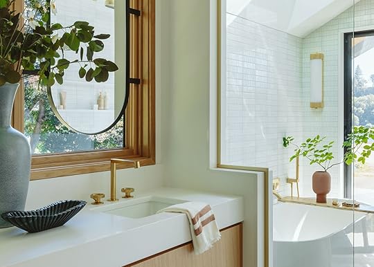
The River House Primary Bathroom Reveal (Including A Sauna!! And Mirrors In Front Of The Window)
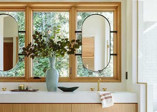
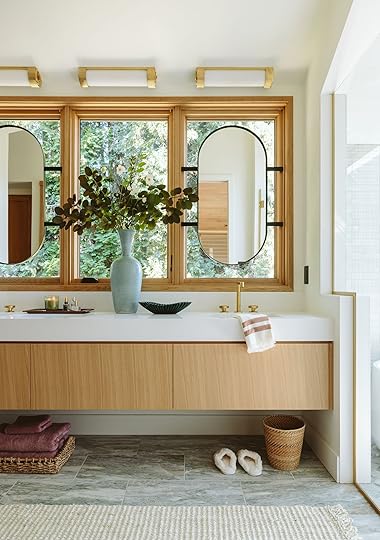
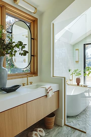
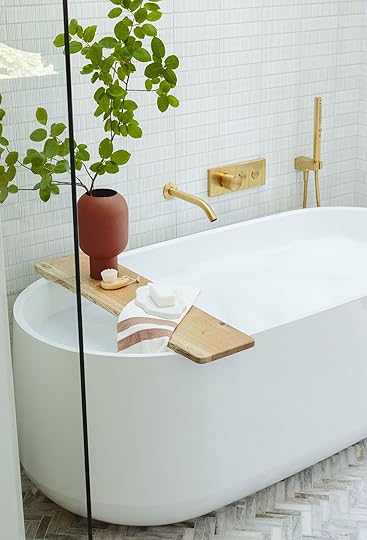
Today we have quite the luxury bathroom for you – including a hers and his shared shower, a view of the river, a heated toilet, and a sauna inside the bathroom (I’m truly jealous). It’s another River House bathroom, my favorite one that is so warm and airy – and the white tile in here might be my favorite I’ve ever used.
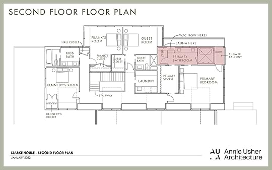
The bathroom itself is more long and narrow – the shower faces east and the windows over the vanity are south. The footprint of this wing was dictated by how the house was designed by Anne Usher (the architect) and built by JP Macy of Sierra Custom Construction. It’s not huge so it had to be really thoughtful in how it was going to be maximized. They actually added the sauna near the end which I think they stole by flipping the toilet room and getting rid of that small storage cabinet between the old toilet room and the vanity area.
Here you can see how it connects to the primary bedroom. There is a pocket door to ensure that if one person needs to get up early to get ready or needs privacy they can just close it.
 photo by kailtin green | from: river house primary bedroom reveal
The view from the bedroom (reveal here!) into the bathroom is just so pretty. Those mirrors hanging in front of the window might be my favorite thing (albeit controversial).
Here’s a little video before we get into the pretty photos! (just wait for the ad to play:))
Paint Color | Windows | Mirrors | Ceiling Lights | Countertops | Vanity (custom) | Faucets | Handles | Sink | Vase | Scalloped Bowl | Towel | Wood Tray (vintage) | Woven Tray (similar) | Towels | Slippers | Wastebasket | Runner
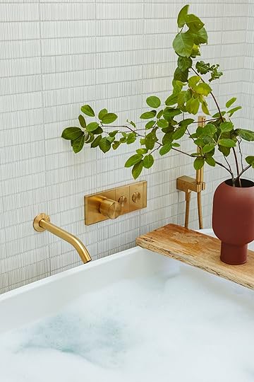
She is such a sophisticated bathroom – wood, green, brass, and so much natural light that you would never need to turn on the overhead lights (except during the 5 months of darkness that we are about to enter, LOL). The vanity is a long floating custom vanity designed by Max and Anne (and maybe me, I honestly don’t remember at this point).
Mirrors In Front Of The Windows?Anne was the one driving the mirror in front of the window situation which I was fully on board with because it’s weird and cool (and I’ll do anything for natural light + quirk). Anne had an interesting philosophy that basically says we should prioritize seeing nature over seeing our faces all day. Obviously, you need a mirror when you are getting ready but I love the idea of not being confronted with my own face when I’m just getting up or even brushing my teeth and instead looking at the trees. Now of course we ended up putting mirrors above the vanity in front of the windows anyway, and here is why…
We originally wanted to hang the mirrors from the side or ceiling on a pivot that could be stored out of the way, but the ceilings are vaulted and angled and the sconces needed to be hung as flush mounts up there. Also, the sides weren’t symmetrical which felt odd to us. We worked with a welder and tried to figure out how to hang from the top of the wood or the side, but he basically told us that it would be floppy and never solid (which seemed like a bad choice). So we designed them to be attached inside the wood frame and used the Kohler mirrors (which were perfect in size and shape) with a custom welded back.
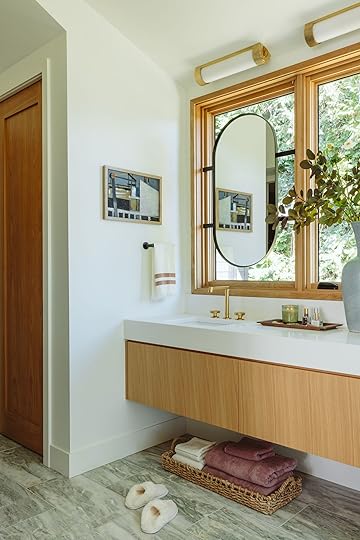
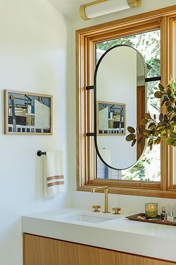
Art (vintage) | Towel Bar | Towel
The vanity has three drawers – two with cutouts for the sink plumbing then a huge drawer in the middle.
Faucet | Handles | Sink | Countertop
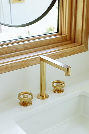
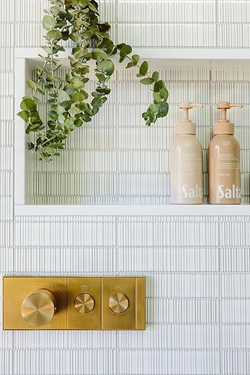
The faucets are part of the Components Collection from Kohler that comes in all the different finishes and a few different shapes. The line is called “components” because you can choose separate handles and spouts – essentially customize the exact look you are going for. We used the gooseneck faucet for the guest bath so opted for the Row spout, a squared-off version, up here.
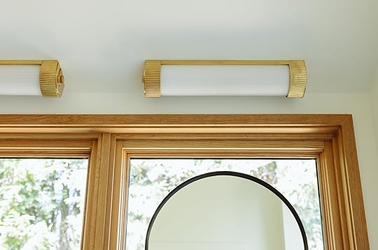
These light fixtures are new and so awesome. They are so heavy and high quality, with a really pretty gold patina, and they give off excellent light. You can obviously use them vertically flanking a vanity mirror as well.
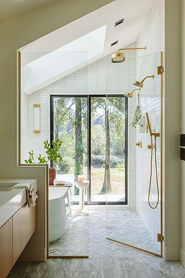
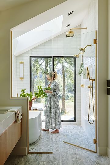
To the right of the bathroom is the tub/shower wet room and it’s so flooded with light, bouncing off all the textures in the tile and the faucets – it’s extremely dreamy to be in there.
Shower Door (custom) | Wall Tile | Floor Tile | Wall Light | Sliding Door | Tub | Tub Tray (local) | Vase (local) | Drink Table | Candle | Rain Showerhead + Shower Arm | Showerheads + Shower Arm | Handshower | Wall-Mount Handshower Holder | Metal Shower Hose | Thermostatic Valve Controls
Because we were working with Kohler on this we were able to go all out in the plumbing department – a rain shower, two showerheads for joint showering, and a hand shower. Their new Statement and Anthem line is so beautiful and with a lot of flexibility and customization – with options for mechanical valves that don’t require electrical in addition to plumbing (so an easier install) or digital.
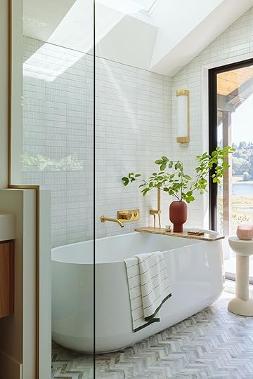
Wall Tile | Floor Tile | Wall Light | Sliding Door | Tub | Towel | Tub Tray (local) | Vase | Drink Table | Candle | Bath Spout | Handshower | Wall-Mount Handshower Holder | Metal Shower Hose | Thermostatic Valve Control
We chose the Ceric tub because it was the narrowest and has such a sculptural and classic shape. The water temp is automatically set and you simply just push on and off and it reaches that temperature. The look of it is so design-forward, but the function is really simple.
The tub is big enough for two people but doesn’t have a huge footprint so fitting into this shower was just fine (which was something we worried about and went through all the exercises like bringing a cardboard template to make sure it fit).

Bath Spout | Handshower | Wall-Mount Handshower Holder | Metal Shower Hose | Thermostatic Valve Control
The knob controls the temperature and the buttons turn it on and off (and control the hand shower). It’s just so streamlined and squared off with these modern round knobs – so graphic and simple.
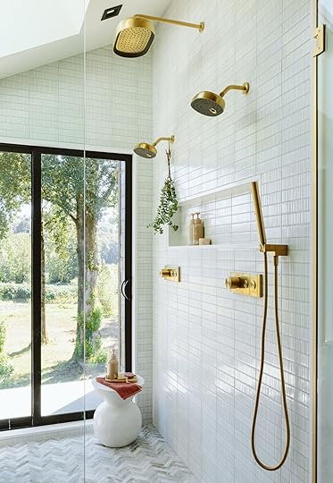
Side Table | Shampoo | Conditioner | Cream | Towel | Rain Showerhead + Shower Arm | Showerheads + Shower Arm | Handshower | Wall-Mount Handshower Holder | Metal Shower Hose | Thermostatic Valve Control
Each person gets to control their own temperature, all pre-set by them, and they can change the water pressure and stream with a few different options (there is a really fun spray that is so soft that we love).
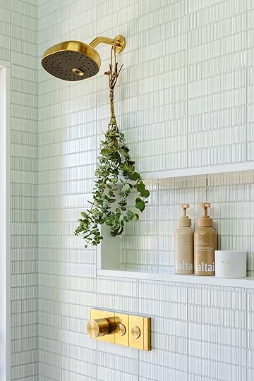
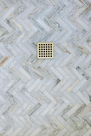
This tile is one of my favorites I’ve ever used – such a pretty texture with white and vertical organic stripes. We stacked them horizontally and the vibe is so rich and textured, and yet still calm.
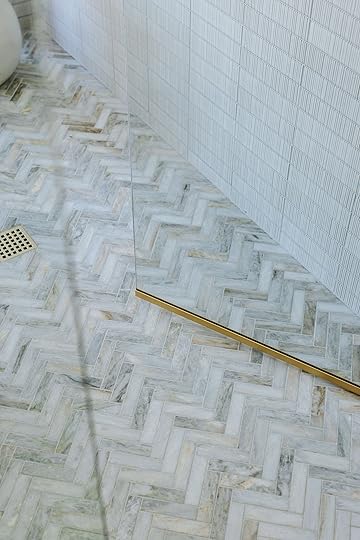
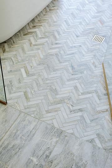
Wall Tile | Herringbone Mosaic Tile & Stone Slabs
Ann Sacks has a lot of stone tile as well, and we chose the large format 12×24 for the vanity floor and then switched to a small herringbone of the same tile for the shower room (smaller tile always works to slope better towards the drain). It’s all so gorgeous.

Herringbone Mosaic Tile & Stone Slabs
The stone has a lot of warmth and green in it, calling back to the trees outside all the windows. I can’t stop staring at it.
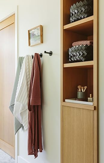
Door (custom) | Robe Hooks | Mint Towel | White Towel | Robe | Art | Built-In Cabinet (custom) | Leather Baskets | Tray
Anne (the architect) designed this storage cabinet with three shelves and a door for extra storage. The Kohler hooks are black to help pull in the black sliding door frame and all the black light switches (we also chose a black hand towel bar).
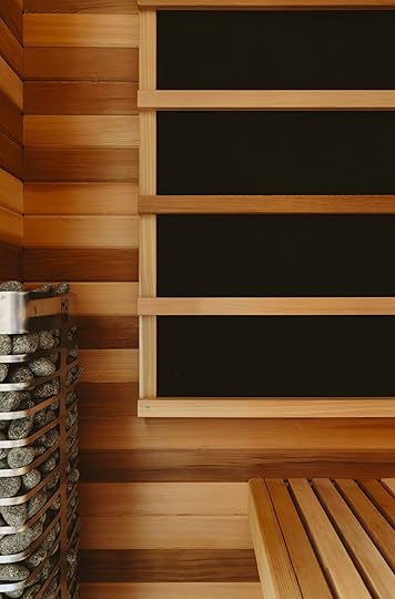
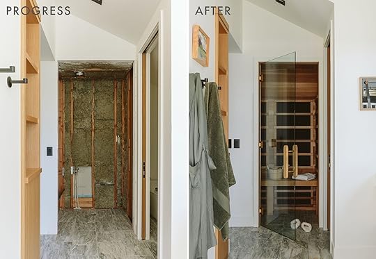
The Sauna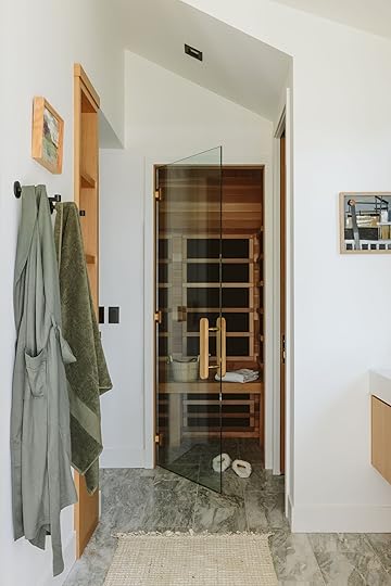
Robe | Towel | Sauna (custom)
Now, TBH I had very little to do design-wise with this sauna, beyond my extreme support and enthusiasm. The best part is that it’s both infrared AND a traditional dry sauna. I’m so jealous. Essentially the infrared goes deeper and some say is better for your skin, but they don’t heat up to be as hot as fast (and you have to stay in much longer to get the benefits) whereas a traditional dry sauna can get really hot and you only need 20 minutes to drip with sweat and get the mood-boosting benefits.
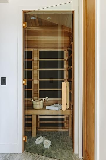
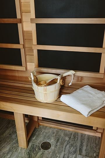
The black panels are the infrared heat and then below you’ll see the dry system with all the rocks. My brother worked with a local sauna builder (that is a design/build firm) and Ken was super happy with their service and work.
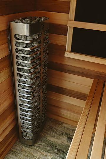
The sauna is big enough to fit both of them sitting up or one lounging. They have been using it 5 nights a week, watching Friday Night Lights through the glass on an iPad. Again, very jealous.
The Toilet Room/Watercloset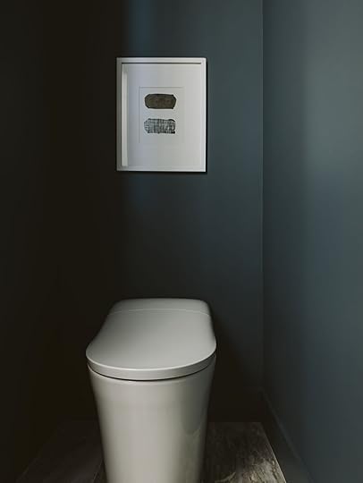
Wall Color | Toliet | Art
Yes, there is a toilet in its own little room with a pocket door and a beautiful deep color. It’s a smart toilet with a heated seat, bidet, and a lot of bells and whistles (controlled by a remote that is attached to the wall). Yes, you need to plan for a plug (and I’d suggest all toilet rooms get an outlet just in case a future owner is as obsessed with having a bidet as the general bidet enthusiasts club population seems to be. LOL). They LOVE it. And I love how streamlined the toilet is, thus making it easy to clean:)
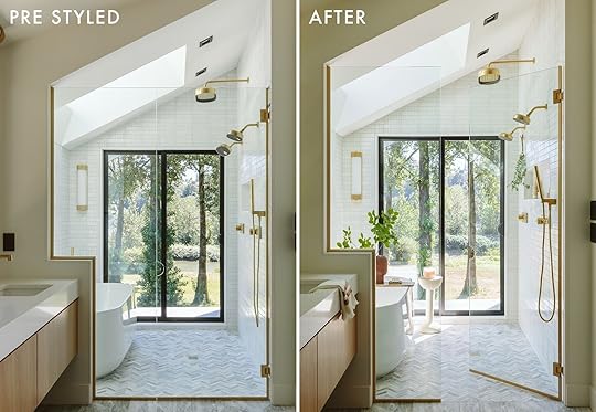
Jess thought it would be fun to show you the difference between the bathroom before and after styling – it’s so simple and calm so the styling really added a lot.
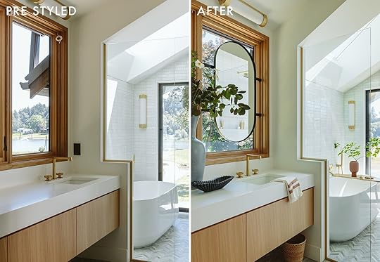
Human for scale:) I love my bathroom, I do, but when you are in this bathroom, showering with a view of the river, surrounded by trees it’s pretty darn glorious. A huge thanks to Kohler for partnering with us on this bathroom – we are so thankful to work with our favorite brands to create beautiful rooms (and photos for the blog).
Bathroom Resources:
Mirror: Kohler
Plumbing: Kohler
Windows: Marvin
Tile/Stone: Ann Sacks
Countertop: Caesarstone
Vanity: Custom
Shower Door: Custom
Sliding Door: Marvin
Main Wall Color: Alabaster by Sherwin-Williams
Water Closet Color: Riverway by Sherwin-Williams
Lighting: Kohler
Sauna: HD Contractor (custom)
*Architect: Anne Usher
**General Contractor: JP Macy of Sierra Custom Construction
***Interior Designers: Emily Henderson (me!) and Max Humphrey
****Styling: Emily Henderson (me!)
*****Photos by Kaitlin Green
The post The River House Primary Bathroom Reveal (Including A Sauna!! And Mirrors In Front Of The Window) appeared first on Emily Henderson.
October 23, 2024
From Quick & Cheap To A Lasting Investment: 5 Ways to Extend the Life Of Your Sofa (Yup, Even If Your Cushions Are Saggy)
Last year, right around this time, I was working on a feature story about sustainable home renovation (ha, it sounds like an oxymoron) for a national publication. I talked to LEED-certified designers, builders, and contractors. I interviewed leaders of sustainable building councils and organizations. And while I learned so much from all of my conversations, my biggest takeaway was a gut-wrenching panic about the amount of home-related (both building material and furnishings) waste that’s created every single year.
This isn’t shocking, I know, but when you don’t understand the full scope, it can be easy to overlook and just let yourself get excited about a room makeover not born out of necessity but out of want. (Stay with me.)
According to the EPA, roughly 12 million tons of furniture and furnishings ended up in landfills in the last report I could find from 2018. While about 20% of that was combusted for energy recovery, nearly 80% remains in the landfill. That’s 9.6 million tons. TONS, not pounds, so some quick math to understand poundage here would be about 192 BILLION pounds. A year. There are some efforts to recycle, but there is no measurable data available apart from mattresses, so it’s hard to know how much is being reused and repurposed.
This is…staggering. It’s hard to even mentally process how much we’re taking from our homes and disposing of either because it’s broken and can’t be fixed, it’s broken and we don’t want to go through the trouble or expense of fixing it, or we’re onto new and “better” things. Sadly, so much of the furniture on the mainstream market today is not meant to last, which is part of the problem. It’s “fast furniture” made of veneer-covered particle board, plastic, cheap wood and foam, built specifically to fill a temporary need, not to stay in our homes for decades (or even centuries as things used to do). Some things we can’t help but dispose of, because there’s no other way. But also—and I’m certainly guilty of this as well—we’ve grown so accustomed to seeing people buy a home only to rip it all out to the studs for their personal preferences, or go through sofas as quickly as I do deodorant in a heatwave (that’s fast).
Of course, there’s always the option to buy second-hand, vintage and antique to not bring a new piece into play that will eventually get tossed. This is such an approachable choice for furniture in particular, being that there is so much already out there, mostly in great shape, and even from current retailers if you prefer that over vintage.
 i feel like i’ve shared this photo of my sofa so many times and everyone is sick of seeing it, but here it is again, for good measure.
 But that’s not what I’m here to talk about in-depth today. What I am here to share is how to make your sofa, specifically, have a longer life both for sustainability purposes but also because sometimes, you just don’t have the budget for something new, or the timing isn’t right. I’m in this scenario myself, which is why I pitched the concept. I’ve had my Interior Define Maxwell sectional since 2018. After years of pandemic-induced round-the-clock lounging, then newborn baby-induced round-the-clock sitting either to breastfeed, pump, or contact nap, my sofa is looking *rough*. Some of the cushions are flatter in spots than others, and the velvet is kind of bubbling weirdly (no clue why, and never seen that happen before). It’s also proving to be a little too small for the number of people we normally have over sharing it with us.
I could just say “Screw it, let’s get something new,” but that wouldn’t work for us financially at the moment, and also nothing larger would fit in our current living room. That, and I’m challenging myself (and now you if it makes sense to you) to stretch this puppy until I can’t stretch it anymore. I brainstormed five ways to keep the heart of your couch beating for a few years more to keep it out of the eventual landfill for just a bit longer, though first, here are a few ideas if you ultimately need a new sofa, because I get it…sometimes your needs change, specifically with how much seating is required in your home. That small apartment-sized sofa you got 10 years ago probably doesn’t work in your now larger living space. But it doesn’t have to go out on the curb! Consider:
Using a too-small sofa in another room of your home, like your office, primary suite, guest bedroom, bonus room, or playroomSelling on second-hand marketplaces like Facebook Marketplace, Craigslist, NextdoorOffering it up to neighbors on groups like Buy Nothing (via Facebook)Donating to Habitat For Humanity, The Salvation Army, Out of the Closet, or even local organizations that may be in need such as shelters, LGBTQ centers, etc.Researching facilities in your area that specifically recycle furniture (there may be a drop-off fee; some may offer pick-up services, also for a fee)Now, on to five ways to extend the life of your sofa, from the lowest and cheapest lift to a much larger (but longer lasting) investment.
Idea #1: Wrap A Pretty, Durable BlanketBy far the easiest way to go about this. This is a great option for anyone wanting to be preventative about the state of your upholstery in a high-traffic living room with pets, kids or generally rough-and-tumble adults. It’s also a useful bandage when your cushion fabric has seen better days (or you’re tired of looking at it).
View this post on InstagramA post shared by JULIA MARCUM · CLJ
(@chrislovesjulia)
View this post on InstagramA post shared by Brigette Muller (@hummusbirrd)
I pulled two opposing examples to show you that wrapping a blanket or quilt (or in the case of Hummus Bird on the right, a tapestry), isn’t necessarily a one-note look. You can go the route of Chris Loves Julia with a tightly wrapped throw, or keep it loose and free with a casual drape.
View this post on InstagramA post shared by Jennifer L Harrison (@fleamarketfab)
View this post on InstagramA post shared by Jennifer L Harrison (@fleamarketfab)
The two photos above are from Flea Market Fab, and both show a thicker coverlet and mudcloth fabric effortlessly covering both indoor and outdoor sofas. I think in the context of those room designs, it works beautifully, though given the right print and colorway on the blanket, it might also be a cool moment of tension in a more modern space.
View this post on InstagramA post shared by domino (@dominomag)
Here’s a very neat, happy modern room where the sofas are covered in blankets, quilts and throws. It’s purposeful, and can really play into the style of the space. It doesn’t have to feel like you threw an old throw on your couch cushion because it was gross. It can feel cool and even edgy!
A large bed coverlet or mattress-sized quilt works best for this both for durability and size, though a traditional throw blanket could also be put to good use here, depending on how large your sofa or sectional is. Here are a few I rounded up that I love:
Blankets, Quilts & Coverlets:


 Top row, from left: Astrid Check Patchwork Cotton Quilt | Checkered Reversible Wool Throw | Brown Kantha Quilt | Bottom row, from left: Rainy Linen Throw | Stillwater Floral Quilt | Averill Organic Cotton Quilt
Now, the first thing I thought when I saw this concept was “Yeah, but the first second I sit on it, we’re done for” in terms of keeping it in place. I dug around to read how some people do it, and there are mixed outcomes of success, though these three things came out on top.
Ways to Keep Them In Place:
From left: Adjustable Bedsheet Holders | Padded Comforter Clips | Bed Sheet Holder Straps
Idea #2 Add A Sofa Cushion TopperCushion toppers have a very European vibe (they are used a lot in France to my understanding), and I love how they add a whole other visual element to your sofa. These are not utilitarian dog blankets, okay? They are decorative and add comfort, support, and durability to couch cushions.
 Left: GreenRow Sofa Topper Pillow Cover w/ Insert | Right: Stone Washed Velvet Throwbed
I love the eclectic patterns of the sofa toppers from GreenRow, but if you prefer a more tailored look, Arhaus has some in pretty matte velvets. For anyone who wants to customize theirs more fully, Etsy has a bunch of shops offering them. I found these three for starters: #1, #2, #3.
Idea #3: Add Supports To Your Existing Cushions/Sofa FrameIt doesn’t matter how many blankets or cushion toppers you add, some sofas seem beyond the pale because of sad, sinking seats. That’s both aesthetically bad but also horrible for anyone with back problems. There are two ways to go about this: A support mat if you have a funky frame with bad springs or slats, or cushion inserts if lumpy, pancake cushions are the culprit. You should see some of the before and afters on these things (you can if you follow the links below). It’s wild! Sofas that looked like a steam roller had been taken to them are as plump and taut as my toddler’s youthful cheeks (both face and tush).
 Left: Ben’s Home Lifetime Couch Cushion Support | Right: Couch Cushion Inserts Support
I’m considering ordering some of those insert supports for the dipped portions of my cushion. They come in different sizes and can be cut to create whatever angle your seating requires. This photo here shows it being put at the top of the existing interior, but I’ve seen them better used at the bottom so the original foam/batting/whatever you have is at the top, which looks better IMHO.
Idea #4: Order New Custom Cushion InsertsNow we’re getting into some more spendy territory, but it’s important to include because new cushion inserts can *really* extend the lifeline of your upholstery. It gives it nearly new life unless the frame or fabric is bad (see idea #5). Yes, you will still have the waste of your old cushion interiors, but it’s far less than the whole couch. I explored this option when I used to own the Crate & Barrel Lounge II sofa and my cushions were flattening. That was about 7-8 years ago, and at the time, for two VERY large cushion inserts (and honestly, I can’t remember if that included the fabric as well or not), it was going to cost me about $700. I’m sure this is far more expensive now, considering that sofa was $1,200 when I purchased it and is now $2,300 (GOOD LORD THE PRICE INCREASE!).

HOWEVER, I write that to say that your first stop if you love your sofa but not how your foam or down has fared is the store where you originally purchased it, particularly if it was a made-to-order item (and not a drop ship item from Amazon, All Modern, or the like). Get a price quote from the direct dealer, because this is going to be the best retrofit. It will, though, likely be the most expensive.
If you’re not able to go that route for whatever reason, fear not, because there are plenty of companies that can make you new inserts and just ship them straight to your home. Some will even let you mail in your existing cushion, and return it with the new one in place. Here are some I found. I put in some estimated measurements of my sectional (which has very large cushions), and got prices from $200 to $500 a cushion. It’s not cheap, but with the average price of sofas being near $2,000 these days, it still may be a more affordable, not to mention sustainable, option.
Foamorder.comZipcushions.comSofacushionrefills.comIdea #5: Full Reupholster JobAnd finally, the big Kahuna of sofa restoration. The full reupholster job. There are certainly sofas that don’t justify the expense of a re-do. Honestly, if you get quoted more than you spent on the original sofa when it was new (vintage and antique pieces are an exception here), it’s probably just not worth it. But an interior and exterior revamp on a sturdy, high-quality piece you already own or bought second-hand can really be a great lane to explore.
 photography by sara ligorria-tramp and veronica crawford | from: all the hows, whys and how much’s of upholstering with (kid- and pet-friendly) crypton fabric
You will have free reign of fabric choices (so feel free to get wild here!), you can get your choice of cushion filling if you need new ones, and even add fun details like piping and tufting. Be prepared to spend anywhere from $1,000 to $4,000 depending on size, frame, if cushion inserts have to be replaced, and if the frame needs fixing. And that’s not including fabric. Upholstery fabrics can be $40 or $400 a yard, and the variation in price tag is based on material, brand, etc. Expect to need 15 to 30 yards (or more) of fabric, again, depending on the size. Location also factors into this spend, but don’t be afraid to shop around. Get 2-3 quotes to feel good, ask to see real-life examples of their work as photos don’t really show you quality or detailing, and remember, you often get what you pay for.
Though the cost to reupholster a couch varies, quality sofa upholstery could cost 50-60% less than getting something new all things considered. A new sofa might be cheaper, but it won’t last as long, which ultimately makes it more expensive. Before calling upholsterers for quotes, measure your sofa and research fabrics—most workshops will also have access to fabrics so don’t feel like you have to source that on your own.
—
And that’s all I have for you today. I hope what I shared today inspired you to look at your sofa with new eyes and see what you might be able to do to it or with it to keep it kickin’ longer, whether in your home or someone else’s. Home decor and renovation in and of itself can be wasteful, but we can all try to do a bit better in some arena of it that we can control. Every little bit helps.
Until next time…
Opening Image Credits: Design by Brady Tolbert | Photo by Sara Ligorria-Tramp | From: Brady’s Living Room Refresh with The Citizenry
The post From Quick & Cheap To A Lasting Investment: 5 Ways to Extend the Life Of Your Sofa (Yup, Even If Your Cushions Are Saggy) appeared first on Emily Henderson.
October 22, 2024
14 Sofas That Look Great From The Back (Ideal For Floating In The Middle Of The Room:))

If you are like me, your ideal living room layout requires you to float your sofa. Or maybe you are unlike me and simply just have a very large living room where putting a sofa on a wall would look off, thus also requiring a floated sofa(s). Either way, this post might be just for you if you are in the market for a great floatable sofa. Now, I think most sofas look fine from the back. Sure, maybe they aren’t anything special but ultimately, no one is going to come into your home, look at your sofa, and immediately shield their eyes to avoid direct eye contact.
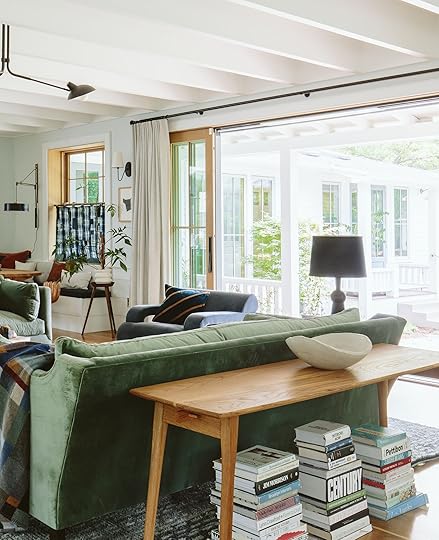
 left: photo by kaitlin green, from: farmhouse living room reveal | right: photo by sara ligorria-tramp, from: mountain house family room reveal
If you already have a floated sofa, our favorite two tricks to add a little visual “behind” interest are a sofa table (see post here for more info/rules) or a patterned blanket draped over the back. I’m sure you’ve seen Emily do this a ton of times.
But these tricks aren’t why we are here today. Nope! Emily thought it would be fun to find a bunch of “pretty backed” sofas along with some tips. And since I am the owner of one of these types of sofas I figured I could be of service. So first we’ll go through some pretty Instagram examples and then I’ll show you my sofa findings. Ok, let’s go!
View this post on InstagramA post shared by Jase Sullivan (@jasesullivan)
Why not start bold?! This vintage De Sede DS600 sofa is HIGH IMPACT. It’s clearly not going to be everyone’s cup of tea (or in most people’s budget) but it so clearly drives home the power of a sofa that has a beautiful back. It’s a part of the sofa, meant to be seen, instead of the part that’s supposed to be hidden against a wall.
View this post on InstagramA post shared by Jase Sullivan (@jasesullivan)
View this post on InstagramA post shared by Jase Sullivan (@jasesullivan)
Another “not so average” aka custom sofa, where the intent was to have the back of it be a part of the room design. I just love the idea of a multi-fabric patterned sofa. SOMEDAY! If you love patterned sofas check out Arlyn’s post here
View this post on InstagramA post shared by estliving.com (@est_living)
View this post on InstagramA post shared by estliving.com (@est_living)
These two sofas are a little less in your face design-wise but the shapes are still a little more unique than your average rectangular sofa. Shapes are going to be a big part of this post and the shoppable sofas I choose!
View this post on InstagramA post shared by Zoe Feldman (@zoefeldmandesign)
View this post on InstagramA post shared by Erin Fetherston (@erinfetherston)
A sofa base/feet is also important for a sofa to look beautiful from the back. So while both of these sofas have a wonderfully rounded top, the wide feet of the white sofa and the fluted base of the pink one add such a special element that’s meant to be shown off!
View this post on InstagramA post shared by Pop & Scott (@popandscott)
View this post on InstagramA post shared by Architectural Digest (@archdigest)
The last example shows the power of the wood-backed sofa. Ugh, SO pretty and it would be a literal crime to not show these beauties off! Technically, the “sofa” on the right is a chair, but it does come in a sofa size:) These types of backs add so much texture and personality to a design that if you can get one, we recommend it!
Before we get into the sofas I found let’s recap the shopping tips for pretty backed sofas:
Look for interesting shaped sofas (usually the backs are cool too)Check to see if the back has any stitch detailingLook for a base or feet where they look equally as great in the back as they do in the frontA solid base will usually always look good in the back:)Ok, onto the picks!
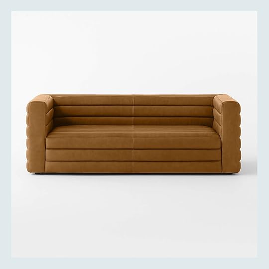
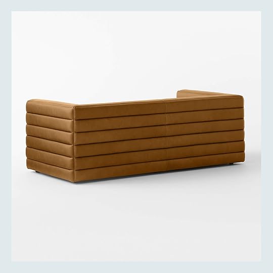
There’s nothing about this one I don’t love. I’d say most channeled sofas aren’t channeled on all sides like this one is. It could go in a modern space, a traditional space to freshen it up, or a totally eclectic room. It’s extremely versatile with the style and tone of leather plus looks great at every angle. It also comes in a beautiful velvet which is more affordable.
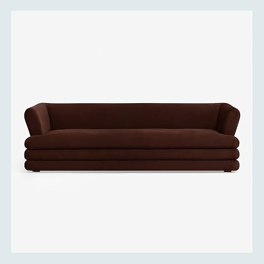
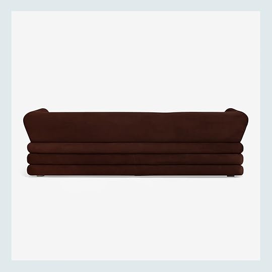
Lulu and Georgia and Sara Sherman Samuel aren’t playing around with the pretty backed sofas. This one comes in a bunch of other colors and a few different widths. It’s another channeled option that’s a little more post-modern than the first. I just really love this color and fabric too.
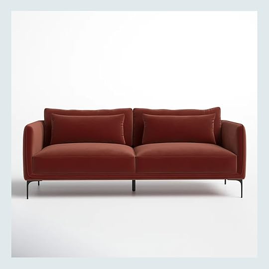
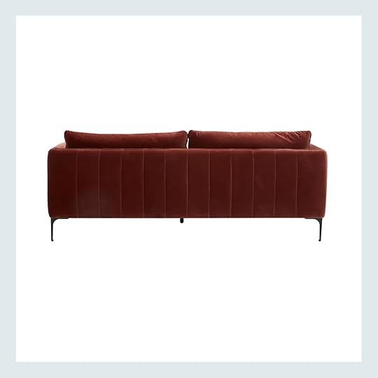
If the first two felt a little too much for your taste but you like the idea of a channeled look, then this one could be your match. Much more subtle but the stitching on the back is so so pretty. This one also comes in a bunch of other colors!
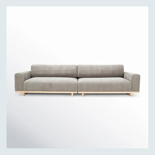
I feel pretty positive that this was one of the sofas the styling team got for our Rugs USA shoot for our second collection! It looked great in person and that base is so pretty, front and back. It’s also well-reviewed:) So simple and clean and adds instant chicness to a room.
Here’s a very similar version but in another very pretty and neutral color palette. And while it’s a white sofa, it’s a performance fabric and super deep which is awesome!
Not only is the shape of this sofa very cool but the legs are very unique and it has over 100 nearly 5-star reviews! They say it looks great and is comfortable which was my first concern when I was looking at it. I’m pumped it’s got form and function locked down.
Here is another Lulu and Georgia sofa so you know that quality is going excellent (the other colors are great too). And that shape is so awesome. The back might seem like nothing is going on but the tubular look of the whole piece makes it feel very unique to me.
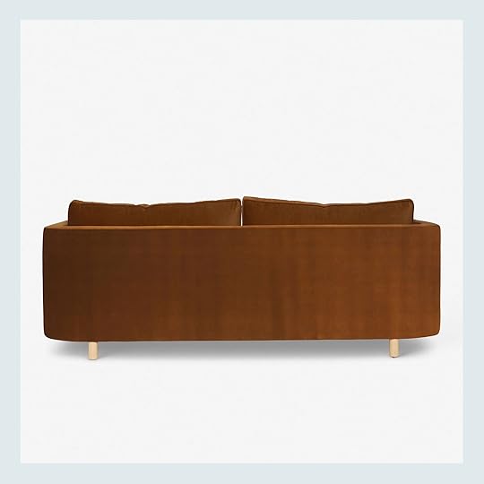
Oh hi there! This is the sofa I have and am sitting on as I type. This one is simple too but the curved back is so so pretty and deserves to be shown off to every guest who enters. I can’t recommend it enough.
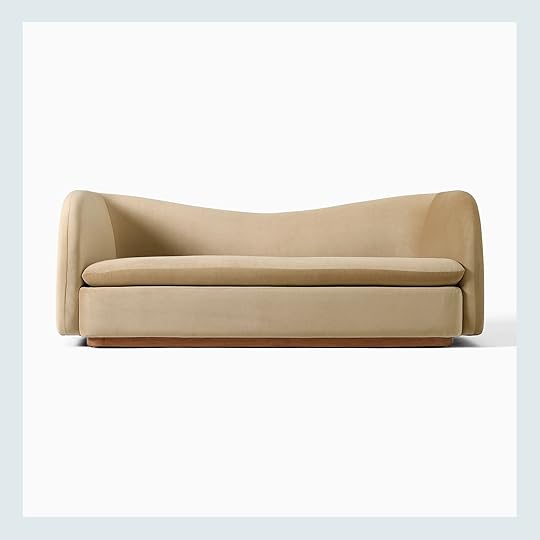
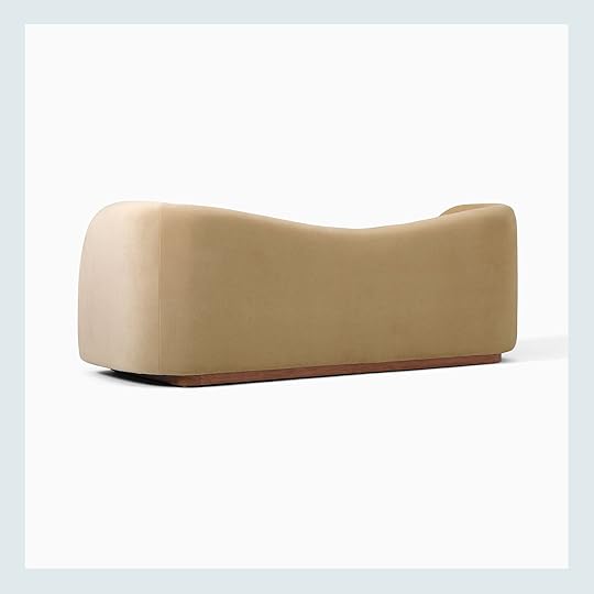
For some more drama, this stunner is a showstopper. The shape of that back paired with the solid wood base makes this a floating sofa dream. I don’t think I could love it more.
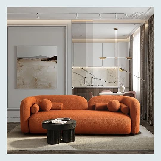
If you have a fun, eclectic modern style then this sofa could be perfect for you. The asymmetrical split back is really cool and not something you see a lot of. The reviews are great and it also comes in a white boucle if the rust orange is a little too bold:)
I think you know what I’m going to say…THOSE LEGS!! Are you kidding me? How cool are they?! The whole sofa looks like a piece of art. 10/10. Oh, and it comes in the prettiest dark olive too.
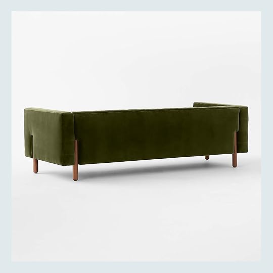
Marconi Tufted Green Velvet Sofa
Speaking of pretty green sofas, this CB2 sofa is pretty gorgeous. I LOVE how the legs are placed into the sofa’s sides and back but are still visible. I also love how the legs are pretty tall so it adds to the drama. Big fan.
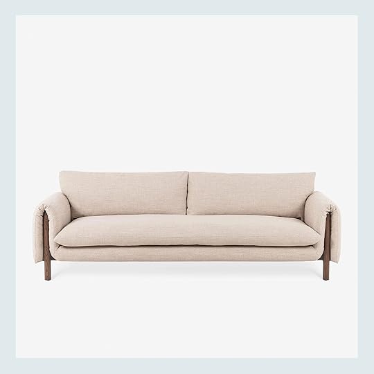
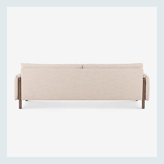
This one kinda has a similar wood leg vibe to the green sofa above. I love that you can see the wood arm in the back and the waterfall soft arm is cool and casual all at the same time!
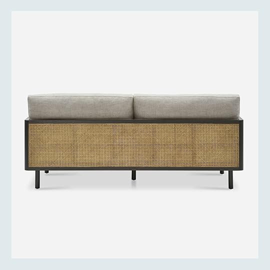
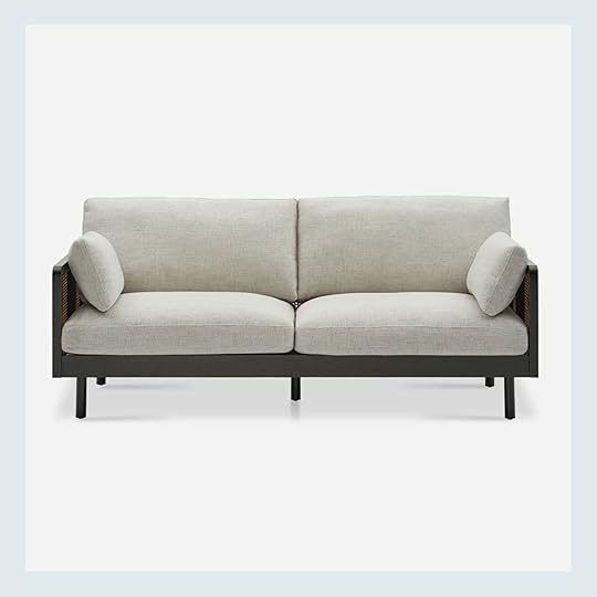
Then last but not least is this awesome cane frame sofa. Talk about a great back (and sides)! It has 42 5-star reviews and would add so much style to a space! It’s bold but neutral and clearly it has a beautiful amount of texture. A truly special piece!
Well, that’s it for today. If you need a sofa and have it float in your room, please don’t forget that the back can be special too:) Hope this post was fun and even a little helpful.
Love you, mean it.
Opening Image Credits: Photo by Sara Ligorria-Tramp | From: Mountain House Living Room Reveal
The post 14 Sofas That Look Great From The Back (Ideal For Floating In The Middle Of The Room:)) appeared first on Emily Henderson.
Emily Henderson's Blog

- Emily Henderson's profile
- 10 followers

