
Emily Henderson's Blog, page 37
October 21, 2024
My Fantasy Craft Room Is DONE – The Full Reveal Of The Art Barn/Craft Shed Happens TODAY
When we first found this property we reveled in the idea that there were so many outbuildings that I could experiment in, design-wise. But as our renovation of our home continued on and on, I got burnt out – the decision fatigue, the regrets, the financial drain, and the endless contractors onsite left me not wanting to touch the other buildings. These run-down buildings were the reason we wanted this property in the first place, but at times all I saw was stress and responsibility. Then this year, as I was doing my brother’s house, designing his kids’ rooms, spending his money (LOL), and decorating for their wants/needs/family, I got so excited to use some of my design energy towards myself and my kids again. It was a total juxtaposition – the river house project is high-end, heavily partnered up, more neutral, and frankly not mine. But this barn? This was a room where I could get wild and do whatever I wanted. It became what I always intended for the non-living outbuildings – a space for me to experiment creatively and flex a bit. To have fun. A design lab. We did it pretty fast, bare bones, and not necessarily budget-friendly, but the ideas hopefully are relatable and can spark some inspiration for you.
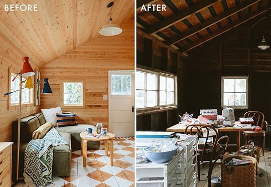
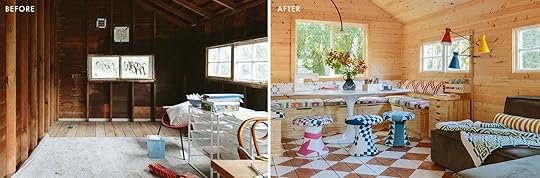
The Barn – BEFORE
As a reminder, this had wood walls, no insulation, electricity that didn’t work, and wood floors. It was pretty filthy, had graffiti on the outside, and was full of spiders. But last summer we brought in a table and some art supplies you can see above and gave it a good cleaning so the kids could hang out in there with their friends (which they did).
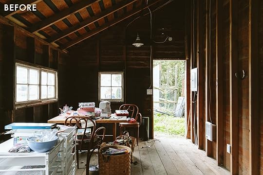
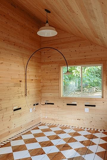
But it was dark, gross, and cold. So in May, we hired JP (Sierra Custom Construction) to take it next level. We would do the bare minimum (no water or HVAC). We added basic electrical (outlets and two pendants), a little cadet heater, one bigger window, insulation, and clad the walls in pine. It was ready to go by mid-June when the kids were out of school and they spent hours out here this summer before it was fully finished. But now it is, and it’s time to show you. IF this is the first time here you can catch up on the process:
The plan for the art barnHow we stained a diamond pattern on the floorHow we upholstered vintage quilts for the cushions and stoolsThe Art Table/Banquette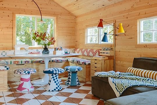
Benches | Cushions (custom) | Table | Stools (custom) | Vase | Floor Lamp
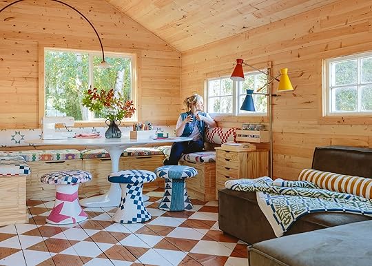
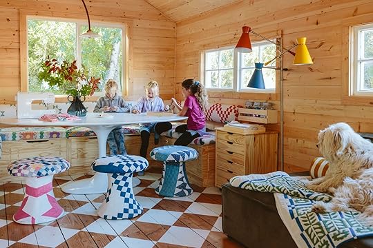
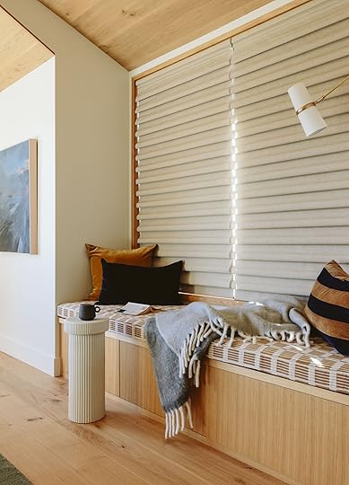
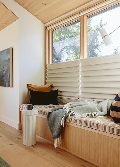
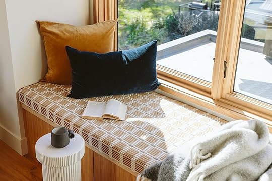
I laid it out to be as open as possible and to create two different zones (art/crafting and hang area). I wanted at least 6 kids to be able to sit around a table to work on projects so the only real way to maximize the space was to shove it at the end the way we have it. I found two sets of these L benches on Wayfair and while they added up, they fit almost perfectly. I loved that they had storage and were in pine so they just went away and matched the walls.

We reupholstered all the stools, bench seats, and back cushions in vintage quilts that I have been hoarding/collecting for years (read the post about it here). The tulip table was really the only one in existence that fit – we needed a pedestal as not to have to try to shimmy around a bunch of legs. We needed an oval to better navigate around the built-in and there were so many that were smaller or too big, but this one (from AllModern) was EXACTLY what I wanted. I also love the juxtaposition of the rustic pine with a mid-century Saarinen-style white tulip table. It fits PERFECTLY.
The light fixtures were both on the splurgier side – but perfect for the space. The white metal vintage farm pendants were purchased from Aurora Mills and the big red arch sconce from a lighting maker in Finland (that I found via 1stDibs). We intentionally placed the pendants to be centered in the room, left to right and lengthwise. I figured that for the longevity of the room that would make the most sense (instead of centering one at the end over the table just in case the whole function of the room changed). But I wanted a cool fixture over the table to draw your eye there (and provide light) so I spent HOURS on the internet looking for an arch sconce like this that could land in the center of the table. This was the only one  It’s pretty perfect (and splurgy… and came with the original Dutch wiring, despite me reminding them that I’m in America, so… I’m going to likely put a rechargeable bulb in it – yes, a huge emoji face slap on that one).


The benches have a ton of storage (and are FULL of fabric, paper, air dry clay – all our kid’s favorite stuff). Then I bought and put together that rolling pine storage drawer thing.

Wood Drawer Cart | Pine Shelf (similar) | Mason Jars | Wood Tray
Above it, I screwed to the wall a pine shelf with jars of pom poms and popsicle sticks, etc.

The kids are allowed to do any art project in here except slime (y’all I HATE SLIME) and if there are young kids (siblings of their friends) they can’t paint. Since our kids are 9 and 11 I feel ok with them doing watercolor and acrylic paints if we cover the table (or if it’s just Elliot, Charlie and I, we are just careful to clean up immediately). In a perfect world I let them do whatever they want for hours and not check on them, but I went ahead and designed this room to be so beautiful that I don’t want it to be trashed with paint. Besides, we are tackling the garage this coming year that will have a larger “shop” for all the super messy stuff. So this is for sewing, crafting, airdry clay, drawing, watercolor, decoupage, glue gunning anything, making charms or jewelry.


One of the best and weirdest perks is that our alpaca and pig pets come and visit all the time. Bert (above) will watch Birdie and I work on projects and we open the window and talk to them (and take a whiff of the pasture, lol). It’s HILARIOUS and terrifying if you aren’t prepped for it.
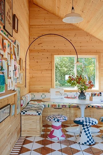
The Art Wall
I had the original intent to keep this room really simple EXCEPT the floor and quilts. Those were going to be my big moments, but I have so much incredible art that my kids have done or that I’ve collected over time that felt so appropriate to be in here. So I ended up turning a huge frame into a corkboard, and then I just kept going. Having pine walls iss THE BEST because I felt no guilt about nailing them up.

“Work Hard & Be Nice To People” Print | “Start With Yes” Print (unavailable) | Oversized Paint Brush
I’ve had the “Work Hard & Be Nice To People” forever (and is pretty much our family motto), and the “Start With Yes” which I love. But the new GIVE poster is a 100-year-old Red Cross antique poster from WWII. I found it in Oregon City at an antique mall and thought about it for months before I went back to buy it (it was $100 so not cheap). I love it as it is a reminder to me and the kids to, in fact, GIVE. It’s such a simple and powerful sentiment – just GIVE. Physically, financially, and through emotional support. I love it. The huge paintbrush was done by local artist Purl (who also made our coffee table and our huge pencil).

The bulletin board is full of art the kids have done (they have taken an after-school watercolor class for two years now). Elliot painted the portrait of Oscar and Buttercup when she was 5 (under the coaching of our nanny/incredible artist during Covid – shout out to Eel Costello). It’s one of my favorite things ever. The blue sun-prints on the right were also done with Eel – she did such incredible art with them during lockdown and I’m so grateful to have these pieces.
Along the top of the bulletin board are all the airdry clay creatures that my kids and their friends did this summer (Hey Clay, is our absolute favorite – it’s more expensive but it’s not sticky and just the best).
Floor Lamp | Sectional | Blanket | Bolster Pillow | White Pillow | Striped Pillow | Coffee Table (unavailable)
On the other side of the room, I hunted and hunted until I found the perfect hang time small-scale sectional (from AllModern). This came with an ottoman that I knew we couldn’t fit (so it’s in storage right now) but the scale, the size, the large corduroy fabric, the vibe (simple, 70s), and the comfort are ON POINT. It’s streamlined but so comfortable. Charlie and his friends all crowd on this and listen to Imagine Dragons and talk about how they wish they were playing Fortnight, LOL. I MIGHT even one day put a projector in here for movie nights, but for now it’s a great place for hanging, talking, and listening to music (and zero screens allowed in here). I bought that vintage IKEA table on FBMP a few years ago for $10 and it’s perfect because I don’t really care about it, but provides a place for snacks and overflow crafts (and works perfectly in the design).


I hung that vintage painting in the corner but I think it’s a bit big (and I really want to reframe it and hang it in my stairwell inside). But the colors work so well in here.
Elliot had a playdate the day that we were shooting so I asked the moms if they minded them being in the shoot and they didn’t. The girls were THRILLED to make charm keychains. TBH they spend more time in here than in the house which is what I wanted – them to have independence, free reign, and no parental supervision but in a really safe and creative environment (and out of earshot of me).


And for now, they even don’t mind if I hang out with them (TBH 9-year-old girls are awesome – so chatty, so fun, on the brink of being tweens but still such innocence).
Well, I hope you enjoyed this makeover. I really, really did. I needed an excuse to have some fun with unlimited creative freedom. I feel extremely grateful and lucky to be able to do this for my job and even luckier to have this extra space for our kids and me to be inspired in.
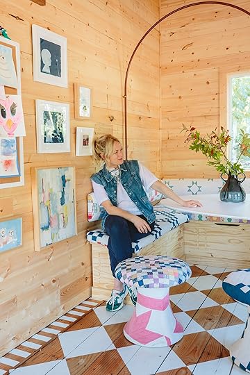
I look very satisfied up there, y’all. Probably because I am. This room reminded me of how much I love employing heavy doses of vintage and color, in a way that feels totally me (Scandinavian + mid-century + casual farm). Every project teaches me a lesson – some really painful. But the lesson in this one was to have more fun. Use more color. Take more risks. Easier to do that in a room that you don’t use all day every day (like a kitchen). Some risks can date spaces, or some risks don’t work and end up being a regret. It’s hard to know what will work (it does get more accurate with experience). However, I never felt nervous about this project. Zero stress. NONE. I love wood. I love white checkerboard floors with borders. I love vintage quilts and midcentury lines. I wish I could approach and execute all projects with this level of confidence and with this little fear. I wish I could feel this happy afterward:) Now… I can’t WAIT to show you the mural on the outside (I’m writing that post right now!). I might just move in:)
*Design by Emily Henderson (me!)
**Photos by Kaitlin Green
***Upholstery by ADF Upholstery
****JP Macy of Sierra Custom Construction
The post My Fantasy Craft Room Is DONE – The Full Reveal Of The Art Barn/Craft Shed Happens TODAY appeared first on Emily Henderson.


October 20, 2024
The Link Up: The Perfect $25 Sweatshirt, Mal’s Annual Candle Purchase, And Maybe The Best Cordless Vacuum We’ve Ever Used:)
Happy Sunday everyone! We hope you’ve been loving the reveals and are ready for more. This next week we have TWO (one river house and one farmhouse)! What can we say, we are happy to spoil you:) Plus, it’s so exciting to show off all the hard work we’ve been endlessly teasing. All you have to do is wait until tomorrow for the first one so let’s get to these links while we count down…
This week’s house tour is another cottage but this time it’s actually old! Like from 1489 kind of old and was a former dairy. Designer Beth Dadswell, revived this little cottage into a warm and completely charming home that anyone can stay at (if you want to travel to England of course:)) Regardless whether you are able to stay, you can step inside through your screen and enjoy. Plus, note all the incredible browns she used. On trend but totally timeless.
From Emily: Our photographer Katlin has been wearing these slightly cropped sweatshirts to our shoots and we all think they are so cute. Come to find out they are from Target and only $25! She has it in three colors (black, gray, and orange). FYI the orange one is more of a pretty red tone in person. A perfect cool, throw on and go cozy top.
From Mallory: Every fall I buy this $10 candle because I LOVE how it smells and now it’s got a real nostalgia. It’s called “warm cider and cinnamon” and comes shaped as a pumpkin which really gets me into the spirit. This year the jar is frosted which I think is super fun:)
From Caitlin: PSA: After months of deep research, my boyfriend Dennis bought us the MOST INCREDIBLE cordless vacuum I’ve ever used. It makes our place smell amazing (seriously), it has great indicator lights (so you know when the floor is actually clean), and I’ve never had to stick my hand into the canister to pull out a clump of hair, wool, or whatever other junk is in there. But the best part? THE BRILLIANT FLEXIBLE WAND. You can hinge it forward to reach under beds, sofas, and tables – no bending required! – or hinge it backward to FOLD THE VACUUM IN HALF for storage. That’s right: in addition to being a genuinely great vacuum, the entire thing is only 27″ tall x 11″ deep when not in use. It’s SO EASY to stash it in a cabinet or under a skirted table, so there’s no longer an unsightly hunk of plastic taking up space in our kitchen – I couldn’t love it more. Claps for Dennis!!! (Can you believe he cooks, too?!?!)
Also from Caitlin: If you’re not watching English Teacher, you’re in for a treat. Trust me on this one – it’s laugh-out-loud funny, perfectly cast, and it masterfully threads the needle between satire and heart. If Abbot Elementary is a little too saccharine for you, English Teacher’s biting wit might be right up your alley. There are only 8 episodes (with the best 80s soundtrack, to boot!) and it’s a great fall binge-watch, I promise. (Added bonus: after you finish, be sure to check out Jordan Firstman’s real-life home on Architectural Digest. PERFECT CASTING. That’s exactly how I’d imagine Malcolm’s house!!!)
From Arlyn: I’ve written about East Fork recently, but that was prior to the devastation of Hurricane Helene. As East Fork is headquartered in Asheville, they shared on Instagram and their website how buying from their Seconds collection (more on that in a sec) will be so incredibly helpful for them to offload inventory to keep their salaries paid and the lights on—they’ll ship as soon as they can commence operations. They’re also donating 5% of all sales until the end of the year to BeLoved Asheville, Poder Emma & La Milpa, and Equal Plates Project, three of their community partners that are on the frontlines of relief organizing. Their Seconds collection is essentially their “outlet” of not-so-perfect pottery, but I’ve bought numerous things at an incredible discount that all looked perfect. I think one set of bowls had a tiny little blemish in the finish that honestly I barely even noticed because it was on the backside of it. It’s a great way to support that business and stock your shelves at a great price with beautiful pottery.

Very exciting news!! Blueprint Lighting and Brownstone Boys collaborated on a beautiful new lighting collection called Boroughs Collection. We really loved the meaning behind the overall theme so we thought we’d share it with you too: “The collection draws inspiration from the unique character of NYC’s five boroughs, reflecting the vibrant spirit and distinctive styles that make the city an icon of design and culture. The shared goal of Barry and Jordan, along with Kelly and Joshua, was to honor the city they call home by telling its story through light celebrating the rich history, local architecture, and community essence of each borough. The result is a heartfelt tribute to the rich tapestry of New York City.” We already loved the designs but the story makes it even more special. Plus, we love both Blueprint Lighting and Brownstone Boys! Remember that the river house has some AMAZING pieces from Blueprint Lighting we can’t wait to fully reveal:)
From Gretchen: I found a new pair of holy grail pants! And while it does pain me to admit that I found them at Walmart, I have to say their affordability-to-wearability ratio more than makes up for it. I had to pop in the other day anyway because I was buying a gift for a friend that was only available at said store, and unfortunately, I do not have the willpower to simply skip past the clothing section. That’s where I found them. For some reason, I was truly drawn to these pants, even though they don’t look like much on the rack (or online to be fair). I kept circling back to look at them and finally just tried them on. Something about the cut of these pants just WORKS on me! They’re made of a sort of corduroy material and have a nice seam down the front of the legs, with multiple drawstrings to cinch in all the right places. On the model they look a little too long, but on my 5’9″ frame they hit at the perfect cropped, ankle height. They feel utilitarian without looking too much like a hiking pant. I’ve dressed them up, I’ve worn them to work–super comfortable–and they’ve held up through multiple washes as if they’re brand new. I’d definitely say size up because I’m pretty sure these come from the “junior” section. The XXL fit me perfectly with some extra wiggle room and I typically vary between a 12-14 in pants these days.
Also From Gretchen: An honorable mention–I scanned the shoe aisle too and found these great, short rainboots with neoprene around the ankle, just like the cute Target pair Em found while boot shopping the other day but couldn’t find in her size. They’re almost identical! I love that this kind of shoe is much easier to slide on than a fully rubber boot and they’ll be perfect for traipsing through the muddy farm this rainy season!
From Jess: I just got home after being away for over a month! The majority of that time was spent tending to my perfect brand-new niece. I may never stop talking about her and leaving her was NOT easy. So while I’m not the new mom here, I was very much in the trenches with my brother and SIL and wanted to recommend one of the best purchases they made – Owlet Dream Sock. They didn’t have it initially but after the first few nights of my SIL not being able to sleep due to completely understandable anxiety worrying if the baby was ok, a close friend recommended this little sock montier that alerts you if your baby’s heart rate, oxygen levels, etc are not in a normal range. It gave my SIL immediate relief and she has been able to sleep so much better. It’s pricey but if you or someone you know could use this, it’s been a game-changer in their home.
Thanks for stopping by and get ready for maybe the most fun farmhouse reveal yet coming at you tomorrow! xx
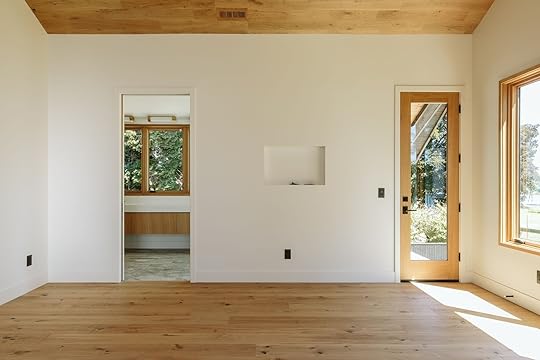
Opening Image Credits: *Architect: Anne Usher | General Contractor: JP Macy of Sierra Custom Construction | Interior Designers: Emily Henderson (me!) and Max Humphrey | Styling: Emily Henderson (me!) | Photo by Kaitlin Green | From: RIVER HOUSE REVEAL: My Brother’s Primary Bedroom – How We Added Color While Keeping The Calm
The post The Link Up: The Perfect $25 Sweatshirt, Mal’s Annual Candle Purchase, And Maybe The Best Cordless Vacuum We’ve Ever Used:) appeared first on Emily Henderson.
October 19, 2024
The 15 Cozy Sweaters We Found And Loved Under $75 (+ One That Has Been Sold Out For Years!)

It bears repeating that cozy season is the best season. There are wonderful things about all four of them but getting to slide on the first soft sweater of the season is pretty intoxicating. I know that for me, I am in need of a really great one but have no desire to spend over $100. So today is a little round-up of my findings. They are all under $75 (most of them around half of that) but maybe the most exciting news is that a fan favorite of one of Emily’s is back in stock and on a very good sale!! Ok, let’s jump right on in:)
Cozy Knit Button-Down Cardigan – $28
While the model is very cute in this sweater, personally I think Emily really sells it in her photo. She wanted it oversized so got an XL which I really love the look of! I could easily cozy up in it on my couch or throw it on with a fun pair of jeans. Either way, I’m going to be warm and very comfortable. Oh, and it also comes in 5 other colors!
My Only Sunshine Sweater – $54 photo by veronica crawford | from: six fall sweaters i’m loving (+ how to wear them)
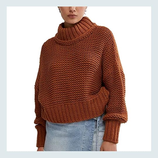
It’s BACK IN STOCK BABY!! Every time we post a photo of Emily in this sweater we get asked for the link. Unfortunately, it’s been very hard to track down until now. Macy’s to the rescue! They have it in stock in all 4 colors plus they are 50% off. Insane and I’m actually going to add to cart as soon as I’m done writing this post. It’s slightly cropped which I love and those cuff and neck proportions are so good. Also, Emily’s stamp of approval holds a lot of weight to me and she loves hers.
Oversized Split-Hem Mockneck Sweater – $39
Currently, this cutie is on sale for $39 (normally $80 so another 50% saving). I think this just looks so chic. That turtleneck is very sleek but the rest of the body looks like it hangs so beautifully with a wonderful amount of roominess. A perfect “oversized but cool” vibe. Now, I’m partial to the brown but it also comes in 5 other colors (some stripe, some solid).
V-Neck Cotton Cardigan – $30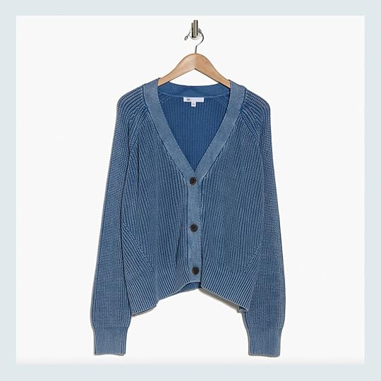
This one gave me Alex Mill vibes, an EHD favorite brand, but at a much lower price point. I would likey size up in this too because as I said I love that look. But also, how good is this denim-y blue? It also comes in an olive green that’s equally as awesome.
SoSoft Crop Cable-Knit Sweater – $30
You’re never going to not love a cable knit sweater. It’s such a classic! This one is $30 on sale (normally $50) so a great price BUT the “so soft” name is apparently very true based on the reviews I read. They all say how amazingly soft it is which means it’s super cozy…and ideal for the colder seasons. Count me in! I might size up for a more slouchy look on this one too but it’s up to preference:) It also comes in 3 other colors and sizes up to 4x!
Polo Sweater – $30
As a gal who lives in LA, we don’t often need super heavy sweaters (despite us dreaming of snowy mornings by the fire). So what I love about this one is that open collar. SO CUTE. This is a cool, casual style that could easily take you through late spring. The reviews also say it’s incredibly soft. Do with that information what you will:) There are 4 other colors, sizes up to 4x, and is also $30 on sale (normally $50).
100% Organic Cotton Boyfriend Crew Sweater – $50
Another very classic-looking sweater that not only comes in 10 other colors and is $50 but there are 3,665 5-star reviews! It’s 100% cotton and I would LOVE this a little oversized too:)
Mock-Neck Crop Sweater – $30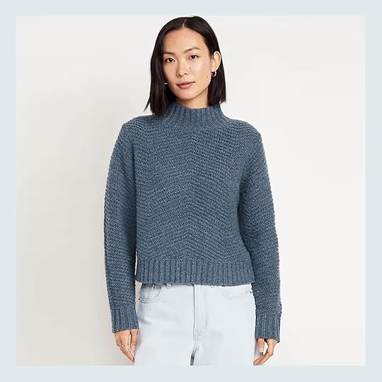
The neck and the color are what really drew me to this one. It’s just so pretty! But if this blue isn’t what you like on you then you have 4 other color options (and sizing up to 4x). So for $30 on sale (normally $50), I think this is such a great buy.
CashSoft Oversized V-Neck Sweater – $70
Clearly, I’m a sucker for a good neckline! The v-shape is pretty perfect and you know I love that it’s meant to be a little oversized. It’s a little pricier at $70 than most on this list but man does it look so cozy. This one also comes in 7 other colors!
Stripe Colorblock Mock Neck Sweater – $40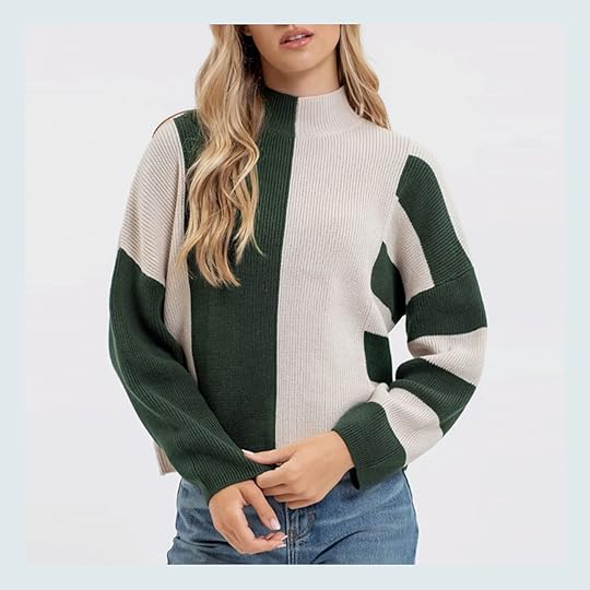
I was really drawn to the fun color blocking of this one! It’s nice that it’s not your average sweater pattern but it’s not so bold or colorful that it’s overwhelming. It’s just cool and comes in two other colors:)
AE Whoa So Soft V-Neck Sweater – $30
I love oversized sweaters but I also love a slight off-the-shoulder moment. Who says a cozy sweater can’t be a little sexy?? And while a soft pink isn’t a traditional fall/winter color I think it should be! But there are 5 other color options however, the sizing is a bit limited. I just had to add this one because I love the look of the fit, it’s $30, and the reviewers confirm it’s a “whoa” in the softness department.
Cozy Cardigan Sweater – $27
How pretty is this color?! It’s the perfect green/gray. Festive but not in your face. It’s the main reason why I had to include it…aside from the fact that it also looks very cozy. Oh, and it’s currently $27 on sale ($45 normally), sizes up to 4x, and comes in 3 other colors/patterns.
Cozy Crew-Neck Sweater – $24
Here is the crewneck version! This warm camel color is stunning and the look is totally classic. You could easily dress this a little up for work, for a casual hang with friends, or pair it with your favorite sweats on the sofa. It’s $24 on sale ($40 normally), sizes up to 4x, and comes in 3 other awesome neutral colors.
Cozy Knit Mock Turtleneck Pullover Sweater – $32
Another great stripe and another great neck! I think this one is just so cute. The black and cream make it feel a little extra cool and the price is so good at $32. There are 4 other colors and the sizing goes up to 4x!
Women’s Sailor-Collar Zip-Front Sweater – $50
I had to include one zip up and this one might be perfect. The oversized collar is so awesome. It also comes in a dark moss green that’s so pretty. So for those not interested in buttons or pullovers, this one could be your match!
That’s it for my research and whether you found something new or simply enjoyed the window shopping I hope you have a great rest of your Saturday (or whatever day you happen to read this on:)) See you tomorrow.
Love you, mean it.
The post The 15 Cozy Sweaters We Found And Loved Under $75 (+ One That Has Been Sold Out For Years!) appeared first on Emily Henderson.
October 18, 2024
How I Used My Hoarded Quilts Collection To Furnish The Craft Shed (+ Three Cheers To Quilters Around The World!)
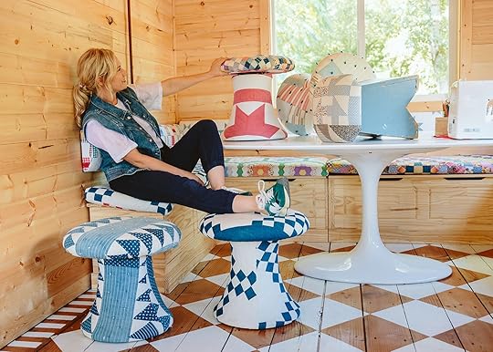
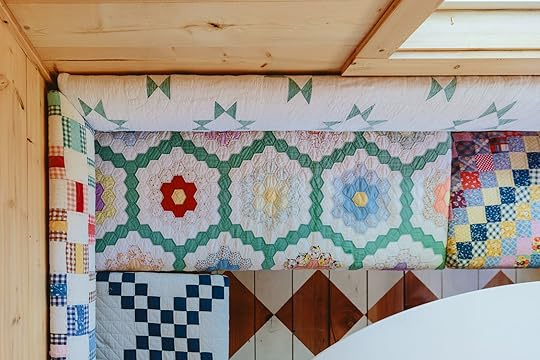
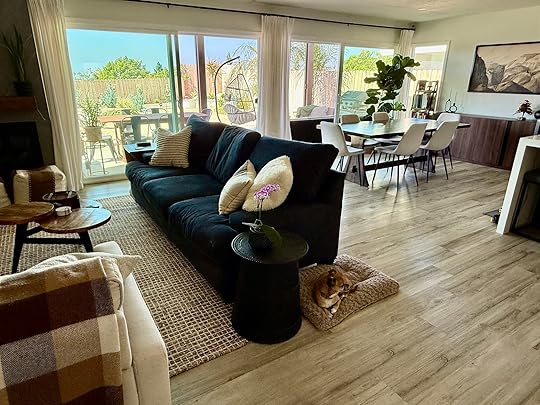
This project has been a huge dose of serotonin to me – I get the same burst of excitement seeing these photos as my kids do eating their Sunday sundaes. It feels chemical, truly. Over the years I’ve shown many hoarding tendencies – you don’t become a stylist without an extreme love of “stuff”. Vintage quilts have always been something that I’ve let myself buy even if “I didn’t need it” (vintage fabric is generally on that list, TBH). I grew up quilting in 4-H so I know the labor, love, and time that goes into all quilts and it’s just hard for me to let them stay at a thrift store, sad, discarded, and unloved in their current life. So for this project, I took all my quilt collection from thrift stores, Etsy, and flea markets (some splurgy, some pennies) and had this fantasy of reupholstering all the benches, back cushions, and mushroom stools in this craft shed (Formerly called the art barn). It might be one of my favorite things I’ve ever done in my life. If you remember me for one thing, let this totally unnecessary (but already SO USED) fantasy room be it

I started by laying them all out – I wanted to triple-check that I was going to love this vibe (and that it would be worth the quilt sacrifice and the financial investment of the upholstery). Once laid out, I was giddy with excitement. Freaking out even. Elliot came in and squealed. Even Brian knew it. Of course, I realized that I needed much more than I had (especially if I wanted to do it on both top and bottom thus making them reversible). I then went on Etsy and bought more that were just quilt toppers (more affordable AND easier to upholster).
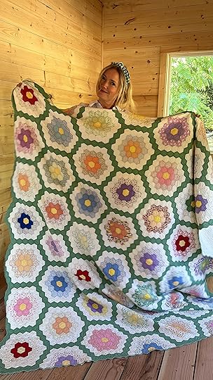
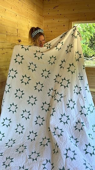

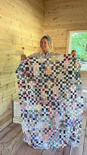

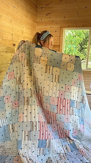
I had a real mix of patterns, styles, and colors (more than what is above). Some were just quilt toppers (that I hoarded to turn into curtains, I think?), others that were more 80s design (square with yarn knots, thick padding), some postage stamp (tiny squares), some Irish chains, some larger flowers and stars, etc. As I collect, I usually buy based on pattern and color, but honestly, I am such a quilt enthusiast that I would also buy any that were really affordable at thrift stores even if I didn’t love the color because I knew I could dye them. Since this was going to be for a kids’ craft space (and our flex space for work and shoots) I also wanted them to be relatively stain and dirt-friendly – so I put the ones with more negative space as the backs and for the seat we intentionally did one side in a less precious quilt so that it could be flipped to be more kid-friendly if needed.
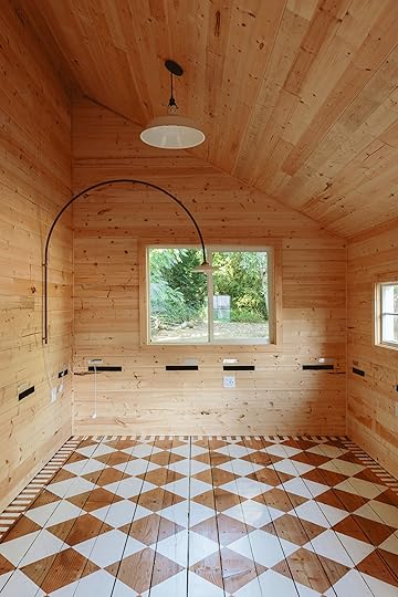
As a reminder, the space was a dingy barn that we clad in pine (added insulation and some basic electrical) and I found these built-in benches from Wayfair (the almost perfect size!) to create a built-in banquet. The black and metal stuff on the wall will make sense a bit later
There was no way I could do this myself and honestly, this is one of those opportunities I knew I could take to support local artist businesses as well as give them some awesome photos. I already knew who I would hire for this – Anne, from ADF Upholstery. She did our first quilted mushroom stool and has a dope booth at Urbanite. She’s a french woman who has such an artful eye and I frankly wanted that eye on my project Anne is a real textile artist, and I knew that she could help me execute this in a way that would be better than me doing it by myself (and yes, I pay full price – a privilege I am grateful to be able to do at this point in my life). Anne came over and we laid them all out, she took notes on where everything was to go, helped troubleshoot the size of the back cushions, and then left with everything. It was a real investment and I felt in really good hands with Anne (and highly recommend her specifically for more design-oriented upholstery jobs – i.e. not your run-of-the-mill ottomans, although I’m sure she’d be great at that, too:)).

A few weeks later she came by and installed them. We designed the back to sit on french cleats (and still allow access to the outlets which we planned specifically to be above the benches so we could use the sewing machine, glue guns, and 3D printer easily. This kind of back cushion is great design-wise, but if this were for a dining bench know that it kinda pushes you out a bit (i.e. not that ergonomic) and therefore you’d want a deeper bench. We knew this but for our purposes, we wanted this look (and again, we wanted easy access to the outlets, which we use all the time). I think a squared-off version of this might be ultimately more practical for comfort for a dining bench, but again, for crafting we LOVE it.
See Them In Action[image error]I’m truly obsessed with how it came out. The ONLY thing I would have done differently is put a more visually heavy quilt on the back wall – something with more punch. I specifically chose that white and green one there because I wanted the green to balance out the green sectional that is on the opposite wall, but I think a punchier color would have pulled the eye back there more. Literally nobody that comes in understands why I have this slight regret and if I were a normal person I wouldn’t even call it out, but that’s not how I roll. Let me be clear, I love it so much that I don’t really care.
We really mixed them up. We put our more favorites up the front and the ones I liked the least along the back cushion (although I really did like them all so win-win).
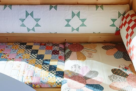
I originally bought the flower quilt topper ($15 at a thrift store) to put on each top of the mushroom stools, but we ended up keeping it as a cushion cover instead.

How sweet are all of these stools? ADF makes these mushroom stools (you can choose to swivel them or not). She specializes in upholstering with quilts (most upholsterers would look at you like you were a bit nuts if you dropped off 15 quilts and asked them to do this). I love all four of those patterns so much for different reasons – the postage stamp has so much energy and so many patterns – all hand-stitched!! The denim one with the triangles is me if I were a quilt. The Irish chain is so classic – I can’t pass one up if/when I find them. And the larger square one is out of men’s shirts, feels very 80s, and was so soft – it reminded me most of the quilts I made when I was little, with the quilting at the edge of each square.

The back cushions are hung on a cleat and the black tape-looking things you saw above was velcro that Anne added I think so they would hang more flat and stay put.
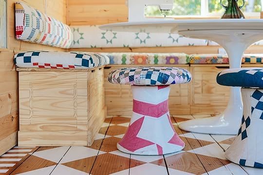
I’m SO excited to show you the finished room (coming soon, next week I think). A huge thanks to Anne of ADF Upholstery for making my quilting dreams come true. It feels more like an art installation and this is exactly what I wanted for an inspiriting art/craft space for our family. Every time I walk in (which is very often – Elliot has claimed this room with her friends as their space) I feel so proud and giddy. The walls are so calm and then your eye just dances around the quilts, delighted by the mix of colors and patterns. I hope you like it
*Photos by Kaitlin Green
The post How I Used My Hoarded Quilts Collection To Furnish The Craft Shed (+ Three Cheers To Quilters Around The World!) appeared first on Emily Henderson.
October 17, 2024
If Your Room Isn’t Working (Or Just Kind Of Boring) & You Can’t Figure Out Why, It’s Probably Missing *This*

Years ago, when I was designing the dining room in my previous home, I kept picking modern furniture and lighting for the space. I liked the juxtaposition of it stylistically against the 1920s Mediterranean architecture of my building. Once I put up my chandelier, sconces, gallery wall, and brought in my wall-to-wall credenza with chunky contemporary brass hardware, I realized it was all too…one note. It was missing something. Sure, I had the contrast between styles but I still craved something else. Something to “funk” it up, or bring a bit more contrast.
It turns out, what I was missing was my vintage brown wood bar cabinet and Rococo-style Venetian gilded mirror. I needed the push and pull of “now” and “old” to satisfy my eye. Make it feel real, lived in, and not like a catalog.
This, my friends, is called tension, and in my opinion, every interesting room needs it in small doses. Now, I say “interesting” because not every space requires tension. There are plenty of beautiful homes and rooms without any noticeable tension; in fact, not having it can really create a sense of placidity, and that’s some people’s preference.
But if your space feels flat, expected and not as elevated as some of the ones you spot in designer profiles or magazines, adding a touch of tension is going to be transformative to you. Tension in design is like picking the pair of ruby-red heels for your all-black outfit. Black heels would have been just fine, even chic, but the red? Well…now you’re standing out.
Before walking through the different ways you can build tension in your design schemes, I just want to explore the word some more, because just saying “add tension!” as advice isn’t exactly clear. Tension brings in a little “conflict.” It’s opposing things that shouldn’t work together but do. Like adding salt to your baked goods to bring out the sweetness. Acid to your rich dishes to cut through the fat. It’s contrast in materials, scale, differing volumes, juxtaposing polar opposite styles, and even colors. It can be as subtle as picking a polished brass chandelier in a room with rough-hewn wood floors and furnishings, or as drastic as putting a modern addition on a centuries-old brick building.
It’s kind of like a decorative surprise, flipping the script on what you *think* you should be doing. Let’s go through some examples of tension in the rooms I’ve designed recently, because visuals always speak louder than words.

Between my old dining room and living room, you can see I went with modern lighting to contrast the 100-year-old architectural style of the spaces. This is one of my favorite tricks for adding tension without having to think too much. That’s not to say that picking lighting fixtures that are appropriate to the era of your home or within its style isn’t good; it totally is! But it certainly adds a bit of a cool factor when they contrast.

In my bedroom, I went with a similar tension treatment of opposing styles: a modern low-slung velvet bed, modern nightstands, sconces, and a modern rug all balanced by a large vintage armoire. To me, this adds so much soul and visual interest. Without it, I think it would have been perfectly lovely, but perhaps a bit expected. I also thought everything was too shiny, so some natural materials like rattan and linen balanced that out. (For anyone getting to this point saying “Isn’t tension just…balance?” I’d tell you, yes…yes it is, but it’s important to understand all the different ways to do it, so let’s keep reading/writing.)


Tension can also come in in terms of shapes: curves vs. angles. I’m fairly certain I didn’t create intentional tension between the curve of my coved ceiling and all the straight angles of my gallery wall, but it certainly applies, so I’m calling it out for you. Something that was on purpose was the punch of cool-toned blue in my otherwise warm kitchen. That’s tension via contrast, and it works every time as long as you are light-handed with it.
What Kinds Of Design Tension Can You Use? Let’s ExploreAlright, let’s dive deeper and see more examples of tension in other peoples’ rooms and designs. This list is not exhaustive, of course, but it’s a great starting point to work from for anyone interested in exploring tension. First up…
Opposing Scales: Big Furniture In A Small Room design and styled by emily henderson | photos by kaitlin green | how i convinced my friend to paint her room really dark: a kid/dog-friendly basement makeover with article furniture
A common mistake I see people make in small rooms (or really, any room) is picking furniture that’s simply too small. While there is a limit to the size you can go without totally consuming the space or feeling overly commanding, I do love to see a large, low-slung sofa in a small living space. It’s okay to let it go across half the wall space, I promise. It’s functional and actually can make the room appear larger than it is. You do want to be sure the scale works in at least one way, so even if it’s long/wide, it should still work with the ceiling heights so it doesn’t visually eat the space.
View this post on InstagramA post shared by Plain English Design (@plainenglishdesign)
This is another example I love: having just one imposing piece in a room with lower ceilings. That green wood pantry/cabinet thing is enormous, and while I don’t really have a sense of the full layout of the kitchen, I know that that ceiling is likely only about 8 feet (standard counter height is 36 inches, and that space above the green cabinet in the second image is not even three times its height). The cupboard-armoire is kind of hulking, but it works to add interest and a touch of “maybe that shouldn’t be there…wait…maybe it should??”
View this post on InstagramA post shared by Architectural Digest (@archdigest)
Scale doesn’t have to just relate to the size of a room compared to furniture; you can use it to play with dimensions of other things, like frames. This eclectic space by Reath Design has tall, voluminous vaulted ceilings, and I love the juxtaposition of that against the gathering of teenie little frames. It’s easy to think “big ceiling, big art” but *this* is how you create character. After all, what’s a story without an antagonist, right? Tension in your design is the conflict point in a plot; without it, it’s just a nice, sweet little tale without any twists or turns or heart-pumping moments. And I don’t know about you, but I love a bit of a nail-biter.
Conflicting Textures: Rough & Organic vs. LuxeView this post on InstagramA post shared by Nicole Fuller (@nicolefullerinteriors)
I LOVE creating tension with materials. Let’s take the room of gallerist Almine Rech above, for example. It’s fully enveloped in wood, and anyone wanting to create harmony would have likely picked a sofa covering more in line with something natural, perhaps a Belgian linen. But nope, this room stopped me in my tracks for the sole purpose that it was unexpected. The stress between the earthy paneling and the luscious, luxe, and fringed velvet is a shock to the system, and that is exactly why it’s interesting.
View this post on InstagramA post shared by Architectural Digest (@archdigest)
I know that last room wasn’t for everyone (I’m not even saying it was for me, tbh), but tension in material can be a little more subtle. Take for instance the matte terracotta(ish) floor and the organic dining furniture against the glossy fireplace tile. That sheen goes a long way of cutting through all the lusterless materials in this very cute kitchen by Studio Eric Schmitt.
Juxtaposed Styles: Modern Meets AntiqueView this post on InstagramA post shared by Iantha Carley Interiors (@ianthainteriors)
I’ve never run into someone who hates a Parisian apartment. They have tension fully mastered. The ridiculously good architectural details many come with certainly help, and setting anything against it would look good. A dented can of chickpeas from Aldi in the room above would look good, surely. Here, we have lots of very ornate, traditional millwork and plasterwork married with sleek, streamlined mid-century-style furniture. The work of Véronique Cotrel Agency, it’s an interesting match of eras that works beautifully because the seating is fairly minimalist while the walls and ceiling aren’t.
View this post on InstagramA post shared by Rickie Broff at Fayette Studio (@fayettestudio.rickie)
This beautiful space by Fayette Studio illustrates the same thing as the image prior but in a more subtle manner. The ceiling detailing juxtaposes the contemporary furniture beautifully.
View this post on InstagramA post shared by Studio DB (@studio_db)
This is just so fun (thanks for the visual treat Studio DB!). I’d never expect to see that modern chair and ottoman with the charming wallpaper, molding and sconce chosen here, but it’s a sharp pairing that feels super fresh and interesting. It makes me want to keep looking at it to see if I missed something, even though it’s simple.
View this post on InstagramA post shared by Lucy Alice Home (@lucyalicehome)
There’s almost nothing I love more than a house mullet: business up front, party in the back. Especially when that party is a totally different style than the original structure. The arches, the stucco, and the combo of soft pastels against the serious brick facade is serious tension that pays off if you’re going for “fun” and “quite unexpected.”
Dark Paint In Small Spaces design by velinda hellen for ehd | photos by sara ligorria-tramp | from: how to make your smallest room, the coziest room in your home + sara’s tv room reveal
This way to build tension has been a go-to for so many of us in the design world lately, especially since color drenching became more of a common thing. Sara’s TV room is a great example of this. She took a very compact transitional space (it actually used to be a bedroom) and made it a jewel box by slathering it head to ankle in a moody, dreamy green. A lower ceiling line and a limited square footage might make most people want to make it appear larger but painting it a light or bright color, which you could totally do, but it’s a great opportunity for cognitive conflict!
View this post on InstagramA post shared by Design Shop Interiors (@designshopinteriors)
We see this treatment most often implemented in powder bathrooms. People LOVE drama-filled powder baths, but really they’re just responding to the tension that is created either by an unexpected color choice, a bold wallpaper, an interesting mirror, a luxe lighting pick…you get me.
 design and photos by sara ligorria-tramp | from: sara’s closet reveal – the bold design moment she’s been craving
I say “color” but this can also apply to wallpaper. Sara used the visually chaotic (I mean that in the best way because I love it) Strawberry Thief print from William Morris in her compact walk-in closet. It’s a feast for the eyes in a small space.
Curvy Furniture In An Angular RoomView this post on InstagramA post shared by David Lucido (@dalucido)
Straight furniture in a boxy room = good. Curvy furniture in a curvy room = good. Curvy furniture in a boxy room = HELL YES. Especially when done just right like in the above room by David Lucido. What makes it even more tenuous is how many straight lines there are between the framing of the wall, the framing of the wall inset, the artwork, the tile flooring, and the grid pattern of the rug. It’s practically screaming for a curvy moment to slice through.
View this post on InstagramA post shared by Joe Schmelzer (@treasurbite)
For anyone who isn’t in the custom furniture game (::raises hand::), the curvy-meets-angular tension type can also be satisfied by a piece like the loveseat in the above office. I love it next to the super angled desk, the 90-degree-angle-heavy Greek key rug design, and even the lines running through the paneling on the ceiling.
Contradictory Volume: Low Profile Against High CeilingsView this post on InstagramA post shared by Jenna Chused (@chusedandco)
And finally, to satisfy our world of opposites here: when your ceiling goes high, you go low. Of course, this works best when the ceiling looks like THAT, and there’s beautifully ornate molding three-quarters up the wall, but if your budgets are as sky-high as your roofline, consider some low-slung pieces to break from the expected.
***
As we come to the end of my dissertation on building tension, I want to reiterate that not every good room needs such contrast/conflict/juxtaposition. Tension is a useful tool to employ when you want to create intrigue. But it also doesn’t have to be as obvious as a fuschia velvet sofa in a wood-paneled room. I challenge you to look at the spaces in your home that maybe you’re not totally sold on, or don’t feel quite finished, that you wish you could give just a bit more of a designer touch, and see if one of these tension techniques might help you out. A little goes a really long way.
Until next time…
Opening Image Credits: Design & Styling by Emily Henderson | Photo by Sara Ligorria-Tramp | From: My Best Friend’s Basement Remodel – On Finding Their Perfect U-Shaped Comfortable Sectional
The post If Your Room Isn’t Working (Or Just Kind Of Boring) & You Can’t Figure Out Why, It’s Probably Missing *This* appeared first on Emily Henderson.
October 15, 2024
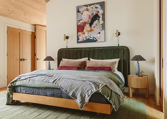
RIVER HOUSE REVEAL: My Brother’s Primary Bedroom – How We Added Color While Keeping The Calm

Y’all, I’ve said it before and I’ll say it again – I love designing a bedroom. Unlike a family room that has to act as a playroom, seating area, TV room with storage, etc, this room needs a singular function – sleep – (ahem), welcomes symmetry (less decisions!), and by nature of the space you don’t have a ton of options. This room was always meant to be calm, simple, white, and wood with huge windows (per the rest of the main spaces in the house) which lends itself easy to be designed. But the easy pitfall with more neutral rooms is that they can look boring (especially on the internet these days). So I needed to still honor the original intent (warm minimalism, focus on the views) while exerting some style and punch (new by-line?). And I LOVE how it turned out. But before you see it all decked out, let’s talk through the bones:
The Bones – Flooring, Ceiling, Paint, Windows And Lighting

The house was designed and laid out by Anne Usher, their architect. I love how she played with volume, light, the views, and didn’t just create a box. The triangular jut outs from the window seat are such a pretty architectural feature that you see immediately when you walk in. The wood flooring is Shell by Stuga, and the ceiling is also from Stuga, called Drift. If you are nervous about putting wood flooring on your walls or ceiling stay tuned for a blog post soon – we think if you do it right it looks AWESOME. The walls are the most perfect warm, but not too yellow white called Alabaster by Sherwin-Williams. It’s my new go-to white. Boy am I jealous that I had to learn my hard “not every white is equal” lesson in our house, but glad I did so that we chose the most perfect white here. The windows are by Marvin – white oak on the inside, black aluminum clad on the outside. The spotlights are from Rejuvenation and are so much prettier than recessed lighting (but less light, FYI so make sure you have other light sources). We also put in this fan which we still need to add an extender on (which came this week lol), so they’ll have that light source as well. It was a really simple space, as they all are when they are empty, and it was ready for some punch and style.
Step on in…
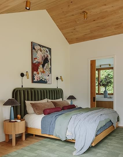
The Bed Wall
Headboard | Bedframe | Rug | Nightstands | Lamp Base (vinage) | Pleated Shades | Sconces | Painting
This room wasn’t as much of a challenge as other bedrooms I’ve done (layout wise), but the bed wall was more narrow and the room itself was more long, less square especially for a wider king bed. So when I started thinking about how to anchor this room, I wanted a bed/headboard that would be grounding enough to handle these high ceilings, to hold the wall with enough impact, add some color (but not in a super bold way), and frankly not look dinky and short but not be so big that you couldn’t fit proper nightstands. It was tight, TBH. So when I found this headboard from Article – wide, with channel tufting and the most beautiful green I designed the room around it. It could anchor the wall in a powerful way, and the right nightstands could tuck right inside.
Headboard | Bedframe | Rug | Nightstands | Lamp Base (vinage) | Pleated Shades | Sconces | Painting
The headboard (and bed) from Article allowed us to casually float these rounded nightstands (which have storage – opens like a cabinet) and look good from all sides – which is important because if they are floating in front of the nightstand you’ll see the back as you walk in. This worked PERFECTLY and I love how the ribbing on the nightstands mimics the channel tufting on the bed (and the pleating on the lamps). We paired the headboard (that attaches to the wall with a big cleat) with the light oak platform bed from Article which is a move that I love to do – you don’t need a fully upholstered bed if the base contrasts enough and is pretty like this one. In fact, I’d argue that if you are on a budget get this headboard then use a basic base with a bed skirt – the headboard packs so much punch for the price. I love how the sconces flank the painting and take up more of the visual space above the bed, softening the shift between the horizontal headboard and vertical painting (plus they provide nice reading light).
If you want a video tour the space HERE YA GO (just wait for the ad to play)
The Most Beautiful Painting
This painting by local Portland artist Charlie Salas Humera and is incredible. I was tipped off to his work last year (shout out to Purl!) and have been stalking him to see what I can buy for my house or convince my bro to buy. His use of color is incredible. When this came up on his stories I begged my brother and SIL to go see it in person – I knew I loved it, but it was an investment as good art should be and I needed them to love it, too. They did and bought it (support local good artist if you have the budget!) and my goodness does it make this room, color-wise, totally sing.

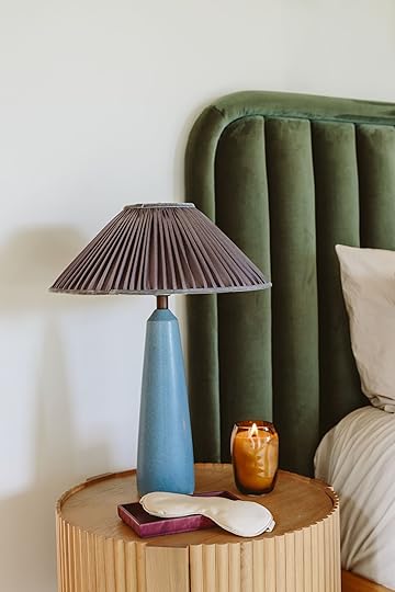
 The Lamps And Sconces
Lamp Base (vintage) | Pleated Shades | Sconces
I bought these vintage lamps when Charlie was a baby off Etsy, one of my first vintage splurges ever (I think they were $300 each). They are from Sweden and I’ve loved them for so long, and had no intention of using them here. We actually ordered these from West Elm that are so similar but they didn’t arrive in time, so I pulled these lamps from storage, ordered the pleated lampshades which did arrive in time. And while I wouldn’t put the two blues typically together, both colors are in the painting so collectively I think it looks really curated and intentional. The second I placed the lamps Gretchen, Emily M. and I all gasped. It took the room next level. And while I wouldn’t sell these lamps to just anybody (I have a strange sentimental attachment to them as I remember the exact time, place and mood I was in when I ordered them and it was a very, very special time in our lives) having them at my brother’s house felt emotionally doable for me, LOL. I can still visit them! Creepy!

 The Rug – The Remy Rug In Green
The rug is our new Remy rug, in green from our new Rugs USA collection that just launched last week and we LOVE this rug. It’s so soft, has texture variation, and a really beautiful rich color that is really forgiving. It’s wool, durable, and the graphic staggered rectangles are totally transitional – they can live in both modern/contemporary houses like this but is so simple that it can easily be in a more traditional home as well.
The View
Chair | Ottoman | Pillow | Throw | Floor Lamp | Window Treatments
This room has the most incredible views of the river and trees (which is why Anne faced the bed that way). The huge wood windows anchor the opposite wall and create the focal point of the room. We hired Decorview for motorized shades (hard-wired, during the construction process) and we chose a color that integrated well with the wood and is just warm and soft.


The shades are room darkening (“blackout” but there is always a tiny light leak in the center) and you can even do top down/bottom up, meaning if you want privacy up to your chest you can control them to go from the bottom up to any point, allowing light to come in from the top.
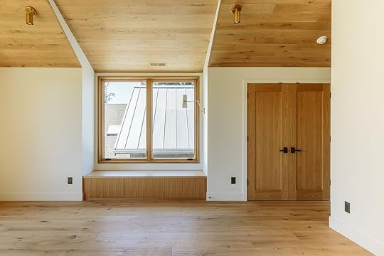
The Window Seat
Window Treatments | Sconce | Seat Cushion Fabric | Throw | Striped Pillow | Drink Table
There are a hilarious amount of window seats in this house, all full of storage and done in a rift-sawn white oak. This one, if head by the sconce has the most beautiful views of the river and is where my bro claims he will be napping. We made them deep enough (30″) to be ample for napping (and in the kids’ rooms they can have friends sleep on them for sleepovers). I found the most incredible fabric at our local upholsterer (shout out to Alexander Matthews in Tigard). The fabric is from Pollack and is called Boxing Day.
I love how the pattern (that is a soft, textured cut velvet) integrates so easily with the wood and yet still adds some pattern and punch. We could have done a solid over here but with the solid rug and headboard I really wanted to bring in a pattern somewhere and this is perfect.

Chair | Ottoman | Side Table | Vase | Stone Tray | Pillow | Throw | Floor Lamp | Art (unavailable) | Rug | Solid Velvet Pillows | Seat Cushion Fabric | Striped Pillow | Drink Table | Sconce
Opposite the bed, we have the most cozy and big chair and ottoman, the Abisko from Article. This corner needed a big guy (and yes, we thought about putting it facing the view, but ultimately they wanted it to face the TV which worked better for me, too) and the scale of this chair and its low profile is perfect. It also comes in a few other awesome colors.

The chair is firm and so comfortable (not a sinking-in chair, but very ergonomic and easy to snuggle in (with a child) with a really generous ottoman.

Chair | Ottoman | Side Table | Vase | Stone Dish | Pillow | Blanket | Floor Lamp | Art (unavailable)
The side table is so graphic and cool (and functional and heavy). The lamp has a great tripod base and mixed finishes – both wood, black, and of course a fabric shade. The painting I bought at Urbanite by an artist unknown (if you know let me know!). Vase and pillow from Anthropologie, marble dish from Target, and throw from Article.
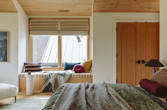
The bedding is a mix of a bunch of brands we shopped from. Upon my advisement, Katie bought the sheets/pillowcases and duvet in ‘bone’ from Parachute which is a really warm neutral (their heathered percale is so buttery and my current favorite). For styling, we added the Garnet Hill green linen duvet, a Parachute blue quilt, a linen throw from Garnet Hill, velvet pillows from West Elm, and custom bolsters (that were originally made for their daughter’s window seat but look sooo good here).

Sheet Set | Bone Duvet | Green Duvet | Dark Blue Quilt | Linen Throw | Velvet Shams | Bolsters (custom)
The whole bed looked so layered and cozy (and while I wanted a bench at the end of the bed, walking around another piece of furniture to get to the bathroom made less sense.


Sheet Set | Bone Duvet | Green Duvet | Dark Blue Quilt | Linen Throw | Velvet Shams | Bolsters (custom) | Frame TV
As you can see up there, the bathroom is on the left with a pocket door (it’s so pretty, I can’t WAIT to show you – hopefully soon). We installed a Frame TV on an arm so they can watch TV in bed (this was a whole thing but a pretty good solution). I want to now go back and shoot a reel coming out and showing how it works. They had to put a huge cavity in the wall to house the arm, FYI.

The whole room turned out so bright and cohesive, but simple and warm. I love it so much. No unnecessary clutter or opportunity for clutter. They are lucky enough to have a walk-in closet (behind the headboard wall, coming soon) storage drawers in the bench, and an additional reach-in closet so this room didn’t need a dresser and hopefully won’t have a lot of clothes mess. It’s ready for a cozy Saturday morning and simple relaxation.
A huge thanks to Article who has been a partner of mine for years because I love and trust their quality and design. If you know me IRL you’ll hear me recommend them to anyone who wants high quality, without spending a ton and most things can come within weeks. I have found all of their upholstered pieces to be very comfortable and they have even added a ton more fabrics to choose from should you want custom colors on their sofas and chairs. I really appreciate how they are doing things in a very simple and thoughtful way, expanding their lines slowly, making sure that everything meets their standards and their customer service is excellent.
Bedroom Resources:
All Furniture: Headboard, Bed, Nightstands, Sconces, Chair/Ottoman, Side Table and Lamp – All Article
Flooring: Stuga ‘Shell’
Ceiling Wood: Stuga ‘Drift’
Paint Color: Alabaster, Sherwin-Williams
Daybed Fabric: Pollack, Boxing Day
Spotlights, Sconces, Fan, Switchplates: Rejuvenation
TV: Samsung The Frame
Rug: Remy in green from EHD x RugsUSA
Painting: Charlie Salas Humera
Window Treatments: Decorview
Upholstery: Alexander Matthews
*Architect: Anne Usher
**General Contractor: JP Macy of Sierra Custom Construction
***Interior Designers: Emily Henderson (me!) and Max Humphrey
****Styling: Emily Henderson (me!)
*****Photos by Kaitlin Green
The post RIVER HOUSE REVEAL: My Brother’s Primary Bedroom – How We Added Color While Keeping The Calm appeared first on Emily Henderson.
October 13, 2024
The Link Up: The $25 Pillow Em KEEPS Buying For Shoots, Cailtin’s Best Money Saving Tool, And The Movie That Made Us Cry Happy Tears
Happy Sunday everyone. First and foremost we want to acknowledge everyone affected by the hurricanes of the last couple of weeks. The nonstop global devastation, whether it be caused by the hands of humans or nature (but arguably both are caused by humans), seems unthinkable and the end feels nonexistent. All of it leaves us nearly speechless. Here are two articles that give a bunch of ways to donate to the hurricane survivors in particular – this one and this one. It’s not going to fix anything long term but the aid is definitely needed. We hope that for anyone affected safety and relief come as swiftly as possible.
This week’s house tour is maybe at the top of our favorite Heidi Caillier homes list! She took this East Hampton cottage from a new build to a home that feels like it’s been there for years (which was the homeowner’s biggest request:)). Please go check out all of Heidi’s work on this home because it’s going to blow you away! Plus, we talked about the 3-D art in one of the bedrooms earlier this year so getting to see it all finished is SO wonderful.
From Emily: I used this pillow in 4 different shoots recently and realized it’s likely because of the following reasons: 1. Its rounded corners play off sharp squares off pillows do well, but it’s bigger and cushier than most trendy circle pillows. Then the colors – both the blue and the pink are excellent. The size makes it easy to look good on most chairs, beds, and sofas. Lastly, the playful single-button tuft gives it some style. For $25 it’s just really really good.
From Jess: It’s VERY rare that I don’t have to wear a bra. So whenever I find one with straps that are pretty but simple and it’s also comfortable I am clearly pumped! I feel way better about having those types of straps show with my tank tops than a regular strap. Enter this silk Everyday Bralette Triangle Bra from Intimissimi that I bought while I was in NYC last weekend. I needed it for this incredible top I got but honestly, I’m going to be able to wear it with so many things. The straps are almost rope-like but lay flat. Love! P.S. I’m a little confused about the sizing online but I got a 36B.
From Gretchen: If you follow along on Instagram, you might’ve seen yesterday’s festive, holiday Anthropologie stories. Now admittedly, it feels a little too early to be thinking about Christmas, and yet in the EHD world, we must! But while shopping Anthro for pieces to style out the shoot, I absolutely fell in love with these mugs. They are just so whimsical and sweet and I love that they come with a little, chunky coaster. The pink/purple colorway is my fav but the other options are adorable too. I snagged a few to give as holiday gifts but will be keeping one of them for myself:) I can’t help it!
You might have noticed by the posts this week (the launch and Fix It Friday) and the nonstop social content that our second collection with Rugs USA dropped! We are so proud of it and feel so lucky to get to call it ours. If you are looking for an affordable beautiful rug, please go check them all out HERE<3
From Arlyn: I haven’t been to a movie theater since the Barbie movie came out last year. And before that, it was before I even got pregnant (my girl is 2.5 now so…it’s been a LONG TIME). We finally found a babysitter we like and trust so my husband and I planned a date night for the first time…ever? I had heard good things about the movie The Wild Robot and OMG IT WAS SO GOOD. I think it offers something to just about anyone watching it but as a mother, the motherhood angle was strong and really got me in the feels. It was both a beautiful story and visually striking. I give it TWO THUMBS UP.
From Caitlin: It’s been about 10 months, so I can officially (and publicly) declare that I love my Rocket Money subscription. It TOTALLY lives up to the hype – they renegotiated my Spectrum Wifi bill and saved me over $400 (knocked it down from $90/month to $50/month – UNREAL, especially considering that Spectrum refused my requests to lower my payments over the phone!); they’ve canceled annoying subscriptions on my behalf; and I finally feel REALLY in control of my finances. It rocks to see where I’m spending, how it compares to previous months, what payments are coming down the pipeline this week, how much progress I’ve made on my car payment, yada yada yada. I’ve used Mint, YNAB, and my own spreadsheets previously – this blows all of them out of the water, IMO. I hate carrying a credit card balance (a double-edged sword when you like to travel as much as I do!) but Rocket Money makes it SO EASY to plan, budget, and stay on track. I know I sound like a spokesperson but the product is just really good!!!! Thought it might be helpful for you, too.
Also from Caitlin: Tomorrow marks my 33rd birthday, and I’m celebrating by launching a Substack! The catch? It’s probably not what you’re expecting. (It’ll be a fun ride, I promise.)
From Mallory: Sweaters are honestly way too expensive so I almost always buy them when they’re $40 or less (shoutout to Target and Nordstrom Rack – they never fail me). I found this INSANELY COMFY sweater for only $24 and have been living in it!! I am desperate for sweater weather to come hither so this is my form of manifesting the cozy fall season!
Hope you have a good and safe week, and a nice long weekend. See you Tuesday for a FUN farm update. xx
Opening Image Credits: Styled by Getteline Rene | Photo by Mark Weinberg
The post The Link Up: The $25 Pillow Em KEEPS Buying For Shoots, Cailtin’s Best Money Saving Tool, And The Movie That Made Us Cry Happy Tears appeared first on Emily Henderson.
October 12, 2024
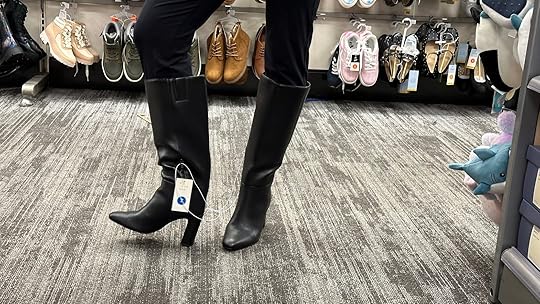
I Tried On All Of The New Boots At Target And These 8 Are My Favorite

I’m clearly no stranger to the joys of Target but after hearing all of the internet chatter about how good their fall boots currently were, naturally, I had to go see myself. A little field research to help give any of you looking the real lowdown:) I have to say before we get any further, Target is doing something pretty special in the comfort department. It’s good, y’all! Oftentimes with affordable shoes, comfort isn’t always the top priority for the maker, just style. Not the situation here. Whether it’s memory foam or just a well-cushioned insole, your feet are going to be happy, thus making you happy. But they’ve really got some awesome styles too (duh) so let me take you throw my thoughts, feelings, and recommendations.
Kenzi Tall Western Dress Boots With Memory Foam Insole – $45

Ok, these really took me by surprise. I was very impressed by all of the detailed stitching and how lengthening for the leg they are. Truly so good. There are plenty of more affordable knockoff cowboy boots that are cheesy but these aren’t. They are actually really good and are really comfortable. I’m a big fan of a memory foam insert as previously stated! Will they last as long as a traditional real leather boot? Probably not. But if you take care of them they will definitely last you a good amount of time.

Final Verdict: I really do love these and recommend them. I would easily pay more than $45. This is the perfect way to enter into the cowboy boot trend (which is also a classic…win-win) if you’ve been wanting to!
Livia Stovepipe Tall Boots – $45

Here’s what I’ll say – These have a really nice shape, are streamlined, but boxy up top. Because of the heel, they feel more like city shoes to me but if you are a heel wearer then you might love that about them! The only real downside is that without care, I’m a little worried they’re a “one-season boot” based on the leather.
Jess loved them when she saw the pictures and I do like the shape of the toe. For me they weren’t a “hell yes” but I think it’s mostly based on my lifestyle.
Hope Tall Boots – $45

But these guys are a different story! Look at them, SO CUTE. You might know by now that I love an equestrian vibe. Plus, I love the structured front and think it would be so cute on everyone. Oh, and they are so so comfortable.

I didn’t buy them but do I need to go back and change that?? So easy to grab and go for the colder seasons and still look so cute (which at times is a challenge when you are all bundled).
Rebel Tall Moto Buckle Boots – $50

These are the knockoff motorcycle boots that people are really talking about. I do have to say VERY comfortable. I have wider feet and these are perfect if you also need a little extra width. Plus, (like most of these boots) I was not expecting the cushion that’s provided in these very rough and tough-looking boots. It’s easy to assume that a heavy, affordable boot is going to be well, not that comfortable. Y’all these are really comfortable. Totally recommend.

Want a little more edge to your wardrobe? These are a pretty cool and easy way to do that:)
Oakley Harness Boots With Memory Foam Insole – $45
These are the Frye knockoffs which I have to say are pretty great. My beef with my vintage Frye boots (that I can’t seem to quit – I never wear them but I’ve had them for 20 years) is how heavy they are – making them pretty uncomfortable. These from Target are lighter-weight and very comfy.


Will they last as long as the real deal ones? Nope, but if you want the Frye boot look for FAR less and a lot more comfortable, I can say that I was shocked and impressed by these.
Logan Lug Combat Boots With Memory Foam Insole – $40

Speaking of really heavy shoes, that’s one of my problems with traditional Doc Martin’s. Just so heavy. But overall they aren’t really my personal style but are so great on other people whose style they are perfect for. The great thing about these knockoffs is that they are so much lighter than real Doc Martin’s which I love.

And you bet the memory foam makes them also very comfortable.
Lonnie Kitten Heel Stretch Ankle Boots – $35

If you remember from last fall, I got a VERY cute pair of Madewell tan kitten heel boots that I wore all of the time. Those ones ran about $200. So when I saw these for only $35 I was very interested. They are really cute, have that class dainty kitten heel look, really lengthen the leg with that pointed toe, are comfortable, and simply just great. Nothing negative!

Oh, but one important thing to note is that they tuck really nicely into jeans. The jean/boot combo dream:)
Mona Rain Boots – $30

Oh man, if they had had my size I would’ve probably snagged these! So great for the rainy weather that’s coming and perfect for the farm.

They didn’t feel too heavy and the quality was great for a rainboot. Ugh, I might need to order them online as I’m pretty sure I just talked myself into them. Cute but very practical.
Ok! Eight great, affordable boots (some I preferred more than others) that could help you get through fall and winter a little more stylish (if you are in the market). Happy boot shopping! xx
The post I Tried On All Of The New Boots At Target And These 8 Are My Favorite appeared first on Emily Henderson.
October 11, 2024
Fix It Friday: The BIG EHD X RUGS USA GIVEAWAY (5 Readers Are Getting A Pretty New Rug With Our Style Help)
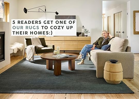
Welcome to maybe my favorite Fix It Friday ever! But I am likely biased given the subject. Yesterday, Emily got to write about her love for the collection and today is my turn, baby! Now let me be clear and say that I loved our last collection and am so proud of it. If you bought one of those rugs I hope you love it and THANK YOU. But this collection feels even more versatile, even more luxe, and we truly couldn’t stop “oooo-ing” and “ahhh-ing” when we got the samples. So I had an idea to have a giveaway but in a potentially more helpful way…a Fix It Friday way:) Rugs USA was on board (THANK YOU!) so here we are.
We are big believers in the power a rug has to transform a room. I’m sure you know what I’m talking about if you’ve ever switched out an old one or simply added one to a room that didn’t previously have one. For this giveaway, we did a callout on social and in the Link Up, asking those of you who needed a new rug if you might want one of our new ones:) The response was overwhelming so first off, I want to say thank you thank you and I’m so sorry we couldn’t pick everyone. And while everyone’s budgets are different, we are so proud to be working with a company that makes quality rugs at truly such a reasonable price. That sounded like an ad but we wholeheartedly feel that way. So without further ado, here are the 5 readers who won an EHD x Rugs USA rug! You’ll see a pic or two of their home and what rugs we think will look awesome in their submitted space. Of course, if they have their heart set on a different one, it’s their home so they can choose whatever they’d like. Ok, let’s get into it:)
Winner #1: Time For The Grown-Up Rug
From Reader: “We have been living in our house for 8 years now and moved in at the ripe age of 25 – we’ve been living with this (cheap!) bound remnant rug since day 1 and it has served us well with two little sticky, spilly kids, but we are ready for an upgrade to reflect where we’re at in life and how our style & home has evolved. This room is tricky because it’s quite long and the floors beneath need some love & attention (a “someday” project) – would be so curious to see how you guys cozy this space up with something that is not so plain, and bring some much-needed style to the floors!”
I think after 8 years, a new rug is in order, don’t you?? Plus, I felt that their overall color palette was super relatable and would help give some of you ideas for your spaces too. This is what I’m thinking…

This room is definitely on the cooler-toned side so I thought maybe warming it up a little with a muted blush rust would be great. The Elliot is SO pretty in person and would look awesome in here. I would then maybe add or switch out a pillow or two with similar tones so it’s not the only warm piece in the room. If they don’t want to change pillows, they could always add a decor piece or piece of art too! But if this color is overall not their vibe then I think The Marlowe would add so much personality. It’s still super neutral but it has that bold pattern that livens it right up. Which one do you think??
Winner #2: Bring In The Light(er) Rug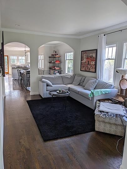
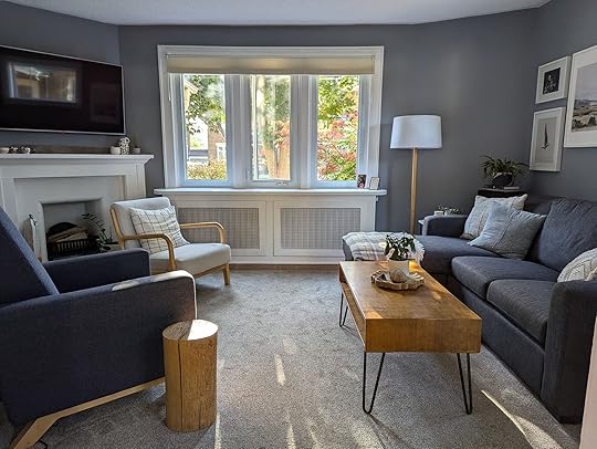
From Reader: “I live in 1918 renovated craftsman home located Kirkland Washington and this is my living room that needs help. Currently the rug is a 6×9 size. Thank you for the consideration.”
What struck me about this room what that the rug is stealing all of the attention because it’s the first place your eye goes. It’s such a pretty space but their rug feels a bit too dark. I totally understand not wanting a light rug (especially in a place that has A LOT of wet weather) so here are my recs!


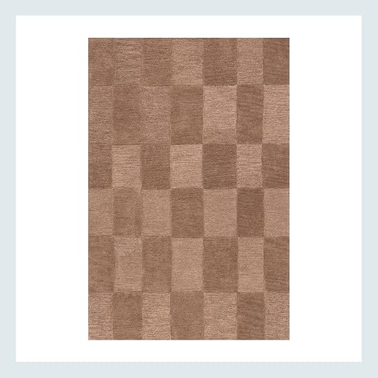
First off, I love the idea of a muted green in this space. It’s a cool neutral that’s also very life-friendly. Plus, these two have a textured pattern that would add just enough visual interest. I truly think both of these would look great but I’m leaning towards The Starke in hunter green. It’s going to make the room feel so much softer and with the broken stripe pattern I think it will really bring the room alive! But I also love the The Southwest as an option too. If the reader still wants a darker rug, this one in charcoal (which in real life actually reads as a very deep green) is so pretty. And as opposed to the one they have the texture in this rug will give the space a lot more movement.
The last thing I’ll say is that I think they could go bigger in size! It’s hard to know not being in the space but it looks like this room could handle even a 9×12. Of course, the reader knows best but I want them to at least consider going up a size or two. Here’s a little size guide post to help

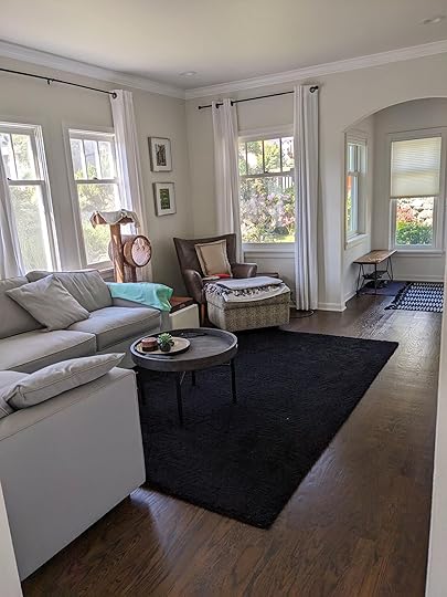
From Reader: “I live with my husband and two dogs. We’ve been in our house for about a year-and-a-half, and I desperately need help with a rug for our dining room. It is challenging because it is an open-concept room, so I have been struggling to find something that flows in with our living room and kitchen. I’d say my style could be described as Earthy Modern. The thing I dislike most about our house is the floors (cheap-looking grayish LVP that was there when we moved in), so the more coverage for the floors, the better! I attached pics of the dining room from different angles so you could also see the kitchen and living room. The table we have is about 86”… so I would think 9×12 rug would be best…Our living room rug is a Rugs USA rug and I’m obsessed with the quality. I loved every one of the rugs in Emily’s first line – can’t wait to see the new ones!”
Dining room rugs can be tough! You don’t want something too delicate, you want them to hide potential messes, and not too thick so that the legs of your dining chairs aren’t too uneven if the chair is half on and half off. But I love their style and think I have two great options to solve their problem.
As she said, their style is earthy modern (yay for warm browns!) When I went through our collection I immediately zeroed in on these two. They feel modern but with a mid century bent and I liked that their pattern scales were much larger than the rug in their living area. Mixing pattern scales will help to make a room feel more intentional and dynamic. Plus, these are busy enough to hide small messes but not so busy that they will take all of the attention in the room. The Annie might be a bit better in hiding mess since the tones are the little richer but The Corbett might be a nice pairing with the living room rug since their colors a little more alike. Both would be awesome!
Winner #4: Baby Deserves A Better Rug

“This is baby #2s room and as you can see– I’ve failed. Baby 1 was a total beige blur and I reused a lot from his space to hers (Crate & Barrel glider, the day bed, rug and blackout curtains). She is so not a beige baby so I got that beautiful crib sheet, photo attached, but have been absolutely frozen as to what to do next to incorporate some color with a rug. I’d love to keep the glider and day bed as central focal pieces so the rug is where I thought I could really incorporate color from the crib sheet. But I’m lost!”
As someone who just had two family members have a baby in the last three months (I’m a first time aunt, y’all!!) I couldn’t not help this sweet mother in design need.
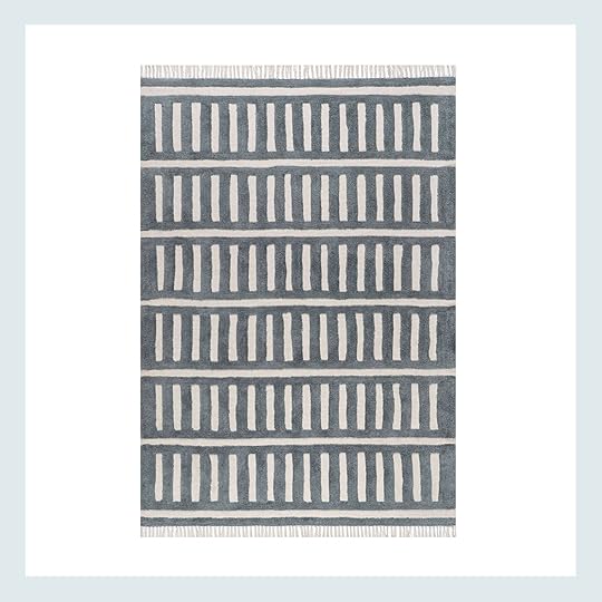
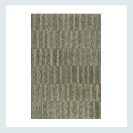
Go green! The ones in our collection are definitely neutrals but are still a pop of color. Plus, a good green rug can grow with you and not look too “young” or “trendy”. For this space, green is a no brianer since there’s a little green in that adorable crib set. The “new” Merrick is one of my absolute favorites so I’m partial to that one for this space. It would add such a burst of life and playfulness in the space. FYI I highly recommend a rug pad for this one since it can be slightly slippery. But I totally understand if that isn’t the reader’s vibe. If that’s the case then our other star, The Starke, in olive would be an extremely pretty and an elegant addition to this room. It still has that playful pattern so it’s not going to feel too formal. Can’t wait to see what she picks!
Winner #5: A No Longer Neglected Indoor Porch
“We love this 3 season porch in our St Paul Minnesota 1953 home. However, the rug has never felt right to me. It is one we had when we moved in 12 years ago and has been low priority to replace. The room is 7’6” wide. I currently have a 5 x 8 rug, but would like something closer to 7 x 9.”
Another reader that has spent too many years with a rug they didn’t love. I want to fix that now!
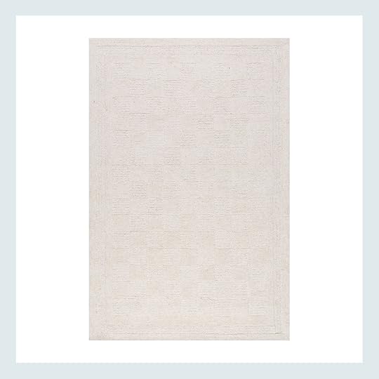

I know this is an indoor porch but that also feels like a sunroom too, right? Point being is that it looks like a fully indoor space where they don’t need to worry about outdoor shoes coming in and out. I mean there’s a piece of art on the wall:) I say this because clearly I’ve chosen two very light rugs. The Robyn is soooo soft and would feel so cozy to step on before cuddling up on that sofa. I love the checkered pattern because it feels fresh without looking overly trendy. Plus, lime green can be a little tricky to work with as you don’t want to compete too much with it. But if an all light cream rug feels too much for a common space then I love one of the other new Merrick options that uses a rust colored thread instead of the original black. It’s a fun pattern that pulls in some of the warmer colors in the space. Oh, and both of these come in a 6×9 which I think will work great!
That’s it, y’all! Truly thank you again for everyone who submitted. It was so hard to narrow down to just five. But I hope that our lucky readers find their perfect rug (even if it’s not one I suggested:)). Do you all have any favorites? We can’t wait to hear what you all think. We are so proud, excited, and completely grateful. To see the whole collection CLICK HERE<3
Love you, mean it.
Opening Image Credits: Styled by Getteline Rene | Photo by Mark Weinberg
The post Fix It Friday: The BIG EHD X RUGS USA GIVEAWAY (5 Readers Are Getting A Pretty New Rug With Our Style Help) appeared first on Emily Henderson.
October 10, 2024
SURPRISE! Our Second Rugs USA Line Drops Today And We Couldn’t Be More Excited – COME SEE!

Welcome to our second line of rugs with Rugs USA, I’m just so pumped about them. This time around we chose more cushy solids with a lot of forgiving cozy textures and I really designed them to go in my house and the river house, which is pretty darn exciting. We hope/think you are going to love them just as much. A huge thanks to Jess who took the lead on these rugs (and will celebrate her 8-year workaversay in a couple of weeks – ALL THE HEART EMOJIS). The team all met at the mountain house this summer and captured the rugs in this environment, with the hope that the styling was simple enough for you to picture it in your home. Without further ado – here are SOME of my favorites of round two (with links to all of them at the end).
The Elliot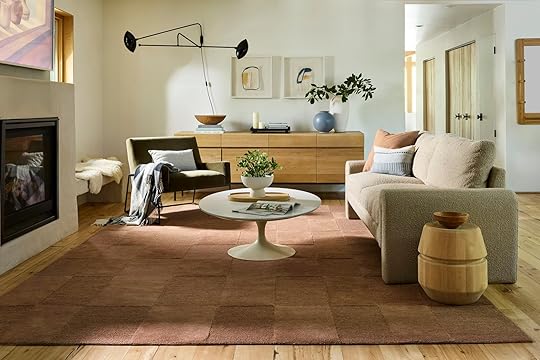
I’m calling it that this color is becoming more and more of a neutral for me. It’s a really warm mauve, with a decent amount of brown undertones making it work with so many different colors. The dual pile gives it a pattern, with ZERO busyness for those of us who want a mellow rug. It’s soft, feels super high quality, and comes in a few other colors as well. And yes, it’s named after my daughter
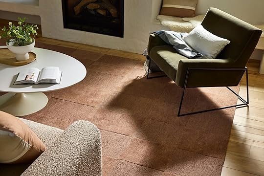
I love this color with creamy neutrals, deeper greens, and of course blues. The Rugs USA team really nailed our colors.
The Starke
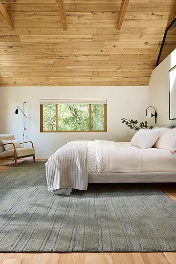
This is my favorite rug pattern in the collection, so I named it my maiden name (Yes, I used to be Emily Starke which was admittedly a very cool name). This is a broken stripe, tonal pattern and we had it made in a few different greens because we realized those were very much missing in the last collection.

This is The Starke in Hunter Green which I LOVE and am going to use in my brother’s river house living room. It has some awesome blue undertones (and shout out to the Article sectional that I bought right before we left for Oregon a few years ago- it’s unbelievably comfortable). Again, this rug has a super soft pile and the color variation makes it really forgiving (i.e. hard to see dirt or wear and tear).
 The Harvey
I keep finding so many places to put The Harvey Rug (named after my brother’s dog for some reason, lol). This is a flat weave and has multiple types of stitching in grays and black. The background is nice cream (not too bright white). I used this in my brother’s mudroom and closet and you’ll see below it comes as a runner.

 right photo: photo by kailtin green | from: my brother’s river house mudroom reveal
I like that it is a pattern, but it’s not too high contrast and has a more organic feel to it. I suppose it is another broken stripe (my favorite and in my opinion the most versatile pattern) and the stitching just makes it feel more special (and it’s wearing really well in my brother’s mudroom – the dirt vacuums up easily).
The Marlowe

This is another neutral with a plaid bent to it that is utilitarian but really warm and soft enough to also work in cozier rooms (it looks like a flatweave but it has a really low pulled pile). For those of you who like the warmer, neutral, minimal, California Casual vibe, this one is great for you.
The Charlie
Ok, for all your high-traffic areas The Charlie is a simply stitched plaid in two very classic colors – green and blue. Great for entries, playrooms, family rooms, kitchen runners, or hallway runners – anywhere that you want something really durable and able to hide dirt.
And while I’m not sure this is official, the other side has a simple stitched stripe and looks reversible to me
Named after our lovely Portland gal, The Gretchen is awesome. It’s a really warm clay/caramel color that is cushy and soft, but with a black stitch that keeps it looking custom and special. it’s a grid pattern with extra detail and two different pile heights.


I LOVE this rug and of course, now wish we had done it in more colors.
The Southwest (MORE COLORS)

The Southwest was one of the best-selling rugs last year so we made three new colors. We photographed this brown one which is obviously great for neutral spaces that need some grounding, but I’m obsessed with the color below.
This color is named “charcoal” but it’s clearly a really dark green/blue. Almost midnight or indigo. The color is so pretty without being black or flat. We are using this in my brother’s game room (formerly called the library) – the stripe still makes it look special, but it’s so simple and rich.


It also comes in a green, ivory, and a brick!
The (New) Merrick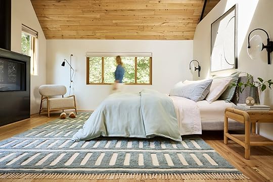
The Merrick was by far my favorite rug from the first drop without me knowing it. I have now used it in so many projects because the pile is soft and the pattern makes it more forgiving even though it was a cream rug. So we made it in a reverse colorway – the pile is a blue/green with a cream base. We all happy gasped when we got the sample:)
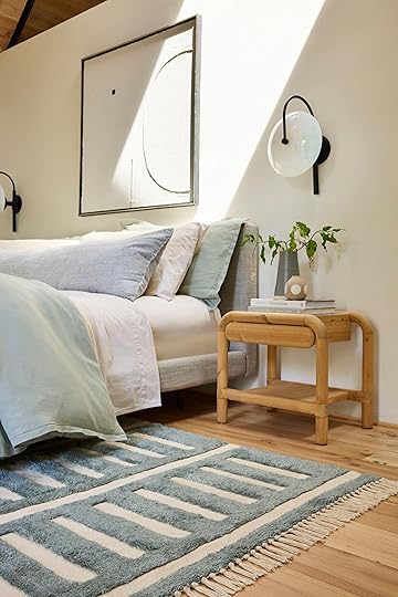
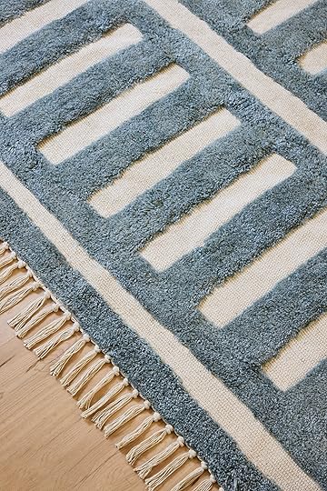
We are using this in my brother’s family room AND Kaitlin’s living room. It’s fun but calming all at the same time.
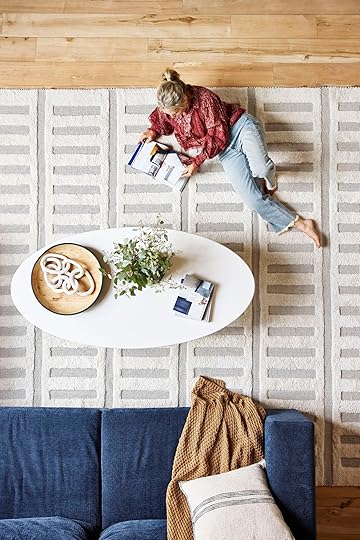


The Merrick still comes in the cream colorway (like in the first drop) but with two additional options. Dark blue threading and a brick color threading. It’s honestly a little hard to see the difference between the blue and black options, but if you want more of a blue undertone this might be for you.
The Robyn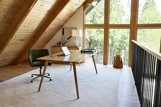
Named after one of my closest lifelong friends, The Robyn is a neutral checkerboard tonal pattern. The Robyn also comes in a dark green checkboard pattern (which we are likely using in the River House dining room).
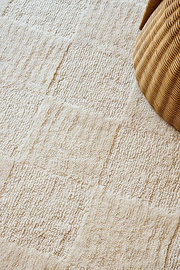

It’s very soft, with varying tones of cream. Of course, I recommend creamier rugs in rooms with less shoe and kid traffic, but that kinda goes without saying (just get the green one if you love it).
The Caitlin

Named after our dear partnership and revenue gal, The Caitlin is a warm brown/mauve and cream. It’s a checkerboard, stripe, graphic but organic pattern that can definitely handle some wear and tear but is not flat woven (so it’s a bit softer). Great for family rooms, hallway runners or anywhere you want a simple pile in a more fun pattern.
There are many we didn’t photograph that I’m rather obsessed with – The Mallory, which comes in the prettiest warm and sophisticated purple (yes, PURPLE) which we all agree is so pretty. It’s technically called Dark Brown but it’s really a vey deep warm purple. The right purple will be having a huge moment this year (I think Olivia Rodrigo is fueling this) and this one is the prettiest one on the market if you ask me (and very affordable).
And The Remy is another great tonal pattern!

1. The Hendo | 2. The Starke (Rust) | 3. The Annie | 4. The Mallory | 5. The Austin | 6. The Morgan | 7. The Corbett | 8. The Oscar | 9. The Merrick (Rust)
Head over to Rugs USA and see the full collection and stay tuned for many a makeover the next few months using some of my favorites. And don’t forget to come back tomorrow to see the winners of the Fix It Friday rug giveaway.
A huge thanks to Rugs USA for being such a great partner on this, and to my team – Jess, Mal, Gretch, Caitlin, and Kaitlin for all you do. The crew at the mountain house was also incredible – looking at you photographer Mark Weinberg, stylist Getteline Rene, and producer Tara Elmore. We were so grateful to have such a talented crew. xx
*Styled by Getteline Rene
**Photos by Mark Weinberg
The post SURPRISE! Our Second Rugs USA Line Drops Today And We Couldn’t Be More Excited – COME SEE! appeared first on Emily Henderson.
Emily Henderson's Blog

- Emily Henderson's profile
- 10 followers

