
Emily Henderson's Blog, page 203
August 18, 2020
Desk Styling 101: How To Make Your Desk Cute AND Practical For Everyday Working (Plus A Bunch Of Affordable Accessories)

I read the craziest statistic the other day. It was “the average office worker spends 15 hours a day at a desk” which is truly baffling considering the fact that there are only 24 hours in a day and at least 8 of those should be spent sleeping. For many of us, our permanent work or school desk just relocated into our homes and now is in need of a major glow up. So today I’m here to do what I do best –– look through our past EHD archives to create an easy peasy formula for how you can decorate your desk so it’s stylish like you BUT IS ALSO PRACTICAL (cause if it wasn’t functional who even cares).
Quick sidebar before anyone gets VERY worried about storage (seriously, we don’t want that), this post is strictly telling you how to make the TOP OF YOUR DESK a stylish and practical space. So we’re not chatting filing cabinets or any other important document storage that happens under your desk (although that’s an important conversation for another day). We can only tackle so much at a time, so if you’re looking for something more specific check out our recent posts: affordable desk combos (this one has actual furniture shopping options for your desk set up), rugs you can roll your office chair on, kids homeschool desks, or check out what Emily’s hilarious work from home situation looks like (update: it still hasn’t changed). Okay, now let’s get on with the desk accessories and styling (the fun part!)
The Basic Formula:
Alright, everyone. For the simple and practical everyday desk styling, you only need 5 ITEMS OR LESS. You heard this right. That’s IT and we have some real solid affordable options here, so you can a desk set up that won’t force you to work more hours to pay for it. Here’s what you gotta do:

Step One
Grab a lamp (or a sconce). Having an extra light on or above your desk makes your life better and will look nice. It helps in the mornings and at night when it’s a little dark over there, but you still want to be able to see ya know? Function and fashion…desk lamps are a double win. We’d also recommend that you grab one that’s taller to give your desk styling some height (and so it can cast a light overhead versus straight into your eyeballs).
Step Two
Art people!! Now you have creative freedom here, so maybe you want to do a full gallery wall or one big piece of art. Do whatever the heck makes you happy, but I guarantee adding something framed above or on your desk will give it the personal touch you need to keep motivated for 15 hours straight. HOT TIP: This is a great place to add in a family photo if you so please! Check out the post I wrote last week on how to frame your family photos in a cool designer approved way if you need some inspo…
Step Three
A cute plant! This is perhaps one of the less “functional” or “practical” things when compared to a light or mousepad or whatever, but a lil plant friend will add so much life and character to your space that it really will become a necessity. You’ll see. You want the place you spend the most time to feel cozy and warm, yes?? Grab yourself that lil plant baby and pop her in a fun planter and VOILA! Instant happiness.
Step Four
Pencil/Pen Holder/Organizer:) Easy access to a pen and paper is crucial, so you need a place for all your favorite #2 pencils, pens, highlighters, sharpies, and whatnots. Essential and SO useful.
Step Five
Last but not least. We fully believe in the power of a mouse or desk pad. It’s hard to find a good, affordable one (unless you scroll down below and see our roundup), but let me tell you, once you do it’s awesome.
Now that you know the basic steps, you can actually add as many or as few of these items as you want. If you read that last mousepad section and you were like, “No way, I don’t want a mousepad,” here’s the fun thing…don’t get one!! This is the basic gist you can go off of, but if you’re a minimalist, it’s your desk and your house so just do what feels right to you. Here are some inspiration photos for your desk styling pleasures:
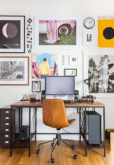 photo by tessa neustadt | from sara’s office reveal
Someone recently asked us in our DM’s how we would style a gaming desk…I’ll be honest, gaming desks have way more lights, keyboards, monitors, gadgets and gizmos, so I’d say to style it similar to this one above & try to keep as few items off the desk as possible. That means get creative with you walls by adding art/sconces/etc 


August 17, 2020
The Unexpected 2020 Tile Trend That A Very Unlikely EHDer Is Putting In Her House…Plus An Ask The Audience
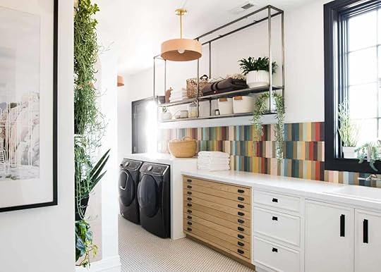
Happy Monday everybody! Design trends seem to be kind of an insane topic to talk about right now. “Trends, Jess? Did you forget the world is on fire?” I know, which is also why we haven’t really been talking about them because we simply weren’t seeing that many for obvious reasons. (Remember this post from back when we were young?) The only “trend” topics that have felt at all fitting are comfort and organization ones. BUT for the past couple of months, the desire for bold design and lots of color has been really picking up speed. It’s not the first time we’ve brought up that fact but today we are talking about it in a more permanent way…tile.
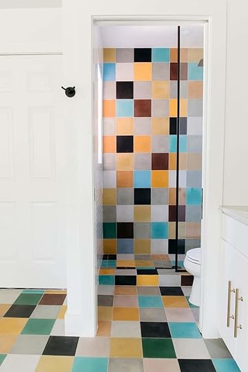
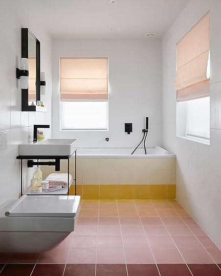
I am pretty shocked but equally delighted that “Rainbow Tile” seems to be a real, honest to goodness 2020 trend. If ever there was a year to bring a rainbow into our homes it’s this year. Now when I say rainbow, I don’t necessarily mean the classic 6 colors (red, orange, yellow, green, blue, and purple). I more mean a handful of a variety of single-color tiles mixed up in a simple, fun pattern like Mandi of Vintage Revivals did in the photo above. It’s genius and cool and her laundry room was the catalyst for me realizing this was a trend and has been a big inspiration for my bathroom (more on that later). First, let’s dig into this trend some more.
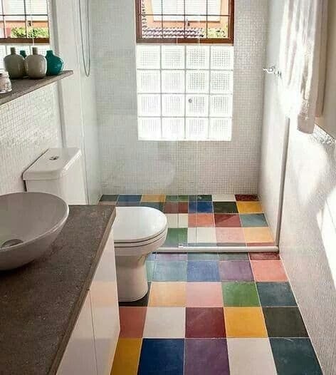
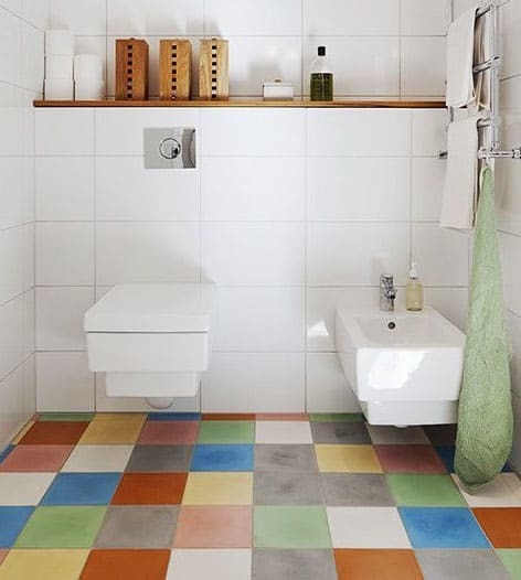 left: photo by lufe gomes, via casa e jardim| right: source unknown
If your first thought, “NOOOO way would I put that in my house,” I get that. But also I love how joyous it is and that has a lot of value to me (especially now). I personally love the one on the left because while it’s very playful it also looks pretty darn chic. Plus it also a refreshing break from the classic white tiled bathroom we’ve all seen more times than we can count. Please note that I still love a beautiful white bathroom:)
 design by kim spradlin wolfe | photo by becky kimball | via domino
Now, this tile combo may be a bit more palatable for a lot of you. The colors are a little more “adult”:) And guess what?? The designer, Kim, won season 24 of Survivor! That’s just a fun fact but one absolutely worth mentioning. Anyway, this 400 sq ft. renovated guesthouse looks fresh and exciting. I also love the way she used the same pattern with smaller tiles on the shower floor. It adds just the right amount of visible interest in an already VERY interesting space. Another fun fact is that the tile, which covered the whole guesthouse, cost only $500. Pretty impressive.
 design by edwina boase and sophie robinson | photo by tim young | via hunker
 So while I love the “random” colored tiles all mixed up, this beautiful ombre bathroom floor by Edwina Boase and Sophie Robinson is also a great option for those who like the idea but want a more uniformed design.
 design by alex boudreau | styled by elaina sullivan | photo by skye parrott | via domino
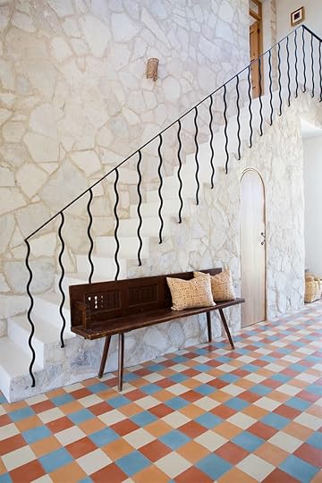
But don’t think that you need a million colors to create this look. Take Alex Boureau’s design in her family’s Mexico vacation home (I know. I am also trying to figure out how to become a family member). She used only four colors and it still makes a beautiful, exciting pattern that is a refreshing departure from the norm but also very in line with the country’s design aesthetic.
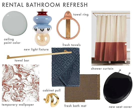
So yes, I have fallen victim to the magnetic pull of making my home more colorful. Historically I have been on the more #teamneutral when it comes to designing my own home. I’m not entirely opposed but for sure hesitant ( if you haven’t seen it). But like I said in this first post about my bathroom, I want to get kinda crazy. AND it’s probably no surprise to anyone that a checkered pattern is my all-time favorite (please see my living rug and art).
So I thought why not continue making my dad’s life hard and design a box to cover my off-centered, not that great medicine cabinet for him to build and for us to tile together (something I have always wanted to learn). This felt like a “fairly simple” and really exciting way to integrate this trend and make my bathroom look super unique. Thankfully he was just bored enough to say yes:) So before we get into the cover design let’s look over my overall plan again…
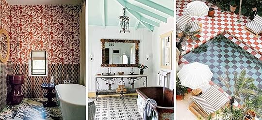 image source | image source | image source
These are my inspiration photos. I want rust tones, lots of pattern and if I can, a slightly vintage feel. It’s very Spanish/French-inspired if you can’t already tell.
This is my current mood board so you can start to visualize and also help me decide on my tile design. Get ready because it’s going to be visually a lot and I need you to dream with me:)
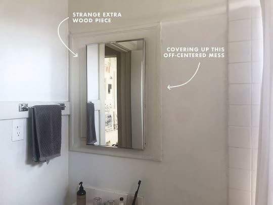
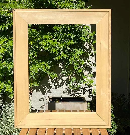
Here’s my actual bathroom and the future location of the cover. The cover is going to completely go around the moulding, I’m going to pop off the mirror and obviously attach a new mirror to the face of the cover (right now I am looking at this one from Rejuvenation). Also, don’t worry I am replacing the towel rack:) This way the only damage to the walls are going to be the four to six holes I will need to attach it to the wall. Easy, peasy, ha.
The Medicine Cabinet Cover
But here she is in all of her untiled glory! She’s a big kid at 28″x34″ and face width at 4.25″ which is perfect for the 2″ tiles you will see below. Also, keep in mind that the font and sides will be tiled so like I said, it’s going to be a statement. Honestly, it may turn out horrible but luckily this project isn’t permanent if it all goes down the toilet. I also just really want to take a risk and break out of my shell a little. With that said drumroll please… here are the six designs I am highly considering:
The Design Options
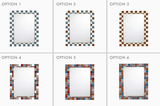
I forgot to mention that these are all zellige tiles (like in Emily’s LA kitchen) so they have texture, depth, and are my favorite tiles in the world. I initially thought that I was going to go with option 1. But then I thought it was maybe too safe and I would regret it. Plus when I saw the rainbow trend coming in hot I thought, “Jess, add more color! Be bold!”. But I’m honestly not 100% sold on options 4 through 6. Maybe it’s my color choice? Maybe it’s because it’s on the computer? I don’t know but I would LOVE your thoughts.
So let me know what you think in the comments (while also being kind:)) But let’s also talk about this trend! Would you ever consider rainbow tile in your home? Are you also intrigued or is it just a hard no? See you in the comments.
Love you, mean it.
Opening Image Credit: Design and Photo by Vintage Revivals
The post The Unexpected 2020 Tile Trend That A Very Unlikely EHDer Is Putting In Her House…Plus An Ask The Audience appeared first on Emily Henderson.
August 16, 2020
The Link Up: Julie’s New $30 Yellow Pants, Ryann’s Affordable Wall Art, and The Best Trick To Keeping Your Plants Alive

Geez, can you believe we’re more than halfway through August?? This means summer is almost over and we hardly remember it even happening…what a weird time. Hopefully, your week was full of good things and not bad things. If it was full of good things, let’s celebrate, and if not here are some links to make your day a little brighter.
This week’s home tour is brought to you via The Design Files and let this be a warning that it will make you want a blue velvet sofa. Also, the bar cart couldn’t be any better which is always a win in our book. You will not be disappointed, trust me.
From Emily: For all of us continuing to support black-owned businesses (and if you want your home to look awesome), 54kibo where I bought this side table is pretty incredible. It’s simple, modern and so special. If you want to see it in action check out my living room.
From Mallory: I accidentally bought a fiddle leaf and before you laugh at me, you need to understand that it was in the plant section that said “rubber tree” and I thought I was just picking out a really special looking rubber tree. Well, I got home and watched Hilton Carter’s video about rubber trees and took one look at the plant he was talking about and another look at the plant I had just bought and realized that they were in fact not the same. From there I found ANOTHER Hilton Carter video all about fiddle leafs (this guy knows his stuff) and now I feel prepared to take care of this little guy that I hope to one day be proud of. If you have a plant you don’t know how to take care of, just google “Hilton Carter and (insert name of plant)” and I’m sure it will come up (he’s the best!)
From Caitlin: I have written before about my obsession with the @cheapoldhouses Instagram — it’s the BEST feed, but it’s also SO FUN to be able to keep tabs on the homes that are saved by fellow design lovers. To that end, writer Myles E. Johnson is raising funds to buy one of the recently featured properties — which may have been a stop on the Underground Railroad!! — and to remodel it as an artist/spiritual retreat for Black LGBTQ+ people. There’s a GoFundMe here if you want to help an under-served group AND save a beautiful home!!!
From Jess: Body lotion has always been hard for me. This fact was mostly tragic as a 13-year-old because Bath & Body Works was out of the question. Anyway, my skin is sensitive and easily rashes so finding a good body lotion isn’t easy. Even “all-natural” ones still can be a no-go. So after months of seeing this Necessaire lotion promoted by basically everyone, I finally just gave in. Welp, I really love it. It’s totally scentless, goes on great and the bottle is a very decent size! It’s also good for the environment because it comes in recyclable packaging, is vegan, and cruelty-free… all great things. I will absolutely be buying this again. Also thank you to Kellie Brown who was the influencer to finally convince me. My dry skin is forever grateful.
For those who are able, here is an article full of ways to continue to support the people of Lebanon after Beirut’s completely devastating explosion that happened at the beginning of the month, making 300,000 people homeless.
From Ryann: Now that my walls are finally painted I desperately need art. My budget is limited so my plan is to incorporate some inexpensive prints along with a few vintage paintings if the price is right. I asked my boyfriend to help me with this endeavor and he discovered this Etsy shop that has THE best prints of so many different genres. I want them all but especially this one and this one.
Also From Mallory: I’ve said it once and I’ll say it again, this mascara is the best thing that’s ever happened to me. Just a friendly reminder if you are looking for one:)
From Julie: I’ve never been able to pull off any piece of clothing in the yellow category due to my fair complexion. That is until I spotted these yellow pants at Target the other day when I was getting some styling props for an upcoming shoot. Sorry Emily, I couldn’t resist a little retail therapy on the clock when they were this CUTE. The pant is also loose-fitting with that trendy sailor pant leg which is so nice for the hot LA summer days when I still need to schlep stuff but don’t want to wear shorts. This is my second pair of pants like this from Target, the first of which I’ve been wearing almost every day this quaran-year (see what I did there?) cause they are close to the comfort of sweats but stylish enough for the public eye.
From Sara: Essie cargo-go nail polish! It’s the color I’ve been wearing all summer and I always get compliments. PLUS it dries super fast, which is never a bad thing
August 15, 2020
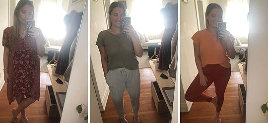
What We Are Actually Wearing On Our Bodies 5 Months Into Quarantine
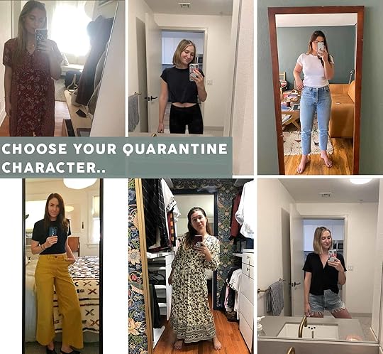
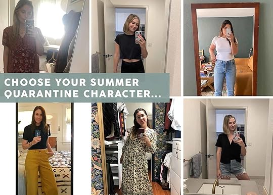
It’s been 5 months since quarantine began in California which is a disorienting and sort of unbelievable fact. Not surprisingly, as time goes on in this bizarre and chaotic year of 2020 many things, both big and small, are shifting day by day, week by week. One of those small things we at EHD have noticed is what we are putting on our bodies. All of us have gone through shifts in our wardrobes since we talked about it here in March (which honestly feels like years ago) so we thought it might be fun to give y’all an update. Here we go..
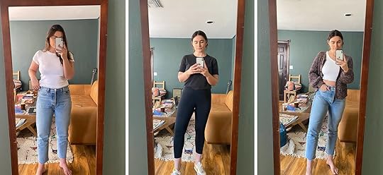
Julie’s Outfits

Outfit #1 – T-shirt | Pants | Sandals: Overall, my quarantine style hasn’t really changed from pre-COVID life. There was that one “lost week” where I lived in sweatpants but I quickly realized that physically getting ready for the day (read: putting on actual pants, the looser the better) and creating a routine for myself in the morning helped me get out of the “I’m at home let’s binge watch The Newsroom” mindset and shift more into a work mode. That is until 6 pm where I have a mandatory date with my porch, the last bit of sun, whatever book I am currently reading, and a drink in hand. I have however opted for a lot of those “loose” clothing options like the amazing yellow pants in the first photo and a simple t-shirt (I have about 8 of those t-shirts all in the same style & multiples of the same color). It makes getting ready in the morning feel more like the old days of putting on my school uniform which now I totally get the appeal.
Outfit #2 – Dress | Converse: A maxi dress just becomes a necessary part of life for the hot LA summer days. It’s easy (and breezy) to just throw on in the morning like a victorian nightgown that is somehow acceptable to wear in public. And to dress it down a bit I like to throw on some sneakers that are also functional when I have to run errands (masked of course) for the shoots we have coming up next week!
Outfit #3 – Jeans | T-shirt: I do still love to wear some high waisted jeans which I know some of the team is baffled by that fact but in a weird way they make life feel a bit normal in a very strange time. That green jacket & black boots are staples in my wardrobe no matter the weather but sadly both are sold out.
Mallory’s Outfits

Outfit #1 – Dress: This dress is me and I am it right now. It’s so insanely comfortable and I’ve been wearing it ALL THE TIME. 10/10 recommend you get yourself a midi dress. I’m in love
Outfit #2 – Leggings | T-shirt: I wear workout clothes 80% of the time, because it’s comfy AND it motivates me to pop a lunch break HIIT workout because I’m already in the clothes. All in all, I could not be a bigger fan of these leggings, which I’ve linked before (they’re the 74% off ones that are only $19!) and I seriously could not have a higher recommendation. They’re insanely comfortable and cute, but all in all, you can’t beat the price. The sportsbra I wear is this one from lululemon. I’ve had this for about 8 years now (no joke) and I STILL WEAR IT ALL THE TIME. Lulu can be expensive, but it’s well worth it if you’re buying any basic workout garb. Lastly, I wear this black top as my workout cover-up (I’m a huge proponent for the less fabric the better when working out so I typically take it off before a workout). It would be weird to answer zoom calls in exclusively sports bras, so I really wear this one for the team/grocery store runs/anything else that may come my way (but not much bc what else do you do rn??)
Outfit #3 – Shorts | Shirt (similar): After I (maybe) workout I usually put on these shorts that I’m sure my family is tired of seeing me in. They’re so classic and great and fit like a glove. The shirt I wear with it rotates constantly, but I gotta say lately I’ve been wearing just a comfy black short sleeve black button down with a few buttons undone at the top to show a lil somethin’, somethin’.
Ryann’s Outfits
Outfit #1 – Jeans | T-shirt: I kid you not, I wear this outfit 5 times a week, bare feet and all. I’ve already mentioned these jeans are perfect and the more I wear them the clearer that fact becomes.
Outfit #2 – Leggings | Shoes | T-shirt (similar): This is my outfit when I want to try to convince myself to work out. It works like 20% of the time but I don’t mind because I think it’s okay to be kind to yourself in the middle of a pandemic. The leggings are my favorite from Nike and the shoes are the most comfortable (and cute) shoes I own.
Outfit #3 – Jeans | Shirt | Sweater: Yes, the jeans again. I’ve been wearing a variation of this outfit for about a month now because it’s so easy and effortless. I love this sweater that I got from Rent The Runway so sadly I’ll have to return it someday – but for now, I can’t seem to take it off.
Sara’s Outfits
Outfit #1 – Joggers | Sweatshirt | Slides | Scrunchie: It’s been insanely hot most days, but the mornings can still be a little chilly. And somedays Mac just really needs to blast the AC because the office gets hot and the fan just won’t cut it. For those moments I’m very into wearing this ultra-soft jogger and sweatpant combo. The cropped sweatshirt I got on sale years ago, and it’s just so good I wear it all the time. But I think a cute cropped hoodie would be a great option. And I just got these joggers (yes, they were an impulse purchase), and they’re INSANELY soft, but they’re not thick so they’re great for summer. They’re also just a touch fitted. And these slides are what I’m wearing most of the time these days.
Outfit #2 – Dress (similar)| Headband: I’ve been wearing a lot of summer dresses recently. To me, they’re just as comfortable as a pair of leggings and t-shirt, but feel just a little more put together with a small touch of whimsy. In the mornings wearing a flowy summer dress makes me feel like I’m “tending my garden” instead of just “out watering the yard”. This pretty dress I’ve been wearing all the time isn’t in stock anymore online, but the dress I linked feels similar in a lot of ways! Throw on this braided headband, and I look like I actually tried.
Outfit #3 – Shirt | Pants: Occasionally I am forced to leave the house, and on those occasions this has been my go-to outfit. These wide-leg pants are roomy and ultra-comfortable but still structured so they feel very professional. And I really like the neckline on this tank top, which avoids getting tight and bunchy right around my armpit area. And my hair has gotten long enough during these past few months that it lives in a bun 90% of the time. I’ve been pretty attached to velvet scrunchies to keep it up and out of my face. Check this post for all the gold jewelry I’m wearing.
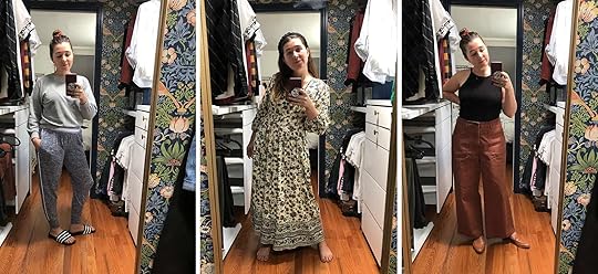
Jess’s Outfits
Outfit #1 – Dress: Well here you have it! My only attempt at looking like a normal human. But seriously I LOVE this dress. First off it’s $30. Secondly, it’s so comfortable and breezy. Thirdly, it looks like the 90s floral dress I refused to take off when I was 5. To be honest I also refuse to take this one off too. So ya it’s a slam dunk and I can’t recommend it enough. The one thing though is that it will shrink. There is a warning on the tag so it’s not a total secret. I got a size large which felt a little too big but when I washed it was just right. So maybe size up if you want that looser look.
Outfit #2 – Sweatpants | Shirt (similar): A real staple because I am still pretty quarantined and only leaving the apartment when necessary… thus making comfort a must. Sadly this is one of my favorite shirts that I talked about no longer being available a couple of weeks ago in the linkup. You can’t see them but there are now holes in pits. WHY?? However, these sweatpants are a DREAM. They are so lightweight (great for air-conditioned homes) and incredibly soft. Plus there are only $20.
Outfit #3 – Leggings | Shirt: This is my attempt at “happy stay-at-home athleisure.” I own a lot of muted colors (especially in the loungewear department) so putting together a bright and tonal outfit is a great fix for this and helps my mood! The leggings are my all-time favorites from Girlfriend Collective (I finally just bought the blue ones). The shirt is a close second to my favorite and IS still available so at least there’s that.
I would also like to give a shout out to the newest member of my everyday gold jewelry collection…the paperclip chain necklace. I couldn’t help myself when Sara recommended it in this post and I found out it was under $30. Add to cart, immediately. So if you want to join our necklace crew you are more than welcome. It’s very fun, with very little responsibilities.
Okay so now that you’ve seen our new uniforms we have to know, who’s outfit do you relate to most?? Choose your characters wisely, my friends. 
August 14, 2020
The “Clench Your Chest” Romantic Movie List We All Need Right Now And Why

This year has been everything from heartbreaking, to scary, to stress/anxiety-including, to a call to reprioritizing, to a long-overdue awakening, etc etc. You name it, 2020 has brought it with a vengeance. I think that when we take necessary breaks from facing the important realities of this time it’s easy to just go temporarily numb. Maybe that’s just me but likely not. And while I never lose sight of my extreme privileges, I tend to forget to remind myself of all the really beautiful parts of life. But honestly, my imagination can feel like a dangerous thing. Like there’s a warning sign that goes off in my head that too much optimism will lead to inevitable heartache. However, a couple of weeks ago I was watching something (and for the life of me I can’t remember what it was) and it hit me in a way that the light, happy comedies I otherwise consume, hadn’t. It was a real, true, and beautiful love story. I was overcome with a very welcomed happy cry that reminded me in a visceral way that those parts of life are crucial to be reminded of. Those “clench-your-chest-you-are-feeling-so-many happy-feelings” kind of stories. So I thought why not rally the team to put together a list of movies that have done that for us. Emily (the true romance movie expert) had SO MANY incredible recs that I hadn’t heard of but after watching the trailers (many of which took my breath away) now NEED to watch.
Ok, my emotional dissertation is over and now we can focus on some movies that are going to get you in touch with that pretty special part of being human…LOVE (or even just some straight-up lust;)). It’s honest to goodness emotional medicine, I promise.
So since there are SO many, I have linked the titles to their trailers for you to get a taste if you haven’t seen it before. Also, some of these movies could work in more than one category but for post length purposes, we decided to stick to only one per movie (I know it’s cruel). All I have to say is get ready for your movie list to get very long!

Emily’s Picks
Shakespeare in LoveTitanicEternal Sunshine of the Spotless MindThe NotebookBrokeback MountainRomeo + JulietHow to Lose a Guy In 10 Days
The Team’s Picks (With Some Endorsements to Emily’s:))
Romeo + Juliet
If you want to cry your eyes out, while also simultaneously feeling super swept up in a cinematic romance may I please recommend Baz Luhrmann’s Romeo + Juliet. Added motivation? Young Leonardo DiCaprio and Claire Danes. That is all. – Sara
Garden State
I saw this movie when I was 16 (I honestly had to use a “How Old Was I When” calculator for this. My brain is deteriorating.) Anyway, I felt changed by this movie and the sweet chemistry between Zach Braff and Natalie Portman still makes my heart burst. Ugh and the airport scene. Go watch now. – Jess
Sleepless In Seattle
Empire State Building scene. What’s more iconic than that? Oh, the fact that it’s with Tom Hanks and Meg Ryan:) – Jess
Love and Basketball
This movie is all about passion and a life long love. It takes you on a rollercoaster of emotions. It’s sweet, heartbreaking, maddening, and joyous (plus pretty sexy). If you’ve never seen it do yourself a favor and watch it this weekend because it’s absolutely a classic. – Jess
When Harry Met Sally
This movie is so iconic and all-around amazing and if you haven’t seen it (or if it’s been a while) I HIGHLY recommend you give it a rewatch. It will make you feel unbelievably good and also will make you want to marry your best friend. Enjoy! – Mallory
You’ve Got Mail
Another Tom Hanks and Meg Ryan home run in the sweet romantic movie game. It’s pretty impossible to not feel happy after watching it. – Jess
How to Lose a Guy In 10 Days
The bathroom scene! – Jess
10 Things I Hate About You
My boy Chase is a big movie person, meaning he’s seen all the “classics” that the world has deemed legendary. Me on the other hand, well, I’ve seen movies like Mean Girls and Clueless more times than the number of years I’ve been alive. So, given that information, I have to say this movie passed the boyfriend test, meaning I made Chase watch it and HE ACTUALLY LIKED IT. That’s how you know it’s good, when people you think are not the target audience actually enjoy it. Try watching it with your S.O. or movie critic best friend bc this flick is a crowd-fricken-pleaser – Mallory
Also, Ten Things I Hate About You – Rebellious girl meets school bad boy, it’s a recipe for success. Heath Ledger and his accent make my heart beat fast, and his tender heart under all that rough persona makes me melt just thinking about it. – Sara
P.S. We all voted and this is our desert island romance. It just has it all!
Eternal Sunshine of the Spotless Mind
There’s an original premise (paying to have someone erased from your mind in a medical procedure??? I don’t hate that!) and Jim Carrey is like…attractive? It’s refreshing to see him play a character that’s not centered around making faces and sounds, and obviously Kate Winslet is just SO GOOD. A classic!!! – Caitlin
Pretty Woman
Hollywood in the 80s never looked so good. Julia Roberts is an absolute vision, especially in this dress and Richard Geere is a stud. It’s pure eye candy and so sweet. – Ryann
Breakfast at Tiffany’s
The movie that made me fall in love with Audrey Hepburn and fashion for that matter (I even cut my hair into a pixie cut in high school to be more like her). The love story is wildly romantic but staring in awe at Audrey’s poise and style is my fav part. – Ryann
The Princess Bride
AHHH. AN ALL-TIME FAVORITE. Is this a kissing story? NO, tiny Fred Savage, it isn’t, and that’s why it’s so great!!! Like, yes, sure, romance is central to the plot, but there’s also adventure and action and a great supporting cast and it’s just essential viewing because it’s SO QUOTABLE. 10/10!!! – Caitlin

Emily’s Picks
Definitely, MaybeThe VowYesterdayLa La LandSisterhood of the Traveling PantsBefore We Go One DayRuby Sparks
The Team’s Picks
The Big Sick
This movie made me laugh SO hard, and then cry SO hard, and then laugh even HARDER. It was such a great film, based on Kumail Nanjiani and his wife’s own real story! I’ll also throw in The Lovebirds here, since it also has Kumail in it (alongside Issa Rae), which is more comedy than romance. But a really fun movie. – Sara
How Do You Know
Reese Witherspoon dates Owen Wilson, an asshole athlete, while Paul Rudd, a kindhearted CEO (??? A little suspension of disbelief here HAH) pines over her and deals with accusations of fraud and potential prison time. I just watched this last weekend and it’s great for turning your brain off for a second. – Caitlin
Pride & Prejudice
I have to admit, most of the romance movies I like are either teens almost kissing, or people in period costumes almost kissing. The almost kissing bit is super important – we’re talking TENSION people. Pride & Prejudice is THE classic period romance. If you don’t swoon when Matthew Macfadyen says “you have bewitched me, body and soul, and I love–I love–I love you” do YOU even have a soul???? – Sara
Sisterhood of the Traveling Pants
This is clearly a beautiful love story of friendship and sisterhood but for the purposes of this post… Kostas, Kostas, Kostas. Need I say more? – Jess
Legally Blonde
THIS IS MY DESERT ISLAND MOVIE. (The sequel is my actual favorite, but there’s less “romance” there, so we’re going to go with this one, okay?!) It has everything: an iconic lead, women helping women, perseverance, self-love messaging, Elle Woods ends up with a TRULY NICE PERSON at the end, and it passes the Bechdel test!!! It has everything I need in a film!!! – Caitlin
The Incredible Jessica James
Am I partial to the name? Sure:) But this is a love story in two parts. One with Jessica herself and one with a man. It’s empowering, sweet and it will make your day better. – Jess
The Half Of It
I LOVED THIS MOVIE. It’s not the relationship you’re expecting, but it’s the relationship you NEED. It’s light (but deep), sweet, and just makes you smile. – Sara
Plus One
Em actually recommended this in a Link Up last year and it’s SO GOOD. Maya Erskine and Jack Quaid (yes, like, the son of Dennis, just so you don’t spend half the movie being like “who does this guy remind me of???“) have such good chemistry and it’s not a super cliche storyline. Honestly, I’m not sure why this one isn’t more popular because it’s GREAT. – Caitlin
Nappily Ever After
OH MY GOSH I love a movie with a strong female lead (so much so that one of my categories on Netflix is literally “movies with a strong female lead” HAH) and this one is no exception! Basically, Sanaa Lathan ~has it all~ and is just waiting on her boyfriend to propose, but he doesn’t — so she dumps him and shaves her head. The ending is SO GOOD and definitely will scratch your “I want to see films with a successful lady in them” itch
How Do You Display Your Religion In Your Home?

 design by meghan and jesse arlen | photo by marisa vitale | via apartment therapy
I don’t go to church and I wouldn’t describe myself as religious. The memories of my parents dragging me out of bed on Sunday morning still echo in my mind and so does the dread I felt having to sit on a pew for an hour listening to a sermon I didn’t understand. But now at 26 years old, something’s shifted. I’ve developed a surprising affinity towards Catholicism, specifically as it relates to my family history and culture. The traditions I used to roll my eyes at are suddenly endearing. The family heirlooms and my grandmother’s collection of rosaries are things I feel lucky to have. Seemingly out of nowhere, I’ve had the strangest desire to incorporate this part of my life into my home, akin to how my parents and grandparents have always done in theirs — albeit with fewer crucifixes (I am not there yet).
For me, being raised Catholic was a little like learning how to play an instrument that was missing strings. I got some of the routines down like going to Mass on Sundays, memorizing prayers, and attending funerals anytime a distant relative or family friend passed. But it never felt completely right so eventually, I stopped practicing altogether. In general, a lot of my experiences with Catholicism were rooted in morals, tradition, and family rather than strict biblical practices but as a kid, those things weren’t the most fun to care about. Then as I got older I questioned the bible and rebelled as teenagers do. As such, I wouldn’t say my relationship with religion is or ever has been easy and I consider myself lucky that my experience with the Catholic religion is not traumatic, especially since humans are fallible and can screw up even the things that are meant to be holy.
But as I said, I was lucky. My parents grew up Catholic and with the understanding that there are certain things you do in life not because you want to, but because it is the right thing to do. When it comes to family, no matter how distant or problematic they might be, you show up. Family parties were non-negotiable commitments and the same applies to funerals, baptisms, first communions, weddings etc, etc. It’s this emphasis on family and tradition that has me reminiscing about Catholicism and reevaluating what faith and religion mean to me. As is the case for most people, the older I get the more I understand the desire to believe in something. A higher power sounds extremely attractive when the world is on fire and I often wonder what it would feel like to have an unrelenting faith.
In fact, when I think of faith I think of my dad, whom I’ve asked dozens of times “Why Catholicism?” and his answer is always, simply, “It gives me peace.” Wanting to feel at peace is as universal as it gets on this earth so I get it. I get it even if I don’t understand it all and have trouble with some of the inconsistencies.
 me and my buck teeth at my first holy communion
How Do You Display Your Faith In Your Home?
design by meghan and jesse arlen | photo by marisa vitale | via apartment therapyI don’t go to church and I wouldn’t describe myself as religious. The memories of my parents dragging me out of bed on Sunday morning still echo in my mind and so does the dread I felt having to sit on a pew for an hour listening to a sermon I didn’t understand. But now at 26 years old, something’s shifted. I’ve developed a surprising affinity towards Catholicism, specifically as it relates to my family history and culture. The traditions I used to roll my eyes at are suddenly endearing. The family heirlooms and my grandmother’s collection of rosaries are things I feel lucky to have. Seemingly out of nowhere, I’ve had the strangest desire to incorporate this part of my life into my home, akin to how my parents and grandparents have always done in theirs — albeit with fewer crucifixes (I am not there yet).
For me, being raised Catholic was a little like learning how to play an instrument that was missing strings. I got some of the routines down like going to Mass on Sundays, memorizing prayers, and attending funerals anytime a distant relative or family friend passed. But it never felt completely right so eventually, I stopped practicing altogether. In general, a lot of my experiences with Catholicism were rooted in morals, tradition, and family rather than strict biblical practices but as a kid, those things weren’t the most fun to care about. Then as I got older I questioned the bible and rebelled as teenagers do. As such, I wouldn’t say my relationship with religion is or ever has been easy and I consider myself lucky that my experience with the Catholic religion is not traumatic, especially since humans are fallible and can screw up even the things that are meant to be holy.
But as I said, I was lucky. My parents grew up Catholic and with the understanding that there are certain things you do in life not because you want to, but because it is the right thing to do. When it comes to family, no matter how distant or problematic they might be, you show up. Family parties were non-negotiable commitments and the same applies to funerals, baptisms, first communions, weddings etc, etc. It’s this emphasis on family and tradition that has me reminiscing about Catholicism and reevaluating what faith and religion mean to me. As is the case for most people, the older I get the more I understand the desire to believe in something. A higher power sounds extremely attractive when the world is on fire and I often wonder what it would feel like to have an unrelenting faith.
In fact, when I think of faith I think of my dad, whom I’ve asked dozens of times “Why Catholicism?” and his answer is always, simply, “It gives me peace.” Wanting to feel at peace is as universal as it gets on this earth so I get it. I get it even if I don’t understand it all and have trouble with some of the inconsistencies.
me and my buck teeth at my first holy communion
August 13, 2020
Our Favorite and Design-Friendly Ways To Display Family Photos (So That Your Home and Family Look Their Best)


What makes a house a home? It’s the little things that allude to the fact that a person (i.e. you) lives there. For example, it could be the coffee maker that’s set to brew at 7 am every morning, or even the row of hooks to hang your dog leashes on. It can be anything specific to you and your lifestyle, but there’s one simple thing that’s totally universal to each household & we’ve deemed it the easiest way to add a touch of hominess to your space (yup, you guessed it): family photos.
We’re all here on this blog because we just want things sprinkled around our houses that makes our hearts happy, so it makes sense that most of us want to frame and hang up pictures of the people we love most. But in order to achieve this, you don’t have to go to the beach to take photos with your family in matching white shirts and jeans…in fact, please don’t. That’s a lot of work. We’re firm believers that candid, fun family photos are your best bet to bring energy and life into your home (and capture the essence of the folks that live there), so today we’ve rallied up a few designer-approved techniques to framing them. Let’s make those hearts happy…
The One Big Photo
 photos by sara ligorria-tramp | from “how we shoot, edit, and hang family photos with framebridge”
Go big or go home. Well you are home, so go big and hang it in your home. This works well when you’re not blowing up a giant photo of your toddler’s face, and instead go for a more scenic family photo (like the one pictured above) from a special moment in time. Sara took this photo of Emily and her fam on an iPhone, so no you don’t have to have some fancy professional camera to blow up a photo to its max capacity. If you do this with an iPhone shot however, we just recommend making it black and white or something that can hide graininess. Sara also photoshopped a little section of this picture out to make the background more scenic, so if you want a full tutorial on how this was done…check out this blog post.
Little Moments (vary frames)
 photo by sara ligorria-tramp | from “4 ways to style a credenza for everyday life”
Okay so I just said “go big or go home” but now I’m gonna tell you about “less is more”. Tomato tomato, go with whatever is right for your family and your space. Just make sure if you’re going for smaller family photos (like the ones pictured on the credenza above) you vary the standing frames to bring in more visual interest. This is a good time to experiment and play around with fun and flirty frames in all shapes, sizes, and materials!
Same Frame Family Photos
You have two options here if you want to do a wall of family photos moment…
Option A: Go for the grid

 photo by sara ligorria-tramp | from “how we shoot, edit, and hang family photos with framebridge”
This is a clean and simple option, and in my opinion looks GREAT when all the photos are in black and white. Oh, which brings me to a sizzling hot tip coming in so hot it’s burning my fingers as I type this…
Hot Tip
If you want to do a wall of family photos with the same sized frame, make sure your photos are either all in black and white or all in color, this will make the wall look more cohesive
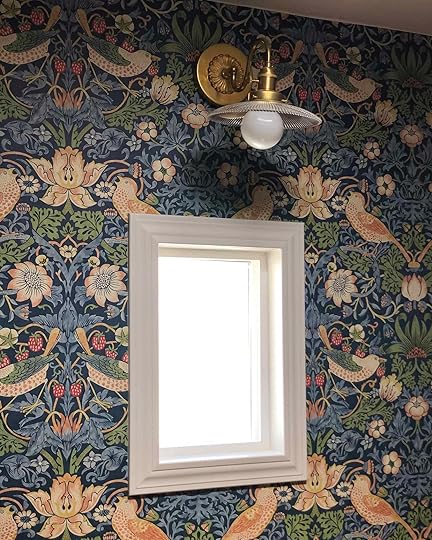
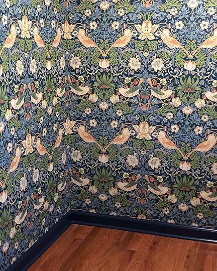
Small Space, Big Design – The Bold Closet Trend (Plus, Sara Reveals Her Master Closet Wallpaper)
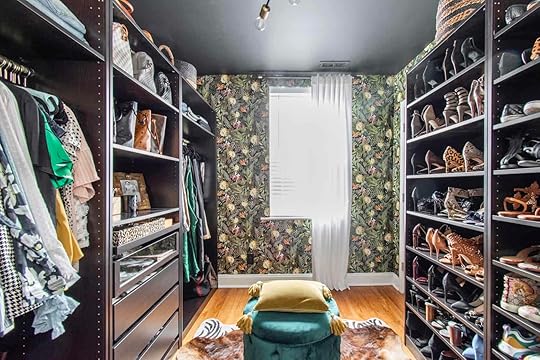
Like a lot of you, I’m pretty over plain white walls for a bit. I’m craving color and pattern. Of course, all of that could change in a few weeks (I wrote all about what I’m calling “design discontent” here). BUT I’m going with it for the moment, and letting these bold design hungers take the wheel. Two weeks ago I shared all the options I was thinking about using in our primary closet – a space I really felt empowered to just go for it. If you’ve been following me on Instastory, then you probably already know what wallpaper I choose to slap on the walls (just kidding, they were lovingly placed my our wallpaper installer Mark). But if you don’t, then you’re about to find out which paper won!
And the winner is STRAWBERRY THIEF by Morris & Co!
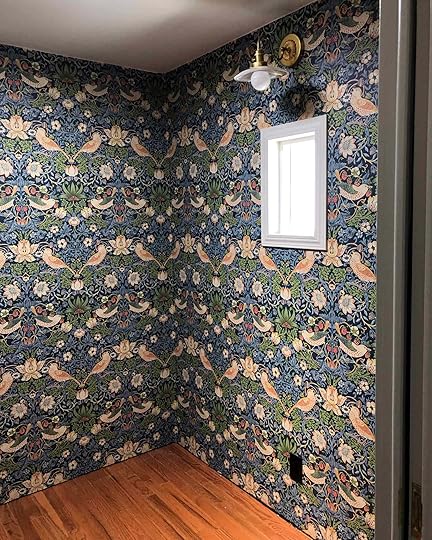
I LOVE THIS WALLPAPER, and now I also love this room. Sometimes I just go in there to sit and smile. Originally I had planned on wallpapering all four walls and the ceiling, but when Mark arrived he told me I was very wrong, had ordered barely enough wallpaper to cover the walls, and to email him before I ever order wallpaper for my house again. NOTED. We all have our strengths and weaknesses – figuring out square footage for wallpaper, as it turns out, is not one of my strengths.
So we ended up leaving the ceiling white, and I actually think it was for the better! And because I’m still learning how you do things, I installed our baseboard without painting it first. So . . . I then spent HOURS painstakingly hand painting this trim with a tiny brush (with leftover “Goodnight Moon” from the office) in order to avoid having to put any sort of painters tape on the wallpaper. I trusted my steady hand more than I trusted even the most expensive “delicate” tape.


Our closet reveal is coming up soon, so hang tight to see how it all came together. But I’m not the only one out there who’s got bold closets on the brain. In fact, it’s kind of thing. Small spaces, it turns out, are actually perfect spots to go big and bold. I think of them as high impact, low-risk areas. Their small size also means it’s cheaper to buy wallpaper for, and tear out/paint over whenever you decide to try something new (as opposed to a large room). So I found a few other bold closet enthusiasts and asked them to share why they also gave their closets an extra serving of personality . . .
DARK & DRAMATIC
First up, we’ve got Kelly Collier from Plot Twist Design, who made over her closet as a “One Room Challenge”. She went BOLD, with a semi-tropical botanic print, black painted ceiling, and animal skin rugs.

From Kelly – “I chose a bold printed wallpaper, because it’s a true reflection of my personality being freely expressed in a space created just for me. It’s on trend, yet floral prints are also timeless; very much aligned with my personal aesthetic and wardrobe. It seems bold closets have become the new norm. I believe it’s a safe, smaller place to for people to explore an unapologetically bold design. It’s also likely to be the one space in the home dedicated to exclusively us, hence more design freedom!”
You can read all about her closet, and see more photos from the reveal here!
P.S. She’s also the host of a great design podcast
August 12, 2020
Living Room Update – AGAIN – Our New Sofa, My Dream Floral Chaise And The Pop Of Red I Always Wanted In My Life

This room. My beautiful, bright charming problem child of a room needs more care and attention (and thought) than any of the others. Why? WHY? It’s such a pretty room!!!??? I’m blaming the children and my intense need for comfort and practicality these days. But historically I’ve blamed the old sofa, the bright rug (then the neutral rug) and at one point I even said: “there are just too many windows!” Ha, impossible. Slowly but surely we are getting there and I’m officially the happiest YET. Of course, my needs/wants have shifted even more because after living so minimally up in the mountains, with nary an accessory in sight other than a pillow or two, I realize how much easier it is to live and parent with less stuff to style and put away. So trying to bring that minimalism to my desired “eccentric English grandma” adds another challenge – she is historically NOT minimal. So with less booked shoots and partnerships, plus some new pieces to show off, it felt like a good time to style out a few rooms (plus I was dying to style/shoot – safely of course). You saw the kids shared room reveal last week (thank you for all your wonderful support – I’m SO happy with it) and today we have a living room update, yet again. It’s Groundhog Day here, but perhaps it’s just GROUNDHOG YEAR.
But one can not give you a proper EHD update without recounting the drama of this room’s sordid past. So let’s revisit the history of this living room over the last three years.
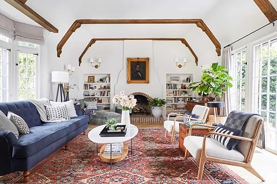 photo by tessa neustadt | from: our modern english tudor living room
Version #1 – 2017. The Busy/Messy English Great Granny. Admittedly this version actually “works” the best visually in photos, and yet it’s not my favorite (thus the need to dedicate the next three years of my life to getting it right). One reader pointed out why this works (in 2019) and it’s because the heaviness of the rug balances out the beams. Oh, I wish I had read that comment (or had that thought myself) before I bought our new rug which I LOVE and is the softest rug in the entire actual world (it’s plush + Emily Henderson.
Emily Henderson's Blog

- Emily Henderson's profile
- 10 followers

