
Emily Henderson's Blog, page 207
July 21, 2020
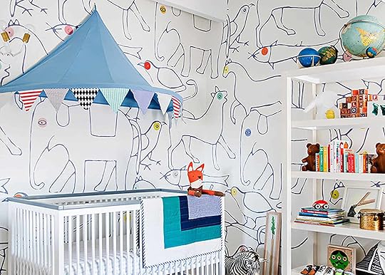
Budget Rooms Are BACK! With A Very Colorful Nursery (Per Your Requests)
I was truly shocked when I did a deep dive into our archives to find out that it’s been over TWO YEARS since we have done an actual Budget Room Design: 1 design at 3 different price points. First off, wow, time has flown by since I did my very first budget boho bedroom. And not gonna lie, I am a little embarrassed to share it with you all. I can officially say that my style has drastically changed over the past 3 years. Secondly, the Budget Room posts were one of my personal favorites as a reader prior to working at EHD so I am excited to bring it back today in a very bold way.
Last week, Caitlin pointed out a very fun observation, there are a lot of women who are a few months out from their due date. And now I can’t stop noticing it, it’s like when you finally watch a movie and then it feels like everyone is suddenly talking about it. A lot of friends, family members, and even some of you readers have shared over on our EHD Insider Community that you are preggers and are quite far along now. Thanks quarantine. 


July 20, 2020
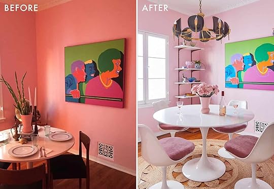
The Pink Dining Room Erik Designed BEFORE He Found His Apartment

Dear Distinguished Guest, At the request of Erik Kenneth Staalberg (that’s me), you are cordially invited to dine (virtually) in the Pink Parlor, upstairs at Suite 4, for an evening of unapologetic prissy fabulousness.
Hi yall! Charmed to have you back in my home for another room tour! Today we find ourselves in my scrumptious teeny tiny formal dining room. Doused in Benjamin Moore “Unspoken Love” and dripping in brass accessories, this room is the flashy one of the bunch.
Unlike my lime living room, which was an organic process that developed naturally, my dining room had been a twinkle in my eye for some years. Before I had my own apartment I had this style vision that now has become a design prophecy fulfilled. As any good glamour girl knows, pink and blue, especially in pastels, are a winning pair and to have that daintiness in what is usually the most formal and stiff room of any house provides a happy alternative to something typically moody. So with frothy pink walls, a good dose of ’60s chic, and lots of dutch blue delft porcelain that I inherited from my little dutch grandmother, I created my Pink Palace. My little slice of Barbie’s dream house.

This was the first room I tackled when I moved into my 1930s 1 bedroom apartment. Originally the room was painted a dingy taupe that made the room incredibly dark. Obviously with some new paint came a changed energy and the room quickly fell into place. I scored the Mid-century chandelier from an estate sale website for a record 30 BUCKS! The natural jute round rug at Target for 60 BUCKS! And the mirrored bar cart that my mother spotted on triple sale at Pottery Barn for 100 BUCKS! You could almost say this room was fate. Do you have chills yet?


As a prop stylist, I have a soft spot (read: unhealthy obsession) with beautiful decor accessories that serve no purpose which is why I had to put up shelving immediately. Not wanting to spend a ton of money, I got the cheapest wall mounted shelving from Lowe’s. To make it feel more glitzy I spray painted the hardware and brackets an antiqued brass. With the heights of the shelves being adjustable, this has become my favorite place to STYLE, PLAY, EVERYDAY! Emily has taught me well! I have an ever-expanding collection of blue and white porcelain and brightly hued colored glass objects, and the shelving is the perfect way to enjoy them over my morning cup of espresso.

My latest purchase was the white Saarinen tulip table that I bought off of a friend who was moving. Pro tip: Always have your radar on friends hand-me-downs – that’s how you can score the best deals! I originally bought the Ikea version when I first moved in but I always knew it was a place holder for the real thing. After several years of covering it with a vintage table cloth when I had company over, I finally leveled up! Now it stands proudly bare in the center of all my soirees.
I adore hosting tasteful, sexy, little dinner parties (well not of recently) and this small intimate place is the perfect setting. Dressing the table is my love language and it really shows who you are dining with how important that time together is. If you come over for dinner at my place and there are paper napkins and no candlelight, you better eat and run because clearly I’m not your fan. Take the time, especially for supper, and dust off your grandmother’s china and use the nice crystal serving ware. Life is too short to not use your very best stuff. You are worth it.

Since this is a space for fabulous city gals, I had to represent my nerdy fixation with the iconic Sex and the City series. After my dear friend Cait Raft @caitraft gifted me an illustration of my muse, the character Samantha Jones, I had the idea to commission the other three characters from three different artists. Sometimes finding art you connect with isn’t always easy, but a great way to change that is to approach artists you admire about collaborating on a commission. I adore how each artist has their own style and yet framed identically, they still feel like a set. These four ladies will live many lives in my future homes, but for now they watch over the bar, blessing the martinis.

My Pink Parlor has been a dream to make a reality. An enchanting place to break bread and pop champagne with loved ones. That has always been the goal for this room. Anyone who has dined here can attest to its infectious magic. Or maybe that’s just the champagne talking…Cheers!
And because who doesn’t love a before and after…


Design by Erik Staalberg | Photos by Sara Ligorria-Tramp
The post The Pink Dining Room Erik Designed BEFORE He Found His Apartment appeared first on Emily Henderson.
July 19, 2020
The Link Up: Ryann’s New Favorite Denim Shorts, Jess’ Go-To Good Mood Song & Sara’s MUST HAVE Skin Serum
 design by roman alonso | photo by stephen kent johnson | via architectural digest
Hello friends. We hope you had a lovely weekend and are staying safe and healthy. In case you missed it, this week we hosted our very first Zoom Happy Hour Q&A with Emily on the EHD Insider Community and it was so. fun. Thank you to all who attended and submitted questions. If you want to attend the next one and have a little cocktail (or mocktail) with us, sign up! Now, here is what team EHD is into right this week:
This week’s featured home tour isn’t so much a tour but an appreciation of Hans Wegner’s Iconic Wishbone Chair and one of its greatest admirers is Roman Alonso of Commune Design (an EHD design firm favorite). He says he has 24 in his home because they are so comfortable. Y’all 24!! We have to say that we love the red one he is showing off in this shot but also THE READING NOOK. Everything about it is just wonderful. Can you pick a favorite detail? Is it the wallpaper accent? The patterns on the chaise? Tell us in the comments:)
From Jess: Last week I discovered musician Tommy WA (via Shoppe Black) and I love everything about his smooth folk style. Listening to his music will make your body involuntarily (but joyously) sway and immediately smile. He only has a few songs on Spotify (Riverbank is my favorite) but his Instagram has more. Check out his song/video and make your Sunday much much better:)
From Ryann: Let’s talk denim SHORTS!! I love denim shorts as I am sure I have previously mentioned here and I recently found my new favorite pair. They are roomy and have just the right amount of stretch. They are called The Perfect Jean Short for a reason (and right now they are 40% off!).
From Sara: This upcoming election is gonna be a BIG one, and if you don’t live in a battleground state you might be feeling a little helpless as to how you can make a bigger impact. Well now, via Vote Save America, you can adopt a battleground state. Choose between “adopting” Arizona, Florida, Michigan, Pennsylvania, North Carolina, and Wisconsin, then get emailed a tool kit for exactly how you can support organizers and volunteers on the ground in those states (and I promise it’s not just donating money). You can also make sure you’re registered to vote or register to vote if you need to!
Also from Sara: I got this vitamin c serum a few weeks ago and have really liked it. I feel like it’s super skin brightening so far! Velinda once told me that vitamin C is the second most important thing you can put on your skin (first being SPF) and I’ve used a vitamin c serum every since.
From: Julie: When you are trying to design your own ‘purple moment’ in your bathroom and come across this all out purple tile design by Ayromloo Design. speechless.
From Caitlin: Okay, I have about a million money management apps on my phone and I always burn out on them, but I FINALLY found one that I really, really like! It’s called Albert, I’ve had it for a little over a month and it does a ton of standard budgeting stuff, but my favorite feature is that it can auto-save funds for you. I’m notoriously not great at remembering to “pay myself first,” but Albert analyzes my checking account and automatically pulls nominal amounts into a savings account. I’ve already saved 70 dollars without doing anything! (I know it’s not a fortune, but it’s A START, okay?!) It also told me how much I was spending on subscriptions ($121! Was I accidentally subsidizing all of America’s Netflix accounts?! No more!) and it was able to negotiate me a lower rate on my internet bill! The best part is that IT’S FREE but they also have a pay-what-you-want tier where you can text experts for real-time advice on your own finances. (I decided to pay $7/month because I love the app and sometimes I need help from someone smarter than me.) PS. I’m still a Robinhood loyalist for stocks…but Team Albert for everything else.
From Mallory: Been looking for a snakeskin summer sandal to replace my snakeskin winter boots and OH BOY I found her (and she’s only $60, originally $138!!) You guys know how I feel about a deal.
That is all we have for you today. Have a lovely Sunday and come back tomorrow for a REALLY fun reveal. xx
Opener Image Credit: Design by Roman Alonso | Photo by Stephen Kent Johnson | via Architectural Digest
The post The Link Up: Ryann’s New Favorite Denim Shorts, Jess’ Go-To Good Mood Song & Sara’s MUST HAVE Skin Serum appeared first on Emily Henderson.
July 17, 2020
Mirrors are Better Than Art… Caitlin’s CONTROVERSIAL Hot Take (And 81 of Our New Favorites)
If you’re a design blog reader, I’m sure you’ve heard the standard spiel for mirrors — they make a room look bigger. They bounce light around. They can trick the eye. They add style. ETCETERA ETCETERA. You get it. But today, I’m here with a new, quarantine-inspired argument for mirrors. I’m about to make a bold statement, so get ready: if you’re designing a space and you love to switch things up, mirrors may be a better investment than art. (At least to start.)
I KNOW. That’s a big claim. And I’m not like Narcissus over here, or trying to create my own personal Versailles, or building my own DIY infinity room…but y’all, mirrors are like the dress of the decor world. They’re one and done. A mirror makes your space look like you’ve put a ton of effort in, when in reality, you’ve just hung one thing. Say goodbye to your gallery wall stress! Just put a mirror there. It’s easy! Wanna get really fancy? Two mirrors!

 photo by sara-ligorria-tramp | from: moto reveal: emily bowser’s bedroom “after” is unrecognizable from the “before”
Let me sing some more praises: A few years back, I bought *the* round Target mirror (does everyone own this, or does it just feel that way?) and it’s since hung everywhere in my home — in my living room, in the space next to my front door, in my hallway, in my bedroom…the list goes on. It’s a WORKHORSE. And since it’s reflective (breaking science news: mirrors reflect!), it always looks good. I never have to worry about colors clashing or about art just seeming a little ~off~.
I feel the same way about my full-length mirror — I’ve hung it horizontally over a sofa, used it on a north-facing wall to reflect my afternoon sun in my living room, and propped it up in my bedroom to help me get ready in the morning. Here’s the reality: when it comes to flexibility and bang for your buck, mirrors are just a more cost-efficient option. Even the most expensive floor mirrors are often cheaper than *just the frame* of a similarly-sized art piece! ARE YOU STARTING TO AGREE?

 photos by sara ligorria-tramp | from: (left) julie’s huge (and diy packed) bedroom upgrade, (right) jess’ long awaited (small space) living room reveal
Julie’s bedroom and Jess’ entry are perfect examples. Both spaces called for something a bit larger, but a big piece of art in either of these spots would have overwhelmed that room and fallen a bit flat. Sure, these mirrors are bouncing light around — both are across from windows — but more importantly, they’re also sculptural and interesting. IT’S BETTER THAN ART, Y’ALL. And you know what else? Both these mirrors will continue to look good, wherever they are placed, FOREVER. That’s a worthwhile investment in my book! ARE YOU FULLY CONVERTED NOW?
Hopefully, the answer is yes because I’ve rounded up a ton of our new favorite wall, floor, and mantel mirrors. We have ones for every budget and price point so you’re guaranteed to find something that works for your space! I looked at about one million mirrors for this post (and then Jess helped me vet about a million more), so I can pretty definitively say that this is the best roundup of good-looking mirrors for good-looking people out there.
 photos by sara ligorria-tramp | from: scott’s bathroom makeover with parachute
And while I’m personally rocking Target and Ikea in my home, the more expensive options included are actually thicker or made from a better grade of glass which means that they’ll last longer, won’t make you look wonky, and they’ll still reflect evenly when hung on uneven walls (because, as I learned, sometimes it’s not the mirror that’s the problem — it’s where you hang it!).
We’ve arranged by shape (and one by type) but keep in mind that there’s a ton of flexibility here! Hang a pair of two next to each other over your vanity instead of a big builder-grade option. Flip a floor-length mirror on its side and hang horizontally in a hallway. Throw up a million mirrors so your room looks like an Instagram exhibit. THE WORLD IS YOUR OYSTER. Let’s kick it off with the classic rectangle, yeah?
PS. At the time I’m linking these up, A WHOLE BUNCH are on sale — like, 20-40% off (the prices on the roundup are full price, so a lot will be cheaper if you click through). Apparently this is a good weekend for mirror shopping. What lucky timing for me! And maybe for you?

1. Rectangular Mirror with Rounded Corners | 2. Kai Mirror | 3. Metal Beveled Venetian Wall Mirror | 4. Bar Harbor Bone Inlay Mirror | 5. Horizontal Yaquina Mirror | 6. Vintage Brass Mirror | 7. Ruban Mirror Rectangle |8. Rounded Rectangle Framed Mirror | 9. Studio McGee Mirror
There’s a great customer shot on the Target site of #1 being used as a vanity mirror, but I’m really partial to #6, which is vintage and nearly 4′ tall. It’s a perfect statement piece for an entry or powder room!
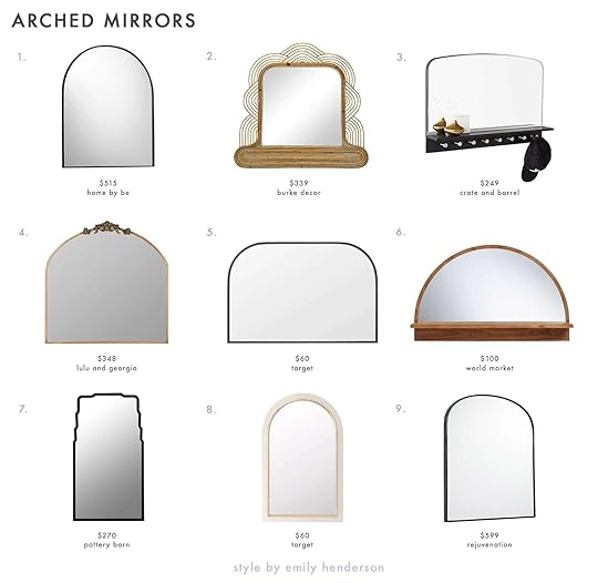
1. Arc Mirror | 2. Glen Ellen Mantel Mirror | 3. Conner Entryway Mirror with Hooks | 4. Tulca Mirror | 5. Over the Mantel Mirror | 6. Half Round Mirror with Shelf | 7. Daisy Black Metal Wall Mirror | 8. Arch Shaped Mirror | 9. Arched Mantel Metal Framed Mirror
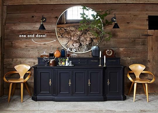
The classic arch. Most of these are perfect for mantels (you can see #9 in action in Sara’s house!), but there’s something to be said for the storage options like #3 and #6, which can pull double-duty in a small entry space. Also, can you spot #8 in this shoot?

1. Hub Floor Mirror | 2. Grace Bone Inlay Floor Mirror |3. Yosemite Falls Floor Mirror | 4. Wood Wall Leaner Mirror | 5. Walnut Acorn Mirror | 6. Tall Wall Mirror | 7. Wood Leaner Mirror With Live Edge | 8. Georg Mirror | 9. Nissedal Mirror | 10. Leni Leaning Mirror | 11. Hovet Mirror | 12. Safi Floor Mirror | 13. Salvaged Door Mirror | 14. Gleaming Primrose Mirror |15. Penarth Walnut Floor Mirror | 16. Bogart Oval Floor Mirror | 17. Deco Oversized Mirror |18. Folded Ellipse Standing Mirror | 19. Hovet Mirror | 20. Floor Mirror | 21. Obregon Beveled Accent Mirror | 22. Paul McCobb Wall Mirror | 23. Temescal White Oak Floor Mirror | 24. Narrow Full Length Metal Mirror
We’ve hit the true motherlode here, folks. My hands-down favorite here is #17 — it’s oversized (almost 4′ wide!) and perfect for the problem corner in my living room. I also love the super modern and organic shape of #12! And #1, #10, #20, and #22 are perfect for bringing a little extra style-able storage to your bedroom.
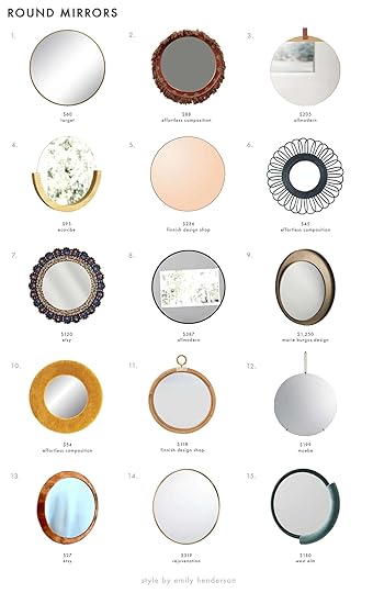
1. Round Decorative Wall Mirror | 2. Embroidered Fringe Mirror | 3. Lucrezia Accent Mirror | 4. Mira Mirror |5. Amber Circum Mirror | 6. Black Bamboo Flower Mirror | 7. Cuzcaja Round Mirror | 8. Rockton Modern Mirror | 9. Eclisse Double Mirror | 10. Groovy Velvet Mirror | 11. Large Ella Mirror | 12. Wall Mirror | 13. Brass Handcrafted Mirror | 14. Round Metal Framed Mirror | 15. Fabric Wrapped Mirror
Round mirrors are a timeless classic — they look great in every room. The leather hang detail on #3 is so special (and potentially DIY-able, for my crafty pals out there!) and I’m really taken with the amber tint of #5. #8 is also ENORMOUS and a great deal for its size.

1. Bangles Mirror | 2. Capsule Framed Wall Mirror | 3. Rogue Small Oval Mirror | 4. Angui Mirror | 5. Oval Acrylic Mirror | 6. Poise Mirror | 7. Lindbyn Mirror | 8. Narrow Tall Wall Mirror | 9. Stamped Metal Mirror
Y’ALL. Pill-shaped mirrors are SO MODERN and wonderful. Be sure to check the dimensions on some of these, as they can pull double-duty as a full-body mirror (looking at you, #7). The Peruvian artist behind #8 also has a ton of options and shapes available!

1. Woven Mirror Artwork | 2. Scalloped Wall Mirror | 3. Round Gold Mirror | 4. Oval Evan Mirror | 5. Rise & Shine Wall Mirror | 6. Tufa Wall Mirror | 7. Pinched Rounded Corner Mirror | 8. Kacey Monogram Wall Mirror | 9. Teardrop Gold Mirror | 10. Leslie Beveled Wall Mirror | 11. Brass & Lucite Shield | 12. Saylor Wall Mirror | 13. Suva Rough Cast Mirror | 14. Abate Slatted Mirror | 15. Pond Mirror
My favorite section! I’ve written about my love of #1 before and nothing’s changed. It’s so versatile! I’m obsessed with the scallops on #2 (especially when hung horizontally) and so delighted that #5 is basically the mirror equivalent of a bolo tie. I also have to call out #13, which is aluminum but almost looks like plaster (worth a zoom in!) and #15, which was the impetus behind writing an entire post about mirrors.
AND OKAY, HIT THE BRAKES. We’re done here. WOW. That’s a whole lotta glass and a whole lotta links, right? With all this said, when it comes to mirrors, it’s always worth checking Craigslist, your local thrift store, or your nearby flea market (if any of those are an option for you right now). You can find some really special vintage pieces at really special prices!
But in the interim, did I miss any favorites? Have I convinced you to swap out some art for a mirror? (You’re the real work of art, anyway!) (I’m not sure if I’m allowed to hit on the readers in our posts but I’m giving it a shot.) HAPPY FRIDAY. Can’t wait to chat with ya 
July 16, 2020
A Case For The “Forgotten” Floor Lamp + 39 of Our Favorite Picks

***Join us over on the EHD Insider Community at 4 pm pst/7 pm est for a Happy Hour Zoom chat with Emily and the EHD team. We’ll be answering your questions (personal, business, and the like) and enjoying each other’s company. RSVP here!***
“The Case of the Forgotten Floor Lamp”…that’s what I really wanted this post to be titled (and then Jess changed the title…haha). It sounds like a Nancy Drew Mystery novel or The Boxcar Children book that I for sure would’ve begged my mom to buy at my elementary school’s book fair. Because, a mystery about interior design??? I. Am. There. So when Emily casually brought up in our Zoom meeting the other day that we should, “make a case for the floor lamp” I was ready. For the past couple of years sconces are what everyone, including us at EHD, have been talking about. From the micro bubble sconce trend to the large swing arm ones that replaced the traditional chandelier, they have been popping up everywhere in interior design. This may be because there are more plug-in and affordable sconce options than ever before. So, did the sconce replace the floor lamp? Well, I am here today to tell you why it has not.
One of the first things you learn in school for Interior Design is the importance of good lighting, natural and artificial kinds alike. If you are a renter or looking to revamp the design of your home I’d always say to first invest in quality window treatments and light fixtures that will enhance not only the style but lighting of your space. Good lighting means that you have two or more light sources at varying heights in your space, these can include a ceiling light, sconce, table lamp, & last but not least a floor lamp.
Here’s why you shouldn’t forget the floor lamp…
Makes a Room Feel Balanced & Adds Architectural Interest
 photo by sara ligorria-tramp | from: new moto reveal: emily bowser’s “refreshed for function” small living room makeover
In Emily Bowser’s living room above, you can see she was an overachiever and has included all 4 light sources.
Have An Unused Nook Begging For Some Attention?? Make It A Beautiful At Home Office

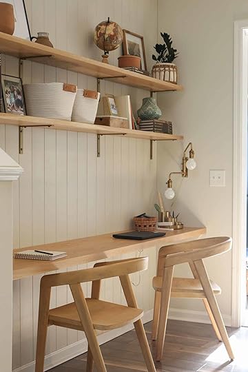
We get the “what do I do with this awkward/unused space” question A LOT. And we totally get it because designing even a normal laid out space is hard enough. But today we have a GREAT solution that I think most of us in desperate need of. I am extremely excited to formally introduce blogger, DIYer, and designer, Tiffany of Pretty Real (check out her patio in yesterday’s post). When I came across her Instagram I was immediately taken with her joyful and approachable aesthetic. And then when I saw her One Room Challenge I knew that so many of you would both relate and be inspired by her warm but minimal (drumroll please)… office nook. I mean look at it! Tiffany is a mother of 3, with a husband who also works from home. So with everyone needing a place to work, she decided to give her dining room a break and really utilize an underused area.
I also wanted this reveal to be part getting to know Tiffany and part getting into the nitty-gritty of how she created this space. So grab a cup of coffee (or wine depending on the time of day…or not;)) and let’s have a blog chat.

“Mercer” Print | Frame | “Moth ii” Print | Frame | Rattan Pot | Brown Planter | Wonders of Man Book Set | Brackets | Coil Basket | Hanging file Holder (Spray Painted) | Folders | Pencil Sharpener | “Here With You” Print | Gold Desk Organizer | White + Brass Stapler | Chairs
What prompted you to start blogging and when did you start?
I started blogging over 10 years ago. Of course, it’s completely different today than it was then so please don’t look back at my old posts! A friend and I started it together- it was called Taste{FULL} and primarily focused on fashion, parties, and food- much different than my focus now. The blog was initially my friend’s idea, but I quickly came to see it as a creative outlet and a fun way to express myself. It continues to be that and combines my love of writing, photography, and inspiring others to celebrate their families and create a home they love.
How would you describe your style? (Sorry it’s such a hard question!)
This always stumps me. I’m a sucker for trends which does me no favors in figuring out what’s really my jam. I think at my core I’m vintage/modern which I know sounds like a rug category but I can literally start planning a room and before I know it I have one vintage-inspired design board, and another that’s completely mod. I try to mix the two (I love the tip that you should have something old in every room- wait, did I learn that here?- and find that I do that naturally) while also creating a cozy and comfortable vibe. I love clean lines and try as I might, I just don’t love pattern outside of geometric/ethnic varieties.
 anyone recognize that wall notepad from this post?
Emily has little ones, but your kids seem to be a bit older thus making actual school a non-negotiable. That must be a bit of a challenge (understatement??) under quarantine. Was this what prompted your ORC idea?
My kiddos are 10, 8, and 5 and yes, yes, yes. They were 100% the inspiration for the ORC project although somewhere along the way I realized that I too, need a workspace. It began with my daughter asking for a family computer for gaming (how am I even old enough to have a kid into gaming??) and we thought it would be a great idea to have a centrally located place for a computer- screen facing out if you know what I mean. And then Covid-19 happened and we realized it would also come in handy for remote learning. Unfortunately, we are slow with home projects, so we didn’t make the cut there, but we’ll be ready if remote learning is required come fall.
What was the biggest challenge of designing/installing the space?
Hands down it was budget (it’s always budget!) and sourcing the wood. We really wanted cabinetry but just couldn’t make the investment work so we decided to splurge on white oak and attempt a built-in look so that it would look substantial without cabinetry.
Speaking of budget, do you mind sharing yours?
Here’s a breakdown (estimate but close):
Wood: $500
Hardware: $160
Chairs: $200
Wall Treatment: $200
Paint: $20
Accessories/office supplies/decorative: $300
TOTAL: $1,380
 yikes that wood is stunning!
Any “fun” hiccups where you had to adjust the design?
I mentioned the wood- we must have gone to the lumber yard 10 times. It was difficult to find wood in the species and size we wanted. In the end, the shelves aren’t wall to wall nor floating- both part of the original plan- but I’m really happy with what we ended up with.
Where did you source the pretty wood you used? Was that a hard process?
A local lumber yard and yes. I don’t know if white oak is hard to find everywhere or just here (North Carolina) but it required lots of visits to the lumber yard (of course the first few don’t count when we were showing up at 2 pm and expecting the good stuff to still be there!). In the end, we settled for a narrower desk (even after joining two pieces together) and shelves that didn’t quite go wall to wall (we joined two pieces together for those too!). We also used brackets rather than float them since we were having a hard time finding 8/4 wood in the length we needed.
Jess here! I can attest to the wood finding process to be A PROCESS (and good wood isn’t cheap). Just be patient and keep an open mind.

Do you have a favorite detail?
The brass sconces are my favorite. I found one on clearance and then a couple months later another one appeared at the store. This was probably a year ago but I kept the faith and had been saving them for forever, waiting for the perfect place.
Hot Tip
If you love the exposed bulb look like Tiffany's beautiful sconces but want them at eye level then make sure to go for an opaque bulb like she did. This way it can have the exposed look without going blind. THE DREAM.

Any tips or tricks for installing a baseboard after you put up the paneling?
We reused the baseboard that was there. After carefully prying them off, we removed the nails, cleaned them up and repainted them before nailing them back on with a finish nailer. No adjustments were needed for the back wall. The side baseboards had to be cut shorter to account for the thickness of the paneling.
How did you adjust the outlets to account for the paneling on the back wall?
My husband used electrical box extenders (make sure to do this prior to attaching the paneling). We learned that the hard way for the shiplap in our kids’ bath.
Is the desk secured to the wood supports or is it sitting on top?
It sits on top but was also glued. The process is on the blog. My husband plans to attach small L brackets for extra support. But you’ve heard of the 90% club, right? Cause we’re in that.
July 15, 2020
Sara’s Main Closet Makeover – A Story Of Four Wallpapers


A lot of projects have been slow moving, or even have come to a grinding halt recently. My primary closet is not one of them. We are moving full steam ahead on this project, and I am GIDDY about it because we’ve been living off a metal garment rack, and a too small front closet for a year and a half. But even that is a big improvement over what used to be in the primary bedroom, which was an added on box that used to be where our new bedroom door entrance is:
 that closet is now a flat wall and the entrance to our primary bedroom from the TV room
The space that is now the closet used to be a strange square space “through room,” that connected the kitchen to the primary bedroom, and also housed the primary bathroom entrance. Here is the floorplan so you can see what I mean:

Here’s what it looks likes right now:

 really cool shoe storage solution | at least the garment rack has a “closet” to live in
Is it ideal? No, but it hasn’t been AWFUL. When we first moved in I was actually living out of a single suitcase, and it really proved to me how FEW clothes I actually need to dress myself. So, I’ve been able to whittle my wardrobe down significantly.
This is great for three reasons: First, my clothing just takes up less space. I still need a little bit more room than Mac, but overall, we’re pretty evenly split. Secondly, I actually wear more of what I own. I used to horde so many pieces, but the truth is I’m not a fashion risk-taker and I end up wearing the same pieces over and over. And lastly, already having a small wardrobe helps me keep my wardrobe small.
 a trip down memory lane, back to when the closet was just a box of dry wall . . .
But now we’re super lucky to be working on designing a primary closet that really functions for what we want and need! I think the best part about this closet is that, since we designed it from the ground up, we were able to add in a Velux sun tunnel in the ceiling, and a small window on the right-hand wall. These two things bring in SO much natural light, which is rare in a closet. And they make the closet feel more like a “room” than a “closet.”

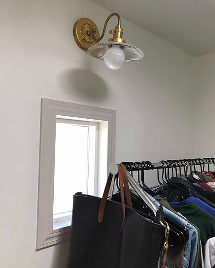
The other detail in here that makes this space feel super special is that custom, vintage-inspired, brass sconce over the window from Light Work Design Co., an independent lighting shop on Etsy that created for me my DREAM sconce after I wasn’t able to find exactly what I was looking for anywhere online. Seriously, if you want something special and want to support a talented independent maker please check Light Works Co.!
The closet really is almost done, it just needs the actual CLOSET system to complete it.
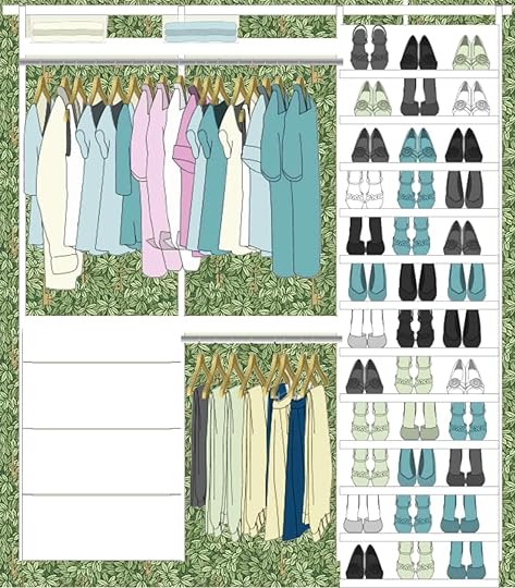
We worked with The Container Store to design a custom closet plan using their Elfa Decor line, and even though we haven’t installed it yet, I’m already in love with it. The design process was wildly easy and Barb, our designer, literally pulled together the closet of my dreams right before our eyes over a video conference call. In full transparency, I was totally blown away by how easy and happy I was with the design process. Here’s where we landed:

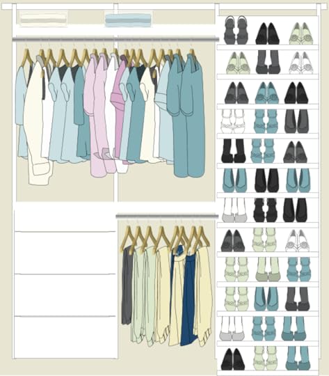
 left & right side of the closet, the back wall in between them will have a full length mirror
There are enough hangers, hooks, and drawers to satisfy both Mac and I. And there’s the sweetest little vanity moment happening under the window and dream sconce. My vision for that area is displaying all of my perfumes there, along with a little vintage piece of art, and a view to our newly stuccoed back wall that will be soon covered in climbing greenery.
We could stop there. The closet, with the sun tunnel, window, dream sconce, and perfect closet system would all make for an awesome closet. But . . . what is a closet without a minor existential design crisis? I mean, truly. So, I’m having a bit of a traditional maximal moment right now. What does that mean? I’m still working that out, but essentially I’m really missing some bold risks in our house. A few exciting moments, like our TV room. At the same time, I want those bolder moments to feel period and natural in our home. So I’m thinking wallpaper, moody paints, and more color.

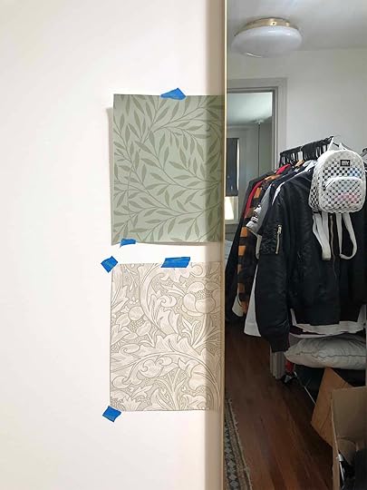 this is how you sample wallpaper, right?
That’s why I want to wallpaper our bedroom closet from top to bottom. All four walls, and the ceiling too. We wallpapered our vanity nook at our old apartment, and it was my favorite moment in the whole space. I truly feel, at my core, I’m a wallpaper person. And our house needs more wallpaper in it (help me convince Mac that we need to wallpaper the ceiling in our TV room with this). The only question is WHICH WALLPAPER? After hours of looking online, and staring at 20-30 samples, I narrowed it down to TWO options. Willow in Japser Green from Bradbury & Bradbury or Bachelor’s Button in Ecru from Morris & Co. Both wallpapers were actually designed by Victorian-era textile design icon William Morris, who had a big thing for medieval motifs. He’s a favorite designer of mine, and his work just happens to fit perfectly into a Craftsman home.
But then PLOT TWIST. After talking about my deep desire for a bold wallpaper moment in my closet, the EHD team told me that the ones I had picked out were ummm… not very bold and I might be sad that I didn’t take a bigger risk. Fine. They might be right. So here are my new top four “bolder” contenders.
OPTION 1 – Strawberry Thief

This is SUCH A SWEET WALLPAPER. I’m in love with these little bird friends. This pattern was designed by Victorian-era textile design icon William Morris, who had a big thing for medieval motifs. He’s a favorite designer of mine, and his work just happens to fit perfectly into a Craftsman home. My only quandary is if this paper is a touch too whimsical and playful, and difficult to design around with the master bedroom.
OPTION 2 – Pimpernell

Another William Morris design, and this one he actually used himself in his own dining room. COMPELLING. I love the earthy colors and the super classic design. It feels a little more “refined” than his Strawberry Thief motif above. But is it snoozy?
OPTION 3 – Chiavi Segrete
Another green option, this one covered in a pretty green foliage with hidden keys throughout. I really like this one, and feel like it’s a touch whimsical, a touch refined, and all green which is just my eternal favorite color. I also think this design could transition with a lot of design directions we take for the main bedroom. Mac likes the pattern as a concept, but isn’t sure he likes it as a whole.
OPTION 4 – HONEYSUCKLE & TULIP

One more William Morris paper to round out the options – but this one is all light, neutral, and very subtle. I like that it still has a lot going on in the design, but maybe doesn’t scream “LOOK AT ME!” It’s definitely not bold though . . .
So what do you think friends – whimsical and fun, traditional and refined, bold and green, or neutral and subtle? Help me, please.
And if you too are in need of some wallpaper boldness in your life head to our online wallpaper resource post.
The post Sara’s Main Closet Makeover – A Story Of Four Wallpapers appeared first on Emily Henderson.
The Fresh #ShowEmYourDIY: 15 DIY Ideas to Transform Your Sad Backyard

Welcome to new and improved #ShowEmYourDIY: Outdoor edition. The feeling about these seem to still be mutual: we love seeing/showing off all of our readers’ amazing work and homes, and you guys seem to be loving reading all about it, so we’re back with a no-brainer topic that means more this year than ever! Our backyards have become our safe havens, so sprucing up our outdoor spaces is pretty imminent (heck it’s already July 15th). I know it can seem daunting to look out into a yard that is crying out for help and not know what to do /think it’s going to cost a fortune or need a professional. BUT if these now 15 projects are any indication, it’s very doable, I promise. Get ready to sit back, sip a cold drink and let that charred smell of grilled sausages all up into your nostrils.
A Stunning (User-Friendly) Pergola
First, let me start with a very exciting DIY… That incredible pergola!

Last summer, Tiffany of Pretty Real, decided it was time to tackle her backyard and create a dream lounge/entertaining area. She started with extending her concrete slab (the more budget-friendly option to a floating deck at $2,500) to fit her soon to be DIY’d awesome pergola. The idea of building a pergola has always been intimidating to me. I mean what if it came crashing down because I didn’t support it correctly?! Luckily Tiffany found Toja Grid. It’s a company that sells those black brackets you see above. This way you can confidently DIY a pergola without any fear of it “unexpectedly falling down.” Tiffany wrote a whole post on it here but the dollar breakdown was around $800 for the Toja Grid hardware and about $300 for the lumber. So for $1,100, her whole family can enjoy endless summer nights in their backyard under that pretty epic pergola.

Two updates in one post? Yep! Tiffany said that staining the pergola black was always the plan but you know… life happened so they waited a year to finish their project. Both versions look great but I LOVE the black stained version. If you are thinking about staining your current pergola for a needed facelift or plan on DIYing one after seeing this, here is the stain she used. However, if you want some more info check out her post about the whole process here. Also yesterday Tiffany wrote a post about her DIY outdoor movie theatre (What can’t this pergola do?)
The Perfect Sunroom
Now let’s head back inside, we’re just dipping our toes into “outdoor” but it’s actually a sunroom because that’s kinda outside, right?

Fun fact, we actually have already showcased Avery’s handwork in the DIY kitchen post where she transformed her kitchen for $250. But when she heard about our DIY outdoor space callout, she emailed us this room and it was too good to pass up. We play by our own rules and definitions here. This awesome transformation took six weeks and cost $650 (minus the rug and curtain dye). She first painted the space with Sherwin Williams’ Extra White, the accent wall with Aubusson Blue from Annie Sloan and the floors with gray epoxy paint. She then, with the help of her brother-in-law, built a bed swing, transformed free tree stumps into coffee tables, and then made custom olive drapes by dying basic white IKEA curtains. For the rest of the pieces, she either owned them or thrifted. My biggest question to her was how did she feel secure about the swing and her advice was to just make sure that “you screw your eye hooks into ceiling joists.” Noted for the future. It looks awesome and if you want more info go here and for the swing DIY go here.
Shall we officially head outside again?
Stenciled Concrete (YES it’s painted)

I mean this entire transformation is insane but likely the most impressive part of Kristin’s outdoor space is her DIY concrete stencil. Ya’ll (I’m stealing “ya’ll” from Caitlin:)) the total cost was $90. Yes, your eyes don’t deceive you! So for under $100 you too could make your bland gray concrete into something so fun and special. Kristin has a whole highlight on her Instagram for you to look at and learn all of her tips and tricks.
The Gravel Marvel

When Melissa and her husband bought their 90+-year-old home they knew a lot of love was needed for their backyard. So over 2.5 years, their yard went from falling apart to looking brand new. The first thing they did was tear down the old fence. Instead of rebuilding it, they repurposed some of the pavers from the ground and created a small retaining wall (needed due to the sloping of their yard). They then dug out all of the grass and built those great garden beds and added pea-sized stone all over. The last DIY was that awesome cedar walkway. Since the rest of the yard had gotten a facelift, they decided to say goodbye to the cement walkway because it looked out of place. It was definitely the right call and the whole space looks fantastic. Like I said before, this project took them about 2.5 years and a rough total of $2,700. Well worth the wait!
The Modern Wall Disguise
Now I’m pretty excited to show you this next DIY because I feel that A LOT of people deal with similar less-than-ideal backyard plaster walls. This is how Anita made her’s nearly disappear.

Anita decided she was tired of looking at her old plaster walls so she and her husband DIYed these very cool modern wall panels to help disguise them. They started by digging holes for the posts followed by pouring a bit of cement into the holes to create a foundation. Next, they sanded the posts down, set them into the holes and finished by securing them with filling the holes with gravel. Once the posts were all set, Anita and her husband painstakingly sanded the rest of the slats with an electric sander and then decided to leave them natural instead of painting which was the original plan. Once the slats were up, she added the flower boxes to add some more visual interest. They also wanted to give their cement pad a fresh look so they painted it with a soft grey. In addition to that, Anita learned how to limewash brick so the previous 90s red bricks that would have been in front of the wall now look brand new! Now for the grand total…the fence (all materials included) was $244 and the plants/planters came out to $481. Anita said that weather prolonged the process but that someone could easily do this over two weekends or even a long one (weather permitted). This is really such a clever and budget-friendly DIY.
Want another killer wall idea but for a patio??
The (Faux) Green Wall of Privacy

Bev is one of the lucky few in New York (Brooklyn specifically) to have outdoor space (especially now). But as expected in a big city, it lacked privacy. In a stroke of genius, she decided to figure out a way to create a green wall and I think it’s safe to say she nailed it. With a bamboo fence, a faux trellis, and zip ties, her patio looks like a slice of serene outdoor heaven. She calls it “The Easiest DIY Green Wall Ever” but it’s also the smartest. Since NY experiences all of the seasons, her bamboo and faux greenery should hold up beautifully. This is incredibly renter-friendly (no tools needed), small space friendly and for a rough total of $500, you can make one yourself. She wanted to point out that the $500 is for two panels so if you need only one panel then slash that price in half.
July 14, 2020
Renters, Do You Ask For Forgiveness or Permission When Making Design Changes?

HI, BUDS. In case it wasn’t clear from the headline, I’m experiencing a universal renter dilemma and I’m hoping you can weigh in and help me out. When you’re personalizing your home, is it better to ask for forgiveness or permission?
Here’s my current situation: I, like most people, have always lived in rental units with pretty strict “no alteration” leases. And true to form for someone who works at a design blog, I’ve ignored parts of these — my walls are dotted with nail holes (like Jess’ living room above) and your girl has hung her fair share of shelves.
But now, I’m DEEP in the throes of my own MOTO (pro tip: don’t try to take on 3 rooms at once! What was I thinking?!) and I’m running into one tiny problem. My landlord won’t let me touch the trim, cabinets, or doors. I’ve been verbally cleared to paint walls, add wallpaper (as long as I remove it), and make holes…but basically, anything painted with a semi-gloss is off-limits.
And y’all. This is driving me NUTS. My apartment, though filled with 1930s charm, is also filled with cracked and chipped paint on my windows, doors, and baseboards. Beyond just aesthetics (and an interest in not living in an apartment with window frames that make me feel like Miss Havisham), I love a bright space and would love to do some accent trim, like Sara wrote about in this post and Julie did below. If I’m in here for the long haul, is it worth just fixing now and asking forgiveness later?
 look at how good that trim looks!
I spent about 4 years in my old place and felt pretty cavalier with my minor alterations as I figured my holes and changes would be written off as “normal wear and tear” after I’d moved out of the unit. And for what it’s worth, I was right — I received my security deposit returned in full, though I imagine some landlords may not be so kind.
So THIS is where I need your help. Have you altered an apartment and gotten backlash from your landlord? How did you manage? Did you agree to change everything back upon move out? (And if you’re a landlord, how do you feel about tenants taking it on themselves to make their apartment their own?)
When I looked back at our MOTO archives, I was pretty surprised to learn that a majority of us hadn’t cleared our plans with our landlords (with the exception of , who is obviously an angel) — but in a nice twist, our property managers often loved the changes we made. One of our landlords even used photos from a MOTO project with an unapproved paint job to secure a new loan for the building.
 this paint color and lighting switches were landlord approved!
But we’re still just talking about paint here — what about the other shifts? Where do you draw the line? Is painting okay, but wallpaper too much? Is switching out lighting fixtures or ceiling fans okay, but only if done by a trained electrician? Is it worth it to swap vertical blinds for curtains if it means drilling into the wall? Can I store my screen patio door in my garage and swap out my shower door for a curtain? I DON’T KNOW. PLEASE HELP.
I’m really struggling because I don’t want to create a design plan, get my hopes up, ask for permission, and get rejected. And for what it’s worth, even when we do ask for permission, sometimes plans for collaboration go awry — remember Orlando’s kitchen? He had come to his landlord with an incredible reno plan, she had approved, and then he was left paying for the whole thing out of pocket. How far would you go to make a rental your own?
I guess a lot of this really comes down to how often your landlord is in your apartment, right? Kinda like if a tree falls in the forest, except “if your landlord never sees your changes and you switch things back before moving out, did it ever happen?” Does your own level of responsibility factor into this? Do you think my landlord, knowing I work this job and have access to my incredible team, would be a little more flexible? (Is that even a fair card to pull?) What about the “I’ve lived here for a year, paid rent on time, and never broken anything, and so you can logically assume I’d probably do a good job and leave this place better than I found it?” card?
ANYWAY, I know people have real problems and that me not being allowed to touch the semi-gloss paint in my apartment is not ACTUALLY important, but now that we’re home so much (or, at least, I’m still home a lot…I don’t know what y’all are up to, but hopefully you’re home and safe, too!), these are the little tweaks that would make living and working here SO MUCH more enjoyable. So PLEASE — I’m throwing out the SOS here. Tell me about your rental tweaks that went great AND tell me about your horror stories. (Mom, if you’re reading, feel free to chime in too.) Give me all of your tips, tricks, advice, and things you would do (or wouldn’t do) again.
Do you ask for permission sometimes for the big tweaks, and plan for forgiveness for the little ones (a girl’s gotta hang that art somewhere, right?!). Or are you the type to just install a new sink and toilet (…like a certain EHD alum) and hope for the best? HELP ME. THANKS.
Opening Photo Credits: Photos by Sara Ligorria-Tramp | From: Makeover Takeover: Jess’ Long Awaited (Small Space) Living Room Reveal + Jess’ MOTO: You Have To See How She Hacked Her Rental Kitchen With DIYs
The post Renters, Do You Ask For Forgiveness or Permission When Making Design Changes? appeared first on Emily Henderson.
Introducing My Never Been Seen Basement Bathroom (And My Plan To Make It Awesome With Basic Pieces + A Lot Of Vintage Styling)

I’ve been sitting on a secret bathroom that we haven’t touched since we bought the house three years ago and it’s time to fess up and show you (obviously I have no secrets. I just realized I don’t think you’ve ever seen it because it’s just meh). It’s in the basement of the guest room/office and it was VERY low on the list of priorities to design. I rarely saw it, never went into it and when Brian was down there working I gave him that space as ‘his’. Well here it is:
It was super generic but functional and since it wasn’t gross or offensive we just left it for years. Brian certainly didn’t complain and he wasn’t going to add to my workload to have a better bathroom.


The challenges are as follows:
SUMP PUMP ACCESSIBILITY – Wake up. DID SOMEONE SAY SUMP PUMP?? Holla. This is exciting stuff. Inside the vanity, under the floor is the sump pump that the previous owners put in to make this bathroom usable, and just in case it needs repair we would need access to it. So no cute pedestals for us and the size of the vanity needed to be very specific, with easy access to a big square hole in the ground that housed something I want nothing to do with ever. Weird angle near vanity – see overhead drawing below. Odd Cement “bench” – I’m sure it’s purposeful, but it makes it awkward and I for one do not want to hang out and read on that “bench”. Sure, all the finishes needed to be changed, but that’s not really a ‘challenge’.
So last year, after the mountain house was wrapped we decided to tackle this little bugger. We had a fantasy about turning the main space into a podcast studio, and listen, our list of podcasts guests included Dax and Monica, Matty Matheson, Lin Manuel, Oprah, Michelle and Barack, Beyonce, and we needed an impressive thrown for their use before our hour of laughter and unhinged honesty.
No. It must be redone. At first, Brian and I were going to “do it ourselves” (talk about unhinged laughter) and I think I even made a big speech about it to my team – how “I want to be more hands-on”, I want to “learn to tile” and Brian chimed in with his desire to demo something. Also, we truly didn’t want this bathroom to turn into something insanely expensive – sure, KB might make an appearance, but we didn’t need to spend $25k on this. YES. We would save money.
Then it sat there for 3 more months. Meanwhile, the entire basement flooded due to those epic flash floods last year so Brian moved his office into Birdie’s old room. We forgot about it, (we had to tell Lin-Manuel to cancel his flight), even though this space was one of the best selling points of the house – a separate guest suite/office is HUGE in LA (and likely even more now so).
So knowing that this wasn’t something that Brian and I could DIY, I shifted gears (while slammed with shooting the book) and thought it would be “fun” for Julie to take over the design. My bandwidth was strapped and she is looking for more portfolio work. No pressure. Just design your boss’s gross basement bathroom – on a budget – for millions to see. So she came up with this plan:

Let’s break this design down:
Walls – Roman clay. YES. A pretty texture on the walls in a soothing moody blue. Vanity – We would do a custom floating vanity and engage that weird corner (aka more counter space) and made from one slab. Flooring – Zellige Octagon & Buchon from Cle in the same color as the wall tile. I just asked her what was her solution for the sump pump and she said that at the time of drawings she didn’t know where the access panel was (because it was under the vanity that hadn’t been demo’d yet) so she hadn’t planned that in, but we would have likely tiled a removable access panel on the floor. Shower surround – We had enough leftover Zellige from Cle (that we used in the kitchen and master bath) so we wanted to use that to save money and not create more waste. Lighting – Right now there are just overhead cans so she planned two sconces – one on the mirrored wall, the other on the sidewall with a pretty mirror in between.


It was all a go. I loved it. GREAT! We thought it would cost about $15 – 18k for mostly labor (guys, it’s always labor) and since we didn’t feel that we could do it ourselves, at the time seemed like a good investment for this house. We started the demo a few months ago and then guess what happened? Miss. Car. A. Rona came to town, and all of a sudden the demo’d basement bath that no one ever used anyway became priority #12560.
So it sat there for months without me knowing how to proceed. And now spending $15k – $20k on this tiny little dark number felt, well, highly unnecessary and indulgent. The world just feels too unsteady to be throwing around that in a BASEMENT even if you are an IFD (internet-famous designer – I hope you realize that I’m making fun of myself when I say that – it’s definitely just different.)
Then a month ago I thought to myself, What if I did this AS INEXPENSIVELY as possible? With the least amount of labor, subs, and materials possible??? What if I made it cool JUST through the styling??? Lord knows I’m not the only one with a basement bath that needs an upgrade. Plus it would be so fun for me to do something super basic that I amp up through styling – what I love to do most, anyway.
So let’s see how little we could spend and how fast it could be done.
Here was the plan:
We’d extend the same Cali Bamboo waterproof vinyl flooring from the bedroom into the bathroom. Keeping it simple and not buying hardly any more material. No tile floor. Just good old wood-looking vinyl that looks GREAT for being totally waterproof. We’d LEAVE the acrylic shower surround but take off the glass door with the chrome handles and instead install a cute shower rod and curtain. You heard me – that acrylic molded wonder is staying. Is it offensive? Well, that really depends on your definition and your taste level. It’s acrylic and has hilarious ‘grout’ lines between the ’tile’ but it somehow doesn’t offend me as much as it should – it’s just white and maybe 15 showers a year will take place in that acrylic hug. To replace it we would need to demo it out, see what lies behind, likely waterproof it all, wet mop the floor, put in a damn, order tiles, and then tile the walls. This hardly-used-shower didn’t deserve that kind of time and expense. We could simply put a really pretty curtain in front of it and call it a day. We’d switch out the shower faucet and the sink faucet trims for something with the exact same specs as was currently there, just changing the style and finishes. I’d shop for something super inexpensive that looked as good as possible. And save a lot of money by not replacing the valves – the plumbing pieces in the wall.We’d put in an inexpensive readymade vanity that could cover the footprint of the sump pump. This was after weeks of me trying to find an awesome vintage wall mount sink that I could put a little skirt around to hide the removable panel. But ultimately being up in the mountains gave me little ability to find that sink unless it shipped from across the country and while buying ‘new’ does create waste, flying a 60 lbs sink from upstate New York seemed unnecessary, too (wasting carbon and way more expensive). If times were different I would have thrifted to find a piece that could be retrofitted into a vanity, but without in-person shopping, I was just so limited in the used/thrifted sink department. By the way, if I could go back in time I’d just paint the one that was there, but it was given to Habitat for Humanity months ago and not a possibility. We’d just paint the walls! No tile, no wall treatments, no paneling – just good old fashioned MF paint. We would put down a primed waterproof baseboard to paint and that’s it. No new electrical. We’d work with the cans and instead, I’ll style out a cute plugin sconce or swag a pendant – but no hardwired sconces or new pendant lighting. I’d style it out with fun art, vintage accessories, and a lot of quirk.
The idea was no need for plumber, tiler, or electrician – we’d just be swapping out fixtures (using the old toilet) and change as little as possible.

At the time of publishing aka today (I really should start with that sentence every day – we are breaking news journalism!!) we are ALMOST DONE. You Insiders will get a sneak peek on the community platform. The only bad news thus far is that we DID need to hire a plumber to move the faucet because the center of this vanity is different than the original (even though I checked measurements like 9 times). So I didn’t succeed in not hiring any subs.
As far as what we are using, product-wise? Here you go. All of it is super affordable and seems FINE in person.

1. Kingston Brass Faucet in Matte Black | 2. 30″ Vanity in Gray | 3. Clare Paint in Good Jeans | 4. Moen Shower Set in Matte Black | 5. Baseboard Moulding| 6. Cali Vinyl Longboards Flooring in Seaboard Oak
It should be done in the next few days and then I get to style it out which I’m INCREDIBLY excited to do. Again, without much in-person vintage shopping or thrifting I’m going to pulling from what I already have, but I have a lot of cool art, smalls, shelves and even stools that I think will be cute, and I’m even toying with the idea of sewing together scraps of vintage plaid for the shower curtain.
It’s 2020 designing and while there are a lot of limitations (HAHAHAHAHAHA IS THERE EVER) the budget ‘make it work’ mentality is contagious and frankly inspiring. I like to style. play. every day, and that’s what I’ll do.
Questions. Comments. Concerns?
The post Introducing My Never Been Seen Basement Bathroom (And My Plan To Make It Awesome With Basic Pieces + A Lot Of Vintage Styling) appeared first on Emily Henderson.
Emily Henderson's Blog

- Emily Henderson's profile
- 10 followers

