
Emily Henderson's Blog, page 149
November 11, 2021
How We Are Repurposing The Original Living Room Windows At The Farmhouse (In The PANTRY??)

What to do with the OG original windows has been a debate since day 2. First, we thought we were keeping all. Then we thought we were replacing them all, but we landed on keeping all the original on the 2nd floor, and adding new ones on the first floor that tie in with the original windows. The gist was that we knew we were opening up the first floor windows to be MUCH BIGGER so we’d need some new ones no matter what, and mixing new and old in the same room is a challenge. Plus, remember the rest of the windows on the first floor were not original – they were aluminum from the ’60s or vinyl from the ’90s…here are photos to refresh you (and you can read more about them in this post).
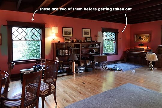
The Awesome Original Farmhouse Windows
 The Less-Awesome Aluminum Or Vinyl Windows
So there are actually only 3 original windows that were removed with no future home. Of course, we are dreaming of a greenhouse someday made of them, but then we found the PERFECT solution.

But first, remember the original pantry/mudroom layout before we moved the kitchen?? Here’s a refresher of where we landed a few months ago when we had ‘draft 1’ completed:

WELL, we fell in love with the walk-in pantry idea up there, but then we decided to move the kitchen altogether – to get it closer to the windows. By losing our mudroom we thought maybe we should put in a mini mudroom/entrance where our pantry was going to be, like this:

But we missed the walk-in pantry so much, so we figured out a solution on where to put the mudroom (if you’re interested, feel free to read more about the mudroom saga here)…

SO, for the first time ever we will have a walk-in pantry. We cook a ton and have carved out the space so mama gets her walk-in pantry. More on the pantry plan later, but trust me we are making it hyper functional (and yes, so pretty).
We had planned to do something interesting to separate the pantry from the kitchen, but it was TBD. We knew we wanted that entrance to involve glass to allow light and keep it feeling open, but separated so we figured some sort of vintage/salvaged doors or windows. We of course considered the original windows but they are double-hung and super-wide so they would be too big and now allow for a big enough entrance.
When I was over there a few weeks ago it became obvious and I lit up with excitement. We would hang the two unused OG vintage windows vertically so that the diamond pattern sits inside a frame that gives separation between the kitchen and pantry. Like so:

So I asked Stephyn to draw it in and see if it would actually fit and guess what? IT DID.

Of course we have to figure out how it should all be finished – how to integrate the window into the “wall” but we are thinking paneling, maybe some peg rails, and maybe even a shelf or plate rail along the top spanning the whole wall.
THEN I was at the farm with a friend a couple of weeks ago and they were like ‘a window goes here, right?’ and I said ‘uh, no …..??”. Truly we joke that this is the swiss cheese house, with so many windows and skylights (all double-paned, all UV, don’t worry) that we can’t believe we missed this opportunity. Here’s where we’re talking about:


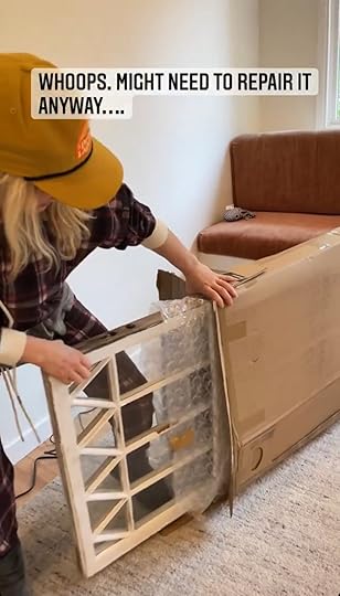
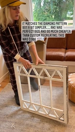
The wall is on an angle so we weren’t able to put an upper cabinet or shelf there anyway. But our window order from Sierra Pacific was placed months ago (And was supposed to arrive this week but we had issues with delivery on our end) so we couldn’t add it. You might have seen on stories that I found another vintage window from eBay…it was the perfect size for just under $300 and it ties in with the diamond pattern AND the more simple grid pattern in the kitchen (which is two panes over two panes, dubbed a ‘2 over 2’).

And here are screenshots of the video of me taking it out of the box. Yes, some paint did chip slightly upon unboxing. We might need to do some minor repairs to it (whoops) 
Technically we have one original window from the first floor left to use somewhere (TBD), while the rest of the upstairs gets repaired. So stay tuned for some more window chat coming soon
The post How We Are Repurposing The Original Living Room Windows At The Farmhouse (In The PANTRY??) appeared first on Emily Henderson.


How We Are Repurposing The Original Living Room Windows At The Farmhouse In The PANTRY(??)
What to do with the OG original windows has been a debate since day 2. First, we thought we were keeping all. Then we thought we were replacing them all, but we landed on keeping all the original on the 2nd floor, and adding new ones on the first floor that tie in with the original windows. The gist was that we knew we were opening up the first floor windows to be MUCH BIGGER so we’d need some new ones no matter what, and mixing new and old in the same room is a challenge. Plus, remember the rest of the windows on the first floor were not original – they were aluminum from the ’60s or vinyl from the ’90s…here are photos to refresh you (and you can read more about them in this post).
The Awesome Original Farmhouse WindowsThe Less-Awesome Aluminum Or Vinyl WindowsSo there are actually only 3 original windows that were removed with no future home. Of course, we are dreaming of a greenhouse someday made of them, but then we found the PERFECT solution.
But first, remember the original pantry/mudroom layout before we moved the kitchen?? Here’s a refresher of where we landed a few months ago when we had ‘draft 1’ completed:
WELL, we fell in love with the walk-in pantry idea up there, but then we decided to move the kitchen altogether – to get it closer to the windows. By losing our mudroom we thought maybe we should put in a mini mudroom/entrance where our pantry was going to be, like this:
But we missed the walk-in pantry so much, so we figured out a solution on where to put the mudroom (if you’re interested, feel free to read more about the mudroom saga here)…
SO, for the first time ever we will have a walk-in pantry. We cook a ton and have carved out the space so mama gets her walk-in pantry. More on the pantry plan later, but trust me we are making it hyper functional (and yes, so pretty).
We had planned to do something interesting to separate the pantry from the kitchen, but it was TBD. We knew we wanted that entrance to involve glass to allow light and keep it feeling open, but separated so we figured some sort of vintage/salvaged doors or windows. We of course considered the original windows but they are double-hung and super-wide so they would be too big and now allow for a big enough entrance.
When I was over there a few weeks ago it became obvious and I lit up with excitement. We would hang the two unused OG vintage windows vertically so that the diamond pattern sits inside a frame that gives separation between the kitchen and pantry. Like so:
So I asked Stephyn to draw it in and see if it would actually fit and guess what? IT DID.
Of course we have to figure out how it should all be finished – how to integrate the window into the “wall” but we are thinking paneling, maybe some peg rails, and maybe even a shelf or plate rail along the top spanning the whole wall.
THEN I was at the farm with a friend a couple of weeks ago and they were like ‘a window goes here, right?’ and I said ‘uh, no …..??”. Truly we joke that this is the swiss cheese house, with so many windows and skylights (all double-paned, all UV, don’t worry) that we can’t believe we missed this opportunity. Here’s where we’re talking about:
The wall is on an angle so we weren’t able to put an upper cabinet or shelf there anyway. But our window order from Sierra Pacific was placed months ago (And was supposed to arrive this week but we had issues with delivery on our end) so we couldn’t add it. You might have seen on stories that I found another vintage window from eBay…it was the perfect size for just under $300 and it ties in with the diamond pattern AND the more simple grid pattern in the kitchen (which is two panes over two panes, dubbed a ‘2 over 2’).
And here are screenshots of the video of me taking it out of the box. Yes, some paint did chip slightly upon unboxing. We might need to do some minor repairs to it (whoops)
Technically we have one original window from the first floor left to use somewhere (TBD), while the rest of the upstairs gets repaired. So stay tuned for some more window chat coming soon
The post How We Are Repurposing The Original Living Room Windows At The Farmhouse In The PANTRY(??) appeared first on Emily Henderson.
November 10, 2021
My Favorite Kids Toys/Gifts Of All Time – What They Actually Play With All Year And Doesn’t End Up In A Landfill

Once again we have to make the decision of what goes under that tree and won’t end up in a landfill but every year we get a bit better at it. So while this list is specific to my kids I can tell you that these things, below, were worth every single penny and they really have played with them for years and years.
Arts And Crafts photo by sara ligorria-tramp | art direction by me and styling by emily bowser | from: keeping the good of last Year: new family (and kid-only) activities – plus the value of “me” time
We craft a LOT at our house – long sessions together and many hours just the two of them. The key to this is having the right crafting inventory to spark their creativity so they’ll do it with or without you. And I’m sorry to tell you that like most fun things that kids actually want to do, crafting is super messy and we’ve accepted it (and no, you don’t have to have a designated space but it sure is nice).

1. Arts and Crafts Library | 2. Red Rainbow Craft Case
We’ve LOVED this craft kit and have this one now with all the fun bells and whistles, and our kids seriously just go to town for hours without us. And yes they make a massive mess, but it’s really inspiring creatively.

1. Cosmic Bucket of Crafts Set | 2. Create-Your-Own Superhero Masks Kit | 3. Seek & Find Coloring Poster
If you don’t want something quite intense and more affordable, this craft kit is good. Our kids also really enjoy the mask making kit and this illustrated poster is an awesome stocking stuffer that I colored with both kids last year while listening to music and it was so relaxing.

1. Dual-Tip Brush Marker Set | 2. Washable Markers | 3. Plastic Caddy
Birdie is EXTREMELY into drawing. She has called herself an artist since she was 18 months old, so we take our marker game seriously. We love these markers that are double-ended because the colors are so good and there is both a fine tip and a strangely satisfying large tip. They are my favorite, hands down. HOWEVER, if you are fussy about cleanliness they aren’t that easy to clean up if you don’t wipe up immediately. They are so much brighter than normal washable markers (but these are good, too for washable), but just make sure it’s on a play surface. We have them all in this caddy and she carries it around the house to wherever she wants to draw (often next to me working which is so cute/fun). They just have really good coverage, multiple tips, and awesome colors.

We did a lot of pressed flower art during quarantine and used this microwave flower press kit which was very satisfying.

1. Crayola Spin & Spiral Art Station Activity Kit | 2. Fun and Easy Crafting with Recycled Materials
Elliot got the paint spinning and spirograph kit from a friend and while it’s a lot of plastic (and be sure to buy extra round paper) she created so much art with it and still pulls it out. And if you are looking for some guidance, this is hands down our favorite crafting book for the recycled stuff you have around the house. We have done probably 20 of the projects together, it’s clever, so cute, and pretty easy.

1. How to Draw 101 Animals | 2. Easy Origami
Last year I gave Birdie this ‘How to Draw Animals‘ book and she referenced it a lot (and it actually was very satisfying for me, too). Charlie is obsessed with this ‘Easy Origami‘ book and while I have a hard time at it, he’s super into it.

This tool kit is intense and SO AWESOME, with real blades that are safe for kids so they can actually make stuff, not just pretend (but you should be nearby). Charlie made a lot during quarantine. He made swords, badges, necklaces and cut out a lot of cool shapes. It’s one of those things that if we get it out and give him the prompt they’ll get inspired and spend a long time working on a project. It’s AWESOME.

Lastly, KiwiCo is seriously awesome. We don’t have a subscription anymore but it’s one of those that they looked forward to getting and we could do them together.
Building Sets photo by mike garten | from: my house tour from good housekeeping
 We are Lego people and while they will make any lego kit, (as most parents know) they just play for hours with all their bits and pieces once you’ve established a large enough inventory.

1. Lego Table (plus cover)| 2. Toy Storage Bin
We just bought this awesome Lego table from Etsy that they love and we still love to put any extra in this genius lego bucket that is super easy to clean up.

1. Straw Constructor STEM Building Toys | 2. Magnatiles
This straw construction set is still a huge favorite and one that they take out ALL THE TIME.
Magnatiles – A classic that can drain hours and are so fun and educational and I’ve been known to sit down with them for hours to make a skyscraper (get the set with more pieces if you want to do that).
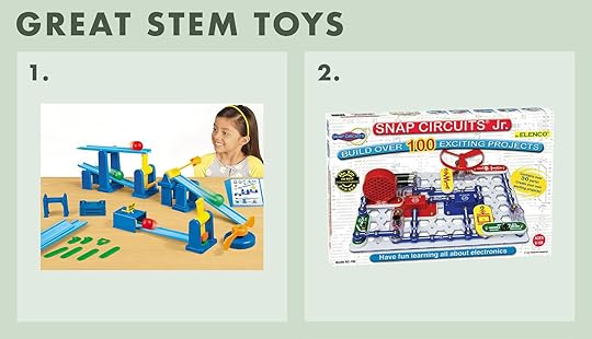
1. Create-A-Chain Reaction STEM Kit | 2. Snap Circuits
Create a Chain Reaction Kit and Electronic Snaps are two awesome Stem toys that you guys recommended to us last year and you really nailed it. They do require some parent help at first, but it’s pretty fun to do together and it certainly feels like they are learning a lot about science and engineering.
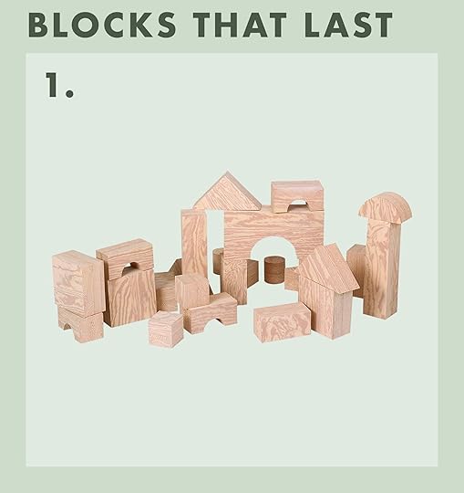
We bought these when the kids were tiny and still have them. They are an investment (which is why they’d be a great gift for a family with young kids) but they are big and soft so they can build really high without blocks falling on toes. We would build worlds for cars and action figures (and they aren’t offensive to look at! Best big foam wood blocks (that look like wood)
Board Games They/We Love photo by sara ligorria-tramp | from: mountain house reveal: how we designed our super kid-friendly family room
Thanks to you all who turned us on to specifically “collaborative games” after asking last year. If you don’t know what that means, they are board games where everyone works together to win the game together rather than compete and it just feels super positive and fun.

1. Gnomes at Night | 2. The Secret Door | 3. Outfoxed! | 4. ChickaPig
We love all four of these games all the time – even tonight on a gloomy Portland night, they make us feel way better than turning on the TV.

1. Storytime Chess | 2. Guess Who?
Storytime Chess is a new way to teach kids how to learn and play chess by setting up a very easy-to-remember story for each type of chess piece. Charlie learned how to play in a couple of hours and now it’s a super fun shared interest with Brian (I want to learn now). And Guess Who is just a total classic.
Random Tech
1. Green Screen Stop Motion Kit | 2. Electronic ATM Piggy Bank
Green Screen Stop Motion Kit – Now this is NOT something that our kids have yet (I just ordered) but our kids loved making stop motion videos with our iPad during quarantine, with superheroes and legos, but we had to tape together green construction paper to make the green screen. So this kit (including gloves) seems like it might be really fun for them.
Electronic ATM Piggy Bank – It looks like garbage, but for whatever reason we are going on year #3 with this bank. I think it makes them feel like a grownup having a “pin number”.
 from: our kid’s attic playroom – update (and mini-reveal) + the five parenting fails/mistakes i made
I think nothing occupies our kids more than imagination play and most parents know that a lot of that can happen without buying anything. But there are a few things that we found really successful that helped encourage the play and kept them engaged longer.

1. Freestanding Wooden Fresh Mart Grocery Store | 2. Food Groups
Play Store – This store is AWESOME. It has an operable conveyer belt, a scanner that beeps, and a working credit card machine. We have clocked so many hours up here both with them (“math”) and on their own. I highly recommend this wood toy food that is NOT plastic, not just for the environment but kids much prefer the heaviness of wood. You can obviously just turn anything into a “store” with a cash register. And lastly don’t get a cute wood grocery cart, kids like the real stuff that looks like a grownup would actually use, so we have this metal one.

Spy Kit – THIS KIT IS SO FUN. It has night goggles, a voice recorder, booby trap lights – HOURS of sneaky fun that both our kids have played with very much.
HOT TIP – any and all fun costumes that involve shields, crowns, wands, swords, wings, literally anything that puts them in a different world (doesn’t have to be full costumes) are gold. I go to Goodwill and get wacky costumes, wash them and shove them in a box and they get very excited.
Stuffies – But Not The Pretty Ones We Love from: a current tour of our new rental house in portland
Our kids are “stuffie kids”(as you can see above in their room in our rental), and they really do play with them A LOT. They’ll set up scenarios in their rooms, talk in weird voices and I don’t know what they are doing but when I go check in on them they have all their stuffies placed strategically around the room and they are in it. It’s painfully sweet. But unfortunately, they are not into the cute ones that are embroidered, knitted, handmade, or look heirloom quality, much to my chagrin ( I want to do a separate post for heirloom gifts for kids). Sure, I buy these to decorate their rooms (I love these ones from Goodee) but I know that as a present to THEM this will not do. What do they want? The cheap ones with big eyes, anything colorful/unicorn/kitty cat OR it must be SUPER DUPER SOFT. Charlie likes realistic-looking ones and Birdie loves anything rainbow and sparkly.

Jellycat (super soft) are so cuddle-able.
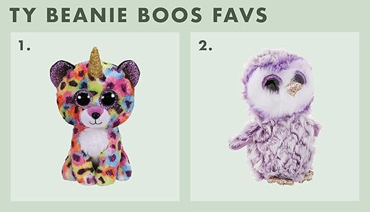
Beanie Boos – TY. Listen I’m not happy about this either, but for our kids at least don’t try to get the prettiest or the least offensive beanie baby. Birdie wants the leopard unicorn with glitter eyes EVERY SINGLE TIME.
But here are some more in case you’d like some more ideas:

1. Glow Brights Toy Plush | 2. Seaborn The Shark | 3. Baby Bunny Stuffed Animal | 4. Plush Toy Sloth | 5. Paris Poodle | 6. Nori Multicolored Narwhal

1. Stuffed Hedgehog | 2. Whimsy Sequin Blue Cat | 3. Plush Toy Unicorn | 4. Buckley Brown & White Spotted Deer | 5. Pinstripes the Giraffe Stuffed Animal | 6. Horse Stuffed Animal
Now, this gift guide is the ‘what they have and love’ but I’m still considering doing ‘What we’re thinking of getting them this year (they are 6 and 9)’ as well as ‘their favorite books and clothes’ and might finish with ‘heirloom quality kids gifts from makers and small businesses (the stuff WE love)’. Let me know if any of those sound useful for you It can be so overwhelming so we are hoping to help the gifting process.
Also while we’ve linked everything up I do implore you to shop small and local when possible and just know that 10% of all our affiliate sales (the commission we get through these links with many of the companies) will be donated to Pen + Napkin for future makeovers of families transitioning out of homelessness. So if/when you are buying through our links know that it is supporting families and community. While gift guide season is a large revenue driver that supports our team and design projects for the whole year, we are committed to paying it forward. xx
Want some more ideas? Here’s more: My Favorite Things – The Official “Emily” Gift Guide Just Landed: PART 1 Home Decor
Opening Image Credits: Photo by Sara Ligorria-Tramp | Styled and DIY’d by Julie Rose and Emily Bowser | From: Mountain House: The Kids’ Room Reveal!!
The post My Favorite Kids Toys/Gifts Of All Time – What They Actually Play With All Year And Doesn’t End Up In A Landfill appeared first on Emily Henderson.
November 9, 2021
13 New Ideas/Trends That’ll Shake Up Your Old Christmas Decor (Whenever You Are Ready To Start)

I thought I would 100% not be ready for Christmas decor until after thanksgiving despite the internet’s November 1st push to try to sway me otherwise. I mean I was still trying to get off my zombie Thelma (of Thelma and Lousie) makeup off on the 1st. But then when this past Sunday rolled around I accidentally watched a new Netflix Christmas movie which then had me watching The Holiday right after. THEN yesterday morning, it happened. The little mini Target bottle brush trees I picked up on Sunday magically appeared on my kitchen self and I have to say they are extremely cute, have been putting a big ole smile on my face.
Now, this post is not to have you feeling like you need to deck the halls this weekend “or else”. Please don’t unless you want to! But if you’ve been circling the idea of wanting a couple of holiday cheer moments or simply start planning for them, then this post is here to help. Some new ideas, old ideas you may have forgotten about and a couple of trends to help you design the holiday/Christmas you want. Let’s get started with an unexpected one…
1. The Undecorated Tree left to right: design by @_forthehome | photo source | design by @frengpartyof5
I know, I know. How? Why? Jess, are you trying to kill Christmas joy?! No. I promise I am not the Grinch reincarnate. Buuut you do have to admit that these trees look incredibly chic, incredibly beautiful, and are guaranteed to induce 50% less decorating stress (I believe lights are at least half the battle). Also to be fair, Christine from @_forthehome (the tree on the far left) did decorate her tree and it looks awesome. I mean, look. It’s an option and an easy, no-stress, free pass if you just don’t want to this year. OR it’s a good way to ease into decorating so that you don’t max out too fast.
2. Put It In A Basket or Bin left to right: design by erin francois | design by the merrythought | design by lea johnson
But for those that want to adorn their trees with lots of ornaments but want to mix up the traditional tree skirt look then I’ve got you. You have so many options. Just choose your favorite (large enough) bin and stick your tree right in. From what we have saw from Erin Francois’ story highlight, you want to weigh down your bin with something like rocks, then choose a small traditional tree stand to put your tree in (so it stands up straight and can get water), and lastly secure with more rocks. Just make sure you can still water your tree (this also works with an artificial tree and probably with less fussy). This might also be a good idea if you have a smaller tree in a different part of your house like your dining room.

 left to right: design by cassandra lavalle | photo by sara ligorria-tramp, styled by emily bowser and erik kenneth staalberg, from: how sara created her first traditional but youthful christmas (with all target)
Few things say cozy and nostalgic like some kitschy decor. But like in most things we recommend it’s all about balance. So set up a sweet reindeer scene (that may remind you of the classic Rudolph The Red-Nosed Reindeer movie) but keep it simple like Sara did. Or get a sweet grandma candlestick holder like Cassandra did in her beautiful Scandi winter wonderland last year. It adds the perfect about of sweetness to a very pretty and chic Christmas look. If you celebrate, think we all crave that Christmas feeling we got when we were younger so bringing in those moments helps us recapture that in my opinion.
4. Unconventional Tree Skirt left to right: design by little merchant goods | design by kristin dion design | design by amanda holstein
Bins are great but if you want a softer look that is in the tree skirt family then we also have some great ideas. Both Arlyn and I love love the thick knit tree skirt. And guess what?! They are for sale on Etsy. Merry Christmas. However, if you want to get crafty, you can make a cool patchwork shirt like the indigo one above. Just find or buy a bunch of your favorite fabrics, sew them together (skills permitted) and BOOM a cool and custom piece. Then lastly, for the people who want something truly unique and something that requires truly zero effort, I present to you the “Rug Pillow Skirt” is for you. It’s cozy, adds a ton of texture, and couldn’t be easier to accomplish. Just literally throw down some small rugs and pillows at the base of the tree and finish it off with turning on the *NSYNC Christmas classic, Under My Tree.
5. Add In Light Olive To Your Color Pallete
 left to right: design by lea johnson, from: lea johnson’s basement reveal | design by cassandra lavalle
I’m forecasting this as a trend given the decor I’ve seen on that market this year. I am actually hopping on the light olive green train this year myself. Some of you might remember my accidental “goth Christmas” last year, so this color is still on the chic and cool side but happy. Plus if you want to use green as a main color to decorate for Christmas then this is a fun way to play with more green tones. It’s a slam dunk for me.
6. The Present Basket left to right: design by päivi lemström | photo source
This was a fun and new concept to me and the team but we are into it. Say hello to “The Present Basket.” It helps to keep presents wrangled and looking super organized. Plus, I will take any excuse to buy/use a pretty woven basket. Amiright?
7. The Half Garland Arch
 left to right: design erin francois | design by new darlings
Not a new idea but a great reminder! I think we are very used to the more dramatic “full-frame” garland over arches (and windows, and mantels, etc, etc). But this look is still beautiful, gives you plenty drama and cheer and it’s simply cheaper because it’s less product.
8. Magnolia Leaves left to right: design by amber interiors | design by roxanne west
Magnolia leaves are not new to the design scene but they have definitely become extremely popular over the past couple of years. They also happen to look extremely cool and stylish in garland form. We love the big leaves, warm golden brown color of the undersides, and the likely smaller mess they create. Dream with me…fewer pine needles to vacuum.
9. Asymmetrical Mantel Garland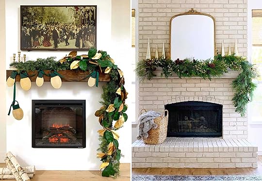 left to right: design by kismet house | design by lindsey walker
I see you, you chic asymmetrical garland you. Ugh, it’s just so awesome and I hope that if you have a mantel or even a doorway that you will consider this garland look for. It basically screams, “I have style and I play by my own rules.” Sooo ya, you should go ahead and at least try. Also, if you are into that very cute DIY lightbulb garland add-on in the photo on the left, then head to @kismet_house for the tutorial.
10. Asymmetrical Stocking Placement

 from left to right: design by chris loves julia | design by made by carli | design by restoration house
Wanna go asymmetrical all the way?? Then get your stockings to the mantel and over to one side. I just love the way it looks, a little unexpected, yet intentional and chic. I also really love the velvet bows in Chris Loves Julia’s old home. A really nice added touch.
11. Lean Into “Handcrafted” Scandi

 left to right: design by lea johnson, from: lea johnson’s basement reveal | photo by sara ligorria-tramp, from: our scandinavian (and easy, mess-free) holiday living room reveal | design by erin francois
This trend has been happening for a couple of years but is NOT losing any steam. It’s all about light wood accents, a balance of light and moody, and lots of handcrafted-looking pieces. Things like ornaments, detailed wooden Scandinavian houses, cut-out paper tabletop trees, and stars. Just make sure there’s not a lot of color but a ton of texture.
12. Unconventional Florals left to right: design by jojotastic | design by ashley fox designs | design by susan burns design
Next, let’s talk holiday florals. I am very into this cool dried flower look in the first two photos. It’s moody yet festive and you don’t have to worry about making sure they are watered (aka less stress). The key to the chicness of these florals is the asymmetrical look. Can you sense a theme?? But if dried flowers aren’t your speed then you can just use tree scraps (that you can get for free at your local tree lot) and drape a bundle on a shelf or surface. It’s messy and organic in a really good way.
13. Fun Decor Accents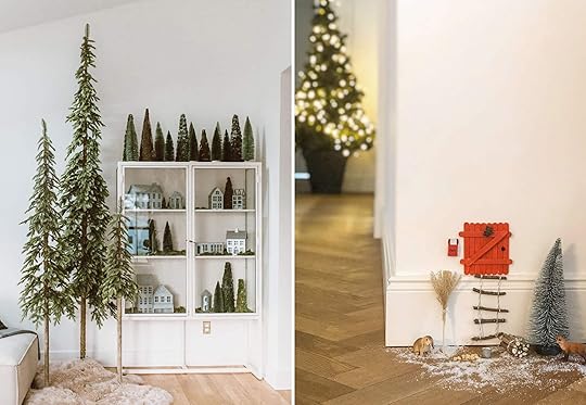 left to right: design by @_forthehome | design by @evaundich
These were just two ideas that we loved: The skinny tree trio and the elf door. First off/once again, Christine from @_forthehome’s styling is perfection. I want that whole forest in my home. But the true star in that shot is the tall tree trio with the faux fur pelt at its feet. You could actually even forgo the traditional Christmas tree if you wanted and mix it up with something like this. Basically, it’s just a really pretty idea. For the second and last idea is the elf door. If your heart doesn’t melt at the little detail then we are different people I guess (which is okay). But seriously how cute is it and how fun would it be to make with your little one. Plus, it would be impossible not to smile every time you walked by it.
Well happy holidays, merry Christmas, and happy decorating whenever you choose to start. I hope these ideas spark some creativity and that you are possibly even more pumped to get the decorating started. Also, don’t forget to use hashtag #ShowEmYourHoliday to show us your holiday decor (and for a chance to get featured on the blog). We love getting inspired by you. Ready…set… deck those halls.
Love you, mean it.
Opening Image Credits: Photo by Sara Ligorria-Tramp | From: Our Scandinavian (And Easy, Mess-Free) Holiday Living Room Reveal + How I Finally Figured Out My Biggest Styling Problem… And Solved It
The post 13 New Ideas/Trends That’ll Shake Up Your Old Christmas Decor (Whenever You Are Ready To Start) appeared first on Emily Henderson.
November 8, 2021
My Favorite Things – The Official “Emily” Gift Guide Just Landed: PART 1 Home Decor

OH GIFT GUIDE SEASON IS HERE and we are taking a different approach this year. Our goal is to recommend good stuff, like the pair of pajamas that you dig around to find in the middle of the night because they are simply the best. So instead of scouring every website on the internet, trying to find the newest proverbial pair of pajamas that likely will be shoved in the back of your drawer, I literally just walked around my own house, looked at photos of our old house (because everything is in storage), and listed what I own and still love SO MUCH. And THEN I went to my favorite brands and small businesses and found new stuff that I legit need, want, or love very much that I haven’t talked about yet. That’s it.
Listen, we love beautiful, functional, practical, and long-lasting things over here – things that bring us joy, express our style and creativity, and make our lives easier and better. The older I get the less stuff I want just for the sake of having it which makes creating these guides harder and harder because sifting through it all becomes impossible. And listen, ideally gifts should be personal to the people involved, so we aren’t doing just generic guides in hopes you’ll click and buy another vase you don’t need for your uncle. What you can get from us this season is recommendations of things that make our hearts sing, tools that make our lives easier, toys our kids actually play with, gifts our boomer parents really want from us – researched, tested, and hopefully long-lasting. And you’ll see many many things here that I have recommended over the years or in linkups. That is purposeful and hopes to show you how great they are – that I have loved them for years and years and years and I hope you and your loved ones will, too.
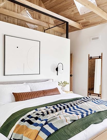 photo by sara ligorria-tramp | from: mountain house primary bedroomClassic Pillows And Throws I’ve Loved For So Many Projects
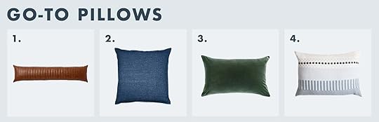
1. Faux Leather Lumbar: She is just good, and if faux leather isn’t your thing I also have this linen one that I LOVE.
2. Denim Pillow: It’s affordable, has lasted a long time, and is generally like a trusted LEVI pair of jeans.
3. Velvet Pillow: I just bought these for the basement project and they are SO SOFT and SO LUSH. They come in many sizes and many colors. So pretty.
4. Embroidered Pillow: For those of you who want something a bit more special – this lady is so pretty and makes me happy (the whole Bole Road line is awesome).
 photo by sara ligorria-tramp | from: a quick update: the changes i’ve made to my la living room
1. Double Striped Pillow: Another Target classic that goes with almost any style.
2. Extra Long Striped Body Pillow: Skip having a combination of pillows on your bed and just have this. It’s so good.
3. Floor Pillow: Where I sat every morning next to the fire while I drank coffee and talked to you all. It’s huge, so comfortable, so high quality. I don’t like dinky little floor cushions – this is like a piece of furniture.
4. Single Striped Pillow: Another great one that is so easy to mix in and yet isn’t boring.
I also just got THIS pillow for the basement project and it’s excellent.

 left: photo by sara ligorria-tramp, from: our scandinavian holiday living room reveal | right: photo by sara ligorria-tramp, from: how we decked our halls for christmas

 left: photo by sara ligorria-tramp, from: our guest room/office basement suite reveal |middle: photo by sara ligorria-tramp, from: 14 rules for how we style the perfect bedroom | right: photo by sara ligorria-tramp, our living room, dressed up for the holidays
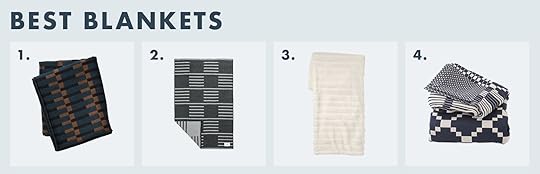
1. Dovetail Throw: I don’t have this but REALLY WANT IT. It’s a splurge, but so beautiful and high quality.
2. Wool Patterned Throw: I have this on the back of our sofa at the mountain house and it’s so soft/thick and great for warmth.
3. Faux Fur Blanket: Our kids each have these as their “cozy blankees” and they take them everywhere in the house.
4. Seasonal Coverlet: A classic blanket that can be on your bed as well as dress up a sofa instantly.
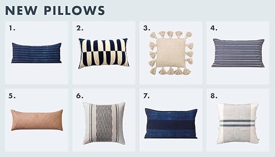
1. Dark Indigo Lumbar: Because we love all things indigo (and the contrasting stripe is lovely)
2. Graphic Patterned Pillow: Will add instant energy to a room – like a broken stripe but softer.
3. Tassel Pillow: I have this in pink (out of stock) and the reason it’s good is because of its smaller scale – it’s a mini pillow which makes it really easy to style with bigger square pillows.
4. Blue Striped Pillow: A classic that goes with everything.
5. Leather Woven Lumbar: For those who want real leather and more texture – plus I LOVE this pinky color.
6. Embroidered Pillow: Lovely details and nice pattern without being too busy.
7. Dark Large Stripe Indigo Pillow: See #1
8. Tassel Center Band Stripes Pillow: Playful pom-poms, two big stripes, lovely color palette. Will never not be in style.
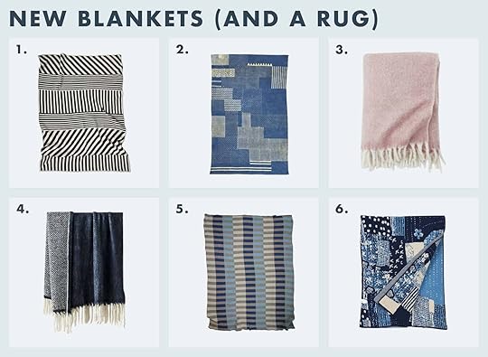
1. Mixed Striped Blanket: I’ve been a fan of these Happy Habitat blankets for YEARS. I want this one badly.
2. Block Printed Rug: I thought this was a throw! What a cool rug that looks quilted and patchworky in a really good way.
3. Pink Throw: This is so soft and fluffy – I have an older version of this brushed wool and it’s the coziest throw that is also very pretty (versus the faux fur that is so cozy but aren’t as refined). Comes in lots of colors, too. I literally think everyone likes a new cozy throw in the winter.
4. Blue Tassel Throw: Two pretty colors, lots of texture, and yes on the fringe. Great for year-round snuggles.
5. Blue Stripe Blanket: This reminds me of one of my favorites that got ruined in the move (just found it covered in mold in storage). I’m going to snag this for myself.
6. Patchwork Throw: I’ve always been drawn to all things quilt and patchworky – this would also look great upholstered on a bench or headboard.
 photo by sara ligorria-tramp | from: emily’s updated living room
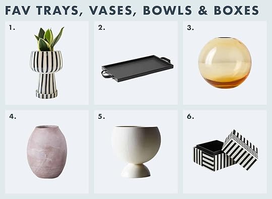
1. Footed Striped Vase: One of my favorites from Justina (and fun fact, it’s three separate pieces so it could be three gifts – a small tray, a cup, and a bowl).
2. Black Wood Tray: I also have this in light wood – just so pretty and simple.
3. Sphere Bud Vase: I’ve used this multiple times for a bedside table bud vase and it’s so easy to style/use.
4. Pink Terra Cotta Vase: Still on the nightstand of our guest room at the mountain house, and the color and texture are just ridiculously good.
5. Footed Planter: It’s hard to see but this one has two different textures – the top is matte and the bottom is glossy. I’ve had this for YEARS and have used it in a million different rooms.
6. Striped Box: Sometimes you want a tiny bit of pattern in a bold neutral and this one is IT (or just get the striped footed vase:))

1. Black and White Terra Cotta Vase: Justina’s vase for Target and the whole collection is REALLY GOOD.
2. Footed Wood Tray: That little foot under the tray makes a huge difference, visually.
3. Blue Glass Bud Vase: The amount of bathrooms I’ve styled this in is stupid – it’s just so good and perfect for one sprig (I have the pink one).
4. Wrapped Rock: My leather and raffia rock collection is one of those things that confuses most non-design guests, but they are just so cool and perfect for on top of a stack of books.
5. Tadelakt Bowl: The most simple farmhouse fruit bowl ever. Bloomist has a ton of great gifts, BTW.
6. Blue Vase: I bought this Target vase twice – one for mountain house, one for our rental. I LOVE IT – i’s that perfect denim color that I want to color-match.
7. Footed Bowl: I love this terra cotta version that would absolutely warm up a kitchen in a modern/rustic way.
8. Sculptural Side Table: I love this little hand-carved cocktail table (it was in my living room).
1. Mercado Floor Storage Basket: I have the one without the black on the bottom but this one is SO GOOD. I have one for magazines/newspapers and one for blankets because it’s that perfect low and wide shape that is easy to toss into.
2. Large Landscape Art: I bought this for above the fireplace at the mountain house because I wanted to take my original art, but it honestly looks BETTER than what I had! It’s from the Studio McGee collection at Target.
3. Serving Basket: I simply can’t get enough wood-woven baskets and storage bins.
 photo by sara ligorria-tramp | from: the coziest upstairs guest “bunk” bedroom
1. Black Wood Base Lamp: Quite possibly my favorite lamp, we’ve had two of these on our nightstands for years.
2. Handmade Earthenware Lamp: I wanted this last year and didn’t get it, so I’m still putting it on my list.
3. Curved Arm Table Lamp: I think these are so lovely – they have a sculptural shape, but in a restrained and unexpected way (and I love the fabric shade).
4. Concrete Table Lamp: Still one of my favorites ever – and it dims very low so it’s a great nightlight, too.
5. Light Wood Base Lamp: I ordered one of these for the basement project after I saw it in person at Rejuvenation. The ribbing is just so pretty.
6. Milk Glass Dome Task Lamp: Y’all this is so good and affordable.
 photo by sara ligorria-tramp | from: our living room, dressed up for the holidays
 photo by tessa neustadt | from: our master bedroom reveal
1. Ceramic Match Striker: A staple on my gift list every single year. I want one for every bathroom.
2. Scented Candle: The wood wick is my favorite and adds a lot to the smell.
3. Candle Holders: There isn’t a home these wouldn’t look good in, and they come in natural wood, too.
4. Totem Candles (Set of 3): The candle that started the sculptural candle trend – this trio is a new classic.
5. Pot Pourri: I bought this years ago for my bedroom reveal for its awesome shape and I had no idea how much joy I would get out of the scent. Brian has even rubbed it on his neck before because it smells that good. If you want to spoil someone, this potpourri + sculptural container would do it.
 photo by sara ligorria-tramp | from: the 10 design books that have inspired the mountain house
1. Upstate: Every single page of this book is incredible and inspiring. The creativity of these houses is unbeatable.
2. Monochrome Home: When I started playing more with neutrals I found this book as inspiration – still so much style and creativity, in a quieter way.
3. Styled: Listen. I had to reference this book a lot this year as we wrapped up its follow-up (on renovation) and was reminded of how useful and helpful it still is (and I was so relieved to see it isn’t dated).
4. Surf Shack: I LOVE THIS BOOK. Doesn’t matter if you’ll ever live near water, there are a lot of really cozy and casual (and inspiring) ideas in here.
5. Scandinavia Dreaming: I have bookmarked the heck out of it while designing the mountain house.
6. Domino: The Book of Decorating: This is still such a GREAT classic that is fun to reference over and over.
7. The New Bohemians: Justina Blakeney, my friend, really created a movement and I’m so proud of her. This book is excellent for anyone wanting approachable inspiration for a more bohemian style.
8. Get It Together!: Orlando is laugh-out-loud funny, seriously, and this book will make anyone smile.

1. Jungalow: Justina did it again, so many beautiful images in this book.
2. Modern Americana: Max Humphrey has such a distinct style and a fresh design perspective. I’ve LOVED working with him on the river house – he’s a great guy with little ego and a lot of style.
3. Made For Living: Amber Lewis – another movement maker who I love and has really made her stamp hard on the design world.
4. House Story: Jasmines’ book is on renovation is so helpful and informative – if you are considering a renovation project or know someone who is, pick this up!
That’s all my favorite decor stuff, friends (without furniture/rugs, obviously – should I do that???). While we’ve linked everything up I do implore you to shop small and local when possible and just know that 10% of all our affiliate sales (the commission we get through these links with many of the companies) will be donated to Pen + Napkin for future makeovers of families transitioning out of homelessness. So if/when you are buying through our links know that it is supporting families and community. While gift guide season is a large revenue driver that supports our team and design projects for the whole year, we are committed to paying it forward.
Opening Image Credits: Photo by Sara Ligorria-Tramp | From: Our Scandinavian (And Easy, Mess-Free) Holiday Living Room Reveal + How I Finally Figured Out My Biggest Styling Problem… And Solved It
The post My Favorite Things – The Official “Emily” Gift Guide Just Landed: PART 1 Home Decor appeared first on Emily Henderson.
November 7, 2021
The Link Up: Em’s $20 Perfectly Cut Sweatshirt, Caitlin’s VERY Pretty Coat, And The $17 Throw Pillow That We Can’t Believe Is Only $17


WOW, this week was a wild one. The holiday season is upon us at full blast. We actually got to all have an extra special team lunch since Em was in LA shooting. A great start to the weekend. Hope you all also got to or are about to get some friend time soon. It’s never not good for you:) And if we are the only friends you have the bandwidth to hang with today, we are here and ready to chat:) Let’s link up!
From Emily: I’m a suber-snob when it comes to sweatshirts because I like them to fit in a way that feels stylish and not schlubby, so this sweatshirt I like because it hugs my neck in kind of a mock turtleneck way which looks cool. It has a thick waistband that creates a lot of fun volume – almost like a half-tuck does and the arms are spacious and boxy. It’s just a really good cut, plus this mauve/purple color is very pretty
This week’s home tour is a piece of art (and a famous one at that). It’s been previously called “America’s coolest home” but the one and only Alicia Keys’ and husband Swizz Beatz now call it their “Dreamland.” While this kind of home might not be everyone’s dream to live in, it’s an incredible piece of architecture that you need to check out. O and not only is the structure extremely artful but the art on the walls is probably our favorite part… and of course the view.
From Caitlin: I’m gearing up to fly back to the east coast for a few weeks to spend the holidays with my mom, so I have coats on the brain. (Seasons are fun when you only have to experience them temporarily!) Just stumbled upon this menswear-inspired long wool coat in black watch plaid with an optional tie for a cinched waist and OH MY GOSH. I LOVE IT. The details are so special – look at the interior checkered lining and the sunny yellow piping and the sweet bright buttons! – and the outside shape and color are so timeless and classic. It’s kind of like a statement coat without being an actual statement coat and I am smitten. (For those who want something a little more minimal, it also comes in camel which is just as swoon-worthy!)
Also from Caitlin: In a past life, I worked in marketing at Apple (this usually surprises people – probably my excessive use of caps + punctuation???). ANYWAY – my former boss, Jing, launched a new media brand called Jaded on Friday and it’s SO GOOD. It’s dedicated to the amplification of Asian artists and the whole site is so cool and slick and graphic and interesting (and I mean, Jing was a very good/smart/stylish boss, so none of this is surprising). Highly recommend scrolling through their homepage (it looks awesome, right??) and giving them a follow on IG
From Albie: I came upon Cloth & Paper about year ago when I first got into using the happy planner system. Why I love em? Aside from being owned & operated by a black woman, the inserts are so luxe… like I’m an adult & I might just actually have my life together. C&P offers a subscription box but I choose to simply purchase items a la carte because that’s just what works for me. In the past year, I’ve placed 3 or 4 orders, with both inserts & accessories for my planning. I remember receiving my first order and thinking “oh this is niiiiiiiice” like the really popular TikTok audio — the colors, the designs, the packaging… all of it just makes me wanna give Ashley (the owner) all of my money!
From Jess: Did y’all see this dining room transformation???
Also From Jess: I can’t believe I haven’t talked about this throw pillow until now! Bowser brought it over for a shoot and I loved it immediately. It’s a fun shape without being “too out there” and it’s only $17. If you are in need of a cool pillow, this could be it. O and we used the rust colored one:)
From Mallory: My sister brought this hair dryer tool on a trip we took this summer and I fell IN LOVE. I recently found out that not only do my sister and I love it, but my boyfriend, Chase and his mom are both convinced it’s the best. IN FACT, Chase’s mom told me I had to try it out and I recognized it and was like IT’S THE BEST RIGHT? So yeah, there’s a great rec from 4 people in one
From Ryann: I am a half leg out half leg under the comforter kind of sleeper because I get too hot at night (especially with my 60 lb dog aka heater sleeping in the bed with us). It’s unfortunate because I like to be cozy under blankets so when I heard about cooling blankets I was very intrigued–but sort of like what’s the point of a cold blanket?? Well, last weekend I felt one in person at a friend’s house and now I GET IT. It’s so soft and the cooling technology makes being underneath it strangely comforting. I am a huge fan and will likely be giving them as gifts this year.
Opening Image Credit: Photo by Frank Frances | Design by Kelly Behun | Styled by Michael Reynolds | via Architectural Digest
The post The Link Up: Em’s $20 Perfectly Cut Sweatshirt, Caitlin’s VERY Pretty Coat, And The $17 Throw Pillow That We Can’t Believe Is Only $17 appeared first on Emily Henderson.
November 6, 2021
What You Bought Last Month: October Edition (Everyone Was CLEARLY On The Same Fall Page)

It’s the first Saturday of November so that sounds like it’s about time for us to give you a list of the most popular things purchased from our site last month!! We’re excited, so we hope you’re excited too. Spoiler alert: this one was a lot of fashion (probably because of the seasonal change, understandably).
I know we have said this before but please know that these posts are only meant to see what everyone is checking out and buying, and IF you are in need of a similar product to give you a popular (and EHD approved) option. That’s what all of our posts are here to do. We hope that everyone shops mindfully and only buys what they really need and/or will love for a long time. Ok, now with that in mind let’s check out what y’all are hitting ‘purchase’ on!
10. Madewell Skinny Jeans
The classic Jess (and now Emily) skinny jeans. The fact that these are STILL making it on this list is incredible. We’ve linked them maybe once or twice in Emily’s fashion posts last month, but that tells you just how good & stand-out they really are. According to both of them, these are the perfect high rise height, are super comfortable and the wash is awesome. So again, THE perfect skinny jeans.
9. Emily’s Alex Mill Utility Jacket
Ah yes, this incredible layering jacket makes the list. It’s a cute color, awesome shape, and has a very hefty amount of pockets so the functionality of this is for REAL. Emily wore it in this post (and all the time in regular life)…here’s what she had to say about it: “This chore coat is excellent – stiff cut (which is what you want), but soft and easy to layer. I have a couple vintage versions of these which I love but they are wider (likely because they were men’s) and this is just a very slimming cut (if you are into that).”
8. Madewell Demi Boot Cut
Another Madewell jean makes the list! These are also Jess’s jeans from the link up 2 weeks ago…here’s what she had to say “From Jess: It was time for a new pair of jeans. While I love my Madewell Perfect Vintage pair, I wanted ones that didn’t stretch out so quickly (and by what feels like a whole size sometimes). So when I went to the store, tried on this pair (I’m in between sizes so I sized down for the snug fit I wanted), and have been super happy with them since! They stretch out a little since they aren’t a fully rigid denim but it doesn’t bother me. Big fan!”
7. Alex Mill Sweatshirt Jumpsuit
Emily has the sweatshirt jumpsuit version of this which she wore in this post (and again – all the time in real life), but we were surprised to see the sweater version come up on this list (mostly because we don’t own it but have always wanted it). I TOTALLY get it – it’s comfy, chic, cute, and perfect for WFH to lunch to grocery shopping and everything in between.
6. Ryann’s Facial Hair Remover
Also from the link up two weeks ago!! Way to go Ryann for recommending this facial hair remover – clearly it was a hit! Here’s what she had to say about it: “From Ryann: It’s possible I have recommended this facial hair removal tool before, but since I’ve had it for a year and still use it regularly I figured it deserves another shout-out. It’s saved my life on more than one occasion, where I am about to leave for a party or event and at the last minute I notice some unwanted hairs above my upper lip. It’s so easy and painless to use and it works!! I know we’re not supposed to “shave” our upper lip because it could cause the hairs to grow back thicker, but honestly I think that is a myth. In any case, this little guy is really useful to have in a pinch!”
5. Madewell Collared Shirt
Okay, a different link up this time, but still a link up link nonetheless…it’s Caitlin’s favorite Madewell top!! Very cute, flattering, and goes with everything!! Here she describes it in her own words (and her words are very entertaining): “From Caitlin: My all-time favorite white popover top (business casual approved for those of ya who are back in office!) is somehow only $14.99 at Madewell right now!!! You may have seen me in it on the blog before – it’s a go-to whenever we contribute to fashion posts because it’s just so easy to slide on – and I love it, especially on those days where I need to look put together but I want to feel super comfortable. It looks great french-tucked and it’s a dream to layer under other sweaters or coats, especially at this time of year. I don’t know why it’s so cheap right now (if they’re discontinuing the style, I WILL WEEP) but boy, what a total steal!!!”

My shoes wahooo! I’m saving up to buy these shoes and boy oh boy am I excited. I keep getting ads for them and I tried them on in-store and was VERY impressed. I usually am an impulse shopper and buy things very sporadically, but for a staple black boot that I want to LAST, I’m trying to be more intentional. Right now these are the front-runners and they’ve been in my cart for quite some time, I’m excited to pull the trigger (I’m now being very influenced by you guys who bought them )
This is something I did impulsively buy!! It’s my favorite sweater right now because it’s SO comfy, it’s the perfect ‘cream’ when you don’t want to wear a white sweater, plus LOOK AT THOSE PURTY SLEEVES. I am in love with this that I wear it every day – just ask my team. Oh, and the price doesn’t hurt either ($28 is a sweater steal in my opinion, although Caitlin is about to show u an even better sweater steal – head to #1).
2. Emily’s Target Boots
THE COMFY TARGET BOOTS! I tried these on – there’s memory foam on the bottom so they’re insanely comfortable, but they’re Em’s find and her link so I’ll let her tell ya about them “From Emily: A lot of you responded to my Mille boots because yes they are very good — but while shopping for a Target shoot I found some dupes that are surprisingly excellent and comfortable because they have a memory foam sole. So comfort is a definite check. Is anyone interested in a fall boot post?” (BTW we did that boot post in case you missed it…check it out here).

Caitlin’s $20 (NOW $15) takes the lead spot in #1 YAY!! We all love when Cailin describes things so here she is “This week I popped into Target to do some returns and WOOPS, I slipped and then came out with this green fisherman sweater, which fits like a total dream. It was $20 and I got a size large, but now after seeing some review photos I kind of want to get another and size up because it drapes in such an awesome way. Crewneck pullover sweaters can be super tricky with 36F boobs but this one somehow falls super nicely and doesn’t make me look/feel like a brick (FWIW I am traditionally the queen of the shapeless brigade because I didn’t know something like this was an option and now I want a million of them)!”
So there you have it! The things you bought and loved this month (and we do too!!) Hope everyone enjoys the rest of their weekend and we’ll see ya REAL soon (aka tomorrow)!!! xx
Opening Image Credit: Photo by Sara Ligorria-Tramp | Design and Styled by Emily Bowser | From: Bowser’s Hardworking Multipurpose Room
The post What You Bought Last Month: October Edition (Everyone Was CLEARLY On The Same Fall Page) appeared first on Emily Henderson.
November 5, 2021
Target Haul: All The Clothes Mallory Brought For My Shoot This Week – Affordable Fall Clothes

It’s Target shoot week! In a perfect world I go to Target myself to shop and pull together the curated 1-3 outfits that I would wear for our different shoots. However, there was a big accident on the 210 freeway so I had to take the back way up the mountain, missing my favorite Pasadena Target that I had planned to hit. So Mal rescued me and brought up what she thought I’d love. So today I’m going to show you a quick and dirty Target haul. And it’s pretty darn cute stuff.

Dress | Jacket | Boots | Bandana
When I saw that dress I thought it was cute but boring, but then I put it on and it’s REALLY GOOD. The sleeves have a lot of cute volume and the skirt is lined! You know I don’t have the patience for a slip, so this is GREAT for me. I paired it with their duck boots, their Levi’s collab sherpa coat, some wool socks, and a bandana (as per my fall styling educational styling hack post).


Here we go with the equestrian vibe again. These were the boots I’ve told you about a couple times but they are so cute and affordable (and so comfortable with memory foam interior soles). The jeans are mine from years ago but these are similar. And that blouse has cute ruffles that aren’t TOO big.

Sweater | Blouse | Jeans | Boots
I actually think this is the second most successful outfit here (the first being the dress with the Levi’s sherpa jacket). Here we have the sweater that Caitlin linked up a while ago that I hadn’t tried but really liked!! It has a good shape – kinda a boyish crew-style that is a good medium length. Of course, Mal even got me a little Victorian blouse for underneath so the collar and sleeves could pop a bit. We were both VERY impressed with those boots – the soles are good and look super expensive.


Jumpsuit | Duck Boots | Boots
Here we have the Sandy Liang jumpsuit that I had wondered about but hadn’t tried. For me, it was hard to style with boots, but I’m VERY picky about jumpsuits. The cut is too important and it can’t hug in the wrong places, and when it’s good it’s just so good (like my old The Great jumpsuit or my new sweatshirt jumpsuit from Alex Mill). I think I should have just worn it with a cuff at the hem and sneakers or Vans, but the crotch is pretty long. Ultimately I prefer a darker or patterned jumpsuit, the cream makes me nervous and I didn’t feel that comfortable. But both boots are awesome. And fun fact, over the weekend I went into Frances May in Portland and spotted this Sandy Liang fleece which was excellent and was VERY BUMMED that they didn’t have it in my size, and then I realized it was $625 but boy was it good. Like really good. Fine, it’s here.


Denim Skirt | Sweater (no longer available) | Boots
I’m so annoyed that this sweater is no longer available (we bought it on Thursday in-store so head to your local Target). It’s so cute and you bet I kept it – a cozy structured ruffle. The skirt is cute too, with an easy fit and a sweet little paper bag ruffle at the top (it’s Who What Wear). Same boots as above, y’all.


Pullover Sweater | Button Up | Jeans | Boots
This was an experiment. I was trying the chambray collar under the 1/4 zip trend that I’ve seen on the social media. Not sure I’m pulling it off there, which means I’m not. The sweater is so cute, though, I just think it’s a lot with the shirt underneath and that combo needs to be under a thicker sweatshirt, not a sweet sweater, but quite literally what do I know.
And that’s what I tried on and mostly really liked from Mal’s Target haul for me. I’ve decided that affordable fashion is mostly about a really good cut, which is the hardest thing to achieve (colors and patterns are easier).
The post Target Haul: All The Clothes Mallory Brought For My Shoot This Week – Affordable Fall Clothes appeared first on Emily Henderson.
Target Haul: All The Clothes Mallory Brought For My Shoot That I Didn’t End Up Wearing… But Really Loved
It’s Target shoot week! In a perfect world I go to Target myself to shop and pull together the curated 1-3 outfits that I would wear for our different shoots. However, there was a big accident on the 210 freeway so I had to take the back way up the mountain, missing my favorite Pasadena Target that I had planned to hit. So Mal rescued me and brought up what she thought I’d love. So today I’m going to show you a quick and dirty Target haul. And it’s pretty darn cute stuff.
Dress | Jacket | Boots | Bandana
When I saw that dress I thought it was cute but boring, but then I put it on and it’s REALLY GOOD. The sleeves have a lot of cute volume and the skirt is lined! You know I don’t have the patience for a slip, so this is GREAT for me. I paired it with their duck boots, their Levi’s collab sherpa coat, some wool socks, and a bandana (as per my fall styling educational styling hack post).
Here we go with the equestrian vibe again. These were the boots I’ve told you about a couple times but they are so cute and affordable (and so comfortable with memory foam interior soles). The jeans are mine from years ago but these are similar. And that blouse has cute ruffles that aren’t TOO big.
Sweater | Blouse | Jeans | Boots
I actually think this is the second most successful outfit here (the first being the dress with the Levi’s sherpa jacket). Here we have the sweater that Caitlin linked up a while ago that I hadn’t tried but really liked!! It has a good shape – kinda a boyish crew-style that is a good medium length. Of course, Mal even got me a little Victorian blouse for underneath so the collar and sleeves could pop a bit. We were both VERY impressed with those boots – the soles are good and look super expensive.
Jumpsuit | Duck Boots | Boots
Here we have the Sandy Liang jumpsuit that I had wondered about but hadn’t tried. For me, it was hard to style with boots, but I’m VERY picky about jumpsuits. The cut is too important and it can’t hug in the wrong places, and when it’s good it’s just so good (like my old The Great jumpsuit or my new sweatshirt jumpsuit from Alex Mill). I think I should have just worn it with a cuff at the hem and sneakers or Vans, but the crotch is pretty long. Ultimately I prefer a darker or patterned jumpsuit, the cream makes me nervous and I didn’t feel that comfortable. But both boots are awesome. And fun fact, over the weekend I went into Frances May in Portland and spotted this Sandy Liang fleece which was excellent and was VERY BUMMED that they didn’t have it in my size, and then I realized it was $625 but boy was it good. Like really good. Fine, it’s here.
Denim Skirt | Sweater (no longer available) | Boots
I’m so annoyed that this sweater is no longer available (we bought it on Thursday in-store so head to your local Target). It’s so cute and you bet I kept it – a cozy structured ruffle. The skirt is cute too, with an easy fit and a sweet little paper bag ruffle at the top (it’s Who What Wear). Same boots as above, y’all.
Pullover Sweater | Button Up | Jeans | Boots
This was an experiment. I was trying the chambray collar under the 1/4 zip trend that I’ve seen on the social media. Not sure I’m pulling it off there, which means I’m not. The sweater is so cute, though, I just think it’s a lot with the shirt underneath and that combo needs to be under a thicker sweatshirt, not a sweet sweater, but quite literally what do I know.
And that’s what I tried on and mostly really liked from Mal’s Target haul for me. I’ve decided that affordable fashion is mostly about a really good cut, which is the hardest thing to achieve (colors and patterns are easier).
The post Target Haul: All The Clothes Mallory Brought For My Shoot That I Didn’t End Up Wearing… But Really Loved appeared first on Emily Henderson.
November 4, 2021
Power Couples: Dining Chairs & Stools (24 EHD Guaranteed Combos To Give Your Open Kitchen/Dining Room Max Style)

POWER COUPLES ARE BACK BABY! Well at least for today they are. You might know (or if you don’t here is your reminder or introduction) that we have a separate online community that we call The EHD Insider Community. A couple of weeks ago they asked for dining chair/stool combo suggestions via Keyanna and we thought that was a great idea considering lots of people are about to have a lot of big dinners.
And while a lot of us saw the virtue in being able to physically close a door and maaaaaybe began to rethink the glory of an open plan concept layout last year, it’s still pretty great… but comes with some decorating challenges.
The main one being “how do I make these spaces look cohesive but not basic?” That’s a big involved question to answer but hopefully, after giving you some tips and explanations about choosing dining chair and stool combos, you can carry those ideas into your other decor decisions. But as always let’s get some hard and fast rules about these chairs first.
 photo by sara ligorria-tramp | styled by emily edith bowser | from: velinda’s first freelance client reveal: molding the ‘builder-grade budget’ + where they saved & splurged
BARSTOOL BUYING GUIDE CHEAT SHEET
If your counter/table (the bottom of it, not the top, since it’s really about where the leg can comfortably fit) is…
roughly 35-37 inches high, you’ll want to go with a counter-height barstool that is typically anywhere from 23 to 28 inches floor to seat.anywhere between 41-43 inches high, a bar-height stool is what you need, which runs from 29 to 32 inches floor to seat.anything above 44 inches (likely something custom), this falls into the “extra tall” category of barstool, with a 33- to 36-inch floor-to-seat height.
 photos by tessa neustadt | from: emily’s kitchen and dining room reveal DINING CHAIR BUYING GUIDE CHEAT SHEET
RULE: Give about 24″ of space per person for maximum comfort and food enjoyment.
Here is a seat guideline for rectangle tables depending on size:
48″long table: seats 460″-72″ table: seats 680″-87″ table: seats 892″-108″ table: seats 10120″ table: seats 12And for round tables depending on size:
42″-48″ diameter table: seats 460″ diameter table: seats 6-8 design by barrett prendergast | styled by emily bowser | photo by sara ligorria-tramp | from: how to make “a cook’s” kitchen
Got that? Cool. So I broke these combos down into four styles with some tips on what to look for to make it a little easier for you to shop yourself. But also feel free to use those tips to mix and match! You know your space the best.
NOTE: Most of the stools and even the chairs come in multiple sizes and heights. So don’t be discouraged if you find a counter stool you love but you need a bar height or a dining chair but want it in a counter stool. With just a few clicks you might just be in luck!
ANOTHER NOTE: Emily is a FIRM believer in stools with backs so all of the stools I chose have backs. If you are wanting to sit or have your friends sit on a stool for a while then having a back is just a no-brainer. We of course love backless stools too but why not focus on comfort for today. Your guests and family will thank you.

 photos by sara ligorria-tramp | left from: mountain house kitchen reveal | right from: mountain house dining room revealModern Traditional
Who doesn’t love a beautiful modern traditional home? So classic, clean, welcoming. But what are the main details to look out for if you are wanting modern traditional furniture:
Clean, simple linesDarker and muted colors or tonesNothing too chunkyA hint of black metal never hurtA little bit of warmth in the natural materialsNot too “mid-century modern”, not too “farmhouse”Ok, let’s shop.
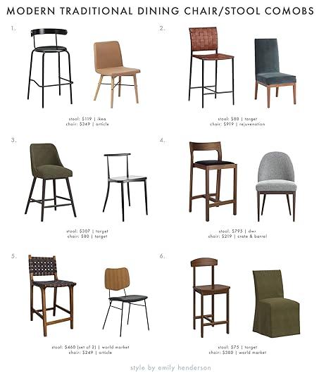
1. YNGVAR + KISSA | 2. Wellfleet Woven Faux Leather Metal Base Counter Height Barstool + Middleton Side Chair | 3. Geller Counter Height Barstool + Northwood Metal Cafe Dining Chair | 4. Profile Stool + Ana Navy Dining Chair | 5. Faux Suede Strap Camden Counter Stools (Set of 2) + VERSUS | 6. Trescott Value Wood Counter Height Barstool + Linen Slipcover Landon Dining Chair
I really love how in #2 and #6 they are both colorful yet muted and still feel warm because of the natural materials in the stools and softness of the chairs. I know that blue chair’s price tag is steep so here is a great alternative in Ocean Chestnut. #1 and #4 are great examples of the power of a contrast. The light tan and black stool look great but what really ties them together is the black metal on the legs of the chair. Subtle but important. Then lastly #3 and #5 are a little more mid-century in shape but the shapes and patterns are pretty cool but still simple.
Organic CasualOur ‘Effortless California Casual’ series a few years ago was SUPER popular and honestly, it hasn’t gone anywhere. I mean, it’s so pretty and you just feel calm being in a room decorated in this style. So if you want to dive into this look here’s what to keep an eye out for:
Alllll the neural/wood tonesNatural woven materials are a plusLeather is a VERY important materialDon’t be afraid of a little hit of blackClean lines but a little bit of chunkiness is totally great
1. Industrial Counter Stools (Set of 2) + Beckett Dining Chair | 2. Emery Wood Counter Height Barstool + Zoey Caned Armless Dining Chair | 3. Jonah Counter Stool + Caillen Dining Chair | 4. Ward Faux Leather Sling Metal Counter Height Barstool + Hargrove Leather Side Dining Chair | 5. Rustler Woven Counter Stool + Tahoe Dining Chair (Set of 2) | 6. Teddy Counter Stool + Tuttle Leather Side Chair
Definitely, a benefit of shopping at the same store is that you can find pieces that aren’t a “matching set” but you can feel confident that what you choose will look real nice together like in Amber Lewis’ collection in #3. I also really dig the soft warm tones and cylinder stool legs of #2 and #6. These combos just look like a hug to me. But the little bit of moodiness in #1, #4, and #5 with those hits of black just give that little extra touch of chicness.
EclecticThis one is all about mixing shapes, mixing styles, mixing materials, and kinda a gut feeling. Sorry no real tips for that one, just practice. So let’s talk about some tips I can give you:
Don’t be afraid to mix stylesPair random materials in similar tonesDon’t be afraid of some colorAsk yourself if they look like they could live in the same world despite their differencesAsk yourself if you like it. If yes, you are done.
1. Wellfleet Woven Faux Leather Metal Base Counter Height Barstool + Salduro Sculptural Wood Dining Chair | 2. Tovin Adjustable Height Barstool + Rue Armless Chair | 3. ZINA + SVELTI | 4. French Bistro High Back Counter Height Barstool + Kelly Oval Back Dining Chair | 5. Natural Rattan And Wood Amolea Counter Stool + Mid-Century Modern Petal Upholstered Dining Chair | 6. Rake Brass Bar Stool + Forged Iron Elowen Chair
I am pretty obsessed with that Studio McGee Target chair in #1. Are you kidding me? So cute, cool, and modern. If I didn’t already have my friendship chairs, there would be a HIGH probability those would already be in my home. Then paired with that slim woven leather stool, it helps to continue the visual interest but in a quiet, contrast way. Now I know #4 is more “farmhouse” than “eclectic” but I wanted to give someone this style option and it didn’t fit on any of the other graphics. SORRY! For all the others, I love the texture differences, the splashes of (a little) color, and general “you can’t put us in a box” vibe.
Postmodern CoolThis one is probably most aligned with my style. I just love some cool, bold shapes, more overt but less classic MCM nods, and general weirdness. Here are my tips if this is the look you want for your combo and home:
The more chunk the betterEmbrace jewel tonesLook for unexpected shapesLet either the chair or stool be visually heavierA hint of glam never hurt anybody
1. Willa Dark Walnut Counter Stool + Paradox Natural Wood Dining Chair | 2. Vinton Value Metal Counter Height Barstool + Foley Faux Mohair Dining Armchair | 3. Amisco Monza Swivel Stool + Evie Leather Dining Chair | 4. Prouve Barstool + Caravan Wood and Metal Dining Armchair | 5. Venn Navy Leather Counter Stool + Nadia Black Cane Chair | 6. Kamlyn Counter Stool + Block Base Dining Chair
I know #1 is kinda wild but I just love it. Their shapes are related but the difference in colors and materials makes it exciting to me! Great for the postmodern lover that likes to keep it neutral (aka me). I really associate a dark, jewel-toned blue postmodernism so #2, #3, and #5 are hitting those notes with that and their chunky-legged seats. Then the stools of #4 and #6 have more of that MCM look that I don’t think anyone is sick of yet because duh, they are incredible. I would happily have any of these in my home.
Power Couples to a power nap. Just me? Ok, that’s probably just me:) Hope this was helpful and got you thinking of dining chairs and stools if you need them because you know…the supply chain. Have a great day and see ya in the comments.
Love you, mean it.
Opening Image Credits: Photo by Erin Francois| From: Tour a Stylist’s Mid-Century-Meets-Traditional “Farmhouse” Full of Thrifted Treasures
The post Power Couples: Dining Chairs & Stools (24 EHD Guaranteed Combos To Give Your Open Kitchen/Dining Room Max Style) appeared first on Emily Henderson.
Emily Henderson's Blog

- Emily Henderson's profile
- 10 followers

