
Rated YA-MA discussion
Book Chat
>
Book Covers - The Good, The Bad and The WTF?
 Oh no problem! Didn't realize that was a no no. I didn't think it was a promotion, LOL, just looking for ideas and thought we were discussing covers but I'll repost there :) As far as others covers, I love the ones for Twilight series. They are very clean crisp and smart because of the meaning behind them. I tend to dislike cheesy covers with couples on them haha.
 Rektok wrote: "Oh no problem! Didn't realize that was a no no. I didn't think it was a promotion, LOL, just looking for ideas and thought we were discussing covers but I'll repost there :) As far as others covers..."
I've been checking out covers, too, and I agree that no matter what you think about the series, the Twilight covers are awesome. Crisp. Clean. They stick in your head right away.

Seems like right now there are a lot of covers with heavily made up goth girls in the woods...don't know what that's about...
 Haha, we had a discussion not too long ago about the pretty dress covers but I guess goth girl in the woods would also fit into a similar category.
Okay, tell me this does not look like a Rick Riordan cover. I keep thinking it's a Riordan book every time I see it.

 It does! Even when I just saw the top part I thought it was a Riordan haha. I got excited.
 I think it's the font being so close in style to the Percy Jackson font that is tricking my brain right now. If you took that off, I don't think it'd look nearly as similar, though the images have the same elements as a Riordan book. And even though these look more like some self-pub cover photoshop collage of stock photos while the Riordan covers are drawn, it's definitely pretty obvious that's what they were going for.
 It's like a mashup of PJ and Kane Chronicles
 They must be banking on the fact that people will pick it up based on that alone! Not sure if I think that's sneaky or smart...
I was thinking the same thing. Like is it because he just likes that style and tried to copy it, only crappier? Or is it some attempt to trick people?
They must be banking on the fact that people will pick it up based on that alone! Not sure if I think that's sneaky or smart...
I was thinking the same thing. Like is it because he just likes that style and tried to copy it, only crappier? Or is it some attempt to trick people? The idea of people copying other covers to trick people kinda pisses me off. It's so manipulative. Like, it will grab your attention because of the similarities, then even once your brain registers that it's something totally different, you'll still associate the two and therefore have that lesser known book in the back of your mind. And once it's there then so is the potential impulse to buy it.
I saw a few self-pubs that mimic the Wimpy Kid books. And someone linked before one that looks like a replica of the Fallen cover (really several of them, but one that looked insanely similar).
This is kinda like all the classis getting the "twilight make over" I dont know if you got them in US but in Aus all of Austins and the Bronte sisters books got new covers that were pretty much like the twilight covers Ill see if I can find a picture

 LOL, they totally have those covers here too. Drives me insane.
Wendy F wrote: "LOL, they totally have those covers here too. Drives me insane."
worst things ever!
worst things ever!
Omg that's terrible! I did see one thing I didn't like recently. I saw someone pretty much copied the guy from Jennifer Armentrouts Lux books and put him on another cover. Did anyone else see that?
It's not her guy, technically (although he's probably most known from that series, but he was on book covers before hers). He's a model and those are stock photos that can be used by anyone. He's actually on a lot of covers. Here's a list : http://www.goodreads.com/list/show/15...
Holy cow! That's crazy but makes me feel a lot better now that I know it's perfectly a legit reason. How did you know that?!! :).
 Rektok wrote: "Holy cow! That's crazy but makes me feel a lot better now that I know it's perfectly a legit reason. How did you know that?!! :)."
There was a lot of talk on Ms. Armentrout's blog back when the first book came out about the cover models-still is-they actually have filmed the book trailers for her as well. Kinda funny-they've created quite a frenzy.
 It's like the marketers thought "well, they have pretty flowers on them so women will be hormonally conditioned to accept this pap, regardless of the insane generalization and homogenization the covers reduce these classics down to."
 Bah. Sorry. Snippy today. I think the holiday onslaught of ads that pander to consumers is bugging me. Plus I'm just tired.
 By joining goodreads I have learned a lot more about the reading communities. I had no idea there was this much interest in cover art.
 Carina wrote: "I want to share this cover
I like it! Very simple, but not ordinary IMO. PLUS the description sounds like an original idea too!
Won't be out till March 2013 though..."
This reminds me of the cover for Unspoken by Sarah Rees Brennan...
 I guess it's continuing with the same cover theme...
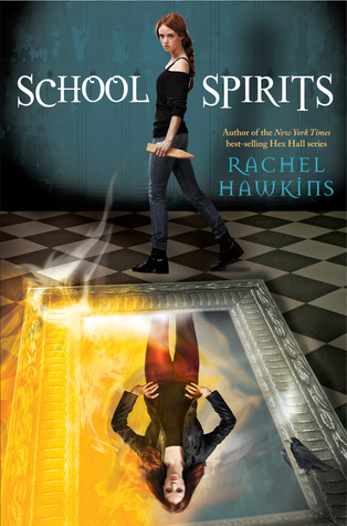 While not my favorite covers ever (they're sort of...Disney, which makes sense since Disney-Hyperion published them), I think that I approve of the similar theme. I like the new title font.
Not my favourite covers too, but at least the spin-off covers are darker than the original.
While not my favorite covers ever (they're sort of...Disney, which makes sense since Disney-Hyperion published them), I think that I approve of the similar theme. I like the new title font.
Not my favourite covers too, but at least the spin-off covers are darker than the original.
 So I'm not sure what they were thinking with this cover but I do not like it. Perhaps I'm the only one but it just looks so wrong next to the other Rot & Ruin books.
 oh wow... no... I don't like that at all. It's very poor graphics first of all.

 That does not look good...specially comparing it to the first covers.
I haven't read that series, but I've always thought the covers were awesome. Now this one? Not.
what is with the eye make-up...?
 Yeah, er, not a fan of that latest cover. I haven't read the books yet, but if I was looking at the series for the first time I'm not sure I'd pick it up if that was the first book I saw.
 I'm really not a fan of the Rebel Heart cover (book 2 in the Dust Lands series by Moira Young). It looks like there's a stick coming out of the dude's butt:

Like, seriously, graphic artists should know better. It's composition one-oh-one not to put anything behind the focus of the piece that the eye could misinterpret as being attached to the thing that should be focused on.
Aggghhh...I liked that cover until now. Unfortunately, it can't be unseen anymore. :p I so get your point though.
Stacia (the hype killer) wrote: "Aggghhh...I liked that cover until now. Unfortunately, it can't be unseen anymore. :p I so get your point though."Ditto =/
I still love Jack, with or without a tail.
Emi: ruining covers since 2012
It's really pretty. It's a good image for the title because it does give you a sense of 'earthy'.
Daniel wrote: "
I love this cover and don't know why"
I think the new covers for that series are great and do a better job of conveying that it is a sci-fi book, and I'm glad they found a cover design that will be more appealing to boys as well as girls - I think that, while I loved the cover of the first book, it was pretty darn girly. It was AWESOME, though, because the little sucker was reversible! You could have pink and purple kissy space faces, or you could have the blueprints of the ship. AND THAT WAS BADASS.
I get the reason for cover changes, particularly with this series. But damn, they have changed the covers for this series with every book! I wish publishers would get these cover changes under control, or at least make better decisions the first time. OR THE SECOND TIME. Or release the book with two covers. It's one thing if it's a 15-book epic fantasy series and the covers of the first books are from the 1980s and are in desperate need of being updated. A YA trilogy that has a book out every year but has undergone 2 cover changes is something else.
message 839:
by
Stacia (the 2010 club), groupaholic, YA-MA founder
(last edited Jan 08, 2013 02:15PM)
(new)
I just wish they'd pick something to start and stick with that. Although, I like the concept of a reversible cover. That's a great idea!Cover changes make more sense when a series is re-releasing as a set or the series is old and needs an update to be relevant. Then, it's not so bad when all of the covers are released together, so people can purchase the entire series together as one cohesive unit. But we've seen far too many instances lately where people own book 1 already, yet are stuck buying a different cover design for book 2 which doesn't match. And that stinks.
For a sci-fi series which isn't as romance heavy (although I haven't read the second book to know if the romance is pushed harder in it), I'd almost always rather see something that's more neutral/appeals to a broad range of people in appearance.
Pink and purple kissy faces scream 'heavy romance' to me. And I'm perfectly okay with heavy romance books because I read those too, but I'd rather not see a heavily romanticized cover on a book which has more to offer than just romance.
 Yeah I have wondered why books have so many covers. It makes it confusing for me when I am looking for books.
It's also highly annoying when I want to get the entire series with the same cover theme -___-
Elaine wrote: "It's also highly annoying when I want to get the entire series with the same cover theme -___-"
Yeah I have wondered why books have so many covers. It makes it confusing for me when I am looking for books.
It's also highly annoying when I want to get the entire series with the same cover theme -___-
Elaine wrote: "It's also highly annoying when I want to get the entire series with the same cover theme -___-"Yep. I have tried and failed many times.
I am not sure if I like the guy chosen for Finnick
OH WTF...I posted this in the wrong topic.Watch those pics go poof magically and reappear somewhere else.
 What's with girls on swings?
 Jessica Warman: Between
 Christopher Pike: Thirst N. 1 (Italian version).
And there was another one that looked exactly like those two, but I can't remember the title right now. Anyone?
Also, while the symbolism works well for "Between" (the main character is virtually "swinging" between life and death), it's totally off when applied to "Thirst" (but then again, even the Italian title is off..."Preda" means "Prey", and you are led to believe that the lonely and apparently helpless girl on the swing is actually stalked by someone or something! Thank godness they correctly named the sequel "Sete", that is, "Thirst").
message 847:
by
Stacia (the 2010 club), groupaholic, YA-MA founder
(last edited Jan 10, 2013 12:29AM)
(new)
I think I know which book you're talking about because there is another one I've seen recently which has the same girl on a swing, but I can't remember the name.There tend to be "trends" in book covers. Hand holding, girls underwater, etc. Every few months it's a new thing. Stock pictures tend to be adapted for multiple series, that's why so many covers look alike.
Even though I think the Mythos Academy series is a lot of fun, I'm not a fan of the newest cover. All I see is awkward boobage.

 I really like the cover to the book Pure.
I found it beautiful and elegant. (The book was really good, but not what I'd call elegant.)

Hah! Figured out how to post cover pictures.
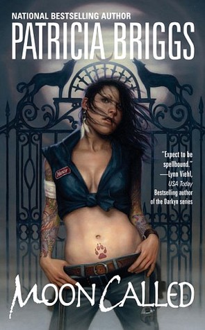
A cover I really didn't like was from Moon Called. It almost made me skip reading the book. My image of her is so not like the picture.
 I think the 'girl on swing' cover you're talking about is
 .
.Stacia, The Mythos Academy covers remind me of The Vampire Academy covers....wow, even series name is similar!
Carina wrote: "I think the 'girl on swing' cover you're talking about is ."
Thank you...and now that I can look at it again, it's almost exactly the same pic used for "Preda" (apart from the background)! Only the hands and the chains' positions are a little different.

Rated YA-MA
Books mentioned in this topic
Feuerhimmel, Sternennacht (other topics)Of Fire and Stars (other topics)
The Wrath and the Dawn (other topics)
Ink and Bone (other topics)
Paper and Fire (other topics)
More...
Authors mentioned in this topic
Cinda Williams Chima (other topics)Cinda Williams Chima (other topics)

You're welcome to re-post about your cover over in the promotions area though. :) I'm sure a few of us would love to help out and give our opinions!