
Did You Notice Something a Little Different?
UPDATE: Thanks for all the feedback! For those of you who were having issues with blurriness, we have good news: we pushed out an update this afternoon that improves the sharpness of the font for users who were affected. We’re monitoring all the comments and will keep you posted on any further updates.
If you’re a frequent visitor to Goodreads, you've probably noticed a few tweaks we’ve made to the fonts and colors on the desktop site today. Our goal with these small-but-important changes was to consolidate and refresh our visual styles and lay the groundwork for some design improvements that we’re planning in the future.
What’s different?
To enhance the readability of text on Goodreads, we’ve adopted two new open-source fonts. Lato, our sans-serif font, was designed by Warsaw-based designer Łukasz Dziedzic (“Lato” means “Summer” in Polish). Merriweather, our serif font, was created by Eben Sorkin and was designed to be pleasant to read on screens.
To make it easier to scan the page for information you need, we’ve touched up and modernized the design of common page layout elements like section headers, tabs and links.
To simplify and modernize our visual design, we’ve reduced the number of link colors we use, removed gradients from buttons and the site navigation, and applied a more harmonious color palette to interactive elements such as buttons, stars, and links.
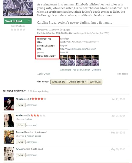
Before:


Comments Showing 801-850 of 3,113 (3113 new)
 Constructive criticism: The contrast with the new colors is lower than before and should be improved. There are many very bright colors with very slim letters as text which means that there is very little perceivable difference between background and text.
 Emily wrote: "Ha! How did you know? :)"
The fact that you're STILL not addressing the numerous complaints about the background being too bright for this font, making your site physically painful to use, makes it kind of obvious. :)
And with that, I'm out, as I literally cannot read any more of this discussion.
 argh, I like the IDEA of making things more accessible, but I wish it were just an option.
The font is big, ugly and blurry, making my eyes do more work when it comes to reading. The lack of headers means there's more white on an already very light site. It hurts my eyes.
The link colour updates and the simplified button colouring look plain, but don't hurt how I use the site at all.
The new font and spacing are a nightmare on my eyes, though. Honestly wish it were just an accessibility option.

 It's to blurry...can you please change it back...its just hideous!
 Do not like it. The other front was easier to read. Also the pages are to white now my eyes are straining to read it. I liked the cream color to highlight things made the page more alive.
 Maybe make it so that people can choose wich setup they like most in there personal settings.
I really hoped to like it but after using the site for a while with the new setting I can barely read the text anymore.
 Agreing with earlier comments about the background. You need to have contrasts on the site or there will be a mass exit :(
Another issue is the autor links that doesn't work.
 Thank you so much for reacting to our comments so quickly! The fonts look so much better now, I can finally read and write on this website again. Great work!
What still bugs me though is the bold font I highlighted in this picture:
 I like it, it does look modern and cleaner. Now please do me a favor and address the sign in page - it's old and definitely not modern looking.

 I don't mind most of the changes, but the progress bar on what people are currently reading is really hard to see now.
 That's one of my favorite features on here; maybe, could that get fixed?
 The stark white background is a huge problem, IMO.
 Looks much better in Chrome, but still a bad choice for the font type, IMO.
 I don't like this font, but I guess I'll just have to embrace it. I liked the other font better.
 I hope I can get used to this new update and learn to like it.
 Morgan wrote: "I don't like it that now when you are currently reading a book and you update on what page you are on, now you have to guess the percentage instead of just putting the page number in. It is REALLY ..."
Morgan, try clicking on the percent sign when you do an update. It should change to a page number view instead.
 Hayley Ann wrote: "I don't mind most of the changes, but the progress bar on what people are currently reading is really hard to see now.
 That's one of my favorite features on here; maybe, could that get fixed?"
That's true. You can barely see the outline of the progress bar.
 The new serif font is really hard to read, no matter at what size I put the text. It slows down reading, I feel stuck to the single letters instead of reading words as with the old font.
 Yes... again a change without asking or voting or anything. It makes things difficult to read. Not cool guys.
 The font is much better in Firefox, but the painfully white background is still painful :(
 Not much of an improvement in Chrome, no matter font size.
 Have pity on readers who already wear glasses (trifocals) because we love reading so much. The small font is too small and too light to see well. You just spoiled my Goodreads experience.
 Kim wrote: "Kim wrote: "This font is very hard to read. It looks like the pixels along the top of each line of text is missing. Everything feels very small and blurry. Is there an option to revert back to the ..."
The text size and clarity has improved greatly, but overall it is still blurry and hard to read. I can actively feel my weaker eye struggling to focus. I've spent about 10 mins on the site today reading comments and have terrible eye strain.
 Hey are you going to bring back being able to widen and shrink the text box size? Cause some stuff that I do on here involves my needing to make the text box wider and longer.

 This is so much cleaner. Ignore all the hate! Good work.
 Couldn't hate it more: too hard to read - if you have user usability folks, they failed you! Please rollback the changes asap.
 It's just too much. The white is too much. Make a theme choice or something.
 Bolded text is fine, but the regular text isn't easier to read. In fact, it makes it harder to read. It doesn't flow right and is too slim, so it gives the appearance that some of the letters are slimmer than others, though upon closer look you can see they aren't, but scanning the text it tricks the eyes into thinking there is something wrong with it.
 I mostly like the changes but does the serif font seem a little blurry to anyone else? (Yes I am wearing my glasses)
 Nici wrote: "Thank you so much for reacting to our comments so quickly! The fonts look so much better now, I can finally read and write on this website again. Great work!
What still bugs me though is the bold ..."
Weird!! Still on Firefox? We'll check into it.

 Lanko wrote: "Can you guys make it better to separate our comment updates while reading a book?
 Sometimes it seems they are all meshed up, specially when we write a lot and separate the comments with paragraphs..."
More than you get on Twitter.
 Well, at least this answers my question of whether something weird has gone wrong with my browser - apparently it's meant to look like this!
It may mean I can't use GR as often as before, though. The layout changes make it ugly and archaic, but that's just a matter of taste, so some will disagree. But the font literally makes my eyes and head hurt trying to read it. Everything is blurry and gets lost in the background. Clearly no concern has been paid to legibility or useability.
On the plus side, as someone who grew up with late-90s-internet-pages, as least the new font and design principles are pleasantly nostalgic for me. Will your next move be to make the background black and the font all luminous green? Can we have some tiny animated gifs of 3D models? Splash pages? MIDI!
[the sizes and prominences are also all wrong in terms of where you should be directing my attention]
But seriously, aesthetic taste aside: PLEASE, PLEASE use something that I can read for more than ten minutes without getting a migraine.
 it's all gorgeous here :) thanks for your creativity.


 Love the font and other changes, but the color of the hyperlinks is nearly impossible to notice a difference between it and the black text when it's inline with other words.
 Really like the new fonts. Am in favour of the changes overall and I love the shade of blue used.
you could try having a darker non-white border background like facebook on the home screen. that reduces the headache-inducing total whiteness.
Really like the new fonts. Am in favour of the changes overall and I love the shade of blue used.
you could try having a darker non-white border background like facebook on the home screen. that reduces the headache-inducing total whiteness.
 I disagree that these fonts are easier to read. There are some areas of the letters that are so skinny it's like the letters look patchy. The new layout is fine, colors are fine, but the fonts are wayyy worse.
 Okay, now that the font's rendering properly, I could certainly get used to it, but it's unpleasant. And I still hate the new modernized/blog-era look and don't think it matches with the purpose of the site as well as the old design. There should at least be the option to change it back.
 After following this trail for a while my eyes are LITERALLY killing me.
Your font choice is simply awful.
I am not sure whether I am willing to continue the torture of reading in here
 I'm not a fan of the changes. Please give us a choice of style.
 Font is finally more readable, but still not a big fan. The colors of the links need to be more distinguishable. It's hard to tell the difference.
 I don't know why it would be doing this suddenly, but now when I click on my individual notifications, it's not taking me to the first un-read thing in the thread. It's taking me to some random part of the conversation that's 'new.' This generally only happens when there's been several comments since the last time I was in a conversation.
Is this a bug with this new change?

As it stands now, my eyes won't be getting used to it. It's too blurry/unfocused. It's not an issue of trying to get used to a change - if I went to any website that used this font, I'd click off. But I think there's an issue and it's not supposed to be this unreadable for most people, so I'm crossing my fingers. I'm not against change in itself just to be against it.