
Did You Notice Something a Little Different?
UPDATE: Thanks for all the feedback! For those of you who were having issues with blurriness, we have good news: we pushed out an update this afternoon that improves the sharpness of the font for users who were affected. We’re monitoring all the comments and will keep you posted on any further updates.
If you’re a frequent visitor to Goodreads, you've probably noticed a few tweaks we’ve made to the fonts and colors on the desktop site today. Our goal with these small-but-important changes was to consolidate and refresh our visual styles and lay the groundwork for some design improvements that we’re planning in the future.
What’s different?
To enhance the readability of text on Goodreads, we’ve adopted two new open-source fonts. Lato, our sans-serif font, was designed by Warsaw-based designer Łukasz Dziedzic (“Lato” means “Summer” in Polish). Merriweather, our serif font, was created by Eben Sorkin and was designed to be pleasant to read on screens.
To make it easier to scan the page for information you need, we’ve touched up and modernized the design of common page layout elements like section headers, tabs and links.
To simplify and modernize our visual design, we’ve reduced the number of link colors we use, removed gradients from buttons and the site navigation, and applied a more harmonious color palette to interactive elements such as buttons, stars, and links.
Before:


Comments Showing 851-900 of 3,113 (3113 new)
message 851:
by
Michelle
(new)
Dec 15, 2015 01:36PM
 This font is much more difficult to read than the prior version.
flag


 The site looks so empty now ): And it's so confusing without the coloured headers! Honestly it makes the site look a bit unprofessional /:
 I liked most of the changes, except the way book titles are shown in the home page:
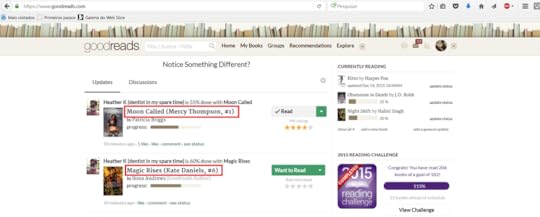
They're "too heavy" on the eyes. A smaller or grayer font would look better, IMHO.
 I could care less about the font but the add author button hasn't worked since you made the change.
 Thanks for your work, GR team!
 Although many people seem not to like the new layout, some of us actually appreciate the effort and are happy to see you're trying to make it look more modern and cleaner.
Also remember that many other massive websites changed their layouts and got drowned in complaints, but people got used to it in the end and forgot about it.
Keep up the good work! :)


 It will probably take me some time to get used to it. I do not think that the new font is easier to read than the one before. The main page looks like it's under a reconstruction or something - the styles and the fonts doesn't seem to go well together. This Christmas update is definitely not what I wished for. No personal offence meant, just offering my feedback.
 Allison Ann wrote: "I could care less about the font but the add author button hasn't worked since you made the change."
We have a fix for this issue that will go out later this afternoon! Apologies for the trouble.
 Can't you change the background to a non-white colour? It's killer on the eyes.
And yes, the font is still god awful. Headache and strained eyes
 alright I actually like the font, but some of the 'special characters' are really annoying...
( & ) for a stylized font this looks good, but for an everyday font it's really annoying.
( ? ) please. no.
 Ugh, just as I was going to start back up reviewing on GR since I liked the font...
but now it's this sharp pointy font. Hate it.
 Btw (and yes, now my eyes are physically hurting why are you doing this to me please please won't you stop), it's kind of annoying me that of the three little notification things in the top right hand corner, the notification box for updates is lower than the notification boxes for messages and friend requests.
Also, WHY are you replacing all instance of i with dotless-i after f? If I wanted to type 'fı', rather than 'fi', I'd use the dotless ı myself. And how are people supposed to write Turkish titles correctly now? These are two different letters!
 Vikjö wrote: "Thanks for your work, GR team!
 Although many people seem not to like the new layout, some of us actually appreciate the effort and are happy to see you're trying to make it look more modern and cl..."
Getting used to something isn't the same as admitting it's better or a good use of time and resources.
Decisions like this also make it hard to trust the website to make useful changes, or the changes that have been on the stack for however long, in the future.
 Nice, clean, modern interface. Very attractive fonts. Thanks for the hard work!
 I really don't want to be a hater, but this new font makes my eyes hurt. It's kinda blurry and small and so difficult to read :(
 WTF is up with all the different fonts?!?! Too damn sloppy. Pick 1 font and stick with it.
 I'd prefer larger font sizes in general becuase these feel even smaller than the ones before . And please make the fonts slightly thicker too. When the font is bolded it looks really nice but regular not so much, sorry. The problem is compounded when in italics mode.
 I do like the more uniform design regarding colours but I'd love if you used a less bright background white - eye strain is significant. And yes, I miss the frame for individual reviews.
Editing options when writing reviews need to change - i.e. no manual typing of html code for bolding text or similar. THAT would be really nice.
 I don't like it..... it now looks a lot like Amazon font and is harder to read . I spend a lot of time logging in my reviews and I liked the previous font but didn't like all the business in the margins blinking and flashing in my face every time. This is harder to read at a glance, and the links are harder to find in a rush. :-(
 Seems like the font got bigger, and the comment box got a fix...
 Still gotta love that awesome background, though. Perhaps a nice tan, or beige, like an old book page? Pretty please?
 The new font is super fuzzy on my phone. I hate it. It gives me a headache ;there isnt enough contrast between the words and the background. Because the serifs in this font are so thin and angular it actually looks like a lighter color.
 The whole bright thing isn't working. The dull background was was easies on the eyes. I like the other one better
 The font is difficult to read, looks... hazy, not clearly defined.
And why would those gradients be removed, or even the link colors showing some sections separately? They seemed all right where they were. But I guess that's not much of an issue. The fonts are, however. Really bad choices.
 Good grief. I only just noticed the question and exclamation marks. What is this?! Looks like I'm reading a comic book and doesn't fit with the rest at all.
 The size is better, but is it possible to make it bolder without overdoing it too much?
 Annika wrote: "I just found another issue with the updates. I cannot add the authors anymore (from the add book/author link) Books are ok but autors doesn't work. Am I the only one with this issue?"
I am also having this problem (using Chrome browser). I can't add authors or even search by author. The author tab highlights as if I have selected it but it acts as if it is still on the book tab.
Please fix this quickly as I use this feature quite frequently!!
 Everything is just too small and some letters seem to disappear into the background. I've tried it on Chrome, Mozilla, and IE and they all look the same. I appreciate Goodreads' attempts at improving usability and readability, but the font (and it's size) as it is right now is not user friendly.

 Thank you for responding so quickly to try to improve the update. It is more readable. I don't like it as much as the previous font.
 I'm going to have to add my name to the list of people saying that the new font is harder to read. It looks extremely blurry and tiny to me now.
My eyes are hurting, because of the background being so bright and white. The color scheme is annoying, I like the other better. The front was better BEFORE!!!
I'm going to have to add my name to the list of people saying that the new font is harder to read. It looks extremely blurry and tiny to me now.
My eyes are hurting, because of the background being so bright and white. The color scheme is annoying, I like the other better. The front was better BEFORE!!!
 Paganalexandria **wicked juices bubbling over** wrote: "Hate this. It actually makes it harder to read. you need to bold it or something."
Yes! Font is too light and TOO SMALL.

 Goodreads.. if you had technical sense.... you would remember LOTS of people had problems with microsoft update KB3013455. They did what you just did.. tried to fix a problem that did not exist and screwed things up even more!!! way to go.. I got it somewhat readable on firefox... but eh.. next time you all should try something called BETA testing.
 As a designer I must say - this is so much better! Hope you'll continue on this path and soon enough it'll be even more awesome and contemporary-looking!
 ....not eye friendly at all... not that it was before ... it's a good thing I use Stylish and turned the entire site dark...


![Lala_Loopsie [fire breathing B!tch Queen]](https://images.gr-assets.com/users/1477498129p1/41378358.jpg) I'm indifferent. I use the app on my phone usually, since it's handy.
I'm indifferent. I use the app on my phone usually, since it's handy.
 I find the font more difficult to read as well...
 This font makes everything harder to read. Terrible.
 The font was readable before. This actually makes it harder to read.
 The new fonts don't enhance the readability at all. They're fairly awful. Everything looks fainter now.
 Kind of hard to read the website. The screen is too bright or something. Might be the font. I can't really tell.

 Quite agree about the new fonts being hard to read.
 And be sure I'll miss the gradients on the "add book" button.
I'll need some time to adapt...
 Too hard to read. Obliviously who ever set it up has no problem reading it but forgot to take into account that not everyone has the same kind of eyesight.
Is the font uniform throughout the site or is it my browser? Font seems to be different in my friends' review pages and comments to them.
Too hard to read. Obliviously who ever set it up has no problem reading it but forgot to take into account that not everyone has the same kind of eyesight.
Is the font uniform throughout the site or is it my browser? Font seems to be different in my friends' review pages and comments to them.
