
Melissa C. Walker's Blog, page 39
December 2, 2010
Cover Stories: Dayling by Gabriel Madison
[image error]
When I saw the cover of Gabriel Madison's
Dayling
(which was released yesterday), I couldn't stop staring at those glowing eyes. I had to find out more about the cover, so here's Gabriel to share:
"I was going through a phase of reading YA Urban Fantasy books with the face of characters on the covers. I wanted that for Dayling. So when the publisher sent me a form to describe what I wanted the cover to look like. I sent them this: 'I see a teenage girl, with long curly black hair and emerald green eyes, wearing a Pullover Hoodie, with the hood pulled over her head. The girl is glancing to the left, as light comes from the top right corner. The rest of the cover is in black, except for the title.'
"I was blown away when I saw the cover. I loved it. I remember opening the e-mail and sitting there for a moment with a silly grin on my face. Even though I described what I wanted the cover to look like, I never thought it would look like that. The girl. The eyes. The title. The way the girl is clutching her Hoodie. Even how the light coming from the top corner of the book is barely visible looked amazing to me. After I stared at the cover for a moment in silence, I pumped my fist in the air a few times from excitement. I know that was a geek move, but I was in a geek mood!
"They wanted me to write a tagline for the cover. I wrote one and the publisher wrote one. They basically combined what we both wrote. Actually, the publisher wanted to use a line I wrote in my query letter. So they combined the tag I wrote after seeing the cover, with a line I had in my query to create the tagline: Times were a lot simpler for Haven before she stepped out of the shadows... and into the eternal night.
"The cover designer, Traci Markou, did a great job. The only thing that was changed a few times was the tagline. But the cover itself stayed the same.
"I loved the cover from the first moment I saw it. I have the cover as my computer Background. I haven't found any hidden meanings, and I think I stared at it for so long when I first opened the e-mail I noticed everything in the cover. It represents different aspects of the story. My main character, Haven, seen on the cover looking straight ahead with sunrays raking across her can represent how for most of Haven's life she had secluded herself from the world and how she now wants to be a part of it. She wants to go from being unseen to seen.
"The cover can also represent what she is. In my story there are two types of supernatural beings, Daylings and Nightlings (Daylings turn into Nightlings on their eighteenth birthdays). The light shining on her in the cover represents that she is still a Dayling, because Nightlings can't be out in the sun. So I think the cover represents both parts of Haven's journey... her desire to finally be seen, and her life as a Dayling."
Thanks, Gabriel! This is the most author involvement I've heard of -- a form describing what you see as the cover! -- so congratulations. I think it's a striking one.
What do you guys think?


December 1, 2010
Win-It Wednesday: Rosebush by Michele Jaffe
[image error]
Last week's winner of
When the Stars Go Blue
by Caridad Ferrer is... Em from Love YA Lit! Send me your address, Em.
This week, I'm giving away an ARC of Rosebush (read a review from Forever Young Adult) by Michele Jaffe of Bad Kitty fame. I met her at a wedding last year (there's us with the gorgeous Dixie-bride, below right) and she is witty and fun and lovely all at once! Delightful. As are her books.
Easy question this week, but one I'm always wondering about: What are you reading? Right now! What book(s) are you in the middle of? I'm reading Room by Emma Donahughe (my first non-YA in a while), and I'm riv-et-ed.
[image error] PS-One favor? Tweet or Facebook this. It is INCREDIBLE and every organization that needs books should know about it... "Amazing! Help @Readergirlz donate 125,000 great books to low-income teens http://su.pr/2bQ3Cz (Pls RT!) #novelgift"
[image error]
November 29, 2010
Cover Stories: She's So Dead to Us by Kieran Scott
[image error]
The fantastic Kieran Scott is here to talk about title changes, taglines and Tiffany blue on the cover of her latest novel,
She's So Dead to Us
(I've heard her read from it, and in case you're not familiar with her books, Kieran -- who also writes as Kate Brian -- pens a great novel).
Here she is:
"The story of my cover is all tied up with the story of my title. When I first pitched the idea that eventually became SHE'S SO DEAD TO US, it was titled RETURN TO ORCHARD HILL. In my mind it was a coming-home story wrapped up in a romance. I had all these thoughts of Dawson's Creek-style, sepia-toned images of autumn trees and quaint neighborhoods. It was all very romantic and dreamy.
"Unfortunately, my publisher didn't love the title. It sounded too old-fashioned and literary. They wanted something more immediate. Something that would grab the reader, rather than lull them into a state of nostalgia. So I went back to the drawing board. I came up with lists and lists of potential titles. I brainstormed with my agent and I brainstormed with my editor. I even brainstormed with my sister and my best friend. But somehow, we couldn't all get on the same page. There was one title we all liked, but we already knew there were going to be three books, and we couldn't come up with accompanying titles that made sense. We went back and forth about this for weeks, until it was basically do-or-die time. Catalog copy had to be set. Covers had to be made. We were playing with fire.
"We wanted something that would evoke the idea of 'you can't go home again,' but we also wanted romance. It seemed impossible to have both. Then, one day, my editor sent me a mock-up that the talented Krista Vossen had put together. It was a light-blue cover with a broken strand of pearls and the title SHE'S SO DEAD TO US. The title had been the brainstorm of someone in marketing, I believe. And a brilliant editorial assistant (ahem, Julia Maguire), had come up with the tagline 'Born with a silver spoon, living with a plastic spork.' I took one look at the package and fell in love with it. The cover, in my opinion, is drop-dead gorgeous. And what female among us is not attracted to that Tiffany blue? The romance angle was, clearly, not present, but at this point I had resigned myself to the fact that I couldn't have it all. I had to hope that when readers opened the book and saw the alternating points of view, they'd see what it was all about.
[image error] [image error]
"The first cover I saw had a different font (above, see two earlier versions), but in essence the design remained the same from there on out. When I saw the final version I flipped over the embossed, raised pearls. The whole thing just feels so elegant to me, and you don't find a whole lot of elegant on the YA shelves. Some, but not a lot.
"The CODA to all this is that the cover is going to change for the paperback version. It's going to more editorial. I haven't seen the mock-up yet, but once I do, I'll let you know what I think!"
Thanks, Kieran! I agree... elegant. And the subtle tweaking of fonts and pearl placements really does make the final cover seem like a more polished version. Can't wait to see the sequel, He's So Not Worth It (another great title)!
What do you guys think?
November 26, 2010
Photo Friday: Thankful for Mom
I'm home in Chapel Hill visiting my mom, and I've been meaning to share these photos from her first wedding. How lovely is she?!
[image error]
With my grandma, getting ready:
[image error]
And with me, at my wedding (because you guys know I use any excuse to post more wedding photos):
[image error]
Happy Thanksgivings! Hug your families!
[image error]
With my grandma, getting ready:
[image error]
And with me, at my wedding (because you guys know I use any excuse to post more wedding photos):
[image error]
Happy Thanksgivings! Hug your families!
November 23, 2010
Cover Stories + Win-It Wednesday: When the Stars Go Blue by Caridad Ferrer
Last week's winner of A.S. King's Please Ignore Vera Dietz is... Lauren! Send me your address, L.
This week, I have a copy of a gorgeous new book to give away...
[image error] A dancer driven to succeed.
A musical prodigy attempting to escape his past.
The summer they share.
And the moment it all goes wrong.
I first saw Caridad Ferrer's cover for When the Stars Go Blue when I was in Spain, so I have extra love for it. I did a quick story about it back then, but here's a fuller version from Caridad (with spine view, which is my new obsession):
"Since the cover was equal parts dance and drum and bugle corps, I was thinking that at the very least the cover might show a dancer, maybe standing outside or preparing to step from a stage to a football field or something to that effect. Maybe looking from backstage onto the expanse of a field with stadium lights. I did honestly think they'd employ the outdoors, especially with the word 'stars' in the title.
"I gave my publisher was the link to an artist whose work I absolutely adore, Fabian Perez. He's an Argentine artist whose work I discovered in a gallery while on vacation in La Jolla, CA. I fell so in love with it, mostly because his pieces so evoked the spirit of Carmen and of dance and passion. [image error] He has an entire Tango series that's magnificent but it was the piece called Flamenco that I kept coming back to, time and again, and that my husband, dear man that he is, bought me as a celebratory gift for having sold the book (there it is, right). So when editor asked for input, I of course sent her a link to that piece as well as several others of Perez's that I admired (oh, to have scads of disposable income...).
"When I first saw the cover, all I could think was that they'd truly taken their inspiration from my favorite piece, because it is so unbelievably evocative of Flamenco. I made noises that set dogs in Australia to howling. And then proceeded to pet my screen for the next several hours. I was honestly just that overwhelmed. There were three stock photos that were combined to create the cover. It was so beautifully done, it appears seamless.
"I was so thunderstruck by its perfection that it was actually my editor who suggested that my name be bigger on the cover. *g*
"I absolutely adore the cover -- especially once I saw the finished version on my author copies. It's a matte finish, which gives the image as a whole some depth and texture that it lacks as a glossy, I think, and rose petals wrap around to the back and I think, my absolute favorite part is on the spine, there's a rose, dead center that almost appears to glow. It's absolutely gorgeous! (I included I shot I took the day I received my author copies-- yeah, I was being a dork!)"
[image error]
Thanks, Caridad! I think I've said 100 times how much I adore the elegance of this cover -- and the rose on the spine is the icing on the cake.
What do you guys think? One randomly chosen commenter will win the book next week.
November 22, 2010
Cover Stories: Problems on Eldora Prime by Sandy Lender
[image error]
Author Sandy Lender is on a Goddess Fish Virtual Book Tour, and she stopped by to talk about the covers of her latest book, Problems on Eldora Prime.
The tagline intrigues me: "Some days, you just want the dragon to win."
Cool, right? Here's Eldora:
"You have probably heard how much authors get frustrated by the cover design that ends up on our books, but I've been lucky with all my books with all three of the publishers I work with. And I love both covers for Problems on Eldora Prime. That's right, the book has two covers. Let me explain that bizarre situation.
"You wanted to know if I had an idea for the cover already in mind as I was writing the book and that's a 'no.' I wrote the book as part of a three-day novel writing contest, so all I was thinking about was write, write, write for 72 hours. Marketing and cover stuff wasn't on my mind until after the publishing process was well underway about 12 months later.
"My publisher did ask for my input because he and I were working closely together on the project. The input I gave was the background picture (and the back cover copy). See, for my day job, I'm a magazine editor, and I had a friend in the construction industry who'd submitted some pictures for an article in that magazine. One of those pictures was this gorgeous scenery shot of the Rocky Mountains. Something about it triggered the memory of a scene from the foothills of the mountains of Eldora Prime in my mind, so I asked his permission to use the picture for my book. He was delighted...as was my publisher.
"The publisher added the silhouette of Khiry (the awesome main character!) and the flying dragon and styled the text. So when I first saw the finished product, I was floored. I loved it. The dragon really stole the show for me. I love dragons, as you can tell from my other books.
[image error] [image error]
"Then we ran into problems with print quality once we got into production, which is always heartbreaking. (The same thing happened with an even more recent book of mine called Desecrated Ring from Keith Publications. The artist had to revamp the fairy ring on the front cover at the last minute because of quality issues, but the second version is still awesome, see above. These artists are far more talented at this stuff than I could hope to be.)
[image error] "This is why Problems on Eldora Prime has two covers. The eBook format has the original cover (above) because it shows up just fine in all the electronic formats. The paperback format has the new cover (right), without Khiry or the dragon, because we had to do a fast-n-furious redo at the last minute during production. So I guess you could say the cover DID change a bit from the original version I saw...if you're looking at the right version. No matter which cover you're looking at, it captures the mood and eeriness of Eldora Prime. I couldn't have found a better image for that planet than what my friend took of the Rocky Mountains.
"Thank you for letting me share the experience with your visitors. If anyone has questions about the process, I'll be checking in to answer them!"
Thanks, Sandy! I have to say that I really like the dragon silhouette flying in the sky, and I wish that had somehow stayed in the second version. But I'm glad both covers have a place, and I think the lighter colors on the second cover work well.
If anyone has questions for Sandy, she'll drop in to answer them. Happy Monday!
November 19, 2010
Photo Friday: Musee Mecanique
The Musee Mecanique in San Francisco is a FAVORITE. It's an antique arcade extraordinaire, and I highly recommend it. Just look at the fun!
The kiss-o-meter rating ruled ("Too hot--let's go again!"):
[image error]
Dave wrestles a smiley masked man (and loses):
[image error]
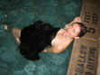
Charles and I play ancient air hockey (he wins):
[image error]
And I took a tiny little video of dancing people. I was enchanted; Charles was unimpressed (and his expression is the best part of this short clip):
Happy weekend!
The kiss-o-meter rating ruled ("Too hot--let's go again!"):
[image error]
Dave wrestles a smiley masked man (and loses):
[image error]
Charles and I play ancient air hockey (he wins):
[image error]
And I took a tiny little video of dancing people. I was enchanted; Charles was unimpressed (and his expression is the best part of this short clip):
Happy weekend!
November 17, 2010
Cover Stories + Win-It Wednesday: Please Ignore Vera Dietz by A.S. King
Last week's winner of Pull by B.A. Binns is... Yasmine! Send me your address, Y.
[image error] A.S. King is the awesome author of TheDust of 100 Dogs (remember its amazing cover?) and the new Please Ignore Vera Dietz , which I flew through recently and just a-dored.
What else do I adore? This new cover. Let's hear about it from A.S. (and remember to comment for a shot at winning the book!):
"I never have any ideas for covers, which, if I think about it, is kinda weird because I'm a really visual person and I went to art school and I do most of my promotional graphic design myself. But NEVER do I think about covers. I just draw a blank or something. I think cover artists are geniuses, so maybe I just know I'm out of my league in that department.
"I do not believe I was asked for input this time around. The art department at Knopf was one of the deciding factors when PLEASE IGNORE VERA DIETZ was at auction. No, not the biggest factor for choosing Knopf, but one little deciding factor because their books are BEAUTIFUL. Absolutely gorgeous. And as a book design geek (and I am one) this kind of stuff matters to me.
"The cover they sent me at first was nothing like the final version you see here now. There were elements I loved about the first try. There were elements I disliked. The people at Knopf were very kind to give it a second shot after hearing my concerns. The final cover is NOTHING like the first try. I'm sorry I can't share the first try here, but having worked in art departments in my life, I am protective of the unused artwork. Genius does take more than one try sometimes.
[image error] "When I saw the final cover for PLEASE IGNORE VERA DIETZ I screamed. I absolutely loved it. I'd just finished reading a paperback of The Perks of Being a Wallflower (left) and it was a similar color green and I just loved the color. And the purple type for my name! YES! And the ZIPPO. I especially loved how the designer messed with that title font and made it all smoky. It's just so original and amazing! (Oohh! And check out the picture of the yellow spine with shiny purple, below. This is my first hardcover, so I was extra thrilled when I discovered that the book sans-jacket, is purple and yellow. I actually screamed again. This was a two-scream book.)
[image error]
"Here's a weird one. Do you remember last time I was here on Cover Stories and I told you that the Flux designer had no idea that I had a thing for red boots, but red boots ended up on my cover for THE DUST OF 100 DOGS? [image error] So, the other night, I was reading in my hometown to a room full of my friends, family, teachers and other hometown people. The question of VERA's cover came up and my good friends were so surprised that I hadn't suggested or mentioned the Zippo lighter because, and I quote, 'Amy, you were the only person in high school who had her own Zippo lighter.' And it's true. And it was exactly like the one on the cover. I still have it. But thank the gods I no longer smoke.
"The photo is a stock image, I believe. I think it is the PERFECT thing to put on the front of this book. I think it totally captures the feeling and is not obscure (though it could seem it at first glance) because Charlie's Zippo is mentioned in the very first paragraph of the book, so I think that helps draw in the reader early-on. I also think it captures the intended 14+ age group for the book."
Thanks, A.S. Ahhh! I totally noticed Charlie's Zippo in the beginning, and that was VERY satisfying as a reader because I like to feel that the cover is TRUE somehow, you know? Anyway, like I said, this book is an edgy, emotional journey and I can't get it out of my head. So you should want to win it, and you have a chance to do that right here in the comments. Just tell me what you think of the cover, and you're entered!
Good luck!
PS-Just for fun, go see a pic of A.S. King in her awkward years on Before You Were Hot. She cracks me up!
November 15, 2010
Cover Stories: Freefall by Mindi Scott
[image error]
Mindi Scott's debut,
Freefall
, has already garnered some impressive praise. The New York Journal of Books says, "In a genre overloaded with bubble-gum-pink teendom and paranormal dark fantasy full of fangs and fur, Mindi Scott's debut novel Freefall stands out as fresh, realistic, young adult fiction... sure to be one of the best contemporary young adult books of the year."
Very cool. And the cover? It's stark and mysterious. Here's Mindi to share the story:
"The day I saw my cover for the first time, I kept my Twitter followers in the loop. But I was secretive about it, so they had no idea that that's what I was doing.
"After hearing a rumor that I might be seeing the cover art, I tweeted this: 'Something cool(ish) might happen today, but it probably won't. I should really unplug the internet so I stop checking my email!'
"A little more than an hour later, my editor sent an email with the subject line 'COVER!!' In her note, she mentioned that at the meeting for the sales, publishing, and marketing team, there were literal sharp intakes of breath around the room when the cover art for Freefall was revealed.
"While preparing myself for what I was about to view, I posted this on Twitter: 'Heart is racing.'
"I clicked to download the attachment and held my breath while I waited. And then, this appeared on my screen:
[image error]
"I stared at it.
"I thought: I love it!
"I thought: It's gorgeous!
"I thought: But... what does it mean?
[image error] "You see, before seeing the cover, I really didn't know quite how this book was going to be marketed. I mean, I knew that Pulse was comparing Freefall to Jason Myers's novel, Exit Here , right. (I like to say that my book is "Diet Exit Here" or "Exit Here Lite.") I knew they were hoping Freefall would have appeal for girls and for guys. I also knew that they were intending to go with a 'mood piece' for the cover and that the characters would not likely be depicted.
"So, I stared at my screen, at this darkness and beautiful broken pieces and thought, What does this awesomeness have to do with being in a band and taking an interpersonal communications class and trying not to be a screw up and falling in love? Connecting with people will bust you up? What?!
"I exchanged emails with my agent, telling him that I loved it, but I didn't quite understand it. He gave me his take. I forwarded the cover art to one or two or maybe three sworn-to-secrecy friends. We talked it through. There were a couple of different interpretations. I quickly decided, though, that it didn't matter if I understood what my cover meant because I was totally, one hundred percent IN LOVE with it.
"Having come to that conclusion, I tweeted this: 'The cool-ish thing happened, and it was everything I'd hoped for. It was even cooler than cool-ish! [/deliberately not telling yet!]'.
"A short time later, my editor emailed asking if I had any ideas for the missing tag line and I said: Oh, gosh. Not off the top of my head, no! I'm not actually sure what we're saying this story is about at this point. :-)
"She responded with: You know, I keep using your line from the book that says Seth was the last person to see his best friend Isaac alive, and the first to find him dead. But that's a little long for a tag line on the cover... that's definitely the hook we're going with, though.
"And THAT is when it finally clicked for me. I had to be hit over the head with the meaning, but I got there eventually.
"So here is the final cover along with the tag line that Alyson from Aladdin came up with:
[image error]
Thanks, Mindi! I agree that it's an arresting cover, and "Sometimes the edge is closer than you think" sounds like a great movie tagline to me! I really like the clear blue playing off the black in both the ice and the type.
What do you guys think?
November 12, 2010
Photo Friday: I'm in San Francisco!
A little family time in San Fran, where a couple of my cousins live.
Today, we visited the California Academy of Sciences, which my biology teacher mother LOVED (and I did too).
[image error]
[image error]
[image error]
Sharks, ideas for saving the world (notice how many involve toilet habits!) and organic, yummy lunch (with my favorite Fizzy Lizzy's grapefruit soda). Yay!
Happy Friday!


![[image error]](http://www.melissacwalker.com/blog/dayling_original.jpg)
![[image error]](http://www.melissacwalker.com/blog/rosebush.jpg)
![[image error]](http://www.melissacwalker.com/blog/medixiemichele.jpg)
![[image error]](http://www.melissacwalker.com/blog/A%20novel%20gift.jpg)
![[image error]](http://www.melissacwalker.com/blog/ShesSoDead_fnl.jpg)
![[image error]](http://www.melissacwalker.com/blog/She%27s%20So%20Dead%20to%20Us%201.jpg)
![[image error]](http://www.melissacwalker.com/blog/She%27s%20So%20Dead%20to%20Us%202.jpg)
![[image error]](http://www.melissacwalker.com/blog/momflowers.jpg)
![[image error]](http://www.melissacwalker.com/blog/MomGma.jpg)
![[image error]](http://www.melissacwalker.com/blog/mommel.jpg)
![[image error]](http://www.melissacwalker.com/blog/when%20the%20stars%20go%20blue%20final_2_2.jpg)
![[image error]](http://www.melissacwalker.com/blog/Flamenco-597x796.jpg)
![[image error]](http://www.melissacwalker.com/blog/spine%20shot%20stars.JPG)
![[image error]](http://www.melissacwalker.com/blog/EldoraPrimeFC1.jpg)
![[image error]](http://www.melissacwalker.com/blog/desring.jpg)
![[image error]](http://www.melissacwalker.com/blog/desring2.jpg)
![[image error]](http://www.melissacwalker.com/blog/eldora2.jpg)
![[image error]](http://www.melissacwalker.com/blog/IMG_1838.jpg)
![[image error]](http://www.melissacwalker.com/blog/IMG_1820.jpg)
![[image error]](http://www.melissacwalker.com/blog/IMG_1817.jpg)
![[image error]](http://www.melissacwalker.com/blog/veradietz.jpg)
![[image error]](http://www.melissacwalker.com/blog/perksof.jpg)
![[image error]](http://www.melissacwalker.com/blog/spine.jpg)
![[image error]](http://www.melissacwalker.com/blog/zippo.jpg)
![[image error]](http://www.melissacwalker.com/blog/freefall-cover-with-tagline1.jpg)
![[image error]](http://www.melissacwalker.com/blog/Freefall%203a.jpg)
![[image error]](http://www.melissacwalker.com/blog/exit-here.jpg)
![[image error]](http://www.melissacwalker.com/blog/photo%2816%29.jpg)
![[image error]](http://www.melissacwalker.com/blog/photo%2815%29.jpg)
![[image error]](http://www.melissacwalker.com/blog/photo%2817%29.jpg)