
Melissa C. Walker's Blog, page 37
January 11, 2011
Dear Bully in Glamour Magazine!
[image error]
You guys may have heard about the upcoming fall anthology Dear Bully, edited by Megan Kelley Hall and Carrie Jones. (The cover's creepy, right? But effective.)
I have an essay in the mix of incredible authors who shared their own stories, which makes me really proud, and the book's back story is in Glamour this month. I had to share the article! Join the Young Adult Authors Against Bullying page on Facebook, too, for stories and anti-bullying strategies. Because haven't we all confronted this in one way or another?
Click below to make the pages bigger/readable.
[image error] [image error]


January 10, 2011
Cover Stories: Deadly Little Games by Laurie Faria Stolarz
[image error]
Laurie Faria Stolarz shared the story behind Deadly Little Secrets, the first book in her Touch series, and she's back to tell us about the cover of the third book,
Deadly Little Games
.
"Since it's the third book in the series, I had an idea of what they might do for the cover. The first two books show a female character (but not her face), in a dark outdoor setting (the woods). Since this book takes place in winter, I knew they'd incorporate snow in some way. I'm happy with the covers to these books. I like how beautiful they look together and the fonts the artist chose. I also like that we don't see Camelia's face. It's more mysterious and it doesn't overly influence how the reader will picture the character.
[image error] [image error] [image error]
"I loved the Deadly Little Games cover right away. I haven't found any hidden meanings within the cover of this book, but with the first book in the Touch series (Deadly Little Secrets), the hand of the girl on the cover is slightly illuminated, hinting at the touch power that the characters have."
Thanks, Laurie! What I really love about this whole series of cover is the sense of movement they have. Also, I'm a sucker for covers that include weather, and I'm especially feeling the snow right now (there's something sparkling and magical about the flakes, right?)... What do you guys think?
PS-Watch the trailer (and enter the contest Laurie's hosting!)
January 7, 2011
Video Friday: Snow Cats!
This is not super exciting, but it's kinda cute. Swayze and Winnie discover snow. As you can see, Swayze is way more adventurous. Winnie's still really shy.
January 5, 2011
Win-It Wednesday: The Things a Brother Knows by Dana Reinhardt
The winner of last week's contest for Sorta Like a Rock Star by Matthew Quick is... Mary Ellen! Send me your address, ME.
[image error] This week, I'm giving away Dana Reinhardt's The Things a Brother Knows. This book knocked me out and made a sob bubble up in my throat near the end. I wrote an email to Dana right after I finished reading it and said, "SUCH an amazing book! An incredible journey. Entertaining and real characters and a non-message message on a really tough subject." So, you know, there's my vague review. Here's Gayle Forman's more eloquent one, which was on NPR (the other books she mentions are awesome too, of course).
Anyway, here's your chance to win the hardcover of this incredible book. Just tell me what your favorite holiday gift was, if you celebrated... I'm nosy and curious, and I hope it was a book (but I won't hold my breath). I think mine was the leopard-print Snuggie my brother got me. Um, I'm serious. And no, I won't be showing a photo. But I will say it's great for reading in the winter--my old apartment gets drafty and it keeps me warm and hands-free!
I'll pick a winner next week. Good luck!
January 4, 2011
Violet in Private on Sale!
In case you never got around to #3 in the Violet series, for a limited time Violet in Private is on sale at amazon for $4. I mean, $4, people. Skip your latte and buy a whole world! I am not even being dramatic. Ha!
PS-Aren't you glad that they went with the college-campus cover rather than the original city cover (left)? (re)Read the Cover Story from back in the day!
[image error] [image error]
PS-Aren't you glad that they went with the college-campus cover rather than the original city cover (left)? (re)Read the Cover Story from back in the day!
[image error] [image error]
January 3, 2011
Cover Stories: The Education of Hailey Kendrick by Eileen Cook
Last year, Eileen Cook stopped by to share the story behind her bright, doll-starring cover for Getting Revenge on Lauren Wood. She's back with a new release, The Education of Hailey Kendrick, which Kirkus calls "the highest quality--like a gourmet truffle" in a starred review! This new cover is just as bright as the last (with less doll), and here's Eileen to tell its tale:
[image error] "I have two (or at least two) great weaknesses as a writer. I'm lousy at titles and terrible at imagining covers. I'm so lucky to have the team at Simon Pulse behind me. My editor somehow manages to avoid laughing out loud at my titles ideas and the cover designer, Cara can be counted on to come up with some great ideas.
"The book takes place in an exclusive boarding school so my first idea was having a scene where you see Hailey climbing over the wall to sneak off campus. However, we didn't want it to look like she was breaking out of jail...
[image error] "Cara then had an idea that she quickly sketched out with photoshop where it was the main character in her school uniform with a lollipop (right). The problem was that it looked a bit 'porny.' You have to watch out for those school uniforms -- who knew a blazer and knee highs could be so racy.
"The third time was the charm. When I opened the email with the cover the bright colors and typeface really jumped out at me. It felt like a great fit for the book."
Thanks, Eileen! I agree that the lollipop is a bit much -- it takes over the cover. The final image is just as bright and bubbly, so I think it's a great pick! Also, for some reason I love the look of that brick wall, which grounds the whole image somehow.
What do you guys think?
December 31, 2010
Photo Friday: SNOW
There was major snow in Brooklyn this week. I'm talking buses-stuck-on-the-street, kids cross-country skiing down my block, having to dig myself out of my apartment SNOW. Here's a peek!
I love Hunter Boots:
[image error]
Stuck bus!
[image error]
Cross country skiing on the streets of Park Slope:
[image error]
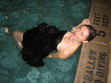
Swayze watches the chaos:
[image error]
And this is how much I love iced coffee from Dizzy's, even in winter. Delish.
[image error]
Happy Friday!
I love Hunter Boots:
[image error]
Stuck bus!
[image error]
Cross country skiing on the streets of Park Slope:
[image error]
Swayze watches the chaos:
[image error]
And this is how much I love iced coffee from Dizzy's, even in winter. Delish.
[image error]
Happy Friday!
December 29, 2010
Win-It Wednesday: Sorta Like a Rock Star by Matthew Quick
Sorry it's grainy! Watch the video and comment below by next Weds for a chance to win Sorta Like a Rock Star by Matthew Quick (which is exceedingly excellent).
Happy Wednesday!
PS-This trailer (way more exciting than my vlog) should get you sufficiently psyched for the book:
Happy Wednesday!
PS-This trailer (way more exciting than my vlog) should get you sufficiently psyched for the book:
December 27, 2010
Cover Stories: Hold Still by Nina LaCour
[image error]
I think Hold Still, which is a beautiful book, has gotten two great covers (hardcover and paperback) so I had to ask Nina LaCour about each one. Here she is:
"I was super worried about my cover. My mom used to be a graphic designer so I grew up a little bit of a design snob. My biggest worry was that the art team would make the book look to girly, or too light, that they would strike a tone that didn't suit the story. So when I heard that Mia Nolting (who had been writing out the journal entries in the novel since before I even had an agent) was going to do the cover art, I was thrilled and relieved. I love Mia's work. It's clean and delicate and has this awesome current, indie quality while still being poignant and honest and really moving. Plus, she's my friend. I loved the first concept she came up with: a girl in jeans with a camera around her neck, a strip mall behind her, a layer of text (below). The concept evolved from there to include a girl's face with the camera raised in front of it and another girl spinning in the distance, and I liked this idea of overlapping images. [image error] "Then, I got a call from my wonderful editor, Julie Strauss-Gabel, who told me that people at Penguin were getting excited about the book, and what we thought was going to be a pretty quiet book was actually going to be a 'big' book for the fall season. I was thrilled to hear this news, but bummed to hear that it meant we were moving in a different direction with the cover. Mia's drawings were no longer going to be on it--instead we would be going with a photograph.
"The next cover I saw was a complete departure. It was a photograph of a mournful-looking girl with a large shadow hovering behind her. The photograph was black and white and the title was written in a red computer font. I did not like this cover. The girl was too glamorous and it felt so oppressively sad. Hold Still is a sad book, but I see it as ultimately hopeful. It's funny because this cover was the opposite of my initial fears that the book would look too light and fluffy. Now it looked like it was all about suffering. I panicked.
[image error] "Slowly, though, the cover evolved and I grew to like the new direction (right). The art team held a photo shoot with a different model who looked more like I imagine Caitlin. Mia's embellishments appeared as the leaves in the corner, and one of her early ideas of torn paper also showed up. Her hand lettering replaced the computer fonts, and ultimately it looked like a good cross between the artistic hand done cover we initially dreamed up and the more commercial photographic cover that came after.
"Then, a year later and out of the blue, came news of the paperback redesign. Sara Crowe, my lovely agent, called me and told me that she hadn't seen the cover yet but that it was described to her as 'a girl with her arms out like she's flying.' Yikes! Again, I got worried. But then I saw the new cover (below), and I was blown away.
[image error]
"It still feels sad to me, but it also has the raw hope that fills the last sections of the book. When I showed it to my writing group, one of my friends said, 'That's exactly what you want to feel like when you're fifteen,' something that struck me as very true. Rosie Hardy took the photograph, and it's a self-portrait which fits perfectly with the events in the novel. Theresa Evangelista designed both the hardcover and paperback, and I feel really fortunate to have two such different and striking covers that represent different aspects of my novel."
Thanks, Nina! I love knowing that the paperback image is a self-portrait, and I really do think both covers are winners. What do you guys think?
December 25, 2010
Happy Holidays!
This is my first Christmas away from NC, so we had to do NYC right.
The Rockettes:
[image error]
[image error]
Scenes from Radio City:
[image error] [image error]
[image error] [image error]
Merry, Merry, everyone!
The Rockettes:
[image error]
[image error]
Scenes from Radio City:
[image error] [image error]
[image error] [image error]
Merry, Merry, everyone!


![[image error]](http://www.melissacwalker.com/blog/DEARBULLY.cvr.PW.jpg)
![[image error]](http://www.melissacwalker.com/blog/glamour%20bully.jpg)
![[image error]](http://www.melissacwalker.com/blog/bully2.jpg)
![[image error]](http://www.melissacwalker.com/blog/games%20cover.jpg)
![[image error]](http://www.melissacwalker.com/blog/secrets%20cover.jpg)
![[image error]](http://www.melissacwalker.com/blog/deadly%202%20cover.jpg)
![[image error]](http://www.melissacwalker.com/blog/things300.jpg)
![[image error]](http://www.melissacwalker.com/blog/VIOLET%20IN%20PRIVATE-city2.jpg)
![[image error]](http://www.melissacwalker.com/blog/violet%20in%20private-lowres2.jpg)
![[image error]](http://www.melissacwalker.com/blog/hailey_frontpg.jpg)
![[image error]](http://www.melissacwalker.com/blog/hailey%20kendrick%201.jpg)
![[image error]](http://www.melissacwalker.com/blog/IMG_2034.JPG)
![[image error]](http://www.melissacwalker.com/blog/IMG_2037.JPG)
![[image error]](http://www.melissacwalker.com/blog/IMG_2041.JPG)
![[image error]](http://www.melissacwalker.com/blog/IMG_2027.JPG)
![[image error]](http://www.melissacwalker.com/blog/IMG_2040.JPG)
![[image error]](http://www.melissacwalker.com/blog/HoldStill_112409.jpg)
![[image error]](http://www.melissacwalker.com/blog/hold%20still%20illo.jpg)
![[image error]](http://www.melissacwalker.com/blog/HoldStill_HI.jpg)
![[image error]](http://www.melissacwalker.com/blog/IMG_0362.JPG)
![[image error]](http://www.melissacwalker.com/blog/IMG_0360.JPG)
![[image error]](http://www.melissacwalker.com/blog/IMG_0354.JPG)
![[image error]](http://www.melissacwalker.com/blog/IMG_0351.jpg)
![[image error]](http://www.melissacwalker.com/blog/IMG_0357.jpg)
![[image error]](http://www.melissacwalker.com/blog/IMG_0350.JPG)