
Melissa C. Walker's Blog, page 41
October 27, 2010
Win-It Wednesday: I Was Jane Austen's Best Friend by Cora Harrison
It was so nice to read the comments about all that you guys are doing to make the world a better place -- it definitely put me in a "the world is mostly good" kinda mood, so thank you! The winner of last week's copy of Denise Jaden's Losing Faith is... Samantha R! Send me your address, S.
This week, I have a lovely new hardback copy of Cora Harrison's I Was Jane Austen's Best Friend up for grabs. Can we ever get enough of Jane Austen's world? I think not.
[image error]
I have the US edition, shown on the right (click the image to see the full image in a larger format). My simple question is: US or UK cover? I'm usually opinionated about this type of thing, but I'm torn here. I like all the little illustrated doodads on the UK cover -- flowers, bird, hearts, bow -- but the US cover has that regency romance feel, which I'm starting to fall for.
What do you think? Comment below and you're entered! Happy Wednesday!


October 25, 2010
Cover Stories: Nightshade by Andrea Cremer
[image error]
Everyone is raving about Andrea Cremer's
Nightshade
, and I need to read it! The cover is enchanting, so at least I've got the scoop on that. Here's Andrea:
"I had a couple of ideas for the cover--one involved wolves, shadows, and blood; the other was that it would feature the Elemental Cross, an image that plays an important role in the series. I envisioned a more abstract cover than the image we ended up with.
"My publisher did ask for input and at first we were going for the wolves, shadows, blood thing, but then they found Suza Scalora's art--she's the photographer who shot the cover--and we all loved it so we switched gears and focused on finding a model who could be transformed into Calla for the cover.
"I gasped when I saw the cover, as it was so, so beautiful. It was different then anything I'd imagined, but I couldn't love it more. To be honest I wasn't sure how I'd feel about having a face on the cover, but Suza and the art director at Penguin, Linda, absolutely nailed it. Plus I adore the bloody calla lilies. My editor got to drip the blood on the flowers herself!
"The cover didn't change much from the original version. The blood drop was a bit longer, we made sure the 't' in Nightshade resembled the tattoo on Shay's neck and Calla's eye went from green to gold.
"Suza Scalora did a photo shoot with a model. [Wolfsbane and Bloodrose, the next books in this series, will also be shot by Suza Scalora.]
"I couldn't be happier with the Nightshade cover. It fits the book perfectly--it's alluring, mysterious and dangerous. Calla's face is just as I imagined it; people sometimes ask me about the makeup she's wearing because Calla doesn't wear makeup. To me the cover offers an artistic rendering of a particular moment in the story--the makeup to me represents the twilight shadows cast on her face and the glitter is the sparkle of new snow on her cheeks. I don't take is as a literal depiction and I like it that way."
Thanks, Andrea! I love Suza Scalora's site and all the amazing beauty shots there--you guys should definitely scroll through. I think this cover is so soft and fresh looking on the one hand, and so deadly and evil on the other--such a cool balance. And sparkle. I love sparkle.
What do you guys think?
October 22, 2010
Photo Friday: Fashion High and Squash Soup
On Wednesday I put on a purple skirt and purple tights and headed to the High School of Fashion Industries in Manhattan... It was awe-some. And they're totally all on twitter.
[image error]
They've been so supportive of the Violet books, and they had this lovely display all set up in the library!
[image error]
In domestic news, I made Squash Soup (with homemade croutons!) this week. Here are the ingredients:
[image error]
And the final product:
[image error]
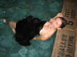
Swayze wanted more...
[image error]
Happy weekend!
[image error]
They've been so supportive of the Violet books, and they had this lovely display all set up in the library!
[image error]
In domestic news, I made Squash Soup (with homemade croutons!) this week. Here are the ingredients:
[image error]
And the final product:
[image error]
Swayze wanted more...
[image error]
Happy weekend!
October 21, 2010
Cover Stories: Girl's Best Friend by Leslie Margolis
[image error]
The Maggie Brooklyn Mystery series is set in my neighborhood, where author Leslie Margolis also lives! I used to adore mysteries when I was a Middle Grade reader, and the first book in the series -- which was just released this month -- is so adorable that I had to ask her how it happened (I love illustrated middle-grade covers). Here's Leslie:
" Girl's Best Friend is the first book in the Maggie Brooklyn Mystery series, which revolves around a twelve-year-old, dog-walking detective. And I must confess - I've been obsessing over what the cover would look like ever since I came up with the idea.
"My editor did not ask for my input directly quite possibly because I never gave her the chance to. When she asked for physical descriptions of my main character and the dogs she walks, I sent those along with this additional note:
"'Brownstone Brooklyn features prominently in the book and it would be excellent to have that represented somehow... I don't want to be difficult at all, but I've been thinking about the look of the book a lot and wanted to send some links to some covers I really like. Here's hoping you find this helpful rather than annoying!'
Harriet the Spy, When You Reach Me and Knuffle Bunny.
[image error] [image error] [image error]
"Reading this again -- over a year later, I'm sure my email was annoying rather than helpful. And maybe I was difficult, too. But oh well. I had to get it out there.
"Harriet the Spy, Knuffle Bunny, and When You Reach Me are three of my favorite books. They are all city stories and they all have striking covers. And Knuffle Bunny actually takes place in Park Slope, Brooklyn, where Maggie lives.
"Maybe this technique worked, or maybe Bloomsbury was thinking along the same lines, anyway. All I know is that a few months passed with no word about the cover. And then one day my editor told me they were looking at an illustrator named Tuesday Mourning.
"I Googled 'Tuesday Morning' and found a website dedicated to discounted gifts and home accessories based in Dallas, Texas.
"I panicked.
"Then I checked my editor's email again and saw that the illustrator's last name is actually Mourning, with a 'u'.
[image error] "I did another Google search, found her blog and fell in love with her work. That's before I even realized she'd done the Paula Danziger re-jackets (like the on on the right). I'm a huge Paula Danziger fan, which made Bloomsbury's choice of illustrator even more thrilling.
"Weeks later the first sketch came in (below, left). My editor sent it to me with the following concerns:
"'...I'm not sure about the clothes. A scarf in September feels wrong, and the hat -- though cute -- isn't really in keeping with the character. [Although] it does add mystery and style... *Does Maggie look too old? I'm not sure, especially since the rendering is so stylized, maybe it's OK. * I love her sideways glance, though I'd like to see just a smidge more of a smile, to make her more inviting. * The dog looks pure pug, not puggle (or, of course, Irish Wolfhound). I'd like to see this be a puggle. I'd also like him to be actively pulling her, rather than posing. Let me know what you think!'"
[image error] "I agreed, completely. Here's my response:
"'Thanks so much for sending this -- I absolutely love this look. Also -- I agree with you on all points. Maggie in Book One is more of an accidental detective so she wouldn't be wearing that hat -- and there are many times in the book where she comments that it's warm so no scarf, either. She looks a tad old but I think if she were smiling and if her clothes were different -- more casual and less sophisticated but still cute she'd look twelve like she's supposed to.
"'Regarding the puggle, here's how Maggie describes him: 'He's got that smushed-in pug face but a thinner body and longer legs.' So I agree -- the face seems close but the body type could change.
"'Also -- the brownstones in the background look fantastic!'
"A week or so later, my editor forwarded me the second sketch (below, right). As you can see, Maggie has lost her hat and scarf and her outfit is more casual. She's also smiling. And there's a shadow in the background to convey mystery, as well as a magnifying glass in Maggie's backpack to show that she's a detective.
[image error] "The puggle is still pretty short, which bothered me at first. But that day, as I walked my own dog past a real, live puggle nearly identical to the one in the sketch, I felt as if the dog-universe was speaking to me and saying this: there are lots of short puggles in the world and why shouldn't they be represented, too? Let this one go!
"So I did.
"Oh, but I did have one other comment. I asked if the magnifying glass in Maggie's backpack could be replaced with a pair of binoculars because Maggie actually uses binoculars in the book. My editor said that binoculars don't say 'detective' in the same way as magnifying glasses. And she's totally right.
"From that second sketch, the artist went to final art.
"And then, I believe, the fabulous Bloomsbury design department took over the task of creating a series look.
"When I first saw the 'maggie brooklyn mystery' banner, it was white and lacked the Brooklyn skyline.
"The next time I saw the cover, it was finished and absolutely incredible.
"When I put Girl's Best Friend next to my worn out copy of Harriet the Spy, I can't help but think that, based on the covers, Maggie could easily be Harriet's long lost, distant third cousin -- one borough removed. Which is kind of how I think of the character, too.
"So all in all, I'm completely enchanted."
[image error]
Thanks, Leslie! Okay, first, I looove the brownstones in the back -- they're perfect! I also think the first sketch makes Maggie look like a fashionable high schooler (cool, but not quite the character). And yes, the dog looks more pug than puggle.
But in sketch two, I love the hoodie/leggings outfit, the adorable puggle, and even the shadow of a (menacing?) stranger on the block. In the final, I think the colors are gorgeous and the title banner is awesome.
What do you guys think?
October 20, 2010
Win-It Wednesday: Losing Faith by Denise Jaden
The winner of last week's contest for You Are Not Here by Samantha Schutz is... Mitzy! Send me your address, M. You'll love this book, even if it makes you weep.
[image error] I featured Denise Jaden's Losing Faith Cover Story last month, and today she's offering up a copy of the book to one lucky commenter! The story deals with assumptions about people, outcasts, and the twisted mystery behind a sister's death. Read more on The Contemps!
Losing Faith is the perfect purply book to show today since I'm wearing purple in support of Glaad's Spirit Day to honor the lives of the GLBT teens who've committed suicide. Go find some purple to wear! (And watch the incredible We Stop Hate video at I Heart Daily -- this organization is one to watch and to make your own video for, asap!).
[image error] So how do you enter to win? Tell me one way that you're stopping hate in your corner of the world. You can say that you're wearing purple or you watched Alyx's amazing video or that you're spreading the word about We Stop Hate or that you stood up for someone recently -- everything counts and adds up to more love. (They're here on Facebook and Twitter.)
Happy Wednesday!
October 18, 2010
Cover Stories: The Good, the Bad and the Barbie by Tanya Lee Stone
[image error]
Tanya Lee Stone's latest book,
The Good, the Bad and the Barbie
: A Doll's History and Her Impact on Us, is earning raves like this one from Lauren Myracle: ""Holy belly buttons! This is no mere Barbie book. This is a how-to manual about being a girl: a strong, sparky, awesome girl, with Barbie in hand *or* Barbie in the nearest Dumpster!"
Love that. Plus, it has a sly, iconic cover. I had to ask Tanya how it came about. Here she is:
"I didn't have a picture of the front cover in my head from the beginning, but once I started playing around with all of the dolls in Peter Harrigan's collection (which we used for the photo shoot), I started thinking about the BACK cover. I pictured a border of heads peering from the edge into the middle of the cover (kind of creepy). I fell in love with the Elphaba doll from Wicked, and thought the Twilight dolls were kind of cool (and again, kind of creepy). In the end, we used a great shot the photographer took of a bunch of the international dolls, in a pinwheel formation. I love it.
[image error] "My publisher did ask for my input. We talked about what image should go on the cover. Should it be a universal favorite (there really isn't one) or not? We all quickly and unanimously agreed it should be the classic 1959 original doll. [See the full original doll, right, with her striped bathing suit and signature white sunglasses in hand.]
"As soon as we knew what doll we wanted on the cover, Karen Pike, the photographer I hired to do a lot of the interior doll shots, talked with the designer about the cover concept. The team absolutely nailed it right away. I love the cover!
"The designer, who I thank on the dedication page, was fantastic throughout the whole process. She definitely took my comments to heart, even though she didn't always agree. And why would she? I'm not a designer!
"I think it's just about the most kick-ass cover I could have imagined for this book. I love the coy, sideways glance of the original Barbie. You can't tell what she's thinking--and I think that plays really well with the themes in the book. Love Barbie or hate her--which way will it go?"
Agreed! I think this cover is bewitching in the best possible way. Those pointed eyebrow arches, those wiley eyes, those pouf bangs. She's iconic.
What do you guys think?
October 15, 2010
Photo Friday: Flowers and Brooklyn and A.S. King
This week, I was a little bit Martha Stewart and a lot bit loving my city. Oh, and I read an awesome book, too. Here goes.
A fall arrangement on the table, courtesy of gourds from the farmshare and winterberries from my aunt's house in Rhode Island:
[image error]
I got Hydrangeas in RI too:
[image error]
Plus, it's been gorgeous in Brooklyn! Love this door with morning glories:
[image error]
And this building on 7th Avenue that always has some sort of sculptural goo on it. Love!
[image error]
Also on my Love List? Please Ignore Vera Dietz by A.S. King. This book is funny, painful, raw and real. You should read it! I wanted to pull off the road to finish it on the drive back from Rhode Island.
[image error]
Happy Friday! What was your week like?
October 14, 2010
Cover Stories: Trance by Linda Gerber
Linda Gerber has another pull-you-in title,
Trance
, out this month. You may remember her cinematic, action-filled Death By... series (remember the covers with the pop-art cut-out covers? LOVE!). She's back to share her new, hypnotizing Cover Story for Trance:
"The cover gods at Puffin have been very good to me. Theresa Evangelista was the designer of the Death by Bikini Mysteries covers, and I knew she was the one working on this cover as well, so trusted it would be fabulous.
"When I first saw the cover, I was happy with it. I really liked Ashlyn's eyes and the trance-esque circles radiating from the title.
[image error]
"In the end, there was just a subtle change, but it made a huge difference. After the first cover mock-up, they decided red would make the cover pop more than the blue. They were so right! I liked the cover in blue, but I love it in red. Plus, it has this cool, iridescent finish on the final version so that it catches the light. Pretty!
[image error]
"Theresa has done it again. I absolutely love this cover."
Thank you, Linda! I agree on the color change. The first one feels colder somehow, but I prefer the warm, red, pulsating nature of the final. What do you guys think?
October 13, 2010
Win-It Wednesday: You Are Not Here by Samantha Schutz, Signed
Last week's winner of
Her and Me and You
by Lauren Strasnick is... Daniel Shelley! Send me your address, D.
[image error] This week, I'm giving away a signed copy of You Are Not Here by Samantha Schutz. The summary: Annaleah and Brian had something special--Annaleah is sure of it. When they were together, they didn't need anyone else. It didn't matter that it was secret. All that mattered was what they shared. And then, suddenly, Brian dies. And while everyone else has their role in the grieving process, Annaleah finds herself living on the outside of it, unacknowledged and lonely. How can you recover from a loss no one will let you have?
This book is written in verse and it is lovely. And yes, it made me cry.
As for your comment task, it is this: Tell me about the last time you cried at a TV show or movie. Watching Teen Mom this week--when Caitlynn and Tyler finally saw Carly again--I was a blubbering mess. I cannot get enough of them, I just think they're so mature and so wonderful and I want them to stay together forever and have a fantastic family and rise above their circumstances. And I hope Caitlynn always keeps her rainbow eyeshadow. They are, as Siobhan Vivian once called them, Teen Angels.
So, your turn: What was the last movie or TV show that made your waterworks flow? I'll choose a winner randomly next week!
October 11, 2010
Cover Stories: The Kid Table by Andrea Seigel
[image error]
Andrea Seigel had some visual ups and downs with her novel
The Kid Table
, but she ended up with what I think is a really clean, funny, standout cover.
Here's how she got there:
"I read your blog all the time, so I know a lot of authors say they're not visually oriented, but I always have covers in my head. In Kid Table one of the main characters tries to burn the table with a lighter, so probably the first image I pictured was of a magnified formal place card with the book's title in fancy lettering, but the place card destroyed with charred edges, chewed gum stuck to it, etc.
"Bloomsbury told me they were scheduling a photo shoot, so they asked what I thought Ingrid, the narrator, looked like and how she dressed. I started to get nervous at that point because I'd never pictured a cover with an actual person on it, but something more conceptual instead. I told my editor that Ingrid wasn't traditionally cute--in the book she says that she'll get called handsome a lot when she gets older--and I gave them actress Emily VanCamp and model Lauren Bush as examples. These were the pictures I sent. You know, strong nose:
[image error] [image error]
[image error] As for Ingrid's clothes, I said she dresses like one of the Robert Palmer video girls (right). In the first event of the book, her hair is slicked back with gel, and she's described as going for simple, sleek mini-dresses.
"When I saw the cover mockup (below left), I had a major meltdown. The emailed image came into my box minutes before I was leaving to drive out to the desert to teach a class, and I just thought, 'Nononononononono.' [image error] I called my boyfriend over to look at the laptop. He said, 'Oh. No.' I'm, uh, fairly emotional, so I immediately hit reply and basically told Bloomsbury that the cover was murdering me. And then seconds later an email showed up from my agent that was like, 'Maybe you should have slept on your response?' But during the three-hour drive out to the desert, I only got more worked up.
"I had a huge problem with the girl's styling. It was incredibly off for me. The girl wasn't right either. I took a print-out of the cover to the desert with me and showed it to a few people that day, and most everyone had comments like, 'Oh, you write a book on babysitting?' Or, 'This looks like something I might buy for my niece, who's in fourth-grade.' At that point I sent another email to Bloomsbury saying that I would reimburse them for the photo shoot if they'd let me have cover control. They didn't take me up on that, but they did agree to keep working on the cover. So then we went through a few rounds where they tried to work with the material from the photo shoot:
[image error] [image error] [image error]
"But I just couldn't get past the girl. (Let me just clear things up here--the model herself is super cute. I'm sure everyone wants to date her at her school.) But those shoes, those tights, that dress--they were killlllllllling me. My agent, who was so great and supportive through all this, stood behind me and said, 'The girl's got to go.' I wasn't sure it would happen. I starting leaning toward the version with 'The Kid Table' in the big white letters because it blocked out as much of the photo as possible. And then a couple weeks later I was walking my dog and a completely new image showed up on my Blackberry.
"I kissed the top of my dog's head in relief.
"I'm not going to lie. I'm a pain in the ass, and I'm nitpicky. So I asked to see some more edgy combinations of objects/foods to intensify the contrast between adult and teen worlds (my mom served me Kraft on her good silverware, so the combo didn't shock me), but by that point, I think my publisher wanted me dead. So they politely said that the macaroni was staying put. Then I just asked that my name go in black and that we add 'a novel' so readers wouldn't think it was a cookbook. We also went back and forth a bunch of times over the final tag line because I felt the originals were too cutesy.
"And this is where we ended up:
[image error]
"The new cover is a combination of two stock images, and it is such a clearer representation of the book, which is on the older spectrum of the YA age group and also pretty dark-humored--the narrator, Ingrid, is a maybe sociopath, but you would never get any sense of that angle from the original cover. The new one, though, it conveys a much wryer perspective; it's in keeping with the tone set by the narration. (I also have a longstanding fetish for anything on the seafoam/aqua spectrum because these were the colors of teenage bedroom (a strict marine-life decorating scheme), so I'm totally on board for the blue-green here.) It was so, so important to me that the cover reflect the material inside because I didn't want to sell the book on a false front. I feel like the cover is honest now.
"So in the end, I'm glad I was so vocal about the original because maybe if my reaction wasn't so strong, we wouldn't have gone through so many rounds until we got to the fork. I can almost get myself to cry about how relieved I am that this is the cover instead of the girl wearing the Wet Seal window, circa 2008. Hand to heart. I tear up."
Thanks, Andrea! I have to say that I think some of the earlier versions are cute, but they do feel younger than the final cover. And I think it's important that the author is into the way their story is represented visually. Sadly, the cover is as important as the story inside because it's what gets the story read in the first place!
I think the final cover is sumptuous--the yellow-orange and green-blue play off each other perfectly, and it has a humorous sophistication to it, much like the tone of the book.
What do you guys think? Do you like any of the earlier covers?


![[image error]](http://www.melissacwalker.com/blog/uk%20jane.jpg)
![[image error]](http://www.melissacwalker.com/blog/NIGHTSHADE_eye.jpg)
![[image error]](http://www.melissacwalker.com/blog/hsfi.jpeg)
![[image error]](http://www.melissacwalker.com/blog/violet.jpeg)
![[image error]](http://www.melissacwalker.com/blog/soup%20ingredients.jpeg)
![[image error]](http://www.melissacwalker.com/blog/squash%20soup.jpeg)
![[image error]](http://www.melissacwalker.com/blog/swayze%20dinner.jpeg)
![[image error]](http://www.melissacwalker.com/blog/Maggie%20Brooklyn%20Cover.jpg)
![[image error]](http://www.melissacwalker.com/blog/harriet.jpg)
![[image error]](http://www.melissacwalker.com/blog/whenyoureachme.jpg)
![[image error]](http://www.melissacwalker.com/blog/knuffle%20bunny.JPG)
![[image error]](http://www.melissacwalker.com/blog/paulad.jpg)
![[image error]](http://www.melissacwalker.com/blog/maggie1.jpg)
![[image error]](http://www.melissacwalker.com/blog/maggie2.jpg)
![[image error]](http://www.melissacwalker.com/blog/LOSING%20FAITH_finished.jpg)
![[image error]](http://www.melissacwalker.com/blog/spiritday.jpg)
![[image error]](http://www.melissacwalker.com/blog/barbie.jpg)
![[image error]](http://www.melissacwalker.com/blog/1959%20Barbie.jpg)
![[image error]](http://www.melissacwalker.com/blog/fall%20martha.jpeg)
![[image error]](http://www.melissacwalker.com/blog/hydrangea.jpeg)
![[image error]](http://www.melissacwalker.com/blog/blyn%20flowers.jpeg)
![[image error]](http://www.melissacwalker.com/blog/bklyn%20bricks.jpeg)
![[image error]](http://www.melissacwalker.com/blog/vera.jpeg)
![[image error]](http://www.melissacwalker.com/blog/Trance.jpg)
![[image error]](http://www.melissacwalker.com/blog/TranceFrontLarge.jpg)
![[image error]](http://www.melissacwalker.com/blog/youarenothere.jpg)
![[image error]](http://www.melissacwalker.com/blog/KidTableRGB.jpeg)
![[image error]](http://www.melissacwalker.com/blog/RGR-00004339985.jpg)
![[image error]](http://www.melissacwalker.com/blog/lauren-bush.jpg)
![[image error]](http://www.melissacwalker.com/blog/palmer.jpg)
![[image error]](http://www.melissacwalker.com/blog/KidTablemockup.jpeg)
![[image error]](http://www.melissacwalker.com/blog/KT1.jpeg)
![[image error]](http://www.melissacwalker.com/blog/KidTable2.jpeg)
![[image error]](http://www.melissacwalker.com/blog/KT3.jpeg)