
Melissa C. Walker's Blog, page 42
October 8, 2010
Photo Friday: Farm Shares and Rainbow Nails
This week we got a huge farm share delivery, full of all this stuff:
[image error]
I worked at the garden this week, so I snapped a pic of the pears and apples we got, which are delish:
[image error] [image error]
And I went to the Spa Week event, where there was a chocolate fountain (missed you, Charles!) and I got my nails done so that the ring finger was a rainbow. It's a sticker trick, but it looks good, right (sorry so fuzzy)?
[image error] [image error]
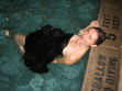
And, finally, my cats are cute. That's Swayze squeezing himself into the corner of our clear coffee table sideways, and Winnie in the window, looking intense (and possibly evil) as usual.
[image error] [image error]
Happy Friday!
PS-Sarah Dessen shared the cover of her upcoming book today! Big news!
[image error]
I worked at the garden this week, so I snapped a pic of the pears and apples we got, which are delish:
[image error] [image error]
And I went to the Spa Week event, where there was a chocolate fountain (missed you, Charles!) and I got my nails done so that the ring finger was a rainbow. It's a sticker trick, but it looks good, right (sorry so fuzzy)?
[image error] [image error]
And, finally, my cats are cute. That's Swayze squeezing himself into the corner of our clear coffee table sideways, and Winnie in the window, looking intense (and possibly evil) as usual.
[image error] [image error]
Happy Friday!
PS-Sarah Dessen shared the cover of her upcoming book today! Big news!


October 6, 2010
Cover Stories + Win-It Wednesday: Her and Me and You by Lauren Strasnick
The winner of last week's copy of hilarious-sounding fake vampire novel Bloodthirsty by Flynn Meaney is... Kristi! Send me your address, K.
[image error] This week, Lauren Strasnick is here to talk about the cover of her latest book Her and Me and You . Kirkus says, "Strasnick's slim second offering packs a lot into its short chapters: divorce, broken friendships, crushes, the lines between love and sex and more. Characterization, scenes, dialogue and setting are seamlessly distilled into so few sharp, image-rich phrases that the novel reads almost as if it were written in verse... Complex and thought-provoking."
How good does that sound? Here's Lauren with the Cover Story (comment below to enter to win a copy of the book!):
"I didn't have any specific cover image in mind - but when I finally saw the finished design, I flipped. So gorgeous. It seriously exceeded my expectations.
"I didn't give any input for Her and Me and You . I got to choose the shoes (Converse All Stars) that went on the spine of my first book, Nothing Like You . And I was asked for suggestions when S&S was trying to come up with an image for the paperback version of Nothing Like You (see the hardcover and paperback below).
[image error] [image error]
" Her and Me and You was born beautiful. It's a stock photo. Makes you want to stroll the snowy streets alone at night, right? Glorious."
Thanks, Lauren. I adore the cover! It actually makes me excited for winter days... which I've been dreading. But when I see that lamp-lit street and the snow falling softly, I'm ready!
I also am way into the paperback revised cover of Nothing Like You . I am a sucker for that late-day (or maybe early morning?) light.
What do you guys think? Comment for a chance to win Her and Me and You!
Cover Stories: Her and Me and You by Lauren Strasnick
The winner of last week's copy of hilarious-sounding fake vampire novel Bloodthirsty by Flynn Meaney is... Kristi! Send me your address, K.
[image error] This week, Lauren Strasnick is here to talk about the cover of her latest book Her and Me and You . Kirkus says, "Strasnick's slim second offering packs a lot into its short chapters: divorce, broken friendships, crushes, the lines between love and sex and more. Characterization, scenes, dialogue and setting are seamlessly distilled into so few sharp, image-rich phrases that the novel reads almost as if it were written in verse... Complex and thought-provoking."
How good does that sound? Here's Lauren with the Cover Story (comment below to enter to win a copy of the book!):
"I didn't have any specific cover image in mind - but when I finally saw the finished design, I flipped. So gorgeous. It seriously exceeded my expectations.
"I didn't give any input for Her and Me and You . I got to choose the shoes (Converse All Stars) that went on the spine of my first book, Nothing Like You . And I was asked for suggestions when S&S was trying to come up with an image for the paperback version of Nothing Like You (see the hardcover and paperback below).
[image error] [image error]
" Her and Me and You was born beautiful. It's a stock photo. Makes you want to stroll the snowy streets alone at night, right? Glorious."
Thanks, Lauren. I adore the cover! It actually makes me excited for winter days... which I've been dreading. But when I see that lamp-lit street and the snow falling softly, I'm ready!
I also am way into the paperback revised cover of Nothing Like You . I am a sucker for that late-day (or maybe early morning?) light.
What do you guys think? Comment for a chance to win Her and Me and You!
[image error] This week, Lauren Strasnick is here to talk about the cover of her latest book Her and Me and You . Kirkus says, "Strasnick's slim second offering packs a lot into its short chapters: divorce, broken friendships, crushes, the lines between love and sex and more. Characterization, scenes, dialogue and setting are seamlessly distilled into so few sharp, image-rich phrases that the novel reads almost as if it were written in verse... Complex and thought-provoking."
How good does that sound? Here's Lauren with the Cover Story (comment below to enter to win a copy of the book!):
"I didn't have any specific cover image in mind - but when I finally saw the finished design, I flipped. So gorgeous. It seriously exceeded my expectations.
"I didn't give any input for Her and Me and You . I got to choose the shoes (Converse All Stars) that went on the spine of my first book, Nothing Like You . And I was asked for suggestions when S&S was trying to come up with an image for the paperback version of Nothing Like You (see the hardcover and paperback below).
[image error] [image error]
" Her and Me and You was born beautiful. It's a stock photo. Makes you want to stroll the snowy streets alone at night, right? Glorious."
Thanks, Lauren. I adore the cover! It actually makes me excited for winter days... which I've been dreading. But when I see that lamp-lit street and the snow falling softly, I'm ready!
I also am way into the paperback revised cover of Nothing Like You . I am a sucker for that late-day (or maybe early morning?) light.
What do you guys think? Comment for a chance to win Her and Me and You!
October 4, 2010
Cover Stories: Powder Necklace by Nana Ekua Brew-Hammond
 Nana Ekua Brew-Hammond's debut novel,
Powder Necklace
, follows London teenager Lila as she's sent to school in her native Ghana, then yanked back to London, and finally shipped off to New York -- all at her parents' whims. It's a book about dislocation and discovery, and Publishers Weekly says, "the beauty of the prose and the resilience of the heroine make this a winning debut." Plus, the book is gorgeous.
Nana Ekua Brew-Hammond's debut novel,
Powder Necklace
, follows London teenager Lila as she's sent to school in her native Ghana, then yanked back to London, and finally shipped off to New York -- all at her parents' whims. It's a book about dislocation and discovery, and Publishers Weekly says, "the beauty of the prose and the resilience of the heroine make this a winning debut." Plus, the book is gorgeous. Here's Nana to tell the story behind the cover:
"For the cover, I envisioned a tin of powder laying on either a blank space or girl's dresser with powder spilling from it -- Ghana has these cool-looking vintage-esque tins of powder that I remember marveling at when I was in school there. I was also thinking a photographic treatment would be cool, in particular, a more literal representation of the title featuring a close-up of a girl's neck dusted with powder.
[image error] "My editor asked me what I was thinking in terms of the cover so I shared my ideas, which she was really into. I couldn't get her a good reference picture of the powder tin in time, but I did send her some images from my days in boarding school as a reference (that's Nana, right).
"I had a bit of anxiety when I got my cover. Seeing it made it real, and I had to ask myself if I could live with this image -- the cover of my first born book! -- FOREVA. The fashion girl in me wondered if I should go more 'editorial' with the cover, i.e. the powder tin, while the Poli Sci & Africana Studies major in me wanted to ensure the image was responsibly portraying Africa. I also recognized I'm a newbie and that the publisher had a far better reference than I did of what would sell on a shelf. I started googling the covers of my favorite authors to get a sense of what was out there and I decided I wanted the cover to clearly and elegantly communicate what the story was about -- and it did!
[image error] "I LOVE-love-LOVED the photograph. I don't know where they found it, but it was a spot-on evocation of the school in the book, the bonds the character makes with her schoolmates, and the journey she embarks on. I loved the little details too! The sun piercing through, strategically covering their holding hands; the red dirt on the ground; and the uniforms they were wearing. The uniform colors corresponded to the houses the girls lived in in the book. Again, I don't know where they found the shot or who took it, but I want to kiss him/her! I wanted to pump up the photograph and details, so the lime green and initial illustration did not work for me.
"I suggested we go with a flower that grew in the area and sent her some images I googled. I also wanted to go with red instead of green since the main character's house color was red. The color change and flower choice made a big difference to me. When she messengered over the final image I was like 'holla!' I would so buy this book."
Thanks, Nana! Agreed. This cover is gorgeous, and I love the photograph, the lighting and the flowers. For the record, I also liked the original illustrated treatment, but I think the colors on the final are stunning.
What do you guys think?
October 1, 2010
Photo Friday: Haircut!
I got another haircut. I think the seasons changing makes me want to snip some hair off my head. But I always get the same boring haircut, so I made things more exciting by photographing it in "heat sensor," "cartoon" and "x-ray" styles. Weird?
[image error] [image error] [image error]
 One day I'll be brave enough to go very short, a la Mia Farrow in Rosemary's Baby (left). That's my dream haircut, but I'm too chicken. Isn't it divine?
Happy Friday!
[image error] [image error] [image error]
 One day I'll be brave enough to go very short, a la Mia Farrow in Rosemary's Baby (left). That's my dream haircut, but I'm too chicken. Isn't it divine?
Happy Friday!
September 29, 2010
Cover Stories + Win-It Wednesday: Bloodthirsty by Flynn Meaney
Last week's winner of Natalie Standiford's
Confessions of the Sullivan Sisters
is... Priya! Send me your address, P.
 Flynn Meaney is here to talk about the cover of
Bloodthirsty
(out next week!), and how difficult it is to create an original vampire novel look these days. I love the idea of a guy faking vampire-dom to get girls -- hilarious, right? -- and Little, Brown is offering a chance for you to win the book (just comment to enter).
Flynn Meaney is here to talk about the cover of
Bloodthirsty
(out next week!), and how difficult it is to create an original vampire novel look these days. I love the idea of a guy faking vampire-dom to get girls -- hilarious, right? -- and Little, Brown is offering a chance for you to win the book (just comment to enter).
Take it away, Flynn!
'I didn't even think about the cover of Bloodthirsty, my debut YA novel, until the first version was emailed to me. I was still in a state of disbelief that my book, which tells the story of high school outcast named Finbar Frame who pretends to be a vampire to get some action, was really being published. There I was, four months out of college, being paid to do something I loved, be creative, reach out to geeky teens like the one I was, and--most importantly--sleep until noon. I was so damned grateful, I would have agreed to any cover.
"Except.... The first cover they sent me. My email from Little, Brown contained a photograph of a giant Slurpee. No vampire, no nerdy boy, not a drop of blood. Um, what?
"As my editor explained in her email, the publishers thought a Slurpee was emblematic of suburbia. My protagonist, Finbar, lives in suburban Westchester, New York, also where I grew up. Now this may be snobby, but, hey, I'm from Westchester, so it fits--we are not a Slurpee suburb. We are more of a Frappuccino suburb. Plus, my hero Finbar isn't much into junk food--whether it comes from 7-Eleven or Starbucks. In fact, he's a super scrawny dude.
"This cover wasn't going to work for me.
"But I wasn't going to push my luck--after all, I had a major publisher paying me a couple thousand Frappuccinos to write books. I had my dream career. If that career came with a giant Slurpee, so be it.
"Then fate, and a fat vampire, stepped in. My agent, Dan Lazar, found a similar book, Fat Vampire by Adam Rex, which had a Slurpee on the cover. [Remember the Cover Story for that one? --MW] And a Slurpee is definitely more appropriate for a fat vampire than for my undersized Finbar. Phew. I was safe.
"Unfortunately, we found that not only the Slurpee, but lots of other ideas were already taken. There are so many vampire-related stories out there that we couldn't touch blood, pale dudes, or--my suggestion--plastic vampire teeth, the type you wear for Halloween.
[image error] "Apparently designing a book cover is easier down under, because the Australian edition of my book features a pale dude with plastic vampire teeth (right). As much as I like the look of the Australian Bloodthirsty, that edition has a Finbar on it, and I wanted American readers to imagine their own Finbars as they read.
"Because so many vampire objects were taken, and the publisher and I agreed to stay away from a drawing or photo of Finbar, the art people at Little, Brown moved towards a more abstract design. That's how we got to the American cover of bloodthirsty--a cheeky smiley-face heart with decidedly non-menacing fangs.
"To me, the cover represents people's initial impressions of Bloodthirsty. It's 'just another vampire book,' with a black and red color scheme like the Twilight series. But then you notice that my book isn't pouting a la Kristen Stewart--it's grinning at you. I also think the fanged heart will grab the attention of bookstore browsers, who will have to look twice to figure out what they're looking at.
"My hope is that the cover--and the book--will appeal to both those who love vampire love stories, and those who mock them mercilessly."
Thanks, Flynn! Such a fun and interesting Cover Story, right?
What do you guys think? Commenters will have a shot at winning a copy of Bloodthirsty (US addresses only, sorry). Weigh in!
 Flynn Meaney is here to talk about the cover of
Bloodthirsty
(out next week!), and how difficult it is to create an original vampire novel look these days. I love the idea of a guy faking vampire-dom to get girls -- hilarious, right? -- and Little, Brown is offering a chance for you to win the book (just comment to enter).
Flynn Meaney is here to talk about the cover of
Bloodthirsty
(out next week!), and how difficult it is to create an original vampire novel look these days. I love the idea of a guy faking vampire-dom to get girls -- hilarious, right? -- and Little, Brown is offering a chance for you to win the book (just comment to enter).Take it away, Flynn!
'I didn't even think about the cover of Bloodthirsty, my debut YA novel, until the first version was emailed to me. I was still in a state of disbelief that my book, which tells the story of high school outcast named Finbar Frame who pretends to be a vampire to get some action, was really being published. There I was, four months out of college, being paid to do something I loved, be creative, reach out to geeky teens like the one I was, and--most importantly--sleep until noon. I was so damned grateful, I would have agreed to any cover.
"Except.... The first cover they sent me. My email from Little, Brown contained a photograph of a giant Slurpee. No vampire, no nerdy boy, not a drop of blood. Um, what?
"As my editor explained in her email, the publishers thought a Slurpee was emblematic of suburbia. My protagonist, Finbar, lives in suburban Westchester, New York, also where I grew up. Now this may be snobby, but, hey, I'm from Westchester, so it fits--we are not a Slurpee suburb. We are more of a Frappuccino suburb. Plus, my hero Finbar isn't much into junk food--whether it comes from 7-Eleven or Starbucks. In fact, he's a super scrawny dude.
"This cover wasn't going to work for me.
"But I wasn't going to push my luck--after all, I had a major publisher paying me a couple thousand Frappuccinos to write books. I had my dream career. If that career came with a giant Slurpee, so be it.
"Then fate, and a fat vampire, stepped in. My agent, Dan Lazar, found a similar book, Fat Vampire by Adam Rex, which had a Slurpee on the cover. [Remember the Cover Story for that one? --MW] And a Slurpee is definitely more appropriate for a fat vampire than for my undersized Finbar. Phew. I was safe.
"Unfortunately, we found that not only the Slurpee, but lots of other ideas were already taken. There are so many vampire-related stories out there that we couldn't touch blood, pale dudes, or--my suggestion--plastic vampire teeth, the type you wear for Halloween.
[image error] "Apparently designing a book cover is easier down under, because the Australian edition of my book features a pale dude with plastic vampire teeth (right). As much as I like the look of the Australian Bloodthirsty, that edition has a Finbar on it, and I wanted American readers to imagine their own Finbars as they read.
"Because so many vampire objects were taken, and the publisher and I agreed to stay away from a drawing or photo of Finbar, the art people at Little, Brown moved towards a more abstract design. That's how we got to the American cover of bloodthirsty--a cheeky smiley-face heart with decidedly non-menacing fangs.
"To me, the cover represents people's initial impressions of Bloodthirsty. It's 'just another vampire book,' with a black and red color scheme like the Twilight series. But then you notice that my book isn't pouting a la Kristen Stewart--it's grinning at you. I also think the fanged heart will grab the attention of bookstore browsers, who will have to look twice to figure out what they're looking at.
"My hope is that the cover--and the book--will appeal to both those who love vampire love stories, and those who mock them mercilessly."
Thanks, Flynn! Such a fun and interesting Cover Story, right?
What do you guys think? Commenters will have a shot at winning a copy of Bloodthirsty (US addresses only, sorry). Weigh in!
September 28, 2010
Kindle Questions
[image error]
Okay, so I got a Kindle. I read The Hunger Games on it, but that's the only book I've bought so far, and I kind of wish I owned the actual book so I could have the complete set on my shelf (I have hard copies of the other two).
I purchased the Kindle mainly because sometimes I read author friends' books before they're published, and I like to download them to the Kindle so I don't have to read them on screen. I thought I'd be able to make notes on it -- and I can -- but then when I try to import the notes back to the computer, it won't do that. So any comments or edits I've made, I have to re-input. That is annoying.
Does anyone else have a Kindle? Are you liking it? I find myself still wanting to buy real books. As anyone who reads this blog knows, too, I cannot abide by the loss of the cover that happens when you get an e-book. Sad!
Thoughts? Oh, and anyone have an idea for a good Kindle case? I can't find one I like.
PS-Just read an essay on why paperbacks are better than e-readers, and I especially agree with the illustrations point. A children's book could never translate!
September 27, 2010
Cover Stories: Low Red Moon by Ivy Devlin
 Ivy Devlin's
Low Red Moon
just shines on shelves. Partly because of the foil, and partly because of its gorgeous red and partly because of the amazing illustrations -- it comes together gorgeously. Here's Ivy to share her side of the story:"The original title of the book was red, so as I was writing the book, I figured that, if I was lucky enough to have the stars align and have it sell, a cover with some red in it would be cool."We did talk a little about the cover, mostly because the title ...
Ivy Devlin's
Low Red Moon
just shines on shelves. Partly because of the foil, and partly because of its gorgeous red and partly because of the amazing illustrations -- it comes together gorgeously. Here's Ivy to share her side of the story:"The original title of the book was red, so as I was writing the book, I figured that, if I was lucky enough to have the stars align and have it sell, a cover with some red in it would be cool."We did talk a little about the cover, mostly because the title ...
September 24, 2010
Photo Friday: Allen and Son BBQ
The Violet books mention Allen and Son, and it's still my favorite BBQ ever. If you're down in Chapel Hill, NC sometime, do stop in. Delish!
[image error]
I forgot to take a picture of the food. I just remembered, um, after we ate. The wasteland of post-BBQ is here (look at that sweaty sweet tea jug--mmm!):

Happy Friday!
[image error]
I forgot to take a picture of the food. I just remembered, um, after we ate. The wasteland of post-BBQ is here (look at that sweaty sweet tea jug--mmm!):

Happy Friday!
September 23, 2010
Cover Stories: Firelight by Sophie Jordan
[image error]
Sophie Jordan's Firelight is about a girl who can shift between human and dragon forms... which might have been quite a cover challenge!Here's Sophie to talk about the process:"Early talks revolved around maybe a silhouette ... and my protagonist's striking red hair. We wanted something to hint to her 'dragon qualities, like wings, but we wanted to make certain no one saw the cover and thought 'angel' since she's not that! "They kindly asked for my input, and I remember just being so excited ...


![[image error]](http://www.melissacwalker.com/blog/farmshare.jpg)
![[image error]](http://www.melissacwalker.com/blog/pears.jpg)
![[image error]](http://www.melissacwalker.com/blog/apples.jpg)
![[image error]](http://www.melissacwalker.com/blog/choc%20fount.jpeg)
![[image error]](http://www.melissacwalker.com/blog/rainbow%20nail.jpeg)
![[image error]](http://www.melissacwalker.com/blog/side%20swayze.jpg)
![[image error]](http://www.melissacwalker.com/blog/winnie.jpeg)
![[image error]](http://www.melissacwalker.com/blog/her%20and%20me%20and%20you.jpg)
![[image error]](http://www.melissacwalker.com/blog/nothing%20like%20youhc.jpg)
![[image error]](http://www.melissacwalker.com/blog/nothing%20like%20you.jpg)
![[image error]](http://www.melissacwalker.com/blog/nana%20ref.jpg)
![[image error]](http://www.melissacwalker.com/blog/nana%20cover%20yellow.jpg)
![[image error]](http://www.melissacwalker.com/blog/haircut1.jpg)
![[image error]](http://www.melissacwalker.com/blog/hair2.jpg)
![[image error]](http://www.melissacwalker.com/blog/hair3.jpg)
![[image error]](http://www.melissacwalker.com/blog/bloodthirstyaustralia.jpeg)
![[image error]](http://www.melissacwalker.com/blog/kindle.jpg)
![[image error]](http://www.melissacwalker.com/blog/allenandson.jpeg)
![[image error]](http://www.melissacwalker.com/blog/High%20res%20Firelight%20cover.jpg)