
Melissa C. Walker's Blog, page 40
November 10, 2010
Win-It Wednesday + Cover Stories: Pull by B.A. Binns
Last week's winner of
Five Flavors of Dumb
by Antony John is... Zaneta! Send me your address, Z.
[image error] This week, B.A. Binns is here to talk about the cover of her new release, PULL , and to give one commenter a copy of the book!
Here's B.A.:
"My publisher, WestSide Books, did something many publishers shy away from these days. They not only bought a young adult book featuring an African American couple, they also put a picture of the hero on the cover. Because PULL revolves around the boy, and is told completely from his POV, the decision was made early on that the book would have a teenaged male spotlighted on the cover. They showed me a selection of models. I picked out a picture of a really cute guy with curly hair and a huge smile.
"They picked the David that now dominates the cover of PULL . And when I saw what the art department put together, I realized they had my hero's essence, and by now I feel that is the face of David Albacore. While I wasn't given cover art approval, they did run things past me and my editor assured me that if I really hated things they would make changes. It took me ten seconds to realize I wouldn't change a thing. They had captured the essence of what I wanted potential readers to feel when they see that cover.
"They and I both know the cover is a risk. There is the fear that some young people will turn away from the book just because of the face on the cover. But this book has a universal theme: that we have to make our own choices about our futures, even if others--adults--think we are wrong. David and Yolanda, the heroine, happen to be Black. But mostly, they happen to be teens, and each has something the other needs to survive the traumas in their lives. David narrates the book, we see the world and the girl entirely through his eyes.
"To me, this cover reveals a young man who could be anyone with the weight of the world on his shoulders and life-altering decisions to make. And I hope that teens, both female and male, will take a chance, open that cover, and let the story and his choices speak to them."
Thanks, B.A.! I've been staring at this cover, and it makes me wonder what is going on in David's world. I think it does its job, and I love the colors and the sun on David's face--it almost looks like a movie poster.
I'm also interested to hear what you guys think about the issues that Barbara mentioned--that this cover is a risk. I'm sad about that, but I know she's right. Thoughts on this cover or on the lack of diversity on YA covers in general? One commenter will win a copy of the book, courtesy of B.A.!
PS-Check out the trailer for PULL :


November 9, 2010
Cover Stories: 7 at Unabashedly Bookish
Over at the bn.com blog... click through to read the full stories.
[image error] The Twin's Daughter by Lauren Baratz-Logsted. "My publisher did not ask for input before beginning work, but once they started coming up with covers--and there must have been over 20 iterations before the final cover was settled upon--my opinion was solicited every step of the way." Read more...
[image error] Sleepless by Cyn Balog. "I had always hoped that the moon would play into my book a little, because I am just a sucker for the moon (my first name means 'belonging to the moon')..." Read more...
[image error] Hungry For Your Love , edited by Lori Perkins. "Hungry for Your Love started as an ebook at Ravenous Romance. When I sold my short story 'Inhuman Resources' I never thought it would end up in a physical book store. Nonetheless, trends catch on quickly and within months this anthology about zombie love sold to St. Martin's Press. Suddenly zombies were big!" Read more...
[image error] Creative Girl by Katharine Sise. "When I first saw my finished cover, I actually got very choked up! There was something about seeing the cover that made the book feel very real and tangible. I could suddenly picture it on the shelf, instead of as a solitary project that I'd been working on for a year and a half from my living room couch next to my dog."
Read more...
[image error] Enchanted Ivy by Sarah Beth Durst. "This cover is a painting of a real person. She emailed me several months ago and said that she was the artist's model. I love knowing that there's a real person that looks like Lily out in the world!" Read more...
[image error] Ten Ways to Be Adored When Landing a Lord by Sarah MacLean. "Romances have a really particular look--you know what I'm talking about... the ravishing (sometimes ravished) beauty, the handsome gentleman, and the famous clinch. Now, some people don't like the idea of a clinch... but I love them. They tell me that the book in my hands is a broad, sweeping love story, and that it's going to end with a happily ever after that will leave me sighing and wanting more." Read more...
[image error] The Doggy Divas by Lauren Brown. "I was adamant that the cover not look too young as can be the case when writing about tweens and animals. We decided it needed to look sophisticated yet fun -- no easy feat. There's a fine line between going totally, over the top girly and keeping it 'cool' for lack of a better word." Read more...
November 8, 2010
Cover Stories: You Are Not Here by Samantha Schutz
[image error]
[image error] "The cover for my first book, I Don't Want to Be Crazy (left), is made up entirely of the title. There's no image. I had a really hard time when I first saw it. It just wasn't what I imagined it would be. I always assumed it would be a photo of a girl. So, it took me awhile to get used to the type-only treatment. But I've grown to really like the cover--especially because if it's facing out on a shelf, you can't miss it! It's very unique.
"So, when I thought about what the cover might be for You Are Not Here , I was really hoping for a photograph. As I wrote, I envisioned a photo of a gravestone (maybe the title of the book would look like it'd been etched into the stone) with a really bright blue sky and deep/emerald grass. I didn't want the cover to look creepy or paranormal (although, that may have been hard to do if we used a cemetery image). You Are Not Here is love story (although, unrequited and impossible to maintain) so even though death is a central image, I still wanted the cover to be beautiful. Also, since You Are Not Here is set in the same neighborhood I grew up in, I had a very distinct images in my head of what everything looked like. I wrote a blog post about this.
"I mentioned my ideas to my editor and printed out some stock photos that I found. Although I am not sure if he actually asked for it. I hoped that they would take my idea, but wasn't holding my breath. By day, I am a children's book editor and when it comes to decisions like this, I have to remind myself that I am the WRITER in this situation, not the editor. And that means I don't always know what's best--because I am just too close to the work.
"When I saw my first cover, I LOVED IT! My editor planned to do a photo shoot, but the designer came across a great stock image. They did a rough mock-up of it and sent it to me [the image shows a girl lying in the grass, as Samantha's main character does in the cemetery]. But only a few weeks later, my editor saw the cover for Before I Fall by Lauren Oliver. They were just too similar. So that cover got scrapped.
"When I saw the second cover, I was really bummed. It was good, but not great. The stock image they had chosen was nice enough [another girl-in-grass, but differently placed]--and I liked how most of the image was grass--but nothing about it stood out. It was also hard to tell what the girl in the photo was feeling. She looked peaceful. Like she was sleeping. And that didn't really fit with the book--Annaleah, the main character is terribly depressed. I spoke with my agent about my concerns (which he shared) and he spoke to my editor. Weeks later I got a new cover (the final)--which I LOVE! It's very striking. And I think it conveys the feel of the book well.
"As an editor it is SO hard not to make notes about nerdy things like leading (the amount space in-between the lines), fonts, colors, etc. I did send excessive notes, but they were mostly ignored. And that's ok. In the end, I had to realize that adding an extra space between lines (or other subtle things like that) would not make my book sell a single more copy.
"I really, truly love my final cover. I am so glad that the designer took another stab at it--and that she was able to think outside the box and get away from the cover needing to be of a girl or a cemetery.
"I think the cover relates to the story perfectly. It's a beautiful image, but also sad. I'd like to think that's how people will describe You Are Not Here.
[image error] Thank you, Samantha! I adore this cover, and I recently saw a cover that reminded me of it--the new cover of the Flowers in the Attic + Petals on the Wind combo book (right)... but I think Samantha's is much prettier!
What do you guys think?
PS-Check out Samantha's website for a PHOTO CONTEST, excerpts from her books, and more!
November 5, 2010
Photo Friday: Brooklyn Bowl
Thank you guys for the cover love! Cover Story coming very soon--I promise!
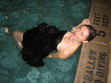
Now, here are some fun shots from last weekend, when Brooklyn Bowl hosted Guns n' Roses cover band Mr. Brownstone, and we got to BOWL!
[image error]
The scoreboard. Note Anne's triple strikes in the last frame. I mean, who DOES THAT?!
[image error]
Mr. Brownstone does "Patience"... and I put my Zippo app in the air.
[image error]
And I was dressed all in blue (this self-take got the disco ball in back, which was key):
[image error]
Yay! Happy Friday! I hope you have an excellent weekend!
PS-Another thrilling thing this week: Pomegranates were on SALE at my grocery store. This made me v. excited.
[image error]
November 4, 2010
Cover Reveal: Small Town Sinners!
I was going to do this on Monday but then I saw the cover on someone else's blog (and on amazon!) I realized you can't keep a new cover under wraps... yay! Cover Story coming soon. For now, have a glance:
[image error]
Here's the official description: Lacey Anne Byer is a perennial good girl and lifelong member of the House of Enlightenment, the Evangelical church in her small town. With her driver's license in hand and the chance to try out for a lead role in Hell House, her church's annual haunted house of sin, Lacey's junior year is looking promising. But when a cute new stranger comes to town, something begins to stir inside her. Ty Davis doesn't know the sweet, shy Lacey Anne Byer everyone else does. With Ty, Lacey could reinvent herself. As her feelings for Ty make Lacey test her boundaries, events surrounding Hell House make her question her religion.
November 3, 2010
Win-It Wednesday + Cover Stories: Five Flavors of Dumb by Antony John
Last week's winner of
I Was Jane Austen's Best Friend
by Cora Harrison is... Genevieve! Send me your address, G. (BTW, the final vote count on US vs. UK cover was 22 to 5, with the UK's graphic design crushing the US's photo version!).
[image error] This week, Antony John (whose first novel shares a cover model with Siobhan Vivian's second book) is here to talk about his upcoming release (next week!) Five Flavors of Dumb . It has an epic cover, as far as I'm concerned, and I'm also reading it and loooving the book. So, you know, you really want to win this one. Read the Cover Story and weigh in to enter.
Here's Antony!
"Believe it or not, as I was writing DUMB I didn't have a clue what the cover would look like. I'm sure that's quite unusual, but I simply couldn't imagine a design that would capture the essence and attitude of the novel without looking seriously weird. I mean, the book touches on everything from deafness to rock 'n' roll to family relationships to college funds to secret crushes to self-identity and, uh... chess. What cover could possibly hope to encompass all of that, right? So I just gave up thinking about it altogether. Looking back, it was kind of nice not to have to worry about the cover as well as every other aspect of the novel.
"Of course, the flip side of having ZERO input is that I had no clue what the finished cover would look like. My editor, Liz Waniewski, emailed it to me last November, just as friends were arriving, so I got to open it in front of them. Trust me: I wasn't the only one who used a really good expletive to describe it. Then I forwarded it to my wife (even though I wasn't supposed to; I just couldn't resist, you know?) and she wrote back within about seven seconds with a similarly giddy response. Seriously, it was just one of those 'THEY NAILED IT!' moments that you dream about as an author.
"My editor then asked if there were any changes I'd like (uh, no), or perhaps minor tweaks (uh... no), or alterations to the font style (uh, let me think about this...NO!). I really wanted to seem engaged and critical, but all I think was, 'Please don't change this cover.' Thankfully, all the sales and marketing people liked it too (as did booksellers), so the whole thing was wrapped up in record time. I owe the designer, Kristin Smith, big time!
"I have since discovered that Kristin's approach was similarly unconventional. Apparently, she usually prepares several different 'comps,' but with DUMB , she knew she wanted to evoke the grunge feel of the book through a split-image of band and narrator, so she went all-out on the one design. I know she spent days looking through stock photos until she found the photo of the girl, who conveys Piper's attitude and vibe perfectly. Thankfully, the art director, editor, and publisher all loved her original comp (see below left), and so she was able to dedicate more time to tweaking the lighting, colors, position of the band, font, poster effect, and so on until she arrived at the finished version (below right).
[image error] [image error]
"I've had almost a year to look at the cover now, and I still adore it. Piper looks so cool and in control--an anchor for all this chaos. Plus, on the finished cover, the title is debossed, which gives it the appearance of a stamp, as though you're about to enter a club. Finally, several people have commented that it looks like a movie poster; and let's be honest, who wouldn't want to have a movie poster on the front of their book? But most of all, I just love the cover's irresistible vibe."
Thanks, Antony! Movie poster: Yes. "Anchor for all this chaos": Yes. This cover RULES. I like the cover tweaks, too--from yellows/greens to pinks/grays. (And it's always good to make the author's name stand out more, which it does on the second version.) You can almost feel the light and the sound, but Piper sits cool and collected among it. L-O-V-E.
What do you guys think? Comment below to be entered to win a copy of the book!
PS-Everyone who "likes" Antony's new Facebook author page automatically gets entered into another contest to win not only a signed copy of DUMB, but also a copy of WILL GRAYSON, WILL GRAYSON signed by both John Green and David Levithan. So get liking!
November 1, 2010
Cover Stories: The Mockingbirds by Daisy Whitney
[image error]
Daisy Whitney's The Mockingbirds is out this week, and she's here to tell the tale behind a cover that reminds me of a classic already!
First, a little about the book:
Themis Academy is a quiet boarding school with an exceptional student body that the administration trusts to always behave the honorable way-the Themis Way. [image error]So when Alex is date raped during her junior year, she has two options: stay silent and hope someone helps her, or enlist the Mockingbirds-a secret society of students dedicated to righting the wrongs of their fellow peers.
And now here's Daisy:
"As I was writing, I pictured a girl at boarding school ala The Disreputable History of Frankie Landau-Banks by E. Lockhart (left)!
[image error] "Ah, but there's the myth that authors have any say over their covers! My editor showed me cover comps throughout the process and I was able to give feedback on the elements I liked. I had suggestions on elements of the bird and the trees and some of them were incorporated. The original cover was red and green (right) and the final is blue and yellow. I'm so happy with the blue version!
"My cover was illustrated by an artist. The final cover design features a blue and yellow bird and the blue matches all my blue shoes! Hurrah! In the end, I love it. I think it's unusual and stands out."
[image error]
Thanks, Daisy! I just think something about this cover looks old-school lit in the best possible timeless way. It also has a great spine, right? (And how about that storyline--whoa! Love.)
What do you guys think?
October 30, 2010
Hark, An ARC! Small Town Sinners
[image error]
I can't show the cover yet (and yes, this is a PhotoBooth-on-the-laptop shot, hence the backwards turn o' photo), but I'll be running a Cover Story of my own during the week of November 8th for my next book, Small Town Sinners (out in July). Any bloggers who want to help me do a cover reveal? Email me and I'll send you a jpeg of the cover and let you know what date I'm posting it, if you'd like to post it too!
I'm excited. You know how into covers I am. Oh yeah.
PS-I heart my Warby Parker nerd glasses, and WP gives a pair to charity each for each pair bought. Bonus!
October 29, 2010
Photo Friday: Autumn & Aliens
Yesterday I saw this guy at my lunch spot (he's reading...). It was hard for me to get my word count done because, hello, there was a film crew taping an alien puppet right near me. If I were writing a different kind of book, this probably would have crept into the pages.
[image error]
But really, I love autumn with aliens in Brooklyn.
[image error]
Happy Friday!
[image error]
But really, I love autumn with aliens in Brooklyn.
[image error]
Happy Friday!
October 28, 2010
Cover Stories: Mostly Good Girls by Leila Sales
[image error]
The cover of Mostly Good Girls by Leila Sales is one of my fall favorites, and not just because I'm obsessed with tights. The book also sounds super-good.
Here's Leila to tell the tale:
[image error] [image error] "I'm not a visual thinker, so I didn't have a specific vision for the cover. I told my editor that I like covers with a lot of white space and that I like covers with silhouettes (for example Maureen Johnson's THE KEY TO THE GOLDEN FIREBIRD or Natasha Friend's PERFECT). I also had an image in my mind of two girls running away from a school building together. But I had no real idea... There's a reason why I'm a writer and NOT a designer!
"I talked about what Violet and Katie would be wearing, if they were pictured on the cover. It was important to me that they not be wearing high heels because, as anyone at an all-girls school could tell you, students there just don't get that dressed up. Girls-school fashion is a lot of J.Crew jeans and Northface fleeces.
"So, actually, when S&S did the cover shoot, they used Kate Spade shoes with like three-inch heels--and then they photoshopped the heels out to make the shoes look like flats. I was going to buy a pair of to wear to book signings, but when I found out that a) they would cost me a few hundred dollars and b) I wouldn't be able to walk in them because I have no talent for heels, I decided against it.
[image error] "The first time I saw the cover comp of a girl in cute tights with her legs crossed (that's the comp on the left), I was happy with it. Truly!
"But I had seen earlier cover comps that I was less thrilled with. There was one that was supposed to be a crumpled-up piece of paper against a white background, which was a great idea, but it was hard to make it actually look like paper. There was another concept that showed a Coach purse against a white background, and I had absolutely no patience for that. It made MOSTLY GOOD GIRLS look like a book about shopping, or THE DEVIL WEARS PRADA for teens. [image error] [That's another early comp idea, right, with a different title, Wayward.]
"We all agreed that we wanted a central, memorable image against a clean background, like the PREP cover; it just took a while to figure out what that central image should be.
"They did a photo shoot with a model. Well, she's sort of a model. She works in Simon & Schuster's sales department, actually. I forget, but I think she sells to Borders? This happens regularly in publishing, that a cover designer will approach one of his colleagues and be like, 'Hey, you have great hair/hands/legs/whatever. Will you model for this cover?' No one has ever asked me to do this, but I am holding out hope.
"S&S featured a blow-up of MOSTLY GOOD GIRL's cover at BEA, and all day people were going over to take pictures of it. My friends wanted photos because, you know, I wrote it, while the S&S sales rep's friends wanted photos because her legs are on it. I met the cover model at a BEA cocktail party, actually. I asked her to cross her legs so I could see if it looked just like my book cover or what. She seemed maybe creeped out by this.
"People keep asking me if I'm the cover model, which I take as a huge compliment. I do like wearing tights. But no, my legs are not that skinny.
"I have seen a few commenters on the Internet saying they thought the cover made this book seem like it was going to be about a bunch of slutty, materialistic girls, which of course it's not. But by and large the response has been that the book looks fun, funny, and fashionable, and that was the goal all along.
"I don't think the girl on the cover is necessarily Violet, or Katie, or any other particular character in MOSTLY GOOD GIRLS. I think the cover image is more evoking the feeling of this competitive all-girls prep school, and it does that so well. So I'm honestly pleased with how it turned out. Especially when I see it on display in a bookstore, on a table filled with dark YA covers-- it just pops!"
Thanks, Leila! I am so, so glad everyone kept working to come up with this concept (and especially that the Coach purse did not fly). The final cover creates a record-scratch moment. By that I mean: You stop and stare. Right?
What do you guys think?


![[image error]](http://www.melissacwalker.com/blog/Pull.jpg)
![[image error]](http://www.melissacwalker.com/blog/twins.JPG)
![[image error]](http://www.melissacwalker.com/blog/sleepless.JPG)
![[image error]](http://www.melissacwalker.com/blog/hungryforyourlove.JPG)
![[image error]](http://www.melissacwalker.com/blog/creativegirl.JPG)
![[image error]](http://www.melissacwalker.com/blog/enchanted%20ivy.JPG)
![[image error]](http://www.melissacwalker.com/blog/10wayseloisa.jpg)
![[image error]](http://www.melissacwalker.com/blog/doggy.jpg)
![[image error]](http://www.melissacwalker.com/blog/YANH%20cover.jpg)
![[image error]](http://www.melissacwalker.com/blog/crazy.jpg)
![[image error]](http://www.melissacwalker.com/blog/flowersattic.jpg)
![[image error]](http://www.melissacwalker.com/blog/balls.jpb.jpeg)
![[image error]](http://www.melissacwalker.com/blog/bowling.jpeg)
![[image error]](http://www.melissacwalker.com/blog/mr%20brownstone.jpg)
![[image error]](http://www.melissacwalker.com/blog/bluemel.jpg)
![[image error]](http://www.melissacwalker.com/blog/poms.jpg)
![[image error]](http://www.melissacwalker.com/blog/SmallTownSinners%20%281%29.jpg)
![[image error]](http://www.melissacwalker.com/blog/five%20flavors.jpg)
![[image error]](http://www.melissacwalker.com/blog/5FlavorsDumbCOMP.jpg)
![[image error]](http://www.melissacwalker.com/blog/themockingbirds.jpg)
![[image error]](http://www.melissacwalker.com/blog/Disreputable-History-of-Frankie-Landau-Banks-PB.jpg)
![[image error]](http://www.melissacwalker.com/blog/mockingbirds1.jpg)
![[image error]](http://www.melissacwalker.com/blog/whitney_themockingbirds_final1.jpg)
![[image error]](http://www.melissacwalker.com/blog/sinners%20arc.jpg)
![[image error]](http://www.melissacwalker.com/blog/alien.jpg)
![[image error]](http://www.melissacwalker.com/blog/park%20slope%20fall.jpg)
![[image error]](http://www.melissacwalker.com/blog/mostly%20good%20girls%20final%20cover.jpg)
![[image error]](http://www.melissacwalker.com/blog/firebird.jpeg)
![[image error]](http://www.melissacwalker.com/blog/perfect%20natasha.jpg)
![[image error]](http://www.melissacwalker.com/blog/cover%20comp%202-1-10.jpg)
![[image error]](http://www.melissacwalker.com/blog/Wayward%205a%20pencil%2012.09.jpg)