
Melissa C. Walker's Blog, page 36
January 28, 2011
Photo Friday: Wedding in Larchmont
Our friends Jimmy and Becky got married in Larchmont, NY last weekend, and the reception was a full-on black tie affair at the Winged Foot Golf Club. I love wearing a gown! So here are some pics.
A group of us, me in the center in my only floor-length gown (thanks, Erin!):
[image error]
Dave and me:
[image error]
And, of course, the gorgeous couple, mid dance, taken with my bad-iPhone camera. (They were soooo happy!)
[image error]
Happy Friday!
A group of us, me in the center in my only floor-length gown (thanks, Erin!):
[image error]
Dave and me:
[image error]
And, of course, the gorgeous couple, mid dance, taken with my bad-iPhone camera. (They were soooo happy!)
[image error]
Happy Friday!


January 27, 2011
Cover Stories: Head Games by Keri Mikulski
[image error]
Keri Mikulski shared her Cover Story for Screwball here in 2009, and now she's back to talk about her new release,
Head Games
:
"As I began writing HEAD GAMES, I definitely pictured a cover that consisted of a combination of boys and basketball. But when it came to the actual moment, I was so engrossed in writing and revising the book, I didn't even think about the cover.
"When I first saw the cover, I was in love! Natalie Sousa, the fabulous designer at Penguin, truly captured Taylor Thomas, the main character. And she did a great job implementing the different features of the first two Pretty Tough Books - PRETTY TOUGH and PLAYING WITH THE BOYS (below). The smirk, the clothes, the beach court, the basketball, the feel of the cover - perfect!
[image error] [image error]
"The original version changed a bit. The basketball scene in the background was tweaked to make it more obvious it was a guys vs. girls game.
"The final cover truly captures the essence of the book - from the basketball to the romance to the beach to the tension on and off the court - it's perfect!"
Thanks, Keri! I love books about sporty girls who are also somewhat girly, and of course I'm totally intrigued by the runway/modeling angle! What do you guys think?
PS-Here's the trailer:
January 26, 2011
Win-It Wednesday: Fall For Anything by Courtney Summers
The winner of last week's contest for Melissa Kantor's The Darlings Are Forever is... Kayte J, who loves Dum Dums! Send me your address, KJ.
[image error] This week, I'm giving away a copy of Fall For Anything by Courtney Summers. You've likely heard about this incredible book (if not, here's My Friend Amy's great review), and it lives up to all the stars and swoons. Courtney Summers gets it so right every time. Love her.
To enter to win, tell me what your fictional obsession is. Brittany and Allie have a new blog category about their fictional obsessions (the first one is talking owls, which inspired B's owl collection). So be it from a book, movie, TV show, whatever--as long as you're obsessed, and the object of said obsession is fictional, it counts.
Mine? His initials are T.R. and he is often found in dusky Texas sunlight, squinting, smiling ever so slightly and perhaps holding a beer.
[image error]
Sigh.
January 24, 2011
Cover Stories: A Girl Named Mister by Nikki Grimes
A Girl Named Mister, by Nikki Grimes, came out last fall. Kirkus Reviews says, "This novel in poetry looks clearly at both teen pregnancy and struggles with faith. Mister is exceptionally well characterized...The language is intimate and immediate."
The cover is one that I've stared at a bit in the bookstore, so I had to ask Nikki about the back story. Here she is:
"OMG, I am so in love with the current cover, I'd completely forgotten what it took to arrive at it! I had no musings on a cover when I wrote the text. I never do. But when it comes to covers, I definitely know what I do or don't like when I see it.
I remember the original cover proposed to me, and I shudder. It combined a photo of a contemporary teen, set against a drawing of a young girl from ancient Israel, with traditional head covering. The word that comes to mind to describe the sum effect is 'hokey.' I am very fortunate to have open discussions with my editor about the art connected with my books, and so I was asked what I thought. I'm always happy to speak my mind on such things, and so the designer went back to the drawing board.
"If I remember correctly, the trailer and cover were both in production around the same time. I was asked to select one of three possible actresses for the trailer, and the young lady I chose was used for the cover profile, as well.
"When I saw the final cover, it took my breath away! It couldn't be more perfect.
[image error]
"The young lady I chose for the trailer and, as it happens, the cover, had the perfect blend of innocence and maturity that matched my character. The flower design that overlays the left side of the photo suggests a blossoming which is on point, too. Mister grows and blossoms in important ways during the course of her story.
"One key feature that makes this cover work is the angle the girl was shot at. She appears to be stepping out of the darkness, into the light, which of course is what Mister does in the story. Brilliant!"
Thanks, Nikki! I think the cover conveys a lot of emotion, and looking at the full spread, I love effect of the illustrated edges and the blue and yellow combination.
What do you guys think?
PS-Watch the trailer, starring the cover model:
January 21, 2011
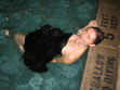
Photo Friday: Book Cat
I got some ARCs of
Small Town Sinners
(those are galleys, or early copies, for the non-book-insidery among us). They're pretty and my cat Swayze loves them, as you can see. (Uh, or maybe he's just bewildered? Cats are tough to read).
[image error]
(Note to self: Clean up Christmas tree needles... argh.)
I promise to host a few contests this spring so you can have a chance to win a copy before the release. July 19th still feels far away!
Happy weekend!
[image error]
(Note to self: Clean up Christmas tree needles... argh.)
I promise to host a few contests this spring so you can have a chance to win a copy before the release. July 19th still feels far away!
Happy weekend!
January 19, 2011
Win-It Wednesday: The Darlings Are Forever by Melissa Kantor
Last week's winner of Across the Universe by Beth Revis is... Avery! Send me your address, A.
[image error] You saw the Cover Story for this book on Monday, yes? Well, now you have a chance to win a copy!
To enter to win, just tell me your... um... favorite snack! Yes, your favorite snack. Those Darling girls are picnicking, and that makes me think of... snacks. Mine, currently, is string cheese. Delicious and oh-so-portable. Your turn.
I'll choose a winner at random next week! Good luck.
January 17, 2011
Cover Stories: The Darlings Are Forever by Melissa Kantor
[image error]
The lovely Melissa Kantor's latest novel,
The Darlings Are Forever
, is out this month. She dropped by to talk about that oh-so-Central-Park cover:
"I'm not a very visual person, so it's rare for me to have a cover in mind for a book I'm writing. And I'm always amazed when my editor shows me a potential cover. It's like--wow, how'd you think of that? The only cover I ever came up with was the one for The Breakup Bible,right, and that's because it's kind of an inside joke. [image error] The book is named for a really unhelpful advice book that the main character gets, and my book has the same cover as the (imaginary) advice book.
"So I really had no idea what they should do for the cover of The Darlings Are Forever, and I was just as surprised when I saw it as I ever am!
"Hyperion is very nice about asking for input--and I never have any good ideas. I always say something like, 'What about a charm bracelet?' even though I've never written a book with a charm bracelet as an iconic item. And I often suggest a backpack spilling out its contents. Actually, that's my website, now that I think of it--a bag with everything being dumped out of it. I think because it's my worst fear (spilling out all my stuff in public). Hmm, maybe I'm over analyzing here.
"I always hate the covers the first time I see them. Really. Each time, I'm like, UGH! Why did you do that? Then it grows on me.
"I made a bunch of suggestions. I hated the first font for the title, and then I saw the movie Rebecca, and the title for that movie is in a really dramatic font that I absolutely loved. I actually googled a still of the title and then emailed it to my editor:
[image error]
"The basic concept remained what it was from the beginning, but I had a BUNCH of small changes I wanted made, everything from the girls' wardrobes to the way the light fell over the scene to Victoria's hair color. And they were really good about trying to integrate them. Everything big is pretty much the same, but everything small changed. I like the feel of it a lot better now. (See the initial cover, left, and the final cover, right, side by side, below):
[image error] [image error]
[image error] "They did a photo shoot, which I thought was really cool. They did one for my first book (Confessions of a Not It Girl, left) also. It's a picture of a girl's butt (the main character thinks her butt is way too big, and she kind of obsesses about it). The only problem was, at every event I did, someone always asked me if it was my butt on the cover (it's not).
"I've come to really like how the three girls are pictured. It's a moment that feels natural. They're having a picnic in Central Park, and it's such a New York City book and so much of their friendship is talking about their lives while they sit somewhere in Manhattan and eat. So the cover feels very true to the book and the Darlings."
Thanks, Melissa! I really appreciate the tweaks in the girls. You can see all of their faces now and they just look much more book-cover-worthy than the initial draft. Glad the Central Park setting didn't change -- it's gorgeous.
What do you guys think of this cover?
PS-You can download Chapter 1 on Melissa's website!
January 14, 2011
Photo Friday: Moonlighting!
A few weeks ago I was talking to author Barry Lyga about his amazing new option deal for Boy Toy, when he indicated that I probably was too young to know the great show that Glenn Gordon Caron, the person who optioned Boy Toy, had created.
"What show was it?" I asked.
" Moonlighting ," said Barry.
Um, that was only my favorite show when I was a kid! I even used to write spec scripts with my friend Ciji (I made her play Bruce's character -- I was bossy). I believe I went on and on about how much I loved the sparring between main characters David and Maddie, and I promised to dig up an old photo that I knew I had somewhere...
Well, here it is--proof of my fandom, complete with coffee-ring stain and pushpin holes in the corners.
[image error]
That's cardboard Cybill and Bruce (in formalwear), plus my friend Becky (in stripes) and me (in yellow "Party Time" alligator tee, naturally) hanging out at a county fair.
Congrats to Barry on the option, and Happy Friday! I leave you with the intro to an amazing 80s show (Shoulder pads! Mercedes! Bruce Willis with hair!):
January 13, 2011
Come Back, Jena Malone!
Remember when
Jena Malone
was all cool and cute and in
Saved!
(great movie, btw)?
[image error] [image error]
And now, she's like a skinny femme-bot. It's making me sad.
[image error]
I wonder if someone told her she had to lose weight to keep her career going, or if some internal pressure kicked in, or if she's just had the flu for like six months. But come on.
[image error]
Come back to us, Jena!
Sorry, I had to get that off my chest. Share more cheery news here for a chance to win Across the Universe, and end this blog visit on a good note. Also, remember: love your real body. Being too skinny makes you look old (she's 26!).
January 12, 2011
Win-It Wednesday: Across the Universe by Beth Revis
[image error]
So,
Across the Universe
by Beth Revis has one of the best first chapters ever. Totally. Riveting. I got a PDF of said chapter in an email from Penguin; if you haven't seen it yet, say so in the comments and I'll email it to you.
And to enter to win the ARC, tell me one thing that made you happy today. I'm in the mood for cheery comments. For me, it was this: The new book I'm writing? I started editing it and it's not as horrible as I imagined it was. I mean, it's not perfect--it needs work--but it's not, like, kitty litter liner.
Your turn!
PS-Oops! Forgot to name a winner for last week's Win-It Wednesday. The winner of Dana Reinhardt's The Things a Brother Knows (which was just named an ALA Best Fiction for Young Adults top 10 winner!) is... shabbygeek! Send me your address, S.


![[image error]](http://www.melissacwalker.com/blog/wedding%20reception.jpg)
![[image error]](http://www.melissacwalker.com/blog/wedding.jpg)
![[image error]](http://www.melissacwalker.com/blog/jimbeckydance.jpg)
![[image error]](http://www.melissacwalker.com/blog/Head.Games.jpg)
![[image error]](http://www.melissacwalker.com/blog/prettytough.jpg)
![[image error]](http://www.melissacwalker.com/blog/pwtb.jpg)
![[image error]](http://www.melissacwalker.com/blog/FallForAnything.jpg)
![[image error]](http://www.melissacwalker.com/blog/tim%20riggins.jpg)
![[image error]](http://www.melissacwalker.com/blog/mister%20full.jpg)
![[image error]](http://www.melissacwalker.com/blog/Swayze%20ARCs.jpg)
![[image error]](http://www.melissacwalker.com/blog/book-darlingsLG.jpg)
![[image error]](http://www.melissacwalker.com/blog/The%20Breakup%20Bible%20by%20Melissa%20Kantor.jpg)
![[image error]](http://www.melissacwalker.com/blog/rebecca%20title.jpg)
![[image error]](http://www.melissacwalker.com/blog/darlings_comps_3-4.jpg)
![[image error]](http://www.melissacwalker.com/blog/book-confessionsLG.jpg)
![[image error]](http://www.melissacwalker.com/blog/Moonlighting.jpg)
![[image error]](http://www.melissacwalker.com/blog/Jena-Malone-1211470.jpg)
![[image error]](http://www.melissacwalker.com/blog/jena.jpg)
![[image error]](http://www.melissacwalker.com/blog/jenanow.jpg)
![[image error]](http://www.melissacwalker.com/blog/jena%20malone.jpg)
![[image error]](http://www.melissacwalker.com/blog/h_across-the-universe-cover.jpg)